
UXpin's Blog, page 96
October 25, 2019
UXPin on YouTube
UXPin 2.0 initiative is in full swing and we thought it’s a good time our CEO spoke about the process. That’s why we decided to host a live webinar with Marcin Treder on YouTube to discover what he found most exciting about our road so far. You can watch the video in full below:
UXPin’s presence on YouTube will be growing more and more with each coming month. Not only have we decided to open up our library of fantastic webinars with top experts from the industry, but also decided that we want to communicate with you more often Live in a very visual way.
Virtual Summit 2019
The next step we want to take in our journey is to invite you to our Virtual Summit that will take place on November 19th on our YouTube channel. If you want to secure your spot and be notified about the event you can subscribe by navigating to our dedicated page:
“A good product isn’t just about features” – the motto behind the conference is not just an empty phrase for us. We have dedicated ourselves to improve how you experience our tool, as an addition to how feature-rich it is.
If you want to learn more about why we decided to embark on the UXPin 2.0 journey and what has happened so far, you can take a look at our list of posts that will explain everything in more detail:
UXPin is not your average prototyping tool for linking static screens or artboards with transitions. It gives you everything needed to design prototypes that work as if they were the finished product. Give us a try:

The post UXPin on YouTube appeared first on Studio by UXPin.


October 21, 2019
How to Design Your Website for Higher Conversions
“Design adds value faster than it adds costs.”
– Joel Spolsky, creator of Trello
In the digital age, a business website is no less than a storefront. And just like their brick-and-mortar counterparts, they are bound to the dominion of aesthetics. It takes merely 50 milliseconds for users today to form an opinion about your business from your website. In fact, design optimization has risen to such prominence that retailers are losing $1.73 billion in sales every year due to unoptimized websites.
Clocking the ideal website conversion rates is critical for the stable foundation of any digital business. And in an era where customer experience is dictating retention, website design can prove to be one of the rare differentiating factors.
Importance of Design Elements in Website Conversion
So, how does a well-designed website impact your audience and business? Here are some eye-opening statistics:
38% of the website visitors will stop engaging with a website if it has unattractive content or layout.
48% of the people consider a website’s design as the #1 factor to determine the credibility of an online business.
With only 15 minutes to consume content, 59% of the visitors would prefer browsing through beautifully designed content. Comparatively, only 41% of them would read something plain and simple.
Mobile-first website designs come with their fair share of benefits:
 Image Source
The primary reasons that place design in the driving seat include:
Sets the First Impression: The design of your website marks the first point-of-contact with your audience. It has a strong impact on how the audience perceives your brand. The only metric that an outdated or unappealing design will increase is the bounce rate.
Adds to Your SEO Strategy: Design elements command the manner in which content is published on your website and how search engine spiders crawl and index its pages. Organic traffic leads to the cheapest form of digital conversion and designing for SEO fulfills this by helping you rank higher in search engines. Consequently, you are more visible to your potential customers.
Promotes Trust and Easier Relationship Management: It is hard for any online customer to trust a poorly designed website. With a compelling design that expertly captures the vision and brand value, visitors tend to stay on your website longer, creating more lead capturing opportunities for the business.
Keeps Your Business Competitive: Regardless of the industry that you operate in, there are high chances that your competitors are already leveraging the benefits of impeccable designs. Any ignorance at your end will only make their case stronger and make you miss out on valuable differentiation opportunities.
Better Performance of Marketing Campaigns: Marketing and memorable designs go hand in hand. When visitors land on your website from any marketing channel, they are already in the consideration phase. While it is important to have a consistent design strategy, smartly designed web pages tend to have much better conversion rates.
4 Ways to Design Your Website for Higher Conversions
By catering to specific design methodologies, you can transform your website into a conversion machine. Here’s how to do so:
1. Have Simple and Unique UI/UX Elements
A popular theory in the design space known as the Hick’s Law states that the more choices people have, the longer they take to come to a decision.
 Image Source
In other words, actions are lost in proportion to the number of available choices. This can be incorporated in web designing by cutting down on the number of choices that are being presented to users. For instance, you can make the navigation bar as minimalistic as possible. Other relevant tactics include:
Remove stocky images and over-the-top design elements.
Implement clear and simple call-to-action (CTA).
Get comfortable with white spaces.
Do not overuse bulky font elements.
For cases where you cannot do without a comprehensive design, using a full-screen welcome gate is a great strategy to bypass the Hick’s Law. It covers the entire screen with a single CTA, compelling users to see only one choice. This ends up minimizing the distractions on the page while also preserving the functionality of your homepage.
2. Include Elements for Real-time Customer Support
Having provisions for real-time customer support is imperative for any business website today. Why? Simply because it is easy for executives to understand the nuances of customer experience and the issues that they face while browsing through your website.
Leading industry players have introduced live chat tool and chatbots to help businesses handle the influx of customer queries. And at the same time, they have been imparted a minimalistic widget design that quietly rests in a corner of the screen and shows up only when necessary. Benefits of these tools include:
Customizing the chat widget design according to the brand voice and theme.
AI-powered chats that recognize keywords in messages and deliver smart canned responses.
Leaving critical information about every chat in the backend for teams to review and accordingly leverage in resolution.
Qualifying, routing and converting visitors to accelerate sales via targetted messages.
Instantly answering up to 80% of customer queries and using Machine Learning to learn from interactions.
3. Focusing on Landing Page Design Elements
Creating or redesigning a website to make it visually appealing in a way that leads to the least possible bounce rate requires catering to the following elements:
Images: All web page images need to be optimized to maximize their potential for conversions. Some key action points here include:
Pick images with human faces to impart a sense of empathy.
Optimizing images for an ideal website load speed without compromising on their quality.
Use Hero Images (large web banner images that are placed above the fold).
Typography: This refers to the art of ensuring that the written language remains legible, readable and appealing during display. This includes the use of elements such as:
Typefaces.
Point sizes.
Line lengths.
Line-spacing.
Letter-spacing.
Ideal font type.
Whitespaces: Also referred to as negative spaces, they are the parts of the website that are left blank. They are often used to increase the focus on certain web page elements such as CTAs or to assist in cleaner web designs. White spaces do not necessarily have to be white. In fact, you are free to experiment with any color. The end goal is to deliver simplicity.
Colors: Colors reflect the mood and impact the message that you want to convey to visitors. For instance, here are some associations that are generally drawn with certain colors:
Black: Power and strength.
White: Purity and innocence.
Red: Love, excitement, and confidence.
Purple: Loyalty and wealth.
Green: Tranquility, optimism, and good luck.
Orange: Warmth, excitement, and energy.
Yellow: Brightness and warmth, attention-grabbing.
CTAs: The color and positioning of the Call-to-Action should make it stand out. Effective CTAs usually:
Lie in the middle of the page with white spaces around them.
Follow the rule of ‘one primary CTA per page’.
Remain relevant to the content on the page.
4. Optimizing SEO Elements for Better Organic Rankings
The best practices of web design vary significantly on how you tend to use specific pages. But whatever the case, targeting the landing pages for organic traffic is always an added advantage. It ensures that web crawlers are able to easily interpret the website content and index the pages in their databases. Some primary SEO-friendly strategies include:
On-page Optimization: These are controlled by the website designers and can directly affect the interpretation of web pages by search engines. The best practices here include:
Selecting the ideal keywords and topics and using them in the appropriate places.
Having an ideal content structure in place that includes headings, paragraphs, and links.
Ensuring that the web page loads in the shortest possible time.
Creating a well-defined URL structure of the website.
Having a responsive web design for all devices.
Off-page Optimization: Includes the management of marketing and the authority of the website. The best practices here include:
Using keyword-rich anchor text for all inbound links.
Earning backlinks from organically authoritative websites.
Comprehensive competitor analysis to understand their strategies.
The Verdict
The best bet, in any case, is to test every element on your website to understand what works for your specific audience or use-case. Having actual data and user feedback is better than any gut feeling or hypothesis. However still, the above-mentioned practices will give you a sense of the right direction and help you generate more leads and sales.
The post How to Design Your Website for Higher Conversions appeared first on Studio by UXPin.
October 15, 2019
Overhauled View Settings for easier access

With UXPin 2.0 on the horizon, we continue to improve the overall experience in the app. This update includes overhauled view settings jam-packed with all-new and useful options. Let’s take a look at what has changed.
Switch the theme between Light, Dark or Auto
We moved our view settings to the bottom right corner of the app and added some new options. That way, you can now access all the important settings easier with less clicking around.
In the Theme section, you will see a new “Auto” setting. It works with Chrome 76 or Safari 12.1 or later on devices updated at least to macOS Mojave. Select “Auto” and UXPin will match your OS system settings. The workbench color follows the color of your theme but you can still switch it to transparent with the Transparent Workbench toggle. We’ve also said goodbye to the Canvas pattern option where you could switch between dotted or grid.
New toggles for rulers, pixel grid, and hotspots
Next, knowing that not everyone uses rulers on a daily basis, we have added the possibility to show or hide them in the view settings. Toggling interaction indicators is now possible only with the toggle and not the Alt I shortcut like before. Working on large, complex prototypes often means a busy canvas with plenty of hotspots. That, in turn, can make it less clear. Luckily, you can now toggle them on and off.
Last but not least, you can now decide whether you want the pixel grid to show or not. Once you select the checkbox, it shows at zoom levels of 800% and higher.
The post Overhauled View Settings for easier access appeared first on Studio by UXPin.
October 14, 2019
Why using a UI Kit in UXPin will make your life easier
When designing apps or websites the quality of the final product very often depends on the tools at your disposal. Using available resources with a comprehensive design tool will make your life easier.
That is our goal here at UXPin. We strive to deliver the best product we can to make your workflow as streamlined and uninterrupted as possible. One of the ways to do that is to give you the resources you need to make your work easier.
That is the underlying thought behind our UI Kit libraries that we have impemented straight into our tool. By simply choosing the library you are interested in, you’ll have easy access to components, elements and styles, which will help you with the projects you are currently working on.
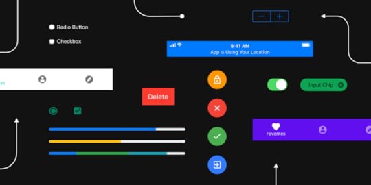
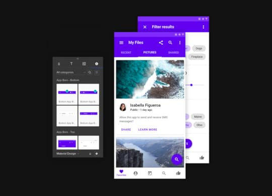
Within UXPin, you’ll find five UI Kits that are ready made for you to start your project immidiately. iOS, Foundation, Material Design, Bootstrap, and User Flows are the choices we are betting on and we are certain that you will fin them useful.
Save time
When designing for a well known platform – like Android with Material UI Kit – you can make easier estimations as to how long the whole process will take. Ready made elements give you a realistic outlook on what a project might involve and can help you narrow down the timeframe.
UXPin offers its UI Kits for free with the added benefit of including them with the app once you sign up and start using it. There’s no additional installation process so you can just get down to designing.
Start using UXPin for free!
Do you need some additional information about our UI Kits?
We decided to prepare dedicated pages that will guide you through what each of them offers.
Bootstrap will let you design web pages with the most popular framework in mind with a complete set of elements, components witj built-in interaction, color themes and more.
Our iOS UI Kit is a great start for poeple who want to design for the iPhone and iPad. Our elements are in line with Apple guidlines and our cancas comes with predefined. selectable settings for different devices and their respective sizes.
Similarly to our iOS Kit the Material UI Kit adheres to Google guidelines so that you can start designing apps for Android designs in no time. Starting with the interface and finishing up with interactions and dependencies spanning multiple screens and pages.
Foundation UI kit is a complete collection of UI elements allowing you to build responsive, mobile-first websites and products. Combined with the prototyping power of UXPin, you can quickly create fully interactive designs to share with your team.
User Flows UI kit is a complete collection of elements that you can use to outline your vision with diagrams – for free in UXPin. Share your work with your team and move to creating a simple prototype.
The post Why using a UI Kit in UXPin will make your life easier appeared first on Studio by UXPin.
October 11, 2019
Showing the hidden treasures of UXPin 2.0 – LIVE!

Our CEO, Marcin Treder will be talking live on YouTube on October 24 and showing you his favorite little usability and performance improvements we’ve released in the past few weeks. Subscribe to our YouTube channel to get notified when the time comes!
Here’s the YouTube live video window. Subscribe now and watch on October 24.
Just so you know, we’re planning a re-launch of our app this November. It’s called UXPin 2.0 because not only the tool itself is changing, but our approach to product development is somewhat new. Or to be honest, back to where we started.
We’ve decided to forget the competitive race, stop hustling over new big features for a while, and focus on the UX. You can read the detailed UXPin 2.0 release note on our blog.
Because our CEO, Marcin Treder, is a designer too and he uses the UXPin app to design stuff on a daily basis, obviously he’s got his own top improvements from our roadmap that he has been eager to check out. He’s already shared his story behind the UXPin 2.0 idea on Medium. However, the latest product changes are all about the user experience and thus, some of them are very subtle. So now it’s “show, don’t tell” time!
Make sure you didn’t miss anything – watch Marcin sharing the highlights live on October 24!
The post Showing the hidden treasures of UXPin 2.0 – LIVE! appeared first on Studio by UXPin.
October 10, 2019
What’s New in August & September
It’s been a busy two months for us at UXPin, but we’re not slowing down at all. While working on our next improvements and features as part of the UXPin 2.0 release in November, we wanted to take some time to share some just as important updates with you – precise Zoom, Layers that work better than ever, and happier snapping with overhauled Guides – just to name a few.
Introducing up to 20X faster Layers
We’ve rebuilt Layers making them up to 20X faster. Apart from being speedier, they also come with the context menu and the possibility to filter layers and setting a color for each layer. You can also expand Components like groups in the Layers panel, toggle visibility and lock each element. On top of that, we’ve added two new shortcuts for the sake of less clicking and faster workflow. You can collapse all groups at once with Alt Cmd L. And reverse the order of layers order with Alt Cmd R. This is especially useful when you want to change the order of inputs on your prototype and how they focus on pressing tab.
Smoothly zoom in from high-level
Apart from all the improvements that we have already described in our post about the Zoom, we have extended the zoom levels from 2% to 25600% for you to zoom in smoothly from high-level.
Also, the pixel grid is now a thing. It shows at zoom levels from 800% and up and allows you to get every pixel just right. When placing or moving objects, they will snap to the grid. This prevents misaligned pixel errors when exporting elements. Last but not least, with the new shortcut, finding a selected layer just got faster! You can now center to selected elements using the Shift 3 shortcut.
New shapes and an expandable menu
We’ve simplified the Quick Tools menu by rearranging elements and adding new ones to it. We’ve made it easier to work and find what you need faster with less clicking around. With all the frequently used Shapes in one place and ready-to-use components under Forms, using Quick Tools feel like a breeze. That also includes Libraries, such as Bootstrap and Foundation being moved to Design System Libraries under UXPin Libraries. Read more about our improved Quick Tools.
Power Duplicate
This is your new best friend if you’re looking to save time, and we call it Power Duplicate. Select an element and hold Alt. Then, drag the blue handle in any direction duplicating the selection as many times as you need. And the best news is that it works with data filling elements with refreshed content. Find out more in our Power Duplicate tutorial.
Happier snapping with overhauled guides
Smart guides and guides are one of those features that should be hardly noticeable as you design. That’s why we’ve totally overhauled their behavior. Smart guides are more visible and show when you move or resize elements with keyboard arrows. That way, it’s even easier to position elements exactly where you want. When it comes to guides, you can now check the distance from a selected element to a guide – just hold Alt and hover over that guide. Finally, guides now snap to elements and canvas edges.
What’s improved
When you move elements, distance values now show in small pink rectangles perfectly centered between elements, making them more visible than before.
You can now remove guides on both axes, x and y.
The default icon is now the cog icon. Also, the icons section remembers the recently selected icon library.
Selecting layers in the Layers panel with Shift pressed selects all layers in between.
We simplified the look of the Typography section in the Properties Panel. Additional options are now available after you open More Options.
What’s fixed
Zoom
Fixed a bug where you could see rulers when zooming in/out.
Polygon looked weird when you changed the number of vertices at a higher zoom level.
Guides created on a zoom level other than 100% displayed the wrong positions.
Canvas
The Canvas would move to a random place when you zoomed out.
The Canvas would disappear when you used the Fit All shortcut to see your entire design.
Components
Pressing Delete in a button inside a Component broke the Component. When you pressed Space you could also see the cursor to jump and skip letters.
Fixed a bug where you could drag and drop images while editing Component Instances.
The breakpoints bar was visible when you edited the Master Component.
Properties Panel
Clicking through the padding and radius inputs would crash the Properties Panel.
You couldn’t use TAB to move to the height input after changing the value in the width input (with lock enabled).
States
Nested states changed calculations – should result in 100% consistency in state changes between editor and preview.
Layers
Ungrouping elements removed interaction indicators.
Iterations
Moving a prototype between projects sometimes removed all iterations.
The post What’s New in August & September appeared first on Studio by UXPin.
October 9, 2019
How to use the data to improve UX?
Should designers count on their intuition and guesses? Not today! UX works differently now, users’ feedback and data on their behavior are key components of successful UX design. In a world of full-scale analytical tools, data can guide designers to make optimal decisions.
However, people are missing this opportunity because of misconceptions about data-driven UX. Let’s have a look at 4 common false impressions that might stop you from using data in the design process.
1. Data is not for designers
There is a common belief that designers should rely on their inspiration and creativity. Nowadays, however, UX is mostly based on data. In fact, data can help designers to:
prove if they are on track or not;
reveal future opportunities if they are on track or pain points if they are not;
improve a current design;
discover new trends and patterns.

So why to depend on intuition and wait when the muse will come if designers can identify what users like and do not like about your website by analyzing data?
2. Just stick to the mainstream design
This is partially right. Actually, reviewing common or best practices are a good idea if you want to have a general idea about positive user experiences in different industries. However, your customers differ from other business’ customers, and therefore you should optimize your design according to their behavior. Data-driven design can provide quality insights about your visitors’ wants and needs.
3. Data is only about numbers
Data is indeed associated with lots of numbers, figures, and graphs. However, data is not only about numbers. Generally, people do not consider non-numeric data because it is hard to generalize and analyze them. Nevertheless, non-numeric data can provide unique information that numeric data can not, and therefore it is worthwhile to examine them.
4. Creativity and data cannot work together
Another typical misconception is based on the belief that data can not assure creative solutions because it depends on past results and users’ behavior. However, data shows you only strong or weak points of your product, it does not tell you how to seize opportunities or fix threat points which you have. And here creativity comes! Designers can modernize an existing design or invent effective solutions to improve it. Actually, data allows you to concentrate your effort and creativity on a specific area, which is way better than intuitively work on probable design options.
You have busted these misconceptions once and for all and want to get started? Then here are the steps 2 scenarios based on which data-driven design process’s starting point will differ:
A) If you are about to start creating a new design, start with constructing hypotheses;
B) If you want to improve an existing design, begin by asking questions.
In this paragraph and the next ensuing case study, we will look at the scenario “B”.
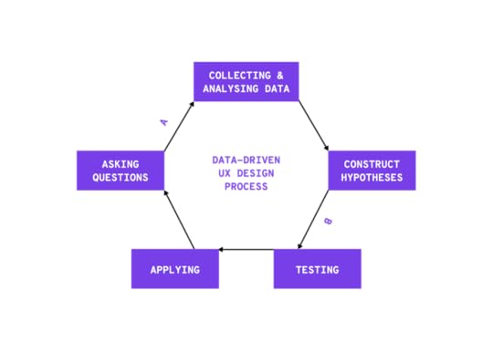
Step 1. Asking questions
It is the first and the main step in the data-driven design process. It helps not only to identify your design path but also to choose proper metrics in Step 2. Therefore, take your time and define what you want to look at. For example, questions can be as follows regarding your website:
What is the effect of the bounce rate on the home page?
How do CTAs affect conversion rate?
Which are the weakest performing landing pages?
Step 2. Collecting & Analysing data
As we mentioned earlier, data is not only about numbers. In fact, there are 2 types of data:
Quantitative data
This is numerical data that tells you what is happening on your website. For example, Google Analytics provides you with the number of new users, the percentage of visitors who navigate away from your website, average session durations and more.
Qualitative data.
This non-numeric data reveals why this is happening on your website. Session replays, heatmaps and conversion funnels show what users click or how far they scroll as well as a replayed video where you can see individual visitor’s behavior.
In this step, instead of collecting all data, be specific. It is important to analyze the necessary metrics that will answer your questions. For example, if you want to examine the performance of a certain landing page, the proper quantitative metrics could be the number of sessions, average session duration, bounce rate and so on, whereas conversion funnel, heatmaps and sessions replays of your home page are the proper qualitative data sources.
Moreover, do not just analyze collected data but try to utilize data to forecast new opportunities and upcoming threats.
Step 3. Construct hypotheses
People tend to make a common mistake, they throw their design into the trash when they are not satisfied with their current design’s results. Instead of doing that, we suggest you make separate modified versions of your design that have different changes.
Why make different versions? Well, most of the time there is more than one probable optimal solution. You can turn creativity and come up with different modifications of your design, thereafter construct hypotheses for each version. In this way, you will be able to test them and stay focused during Step 4.
Step 4. Testing
After framing hypothesis for your future design options, you can test them through:
A/B testing when you show random visitors 2 different variants of your design;
A/A testing when you show 2 different groups of visitors the same variant of your design.

Both testing methods are useful in their own way. A/B testing helps you to understand which color, font type, words, images, and other elements work the best, whereas A/A testing guarantees reliable and unbiased results of A/B testing results and high-quality execution.
Step 5. Applying
If you complete analyzing data on your design, testing hypotheses and figure out what works well with your visitors, then you are ready to apply it in practice. Do not forget that data-driven designing is a continuous process, meaning that even after applying you should continue checking metrics and KPIs and if needed, start from the beginning again. Well, design and people’s preferences do not remain the same, that is why you should improve with the changes or even get ahead.
Expert’s opinion
To learn even more about data-driven UX, we asked the UX designer to share his opinion about the importance of data in the design process. Our interviewee, Ákos Fülöp, is UX designer with 7-year experience. He designs digital products with a data mindset and manages data-related product development processes.
Why can not intuition drive UX anymore?
I think UX was never about intuition, it’s just how many sold it because it was a relatively new field. However, classic UX has always been based on data: interviewing, usability testing, questionnaires have always been there. Fortunately, since then, our toolbar has been expanded to assist with data acquisition.
Ego-driven design is something that can’t work in the long run. Sure you can get, but I haven’t seen a successful example in the medium or long term. A successful, scalable product can only be achieved with the data-driven design. In other words, we need to know how the behavior of those, who we call „our users” change over time.
How often UX related data should be checked?
That’s a tricky one. It all comes down to the type of data. As Bill Gates stated in the title of his essay „Content is King”, I monitor every that is related to content production and performance. These are the foundations of everything. If the user is looking for something but can’t find the content, there’s nothing to measure.
Then there are data that I don’t track on a daily basis. These don’t change that often, for example, ad placements, source of traffic etc. A weekly fine-tuning is usually enough.
Last but not least, I like to track all kinds of trends. Trends related to consuming content to be precise. Everything related to design goes here. Here I track the relevancy of the current design, including the graphical elements, the overall UX/UI. This is where I run usability audits and perform qualitative analysis.
Wrapping up
There is no doubt that intuition and creativity are needed in UX design. Nowadays, however, there is a high need for more precise information. Therefore, designers’ ideas should be based on unbiased and reliable data about the users’ behavior. We should understand that design is not guesswork, it is a science that needs hypotheses and testings.
The post How to use the data to improve UX? appeared first on Studio by UXPin.
October 3, 2019
13 ways to make your UI writing better
Building trust with the help of writing and making your UI more intuitive is very possible. There are some things you should avoid and others that you must follow. Here’s how to make your UI more intuitive with your writing.
1. Avoid Using Jargons and Specific Terms
Not all of your users know what those specific terms mean. At the same time, jargons are not a great substitute either. Both terms and jargons can be overwhelming to your readers when they don’t understand their meanings.
Always strive to avoid both of these to avoid miscommunication. Choose words that are easy to understand. Remember: you are writing for a wide audience. This means that you have to get through to every visitor of your website.
2. Get to the Point and Make It Concise
There is no need in making your content overly long either. Make sure you check out 3 Psychology Principles Web Designers Must Know to better understand why as these principles are useful both to web designers and to writers.
More often than not, you don’t have to include every single detail as Internet users can usually figure out what’s what. If they want to know more, they will explore features individually one step at a time. Ask yourself whether or not your users need to know what you are about to write.
3. Use Simpler Words and Sentence Structure
Using simpler words including less complicated grammar can help your UI become more intuitive. It doesn’t matter which tense you use – either past or future – as long as you use simple forms.
At the same time, refrain from using absolute forms. Don’t promise anything big and don’t boast. Explain the features of your product without excessive pride and try to be as realistic as possible. You don’t want to raise your readers’ expectations too high.
4. Specify the Gender When Possible
This may seem like a really small and unimportant detail, but specifying the gender when it is possible can make a big difference. Use either or “her” or “his” depending on the user. Even though English allows gender ambiguity (by using “they”), it is still a good idea to be more specific. This is especially true for when you are using a different language.
5. Don’t Mix Pronouns in the Same Sentence
Don’t use “you” and “your” with “me” and “my” in the same sentence. It is very confusing and can throw off your readers. Try to avoid using them in the same context when addressing the user. For example, instead of saying “Change your preferences in My Account”, use “Change preferences in My Account”.
6. Avoid Exclamations and Refrain from Using Idioms
Exclamations are not very widespread which means that when you use them, they can come off as shouting. Try to avoid them as much as possible, so that you don’t sound rude or pushy to your audience.
Moreover, refrain from using idioms. Not all of your users know English perfectly, so it would be very hard for them to understand what you meant by a certain phrase. Besides, finding a corresponding phrase in a different language is very hard when you are translating your website.
7. Use Tools for Writing and Editing Your UI
Writing and editing your UI must not be overlooked as it is an integral part of the whole process. Here are some great tools to help you:
#1 Hemingway Editor and Readable – Making your content more readable is essential for your audience to understand it easier.
#2 Trust My Paper and Grab My Essay – Sometimes you won’t have time to write the content you need. Use these online writing services to help you.
#3 Focus Writer and Google Docs – A good word processor can be a lifesaver with all its features for editing and formatting.
#4 Studicus and Grammarly – Proofreading is just as important, so make sure your text doesn’t have any grammar, spelling, and punctuation mistakes.
8. Make the Error Messages More Specific
Making your error messages as clear as possible is essential for your users to be able to complete the actions they want to make. Think of such questions as:
What happened and why it happened?
Why was there an error and what went wrong exactly?
How can the user fix this issue?
What are the specific actions that the user must make?
You must explain to the user what is wrong and how they can overcome. It is a part of a great UI just like everything else.
9. Use Numerals and Capitalize Necessary Letters
Using numerals instead of words does not only save you space but also makes it easier for your users to read the content. The point is to make the experience of your users as comfortable and enjoyable as possible and numerals can help a lot.
Don’t capitalize every single letter. Such text is much harder to read, so refrain from using it even in headings, menu items, and titles. There are some exceptions, of course, such as logos or acronyms, but all other times do not require all caps.
10. Stop Accusing Users With or Without a Reason
Of course, users will make mistakes – it’s inevitable. But you shouldn’t blame them for this as you will definitely come off as rude, mean, or something similar to that.
Instead, write more neutral messages that will not have any charges for the issue. You aim to focus on the user rather than focusing on the issue itself. If you can manage that, you will be able to stop accusing users with or without a reason.
11. Avoid Common Phrases and Simplify Sentences
As mentioned earlier, simplifying the way you write can make your UI way more intuitive. For example, if you check out tips about content style guides, you will have a better understanding of this rule.
You must speak a simple language that is easy to understand. Avoid using common phrases like “to”, “you should”, and so on. Such words only take up space and sound very awkward.
12. Don’t Ask About Sureness Yet Again
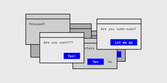
This is simply unnecessary. You don’t need to ask for sureness again and again. This includes anything from “Are you sure?” to “Do you want to proceed?” questions. They don’t add any value to the request and are usually fundamentally useless.
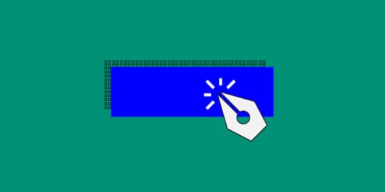
13. Name the Buttons with Their Respective Actions
This is very similar to the rule about unclear error messages. Instead of using “OK” in dialogs, it is better to stick to using the name of the respective actions. You not only have to ask what your users want to do but also make it clear what they can do.
The “OK” button is a standard and seems obvious for many dialogues. However, you can still use other options instead. After all, you aim to make your UI intuitive rather than stick to something conventional.
If you want to learn more about UX and UI writing we encourage you to give a listen to our podcast with Yuval Keshtcher:
Final Thoughts
To sum up, making your UI more intuitive with the help of writing is possible as long as you are willing to dedicate time to it. Follow the tips in this article and avoid mistakes. If you do this, you will be able to create an intuitive user interface.
The post 13 ways to make your UI writing better appeared first on Studio by UXPin.
October 2, 2019
How Netsmart builds healthcare technology using UXPin – case study

Health technology is developing fast. The times when people would frantically boil water and shred sheets when someone needed medical help are, luckily, coming to an end. With Dr. Quinn, Medicine Woman forever in our hearts, we’ve welcomed the times of online medical support platforms, heartbeat monitors, earlier diagnosis, less invasive treatment options, patient portals, and all kinds of digital healthcare services. When we are the most vulnerable, we can rely on technology.
No pressure, health tech companies, no pressure.
Who Netsmart is and how they make the world a better place
Netsmart is one of the companies that decided to stand up to the challenge of providing reliable solutions and building experiences in the medical tech department. They are a US-based healthcare IT company with over two thousand associates. They provide technology for a variety of healthcare markets, such as behavioral health, family services, and post-acute care.

Needless to say, this industry is very demanding. Not only because people’s lives are at stake, however big of a reason this is anyway. From the product development point of view, the big challenge is still that you have to adapt to all sorts of user experiences.
There are a lot of different care settings, that have complex UX needs, to be addressed with the products designed and developed by Netsmart. What they do is provide products that combine all kinds of features that answer different needs, from rehabilitating a knee replacement over a couple of weeks to managing depression over a lifetime.
How the Netsmart design team operates
A very resourceful team of three is collaborating in one office, based in Kansas City Metro. Adding new features to existing tools or building brand new products to serve a big portion of the market.

Doing research, mockups, wireframes, user testing, and passing the design over to engineers – the entire UX process is all in their hands. In fact, wireframes are not used in Netsmart as much, but actually more high-fi design which is very important when it comes to the toolset on which they choose to work.
Is there a doctor in the house?
How did Netsmart work look like before they decided to move their work lives to the next level with UXPin, a full-stack collaborative design tool? They would generate flat mockups using Illustrator, and to describe interactions, they would type out a paragraph.
Because the company grew a lot in the last four years, their design process had to be scaled as well. There’d be more and more products to design and test, and most of all, to develop. They tried to explain their ideas to the stakeholders and users but the pitching and user testing are not easy in this particular industry. Graciela Brewer, Senior UX Engineer at Netsmart admits they have been using Axure for real interactions, but somehow it was a pain as they weren’t able to edit well.
“Our prototyping usually involves full workflow design, and interactions that just link to another page simply don’t cut it for our team.” – Grace Brewer, Senior UX Engineer at Netsmart
The design and engineer work started to duplicate and the team would start from scratch each time. The burning question had arisen. How to make it uniform?
Key pain points the Netsmart team decided to address
The company had a lot of prototyping needs for all sorts of products.
The healthcare industry is not familiar with technology so it was hard to explain the ideas.
Users could barely complete the tests.
The team had to start over with each design.
It was hard to keep consistency throughout the whole design process.
Why and how Netsmart chose UXPin
Although Netsmart is a company with thousands of associates, the design team was and still is pretty small. With the company’s overall growth and raising expectations, they had to adapt to the new, faster work pace so they needed a toolset that could expand along with the demand for design and prototypes.
This tool also had to allow the designers to generate UI designs that feel like the real product so that their user testing could work and stakeholders could get a better understanding of what the design team had in mind. They were looking forward to smoothing the collaboration, too. Not just among each other, but most of all with the dev team.
Grace and her team had the freedom to choose a design tool and so they decided it had to have the three main traits. It had to be:
scalable,
interactive,
collaborative.
After a lot of research, having a go with Webflow, Sketch, and InVision, they felt UXPin was the best match. It all happened in 2016 and that’s the way they keep making design happen ever since.
How Netsmart work looks like now
What kind of design work does Netsmart create with UXPin? As an all-hands type of design team, the Netsmart uses UXPin to creating all sorts of assets from hi-fi interactive app UI through web design to collateral.

Since a lot of their work is showcased to the management for approval before the development (as it happens), they happily exploit all the interaction features. It’s no longer a bunch of static images where you have to go through each of them and explain each action, like what this button does, what happens when the user clicks that box. They can simply set a variable and show that easily.
What Grace Brewer also emphasized is that in their field, accessibility features are highly helpful. Creating a UI design for vulnerable people or people with disabilities is a very complex and sensitive work. You have to be mindful of all the special needs your end-user might have.
“The addition of the accessibility features has been very valuable to our team. Being a healthcare software company, accessibility is extremely relevant and important to our clients. The ability to actually show our stakeholders how designs may look to those with different forms of color blindness has been a particularly meaningful addition.”
UXPin being browser-based is a big relief as well. The online repository allows quick access to all their work. They can simply share a prototype to cooperate easily and edit during deadlines. Not having to switch through a lot of tools or look for the most recent version but simply maintaining one common prototype saves them a lot of unnecessary work. Which at the end of the day, saves the company money, as you hire designers not to send files back and forth, but for their creativity and expertise.
UXPin’s top features according to Netsmart
Browser-based,
Accessibility,
Conditional Logic,
Variables,
Interactions,
Spec Mode,
Symbols,
Design Systems,
Comment Mode.
Try UXPin for free!
What did Netsmart gain with UXPin?
First of all, in simple words, they can create images and make them interactive. And that changes a lot when your work is generating healthcare apps. The time they save while eliminating double work of design, describing interactions, handoff to the developers, is incomparable.
They created their own look and feel and it lined up with the Design Systems. This way instead of doing the mundane work of creating all the designs from scratch, the team can rather focus on software solutions and usability. User testing became much easier too with the prototypes that look and feel almost like the real product.
“The ability to create full, realistic interactions has helped stakeholders better understand our designs, enabled our clients to usability test our prototypes more effectively, and allowed other roles in the org to demo our work with much more ease.”
What has kept the Netsmart team excited to use UXPin for almost three years – Grace admitted – are all the helpful improvements and new features added in that time. With UXPin as their design tool of choice, they can create technology that helps people when they need it the most.
The post How Netsmart builds healthcare technology using UXPin – case study appeared first on Studio by UXPin.
September 18, 2019
The Strikingly Precise Zoom
When you work in one tool every day, little things can impact your workflow a lot. “Only making the overall UI creation process smooth and painless is what kept us successful so far. This is what our loyal clients care for”, that’s what our CEO, Marcin Treder wrote in his recent article Where’s Your UX Now? Behind the Scenes of UXPin 2.0.
And that’s why we’re committed to improving the UXPin experience and making it as enjoyable as possible for everyone. We’re taking it one day at a time, working on the little things that matter before the official launch of UXPin 2.0 on November 19th on Product Hunt. Before that, we’ll be sharing with you all the exciting updates. Today, we want to focus on our zoom which we’ve recently improved to be more precise and work in a lot more predictable way
Zoom mode to make things easier
One of the most exciting parts of the zoom is what we call the Zoom mode. Hold Z to enter that mode and click to zoom in or press Alt and click to zoom out. Or, keep the “Z” button down and select an area you want to fit the viewport to.
Zoom centers on cursor for striking precision
Before the changes, zooming simply wouldn’t focus your working area on the cursor. As you can imagine or remember, this required panning around the canvas to get where you want to be. It’s a tiny thing, but it’s annoying to have to zoom, then scroll to get to where you want to zoom in on. Now, zooming in with the mouse scroll or the trackpad focuses on where your cursor is. And it works the same when you zoom in and out in the zoom mode.
Even more zoom options

Apart from just typing in the zoom percentage directly in the field the same old way, there are more options in the dropdown menu when you click on it.
Let’s start at the top. The Zoom In and Zoom Out options allow you to adjust the Zoom at pre-determined increments: 10, 25, 50, 75, 100, 200, 300, 400, 500, 1000. Then, you can zoom the canvas to a specific percentage, 50%, 100%, and 200%. Fit to All enables you to see the entire design and Fit to Selection zooms to the currently selected element.
And last but not least, checking Zoom to Selection checkbox at the bottom of the dropdown menu will center the selected elements on the viewport when zooming.
As you can see we are hard at work to make the experience of using UXPin as friendly and as streamlined as possible. Zoom, as well as a steady stream of other improvements, all fall under the banner of UXPin 2.0, the initiative where we focus on you. If you want to learn more, leave your email and we will keep you up to date.
We protect your data with care – just as described in Privacy Policy.
The post The Strikingly Precise Zoom appeared first on Studio by UXPin.
UXpin's Blog

- UXpin's profile
- 68 followers

