
UXpin's Blog, page 156
June 17, 2015
Free pocket guide: Designing UX with Developers

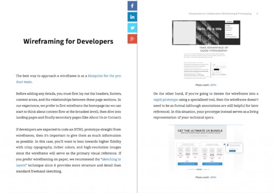
Now available: our pocket guide Designing UX with Developers. This introductory guide focuses on involving developers in the early wireframing and prototyping stages.
Take a look inside.
The sooner development is involved in the process, the better. Their early input can tell you what’s feasible and open up new suggestions and inspiration. Their technical expertise will save the entire team from wasting time and energy on that would need revisions later.
Unfortunately, given the nature of the two disciplines, working together effectively sometimes needs works. That’s why we’ve written this free pocket guide to explain the best practices for collaborating during the wireframing and prototyping phases.
What’s Inside:
With a simple-to-understand tone and citing real-world examples, this free pocket guide provides a quick overview of better collaboration with developers.
Inside, you can learn:
how to view wireframing and prototyping from the developer’s point of view.
why involving developers in usability testing can make a big difference.
where developers fit in on different iterations of wireframes and prototypes.
why coding doesn’t have to slow down rapid prototyping.


How to Hook Users With Habit-Forming UX Design

Apple. Facebook. Twitter. Google. Pinterest. These companies all have one thing in common — they create habits among their users. People use these products habitually on a daily basis and they’re so compelling that many of us struggle to imagine life before they existed.
But creating habits is easier said than done. Even though I’ve written extensively about behavior engineering and the importance of habits, there are few resources to give designers the tools they need to design and measure user habits. That’s why I wrote “Hooked: How to Build Habit-Form Products,” which explains the four-step Hook Model that can help form habits among your users.
In this post, we’ll take a look at how you can use Habit Testing to build products that users not only love, but are hooked on.
The Hook Model
Before we take a look at Habit Testing, it’s important that we familiarize ourselves with the Hook Model.
As described in my book, the Hook Model is a four-step process companies use to hook users and form habits among them. The four parts of the model include: trigger, action, investment and variable reward.

Image Source: Nir Eyal
Let’s break that down:
Trigger: This is the spark for a behavior that gets someone into a system. There are two types of triggers: external and internal. The external trigger alerts users with something like an email, link or icon. Internal triggers happen within the system and are formed as a user cycles through successive hooks while using the product.
Action: This is the behavior taken when a reward is anticipated. For instance, the action of clicking on an image on your Facebook feed. When you click that image, you anticipate that you’ll be taken somewhere interesting, such as the latest listicle on Buzzfeed. This is an important part of the model because it draws upon usability design to drive users to take action.
Variable Reward: This is the part of the model that allows you to create craving in users. Rather than using a conventional feedback loop, you can serve up a multitude of potential rewards to hold a user’s interest. For instance, Pinterest does this by showing you images that are relevant to your interests along with other things that might catch your eye.
Investment: This is the part where the user now has to do some work. Think of it as giving back into the product, and that can take the form of time, data, effort, social capital or money. But this isn’t solely about swiping their credit cards. Investment is an action that will improve the product as well — such as inviting new people into the system, giving feedback on features, etc.
The Hook Model is a great way to start consider how you bring users into a system, hook them and keep them there through variable rewards and internal triggers. In the end, you’ll be able to build habits among your users that will have them coming back for more.
An Introduction to Habit Testing
Habit Testing fits perfectly into the Hook Model.
With Habit Testing, you’re better able to answer three vital questions:
Who are your devotees?
What part of your product forms habits?
Why do those parts of your product form habits?

Image Source: Nir Eyal
A prerequisite to Habit Testing is having some kind of product up and running. Of course, it’s a good idea to complete your business model hypotheses and explore how your product will create user desire before launching even a minimal viable product.
Once you’ve released your site or app into the wild, you must start reviewing data. Don’t track everything: focus on when users interact with your site along with the path of their visit.
Let’s go through the three steps of Habit Testing.
Step One — Identify
This is where we look at the first question of Habit Testing: “Who are the habitual users?”
Here’s some tips to do that:
Define the characteristics of a devoted user. Ask yourself how frequently someone should use the site, assuming that most bugs will be resolved and the product is nice and polished.
Be real with yourself. If you’re working on a social network app like Instagram, you’d expect habitual users to be on the app many times a day. But if you’re building a movie recommendation site, you might not expect people to visit more than three times per week
Crunch the numbers. Once you know how often someone should use your site, check the data to see how they stack up against expectations. Create a cohort analysis as a baseline for measuring upcoming iterations.
When defining the frequency of use, don’t be overly optimistic by thinking only of super users. Aim for a reasonable guess. For example, you could average out the product use between yourself and your coworkers.

The more frequently someone uses a product, it’s more than likely they’ll form a habit.
A good way to measure whether someone will actually use your product is to see whether your own team is using it. Take for example Twitter. The social media giant was born within Odeo — the original company Biz Stone and Jack Dorsey founded. They knew they were on to something with Twitter because the engineers couldn’t stop playing with it.
In any case, you’ll hopefully have at least a few users who interact frequently enough with your product for you to call them devotees.
Editor’s note: To learn more about how to influence behavior with design, check out the free e-book Interaction Design Best Practices.
Step Two — Codify
The next step is to codify the steps devotees took using your product so you can understand what hooked them.
First, how do you know you have enough devotees? A safe guideline is roughly 5%.
Keep in mind, however, that your rate of active users will need to be much higher to sustain your business. If at least 5% don’t find your product useful, you have a problem. If you have that 5%, then it’s time to find the Habit Path, a series of similar behaviors shared among your most loyal users.

Not every user will interact with your product in the same way. Each one will have a unique data fingerprint, which will reveal patterns in usage and that in turn will help you discover the Habit Path.
Let’s go back to Twitter. The social media app discovered that once new users followed enough other members to odds of more people using their site increased.
Here’s how you determine which of the steps in the Habit Path were critical for creating devoted users:
Create a hypothesis. Where was the turn that turned passers-by to devotees? This could feel like assuming causation from correlations — but in the murkiness of launching a new product, it’s the best you’ll have.
Talk to users: Learn how they use the products and why they use it. For instance, you can walk them through the actual steps that got them hooked.
Step 3 — Modify
Now that we have a hypothesis, it’s time return to the build. We need to measure, learn and take new users down the Habit Path we’ve discovered.

Image Source: Twitter
For example, leveraging their Habit Path, Twitter’s onboarding process suggests news users who to follow. You’ll want to do something similar once you’ve identified the path that turns onlookers into devoted users of your product.
Takeaway
Habit Testing is an ongoing process that applies to every new release. Continually comparing new user activity to devotee usages can guide you on how to evolve and further foster habits.
Products fail when they don’t adequately create user habits. And if a product doesn’t create a habit, then it’ll get left behind in the ever increasing distractions we all face.
Note from the editor: For more persuasive design techniques, check out the free e-book Interaction Design Best Practices: Mastering the Intangibles. The practical guide analyzes 20+ examples from companies such as Mint, Apple, AirBnB, Kickstarter, and Netflix.

June 16, 2015
3 Crucial UX Considerations Before Going Parallax

Skeuomorphism gives way to flat, and flat gives way to … something in between. One technique that’s taken hold in recent years is parallax scrolling — a visual effect that adds the illusion of depth to your site.
In this piece, we’ll explain a few things you must consider if you want this technique to work for you.
Having both the foreground and background content scroll at different speeds creates an illusion of depth. As Jacqueline Kyo Thomas points out in her excellent UX Matters article on the subject, “Parallax scrolling is very effective in guided storytelling.” In other words, you can help sell your products or services through a scrolling storybook.
Sites such as “The Boat” by Nam Lee use parallax as a narrative device. However, that raises the question: do they actually deliver a good UX?
When it comes to parallax, you must consider multiple factors ranging from SEO to usability best practices.
1. Parallax and SEO Don’t Usually Mix
As described in the free e-book Web UI Best Practices, parallax can come at an expense – your site’s search engine optimization.
Lindsay Kolowich in her Hubspot article “Is Parallax to Blame for Poor SEO?” says that the dent to SEO comes from placing an entire site on one URL — something that parallax scrolling encourages.. That means search engines – like Google – will only index that single page. Having content spread across more pages gives your site more search engine visibility.

Image Source: Flat Design vs Realism 2013
But there are a few ways around this. Let’s take a look at them:
Add parallax to selective parts of your pages. In her article, Lindsay recommends using parallax in specific areas on your pages to illustrate smaller stories rather than larger narratives.
Use jQuery to divide content for search engines. You can use jQuery to slice up a page into different sections with different URLs (for search engine indexing). Kevin Ellen, of iProspect, has an excellent tutorial on how to implement a jQuery solution.
Optimize around one keyword. It’s never a bad idea to target a single keyword in your H1 header and body paragraphs.
The SEO experts at Moz have written an extensive article on other workarounds, including Kevin Ellen’s jQuery solution, if you want to dive deeper into the specifics around SEO and parallax.
2. Parallax Can Be Slow and Isn’t Mobile Friendly
Other downsides are speed and mobile-friendliness.
Parallax’s heavy JavaScript use can increase load times, which wreaks havoc on mobile users. Featuring all the content on a single page certainly doesn’t help site speeds either.
Let’s walk through an example of a well-done parallax site, Cyclemon that takes mobile into consideration.

Image Source: Cyclemon
As you scroll down, the image above changes the image of the bike and it’s not especially slow to load.

Image Source: Cyclemon
As you begin to scroll down, a bike appears. As you continue to scroll, you see that the bike also has a title, which describes what type of rider you might be.

Image Source: Cyclemon
There are twenty different types of bikes illustrated as you move down the page.
Note that there is also a basic navigation menu at the top left of the page, which doesn’t detract from the design at all.
It’s only when you click on the “shop” link that you realize that it’s not a site selling bikes at all, it’s a site for two graphic artists selling their work (which includes the bike graphics). They’ve certainly used some sleight of hand, but it works because the parallax scroll entices users with a rich visual teaser.
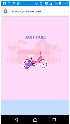
Image Source: Cyclemon
Let’s go to mobile. The parallax effect is lost.
The site loads quickly enough and while it doesn’t offer the same effect, the imagery is still there.
The imagery on its own is good enough to pull a mobile user in and not much is lost. The navigation menu is still available and users can easily get around the rest of the site.
While the parallax on this site isn’t groundbreaking, the designers exercised sound judgment in providing a backup design for mobile users. Their strategy, nonetheless, is quite clever for using parallax to create an interactive showroom of their art.
3. There’s No Real Usability Advantage
The Journal of Usability Studies did a study on parallax. The verdict: it’s a satisfying experience but there’s no real difference between a site that uses parallax and one that doesn’t.
One test group used a parallax site and another group used one without it. Both groups had to complete the task of booking a hotel room.
Testers reported the parallax site as being more fun. But that may be all it was good for. Among both groups, the parallax site didn’t gain an edge in terms of usability, satisfaction, or overall enjoyment.
However, the study did find that two of the participants using the parallax site suffered from “motion sickness and experienced significant usability issues while interacting with the parallax website.”
The bottom line? Parallax isn’t the best choice if users are looking to accomplish clear-cut tasks (like online shopping). Imagine for instance, how frustrating Amazon would become if you had to scroll through 8 sections of unrelated products to find the hard drive you want.

Image Source: Cyclemon
On the other hand, parallax is a strong choice for sites aiming to immerse users in a visual narrative. For example, take a look at how The Dangers of Fracking allows the user to control a droplet of fracking fluid through its entire journey. In this case, parallax is certainly a compelling technique for condensing a complex topic into an enticing (and almost fun) experience.
A Final Word On UX and Parallax
Parallax scrolling can be used to great effect but requires trade-offs.
There are serious UX issues that you must consider before deciding to use the effect.
Let’s review them:
Parallax encourages bad SEO practices. While there are a few workarounds, SEO can be seriously hampered. That’s because if all the content is on a single page with a single URL, search engines will only index the site once.
Parallax isn’t mobile compatible. Load times are atrocious because parallax makes heavy use of JavaScript. This makes it impractical for both mobile and responsive design.
Parallax doesn’t have much of an edge for usability. It’s great for fun websites, but doesn’t necessarily make it more usable than one without it. However, we all know UX requires more than usability. If your goal is interactive storytelling, then parallax certainly adds a layer of delight.
With this in mind, any project that considered parallax scrolling will need budget set aside for thorough usability testing. Testing with users, after all, is the only true indication of whether parallax will improve or damage your site’s UX.
If you’d like to learn about other practical web UI techniques, check out the free e-book Web UI Design Best Practices. The 109-page ebook includes analysis of 30+ examples from top companies like Spotify, Apple, and Skullcandy.

UXpin's Blog

- UXpin's profile
- 68 followers

