
UXpin's Blog, page 100
March 28, 2019
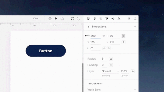
API Request
We truly live in the future. One in which we can manage our home lights, sound systems or even security with our voices or from a phone app while miles away. You’re now able to build such prototypes in UXPin!
UXPin’s latest feature, API request, allows you to create prototypes to “talk” with your products. It works by allowing you to send HTTP requests to an external API. This is now part of Interactions as a new type of action called API request.
The post API Request appeared first on Studio by UXPin.


Build Prototypes That Talk to Your Products

We truly live in the future. One in which we can power our home lights, sound systems or even security with our voices or from a phone app while miles away. Much like the one predicted in the cult classic, Back to the Future:
You’re now able to build such prototypes in UXPin! Until now, it was impossible to do this using prototyping tools or without coding. What is this sorcery?! Or as Doc Brown would say: Jumpin’ Gigawatts!
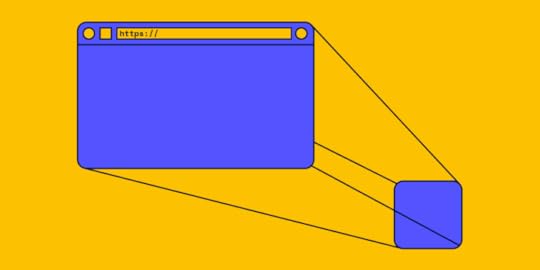
UXPin’s latest feature, API request, allows you to create app prototypes to “talk” with your products. For e.g. as a car manufacturing company, you could build a prototype that communicates with the car. You can even save data from a prototype to a spreadsheet! Or you’ll be able to simulate changing the colors of your smart lights via a prototype created in UXPin. Just like so:
Changing the colors of your smart lights via a prototype created in UXPin
Technically speaking, it allows you to send HTTP requests to an external API. This is now part of Interactions as a new type of action called API request.
Learn how to use this feature here.
Welcome to the future.
Join the world's best designers who use UXPin.Sign up for a free trial.Try it for free!
The post Build Prototypes That Talk to Your Products appeared first on Studio by UXPin.
March 22, 2019
Are UI Patterns Like Cartoon Characters?

This article was cowritten with Aniko Kocsis.
Have you ever watched the movie Snow White? Did you notice she moved exactly the same way as characters from your other favorite childhood movies? I hadn’t either.
 Source: “Maid Marian and Snow White” – © by Jim MacQuarrie, source: https://geekdad.com/2015/06/disneys-r... animation stills: Maid Marian, Snow White – © by The Walt Disney Company”
Recently, I found an article about recurring animations in cartoons. And now, I completely get it. They are much like UI patterns. And that is why UI patterns are a genius hack for being efficient.
In this article we’ll cover:
What are UI patterns?
Why should designers use UI patterns?
How can UI patterns help users?
How can designers apply UI patterns?
Think about it: is creating a UI design from scratch the best solution when designing a product? Even run a design sprint? Not necessarily. UI design patterns are repeatable solutions for a recurring problem.
You think that is cheating? Users don’t. Just as you didn’t when you were watching cartoons! Same difference.
What are UI design patterns?
When implementing a new feature or creating a product from scratch, you don’t have to come up with brand new solutions every time you come across an interface problem.
Designers want to figure out the easiest way users should interact with a product by cutting down on time and effort needed to navigate through it.
It’s already challenging to create a useful and intuitive interface that retains users. Therefore, it’s very important to remember that there are existing patterns that incorporate the best practices for every function.
 Screenshot search example (Source: UIpatterns)
 Why should designers use UI design patterns?
1. They speed up and simplify the design process
Look into repositories of existing patterns like Design Patterns or best-known design systems like Google Material Design, ADG by Atlassian, Airbnb Design System, etc. Then tweak them according to your needs, so you can turn your focus to other issues.
2. UI patterns increase engagement with a product
When people see a product for the first time, it has to be very easy to use and to understand; they shouldn’t have to think too much. This is one of the first steps to increasing its engagement.
3. Use common vocabulary
When you say “You need to check-in at the airport”, frequent flyers know what you mean. It’s simply mentioning the name of a pattern instead of explaining to others what it does and how it works.
Familiarity and affordance are key components of “Easy to use” as Peter Zalman explains. A repeated experience of using familiar patterns reduces cognitive strain.
How can UI design patterns help users?
1. Intuitive navigation
It’s similar to going into a supermarket and always finding the baked goods in the back of the store. These are common practices that make you get used to navigating accordingly.
 Could you tell where to turn off your computer? A new UI can be challenging for users. (Source: Conceptdraw)
Based on their prior experiences, when users access an app or website for the first time they already think they know where to click and what to do. They don’t have to ask, “Where are the dairy products?”
When those interfaces use common patterns, navigation becomes a simple task.
2. Understanding the function
Imagine you’re on a flight search website and want to choose the dates of our departure and/or return trip. You expect to have an overview of those dates in a calendar to find or submit information based on a date or date range.
 The example of WizzAir for UI patterns
3. Ease of use
A date picker displays two calendars side by side, and lets users pick a date or a range of dates in a few clicks without entering them manually.
Although this is an example of a common pattern solving a common problem, let’s analyze its efficiency. Maybe the dates are more easily inputted via writing the date as text due to its extensive range. In this case, this pattern may not be ideal.
How can designers apply UI design patterns?
UI design patterns are solutions to usability problems, so if it ain’t broke, don’t fix it.
It might seem simple to choose which pattern to apply to a problem, but it’s quite challenging to pick one most relevant to your needs.
After determining the visual hierarchy, the look and feel of the product, you can start the process of selecting patterns.

This can be simplified into four basic steps:
1. Figure out the problem to be solved
Several methods exist to detect usability issues presented in the interface.
If it’s a new product in its exploration phase, try in-person surveys, interviews or a simple online research.
If it’s an existing product or in an advanced stage of development, try user tests or A/B testing. Such methods will help you figure out what users don’t like about the current design solutions and what the interface lacks.
2. Understand how other products solve similar problems
For example, imagine you’re trying to figure out the best navigation method for a certain section in your product. Research different apps or websites that solve that similar problem with different navigational patterns.
3. Examine the efficiency of solutions used on other products
How often are these solutions used? Future success can be derived from that, as users can get used to the road already taken.
4. Analyze the patterns’ proper usage to recreate it for your own needs
If you know the exact solution you’re looking for, this will come easy. Get straight with yourself and you’ll get a clear image of how your own version should work.
5. Look for tools to help you in the use of UI patterns
For instance, UXPin provides shared libraries to store and reuse UI patterns, which are accessed by the whole team. You can start with one of thousands of prebuilt elements for extremely rapid prototyping. Start quickly and mess with screen layouts. Then, you can make it interactive and go from static mockup to interactive prototype within a few clicks.
Once the interactions are added and components grouped into a pattern, you can choose to add documentation to the pattern. Suddenly, you have the start to a complete design system (containing not only the visual layout and documentation, but also the functional interactions!). Working on multiple products or with different clients? You can create multiple libraries that can be accessed from whatever project you’re in!
 UXPin UI library in action!
 Which one is a pattern? (Source: Balraj Chana, weandthecolor)
Takeaways: How can UI patterns help users?
As you now know, UI design patterns are repeatable solutions for a recurring problem. Just like reused cartoon animations. And they work super well!
They are common, known solutions. They help users:
Navigate
Understand
Use the functions on the interface
The benefits for UI designers include:
A sped up and simplified design process
Increase engagement with a product
A common vocabulary between the user and designer
Make sure to identify a user problem that needs solving before considering using UI patterns. Then, you can start hunting for a solution. There are lots of resources out there!
Join the world's best designers who use UXPin.Sign up for a free trial.Try it for free!
The post Are UI Patterns Like Cartoon Characters? appeared first on Studio by UXPin.
March 6, 2019
What’s New in February
The last day of February was the day we had marked in our calendars months in advance. Because that day we reached another milestone — UXPin Merge entered its beta phase! Apart from that, this month we’ve really gone the extra mile and brought to you numerous enhancements and fixes.
UXPin Merge closed beta
Last week, we bid adieu to the UXPin Merge alpha and moved on to the closed UXPin Merge beta! As we’re getting for the release, we’re testing Merge with some great companies — so if you’re up to it, join now! Invite your team to import, keep in sync and use your coded React.js components in UXPin to see your designs the way your users will.
A design tool that can access *production* React.js code and import *interactive* components?

February 19, 2019
The Immense Power of Progressive Web Apps

Progressive Web Apps (PWA) are a powerful new technology. They makes your website faster, let you harness the power of notifications and even work offline. So it’s a pretty big deal.
In many companies, employees and users are too used to the way the current system works. So much so that they know where each thing is, and any change can cause them to get lost and be less efficient. So, should you implement a new and great PWA in your system?
Let’s start from the top
On most websites, there are just a few page templates. Let’s take eCommerce, for example. You have:
Homepage – unique and only the front page of the shop
Product listing page – where you usually see search results, a category listing, etc.
Product page – generally product pages look the same, for example, on nike.com every shoe has the same product page structure, just the information on it varies
Static pages – all pages with pure text are the same, the formatting of text can of course differ, but again, the structure is similar domain-wise
And more!
Photo by Charles 
February 13, 2019
2019’s Greatest Web Design Hits – Free eBook

From layering with interactivity to bright colors, know the trends that will influence 2019… and beyond.
Is orange the new black? How much animation is too much animation? Will 2019 be the year of Euclid? Whether you want to follow the trends or stand out in the crowd, this web design eBook will give you an idea of what to expect in 2019.
Written practically for designers of every level, this hot off the press guide includes 60+ pages of solid advice and 60+ current examples. Think of it as equal parts look book and instruction manual.
For each trend, the guide explains:
What does the trend look and feel like?
Why is this trend useful?
How can you adapt it to your own work?

Join the world's best designers who use UXPin.Sign up for a free trial.Try it for free!
The post 2019’s Greatest Web Design Hits – Free eBook appeared first on Studio by UXPin.
February 4, 2019
What’s New in January
We’ve definitely kicked off the new year with some great updates. As January has come to an end, we can sure tell that we’ve already taken a big step forward. This month was about two things: The UXPin Mirror app and Local Fonts in the UXPin Editor. To top it all off, our engineering team churned out other experience, stability and workflow improvements and fixes.
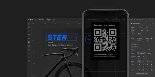
UXPin Mirror
Long-awaited, highly anticipated and finally released in January! This month brought to us the Mirror app that makes it a breeze to view designs on mobile devices in real time, both iOS and Android. Simply scan the QR code in the Editor, and that’s it! There is no need to connect via USB or use Wi-Fi. Any changes you make in the prototype will show on the device automatically. Get it on the App Store or Google Play.

Local fonts
What’s also massive this month are Local Fonts. When you open UXPin, you will notice that apart from online libraries like Google Fonts or Adobe Fonts, every font installed on your computer is now available and ready for use in the desktop app. More about local fonts.

Brand new video tutorials
Another distinguishable update to UXPin are video tutorials available to watch right inside the Editor. You’ll find them in the right corner of the bottom bar. No more switching between the tool and the browser window to get the hang of UXPin and our most important features. We believe that this will add tremendous value to a better day-to-day learning experience. Of course, all tutorials are also available on our YouTube. Happy binge-watching!
Scrubbing values
You can now scrub values by dragging labels in the Properties Panel. Hover over a label with a numeric value input and drag the cursor right and left to increase or decrease that value. Alternatively, in case there is no label, just click through the input and press Cmd/Ctrl. And if you drag with Shift, the value changes by 10px. On top of this, the cursor goes beyond the screen even if it reaches its end (desktop app and Google Chrome).
Enhancements
All the recently used fonts appear at the top of the font section dropdown to speed up the workflow.
Improvements in positioning elements in nested States.
Different types of elements were placed in a different way on the canvas – some in the top left corner, some in the middle of it. From now on, all the elements land in the middle of the viewport.
The Mac OS X Traffic Lights are back inside the app’s UI in the desktop app.
Fixed
Changing the name of the prototype while offline is blocked.
When trying to open a project while being logged into different account , the editor kept reloading with a spinner endlessly. Now users are taken to the dashboard.
Long names of projects not displaying entirely in the dashboard list view.
Scrolling through all interactions for cases with many interactions in the Copy Interaction section.
Every once in a while, adding a new line in a text element didn’t update the canvas size on the preview properly.
Moving multistate elements around in the dark theme caused both the background and font turn white.
Copying a part of code and pasting it into the code block section in the Design System separated each line into its own block, instead of keeping it together.
Occasional blank screen issues in the desktop app.
The post What’s New in January appeared first on Studio by UXPin.
Video Tutorials
We’ve just released our new video tutorials that will help you understand UXPin inside and out! Master expressions, catch on variables and ace conditional interactions – and there’s more to it! Check them all out in the right corner of the bottom bar of the Editor or watch them on our YouTube channel.
The post Video Tutorials appeared first on Studio by UXPin.
January 31, 2019
The Subtle Detail That Gives A Design Its Entire Personality

What’s the biggest difference between your designs and a $20 template?
Companies ask themselves this every time they enter the market. With the widespread advertising from website builder tools, it’s an entirely rational question to ask.
What do you have that they don’t? Turns out, there’s one subtle detail that gives design its entire personality… that extra “oomph” that no template or builder could ever hope to provide.
In this post we’ll unpack what that subtle detail is, and why it matters so much. This will help us to better appreciate the skills offered by designers and give us language to articulate this value.
Let’s go on a little journey through how successful websites are designed:
1. Reading the story
The design process starts with the copy being written and handed to the designer. This copy contains the story. As designers, it is our duty to bring it to life by giving it a visual form.
It’s essential we understand the value of the story being told before we begin.
This is why we read with the mindset of a designer. We engage our mind’s eye to seek out the narrative, the journey, and the key messages. The narrative is the thread that runs through the text and ties the events together. The journey is layered on top of and responds to the narrative. It can be emotional or factual. The key messages are the most important points in the narrative or the journey that we can take from the copy.
Identifying these elements is imperative to understanding why this page exists and what is happening in the overall story.
At this stage, we only have words on a page. There are no visuals, no fonts, or anything else. The visual story will come later.

Photo by Jelleke Vanooteghem on Unsplash
For now, we should:
Focus on the words. That is to say that we shouldn’t get too far ahead of ourselves and begin imagining what the design may look like, yet. The temptation may be there but resist it till the next stage. For the time being, we’ll give our all to studying the words and their meaning.
Embrace and experience the story from a designer’s perspective. Designers have a special ability to feel what a story is telling us. This is what separates quality designers from the rest of the pack. Use this ability to see beyond the words and understand the story and its constituent parts.
Use your intuition to delve into the details. As you read, think through what’s being said underneath the words. What isn’t written, but shows through in the copy anyhow? What has the writer hinted at without saying explicitly?
2. Asking “What did I just see?”
After a thorough read through, it’s time to dig deeper into the story. This can be done by asking questions like:
What big feelings did the copy leave me with?
What did I see with my mind’s eye?
What texture did the story have?
Were some sections of the story particularly dramatic?
Did any patterns or colors come to mind?
This step seems abstract at first, but building an initial rich mental picture of the story is key to the success of the final design. After all, it’s our responsibility as designers to bring that story to life.
The best designers do this. They’re able to say “look at this” rather than “look at me”. How? They’re adept at creating a very rich and developed understanding of the stories they work with.
When we understand the story entirely – its tone, background, and key messages, etc. – we can convey it to readers who aren’t designers and don’t have that gift of expression.
After asking questions about the story, it’s essential to sum up the key emotions we’re left with. Listing a range of emotions felt can help us in the design phase. We need to reflect those emotions through design. Pinning them down will ensure our final design captures the story fully.
3. Checking that perceptions are aligned
Now that we have a fleshed out idea of the story we’re working with, it’s time to confirm how accurate our interpretation is.
Did we see what the target audience will see? Did we see what the project owner wants them to see?
If our interpretation is different, the copy gave us the wrong impression and it will have to be adapted and refined before the design process goes ahead. It will make the story clearer going forward.
Once our understanding of the story is aligned, it’s time to look at it from the perspective of our target audience.

Photo by Emily Morter on Unsplash
We should ask questions about our audience to better understand how the story will be framed in their minds:
Who are they? Consider putting together personas (or using existing ones related to the project) to segregate your audience and understand each individual group on a deeper level. Think of things like age, profession and interests.
What’s their experience? After understanding the personas that’ll interact with your story, ask how their unique experiences will affect their view of it. Are they related to the story somehow? Will this help or hinder them when it comes to understanding it?
What are their needs, hopes, desires, dreams and fears? There are no more powerful motivators than these. Put yourself in the shoes of your audience and consider each of the above to gain a deeper perspective of how they’ll approach the story. Their needs are especially important here – what can’t they live without?
4. Bringing it to life
At this point, you’re probably wondering, “Jeez, we have done a lot of work, but only have text on a page.” However, we now also have a totally developed understanding of the story, and it’s time to breathe life into it with the design.
Promoting story through design
Every choice that we make – font, color, size, composition, motion graphics, etc. – should reveal and promote the story. We must use our designer’s mind to make sure the story is brought to life.
Begin by gathering images based on what we saw in our mind’s eye. Did we see any faces, objects, scenes or other elements?
Illustrations, with their ability to unpack and simplify abstract concepts, will probably play a part too.
Think about the hierarchy of information and how it’ll be organized. There may be core pieces of information and more supplementary pieces – how will these be presented and differentiated?
All of these decisions will help tell the story. Some people see design as the decoration of a page before putting words onto it. But as this process reveals, it is far more:
We are visual storytellers.

Photo by Kaleidico on Unsplash
Remaining focused
It’s inevitable that we’ll think ahead. We may begin to blend form and function. For example, we might wonder how sticky navigation could be used. Could a carousel work with the images we’re envisioning?
Abandon those ideas for now. They’ll have their time to shine.
Of course, our page has to function properly and have a focus on conversions. However, none of that matters if our design doesn’t first connect with our audience.
And this, folks, is the subtle difference that we have been alluding to throughout this entire post: connection.
The importance of connection
By connection I mean an empathic, deep, visceral appreciation and understanding between the story being told and the person hearing it.
With a finite number of options and restrictive choices, no template or theme can hope to achieve this. This is what makes designers unique and valuable – we breathe life into stories and build strong bonds.
Picture a children’s book…
To better understand this idea, imagine the process of creating a children’s book.
It’s impossible to illustrate one before knowing the story. And to write the story first and then find a template with illustrations that fit perfectly? Unheard of.
In both scenarios, there would be no cohesion and the story would be lost.
Conclusion
To sum it up, themes, templates, and “done-for-you” tools can’t offer the subtle difference that gives design its personality. The elements that make up these tools have not been designed to champion the story from the very beginning. Frankly, they suffer for it.
This is exactly the point where our designs differ from the $20 template: we have a capacity to infuse meaning through deliberate design choices. The story is more effectively communicated because of them.
Learning to articulate this value is both a very important skill and a vital tool to counter the prevalent advertising from website builder tools. As designers, our work has irreplaceable value. If we communicate it effectively, our clients will not only appreciate it, they’ll crave it.
The post The Subtle Detail That Gives A Design Its Entire Personality appeared first on Studio by UXPin.
January 28, 2019
Ensure Mobile Prototypes Look and Perform as Intended

Designing web and mobile experiences is no easy feat. It can be tough to visualize complex digital experiences you’re creating with just artboards. You should save your imagination for creating your designs, not waste it racking your brain on how they will interact in real life.
That’s why we created UXPin’s new Mirror app. It makes previewing prototypes on real devices (both iOs and Android) fast and easy. That too in real time. All it takes is one click to ensure mobile prototypes look and perform the way you intended.
This feature allows for a fast review of created prototypes by seeing them immediately on the device they’re intended for. The Mirror app must be used in conjunction with UXPin’s Desktop App or Browser.
As you make changes in the prototype, the preview on your device updates automatically. So if you switch pages, you’ll see that real time in the preview. Also, there is no need to connect via USB or use Wi-Fi network, just scan the QR code in the editor to view your prototype!
Learn how to use this feature in a tutorial here.


Join the world's best designers who use UXPin.Sign up for a free trial.Try it for free!
The post Ensure Mobile Prototypes Look and Perform as Intended appeared first on Studio by UXPin.
UXpin's Blog

- UXpin's profile
- 68 followers

