
UXpin's Blog, page 97
September 11, 2019
Better Quick Tools are here – more intuitive and faster than ever
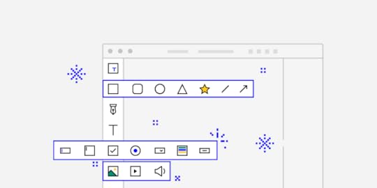
Over the past months, we’ve done a lot of work to improve the left-hand toolbar which we call Quick Tools by rearranging elements and adding new ones to it. Once you start using it, you’ll see that it’s a lot more intuitive and just overall more natural to get used to. See what changes we made to our ever-improving editor.
New Shapes and an expandable menu
To make life easier for all of us, we’ve put the shapes which you probably use most often under one, expandable menu – Shapes. When you open it, you’ll see two new shapes, Polygon and Star. You can read all about it, in this tutorial.
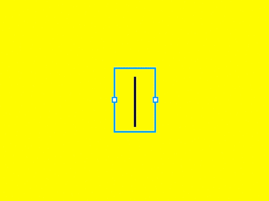
Box and Rectangle – alike but very different
When it comes to the difference between Box and Rectangle, there’s more to it than meets the eye. To avoid any confusion, let’s get right to explaining what sets them apart. As with most things, the devil is in the details. It’s possible to add text to the Box, but since the Rectangle is a vector shape, you can customize by dragging the vector points or adding new ones.
Libraries are in Design System Libraries
Libraries, such as Bootstrap and Foundation are now in Design System Libraries under UXPin Libraries along with Material Design, iOS and User Flows. Previously, you could access them from More elements which we removed.
Easier and smooth access to elements
We’ve made it easier to work tool and to find what you need faster with less clicking around. With all the frequently used Shapes in one place and ready-to-use components under Forms, using them should all feel faster and smoother. All this and even more improvements are coming to UXPin 2.0.
The post Better Quick Tools are here – more intuitive and faster than ever appeared first on Studio by UXPin.


New Layers in UXPin – as fast as they come
Staying in line with our UXPin 2.0 initiative our dev team is heavily focusing on delivering a better user experience to all UXPin users. One thing we decided to look through and improve is speed – and our New Layers exemplify this perfectly.
The code behind Layers has been rewritten to ensure that whatever the asset and element load is, your work experience in UXPin does not suffer from stutters or delays. With that said, let us take you on a more detailed, technical journey to exemplify what has exactly changed and how it influences your work.
A detailed performance comparison
Our dev team took the time to run a series of tests on both versions of layers, the old one and the new one. These tests aimed to clearly show what has changed, since visually in the editor it might be unnoticed.
The comparison was done manually using Chrome DevTools with 774 layers in the layers panel – all visible without nesting. On the canvas there were 1482 elements (as counted using document.querySelectorAll(‘.ng-element’).
Drag and Drop
In the Old Layers, the LayersTree component had to be refreshed with every drag of an element on the canvas. Because of the already complicated structure of layers, it could take about 250ms to 500ms to update depending on the position of an element in the layers tree.
On the other hand, New Layers take a more streamlined approach and due to the simplified structure of the component and a flat structure in redux, the update takes much less time – down to about 60ms. It is also worth considering that much of this time is spent rendering the view.
Scrolling to the end of the layers list
With the Old Layers, this action within the parameters of our test took about 15s, with rendering taking a large portion of that time (4s). This was due to lazy-loading, which meant that layers created elements with every scroll.
The New Layers take much less time to scroll through (about 10s), saving you time. The implementation of New Layers assumes that single elements are updated as you scroll and their quantity stays the same.
Selecting the last element in the layers list
 Selecting the last element in the layers list
Before the change, selecting the last element on the list was very time-consuming as all elements from the layers list would load. As you can see on the screen, this action used to take 1.45s – and this surely got noticed by many of our users.
New Layers render only visible elements. As a result, selecting the last element is simply much faster. The action itself lasts about 70ms, most of which is rendering.
Comparing Old Layers and New Layers using performance tests
With dragging and dropping elements on the canvas, we also wanted to measure how the frame rate was influenced when working on a large project. With the test parameters described above, the average framerate went up significantly with the New Layers implemented.
The difference is akin to what might be the case of switching off the layers panel with the old system. So the difference when working on large and lengthy projects is clearly visible and it benefits the user experience immensely.
Other improvements that have seen a significant decrease in time are opening the layers panel (a gain of at least 60ms) and selecting elements on the canvas.
With the latter, the time of selecting an element on canvas has also improved. Choosing a group (i.e. an element that is directly on canvas) takes about 300ms less (429ms vs 733ms) and is only 100ms longer than with a closed layers panel. Selecting the input (i.e. the element which is nested) takes around 300ms less (586ms vs 864ms) and is only around 100ms longer than with closed layers panel.
This change signifies what we consider to be UXPin 2.0 – a long hard look at what we can improve to make your experience better. If you want to learn more leave an email and we’ll keep you up to date.
We protect your data with care – just as described in Privacy Policy.
The post New Layers in UXPin – as fast as they come appeared first on Studio by UXPin.
September 10, 2019
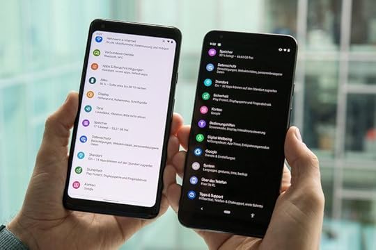
Dark Mode Feature as an Ultimate Solution in Mobile App Design
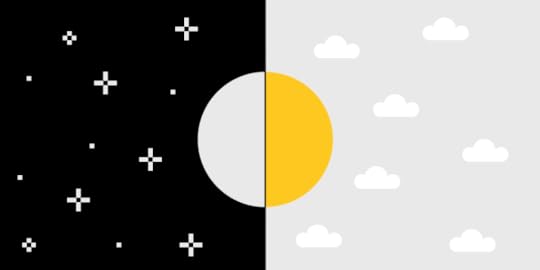
With the Android Q and iOS 13 presentations a little earlier this year, both technology giants have finally provided their users with a fully working and healthy dark mode. Many users do not suspect that applications or entire operating systems that they are using include the built-in dark mode function. This feature, in addition to its main task to increase comfort when using the phone in a dark place, also includes many other useful things.
In our article, we will list all the dark mode benefits, and also tell you why it is an ultimate feature of any mobile application and why developers should not save resources on its development.
Brightness – a hidden threat

The usual, bright theme of your phone doesn’t seem to pose a direct threat, right? However, remember how uncomfortable and painful it was to unlock the phone at night and get this bright flash of white light in your eyes. In addition, this contrast also adversely affects the condition of our eyes and, over time, can lead to significant visual impairment. That is why experts do not recommend working with a computer at night with the lights off. The sharp contrast of dark and light tones hurts our eyes.
Mobile applications’ designers and developers didn’t attach serious importance to this moment. In particular, Google, whose main page at night could completely deprive the user of vision for a few seconds. In addition to harming our eyes, a bright mode also discharges our battery faster. Nevertheless, user’s requests and complaints were taken into account, and Android, as well as their main rivals from Apple, presented new versions of their operating systems with an integrated, safe and fully working dark mode.
So, dark mode, what is it? An ordinary feature that changes the color of your background from white to black and makes using the phone more convenient at night or an ultimate solution for your applications?
Dark Mode Benefits
Health

Everybody knows about the discomfort that bright white light brings in a dark place. Moreover, this is not only about not hurting our eyes. The scientists proved that our almost round-the-clock viewing of the screens slows down the production of melatonin hormone, which we need for a good sleep. There is research showing that a blue-white theme slows down the production of melatonin by almost half compared to other colors. That is why the dashboard in our cars most often has a blue tint – so that the driver would like to sleep less.
However, the average user lying in his bed isn’t thinking about staying awake. On the contrary, he needs to fall asleep, but before that, it is also desirable to set an alarm clock. And here is the moment when you deprive your eyes (which have already accustomed to the dark) of sleep with a bright white flash from the phone.
According to studies, the average person spends nearly 5 hours a day interacting with mobile devices only! If you add a computer or television, you reach an incredible 11 hours per day of screen-using. It is not surprising that insomnia, neck, and head pain are some of the most popular problems of modern man. A dark mode solves this problem. The mode not only keeps your eyes from bright flashes at night but also makes you a little healthier in general.
Increased battery life
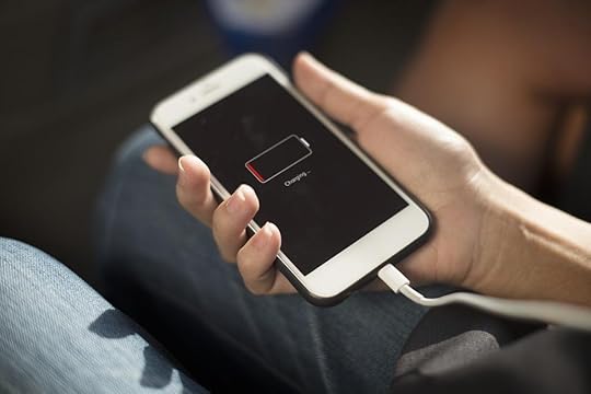
Not everything is so simple here since the real effect on the battery depends on what type of screen is installed on your smartphone. Google confirmed that OLED screens with the included dark mode save almost 60% of the energy charge at 100% brightness. 50%-brightness saves only 15%, but still, it is better than nothing. The fact is that the OLED screens do not need to use the dark pixels in order to keep the entire screen lit. Thus, the dark mode on such a screen uses not all the screen’s pixels and saves battery power.
Nevertheless, this feature is currently available only to Android users, since almost all their devices use OLED screens. Apple, using LCD screens, confirmed that they would switch to OLED screens after 2020, so iPhone or iPad users would also receive a possibility to extend their battery’s life. Both Android and iOS users can expect a native Dark Mode at the end of this year.
It is more stylish
Yes, this is more a matter of individual taste, but you must admit, users are tired of this omnipresent identical white background, it is literally everywhere! The dark mode might look more familiar to developers especially, as most code editors have a default dark mode. While the dark mode adds pure style, as the black color and its tones are an example of a classic stylish color scheme. Having a dark background, developers get more opportunities to play with colors and shades, making graphics, presentations, and generally any UI-element more stylish.
This effect is also achieved because of black and dark colors, in general, contrast perfectly with almost all the colors. At the same time, you can find only a few colors that will look organically on a white background, including black and other colors in slightly low lighted shades. Black color offers you a greater variety in playing with contrasts and in making bold design decisions.
Be careful with the dark mode
With all its excellence, the dark mode has several disadvantages. For example, reading text on a dark background becomes very difficult in daylight or well-lit room. Therefore, the dark mode, after all, is intended more for use at night or in dark places.
And contrasts, again. Dark mode doesn’t necessarily mean exclusively black background and white text. This is much more complicated. It is critical to be able to handle shades and light correctly. For example, it is forbidden to use a Pitch black (#000000) for background and bright white (#ffffff) for text. Because, due to the two colors’ striking contrast, reading the small text becomes extremely uncomfortable. In order to make the reading process more pleasant, you need to use softer colors and tones, for example, dark blue and light gray.
As you can see, it is all about balance. The dark mode is an integral component of any application today, and its addition is a prerequisite for success. Nevertheless, the development process of such a mode should be approached with caution, since a poorly designed dark mode can cause the user to turn away from your application.
The post Dark Mode Feature as an Ultimate Solution in Mobile App Design appeared first on Studio by UXPin.
August 28, 2019
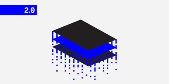
Why UXPin 2.0 will be more than a collection of features

UXPin 2.0 is coming on November 19, 2019. This is a marking moment for UXPin product design. The time has come for us to change our approach to how we develop the tool. Because a product is not just a collection of features.
We decided to stop adding heavy-duty features and focus on making what we already have more user-friendly and faster. How did we get here? We’ve been adding feature after feature. It’s been a fun ride and we’re super excited to see the effects. But the high-paced competitive race that’s making companies take shortcuts. When you’re busy building, sometimes you miss the details.
That’s why we decided to draw a line under our product roadmap, rally the troops and put all efforts into improving the user experience. And as a final result, give you the new UXPin 2.0 – fast and smooth this time. Sign up for updates if you’re curious about the specifics.
We protect your data with care – just as described in Privacy Policy.
Becoming the design tool that cares about UX
UXPin has changed a lot. From a lo-fi mockup and wireframing tool to the all-in-one collaborative design tool. You can prototype the life-like interactive projects in our tool now.
So what is our mission in the home stretch of the UXPin 2.0 project, is to fix all the niggly things to make your work more efficient. After all, you’re spending long hours creating absolutely astonishing things in the tool. We wouldn’t like to be a pain in the… erm… neck.
The ambition is to let you create prototypes a thousand times faster. We’ve spotted a few usability improvements our devs are sooooo happy to add! Right now, as you’re reading this text, they are looking for more details to polish in UXPin.
“The biggest lie of product development is that a great product is a collection of features. It’s easy to believe in this lie when the competition on the market is fierce. The promise of the next big thing is a thought that brings comfort. But this comfort is a trap. Today we’re putting a stop to it. Instead of focusing on competitors, we’re going to focus on you.”
Marcin Treder, CEO at UXPin

Along with many feature additions and updates we’ve done so far, we’re introducing all the little changes that make a hell of a difference.
In the next few weeks, we’re about to release the app performance and usability fixes like improvements to zoom, layers, quick tools, moving elements on the canvas, and so on. This will hopefully make your work easier. Some of the changes have already been seen and appreciated but there’s still a lot to come!
What UXPin 2.0 is made of
We’re going to update this article to let you know what exactly is changing because some of the improvements are not that visible right away. Take a look at UXpin 2.0 flag features and keep up to date with what we’re about to do as there are pure wonders to come, we promise!
Conditional Interactions
Conditional interactions give your prototypes a layer of logic and a set of rules that make your everyday work easier. Learn more on docs.
Collect data and pass it to the next page of your prototype,
Store and re-use user entered data,
Tailor your prototypes for user testing.
States
In UXPin each element can have several states with a different set of properties and interaction. Learn more on docs.
Define an alternative set of properties for every state,
Use states to create animated components,
Easily track changes and vartiation between states.
Power Duplicate
Select an element on the canvas and drag to duplicate the selection. It works with elements filled with data. Learn more on docs.
Duplicate based on adjustable grid,
Fill elements with data automatically,
Speed up prototyping by cutting down on repetitive work.

Be the first to know
As we’re adding the finishing touches to UXPin 2.0 we’re open to your feedback more than ever. Feel free to run tests, check the performance of our app and compare it soon. Feel free to let us know in comments if you see any possible improvements. But most of all, subscribe for updates!
We protect your data with care – just as described in Privacy Policy.
The post Why UXPin 2.0 will be more than a collection of features appeared first on Studio by UXPin.
August 20, 2019
Everything you need to know about content styleguides
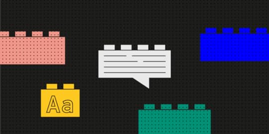
Way before I started the UX Writing Hub, I was a Lego fanatic.
If your childhood was anything like mine, legos were a part of it. I’d say on average, my household acquired about one new set per year. So by the time I was 8 or 9, we’d developed a nice sized “lego pile.” You know what I’m talking about, a massive jumble of Lego sets that you could use to build pretty much anything you could think of.

The funny thing about that pile was how it lacked consistency; one day it was pirates on a spaceship, and the next it was a medieval knight riding a T-Rex. Hey, it was the ‘90s—all bets were off.
Fast forward to when I joined a product team in a collaborative app for musicians at a Tel Aviv start-up. As soon as I started getting familiar with the product, I noticed huge inconsistencies with its look and feel—pirates on spaceships all over the place.

Luckily, I had recently learned about the perfect solution that I knew we had to implement. We decided to create a design system.
What is a Design System?
Design system is a collection of UI elements and instructions for their use. This includes things like color schemes, fonts & typography, and general style. It may even outline how the product should behave in different scenarios.
Imagine a big company with several digital products spread out across dozens of product teams. Now, imagine that every product team gets their own lego set with its own instructions. What do you get? Chaos. No consistency across the products—lego zoo animals driving lego race cars. Now imagine that all the design teams have access to the same super set of legos with a shared set of instructions.
 A shared set if instruction is needed
But designs systems don’t stop at just graphical elements. They can also include code for these reusable parts which make life easier for the developers as well. I don’t want to get too technical here, but design systems are an awesome way to promote efficiency and consistency inside of a product team.
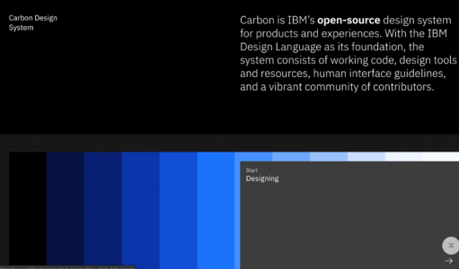
Two of the most well-known examples of design systems are Google’s Material Design and Shopify’s Polaris. I know what you’re thinking: “Do all design systems have cool, futuristic names?” Well, IBM’s Carbon seems to be continuing that trend, so I guess that’s a thing.
But even more recently we’re starting to see another trend. As more and more companies are becoming aware of the need for a set of guidelines for visual design, some are also creating them for the product’s content as well.
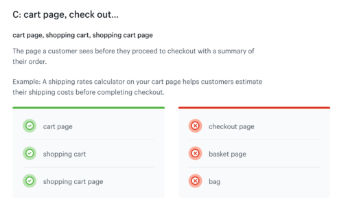
So if a design system’s UI libraries keep the visual design consistent, what keeps a product’s voice and tone consistent? Meet the content style guide.
Content Style Guides as Part of a Design System
OK, here comes the wonky definition. A content style guide is a set of writing principles that inform all of the copy and content of a company’s products. They establish rules and guidelines for copy that help bring consistency to the product’s voice and help shape the brand’s personality.
They’re important because content is important—as important as the visuals. Just have a look at Dropbox’s homepage sans real content.
 Right… now I get it. Not really.
Like mentioned before in the UX Writing Hub’ newsletter, without content, the visuals do you no good. So why have more companies adopted a visual design system than one for content? It seems to be a matter of awareness.
However, there are now several forward-thinking companies that have created content style guides. The most famous one is probably Mailchimp’s but actually, Material Design and Polaris also have content style guides.
These guides include things like the voice and tone of the product, naming conventions, vocabulary, and more.
A content style guide may elaborate upon all of the content elements in a company (content marketing included) or may be oriented solely toward product writing. It depends on the team of writers and product designers to make decisions about what the guide should include. And of course, style guides are continuously being updated; they’re never really “done.”
Structure of a content style guide
So here comes the million-dollar question. How does one actually create a content style guide? Unfortunately, there isn’t a single, simple solution. After interviewing dozens of product teams, I learned that every company used a different approach to create theirs.
So while there’s no cookie-cutter for creating them, there are plenty of open-source style guides out there that we can take inspiration from. Here’s a collection of some of the very best content style guides out there.
Still, just looking at some existing guides isn’t going to do the trick. The best way to kick-start a content style guide is with your existing content. Look at the content elements of the product and analyze what you already have. If a team is going to start building a library of UI elements, they’ll start with what they have. They take a standard button from the design and describe it in the library; its color, size, font, radius, etc.
We can do the same with content. Look at the texts of your CTAs, empty states, and other content elements. Once you’ve cataloged major types of content, you can then add guidelines about them. For example, a CTA should be of a certain length, or what you want to communicate in your headlines. After this, use these four steps to give structure to your style guide.
1. Preamble
An excellent first step to take is to articulate exactly what this content style guide is for—what we hope to achieve by creating and using it. A brief statement detailing the goal of the content style guide should suffice. You can also include information about the company’s vision, including how business goals align with the needs of the end-user.
This is important because style guides, though created by the UX writers, should be used by anyone creating content for the product. That could include copywriters, marketers, designers, and perhaps even developers. Now, Bobby on the Dev team might have a way with code, but less so with words. Help him out.
2. Voice and Tone
This is one of the most important aspects of the guide as it as such far-reaching influence; every word inside an interface should match the product’s voice, which must be clearly described in the guide. So how is this done?
Again, it varies. One approach is to think of your product as if it were a person or even a fictional character. Once you’ve figured out who they are, try to imagine how they speak and what they’re like. Is that person confident, funny, serious? If we personify our product or brand, it becomes easier to understand how it will interact with our users, which is important.
Today’s successful digital products give their users an experience that feels like natural human interaction. If the user feels like they’re talking to a robot, that’s a bad experience. Though the day may come when writers will need to write the narratives for actual robots ala HBO’s Westworld, in the meantime it’s important to give your interface a personality, whether it’s a chatbot or just the content on flat UI.
Speaking of chatbots, here’s a cool example by IBM of a content style guide specifically for chatbots.
One last note about voice and tone. It’s helpful to make a distinction between the two with voice being the general style and permanent characteristics and tone being how those characteristics manifest in different scenarios.
For example, a product might have a voice that is funny and light-hearted, but when that voice is in a serious situation, it can still be clear and to the point. Think about the Robin Williams’ genie from Aladdin—whimsical and witty, but still sounds like Genie even when he’s serious or sad.
3. Do’s and Don’ts
Part of having a style guide is having a clear set of rules. This means that, when creating a content style guide, you need to know what your product is and what it isn’t.
Any time you give an example of grammar, vocabulary, naming conventions, or even documentation. Don’t forget to add do’s and don’t. Bobby will be forever grateful.
 Example by Shopify Polaris
4. Accessibility
Unfortunately, accessibility is an issue that many companies are still not taking seriously. It’s almost 2020 and a blind man still can’t order Domino’s Pizza, which is sad and unnecessary.
Even though regulators tried to do something about it, not enough attention is given to this topic. This means that writers have an opportunity to take leadership in this area. They can be eyes for the blind and guide them through the platform using content and text.
So, in order to create a consistent experience that is accessible to all, accessibility practices should be documented in the content style guide as well. For example, you can decide that transcripts will be created for all videos using a tool such as REV.
The coolest project I’ve seen about content accessibility guidelines is by Content Design London. It’s an open-source project that helps everyone to create accessibility and readability rulesets. It’s well worth a read.
Now It’s Your Turn
The first step you need to do before creating a content style guide, would be to join the UX Writing Hub’s free UX Writing course if you want to learn more about the role of the UX writer as a product designer.
Now, let’s say that day has come and you’re ready to start on your very own content style guide. Remember:
First, find the common ground between the content elements of your product. Then, write a brief preamble where you state the goals and purpose of the guide. Next, define the voice and tone, create a ruleset of the do’s and don’ts, and don’t forget to make it accessible.
At first, it may be difficult to find all of the right pieces, but once you get the hang of it, it’ll be easy as legos.
The post Everything you need to know about content styleguides appeared first on Studio by UXPin.
August 14, 2019
The UX of a smart home
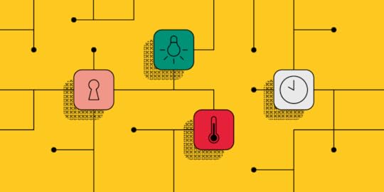
 Internet of People, Places, and Things
History of IoT Devices
The Internet of Things (IoT) can be defined as “the concept of connecting any device with an on and off switch to the Internet (and/or to each other).” Nowadays we are seeing IoT devices in the form of headphones, speakers, thermostats, light bulbs and more, but this has been a long time in the making. The phrase “Internet of Things” was coined by Kevin Ashton in 1999, but the idea of connecting devices had already been percolating for some time. While technology has drastically improved, the underlying motivation remains the same: connecting physical objects to the Internet can simplify our everyday tasks.
The first recognized IoT device was a Coke machine at Carnegie Mellon University. In the early 1980s, a group of graduate students realized that if they attached a sensor to the machine, they could determine how many cold coke bottles were left before actually walking to the machine. A few years later, John Romkey proved that he could turn on a toaster with the Internet. Other early IoT inventions took the form of wearable and tracking technology.
The Adoption of IoT
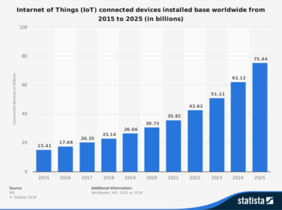
Many of the early IoT pioneers were ahead of their time and the initial growth of these IoT devices was slow due to limitations in technology. When the technology finally caught up, the adoption rate of IoT devices skyrocketed. The figure below demonstrates this massive growth, with the number of connected devices expected to grow to 75.44 billion by the year 2025.
“Anything that can be connected, will be connected.” – Jacob Morgan
IoT technology was initially used to satisfy business needs but in the years since it has expanded to satisfying personal needs (in the form of consumer products) as well. This transition made IoT devices relevant to a much larger market and truly allowed the IoT marketplace to grow into the giant it is today. As technology advances and more devices are made available, the connectedness of our world will only continue to grow.
“A decade ago, the idea of controlling your home’s thermostat, lights and security systems remotely via smartphone would have seemed like futuristic science fiction.” – Forbes Technology Council
The IoT has been silently growing over the past three decades but now it has been thrust into the spotlight through the growth of consumer products, many of which are common household items. Consumers can purchase IoT devices in the form of thermostats, security systems, refrigerators and more. These products work together to create what is now being called the “smart home.”
A Glimpse into a Smart Home
 Photo source
A smart home can be defined as a home that is equipped with network-connected products for controlling functions such as temperature, lighting, security, safety or entertainment, by a phone, tablet or computer. It is estimated that in 2019, 42.25 million homes will be considered “smart homes.” As technology advances and the list of IoT gadgets grows, we may begin seeing houses where everything is controlled by a system of connected devices.
The adoption of these IoT devices in the home is creating a more holistic user experience than we’ve ever seen before by connecting multiple devices into one overall experience. IoT devices allow us to use our mobile devices and mobile apps as a control center for almost everything in our home, and the possibilities are endless.
Consider this scenario:
Your IoT alarm clock wakes you up at 6 am and you walk downstairs to your IoT coffee maker that has already brewed a hot cup of coffee, based on the set schedule you created in the app. You shout out to your IoT speaker to begin playing your favorite song and then you head over to your smart refrigerator to check your schedule for the day. Then you go upstairs and tell your shower to turn on and heat to your desired temperature. You’re running late to work and leave the house without turning the heat down so you open your thermostat app and change it to ‘Away’ mode to conserve energy. You also realize that after leaving in a hurry, you forgot to lock the front door but you can open the app for your security system and make sure everything is all locked up. Now you can continue your day with the peace of mind that everything at home is in check.
 Amazon Smart Home
Personalization of IoT Interactions
The presence of these IoT devices makes every aspect of your daily routine easier while serving as a remedy for small mistakes, such as leaving the lights on. These devices simplify our lives and as we use these products, they learn more about our daily routines and personal preferences. Users generate 2.5 quintillion bytes of data every day. In comparison, 3.5 billion Google searches are conducted every day. If you’re wondering how those relate, there are 9 zeros in a billion and there are 18 zeros in a quintillion. In much simpler terms, we generate a lot of data.
The process of gathering and analyzing data is a cycle that when done correctly results in improved user experience. After we add these IoT devices in our homes, they can incorporate machine-learning algorithms to recognize user trends and behavior. Access to this amount of information can be used to further personalize our next interaction with the device.
For example, let’s say you just installed an IoT lighting system. If you work every day from 9 am to 5 pm, your lighting system could program itself to turn off 15 minutes after you leave in the morning and to turn back on 15 minutes before you return at night. Customizing a consumer’s interaction with the IoT device in this way improves their experience and encourages future product use. Creating a positive experience is crucial to the success of IoT connectedness.
A “one size fits all” methodology no longer fits in our digitally connected world. Digital agencies need to take the time to better understand their users in order to create a successful product. Companies can perfect their user experience design through user data, user testing, beta tests, and continuous user feedback.
A Consumer in Control
The impact of IoT is impressive but above all else, it is drastically changing our perception of user experience and it shifts a lot of control to the consumer. These connected devices give us the ability to control physical products regardless of where we are. The more connected we are, the more control we’ll want to have.
There is an increased expectation with IoT devices that the transition between a product and its corresponding mobile app will be seamless and consistent each time. Connected IoT devices add pressure on digital agencies to implement a device-agnostic design, which means a single design style works across multiple devices. Research shows that the average 4-person US household has 19 connected devices. To ensure your product has a great user experience, the experience should be the same across all devices. Failure to create this seamless experience can discourage users from using the IoT device and your accompanying app.
The average consumer likely does not know what the Internet of Things is or understand its true value. In order for consumers to realize the benefits of the IoT and connected devices, they need to be used on a regular basis. A strong user experience design encourages continued use and improves the overall impact of the IoT.
The post The UX of a smart home appeared first on Studio by UXPin.
August 8, 2019
6 Benefits of Diagramming your Prototype
Yet again, mobile apps expand and capture a little more of the digital space. This time it’s about product prototyping. Apps account for 88% of the time spent on mobile phones. Designing and developing a mobile app for your business consists of a number of steps, of course. However, the most important and possibly most overlooked step in the app development process is prototyping.
What is a Prototype?
A prototype is a rudimentary working model of the app. It provides immensely useful insights regarding the scope, needs, and expectations associated with the development activity. It’s the preliminary interactive model of the idea before it becomes a full-fledged product. A prototype acts as a bridge between the creative thought process and the final product.
App prototyping is integral in the app development process as it gives visual insight into the features and the flow to be incorporated within the final app.
Types of Prototypes
Depending upon the level of complexity and the number of features, there are three types:
Low fidelity prototypes
The simplest type of prototype that’s based upon broad concepts of the final product developed. The level of detail and realism is low; it’s mainly aimed at testing and validating the design early on in product development. Low fidelity prototypes are quicker to create. These are very basic hand-drawn diagrams of how it flows from one stage to another.
 Photo Credit: Fairhead Creative
Medium fidelity prototypes
They add significantly greater details and interactions and are capable of undergoing usability testing. Additionally, they consist of clickable areas which provide a navigational guide within the app and give insights to the user flow within the app. Every action incorporated into the application has a basic visual design associated with it, which can validate the interactions within the prototype.
High fidelity prototypes
These have the highest level of design and functionality incorporated in the product prototype, making them the closest to the final product. It’s a time-consuming process, but it has more benefits, too. For example, they’re used to identify errors during usability testing and discovering workflow issues. The incorporation of design elements and components gives high fidelity prototypes the look and feel of the final product and allow realistic user interactions. They’re fully interactive and clickable which brings you one step closer to getting validation from customers and investors. This is what you create in UXPin!
How to get started with prototyping?
Good news: you don’t need a ton of resources to start building your own prototype. Something as simple as a pen and a paper or a whiteboard is enough to start with low fidelity prototypes. Have an app idea in your head? Start drawing the functionalities that you want to include in it!
When it comes to building medium to high fidelity prototypes, there’re many tools at your disposal. Prototyping tools help you to quickly launch your app idea and share your concept with your team to get feedback and validation. They also let you test use cases by providing you with interactive prototypes.
Benefits of prototyping
Elimination of ambiguities – Improve the quality of requirements and specifications by removing any ambiguity surrounding the final product. It gives visual clarity into the features and functionalities to be eventually incorporated within the app.
Lower costs – It’s always cheaper to make changes in an early-stage product. Save yourself huge amounts of money you would otherwise spend on building a bloated product.
Gathering user feedback – Prototyping allows you to collect user feedback in real-time during the planning, design and development stages of product development. It’s a great tool for creating a product that meets user requirements. Visualizing the product allows for the identification of issues in the workflow and functionalities at an early stage.
Improved user experience – Gathering of usability data earlier in the process via product prototypes leads to better user experience. It gives accurate insights into the preferred flow and helps eliminate redundant features. Visualizing the relationship between different components within the app results in the development of an interactive mobile app that ranks high in user experience.
Stronger features integration – Understand how a set of different features work well together while designing the mobile app’s UI. Prototyping is just like a simulator of an app that helps you understand how the user progresses with every step in an app.
Clarity and validation – App prototypes provide visual clarity to customers as well as the investors about product offerings in the mobile app. The validation that the prototype generates creates a buzz about the app in the market, thus improving its chances of success in app stores. Prototypes are a great tool at the initial stage of business to show off the future features and functionalities of the app.
Irrespective of the complexity of the prototype developed, the prototyping process is an integral part of the app development cycle. Choosing the type of prototype or prototyping tool depends upon the resources available to you. If you have the requisite time and monetary resources available at your disposal, develop a high fidelity prototype. If time and money happen to be scarce, and flexibility is the key requirement for your project, start with a basic low fidelity prototype, but don’t skip this essential step.
Try UXPin for free!
The post 6 Benefits of Diagramming your Prototype appeared first on Studio by UXPin.
August 5, 2019
3 Psychology Principles Web Designers Must Know

When you look around you what do you see? Everywhere you turn people are quite literally immersed in the digital world via their smartphones, iPads, and laptops. This isn’t something that happened by accident. In fact, there’s rather a lot of cutting edge psychology paired up with all the tech stuff that makes it happen. To give you a better idea about how you can ensure your web design taps into the popular psyche take a look at these principles of psychology you really need to know about.
Master Heuristics to Automatically Get More Click-Throughs
Your brain is busy making decisions. It does it all day long and eventually arrives at a state known as decision fatigue. For those of you who haven’t heard of it before you’ll have certainly experienced it.
When you arrive home at the end of a long day do you sometimes slump down in front of the TV and find it hard to decide what you want to eat? That’s a typical example of decision fatigue that most of us experience on a daily basis. Your brain isn’t like a muscle that cramps up or tears with overuse. But it will gradually run out of energy throughout the course of the day and eventually require an uninterrupted period of sleep to fully recover. So how does this help your web design efforts?
Your brain works on principles called heuristics a lot of the time — they’re like shortcuts that allow it to save time and energy thinking about stuff it’s already familiar with. In fact, what it actually does is rather incredible.
 Image by John Hain from Pixabay
By creating simple models of concepts and relationships it then learns to spot these in new events and scenarios as they unfold before your very eyes. A great example would be fire. Your brain learns at an early age that it’s hot, that you shouldn’t touch it, and that if you avoid touching it you won’t get burnt. Sounds like common sense, but imagine how exhausted you’d be if you had to consciously make every little decision during your day. This step-by-step approach to thinking would consume all of your time. This is where heuristics comes in handy.
“When you come to apply heuristics to web design you want to apply certain tried and tested rules,” shares Anya Millington, a UX designer at Resumescentre and FlashEssay. “Drop-down menus at the top, logo across the top of the page, links in blue. These are all things our brains have gotten used to, so why change them?” she adds.
You may think you’re creating something far more aesthetic and logical, but the problem is that people will have to get to know how to use your site. Use a heuristic approach and they’ll already know how to navigate before they ever log on.
Serial Positioning Means the Start and End Points Truly Matter
Your brain is designed to process large amounts of information and fish out the bits that it thinks are most valuable. An interesting byproduct of this approach is that it places particular stock on lists. From the point of view of your brain, these are streams of data that have already been sorted and organized by an intelligent creator. They are therefore ripe for assimilation and application.
Interestingly the human brain pays particular attention to the entries at the beginning and end of a list. Those in the middle are not ignored, but engagement and retention are noticeably reduced. This is because it assumes that the start of the list is of primary importance and that the end of the list summates everything else already listed.
Oliwia Rivera, head of marketing for Online writers rating explains: “This means that if you want your users to engage with a particular tab on your site then you want to list it at the start or the end of your list of products and services. You can apply this principle to everything from drop-down menus to rows of tabs across the top of your homepage.”
 Screenshot of the Tesla homepage
You’re also going to need to be consistent with the order. If you unintentionally change the order of your tabs from one page to the next then this will confuse your users and ruin their automatic predilections to click on a particular link.
Hick’s Law Tells You Why It Can Be Harder to Choose
We all find it hard to make choices at times, especially when presented with 2 or more options. You may think that this is obvious or just one of your own annoying quirks, but there’s plenty of science to back it up.
Hick’s Law states that the more options you have at your disposal, the longer you will take to make a decision. If you’ve ever tried in vain with your partner to find a film on Netflix that you both want to watch then you’ll know the feeling. If you only had 20 or so options on cable then you’d already be watching something by now. But because you have thousands of titles to choose from you enter a state of decision paralysis.
Applying this principle to web design is actually pretty simple, provided you keep things simple. If you’re listing a product and you want to offer the option to read an expanded description then a simple ‘Learn More’ button will get the job done. If instead, you opt for half a dozen links that take you to pages detailing the specifics of certain areas of the product then your browsers won’t really know where to look.
Miriam Chaney, creative writer at Canada-Writers emphasizes: “A good rule of thumb when designing a product sales page is to include a maximum of 2 key decision points. One should be your CTA in the form of a ‘Buy Now’ button, and the other (if appropriate) should be a simple ‘Learn More’ option that drops down an expanded version of the text.”
 Screenshot of the Iphone webpage
Note that I’ve said: ‘if appropriate’ for the second decision point. If you don’t need the expansive text then do without it. This will further remove distractions and possible points of departure from the buying pathway you’re trying to keep every browser on.
Try UXPin for free!
Final thoughts
The secret of applying psychological principles to web design is taking a methodical and scientific approach. By quantifying the impact of the changes you have made to key metrics you’ll be able to iteratively arrive at a site which taps into the human psyche and takes browsers precisely where you want them to go.
The post 3 Psychology Principles Web Designers Must Know appeared first on Studio by UXPin.
What’s New in July
We’ve got some really exciting updates to share with you! From welcoming Components, to the new text, and an array of awesome improvements to the editor, this surely was a busy and exciting month for us. Read on!
Hello Components!
We’ve had a lot of requests for this one, in July we said so long to Symbols and welcomed Components. They are more intuitive and way more powerful! From now on, you can style every Instance individually the way you want by editing all their properties. Or, when editing the Master Component, you can update all Instances at once. Read more about Components in this post.
New text element
July was also the time for a major overhaul for our text! We replaced the old text element with the new one which has an array of new possibilities, such as the new auto size, vertical align, paragraph spacing and an improved auto line height. All typography lovers out there, this one’s for you: we’re very excited to say that you can now enable ligatures, fractions, as well as subscript and superscript!
Enhancements
The possibility to edit the names of variables has been disabled, as it was breaking all previously created interactions that use this variable. However, we look forward to enabling this back in the future.
We’ve unified the way you add elements from the Quick Tools menu. From now on, when you click on an icon or use the shortcut, you can either draw an element on the canvas to define its size or click to place it.
The Edit Master and Break options are now available in the Properties panel after you select an Instance.
Now, the names of Components update across the library, the Master Component and the preview in the Properties panel.
The resize handles are now bigger. To make it even easier to resize, you can now grab any edge to resize an element.
We removed auto numbering layer names of new elements.
Fixed
Grid disappeared after switching between pages.
Locked elements couldn’t be selected in the Spec mode.
Various performance fixes and memory leaks removed.
Sometimes, deleting interactions from a copied element was impossible.
The post What’s New in July appeared first on Studio by UXPin.
July 31, 2019
The Best Designs of the Last Thirteen Decades

This isn’t just an article about the best designs, it’s also about what actually makes a good design. My first thought was Henry Ford’s “Model T” in 1908, but when you think about the environmental effects of car ownership, was it really good design? After all, electric cars were available at the time.
Considering the mental health effects of excessive Facebook usage (a known and exploited effect), by that same logic, Facebook isn’t a good, user-centred product by design either.
Let’s take a look at (some of) the best designs of the last 13 decades, and what they truly achieved to warrant such a title.
1890s: Gem Paper Clips

Cheap
Sustainable
Small/minimal
Fulfils a need
Paper clips have existed since as early as the 13th century (depending on your definition of one, of course), but the “Gem” clip we use today was invented in 1899 by Connecticut inventor William Middlebrook. Although other designs were made (before and after this design), the iconic double-loop design was the most effective at fastening without tearing or becoming tangled.
Paper clips are also used for art, electrical conduction, unlocking doors, flicking rubber bands, and of course, binding documents together. Made with steel, this tiny “device” is also recyclable and Americans use 11 billion of them every year!
1900s: Brownie Cameras

Enjoyable
Affordable
Good usability
Introduced in 1900 at an initial cost of only $1 ($30 in 2019), the brownie camera, designed by Kodak in one of their first ever commercial ventures, made amateur photography trendy for the first time due to its inexpensive cost and its ease-of-use.
1910s: Electrical Air Conditioning
Fulfils a vital set of needs
The first home to install the type of air conditioning that controls heating, cooling, and humidity was in 1914, and was designed by Willis Carrier. Electrical air conditioning was a huge step above mechanical ice-making, especially since lower temperatures help to reduce disease and dehydration; lower humidity reduces mold; and air quality is improved as well.
1920s: Three-Colored Electric Traffic Lights

Cheaper
Safer
Automated
Good usability
Earlier designs of traffic lights were flawed. Gas-lit lights were quickly abandoned after a blowing-up incident, and would eventually be replaced by electric versions after numerous adaptations sporting different colors, words, sounds, and concepts that would differ from state-to-state, and country.
The elimination of words and sounds in addition to their standardization eventually made traffic lights more accessible and understandable in the 1920s. The need to have somebody control them manually was also starting to be abolished.
1930s: Electric Typewriters
More features
Better usability
Improved functionality
Although the idea for electric typewriters began with Thomas Edison way back in 1870, it never really took off. When the idea resurfaced decades later, a series of mergers and acquisitions halted its development, but eventually IBM acquired Electromatic Typewriters in 1933, spent $1m dollars on a redesign, and went on to generate 8% of its revenue from electric typewriters.
Typewriter owners debated manual vs. electric like macOS vs. Windows — the upside of electric was multiple fonts, decongested keys, and an automatic wheel, a big step above the slow, noisy, and inky manual models, and a huge step above writing by hand.
1940s: Bloodmobile

[photo source]
Fast
Safe
Effective
Good usability
Charles R. Drew led a wartime initiative (“Blood for Britain”) designed to test, collect, and distribute large quantities of blood to the UK, eventually coming up with a mobile solution called the bloodmobile, a truck which could both collect and distribute blood quickly and effectively. For safety reasons, only highly trained staff could handle the blood, and all blood was tested before distribution. Drew also chose a central location for the banks to ensure maximum efficiency.
His efforts later became the American Red Cross Blood Bank.
1950s: Charge Cards
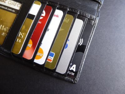
Safer
More accessible
Requires fewer resources
Not only do charge cards use fewer resources (i.e. there’s no/less need for bank staff, bank buildings, we don’t need to carry cash, etc.), but up until 1950, handling money was quite an inconvenience. Money could only be accessed from the bank itself, which required a building and staff, or, stores would have their own paperized credit system. Diners Club was the first to introduce a much more convenient electronic card that could be used in multiple stores, setting the bar for what would eventually become the more widely-accepted debit card that could be used anywhere, including to withdraw cash from the bank, even if the bank was closed.
In more recent years, the evolution of fintech has eliminated the need for bank branches altogether, meaning customers can now manage their finances entirely themselves — digitally!
1960s: Postal Codes
Good usability
Postal code systems varied from city to city until the 1960s when each country began to standardize their own approach as a result of city/country infrastructures becoming more complex.
It’s interesting how various regions unified their information architecture in regards to code labeling and organization. In London, for example, boroughs are ordered alphabetically, then assigned a number in ascending order. This number is then appended to an abbreviation describing which quadrant of the city it belongs to (e.g. Abbey Wood, South-East London, is SE2).
1970s: Personal Computers
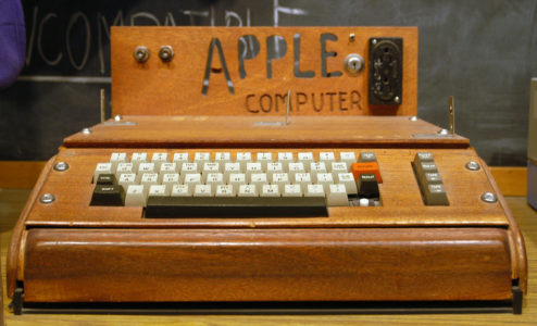
[photo source]
Where would we even be without PCs? No doubt, various mobile devices (probably) wouldn’t exist, we’d have no internet, and many of the products that have shaped our society today wouldn’t even be needed. Several PCs came to light in the 1970s — some didn’t have a GUI, some didn’t even have screens, but there’s no doubt that the 1970s started a digital revolution.
1980s: Mobile Phones
 [photo source]
Portable and convenient
Good usability (better than today’s devices!)
The Motorola DynaTAC 8000X was the first commercially-available mobile device using a cellular network (1G). It was released in 1984, and although it weighed approximately 2 kilos and required 10 hours of charging for only 30 minutes of talk time, it perfectly fulfilled the needs of its users at the time. After all, not everybody had one, so long talk times were not needed, and since they only fulfilled one need (audio communication), they were fairly easy to use.
Later models and devices would soon eliminate most of these flaws.
Either way, it was quicker than sending a letter or waiting to use a landline.
1990s: The Internet
Convenient
Interestingly, the internet is a controversial addition to this list, as we could argue that, overall, it’s done more damage to our society than it has good. After all, PCs and mobile devices are still hugely useful without the internet. That being said, the internet was originally designed to make communication between separate computer systems more convenient, so technically it did achieve what it set out to do. It’s only what happened to the internet after that, is questionable.
2000s: Electric Cars

More affordable (long-term)
Environment-friendly
Still meets consumer demands
Electric cars first surfaced in the 1830s and were actually advantageous since they didn’t require gear changes or manual startups; however, the emergence of gas cars offered faster vehicles, better range capabilities, and non-reliance on charging. At the time these were major issues because road infrastructures were growing rapidly. Petroleum reserves also meant that gas was more affordable too, but it wouldn’t be long before we’d begin to notice the negative environmental impact.
Tesla began development on electric cars in 2004, and soon the consumer demand began to rise after achieving longer ranges and higher speeds, and despite electric cars still being more expensive today, it’s known that the long-term costs are lower.
A number of cities have now opted to ban cars (on some level).
2010s: On-Demand Products

While there are various products of significance, what unites most of the technological advancements of the 2010s is that they’re designed to offer customers something on-demand.
One such example is the ability to hail a taxi on-demand, a service mainly led by companies Uber and Grab, founded by Travis Kalanik and Anthony Tan respectively. Other types of on-demand services include communication (messaging apps), food (UberEATS), TV (Netflix), and so on. There’s no denying that the 2010s have been about being faster and more efficient.
2020s: Accessibility & Sustainability
It’s difficult to fathom what the next decade might bring us with technology evolving faster than it ever has done before. Personally, I’d like to think that technology will make the world more sustainable and accessible, both online and offline!
About the author
Daniel Schwarz is a UX/UI designer, web developer, and maker by background, but a writer, editor, 5x author, and teacher at heart. To that end, he’s currently building UX Tricks.
The post The Best Designs of the Last Thirteen Decades appeared first on Studio by UXPin.
UXpin's Blog

- UXpin's profile
- 68 followers

