
UXpin's Blog, page 94
February 4, 2020
Everything About Usability Testing Through Al-Powered Software
Are you a professional designer or developer? Are you an online business enthusiast? How much do you know about Artificial Intelligence? Why is AI now more feasible and critical than ever? How is AI best applied, and how can AI help us test smarter? How is AI changing user research? How do you leverage Al in software testing?
Computers and machines can now function more intelligently. The world is evolving, and so is technology. Software testing is moving with a speed of light from traditional manual testing to automated testing. There is now a growing need to develop software at a faster velocity and test at a smarter rate.
What is Artificial Intelligence?
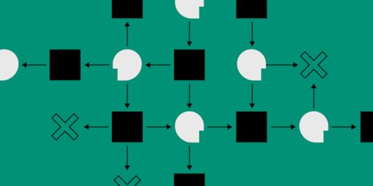
In computer science, Al is regarded as machine intelligence. It is the study of ‘’intelligent agents’’ – any device that perceives its environment and takes actions that maximize its chance of successfully achieving its goals. Al often makes use of algorithms. It involves making decisions backed up by data to ensure quality software standards.
The overwhelming ability of the Al to process data makes it a powerful asset for any form of usability testing as it also eliminates biased approaches in A/B testing. Do you know that an Al system can analyze thousands of different design variations while generating alternatives? In short, Al requires just data, computing power, and algorithms. Little wonder it is said these days that data is the new gold.
AI is often used to describe machines that mimic ‘’cognitive’’ functions that humans associate with the human mind, such as ‘’learning’’ and ‘’problem-solving.’’ AI has become an essential part of the technology industry. The end objective of leveraging AI is to reduce the lifecycle of testing software mainly. This is more flexible, more maintainable, and more reliable. Calling it a technological revolution is not an understatement!
The Importance of AI
Before we get swayed by the wind of this wavering system, let’s briefly assess how Al can help us achieve quality targets. More than ever, customer satisfaction is key, and any company that must thrive must create a customer-oriented product in other to reach a product-market fit. Now is the age of a centralized customer system. This indicates that tech companies must focus more on studying user’s needs to deliver top-notch products.
The application of AI can be found in various industries, and a good example is with the voice-activated assistant in smart devices, Siri and Alexa. The use of AI is not restricted to tech companies only, even in the copywriting industry, one can still see the application of AI like with Google Translate and The Word Point, where you can achieve error-free website translations with just one click. The importance of AI cannot be overemphasized, as it’s gradually becoming a part of our daily lives.
Usability Testing
Usability testing is a technique used in user-centered interaction to evaluate a product by testing it on users. It gives direct input on how real users use the system. Usability testing is necessary for the success of a viable end product. A functioning software that creates confusion among its users will not last.
Usability testing measures the usability or ease of use of a device. It focuses on measuring a human-made product’s capacity to meet its intended purpose. Usability testing is a way to see how easy it is to use something by testing it with real users. Users are asked to complete tasks while they are being observed by a researcher to see where potential problems may be encountered.

This will, in turn, assist the developer in making recommendations to overcome these hitches. Usability takes place with actual customers of the product. It helps the developer to get feedback directly from the target audience. It also helps to resolve internal debates that may arise on different perspectives of the user’s experience. It also reduces the risk of the product failing.
The aggressive transformation in cyberspace is fast, compelling many companies to innovate at a very aggressive speed. According to experts, Al will grow into a $118.6 billion industry by 2025. For what the future seems to unfold, Artificial Intelligence is a technology without alternative. Today, more than ever before, designers and developers can largely leverage the applications of Al I web development to achieve a higher response value from their target user.
Al applications should make an online experience more valuable and personalized. Al provides personalized user experience and accurately target customers. With a growing number of designers and developers shifting towards Al-based design practices, artificial intelligence has now become an indispensable part of modern web development.
According to the Gartner report, 85% of customers’ interactions by 2020 will be handled by Al robots. In a traditional environment, the user interface design process is often overwhelming since it requires a great deal of innovation to keep it novel. It may begin with designers sharing their creativities, jotting them down on a whiteboard, and exploring several possibilities and outcomes. Before any A/B testing can commence, the wireframe is set out and translated into HTML so the development process can start.
The Al Experience
This process demands a sheer amount of effort, and mistakes may be unavoidable. With upscale in technology lately, Al has quickly found its way to the digital cyberspace. Hence, allowing designers to combine their applications into websites and create better functionality and user experience. Al has changed handwritten user interface design to a usable HTML markup code. Do you know that you can now optimize your e-commerce website with some Al-based interactions with your customers daily?
Al has been hitting it for quite some time now. It impacts on various industries cannot be overemphasized. As the year goes by, many industries are being reshaped by this emerging technology. Contrary to the fears of many, Al will not render many jobless. Instead, it will make more jobs available.
Is this going to be the herald of the extinction of human testers? Certainly Not! Although one statistic published by Springboard Blog states that by 2022, AI will have rendered about 75 million people jobless; likewise, it will have created 133 million jobs as well.
Integrating Al in testing merely is going to make the job a bit easier for software testers. It will save manual testers countless useful hours that would be spent testing applications. It will make them more efficient and agile. However, human expertise would still be needed to supervise the testing process.

Final Thoughts
On a final note, while we keep ourselves updated about the changing technology, let us also allay the fears that automation in testing is nowhere close to replacing manual testing. AI has come in very handy in the last couple of years, as technology makes life easier and more productive.
The post Everything About Usability Testing Through Al-Powered Software appeared first on Studio by UXPin.


January 29, 2020
Product Designer vs. UX Designer. A comparative Analysis
Since the evolution of digital products, the trend has been to move away from generalized roles and to more specialized ones where designers intended to communicate the purpose of their role. There were simpler times when there was just a designer and a developer. Then came a time, when the role and responsibility of a digital designer became much more complex. Complexity implies Specialization. As a result, today, we find ourselves among UX researchers, UX designers, strategists, CX designers, UI/ visual experience designers, product designers and even service designers.
These evolutions in the roles of design have caused quite a lot of confusion among the design fraternity itself. One such popular disagreement is – about product design and UX design. A lot of businessmen, decision-makers face a dilemma when it comes to hiring designers for their businesses. ‘One candidate claims he is a UX designer and the other one that, she is a product designer’. Whom should you hire? Not sure who would be a good fit for your requirement, if you just need a website? Who do you think can help you efficiently?
To answer all these questions better, let us take an analytical approach towards understanding these concepts.
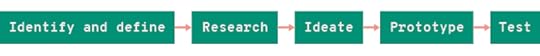
The Design Process

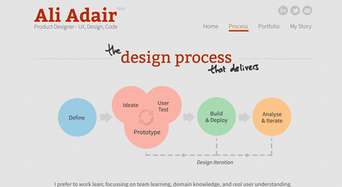
First and foremost, let’s look at the lifecycle of a digital product’s design process.
This is an overview of the design process that is universally applied. It is an iterative process, one that doesn’t necessarily progress in a linear manner. Every step in the process is based on a user-centric approach, cognitive principles, business insights, and a host of other activities that help designers better understand and address – the business needs as well as user needs. Let’s take a look at and understand the roles of a product designer and a UX designer.
Product Designer

Role & Responsibility:
Storytellers.
Designing the overall experience of a product, working through the design process from start to end.
Focusing more on the holistic design.
Product Strategy and Execution.
Rightly, Own the aspect of designing the experience.
Priorities:
Bring about clarity that guides through complex actions.
User goals + Business Goals.
Convenience of design. Ease of use.
Best possible solution at a lesser cost.
Skills/ Expertise:
Curiosity + Empathy
Communication
Analytical & Critical Thinking
Project Management Knowledge
Strategic Mindset + Business Acumen
Deep product and market knowledge
UX Designer

Role & Responsibility:
Storytellers.
Designing the overall experience of a product, working through the design process from start to end.
The Concept Model, Interaction Design, Information Architecture.
User Interface and UX writing, coordinating with developers & UI designers.
Priorities:
Bring about clarity that guides through complex actions.
User goals + Business Goals.
User-friendly design. Ease of use.
Consistency of design.
Skills/ Expertise:
Curiosity + Empathy
Communication
Analytical & Critical Thinking
Research and Synthesis Skills
Interaction Design Skills
Visual Design Skills
Project Management Knowledge
Strategic Mindset + Business Acumen
Writing Skills
It is quite clear that these segmentations, evolutions of the roles have come about due to focusing on the problems that they solve rather than the aspect of the work. The ultimate goal of a product designer or a UX designer is to ask, have we crafted an experience that our audience feels connected to? The answers to this question will define the impact of their design efforts. A product designer is an almost predictable evolutionary role of user experience designer. It represents the progression of design scope, away from just user experience design towards an even broader area of design encompassing the entire product.
The demand for design today is massive, hence the methods to produce designs that serve the purpose well, has grown accordingly. Design is no longer recognized as an afterthought to business, but an essential part of business right from strategy and development. And, thus, the evolution of designers’ roles following the ecosystem. At the end of the day, these roles will change in different workplaces and with different team structures. We believe that design thinking should lead the way for designers aspiring to level up in the hierarchal structures of UX design companies.
The post Product Designer vs. UX Designer. A comparative Analysis appeared first on Studio by UXPin.
January 27, 2020
See what’s new in UXPin 2.2
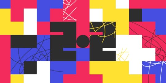
We’re back with a roundup of new features, and we’re very excited about all that is yet to come this year. This release brings all-new grids, color labels for pages and access to your recent prototypes right from the editor. All topped off with over 100 fixes and improvements.
New Grids are on the Block
You now have three types of grids to choose from and apply in your projects: column, baseline, and square. Define the right structure, hierarchy, and rhythm in your design and take the guesswork out of many aspects of your design process. Get griddy with it! See how it works in Docs.
Access to Recent Prototypes from the Editor
We know that until now switching between projects took far too many steps — open the Dashboard, go back to projects, open the project, choose the prototype, and so on. That’s why we’ve decided to make switching between prototypes easier and faster, by adding the possibility to access up to five recently opened prototypes. Just click on the down arrow in the top left corner of the Editor. See more in Docs.
Color Labels for Pages
After introducing color labels for layers, we’ve pretty much been snowed under questions and requests to enable this feature for pages. And we did it! Right click on a page to get an option to add a color label. See more in Docs.
Improvements
Here’s a list of selected improvements:
Text
A number of improvements that make working with the font select smoother and easier.
We renamed the Fonts Management to Font Library.
You can now adjust the font size, line height, and letter spacing with shortcuts.
The text no longer blinks when switching fonts.
Shapes
Shapes, lines, and arrows that have Bézier curves or 2 points don’t have the radius option available.
Rectangles and rounded rectangles will have radius available for all edges.
On various zoom levels, Pen tool paths are always 1px.
Pages and Layers
You can now use emojis in page, prototype, and project names.
We’ve increased the time for undoing deleted pages from 10 to 20 seconds.
Duplicated pages appear below the last duplicated element.
Editor and more
The swipe gesture no longer exists the editor.
We’ve updated the names of a few interaction triggers and actions.
Fixed
Check out all the fixes we smashed this time:
Breakpoints
The “Open in New Tab” option for pages would always open the default breakpoint, instead of the active one.
Custom breakpoints were not visible in canvas properties.
Adding more than 8 breakpoints would make the Properties panel disappear from the viewport.
Elements
Enabling auto-size for Boxes displayed the wrong values in the padding inputs.
When zooming in, the zoom jumped from high level to very low too fast.
Sometimes applying gradients from the Design System Library would make Rectangles transparent.
Elements changed their position when pressing and releasing Alt during resize.
Elements did not align to the pixel grid after being copied or duplicated.
Drawing paths inside combined shapes was not possible.
Positions
Snapping to guides did not work for elements that were outside the canvas.
Elements did not align to the pixel grid when aligned to center.
Smart guides moved 1px when duplicating elements on zoom.
Editor
Disappearing bottom bar when switching to documentation mode.
You couldn’t drag elements on the canvas after drawing a path and adding an image without closing the editing mode.
Pinning the Sitemap to the right deselected pages.
Blinking Sitemap on resize.
We fixed issues that caused the app to crash.
What’s Next
See what’s coming up in the next release:
New Color Picker
We are still working on rewriting our Color Picker to make it faster and more intuitive.
Pages Overview
We’ve been working hard on a major update to our interface – the Pages Overview – thanks to which you will be able to access and view all your pages in one place.
Spell check
Soon enough we will give UXPin a spell-checking superpower for everything you type on your design.
OS default fonts in the browser
You will soon have access to all your default OS fonts in the browser.
The post See what’s new in UXPin 2.2 appeared first on Studio by UXPin.
January 23, 2020
2020 Design Trends

From hip logos, fonts, and colors to computational design, the changes in the design jobs landscape, inclusive design, and much more. This is more or less what we discussed with a bunch of amazing designers from all around the world in our new YouTube series of 2020 Design Trends interviews.
In reality, 2020 is just another year in our lives. Yet somehow this date seems very special. A lot is changing not only on the design scene but around the world in general. We’ll see new technologies, new opportunities, and new business needs. On one hand, the world is becoming more and more digitalized, on the other – we find ourselves in need of human contact more than ever.
2020 Design Trends video interviews
That’s why – unlike in the previous years – this year we decided not to just publish another ebook of trends (feel free to check the last years’ editions, if only to compare: Design Trends for 2019, Design Trends for 2018, Design Trends for 2017).
This year, we want to give a voice to the design community.
Throughout February, we’re going to publish 15-minute interviews with skilled designers, representing different industries, different branches of the design world, and most of all different viewpoints. With the idea to inspire you briefly and casually. Subscribe to our YouTube channel to get notified when a new interview pops up!
Join the discussion on design trends for 2020
Because after all, there’s no such thing as a universal trend for a given year. One color, one font, one feature to make all designs nice and pretty. No such thing. At UXPin, we strongly believe there are some basic rules that apply to design in general and some trends that develop all over the world. But they do vary depending on your clients’ needs. Because at the end of the day, it’s them who are using what we design.
And so, we’d like to invite you all to watch what the designers we chatted with had to say and let us know what you think in comments (either here or on YouTube). You may agree, disagree, you may have a brand new idea. Either way, feel free to open to the community. Let’s all learn from each other! Join the conversation and voice your opinions!
The post 2020 Design Trends appeared first on Studio by UXPin.
January 14, 2020
Top Tips To Design UX Text for Mobile Apps

When you are designing your app, you want to make sure not to gloss over your UX text design. Text copy is a key component of how users will utilize your app, and poor UX text can frustrate them and turn them away. Below are 9 fundamental tips on UX design that will enhance your product and, most importantly, your user’s experience.
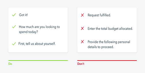
1. Be Concise
No one wants to read a block of text, especially when using an app. “One of the simplest tips for designing UX text is to keep it short and sweet”, said Lucas Bailey, UX/UI designer at Essaytigers. Of course, you have to make sure you get the point across, but it is important to do it in as few words as possible, unlike this:

Notice that the sign itself is quite intimidating with lots of small text all in one ugly block. Now imagine you open an app and see a warning like this, many users would just skip it instead of getting the necessary information. The flip side of this is being as concise as possible:

When you see this, you know exactly what it means. There are no arrows pointing to the house, talking about the type of house, price, etc. It is giving customers (users) the crucial information of the house being for sale (and if they want more information it can be available elsewhere).
2. Use Numbers/Numerals
If you want the user to pay attention to something, you need to somehow draw their eyes to the relevant text. The easiest way to do this is the use of numbers or numerals. Numbers often pop out to the average reader, and tend to be associated with something important:
You will notice in this UI that the numbers are bigger than the text and really grabs your attention. You should also refrain from spelling out numbers (even 0-10!), as it takes up more space and blends in with other text. Even something as simple as changing “Pick Two Options” to “Pick 2 Options” will make a difference in grabbing the user’s attention.
3. Mix Up Your Fonts/Colors
Similar to using number/numerals, you want to use different fonts, text sizes, and colors to grab the user’s attention. Even if your text is interesting if all of the app’s text is in the same font/same color the user will likely get bored and frustrated that they can’t find the information they want. You need to be careful, however, because overdoing colors/font sizes (or just using the wrong ones) can make your app look ugly and hurt the user’s eyes.
Below is an example of good use of colors and fonts:
While this is what designers came up with to showcase a not so great use of fonts and colors:
4. Nudge Your User In The Right Direction
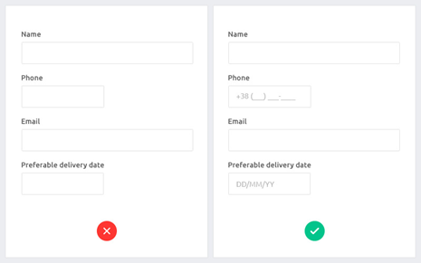
Let’s say you need your users to input their birthday. There is a ton of way to input a date, from dd/mm/yyyy to yyyy/mm/dd. For data storing purposes, it is often useful to have a consistent date input from users. Where some designers mess up is that they forget to tell the user HOW they want the date to be input. Below is an example showing the difference between leaving your user to figure it out for themselves and showing them the desired format:
5. Avoid Confusing Terms
When designing UX text you want to make everything as clear as possible. Part of that is avoiding the use of terms that could throw off users. This includes things like slang and specialized jargon. Leave the “yolos” and ”legits” for your texts, and avoid the use of business terms like “core competency” or calling something “actionable”. You can see the difference here:
6. Be Consistent
Another common pitfall for UX design is inconsistency. Let’s say you ask the user to enter their birth date on one page, and the next you ask them to input their gender. This is a prime example of inconsistency within your text design. Being inconsistent makes your design look amateurish and forces the user to remember multiple terms for the same thing. Below are a few examples of inconsistent UX text design:
“Enter your name here” and “Put your address here”
“My name is” and “Your name is”
“Have you shopped with us before?” and “When was the last time you browsed with us?”
When you are reviewing your text copy, make sure you are using terms as consistently as possible.
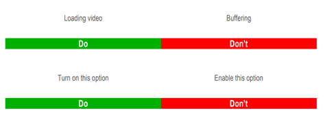
7. Personalize Instructions
We’ve already talked about how important it is to be clear and concise in UX text. However, another way to boost user retention is personalizing instructions. This essentially means avoiding instructions that sound like they were written by a robot, and instead of trying to recreate what the user would be asked in a real conversation. Below is an example showcasing the difference that personalizing your text can make in the user experience:
8. Utilize Graphics
Many people are visual learners, so if you have a particularly complex task or interaction the user will perform using a graphic that can help them understand it easier. A common example is when you are asked to enter credit card information some apps will have a graphic showing where users can find the credit card number, security code, etc. Smart use of graphics will make your app easier for users to navigate, making it much more attractive. Check out this graphic to see how you can use visuals to break down a more complex process to users:
9. Take Care With Error Messages
Any app is going to have errors. Whether they are user errors or connection errors, you need to have a message telling the user what is happening and what their options are to fix it. Make sure you never include an error message without at least linking to a help page that gives instructions on how to fix the error.
We hope that these tips help you create the best possible UX text for your future apps.
The post Top Tips To Design UX Text for Mobile Apps appeared first on Studio by UXPin.
January 6, 2020
Common Mistakes In UI Design And How Graphic Designers Can Avoid Them

User interface design has a lot to do with the ‘outside’ of design, the visual aspects that the audience see. Whether it be an app or a website, the placement of elements and features of each design can make or break it.
It is important to ensure that the meaning of the design is fully conveyed. Like with any design that we see daily, such as street signs or even those in the supermarkets, if the design doesn’t provide complete clarity, then the audience can quickly become confused. Within this blog, we will be looking at what the user interface is, but also the most common mistakes in UI design and how you too can avoid making these mistakes.
What Is User Interface Design?
User interface (UI) design is the process of using graphic workstations to create layers of interfaces in software or applications, with the designer focussing fully on looks and style. In order for a user interface designer to be successful, they must always create with three key criteria in mind. These guidelines ensure that the designs are engaging, attractive and create an emotional response from the user, helping to minimise the amount of common mistakes in UI design made by the designer.
Being able to uphold these audience desires can be rather difficult for a UI designer. With users being extremely judgemental and somewhat impatient with the interfaces they are using. To put it into perspective, it has been researched and concluded that:
94% of device users will shut down and stop using a website if their web design is not up to scratch
38% of users will avoid a website if their content or layout is unattractive
47% of users will expect a web page to load in less than 2 seconds, and will not use the site if it fails to do so
With very high expectations, the job of a graphic designer is not for the faint hearted and requires being taken seriously at all times. In order to succeed, every design must be different, innovative and always to a high quality to avoid those clear and ruthless website killers. Otherwise, your work will quickly become unused, and building a brand name will become impossible.
Because of this, below are some of the top common mistakes in UI design that an user interface designers will make throughout their careers, and how they can best be avoided.
Unresponsive Designs
 https://poweredbyawesome.com/2017/05/24/non-responsive-website-killing-business/
Having a responsive design is the ability to be able to access and view a website across a range of different devices. From the large computer screens to the tiny mobile phones, a responsive website will be actionable, attractive and easy to use for all. But this is a very difficult task to succeed in.
An unresponsive design prevents the creators from providing users with the best possible interface. It adds an extreme amount of effort on top of the design process, and in unfortunate circumstances, forces the customers to use a different web page for a better experience.
Inconsistency In Elements
 https://inspiretothrive.com/your-facebook-feed/
Another common mistake in UI designer and that is many designers may often become slightly too adventurous within their processes, and begin to branch out using new and innovative tools and layouts. However, this inconsistency doesn’t show creativity as many would assume. In fact, it will only send mixed signals to the users of the interface.
The key is to keep up with repeating patterns and elements at any chance given.
In doing this, there is a sense of trust built up from the customers or users, when the designer is creating inviting and enjoyable user experiences. Including this, it allows any user to get to know the interface they are using, which will allow functions such as purchases to be dealt with a lot faster.
Too Much Text
 https://visme.co/blog/graphic-design-rules/
When users google sites online, they usually do not take the time to read through everything produced on that page. Instead, they focus on skimming through the text, trying to reach the few points they need most, skipping out on anything extra and useless to their needs.
Having too much text on a page doesn’t actually serve any purpose. It will only send users away, or (as said before) will give them a reason to skip through everything seen. For a designer, the temptation to brag about services, products or prices will be hard to fight, but the key to learn, is that less is far more.
Having emotion in what is written is key to know that what has been said, no matter how short, will help to create an impact, drawing them in further, converting them and preventing them from exiting to go on to use another site.
Confusing Forms
 https://yourstory.com/mystory/46e3dafe96-content-or-design-whi
A form is one of the most important parts of the user journey. Surprisingly named, a form is a pop-up feature given to log in, check out, sign out, or proceed further into the site. These aspects are essentially the most important. Especially for those that have sites where users will be purchasing products.
Providing clear guidance through these parts of the user processes will avoid any issues being made, or customers getting annoyed and deciding not to use the site.
To do this, avoid using colour to show that the user has selected something in error. Instead, use commentary feedback such as ‘Password Incorrect’, in order to show a mistake has been made. This way, every user processes should function swiftly, with few errors occuring, helping to create a positive user experience.
Distinction Between Buttons
When designing apps and software, there are likely going to be functions that the user has to complete in order to progress further into either the site or complete their transaction. For example, with the app ‘Instagram’, the user can follow, like and comment on anything they wish, with each task having a different button to click to perform each task.
 https://uxmovement.com/buttons/the-myths-of-color-contrast-accessibility/
The problem most designers will have is unintuitive buttons. This is either the buttons being too small, too large or each being too similar in size that an action chosen cannot be performed – this will, of course, ruin the user experience.
This is also valid when it comes to differentiating between primary and secondary actions. For example, a ‘login’ button should be in a contrasting colour or size to the ‘sign up’ button. This way, there is a distinctive difference, and the users will never get confused, or click for the site to perform something they do not wish. In turn, leading to a negative experience.
Summary
User Interface design does not come without its challenges. The creator, without a doubt, has a sure set amount of obstacles that have to be overcome before being able to make immersive, entertaining and attractive applications, software or websites.
The designer must ensure that the user experience is kept always in mind. Just because the page looks pretty, it doesn’t mean it performs well. Similarly with building the interface, if it is too difficult or jam-packed with high-end features, a user may find it difficult and challenging to use, and therefore find somewhere else to aid their needs.
The users are always going to be the most judgemental and hard to please group, and as a designer, be aware that the audience is continually changing and requires a well designed and functioning website to cater to their every need.
By following our common mistakes in UI design and using them as a checklist to avoid, you too can make sure that you have created a well designed, attractive and functioning website with the perfect user interface that users will enjoy navigating their way around.
The post Common Mistakes In UI Design And How Graphic Designers Can Avoid Them appeared first on Studio by UXPin.
December 30, 2019
Top software and hardware recommended by designers in 2019
The end of the year is a good time for summaries, recommendations, and plans for the future. You’ve probably spent some time using a lot of different types of tools – both software and hardware. Some of them might have made your life miserable, others might have become good candidates to your usual toolset. Some you’re throwing out (or replacing) next year, and with the others, you just can’t wait to make more magic.
While here, at UXPin, we have little influence on your daily life, we do our best to significantly improve your work. And not only by making our product the best we can but also by providing you a list of what our fiends liked in 2019.
We’ve asked our clients and community what was their top gear of 2019, and here are the most common or most interesting answers.

Hardware recommended by designers in 2019
iPad Pro and Apple Pencil
“The technology behind the iPad has made such a huge leap! I remember one of my first iPad and the limits to it. Now, what I love the most is that with my paper-like screen protector, drawing is so life-like but also easy to erase and improve. I doodle all the time – much more than I used to. And that is a huge improvement in my design process.”
Mouse
“My freshly purchased Logitech M590 Multi-Device Silent Mouse is the quietest mouse I’ve ever heard AND it comes in a beautiful gray!”
Mechanical Keyboard
“I’ve been dreaming of a mechanical keyboard for a while now and this year finally I got the WASD V3. It 
December 23, 2019
Top books, movies, and series recommended by designers in 2019

The Holiday season is upon us. A time of eating, relaxing, meeting family and friends, netflixing and chilling. Perhaps this year you’ll find a moment to just lay on your sofa and do nothing else but watch the motion pictures in front of you. Maybe a New Year’s Eve with a good book awaits you. No shame in that. Finally, you’ll get some quality time for just you.
Every good designer will tell you that making an effort to stop the racing thoughts from time to time is a must. Especially when you work in an environment demanding constant creativity. You have to clean up your mind and be ready for new challenges in the next year. So this season we wish you to simply relax and get inspired.
But how many times have you found yourself already covered in a blanket, with your laptop on your – well – lap, a bowl of popcorn growing cold by your side but still, with no idea what to watch? Or thought you’d grab a good book and just dive in but there’s so many of them on Amazon and how to know which is a really good one and which one will be a total waste of time? So maybe you’re looking for a good book or movie or series recommended by designers?
Here’s a list of great books and shows that our friends from the field liked in 2019. It’s probably not the most objective, but surely very interesting. There’s a chance you’ll like it.

Books recommended by designers in 2019

Books about leadership
Radical Candor: Be a Kick-Ass Boss Without Losing Your Humanity by Kim Scott
Lean Out: The Truth About Women, Power, and the Workplace by Marissa Orr
Measure What Matters: How Google, Bono, and the Gates Foundation Rock the World with OKRs Hardcover by John Doerr
Product Leadership: How Top Product Managers Launch Awesome Products and Build Successful Teams, by Richard Banfield, Martin Eriksson, Nate Walkingshaw

The classics about design
The Design of Everyday Things by Don Norman
Don’t Make Me Think by Steve Krug
Be Our Guest – Perfecting the art of customer service by The Disney Institute with Theodore Kinni
The User Experience Team of One: A Research and Design Survival Guide

Inspiration from different fields
This is Marketing by Seth Godin
Building a Story Brand by Donald Miller
It Doesn’t Have to Be Crazy at Work by Jason Fried

Movies and series recommended by designers in 2019

Top movies of 2019
Once Upon a time in Hollywood, directed by Quentin Tarantino
Joker, starring Joaquin Phoenix
Afterimage (Powidoki) by Andrzej Wajda
Le Mans ’66, starring Matt Damon and Christian Bale
The House that Jack Built, directed by Lars von Trier
Burning, directed by Lee Chang-dong
Spider-Man: Into the Spider-Verse Avengers: Endgame
Toy Story 4
The Irishman, directed by Martin Scorsese (available on Netflix)

Visually appealing web TV shows
Killing Eve, season 2 (BBC/HBO)
Watchmen (Netflix)
Chernobyl (HBO)
The Boys (Amazon Prime)
The Mandalorian (Disney +)
Abstract: The Art of Design, season 2 (Netflix)
Queer Eye: We’re in Japan! (Netflix)
Russian Doll (Netflix)
The Crown, season 3 (Netflix)
Fleabag (HBO)
When we’d been asking around, the premiere of Netflix The Witcher was still ahead of us all but the expectations were high so fingers crossed this will be the number one in next year’s summary.
The source of images of book covers: Amazon.com; movie posters: press materials.
The post Top books, movies, and series recommended by designers in 2019 appeared first on Studio by UXPin.
December 17, 2019
How to Create Hi-Fi Prototypes for Mobile Commerce Apps

When talking about prototypes we think about a simulation of the final product that is an essential part of every designer’s work. In a nutshell, prototypes can express ideas that words struggle to. Prototyping is an important part of all stages throughout the design process and your designer should do it as early and often as possible.
There are three main types of prototyping, but in this article, we will focus on two of them- low and high fidelity and their benefits. Being a critical step in every design process, prototyping phase brings not only speed, but also further design evaluation and feedback in early stages of the project.
Whether you’re designing a website for desktop or a mobile app, you have plenty of innovative tools on the market that can help you test your work, from InVision, Framer and Marvel to Proto.io. In fact, we’ve witnessed the rise of in-app shopping with conversion rates three times higher than mobile sites.
In this article I will examine how to make an app prototype, if you are still unsure how you can increase commerce conversion rate through a mobile app. I will also go through benefits of different types of prototyping and review some of the mobile app UI design tools.

Low and High-Fidelity Prototyping
Prototyping results in better understanding of the design and helps people involved in the project overcome issues at early stages. There are ongoing uncertainties on how much of your final design the prototypes should reveal. You can get your ideas across with different kinds of prototyping- low and high fidelity.
Low Fidelity
Good old pen and paper, because that’s what low fidelity prototyping really is. The process is quick, won’t require the fanciest tools and can minimalise the costs of work. With new software available to photograph the sketches, designer can turn paper into interactive prototypes in no time. Accessibility and real-time interactions offered by low fidelity prototyping belong to the list of benefits that this process has to offer.
High Fidelity
To receive more control over the designs and demonstrate the functionality at its fullest, high fidelity prototypes come in to show off those animations. High fidelity prototypes are more presentable, interactive, give a more accurate idea of how the final product is going to look before it goes live and can test many different components of the project from navigation to engagement and animations.
Ecommerce App Prototyping
There are two main ways for consumers to make purchases using their mobile devices- from websites or directly from apps. You probably have a mobile-friendly website in place and if you’re reading this you must be considering building an app that increases conversion exponentially.
Generally speaking, mobile is the future of eCommerce. The majority of the time we spend on our phones we spent using different apps. In fact, some of the mobile shopping statistics say that 53% smartphone users buy from company-specific apps and their conversion rates are three time higher than mobile websites. Saying that, is still not too late to optimise your site for mobile, invest in building an eCommerce app and grow your revenue.
Mobile-app usage keeps growing year-on-year and has noted the highest conversion rates. Some of the reasons why consumers prefer using mobile apps rather than scrolling through mobile sites are speed and convenience, followed by:
Easy way to find better deals
Saved setting and preferences
Rewards and Loyalty Programs
Entertainment
As more and more shoppers buy on the go using their mobile devices, they also tend to complain that it takes slightly longer to complete the purchase on mobile than it does on desktop. This is why busy people reach out to mobile apps, which is a better, faster and innovative way of shopping.
Now that you have an idea of effectiveness and return on investment that mobile apps can bring for your business, we can cover some basics if it goes to eCommerce app prototyping, so your designers can plan ahead and deliver some outstanding user journeys.
1. Homepage
The entrance to your store, your homepage is where your potential customer usually lands on. You know what they say- “Don’t judge a book by its cover”, but this unfortunately does not work in a digital world. Your homepage can determine how users feel about your brand, products and the whole shopping experience.
There are 3 main things you should consider when prototyping an eCommerce app and a homepage: Speed, Functionality and Design. On-the-go users doing their last-minute shopping expect simplicity and clear call to actions that help them find the right information faster.
Avoid adding unnecessary buttons and details, just keep it simple to make sure information on your homepage is visible yet engaging users. Using different prototyping tools will help you structure your eCommerce app and align all UI element in the right way.
2. Navigation
Seamless navigation is a key element of increasing conversion rate through your eCommerce mobile app. Unlike desktop websites where user can browse mega menus, apps don’t have that much space to play around with.
To reach that consistency you need to define the user flow and take into consideration different scenarios. Creating screens that will link together is the best representation of a user flow and you can easily reproduce those while working on the eCommerce prototype. Your navigation should be pretty straight forward and accessible rather than memorable, which can unnecessarily overcomplicate the whole experience.
3. Log and Sign In Process
No one likes going through too many questions and filling up the form when signing up to a new platform. Your customers expect to complete the purchase pretty fast, considering they are using their mobile device. On smaller screens, simplifying the whole process is more important than you think.
Try asking for essentials only and make sure all items fit on the page. If the form contains too much information, divide it into a few simple steps. Be specific and help users understand what has to be done, rather than playing a guessing game. Try displaying an error message if incorrect details have been entered, which can set them in the right direction and won’t leave them frustrated.
4. Shopping Cart
Here we are, the place where your customer makes a final decision whether to complete a purchase. To avoid cart abandonment, you need to carefully plan for a pleasant experience. Give the user a chance to easily return to the shopping cart at any stage, as well as go back to browsing products.
Navigation is key, that is why call to actions should be visible and always accessible to your customers, especially when decision making process takes its place. Make sure the shopping cart is responsive, because there is nothing more frustrating that seeing a disturbed layout, which may also result in less conversions.
5. User-friendly approach
Remember, the customer comes first. Apart from a beautiful design that helps users find information with ease, keeping them engaged throughout the whole experience is a real conversion booster. Imagine that you’re having a constant dialogue with your customer, just like a sales advisor has with the in-store customer.
If you want a user to experience a consistent flow through your eCommerce app, you need to ensure that app doesn’t crash in the decision-making process and that customer’s information is stored, so they can easily access it in the future.
Takeaway
Nowadays eCommerce highly depends on mobile and it is a place where conversion happens, with no doubt. With endless benefits brought by eCommerce mobile apps, your main focus should be building an app that drives conversion through seamless user experience, and that is why prototyping is an essential and very important stage of any design process. Following this simple guide will help you plan ahead and create prototypes that will engage you users and drive more revenue. Go ahead and try out multiple tools and find the one that works best for you and your teams.
The post How to Create Hi-Fi Prototypes for Mobile Commerce Apps appeared first on Studio by UXPin.
December 11, 2019
Heuristic Evaluation: The Most Informal Usability Inspection Method

Heuristic Evaluation is a convenience review technique that asks ease of use experts and different partners to assess the user interface (UI) designs based on the standards and rational rules.
This strategy was initially considered as rebate ease of use technology that could be utilized to discover issues early utilizing wireframes, models, and working items. A side advantage of the method is that evaluators find out about the rules that help great ease of use.
Heuristic Evaluation and related review techniques have become one of the most well-known strategies for discovering convenience issues.
 Image Source:Photo by
Alvaro Reyes
on
Unsplash
Image Source:Photo by
Alvaro Reyes
on
Unsplash
The heuristic Evaluation technique is easy to clarify (although “heuristic” isn’t). At its most essential, you hand individuals a rundown of heuristics with some clarification and models, furnish them with a portrayal of the UI to survey, and request that they list ease of use issues utilizing the heuristics as a guide.
Heuristic Evaluation is moderately quick if your attention is on a sensible extent of highlights. Heuristic Evaluation can give helpful information generally rapidly, without the cost or exertion related to selecting clients.
Heuristic Evaluation is like programming code investigations, and this similitude may make heuristic Evaluation simpler for item groups to acknowledge than other convenience Evaluation techniques.
Heuristic Evaluation requires no unique assets, for example, ease of use lab (even though for early models of the item, you may need to work with a “test framework”) and can be utilized over a wide assortment of items at various phases of advancement.
Heuristic Evaluation increment attention to regular convenience issues and fill in as a strategy for preparing the item group about what parts of configuration can prompt ease of use issues.
One shrouded quality of heuristic Evaluation and different approaches in this book is that through the span of a year, associates who are engaged with the Evaluation will begin to perceive configuration gives early and dispose of probably a few classifications of issues.
Pros
Modest comparative with other Evaluation techniques
Natural, and simple to propel potential evaluators to utilize the technique.
The early arrangement not required.
Evaluators mustn’t have formal convenience preparing. In their examination, Nielsen and Molich utilized proficient software engineers and software, engineering understudies.
It can be utilized from the get-go in the advancement procedure.
Quicker turnaround time than lab testing.
Cons
As initially proposed by Nielsen and Molich, the evaluators would know about the ease of use structure standards, yet were not convenience specialists. Nonetheless, Nielsen consequently demonstrated that ease of use specialists would recognize a more significant number of issues than non-specialists, and “twofold specialists” – ease of use specialists who likewise had mastery with the sort of interface (or space) being assessed – distinguished the most issues. Such twofold specialists might be challenging to find, particularly for little organizations.
Singular evaluators distinguish a moderately modest number of convenience issues. Various evaluators are prescribed since a solitary master is probably going to discover just a little level of questions. The outcomes of different evaluators must be totaled
Heuristic Evaluation and other markdown strategies may not distinguish the same number of ease of use issues as other convenience building techniques, for instance, ease of use testing.
Heuristic Evaluation may distinguish more minor issues and less significant issues than would be recognized in the verbal process ease of use test.
Heuristic surveys may not scale well for complex interfaces. In complex interfaces, few evaluators may not discover the lion’s share of the issues in an interface and may miss some significant problems.
Doesn’t in every case promptly recommend answers for ease of use gives that are recognized?
One-sided by the predispositions of the evaluators.
In heuristic evaluation, evaluators can enhance sets of general structure standards with extra heuristics that match the item classification or its qualities, as fundamental. The number of evaluators for each venture may shift, yet utilizing around five of them is, for the most part, prescribed, as this number has been demonstrated to have the option to find roughly 75% of all ease of use issues.
Understanding the process of conducting Heuristic Evaluation
Figure out how to lead a heuristic assessment on some random UI plan. This article will show you how to produce and direct your very own heuristic assessments so you can improve the ease of use, utility, and attractive quality of your plans.
The best practice is to utilize built up heuristics like Nielsen and Molich’s ten general guidelines and Ben Shneiderman’s eight brilliant principles as a venturing stone and motivation while making a point to consolidate them with other essential structure rules and statistical surveying.
Jakob Nielsen, great web ease of use specialist and accomplice in the Nielsen Norman Group, and Rolf Molich, another remarkable ease of use master, built up a rundown of ten UI structure rules during the 1990s
Set up a fitting rundown of heuristics. Make a point to consolidate them with other significant structure rules and statistical surveying.
Select your evaluators: Make a point to pick your evaluators painstakingly. They ought to usually be ease of use specialists and ideally with area mastery in the business type that your item is in.
For instance, an evaluator examining a Point-of-Sale framework for the eatery business ought to have, in any event, a general comprehension of café activities.
The preparation session ought to be institutionalized to guarantee the evaluators get similar guidelines; else you may predisposition their assessment. Inside this short, you may wish to request that the evaluators center around a determination of assignments; however, in some cases, they may state which errands they will cover based on their experience and mastery.
Initial assessment stage: The first assessment, for the most part, takes around two hours, contingent upon the nature and unpredictability of your item. They will, at that point, recognize specific components that they need to assess.
Second assessment stage: In the subsequent assessment stage, the evaluators will bring out another go through, while applying the picked heuristics to the components recognized during the main stage. The evaluators would concentrate on single elements and see how well they fit in the general structure.
Questioning session: The questioning session includes coordinated effort between the various evaluators to gather their discoveries and set up a total rundown of issues. They should then be urged to recommend potential answers for these issues based on the heuristics.
Conclusion
Heuristic Evaluation is the nonexclusive name for a lot of strategies that are altogether founded on having evaluators investigate a UI. Ordinarily, ease of use Evaluation is planned for discovering the ease of use issues in the structure. However, a few strategies additionally address problems like the seriousness of the ease of use issues and the general ease of use of a whole framework.
Numerous review strategies loan themselves to the investigation of UI determinations that have not been executed at this point, implying that examination can be performed from the get-go in the ease of use building lifecycle.
The post Heuristic Evaluation: The Most Informal Usability Inspection Method appeared first on Studio by UXPin.
UXpin's Blog

- UXpin's profile
- 68 followers

