
UXpin's Blog, page 90
September 15, 2020
The 6 UX Methods That Proved to Be Effective in Driving Results
Most designers want to create something beautiful, but beauty alone in the UI & UX world is not enough. If it doesn’t support the goals of your business or your clients – it just won’t last very long.. A product can only last when the client makes money from it. A UX that doesn’t drive results will ultimately fail and disappear.
In the following article, you will learn about UX methodologies that have helped other companies drive impressive results. You can always express your creative ideas by twisting the concepts a bit, but you will want to follow the core methods to get results that clients will notice.
Before you start learning in-depth methods, consider that users abandon 80-90% of apps after using them just once. You face a lot of competition, so you need to follow a UX design methodology that drives impressive results.
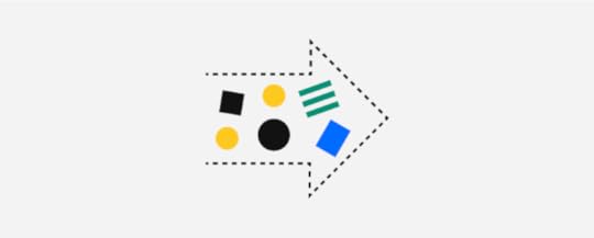
Study the UX of Top Market Competitors
Start researching UX methodologies that already work within your product’s niche. You don’t need to reinvent the wheel, but you can improve on its design.
If you have a client that wants a pet-themed app, for example, you can start by exploring the top-ranked apps in that niche, such as::
MyPet RemindersThe Bark: Dog Culture MagazineRoverPetParent
After reviewing the above examples, your client will choose something they like from each. Having a shortlist of your client’s preferences, needs, and expectations, you can already start building the user experience.
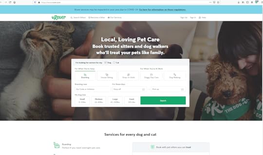
You decide that you can create a better UX design methodology by adding UI dialogs that will transform the user’s journey.
When you present your first wireframe to your colleagues, you show them that the user gets to make small decisions that lead to a superior result. Upon opening the app, the user chooses between “dog or cat.”
The answer takes the user to the next step in the process. Users that choose “dog” are asked if they need services “when you’re away” or “when you’re at work.”
The “away” answer takes them to a screen with icons for boarding, house sitting, and drop-in visits. The “work” answer takes them to a screen with icons for dog walking and doggie daycare.
Regardless of the answer, they have to select a size that best represents their dog.
Users who choose “cat” get taken to a new screen with icons for boarding, house sitting, and drop-in visits.
No matter how users answer, the final screens ask for their locations and when they need the services.
Their answers produce a list of results that show well-vetted service providers and their prices. The users can schedule with one of the providers, enter their payment information, and expect their pets to receive excellent care.
Notice that the new UX techniques don’t deviate much from Rover’s original. It just takes a complex form and simplifies the user’s journey by breaking the form into a series of simple questions.
Run Lean UX Workshops with Clients and Stakeholders
Your clients, which may include your project manager, agency owner, or client, need to be included in the entire design process. This is part of the Lean UX framework which advises to include as many stakeholders as possible from the start.
Therefore, before you spend too much time developing a prototype, talk to your client about defining and tracing goals. Do they want to see a quick financial return on their investment? Do they want the product to direct new users to an existing service?
The answers to these questions will help you design a product that reaches the proper goals.
Understand the Consumer’s Journey Map
Put yourself in the user’s “shoes” and think about how you would experience the product. Taking this step will send you on a journey to create a better user experience.
While you use your product, ask yourself:
Does this experience prioritize my needs?Does the product keep me front and center, or does it meander in other directions?What steps could you add or subtract to make your experience better?
Some people find it harder than others to step outside of their perspective and look at products objectively. If you know that this method won’t work well for you, recruit colleagues who don’t feel attached to the project. Hopefully, they can give you unbiased feedback that helps you understand and improve the consumer’s journey map.
Create CTAs and Microcopy That Motivate and Convert
Microcopy plays a major role in how users respond to your designs. Inserting a well-written call-to-action in your design can motivate and convert users.
Your CTAs can drive results by using short statements that tell people how to respond.
As people become more tech-savvy, though, designers and writers need to reconsider the types of messages they use. Many people don’t trust tech companies. Some surveys show that 61% of people in developed markets believe that tech companies too often want to trick them into something, which in turn evokes the sense of mistrust..
Microcopy can help alleviate some feelings of mistrust and fear. Consider what Facebook has done to put new users at ease.
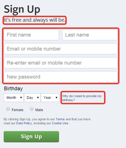
The sign-up form tells potential members that the service is “free and always will be.” Anyone worried that Facebook would start charging members can take some solace in that statement.
The sign-up form also provides links to additional information. Potential users can learn why Facebook wants to know their birthday. They can also read Facebook’s terms of service, data policy, and cookie use policy.
Most people never read policies. Anyone who questions Facebook’s motivations, though, can sift through the legalese to learn more about how the company operates and what it plans to do with member data.
Use Usability Testing to Get Feedback
Once you have a basic design of your product, create a functional prototype, distribute the prototype among test users, and conduct interviews to learn more about what they liked and didn’t like.
Other designers and stakeholders may have prejudices that make it difficult for them to give you unbiased feedback. A random person without any stake in the product’s success, though, can give you an unfiltered opinion.
Feedback may include everything from “I really like the way scrolling down the screen expands individual options and makes them easier to read” to “this is the dumbest thing I’ve ever seen!”
It goes without saying that you should take some criticism with an entire shaker of salt. Disregard off-the-wall comments. Pay attention to sincere responses that can shape the future of your product and business , though. You never know who will give you insight that leads to better results.
Perform Research to Find the Right UX Techniques for Products
Interviews can help you see your product’s UX design methodology from more perspectives, which can lead to significant improvements in your designs.
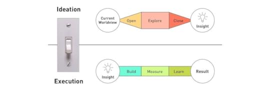
Few options outperform data-driven research, though. The Interaction Decision Foundation uses a process that includes:
InsightBuildingMeasuringLearningResults
Measuring sits in the middle of this process because it bridges the differences between artistic insight and data-driven testing.
To see how people respond to your product, you can lead a whole product with data-driven testing as it lives and grows. Based on different UX methodologies, you can optimize the product as it is already live. For example, running a/b tests, and drawing conclusions from them will give you some solid data-driven results.
Then, Watch data evolve as your people use your product. If you see poor performance, you can recruit artificial intelligence to help you spot patterns in behavior. Make adjustments to the product to see how the changes influence user behavior. You may find that a few tweaks can generate considerably more conversions.
Create and Share UX Designs With UXPin
When it comes to prototyping tools that support your UX processes and methodologies, look no further – UXPin does the job perfectly. It is full of design, prototyping, and collaboration features to let you and your team align and work in context. UXPin lets teams work on the same design – not only designers but also stakeholders who don’t have an account can collaborate. This takes so much frustration out of the review process and puts an end on the never-ending emails with feedback. All you have to do is send someone a preview link so that they can start reviewing the design.
Start with a free UXPin trial to discover and try all the features yourself.
The post The 6 UX Methods That Proved to Be Effective in Driving Results appeared first on Studio by UXPin.


September 11, 2020
How to Create a Wireframe: Step-by-Step Guide + Examples
The user experience of a website often determines its success. As developers, creating a new website for clients means striving for results — not just a pretty picture. The wireframe focuses on this UX factor. It’s the first stage of website design, that focuses on functionality instead of graphics. It’s a crucial process that you can pursue with ease using a tool like UXPin.
Developing an approach, as outlined in this guide, will help ensure you get the most out of your wireframe.
Why Focus on UX?
There’s often a difference between what a website user says they are looking for and what kind of layout actually leads to conversions. User experience is honing in on those behaviors and optimizing the website to appeal to them. As an example, a user of a fashion website may say they like a particular color scheme, but what’s most important for conversions is a clear, uncomplicated path through product options and checkout.
Some analysts distinguish between user interface — the nuts and bolts of where and how users interact with a site — and user experience, which includes UI as well as the products and services the site offers.
That’s not to say design isn’t important. Design and style are essential. But flow is the first step that developers must look at before deciding on those aesthetic elements. That flow — the clickable elements, placement of calls to action, movement of text and graphics in a slideshow or similar elements — is what makes the site visit enjoyable. Even with a top-notch design, a poor user interface leads to frustration, abandoned carts, and the unwillingness to come back to the site a second time — even if that site offers a preferred product.
Why Create a Wireframe?
A design prototype will go through many different versions. It’s easier, and often cheaper, to start with a wireframe. This is a sketch of what the site will look like, without color, fonts, graphics, or text. This stripped-down version lets you focus on the user experience of the website. It’s easier to fix a UX element at the wireframe stage, compared with later on down in the design process. It may also be easier to spot a problematic UX feature before it’s obscured by appealing graphics later on.
For those schooled in coding or early website development, it’s helpful to think of the wireframe as a visual sitemap. The sitemap is a simple list that represents the hierarchy of pages on the website. Instead of a linear representation of how elements link together, a wireframe is a visual map, much like a blueprint.
That said, a wireframe does not have to be a simple sketch. A low-fidelity wireframe has only the basic layout, but a high-fidelity wireframe may introduce more precise design elements. That gives you and your team the flexibility to ease into the perspective of the end users, with increasingly complex details.
At all stages it’s key to envision the movement of the user through the website. UX is how a client knows the website is performing its job — attracting and engaging users to ultimately perform a task. You and the team should make it as easy as possible for them to convert, however conversion is defined by the client.
Here are the six steps you need to use the wireframing process to maximum effect.
Step 1: Get Acquainted With Your Wireframe Tool
You can do a wireframe with nothing more than a pen and paper. But there are obvious limitations to this method. You can hardly share your wireframe with your team and it’s less impressive to show to your client. As the wireframe goes through various changes, you’ll want to make easy updates — that can get messy if you’re using the old-fashioned method. That’s not to say the tactile elements of pen and paper go out the window, but for maximum efficiency try using a tool that lets you translate that doodle into a workable wireframe.
UXPin gives you this ability. The platform has all of the features you want when you are working with a team to build a high-functioning, high-conversion website, from wireframe to final prototype. UXPin is a design tool that focuses on function as much as aesthetic sensibility.
UXPin allows you to build a wireframe under a time crunch. It’s a simple feat to share that wireframe with others and to modify it appropriately. Once your wireframe is set, you can go immediately to the design phase without leaving UXPin. There’s no need to switch to a separate design tool. The platform provides you with access to all graphical elements as well as full interactive prototypes you can use for A/B testing before the site goes live.
So, Step 1 of wireframe creation is to dive into UXPin– take a few minutes to enjoy the possibilities in the platform’s wireframe tools.
Step 2: Develop a User Persona

It is crucial to understand who is visiting the site. By knowing who the website should attract, and how your client wants them to behave when they start browsing, you can develop a UX-focused wireframe. After all, not all website users are going to behave the same way — it’s akin to setting up a brick-and-mortar store layout that drives the focus demographic in a certain direction around the store.
Start by identifying a user persona for the website. This is a tool often used in marketing. In order to develop sales strategies, businesses assess in detail who it is they are trying to sell to. Beyond the demographics of the website user, you should understand the user’s typical behavior. A potential customer for an enterprise-level SaaS may spend more time on a site to learn about the specifications of a product, while a fashion consumer may rapidly click through photos and skim reviews before making a purchase decision.
Translate these tendencies into website flow. As an example, for enterprise-level products, the business may want to offer the website user a product demo or to sign up for a free trial. The website should guide the user to read blog posts and promotional materials. For the e-commerce site, it should be quick and easy for customers to fill up their cart and check out.
User personas are full of important information — from stage in the sales funnel to average time spent on a particular site.
Step 3: Decide Where You Want Users to Go
This is the crux of the wireframe process. You can determine the flow of traffic, from where they initially land on the site, through to conversion. For example, the user may land on the home page, then go to product demo or resources before answering the call to action. In order to determine this flow, answer a few key questions about the nature of this website user’s experience.
Put yourself in the user’s shoes. Determine what you would want to know. At the same time, determine where you want that user to end up. Your flow through the site should answer their questions and, in so doing, lead them to take a particular action. Brainstorm important details, like the nature of the core message your users will see when they first arrive at the website.
Step 4: Sketch Out Your Wireframe
At this stage, you can start putting your flow onto the digital page. Include spaces for headers, text, videos, and clickable elements. At this stage, you can even provide important detail about what kind of information to include. For example, in the box where there’s a video, you can indicate it’s an informational video about the company. At this step, you still want to keep it basic. But it should nonetheless be complete enough to offer a visual representation of the website’s construction.
Focus on a few key items: navigation, menus, footer text, click-through elements, and where you want the client to end up. There’s no need to discuss color schemes, fonts, or other design factors — think only about the mindset of your user and what leads them from one stage to the next.
Step 5: Try Out the Wireframe With Others
With a tool like UXPin, you can test the functionality of the website layout — even at the wireframe stage. Try out the wireframe in a few different settings. You can meet with your team and share feedback on how the wireframe feels. Importantly, many development teams also test the wireframe with a focus group that represents potential end users. Without knowing the background of the website, nor the objectives of the client, this focus group can offer an honest opinion of the efficacy of the flow through the site. It allows for feedback on functionality, instead of on design elements which will come later on in the process.
Step 6: Create a Prototype
Using UXPin, you can translate your wireframe into a prototype. At this stage, include all elements of the design. Your product should be as close as possible to the final product. You and your team, as well as the client, and potentially focus groups, will use the site and offer feedback on the entirety of the UX experience. That way and revisions to the site can affect all layers of the website, from functionality to its look and feel.
The post How to Create a Wireframe: Step-by-Step Guide + Examples appeared first on Studio by UXPin.
September 10, 2020
How to Organize Information Effectively: What You Can Learn From Information Architecture
At its core, a website is a way of presenting information to users. When the information is organized effectively, it makes it easy for users to find what they are looking for and for the business to accomplish its goals. In this article, we’ll look at how you can use Information Architecture (IA) to create better designs.
What is IA?
IA is the process of organizing information in a way that makes it easy to find and understand. The goal of IA is to help users find information on your site so that they can complete tasks. When your site doesn’t have good IA, users might find it confusing and hard to use.
In order to organize the information on your site effectively, you have to understand how the different pieces of information work together and how they fit into the big picture of your website.
The main strategies for organizing information include creating systems for:
Classification: Categorizing and structuring information Labeling: Representing information Navigation: Moving through information Search: Looking for information
For you to create the required IA systems, you have to understand that IA is affected by three factors: content, context, and users.
Content: This is the amount of content that you have to organize, its type, how it is structured, and who owns it. Context: These are the business goals, culture, technology, and resources within which your site exists. Users: This is who the website is made for, the tasks that they need to accomplish, their information-seeking behaviors, and their level of experience.
 Factors that affect IA
Different types of IA design structures
There are different ways that you can organize the information on your website. The IA design pattern that you choose will depend on the three factors that we have discussed before: content, context, and users. Here are five common web structures.
Single Page Structure
In this IA structure, all the information is presented on one page. The single-page structure is suitable for sites with a small amount of information and a single goal. These can be personal contact sites or a site that promotes one product.
 Single page structure
 Flat structure
All the pages have the same level of importance in this structure. Users can access every other page from one page. Typically, this structure is used for simple sites that have few pages such as ‘Home’, ‘About’, and ‘Contact us.’
 Flat structure
Strict Hierarchy Structure
This structure is made up of a home page, category/ subcategory pages, and then individual pages. The categories can be accessed from the homepage. Each category or subcategory has its own individual pages that are linked from it. A good example is an e-commerce site where the ‘men’ category has individual pages such as ‘clothes’ and ‘shoes.’
 Strict hierarchy structure
 Multi-dimensional hierarchy structure
This structure is similar to the strict hierarchy structure with the only difference being that individual pages can be accessed from different category pages. This structure is suitable for sites that have a lot of similar information.
 Multi-dimensional hierarchy structure
 Best practices for IA design
Once, you’ve chosen a suitable IA structure there are several best practices that you need to follow as you organize the information on your site.
Keep the needs of the users first
One of the major pillars of IA is putting the needs of the users first. Consider the information-seeking behaviors of your users, their level of experience, and their cultural context. You should also map out the user journey of how your users might interact with your site.
Additionally, your site might have more than one type of user so its important to create different personas for each user type. This will help you keep the needs of all the different types of users front and center as you structure your site.
You can find out the needs of your users through user researching methods like interviews and usability testing. You can also use beta testers to find out if the intended users are able to navigate your site easily.
Don’t make the mistake of assuming that users will have the same needs or preferences as you. It is only after truly understanding the needs of your users that you can figure out how to organize the information on your site to meet their needs.
Understand the purpose of your site
The purpose of your site is the main goal that it seeks to achieve. This goal might be educating users, informing them, or selling a product. The information on your site should be organized in a way that moves users towards achieving the goal of the site. If the goal of your site is to sell a product, the IA should move readers towards making a purchase. Similarly, if the goal is to inform users, your site should direct users towards the next most useful piece of information.
Often, your site can have more than one goal or sub-goals, which is okay. The key to good IA is to ensure that all content that leads to a similar goal is grouped together.
Be consistent
Use a consistent IA structure by grouping similar content together. If you have 5 category pages, put them together and don’t leave one out. A consistent IA will make it easy for users to understand your site, find the information that they are looking for, and complete their tasks.
Methods of IA design
When choosing how to design the IA of your site, there are several methods that you can use.
Card Sorting
Card sorting is a simple and inexpensive method of getting the input of users on how you should organize the information on your site. First, you write the content type or page name on an index card, and then the users’ sort and group the index cards.
You can use the basic card sorting method where you place the cards at random and the users sort and group them or you can use the reverse card sorting method where you sort the cards into groups and then have the users rearrange them. Moreover, you can let the users name the groups or you can have them use pre-named groups.
Wireframing and Prototyping
Wireframes are useful for outlining how the design layout of your site will look. More than that, they also give a basic view of how the information will be organized once the site is complete. The same is true for prototypes which are an early model of how your site will look and function. You can use a tool like UXPin to create wireframes and prototypes that look like the real thing which will help you test the IA of your site.
Mindmapping
This is a low-fi way of web organizing and illustrating the relationships and connections between the different types of content on your site. You can ask users who participated in the card sorting exercise to create mind maps of how they think the content should be grouped using pen and paper. You can also create mind maps yourself using software tools such as Lucid Chart.
Organize The Information In Your Designs Effectively
Information Architecture is the key to creating a site that is easy to use. Use UXPin’s prototyping and wireframing tools to create a site whose IA truly serves the needs of your users. Share the prototypes with your clients or users and collaborate with your fellow designers all in one place!
The post How to Organize Information Effectively: What You Can Learn From Information Architecture appeared first on Studio by UXPin.
September 9, 2020
How To Use Conceptual Models for Better UX and UI Design
When you’re designing for a friendly user experience and user interface, you start with a concept. You have an idea of how it should work in the real world. You just need to communicate it to the rest of the design team. Welcome to the world of what we call Conceptual Models. In this article, we will explain what Conceptual Models are and how to use them.
What Is a Conceptual Model?
A conceptual model is a representation of a system. It shows how people, places, and things interact. They show the real-world features and interactions of your design idea.
In other words, a conceptual model is an abstraction of a piece of the real world or a design you plan to bring into the real world.
Conceptual Models That You Already Know
Google Maps

When you pull up Google maps on your mobile phone or another device, you will see a representation of the roads, bridges, intersections, restaurants, fueling stations, retail stores, and points of interest.
Let’s say you want to visit Carnegie Hall in New York City.
You enter “Carnegie Hall” into the search engine. It brings up a map of the area around 7th Avenue and West 57th Street in New York, New York, USA.
You’ll see that the 57th Street Subway Station is across the street from Carnegie Hall, so you can just take the train to get there..
You’ll also see that there are restaurants, diners, and hotels nearby in case you get hungry during your visit or want to stay overnight.
These facilities appear on the map as sketches of buildings with labeled markers showing their location. Cartographers at Google maps that show you the concept of the area of New York near Carnegie Hall.
A Planetarium
Take an orbital model of the solar system. It has spheres that represent the Sun and planets. They’re mounted on arms that hold the “planets” at a distance from the “Sun” that’s proportionate to the distances of the real-world planets.
Within a complex system of gears, wheels, cogs, and sprockets, the spheres revolve around the “sun” and rotate just as the real-world planets.
It’s not the solar system, but it shows you how the planets move.
A Flowchart
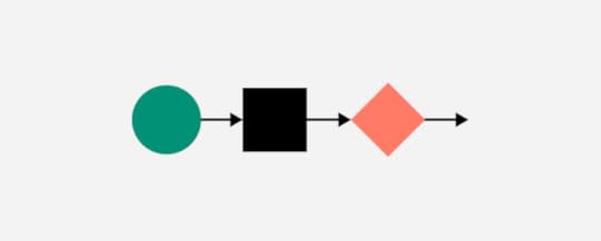
A flowchart represents processes. You have:
Ovals signify the beginning and end of the process.Rectangles represent steps of the process.Diamonds symbolize a decision.The text describes the steps and actions.Document icons that could mean “print invoice” or “review sales report.”Input, output, merge, and other symbols.Arrows show the direction of the process flow.
As you can see that conceptual modeling can take many forms.
And they’re not media dependent. That is, you can create them with a sophisticated design program or draw them on a piece of paper.
Conceptual Model Entities
Conceptual modeling entities are the symbols of real-world objects in a system. Let’s take Google Maps again as an example.
You’ll see that it has lines to represent the streets. Two parallel lines represent West 57th Street to show that it’s a 2-way street.
7th Avenue is a single line because it’s a one-way street. It has arrows to show the direction of traffic flow in the real world.
We’ll talk more about entity interactions later.
In the case of the planetarium, we have spheres that represent the sun and planets. The entity that signifies the sun is at the center of the model. It’s usually a yellow-colored sphere that’s larger than the others.
Closest to the “sun,’ you have the entity (a small sphere) that depicts Mercury. The second-largest entity is farther out and symbolizes Jupiter. And so on with the other planets.
In a flowchart, entities appear as icons with text descriptions.
Entity Classes and Instances
Entity classes are the universals. Instances are particulars.
For example:
Class – StreetW 57th St7th AveBroadwayClass – RestaurantChai Thai KitchenBrooklyn DinerP.J. Carney’s PubClass – HotelPark Central HotelThe WellingtonCourtyard by Marriott New York
Conceptual Model Relationships
Conceptual model relationships depict an interaction between entities.
It’s like forming a sentence where you have a subject, a verb, and an object. The relationship is the verb. The entities are the subject and object.
For example:
Karen Smith (entity) checks in (relationship) at Park Central Hotel (entity).The box office (entity) sells (relationship) tickets (entity).
Conceptual Model Constraints
Constraints govern entity relationships within a conceptual model. You may recall that there are entity classes and instances. One instance might interact with a whole class. A class may interact with other classes. Or an instance may interact with only one other instance. A class might not interact with any other classes. Some possible constraints are:
One and only one. This indicates that only one entity of this type is in the system. For example, an orchestra has one conductor.Zero or one. You can think of this as a yes/no or an on/off constraint. For example, one customer attending a performance at Carnegie hall has a season pass. Another does not. The entity that we call “season pass” has a constraint value of 1 in its relationship with the first customer. With the second customer, the value is 0.
More than one. You express this as a minimum and maximum value. An orchestra might need a minimum of 4 violinists. A full-sized symphony orchestra has no more than 34. The constraint value for the entity labeled “Violinist” is 4 to 34 in relation to an entity named “Orchestra.”One or more. Here you have to have at least 1. An entity named “Musicians” must have a value of at least 1 to have a relationship with the entity “Musical Performance.”Zero or more. This says that it’s possible to have none of this kind of entity and that you can one or more. You might not sell any tickets to a performance. But if the performance hall has 3,671 seats, that’s the maximum value.
Suppose you’re creating a conceptual model for a database for Carnegie Hall. Some of the constraints might look like this:
PeopleMusiciansConductors – 1 and only 1Violinists – 4 to 34Violas – 4 to 12CustomersSeason pass holders – 0 to 1,000Robert Johnson – 1 and only 1PerformancesEvent on 5 April 2021Sold tickets – 0 to 3,671Unsold tickets – 0 to 3,671
And relationship constraints might be:
Conductors (1 and only 1) to violinists (4 to 34).Customers (0 to infinity) to seats (0 to 3,671).Robert Johnson (1 and only 1) to season passes (0 or 1).
Putting It Together
You have an idea for a system, and you know what you want it to do in the real world. Now you need to communicate the idea to your teammates. So far, you’ve looked at the parts of a conceptual model.
Entities – the people, places, and things.Relationships – how the entities interact with one another.Constraints – the number of entities interacting.
You want to keep it simple. Start with the drawing tools inside UXPin. That way, you can quickly share your idea with the entire design team, clients, investors, and other stakeholders.
The great thing about UXPin is that you won’t need to export your design file to another program when you move from concept modeling to prototyping.
Use the box tool from the editor to add entities to your model. Add text inside of a box to label the entity.
You can include the constraints inside the box or add text outside.
Use lines to show entity relationships. If the interaction only goes one direction, draw an arrow. Add text to describe the relationship.
Suppose you’re making a conceptual model for a system to sell tickets to an event at Carnegie Hall. It might look something like this:
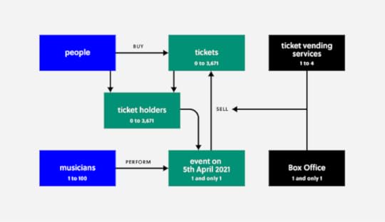
You may have noticed that the entity “People” has no constraint value. It’s omitted to keep things simple. It could easily carry a value of “0 to infinity” or the current earth’s population. You don’t have to show every detail, as long as everyone concerned understands.
Tips For Success
Start from the end. Establish the goal. Who is the product for? What does it do for them?Brainstorm. Create a simple model. Get input from team members. Add details as needed.Evaluate. Do you understand the concept? Do team members understand the concept? Does the model communicate it clearly?Iterate. You may need several versions before finding the best way to convey the idea.
Final Thoughts
When you kick off a UX/UI design project, conceptual modeling can be valuable to any design team.
Establishes entities. It defines the people, places, and things represented within the model.Defines project scope. How big is it ? How much time will it take to build it?A springboard for creating more concrete models.Keeps everyone on the same page. Some team members might not work with code. But everyone needs to understand what’s going on.
For UX and UI designers, a conceptual model is a first step in communicating what you want the system to do for the user.
Keep your model simple. You don’t have to include every possible entity, relationship, or constraint value. Covering every detail can lead to a lot of time waste.
When you create your conceptual model in UXPin, your teammates and stakeholders have instant access. That lets them input their ideas and give feedback.
And there’s no need to export to another design tool when you’re ready to move to the next stage of the project.
The post How To Use Conceptual Models for Better UX and UI Design appeared first on Studio by UXPin.
September 8, 2020
User Interface Style Guides: The Checklist of 5 Things Your Guide Needs
Every product needs a consistent design that helps users make sense of their experience. Without consistency, users will feel lost. Frustration leads to abandoned carts. Your customers will choose an alternative that maintains a cohesive standard throughout its features – and you don’t want that. UI guidelines can help you maintain the consistency that appeals to users.
Creating a checklist with all the necessary UI elements will help ensure that your products appeal to consumers. Before you jump into creating the checklist, though, it’s important to understand the role that UI guidelines play in product development.
Key Parts of User Interface Style Guides
Now that you have a deeper understanding of what user interface style guides accomplish, you can start creating your own style guides that improve efficiency and contribute to your product’s success.
Just one last thing before you start. Use the following UI style guide checklist to make sure you cover all of the items your design team may encounter.
Colors
Every product needs a cohesive color scheme that separates features, communicates with users, and makes the UI attractive.
In most cases, you want to keep your color schemes as simple as possible. Some products, however, require more colors than usual. A video game with several characters will probably need more colors than an app designed to help people budget their money.
UXPin’s Design Systems feature can help you organise your color palette as well as text styles, colors, and icons.
You can also find inspiration from free tools like:
Color HuntCoolersColour Lovers
Text
Text descriptions in your UI style guide should cover features like font, font size, color, and the amount of space between letters, words, and lines.
You may need to create unique text descriptions for different fields in your product. For example, your buttons might use a different font, font size, or color from the text used in your hero banners.
Iconography
Design teams spend a lot of time creating icons that they can use throughout products. A creative system of icons can add personality to your products.
The way that you design icons can help establish your product’s tone. If it’s a whimsical app for finding rideshares, then you can use fun icons that make users smile. If it’s a serious app for filing taxes, then you can use basic icons that provide clear instructions without letting whimsy confuse users.
As long as your style guide contains the same icons, everyone on your team will know which ones they can use.
Patterns
Design patterns play an important role in helping users understand the different parts of your product. Your navigation bar, for instance, might use a pattern that differentiates it from the background, search bar, and forms.
By setting patterns in your user interface design guidelines, you ensure that every element of your product has the correct look. Even a subtle change can confuse users. Consistency is key!
Interactivity is one possible feature of your patterns. Take a moment to think about this aspect.
How do you expect users to interact with your product? Should they push, click, speak, or gesture? Your style guide needs to define the expected interaction so that users know what to expect on every page.
Similarly, you need to define how your design elements respond to interactions. Perhaps scrolling down causes icons to swell and dominate the screen. Or maybe clicking an icon initiates an animation that shows the action’s progress.
UI interactions and story mapping help to create an experience that matches your product’s purpose. You can place interactive design patterns into UXPin’s library for use by many or a select few users.
How UI Guidelines Benefit Both Users & Design Teams

Following a UI guideline benefits your users and team members. It improves the experience for users, who can approach your products with enthusiasm knowing they have the UI guidelines as an accessible resource. It also fosters independence and agency among design team members, giving them access to a variety of tools and approaches.
Benefits for Users
Easier for users to understand the product.Cohesive experiences that make people comfortable using the product.Cross-product branding that helps users recognize other websites and applications made by your company.Intuitive features that people can use without reading instructions.
Overall, adopting UI guidelines makes people feel more comfortable and confident while using your products. That contributes to their brand loyalty, which could lead to greater success for other products.
Benefits for Design Teams
Provide clear instructions instead of forcing designers to “reinvent the wheel.”Give designers access to a library of approved assets and elements that they can add to products.Reduce the amount of time that developers spend seeking guidance from project leaders.Improve collaborative efforts without forcing everyone to work in the same space.
UI guidelines won’t eliminate all of the problems that teams encounter while developing new products, but they can streamline the development process, lower the stress that individuals experience, and improve the time to market.
User Interface Design Guidelines Are Distinct From Other Design Documentation
New designers often get confused by the differences between design systems, pattern libraries, and style guides.
You can remember the differences by thinking about each one as a step in your design hierarchy.
Pattern libraries establish design patterns used by everyone across the company. They usually include design systems. These systems describe everything from documentation to design standards used by designers and developers across the company.
Style guides describe specific aspects of a project’s design. It can include design scales, typography, UI patterns, icons, and other assets used throughout a specific product. The design system and pattern library may contribute to a user interface style guide, but designers should focus on meeting the style guide’s descriptions when working on products.
Why You Make Style Guides at the Beginning of Projects
Creating a style guide can seem like a serious burden. Making a UI style guide could take anywhere from a few hours to a few weeks. However, it’s important to resist the temptation to skip this stage of product development. Over the course of the project irregularities will emerge. When your team doesn’t have access to a style guide, members will make subtle differences that make the product look amateurish and incomplete.Save time and energy by taking the time you need to build a comprehensive UI style guide at the outset of a new project.
Find Inspiration in These Three Outstanding UI Style Guides
On some days, your creative energy makes it easy to create spectacular UI style guides that will blow away users. When you don’t feel inspired, though, making a style guide can feel impossible. On those days, draw inspiration from these three examples of outstanding UI guidelines.
Microsoft
Microsoft has built a comprehensive Windows UI library called WinUI that can add consistency, accessibility, and intuitiveness to websites and applications. The WinUI platform emphasizes modern UI features that put a priority on control, performance, and choice. The platform also makes it easy for you to continue updating your products as Windows and similar platforms evolve.
Code Academy
When Code Academy updated its UI style guide, it made several of its guidelines public. The rejuvenated website uses:
More contrast between elements to keep the color scheme as simple as possible.Fewer form fields to improve conversion rates and reduce typing fatigue.Easily identifiable icons that help users navigate the app intuitively.
Google Material Design

Google developed Material to help developers create websites and applications for smartphones and websites.This is a design system, but provides an excellent gateway to a model UI style guide.
Material feels a bit daunting at first. You expect to see terms like “typography” and “navigation.” “Machine learning,” however, looks intimidating to people without technical backgrounds. The average designer doesn’t know a lot about machine learning. Google provides instructions for using machine learning and other sophisticated tools, but you will need to spend time studying them.
More often than not, you will get the results you need by playing with Material’s design guidelines, components, icons, and other common features. If you ever want to enter the world of coding, you can find plenty of tutorials on Material’s website. Most designers will feel more comfortable using a tool like UXPin, which can simulate interactions and generate prototypes without coding experience.
Make a User Interface Style Guide With UXPin
UXPin’s design tool makes it easy for you to create design systems and style guides for your projects. Your style guide and design libraries can be shared with your team, so all of your designers and shareholders will have access to the same assets.
Want to see how UXPin’s design tool can help you create a design system and collaborate with your team? Start your free trial account to explore all of UXPin’s features. Once you have a design that you like, UXPin will help you turn it into a fully functional prototype. Get the results you deserve by adopting a tool that includes design, collaboration, and prototyping features!
The post User Interface Style Guides: The Checklist of 5 Things Your Guide Needs appeared first on Studio by UXPin.
September 3, 2020
Search Bar Design Guide: How to Get Your Users Where They Need to Go
The search bar is an easily overlooked part of a site during the design process yet users depend on it to find specific information. Since the search bar is one of the most used elements on a website, search bar design has a significant impact on user experience. This article will give you the complete guide on how to design search bars that help users find the information that they are searching for.
Should you have a search bar on your site?
The thinking and psychology behind search bar use is that it helps users find information quickly. Search bars are useful in complex content-heavy sites that have more than 100 pages. In the Business to Consumer (B2C) sector, search bars are used in large e-commerce sites, news sites, deals sites, and booking sites to help users find information easily. They are also used in large Business to Business (B2B) sites that have many customer segments and product lines. If you have a small site that has few pages, a search bar might not be required but you will need it as the site grows.
Ideas to consider when creating your search bar
A search bar is usually made up of two UI elements: an input field, and a button. However, the design of a search bar has a significant effect on how fast users can find the information that they are looking for on your site.
Display your search bar prominently
Make your website search bar easily discoverable by displaying it prominently on your site. The discoverability of your search box is even more important on ecommerce sites or booking sites where users rely on search to navigate the website.
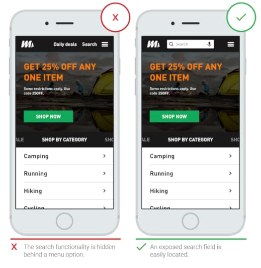
A prominently displayed search box (Source)
Avoid hiding your search box in a drop-down menu or behind the search icon (progressive disclosure) because it makes it hard for users to find it. Additionally, when you hide your search bar, you add an extra action that users have to take before searching your site.
A search bar hidden behind an icon (Source)
Include a magnifying glass icon in your search bars
Icons act as mental shortcuts and visual cues for an action or an object. For the search action, the magnifying glass is the universally accepted symbol, and using it will make it easy for users to recognize your search bar even when there is no text label. When choosing a magnifying icon, choose a schematic icon that is not overly stylized to increase the speed of recognition.

The magnifying glass icon (Source)
Use a lot of contrast and padding to make sure that the icon stands out and make it large enough.
Have a search button in your search bar
Depending on the type of site you are designing, you can choose to have a search button next to your search bar instead of a magnifying glass icon. The button shows users that they need to submit a search query before they can get their search results. LiquidPlanner’s search bar has a prominent search button that is well labeled.
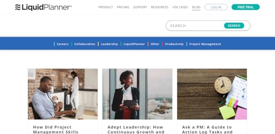
A search bar with a search button (Source)
When creating a search button for your search bar, follow the conventions of good button design by ensuring that it is of the right size and it has enough contrast so that it stands out. Ensure that users can use the ‘Enter’ function on their keyboards to submit their search queries. Some users still use the enter function to submit queries and it’s also good for accessibility.
Use placeholder text to guide users on what they can search for
Use a sample search query as placeholder text to guide users on the search queries that they can make on your site. This is useful for website search bars where users can search for different items. Limit the length of your placeholder text to reduce cognitive load and ensure that there is enough contrast for it to be legible.

Placeholder text guiding users on what they can search (Source)
Design a simple search box
Create a search box looks like a search box and that it is easy to use. Start with a simple search and give users the option to use search filters or advanced search mechanisms if they need to. A good example is IMDb, which allows users to choose the type of search that they want to use. If you make advanced searches as the default, streamline the search box design so that it’s easy to use.
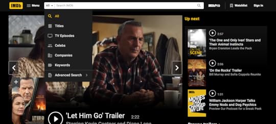
A simple search bar with advanced search options (Source)
Place your search bar where users expect to find it
Website users scan websites using an F pattern and it is important to place your search bar within this F pattern so that users can see it. This is at the top center or top right of your website. Additionally, users actually expect to find search bars for websites at the top of the page. Don’t bury your search bar in the footer, where users have to hunt for it. Use heatmaps to find out the areas of your website where users scroll and click the most (hotspots) and place your search bar there.
Use auto-suggest
Auto-suggest guides users when they are typing out their search queries to avoid errors in search query formulation. Make sure that your auto-suggestions are helpful to avoid confusing or distracting users. Show the difference between the information put in by the user and auto-suggestions by bolding the auto-suggestions. Make your auto-suggestions keyboard navigable to and don’t give too many auto suggestions as this can cause confusion.
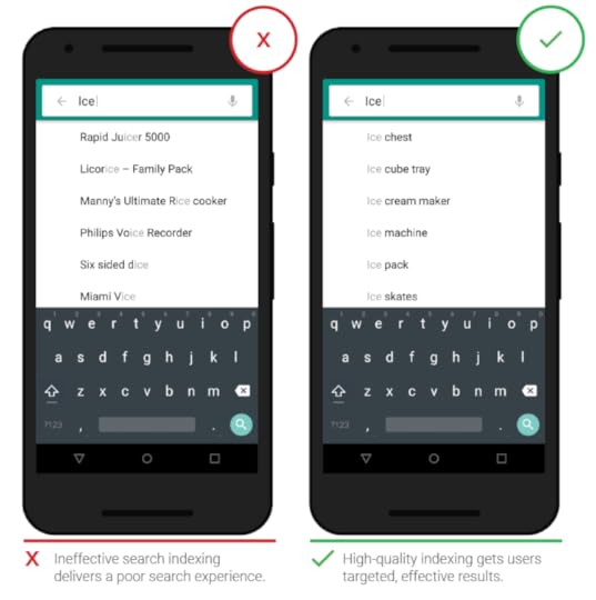
Auto-suggestions (Source)
Put your search bar on every page
In your search bars design,make it possible for your users to always access the search box. The search bar is especially useful in the 404 and other error pages where users hit a dead end.
Use a large field size
If the input field of the search bar for your website is small, users have to scroll back and forth to see what they have typed which leads to poor usability. Make it easy for users to view and edit their search queries by using large input fields that reduce query errors. Google uses a large query input field to accommodate its common search queries.
Large input field (Source)
Size your input fields according to the size of queries that you expect and set your widths with em. Use a growing search box that expands with the users’ search query if you want to save space.
Design search bars with the best UI tool
In order to design search bars that answer your users’ questions, you need the best UI tools. UXPin provides you with an all in one platform where you can design and prototype your search bar as you collaborate with your team members and developers. Sign up for a free trial of UXPin (no credit card required) and start designing your search bar today.
The post Search Bar Design Guide: How to Get Your Users Where They Need to Go appeared first on Studio by UXPin.
September 2, 2020
How a Human Centered Design Process Infinitely Enhances Your UX and UI
The best design is focused on people. Always.
In the world of Web and app design, we often use words like audience, clicks, likes, visitors, and users. Those words remove us a step from the fact that we are designing for people. Behind every click is a human being looking for something — a product, an answer to a question, or entertainment.
The concept of human-centered design isn’t new. The overlap between human-centered design and User experience/UI design is large, though there are some subtle differences. In this blog post, we’ll explore the basics of human-centered design and how it overlaps with UI/UX, provide examples, and outline the process to create a human-centered design.
Here at UXPin, we think all great designs are human-centered.
Human-Centered Design Versus UX Design: Is There a Difference?
In many cases, there aren’t any meaningful differences between UX/UI design and human-centric design. However, there a few do exist.
Firstly, human-centric design is broader than UX/UI design. The concept covers ALL design — physical and digital.. We give designers the tools to create great user experiences online. In our context, UX Design is focused on the techniques and strategies for creating people-focused design for apps and websites. Think of human-centered design as a mindset and philosophy and UX/UI design as a professional role.
The other difference is a subtle, but important one. Here’s a great explanation of human-centered design from IDEO.org, the design firm behind Apple’s first mouse:
“It’s a process that starts with the people you’re designing for and ends with new solutions that are tailor made to suit their needs. Human-centered design is all about building a deep empathy with the people you’re designing for; generating tons of ideas; building a bunch of prototypes; sharing what you’ve made with the people you’re designing for; and eventually putting your innovative new solution out in the world.”
When you scan the think pieces about human-centered design, the word “empathy” appears everywhere. The designers must have empathy for — and a deep understanding of — the people who will use the product.
User experience/User interface design is focused on ensuring that website visitors or app users can access features intuitively. Actions are streamlined to remove sticking points from the user’s journey. Obviously, having an empathic connection with and deep understanding of the people who will use the website will improve design, but it’s not always a core element in the UX/UI design literature.
Here’s the definition of UX Design from whatis.com:
User experience (UX) is the art of planning a product’s design so that interactions with the completed product will be as positive as possible.
This includes an end user’s interaction with and attitude toward a given IT system or services, including the interface, graphics and design. IT leaders concerned with UX ask questions to determine what their users need and value, and compare those findings to their IT system’s current abilities and their limitations.
User experience design (UXD or UED) addresses all aspects of how a product or service is perceived by users. Elements of user experience design include:
Visually pleasing and interactive design;An information architecture that presents information in an organized fashion, paying special attention to features such as design and navigation themes;AccessibilityHCIErgonomicsUtilityPerformance.
As you can see, there’s not a huge difference, but the focus on empathy is crucial — and can be the difference in creating just another website versus creating a website people love to use.
To sum up, the focus of human-based design is obvious, but we’re going to say it anyway. You are designing for people, in our case, for online apps and websites. You must have a deep empathy for and understanding of your audience and place them at the center of your UX design and NOT add design complexity to show off your dazzling design abilities — no one cares unless it makes their life easier. However, when you combine your dazzling design abilities with empathy for the people who will use your design; the result is dynamite.
Human-Centered Design Examples
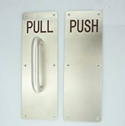
Before showing Web examples, I’d like to show one of the best examples of human-centered design – The Norman Door.
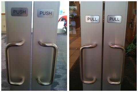
When the human brain sees a handle on a door, we are triggered to pull. I’m sure all of us have at least once pulled on a door that says “push”. The solution proposed by Don Norman, who is a UX researcher, is fairly obvious in retrospect.
The focus on functionality and usability here is based on understanding how the human brain works and responds to prompts and our environment. Another common example is children’s toothbrushes. If you have children, you know how “fun” it is to get them to brush their teeth. Children’s toothbrushes are shorter; have large, easy-to-grip handles for smaller, less coordinated hands; and comic characters are often designed to encourage brushing.
TV remotes are another example, with the most frequently used functions (volume, channels) more prominent for ease-of-use and ergonomically placed where either the thumb or index finger fall (depending on the design of the remote). examples we’ve all experienced are the evolution of the TV remote to having the most used buttons — volume and channels — moved to the top of the remote. Last but not least,, inverted condiments — no one misses smacking the bottom of the ketchup bottle to get the last bit out.
In Web design, Trello is a good example of a tool that removes clutter to focus on project management and collaboration. Trello removes clutter and allows individuals and teams to keep track of projects. Here’s the project management template Trello uses.
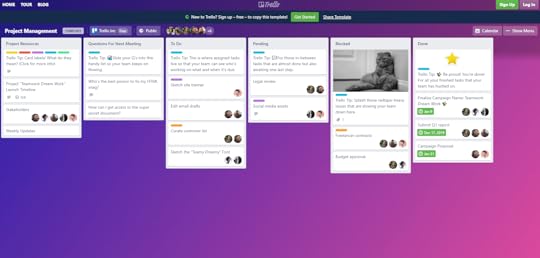
The simple structure is easy to navigate, update, and keep an eye on progress.
The Google search page is a masterpiece of simplicity. There’s a daily image. The search box (which suggests topics as you type, helping people find what they’re looking for). At the top right, those with Google accounts can easily sign in.
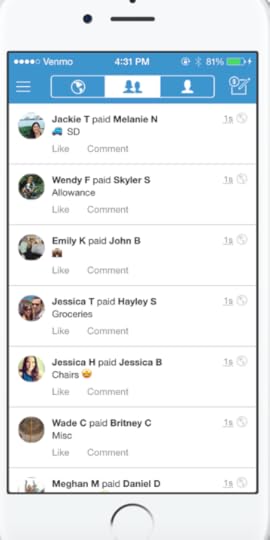
Venmo is another triumph of human-centered design. Think about how painful it can be to pay someone back — get cash and give it directly to them, write them a check and mail it or hand it to them (which they then have to deposit); Paypal can be clunky; and unlike Europe, bank to bank exchange is difficult in the US;
Venmo is a simple, easy to use app that even strangers can use to pay each other — for freelance work, for your fantasy football league dues, anything.
Human Centered Design Thinking
Always include humans in the design process. In too many projects, no one talks to the people for whom the project is intended. This seems so obvious that it shouldn’t need to be said, but you have a greater chance of designing a website or app that people love when you include the people you want to love it in the design process.
There is a wealth of resources about human centered design. This is a very short list to provide a broader perspective for you.
How to Utilize Human Centered Design for Your Website. A quick, refresher view of the process. A Guide to Human-Centered Design Methodology and Process. A comprehensive look for UX designers about the process.Top 4 Principles of Human-Centerd Design. Exactly as the title says.Wikipedia has an entry on Human-Centered Design that covers criticisms as well.The Four Fundamental Principles of Human-Centered Design and Application. A more scholarly approach to the topic. Using Human-Centered Design to Create Better Products (with Examples). An explanation and then a look at a number of examples to illustrate the concept.IDEO has a Design Kit and additional resources for human-centered design.Why Human-Centered Design Matters. From Wired, good insight from a practitioner of human-centered design.
Without vetting them, we didn’t want to list them, but it’s worth mentioning there are a range of online courses on human-centered design.
Human Centered Design Methodology and Process
The methodology of human-centered design aligns with the UX/UI design process. Different proponents of the methodology have slightly different processes, some have three steps. Others suggest five or more. Here are five steps for a human-centered design process.
Empathy/Know your humans (end users).
You should have personas developed by speaking with the people who should use your design. Feedback from social media, beta testers, interviews, etc. are crucial to understanding what your people actually need, not just say they need.
Every UX and UI designer can benefit from understanding the human-centered design process. As we’ve discussed, the differences aren’t huge. The biggest switch is a mental one. Stop thinking of users, clicks, and views and always keep the idea that you are designing for people at the forefront.
That will keep you focused on what matters — delivering a user experience that will keep the people you serve coming back for more.
You need to have empathy and a deep understanding of the needs and frustrations of the people you’re designing a solution for.
Define the Problem.
Define the problem by asking “why?” What problem are you solving for? The goal is to get to the fundamental problem or issue, not focus on the symptoms. Keep digging until you understand the action that needs to be accomplished.
Generate Ideas
Time to brainstorm. At this point, don’t limit yourself. Gather as a team, even with the end users you’re designing for when it makes sense, and write down ideas on a whiteboard, Post-It Notes, whatever. Come up with as many ideas as possible.
Prototype
For UX/UI design for apps and websites, it’s time to start wireframing (UXPin is a fantastic choice for wireframing, click here to try it for free). Get to a minimally viable design and begin testing. The goal isn’t perfection at this stage, but to create a design to beging gathering feedback.
Test and Iterate
This part of the process is a core piece in any design protest. Test, see what works and what doesn’t. Gather feedback from the people you’re designing for. Don’t be defensive. Remember that while something may make sense to you as the designer, it may not for the people you’re designing for. And you’re creating something for THEM, not yourself. Keep the first element of this process in mind — empathize. Uncover why something works or doesn’t work for them, then make it better. Then, of course, do it again.
The best part of incorporating human centered design methodology into your UX design process? Everyone wins. Your intended audience is more likely to love the website or app you design for them. In turn, these websites and apps are more likely to be successful — and profitable.
Using UXPin as they Lynchpin of Human-Centered Design
The UXPin platform is ideal for bringing a human-centered design for a website or app from conception to life. With the ability to gather feedback from anyone at any stage in the UX design process, UXPin provides designers with the tools they need to create a great design and the suggestions and ideas of the humans they are designing for.
[I’d create and add a button CTA here — Try UXPin for Free; Free Trial, Demo, etc.]
The post How a Human Centered Design Process Infinitely Enhances Your UX and UI appeared first on Studio by UXPin.
September 1, 2020
Affordances 101: What You Can Learn About User Interactions
Users require physical clues on what they should do on your site and where they should do it. This is where visual clues or affordances come in; they show users what they should do. This article will show you how you can design the best affordances to guide your site users.
What is an affordance?
The term affordance refers to the properties of an object that imply how the object can be used. Affordances give clues on how an object can be used to carry out an action. For instance, the slots on a vending machine are affordances, they show you that you can insert something, perhaps a coin in order to make a purchase. The possibility of inserting something into a slot, is its affordance.
In the context of UI and UX, affordances are used to help users know what they should do without having to use pictures, labels or instructions. A great example of affordances are buttons, users know that buttons can be pushed because they resemble the buttons that they encounter and push in real life. The likelihood of a user pushing a button is the button’s affordance.
Affordances provide useful visual cues and psychological shortcuts that help users understand the tasks that they can carry out on a website or within an app. When used well, affordances make your designs intuitive and easy to use, which increases conversions.
Affordance vs Signifier: Key Differences
What’s the difference between an affordance and a signifier? A signifier indicates that an affordance exists, it can be a mark, a sound or a label. Microcopy on a button that states ‘click to create an account’ is a signifier that indicates the presence of the affordance of pushing a button.
Types of affordances
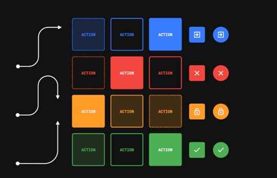
For you to understand how you can use affordances to improve user interactions, you need to first understand the different types of affordances available. They are: explicit, hidden, pattern, metaphorical, false and negative.
Explicit affordances
These affordances give cues using the physical appearance of an object or language. Buttons that have a high contrast and resemble real life buttons afford pushing. Similarly, an input field with the words ‘enter email address’ affords an email address being entered. Facebook uses explicit affordances on its buttons that are clearly labelled as ‘Log In’ and ‘Create Account’ and on its input fields that are also labeled.
Explicit affordances (Source)
These affordances are said to be explicit because almost anyone can understand how they need to interact with the element, even if they have never interacted with digital interfaces before. Explicit affordances are easily discoverable by users and are thus well suited for users who are not tech-savvy and do not understand common design conventions or patterns. These affordances are also useful when you are introducing new or innovative digital interfaces that users are not familiar with.
Hidden affordances
Hidden affordances are not revealed to the user until they take a specific action such as hoovering or mousing over an element. The drop down menu is a hidden affordance where the user cannot see the other menu items unless they click on or hover on the parent tab. The Asos Marketplace website uses a drop down menu to display more clothing categories. Users cannot see this drop down menu until they click on the clothing tab.
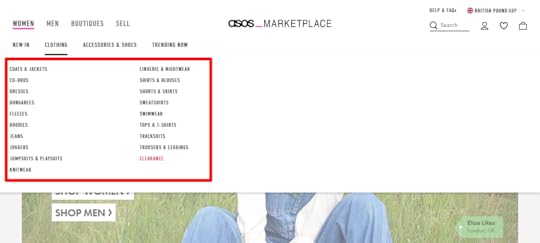
Hidden affordances (Source)
Hidden affordances are used to reduce clutter and emphasize on the hierarchy/level of importance of the actions that users can take. However, there is a danger that users might not know how to reveal the hidden affordances. This danger shows that hidden affordances should not be used for important actions and should be reserved for actions that users can do without.
Pattern affordances
Pattern affordances are the most common type of affordance because they rely on patterns that users already recognize. The navigation on the homepage of a website is a pattern that many users understand and therefore many websites, such as Apple, have a navigation on their homepages.
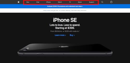
Pattern affordances (Source)
Another pattern is the logo on a website which takes users back to the homepage when clicked. Users also understand that in a body of text, text that has a different color, is underlined or italicized is almost always a link.
Patterns provide useful mental shortcuts for users which removes the need for memorization. Patterns are useful when designing for an audience that is tech savvy but might be confusing for audiences that have less experience with digital interfaces. As a designer, you should be wary of breaking existing patterns because users will have to learn the new pattern before they can recognize it.
Metaphorical affordances
These affordances use real-life objects as metaphors for actions that users can take. Metaphorical affordances are used in many interface icons to inform users of the actions that they can take. The magnifying glass icon affords searching, the envelope icon affords sending an email and the plus sign icon affords creating something new like a document or email.

Metaphorical affordances (Source)
These affordances can be contextual as in the case of the magnifying glass ison which affords searching when put next an input field and affords zooming when put in a document viewer. Because of their relationship to real world objects, metaphorical affordances are useful for communicating complex tasks quickly as users can easily understand them.
Negative affordances
These affordances tell users that some design elements are inactive and that they cannot be acted upon. Such affordances include greyed out buttons or input fields that can only be activated if another action is complete. In the example below, the password input field can only be activated when the user clicks on the change button.
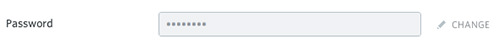
Negative affordance
Negative affordances are useful in guiding users on the order in which they need to take action. A user cannot submit a form unless they fill out all the fields, so the submit button is greyed out and only becomes active when all the fields are filled out.
False affordances
These are affordances that appear to afford one action but actually afford another action or no action at all. A piece of text that is colored and underlined but not linked is a false affordance. A greyed out button which affords the pattern of being inactive but is actually clickable is a false affordance. This is the case on Medium, the ‘Manage Publications’ and ‘Manage Newsletters‘ buttons are greyed out and thus look inactive but they are actually clickable. 
False affordances (Source)
False affordance causes user errors and lower conversions, so designers should avoid them.
How to design the best affordances
When done right, affordances reduce user errors and cognitive load while improving user experience and increasing conversions. Here are some tips to help you design the best affordances.
Always put the users first by researching their needs and their context. This information will help you to design helpful affordances for your users. Create logical and clear affordances which will make it easy for your users to intuitively understand your affordances.Use signifiers to provide more information to your users about the affordances you design. You can use text labels, highlights, color and shadows to male affordances obvious. Follow common design conventions to make it easy for users to understand your affordances.Use size to show your users the affordances that they should prioritize.
Design the best affordances
Affordances give users metal shortcuts that help them understand the tasks that they can carry out on a digital interface. Use UXPin to create realistic buttons that get clicks and use the pattern library to create clear and consistent affordances throughout your designs. Sign up for a free trial of UXPin today and start collaborating with your team on your affordance designs.
The post Affordances 101: What You Can Learn About User Interactions appeared first on Studio by UXPin.
August 27, 2020
Consider Website User Flow: a Guide to Understanding Your Site User’s Journey
Understanding your site user’s journey is foundational to designing a better user flow on your website. When users are ready to learn more or take action, is the path clear? Or is their journey disrupted by a broken or disconnected experience? When this happens, users get frustrated, bored, or decide to search for an alternative. Mapping the site user’s journey to the user flow means more than just making sure that buttons work, are easy to identify, and have a clear call to action, although it means that, too. It means understanding the objectives and pain points of visitors so that each touchpoint gives them the feeling of progress and motion along a journey and a sense that their action is being properly rewarded.
When they click on a button or link are their expectations met? Does the content answer their question? Does it unfold effortlessly, or does the user have to work hard or face too many choices or unclear alternatives? When they are ready to act, can they immediately do so? Too many options and no clear flow can confuse and overwhelm the user, while too prescribed a path can feel controlling. The correct balance is a flow with options and a few paths forward, giving users both control and direction. Before designing your own unique user flow diagram, take the time to map out the objectives of both your company and your customers. Where those circles overlap will be the basis of your flow.
Structuring Your Website for Effortless Flow
In evaluating how your overall website design will drive conversions, assign priority numbers to the user tasks that your site will help them achieve. Those numbers will form the basis of your user test protocols once the prototype is ready. When the user can navigate through desired content intuitively, follow relevant links, and reach conversion forms with minimal friction, the rest is fine-tuning. This all comes from matching your site to your user expectations through excellent design.
The 5 Critical Elements of Flow Design
The elements of your website design can either propel the user toward conversion points or interrupt the flow, generating hesitations and bounces. The elements that must work together at a structural level are the content flow, internal links, buttons, navigation, and internal search options.
1.The Scannability Factor in Content Flow

Your content design begins influencing the user before they even read the words or recognize the images. Users scan the page and begin forming their judgments by layout alone. The ideal content delivers a message at the page level, no matter what else changes with the pieces of content themselves.
For example, big chunks of text will require commitment and concentration. That has value, but only for specific users under limited conditions. Model the most likely set of emotional conditions that bring users to your site. You can see this principle in action with Atlassian’s content strategy. The design team starts with “empathy for the end-user and their emotions in using the products.”
Above all, clear copy, clean visuals, and clear articulation of the value being delivered helps the user make a decision rather than puzzle over what it means and how it helps them.
2. Intuitive and Relevant Internal Links

Once your content design is in sync, the next step is weaving it all together with links. Great internal links accomplish three things at once:
They streamline user flow across the entire siteThey clue in the user to the hierarchy and architecture They boost authority and SEO rank for all linked pages
Contextual internal links connect relevant content pieces to keep the user engaged while they pass on link equity from your pages with the best authority. Collecting data on how users click through the prototype can help the team understand how intuitive it feels to your users, and if the touchpoints address their pain point or aspiration. The links should guide the user along the journey, progressing them along a well-designed path of exploration and discovery and rewarding them for their effort.
3. Buttons That Convert

A button is a doorway. By clicking, the user expects to enter another world within your site where treasures lie. Good user flow means buttons that are easy to recognize, contain action words that define the function completely, and offer visual clues to what is happening behind the scenes after the user presses the button. Color, shape, and language all play a role in determining whether the user will progress along their journey., but users also expect familiarity and reliability above all., as well as consistency across the site.
Analytics will bring you facts like where users bounced and dwell time, but it can’t answer the really important questions, like why they bounced or whether the dwell time represents hesitation. Button A/B testing can answer some of the biggest questions because the button is the number one unit of user interaction on most sites.
Before a user can get to a form where they enter their information, they will have to click on a button or navigation link to get there. Your content guides users to the doorway but the button is what ushers them through. Devote development time during the structural phase to best practices in button design, including the psychology of what makes a button appear more inviting.
4. Navigation That Impels Action

When mobile overtook the desktop as the primary way that users access the web, some of the biggest changes for design professionals came in the science of navigation. The loss of on-screen real estate and the replacement of a mouse with a finger changed everything in terms of what was important for the user as well as how to display those links attractively. The three-lined hamburger button with its slideout menu remains the default for many apps, but it’s not necessarily your best option. Even when it is, there’s an art to choosing just the right amount of links on that slideout.
Navigation really deserves to be a project all its own due to all the possible combinations and the implications of each. Take a look at 16 navigation trends we’ve deconstructed for their value to various UX schemas.
5. Keeping the User Engaged with Internal Search

As search gets smarter and loading times accelerate, user tolerance for wait times has evaporated. Up to half of your users will go straight to search when they visit your site and all will bounce if they can’t find what they want fast enough. Microcopy, such as placeholder text in the search bar, has proven effective in coaching users on how to search the site.
Review your search log database for the best examples of how users found what they wanted. Add autosuggestions to complete the search and push related search items into the results to improve flow. Eventually, some users will come up with 0 results. When that happens, suggest links that will dial the flow back up before the user gives up.
The Art of Shaping the User’s Journey
Great design and user flow are all about making the journey as fulfilling as the destination while eliminating friction and driving the action forward to a final destination. Ultimately, the user flow is a simulation of an internal cognitive experience that drives the user along not just a series of links and semantically-related content, but a narrative imbued with emotional resonance and the power of storytelling.
To help get there, UXPIN User Flow UI kit provides all the elements and tools to shape and drive the user journey, built directly into our powerful and agile design tool. With flowcharts and prototypes in one place, the kit includes fully editable visual elements that allow teams to easily build clean, functional flows for their prototypes. Working between a holistic vision of the user journey together with the functionality to drill down into the details and make granular adjustments, this kit can help both designers and non-technical team members collaborate more effectively and optimize the customer journey. Working within UXPIN’s prototyping tool, work teams can:
Easily share flows with stakeholders and gather feedback from the team;
Collaborate, share and comment on designs and user flow elements;
Test and track user behavior, gaining a more nuanced view of the customer journey.
Ready to start building user flows and mapping the journey easily in an intuitive tool designed by designers for fast-moving prototyping and design in a changing world? Start creating flowcharts and diagrams today with a free trial of UXPIN’s prototyping tool.
The post Consider Website User Flow: a Guide to Understanding Your Site User’s Journey appeared first on Studio by UXPin.
August 26, 2020
Heatmaps Guide: What Hot Spots Indicate About How Users Experience Your Site
No matter how tight your design is, users may interact with it in a different way than you intended. Heatmaps give you a visual picture of how users are experiencing your site which then gives you the information you need to optimize your site. This article will explain how to use heatmaps effectively.
What is a heatmap?
A heatmap analyzes data on how site visitors browse a web page and then presents this data visually using color. Warmer colors indicate web page areas that get more attention (hot spots) while cooler colors indicate areas that get less attention.
The results from a heatmap are easy to understand, which makes them a very useful decision-making tool. You can create a heatmap by using software tools such as CrazyEgg or Hotjar. The process is fairly simple: specify the page you want to track, set up the tracking parameters, and then check back for the heatmaps.
Types of heatmaps
There are several types of heatmaps that display information about different types of user behavior.
Hover (move) maps
Hover maps show you where site visitors moved or hoovered their cursors on your web page. Areas with bright colors (hot spots) show that users were paying a lot of attention to the design elements there.
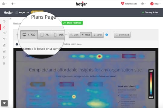
Example of a hover map (Source)
Scroll maps
Scroll maps show you how far visitors scroll down a page and the percentage of visitors that scroll to the end. These maps are useful in sites that have a lot of content because they can help you optimize the length of your content.
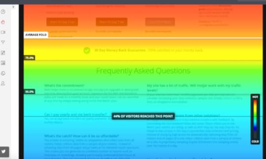
Example of a scroll map (Source)
Click maps
These show you the exact elements that your visitors click on your site plus the number of clicks that each element gets. Elements that get more clicks have warmer colors than those that get few clicks.
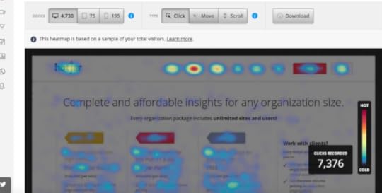
Example of a click map (Source)
What Hot Spots Indicate About How Users Experience Your Site
Hot spots on a heatmap tell a visual story of how visitors are experiencing your site. They can indicate distraction, confusion, or interest. Here is how to interpret heat map data and use it to improve your site’s UX.
Distracting elements
Too many hot spots on elements around your main Call to Action (CTA) button indicates that your site users might be distracted from the main CTA by other UI elements. For instance, if your site has a cluttered sidebar next to the CTA button or a form, the sidebar might distract the users and prevent them from taking action.
If your heatmap indicates that your users are distracted, you can increase conversions by removing the distracting elements. Ensure that the attention ratio (ratio of actions that users can take to the actions that they should take) of your page is low. Additionally, you can make your CTA more prominent by using white space, increasing button size, and improving color contrast.
Confusing elements
Often, click maps show that users click on unclickable elements such as images a lot. If you see a lot of hotspots on unclickable elements, it means that your CTA buttons are not prominent enough and your users want to take action but they don’t know how to. This frustration might cause high bounce rates and poor conversion rates because users leave when they are frustrated.
To fix this, ensure that your CTA buttons, forms, and other interactive UI elements look like the function that they are supposed to serve. As a designer, some design elements such as ghost buttons might look fairly straightforward and easy to understand but that may not be the case for your users. Alternatively, you can modify some of these confusing elements and make them clickable if you find that users click on them a lot.
Scroll maps can also indicate confusion if a large number of users drop off your page at the same point. There might be a design element such a page break that confuses users and makes them think that that’s where the page ends. Look at the drop off point carefully and fix any confusing elements that you might find there.
Poor page layout
A scroll map shows you how far down a user scrolls and you might find that your CTA button is placed too far down the page. If your visitors don’t see your CTA buttons then they can’t take action. You can fix this and improve conversions by moving your CTA buttons above the fold and into the hot spots where more users will see them.
A flawed user journey
A click map can help you understand where users are getting stuck in their journey. You might find that many users in an e-commerce store are unable to check out their carts after shopping or that users get stuck on one particular step when signing up for software. This indicates that there is some friction in that step of the user journey and you should explore why this is happening.
If they are clicking on other non-CTA elements, it might indicate distraction and if they click on unclickable elements it might indicate confusion. Either way, a heat map will help you diagnose the problem and test possible solutions.
UI elements that are working very well
Heatmap hot spots also indicate design elements that are usable and provide a good user experience. If users click on a CTA button often or scroll to the end of a page, it shows that these elements or copy are working well.
Positive feedback is important because it helps you know what you are doing right and thus use that information to improve other pages on your site that might not be performing very well.
Want To Improve How Users Experience Your Site?
Heatmaps are an excellent way of finding out how users experience your site. They let you know what’s working and what’s not working so that you can fix the problems and increase conversions while improving user experience. UXPin offers an all in one platform where you can design, prototype, and develop sites that convert users.
The post Heatmaps Guide: What Hot Spots Indicate About How Users Experience Your Site appeared first on Studio by UXPin.
UXpin's Blog

- UXpin's profile
- 68 followers

