
UXpin's Blog, page 86
December 8, 2020
Design Budgets

Depending on the type of client you’re working with and the budget size, some things are going to be higher up on the priority list in regards to others. When you need to do a design project on a budget, keeping control of the spendings is vital to ensure a healthy percentage of ROI (return on investment).
Even if you have a small budget you can still knock a project out of the park and create an impactful design for the user if you decide to follow along. So it is not a question of how to break the small design budget barrier but instead how to embrace the situation and pivot.
How to design on a small budget?
To design on a small budget is not a small feat. Indeed, to keep within the constraints of your predetermined design budget you need to tackle some important aspects. These will, directly and indirectly, affect your project expenses whether you like it or not. So better to be safe than sorry.
Things to keep in mind when dealing with a small design budget:
Manage Expectations
Scope of Project
Process and Strategy
Project Management
Team Communication
Implementation
Focus on The User
Follow along as we go through each of these steps so you can see how all of them are interrelated and how to make the most of it when designing on a budget.
Manage Expectations
The client brief and discovery session should answer all possible questions concerning the project that both parties might have. There’s no space for assumptions so they will need to be removed from the equation and replaced with specific and accurate answers.

How to tackle the client brief and pave the way for a successful ongoing relationship:
Help the client get familiarized with the process and the development of the project.
Set up realistic expectations right away.
Don’t over-promise and under-deliver.
Address the immediate pain-points.
Show the client that you’re professional and serious while being friendly.
Helping the client understand what they are getting into and the project you are both about to embark on will help them feel assured and will remove buyer’s remorse.
Define the Scope of the Project
Project analysis and scope determination is something that needs proper attention if you want to ensure smooth project flow from early stages all the way to late-stage implementation and testing.

Also, having a style guide to consult or reference during the project will provide you with the benefit of saving both time and money. It facilitates the sharing of resources and effectively streamlines the process for everyone included.
A style guide will keep every team member on the same page instead of getting bogged down on the details regarding the visual side of things. That way the devs can spend more time working on implementing the design created by the UX designers.
Having a Clear Process and Strategy
You will effectively eliminate expenses creeping up on you if you have a detailed process to rely on so you don’t waste your already precious resources on things that don’t matter. Employees, professional software, outside collaborators, project management tools, research staff, all of these count as resources.
Outsourcing some of your work can be an effective cost-cutting measure and will also free some of your in-house UX designers or developers to work on the more important stuff. It goes hand in hand with a smaller design budget project
The Value in Effective Project Management
Managing the project every step of the way so that every department team is on track is even more important when working on a design project with a small budget. Not all people naturally possess organizational and time management skills.
So, having a DesignOps team to manage the design process within your company will result in higher efficiency and consistent workflow without any hindrances.
In regards to project management, you will have to make plans with the DesignOps department about prioritizing certain tasks over others while still collaborating simultaneously with all sectors.
When working with a small budget the one thing to keep in mind is the balancing act of delivering a product that doesn’t tip the scale between backend functionality and visual design. This ties in perfectly with the “don’t over-promise and under-deliver” advice we gave you earlier in the article.
Team Communication
Establishing proper team communication is also vital when you have a big design project and a small budget on your hands. Communication will keep everyone in the loop on every task that’s going on. Building rapport is also an important piece of the puzzle called team communication.

By the way, updating each other often when working on tasks so that the project is going in the desired direction is something you’ll need to get into the habit of doing. That is, if you wish to improve team communication.
Besides that, the hidden benefit behind great team communication can be the abundance of design ideas that can be produced organically and help you get a better and more polished final product.
Implementation
It’s obvious – functionality is king whether you’re working with a big or on a small budget design project. But even more so on smaller ones because of the inability to spend money on extensive research.
Know that you can’t kick a project back into the development cycle if things don’t go as well as expected. You don’t have the budget for it, so, make time count and make things worthwhile.
So, if you spend extra time on implementation rather than making a pretty design, it will give you that boost of confidence when delivering the final product.
Focus on the User
Although a small budget can pose a challenge, it shouldn’t dictate the process and direction of the project. Regardless of your budget, the focal point of every project is to create with the user in mind.
If your plans are to make a significant amount of return of investment in a short timeframe, then user satisfaction in every aspect should be one of your top goals.

Work on CRO (conversion rate optimization). Heat mapping will give you an insight into how the users interact with your product and A\B testing will help you tailor the experience to your user as much as possible.
Summary
Let’s wrap it up with a few final notes. You can always add value to a project, regardless of the budget. Don’t forget to design and develop with the user in mind, even involve them in the design process They are the key to maximizing your ROI. User insight is the most valuable ingredient when working on a small budget design project.
And, always challenge yourself in all the different aspects of the project, while working within the constraints of the budget.
Have you ever had to work on a project with a small budget? What was your approach?
We’d love to hear.
The post Design Budgets appeared first on Studio by UXPin.


December 3, 2020
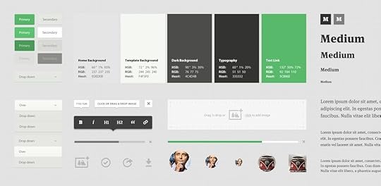
How to Create a Style Guide to Enhance your Brand’s UX?
In the world of UX (user experience) and UI (user interface), one thing that you should always keep in mind when starting a project is a style guide. It will help you enhance your brand’s user experience and bring it to a whole new level.
A style guide will help you craft a consistent design system. It will pave the way for effective communication of ideas and the creation of great content. It will save time when working without hindering productivity and most of all, will showcase your brand and company in the most professional light.
The whole UX process that involves meticulous planning, heavy research, and testing in order to nail down the details of human online behavior is done so that the company can convert while the user meets their goal and fulfills the purpose of their online browsing. It’s a win-win situation for both sides.
But, in order for that to happen, it requires a repeatable process that yields repeatable results (success).
What Are the Benefits of Having a Style Guide?
At the beginning of every cohesive project lies the genius of the style guide, which is why every team member should take notice of and reference the document as much as possible when working.
Let’s go through some of benefits of having a style guide:
It will be easier for the front end developers to write their CSS and HTML by referencing all the important information and data, find hex codes for colors easily, reuse UI components, SVG files and quickly find and extract any other asset that they may require.Will help the UX designers to craft responsive layouts that fit the brand’s style. The social media managers can consult the document to use the same exact typeface, color palette, and graphic assets to create a consistent social media feed.The creative writers will produce copy that corresponds with the brand’s specific tone of voice.
Having a style guide to define the scope, style (duh!), visual direction, and tone of voice prior to starting a project can be really beneficial to all team members. From the front end devs all the way to the design team, project managers, researchers or strategists.
In addition to that, it can also be a reference point to help you craft the end-product you’ve envisioned and guide you (duh!) so you don’t stray away.
A UX/UI style guide document will help you meet deadlines, keep productivity high at all times, and avoid stress in general.
Style Guides or Brand Guidelines?
Let’s quickly make one thing very clear – style guide is not a brand guideline book.
Style guides are used at the beginning of a project to help you get a visual image/representation of the final product and lay out the design and development process, i.e, what to expect.
Whereas the brand guideline book is a document that specifies the usage of certain brand elements like logotypes (primary and secondary), graphic elements, patterns and icons, and their application in web, print, and other media. It also suggests the optimal application size and spacing for every brand asset.
If you abide by the rules of a style guide and utilize what is given to you, you won’t have to worry about these things:
Typography / TypefacesColor paletteIconsImagesUI componentsHEX codes, CMYK, and RGB valuesTone of VoiceCode Documentation
You just have it laid out in front of you and to spare yourself the headache and possibly dozen iterations, all you have to do is consult your C3PO in the form of a digital style guide document.
One such thing worthy of praise is the NASA Graphics Standards Manual, Mailchimp’s style guide, or Barnes & Noble’s ui style guide.

So, after this brief intro, you might already have a faint idea of what is a style guide, but to help you grasp the full concept of it so you know how to create one, follow along with this article.
Style Guides and Brand Messaging
If you made it so far, we’re pretty sure you already know what a style guide is. Let’s instead, touch a little bit on the brand side of things and make a discourse to put a few words about brand messaging..
According to Marty Neumeier, a brand is a gut feeling (The Brand Gap).
“A brand is a person’s gut feeling about a product, service, or company. It’s not what YOU say it is. It’s what THEY say it is”. (Marty Neumeier, The Brand Gap)
It’s all about making people feel safe, secure, cozy and everything you want them to feel. Think of it like this way: When a potential customer comes into contact with any of your brand’s touchpoints, be it the website, app, or other digital and printed media, you get the chance to influence that person through color, typography, copywriting, clever UX and clean UI. It’s your brand’s time to shine.
What Should a Style Guide Include?
As already mentioned, a style guide that can effectively serve as a reference point to consult during the design and development process in a project should at least have these crucial elements:
TypographyColor PaletteUI ComponentsImages
As we already mentioned the defining elements of a style guide, it is time you learned how to create.one.
How to Create a Style Guide?
A style guide will give you full control over a project from start to finish.
Now, let’s break down the crucial elements one by one and see how every piece of the puzzle helps drive optimal design decisions and keep brand consistency.
Typography
Implementing typography the right way is not as easy as it may seem.
For example, the formatting and structure of a website’s copy or a brand’s overall tone of voice expressed through copywriting is very well one of the most crucial aspects to consider.
So, as mentioned, you can encapsulate the goal and mission of your brand through a well-written copy and storytelling or encourage a user to engage your CTA’s (call to actions) that may lead to conversion.
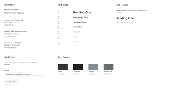
On the other hand, proper, SEO-friendly content formatting and structure with clever use of character spacing and line height is something that can elevate the experience to a whole new level. Using headings like H1, H2, and H3 to introduce hierarchy in a text should be standard practice.
After all, a big chunk of a website is the typography. You want the paragraphs on your homepage and the rest of the website to look clean and not like a ransom letter.
It should be clear, alluring, legible, and high-converting. Determining the right font size for the body and the headings to provide the best possible legibility should be high on your priority list and is one of the most important accessibility features.
Knowing what typeface and font size to use for headings and body text right away instead of experimenting and trying to find the font on their own can be a time-saver (not to mention a time-saver) for the ux designers and the developers who are usually working closely.
Color Palette
Much like the typography on a website or app that helps convey the tone of voice, the colors used within a brand’s visual identity help evoke a certain emotional response from the user. The right color palette can affect the user’s mood at the moment and improve their feeling about the brand which translates to a higher possibility for conversion.
Colors are one of the main features of every brand identity and style guide. They carry a lot of weight in their shades and hues. A color palette can affect a user’s buying psychology and express a particular set of emotions and vibe that reflect the brand’s voice.

Every brand has a set of primary and secondary colors.
When choosing colors to create a color palette, you have to define the primary and secondary colors in respect to your brand’s attributes. The primary set of colors will carry over to the main brand assets and that’s why it’s important you nail them.
The secondary set of colors are the accent colors. They help you contextualize certain UI elements and text on a webpage and make things even more clear for your users and customers.
The Accent or secondary colors can be utilized for links, text, buttons, menus, animations, forms, or input fields to give off a distinct look that explains an action or conveys context to a user.
One thing worth mentioning though is that accent colors and primary colors should always play well together when matched. You want to create a harmonious color environment where there is no conflict between the interplay of colors.
And ultimately, choosing a suitable color palette can help you create brand positioning, communicate your brand values and tone of voice to your target audience.
UI Components
The user interface design components are a crucial part of offering a top-notch user experience.
Through the GUI you can bring your website to life.
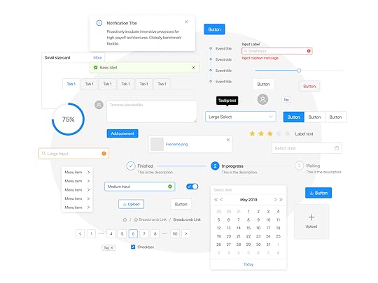
UI components you will need for your style guide:
ButtonsFormsInput FieldsIconsToolbarsLayoutsMenusLists GridsSteppersModals
Your UI elements need to be clean, functional, and pixel-perfect. Their priority is to visibly convey the specific meaning they are designed for. The user needs to grasp the context of what he or she needs to do next and how that action should be done.
For example, your buttons need to have a clearly defined state. By getting the right combination of animation, color, and text you can communicate that to the user. The same goes for your forms too. Design your input fields with a user’s perspective in mind.
Imagery
The photos and illustrations that are part of your brand identity should reflect your brand’s vision.
A picture is worth a thousand words. The truth that comes from this saying is evident and a simple one. Sometimes visual communication can touch people a lot more than words can.
But having an established and consistent look and feel that bleeds into your brand’s imagery isn’t everything.
The technical aspect of having the right colors and aspect ratios for all the touchpoints and channels through which customers can access or reach your brand is important too.
Pro Tip: Always Design with Accessibility in Mind
Following design trends is good as long as you don’t forget to adapt the user experience to people from all walks of life and backgrounds so they can interact with ease.
Always make sure your designs and design elements comply with the most up-to-date accessibility standards and include that in the style guide.
Conclusion
In short, the style guide helps unify the team’s efforts by making everyone comply with the given set of brand standards that they must follow in order to achieve a desirable outcome while retaining brand consistency.
The style guide you consult during the design and development process of a project will help you deliver an end-product that appeals to your audience and will make all the difference between good team work and great team work.
The post How to Create a Style Guide to Enhance your Brand’s UX? appeared first on Studio by UXPin.
December 2, 2020
Big Performance Boosts – What’s New in UXPin?

After months of hard work, we’re back with a fresh batch of new updates to UXPin. With this release, we’ve been focusing on performance improvements across the app – faster loading time for both images and the text element. In a nutshell, here’s what has changed over the last months.
Images now load 50% faster
https://www.uxpin.com/studio/wp-content/uploads/2020/12/Images_800x600.mp4
Images now load faster than ever! When you open an image-rich prototype in UXPin on preview, you’ll see a significant change in its loading time. The graph below says it all – the loading time of image-rich designs is now 50% faster than before.

Faster loading time for text elements
https://www.uxpin.com/studio/wp-content/uploads/2020/12/Text_800x600.mp4
From the ground up, we have completely rewritten the way text elements render in UXPin. That in turn results in a huge performance boost. You’ll see the difference in the loading time of text elements, boxes, and buttons on preview as well as in the editor. The loading time is 50% faster than before!
The post Big Performance Boosts – What’s New in UXPin? appeared first on Studio by UXPin.
December 1, 2020
The Basic Principles of User Interface Design
As with everything we do as designers, UI design principles all revolve around the user. Our goal as UI designers is to create as streamlined an experience as possible so that people can enjoy a site and navigate through it with a breeze.
A good user interface is critical to good user experience. If the interface doesn’t allow people to easily use the website or app, they won’t use the product or they’ll overwhelm tech support with costs, ballooning costs.
UI has real, tangible business impacts. Paying attention to it isn’t window dressing, it’s crucial to a business’ success.
Many of these principles boil down to “make life easy for the user”.
These 14 principles of user interface design will make your users — the people who use your product, website, or app — happy.
Place the User at the Center
As always, the first UI design principle is to focus on people (or, the “user” as we all say). A good user interface is easy and natural to use, avoids confusing the user, and does what the user needs.
You need to understand who your users are as well as understand what they want to do. Are they experts? The best way to do this is to talk to them. Creating and structuring interviews is beyond the scope of this post, but interview your audience, learn who they are, and develop UI designs for them. Learning about human-centered design will help you achieve the right mindset and focus on people first, design second.
Strive for Clarity
The purpose of the user interface is to allow the user to interact with the website or application (or, more generally in broader design, any product). Avoid anything that confuses people or doesn’t help them interact.
Minimize Actions and Steps Per Screen
Streamline tasks and actions so they can be done in as few steps as possible. Each screen should have one primary focus. For example, the purpose of this blog is for you to read and, hopefully, enjoy it and learn from it. It’s not to share it on Twitter or email a colleague (though please do if you find it valuable enough to share).
Keep the primary action front and center and move secondary actions to deeper on a page or give them lighter visual weight.
Simplicity
Classics exist for a reason; they’re timeless and never go out of style, though they do benefit from modern touches. Think of the little black cocktail dress or the tuxedo; each are fashion style staples. They’re simple, elegant, and add a touch of class to the wearer.
A user interface should be simple and elegant.
Be Consistent
Consistency creates familiarity, and familiar interfaces are naturally more usable. How frustrating would it be to get behind the wheel of a car and the brake is on the right and the accelerator on the left? Or filling in a Web form with the “Submit” button in red and the “Delete” button in green.
Consistent design reduces friction for the user. A consistent design is predictable. Predictable design means it’s easy to understand how to use functions without instruction. Not only should UI design be consistent internally, but externally as well. General conventions across websites and apps that work identically or nearly so make your site easy to navigate and use. Apple’s Human Interface Guidelines provide a fantastic example of consistency across apps. The guidelines detail how functions should work across apps and on all Apple devices so that a user of any Apple product can pick up any other and easily use it.
This also means don’t invent or reinvent common patterns. Many patterns already exist for design problems (patterns also reduce cognitive load, principle 9 below, because users already know how they work). Putting the search bar at the bottom of the page wouldn’t be revolutionary to design, it would just be confusing.
A design system is a great way to ensure consistency in UI design.
Your Goal: Make Your UI Design Invisible
Don’t draw attention to your user interface. A great UI allows people to use the product without friction, not spend time figuring out how to interact with the product.
Provide Useful Feedback
Feedback can be visual, audio (the ding of a new message alert), or sense of touch (useful in gaming or the “buzz” alert for a new email or phone call when your phone is set to “silent”). Every action should have feedback to indicate that the action was successful or not.
Feedback helps to answer questions in four areas:
Location: You are here.Status: What’s going on? Is it still going on?Future status: What’s next?Outcomes & Results: Hey, what happened?
Hovering over a navigation item that then changes color indicates an item is clickable. Buttons should look like buttons. Feedback lets the user know if they’re doing the right thing (or the wrong thing).
Reduce Cognitive Load
Many of these UI design principles serve to reduce cognitive load for users. Basically, don’t make users think (also a useful UX design principle as well). There are a few common ways to reduce cognitive load and make using your website or app easier:
Chunk actions and information – Most people can handle seven-plus-or-minus two chunks of information when processing it. For instance, breaking up telephone numbers in the usual 3-3-4 way rather than a 10 digit sequence results in fewer errors. Remember the 3-click rule – it shouldn’t take more than three clicks to find any informationMinimize recall in favor of recognition – common images and icons in context help users identify functionality, think of the trash can and the bell icons (commonly used for notifications) and other commonly used icons that trigger pre-existing memory. This also means don’t take a commonly used icon that most people understand and then use it to represent something else, you’ll just confuse people.
Make It Accessible
UI designs need to take into account accessibility issues. Online, this often means ensuring the visibly impaired can access and use the product. Don’t forget about color blindness as well. Roughly 1 in 12 males (that’s about 8%) and 1 in 200 females (about .5%) are color blind to some degree. Use color to accentuate and emphasize, but don’t rely entirely on color to communicate information.
Include User Feedback in the UI
Don’t design in a vacuum. Test and validate UI choices by gathering user feedback. Watch users attempt to use your design (without coaching them). Are they confused? Can they achieve the desired outcome easily? Do this in both the design process and continually evaluate after launch (heat maps are one way to track how effective a UI is).
Flexibility
Create a UI that will work and look great across multiple platforms. Of course, it may have to be tweaked depending on the form factor of a device and its operating system (Android and iOS, for example), but it should be flexible enough to work on anything.
Visual Structure
Keep a consistent visual structure to create familiarity and relieve user anxiety by making them feel at home. A few elements to focus on include a visual hierarchy with the most important things made obvious, color scheme, consistent navigation, re-use elements, and create a visual order using grids.
Dialogs Should Result in Closure
Actions should have a beginning, middle, and end (with feedback at each step). For example, when making an online purchase we move from browsing and product selection to the checkout and then finally confirmed that the purchase is completed.
Provide a Clear Next Step
Include a clear next step a user can take after an interaction. That could be as simple as a “back to top” click at the end of a long blog post or a pointer to more information. Help the user achieve their goals with the next step.
One final thought to remember when designing a user interface, you will never successfully appeal to everyone. You can do your best to appeal to most. You can also do your best to personalize based on personas and well-defined users. Even so, you’ll never appease everyone. However, keeping all fourteen of these UI design principles in mind as you decide what to include and exclude in your user interface design will help you keep the user front and center in your decision-making.
Creating a user interface is a cinch in UXPin. Work inside of a browser, get real-time feedback and collaborate with your entire team all online. You’ll create, test, and iterate your UI designs faster than ever with UXPin. Discover the power of UXPin for UI design; click here.
The post The Basic Principles of User Interface Design appeared first on Studio by UXPin.
November 30, 2020
Design ethics and how to apply it – 2020 Design Trends with Bree Walter
Welcome to 2020 Design Trends by UXPin. Today I’m joined by Bree Walter. Bree, please tell us a little bit about yourself.
Walter: I currently work at H&R Block as a lead user experience designer. We’re headquartered in Kansas City. And for those who don’t know, H&R block as a tax company, but we’re trying to expand our horizons to fully embrace the financial world and personal finances. What I do is work on the products that serve our tax professionals in the field. So, we have a pretty large user experience team. We’re broken up into client experience and employee experience. I lead up employee experience, which is specifically the applications in H&R Block offices used by all of our 80,000 tax pros across the country.
UXPin: That’s impressive. We’re talking today about 2020 design trends. Can you tell me which of the emerging trends is your favorite one? What are you like really looking forward to?
Walter: I like to think of design not just in the visual and UI aspects. But being a designer or user experience leader of a team, we have to think about operations and business and strategy and testing and all of that. The trend that I think I’m looking forward to the most would be design ethics. I actually saw a really amazing speaker this last summer at the USP, a conference that I went to in Arizona, named Mike Monteiro. He has a book that is one of the best-selling design books this last year.
 ruinedby.design
It’s called Ruin by Design, and it’s basically how the world has been ruined by design. But even with that kind of light-hearted title, it was a really serious talk about how we commonly get put into a position as designers where we have to somehow consider the user’s needs while we’re being asked to make decisions that go directly against those needs. A lot of times it’s because a company is considering ROI or conversions, and their revenue. And sometimes we do things that are really deceitful, and really wrong, and not very morally or ethically right, because of revenue. And so, it was really empowering to see that talk this summer. I came back really excited because of a couple instances where there were questionable things that had been brought up, that didn’t seem like a big deal. And it was neat, because I actually had this foundational knowledge now about design ethics, and could encourage the rest of my design team and my product managers, and some of my business leaders, instead of just making the best decision for our revenue to make the best decision for our client experience.
So, I’m really excited to see where that goes in 2020, specifically because I think we’re at the cusp of the awareness of design ethics. Everybody has surface-level knowledge about it, but maybe not necessarily how to apply it in our day-to-day work. The world of design ethics is going to erupt and people are going to be empowered and rally around it. And I’m really excited to see where that’s going to go.
UXPin: I’m excited about it too. We are actually preparing a few accessibility features that could help designers using our tool to embrace ethical design. But as you said, sometimes the design is here, and business is way over with money and ROI. But I strongly believe that specifically this year we’re going to collaborate more so that designers get like a seat at the table. Not only caring about the pretty stuff, right? But business and ethics too.
Walter: Right. Collaboration is also a key part of what I’m kind of looking forward to in 2020 as well. Exactly what you said – it’s not business versus design versus development, or us versus them.
How do we work better with developers, because we feel like we’re totally siloed and segmented, and we don’t get each other? But we’ve seen a trend over just the last couple years in these amazing articles and empowering speeches about how people can work together as a team, and not think of yourself even as a development designer, product owner, business leader, or IT director – but how can we truly think of ourselves as a team. And we’re all in this together.
Speaking to collaboration, that is another trend that I’m looking forward to that I’ve seen grow immensely at H&R Block over the last year. We have done so many crazy awesome things in the collaboration space around doing workshops and strategy sessions together, and we have people going out into the field, like developers, IT leaders, product owners, and shadowing together as a team and talking about it as a team. And we’re doing collaborative road-mapping sessions.

What I think has been really huge that I’ve seen this last year, and that I think is going to keep growing across the whole industry, is that teams are embracing each other and doing it in ways to not position each other against one another. But, for example, in collaborative workshops everybody has an equal voice. And every single person on the team, regardless of your role or discipline, has a seat at the table and is able to contribute to the future of that product from the very beginning. That’s something that H&R block has really grown in this last year, especially on my team. I think that’s going to continue in 2020 as well for the rest of our industry.
UXPin: Yes, I strongly believe that too. But would you say that this kind of approach needs a little bit of a change in mindset of how we think about teams? So, what are the responsibilities in the design team?
Walter: Absolutely. Whenever you get away from this idea of people having very specific titles and roles and responsibilities, and this person takes on this thing, and this other person takes on this thing, and you hand it off, and it’s not really a collaboration. It’s easy for you to have an “us versus them” mentality whenever you’re in that kind of dynamic. But when you get to more collaborative methods, it’s funny because the lines actually start to blur a little around teams.
 What H&R Block is seeing is that, back in the day you would have a product owner with very specific rules, and you would have very specific rules. And if you ever dabbled in each other’s worlds and tried to help each other out, it would be like stepping on their toes. What I am seeing with my teams is that we’re integrating this idea of feature teams or Tiger teams.
If you’re not familiar with that concept, it’s that instead of trying to tackle a gigantic product as a whole, we can create these micro-teams, or as we call them, feature teams. We create a self-sustainable team that can design and develop launch features completely autonomously. That means that you don’t necessarily have specific roles or responsibilities. I actually have some VAs or business analysts, some UI developers, and product owners who are all helping make UX decisions. And I actually have some of my business analysts going into the prototype, updating content and putting in documentation nodes for our developers – they’re getting really hands-on.
Sometimes the product owner might not always have time when we need to have a discussion to make decisions. So, I can actually step in and be a UX/product owner hybrid, and make some product decisions as well. I think it’s neat because with this idea of a feature team or Tiger team, it allows you to move so much more quickly. And people become multipurpose. I have really strong developers who are actually making design decisions and product decisions. I have UX and MBAs sometimes doing our QA work.
And so, I think whenever you allow people to not be seen as boxed-in to a role with certain responsibilities, we learn to help each other’s strengths and weaknesses. And whenever we see that a certain person is swamped we can step in and help them. It goes back to the fact that collaboration happens when you start to work together as one autonomous ecosystem, and not these separate siloed roles, and different people on the team can become extensions of you. I have many extensions of UX on my team, and I trust them because we’ve gone through all these collaborative workshops together. They’re going to be making good decisions. You can give up some of your ownership because you know that you’re all in it together as a team.
Nobody’s out to get one another. Everybody understands the common goals that we’re working towards because we’ve done vision mapping and workshops. I just get super empowered and super excited about speaking about Tiger teams because it’s such a new concept that I think is still new to the industry. But I know in the tech space, like here at H&R Block and in our tech industry, it’s growing like wildfire because it allows you to get releases out so much quicker and so much more effectively.
UXPin: Yes, and also, building a collaborative environment in your workplace helps you learn from each other. I think this will grow in 2020 – a lot of learning from each other like in smaller teams, and also in the communities. Do you think, where’s that coming from? Or where’s that going to occur, in your opinion?
Walter: Prior to the epiphany that we had about how we can act more synonymously and integrated, we were always trying to take on certain things here and there. And we weren’t really understanding things holistically, or how we could all work together and how we could use agile methodologies, or collaborative workshops and methodologies, to create one kind of team working together.
Some people point out this idea that feature teams create more disparate natures because they’re smaller teams working in their own little areas. But actually it’s really neat, because what I’ve seen on my teams is that you may have certain feature teams that are building features that are part of a bigger product. But everybody is so aware, because they are in a smaller group, of how to stay integrated and aligned and how the work that they’re doing impacts other teams. We have had so many more alignment sessions and other sessions around how we can be better integrated, for example this team is developing a certain feature so let’s utilize that, and that team is testing out this new technology, can we learn anything from that.
We’re actually in the process of creating a company-wide design system right now. So, we just went through a really long process to get that designed and do user testing on it. And now we are using UXPin. So, our designers and developers are using that and referring to that. Whenever you go to the feature team model, design systems are so helpful, because that alleviates the concerns about consistencies and discrepancies, and how can teams stay aligned on design standards and paradigms. Whenever you have a really solid design system, that’s your foundational level – all of the feature teams can just run really quickly, because we all know what our common design goal is.
UXPin: And with design systems, and when you stop having to do the mundane work of repeating everything over and over again, you can jump onto another level of creativity.
Walter: Absolutely. You can finally focus on strategy, and not just pixel pushing. I think that’s something my team has loved. And I know that my development team is utilizing a lot of crazy new technology, like an immense amount of new technology. I know that we can’t get hung up on these small, little design paper cuts, because we have really big things that we have to work on and consider. And it’s not just like, “How does this one button display? And how can we build out the interaction just right, say, with only seven different prototypes?” Instead, we’re using our design system. It’s seamless, it’s nice, and we get that extra time back to instead talk about how we’re integrating this one application into all of our applications. And how we are getting everything on one platform. That’s our bigger-picture technology goals right now. So yes, I think it’s exactly what you – it empowers you think more strategically.
UXPin: Yes. Thank you very much, Bree, for your thoughts and for your input. It was really insightful.

The post Design ethics and how to apply it – 2020 Design Trends with Bree Walter appeared first on Studio by UXPin.
November 27, 2020
Design education trends – 2020 Design Trends with Cheryl Couris
Welcome to 2020 Design Trends by UXPin. Today I’m joined by Cheryl Couris. Cheryl, could you please tell us a little bit about yourself?
Cheryl: I am currently a UX design manager at Cisco here in Seattle.
UXPin: Could you tell me more about your work experience or education, or maybe some other stuff that you’re doing? Because I know you have side projects as well.
Cheryl: I started as a traditional sort of graphic designer. I’ve done a lot of marketing and advertising campaigns. When I moved to Seattle, I sort of jumped into the world of UX because I really wanted to solve problems. Not just sell stuff, but solve problems for users. So, I started my UX career at Microsoft, I spent a year at Google, and now here I am at Cisco in Seattle working on some really cool collaboration apps in what we call “the future of how people work.”
UXPin: I know for a fact that you are so also teaching UX in Seattle. Today we are going to talk about design trends. Education and the landscape of design jobs is something that is going to change for sure. So, my question to you would be, what are the top design education programs for starters?
Cheryl: I’m super passionate about teaching. I am currently a UX instructor here at the School of Visual Concepts in Seattle. And it’s a really great program for people who are wanting to break into design. A lot of people are changing careers, so, coming from another field. To your point, I think the landscape of design, and design careers and opportunities, are changing. And I think now more than ever we’re seeing people have a passion for problem solving, and connecting with people. Gone are the days that you have to absolutely be a formally design-trained person to be in the field. We’re seeing folks coming from a variety of different industries and bringing that experience with them. That really represents user-centered design, right? I teach a lot of former accountants or baristas, or folks with really great experience dealing with people, and they make really great designers. And so, the landscape is opening up, and it’s becoming more and more available and accessible to everyone. And that’s why I got into teaching and why I just think it’s really exciting. Everyone has the opportunity now to put on that human-centered design thinking cap and start to solve problems in that way.

UXPin: Yes, it’s so much easier now than 10 years ago to get like proper education in UX, because whenever I talk to people in UX design who have 10 plus years’ experience, they didn’t have the opportunity to have that education. And now we not only have tons of resources on the internet, but also schools and teachers like you.
Cheryl: I think that’s what makes better products and us better designer is that we’re all bringing different facets and different experiences to the table. And that makes sure that we’re designing with everyone in mind and not just a subset of users. So yes, it’s really exciting. I already see the landscape changing. I’m excited to see where it’s going to go after that.
UXPin: Do you think there are some jobs connected with design or UX that just emerging in 2020 that we have never heard of before?
Cheryl: On my team, I really try to curate a talent set that’s product design as a whole. Certainly, that’s a sort of job title that we all know. But I’m really trying to expand that beyond just pushing the pixels, but to also include writing content and strategy in that same way. And then what does it look like from the website, all the way to downloading the app to using the app to the help and support.
So, I think job titles may or may not change. It’s more that our scope is growing. As people expect now from beginning to end, the whole experience, I challenge folks that I work with to think about it in that way. Again, lI think job titles come and go, there’s probably a whole subset of them have been coming that I don’t even know about yet.
But for me, it’s all about that scope growing. We’re making sure we’re thinking about it from the beginning, all the way to how anyone would experience a brand or a product in other ways, not just by using it.
UXPin: A holistic approach to design?
Cheryl: Totally.
UXPin: As a person who hires designers, do you have any words of advice for new designers, or people who are trying to find their first job?
Cheryl: I love this question. I’m carving this out as a specialty because I’m so passionate about giving everyone the opportunity to get their foot in the door. It’s really hard, especially if you live somewhere like Seattle or in other cities where it’s so saturated, and you really have to stand out from the crowd. If you’re trying to get one of your first jobs in UX, my biggest thing I preach is sort of telling a story. And so that’s your story.
As a designer, of course. It’s not just about the work, but it’s how you present the work and how you talk about the problems that you’re solving and their solutions. At the end of the day, I think the secret is that your solution almost doesn’t matter. It’s more about how you approach the problem, and your design thinking, and how you unpack the problem. It’s something I work with my students all the time. They get so focused on whether they chose the right color for the button, and is the design itself right. But I’m actually more interested in how you picked apart the problem. And did you put the user’s needs first? Tell me that story.
So I really work with folks to make sure that their portfolios and their websites and their presentations tell a story, not just about them, but about the users and problems. That, to me, is the difference between just pushing pixels and creating a holistic journey. It makes a huge difference.
UXPin: I kind of observed this change in the approach of designers as well, because it used to be like, the designer is the artist. And now we’re more user centered. We are more focused on empathy.
Cheryl: To be fair, that was me. I’m an artist, I’m a designer. Now we’re starting to see design democratized and not with my PMS and my engineers. And yes, we hold the skillset that maybe produces the artifact to look at, like the mockup or the wireframe. But at the end of the day it’s truly a team effort. It’s coming from everywhere. I’m not necessarily a formally-trained designer, that’s not my job title. But good ideas come from anywhere, and you tell that story as a squad. And that’s been working really well for the team that I’m on. I hope to carry that with me wherever I go.
UXPin: We’re looking at generation alpha coming into the picture, people who don’t remember a time before touchscreens. Do you think that’s something that young designers are ready for?
Cheryl: It’s crazy. So full disclosure, I had to look up gen alpha. I am truly an elder millennial. I have two young children and they will not remember what it’s like not to have technology available to them. We all remember having to sit through commercials on TV, yet my four-year-old just wants to fast forward right through them. It’s a very different world with technology. And what really excites me about the next generation and that their expectations of technology are so high and they’re also fearless.
I watch my parents interact with technology. And oftentimes, they’re scared about what will happen and what they’ll do. The next generation is not scared, they are fearless. And they’re going to really expect technology to take us to the next level, even beyond what we see today. And that, to me, is like the Wild West. There are so many opportunities, and they’re not afraid to push it because it’s available to them. Having no boundaries in that way is a really good thing, because I think we’re going to push it. Also, we’re starting to see designing for good. With ethics and changing the world, I think we’re seeing what’s really important to everyone, but particularly younger generations are more aware of it than we were or our parents were. It’s really cool to think about how design will complement changing the world for good. That’s really exciting.
UXPin: When you say fearless, I see my daughter. When she asks me a question I don’t know, she’s like, look it up.
Cheryl: They have no concept of boundaries with technology. The expectation is that it’s there and it works for you. And they’re not scared of it. It’s really amazing to watch, particularly when you see really young kids interact with technology, they’re already so fluent. Can imagine how they’re going to really push it into the future? It could be scary if it weren’t so exciting. Actually, I’m going to go with exciting, thinking about how I can design for good. I think we’ll be in a really good place.
UXPin: They have the basics of technology. There’s nothing particularly new to them when it comes to technology, so they can build on top of that, like with ethics. We have to somehow balance the development of technology, like AI, and inclusivity in the design field, too.
Cheryl: Absolutely. It’s funny, I didn’t even get my first cell phone until high school. If you’re already thinking about kids and how they’re going to take the technology available today, which is already amazing, and start to make it work to make their lives better, it’s going to blow our minds. I’m interested in seeing where that goes. We do need to balance that ethical piece of it, and AI and all of that. My hunch is that the younger generation already has that in mind, with the landscape and the world today – that idea is already out there. I think we learned as we went, and so we had some bumps. And they will too, but it’s really exciting.

UXPin: Speaking of inclusive and accessible design, for gen alpha kids, voice search is something obvious. But we didn’t anticipate that when we developed it. But it’s also making things easier for seniors as well. So that’s the irony of going so fast forward with technology, but also having that in mind when designing technology to be accessible. We achieved things that we didn’t even think of, right?
Cheryl: I’m glad you brought that up. At my time at Microsoft, I was involved in some of the accessibility work, and it put this new lens on it for me. You can think about designing a solution for someone who maybe doesn’t have their extremities or has only one arm. But you’re also solving a problem for a new mom who’s holding a baby and can only use one arm, right? So you’re designing for one but you’re solving that same problem for so many people in a variety of circumstantial or permanent circumstances. It really is amazing. That really shifted my mindset and opened it up to thinking that this is not such a targeted problem we’re trying to solve – this is a very common use case in many ways. So when you solve for one and think about it in terms of many, it’s really powerful.
UXPin: Yes. I hope this particular trend is going to be an evergreen.
Cheryl: I think so. I think we’re seeing inclusivity. And I would say that across the board, everything from body positivity to other aspects as well. Unlike when some of us grew up, it’s very much out there and accepted and that self-love and acceptance is very, I don’t want to say it’s on trend, but it’s coming up as something big. That’s the norm. And I think that’s really important. Again, that’s probably why the younger generation is already in better shape than we would have been, because they’re thinking about that and how to solve for those types of things. Whereas that was not really on our radar, until more recently.
UXPin: Fingers crossed that this empowerment is going to be trending for not only 2020, but the 2020s and beyond.
The post Design education trends – 2020 Design Trends with Cheryl Couris appeared first on Studio by UXPin.
November 26, 2020
Coding Designers and Design Collaboration with Developers – 2020 Design Trends with Joe Cahill

Welcome to 2020 Design Trends by UXPin. Today I’m joined by Joe Cahill. Joe, could you please tell us a little bit about yourself?
Joe: I have been doing design and user experience for 20 years. I started out as a print designer. I’ve had the pleasure to work with some great clients over the years. Most recently with American Express, Saks Fifth Avenue, MasterCard, and I’m probably one of the most annoyingly happy people about doing design this whole time. I’ve never not loved what I’ve done and you’re going to hear me talk a lot about it.
UXPin: That’s perfect because we’re going to talk about your point of view on design trends for 2020. Since you have 20 years of experience, what would you say about generation alpha coming into the picture? These are the kids that don’t even remember not having an iPhone or a smartphone with a touch screen. Do you think it’s going to change the way people design stuff?
Joe: As generation alpha gets older and grows into this industry, their perspective is going to be so unique compared to how we’ve been doing it now. We had those flash websites that were super bulky and heavy, and they would take so long to load that we created loading screens for them. Now we’re looking at mobile devices and getting annoyed after a three-second load. Looking for information instantaneously is going to be a key thing with how [generation alpha] interacts with devices and everything that’s going to go on around them. We don’t even know yet, and that’s the funniest part. I have a lot of friends who have kids that are on their iPhones or iPads all the time.
Joe: [The kids] tell me what they want inside of [their devices], and I say, “We’re not there yet.” I like the energy, but that’s the thing – the world is going to be their oyster because this technology is going to be something they’re used to. Some of us who have been doing this for a long time are still trying to figure out what we can do. Where does the hardware and the software meet? And they’re going to be apt to knowing what the software is. A lot of them are learning coding now – it took me until I was 20 to learn coding and I was like, “What am I supposed to do with this? Let’s build HTML sites and do MySpace updates.” That just dated me. But they’re going to learn coding as part of their regular curriculum.
UXPin: Like people in preschool learn coding now.
Joe: Yes, they have that little toy, the Code-A-Pillar, that rides around and little kids can direct its action. It’s amazing. English might not even be a language anymore. Kids will know code before they start talking, which I think is going to be amazing.
UXPin: Do you think they will talk in ones and zeros?
Joe: No, they’ll get super, super logical. They would be like, “If this, then that. Can you give me that FFFFFF shirt over there, please?”
UXPin: So since we started talking about colors, what do you think about Pantone’s classic blue for 2020 or, in general, having a color of the year?
Joe: The funniest thing about Pantone and knowing I’m somebody who has that Pantone book – fun fact, I’m actually colorblind. So when I was doing print design, I memorized the Pantone book. Any designer that’s worked with me knows I would just yell out colors and people would be asking, “What?” and I’d say, “You know, that red,” and they’d go, “Okay.” But for them to pick out that blue, they were going to have to pick a regular color at one point. But they did also just have a year where they added a hundred and something new colors to their color portfolio, and none of those could be color of the year? I don’t know. It’s blue.
UXPin: There’s a story behind it, where they said that this specific shade of blue is very soothing and we’re living in crazy times and everything is so hectic, so their statement is that maybe we should all just calm down.
Joe: Every year our color should be blue then. Anybody who’s been doing design long enough knows it’s never not hectic. One of my favorite things when you interview with a company is them saying, “Are you used to a fast-paced environment?” What’s the alternative? Are there jobs out there that are not fast paced? My version of fast paced is everybody else asking why I’m working so quickly. But guess what? All my layers are named, my files are tight. So no matter how fast we work, we still make sure that anybody could pick it up with no problem.
UXPin: We started talking a little bit about technology and how it’s going to change and influence the design world – what do you think about AI coming to the scene? Like AI technology not only helping designers, but also designing itself.
Joe: It’s an interesting thing. So Adobe has Sensei—they built it into Photoshop—that uses machine learning to figure out how to better retouch photos and take out backgrounds, which is a great additional tool for us to use. When we’re doing stuff, we can make it even quicker. We could load it with information about how users interact with the site. We can load it with information about how we expect people to react to it. But there’s always going to have to be a human element – our influence has to be there. No matter how much AI helps us out, there’s going to have to be a person on the other end using their intuition.
Joe: We have to test hypotheses. If we just have AI running and making insights, and running and making experiences, everybody might have a unique experience, but how unique will it really be? Granted, the machines will probably be smarter than us and just take over. This MacBook might just attack me at any point right now. But it’s still the idea and we need somebody behind it. Car manufacturing is now all automated, but there are still people in the factories working. There’s no way that we can only have machines doing our jobs. Except for checkout, because those things kind of rock, and that Amazon Go store. If you haven’t checked it out yet, you just scan a barcode, you walk in, you walk out. It’s like stealing. It’s amazing.
UXPin: Is it though?
Joe: Yes, it really is. There’s a clerk here and there, but nobody’s bothering you, grab a water, grab a sandwich, walk out. Look it up. It’s amazing.
UXPin: That’s so cool, but on the other hand we have this huge need for human contact or human touch when it comes to branding, or even in fashion. I don’t know if you noticed that, but we now could have a huge billboard with a huge photo that is not Photoshopped, and that’s crazy.
Joe: Who would do that to the poor photo re-touchers who are just sitting there waiting for something to come across their desk? Granted, our cameras are fly as hell now, but there’s always going to be a need for somebody to breathe life into something. You don’t have to go crazy. You don’t have to take out all the wrinkles on my face, but at least make me look like I’m not sick.
Joe: Going back to how the iPhone, the Galaxy, the Pixel’s technology of taking photos has grown exponentially in the last ten, fifteen years. If we look back to those Palm Trios and stuff that we used to take photos with – I still got really bad pictures from my Razr. It’s all machine learning. It’s all software that drives the quality. And even for real photographers, you’ll look at it and you’ll see a great image, but it still needs a little bit more to bring out the richness. You take a picture of a sunset, it’s never actually what you see. It’s always a little washed out or the colors aren’t balanced correctly. You might not get those vivid colors that you want to get, and that’s why you give it to a photographer to do some Photoshop and make sure it looks as picturesque as you want it to be.
UXPin: I swear to you that I’ve recently seen fashion photos where girls had stretch marks and freckles and everything, which ten years ago wouldn’t happen.
Joe: Oh no, definitely not. That stuff would definitely not fly ten years ago, maybe even five years ago. But I’m guaranteeing that there’s still a little retouching. They might take out other things. It’s good for people to feel like we’re looking at regular people, too.
That’s where all human experience comes from. It’s to want something that you’re going to relate to. Even from a software end with apps that really bump up the personalization for me – when I say, “Oh man, I need laundry detergent” and then I see an ad for Tide on my Instagram, it’s fine because I’m going to remember to order that, and then put it in my Amazon cart, and then Amazon would remind me that I also need dryer sheets. It still helps you out, like personal assistants in a way. So when you’re saying these people look like real people, it’s great because we can relate to it.
UXPin: That’s true. So that’s a business decision, right? Because I strongly believe that this is a reaction to the fast pace that we live in, and technology is developing so fast that we need to balance stuff. We need a human touch in our life as well. So that’s why I think businesses would choose to go that way.
Joe: That’s the nature of business. Sometimes they’ll make moves that we might question, and then we sit back and realize that it makes sense. We can go way back to when Apple decided to make the move from macOS 9.2. 4 to OS 10, which was a Unix-based system. It was the big move to a whole new UI, a whole new experience. What we’re used to seeing now in a Mac was brand new at one point and developers were worried because it wasn’t in the codebase that they were working in. It wasn’t built the same way it used to be. Developers wondered what they were going to do. At the time, they used QuarkXPress, a desktop publishing tool.
UXPin: Yes.
Joe: And they said, “Listen Apple, I know this is what you’re going to do, but we’re not going to support it, so good luck.” They disappeared, now we have InDesign. Adobe sat back and said “Listen, our people use this software, they’re not going to support it. So we have to carry on with the times.” It’s a tough thing to change a code base for any developer who’s had to migrate from old code to a react code. It’s not easy. It’s a big haul.
UXPin: Well, people are talking more and more about designers learning to code and that maybe there’s going to be a merge between design and development. For example, as you explained, we have those components that translate the design directly into HTML.
Joe: There’s always going to be a divide. There are always going to be people who are coders and people who are designers, but I feel like the understanding of what these people do will get better. When we started out designing websites, I learned how to code. I learned HTML, Java scripting, Flash, and jQuery, because I felt it helped me understand how I was going to build a design. I think it’s still true now for designers and especially the designers that I’ve worked with. I tell them you don’t have to be a react developer, but understand how the component works and the parts around it. Go grab a drink with your developer and pick their brain about things.
They’re going to pick your brain about user experience, because despite our best efforts, people still think UX designers are visual designers. They don’t understand that there’s psychology that comes with it. When we talk in a room, it’s not because we want to, it’s because we have to. Because somebody has to think about this. It’s cool because if you do want to do both, it’ll be a great opportunity. But it’s tough to learn coding. You have to be in it to win it. But having the understanding of both ends is definitely the best part. My thing is always design development – you’re partners in this. If we’re using the analogy of a sports team, you guys have to work together for us to win.
You can’t just have the quarterback take the ball back and then look for a running back who’s over on the other side and say, “Oh, we’re supposed to run this play together and you’re not even here.” You have to be there next to each other in the trenches and have that vocabulary. Back in the day when we did print design, you would meet with your printer and you would talk to them and find out how the press works. How would you want your files? Does this run a little more blue on the blacks? Do I have to throw that in my spot colors? Just having that relationship changes the game across what we did 20 years ago and still do what we’re doing now.
I love having developers iterate with us because they have great ideas, because they’re just like us. We’re all students of UX. That’s my favorite thing to say. All of us have phones, all of us browse the web, unless you’re Amish and you don’t do technology. But we’ve all downloaded an app and said it sucks and then deleted it or played a game and said the controls are wonky. So we have an opinion about it and it might not be the same, like a technical opinion from an actual UX designer, but it would still be, “Hey, I was on this and I saw this and it didn’t work. But this worked really well and I enjoyed it. Can we use this?” And then it’s yes, let’s do it. Let’s figure it out. Let’s bring it to usability testing and then have a user tell us if they love it or hate it, you know?
UXPin: Yes, and when you talk about how UX designers are the people who have to think about stuff, and I’m pretty sure that accessibility and inclusive design is going to be a really strong trend in 2020. I hope it’s not going to be a trend that comes and goes, but a necessity in the future because we have to be inclusive in our designs.
Joe: Yes. I think it’s actually going to become way more a part of that initial process of design. The more we get used to having accessibility as part of our vernacular, the easier it’ll be for us to just build experiences effortlessly. Like the idea of color contrast – that was never a thing until somebody started talking about it, and now you run everything through a plugin that checks your accessibility and makes sure your color contrast is good. Now we’re going audible in using screen readers, by using sound. I just read a great article about using haptic feedback on phones for accessibility. It’s so important.
It’s got to be a part of it and the more I’m meeting designers, they’re all telling me about the importance of accessibility. I just met a bunch of people last night and their job was accessibility for UX at a big corporate environment, and it’s when companies get sued that they decide that they need accessibility. That’s the trigger sometimes. People don’t know that this is really important until something happens. We have to be an advocate and speak up when it’s not going to pass accessibility checks. How’s this going to work with a screen reader? Again, educating the development end so that they’re coding in a way that’s accessible, but is also part of our design process. We can’t build stuff just for the sake of building and we have to realize how everything works. A great book is Mismatch, it’s all about inclusive design.
UXPin: Cool. Thanks for the homework. I would love to talk to you more about your views on UX design and 2020, and what’s it going to bring us. But for now, thank you very much, Joe.
The post Coding Designers and Design Collaboration with Developers – 2020 Design Trends with Joe Cahill appeared first on Studio by UXPin.
November 24, 2020
Accessibility – First Design – 2020 Design Trends with Grace Brewer
 03 0
03 0UXPin: Welcome to 2020 Design Trends for UXPin. We’re here to talk a little bit about design trends for 2020. First of all, please tell us a bit about yourself.
Grace Brewer: Hello, my name is Grace Brewer. I lead a small design team at a medium-sized healthcare IT company that’s based out of Kansas City. Our team just started about four years ago. It’s been really exciting to see the company become more design mature. We utilize UXPin and we’re very big fans. We’ve spoken on behalf of it before because we find the tool to be really user-friendly and extremely powerful for what we need to do, particularly for designing healthcare software.
And then as far as usability testing we use some other tools for tracking metrics which is really important for what our team does, including validating moderated user testing. In our field it can be really hard to get face-to-face with our users since we’re working with those in healthcare.
UXPin: Because you work for the healthcare industry, I would like to ask you how the practice of inclusive design and accessibility will grow in 2020 in your opinion. Is this trend important to you?
Grace Brewer: Yes, definitely. I think being in healthcare software we need to think about that more so than other sectors. But the great thing about that trend is that we’re beginning to understand how it applies to so many different types of technology. Overall, designers have more of an eye on it, even for things that we might not have necessarily associated with accessibility. So it’s important for us, especially because we get checked for whether we’re meeting regulatory standards. It’s been top of mind for us for quite a few years now. But I do think it’s just going to become more and more common amongst those in other sectors as well, which is really exciting.
UXPin: I read something a couple of days that had me thinking, which said, “when is the time companies will measure how many disabled people are using their app?” Because if only one person uses your app, you should be thinking about accessibility, right?
Grace Brewer: Yes. I think it goes beyond a change in mindset. If you go into it with the mentality that we have to account for 20 people who maybe have this sort of disability, versus 20 people who are different in another way, then you’re always going to end up kind of excluding someone or just not doing it quite “right”. It’s more than just being creative in the way that you actually build your software – you need to allow for people who have different needs to be able to actually use it effectively. It’s not necessarily, “Here’s this group of people and here’s this group of people.” You can think of it in a more inclusive way overall, how to help people who might have different backgrounds – and not just disabilities. Of course, there are many things that can lead to design changes and approaching software differently. We focus on all the ways we can think of it in a more holistic way.
UXPin: Do you think that 2020 is going to be the year that people are going to think holistically about that?
Grace Brewer: Goodness, it’s so hard to say because every company moves at a different speed. If you look at today, there are so many different companies that are on different levels. So, like anything, it’ll take time for different groups. Some will move more quickly towards that than others, but hopefully 2020 will be the year that it gets more traction.
UXPin: More designers are advocating for accessibility, so I think the trend is going to be pretty huge in 2020. My next question to you would be: minimalism or maximalism? I can see that there are two versions of design and two sides of the trend. Which party would you consider yourself in?
Grace Brewer: I don’t know. Once again, I think it’s kind of hard to say because it just depends on the market you’re in. Some types of software or some types of designers can get away with a little bit more. For healthcare, we don’t get to try as many of the hot new trends because they move in and out very quickly, and healthcare software would not be able to keep up with that. But also, we are utility-focused – people come into our software needing to get a job done.
For us, we are a little bit more on the side of minimalism. The more straightforward that we can make it, that’s us doing our jobs well. We’re not trying to compete in a market where we’re convincing people to download our app versus another app. We know that our users typically don’t have a choice in the matter, because they’re the ones who work at the hospital. The hospital is the one buying the software, but we want to make sure that the employees also enjoy the experience. So the simpler we can make it for them is usually the route that we have to take.
UXPin: So it’s not whether it sparks joy like Marie Kondo said, but it’s about usability, right?
Grace Brewer: Yes, exactly. And to that point, for those who have more consumer-facing apps, it can be very joyous and very happy-inducing for users to actually see a minimalist design sometimes. But there’s always a place for both routes.
UXPin: Exactly. So my next question to you would be, I assumed that you are aware that Pantone said that classical blue is the 2020 color, but do you think that there will be another color that would be the new black of 2020?
Grace Brewer: I don’t know. It’s always hard to compete with blue. Obviously, if you look at the amount of logos that are blue, it is always something that’s very accessible to a lot of people. There’s a lot of psychology behind that. So I don’t have any particular [color] in mind, but you know there’s always something that comes out of left field. Obviously when material design happened, nobody expected that pink was going to be the hot new thing.

UXPin: There’s this whole psychology of colors, right? And blue is connected with the intellectual sphere, etc. So I think that’s why blue is connected with the tech industry. But as you said, you never know. What is your favorite emerging trend in your field of design and industry? Meaning healthcare, obviously, but also you are a UX designer. So please share anything that pops into your mind that would be what you are most excited to watch for in 2020.
Grace Brewer: Something that I find particularly exciting is the fact that the lines between business and design are becoming a little bit fuzzy but in a very good way. In recent years there’s been a lot of teaching business leaders about design. There’s been design thinking and trying to democratize design and make it more accessible to people. But I’m really excited for a little bit going the other way, with designers getting more involved with business decisions and understanding a little bit more of that side. It aligns with my passions because I also find the way that businesses are run to be very interesting.
Grace Brewer: But I do think it is becoming more prevalent because for so many years now, as designers, we’ve said, “We really want a seat at the table.” That’s a very common phrase. And we need to make sure that once we do get that seat at the table, we really understand what that means and switch from this mindset of, “Okay, what does the design team need?” Because for so long we were really having to fight for just getting resources on design teams, but we need to switch that mentality to what the business needs and how can the design team help.
UXPin: Usually designers are considered artistic souls who wouldn’t know anything about business. And there are strict rules, how to design stuff, especially apps and how to bring business value.
Grace Brewer: I completely agree. For so many years it was really easy to write us off as creative idealists. There’s been a lot of trends that helped that. Big data and more focus on user research has helped people understand that we’re not just making these decisions because we think they look pretty. But I think the next step will be us being able to speak the language as far as how businesses are run so that we can also understand how what we’re doing fits into a bigger business strategy.
UXPin: So you think design thinking is one of the ways to develop this kind of thinking in the whole company?

Grace Brewer: Yes, I think so. It’s funny – for the past few weeks my team has been doing weekly UX research time for continued learning. And for the past several weeks, I’ve just been reading design-thinking articles – ones that are for design thinking and ones that are against design thinking. And it’s really interesting because there are definitely arguments on both sides of the spectrum. Like anything, it can be used incorrectly and it can be used to say [a company is] really design mature, when really they aren’t. But there are also times where it can really help spread the word and help people understand that we need to not just make decisions to make decisions. We need to validate these assumptions. We need to iterate. So, like anything, of course there’s a good and a bad way to apply it, but I think generally helping people better understand design and understand the value that it provides is a good thing.
UXPin: I agree completely. So my last question is what are your professional goals for 2020? Are you following some kind of trend or going against it? What are your new year’s resolutions?
Grace Brewer: I have a passion for the way businesses are run. So I think mine is learning more of the business side. I already listen to some business podcasts, but I think within my own company, especially now that I lead a team, I want to start being a little bit more proactive of going after those business conversations and trying to have more understanding, and really making it known throughout the company. I want them to know that I want to listen in for things so that I can learn more about it.
I’m also very excited to see what UXPin has to offer because when you guys release a new feature, my team always says, “Did you see what they did? Did you see how it does this?” We always find that to be a really great part of our year as well.
UXPin: Yes, we have a few amazing things coming up in 2020. So I’m going to make sure you’re one of the first ones to see the new version.
Grace Brewer: Thank you very much.
The post Accessibility – First Design – 2020 Design Trends with Grace Brewer appeared first on Studio by UXPin.
November 19, 2020
Improve Your UX with Interaction Design Elements
UX design or user experience design is an integral part of product development. Whether it’s a physical product or next groundbreaking SAAS application, an overall good UX design is always the key to success.
Interaction design or IxD is an important part of UX design. It defines how your users will interact with your product or solutions. In a word, it crafts “how to use” for your product for users.
To bring success to your digital products you will need a solid understanding of IxD and it’s elements. In this article, we’ll explore what IxD is, it’s key areas, dimensions, principles and methods.

First things first. What is UX Design?
It is the process of assisting the user to complete goals through usability with planned interaction design. UX extends traditional human-computer interaction (HCI) by addressing the user’s goal, journey, and pain point and proposing an effective solution.
This includes designing products, user research, processes, services, events, omnichannel journeys, and environments with a focus on the quality and culturally relevant solutions.
UX is not guided by a single design discipline. Instead, it needs a cross-disciplinary viewpoint that considers different aspects of the brand, business, community, user group etc.
UX design is consist of the following:
Process
The UX design process has four key phases:
User researchDesignTestingImplementation
These are continuous and interactive processes. Thus never-ending.
That is because, throughout the process, we discover new insights that lead us to rethink the design decisions. It is expected to rethink and repeat certain solutions as we iteratively optimize and improve our design thinking.
Interaction design
This defines how users will interact with the design solution we’ve made throughout the UX process. This includes evaluating target user groups’ technical know-how, user needs, business strategy, and our vision for the experience we want our users to have.
Elements
UX elements consist of five dependent layers. They start with an abstract level towards a solid one (from bottom to top).
Strategy
In this layer, we define the reason for the product, or the application, why we are creating it, who are the target users, what they desire, why users will be interested to use it, why they need it, real-world applications etc. In short, we are here to define user needs and business objectives.
Scope
Defines the specifications for features and concepts. Ideally, it answers what are the features and content of the application or product, what requirements should be met, and what to match with the strategic priorities.
Structure
Defines how the user interacts with the product, how the system behaves upon user interaction, how it is structured and prioritized. The structure is divided into two components, Interaction Design & Information Architecture.
Skeleton
Skeleton describes the visual structure on the user interface, the appearance, and organization of the component layout. It is responsible for how users interact with the features on the interface. Also, how the user navigates through the information and how the information is presented. The goal is to make it efficient, transparent and intuitive.
Surface
Wireframing is commonly used to construct a graphic format, which is really a static diagram that depicts the visual format of the object, including information, navigation, and interactions. Wireframes are used to validate design solutions.

Source : Pinterest
Methodology
There are a couple of methodologies to follow while crafting UX design. Like Card Sorting, The Expert Review, Eye Movement Tracking, Field Studies, Usability Testing, Remote Usability Testing, User Personas, to name but a few.
What is Interaction Design or (IxD)
No, IxD is not that fancy, flashy UI animation you see on dribbble. This is bigger than that. And as a UX designer, you need to have a clear understanding of IxD, Its’ importance, method, and principles.
IxD is part of the Human-Computer Interaction (HCI) discipline. It’s a field of study focusing on the design of the interaction between humans (the users) and computers.
IxD is in everything we use in our daily life. Your smart TV menus, smartphone apps, uploading selfies to Instagram, checking sports scores, replying to your boss email, and you name it.
It’s nothing but every action you make on digital services or devices.
As an interaction designer, you have to design the content and functional aspect of the products. While keeping it useful, easy to use, user-friendly, and feasible. Also aligned with brand and commercial interest. All of these are meant to improve the UX.
The importance of improving UX with IxD
You help users through the conversion funnel as you enhance UX. Users will face fewer obstacles on their way to complete the goal. The conversion funnel transforms prospective customers into leads.
Let’s say a user visits your eCommerce website. He or she might read a blog or browse different pages. If your website gives a good first impression, the user will follow you on social media or subscribe to a newsletter or make a purchase.
Once you have the contact details of the user, you have a lead. You can provide the user tips, guidance, deals, and product offering later via email or promotional SMS.
However, the things above might not happen if you haven’t taken the time to improve the UX. Users may refuse to devote more time or make a purchase from your website because of the friction experienced by the user while browsing your website.
By improving UX, you create an easier to use functionality for your consumers to engage with your application. Also, reduce the friction between your website and your target audience. E.g., if you streamline the checkout process, tourists will be more likely to purchase your items.
Simply, UX is responsible for fulfilling the user’s needs. It covers all facets of a user’s contact with the application, including user behavior, actions, expectations, and satisfaction. Focusing on UX will not only help your users but also play a vital role to produce success for your business.
The difference from visual design
The visual design (also known as UI design). It’s a visual representation of the UX design you’ve prepared throughout the UX design process. Both of them are essential for a product and cooperate closely. However, they are very different from each other, relating to very different areas of product creation and design.
The bones reflect the structure if you think of a product like a horse. The organs reflect the UX design: which tests and optimizes various tasks to serve life functions properly. And visual design represents the visual look of the horse; It’s color, shoulder, jaw, muscles etc.
The difference from UX design
Successful IxD without good UX is almost impossible. Interaction design is a part of the UX umbrella.
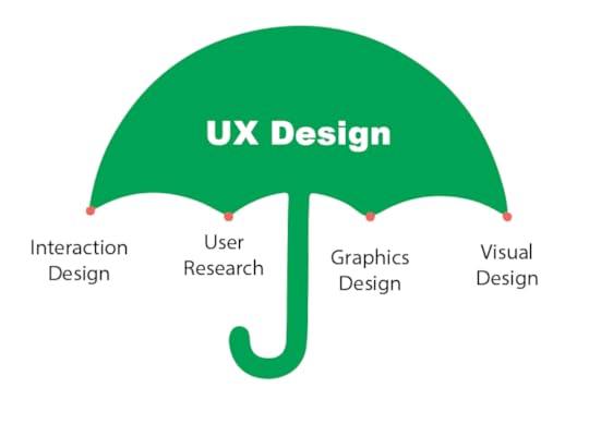
Key areas of IxD
Knowing the key areas will help prepare your user research. It will ensure that you’re examining each element to some extent and that is working well for your users. Here are the three key areas of IxD.
Usability
Usability is the bare minimum of IxD. If your users can’t use your product, they certainly won’t desire it. The Usability of a system should be straightforward. The less the user pays attention to figure out how to use it, the more he/she can complete the goal. A system must be usable before it can be beautiful.
Influence
A critical element of UX is the ability to influence your users to do something. Whether it’s making a purchase or subscribing to the newsletter. The key metric of influence is usually the conversion rate.
Visual Design
Visual design plays a vital role in UX. This lets users know what they need to respond, what to click or where to navigate. It is the first impression your product will make. Studies have shown that you have 50 milliseconds before users have made their first judgments on your product.
Dimensions of IxD
Gillian Crampton Smith, an interaction design academic, first introduced the four-dimensional definition of the IxD. In an interview in Bill Moggridge ‘s book “Designing Interaction”. Later Kevin Silver, senior interaction designer at IDEXX Laboratories, added the fifth. Behaviour. Here are the five dimensions of IxD
1D: Words
Words used in interactions, like button or input labels—should be meaningful and easy to understand. Should be written in such a way that they communicate information easily to the end-user.
2D: Visual representations
Visual representations include graphical elements like images, typography, photography, icons, diagrams and any graphical elements. The visual representation can be more powerful than texts. For example, search icons are very much familiar to the users. Without even looking at the label anyone can tell there is the search option.
3D: Physical objects or space
This includes the medium through which the user interacts with the product. It could be a mobile/tablet screen, computer peripherals, joystick, etc. For instance, A user is standing in a crowded subway while using the mobile app on a smartphone or sitting on a desk in the office surfing the website. All of these affect the interaction between the user and the product.
4D: Time
Time is the length that the user spends interacting with the first three dimensions. Interactions happen over time. Usability, Responsiveness, Context, Perception, etc are defined for the users to understand the interactions between the users and the product/ interface
5D: Behaviour
It’s how the other dimensions define the interactions for a user. This includes the functionality of a product: how users perform actions on the product, how they use the product. It is the emotions and reactions that the user has when interacting with the system.
Interaction design principles
There are certain principles for IxD. It’s impossible to list all of them. Here are the major principles that are proven and widely used.
Goal-driven design
It is the design that considers problem-solving as the highest priority. It focuses first and foremost on solving a specific pain point of the end-user, as opposed to older methods, which focused on technical capabilities.
Usability
Usability is responsible for the question “can the user use this product?” Good usability is a fundamental requirement of IxD. Four things that have a direct impact on usability.
Learnability (how easily can a new user learn to use the product?)Efficiency (how efficiently can users achieve a specific goal?)Error rate (how many errors do users make while performing a task?)Error-recovery (how quickly the product and the user recover from errors?)
Ergonomics
For IxD, Interaction designers often use a predictive model of human movement, known as Fitts’s law. According to Wikipedia,
“Fitts’s law is a predictive model of human movement primarily used in human-computer interaction and ergonomics. This scientific law predicts that the time required to rapidly move to a target area is a function of the ratio between the distance to the target and the width of the target.”

Positive responses
The system must impose a good design that influences positive emotional responses in users. Colour palettes, fonts, animations are the elements that influence user emotional responses.
User-centric approach
It is difficult to design for an abstract user when it comes to product design. For a specific user group, designers should always personalize their decision. “User personas” are a great design tool.
User personas are fictional characters, which designers create based upon their user research to represent the different user types that might use the service, product, site, or application.
Design patterns and guidelines
Designers address interaction problems by using patterns. It’s a solution for a particular context. Often, it’s possible to address new problems through the modification of existing patterns.
Usually, interaction designers start with well-known UI guidelines such as Human Interface Guidelines (HIG) by Apple and Material Design by Google. These interface design guidelines provide the familiar pattern, best practices and use cases.
Validation via testing
We may have multiple solutions for one specific interaction problem. The best way to find a better solution is to validate it through testing. Not all solutions pass the test, hence sometimes we have to return to the drawing board to design an alternative solution.
IxD Methods
Here are a couple of widely used IxD methods.
Defining Use Cases
A use case is a written description of how users will perform tasks on an application or product. It outlines the topics from a user’s point of view.
Card Sorting
Card sorting is a method used to help design or evaluate the information architecture of a product. In a card sorting session, participants organize topics written in cards into categories.
Prototyping
A prototype is a draft version of a proposed solution against a specific problem. It is used for validating ideas before implementation and iterative improvements.
Conclusion
In this article, we’ve covered the interaction design and the importance of improving the IxD. From key areas to dimensions, and methods. We’ve discussed all the principles you need to grasp as an interaction designer to design and improve your UX. We’ve also discussed the basics of UX and it’s relation with IxD.
To create efficient IxD, I recommend using UXPin. UXPin offers all the features you need to create a successful IxD, simplifying the process of designing and prototyping with powerful features!
The post Improve Your UX with Interaction Design Elements appeared first on Studio by UXPin.
November 18, 2020
Branding and Logo Design Trends for 2020 – 2020 Design Trends with Chiara Aliotta
 05 0
05 0Welcome to another one of our interviews for 2020 Design Trends. Today I’m joined by Chiara Aliotta. Chiara, tell us a bit about yourself.
Chiara Aliotta: Hello. Thank you, first of all, for inviting me. I am an Italian designer. I define myself as a brand keeper and I work under the name Until Sunday.
UXPin: Can you share a little bit about your experience? What’s your field of expertise?
Chiara Aliotta: What I mostly do is branding and brand consulting. I work with companies and startups to help define their brands, work on their core messages, and define their targets. And, of course, define their image and how they need to talk to their audience. I love typography. I love designing logos with a purpose and I love sharing my knowledge with other people.
I often participate in two conferences where I talk about my life as a designer and how design can influence everyday people, not just designers and developers. I like making people happy, using what I design. Actually, I found that my work is very interesting because it has touched so many people, and it may change their lives as well.
UXPin: That’s amazing. Speaking of design trends for 2020, you said that you like logos and you consult with new brands on designing logos. Can you share with us what will be hot in logo design in 2020?
Chiara Aliotta: I hope that the eighties’ esthetics are coming back because I’m a millennial, so I’m moving to where my forte is. I see successful studios like Netflix, and the shows Stranger Things and Dark, and they are inspired by the eighties and they brought me back to my childhood. I think if brands want to engage more with my audience—millennials—one way to do it is by bringing back this kind of nostalgia. I can imagine logos to be inspired by neon lights or being pixelated or inspired by video games like Super Mario. I can imagine very fun logos.
Otherwise, another trend that could be very possible is animated logos. We are slowly moving away from structured logos that are printed and always need to be that way and never change. Right now, brands are spinning on the screen more often, and the brand experience actually happens on the screen of different devices. Logos can also be very interactive and interact with the user in different ways. Animated logos could be another trend that could happen in 2020. I am very curious to see how it would go. We are still in the beginning.
UXPin: I’m wondering about the eighties and nineties nostalgia thing as well. A couple of days ago, I had this talk with another designer and they said that they never would have guessed that pink was going to be the next “it” color. I think it’s because of the neon fluorescent color. You said things change and we’re going from the structured logo to maybe animated logos, but a huge part of branding and logos is typography. We had a year of Helvetica. We had a year of Comic Sans – maybe we’ll experience the great comeback of Comic Sans. So which fonts will be, in your opinion, popular in the 2020s? Do you think custom typography will be a significant trend?
Chiara Aliotta: This brings me back to a talk that I gave in 2008 about the power of typography and the ability to be expressive without using images. The title of the talk was, “You just love me for my body.” The title was very provocative because I was trying to ask developers to join a design talk. The talk was about expressive typography and that was also the year where the font Gotham was used to deliver a message of hope, change, and freedom in Barack Obama’s campaign. So that moment, typography was starting to be a very strong element in design. Finally, people were recognizing typography as being an expressive tool, and an emotional tool.
 Source
Chiara Aliotta: In 2019, I saw how many websites and many applications were using a very type-only approach. What I expect for this year is that variable fonts will become mainstream on the web, and custom typography for brands would be the only viable way to deliver a message that is consistent and to the point.
UXPin: For the second time you bring up the point of shifting from print to web, and of course it has a great value and amazing opportunity, right? When it comes to logos or typography.
Chiara Aliotta: It’s also my background, because I started as a print designer. Whatever I knew from print I brought into the web, when notebooks were telling you how to design for the web. Supreme was always my reference. There will always be this duality for me in my work.
UXPin: Speaking of which, I think that design in general changes, obviously the trends are changing, but jobs are changing too. It is said that in about 20 years we’re going to have 70% new jobs and positions that we don’t even know about yet. But of course most of them will be in the development field or engineering. But in our environment and our industry, people are saying the UX designer job is disappearing. Would you agree with that? And if so, or if not, what are the new titles that are going to be trending?
Chiara Aliotta: It’s funny because in 2016, the first company asked exactly the same questions to design leaders. And four years later we are still discussing if the UX designer job is going to die. I think it won’t die as long as we need to create interaction between humans and technology.
 It will evolve because technology is evolving, and the words used for this year are specialization and diversification. So if you’re asking for new job profiles that will be listed in 2020, I already wrote a few that could be very interesting.
Chiara Aliotta: So let me recall. One is the drone experience designer. The other one is emotional intelligence experience designer, or human empathy experience designer. As long as technology is going the way of VR and all these new tools that are appearing in our lives, there will be more of a need to create experiences that are close to the way humans actually work, so that we can teach these machines to actually communicate with us.
UXPin: Yes, exactly. I agree with you that UX designers are not going to be needed. They just need to specialize, right? And maybe specialize to the technology that they work with.
Chiara Aliotta: They work with, yes.
UXPin: So my next question to you would be, what is your favorite emerging trend in your field of design in 2020?
Chiara Aliotta: As a brand designer with a focus on branding, what I see right now is how brands are getting more involved in the real world we live in. And how the stories they tell us are more real and tangible. Brands that are getting involved in new trends like global warming, gender equality, sustainability, and so on, will be even stronger this year. And what I like is that these brands are trying not to be meaningful just for you or me as individuals, but they’re trying to be meaningful for communities, and be more powerful. They are starting to understand they have power and that their message is going to be strong enough to dictate change. I like that this is happening this year, and I hope they will invest even more funds to support the causes they believe in. This is going be a very interesting year in that sense. We’re going to have a lot of interesting brands getting involved and making their voices heard.
UXPin: Yes, exactly. Technology is developing and that is the reason why we need brands to be more human. That’s why you have to have a story – not just for the sake of the story, but for the people who engage with your brand.
Chiara Aliotta: Exactly, yes. I agree. True connections.
UXPin: So my last question to you would be, what are your professional goals for 2020?
Chiara Aliotta: A few days ago I finished writing a very long list of solutions, which I’m not going to share with you because time is short, but I’m going to share just one. I hope that behind every prediction that I just gave to you, I will be able to actually face the unpredictable with creativity and use my creativity to beat the odds. That’s my solution.
UXPin: Yes, creativity is like the evergreen trend, isn’t it?
Chiara Aliotta: Yes, it is.
UXPin: Thank you very much, Chiara, for joining us.
The post Branding and Logo Design Trends for 2020 – 2020 Design Trends with Chiara Aliotta appeared first on Studio by UXPin.
UXpin's Blog

- UXpin's profile
- 68 followers

