
UXpin's Blog, page 85
January 5, 2021
7 Best Reasons To Use React.js Components In Your Project
React.js is a library of Javascript components that can be used with UXPin to create your projects faster and easier. The many React benefits make this a popular option with product designers and anyone interested in creating their own page or app.
Designed in 2013 by Facebook, React.js allows you to build a mobile app or a simple web page. Don’t be fooled by the simplicity, though, the library is full of powerful options that speed up the design process. With the components available, you can create apps that instantly update as new information or data is collected.
1. Instant updates without page reloads.
Perhaps the biggest of all React benefits is the ability to update individual elements on your web page or app without the need to reload the entire page. You can see this in action on Facebook, when people click like or write a comment that appears immediately. There’s no need for excessive loading and this feature makes it possible to update information as it comes in.
2. Use conditional statements within the JSX.
JSX is a Javascript extension to make React.js components more efficient. You can use it to create a single file for both markup and logic, eliminating the need to work on multiple files. JSX allows you to easily create conditional statements to improve your design and the functionality of the app. In fact, you can blend HTML and JSX together to give you exactly the result you desire.
JSX is also much faster than Javascript, so you can get your project done faster. You’ll find it quite simple to build your own templates.
3. Reuse the same components.
As you design your mobile app, you can use the same assets. React originally did not reuse code components, which meant a lot of time was wasted. However, that option is now available and you can speed things up even more by using the same code or assets and then adjusting to your needs.
4. Update just one component.
Every React.js component acts separately, so you can change one section of the app without needing to update everything. This also means you can use the same component in each area of the app and change the individual pieces. There’s less to update, so it makes the entire process far more efficient.
If there is an error or an update that you need to make to the app, you can do this easily. In many apps or programs, updates are difficult because of the complex nature of the code. A simple change in one area can end up causing issues throughout the entire app. However, with React.js components, you can make quick adjustments anywhere you like without worry.
5. The code is nice and stable.

As opposed to many other options, React.js offers a stable code. This is done by using a downward data flow. It’s actually how the code protects the parent structure from changes in the child structure.
If you’ve previously had problems with unstable code, glitches, and long, drawn out maintenance procedures, you’ll love React.js. The ability to fix a glitch by only focusing on that component saves more time.
6. React.js is easy to learn.
Anyone can learn to use the React.js components, because it’s so user-friendly. One of the biggest React benefits is the fact that if you know Javascript, you’ll know how to use React. Even if you don’t know Javascript, you likely won’t have an issue learning the components. They are so well set up and designed that it takes very little time to understand them. The code is also very focused, so you only need to learn a little in order to do a lot.
7. React.js has a very sturdy engineering team behind it.
While originally designed for Facebook to use in-house, the React.js library is now available to anyone who wants it. However, the engineering teams behind the design are still a big part of the program. These include teams from Facebook and Instagram, and outside developers with an expertise in the area.
When you use React.js components for your apps, you’re in expert hands. It’s also helpful to remember that some of the biggest apps in the world are using React, making it likely Facebook will support it for years to come. Netflix, Paypal, Dropbox, Khan Academy, Lyft, Reddit, Coursera, and BBC are just a handful of the many sites that are built with React.js components. As it becomes more popular, you’ll see the framework on even more Fortune 500 company sites.
React.js can be expected to continue improving and building on existing factors, because of its importance around the world. It makes creating the perfect user interface that much simpler and allows you to get your product, site, or app out on the market faster than ever.Are you ready to get started with developing your own app today? Join UXPin for free to get going.
The post 7 Best Reasons To Use React.js Components In Your Project appeared first on Studio by UXPin.


December 30, 2020
React vs. Flutter: Which Framework Works Best?
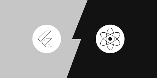
Both React Native and Flutter have received a lot of publicity lately. Both are frameworks that make it easier to build sites or apps, but one stands out above the other. Not all solutions work for everyone, so it’s important to research the best option for you. Today, we’re looking at React vs. Flutter, which one is best for your programming needs?
Apps are now being used to manage nearly everything in our lives. According to Global Web Index, people are turning more and more to mobile apps to keep track of their time and everything else.
Why React Native is Better Than Flutter
There are a number of factors to consider when comparing these two platforms. However, the desired end result plays a big part in the decision-making process. You want a framework that is easy to work with, fast, and that results in a stable app that does what you need it to. Of course, you’ll want to easily update the app and manage the code, too, but the main goal is to have a functional, non-problematic product at the end of it all.
With that in mind, let’s look at what these two frameworks have to offer.
React Native was released by Facebook in 2015 and is a framework that uses React (available since 2013) to create native applications. Flutter is also meant for building native apps, but is a portable UI toolkit. Flutter was released in 2018, by Google.
Both frameworks are free and both are open source, though engineers continue to work on them.
The user interface is more varied
An important factor to consider when choosing a framework for your app is the user interface. How will users experience your app on different platforms?

React Native offers native components for Android and iOS, so the experience is the same across platforms. All the components, buttons, widgets, etc. are the same across platforms and when you update the OS UI, all the app components will be immediately updated. React Native has a wide variety of external UI kits to choose from. You can pick from iOS-style components, or several other kits to fit your needs.
Flutter has a flexible, fast-rendering UI with its own design, including interactive widgets, platform, and visual designs. These replace the native components, which not everyone wants to do. Flutter also uses pixel rendering to ensure the UI is identical, down to the pixel, on all devices.
If you want variety and options, React Native is what you need. Flutter offers more flexibility, but less variety.
Simpler programming language
You may already be aware that React Native uses JavaScript. This is a well-known programming language that most developers are already used to. In fact, According to Stack Overflow, over 70% of pro developers are familiar with JavaScript. When you move into using React, it is intuitive if you’ve previously used JavaScript.
Flutter uses the programming language Dart, which is almost exclusive to Google. It does allow you to compile native code at a more rapid rate, but it means a steeper learning curve for anyone outside of Google.
In this case, most people prefer to stick with what they already know, so React Native tends to be chosen.
Less time is required for development
Developers are always in a rush to get their apps finished, perfected, and sent out. That means, they need React Native, as it is much faster than Flutter. The framework is designed to make creating a mobile app very quickly. A number of factors play into this, including the ease of programming JavaScript in place of Dart.
Flutter takes longer due to the fact you have to code each section separately. React Native offers ready-made components that can be placed and adjusted as needed. You can also reuse these components as necessary without affecting the other components in the app.
Different coding styles
React Native has a more complicated code structure, but you can use the same code throughout web apps, Android, iOS, Windows OS, etc. This makes it possible to share codes in third party libraries that are free for the taking. You, as the developer, can focus on the actual code, rather than worrying about whether or not it is compatible.
Flutter, however, leans toward the simpler code options. You can code everything in one place and have access to it all. Templates, data, and styles are not separated. While this is simpler to use, code sharing can only be done between Android and iOS. This is expected to change, but for now, Flutter is much more limited than React.
Overall, React Native is preferred by 42% of developers and Flutter is selected by 39%, showing a clear preference for React Native. While both options are used for creating apps, there is a definite reason to select React over Flutter.Are you looking to create your app or web page? There’s no better time than right now. Join UXPin today for free and get started.
The post React vs. Flutter: Which Framework Works Best? appeared first on Studio by UXPin.
December 28, 2020
The 30 Best Google Fonts for Your Website
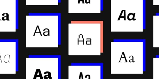
Google Fonts has a library with over 1,000 fonts that you can easily add to your website with CSS. Having access to so many options sounds great until you realize that you will never have enough time to look at them all. Luckily, you don’t have to. Explore 30 of the best Google Fonts to decide which ones will look amazing on your next website design.
To make the process even more comfortable, UXPin now lets you add Google Fonts to your prototypes. You don’t have to worry about finding a go-around that puts your favorite fonts into UXPin. Just choose an option that suits your project and get to work!
Why using the best Google Fonts matters
If you don’t work in website design, you might wonder why it matters whether you have an extensive library of fonts. As long as text gives readers the information they need, it does its job well, right? The graphics and layout make sites look appealing. Who cares about the text?
People make a lot of incorrect assumptions about fonts. Graphic designers probably recognize some of those mistaken assumptions in the above paragraph.
The biggest mistake is confusing text with fonts. Text gives readers direct information. Fonts use typography to guide the website visitor’s eye, emphasize certain pieces of information, and add to a website’s attractiveness.
Choosing the best Google Fonts for a website can also:
Create a visual hierarchy that makes some areas of the page look more important than others.Control how much white space designers use on pages.Add contrast between the page’s background color and the text’s font.
The best Google Fonts work well on mobile devices
Perhaps most importantly, today’s website designers need to think about how different fonts will appear on mobile screens. About 81% of Americans own smartphones. Most Europeans also own smartphones.
By country:
81% of French adults own smartphones.72% of adults in Spain have smartphones.71% of Austrians own smartphones.
With so many people accessing the internet via smartphones, it makes sense for website developers to choose fonts that will look clear on small screens. The trend toward smartphone ownership will only continue. A lot of people still use desktop and laptop computers, but smartphones play an undeniable role in how people browse content, shop, and communicate.
Fonts can add to a website’s brand
Some companies invest a lot of money to have graphic designers create unique fonts that make their brands stand out. When you see Under Armour’s font, you immediately identify it with a brand that makes reliable athletic clothing, shoes, and accessories.
Other fonts that you probably associate with specific brands include those used by:
EnergizerApple Abercrombie & FitchBuzzFeedWalmart
Once you start paying attention to fonts, you can’t ignore the subtle differences that make some more unique than others. Walmart uses an interesting “t.” Apple uses a thin font that gives practically every letter “feet.” (More on those feet in the next section.)
Categories of Google Fonts to explore
Before you can distinguish the small differences between the best Google fonts, you need to learn the general categories that people use when identifying fonts.
Serif fonts
Serif fonts have small lines at the bottom of letters. The lines often look like little feet. Brands that choose serif fonts often want to look luxurious and intelligent.
Popular serif fonts used by today’s website designers include:
RomanaOggGaramond
If you’re not familiar with the latest typefaces, think of Times New Roman. It’s probably the most famous serif font used today.
Sans-serif fonts (often referred to simply as “sans”)

“Sans-serif” simply means “without serif.” These fonts don’t have the “feet.” Brands that use sans-serif fonts may want to create a modern, hip personality.
Popular sans-serif fonts include:
FuturaCircularGraphikGotham
If you use word processing software, try Calibri to see a common sans-serif typeface.
The Best Google Fonts to Explore for Your Website Prototypes
Now, let’s look at 30 of the best Google Fonts available right now. They’re numbered, but don’t let that influence which one you choose for your next project. Always choose the best typeface for the project.

Clean and curvy.Elegant appearanceLooks strong without dominating the page.

A readable typeface that works well for pages with a lot of content.Can work as a headline or content text.

A good choice for strong, bold headlines.Has a traditional look when downsized.

Clean, modern typeface that looks great as text for professional brands.
Extremely legible, which makes it great for long blocks of text or multiple blocks.

Unique look that not many websites use.A modern, fun twist on Courier
Geometric sans serif commissioned by Google.Meets the needs of diverse devices and screen sizes.

Very easy to read.Fresh. simple look makes it a strong choice for trendy brands.

Manages to look beautiful and legible on screens of all sizes.

Simple look manages to grab attention.Futuristic aesthetic.

Very modern, curvy typeface.Wide spacing makes it useful for headlines, sub-headers, and pull-out quotes.

Sleek look that looks great as a stand-alone sentence.Unique curves make it charming without losing sophistication.

Versatile font that will look great on any device’s screen.
Extremely readable typeface for blog posts and articles.Looks good with many other fonts, including Roboto and Oswald.

Heavy typeface that demands attention.Automatically adjusts itself to the reader’s device.

Works well as an eye-catching display font.Thoughtful spacing makes it a good choice for text blocks.
A font for all languages, making it suitable for websites used by people around the world.
Has rounded terminals that guide the eye from one word to the next.Not an extremely popular option for websites, so you can use it to stand out.
Modern aesthetic that exudes sophistication.A diverse typeface that can work as headlines, block quotes, and sections of text.
Made specifically for computer screens.Adapts to mobile devices.Looks great on pages with minimal text.

Highly versatile typeface with 18 variants.Multilingual features.
Narrow text that looks amazing as a headline but can feel cramped as long-form text.
Very readable on desktop, laptop, and mobile device screens.Diverse options give designers more control over its personality.
Attractive, modern text that doesn’t sacrifice legibility for style.Good option for designers who want to add contrast to pages.

Easy-going personality that puts readers at ease.Diverse options make it a strong choice for designers with an eye for balance.

Serif typeface that makes headlines stand out.

One of the most legible Google Fonts.Versatility makes it useful for text and headlines.

Professional typeface for brands that want to reinforce trust and expertise.Easy to read.Works well in print and on screen.
Stylized functional typeface that works in nearly any situation.

Doesn’t distort regardless of screen resolution
Get started with a free trial from UXPin
Start adding the best Google Fonts to your website prototypes today by signing up for a free trial with UXPin. Once you see how UXPin makes it simple for you to create amazing websites, you’ll understand why so many other designers choose it.
The post The 30 Best Google Fonts for Your Website appeared first on Studio by UXPin.
December 23, 2020
The UI Enterprise Components You Need to Design Your Business App
Smartphones have become an essential part of everyday life. The way consumers interact with a business has completely changed. But the changes to how we interact with companies don’t stop there; our work lives have changed completely. Over the last nine months, business has moved from almost entirely in-person to almost entirely online. RedHat explains, “In our always-on, mobile world, a field worker with a smartphone expects to be as connected as a colleague at a desk. Enterprise mobile app development is about making this connectivity possible while meeting the security and reliability requirements of a large organization.”
Mobile apps can be a great way to enhance the technology that supports your customers, employees, and stakeholders. Depending on your business, you won’t always be able to rely on your workers having stable internet or access to a database for using your systems back at the office. At its best, the mobile app provides access to core functionality that your users need when they aren’t in the office. This can be navigation, connectivity, data entry, information access, or any number of other core features. It shouldn’t replace more complex software, but make life easier for workers who are in the field, in a clinical setting, need to travel, or otherwise want and need the flexibility of mobile access to information and tools. Your mobile or web app should be an extension of your technology tools suit, though. It should look and feel like an extension of the other tools in use. By considering app design and technology needs in your design system, you can ensure that development is more efficient and that your user experiences are streamlined across devices and tools.
The Design System
The Who, What, Where, When, and Why of a Design System
A design system is more than a set of guidelines or rules like a style guide, though it should include your style guide(s). While you may already have a design system in place for your other products and web sites, if you don’t, it’s an excellent investment. And if your current design system doesn’t include app components, it needs to be updated. It is a complete library or catalog of components that can be reused throughout your product or ecosystem of tools to enhance brand consistency, improve user experience, and, most importantly, make design and development as efficient as possible. The library includes color schemes, typography, graphics, layouts, everyday interactions, design patterns, and the front end code to implement those components. It may even include hooks to the back end for major components like data analytics, database integration, notification structures for various environments, and features supported by technology like GPS. Beyond that, it also describes when to use each component and incorporate it into the design. The effort to set up the design system can be extensive, but it pays off in the long run both in terms of quality as well as in design and development costs in the future.
Your design and development teams are not the only groups that benefit from standardizing and building reusable components. Other teams like quality assurance, marketing, and product management all benefit if your design system is properly designed and implemented. Updates are smoother when receiving new assets such as a logo from marketing, you can simply update your asset library. New feature ideation and design are more efficient because you have a tested and proven set of templates and patterns to follow. Concerns and needs of these other groups should be discussed and incorporated into the design system from the start. It’s a good idea to interview all stakeholders to find out:
what is working for them, what data informs their decisions, how they like to work, any challenges they’ve faced so far, how documentation and communication will be handled, and any expectations they have.
Keep these groups in the loop as the system develops and ensure that any design reviews for components include them to save on rework later. Ultimately the goal is to provide an incredible user experience and keep the internal processes running smoothly and efficiently.
Here are a few benefits of a design system.
Brand Consistency – A single design system used across all your enterprise and end-user products and applications ensures that all external and internal users receive the same message wherever they interact with your brand.Teamwork – Your design system sets up a consistent language for all of your teams and stakeholders. This reduces miscommunication and confusion, streamlining all product and business decisions in your design and development process.Reuse and Scalability – While standard components are the system’s building blocks, they can be combined in endless ways to suit the user’s needs and functionality. Considering the mobile and web app components is essential, as these components are the core of their entire system.
How do I Build a Design System?
There are many tools and services available for creating your design system and your app itself. Tools like UXPin provide the framework, while other companies offer design system creation as a service; in other words, they will build it for you. The tool you select will depend on your needs and staffing. If you’ve got a strong, stable design team, they can do the work in-house.
When you start looking at your app and design system tools, begin with a full inventory of the types of features your enterprise tools will need to include. Think about your technology roadmap, not just what your current needs and feature set include. You want your design system to scale with your business. Make sure you select tools that can support those features and functionality. If your company has a delivery service, you’ll need GPS support. If your employees work in the field, you’ll need offline availability for data entry. Make sure the tool you select covers your component needs in these areas.
Data processingAnalyticsHooks to the back-end infrastructureMessagingNotificationsPayment gateways for purchasingDevice integration such as maps, camera, and microphone usePersonalization through customization and machine learningTies to social mediaFramework for Content Management System and/or Customer Relationship Management
The Components
Mobile apps and web apps have different requirements and considerations compared to other types of products. Your apps should serve a particular service and contain the core functionality needed, space is limited, and user attention is scarce.
Great Navigation
Navigation is your app’s skeleton. It is one of the first and most important components to consider and include in your design system. Navigation should be simple, clear, and facilitate your users in completing their critical tasks. Design considerations include:
Familiar controls and icons that are easy to understand.Easily accessible one-handed.Co-located in one area, top or bottom, for example.Limit to 1-2 primary navigation methods.Consider a search option for content-rich apps.
Helpful Notifications
Notifications are vital interactions for users, both while actively using and not actively using the app. They fall into several categories; warnings, errors, information, and confirmation. Both Android and iOS have frameworks to support asynchronous and synchronous notifications, along with user settings for privacy and personalization. Consider the following when planning notifications.
Use clear, simple language. The device OS will have key fields and include app name, icon, and time stamp. This takes up space and also needs to be complete for proper formatting and display.Each device will also support creating a short version for display in notification centers and a longer form for full notifications.Each notification should support the overall workflow for the user, particularly synchronous messages. The asynchronous messages should include context so that the user can jump back into the flow efficiently.Consider using color, icons, or text to indicate the type of notification to the user. Is it something that is urgent and must get fixed? Or is it just a confirmation that the task completed successfully? Users are distracted by multiple sensory inputs, and these signals will help them prioritize.Use consistent elements for each type of notification and modality. Like color, icons, and text, your users will be able to make decisions about their activities more easily through these queues.
Seamless Device Integration
There’s no need to recreate features and functions that are already available on your user’s device. Be sure to consider variations and code snippets needed to support these integrations on a variety of platforms, iOS and Android at the very least. Some of the connections you’ll want to consider include:
Camera accessSocial Media appsPayment options like ApplePay or PayPalGPS navigation and mapsChat, messaging, and phone access
Offline Features
One significant advantage of mobile apps over websites and web apps is the ability to include offline content and features. Unlimited data plans are cheaper these days, but there are still times your users may want or need to access your app when there is no service or wi-fi available. Requiring the user to be connected simply can’t be avoided for things like location sharing or placing a purchase. But, consider what features might be useful or desirable if your user is sitting on a plane, for example. This is particularly important if your users often use your app in remote locations or challenging work environments. Here are a few functions you may want to consider for offline use.
If your app is used for data entry, such as in a medical/clinical setting, allowing offline data entry and syncing may be essential for timely and accurate recording of vital information.Allow content downloads for later use, such as movies, books, music, and other media.Allow in-app preferences and settings to be stored locally and synced later.
Beautiful Visualization
Screen sizes vary, but even on the largest mobile screens, real estate is limited in apps. Every element must serve a purpose, and that purpose must be immediately apparent. Visualization is more than aesthetics; it tells a story and lays out the path forward to complete the user’s task. Using images, icons, and standard elements can save space and time for your user by skipping long blocks of text. Depending on your app and its features, simple graphs, tables, and charts can convey large amounts of information in the small space available. Visualization components should be considered carefully in terms of their purpose, whether expediting the user flow or providing an engaging interaction.
Keep the graphics simple and clear.Avoid requiring users to scroll to see the whole picture.Break-up flows and content into small pieces that allow the user to work through them by gradually expanding the next element or tapping a button.Use tables to layout complex or large amounts of data, and include simple, clear labels.
Efficient Forms
Forms are used for payments, app setup, contacting support, and endless other interactions within apps. Form design should be simpler in your app but can leverage existing elements of the design system.
Field labels and dropdown contentsLayouts including alignment and spacingButtons and button labelsError statesStandard text components like instructions. For mobile, these should be cut down and provide the simplest, clearest text possible.
Summary
Your enterprise design system helps tie together all involved teams and stakeholders, making the entire development process more streamlined. Apps require unique components, stripped-down versions of existing components, and differing backend needs. Before tackling any app development project, be sure your design system is up to the task with UXPin. For even more considerations, decisions, and actual execution for creating an app, check out this detailed guide.
The post The UI Enterprise Components You Need to Design Your Business App appeared first on Studio by UXPin.
December 21, 2020
The Stages of UX Design Process
The value we provide to the user with our product is called User Experience or UX. Developing an efficient UX is the key to product success, whether it is a saas application, website or any other software/hardware product.
To develop an efficient and successful UX Design, the team has to follow a standard procedure called the UX design process. It allows the designers to iterate and improve their designs decision and methodologies.
UX design process defines the entire process of design. From integration to the evolvement of the product while maintaining branding, business opportunities, usability and functionality.
In this article, we will explore more about the UX design process; its different stages and best practices.
What is UX design?
Let’s talk about UX design first. In 1988 cognitive psychologist and designer Don Norman first introduced the term UX. UX design or UXD forms the digital face of a product — leading users around its features and offering them something that influences how they feel. Content, structure, and navigation all work together to give someone a meaningful experience.
It’s a process that defines the interaction between the user and the product. UX extends traditional human-computer interaction (HCI) by addressing the user’s goal, journey, and pain point and proposing an effective solution.
The purpose and benefits of UXD
The primary purpose of UXD is to design such an experience that helps users to complete a particular product goal efficiently.
A well-developed UXD can significantly improve the satisfaction of the users. That leads to higher conversion rates, growing business and revenue.
Here are some key benefits of good UXD.
It increases user acquisition and loyalty.It maximizes opportunities to generate more traffic and business. It optimizes resources. Also helps to reduce time and costs for development.It helps to design features that are more optimized for the product goals.It helps to reduce error resolving and maintenance cost.
What is UX Design Process
It is an iterative process that explores the design solutions for a specific set of UX problems.
On each stage, we iterate through different design decisions and solutions. Also, we evaluate existing design decisions and propose improvements.
Each move involves relevant stakeholders of the product. So that every design made is efficient and accessible.
Importance of UX Design Process
Here is some important aspect of UX Design Process:
By following a standard design process, we can be more efficient and transparent. Therefore, we have a tested and refined design solution. With each iteration, we can revalidate our decisions from different perspectives. And make them more refined.It also reduces risk because we use a tested solution — no guesswork is necessary. It also helps to track and cooperate easily with team members and stakeholders.It helps us to find solutions for issues we might not even know that exist. Ultimately, we will have a well-worked product that is easy to use and that the customer wants to use.
Stages of UX Design Process
A successful UX design process might be different for you from what we have outlined here. It entirely depends on your team, product or existing processes.
Typically the design process consists of six stages.
Understanding the problem
Before you even start to look for a solution first, you need to understand the problem. We need a clear idea about the user goals, pain points and what is blocking them to perform a specific task. We can not find a solution unless we know what problem we are solving.
Conducting Researches
After we successfully pinned down the problems, the next thing we do is the research. It is the heart of product development. The knowledge and information we gather in this step will be responsible for the product fundamentals and functionalities. We also define relevant user personas and journeys in this step.
User interviews, surveys, workshops are some widely used research methods.
 Source: Pexels.com
Sketching and prototyping the decision
This stage involves the visual definition of a proposed design solution. It includes sketches, drawing, paper mockup, interactive prototyping, to name but a few. Testing and evaluation of design decisions are part of this stage. Design team builds mockups and shares with stakeholders and users to get their input.

Building Design
In this step, we build the actual design. Turn the mockups and wireframes to a visual design with themes and styles. We also build a design system that will act as a source of truth for all visual implementation. Here are some primary things we build in the design step.
Product NavigationUser journeyMockups and wireframes Visual assets including, images, illustrations and icons.
 Source: Saif71.com
Implementation of the design
The technical team can start implementation while the design phase is in progress. Since they are participating in every stage and iteration through the process, they have a clear idea about the design.
It is a standard practice that the design team is involved in the implementation step. So that they can help developers to explain various aspects of the designs. Also, designers can make some minor changes that might be required.
 Source: dribbble.com
Validate designs
So we finished developing the first version of the product. It’s time to roll it out to production. An important part of the job comes here for the design team, validating the design. We need to monitor how our users use our product, how they are communicating, can they reach the goal that they desire? If not, what is wrong?
After this last stage, the process will restart again depending on required changes. The whole process goes on during the entire lifecycle of the product.
Best Practices
While the order of the stages in the design process, might not be the same for all organizations and teams. There are some best practices to follow when streamlining our design process.
User-centric thinking
End-user should be at the centre of our design decisions. User-centric thinking helps to understand users’ needs and preferences regarding the features of a product. It is one of the most important parts of designing a great user experience.
Reduce complexity
It’s all right when you use the technical terms such as heuristics or phenomenology in the design team, but remember to simplify them when communicating with the technical team and other stakeholders. It will help to make communication better and efficient.
Try relevant tools
It’s important to choose relevant tools that simplify the collaboration while working with a team. UXPin Merge is a wonderful tool for designers and developers to work together with ease.
Recycle and reuse
If you create a standard method of design like a branding guideline or a design system, it will save you hundreds of hours doing the same work over and over. For faster designing and quickly iterating through ideas, reusability is the key. You can also use a UI kit like the Material UI Design UI Kit by UXPin.
Conclusion
In this article, we covered details about UX design and its process. We also covered the importance of the UX design process and details of every stage. We discussed the best practices to follow for an efficient design process.
UXPin offers all the features you need throughout your design process, simplifying the prototyping and collaborating with powerful features! Get started with UXPin today and kickstart your design process.
The post The Stages of UX Design Process appeared first on Studio by UXPin.
December 17, 2020
Landing Page Design Trends That Increase Conversion
We all know the impact of a first impression. Landing pages are often the first interaction a potential customer has with your company. Incorporating current trends will not just keep your site fresh and current, but help to make that first impression a great one by capturing visitors’ attention, engaging them in your content or design, and getting them to take that next step.
Trends come and go, but great design is timeless. We are focusing here on landing page trends that are consistent with general principles of effective UX. Incorporating a few of these trends while maintaining a focus on minimalism, engaging content, eye catching design, and creative value propositions will make your site stand out.
Incorporate movement
One of the biggest trends, and one that’s been around for a few years now, is movement. Techniques range from background videos to subtle motion as the user moves around the screen. Movement is eye catching and pulls the user in.
VideosBackground videoIntro VideoAutoplay VideoAnimated VideosAnimationAnimated Page ElementsParallax ScrollingParticle Backgrounds (examples)Subtle Motion
Jet Up incorporates several of these techniques, without being overwhelming. The page starts with a loading animation, then uses subtle particle animation and subtle movement as the user interacts with the page. The watermark shifts slightly, the cursor is unique and changes depending on the placement, and other graphical elements shift in purposeful ways. 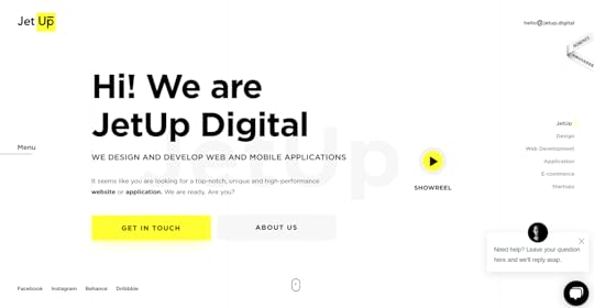
Jet Up has also provided a video, accessed by an animated button, which opens in a pop-up.
 https://jetup.digital/
Visual hierarchy and queues
The core design elements of typography and contrast feature heavily in current landing page trends for both capturing the viewer’s attention and focusing that attention toward CTAs and other important page elements.
Large fonts – using oversized typography to emphasize the most important elements, like your value proposition, helps overcome lack of attention by visitors who are simply scanning your page and making snap judgements. High contrast CTAs – bright colors are trending as well, so using a brightly colored button on a solid white or dark background helps it jump off the page.
Go to Meeting makes effective use of both trends by using a big, bold headline and high-contrast orange for their primary CTA. Contrast here is combined with another trend we’ll discuss later, offering a freebie.
 https://www.gotomeeting.com/
Interactivity
What could be more engaging than direct interaction with your visitors? People are naturally social, curious creatures. We want to play, explore, and connect. Some of the top ways designers are accomplishing this is through elements that shift, respond, move, or change when the user interacts with them.
Live chat and chat bots – establish a connection with customers, answer questions real time, and cut down on help desk calls.
 https://www.intercom.com/
Content and forms – allow users to drill down for more information, accomplish a task, or submit a request all without leaving the page.
 https://freshdesk.com/
 https://www.onerecruit.es/
Guided tours – allow users to experience your product or tool while getting a hands-on customer experience.
Strategic pop-ups – make helpful, timely suggestions when appropriate for the user flow without detracting from the task or risking abandonment due to irritation or annoyance.
Social proof
People love to ask for, and give, referrals. Think Yelp, or really any social media platform. Tapping into this trend takes more than just putting your FaceBook and Instagram links on your page, which does keep them involved with your brand, but drives them away from the page. Social proof can come in many forms, but it should always feel real, organic, and natural.
Images or videos of the product in use – pictures, videos, or illustrations can give your users a better idea of how to use your product, or see how it works.
Brand bars – show your potential customers which of their peers are using your product, or even bigger name brands to help them understand how you can help their business as well.
Testimonials – recommendations from social media platforms or direct quotes and feedback provide a personal feeling recommendation for new visitors.
Free trials and tools – first hand experience can be even better than seeing or hearing about someone else’s.


 https://www.referralcandy.com/https:/...
Imagery and Aesthetics
People HR masterfully combines some of the trends we’ve already discussed with some of the best graphical trends for landing pages. They use custom illustrations in combination with visual hierarchy of large fonts and high contrast CTAs to create a fresh, unique interface that also visually guides visitors to the most important information and next steps. The result is clean, crisp, and effective.
 https://www.peoplehr.com/
The current visual trends especially borrow from classic design principles.
Layout and design
Cards and chunking – keep content tidy, easy to digest, and provide a simple way for users to quickly parse information.
Two column layouts – great for structured content like forms by guiding the eye down the page and reducing cognitive load.
Flat design – simple, two dimensional imagery often in combination with oversized typography and bright color schemes are fun and crisp. They also work really well on mobile UIs.
Drop shadows – depth and richness can be added subtly with drop shadows.
Organic shapes – feel natural and work well with many of the other trends to guide the user, add emphasis, or provide character to the landing page.
No (or little) navigation – allow users to focus on the CTAs that lead to conversions. Navigation can distract and lead the user away from the primary goal.
ColorAmple use of white space – a staple of good design. When used in combination with other layout trends like bright pops of color, cards, and organic shapes, white space creates a simple, crisp, and fun look.Bright, vibrant color schemes – bright pops of color help focus the eye, draw attention to the most important elements of the screen.
Custom visualsIllustrations – custom illustrations are less expensive than photo shoots but provide a fresh, authentic brand personality.Photography – stock photography can come across as stale. Custom photography adds richness and originality.
Shopify is another great example of current layout and design trends. Information is chunked to be easy to digest, as well as visually appealing. Visitors can easily find and understand key information related to the service offerings. They use plenty of white space, bold colors, and organic shapes that flow across the page, pulling the eye along with it.
 https://www.shopify.com
Conclusion
Landing pages should be updated frequently based on data, so don’t worry if your first attempt isn’t completely right or needs adjustment over time. Look around for inspiration, try a few trends that might work best for your users, and tweak as needed to find the right mix. Keep it simple, don’t try to do all of these together, and have fun with your designs.
Check out UXPin 2020 Design Trends for more design trends you can incorporate into other areas of your sites.
The post Landing Page Design Trends That Increase Conversion appeared first on Studio by UXPin.
December 16, 2020
A Guide to Creating Your First React App
Facebook started using an early version of React in the early 2010s. App developers didn’t get a stable release until 2020, though. As a result, some developers have a lot of experience using the open-source JavaScript library while others could benefit from a React app guide that addresses basic and advanced uses.
Luckily, most developers can create their first React apps rather quickly because they already have experience using JavaScript.
You already have several skills to needed to build a React app
Assuming that you know CSS and JS, you already have many of the skills that you need to understand a React app guide and start building your first app. If you feel confused at first, keep at it for a few days. Also, take time to read Thinking in React. Many developers say that it helps that the five-step tutorial helps immensely.
Some prerequisites to getting started
If you have experience with JavaScript, CSS, and HTML, you’re already very close to using React. Before you can build anything with React, though, you need to install:
Node.jsPowerShellnpmCreate React App (it isn’t the only coding environment available, but it’s probably the best)
You might not need a toolchain for your first React project. However, you might want to check out options like:
NxGatsbyParcelRazzleNeutrino
All of these development tool kits will come in handy. You don’t have to use them, but you should. They will make your life a lot easier.
Know the differences between React and JavaScript
Despite the similarities between React and JS, you will have to overcome some hurdles before you can use React proficiently. Some of the differences that stand out the most include:
How you build a UI—In JavaScript, you create the interface in your HTML document, which reaches out to a server for your code. With React, you define the UI in the browser. At first, it feels unnatural to add such a short bit of HTML. Realistically, though, you get the same result. The difference is that React works within the browser, and JS needs help from a server.How you divide functionally across apps—The ways developers use JavaScript have gotten so complex that JS code often looks unbearably complex. As a result, you end up keeping a lot of files open while working on the same app. React makes projects more manageable by splitting features into components. Each component holds all of the code that it needs to perform. As a result, you get code that looks more like a short list than a cluttered library.How the app manages user data—When JS, data submitted by the user gets stored in a document object model (DOM) that the browser handles. For example, when you enter your name in a text field, the information goes to the DOM before transferring it to a server. React stores user data as variables. From the user’s perspective, nothing changes much. On the backend, data becomes much easier to manage.
Practice using React to build apps
No matter how many apps you have built with JavaScript, you will need more than a React app guide to start making applications in React. W3Schools has a primer that will teach you how to build a simple application.
You can gain more experience by:
Making a Tic-Tac-Toe game using React syntax.Experimenting in sandboxes like CodePen, CodeSandbox, and Stackblitz.Creating a UXPin Merge Library for React.js components.Taking the Codecademy course (courses cost money, but many public library systems have memberships that give their patrons free access)
Why bother learning React when you already know JS?
If you’re a beginning developer who enjoys using JavaScript to build apps, you may wonder why other people in your field get excited about React. You will discover the reason once you reach a point in your career where you need to build applications that perform complex functions. At some point, JavaScript becomes a huge pain because it doesn’t cater to the needs of today’s app developers.
You should learn React because it:

Offers reuseable components that will save you time in the long run.Avoids the pitfalls of DOM.Has a robust community of developers who freely contribute tools and advice.Is rapidly becoming the industry standard.
Learning to build with React also gives you access to numerous design patterns. Some recommended patterns that you should learn from the beginning include:
Stateless componentsConditional renderingRender propsControlled componentsReact hooks
You can gain a more in-depth understanding of React design patterns by reading The Best React Design Patterns You Should Know About.
Create and test your React app prototypes in UXPin
UXPin makes it easy for you to create and test React app prototypes. Check out Authoring and Managing JSX Presets to see how easy it is to test your code in UXPin. You just have to drop your components into the UXPin Editor canvas to determine whether they work as intended.

No matter how much app development experience you have, UXPin can help. Use the cloud-based tool’s collaboration feature to share your ideas with others. They can view your projects and leave feedback without creating their own UXPin accounts. As long as you give them the right link, they will have access to your prototypes.
You can also use UXPin to explore ideas before committing anything to code. Built-in libraries give you quick, easy ways to test features. If you like the way they work, you can build your own versions with tweaks that suit your product.
Start your free trial with UXPin
Not sure whether UXPin has the features that you need to create React app prototypes? Start your 14-day free trial to see UXPin in action. If you don’t want to continue using UXPin, your trial membership will expire. You don’t have to provide your credit card number, so you never get charged for services you don’t want. If you enjoy the benefits that developers at companies like HBO and PayPal like, choose a membership option that will help you make better React apps more efficiently.
The post A Guide to Creating Your First React App appeared first on Studio by UXPin.
December 15, 2020
Master the Basics of UI Mobile Design
As a UI designer, you likely already know, understand, and are passionate about the core principles, tools, and purpose of fantastic user interfaces. You may even be a propionate of the Mobile First design approach. More and more, though, the app is the end solution, with no need for a responsive design.
As far back as 2015, Oracle published a study showing that most millennials take their app experience into account when selecting a company’s goods and services and that their recommendations are similarly influenced. They reported that 65-75% of Millennials prefer to use apps for purchases, paying bills, and reporting issues. More recently, COVID and other factors are changing app usage as well. According to Forbes, people are spending their money more and more on in-app purchases (within games) and subscriptions (non-game apps), staying within the ecosystem of their mobile device.
While a company’s user experience should be consistent across their products and user touchpoints, there are special considerations for web and mobile app design as compared to web design. The overall process is the same, and a design system should cover all products for branding, patterns, and other components. Apps require more simplicity, less functionality, and a deeper understanding of the platform they are used on.
Simplicity
A simple user interface is always a good idea. But for mobile apps, it’s the most crucial goal. An app should not replace a website, but enhance it and provide the absolute essential functionality for a user in their day to day activities. Additional functionality can be made available, but prioritization and clear signals to the user will help them prioritize as they interact with your app.
Minimize Cognitive Load
Attention spans are short under perfect conditions. It’s even more of an issue when you can’t predict what environment your user will be in, and what other tasks they are attempting to do simultaneously. No one should be using their phone when driving, but many people do. They could be standing in line at a busy store, on a noisy bus, or trying to wrangle kids.
Business apps are often used in challenging conditions such as low light, high noise, irregular temperatures, or any number of other distractions. Don’t make your users think too much or focus too hard. Hide content and functionality that isn’t core to the current task, but make it easy to find when they want or need it.
This doesn’t mean to hide options the user is likely to want or need though. Keeping options clear and obvious helps keep them on track and engaged with your app.
 Think with Google, Chapter 1: App Navigation and Exploration
Provide Minimal Functionality
Every component and element of your app needs to be an essential function for users to complete their tasks. Not every task or feature you provide on a web platform is needed for the app. Carefully consider the minimal viable product that will give your users exactly what they need for the purpose of the task or app as a whole. The more features you provide, the more complex the navigation and overall usability of the app becomes.

For example, if your app is for a delivery driver, prioritize or stick to the primary flow of receiving, picking up, and delivering the order. They don’t need to access other data like on-time stats or wage information. Those items can be left in another tool or made available but de-prioritized in the user interface.
Chunk Content and Tasks
When complex patterns or detailed text can’t be avoided, break them up into small digestible chunks. An overwhelmed user will abandon the task and your app.
Clear, simple language is essential for comprehension and to minimize clutter in the interface. Forms and long flows should be broken into steps and only presented to the user when they complete the previous step. Anticipate their needs by allowing them to get more information when needed, but keep it hidden and out of the way until then.
User Input
First-time users are turned off by long sign-up and set-up processes. An obstacle on their first experience with your app could drive them away entirely before they’ve really even gotten started. Whenever possible, collect and reuse data from other sources. You have the ability to leverage all the information housed on the phone and within other native apps if you know how to use it. This keeps the amount of information the user has to enter to a minimum. Designs can and should take advantage of the platform hosting them by tying into existing functionality on the phone or device.
If they’ve already entered personal info somewhere else, pre-populate fields. Infer information when possible such as location from GPS data already on the phone, pre-select nearby locations. Features like logging in with Google or Facebook allow users to skip tedious onboarding tasks and eliminate yet another set of credentials to remember. Leverage the device’s security protocols by allowing face recognition or fingerprint recognition authentication options.
For information that they must enter, tailor the input to help them out.
Order picklists based on frequency of use. Offer the right keyboard layout for the task, such a calendar instead of a number pad. Include field hints and other tips throughout the form and whole interface whenever possible. If a piece of information isn’t absolutely essential for the current task, leave it out of the form or flow and allow the user to provide the information at a later time.
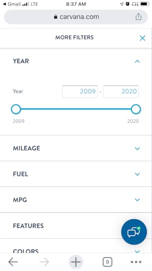
First time users aren’t the only ones that can become frustrated with your task flows. The two screens below are taken from two different car shopping experiences which users will likely use over and over throughout their car buying journey. One app forces users to go out of the primary flow to make a single model year selection.
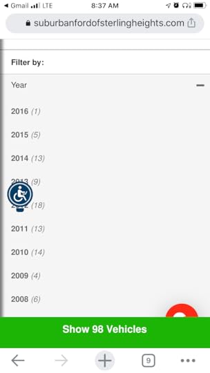
The user then has to bounce back and forth between filters to see all of the available options. The screen on the right however, allows more flexible access to a variety of filters, staying more within the flow of the task. It also allows a range of model years so the user doesn’t have to go back and forth to view the results of each year individually.
Robust Design System
If you don’t already have one, set up a design system that supports not just your mobile or web apps, but your whole suite of products and online presence. This will save you time, increase efficiency in your internal processes, reinforce brand identity, and help you stay consistent in providing a seamless user experience. Tools like UXPin allow you to set up components, your visual language, annotate and explain design decisions, and much more for consistency and efficiency in your apps and other products.
Familiar Components
Start with simple patterns people expect. Remember, simple is always better to keep users engaged and on task without distractions. Even more so than on the web, don’t try to get too creative with icons, navigation, or fancy interactions. You can introduce creativity and personality through rich graphics or innovative features, but the basics need to stay basic to support your goals of simplicity and keeping cognitive load to a minimum.
Users expect certain components like a sign up screen, loading screens, and expandable hamburger menus. If you stick to these common conventions, they won’t need to learn anything new about using your app and can focus on their task or your service offerings.
Visual Hierarchy and Queues
Mobile offers a variety of interactions and visual elements that are harder to incorporate in a website or other software products. This could be the biggest difference in designing for mobile apps. Most interfaces do use color, typography, and placement to help guide users to the most important information or tasks, but in mobile it is both easier and more complex to do.
Device platforms allow for more animation to indicate success, next steps, and other queues within the interface. These must be used carefully though to subtly guide the user, and not overwhelm them with too much visual stimulation.
Placement is unique to the mobile device due to the size and touch interface. In computer based software or web use, reach is not an issue.
 Touch research by Scott Hurff
Most people use their thumb to interact with the screen while holding the device in that same hand. Larger screens make it more difficult to reach more of the screen real estate. Placing the most important elements in the right location helps users perform critical tasks more quickly and easily.
Accessibility should not be overlooked either. W3C’s guidelines on color for example explain how using color to indicate importance is not always the best due to disabilities like color blindness. Color can be great, but problems like glare and variations of screen quality can skew color, just like someone being color blind. SmartPhones offer many different accessibility settings and other settings that can impact your design. Keep in mind how your app will work, look, and gracefully degrade when these device features are enabled.
Learn More
If you are interested in learning more about mobile design or considering specializing in this area, there are a host of options for developing your skills.
Popular platforms like Coursera, Skillshare, and UX Design Institute offer a variety of UX and UI design courses, including some focused on mobile UI design. Skillshare offers a well reviewed course called “Mobile App Design from scratch with Sketch 1, 2, 3.” Alternatively you can check out literature, tutorials, and courses available from organizations like the Interaction Design Foundation or Nielsen Norman Group,
Conclusion
Apps are constantly evolving as the devices and platforms change, and the user needs evolve with your product or business. Be sure to tackle any app design project with the mindset of continuous improvement. It should be simple, scalable, and involve frequent user testing and analytics to identify improvements over time. Providing your users with a beautiful app that helps them complete tasks quickly while on the go will earn brand loyalty and keep your app front and center in their minds.
The post Master the Basics of UI Mobile Design appeared first on Studio by UXPin.
December 10, 2020
Basic Design Elements and the Principles of Design

Good design isn’t about many years of practice and thousands of hours spent in graphic editor tools. The beauty of this craft is that it’s accessible to all, given that they have a surface level understanding of its principles and the basic design elements.
Luckily, hundreds of years of work with paintings and graphics have provided us with a series of vital rules that guide designers to this day.
In today’s article, we’ll take a closer look at these rules, along with the building blocks of design that will help you create great products with little effort or experience.
Let’s dive right in, shall we?
But First — What Is Design?
An essential first step on the journey towards good design is understanding what it is at its core. We often mistakenly believe that it has a decorative function — it’s meant to make things pretty and appealing. However, its spirit is much more pragmatic.
Design isn’t art per se. Some designers go as far as to insist that there’s pretty much no overlap between the two. While there’s a lot to debate in this viewpoint, one thing is for sure — the purpose of design is to solve problems. Furthermore, it can often be done to the detriment of beauty.
A design’s end goal is to find an innovative solution; this solution’s prettification is a secondary matter.
Therefore, it’s safe to say that design is the arrangement of visual elements that aims to solve a real-world problem. As designs become more complex, they evoke feelings that form experiences. Fundamentally, it helps us shape the world we live in and impact the way we perceive reality.
Basic Design Elements
Before we dive into the central principles of design, let’s explore its basic elements.
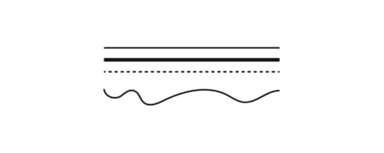
Lines
Lines are the most seamless and most powerful elements of design. They have a vast spectrum of functions and purposes. We use them to separate and organize space, outline and contour objects, emphasize certain elements, draw attention, and so forth.
It’s interesting how such a simple element can yield such a strong effect on our attention and have such a complex meaning in the modern visual grammar.
More importantly, we can curve and combine them to create rich meaning through different shapes and patterns due to how fundamentally simple lines are.
Lines can be thin and thick, horizontal, vertical, and diagonal, curved and zigzagged, dashed, and dotted — all of them can be used to convey meaning and shape experiences.

Source: https://www.pexels.com/photo/abstract-architect-architectural-design-art-323645/
Shapes
Everything is made of shapes which, in turn, are made of lines. We can deconstruct the world we live in into a series of basic geometric and natural forms.
Human cognition is odd. In our daily lives, we tend to forget that shapes surround us. Too often we fail to notice how they influence us too. Their effect on our psyche is partly due to our evolutionary upbringing — some shapes instill comfort, others make us cautious.
Rounder shapes like circles and ovals are generally associated with safety and children — throughout evolution, few round things could harm us.

On the other hand, pointier shapes make us think of danger. Throughout the early days of human evolution, they’ve forced us to direct our attention towards them.
A few million years forward, we’ve started using various shapes in typography and art. Human perception has fine-tuned the meaning of every kind of shape in part. Here’s a rough overview of a few of them.
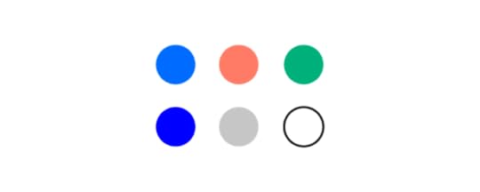
Squares and rectangles — they make us think of stability and safety. They’re balanced and mathematically sound;Triangles — often associated with power and energy. They often make us think of action, tension, and even aggression;Circles and ovals — typically associated with harmony, life, and permanence;Spirals — associated with nature, birth, evolution, and growth;
Color
Colors are equally mysterious. At their core, they’re nothing but electromagnetic radiation at different frequencies, yet they still have a very powerful effect on the human mind.
At the same time, it’s important to underline that there’s a lot of subjectivity to color perception. Our opinion on a certain color can be affected by various cultural, religious, geographical, and professional factors, along with plain personal preference.
Fortunately, we can outline how certain color groups affect the majority of people.
Warm colors (red, yellow, orange) typically instill a series of emotions ranging from calm and warmth to aggression and anger;Cool colors (blue, green, purple) can instill a range of feelings ranging from calm to sadness;
Plus, every color in part has its connotation and can evoke a complex spectrum of emotions. The most commonly used colors in modern design are:
Blue — it’s extremely popular in web design and digital interfaces in general. It’s the predominant color on the web’s most trafficked websites. It’s twice as popular as yellow and red;Red — while not as popular as blue, red has a very clear function — push us towards action. This is precisely why it’s among the most used colors in calls to action on the internet;Yellow — can be perceived as cheerful and pessimistic, depending on the tone and hue;Green — mostly associated with nature and fertility. However, it can also be associated with money and greed;
Typography

Fonts are multifaceted. They communicate meaning through words and a mood through its characteristics.
When it comes to spoken language, we typically use a variety of factors to convey how we feel — rhythm, pitch, tone, gestures, and so forth. Typography also has a diverse set of characteristics that modulate the feelings that a text can evoke — size, weight, kerning, position, and so forth.
Due to how long we’ve been exposed to different typefaces, we’ve formed individual impressions about fonts. Some convey seriousness; others feel silly and unpresumptuous.
We use typographic differences to establish a visual hierarchy and outline the differences between kinds of information in design.
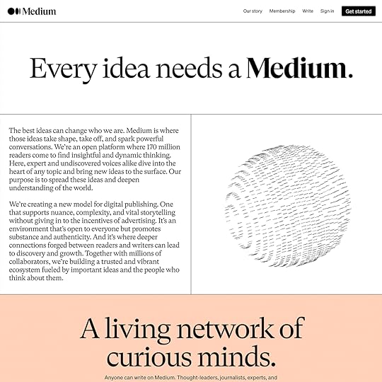
Source: https://www.typewolf.com/site-of-the-day/medium-2020
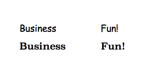
Larger, heavier fonts are often used for headlines. They set the tone for the text that will follow below. They aim to entice the reader by offering them a short glimpse of what they’re about to read.
Given that it’s common to keep headlines short, the fonts used for them will sometimes have more ornaments. Body text is meant to be slightly simpler to ensure legibility.
The rightness and wrongness of a type
There’s a myriad of things that you should consider when choosing the right font for your design.
Fundamentally, your choice should be guided by the message, the medium, and the audience you’re writing for.
Start with minimal diversity and gradually introduce the smallest amount of typographic contrasts necessary to guide a person through the classes of the information displayed.
Excessive complexity and lack of expressivity can make your design bland, unappealing, and illegible.
Bear in mind that your goal is to create unity through design. You’re on a mission to find the golden mean — the path between consistency and emphasis.
The Central Principles of Design
Now that we’ve gone through the basic design elements, we need to look at the principles that shape their relationship in a medium.
These principles differ based on their purpose and function. Things like contrast, repetition, and rhythm will help certain elements and components draw a person’s attention to them. Balance and variety are essential when it comes to creating designs that appeal to our senses.
More importantly, it’s essential to point out that all of these principles are tightly related to one another. Your goal as a designer is to achieve their harmonious coexistence.
It’s important to underline that you shouldn’t necessarily include all the principles in a design. However, using at least a few will guide you towards a more coherent and cohesive end-product.
Unity
Unity is a quality that a designer achieves once the product is finished. It’s important to point out that there are two kinds of unity — conceptual and visual.
The former is extremely important during wireframing. Conceptual unity is all about combining information for the user’s comfort and ensuring that they have to perform as little interactions while going from point A to point B.
The latter has to do with how things look. The idea behind it is to ensure the harmonious use of elements, colors, shapes, sizes, and so forth. Equally important design elements should have the same size or color and vice versa. A unified design allows to establish consistency and a clear visual hierarchy.
Contrast and similarity
Designers use these two principles to guide a person’s attention. Similarity is a powerful tool that allows us to create relationships between elements. Let’s take a quick look at a famous example of the similarity principle visualized by the Nielsen Norman Group.
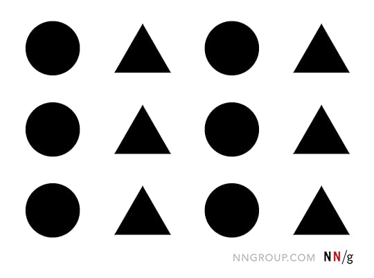
According to the Gestalt principles in design, we tend to group things together based on their appearance. That is why people typically perceive the above image as four columns rather than three rows. We unify the sequences of triangles and circles in their own groups.
As a designer, you can use this principle to signify relationships between objects based on their shared features.
We generally use contrast to make things stand out. Our brains are hardwired to observe things that are out of place. These visual or structural outliers pique our interest and draw our attention.
Given that designs are created by people, we can immediately conclude that an existing contrast is there for a reason.
There are lots of basic ways you can create contrast. Here are a few of them:
Texture — rough and smooth;Shapes — organic and geometric, rounded and sharp edges;Colors — difference in warmth, hue, and intensity;Scale and size — large and small objects;
Balance
Balance triggers a certain kind of satisfaction in us. It just “feels right.” It creates a sense of stability and composure. However, balance isn’t just one thing. There are a few kinds of balance that designers make use of — symmetrical, asymmetrical, mosaic, and radial. Each of them has a variety of subtypes.

A lack of balance can cause multiple issues — it can misguide the user, causing them to feel disoriented or trigger a sense of visual discomfort. Therefore, a visually unbalanced composition will inevitably create unnecessary friction between the user and the medium.
As a result, a poorly balanced design will cause a scattered interaction with the product, causing some of the information to go unnoticed.
Hierarchy and emphasis
The main idea behind hierarchy is to ensure that a person follows a right order while processing the information in a design. Its purpose is to make sure that the elements presented in a medium are structured rationally, allowing the person to reach their final goal.
Hierarchy can be established by using a variety of visual parameters. Here are a few of them:
Size — larger things are typically easier to notice. Therefore, they are considered more important;Color — things that have a brighter color stand out compared to the paler ones;Contrast — contrasting colors are more captivating;Alignment — misaligned elements are more eye-catching than the ones that are in order;Repetition — similar element features may indicate that they are related;Proximity — things that are placed close to one another typically seem related;White space — the more isolated elements are, the more attention they draw;Texture — complex textures typically draw more attention than the simpler ones;
A series of objects that lack prioritization will have too many accents. As a result, this can cause a rippled perception of the design. This chaotic quality feels irritating and frustrating. On the other hand, a lack of clearly emphasized elements may cause a design to seem dull and unappealing.
Rhythm and flow
Compositional flow determines how the eye is led through a design: where it looks first, where it looks next, where the eye pauses, and how long it stays.
Interaction layouts
To ensure that your design has a coherent flow, it’s essential to look into a couple of traditional layouts.
The Gutenberg diagram — This layout is used applicable to cultures that read left to right. According to this pattern, reading gravity moves our attention from the top-left corner of a plain towards the lower-right corner. As a result, the other two corners get considerably less attention — they’re called fallow areas.

The F-pattern — widely used in design for digital interfaces. Here, the eye movement starts at the top and moves from left to right. Then it moves onto the next line of text and continues its rightward movement. However, because modern users tend to skim over text, the lower lines vary in length, creating an F-shaped pattern.

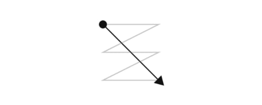
The Z-pattern — The logic behind this layout is that our eyes move in a Z-shaped pattern when exploring a visual medium. We sweep from left to right on the upper side of the plain, then make a diagonal transition to the bottom-left side, and finish by moving to the lower-right side.
However, these principles apply mostly to text-heavy designs. Once you start adding various graphical elements, the relevance of these patterns will gradually wither away.
Compositional flow
In order to guide our users in a scenario that isn’t covered by the layouts above, we need to make use of a variety of directional cues to guide our users. Here are a few of them:
Repetition of elementsRhythmImplied actionDiagonal linesGestural linesDirectional linesPerspectiveSubject matter of elementsGradation
These objects can be used to imply direction and guide a user’s movement.
Rhythm and repetition
Without repetition, there is no rhythm. Our brains are hardwired to seek patterns and similarities in our surroundings. In design, we can also use alteration and gradation to trigger pattern-like thinking.
There are three general kinds of rhythm:
Regular — occurs when the size of the elements or the size of the space between them is predictable.Flowing — this rhythm is similar to the regular one yet does not imply an even size or distance between elements. Instead, it has to do with patterns we consider organic, similar to the patterns you’d see on a tiger.Progressive — occurs when an action’s progress is represented through continuous change in shape, color, etc.
White space
White space isn’t necessarily white; it can be of any color, texture, and so forth. Simply put, it’s the area that surrounds one or more elements of your design.
It’s a vital component for enhancing your text’s legibility and reducing cognitive fatigue and friction between the beholder and your design.
White space has become especially relevant in the last 15 years, as designers started moving away from extremely crammed and disorienting interfaces.
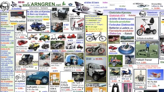
Please take a look at Arngren, an old version of a Norwegian classified site that immediately throws us back into the ’90s (not in a good way). It’s a perfect example of a near-total lack of white space. Take a second to think about how it makes you feel:
Now, compare it to Apple’s 2020 homepage:

Why use white space?
The effective use of white space has a wide array of benefits. First off, it directs a person’s attention towards a specific object. It’s another way of establishing a visual hierarchy. It allows us to guide a person through a design and direct their attention to its most essential elements.
Secondly, it increases the chances that a person will interact with it. At the end of the day, that’s why we design things — we want people to use them to solve important problems.
Thirdly, a lack of white space can take its toll on the eyes and brain. Let’s go back to Arngren and Apple for a second — imagine you’re looking for something on the first site; a microwave oven, for instance. Try to be mindful of how complicated this task appears. Furthermore, pay attention to how tiring this experience is to the eye.
Last but not least, white space ensures legibility. By not cramming your text in a tiny area, you’ll make it significantly more accessible for people to read it.
Here’s an example of text that has very little white space:
And an example of text that has plenty of it:

Variety
Variety is a vital part of design that aims to arouse visual interest. Designers typically use it to counteract excessive unity — when things are too monotonous and bland. An uninteresting design will often fail to communicate which elements are more important and deserve a person’s attention.
There are many ways we can use variety to liven things up:
Lines — varying weight, angle, or lengthShapes — changing up the kind of shape (i.e., amorphous or geometric) as well as the size, color, orientation, texture, etc.Colors — using diversity in the hue, value, or saturationValues — varying the lightness or darknessTextures — is it rough or is it smooth?
Conclusion
On the surface, design is in continuous change — it never stays the same. However, its principles and elements are timeless.
More importantly, it’s a good idea to think of them as parts of a large system. Improving on variety might harm balance. Making a design too unified, might cause it to seem dull and unappealing.
One thing is for sure — by continuously taking them into account, you’ll be able to create well-thought-out designs, whether you’re a beginner or a pro.
The post Basic Design Elements and the Principles of Design appeared first on Studio by UXPin.
December 9, 2020
The Best React Design Patterns You Should Know About

There is no denying the immense popularity and practicality of React. In the fast-changing technology landscape, keeping up with all the new frameworks and tools is a difficult task.
React brought a much-needed sigh of relief for developers with its ease of use. The reusable components, great developer tools, and extensive ecosystem are some of the most loved features of React.
Instead of the traditional approach of directly manipulating the DOM, React introduced a useful level of abstraction in the form of the virtual DOM concept.
The React library is being actively developed and maintained by coders at the tech giant Facebook. This provides it with a much-needed edge over other frameworks and libraries.
Countless contributors in the JavaScript community also regularly contribute to refining and improving React.
All these factors allow React to maintain its popularity among developers even though newer frameworks are constantly emerging and competing for recognition amongst frontend developers.
The success of any framework, library, or programming language can be attributed to its features and the active status of its community.
Apart from these two factors, an often overlooked but highly utilitarian aspect of any programming language or framework is the use of design patterns, and React manages to deliver in this area.
In this post, we take a look at a few of the must-know to react design patterns.
The Importance of Design Patterns
Let us first briefly recap the role that design patterns play. Simply put, design patterns are repeatable solutions to commonly occurring problems in software development.
They serve as a basic template upon which you can build up the program’s functionality according to the given requirements.
The term ‘design pattern’ is not to be confused with a ‘design system’. We have discussed more about design systems in a separate article.
Design patterns not only speed up the development process but also make the code easier to read and to maintain.
Some common examples of design patterns include the Singleton pattern and the Gang-of-Four pattern.
In software development, design patterns are associated with two common roles.
Offer a common platform to developers
Design patterns provide standard terminology and solutions to known problems. Let us take the example of the Singleton pattern that we mentioned above.

This pattern postulates the use of a single object. Developers implementing this pattern can easily communicate to other developers that a particular program follows the singleton pattern and they will understand what this means.
Ensure best practices
Design patterns have been created as a result of extensive research and testing. They not only allow developers to become easily accustomed to the development environment but also ensure that the best practices are being followed.
This results in fewer errors and saves time during debugging and figuring out problems that could have been easily avoided if an appropriate design pattern had been implemented.
Like every other good programming library, React makes extensive use of design patterns to provide developers a powerful tool. By properly following the React philosophy, developers can produce some extraordinary applications.
Now that you have an understanding of design patterns. Let us move on to some of the most widely used design patterns available in React.js.
To learn how you can effectively reuse design patterns, check out our article on how great artists reuse.
The Functioning of Reactjs
You can install react using the create-react-app available on Github. Using npm you can add all the other dependencies.
React.js makes use of JSX. This is a syntax extension of JavaScript. It comes with the full power of JavaScript and provides us with what is termed as React ‘elements’.
Although it is not mandatory to use JSX, it is the preferred method due to the helpful visual aid and styling options that it provides. It also provides useful error messages and warnings.
The core philosophy that React.js follows is that of reusable react components. You will notice that this component-based approach can be leveraged to build rich user interfaces for web applications.

These React components can be considered as a small system in itself. Each component has its own state, input as well as output.
The input of a component is taken in the form of props. The component may be considered as a black box. Each having its own state and lifecycle. Components are easy to compose.
The final react app consists of a highly maintainable code.
React Design Patterns
There are numerous design patterns that are available in React.js. Here, we shortlist a few recommended patterns.
Stateless Components
In order to understand the concept of stateless functions, let us first take a look at what is meant by state.
The state is simply the data that is imported into a component. Typically data is fetched from the database.
Components can be of two types, namely, stateful and stateless components. The difference between both is merely the presence of state or lack thereof.
In stateless components, you can not reach this.state inside it.
Stateless components are also called functional components or presentational components. In React, such components always render the same thing or only what is passed to them via props.
Your aim, as a developer, should be to create stateless components even if there is no immediate scenario in which you would have to reuse that particular component.
Most often developers figure out whether a component needs to have a state or not once they start writing the code as it is not always clear beforehand.
For a hierarchy of components, the best practice is to let parent components keep as much state as possible and make stateless child components. Data can be passed down via props.
Conditional Rendering
Conditions are the foremost tool in the arsenal of any software developer.
In the process of writing React components, the need often arises to render a certain JSX code based on the state. This is achieved through conditional rendering.

Conditional rendering is very useful as it allows you to create distinct components based on your needs and then render only the ones that are required by the application.
For instance, conditional rendering can be used to display different messages to the user based on the login status of the user. The message will be subject to the value of the prop isLoggedIn.
Render Props
We discussed how design patterns are there to solve common problems. Render props are available in React to help us solve the problem of logic repetition.
According to official React documentation, render props are defined as a ‘technique for sharing code between React components using a prop whose value is a function’.
Render props prove really handy as they allow us to share the same state across different components. Instead of hardcoding the logic inside each component, you can use a function prop to determine what to render.
Some popular libraries that make use of render props include Formik, React Router, and Downshift.
Controlled Components
Web forms are a common requirement in a large number of applications and controlled components are React’s answer to handling form state.
The controlled component takes the state through props. It can notify any changes by means of callbacks like onChange.
Parent components can control it by handling the callback and managing its own state meanwhile, the new values are passed to the controlled component as props.
By default React forms have support for both controlled and uncontrolled components. It is highly recommended that you use controlled components.
The following code snippet shows a controlled component.
React Hooks
Hooks are a relatively new addition to react and were introduced in React 16.8.
These functions allow developers to use React without classes. There are a number of different pre-built hooks available like the Effect Hook ( useEffect ) and the State Hook.
For a complete list of available hooks, you can visit the Hooks API Reference.
Apart from the pre-built hooks in React, you can also create your own hooks. This allows you to extract the component logic and create reusable functions.
Hooks are a welcome addition to React and the developer community really appreciated this new addition with great enthusiasm.
However, it must be kept in mind that sometimes hooks can become a little tricky to work with when the arguments are objects, arrays, or functions. This can become somewhat confusing.
On the other hand, custom hooks are easy and simple to use and they also provide immense benefits to the developer.
Conclusion
React has proven to be a highly popular library. The community is among the fastest-growing developer communities online.
You will also find lots of useful web development resources available online that make it easy to learn react.js and adapt to it.
The power of React is due to its amazing features and the robust architecture that it offers. One of the most prominent and widely loved features of React is its design patterns.
Design patterns are in fact what gives this library its extraordinary practicality and usefulness. They make code optimization and maintenance easier.
They allow developers to create apps that are flexible in nature, deliver better performance, and produce a codebase that is easier to maintain.
We have discussed a few popular React design patterns like stateless functions, render props, controlled components, conditional rendering, and react hooks.
However, it must be noted that react design patterns are not just limited to these patterns and there are several different design patterns that you can implement.
Once you get familiar with the usage of the common design patterns, it will become easier to graduate to others.
Capturing the true essence of React application development can be made easier by the use of the right tool. At UXPin we provide you precisely that! Based on a deep understanding of the best industry practices and design principles, we give you a tool that simplifies the whole design process. You can also check out our latest blog for more inspiration.
The post The Best React Design Patterns You Should Know About appeared first on Studio by UXPin.
UXpin's Blog

- UXpin's profile
- 68 followers

