
UXpin's Blog, page 88
October 27, 2020
How to Apply Strategic Design Principles to UX
Strategic design is the crossroads between user experience and business objectives. It means creating a set of design principles that guide your team through the process of building a product or experience. The principles articulate the vision and mission of your project and keep you focused on the big picture as you move through the stages of design. Ideally, strategic design means you will always know the next step.
Strategic design affects every aspect of your product or service. It encourages designers to look at the design process and a fluid, adaptable approach to problem-solving. Strategic design thinking creates an understanding between designers and stakeholders. It outlines how the design team plans to align the user experience of a product with business objectives. This kind of design thinking improves branding and innovation as well as the long-term sustainability and competitiveness of an organization.
Learn these 10 ways to incorporate strategic design thinking into your user experience designs.
Table of Contents:
Get Inspired Assess the ProjectCenter Strategic Design Around Business GoalsAsk Thoughtful QuestionsMatch Strategic Design Principles With Core ValuesKeep Strategic Design Principles FluidEstablish Ownership of Strategic Design PrinciplesEncourage Collaboration on Strategic Design ImplementationSet ExpectationsHave Regular ReviewsPractice Good CommunicationConclusion
Get Inspired

Before laying the groundwork for your own tactical design thinking, you can start by researching the design principles of other companies. Design Principles FTW is a great resource for creating your own set of principles by browsing through collections of inspiring companies and strategies. Principles.Design also has a great open-source collection of design principles and methods. Getting some insight into what other organizations are doing can inspire you to formulate killer strategic design principles that will benefit your team for years to come.
Assess the Project
Once you and your team have gotten into the strategic mindset and observed how other organizations are using design principles, turn your focus back to your team. Assessing the project in a holistic way is the most important principle of strategic design and the one that should run as an undercurrent throughout the different steps of the project. This is an opportunity to analyze obstacles and opportunities, and to look at the design from a bird’s-eye view. What is the purpose of the project and what impact do you want it to have on the business?
Center Strategic Design Around Business Goals

The best way to implement strategic design in your UX design is to tie every design decision back to your business objectives. In order to do so, you need to have a clear outline and hierarchy of both your design and business goals so you can make sure they remain aligned. Look at the desired outcome of the project – how does it directly relate to business goals? What are the key measurements that will serve as performance indicators?
Ask Thoughtful Questions

Any designer or design team that has successfully implemented strategic design principles will tell you that curiosity is a critical element of this approach. Tactical design is not a step-by-step formula, it’s a manner of thinking about design that serves as a problem-solving mechanism. In order to incorporate design principles into your UX design, you’ll want to ask thoughtful questions about the client, the team, and the project itself. Why does the project exist? What problem are you solving for users? How does the product reflect the mission of your business? Does the product/experience help users in achieving their goals? How does their satisfaction help your company achieve its goals and build your brand?
Match Strategic Design Principles To Your Core Values
Design Principles should align people around the nature of your organization. It’s important to evaluate every strategic design touchpoint according to the vision and mission of your organization. This involves having designers and stakeholders work together on establishing guiding values. Shopify has a great example of how they outlined their experience values here: Shopify Experience Values.
Keep Principles Fluid

Strategic Design is not about coming up with fixed, static rules to guide a project from start to finish. Thinking strategically is more about problem-solving and creating new approaches to old problems. This approach involves practicing the strategy over time, making adjustments, and improving. Implementing strategic thinking into UX design means leaving room for adjustment and change. It also helps you learn along the way by adapting to new understandings of your users.
Establish Ownership of Strategic Design Principles
Implementing strategic design into UX is a project in and of itself, so it’s important to establish ownership from the outset. Assign the job to a person or team who will manage the project from start to finish and keep all of the team members on the same page. Strategic design is a philosophy that will apply to every level and member of your organization, but without an explicit owner of the project, it’s easy to lose focus of the principles. Select a project owner who can create a plan for outlining and adhering to your design principles. This should include everything from creating a hierarchy of company values to selecting the principles to keep them in plain sight (such as on vision boards throughout the office, on interoffice communication, etc.).
Encourage Collaboration on Strategic Design Implementation
Your organization’s strategic design principles will be much more effective if you develop and implement them in a collaborative way. Invite all team members to participate in the process. It also helps ensure that they are effectively implemented into UX design. Individual team members will have more motivation to use design principles on a project when they have a role in creating the principles. This is also a great way to get team members from across the company to brainstorm ideas on what is necessary for good design. The collaborative process serves to give the principles more meaning to your team on a personal level.
Have Regular Reviews

Another essential part of implementing strategic design into your UX is to have regular check-ins. Your strategy should be a constant work-in-progress. Planning tasks and milestones will help you assess the elements of the strategy and make sure each principle is supporting the core objectives of UX design. As you finish tasks during the design process, schedule team meetings and ask strategic questions. These check-ins will help you reassess the effectiveness of your principles and make sure each one is directing you toward your intended goals.
Practice Good Communication

Applying strategic design to enhanced UX is also directly related to how competently designers can communicate. Even the most proficient and talented designers can’t succeed without being able to communicate ideas, processes, and principles effectively. Clearly articulating design strategy and decisions to stakeholders ensures that everyone understands and agrees on the principles and how to apply them to UX design. Asking for input, listening to feedback, practicing empathy, and communicating in a practical manner are all essential for applying strategic design to your projects.
Conclusion
Implementing strategic design principles to UX requires a tactical thinking approach. This kind of mindset gives us a more useful and effective perspective on building a new product or experience. If you need help developing a design strategy or revising your existing principles, contact us. UXPIN can help your team easily plan, collaborate, and implement strategic design principles that are better aligned with your business objectives.
The post How to Apply Strategic Design Principles to UX appeared first on Studio by UXPin.


October 23, 2020
We’ve open sourced the Merge CLI
The release of the recently announced UXPin Merge introduces a new era for UXPin: we’re not just for designers anymore. Merge allows frontend devs to push live, working React components to UXPin. This ensures designers are prototyping with real, up-to-date components and reduces friction in the design/dev handoff.
How do developers test components locally and push their design system components to UXPin?
The Merge CLI, of course! Today we’re happy to announce that our CLI has been open sourced on GitHub. If you’re a developer using Merge, you’ll get the same open source flow you’ve come to expect: submit issues, be notified of updates, and submit PRs (if you are so inclined). We’re committed to providing the best flow for both designers and devs and believe open source is a big part of the dev experience.
If you’ve been following open source software companies, you’re probably aware that licensing has become more restrictive. We’ve tried to make our licensing for the CLI as open as possible. Our CLI is released under the GPL v3 License. It means you’re free to make changes as long as they are shared (just do a GitHub fork). We’re making a significant investment in Merge and want to move the design/dev handoff forward. We think the GPL v3 accomplishes that broader goal.
If you have questions about the Merge CLI, don’t hesitate to email us at support@uxpin.com.
The post We’ve open sourced the Merge CLI appeared first on Studio by UXPin.
Hero Image Banners: 4 Effective Ways to Catch User’s Attention Before They Scroll
Hero image banners, also called “hero headers” dominate the top of your website or application. Typically, they spread out over the entire horizontal space. Ideally, they have high-resolution images and calls-to-action that get attention from visitors.
Creative designers have made a variety of hero image formats over the years. A hero section may include navigation buttons that rest on top of the hero image. Other hero sections force users to open navigation bars.
A hero image website design may also change depending on the type of device people use. When you use a desktop computer with a large screen to access a website, the hero section may stay at the top of your screen even when you scroll down. On a mobile device with a smaller screen, though, the hero section may shrink – or even disappear – as you scroll down.
You have plenty of options when making hero image banners that effectively catch a user’s attention before they scroll. Start with these four tips, but feel free to explore unique ideas that fit your product’s brand.
1. Use Bold Colors to Grab the User’s Attention

You & Sundry, a wellness center and barbershop made especially for LGBTQ+ individuals, offers an excellent example of using bold colors that grab a visitor’s attention. The bright yellow letters in the background provide an anchor for the visitor’s eyes. After the eyes linger there for a bit, though, visitors can’t help but look at the colorful clothing worn by the hero section’s models.
The diversity of color plays into the company’s brand. It also contributes to a hero image website design that holds a person’s attention and encourages them to explore more.
2. Write CTAs That Tell Visitors How to Respond
Placing a CTA button inside a hero section can drive results by encouraging people to follow instructions. Depending on your page’s goals, you may want to generate leads, get people to sign up for services, or educate them about upcoming products from your company.
Apple’s page for the iPhone X includes two clickable CTA buttons. One tells visitors to learn more about the product. The other button simply says, “Buy.”
These are the kinds of instructions that visitors need from CTAs. Keep messages short and to the point. Eager, impulsive shoppers will immediately head to the Buy section. Consumers who want to explore their options can follow the Learn more button. Either way, the CTAs provide clear instructions without any ambiguity.
Typically, you should think about how your button’s design will influence visitors. In this case, Apple wants its product to dominate the page, so it makes sense to put the CTAs inside invisible buttons.
3. Use Strong Contrasts to Make CTAs Stand Out
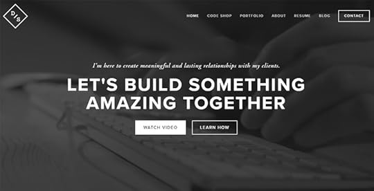
Image source: https://whatpixel.com/images/glossary/hero-images/049-harrisburg-web-design.jpg
CTAs can only accomplish their goals when they stand out to visitors. A hero image website design with too many colors could make the CTA difficult to read. Some visitors might skip the button completely.
Using strong color contrasts will help your CTAs get noticed. The example above takes contrast to the extreme with bold, white text on a black background. The message tells the visitors, “let’s build something amazing together.” Next, your eye gets drawn to the bright white button that says, “Watch Video.”
Interestingly, the designer chooses to make the “Learn How” button a little more subdued. It doesn’t grab your attention as quickly as the white button, but it does create a pleasant balance within the hero banner’s composition. Without the “Learn How” button, the composition would feel lopsided. With the current approach, the hero banner has nice, satisfying proportions.
A/B Test Your Hero Section to Determine What Works
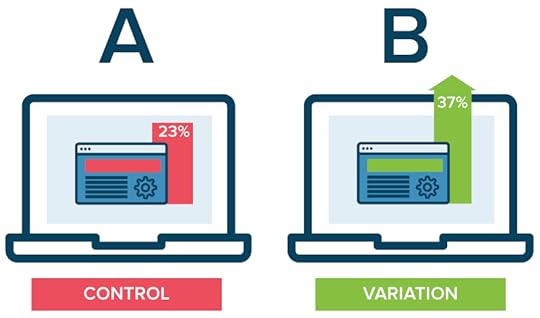
Image source: https://images.ctfassets.net/zw48pl1isxmc/4QYN7VubAAgEAGs0EuWguw/165749ef2fa01c1c004b6a167fd27835/ab-testing.png
You can make educated guesses about what hero image features will drive results before users scroll down. You cannot know whether your design gets the best results, though, until you perform testing.
In A/B testing, you create two versions of your hero section. The control version consists of your original design. The variation can have one or more changes. For example, you might put the CTA button elsewhere, change the CTA’s wording, or choose a different color scheme.
Over time, you track the performance of each design to see which one drives the most results. If the control version gets more conversions or leads, then you keep using it. If the variation performs better, then you use it to replace the original.
You can keep finetuning your hero design until you reach a ceiling and your results will not improve.
4. Make Effective Hero Section Banners With UXPin’s Design Tool
UXPin makes it easier than ever to design effective hero section banners. UXPin has a design tool that lets you build every aspect of your web page or application. You can use interactive elements like clickable buttons and forms that let users enter real information.
Once you have a hero section you believe in, you can use UXPin’s collaboration tool to share your work with others. Feedback can play an incredible role in improving your original design. You don’t even have to restrict your collaboration to other people’s UXPin accounts. You can send a link to anyone for feedback.
Are you ready to see what UXPin can do for your hero image designs? Start your free 14-day trial now so you can explore all of the features that make UXPin such an amazing tool for designing and prototyping!
The post Hero Image Banners: 4 Effective Ways to Catch User’s Attention Before They Scroll appeared first on Studio by UXPin.
October 20, 2020
So You Want to be a UX Designer – Google Has a Boot Camp for That
With the U.S. unemployment rate hovering at around 8%, millions of Americans are in limbo either looking for a new job or unsure about when (or if) they’ll be able to go back to their pre-pandemic employment.
On the bright side, a tight and unpredictable job market is the perfect time to learn a new skill or make a career pivot. To help bridge the skills gap and get more people trained for the most in demand jobs in the tech industry, Google is launching a new boot camp to train UX designers.
Google’s New UX Design Certificate Program
Boot camps and career certificate programs in the tech sector have proliferated in the last few years, and grew by over 4% in 2019 according to Career Karma. While many tech boot camps focus on software development and programming, coding is just one slice of the tech industry pie.
User experience design, project management, and data science are all lucrative fields in high demand and with good earning potential. Google has announced a new UX design career certificate to help people break into the field without breaking the bank.
Here are some features of the new UX design career certificate according to Google:
Google staff will teach the coursesHosted on the Coursera platform100% remoteNo prerequisites or previous experience requiredProgram duration is about six monthsDoesn’t require a college degreeThe program is designed by Google and recognized as the equivalent of a four-year degreeScholarships are available for students with financial need
Google’s IT Support professional certificate on Coursera has enrolled over 600,000 students and costs about $49 per month, making it more affordable than typical boot camps and professional certificate programs which can cost thousands of dollars.
While there’s no guarantee that students will find a job as a UX designer after completing the certificate, it’s designed as pathway to connect graduates directly with potential employers.
What skills do you need to become a UX designer?
User experience design is both an art and a science. UX designers perform research, analyze user behavior and trends to create user personas and intuitive designs for websites and apps, and collaborate with designers, software developers, and other stakeholders on every project.
Some skills you will need be a UX designer and can expect to learn and develop in a boot camp program include:
Conducting user researchWireframingPrototypingGraphic designInformation architecture

Good UX designers also need to master “soft skills” like communication, empathy, collaboration, critical thinking, and the ability to change and adapt from project to project and as industry trends develop and change.
How much can UX designers expect to earn?
UX designers have great earnings potential. Starting and median salaries vary depending on the company and industry you work in, but the average starting salary for an entry level UX designer is over $60,000 (and as high as $89,000) according to Zip Recruiter. UX designers are in high demand, so the job outlook is much better than other sectors of the economy depending on where you live.
Another advantage to consider is that UX designers have the flexibility to work in several industries and sectors. If you already work in a field or company that you love, you can leverage your experience and existing network to find a new job as a UX designer. Virtually every industry and business – from startups and small local companies to large corporations need intuitive and well-designed websites that meet customer needs and expectations.
You don’t have to work at Google or Apple to earn a good salary or have a lucrative and rewarding career as a UX designer.
Building a UX portfolio
A resume will only take you so far when you’re looking for a job as a UX designer, especially in the beginning. A strong portfolio that showcases your skills is your ticket to landing interviews and convincing potential employers that you’re up to the task and have the skills they’re looking for.
One of the biggest advantages of boot camp and professional certificate programs is that students typically graduate with a portfolio of one or more design projects that showcase the skills you learned. Instead of just learning theory and processes, you get the equivalent of on-the-job training which will make your job search easier once you complete the program.
There are many UX design tools and software available to help you create dynamic designs and build a strong portfolio of projects.
How to find a UX design job
Boot camp programs can’t guarantee a job once you finish the program, so consider that when weighing your options to decide whether investing in a professional certificate program or training course is right for you.
That said, the right program can provide the practical training you need and networking opportunities and connections to hiring partners and companies actively looking for UX designers.
The term “UX designer” is actually very broad, and there are many areas that you can focus within that job description, such as user research, prototyping, or project design. As you work your way through your training, pay attention to the areas and tasks that interest you the most.
Working with a mentor is another great way to expand your network and find job leads and introductions.
Thanks to the growing demand for skilled UX designers, major job sites like Glassdoor and LinkedIn usually have an abundance of job listings across the country and in many sectors. Once you decide that you’d like to become a UX designer, start by making a list of the companies or industries that you’d like to work in.
You don’t have to wait until you finish your training to think about your next job. If you’re not sure where to start, you could work on a few freelance projects to build your portfolio and network and test a few areas before making a commitment.
UX design is a growing field, so expect to continue learning even after you’ve finished a boot camp or certificate program.
The post So You Want to be a UX Designer – Google Has a Boot Camp for That appeared first on Studio by UXPin.
October 15, 2020
Meet UXPin Merge: quickly launch a design system devs and designers will love
Like Patrick Bateman inspecting Paul Allen’s business card, it’s easy to be envious when inspecting the design systems of GitHub, IBM, and Atlassian.
Responsive? Check.
Patterns? Check.
Vector-based design libraries? Check.
These systems are monuments to work-ethic, discipline, and teamwork. When a design system is launched, it dramatically reduces the time it takes to go from prototype to living app. It also reduces communication friction between designers and devs, and cuts UX bugs by consolidating the experience around well-supported components.
Have you been asked to create a design system at your company? Or are you struggling to keep your existing design system components consistent between deployed code and design libraries? You owe it to yourself to see how Merge can dramatically simplify your workflow. Before I introduce Merge, let’s look at how a classical design system was built and maintained at a forwarding-looking company like GitHub.
Designing a Design System: the Classical Approach
In Design systems at GitHub, Diana Mounter walks through GitHub’s Design System creation story and evolution. Some highlights:
Planning for GitHub’s design system started in 2016. By the end of the year, there were two full-time employees dedicated to that project. They focused on the documentation and making it easier to prototype without having to write a lot of new CSS code.
In 2017, GitHub’s design system team added another dedicated team member, bringing the total to three employees. They improved their process for communicating style changes, the status of styles, and the release flow of the design system.
In 2018, they added another new team member, a front-end engineer increasing the team size to five employees. This helped drive the creation of a React.js component library.
When the article was written in 2018, GitHub’s design system team included five full-time employees. It’s a significant amount of work creating a design system that designers, developers, and product managers will adopt. The work doesn’t stop at launch, UIs don’t stop evolving. Much of this work is tedious. For example, manual translations of vector-drawn components to HTML/CSS-based (and back).
We’ve talked to many folks that are desperate for the benefits of a design system but don’t have the resources for a dedicated design systems team like at GitHub. That’s where UXPin Merge comes in.
Designing a Design System: the UXPin Merge way
A big reason why classical design systems require multiple dedicated team members is the translation between vector-based design tools (Figma, Sketch, etc.) and HTML/CSS.
It’s a manual process that quickly diverges from the source of truth: the UI of the deployed app. Redrawing the symbols in your design tool’s library to keep them consistent with the HTML/CSS version is a tedious, detail-orientated chore. Because this is such a chore, open-source tools like react-sketchapp and html-sketchapp have tried to solve this problem with code-driven transformations. However, I’ve had little success with these: frequent crashes, lack of support for more recent versions, inconsistent translations, and more. This isn’t for the lack of effort by the project maintainers: translating HTML/CSS to vectors is a herculean problem.
What does all this HTML/CSS to vector discussion have to do with UXPin Merge?
Well, on the surface UXPin looks like a vector-based design tool. However, that’s just the surface: it actually codes all the way down. UXPin Merge lets you import and keep in sync coded React.js components from Git repositories to the UXPin Editor. These aren’t flat symbols – imported components are 100% identical to the components used by developers during the development process. It means that components are going to look, feel, and function (interactions, data) just like the real product experienced by the end-users.
There is no HTML/CSS to vector translation with UXPin Merge: it’s the real thing. Let’s walk through the entire prototyping workflow: we’ll design a prototype and use its UI in a React app in minutes.
An example: creating a prototype with Material UI
An easy way to experience Merge is by trying one of the open source React-based design system implementations we already support. I’m going to show just how quickly you can go from idea to React app via Material UI.
1. Add the Material UI Design System to your account
Start by pushing the Material UI Design System to my UXPin account. Once pushed, anyone on my team will have access to Material UI.
The steps below require git and NodeJS. The total setup time is just a couple of minutes.
Here’s how to push the Material UI library to UXPin Merge:
Go to your UXPin account
Enter the UXPin Editor
Create a new library
Select the option “import React components”
Copy the Auth token
On your computer:
git clone git@github.com:uxpin-merge/material-ui-merge.git
cd material-ui-merge
./node_modules/.bin/uxpin-merge push --token [TOKEN FROM STEP 5]
Back in your browser: reload the project
Everyone on your team can now develop a prototype with fully interactive Material UI components. Let’s do that.
2. Drag-and-drop prototype creation
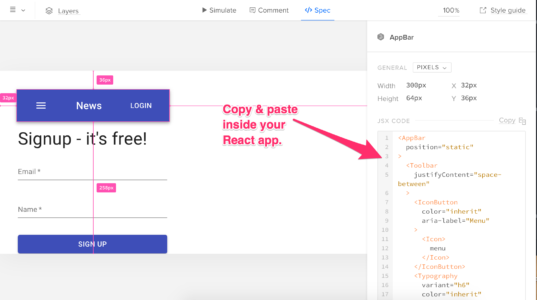
With the Material UI Design System added, you can now create a fully-interactive prototype. How about a signup form? Start by adding an appbar:
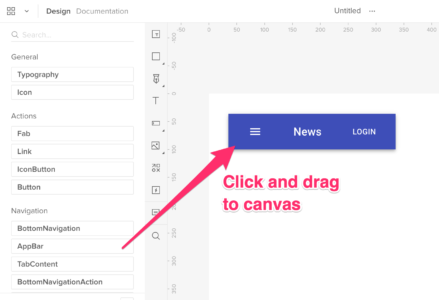
Next add the Signup text, two text fields for name and email, and a button to submit the form:

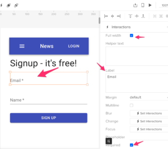
Customize the appearance of these elements via the properties panel within UXPin. These properties are passed through from the component’s propTypes (see the source code for a text field):
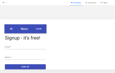
It’s time to preview. Just click the play button in the editor:
Prototypes are great, but how do we go from idea to actual live React.js code?
3. Creating a React app
Remember how UXPin is a code-based (not vector-based) design tool? That means we can go right from prototype to React JSX code. Let’s see how.
Before we can copy over the prototype we need to setup a React app:
Create a React app via create-react-app
Install Material UI: npm install @material-ui/core
Go back to the UXPin Preview of the prototype. Enter Spec mode. Copy the JSX of the parent component into the app:
Start the React app with yarn start and then open your browser to http://localhost:3000. Your coded app awaits. We’ve gone from idea to React UI in minutes.
What about your custom themes and components?
The default Material UI theme is fine for a Proof Of Concept, but what about your company-specific theme? How can you add the custom components your dev team has created? Don’t worry – if you can bundle assets with webpack, you can render them within the UXPin editor. As for your custom components, it’s a fairly straight-forward process: wrap the React component and define default property values that are required to render a component.
Can designers push changes to code?
While designers cannot modify the appearance of Merge components and export those changes to code, they have the freedom to make any changes. Designers are free to mix Merge components with native UXPin elements. When viewed in preview mode, Merge components will display their JSX code and native UXPin elements will display their required CSS.
Getting started with UXPin Merge
When you look at a design system like GitHub’s Primer you are looking at a several-year effort. With UXPin, we’ll get you there faster but it’s important to pick the right place to start.
Our advice:
Build on an existing open-source design system – Don’t re-invent the wheel. Start with an open-source React.js design system implementation. Implementations like Material UI have solid documentation already. New team members may already have experience with it, reducing the onboarding time of new employees.
Internal apps – The default theme for Material UI may not be acceptable for your customer-facing app but it can be totally acceptable for internal tools. Use UXPin to prototype these tools. Let non-designers get in on the action. They are the ultimate consumers of the design system.
Add a custom component – Now that your designers and devs have seen just how fast it is to from prototype to real code, they are likely itching to use Merge on higher-visibility custom components. Pick a basic component and work up in complexity, thinking about addressing the biggest pain-points first.
Don’t forget: if you don’t have the internal resources to kickoff a design system UXPin’s Merge Concierge service is here to help. Our team can provide extensive one-on-help assistance to help with the initial launch of design systems.
Summary
There are no downsides to having a design system. As Storybook says:
If a UI pattern is used more than three times, turn it into a reusable UI component.
If a UI component is used in 3 or more projects/teams, put it in your design system.
We’ve found this baseline is met by many orgs. The challenge is finding the resources to launch and maintain a design system. That’s where Merge comes in: there’s no manual re-drawing of components in your editor or consistency issues between automated HTML/CSS => vector conversions. Merge enables your team to deploy a design system without the need for dedicated team members.
Request access to UXPin Merge and accelerate the adoption of your design system.
The post Meet UXPin Merge: quickly launch a design system devs and designers will love appeared first on Studio by UXPin.
October 14, 2020
UX Consulting: How To Know When You Need It
You may want to hire a UX consultant before you begin your next product development project. User experience consultants become particularly valuable when you have a team of junior designers or you want to create a product outside of your expertise.
By bringing a consultant in before you start the project, you can create an action plan that leads to success.
At this stage, UX design consultants can help:
Establish milestones for your product’s development.
Brainstorm features and interactions that users will love.
Create a design system that keeps your designers focused on a unified goal.
Explain the lean UX design process to improve your project’s efficiency.
Anticipate problems that you might encounter while developing a product or taking your product to market.
Estimate the cost of developing your product.
Instead of making mistakes at the beginning of your project, you can shorten your development time, lower development costs, and start making features that will attract loyal users.
Bring a UX Consultant on Board When You Start Designing

The beginning of a new project forces you to make a lot of decisions. Many project leaders feel overwhelmed by stress. In response, they experience creative doubts similar to “writer’s block.”
You cannot let the start of your design project falter. Mistakes that happen at the beginning will only create more work for your team later.
Bring a user experience consultant on board at the very beginning of your project so you can get off to a great start.
If you feel like your team needs a crash course in UX, you can hire a consultant to give everyone a UX workshop that will allow them to gain such skills like creating design systems that work. Apart from that they will also learn how to approach designs from the user’s perspective and define goals for the project.
Other benefits of hiring a user experience consultant at the beginning of the design project include:
Creating wireframes and early prototypes.Developing icons, color schemes, interactions, and other assets.Choosing an approach to project management that elements waste and improves efficiency.Providing feedback that can streamline the rest of the development process.
Your designs need to make an impression on users within 10 seconds. After that, people are more likely to abandon your product. Using a UX consultant at the beginning of your design process helps ensure that you grab your audience’s attention immediately.
Hire a User Experience Consultant When Your Team Gets Stuck

What happens when your team encounters an unexpected problem during product development? Sometimes, a challenge can encourage your designers to find creative solutions.
Often, though, people get frustrated by the sudden pause in productivity. They felt good about their work, but now they struggle to differentiate between great designs and terrible designs.
Hiring a UX consultant when your team gets stuck offers a fresh perspective on the problem.
Your design team might feel lost because it naturally wants to keep moving forward with the project as planned. An outsider can look at the situation without the emotional baggage that comes from expectations and hours of hard work.
A consultant also has the benefit of working with diverse clients. Working with many clients means that UX consultants learn from companies that design a variety of products for different audiences. The consultant may already know a solution that will put your team back on the right path to success.
Get a UX Design Consultant About Halfway Through Your Project
Once you reach a project’s midway point, you have an opportunity to look back and reassess your work. If you discover unappealing or dysfunctional aspects of your work now, then you can correct those mistakes before moving forward.
Do you and your team have a clear vision that lets you review your work objectively?
This is a great moment to have a UX design consultant go over your progress. Hopefully, the consultant will find very few problems with your work. Then, you can sprint through the final steps of developing your product. If the consultant notices some issues, you still have time to fix them without ruining your design schedule.
No one likes redoing work, but it’s better to correct mistakes halfway through a project instead of waiting until the end when you have much more to fix.
Hire a Consultant Before Taking Your Product to Market

The moment you take your product to market, you will start hearing about all of the good and bad features that you included. User feedback plays an important role in improving your product, attracting more customers, and generating more revenue.
You don’t have to wait until you release the product before you make those improvements, though. Instead, you can hire a UX consultant with experience reviewing products, noticing irregularities, and troubleshooting features that don’t work perfectly. Use the information to improve your product before giving users access.
You want to release a product with as few bugs as possible so you can get better reviews from experts and users. You will probably decide to make some changes as you gather data about how people use your product. Still, it helps to start with as few problems as possible.
UXPin Makes It Easy to Work With UX Design Consultants
UXPin’s features make it easy for your team to work with user experience consultants at every step of a project.
Many teams choose UXPin as their design and prototyping tool because it allows them to build prototypes that work just like finished products. The prototyping features lets consultants experience the design as the real thing. Consultants can even use real data when they test your design interactions.
UXPin also makes it easy to share your prototypes with consultants. Your consultant doesn’t need a UXPin account to review your prototype. Instead, you can send a link that lets the UX expert access your work. The link lets anyone experience the prototype. They don’t even need a password.
Start your free trial with UXPin so you can experience the benefits of using a tool that combines the features of designing and prototyping software. Once you see how UXPin helps your team collaborate with consultants, you’ll want to sign up for full membership.
The post UX Consulting: How To Know When You Need It appeared first on Studio by UXPin.
October 13, 2020
What Actually Constitutes Design Language?
Visual communication is exceptionally complicated. It’s diverse, boundless, and relentless. To induce a sense of clarity and coherence to it, we need to establish a series of constraints that will help us communicate with our end-users. This is where Design Language comes into play.
Historically, we’ve done the same thing with natural languages. Syntax, semantics, and morphology allow us to organize thought into meaningful narratives and aid in exchanging ideas.
In today’s article, we’ll take a closer look at what Design Language is, how it’s created, and the people involved in its development.
Let’s dive right in, shall we?
Design Language: Why Is It So Important?
A Design Language is a set of rules and principles that guide an organization’s visual identity, which ensures that their designs have a sense of continuity.
What goes into a Design Language?
For it to be prescriptive, a Design Language must contain a series of visual and conceptual standards.
The central elements of a Design Language are:
A collection of UI components and patterns;Style guides;Documentation of semantics;
These three pillars define the use of colors, typography, iconography, interactions, animations, valuable resources, folder systems, naming conventions, and the product’s grid system.

Similarly, it must provide an in-depth understanding of the brand’s tone of voice and its values.
The need for Design Language
The need for a unified visual language can be defined from two perspectives: internal and external.
The former ensures that all the teams throughout a company can follow the same rules and methodologies. This allows them to have a set of reference points and coordinates that makes the design process efficient and free of confusion.

The latter is oriented towards its users and the platform within which a product exists. By following broad industry standards, organizations can create designs that are intuitive and familiar to the people interacting with it.
Therefore, by blending these two perspectives, companies can make the design process more efficient, craft a memorable brand identity, and quickly improve usability.
A few examples of Design Language
Let’s take a look at how successful organizations explain their need for a Design Language.
One of IBM’s design philosophy is to create instantly recognizable designs.
“If you covered up our logo or name, would you identify an execution as being designed by IBM?”
A distinguishable visual identity is vital when it comes to building brand recall and user fidelity. One of the ways IBM achieves that is by engineering their grid systems like the 2x Grid.
insert: https://vimeo.com/344611705
“Precise use of the grid, along with consistent shapes, angles, and radii, help define a particular aesthetic that’s critical in expressing the “IBMness of our illustrations and reveals a well-considered and systematic approach” — IBM.
Airbnb’s Design Language aims to achieve the same thing, but the difference here is that the startup has experienced massive growth over the last few years. Therefore, they’re focused on creating a visual language that allows them to continue to scale while preserving their brand identity.
“Here’s the simple truth: you can’t innovate on products without first innovating the way you build them.” — Airbnb.
Airbnb’s language allows them to make the communication process between designers and stakeholders much easier, as well as standardize their practices throughout platforms and devices.
Creating a Design Language
Putting together a Design Language can be an arduous, time-consuming task, but it’s well worth the effort. Here are a few essential steps that will help you lay its foundations:
Start with a UI audit
It’s often a good idea to conduct a UI audit to lay down the foundations of your language. It will allow you to address pressing issues, ensure consistency, and generate documentation, which is essential during implementation.
Create a vocabulary
A vocabulary should contain and clearly define a product’s visual elements. Its main goal is to contain a systematized pattern library of building blocks, accompanied by a style guide.
To promote consistency and clarity, your style guide must provide directions on the elements’ purpose. Here’s an example of how this can be approached:
“This [design element] from the [library] allows us to express [purpose]”
This enables organizations to establish the meaningful constraints we’ve mentioned above while allowing their designers to streamline decision-making. For instance, here’s how Atlassian explains the logic behind their color palettes:
“Our primary palette is comprised of neutrals, white, and blue to bring boldness to our brand and is used in logical ways throughout product and marketing to guide the eye and highlight the important bits. We pepper warmer, secondary palette colors throughout to soften the experience and to impart confidence and optimism. ” — Atlassian.


Define the design principles
The principles behind a product’s design philosophy are a litmus test for evaluating the quality and the purpose of a design. It allows an organization to assess whether or not a prototype adheres to its general guidelines.
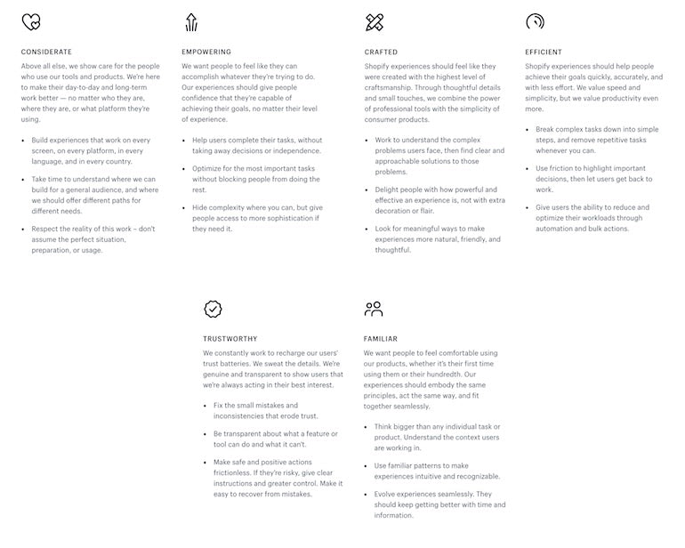
For example, Airbnb’s design principles are oriented towards accessibility and functionality. Their goal is to create “unified, universal, iconic, and conversational” designs.
On the other hand, IBM’s principles state that they aim to create designs that are “carefully considered, uniquely unified, expertly executed, and positively progressive.”
Set the rules
An organization’s design rules are subsets of its principles. They are essential when it comes to making a designer’s work more efficient and ensuring a great user experience.
The rigidity of these rules can vary — some can be strict; others can be malleable. Having a class of looser rules provides designers with the flexibility to make improvements where they see fit.
Allow the language to grow and expand
We must be mindful of the fact that having Design Language is never an end-goal in itself. As time passes, an organization’s language must adjust to changes in its industry and account for technological debt. Industry standards tend to shift and change, and so should your Design Language.
“ A unified design language shouldn’t be just a set of static rules and individual atoms; it should be an evolving ecosystem.” — Airbnb.
Allow your language to gradually take the shape of the market it exists in so that it remains relevant to the current Zeitgeist.
Similarly, the potential for a language’s growth stems from their users’ needs and the organization’s competitors. 
Continuously researching and refreshing your customer personas allows the organization to serve its users better and keep the quality of their services high.
Understanding the organization’s competitive landscape allows it to explore strategic design opportunities and create a distinct visual identity.
Who’s Responsible for Creating a Design Language?
A Design Language isn’t exclusively a designer’s responsibility. Instead, it’s the collective effort of a broad spectrum of departments and specialists that include:
UX/UI Designers — responsible for the visual components of the language;Accessibility specialists — ensure that the language abides by accessibility standards;UX writers/Content strategists — responsible for the tone of voice guidelines and brand spokesperson parameters;Researchers — provide valuable insight into the needs of the end-users;Front-end developers — instrumental in writing efficient code and assisting with documentation;VPs and directors — ensure that the language aligns with the organization’s goals and its identity.
Conclusion
The development of a consistent and detailed Design Language can be very time-consuming. Bear in mind that multiple iterations will be necessary.
Despite these significant investments, a unified visual language will allow an organization to create convergent and coherent experiences, significantly decrease spendings, and set a high design standard that’s easy to follow.
Developing a Design Language is a collaborative effort
An essential part of creating a visual language is effectively collaborating with a wide array of professionals. UXpin is an excellent tool for managing your design projects, conducting UI audits, building design systems, and storing your documentation. Sign up for a free trial and try the most advanced design system management tool in the market.
The post What Actually Constitutes Design Language? appeared first on Studio by UXPin.
October 12, 2020
Join our free webinar “Scaling design with DesignOps2.0”
We’re happy to let you know that we’re hosting a free webinar “Scale design efficiently with DesignOps2.0” with a guest speaker: Erica Rider from PayPal’s internal developer tools team on Oct 29th, 2020 at 10:00 PDT.
Join now for free!
During the webinar, Erica will share some DesignOps best practices and explain how to smoothly transform your design processes, remove UX bottlenecks, and empower product teams with an end-to-end product development lifecycle.
Apart you’ll learn how to:
Transform your organization from a development-driven organization to a design-driven one.
Optimize your design processes and facilitate design quality through smooth processes.
Connect design and operations by sharing and expanding design intelligence.
The post Join our free webinar “Scaling design with DesignOps2.0” appeared first on Studio by UXPin.
October 8, 2020
Creating A User Research Plan (with Examples)
Every UX research plan should start with a solid outline. A UX research plan helps to set expectations and document the essentials you need to communicate to stakeholders and clients. Your company needs a strong business case for every user research session, complete with research objectives, goals, methods, and logistical needs for the study.
Master templates are the best way to create a successful and effective UX research plan. Using a template as a starting point makes planning and writing easier and helps you and your team stay focused on the who, what, why, and when of research. Read on for tips and examples for how you can build a user research plan that works.
Table of Contents:
BackgroundObjectivesMethodologyParticipant ProfilesTimelineConclusion
UX Research Plan Background
The background section should offer your clients and stakeholders a few sentences on why you are creating a user research plan and what it will accomplish. It should orient readers to the needs and expectations behind the purpose of the study. It should also include a problem statement, which is the primary question you’re setting out to answer with your research findings.
Example Background:
The purpose of this study is to understand the major pain points users experience in using our website/app and how these contribute to issues such as cart abandonment, returned items, and low customer loyalty.
We will be using usability testing to follow the user’s experience of our website/app and the obstacles they encounter leading up to the point of purchase. We will also be using generative research techniques to better understand the customer’s experience of our brand and the challenges and needs they face in making a purchase.
UX Research Plan Objectives
Before getting into the nitty-gritty of your user research plan, you first want to focus on your research objectives. This step outlines the reasons you are conducting a UX research plan in the first place. Why are you carrying out this research? What are the end goals you have after completing all the work? Seeking out answers to these questions should be a collaborative effort between you and your stakeholders. It’s also helpful to consider discussions and learnings from past clients and projects to create metrics for your UX research plan.
Objectives and Success Metrics/KPIs
Research objectives will be different for every project, but they should always be actionable and specific.
Example Objectives:
Understand how users currently go about tracking orders on our website
Understand what actions customers take when they consider buying a new [product we offer]
Learn about competitor websites/apps customers are using to buy [product we offer]
Evaluate pain points customers are experiencing in using our website/app
And here are some examples to help you determine the success of your UX research plan.
Example Success Metrics:
What information are we trying to collect about users?
What scales/documents/statistics do we intend to create?
What decisions will these materials help to make?
UX Research Plan Methodology
This step should be a short and sweet description of the research methods you will use to answer the research objectives. It should include both secondary and primary methods. Generative methods, such as user interviews and open-ended questions, help uncover motivations or more general insights, while UX testing helps to evaluate the usability and experience of your product.

Research Scope & Focus Areas
Clearly outlining the research scope and focus areas helps to facilitate efficient user research planning. The more you’re able to hone in on the specifics of what information you are wanting to collect, the less overwhelmed you will be in the process. It also helps avoid inundating your clients with unnecessary information.
To keep research-focused, this section should include:
3-6 question topics (e.g. How do users spend their time on a website?)
Design Focus Components, including interface qualities (e.g. Usability, Training, Efficiency, Satisfaction)
Primary User Scenarios (e.g. Scenarios in which pain points are most problematic; scenarios you have the least information about, etc.)
Example Methodology:
For this study, we’re conducting a 30-minute usability test to evaluate our user’s experience of our app/website. A secondary method will be to conduct one-on-one generative research interviews to better understand our customers and empathize with their needs.
UX Research Plan Participant Profiles
Once you’ve defined objectives methodology and focus areas, it’s time to outline the participants you’ll need to get the required insights. Participant profiles help you determine who you want to recruit, or an approximation of your users, to optimize recruiting efforts. Here are a few examples of how to ensure you’ll get the best participants for your study.

Define your target user by collaborating with internal stakeholders, marketing, sales, and customer support. With their help, you can create approximations about who your users are. This is a great starting point for finding the right participants for your study.
Compare yourself to your competitors and create participant profiles based on their audiences. Recruiting people who use a competitor’s product can be an excellent way to glean insights into how to further improve your product.
Outline a screening process. Participant profiles should include any relevant information concerning your target audience, including behaviors, needs, demographics, geography, etc. Including the right criteria will help you evaluate whether or not to include certain individuals in your user research plan.
This Nielsen Norman article offers some great information about defining and recruiting the right participants for your study.
UX Research Plan Timeline
This is optional, but many UX research plans include a timeline that offers clients and stakeholders a general overview of how long the research will take. It helps to set expectations for the final results as well as allowing you to create a schedule for research sessions, debriefing, follow-up, and deliverables.
Timeline Example:
Approximately 6-8 weeks for identifying objectives, creating participant profiles, recruitment, in-person meetings, qualitative research, and analysis.
Conclusion
UX research plan templates are essential tools for executing a successful project. Having a master template helps you to remember what the process entails, communicate essential information to the right people, and stay on track throughout the user research plan. UXPin makes creating such research templates fast and easy. Especially since each project will be a little different and plans will need tweaking in terms of structure and content. A solid research-plan template that allows for modifying and flexibility will be an invaluable tool that will save time and provide more efficient results in future projects.
The post Creating A User Research Plan (with Examples) appeared first on Studio by UXPin.
Average Cost of a Well-Done Website Design (Or Redesign)

The average cost of website design is anywhere from a few hundred dollars to tens of thousands of dollars. There are several factors and options that will affect the cost of your project, which is why it is hard to pin down the exact cost of such an endeavor before you begin. While it may seem overwhelming in the planning process, this is actually a good thing, because it means you can find an option for almost any budget.
Website Redesign Options
In House

Doing a redesign in-house depends on your infrastructure. If you’re a startup with a team of just one or two people, this may be an impossible task if you haven’t redesigned a website before. However, there are tools available that can make the project a bit easier, and plenty of free videos to watch online. In this case, the hardest aspect is the amount of time it takes. Doing it completely on your own can cost as little as $150, which represents the cost of web hosting, a URL, and an inexpensive premade template.
If you are a larger company with a team of tech experts, doing a web design project may be a bit easier. However, having your own in-house team of designers will cost more as you will have to pay salaries, benefits, and other overhead costs.
Pros
In-house designers are always easy to contact in case of any changes or updates.
The web design teammates are already your employees who are familiar with branding and messaging.
Cons
Can be a lot of new overhead if you don’t already have the knowledge or proper staff, however, it may be a great investment.
Hiring Freelancers

Hiring a freelancer is a great way to get an expert on your side. Most people don’t have web design expertise, so hiring someone from outside of your organization makes sense. Working with a freelancer can cost anywhere from a few thousand dollars up to $15,000 depending on the size and features of the website. This is one way to get the out-of-house experience for a bit cheaper than an agency. Freelancers can set their own schedule, so they may be able to have more flexibility with timing in terms of your project. Although, there is a bit more risk when working with a freelancer.
Pros
Costs are lower than hiring an agency.
May be able to devote more time to your project.
Brings outside expertise to your business.
Cons
Individual compatibility is very important – you have to find the right fit.
There is more risk because you rely on one person for the entire project. If something happens in their personal life, you may be out of luck.
They may have a specialty or expertise but may lack other skills.
Can be difficult to verify the quality of prior work before hiring.
Working With an Agency
Agencies are businesses that are fully devoted to marketing, branding, and web design. They are the most expensive option generally, but they also bring diverse experiences and specialties to the table. Agency website design prices start around $10,000 and go up to $50,000 or more depending on the project. Why work with one? They have teams and networks of experts who can bring their professional experience to your business’s redesign. They also have a lot of infrastructures to support new endeavors. However, they usually work with multiple clients so they may not have the bandwidth to deliver your project super quickly if you are on a short deadline.
Both freelancers and agencies generally deliver completely unique solutions for their clients. A custom website design cost is generally higher than a template site, as reflected in the price of working with a freelancer or agency.
Pros
Gives you access to a variety of experts.
Agencies generally have ways to verify legitimacy and quality like testimonials and reviews online.
Has infrastructure to offer support beyond the project completion date.
Cons
Most expensive option.
May move slower with more team members.
Agencies have multiple clients at one time so they may not be as flexible.
What to Include in Your Website Redesign
A website redesign cost also depends on what features you include. It is about much more than just getting a new look for the site. It should be a full revamp for everything from the ground up. Consider the following aspects that may add to the cost but will make your site competitive in our digital world.
Upgrade Your Technology
Make sure that the technological components of your new website are up to date. For example, it should be responsive, meaning that it looks great on any device. A responsive site automatically detects which device is being used and displays the appropriate site version. It has been shown that up to 60% of web users won’t visit a site again if it is not responsive.
Another technology focus should be search engine optimization, which is about more than just keywords and content. These days, it also includes the amount of time your site takes to load, whether or not it is mobile-friendly and overall user experience.
Revamp Your Content
Content is an important factor for many reasons. Content affects search engine optimization, branding, marketing, and user experience. If your redesign has occurred along with a rebrand, make sure your content is in line with your new branding materials. Come up with a content plan and schedule that reflects the new look and feel of your site. Consider doing more than just creating written content. Photos, videos, and audio content can add a lot to your website and make users engage with your content even more.
Consider New Brand Graphics and/or Marketing Images
If your website design is a bit outdated, chances are your graphics and images may need a revamp as well. Consider adding this into a redesigned package to give your website a completely new look. It may add to the cost but it will be worth it to have a completely cohesive new website complete with graphics, logos, and images.
So, How Much Does Website Design Cost?
The answer to this question is not simple. There is a huge range of price. First, figure out your budget, and then find the option that works for that. If you have just a few hundred dollars, you may have to do it yourself. If your budget is more, you can choose to work with a freelancer or an agency. Wherever you start, remember that most businesses redesign or update their sites every 3-5 years, so it won’t be too long before you’re doing it again!
Using UXpin for any redesign process makes it easy to create a new website from start to finish, while collaborating with multiple people. Thousands of top companies use our tools to make web design a streamlined process. Read our testimonials to find out how UXpin can help your business, then contact us to get started!
The post Average Cost of a Well-Done Website Design (Or Redesign) appeared first on Studio by UXPin.
UXpin's Blog

- UXpin's profile
- 68 followers

