
UXpin's Blog, page 89
October 7, 2020
Interaction Design (IxD): The Next Step for UX Designers

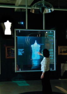
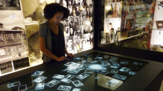
There is no single definition for interaction design. However, much of its character shapes digital products, services, artefacts, and spaces with a strong emphasis on user experience. The field is broad, user interaction is diverse and dynamic and involves aesthetics, motion, sound, space. With these elements becoming more granular, i.e. sound design for the crafting of sounds used in user interactions (games, installations, industrial work areas). IxD takes a multifaceted view on the social, cultural and business context for which a digital artefact resides.

What is Interaction Design?
Interaction Design is essentially the practice of designing interactive digital products, environments, systems, and services. It focuses on creating a flow where a user can locate and manipulate information quickly and in a succinct manner. The notion of usability in a digital product is often associated with good interaction design. Ultimately a design is a plan to make something new for people that they perceive as beneficial and IxD examines the interaction (via an interface) between a system and its user. Interaction Design is heavily multidisciplinary with labs usually containing a mix of disciplines such as computer science, HCI, anthropology, industrial design, informatics, and applied physics and electronics.
User Experience (UX)
Interaction Design and UX is used homogeneously in cultural discourse. There is no doubt the two disciplines share many characteristics. A large section of UX concerns a user interacting with a product, however the two are not synonymous. UX Design is a higher-order concept that encompasses numerous design aspects along with a user’s journey on a system, platform, software, or application. It includes UI design, Ix design, communication design, application design, information architecture and more. The goal of UX design is to induce a positive feeling for the user when operating on the device – this encompasses a wide variety of disciplines and techniques. Whereas Interaction Designers are concerned with the moment a user interacts with a product; their objective is to improve the interactive experience. The moment of interaction is just a part of the journey for a UX designer; UX must focus on all user-facing aspects of a product or system. The IxD designer focuses on the choreography of the interaction; if the exchange is quick, intuitive and pleasurable, their job objectives are satisfied.
What Is Good Design?
What does good mean? Is it possible to measure or analyze? The answer is not black and white, but some characteristics pertain to good design. When we interact with everyday artefacts, like a car, we don’t waste mental energy analyzing the interaction: we think about where we’re heading and what we want to do. The interaction is intuitive; removing the conscious thought needed to operate the system, leaving us to concentrate on our goals. When one designs a computer-based system or digital artefact, they’re focusing on how it behaves and not just aesthetics. The quality of interaction is more important, and this is the skill of the interaction designer.
Consistency
Consistent design is intuitive design. A specific command in one part of the system should initiate the same response in another position. The Apple II is an example of this; one knew what to do at all times. A command in the database behaved the same within the word processor; one was never lost and rarely made a mistake, regardless of your position within the system the escape key took you back up a level – consistency promotes user learning and avoids confusion. Compare this with contemporary “integrated” applications. Consistency and simplicity is a difficult combination to attain but when executed, produce timeless affectionate tools for the human race. Check out our webinar on Balancing UX Consistency for a practical deep dive.
Perceivability
Perceivability invites interaction and acknowledges that our experience of any interactive product must first pass through our senses. If an interface can engage the user’s senses, it will inherently be more comfortable for the user to perceive and understand the elements use case and how to performs actions with it – the louder the voice of a satnav, the stronger the vibration of a mobile phone or the bigger an icon on a screen; each stimulus catches the users attention and elucidate subconscious meaning. Obscured interfaces and interactions decrease usability and intuitive play; one must not have to guess or act out of desperation or rely on luck and random discovery, the user should be able to interact with the system intuitively without conscious thought.

Affordance
Affordance is essentially the perceivable characteristics of an object, for example, shape, size, colour, location or texture, which determine the tactile possibilities of the artefact; it is possible to stretch the concept of affordance into the virtual world. A physical button affords to be pushed down. The virtual representation of a button on a website evokes the affordance inherited by the physical object it evokes, elucidating to the user that they can press it (i.e. click on it).
Constraints
Constraints limit the range of interaction possibilities for the user; restrictions prevent users from following dead-end paths, making mistakes, and of course, it guides the user to make the appropriate next action. Constraints clarify direction; limitless possibilities confuse. For example, on particular pages, the menu items of a website may be temporarily disabled. A technique to mitigate against this and avoid frustration, may include greying out items to signal that it’s inoperable or defective.
Feedback
Reassuring feedback is central for interaction design, how does one know when an action is initiated and if it has been successful or not. Let’s take the humble keyboard as an example; we understand the implications of our actions. by the characters appearing on the screen and the tactile sensation of pressing keys and of course, the aural feedback.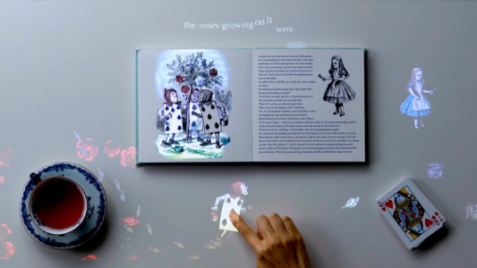
Navigation
One needs to orient oneself within a system, intuitively knowing how they can go somewhere and how to get back – Macintosh and Xerox Star interfaces led the way for screen-based systems. A 1982 paper describes how The Star user interface differs from alternative office computer systems of the time with its emphasis on graphics and adherence to the metaphor of a physical office; of course it’s rigorous application of a small set of design principles. It is clear how one navigates and travels within the system.
 Xerox Star Interface I
 Xerox Star Interface II
Usability
Usability in a digital artefact correlates with good interaction design; usability design aims to improve the usability of a product and is regarded as user-centred design; this includes several essential elements – usability testing, based on the target users psychological research – user model and needs, the use of processes, etc. Cognitive Psychology, Ergonomics, Industry Psychology and various other disciplines are applied iteratively to distil the most suitable and practical design for the end-user. Designing a usable system requires intimate knowledge of human psychology in the context of digital interaction; check out our e-book bundle – Psychology Principles for WebUI Design.
Coming full circle, the following list by Jakob Nielsen’s(aka “the king of usability”) outlines ten general usability principles, more commonly known as Nielsen’s “heuristics” – use this as a pragmatic cheat sheet; if a product has a strong usability foundation the remaining design will emerge effortlessly.
 Ten Usability Heuristics by Jakob Nielsen
Visibility of System Status
Users must be at all times informed about what is going on within the system, using appropriate feedback techniques within a reasonable time frame.
Match Between the System and the Real World
The system should speak colloquially, and the flavour of speech should not be system-oriented.
User Control and Freedom
Users do not always make the best choices and must have the facility to undo and redo; emergency exit and cleanup procedures must be easily accessible.
Consistency and Standards
Users should not have to second guess standards within the system; specific actions should do the same things throughout the platform – actions need to be consistent.
Error Prevention
Design the system in a way that it is difficult for the user to break (the user should not be able to harm), safeguards should be put in place to prevent system meltdown and misuse.
Recognition rather than Recall
Reduce the user’s memory and cognitive load by making objects, actions, and options visible.
Flexibility and Efficiency of Use
Create multiple paths within the system wherein expert, and novice users can navigate in an accelerated or slow manner. CLI(Command-line Interface ) vs GUI (Graphical User Interface).
Aesthetic and Minimalist Design
Follow the principles of KISS(Keep It Simple Stupid ) and Occam’s razor. Everybody hates bloatware. One useful approach is applying the You Ain’t Gonna Need It principle, or YAGNI for short: leave out all the things that seem nice-to-have, but you have no proof you need.
Help Users Diagnose, Recognize and Recover from Errors
Error messages need to be in plain English (no error codes) and should be solution orientated, guiding the user to recovery.
Help and Documentation
A system must be completely intuitive, requiring no manual or second-guessing, but there are always edge cases where complex tasks need further explanation, in a more granular manner. An instruction manual should be easily accessible—for example, Linux MAN pages.
Create and Share UX Designs With UXPin
When it comes to prototyping tools that support your UX processes and methodologies, look no further – UXPin does the job perfectly. It is full of design, prototyping, and collaboration features to let you and your team align and work in context. UXPin lets teams work on the same design – not only designers but also stakeholders who don’t have an account can collaborate. This takes so much frustration out of the review process and puts an end on the never-ending emails with feedback. All you have to do is send someone a preview link so that they can start reviewing the design. Start with a free UXPin trial to discover and try all the features yourself.
The post Interaction Design (IxD): The Next Step for UX Designers appeared first on Studio by UXPin.


October 5, 2020
Bringing a crazy design idea from prototyping to real-life with confidence
Do you want to find out how to simulate millions of virtual users that interact with a site from different locations on a single screen? You can get behind the scenes and discover all the insights about it in our recently published success story from Nitzan Ron of BlazeMeter.
Ron recalls having tested numerous solutions, from dynamic pie charts to vertical charts – none of them were good enough for what he intended to design in the first place. He wanted to present the concept of statuses with waves – moving, dynamic, and changing all the time in a non-linear way. Guess what? UXPin turned out to be the perfect solution to prototype such a concept! He achieved the desired effect with only two features, states, and interactions, on a single page without the need to duplicate each wave numerous times. The final outcome created a really unprecedented “wow” effect – read all about it now!
The post Bringing a crazy design idea from prototyping to real-life with confidence appeared first on Studio by UXPin.
October 1, 2020
What Should You Expect From a UX Developer?
UX developers can play critical roles in product development. Oddly enough, some people in the industry don’t know what UX developers do. Many others confuse them with front-end developers and UI designers. The following article will give you a deeper understanding of what UX developers do and how they can help you build great products.
What Is a UX Developer?

UX developers often fill a variety of roles in prototyping and product development. They have excellent communication and critical thinking skills that lead to better, faster product development. They also have the ability to think from multiple perspectives, so they can get inside the head of your target market to anticipate needs.
You can think of UX developers as coaches that help your team members reach their goals by anticipating problems and predicting how the other team will respond.
Essential UX Developer Skills

Many people get confused about the skills that UX developers need to do their jobs successfully. Some don’t understand the difference between a UI and UX developer. Others don’t know how to differentiate between the skills of a front-end developer vs. a UX developer.
Some of the most essential skills required from UX developers include:
Wireframing that creates a blueprint of the product.Prototyping that tests whether products will work correctly before releasing them.Information architecture that helps them create intuitive navigation and other features.Research to understand consumer needs and how to discover ways that a product can solve problems.Visual communication that includes an understanding of layout, color, icons, typography, and other aspects of design theory.
UX Developers vs. UI Developers
UX developers and UI developers often work together to reach a common goal. They do, however, play different roles in product development.
UX developers focus on features that will affect the user’s experience. The UX developer has to get inside the user’s head to understand consumer needs and preferences. They think about questions like:
Would an auto-complete form benefit users here?Should modal pop-ups interrupt the user’s experience to make a task easier?Will this landing page convert visitors?Do this product’s users prefer horizontal or vertical layouts?Will this feature decrease the amount of time clients need to fulfill a task?
UI developers may ask themselves some of the same questions, but they usually think about their work from a design perspective. More importantly, they try to do things like:
Selecting the colors that guide users through the product.Choosing icons that intuitively express an action.Keeping designs clean and simple so users don’t feel overwhelmed.
The difference can seem subtle at times, and there is some crossover. When you built a team, though, you will see the differences between UX developers vs. UI developers.
Front-End Developers vs. UX Developers
A common misconception is that UX developers have similar skills as front-end developers. Many UX developers find it helpful to learn some front-end developing skills, but they can do their jobs without spending too much time with technical details.
At the most basic level, UX developers help think of features and designs that make products appealing to consumers. The UX developer does not necessarily need to know how to make these features function, though.
That job falls on front-end developers who need skills like using:
HTML and CSSJavaScriptJQueryContent management systems (CMS)E-commerce platformsRESTful APIs
In other words, front-end developers have much more technical roles than UX developers. While UX developers try to imagine how a product will fill consumer needs, front-end developers find ways to make those features function.
How a UX Developer Fits Into Your Team

More often than not, several team members fulfill multiple roles. Few members, however, do more than your UX developer. A UX developer has some knowledge about designing and coding. That makes the person an excellent communicator between your artistic and technical teams. You need someone to translate. A UX developer gets the job done.
UX developers also do a lot of research with potential users. The research can involve surveys and interviews. It can also involve thinking from the perspective of a potential user. Ideally, the UX developer identities problems and recommends improvements before your team spends too much time developing a product.
Your UX developer can also provide a fresh perspective on your team’s work. People often get emotionally attached to ideas when they work on them for weeks. The UX developer can step in and question whether an approach truly works as intended, especially when confronted by a new user.
A UX developer may upset some of your employees. The person isn’t there to massage egos. The UX developer’s work helps ensure that users will have an excellent experience that will make the product successful.
When Should You Hire a User Experience Developer?
There isn’t a perfect time to hire a user experience developer. Some companies get UX developers involved at the beginning of a project. Others give their technical and design teams some time to work before they bring in a UX developer to review the progress.
Either approach can work well, depending on the project. Just remember why you hired the UX developer. If you want to identify a product’s user, you probably want to get the UX developer involved as soon as possible.
If you want a UX developer to organize a website, it could make more sense to bring the person in half-way through the project. That way, the person can get a lay of the land and start organizing pages.
You have two basic choices:
Get the UX developer involved early to avoid mistakes.Get the UX developer involved after the project has started to find mistakes and recommended corrections.
Benefits of Using UXPin With a UX Developer
Your team members will need to share a lot of information with the UX developer. UXPin, a collaborative prototyping tool, makes working with your team very simple. Especially, when you have team members working remotely. With UXPin, you get real-time collaboration that works similarly to Google Docs. When someone makes a change to the prototype, everyone sees it happen.
Better still, when it comes to developer hand-off, a UX dev doesn’t even need a UXPin account to participate in the collaboration. You can send them a preview link that works for everyone on the web. As long as your UX developer has the right link, they can contribute without committing to a UXPin plan.
UXPin also lets your UX developer and other team members create design systems that will streamline your work and keep all projects in the company consistent. When you have all of your assets in one design system, no one will “color outside the lines.”
The post What Should You Expect From a UX Developer? appeared first on Studio by UXPin.
September 30, 2020
How to Use a Design System to Make Great UX Design Decisions
Making the right design decision on any stage of the process is tough. What’s more science shows that humans have a finite ability to make good decisions throughout the day. Our willpower literally evaporates during the day as we make decision after decision. Did you ever intend to eat something healthy for dinner, but, too tired to decide what to cook, you ordered a pizza instead? You can blame biology.
We can’t help you avoid the pizza, but we can help you make better UX design decisions. So how do we remain productive throughout the day and ensure we’re making good UX design decisions?
How designers make decisions?
We will first give you a quick overview of how most designers make design decisions. Then, we will explain how having a UX design system in place can provide you with the guardrails you need to keep your decisions focused on whatever project you’re working on — even, or especially, at the end of a long day in the design trenches.
Have you ever sat down and tried to explain how you made a particular design decision — or how you do what you do? Most of us sort of “Just Do It”, to borrow a phrase.
What UX designers do isn’t easy. The use of colors and getting the exact right tone, pixel width and relation to shapes (and choosing the shapes and how to place them so that they are aesthetically pleasing AND enhance the user experience); it’s no wonder our brains can be a bit sore at the end of the work day.
There are three ways in which we make design decisions:
ExperienceIntuitionReference or imitation
These aren’t entirely separate — our experiences inform our intuitions and both of those are influenced by designers we’ve studied. So there’s a constant tug-of-war going on between these three decision-making styles as we do our work.
UX Design Based on Experience
As designers build experience and knowledge, we begin to make decisions based on what worked in the past.
The spacing between these objects should be just like this.
Leaning too much on experience, though, can lead to UX designs that are outdated and that don’t deliver a great user experience — or just a great user experience five years ago, not today. It can feel safe to rely just on past experience, but that cuts us off from trying something new. Which leads to intuition.
UX Design Based on Intuition
Using intuition can create inspired design. It can also lead us to poor UX design because it just “feels right.”
So long as you remember you are designing for people and not what you personally like, using your intuition can help you work quickly and get a project started quickly.
Reference or Imitation
They say imitation is the sincerest form of flattery. For many UX designers, it’s how we stretch beyond our comfort zones and explore new UX/UI design ideas.
Imitation isn’t a bad thing — it’s how we learn to talk, use a fork without poking our eyes out, and how new skills are generally learned. Think of every kung fu movie you’ve seen, the student learns from (imitates) the master.
Using a reference is also a way to incorporate new ideas that work into your design. Remember that the ideas you are imitating began as a flash of intuition from another designer. When you combine your experience and intuition into a reference design, your flash of inspiration could be the next great UI design idea used as a reference.
UX Design System: Guardrails for Decision Making
A great way to keep your design decisions focused while getting the most out of your mix of experience, intuition, and imitation is to create a design system.
A design system removes the burden of making design decisions in the context of a single project.
Should that button be blue or green? The design system will tell you which color to use.
What font and size would look best here?
How wide should this image be?
How should I lay out this page?
A design system will answer all of these questions for you so you can focus on creating a great design without having to decide on the various elements.
Don’t waste your precious decision-making ability making decisions that you don’t need to. Create a design system for your projects and reap the benefits. You might even have enough willpower to eat something healthy for dinner.
UXPin makes creating a design system simple. You can give it a try for free — try UXPin today.
The post How to Use a Design System to Make Great UX Design Decisions appeared first on Studio by UXPin.
September 29, 2020
Building Your UX Team: Roles & Priorities When Hiring
While you may realize the importance of developing the right UX team structure, actually executing this is something that many businesses struggle with. Whether there’s a lack of organization or you don’t have the right team in place to create a structure, there are many reasons why companies may find this difficult.
In this post, we’ll dive into the topic of UX team structures. We’ll cover the common types of structures that many UX teams use today, the pros and cons of each, and some tips on how to build a UX team structure that is well-suited for your organization.
Common UX Team Structures
As you’re trying your hardest to develop the perfect UX team structure, you may run into many challenges. After all, your goal is to ensure the working environment is both collaborative and efficient. In addition, the structure of your team is always changing and evolving — new team members, staff members who quit, new products, new features; all of these factors can have an effect on the structure of your team. Another factor that leads to more difficulty involves the fact that the UX team structure is often a discipline that doesn’t take priority when compared to others; development and product management, for example, are ones that typically hold more weight. That being said, finding a solid UX team structure isn’t always the leading priority for many organizations.
Whether in regards to a corporate internal UX team structure or one for a small organization, user experience teams are typically structured according to the following models:
Centralized

One of the more common UX team structure solutions is a centralized approach. A centralized UX team is one where all UX team members report to a UX manager. Under this approach, the UX staff will work on different products and tasks for the organization, essentially acting as consultants to the rest of the business. UX team members, using this model, may work with multiple departments to solve a need, but they only report to their UX manager. For companies who invest a lot in UX, they may have a much more complex organizational chart as it relates the tasks of the team, but if strictly following this centralized model, then UX team members would report to a single UX lead or executive.
Pros and Cons
One benefit of this structure is that there is typically one UX manager who oversees the performance and contributions of all team members in the group. If someone isn’t doing their job effectively or a process needs improvement, the manager can step in and make the necessary changes.
One downfall of the centralized UX team approach is that sometimes other team members of the business may forget to involve the UX staff in their projects. If a UX team isn’t always included in the project development process, other staff members may forget they are even there. But this doesn’t mean they don’t realize the importance of UX; sitting down with the UX team just may be an afterthought for them.
Embedded
 UXTeam 02
An embedded, or decentralized UX team is essentially the opposite of the centralized approach. Rather than having a separate UX team that reports to a single person, an embedded team is one that has multiple team members with various areas of expertise. For example, rather than having one team full of UX team members who report to a single manager, an embedded team typically only has one or two UX members, including other members of the business; usually project managers, developers, etc. Organizations use this approach to better align their teams to specific products, processes, or lines of business.
Pros and Cons
One leading advantage of the embedded approach is that the UX team tends to be more involved at a higher level. Given how centralized user experience teams basically act as consultants to other areas of the business, that tends to lead to less involvement in many projects for the UX staff. But in an embedded team, UX team members are typically involved in many phases of the project, and they’re also usually involved in meetings and collaboration sessions with other staff members.
One negative of the decentralized approach is that sometimes it’s hard for UX team members to have their voices heard. In a centralized team, there are multiple team members who are involved with UX projects. But when there is only one UX team member working on a project, it can be difficult for these professionals to hold their own. These difficulties may arise when there are differences and disagreements with developers and other members of the team.
Matrix

In simple terms, a matrix UX team is a hybrid of the centralized and embedded models. Using this structure, the UX staff reports to their own specific team, like in the decentralized model, and also to their UX-group leader, as seen in a centralized model. However, it’s important to note that one of these two managers holds precedence over the other; therefore, UX team members report to this leader for high-level executive decisions. That being said, the UX staff working under this structure will be overseen by both an individual team lead, as well as a UX-specific manager.
Pros and Cons
A huge benefit of a matrix UX team is that there is typically increased flexibility. As many organizations, and technologies, are constantly evolving, this flexibility can be extremely useful. These teams are usually able to easily adapt to organizational pressures that may change often, and they may also have the flexibility to shift focus to any immediate needs that may arise.
Since UX team members have to essentially report to two team managers, things can get pretty confusing. In addition, these staff members may get pulled in two different directions, wondering who has the ultimate authority over the other. This can create a lot of disorganization within a business, and can lead to an inefficient process when it comes to UX management.
Finding the Structure for Your Organization
After reading about the common UX team structures out there, you may be at a standstill when it comes to deciding the right model for your organization. But the truth is — one model may work great for one organization and be the totally wrong approach for another. But to help you navigate around this topic, it really depends on the size of your team, your priorities, and how much weight you put on user experience.
Take a look at the following considerations you should make when trying to decide on the ideal UX team model:
Workload
While you may want to hire a huge UX team, you need to have work for them. That being said, one factor when looking for a UX team structure involves your workload. Is there enough demand for UX expertise to justify the resources you would use to build this team? Will there even be enough work for them? Before starting the hiring process for a UX team, consider if the demand is substantial enough for growth.
Current Process
You’ll also want to look at your existing process to determine if the need for UX expertise is truly there. Does your current team use UX activities in their process? If your team doesn’t focus on UX at all, or very little, then it would be extremely difficult for a UX specialist to mesh well with the decentralized team, especially when just starting out. In this case, a centralized approach may be the right path to take.
Collaboration Opportunities
In regards to the decentralized model, there may be some difficulties when it comes to collaboration and resource sharing for the UX team. If these team members are distributed across multiple areas of the business, then it’s best to find a way for them to collaborate and share their resources. If you’re finding it difficult to find a solution for this, then the decentralized approach may not work for you.
Tips for Hiring the Perfect UX Team

Alright, so you’ve decided that it’s time to focus on building the ideal UX team. To ensure you build the right team with the right professionals that can help your organization grow to new heights, follow these tips:
Understand the Problem
The first step to hiring the perfect user experience teams starts with understanding why you want to hire these people in the first place. What needs to improve with your user experience? What can a new UX designer or UX team member do to help? In order to find the perfect team, you need to understand your current challenges at a high level.
Know Your Process
Another tip is to have a complete understanding of how your organization operates. How would a new UX specialist fit in your team’s culture? Would these new UX professionals be able to easily integrate with other team members? These are questions to ask yourself before bringing in a new hire.
Understand Your Team
The most important tip of all is to understand your team to determine who can mesh with them perfectly. Especially if these UX team members will be constantly collaborating and engaging with the rest of your team, you’ll want them to get along.
Crush UX Challenges with UXPin
While you need the right UX team structure to conquer problems and grow as an organization, you also need to stay updated on the latest UX tools for the job. That’s where UXPin comes in. We help design companies crush their UX goals from every angle. Want to learn more? Contact UXPin today!
The post Building Your UX Team: Roles & Priorities When Hiring appeared first on Studio by UXPin.
September 25, 2020
Tips for Running A Design Thinking Workshop with Your Team
Running a design thinking workshop is one of the best ways to spark creativity and nurture a user-centric mindset within your design team. As a designer, you will encounter situations where you need to run design thinking workshops either with your team, your clients, or other departments in your organization. This article will give you a step by step guide on how to run design thinking workshops that come up with innovative solutions to user problems.
Table of Contents
What is a design thinking workshop?
What are the goals of a design thinking workshop?
Who should run a design thinking workshop?
How to run a design thinking workshop: a step-by-step guide
What is a design thinking workshop?
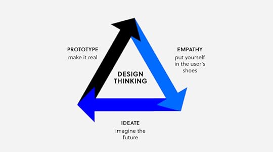
A design thinking workshop is a creative problem-solving session that is based on the principles of design thinking. These workshops are activity-based and they are often done in person but they can also be done remotely. The activities of a design thinking workshop are organized according to the three phases of the design thinking process: empathy, ideation, and prototyping.
Empathy: Developing a deep understanding of the problem that users face and empathizing with them.Ideation: Coming up with many ideas on how the user problem can be solved. Prototyping: Creating a prototype of potential solutions and then testing it with real users.
 workshop 01
A workshop can last for a few hours long, a whole day, or even a week.
What are the goals of a design thinking workshop?
Design thinking workshops help design teams to create feasible and user-focused solutions to design problems. This helps the team to design better products faster, reduce costs, and increase profits. Other goals include:
Improving the problem-solving skills of the team. These skills are transferable to other design problems within the team. Creating a sense of community in the design team because workshop participants have to collaborate in order to get a solution. Giving the team a competitive edge by producing innovative and industry-leading ideas.
Who should run a design thinking workshop?
 workshop 02
A design thinking workshop should be run by a designer who understands the design thinking process. The facilitator should also have presentation skills and the ability to keep the group engaged throughout the workshop.
How to run a design thinking workshop: a step-by-step guide
The design thinking process is made up of activities that are done before the workshop and during the workshop.
Step 1: Planning and preparation
Before you can run a design thinking workshop, there are some things that need to be in place first, they include:
Workshop objectives: This is a clear definition of the goals that the workshop should achieve. Is it to generate new ideas or to improve on an existing design product? This is also a good time to define the challenge or question that the workshop will answer. It might be “how can we improve the user experience of our website users?”Workshop location: Choose a suitable location for your design thinking workshop. If the workshop is happening physically, choose a location that has enough space for your design team. If the workshop is happening online, decide on the meeting and presentation tools that you are going to use. Workshop agenda: This is a plan of how and when the different activities are going to happen. Do not overschedule the workshop and be sure to include a lot of activities in your design thinking workshop agenda. Workshop materials: Ensure that all the necessary design thinking workshop materials such as paper, marker pens, sticky notes, whiteboards, and props are in place.
After making all the necessary preparations as outlined above, the next steps will be the execution of your workshop agenda.
Step 2: Introduction
Welcome all the participants to the workshop and brief them on what they should expect during the workshop. Share the following information:
The main objective of the workshop and the problem that it is going to solve.A schedule of the workshop activities.
Step 3: Kick off the meeting using an icebreaker
Use fun icebreaker activities to help your team loosen up before the workshop begins. This will make it easy for them to collaborate and share their ideas.
Step 4: Introduce design thinking
Make a brief presentation on what design thinking is, the phases of design thinking, and its benefits. This presentation is useful even for designers who are already familiar with the design thinking philosophy because it brings everyone up to speed and ensures that you are all on the same page.
Step 5: Empathizing with the user
This is the first step in the design thinking process where you encourage the workshop participants to put themselves in the shoes of the user. This will help them to start generating ideas on what the user needs from the product.
You can use activities such as role-playing and creating an empathy map to help the participants really understand the needs, wants, feelings, and language of the user. After these activities, give the participants a chance to share their findings and ask questions, if any.
Step 6: Get more specific on the problem
After the empathy exercise, participants are better placed to really narrow down on the problem that the user faces. Ask your team to create a problem statement that will guide the rest of the design thinking workshop.
Step 7: Come up with ideas and possible solutions
The next design thinking step is ideation where your team suggests possible solutions to the problem that they identified in step 6. Use techniques such as brainstorming to come up with a list of potential solutions.
Give the participants a chance to discuss their solutions and then come up with one refined solution.
Step 8: Create a user journey map
After settling on one solution, get your team to map out the steps that users will take so that they can solve the problem. These steps can be downloading an application, setting up an account, adding their bank details, and then sending money. Give them enough space and sticky notes to create a step by step representation of the user journey.
Step 9: Prototyping and testing
This is the final step in the design thinking process where participants will create low fidelity prototypes of their solution. Ask the users to create screens for each step of the user journey and then ask them to add functionality to their screens in the form of buttons.
Once again, give your team some time to compare their prototypes and then ask them to vote for the best prototype.
Step 10: Describe the next steps and close the workshop
Close the workshop by explaining to your team the next steps such as turning their prototypes into wireframes, high fidelity prototypes, and actual user testing.
This is also a good time to ask your design team what they learned from the design thinking workshop. Don’t forget to ask for feedback so that you can improve your design thinking workshop facilitation skills.
Solve design challenges with the best design tools
Design thinking workshops help your design team to come up with innovative and user-centered solutions to design problems. Use UXPin to design, wireframe, and prototype the innovative ideas that you come up with during your design thinking workshop. Sign up for a free trial of UXPin and turn your ideas into wonderful designs.
The post Tips for Running A Design Thinking Workshop with Your Team appeared first on Studio by UXPin.
September 24, 2020
Design Team Structure: Ideal Setup for Small, Medium & Large Organizations
Gone are the days when design was considered as a ‘nice to have’ in most organizations. Today, design is an integral part of successful companies with McKinsey reporting that companies that invest in design see a 32% increase in revenue and a 56% increase in shareholder returns. Design teams that are structured properly are the heart and soul of great design that drives profits. This article will explain the different types of design team structures and the ideal structure for organizations of different sizes.
Table of Contents
What is a design team?
Types of design team structures
Ideal design team set up for small, medium, and large organizations
Best practices for building a strong design team structure
What is a design team?
A design team can be made up of one designer or a group of designers who play different roles, using different tools and methods to achieve one common goal. The common goal can be building a website, designing a mobile application, or any other design project.
Types of design team structures
The structure of a design team refers to the hierarchy of different designers in the team and the different roles and responsibilities that they have. It is the organizational chart of the design team. There are four types of design team structures: centralized, embedded, flexible, and contractual.
Centralized design team structure
In this structure, the entire design team works together in a central location with one decision maker. Large design teams have several design managers who manage individual designers. These design managers then report to a single person mostly the Director of UX or the Vice President of UX.
Centralized design teams work like agencies in the sense that they work on different design projects within the organization. The workload is managed by the design managers or the Director of UX.
The benefits of a centralized design team are:
Easy collaboration and sharing of feedback within the design team. A unified design experience because the design team shares the same vision and design resources. Reduced internal team conflict because of clearly defined roles within the design team. Wide range of learning opportunities for designers when they work on different design projects.
This design team has several disadvantages which include:
Isolation of the design team.A slower design process leading to time wastage.
Embedded design team structure
Here, designers are embedded in several cross-functional teams within an organization and they report to the leader of the team. Designers get to work with developers, product engineers, and marketers on a specific product, feature, or line of business.
They are also known as decentralized or distributed teams and they have the following advantages:
Improves cross-departmental trust and collaboration.Increases the speed of product development. Provides designers with a chance to be experts on a specific type of project.
This team structure comes with some drawbacks which include:
Designers can be outnumbered in a team which might lead to their opinions being disregarded.If there is no centralized design system, distributed teams can do a lot of repetitive work which wastes time and resources.There might be little improvement in the design process if no one is in charge of improving it.
Flexible design team structure
In the flexible design team structure, designers are part of cross-functional teams and report to the team leader and they also report to a central design leader. This in-house design team structure is a hybrid of centralized and embedded design team structures. These design teams are flexible because they can be moved around easily to meet changing organizational design needs.
In the flexible team structure, the daily activities of designers are directed and supervised by the team leader. Additionally, design team management is done by the design leader and there is collaboration with other designers in the form of design reviews.
The benefits of the flexible design structure are:
Increased flexibility to meet any arising design needs.More focus on the design process as a result of the double oversight.Improved collaboration between design and other product teams.
The drawbacks include:
There can be confusion among designers on which leader has the final say in design decisions. The structure might be hard to implement in large organizations.
Contractual design team structure
An external design team can be hired on a contractual basis to fill design gaps. Small organizations that don’t have enough budget for a full-time designer can hire a design team on contract. Similarly, organizations with in house design teams can experience spikes in their design workload or gaps in the skill set of in house designers. In both cases, contractual design teams can help fill the shortfall in bandwidth and expertise.
Ideal design team set up for small, medium, and large organizations
The right design team structure for your organization will depend on many factors. These are: the size of your organization, the type of design projects, and the capacity of your design team in comparison to design demand. Nevertheless, there are some design team structures that are best suited for organizations of different sizes.
Ideal design team setup for small organizations
For small organizations, the decentralized model where a designer is attached to a cross-functional team is most suitable. This designer can be in house or contracted. The best type of designer to hire for small organizations is one who has design leadership skills. A design leader will be able to advocate for the importance of design to the executives and create a strong vision. This will create the foundation for building a strong design team as the organization grows and hires more designers.
Ideal design team setup for medium organizations
As an organization grows, more designers are hired. The centralized model is more suitable for medium-sized organizations because the design leader will be useful in creating a common design vision and in managing the day to day activities of the designers. A centralized design team structure will make it easy for designers to share knowledge and give each other feedback.
Ideal design team setup for large organizations
Once an organization has a high design maturity and a large number of designers, the flexible or hybrid team structure works best. The design leader will be responsible for ensuring that designers collaborate well and for creating common design resources such as design systems.
On the other hand, the team leader will be responsible for ensuring that the design team collaborates well with other teams such as the product or engineering teams. This team structure gives large organizations the best of both worlds.
Best practices for building a strong design team structure
Hiring designers and putting them into teams is not enough, you need to ensure that your design team has enough resources and that it is properly managed. Here are a few strategies to help you get started:
Ensure that they have access to the best tools
Design tools can streamline the design process and save your company time and money. An all in one tool like UXPin makes it easy for your designers to design, prototype, and collaborate in one place. This tool will help your decentralized designers work well with developers because it bridges the gap between design and development. Your team can share feedback with contracted designers and other stakeholders easily.
Make growth and development a priority
In order to create an engaged design team, give them feedback that helps them improve their skills. Schedule regular one-to-one meetings with every designer on your team to give them feedback and to find out if they need additional support.
Build a culture of design strategy
A culture of design strategy helps your design team to play a strong role in driving business goals. It makes it easy for other departments to see the value of design which improves the morale of your team.
You can create a culture of design strategy by training your designers to be customer-focused and by aligning design goals with business goals. Design strategy should guide everything that your design team does.
Empower your design team with the best design tools
A great design team structure makes it easy for your design team to collaborate with each other and with other departments in your organization. UXPin makes this collaboration easy by providing a single tool to rule all your design needs. Sign up for a free trial of UXPin today and empower your design team.
The post Design Team Structure: Ideal Setup for Small, Medium & Large Organizations appeared first on Studio by UXPin.
September 23, 2020
DesignOps 101: What Is It and Why Does It Matter for Your Business?
Workfront’s 2019 State of Work Survey reported that American workers spent 60% of their workday working on tasks that were not their core responsibility. Time was spent in meetings, answering emails, and doing other administrative tasks. As companies grow, designers are faced with the same challenge: the need to do other tasks that are not design related. This is where DesignOps come in, they take care of the secondary tasks so that designers can focus on what they are paid to do: designing. This article will explain what a design operations manager does, why DesignOps is important, and how it can help companies scale.
Table of Contents
What is designops?Why is DesignOps important?What roles does DesignOps play?How does DesignOps help companies scale?Does your company need a DesignOps team?
What is DesignOps?
DesignOps refers to optimizing processes, teams, and craft to amplify design’s value and impact at scale. Usually, a team of people whose role is to design, plan, and manage the design process, take care of operations, business process, resource allocation, and logistics in the design team. The end goal of design operations is to increase the efficiency of the design team and improve the quality of design output.
Why Does DesignOps Matter?
In order to understand the importance of DesignOps, it’s important to first look at the challenges that design teams face:
A high volume of work. As the demand for design continues to grow in many organizations, designers have more design work to do. Additionally, they often have to do other tasks such as attending meetings, responding to emails, and managing collaboration with other teams.Isolation. Most designers work in silos, away from other teams in the organization which creates a lot of inefficiencies.Lack of design tools. Many design teams do not have access to all the tools that they need to carry out their jobs. Being kept out of the loop. Often, design teams are not involved in the strategy meetings that create design requests. Need for speed: The success of design teams is often measured by how fast they can churn out design projects, which creates a lot of pressure.
These challenges are often a recipe for burnout, slow design delivery, and poor quality design outputs. The list of benefits that come with DesignOps is extensive. The people that implement DesignOps remove these bottlenecks and inefficiencies by streamlining the design process which makes it easy to scale design. They bring structure and consistency to the design process while also removing all the obstacles that designers face.
The Role of DesignOps

The main role of design operations management is to protect the time of the design team so that they can focus on doing their jobs without obstacles or distractions. Here is how this role plays out day-to-day:
Operations management
This role involves creating a clear design roadmap of what the long-term goals of the design team are and how they can be achieved. It is also their job to assess the headcount of the design team and identify any skill gaps.
Process design
DesignOps plan and manage the design process by creating design systems and mapping out the design tools that the team needs. They create the frameworks of how the design team should collaborate with other teams within the organization.
Project management
They are in charge of design workflows and assign projects and set timelines. The DesignOps team schedules daily stand up meetings to find out the progress of design projects. They also organize and run design sprints.
Creating a communication strategy
The design operations manager acts as the liaison between the design team and the rest of the organization. They evangelize the importance of design and set team meeting agendas. DesignOps creates a system for storing all the files and resources that the design team needs for easy retrieval.
Onboarding new hires
They orient new staff, train them, and ensure that they fit into the design team. Hiring new design staff is also part of their mandate.
Building the culture of the design team
The DesignOps team organizes workshops and training for the professional development of the design team. They also provide professional and emotional support for designers within their team and organize team-building activities to create a sense of community in the design team.
Budget allocation and control
Ops design establishes how much it costs to run the design team and justifies these costs. Once the budget is approved, they are in charge of how it is distributed within the design team.
Legal
Working with the legal team to create NDAs and participant release forms that are used during user testing
Managing the procurement process
Liaising with the procurement department to streamline how the design team makes purchasing decisions.
IT and Security
Coming up with the technological roadmap of the design team and working with the IT department to ensure the compatibility and security of design tools.
How DesignOps Helps Companies Scale

Growing companies often see a sharp increase in their design needs. This can be due to expanding product lines or the creation of new business lines. Often, there is a commensurate increase in the stress, workload, and pressure that design teams face which can be a bottleneck to further growth. DesignOps help companies scale by:
Removing any bottlenecks and obstacles in the design process. Standardizing and optimizing the design process. Coordinating communication and collaboration across all teams. Allowing designers to focus on design. Taking care of new employee onboarding to make it easy to bring new employees up to speed.
Once the operational kinks are smoothened out, organizations can increase the quality and quantity of their design output.
Does Your Company Need a DesignOps Team?
For large organizations with teams of more than 50 designers, a design operations role is necessary to coordinate all the designers and the different projects that they are working on. An organization with fewer designers who work in different teams also needs a DesignOps manager to coordinate the different design teams.
While a DesignOps manager might not be needed in a small organization with few designers, these organizations can benefit from DesignOps thinking. This means that small design teams can work better if they standardize their design processes and workflows. This will lay a foundation for small teams to scale more easily when the organization grows.
Scale Your Design Team With the best Design Tools
Design operations help design teams scale much faster by allowing them to focus on design. UXPin is an all-in-one design tool that helps DesignOps managers to amplify the value of design, standardize their design process using design systems, and to make DesignOps a thing. Sign up for a free trial of UXPin and start creating your design system today.
The post DesignOps 101: What Is It and Why Does It Matter for Your Business? appeared first on Studio by UXPin.
September 17, 2020
Modal UI Dialogs and Windows: When Should You Interrupt User Flow for Your Own Benefit?
Most designers do everything possible to give users streamlined experiences without any interruptions. Sometimes, though, it makes sense to interrupt the user flow with a modal that triggers the user to do something on a website or in an app..
The following article explains various cases in which it makes sense to use modal UI dialogs and windows. Knowing the right moments to interrupt the user experience can actually add to your product’s effectiveness. You need to take a savvy approach to make the most of modal design without annoying users, though.
What Are Modal UI Dialogs and Windows?
Modal UI dialogs and windows are large boxes that cover entirely or partially the main window until the user performs an action. They work like pop-up windows. Unlike most pop-up windows, though, users cannot continue by clicking an X and closing the box. Instead, they must take an action that tells the website or app how to behave.
As a designer, you probably don’t like the idea of interrupting a user’s experience. You want to create a seamless product that simplifies complex tasks. You might also have aesthetic reservations about UI modal designs. When a window interrupts the main window, it also interrupts your design.
When you think beyond the immediate experience of encountering a UI dialog, though, you can discover ways that the interruptions actually improve user experiences.
Modal designs can also help your product acquire the information that owners need to make money. Even if you despise the interruptions that modal UI dialogs cause, you must accept that designers can only work when they have clients willing to pay them. If that means adding a few interruptions, then you have to do it.
That’s also why we put together the following examples to show you that modal dialog has a place in cohesive, pleasant designs.
Use a Modal UI Collect Information and Generate Leads
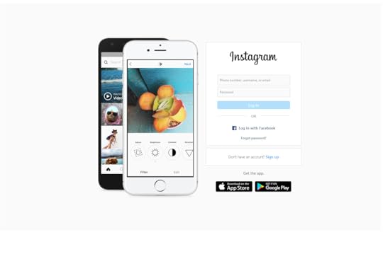
Many apps and websites collect information from users so they can generate leads for clients. When someone visits an app like Instagram, they have limited access to content until they create an account.
If you try to scroll too far into the content, a modal dialog box will appear and ask you to either log in or create an account.
Creating an account gives you access to all of the public images on Instagram. You have to give Instagram your email address to create an account, though. It uses this information to stay in contact with you. Depending on how often you use the platform, you may get daily or weekly emails with updates about your account and friends.
Lead Generation for Ecommerce
Instagram doesn’t want to sell products or services to you. It just wants you to visit its platform so it can earn advertising revenue.
Ecommerce sites, however, use lead generation in a different way. Their modal dialogs ask you to enter your contact information to create an account. Companies can then use your information to let you know about products, services, and specials that might appeal to you.
With this type of lead generation, companies hope to make money by getting you to buy something. With the modal UI, they would miss opportunities to generate the income needed to grow and serve their customers.
Helping ecommerce sites generate leads and improve buying experiences will always play some part in a product designer’s work. Learning how to meet your client’s needs will help ensure that you continue getting work.
Ideally, you should also learn how to write microcopy that converts users. Choosing the right messages can make a significant difference in your dialog box’s effectiveness.
Break Complex Actions Into Smaller Steps With Modal Dialogs
Product designers cannot assume that all users have a lot of experience using websites and apps. Even though 81% of Americans own smartphones, you can’t assume that all of them have used their devices for anything other than placing phone calls. You certainly can’t expect all of them to know how to complete complex actions online.
Modal windows can break complex actions into small, manageable tasks. Instead of confronting users with unrealistic expectations, modal dialogs can take small steps to reach a complex goal.
Ler’s use asana login as an example. It’s a user-initiated modal that doesn’t launch until the user asks it to. Asana must ask several questions to create your account, including:
Your name.The type of work you do.An introduction to setting up your first project.Your billing information.
By spreading out these and other steps, new asana users get to create accurate profiles and learn the basics of setting up their first projects. If the website asked all of these questions and presented all of the instructions at once, users would feel assaulted by information. Asana’s approach makes it easy to focus on each step without feeling overwhelmed.

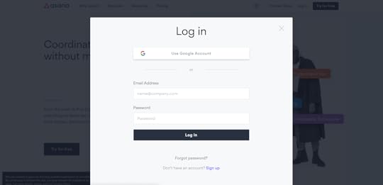
Position Modal UI Pop-Ups in the Right Places
Pop-up windows need to appear in the correct place to grab the user’s attention and encourage action. Twitter offers a great example of modal UI screens that pop-up in just the right places.
Notice that the pop-up doesn’t fill the entire screen, so users still know which service they’re trying to use. Instead, it covers just enough of the area to demand action.
The position matters quite a bit, too. Pop-ups can work well in different places. Twitter gets it just right by positioning the modal UI in the center of the page. Each user gets confronted with an account request that asks straightforward information. The fields also give people plenty of room to answer questions completely.
On a mobile device, the pop-up appears on the upper-half of the screen. This ensures that the user sees the modal pop-up before scrolling down. If the pop-up appeared elsewhere, users might miss the interaction, which would leave them wondering how to create accounts.

Use Modal Design to Prevent Errors and Correct User Mistakes
When trying out new products, most people jump into the experience instead of looking for instructions. Designers should recognize the impulse as a part of human nature.
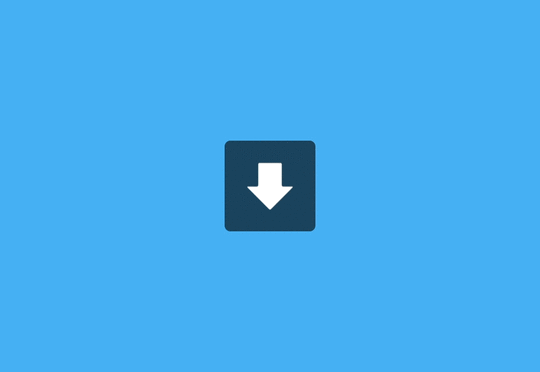
Modal design gives you a whimsical, non-judgmental way of saying, “You didn’t do that right at all!”
The above UX automation tells the user that a download has failed. Maybe the user caused the failure. Maybe the failure came from somewhere else. What matters is that the animation makes the failure amusing.
You can imagine similar modal dialogs that say something like, “Oops! You forgot to attach your file!” or “Could you check that address again?”
Suddenly, the interruption doesn’t come across as judgmental. It acknowledges a mistake that happens all of the time and asks the user to try again.
Let Modal Windows Direct Users to the Right Features
Some websites and applications need users to complete specific actions before they start working. If the user doesn’t follow instructions, the feature becomes useless. At this point, frustration kicks in and the user navigates away to find a product with a more intuitive interface.
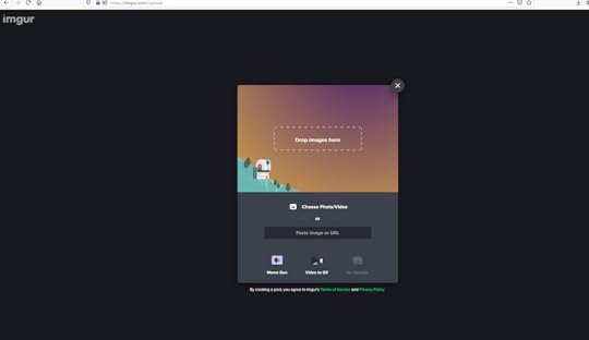
Imgur gives you an example of an application that makes it easy for users to understand what steps they need to take to reach a goal. When a user wants to upload an image to Imgur, they see a modal UI dialog with several straightforward options. Technically, the user can X out of the dialog box, but they will get sent back to the homepage.
Assuming that the user wants to upload an image, they can choose between:
Drop images hereChoose photo/videoPaste image or URL
It doesn’t get much simpler than that.
Yes, the modal design has interrupted the user experience, but to perform an essential task. A window pops up that says, “I’m here to make this easy for you! What image do you want to add?”
Without the modal dialog, users would need to search for an icon or command to upload images. The interruption saves time and prevents frustration. That makes it a necessary part of Imgur’s success as a free image hosting service.
Add Critical Modal UI Dialogs With UXPin’s Design Tool
UI modal windows interrupt user experiences, but they do it for good reasons that make products more enjoyable.
Unfortunately, it’s easy for designers to misread their target audiences. What one person finds amusing or helpful could offend someone else. UXPin gives you the right tools, such as interactions and animations to test your modal UI dialogs and windows to make sure they do their jobs well.
Use UXPin’s design tool to create an interactive prototype of your product. Your prototype can accept real information from users, so it feels completely lifelike. Test your modal UIs by sharing your designs to colleagues, friends, and stakeholders for feedback.
Start your free UXPin trial today so you can make designing and collaborating easy. You can even send links to people who don’t have UXPin accounts.
After your trial, you can choose a plan that fits your designing and prototyping needs. The UXPin team always has someone ready to offer help when you need it, so you can start designing products immediately.
The post Modal UI Dialogs and Windows: When Should You Interrupt User Flow for Your Own Benefit? appeared first on Studio by UXPin.
September 16, 2020
4 UI Animation Examples That Showcase Effective Individual Components
When UI components don’t offer a visible change in response to a tap or click, users don’t always know whether the website or app is working. Think of an animated user interface that shows the progress of a file download. This basic example helps illustrate the importance of UI animations. You can, however, get much more creative to give users fun, useful interactions.
A great animated user interface can accomplish several goals, such as:
Holding the user’s attention.Giving the user progress updates.Making designs feel more personal.Creating a sense of accomplishment or finality.
Draw inspiration from the following four UI examples that showcase effective individual components. They will bring your designs to life and get you to start thinking more creatively about the possibilities of motion in UI design.
1. An Ecommerce UI Animation That Gives Users Control
Dannniel who is a freelance UI designer uses animations to give users a sense of control while shopping online. In an animation UI design concept for a shoe-seller, Dannniel created an interface where users can learn basic information about a shoe (such as price and reviews). When shoes interest a shopper, the person can drag open a new window that lets them choose size and color preferences.
Why Does This UI Animation Matter?
Even the most successful e-commerce sites struggle to make shopping fun. Zappos.com, one of the world’s biggest ecommerce sites for shoes, has cluttered page designs that don’t always make options obvious. You can click on a lot of pictures to get different views of a shoe. Or, you can also use dropdown menus to see your color and size options.
None of it creates a sense of control or fulfillment. On Zappos, choosing a different color forces the page to reload and display your color preference. Changing the shoe size doesn’t affect the UI at all.
With Dannniel’s UI animations, the colors change seamlessly within the page. When you scroll through the available sizes, the shoe changes size on the screen. Tiny details like this can have a huge impact on the emotional fulfillment that users experience.
2. A Budget App Built on Colorful Intuition
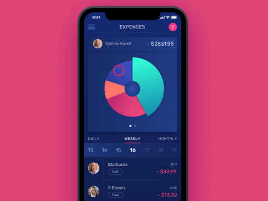
The design agency tubik has made hundreds of animated user interfaces for their clients. The company’s budgeting app, however, stands out for how well it uses motion and color to help people set financial goals.
When users open the interface, they can see daily, weekly, and monthly expenses expressed in a segmented circle graph. Each segment has a unique color, so users can select the expense they want easily. The screen comes to life when users press a segment. The colors whirl around the screen to form a horizontal bar chart that offers a different way of understanding the budget.
Why Does This UI Animation Matter?
The vast majority of people say that budgets are important, but only one out of three Americans say that they actually follow their own budgets. It’s easy to understand why so many people avoid budgeting. It feels uncomfortable to confront financial decisions, especially when you might need to cut spending to focus on saving money or repaying debts.
UI animation in tubik’s app makes budgeting easier in at least two ways. Let’s take a look at each:
First, it gives budgeting a playful feel. The colors don’t move like they’re creating graphs about money. They look like the reward you get for completing levels in a video game. The colors and motion help ease anxiety by building a connection between an unwanted activity (budgeting) and something fun (video games).
Second, giving users multiple ways of viewing their budgets helps the app appeal to a wider range of people. Some consumers like seeing plain numbers without any frills. Other people find it hard to conceptualize what numbers mean. When they think about budgeting a few thousand dollars each month, the numbers feel very fuzzy and unreal. Offering a variety of graph options makes it easier for the app to conform to each person’s learning preference.
3. Animation UI Makes Failures Less Frustrating
A precisely animated component can really make the lives of your users easier. Take the way Google Translate works – even if you make an accidental typo, Google will show you an animated dropdown with the list of suggested words that you probably had in mind to type in. Frustration of having to retype it over again is gone.
When a download fails, though, the UI adds a little humor to the situation. Instead of plainly saying, “Your file failed to download,” the text bubble tips over on its side and spills the progress bar to the bottom of the page. It adds whimsy and creativity in a way that static images cannot.
Why Does This UI Animation Matter?
No one likes it when a product fails. Unfortunately, mistakes happen. Perhaps you lose your internet connection while downloading a video. Maybe you want to play a game that isn’t compatible with your device.
Animation UI can’t always stop failures, but it can make them less frustrating. Instead of simply dropping your video halfway through the download or letting a game crash your operating system, animation UI can deliver amusing messages that distract you from the failure.
Similarly, UI designers should consider how web accessibility will impact potential users. Are there alternatives for people with hearing impairments, low vision, color blindness, and other struggles? Adding them can make designs appealing to users who often get left out of the conversation.
4. UI Animations Make Maps More Useful and Meaningful
UI designer and developer Alexandru Stoica makes maps more useful with simple UI animations. One of his map apps shows how far the average person can walk within a certain amount of time. The circular map has a spotlight that shows the walking distance with the amount of time it will take to cover that distance. Enlarging the spotlight expands the distance and amount of time so users can decide whether they want to walk somewhere or schedule a rideshare.
Why Does This UI Animation Matter?
The UI element appeals to the user’s visual understanding of distance. This makes the map much more effective as a tool to gauge walking length and time. It makes this kind of map distinct from others that appeal to drivers or public transit users.
UI animation gives users one more tool to make maps easier to understand. In this instance, they can use an intuitive tool to decide whether they want to walk or get a ride. As a stand-alone product, the map won’t blow anyone’s mind. When you think of it as one feature among many, you can see how several types of UI animations can work together to make maps more meaningful.
5. Make Your Own Animated UI Elements
UXPin makes it easy for you and your team to collaborate on UI design projects that include animation.
Want to see how it works? Start your free 14-day trial to design and prototype UI concepts within UXPin’s all-in-one tool. Your designs will become more useful, and your team will become more productive!
The post 4 UI Animation Examples That Showcase Effective Individual Components appeared first on Studio by UXPin.
UXpin's Blog

- UXpin's profile
- 68 followers

