
UXpin's Blog, page 2
October 7, 2025
OpenAI Expands ChatGPT with Strategic Enterprise Integrations
OpenAI is charting a bold new course for its flagship AI product, ChatGPT, by shifting its focus from consumer applications to enterprise solutions. During its developer conference on Monday, the company unveiled a series of strategic partnerships and new tools designed to integrate its technology into a variety of industries. This move signals OpenAI‘s ambition to strengthen its presence in the business sector.
Partnerships Showcased Across IndustriesAmong the highlights of OpenAI’s announcement were collaborations with major players such as Spotify and Zillow. These partnerships were presented as part of demonstrations showcasing ChatGPT’s adaptability in solving real-world problems. For instance, ChatGPT was shown generating Spotify playlists and refining property searches on Zillow, illustrating its potential as a versatile platform for enterprise-level applications.
Tools for Developers and a New Vision for AIIn addition to these collaborations, OpenAI introduced new tools aimed at empowering developers to build advanced applications with its AI technology. These tools are part of the company’s broader vision of transforming ChatGPT from a conversational AI product into a multifaceted platform capable of serving diverse business needs.
CEO Sam Altman underscored OpenAI’s commitment to this strategic pivot, stating, "The company’s commitment to expanding its influence in the business world" is a critical step forward. Altman conveyed confidence in the value that these AI solutions can bring to enterprise clients as OpenAI continues to scale up its offerings.
Challenges AheadDespite its ambitious plans, OpenAI is navigating a landscape fraught with challenges. The company faces financial losses, as well as skepticism from some who question the long-term sustainability of the AI investment boom. However, OpenAI remains undeterred. Altman expressed confidence in the potential for transformative impact, noting that the company is prepared to address these hurdles as it advances its enterprise-focused initiatives.
By expanding its collaborations and offering tools tailored to businesses, OpenAI is signaling a clear intent to redefine how AI can be applied across industries. While challenges remain, the company’s new direction highlights its determination to position ChatGPT as a cornerstone for enterprise innovation.
The post OpenAI Expands ChatGPT with Strategic Enterprise Integrations appeared first on Studio by UXPin.


Apple Pauses Updates for Vision Headset, Focuses on New AI Glasses
Apple has made a strategic pivot in its augmented reality (AR) roadmap, turning its attention away from immediate updates to its Vision headset in favor of developing smaller, AI-powered smart glasses. The company’s decision, first reported by Bloomberg on October 1, 2025, has reshaped expectations for the AR market and triggered swift reactions from developers, investors, and competitors.
Strategic Shift Toward Compact AI GlassesApple has reportedly paused a planned overhaul of its Vision headset to reassign resources toward creating lightweight, AI-driven AR glasses. This decision not only delays Vision headset updates, potentially until after 2026, but also signals a broader pivot in Apple’s approach to AR technology. According to Bloomberg, internal staff reassignments and supply chain adjustments have already started to reflect these changes. By focusing on smaller and more consumer-friendly devices, Apple appears to be aligning itself with the industry trend favoring less bulky, phone-compatible AR wearables.
Implications for the AR MarketThe decision to delay Vision headset updates grants Apple’s competitors an opportunity to gain ground in the competitive AR space. Companies like Meta, Samsung, and Ray-Ban have been advancing their own compact AR offerings, with Meta and Ray-Ban’s latest collaboration priced at $799, further highlighting the push toward more affordable and accessible AR devices. This pause in Apple’s Vision upgrades may allow these rivals to lock in developer interest and consumer loyalty before Apple’s new product vision materializes.
"Bloomberg’s scoop matters because it changes timelines: a paused Vision revamp means Apple is trading an immediate headset upgrade for a longer-term pivot toward wearable AI", the source explained. As a result, developers, accessory makers, and investors are reassessing their strategies, considering the ripple effects of Apple’s decision on the fast-evolving AR market.
Industry Reactions and ConcernsThe announcement sparked immediate responses across social media and among technology analysts. While some view Apple’s move as a pragmatic recalibration, others argue it risks ceding AR market leadership to competitors. "Some analysts framed the pause as strategic focus; others called it a surrender of near-term narrative control", the original report noted. Concerns around timelines and the potential loss of developer momentum have further fueled debate about the long-term impact of Apple’s shift.
Market momentum currently favors smaller, more affordable AR glasses, which have the potential to scale quicker than larger, more expensive headsets. Meta, for instance, recently unveiled advancements during its September 17, 2025, Meta Connect event, underscoring its push to dominate this space.
What This Means for Consumers and DevelopersFor consumers, Apple’s decision may result in slower updates for Vision headset features in 2025, making potential buyers reconsider their options as rivals continue to roll out competitive products. Developers, meanwhile, are encouraged to adopt multiplatform strategies and focus on quick user experience wins as the AR landscape continues to evolve.
"Will Apple regain the narrative with superior mini-glass hardware, or lose early momentum to rivals?" the report asked, leaving the outcome uncertain. As Apple places its bets on compact AI glasses, the next few quarters will determine whether the tech giant can reassert its dominance or face heightened competition in the AR market.
Competitive Pressure on the HorizonWhile Apple’s pivot may signal a more refined long-term vision, the decision hands competitors a critical window to attract consumers and developers in the short term. Meta, Samsung, and Google have all made significant strides toward establishing themselves in the AR space, further compressing Apple’s timeline to re-enter with a decisive advantage.
The coming months will be pivotal in shaping the future of the AR market. Whether Apple’s gamble on smaller, AI-powered glasses pays off or results in lost market share will depend on the speed and quality of its product development, as well as its ability to regain developer and consumer trust in the interim. For now, the AR race continues – with rivals capitalizing on Apple’s pause.
The post Apple Pauses Updates for Vision Headset, Focuses on New AI Glasses appeared first on Studio by UXPin.
How to Use Web Components in Modern UI Workflows
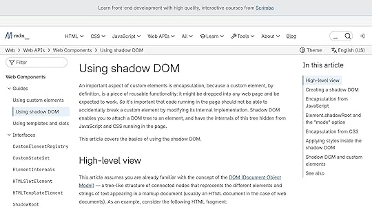
Web components have come a long way over the past few years, evolving from a niche concept to a foundational technology for creating interoperable, reusable user interface elements. In the talk "How to Use Web Components in Modern UI Workflows", Martin Hel, a principal engineer at Microsoft, dives deep into the promise, progress, and current state of web components. This article distills key insights from his talk, providing actionable advice for UI/UX designers and front-end developers who aim to leverage web components in their workflows.
Introduction to Web ComponentsWeb components are a set of native web platform APIs that allow developers to create reusable, encapsulated custom UI elements without relying on external frameworks. They are built on three core technologies:
Custom Elements – Enables the creation of new HTML elements.Shadow DOM – Provides a way to isolate styles and markup from the rest of the page. HTML Templates – A native mechanism for defining reusable chunks of markup that can be instantiated dynamically.These features make web components an attractive option for building design systems, enhancing HTML, and creating standalone widgets that work seamlessly across different frameworks and browsers.
Martin Hel’s talk offers an in-depth exploration of the advancements in web components over the past five years, addressing their growing adoption, new browser APIs, accessibility improvements, and practical use cases.
A Snapshot: The Growing Adoption of Web ComponentsFive years ago, web components were used on a meager 6% of web pages. Today, that number has grown to approximately 20%, according to Martin Hel. Major companies like Apple, YouTube, GitHub, Microsoft, and Adobe have adopted web components in their products, signaling industry-wide recognition of their value.
This growth is attributed to advancements in browser support, improvements in the native feature set, and the rise of tools and standards that make web components easier to use in real-world applications. However, challenges remain, especially in areas like server-side rendering and accessibility, which the community continues to address.
Key Technical Developments in Web Components1. Improved Templating FeaturesHTML templates have long been a core part of web components, but they lack the dynamic capabilities offered by frameworks like React. New proposals, such as Template Instantiation and DOM Parts, aim to bridge this gap by providing native support for data binding and dynamic updates.
While these proposals are still in development, they promise to make web components more developer-friendly, enabling features like automatic state propagation and interpolation within templates.
2. Enhanced Styling OptionsStyling within web components is both a strength and a challenge. Shadow DOM provides strong encapsulation, isolating styles from the rest of the page. However, this isolation requires developers to rethink their approach to styling.
CSS Variables: Allow customization of shadow DOM styles by exposing "public APIs" for component styling.Constructible Stylesheets: A memory-efficient approach that allows styles to be shared programmatically across components without duplication.CSS Shadow Parts: Enable selective customization of internal component styles by exposing specific parts of the shadow DOM for external styling.These advancements provide developers with more control and flexibility, but they also necessitate a deeper understanding of CSS scoping and shadow DOM principles.
3. Scoped Registries for Custom ElementsOne of the long-standing challenges with web components has been the global nature of the custom elements registry, which causes conflicts when different libraries or packages define elements with the same name.
The introduction of Scoped Custom Element Registries addresses this issue by allowing developers to define and manage custom elements within isolated scopes, preventing naming collisions and enabling safer integration of third-party libraries.
4. Accessibility EnhancementsAccessibility has been a critical area of focus for web components, particularly when using shadow DOM. Recent improvements include:
Delegate Focus: Ensures that focus automatically shifts to the correct element within the shadow DOM, preserving native keyboard navigation behaviors.Element Internals API: Allows custom elements to participate in native form behaviors, such as validation and submission.Shadow DOM Reference Target Proposal: Aims to resolve issues with cross-root ARIA references, making shadow DOM elements more accessible to assistive technologies.These updates demonstrate a commitment to ensuring that web components meet modern accessibility standards.
5. Declarative Shadow DOM for Server-Side Rendering
Server-side rendering (SSR) has historically been a weak point for web components. The introduction of Declarative Shadow DOM changes this by allowing developers to define shadow DOM structure directly within HTML templates.
This feature simplifies SSR workflows and improves initial render performance, although challenges remain, such as the increased size of HTML documents when using declarative shadow DOM extensively.
Practical Use Cases for Web ComponentsEnhancing Design SystemsWeb components are an excellent choice for creating design systems that need to work across multiple frameworks. Their encapsulated nature ensures consistency and reusability, while features like shadow DOM provide strong isolation for styles and functionality.
However, developers should be cautious when combining web components with server-side rendering or framework-specific features, as these scenarios may require additional tooling or custom solutions.
Standalone WidgetsWeb components shine as standalone, reusable widgets that can be easily integrated into any application. Examples include a custom calendar component or a rich text editor. These components are self-contained and framework-agnostic, making them ideal for distribution across different projects and teams.
Progressive EnhancementBy using web components to enhance existing HTML elements, developers can provide advanced functionality while maintaining compatibility with non-JavaScript environments. This declarative approach aligns with best practices for progressive enhancement, ensuring a baseline experience for all users.
Key TakeawaysAdoption is Growing: Web components are now used by 20% of web pages, with adoption by major companies like Microsoft, Apple, and YouTube.Three Pillars of Web Components: Custom elements, shadow DOM, and HTML templates form the foundation of this technology.Styling is Evolving: CSS variables, constructible stylesheets, and shadow parts provide powerful new options for styling web components.Accessibility Improvements: New APIs like Element Internals and Delegate Focus address long-standing accessibility challenges.Scoped Registries Solve Conflicts: Scoped custom element registries prevent naming collisions, enabling safer integration of third-party libraries.Declarative Shadow DOM Simplifies SSR: Declarative shadow DOM makes server-side rendering feasible, but implementation challenges remain.Practical Use Cases: Web components excel in design systems, standalone widgets, and progressive enhancement scenarios.Not a Silver Bullet: While powerful, web components are not a universal solution and should be used judiciously.ConclusionWeb components have matured significantly over the past five years, addressing critical gaps in styling, accessibility, and server-side rendering. They are no longer just a niche technology but a viable option for creating reusable, interoperable UI elements in modern applications.
While challenges remain, especially in achieving full parity with framework-driven workflows, the trajectory is clear: web components are becoming an essential tool in the UI/UX designer’s and front-end developer’s arsenal. By leveraging their strengths and understanding their limitations, teams can harness the transformative potential of web components to build better, more consistent user experiences.
As Martin Hel optimistically notes, the future of web components is bright – and perhaps in another five years, we’ll have reached the promised land of full adoption and seamless integration.
Source: "tim.js meetup 100: Web Components: are we there yet? by Martin Hochel" – tim.js, YouTube, Oct 2, 2025 – https://www.youtube.com/watch?v=jzMIgJpoRoQ
Use: Embedded for reference. Brief quotes used for commentary/review.
Related Blog PostsReact Components vs Custom Elements: A Developer’s GuideResponsive Code Export for React, Vue, and AngularReact Components and Version Control in UXPinIntegrating React Components with Design Patterns
The post How to Use Web Components in Modern UI Workflows appeared first on Studio by UXPin.
October 6, 2025
Case Study: Building a Component Library
Building a component library solves two major problems for product teams: speeding up development and ensuring consistent user experiences. Instead of recreating the same UI elements repeatedly, a centralized library provides reusable, pre-built components that streamline workflows and reduce errors. This approach eliminates inconsistencies, saves time, and simplifies maintenance.
TechFlow Solutions, a fintech company, faced challenges like inconsistent UI elements, redundant development efforts, and inefficient workflows. By creating a centralized component library, they achieved:
Faster development: Pre-built components replaced repetitive coding tasks, boosting delivery timelines. Consistent design : A single source of truth ensured uniform styling and behavior across products.Stronger collaboration: Designers and developers worked more efficiently with shared resources and clear guidelines.Reduced maintenance: Updates applied to the library automatically propagated across all products.The process wasn’t without challenges, including aligning distributed teams, integrating with legacy systems, and creating thorough documentation. However, solutions like a design audit, a central repository, and tools like UXPin helped overcome these obstacles. The result? Improved workflows, better user experiences, and a scalable system for future growth.
Key Takeaways:
Perform a design audit to identify inconsistencies and prioritize updates.Create a centralized hub with production-ready components and clear documentation.Use tools like UXPin for prototyping and collaboration to streamline design-to-development workflows.Regularly update and refine the library to maintain its effectiveness.Why it matters: A well-organized component library is a game-changer for teams managing multiple products, reducing inefficiencies, and ensuring a polished, consistent user experience.
Case sudy: Lucentum, creating our own React component library – FLAVIO CORPA
Project Background and Goals
TechFlow Solutions, a fintech company based in Austin, Texas, found itself at a pivotal moment in its growth. Transitioning from a startup to a multi-product organization, the company managed a portfolio that included web platforms, mobile apps, admin dashboards, and customer microsites. However, as each product evolved independently, challenges began to emerge, affecting both team efficiency and the overall user experience.
During a quarterly design review, the Head of Design noticed a troubling trend: multiple versions of common UI elements – like buttons – were being used across products, despite the brand guidelines specifying a limited set of styles. This inconsistency extended to forms, navigation menus, and data visualization components.
Meanwhile, the engineering team faced its own frustrations. Code reviews regularly stalled as developers debated the implementation of components that should have been standardized. A significant amount of development time was spent recreating UI elements that already existed elsewhere in the codebase.
Identifying the ProblemsAn internal audit shed light on the scope of these issues. While the design inconsistencies were the most obvious problem, they were just the tip of the iceberg. User feedback and support data revealed that these inconsistencies were negatively impacting the overall experience.
Teams across the company were building their own versions of common components. This meant bug fixes and accessibility updates had to be applied multiple times across different codebases, increasing the workload and the likelihood of errors.
The design-to-development process was another pain point. Designers often created detailed specs for components that already existed, leading developers to rebuild elements from scratch instead of reusing existing code. This redundancy slowed down production and wasted valuable resources.
New team members also struggled to navigate the disconnect between the documented design system and the actual products. Without a clear source of truth, it was difficult to determine which components to use, perpetuating the cycle of inconsistency. As a result, product development slowed, and the company found it increasingly difficult to stay competitive in the fast-moving fintech sector.
Defining Project GoalsTo address these challenges, TechFlow formed a cross-functional team and set clear, actionable goals to guide the initiative.
The primary objective was to establish a single source of truth for all UI components across TechFlow’s products. The team envisioned a comprehensive component library that would include everything from visual designs to production-ready code, along with detailed documentation and usage guidelines. This would allow any team member to quickly find, understand, and implement the correct component.
Another critical goal was improving the design-to-development workflow. By ensuring that every component in the library had a corresponding, ready-to-use coded version, the team aimed to significantly reduce the time it took to move from design to implementation – a recurring bottleneck identified in earlier reviews.
Scalability was also a major focus. With plans for future product expansion, the team needed a component ecosystem that could grow seamlessly while maintaining consistency with existing design patterns.
Accessibility was another cornerstone of the project. Every component would be built to meet established accessibility standards, including proper keyboard navigation, screen reader compatibility, and appropriate color contrast ratios. This approach ensured that accessibility wasn’t an afterthought but an integral part of the product experience.
Finally, the team set measurable quality metrics to track the initiative’s success. These included reducing customer inquiries related to UI issues and improving development efficiency. A detailed timeline and dedicated resources were allocated for auditing, component creation, and implementation. Governance processes, such as a component review board, were also put in place to ensure the library remained effective and up-to-date as the company continued to evolve.
Challenges in Building a Component LibraryDuring the development of the component library, the team faced several obstacles that highlighted the complexities of creating a unified system.
Maintaining Consistency Across TeamsOne of the biggest hurdles was ensuring consistency across geographically dispersed teams. With team members spread across different regions and time zones, aligning on design guidelines became a significant challenge. Each team had its own methods for implementing common components, which led to visual and functional inconsistencies. Communication delays and fragmented updates only made the situation worse. The issue was further amplified during rapid onboarding, as new team members often adopted inconsistent practices due to the lack of a centralized standard. These challenges underscored the importance of establishing a single source of truth for design components.
Integrating with Existing Tools and WorkflowsBringing the new component library into TechFlow’s established development environment wasn’t straightforward. Legacy systems and a mix of technology stacks created compatibility issues. Components had to work seamlessly across various platforms, which required creating compatibility layers and tweaking build processes to address conflicts between old code and the new component styles. Additionally, aligning the diverse workflows of different teams required retraining and standardizing processes, adding another layer of complexity.
Creating Documentation and DiscoverabilityEven after the components were built, locating and using them effectively posed a challenge due to incomplete documentation. As components evolved, the documentation often lagged behind, causing confusion and leading to duplicated efforts. The lack of clear visual examples and limited access to centralized resources made it harder for designers, developers, and product managers to collaborate effectively. Without proper guidance, the full potential of the library remained untapped.
These hurdles laid the groundwork for the innovative solutions discussed in the next section.
Solutions and Implementation MethodsTo tackle the challenges mentioned earlier, TechFlow’s team took a structured approach by setting up clear processes, centralizing resources, and using key tools to drive meaningful results. The first step? Evaluating the current state of their UI components.
Running a Design AuditFixing inconsistencies started with a thorough audit of all design elements used across products and platforms. This audit cataloged every UI component to uncover discrepancies. For instance, the team found multiple button styles performing the same function but differing in design, spacing, and interaction patterns. They also identified "orphaned components" – outdated elements no longer in use but still lingering in style guides and code repositories.
This review provided clarity on which components to standardize, refine, or retire. It also helped the team prioritize updates based on how much they would improve overall consistency.
Creating a Central Component HubWith the audit complete, TechFlow built a centralized repository to serve as the single source of truth for all design components. This hub was crafted to be user-friendly and accessible to designers, developers, and product managers – regardless of their time zone or technical expertise.
The repository was designed using tools that paired each component with its production-ready code. Every element came with detailed specifications, including spacing, color values, typography, and interaction states.
UXPin played a key role in this effort, offering a platform where the team could create interactive, code-backed prototypes with their standardized components. Once the repository was live, the focus shifted to ensuring consistent component behavior and usage.
Setting Component Standards and GuidelinesAfter organizing components into a central hub, the team established clear guidelines to ensure long-term consistency. These guidelines outlined naming conventions, usage patterns, accessibility requirements, and responsive behaviors.
For example, buttons were categorized into groups like "Primary-Large" or "Secondary-Medium" to clarify their specific use cases. This systematic approach extended to all components, creating predictable patterns that were easy for new team members to grasp.
Accessibility was a top priority, with all components meeting WCAG 2.1 AA standards. This included defined states for keyboard navigation, screen reader compatibility, and sufficient color contrast. Addressing these needs upfront saved time and costs by avoiding retroactive fixes later.
Using UXPin for Prototyping and Collaboration
UXPin’s code-backed prototyping changed how TechFlow’s designers and developers worked together. Instead of relying on static mockups, designers created prototypes that behaved like the final product.
The platform’s real-time collaboration tools allowed team members across different time zones to review and refine designs without delays. Developers could inspect the underlying code, while designers could see how their work translated into functional components.
UXPin also supported advanced interaction prototyping, enabling the team to simulate complex behaviors like multi-step forms, dynamic data loading, and responsive layouts. This helped identify potential issues early, well before development began, saving both time and effort.
sbb-itb-f6354c6Results and Lessons LearnedTechFlow’s component library project brought noticeable improvements in development speed, team collaboration, and product delivery timelines. These achievements highlight the value of streamlining processes and fostering teamwork while maintaining a focus on ongoing refinement.
Improved Workflow EfficiencyThe project drastically cut down development time. Tasks that used to demand significant effort – like crafting consistent form layouts or managing various button states – became much quicker thanks to the availability of pre-built components. Design handoffs also became more seamless, reducing friction between teams.
Additionally, reusing standardized interface elements not only saved time but also ensured a consistent user experience. This uniformity made it easier to roll out new features without compromising quality.
Better Team CollaborationThe component library strengthened communication between designers and developers throughout the development cycle. Comprehensive documentation and interactive prototypes, created using UXPin, helped resolve routine questions quickly, cutting down the need for lengthy cross-team meetings.
Sarah Chen, TechFlow’s Lead Designer, noted, "The standardized naming conventions established by the component library fostered a shared vocabulary that minimized confusion during discussions."
Having clear, consistent terminology allowed team members – regardless of their role – to easily understand design elements and expectations. This improvement streamlined code reviews and made onboarding new team members smoother. Even remote collaborators benefited from having a centralized and reliable resource to reference.
Continuous Improvement for Long-Term SuccessFrom its initial launch, the component library proved to be a dynamic tool requiring ongoing care. TechFlow quickly realized that to maintain its value, the library needed regular updates and responsiveness to team feedback. Structured review sessions became a key part of this process, providing an opportunity to discuss adjustments for existing components, address underused elements, and brainstorm ideas for new additions.
To guide these updates, the team relied on usage analytics and a built-in feedback system to identify which components were most effective and where improvements were needed. Robust version control practices and detailed migration guides ensured that updates could be implemented without disrupting ongoing projects. By treating the component library as a living product, TechFlow has created a foundation that continues to evolve alongside its product ecosystem.
Best Practices for Component LibrariesWhen it comes to creating a component library, clarity, accessibility, and maintenance are key to ensuring it remains a valuable resource. These best practices can help maximize component reuse and keep teams aligned.
Use Clear Naming ConventionsGood naming conventions are the backbone of an effective component library. Poorly chosen names can lead to confusion, slow down development, and cause redundant work when teams struggle to locate existing components. Think of naming conventions as the "common language" that bridges the gap between designers and developers.
To keep things consistent, use the same conceptual name across platforms, with formatting tailored to each. For instance, a "Quick Actions" component might be called QuickActions in React, quick-actions in CSS, or quickActions in JavaScript – but the base name remains the same.
Avoid assigning multiple names to the same component. Sticking to a single term, like "Quick Actions", across all libraries makes collaboration smoother and components easier to find. Prefixes can also help. For example, naming a button myDSButton can distinguish it as part of your design system, especially when migrating or integrating with older libraries.
When it comes to design tokens, clarity is equally important. Instead of vague names like primary or default for colors, use names that reflect their purpose and context. A layered naming approach – starting with a base value and adding numeric increments for tints and shades – can simplify communication and make the system easier to maintain.
Clear naming is just the start. To truly empower teams, you’ll need strong documentation.
Create Complete DocumentationDocumentation is what transforms a component library from a mere collection of code into a fully realized design system. Without proper guidance, even the best components can become obstacles.
A strong Design API is essential. It should detail every component variation, including options, booleans, enumerations, combinations, mutual exclusions, and defaults. This ensures consistent implementation across platforms and reduces ambiguity. Adding visual examples, practical code snippets, and clear usage guidelines further enhances understanding and helps teams maintain consistency.
Organizing your documentation for easy searchability is equally important. Whether you structure it by function, visual hierarchy, or stages of the user journey, the goal is to make information quick to find. A dual focus – providing technical details for developers and design specifications for creative teams – makes the library a collaborative tool that benefits everyone involved.
Conclusion: Building for the FutureCreating a component library lays a solid groundwork for scaling teams and products. It’s an investment that pays off in the long run, offering both efficiency and consistency.
Key Takeaways for TeamsFrom analyzing successful component libraries, three key elements stand out: thorough preparation, centralized organization, and ongoing maintenance.
A detailed design audit sets the stage for consistency. By tackling this upfront, teams can avoid technical debt and ensure the library addresses actual needs instead of introducing unnecessary complications.
Centralizing components establishes a single source of truth. When teams know exactly where to find what they need, development speeds up, and consistency becomes second nature. However, centralization works best when paired with clear standards and guidelines. These help teams understand not just what components exist but also when and how to use them effectively.
Documentation is the linchpin of any reusable component library. Teams that prioritize clear naming conventions, visual examples, and practical usage guidelines experience higher adoption rates and fewer questions. This upfront effort reduces time spent on explanations and troubleshooting.
Finally, regular reviews and updates keep the library relevant. Neglecting components can slow progress, so fostering a culture of continuous improvement is crucial for long-term success.
These insights highlight the importance of structured, ongoing component management in scaling design systems efficiently.
How UXPin Supports Component ManagementHaving the right tools can elevate the process significantly. Modern component libraries thrive on tools that seamlessly bridge design and development. UXPin stands out with its code-backed prototyping capabilities, enabling teams to work directly with React components instead of static mockups. This ensures prototypes mirror the final product with precision.
UXPin also includes built-in libraries for MUI, Tailwind UI, and Ant Design, offering ready-to-use components that teams can customize and expand.
With features like the AI Component Creator, integration with tools like Storybook and npm, and real-time collaboration, UXPin streamlines development and keeps design in sync with production. Updates are instantly visible, cutting down on communication delays.
For teams scaling their design systems, UXPin’s enterprise features – such as enhanced security, version control, and advanced integrations – provide the necessary support for large organizations. By focusing on code-backed design, UXPin eliminates the traditional handoff friction between designers and developers, ensuring component libraries transition seamlessly into production code.
FAQsWhat are the main steps to create a centralized component library, and how can it boost team productivity?Building a centralized component library requires a few important steps. Start by auditing your current design elements to identify what can be reused. Next, document these reusable patterns clearly, ensuring they’re easy to understand and implement. Then, organize your components in a logical structure so they’re accessible and intuitive to use. Finally, focus on designing small, reusable components with clear, meaningful names and detailed documentation to guide their usage.
When done right, this process can bring consistency to your projects, cut down on repetitive tasks, and improve collaboration between designers and developers. A well-organized component library doesn’t just save time – it also boosts the quality and efficiency of your product development workflow.
How can TechFlow Solutions keep their component library effective as the company grows and evolves?To keep their component library running smoothly, TechFlow Solutions should focus on frequent updates and upkeep to meet changing design and development requirements. Setting up a clear governance model is key to maintaining consistency and scalability, while encouraging collaboration between designers and developers helps keep ideas fresh and aligned with project goals.
Equally important is having detailed documentation and using version control. These steps make workflows more efficient and ensure that every team member can easily find and use the library. Regularly revisiting and improving components ensures they stay useful and flexible as the company continues to evolve.
How does UXPin help with creating and managing a component library while improving collaboration between designers and developers?UXPin makes it easier to create and manage a component library by providing a single platform where you can build, store, and reuse UI components. This approach helps maintain both visual and functional consistency across projects while cutting down on time and effort.
Key features like code-backed components, shared design systems, and real-time collaboration tools allow UXPin to connect designers and developers seamlessly. By creating a shared design language, it simplifies handoffs, minimizes miscommunication, and speeds up development cycles, resulting in a smoother, more unified workflow.
Related Blog PostsComponent-Based Design: Complete Implementation GuideHow Design Pattern Libraries Improve Team CollaborationHow to Build a Scalable Design Pattern LibraryBest Practices for Scalable Component LibrariesThe post Case Study: Building a Component Library appeared first on Studio by UXPin.
October 3, 2025
Mobile Navigation Patterns: Pros and Cons
Mobile navigation patterns are the backbone of user experience on apps and websites. Choosing the right one impacts usability, accessibility, and how users interact with your app. Here’s a quick breakdown of the four main navigation styles:
Hamburger Menus : Saves screen space but hides options, making it harder for users to discover features.Tab Bars: Always visible and easy to use, but limited to a few sections and takes up screen space.Full-Screen Navigation: Great for complex menus, but overlays content and can feel slower for frequent tasks.Gesture-Based Navigation: Maximizes screen space and feels modern, but has a steep learning curve and accessibility challenges.Each pattern has strengths and weaknesses, so the best choice depends on your app’s structure and user needs. Below is a quick comparison:
Navigation PatternProsConsHamburger MenuSaves space, handles large menusHidden options, extra taps, less intuitiveTab Bar (Bottom Nav)Always visible, easy access, ergonomicLimited sections, permanent screen space usageFull-Screen NavigationHandles complex menus, immersive viewOverlays content, slower for quick navigationGesture-Based NavigationSleek, maximizes content spaceHard to discover, accessibility issuesThe right navigation design balances user behavior, app complexity, and frequent interactions. Always test with real users to ensure it works seamlessly.
Types of Navigation | 5 Most Used Navigation Style1. Hamburger Menus
The hamburger menu, represented by three stacked lines, is a staple in mobile design. It tucks navigation options behind a single tap, helping create cleaner interfaces while keeping menu items accessible.
UsabilityHamburger menus reduce visual clutter on small screens but come with a downside: the "out of sight, out of mind" issue. When users can’t see all the options upfront, they may forget what’s available.
Placement plays a big role in usability too. The top-left position – a common choice – can be inconvenient for one-handed use, especially since most people hold their phones in their right hand. This becomes even trickier on larger screens. To address this, some apps are experimenting with bottom-positioned hamburger menus, making them easier to reach with a thumb.
Another challenge is the lack of visual hierarchy. When all navigation options are hidden behind the same icon, users lose context about the app’s structure and their current location. This can make navigating the app feel less intuitive.
AccessibilityAccessibility adds another layer of complexity to hamburger menus. On the plus side, they work well with screen readers when properly implemented. A clearly labeled menu icon and a logical reading order for the expanded menu can make navigation smoother for users relying on assistive technologies.
That said, the small size of hamburger icons can be a problem for users with motor impairments. Many of these icons are smaller than 44 pixels, the recommended minimum size for touch targets, making them hard to tap accurately.
For users with cognitive disabilities, the hidden nature of hamburger menus can be confusing. Having all navigation options visible at once often helps these users better understand the app’s layout and remember available features. When menus are concealed, this added layer of complexity can make navigation more challenging.
Screen Space UtilizationOne of the biggest advantages of hamburger menus is their ability to maximize screen space. By hiding navigation options, they allow the main content to take center stage. This is especially useful for apps like news readers, social media platforms, or online stores, where articles, images, or product listings need as much room as possible.
This space-saving approach is even more valuable on smaller screens, where every pixel counts. Apps can dedicate the entire screen width to content without navigation elements competing for attention.
However, there’s a trade-off. When the menu is expanded, it overlays the main content, which can feel disorienting. And while the menu is hidden, it still requires header space, which can make it harder for users to keep track of where they are within the app.
User Learning CurveThe hamburger menu is widely recognized, so most users understand that the three-line icon reveals more options. This makes the initial learning curve relatively easy for basic interactions.
But the curve gets steeper when it comes to understanding the app’s overall structure. With navigation options hidden, users must actively explore the menu to discover features. For apps with deep hierarchies or extensive feature sets, this can feel tedious and add to the mental effort required, even for experienced users.
2. Tab Bars (Bottom Navigation)Tab bars provide a straightforward, always-visible navigation option, standing in stark contrast to the hidden nature of hamburger menus. Positioned at the bottom of the screen, they typically showcase 3-5 key sections, each represented by an icon and a label. This design keeps essential features front and center, making it easy for users to switch between core app sections. It’s no wonder apps like Instagram and Spotify rely on this approach – it’s simple, practical, and keeps everything within reach.
UsabilityOne of the biggest advantages of bottom navigation is how well it supports one-handed use. For right-handed users, the bottom of the screen is naturally within thumb reach, making it far more ergonomic than navigation options placed at the top. This is especially important on today’s larger smartphones, where reaching the top corners often requires two hands or some finger gymnastics.
Unlike hidden menus, tab bars give users immediate access to an app’s main features. There’s no need to guess or dig through layers of menus to find what you need. This constant visibility not only speeds up navigation but also helps users stay oriented within the app. However, this simplicity works best for apps with a flat structure. If your app has a deep hierarchy or a lot of features, fitting everything into a tab bar’s limited space can be a challenge. To avoid clutter, most designers stick to a maximum of five tabs.
Tab bars are particularly effective for apps where users frequently switch between sections. Social media platforms, for example, use them to provide quick access to feeds, messages, and profiles. While this setup is great for instant navigation, it does limit the ability to accommodate more complex layouts.
AccessibilityTab bars also shine when it comes to accessibility. Their bottom placement makes them easier to reach for users with limited mobility or dexterity. The larger touch targets – dividing the screen width by the number of tabs – are far more forgiving than the small icons often found in hamburger menus.
Screen readers work well with tab bars, too. Each tab can be clearly labeled, and the linear structure makes it easy for assistive technologies to guide users through available options. The persistent visibility of the tabs also helps users with cognitive challenges better understand and remember the app’s layout.
That said, visual accessibility can be a sticking point. Tab bars often rely heavily on icons, which aren’t always intuitive. Adding text labels helps, but space constraints sometimes force designers to stick with icons alone. This can create confusion for users who struggle to interpret symbols. While the design offers consistent accessibility, ensuring icon clarity remains a challenge.
Screen Space UtilizationTab bars do come with a trade-off: they take up a chunk of screen space, typically around 80-100 pixels in height. On smaller screens, this can feel significant, especially compared to patterns like hamburger menus that keep navigation hidden until needed.
For apps focused on immersive experiences, like video players or games, tab bars can feel intrusive. In these cases, designers often hide the tab bar during content consumption and add interactions to bring it back when necessary. This ensures users can enjoy a full-screen experience without sacrificing navigation entirely.
On the flip side, the time saved by having instant access to core features often outweighs the loss of screen real estate. For apps where users frequently switch between sections, the efficiency gained in navigation can make up for the reduced content area.
User Learning CurveTab bars are easy to understand, even for first-time smartphone users. They mimic familiar concepts like file folders or notebook tabs, making navigation feel natural and intuitive.
Once users grasp how tab bars work in one app, they can apply that knowledge to others. This consistency across apps reduces the mental effort needed to learn new interfaces, helping users feel comfortable more quickly.
Because all options are visible, there’s no need for memorization or trial-and-error navigation. Users can explore the app’s main sections directly, making tab bars an ideal choice for apps aimed at a broad audience with varying levels of tech-savviness. The result? A navigation system that’s intuitive with minimal effort required to understand it.
3. Full-Screen NavigationFull-screen navigation takes a bold step by dedicating the entire screen to navigation options when activated. Typically triggered by a hamburger icon or a gesture, this pattern transforms the display into a menu overlay, offering users a complete view of navigation choices. Unlike tab bars, which occupy permanent screen space, full-screen navigation appears only when needed and vanishes entirely afterward. While it provides a dynamic and visually clean approach, it also introduces unique challenges in usability and interaction. Let’s break down its impact on usability, accessibility, and screen space.
UsabilityFull-screen navigation shines when it comes to organizing complex app structures. Once the navigation is triggered, users are greeted with a clean, uncluttered menu that lays out all options clearly. This makes it especially effective for apps with a lot of content or multiple user paths. The extra space allows for hierarchical menus, subcategories, and even previews, all displayed in a way that’s easy to scan and explore.
The spacious design, paired with clear typography and generous spacing, makes it simple for users to locate what they need. However, the need to activate the navigation before making a selection can slow down frequent interactions.
One of its standout features is the design flexibility it offers. Designers can incorporate visual elements like icons, images, and descriptive text, making navigation not only functional but also engaging. This is particularly useful for apps like e-commerce platforms, where visual cues can guide users more effectively.
AccessibilityFrom an accessibility standpoint, full-screen navigation offers several advantages. The ample space allows for large touch targets, making it easier for users with motor impairments to interact with menu items. The increased spacing between elements also minimizes accidental taps, a common issue for users with limited dexterity.
For users relying on assistive technologies, this pattern’s clear hierarchy and logical flow are a big plus. Proper heading structures and detailed descriptions can be implemented without worrying about space limitations, ensuring screen readers can navigate menus effectively. Its sequential layout also assists these technologies in guiding users smoothly.
However, the overlay nature of full-screen navigation can pose challenges. When the menu disappears, users may lose their sense of location within the app. To address this, clear visual indicators and consistent animations for entering and exiting the menu are crucial. These design elements help users maintain their orientation within the app.
Screen Space UtilizationFull-screen navigation is all about making the most of screen space – but in a different way. When inactive, it takes up no space at all, allowing content to fill the entire display. This makes it ideal for apps focused on immersive experiences, such as reading platforms, photo galleries, or video apps, where the content itself needs to be the star.
When activated, however, the navigation takes over the entire screen. This shift provides designers with plenty of room to organize menus without cramming elements into tight spaces. It allows for multiple columns, clear visual hierarchies, and even rich media integration, which are hard to achieve with more constrained navigation styles.
The trade-off comes in the form of context switching. When the navigation takes over, users momentarily lose sight of the content they were viewing, which can be disorienting. Apps that handle this well often use smooth transitions and visual continuity cues to help users maintain their mental map of the interface.
User Learning CurveWhen it comes to ease of use, most users quickly understand the show/hide nature of full-screen navigation. However, the full-screen takeover can catch some first-time users off guard.
The learning curve largely depends on the complexity of the menu. Simple menus with clear categories are easy to navigate, while more intricate hierarchical structures might require a bit more exploration. The benefit is that once the menu is open, users can see all their options at once, eliminating the guesswork that often comes with hidden navigation systems.
Consistency in design is key to helping users adapt quickly. Apps that maintain uniform styling, typography, and interaction patterns between the main interface and the full-screen menu create a more seamless experience. The extra space available in this navigation style also allows for descriptive labels and visual aids, making it easier for new users to find their way around.
sbb-itb-f6354c64. Gesture-Based NavigationGesture-based navigation is the latest trend in mobile interface design, shifting away from visible buttons and menus to rely on gestures like swipes and pinches. This approach has become popular with the rise of edge-to-edge displays and the removal of physical home buttons. Instead of tapping, users swipe from screen edges or perform specific gestures to navigate through apps. While this method creates sleek, clutter-free interfaces, it also introduces challenges, particularly in how users learn and adapt to these gestures. Let’s dive into how gestures stack up in usability, accessibility, and overall user experience.
UsabilityGesture-based systems offer a clean and streamlined alternative to traditional navigation, but they come with their own set of usability hurdles. When gestures are intuitive and consistent, they can make navigation feel smooth and natural. Actions like swiping left to go back, pulling down to refresh, or pinching to zoom have become second nature for many users due to widespread adoption across platforms.
The downside? Discoverability. Unlike buttons or menus, gestures are invisible, leaving users to figure them out through trial and error or onboarding tutorials. This can be frustrating for new users who aren’t immediately aware of what gestures are available.
Another challenge is gesture recognition. If the system misinterprets a gesture or fails to register it, users can quickly grow frustrated. This is especially problematic on slower devices or laggy interfaces, where the lack of visual feedback during a gesture can leave users unsure if their action was successful.
Additionally, context switching can be tricky. Users have to remember different gestures for different app sections, which can feel overwhelming for beginners. While seasoned users may find this speeds up navigation, it’s a steep climb for those just getting started.
AccessibilityGesture-based navigation poses unique challenges for accessibility, making it essential for designers to consider diverse user needs. For individuals with motor impairments, complex or multi-finger gestures can be difficult to perform, especially when precision or timing is required.
For users who rely on screen readers, gesture navigation adds another layer of complexity. Invisible gestures require alternative methods, such as voice commands or simplified touch patterns, to ensure everyone can access the same functionality. This often means apps need to offer dual navigation systems, combining gestures with more traditional controls.
Users with cognitive disabilities may also face difficulties. Without visual hints or haptic feedback, understanding how to navigate an app can become a barrier. Customization options, such as adjusting gesture sensitivity or disabling certain gestures, are critical to making these systems more inclusive.
Screen Space UtilizationOne of the biggest advantages of gesture-based navigation is how it frees up screen space. By removing visible navigation elements like buttons and tabs, the entire screen becomes available for content. This is especially beneficial for apps that focus on visuals, such as media-rich platforms, reading apps, or immersive games.
The edge-to-edge design that complements gesture navigation creates a sleek, modern look, allowing content to take center stage without distractions. Photos, videos, and other visual elements can flow seamlessly across the screen, enhancing the user experience.
However, this design isn’t without its downsides. The invisible nature of gestures can lead to accidental activations, especially when users interact with content near the screen edges. To address this, apps need to carefully define gesture zones and set sensitivity thresholds to minimize unintended actions while keeping gestures responsive.
Striking the right balance between maximizing content space and maintaining usability is key. While removing visible controls enhances aesthetics, it can make the interface harder to navigate for users who prefer explicit, clickable elements.
User Learning CurveThe learning curve for gesture-based navigation varies widely among users. Experienced users often adapt quickly, building muscle memory over time. However, for newcomers, onboarding is essential. Interactive tutorials or step-by-step introductions to gestures can help ease users into the system without overwhelming them.
Once users become familiar with gestures, navigation tends to feel faster and more intuitive compared to traditional button-based designs. But reaching this level of comfort requires consistent use and practice.
There’s also a generational gap to consider. Younger users, who are more accustomed to touch-based interfaces, often embrace gesture navigation more easily. Older users, on the other hand, may prefer visible, clickable controls, which feel more familiar and straightforward.
Another challenge lies in platform-specific gesture languages. Switching between operating systems or apps with different gesture implementations can confuse users, especially if the gestures aren’t consistent. Sticking to established platform conventions and introducing custom gestures sparingly – with clear guidance – can help reduce this friction.
Advantages and DisadvantagesMobile navigation patterns come with their own set of strengths and challenges, and the right choice depends on your app’s structure and what your users need. Picking the right navigation style is about finding the sweet spot between functionality and a smooth user experience. Below, we break down the trade-offs to help you align navigation strategies with your app’s goals.
Here’s a quick comparison of the major navigation patterns:
Navigation PatternKey AdvantagesKey DisadvantagesHamburger Menu• Saves a lot of screen space• Handles large menu structures well
• Offers a clean and minimal look
• Great for complex hierarchies• Hidden navigation can hurt discoverability
• Adds an extra tap to access options
• May reduce engagement and exploration
• Can confuse new usersTab Bar (Bottom Navigation)• Always visible and easy to access
• Excellent for discoverability
• Quick switching between sections
• Familiar to most users• Works best with 3-5 main sections
• Takes up permanent screen space
• Not ideal for deep hierarchies
• Can feel cramped on smaller screensFull-Screen Navigation• Great for providing an overview
• Handles complex structures effectively
• Immersive user experience
• Clearly lays out visual hierarchy• Completely hides content while in use
• Requires full attention to navigate
• Overwhelming for quick tasks
• Slower for frequent navigationGesture-Based Navigation• Maximizes screen space for content
• Sleek, modern design
• Fast once users get the hang of it
• Perfect for edge-to-edge layouts• Hard to discover without guidance
• Steep learning curve for new users
• Accessibility can be a challenge
• Prone to accidental gestures
When it comes to navigation, screen space is a critical factor. For example, tab bars are great for reducing cognitive load since they’re always visible, while gesture-based systems require users to memorize interactions that aren’t immediately obvious. Accessibility also varies: tab bars tend to work well with screen readers, while gesture-based navigation may require alternate input methods.
Your app’s content structure should also influence your decision. If your app has a simple, flat hierarchy, tab bars are a solid choice. For apps with deeper or more complex menus, hamburger menus or full-screen navigation might be a better fit. Media-heavy apps often lean toward gesture-based navigation to keep the focus on content.
Finally, think about how often users will navigate. For apps where users frequently switch between sections, a visible tab bar is ideal. On the other hand, if navigation is only needed occasionally, hidden options like hamburger menus can work well. Power users who regularly navigate through the app may appreciate the speed and efficiency of gesture-based systems once they’ve become familiar with them.
These considerations set the stage for the next step: prototyping your mobile navigation with UXPin.
Prototyping Mobile Navigation with UXPinBuilding on your earlier analysis, UXPin offers a powerful platform to prototype navigation patterns with precision and efficiency. It’s especially equipped for testing mobile navigation designs, allowing you to refine your ideas before diving into development. Here’s how UXPin simplifies the prototyping process for mobile navigation:
With its interactive prototyping capabilities, UXPin enables you to create navigation experiences that closely resemble the final product. Imagine designing hamburger menus that glide in seamlessly, tab bars that respond to touch with realistic feedback, or swipe-based gestures that mimic actual interactions. This high level of detail helps both stakeholders and users visualize exactly how the navigation will function – no need to rely on static mockups.
Consistency is key in mobile navigation, and UXPin makes it easy to maintain. You can create reusable tab bar components that work across multiple screens, saving time and effort. Any changes you make to these components – whether it’s styling or functionality – are automatically applied throughout your prototype. Additionally, UXPin integrates built-in React component libraries like Material-UI, Tailwind UI, and Ant Design, giving you access to pre-designed navigation elements that align with established design standards and come with built-in accessibility features.
UXPin also supports advanced interactions and conditional logic, allowing you to simulate dynamic navigation scenarios. For instance, you can design prototypes where navigation adapts to factors like user roles, content availability, or screen orientation. Picture a system that switches from a tab bar to a hamburger menu on smaller screens or displays different menu options based on user permissions.
Accessibility is another area where UXPin shines. By incorporating proper semantic structure and keyboard navigation into your prototypes, you can easily test for compatibility with screen readers and other assistive technologies. This includes checking focus states, keyboard navigation flows, and screen reader announcements – all directly within the prototype.
Collaboration is seamless with UXPin. Teams can inspect prototypes in real time, enabling developers to understand interaction details and stakeholders to experience the navigation firsthand. This process encourages actionable feedback and helps identify usability issues early, reducing costly revisions during development. Plus, the version history feature allows you to experiment with different navigation approaches while preserving earlier iterations.
ConclusionPicking the right mobile navigation pattern means balancing user needs with your app’s specific goals. Different patterns shine in different scenarios.
For example, hamburger menus work well for apps packed with content, while tab bars are ideal for apps with just a handful of main sections (typically three to five). If your app is all about exploring and discovering content, full-screen navigation can provide an immersive experience. On the other hand, gesture-based navigation offers smooth, intuitive interactions – provided you include clear visual cues to guide users.
When deciding on a navigation style, context matters just as much as user behavior. Think about your app’s structure, the complexity of its features, and how comfortable your audience is with technology. The best apps often combine multiple navigation styles, using one for primary navigation and another for secondary tasks.
Before locking in your design, test your navigation pattern with actual users. What works in a wireframe might not feel intuitive in practice. Build prototypes, gather feedback, and refine your design to ensure it meets user expectations.
Tools like UXPin make it easier to prototype and validate these navigation choices, helping you create a user-friendly experience that evolves with your app over time.
FAQsHow do I choose the best mobile navigation pattern for my app?When selecting a mobile navigation pattern, it’s all about aligning it with your app’s structure and what your users need most. Think about how comfortable your audience is with different navigation styles and choose something that feels natural to them. For apps with straightforward functionality, tab bars or bottom navigation can be great options. On the other hand, apps with a lot of content or features might benefit from drawer navigation or a layered setup.
Take a close look at your app’s hierarchy and pinpoint the key destinations. The goal is to make sure users can quickly and easily access the primary features. Keep the design clean and consistent, ensuring it reflects your app’s purpose while prioritizing a smooth user experience.
How can gesture-based navigation be made more accessible for users with disabilities?Designers can make gesture-based navigation easier to use by simplifying gestures to reduce physical strain and offering alternative input options like voice commands or touch controls. These tweaks help ensure that people with different abilities can navigate mobile interfaces comfortably.
By integrating technologies such as wireless sensing or blending gestures with speech recognition, usability can be taken to the next level. These approaches create more natural interactions and make mobile design more inclusive, accommodating a broader range of user needs.
Why should designers test mobile navigation patterns with real users before finalizing the design?Testing how users interact with mobile navigation is crucial for spotting usability issues and making sure the design aligns with what users actually need. Feedback from real users often reveals challenges and areas for improvement that designers might miss during the initial design phase.
Creating prototypes and testing them early allows designers to check their assumptions, tweak navigation paths, and avoid expensive mistakes down the line. This process helps ensure the final product feels intuitive, works efficiently, and provides a smooth experience – boosting its chances of being well-received.
Related Blog PostsHow Design Pattern Libraries Improve Team CollaborationHow to Build a Scalable Design Pattern Library7 Metrics for Testing Accessibility PerformanceCommon Problems with Design Pattern LibrariesThe post Mobile Navigation Patterns: Pros and Cons appeared first on Studio by UXPin.
October 1, 2025
Master Your AI-Assisted Development Workflow
Introduction
With the rapid integration of AI into design and development workflows, professionals in UI/UX design and front-end development are increasingly exploring how these tools can improve efficiency while maintaining quality. In a recent conversation, several industry practitioners shared their hands-on experiences with AI-assisted development, shedding light on how to balance automation with human oversight. If you’ve ever wondered how to harness AI without compromising on control, consistency, or creativity, this article will guide you through actionable insights and transformative strategies.
From structuring tasks to leveraging AI functionality like agent modes, this discussion dives deep into practical techniques for maintaining reliability, avoiding pitfalls, and optimizing the design-to-development pipeline.
Structuring Your Workflow: The Foundation for SuccessThe Importance of Task Planning and SubtasksA recurring theme in the discussion was the need for structured task planning. Breaking complex projects into manageable subtasks ensures that each step is clear and achievable. More importantly, this approach helps mitigate the risk of losing context when using AI tools, which often have token limits for processing information.
Key strategy: Divide each task into smaller subtasks such as creating code, writing tests, running tests, and reviewing outputs. This granular breakdown minimizes errors and allows for regular checkpoints to review progress.
Commit Early, Commit Often"If I don’t stop and review the output, the AI might move on to the next subtask without my approval. This slows me down but makes my code much more reliable."
Another valuable insight was the practice of committing stable code frequently. Stability checkpoints not only make debugging easier but also provide a safety net should an issue arise later in the workflow. While this practice might feel slower, it leads to fewer errors and higher-quality outcomes in the long run.
Human Oversight in AI Workflows: Maintaining ControlThe Risks of Blind AutomationOne of the developers highlighted the dangers of "blind coding", where tasks are handed off completely to AI without human intervention. While AI can improve productivity, it’s not infallible. Even if tests pass, the underlying functionality might not align with your expectations.
Leveraging Agent Modes"Even if the tests pass, you still need to check if the code does what you expect it to do. Blindly trusting the AI can lead to overlooked issues."
Some AI tools offer advanced modes like "agent mode", where the system can execute specific functions autonomously, such as running tests or creating files. However, maintaining control over these actions is crucial. For example, setting rules within the tool can ensure that AI stops after specific actions, allowing you to review its performance before moving forward.
Pro Tip: Always set boundaries for AI tools, specifying what they can and cannot do without user approval. For example, allow them to run tests but require permission before executing terminal commands.
Managing Context and Token LimitsThe Challenge of Context Loss"Sometimes the AI doesn’t stop when I ask it to, so I make sure to establish rules in the context. This ensures it follows the workflow I’ve outlined."
As projects evolve, the context behind tasks can grow too large for AI tools to process efficiently. This often results in errors or missteps, as the AI struggles to interpret instructions. One effective solution is restarting the AI chat periodically to reset its context.
Using Compressed Context"As the chat history grows, the AI starts losing track of the context. Restarting the chat for each subtask can prevent this issue and save token usage."
Some tools allow users to toggle between full and compressed context modes. While compressed context can save token usage, it may lose important details. Balancing these options based on the project’s complexity and the tool’s capabilities is essential.
The Value of Knowing Your ToolsTailoring AI Tools to Your NeedsDifferent AI tools offer various features, from plan-act structures to custom modes. Understanding the strengths and limitations of your chosen tool is critical for maximizing its potential. For example, some tools might allow you to set predefined workflows or create custom instruction sets for specific tasks.
Custom Instructions for Better Results"It’s important to fully understand your AI tools, just like you would with any other software in your tech stack. Know the good, the bad, and the quirks."
For tools lacking built-in planning stages, you can create your own prompts or workflows. This approach ensures the AI operates within the boundaries you’ve defined, reducing the likelihood of errors and inefficiencies.
Key TakeawaysPlan and Divide Tasks: Break projects into smaller subtasks to maintain clarity and control. This approach ensures smoother workflows and prevents the AI from losing context.Commit Frequently: Regularly commit stable code to create reliable checkpoints during development. This practice boosts long-term quality, even if it seems slower initially.Maintain Oversight: Avoid blind automation by reviewing outputs at each stage of the process. Even if tests pass, ensure the functionality aligns with expectations.Set Rules for AI Tools: Establish clear boundaries and instructions to guide AI actions. This minimizes deviations and ensures adherence to your workflow.Restart AI Chats for Context: Restarting AI conversations periodically prevents context loss and optimizes token usage in complex projects.Learn Your Tools Inside Out: Invest time in understanding the features and limitations of your chosen AI tools to unlock their full potential.Customize Your Workflow: For tools without built-in planning features, create custom instruction sets to guide the AI effectively.ConclusionAs AI continues to revolutionize the design and development landscape, mastering its integration into your workflow is key to achieving efficiency without sacrificing quality. By maintaining control, planning effectively, and understanding the nuances of AI tools, professionals can strike the perfect balance between automation and oversight. Whether you’re a seasoned developer or a UI/UX designer exploring AI for the first time, these strategies will empower you to deliver reliable, impactful results in your projects.
Remember, the goal isn’t to replace human expertise with AI but to amplify it. The more intentional you are about structuring your workflow and defining boundaries, the more value you’ll extract from these transformative tools. Happy coding!
Source: "Mastering Your AI Workflow: Tips and Tricks for Enterprise Development" – Java para Iniciantes | Carreira Dev Internacional, YouTube, Sep 17, 2025 – https://www.youtube.com/watch?v=Ru7VzROLlUo
Use: Embedded for reference. Brief quotes used for commentary/review.
Related Blog PostsHow AI Improves Design Team WorkflowsAI Tools for Detecting Component ErrorsHow to Automate Interactive Prototypes with AIHow AI Converts Prototypes to Code
The post Master Your AI-Assisted Development Workflow appeared first on Studio by UXPin.
September 30, 2025
Responsive Design: Best Practices & Examples [2025]

Designing a mobile-friendly website is a critical factor for modern website design. The highest priority for designers is to maintain consistency across multiple viewports.
Speed up responsive web design with code to design approach. Bring UI coded component to UXPin and enjoy full interactivity of prototyping. Learn more about Merge technology that makes it possible.
Reach a new level of prototyping
Design with interactive components coming from your team’s design system.
Discover UXPin Merge .discover-merge { margin: 40px 8px;}.discover-merge__container { display: flex; max-width: 690px; height: 200px; padding: 20px; padding-left: 24px; border-radius: 4px; background-color: black; box-shadow: 10px 10px #9999ff; align-items: center; justify-content: space-between;}.discover-merge__left { width: 50%;}.discover-merge__left p { margin: 10px 0px !important; color: white !important; font-size: 18px !important;}.discover-merge__heading { font-weight: bold !important; color: white !important; font-size: 18px !important;}.discover-merge__text { margin: 0 !important; line-height: 22px !important;}.discover-merge__button { width: 174px; height: 44px; margin: 10px 0px; border: none; border-radius: 2px; background: white; color: black; font-size: 16px; text-align: center;}.discover-merge__button:hover { cursor: pointer;}.discover-merge__image { max-width: 320px !important; height: 200px; margin-right: -19px;}@media (max-width: 760px) { .discover-merge__container { height: auto; margin: 10px; align-items: left; }}@media (max-width: 500px) { .discover-merge__container { flex-direction: column; } .discover-merge__left { width: 100%; align-items: normal; }}
What is Responsive Web Design?
Responsive web design is the process of designing a mobile-friendly website that adapts depending on the visitor’s device–desktop, tablet, smartphone. Developers use CSS media queries to set breakpoints for each screen size so that users can browse a website within the constraints of their device.
These media queries change column layout, typography sizes, image sizes, or hiding and revealing content. The website’s functionality remains the same, but the content and structures adjust to different screen sizes.
Why is Responsive Web Design important?
UX design is about creating the best user experiences; this includes optimizing interfaces to adapt to someone’s device. Designers must create a consistent experience across different devices and viewports.
Responsive web design is essential if you want search engines to index and rank your website. Google’s mobile-first indexing prioritizes responsive websites for mobile search results.
According to Google Search Central, “In the USA, 94% of people with smartphones search for local information on their phones. Interestingly, 77% of mobile searches occur at home or at work, places where desktop computers are likely to be present.”
In short, most people use their mobile devices to search the web. They’re also shopping for products and services, so your website must be mobile optimized to take advantage of these customers.
Designing great website experiences starts with ensuring you and your team have the right tools. UXPin is an end-to-end design, prototyping, and testing tool for organizations to build responsive websites and applications. Sign up for a free trial today!
Incorporating mobile optimization into your technical SEO checklist ensures your site meets search engine requirements and provides a seamless user experience.
Google offers a free Mobile-Friendly Test that evaluates whether your website is optimized for mobile devices.
The Responsive-Design Approach
There are two essential factors designers must consider for responsive web design:
Breakpoints
Visual Content
Breakpoints
Designers must identify these breakpoints and optimize layouts to match multiple devices during the UX design process. In most cases, designers only have to consider three viewports:
Smartphone/mobile
Tablet
Desktop
But, for a website to be fully responsive, designers should also consider both portrait and landscape layouts for mobile and tablet for a total of five breakpoints:
Smartphone/mobile–portrait
Smartphone/mobile–landscape
Tablet–portrait
Tablet–landscape
Desktop
Visual Content
Visual content includes images, videos, and GIFs. These visuals take up a lot of resources and can take a long time to load on mobile devices, so designers must compress and optimize visual content to reduce the file size.
10 Best Practices for Responsive Web Design
1) Flexible Everything
Flexibility is crucial for responsive website design. Layouts, images, text blocks, components, everything must all be responsive.
2) Modify Images
Responsive images are essential for mobile-friendly design, including sizing and cropping. Smaller screens might require you to crop certain images to retain their impact. For example, creating square versions of landscape images for mobile devices.
Mozilla has an excellent article on responsive images, including considerations for designers and developers.
3) Use Scalar Vector Graphics (SVGs)
Try to use SVGs in place of raster graphics, especially for icons and logos. Unlike raster graphics, SVGs alter their resolution based on image paths, not pixels, so they remain the same at any size.
4) Pay Attention to Breakpoints
Each web page should have a minimum of three breakpoints (mobile, tablet, and desktop). As mentioned above, we recommend five breakpoints for maximum device flexibility. In rare circumstances, designers might also need to consider how websites perform on iOS vs. Android devices.
5) Consider Card Interfaces
Card UI patterns act as content containers that are easier to move around, saving you a lot of time. With UXPin’s Auto Layout, you can automatically resize, fit, and fill designs to make cards and other components more responsive. UXPin’s auto-layout works on flexbox principles, making it easy for engineers to copy/paste CSS during design handoffs.
6) Minimalism Matters
Here are three reasons why minimalism is an essential best practice for responsive web design.
Reducing content creates less clutter making it easier for users to read and digest.
A minimalist UI design makes it easier to create consistency across multiple devices and different screen sizes.
Web pages with less content, HTML, CSS, and Javascript load fast, creating a positive user experience for your website visitors and enhancing your SEO.
7) Mobile-First Design Approach
Mobile-first design means you start with the smallest screen size and scale to your largest viewport. Designers who start with the largest screen first often have to delete elements or make compromises as they scale down.
Learn more about this approach in our free eBook, Responsive & Adaptive Web Design, where we analyze ten major companies, including Facebook and Hulu.
8) Prioritize and Hide Content Appropriately
With limited space on smaller screen sizes, designers must identify which content is always visible and what they can hide. The most common example is using a navigational drawer for the main navigation on mobile devices.
Designers can also use progressive disclosure to hide non-critical content and information for a cleaner, more minimalist user interface on all devices and screen sizes.
For example, most eCommerce website designs hide size guides using modals, tabs, or accordions to reduce visible content and create cleaner layouts. Shoppers can still access these guides by clicking a link.
9) Large Clickable Area for Buttons
Fitts’s Law (explained in Interaction Design Best Practices: Book I) states that buttons with large clickable areas make it easier for user interaction. Designers must also create enough whitespace between links and buttons, so users don’t accidentally click the wrong one–which can be frustrating!
10) Research Competitors & Industry Leaders
One of the best ways to learn and stay on top of the latest responsive web design trends is by researching competitors and industry leaders. For example, if you’re designing an eCommerce website, look at how major global brands Nike, Asos, H&M, and others design their stores. These brands spend millions researching and testing best practices, so why not leverage that R&D to your advantage.
Responsive Web Design Examples
We’re going to deconstruct three globally recognized websites that do responsive web design right! Keep in mind that some of these websites might look different from the screenshots below, as brands continuously update their UI design. But, the principles of responsive web design are still relevant.
The Guardian
The Guardian is a famous British newspaper with a strong online presence and an excellent example of mobile-first design consistency.
In keeping with our mobile-first approach, let’s start the Guardian’s analysis with the smallest screen:
Smartphone View
The smartphone view is cohesive and inviting, with all the essential elements presented in a clear visual hierarchy.
At the top, the necessities are in the banner, with login, search, and the site’s title.
Directly below are the most popular navigation categories (home, “US,” “world,” etc.) for easy access. The Guardian hides additional navigation links behind the hamburger menu (following the principle of progressive disclosure).
The features story takes up most of the room with its enticing image, showing that it’s the most important element.
The user can access multiple secondary stories making headlines with a quick scroll, thus facilitating browsing and giving users control.
No space is wasted on the mobile version, too–even the whitespace opposite the “headlines” title features weather information, providing extra value to mobile users.
Tablet View
Above the user interface on the tablet view, the Guardian includes an ad for business value.
At the top, the banner remains the same, but the tablet view offers more room for additional elements (“jobs” and the country edition), labels for the icons, and the Guardian’s subheading below the logo.
The hamburger menu remains, but there are more visible categories than the mobile version.
The most significant difference is that the tablet shows more stories and increases from a single column to four. This creative use of the card UI pattern allows the designers to prioritize stories using a size hierarchy.
Desktop View

The desktop view reveals the true mastery of the Guardian’s website. The site is consistent across all three screen sizes, giving readers the same user experience no matter what device they’re using.
Each version is scroll-based, uses the same card components with similar header navigation and branding. The only significant difference is the number of stories per screen size.
Smashing Magazine
Smashing Magazine does well to follow its own advice on creating better mobile experiences with a fully responsive website.
Smartphone View
The header is simple with the brand’s logo, search icon, and clearly labeled menu to open the navigational drawer.
Smashing Magazine shows its latest article with relevant metadata, and except.
Smashing Magazine makes it obvious that you must scroll to see more content on the home page.
Tablet View

Smashing Magazine’s content remains the same, but the menu icon disappears, revealing the site’s full navigational links. Smashing Magazine also displays content categories for quick access to related content. The tablet view also includes a sidebar with search, newsletter signup, and promotional lead magnets–thus increasing the design’s business value.
Desktop View

Smashing Magazine’s desktop view is almost identical to the tablet view, but the main navigation and content categories move to the left.
One thing that remains consistent across all devices is the content. As a leading blog, Smashing Magazine wants its content to be the hero, no matter what device the visitor is using.
Lookout
Unlike our first two examples, Lookout is a service-based website that wants to onboard new customers. This time we’ll explore the website from desktop down to mobile.
Desktop View & Tablet

Lookout maintains the same view for tablet and desktop users. The navigation, login, sales CTA, and search icon are all visible, albeit more whitespace, on the desktop viewport.
Lookout wants to generate more leads, so they use an eye-catching green CTA for multiple lead magnets.
Smartphone View

Lookout hides the main navigation behind a standard hamburger icon with login, sales CTA, and search still visible and accessible for users.
Lookout maintains the same design strategy for its mobile website with a prominent, eye-catching CTA to the company’s lead magnet.
All three of these websites are excellent examples of UI design consistency and prioritizing content as you scale from desktop down to mobile.
Summary
Responsive web design is no longer something designers “should consider,” you must embed it in your standard best practices and workflow.
In fact, you should prioritize mobile over your desktop experience with a mobile-first or progressive enhancement design approach.
Consistency in the design itself and design drift are also challenges designers must overcome–a problem UXPin Merge can solve!
Merge allows you to sync code components to UXPin’s design editor from a repository. Designers can simply drag and drop these fully functioning code components to build user interfaces that look and work like the final website or application.
The result? Designers can use high-fidelity prototypes to improve usability testing and design better customer experiences. By using code components, engineers have less coding to develop the final website, thus reducing errors and time-to-market.
Find out more about UXPin Merge and how you can request access to this revolutionary technology.
The post Responsive Design: Best Practices & Examples [2025] appeared first on Studio by UXPin.
September 29, 2025
UI Color Palette Generator for Stunning Designs
Design Better Interfaces with a UI Color Palette Generator
Creating a user interface that’s both visually appealing and functional starts with the right colors. A well-thought-out color scheme can elevate your design, making it intuitive and engaging for users. But finding the perfect harmony between hues isn’t always easy—especially when you’re juggling aesthetics with accessibility. That’s where a tool like ours comes in, helping designers craft balanced palettes without the guesswork.
Why Color Matters in UI DesignColors do more than just look pretty; they guide user behavior, evoke emotions, and ensure readability. A poorly chosen set of shades can frustrate users or make text hard to decipher, while a thoughtful selection can create a seamless experience. Our web-based solution lets you input a starting color, pick a desired vibe, and generate a set of complementary tones in seconds. It even previews how they’ll look in a mock interface, so you know exactly what you’re getting.
Accessibility Made SimpleBeyond aesthetics, we prioritize usability. The tool checks contrast ratios to ensure your selections meet accessibility guidelines, helping you design for everyone. Whether you’re a seasoned pro or just starting out, building harmonious schemes for interfaces has never been this straightforward.
FAQsHow does the UI Color Palette Generator ensure accessibility?Great question! We know accessibility is crucial for inclusive design. Our tool automatically checks contrast ratios between text and background colors in your palette to meet WCAG standards. If a combination doesn’t pass, we’ll suggest tweaks to ensure readability for all users, including those with visual impairments. You’ll see warnings or tips right in the preview so you can adjust on the fly.
Can I customize the mood or style of the color palette?Absolutely, that’s one of the best parts! You can pick from preset moods like vibrant, calm, or professional to steer the tone of your palette. These moods are based on color theory principles—think complementary or analogous schemes—so the results feel cohesive. If you’ve got a specific vibe in mind, start with a primary color that matches it, and we’ll build from there.
What formats can I export my color palette in?We’ve made exporting super simple. Once your palette is ready, you can download it as a JSON file for easy integration into design tools or codebases. Alternatively, grab it as a CSS file with ready-to-use variables for your stylesheets. Both options include hex and RGB values, so you’re covered no matter how you work.
The post UI Color Palette Generator for Stunning Designs appeared first on Studio by UXPin.
September 26, 2025
How AI Is Reshaping Design Tools and Workflows
The rapid advancement of artificial intelligence (AI), particularly in the realm of generative AI (GenAI), is fundamentally transforming the design landscape. For UI/UX designers, front-end developers, and design teams, AI is no longer just a tool; it’s a co-creator, streamlining workflows, unlocking creativity, and challenging traditional boundaries. However, with great innovation comes the need for adaptability, curiosity, and an openness to failure.
This article synthesizes the perspectives of a panel of design leaders from the video "How AI is Reshaping Design Tools and Workflows", capturing their insights into the future of design tools, the evolving roles of designers, and the implications of AI on creativity and collaboration.
The Human Element of Design Leadership in an AI-Powered World

The panel began with a reflective discussion on their defining moments as design leaders. Despite AI’s growing capabilities, the foundational principles of leadership – creating psychological safety, empowering teams, and fostering collaboration – remain essential.
One key takeaway came from Nad of Levable, who highlighted the importance of psychological safety as a driver of team performance. Drawing on research conducted at Google, Nad emphasized that environments where failure is embraced enable experimentation and innovation. As he put it, "It just has to be okay to fail."
Similarly, Manuel from Verso shared how guiding and mentoring others through their design journeys has been a highlight of his leadership experience. "Seeing people surpass me in their careers is when I feel I’ve done my job well", he noted.
Jenny from Anthropic underscored the power of storytelling in leadership, recounting how she successfully framed a challenging team reorganization as an opportunity for growth. "We, as design leaders, have the ability to motivate and inspire through storytelling", she said, reminding us that even in an AI-driven world, human connection and narrative remain invaluable.
The Future of Design Tools: What’s Missing?AI-powered design tools are evolving rapidly, but as Jenny noted, the user experience (UX) for most tools is still far from seamless. The panel agreed that while current models have advanced to create strong "first drafts", there’s a gap in tools that integrate full workflows.
Jenny explained:
"While the technology to fundamentally change how we work exists, the UX hasn’t been perfected. Tools need to move beyond being canvas-based to become truly cohesive and collaborative."
The consensus? AI tools need to be designed with the designer in mind, offering seamless transitions between ideation, prototyping, and implementation without losing creative freedom.
The Role of Generalists in Flattened Product DevelopmentAs AI assumes more of the grunt work, the roles of designers, engineers, and product managers are converging. Nad highlighted a shift toward generalist roles, particularly in small teams developing new products. He shared an "80% rule" his teams apply: AI can now perform many tasks at around 80% effectiveness, empowering individuals to complete end-to-end workflows with minimal handoffs. However, the remaining 20% – which often requires human finesse – can be disproportionately challenging, creating opportunities for collaborative problem-solving.
This is especially notable in smaller, highly adaptable teams where roles blur, and the focus is on agility. Nad likened this return to generalist archetypes to the early days of the web, when "webmasters" wore multiple hats across design, development, and IT.
Will AI Replace Designers? Absolutely Not.While AI is raising the floor of what’s possible in design, the panel was unanimous in their belief that human creativity will always set the ceiling. Manuel astutely stated, "The large language models (LLMs) might commoditize certain processes, but things like taste can’t be pocketized." Taste, intuition, and the ability to craft experiences for humans are inherently human skills that AI can only augment, not replace.
One interesting point raised was whether AI could take on the role of a creative director. While AI is already capable of providing creative direction in structured contexts (e.g., generating entire websites), the panelists agreed that humans will remain responsible for making critical decisions about what ideas to pursue and how to execute them.
Manuel summed it up well: "Even if AI becomes more autonomous, someone needs to decide what goes out into the world. That someone will always be human."
The Challenges of Embracing AI: Experimentation over PerfectionismA recurring theme throughout the discussion was the need to experiment, fail, and iterate. The panel emphasized that AI tools can be incredibly powerful, but only if users are willing to embrace a mindset of play and exploration.
Manuel encouraged designers to "go have fun" with emerging tools, emphasizing that failure is an integral part of the process. Nad echoed this sentiment, advising designers to "ship end-to-end", even if the result isn’t perfect. Experimentation, they argued, is the key to understanding AI’s capabilities and uncovering new ways of working.
Jenny also highlighted the importance of curiosity. She noted that as AI technology evolves at breakneck speed, designers must remain open to learning and adapting. "What’s true today might not be true tomorrow", she said, emphasizing the iterative nature of working with AI.
The Broader Implications of AI: Ethics, Trust, and ResponsibilityThe panelists also explored the societal and ethical considerations of AI in design. Jenny shared how Anthropic prioritizes user trust by implementing strict safety protocols, delaying launches when models fail to meet safety standards. For her, designing ethical user experiences means ensuring transparency, giving users control over their data, and building features that inspire confidence.
Nad, drawing from his experience with Element, added that ethical considerations must extend beyond product design to influence policy and regulation. He cautioned against an AI "arms race" and called for thoughtful collaboration between governments, technologists, and designers.
Key TakeawaysPsychological safety fosters innovation: Create environments where failure is viewed as a stepping stone rather than a setback.AI tools enhance creativity but don’t replace taste: While AI can automate repetitive tasks, human intuition and aesthetic judgment remain irreplaceable.Generalists are on the rise: AI empowers individuals to work across disciplines, reducing the need for rigidly siloed roles.Experiment, fail, and learn: Embrace a mindset of play to uncover new possibilities in AI-powered workflows.Ethical design is non-negotiable: Build trust by prioritizing transparency, user control, and safety.Stay curious: The rapid pace of AI advancement requires designers to continuously adapt and learn.Ship fast, iterate faster: Don’t let perfectionism hold you back – focus on building, testing, and improving.Collaborate across disciplines: Designers must work closely with engineers and researchers to unlock AI’s full potential.ConclusionAs AI continues to reshape design tools and workflows, the role of the designer is evolving. Success in this new era depends not on resisting change, but on embracing it with curiosity, flexibility, and a willingness to fail. By experimenting with AI, leaning into generalist roles, and collaborating across disciplines, today’s designers can not only survive but thrive in this transformative age.
Above all, the panelists reminded us that while tools and technologies will continue to evolve, the human touch will always be at the heart of great design. AI may raise the floor, but it’s up to designers to set the ceiling.
Source: "AI is Redesigning Design Tools – with Lovable, V0 and Anthropic" – Hatch Conference, YouTube, Sep 16, 2025 – https://www.youtube.com/watch?v=Rrt_MDrpraU
Use: Embedded for reference. Brief quotes used for commentary/review.
Related Blog PostsAI in UI Design: Current Tools and ApplicationsHow AI Improves Design Team WorkflowsHow to Automate Interactive Prototypes with AIBest Practices for AI-Assisted Design System Versioning
The post How AI Is Reshaping Design Tools and Workflows appeared first on Studio by UXPin.
September 24, 2025
How to Connect Your Design System to LLMs for On‑Brand UI
Design systems have become a cornerstone for ensuring consistency and efficiency in UI/UX workflows. However, rapidly advancing AI technologies, such as Large Language Models (LLMs), are now poised to further optimize design-to-development pipelines. But how can you harness this potential while maintaining the integrity of your design system?
A recent discussion and demo introduced by Dominic Nguyen, co-founder of Chromatic (makers of Storybook), and TJ Petrie, founder of Southleft, explored this intersection of design systems and AI. With their expertise, they showcased Story UI, a tool that connects design systems to LLMs, streamlining tasks like prototyping, component scaffolding, and generating on-brand UI code. This article unpacks their insights, offering actionable takeaways for professional designers and developers.
Why Combine Design Systems with LLMs?Design systems streamline the creation of consistent, reusable components across design and development teams. However, integrating LLMs like Claude or GPT with these systems introduces a new level of efficiency.
Key Challenges Addressed by LLM Integration:Prototyping Speed: LLMs generate UI prototypes based on your design system’s components, minimizing back-and-forth iterations.On-Brand Consistency: By referencing your design system, LLMs ensure that generated UIs align with your organization’s patterns and guidelines.Reducing Manual Work: Tedious tasks, like creating story variants for every UI component, can be automated, saving developers significant time.Scalable Context Awareness: Without integration, LLMs generate generic or unpredictable outputs. Connecting them to your design system ensures precise, usable results informed by your specific context.Yet, without proper implementation, the outputs from LLMs can feel disjointed or fail to meet organizational standards. That’s where tools like Story UI step in.
How Story UI Bridges LLMs and Design Systems
Story UI acts as a middleware, connecting LLMs to your design system’s component library. It ensures that AI-generated designs use the correct components, tokens, and properties from your system.
How It Works:
System of Record: Storybook serves as the repository for your components, stories, and documentation.MCP Server: The Model Context Protocol (MCP) server bridges the gap by supplying the context LLMs need for accurate code generation.LLM Integration: The LLM (e.g., Claude) generates code informed by both your design system and Storybook’s structured data.Setup OverviewThe process to integrate Story UI and an LLM begins with installing a node package and configuring the MCP server. Once connected, you can generate stories and layouts through prompts, automate story creation, and even experiment with complex UI prototypes.
Features and Use Cases of Story UI1. Automated Story GenerationInstead of manually creating variants for each component, Story UI enables you to generate complete story inventories in seconds. For example:
Example Prompt: "Generate all button variants on one page."Result: A single Storybook entry showcasing every button state, type, and style defined in your design system.This feature is a game-changer for QA teams, who often need to stress-test all variations of components.
2. Prototyping New LayoutsStory UI supports the creation of dynamic, on-brand layouts by combining and customizing existing components. For instance, you could request:
Prompt: "Create a Kanban-style dashboard with Backlog, Ready, In Progress, and Done columns."Result: A fully functional prototype resembling a Trello-like board, assembled from your design system’s grid and card components.These prototypes can then be tested, refined, and either finalized or handed off for further development.
3. Iterative Design with Visual BuilderVisual Builder, an experimental feature in Story UI, offers a low-code interface for modifying AI-generated layouts. With it, non-developers can tweak margins, spacing, or even replace components directly.
Use Case: A project manager can explore layout options without needing access to an IDE or terminal, empowering non-technical stakeholders to participate in the design process.4. Non-Developer AccessibilityOne of Story UI’s primary goals is to make advanced AI workflows accessible to non-developers. By exposing the MCP server to tools like Claude Desktop, any team member – product managers, designers, or QA testers – can experiment with prompts and layouts without requiring coding expertise.
5. Stress-Testing and QAStory UI allows teams to stress-test components by generating edge cases and unusual combinations. For example:
Prompt: "Show all form fields with validation states in a dense two-column grid."This feature ensures that nothing gets overlooked during development and helps identify gaps in design system coverage.Balancing Automation and Creativity
While tools like Story UI make workflows more efficient, they don’t aim to replace designers or developers. Instead, these tools augment human creativity by taking over repetitive tasks and allowing teams to focus on problem-solving and innovation.
For example, AI can generate variations of a button, but the creative decisions – such as selecting the most appropriate variant for a given context – still rely on human judgment.
Practical ConsiderationsFigma vs. Storybook
Though Figma is often the source of truth for design teams, Story UI operates within the development space, focusing on the coded components in Storybook. It doesn’t directly interact with Figma but relies on the foundation laid by Figma’s structured design work.
Security ConcernsMCP servers that serve as bridges between LLMs and design systems are typically local by default. However, they can be configured for remote use with proper security measures like password protection. Transparency and open-source tooling help ensure that no malicious code disrupts workflows.
Key TakeawaysStreamline Workflows: Tools like Story UI automate repetitive tasks, allowing developers and designers to focus on higher-value activities.Maintain On-Brand Consistency: By leveraging your design system as a structured source of truth, LLM-generated components maintain alignment with organizational standards.Prototyping Efficiency: Generating dynamic layouts and edge cases takes seconds, accelerating design iterations.Empower Non-Developers: Interfaces like Visual Builder enable product managers and designers to participate in layout creation without needing coding expertise.Stress-Test with AI: Quickly produce validation states, dense grids, and component variations to identify gaps in design system coverage.Context Is King: The more structured your design system (e.g., with detailed descriptions, tokens, and guidelines), the better the AI results.Security Is a Priority: Use local MCP servers for sensitive projects, or configure remote access with robust protections.Flexible Deployment: Story UI works with open-source and custom design systems alike, offering flexibility for various teams.ConclusionThe intersection of design systems and LLMs represents a powerful frontier for UI/UX professionals. Story UI exemplifies how this integration can create more efficient workflows, empower non-developers, and maintain on-brand consistency.
By automating mundane tasks and enabling rapid prototyping, tools like Story UI free up teams to focus on creativity and innovation. Whether you’re a designer exploring layout possibilities or a developer striving for efficiency, the future of design-to-development workflows is bright – and powered by AI.
Source: "AI that knows (and uses) your design system" – Chromatic, YouTube, Aug 28, 2025 – https://www.youtube.com/watch?v=RU2dOLrJdqU
Use: Embedded for reference. Brief quotes used for commentary/review.
Related Blog PostsDesign Systems vs Style Guides: Key DifferencesHow AI Improves Design Team WorkflowsHow to Automate Interactive Prototypes with AIDesign Systems and Natural Language to Code
The post How to Connect Your Design System to LLMs for On‑Brand UI appeared first on Studio by UXPin.
UXpin's Blog

- UXpin's profile
- 68 followers

