
UXpin's Blog, page 92
July 8, 2020
The Psychology of UX Writing

There is much more to UX writing than words alone. The words in your product should be focused on the user, and every user brings a lot to the table. Each individual comes with prejudices and attitudes, expectations and cognitive limitations.
Although it may not seem like it at first, UX writing has a lot to do with psychology, on both the emotional and the cognitive level.
In this article, I’m going to cover some of the most applicable psychology principles for better UX writing. No matter if you’re a professional writer, a UX designer, or a product manager, this knowledge is sure to help you create more user-friendly experiences.
Let’s start with the very basics of human behavior.
Behavioral psychology in UX writing
Apart from psychoanalysis (which has little application in UX design – let me know if you know any!), behavioral psychology is one of the earliest approaches in the field. Behaviorism has been around for more than a hundred years now. Even though it’s been criticized as one-dimensional, it still has a great impact on how we explain what people do.
One of the most interesting theories based on behavioral psychology is the Fogg Behavior Model:

Although the chart might look complicated, the idea is actually quite simple. The model states that there are three factors influencing user behavior. These include:
Motivation
Ability
Prompts
These concepts are hardly a novelty. Similar factors are present in other, much older, behavioral theories. The power of the Fogg Behavior Model is that it describes how these three come together.
In order for the behavior to take place, the user needs to:
reach a certain level of motivation
feel able to take action
get a prompt
What’s more, the three factors can compensate each other. When the motivation is really high, the user can take action even though there is no prompt and it seems rather hard.
That’s it for the theoretical part. Now, let’s analyze a real-life example to see how this framework applies to UX writing.

The message you see above is a pop-up window from Asana, a popular project management tool. This short piece of copy introduces a new feature in the app. Let’s see how the Fogg Behavior model applies to it:
Motivation – The message focuses on the main benefit. The feature will help the user focus on their important work – and this is exactly why they’re using Asana.
Ability – The user knows what they’re supposed to do – add an inbox filter. The pop-up is displayed right next to available filters.
Prompt – The information appears in the form of a pop-up. It creates a sense of urgency and encourages the user to take action.
As you can see, FBM is a simple and handy framework to use when working on UX copy. It will help you construct short, actionable messages that will encourage the right behaviors and guide your user through the product.
And here comes another question: how long should the messages be? Cognitive psychology has the answers you’re looking for.
Cognitive psychology in UX writing
Instead of focusing on behavior alone, cognitive psychology addresses attention, memory, thinking, as well as perception and language. The last two fields are particularly interesting for UX writers. Here are some of the findings you can use in your day-to-day work:
Perception of text
If you’re only going to read one book about UX writing, Strategic Writing for UX is the right pick. The author, Torrey Podmajersky, shares a lot of actionable tips that are rooted in cognitive psychology.
For instance, Torrey suggests that a single line of English text in an app should not be longer than 40 characters, which is usually three to six words. In the case of larger chunks of text, three lines make an optimal length. When a paragraph is longer, people refer to it as a “wall of text”.
As soon as a writer starts applying these rules, the user will feel more confident and capable of using the product. This goes in line with the Fogg Behavior Model we’ve discussed above.
Memory limitations
Have you ever heard of the Magical Number Seven, Plus or Minus Two? This is the title of a classic, widely cited academic paper written by George Miller. It has laid the foundations for Miller’s law, which states that people are able to hold between 5 and 9 items in their working memory.
It’s a handy point of reference, yet it doesn’t mean that you need to limit the number of items in the interface to just 7 items. The range of numbers is just a suggestion and the actual capacity may vary depending on circumstances and individual differences.
You can try dividing the information into smaller chunks instead, like you normally do it with phone numbers. It’s easier to remember three chunks consisting of 3 numbers than 9 numbers at once, isn’t it?
Same rules apply to information architecture, UX design, and interface copy. Have a look at this example from the landing page of Mailchimp:

The text is divided into smaller parts, yet there’s much more to this design. To avoid clutter, the content design team decided to use progressive disclosure. The interface indicates that you can expand a section to read more when you’re interested in, let’s say, startups or the restaurant business.
UX content heuristics
If you’ve been working in the UX field for quite a while now, it’s more than likely that you’re familiar with usability heuristics. This list of canonic rules was first created by the Nielsen Norman Group, an acclaimed UX research institute. Let’s see how they apply to UX writing:
Visibility of system status
As we’ve already mentioned, UX copy is supposed to guide the user through the product and tell them what’s going on. This is crucial from the moment they start using a digital product. At first, they’re faced with a tabula rasa, an app that needs data to start working. This is why empty state messages are important, like in this example from LiveSession:

Before the user starts recording website visitors, they need to connect their website. The profile is technically empty, yet it could also mean that something is not working. The empty state text ensures the user that everything is fine and suggests what they should do to get started.
Consistency and standards
Useful UX copy should above all be consistent. Imagine that at one point you’re asked to sign in, and then you find out that your login details are incorrect. You might click a modify button and see a pop-up asking you if you want to change this.
This is why all UX writing processes should start with an in-depth audit and agreeing on consistent terminology throughout the product. The sooner you get it all sorted, the easier it will be to maintain clarity later. Trust me on this one!
Error prevention
Avoiding errors creates a much smoother user experience than trying to fix them later. Here’s how Slack tackles it in their settings:
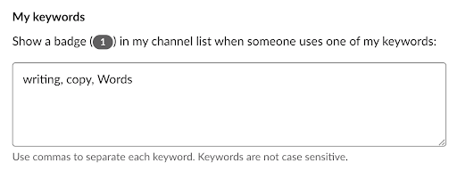
Instead of displaying an error message when someone doesn’t use commas, or including this information in the help center, Slack provides clear guidance through microcopy. A similar strategy can be applied in the registration process:

When you set up a password in DataFeedWatch, you already know what needs to be included. This way, the users avoid annoying error messages and they’re more likely to get it right at first try.
Bonus: your own limitations
Of course, the rules described above apply to designers too. Apart from them, we’re also affected by many other psychological phenomena. Perhaps the most important one of all is the curse of knowledge.
While you’re good with words, your users don’t have to be. Using fancy words, puns and metaphors in your UX content may appear witty to your and your colleagues – and incomprehensible to your users. Don’t forget edge cases, too – for instance, users on the autism spectrum often don’t understand metaphors at all.
Remember that most of the time, you’re not the end user. This is why it pays off to focus on plain language that will serve a wider audience coming from different backgrounds.
If you’d like to read even more actionable tips for better writing, you’re sure to enjoy this article about UI writing on the UXPin blog. I hope that this little psychology lesson has left you inspired!
The post The Psychology of UX Writing appeared first on Studio by UXPin.


June 18, 2020
Free and seamless collaboration for cross-functional teams
We have lived to see design teams transform from a few designers working in the corner of the open space to large cross-functional teams that collaborate with business, stakeholders, and development. Today, designers work with people from many departments, on all sorts of levels, in different timezones – sometimes even people from outside the company. How does one manage such a diverse team that needs to work towards a common goal?

In a recent interview Bree Walter, Senior UX Designer at H&R Block talks about her experience with cross-functional teams and how she manages their work using UXPin. So if you’re a Product Owner or a Product Manager, we know how much you value seamless collaboration – not only for designers but everyone involved.
One of the key differences between UXPin and other design tools is that UXPin offers a few features that allow you to connect the worlds of design, business, and development, and make it easier for everyone to stay on the same page.
Gather feedback from anyone, no sign-in required
Unlike other design tools on the market, such as InVision (see UXPin vs InVision comparison), comments in UXPin let you gather feedback right at the spot from anyone even if they don’t have an account.
This is perfect if you need to invite additional members of the team to contribute to the project or have someone suddenly jump on it and share their opinion. It’s a win-win for both.
Reviewers don’t have to create an account just to leave a comment, and you don’t have to request an additional seat so that they can contribute. You only need to share the preview link with them and you start having an open discussion about the design.
Share your life-like prototype with the stakeholders or potential users of your product so that they can click through the prototype. This way you gather feedback on early stages and can iterate before the coding even begins.
https://www.uxpin.com/studio/wp-content/uploads/2020/06/Alexander-Olssen-–-Guess-game-1.mp4
How about this awesome Guess Game by Alexander Olssen from the video above? Wanna play too? Here’s his UXPin design preview. Simply click through and you’ll get the idea and the feel of what the game would work like if it was an actual product. (PS. The comments were turned off for this specific prototype because you don’t have to grant everyone access to comment on your design previews.)
Keep feedback in one place
This way, all feedback is kept in one place. It doesn’t get lost in Slack conversations, emails or multiple versions of the same design files passed around by designers, where nobody knows what is final because there are endless non-final final versions of a single file.

Share documentation and specs with developers
UXPin goes way beyond the possibility of just leaving comments with no sign-in. It also makes the designer-developer collaboration feel like a breeze. The same preview link that you’ll use to get others to comment also includes all information about the designs that your dev team needs to translate layers into code.

UXPin’s Spec mode is like an open book to everyone. Thanks to it, designers can keep creating and developers can have access to any information they need to implement the project. Any changes update right away so you don’t have to worry about updating it.
Ready to change how you work?
Creating products with great user experience requires coordination and perfect alignment across the entire team. UXPin really supercharges complex teams to move faster, make better decisions by quickly exchanging feedback, and master the art of dynamic teaming. Sign up for UXPin 14-day free trial to check all the collaboration features with your cross-functional team now.

The post Free and seamless collaboration for cross-functional teams appeared first on Studio by UXPin.
June 15, 2020
Creative Pop-up Examples Done Right
Pop-ups are one of the most popular design patterns. That’s why we’ve put together some examples of pop-ups done right and backed them up with tutorials on how to create them in UXPin.
The whole idea behind cookie consents
When sites remember your login details, preferences, or store your shopping cart items for later, that’s all thanks to web cookies. Cookie consents are probably one of the most popular and obvious pop-ups. Still, when designing them, you need to provide a great user experience and ensure users’ privacy at the same time.
What’s really required in the cookie policy messaging
Copy approaches to writing a cookie consent can be very different and may vary widely. However, at minimum, the consent should address:
What you use cookies for,
What do they give,
How your users can manage them.
Selected examples of cookie consent banners done right
The vast majority of websites display the cookie consent at the bottom of the viewport. It can be displayed as the footer or simply in the bottom-right or bottom-left corner. Let’s take a look at some websites that have done it right.
Squarespace’s cookie consent is not intrusive, yet remains visible at the bottom of the screen as the user scrolls the page. It informs you of the privacy and cookie policy and what you consent to by continuing to use the site.

Another way is to display the cookie consent in the corner of the screen. The example from FullStory is a more prominent one. It is a fixed dialog in the bottom left corner of the viewport that stays in that place until you interact with it.

How to create a cookie banner in UXPin
You can create this kind of a pop-up in UXPin in minutes by using just a few elements, such as a Box, a Text element, and Buttons. If you want to know how to recreate it step by step, read our tutorial on How to Create a Cookie Consent Pop-Up.
https://www.uxpin.com/studio/wp-content/uploads/2020/06/cookies.mp4
On-scroll pop-up window
Instead of welcoming your site visitors with a newsletter sign-in pop-up right away, you may want to take a slightly subtle approach. You can display it only when it is relevant to the content and on a scroll, just like Curate Labs did.

How to build an on-scroll pop up in UXPin
To prototype an on-scroll pop up in UXPin, you’ll need to build an interaction that displays the pop up when the page is scrolled to a specified position. Watch the video below to see how to recreate it step-by-step or follow our tutorial.
https://www.uxpin.com/studio/wp-content/uploads/2020/06/onscroll-popup.mp4
The post Creative Pop-up Examples Done Right appeared first on Studio by UXPin.
May 28, 2020
What We Brought to UXPin Over the Last Months
At its heart, UXPin is a design and prototyping tool that takes your designs to the next level by giving them that “real product” feel thanks to many, many features – from real inputs and data to interactions and variables.
Bridging the worlds of design and development, UXPin also brings out to the best of both with collaboration for everyone. Over the last months, we have showered you with a host of product updates. Behind the scenes, we’ve been working hard to improve performance. In case you missed any of our updates, here’s everything in a nutshell.
We always listen to what you say
We always listen super carefully to what you say, taking every opportunity to make UXPin better. Over the last months, we have shipped many frequently requested features. And that makes us super proud!
Set different canvas sizes
Along with UXPin 2.5 came what we call Different Page Sizes. It’s the ability to set different canvas sizes for each Page separately within one Prototype. Before that, all Pages would always share the same size. Since we still receive some questions from you about it, we thought this tutorial would be of extra help.

Comments in editor
Comments in the Editor were among other frequently requested features. Thanks to that, giving and replying to feedback to the design while working on it is such a no brainer.
Undo deleted pages
Without a doubt, undoing deleted pages (just like you do it with email in Gmail), was something you often asked for. So we made it possible to recover deleted pages seconds after you remove them.
File import
Sharing designs between accounts has never been faster. The file import allows you to save your prototype as a .uxp file, share it with anyone to import it back and open it – without a UXPin account.
Color labels for pages
Color labels for Layers that came with UXPin 2.0 turned out to be so helpful that we went the extra mile and enabled the same for Pages. Right-click on any page in the Pages panel and choose a color label for it.
Elastic boxes and buttons
Boxes and Buttons expand as you type into them, making last-minute copy updates a breeze. Just uncheck the Fixed Width and Height option in the Properties Panel.
Selecting elements made easy
We’ve made it easier to select locked elements, elements that overlap or are hidden under one another.

New grids
With the introduction of New Grids, you have three different types of grids to choose from: column, baseline, and square. New Grids we also something we have tested inside and out internally before we gave it to more hands.
Jump between recent prototypes
To jump between recently opened prototypes, just click on the down arrow in the top left corner of the Editor.
Color picker
Making the Color Picker faster and more intuitive took us a lot of work, but the feedback we have received from you proved that it was worth it!
The Color Picker gives you instant access to up to twenty recently used colors. Each time you use a color, it gets saved at the bottom of the Color Picker. That’s also where you can switch between colors from any of your Design System Libraries.

Contrast checker
Along with the rebuilt Color Picker, came the built-in Contrast Checker to ensure your text reads easily. When you’re working with text, there will be two lines across the color picker. These are the dividing lines between colors that make the text on your design readable and those that don’t.
Spell check
Both in the browser and in the desktop app, UXPin’s spell-checking ensure your copy is free of any typos. It constantly checks your prototypes for any typos and allows you to fix them with a few clicks.
OS fonts in the browser
Speaking of fonts and text, we’ve brought all OS fonts to the Editor. Depending on your operating system, you’ll now see all of them in the Font picker under Local fonts.
One home for all your pages
We call it the Overview – a single place with a bird’s-eye view of all your pages that makes it so much easier to keep things nice and neat.
Editable SVGs
With this release, we’re also introducing editable SVG files. Quickly upload and edit the SVG files on your design. With this, you can upload and refine illustrations or icons without leaving the prototype to use a different tool.
Big and small nudge
With the Big and Small Nudge, it’s possible to configure how many pixels the element will move or resize when using the keyboard. Especially handy with the 8px grid.
Duplicate improvements
Such a small thing yet so powerful! When duplicating elements, UXPin will remember the last offset, saving you so much time down the road.
Input placeholders
Inputs act like the “real-deal” – no need for additional interactions or states to make the placeholder.
The post What We Brought to UXPin Over the Last Months appeared first on Studio by UXPin.
May 19, 2020
What’s New in UXPin 2.5
The UXPin 2.5 release brings Comments to the Editor! You can now leave and reply to feedback as you work on the design. We’re introducing the option to set different canvas sizes for each Page. From now on, it’s also possible to edit SVG files. With it, you can refine your icons without leaving UXPin. See what else is new.
Comments in editor
Comments are now also in the editor! Giving and replying to feedback has never been easier and faster. Until now, Comments were available on Preview and we’re not taking them away from there.
Different canvas sizes for each page
You can now set different canvas sizes for each Page separately. Before that, all Pages would always share the same size.
Editable SVGs
With this release, we’re also introducing editable SVG files. Quickly upload and edit the SVG files on your design. With this, you can upload and refine illustrations or icons without leaving the prototype to use a different tool.
Big and small nudge
You can now configure how many pixels the element will move or resize when using the keyboard. This comes handy for the 8px grid.
Duplicate improvements
Duplicate now remembers the last offset, saving you so much time. This sounds like a small thing, but it’s so useful!
Improvements
This release also brings many improvements to the Editor.
Image optimization for files bigger than 4000px to improve loading times.
You can now place images into elements.
We’ve enabled batch editing properties for different element types.
You can double-click on the text’s resize handles to change it from fixed size to auto.
You can now copy and paste canvas interactions
You can paste interactions to multiple elements at once.
We added the “Loop” option to the following interactions: Set state, Next state, Previous state, Set variable, Set content, and API request.
You can set the Delay for Set Variable and API Request interactions.
Changed the default mask mode from the alpha to the outline.
Added Placeholder property to Input and Text area elements.
There’s a new option to reset image size to its original size in the Properties Panel.
From now on, selecting a gradient from a Library in the Color Picker changes the Fill to Gradient.
It’s now easier to resize very small elements.
Fixes
Occasionally, Go-to-page interactions couldn’t be copied with keyboard shortcuts. That won’t happen anymore.
Some SVG files were broken when added (with drag-and-drop) –we got your back.
When you copied and pasted a style from one Oval to another, the shape would change.
Changing the size of a Button from Fixed to Auto, saved the wrong result when the Button had padding set.
After setting the anchor point, the position in the tooltip (that shows the positions on the X and Y axes) was different from the position in the Properties Panel.
Fixed some snapping issues that occurred when resizing a group of elements.
A delayed interaction would either interfere with other interactions or trigger even if you switched to another page.
There were times when it wasn’t possible to paste copied elements. We fixed it.
Contrast Checker now skips invisible elements.
Snapping didn’t work when duplicating elements with Alt + drag.
Smart distances in the Spec mode sometimes showed values mismatched by 1px.
The post What’s New in UXPin 2.5 appeared first on Studio by UXPin.
May 18, 2020
We’re Leaving Spectrum
Thank you for being part of our Community on Spectrum for over a year. There wouldn’t be us if it wasn’t for you! We appreciate all the valuable insights and lots of energy that you have given us – it has allowed us to make UXPin better. The Spectrum Community has been a place where everyone learned from each other. We learned from you, and you learned from us. We are incredibly grateful for every message, piece of feedback, feature request, or even the smallest reported bug – these are the building blocks for improving UXPin. We were able to create lasting changes that benefit all of us.
Unfortunately, due to the changes in Spectrum, we are closing the UXPin Community on May 18th, 2020.
Why are we leaving Spectrum?
When we launched the Community over a year ago, anyone could sign up for Spectrum. However, along the way, Spectrum has changed its policy. Today, the only way to join the Community is with a Github account. We want our Community to be open to everyone, and Spectrum fails to meet these needs.
We are already on the lookout for a better place for our Community. In the meantime, you can still talk to us in our in-app chat or email us at ideas@uxpin.com to make feature requests, ask questions, and report issues. Also, we highly encourage you to join the UXPin Research Group to be in the loop. All members of this Group are updated about our upcoming features, can test them, and have an impact on how things work.
Thank you once again for being valuable members of our Community!
The post We’re Leaving Spectrum appeared first on Studio by UXPin.
May 7, 2020
See What to Expect in UXPin 2.5
We hope you’re all doing just fine! We all work remotely now, but that’s not stopping us from building new features and adding improvements to UXPin. That’s why, before UXPin 2.5 is officially released, we decided to shed a light on some of the features that are about to roll out:
Comments in the Editor: New level of collaboration
We’re super excited to announce that Comments are coming to the editor! Over the last months, we’ve received plenty of requests to make this happen. You will soon be able to add comments and reply to feedback when working on your design.
https://www.uxpin.com/studio/wp-content/uploads/2020/05/2-5_Comments_Blog_700x526-1.mp4
Editable SVGs: Refine your icons at the spot
We’re making SVGs editable in UXPin. This means that you will be able to upload and refine illustrations or icons without leaving the prototype.
https://www.uxpin.com/studio/wp-content/uploads/2020/05/2-5_EditSVG_Blog_700x526.mp4
UXPin 2.5 will launch in a week so stay tuned as there’s more to come!
The post See What to Expect in UXPin 2.5 appeared first on Studio by UXPin.
April 28, 2020
5 Tips to Crack Any Job in Web/UX Design
If you have a fair amount of experience in web or UX designing but are finding it difficult to get your next job, then you’ve come to the right place.
Job hunting should not be as hard as it is. Knowing a few tricks and implementing them in your job-hunting strategy can help.
This article seeks to bridge the gap between you and your dream UX/Web Design job.
Read on to learn what you can do to revolutionize your job hunt using the 5 tips we have mentioned below:
1. Identify your professional needs

Knowing where you want to work and in what capacity you want to work makes your job search a lot easier and helps you crack a job faster than someone who doesn’t.
The reason being that you are more likely to work towards that goal with a methodical and focused approach.
So to crack your dream UX/Web Design job, you need to prioritize this aspect first.
The goal here is to make a conscious effort and identify your area of interest. This will make your task a lot easier and help you crack a job in UX/web design a lot faster than you think
If you have not made up your mind about what exactly you have in mind, meditating on the below-listed questions is perhaps a great place to start:
Do you want to join an MNC or do you want to enjoy the thrill of working in a vibrant startup?
What kind of industry would you like to work in? Would you want to continue in your industry or do you want to transition?
Are you into UI or UX? Are you a UX Designer, Developer, or Architect? Are you a researcher or a project manager?
Answering these questions truthfully will shed a lot of light on who you are and what you want to become. This will also allow you to eliminate profiles you’re not interested in, so that you don’t end up wasting a lot of time applying to roles that aren’t worth your time.
Once you make a decision, you can successfully move on to the second step of streamlining jobs that most resonates with your preference.
2. Customize your job search

If you have followed the first step, the next step is to customize your job search.
Professional portals like LinkedIn gives you the liberty to choose jobs based on various criteria such as:
Job designation
Location of the job
Industry
Years of work experience
After you select your job preference, you’ll get a list of job vacancies that you can apply to. If you don’t find a job vacancy that fits, you can simply switch on the job alert. By doing this, you’ll get notified every time there is a job opening in the target industry and job type of your preference.
You can check out this guide on job search sites for more clarity on how you should begin your own job hunt.
3. Build your online portfolio

The best thing about being a UX/Web Designer is that most of your work or projects are available online.
Whether you have built a website for a client or made one as part of your college project, the idea is to have practical proof of the work you have done in an online platform.
Your portfolio for web design is a personal website that you should use to your best advantage. Some might even go on to suggest that it acts as a virtual resume as it helps you communicate the following:
Your contact details
Projects you have worked on
The extent of your contribution
Long story short, your online portfolio is important. You can check out some of these best portfolio websites for UX designers.
Keep it up and running so you have something to show once you start filling up your job applications!
4. Write an impactful resume

Your resume is the first point of interaction between you and the recruiter.
It is your one shot at impressing the recruiter before you even get the chance to meet them face-to-face.
Unfortunately, not everyone gets the rare opportunity of meeting a recruiter. This is why the need to impress the recruiter and get shortlisted is crucial if you want to land a job as a UX/Web Designer.
For best results, you can use an online resume builder with ready-to-use resume templates. There are 3 important resume hacks that you can implement to get shortlisted for the hottest jobs in UX/Web designing. They are:
A bang-on summary
Endorsement of skills through your Professional Experience
A hard-hitting Projects section or portfolio to go beyond the resume
We’ve explained them below.
Make a bang-on summary articulating your career highlights
Think of your summary as a window to resume success. It helps you communicate your key career highlights in a neat 3-5 line paragraph. Being the legs on which a resume stands, a great summary has the power to get you shortlisted for your dream UX/Web Designer job.
Here are two examples of what a summary for a UX Designer and a Web Designer should look like:
UX Designer Resume Summary:
4+ years experienced UX Designer with a demonstrated history of designing intuitive UI and strategizing product launch. Highly proficient in collating with senior stakeholders to analyze user needs. Adept at serving old accounts and generating new business to successfully fulfill the product roadmap and achieve the organizational vision.
Web Designer Resume Summary:
5+ years experienced Web Designer adept at designing intuitive website layouts and visual/digital designs across web and mobile. Highly efficient in managing a team of junior web developers to deliver satisfactory user experience. Proficient in gathering and fulfilling client requirements with expertise in deploying innovative technologies to deliver user-centric solutions.
Highlight your skills effectively in your UX/Web Designer Resume
Whether you’re applying for the position of a UX Designer or a Web Designer, it is obvious that you know how to work on a set of tools and software. But your skills and technical proficiency are useless if you’re not able to effectively articulate them in your resume.
This is why you should make a separate skills section and distinguish your core skills from your technical skills. Doing this will help a recruiter identify your functional areas and skillsets in one go.
Include relevant certifications in your UX/ Web Design Resume
Being a certified web designing professional can do wonders for your job hunt if you include it in your resume. It helps you show that you have some additional knowledge in your field and that you’ve got the relevant certifications to prove it.
It also stands as a testament to your competence and your willingness to constantly up-skill which is seen as the hallmark of a great employee.
So if you’ve done relevant certifications, make sure that you endorse them in your resume.
5. Write a targeted cover letter

A great cover letter is the need of the hour. It gives your job application a personal touch.
It also gives you the opportunity to elaborate aspects of your career that may otherwise seem questionable such as a career gap, or a frequent job switch. Moreover, a cover letter also gives you a wider scope in terms of helping you talk about your achievements in ways that a resume doesn’t.
A cover letter that directly addresses the hiring manager and talks about the qualities that make you the perfect fit for that particular job has a higher chance of making a favorable impression on the person evaluating their suitability for the job than someone without a cover letter.
So the next time you apply for a job in UX or web design, write a cover letter.
You’ll see the results first hand.
Conclusion
To sum up:
Prioritizing your professional needs and wants is the first step to landing your dream UX job.
After identifying your professional requirements, make a customized job search catering to your target job, and switch on the job alert.
Create an online portfolio showcasing the major projects you have successfully completed.
Make an impactful resume that articulates your career history and achievements.
Seal the deal with a compelling cover letter.
The post 5 Tips to Crack Any Job in Web/UX Design appeared first on Studio by UXPin.
April 23, 2020
What You Need to Know About Negotiating Design Ideas with Skeptical Customers
Design is a key part of branding and marketing. Great design can boost user experience and can offer higher profit margins. Since business owners realize the important role design plays, they can often be skeptical in design pitches, especially when your designs reflect new approaches.
For many designers, negotiating design ideas can seem daunting. It can be tempting to roll over and deliver what the customer wants, even if, as the design expert, you disagree with the customer’s ideas. Here’s what every designer needs to know about negotiating design ideas with skeptical customers.
Maintain a Positive Attitude

Designers need to know that objections from skeptical customers seldom mean rejection. Your skeptical customer also isn’t likely to be trying to fleece or lowball you by discrediting your design. Most customers are likely just wanting the best results for their business.
With some negotiation training, we learn to view negotiation not as a conflict but as a meeting of minds. Objections are an opportunity to refine the ideas on the table.
Prepare for Negotiations

Too often, designers pitch their ideas without preparing for objections. Yet, sales pitches rarely pass without some questioning.
The customer may not always see why your design concept answers their problems right off the bat. In many cases, the customer will prefer their own ideas until you explain the key features of your design.
Prepare to walk your customers through your design concept. Explain why each part of your design meets the customer’s specific needs and the brief. If you can’t explain the reasoning behind your ideas, you risk rejection. With early preparation, you can explain common customer concerns.
List Key Objectives

Your customer will likely be more receptive to your ideas if your design goals align with their business objectives. With each design and negotiation, aim to accomplish a particular goal. Start by listing down your key objectives as well as any side goals. Some examples of negotiation objectives to aim for include:
Defining project scope.
Pricing for design elements.
Customer benefits to expect from the design.
Use of data and accessibility features.
Collaboration modes between your team and the customer’s team.
Be an Active Listener

One of the crucial lessons to take during negotiation training is active listening. When you pay attention to the customer’s words, you gain extra insights into the customer’s needs and desires.
Active listening involves asking relevant questions. Your guided questions inform your design decisions and increase the customer’s confidence in your concept. For instance, when you ask about the customer’s existing artboards, you reassure the customer there can be continuity across the designs. Like you, the customer doesn’t want a chaotic design that veers from their corporate identity.
Expect Some Give and Take
Most design customers enter negotiations with preconceived ideas about what the design should look like. It’s only natural for people to form ideas about how their brief will translate, and it can be surprising to customers when your ideas don’t match theirs.
While you may be a highly trained design expert, you should also respect the customer’s business expertise. Treat the negotiation as a session to brainstorm ideas. Trust that the owner knows what works in their market and industry.
Work together with the customer to find common ground between their business needs and your design concept. Be ready to integrate some of your customer’s ideas into your design wherever possible.
Be Firm on Deliverables

Even as you accept your customer’s ideas, be wary of suggestions that compromise on your design intentions. Make sure new ideas fit with the design goals.
When you compromise on deliverables, your design likely won’t provide the results you promised. Your skeptical customer will blame you, even if the customer’s ideas watered down your design’s effectiveness. Ultimately, it’s your duty to ensure what you put out delivers on your word. Some of the most crucial deliverables typically include:
Product vision (why the design exists in the first place).
Sitemaps and information architecture.
Wireframes and intended user behavior.
Usability testing.
Reporting for usage analytics.
Timelines and budgets.
Show Proof of Concept

Skeptical customers need some assurance that your concepts can meet their business goals. Use your experience to show proof of how your design concepts can achieve those goals. The use of statistics is a great way to back up your claims. Some script examples to persuade skeptical customers are:
In my last role, my design increased shopping cart values by 46% within three months, providing an extra 8% per month in revenue.
A similar design I created for (name of past customer) reduced shopping cart abandonment by 65%, earning the company an extra 3% in previously lost sales.
My design for (name of past customer) based on the same concept contributed to a 400% surge in traffic and a 512% increase in page views over the campaign period.
Present Visual Aids

One of the main reasons your customer may be skeptical could be an inability to visualize your information and ideas. Prevent this problem by preparing clear design outlays and interactive prototypes to illustrate your ideas. You can also use visual aids for training your customers on product usage.
Preparing visual aids can take some extra time (unless you take from a design system library), but can save you a ton of time during negotiations and implementation. Prototypes provide a user flow for your design process. A life-like, fully interactive prototype created in UXPin can reduce confusion on expectations as both you and the customer are visualizing the same end product.
The post What You Need to Know About Negotiating Design Ideas with Skeptical Customers appeared first on Studio by UXPin.
April 15, 2020
4 Cognitive Psychology Tricks for UX Design Excellence
UX design experience that does no harm. What is it about? It’s about putting value over personal gain.
While it sounds perfect in theory, in practice it is hardly ever achieved. So, what is behind the value in UX design? Many UX designers make a mistake by thinking that value can be achieved by having enough technical knowledge. However, in UX design, like in design in general, psychology plays a more important role.
Most importantly, cognitive psychology.
The Impact of Cognitive Psychology on UX Design
Cognitive psychology encompasses different studies of mental processes, including the research on attention and perception, memory, problem-solving and creative thinking.
Since cognitive psychology describes human behavior and what preconditions it, the benefits of it for UX design are obvious.
Cognitive psychology can help overcome the cognitive barriers to improve:
usability
navigation
readability
accessibility
The ultimate goal is to create value for the target user, the experience that they will remember.
In support of the idea that people remember general experience rather than details, researchers from Tufts University and Brown University made an experiment by asking the participants to draw a U.S. penny. The participants were given the following tasks:
draw a penny without any help
draw it with a list of visual features
from another list choose only those features that belong to a penny
describe what’s wrong with a given drawing of a penny
select a correct one from a series of drawings
Now, a penny is what an average U.S. citizen uses every day. They should know what it looks like. But surprisingly, the performance during this experiment was very poor. The researchers came to the conclusion that people do not recognize anything about this object except its general value. This is because of memory limitation, a phenomenon in cognitive psychology.

Such cognitive psychology tricks can come in handy in UX design. Want to learn more? Take a look.
1. Classical Conditioning
We all know the famous ‘action-reaction’ pattern from the experiment with Pavlov’s dog. People and dogs obviously are different anatomically, there is one similarity in how we learn.
In cognitive psychology, this ‘action-reaction’ pattern is called classical conditioning or Pavlov’s conditioning. In Pavlov’s experiment, he taught his dog that ringing the bell means that the food is coming.
In everyday human activity, this principle is the foundation of how we learn simple actions. If our tongue is dry, we drink water. If our belly rumbles, we eat. Or, if we click a ‘Features’ button on a website, we get the relevant information.
This principle can be applied in UX design to enhance navigation. Here’s one of the ways how it can serve the interest of UX designers.
Pavlov’s principle can help choose the right color for the buttons and sections that need more attention. When designing a CTA button, this principle can point at the right choice.
For example, if a user sees a CTA button painted red, they will be more determined to press it. By creating a red CTA button you send a call to action, and you get the desired reaction.

Why red?
Cognitive psychologists have found the link between the color red and the increase in attention a while ago. A study by the University of British Columbia has found that red increases performance on a detail-oriented task.
Blue, on the other hand, has a more calming effect, which is why it serves perfectly as a background color. This is a general approach to color perception and reaction to different colors in cognitive psychology, and it serves well for the general audience. But what if a certain gender dominates in your audience?
A study by Joe Hallock, principal design manager at Microsoft Azure, has indicated the difference between how men and women give preference to different colors:
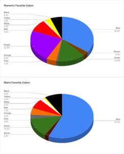
Image credit: Joe Hallock
So, as you can see, the knowledge of how Pavlov’s conditioning works can be very helpful for UX designers, in particular, to choose the right color of the interface and create user-friendly navigation.
2. The Left-to-Right Theory
This theory comes to complete the previous one.
If the first theory talked about how to create content to receive a certain reaction, this theory is about how to place content to receive the necessary reaction.
In cognitive psychology, this theory belongs to the study of perception. “The left-to-right theory claims that people mostly perceive information from left to right and from top to bottom”, says Melanie Sovann, a researcher at Studicus, an online educational platform.
Why mostly? While the top-to-bottom part of this theory is true to everyone, not all audiences perceive information from left to right.
It is well-known that Arabic readers, for instance, perceive information from right to left, as it is characteristic of their writing style. But even if the direction of writing is a point to argue in this theory, the placement of information from top to bottom is universal for everyone.
This theory is also employed in creating a mind map of the future design. With this theory in mind, you can create an order of the items, which you will later follow to improve navigation.
3. Chameleon Effect
Continuing our conversation about cognitive psychology tricks that affect perception, now let’s talk about the theory that has an effect on the contents.
Chameleon effect is a well-known cognitive psychology theory that indicates that all people tend to mimic the emotions and feelings of others. Such behavior is unintentional (unconscious), but you can consciously employ it in UX design to create content that provokes certain emotions.
For instance, all Duolingo users, who skipped at least one language lesson, know this guy:

Crying duo bird makes them feel bad for skipping the lesson, which encourages them to return to learning and using the app.
Behind this, there’s an obvious intention to make the users mimic the duo bird’s feelings. Hence, we can see the Chameleon theory in action.
This theory is also very popular in content marketing. In content writing, for instance, writers would intentionally create certain introductions to provoke particular feelings and create an atmosphere based on certain emotions. This is done to achieve a certain goal, for instance, to make the reader feel skeptical or make them excited.
4. Serial Position Effect
This theory is the explanation of why a middle child in the family always feels left out.
Another theory from the study of perception in cognitive psychology, serial position effect determines, in which order we perceive the items better. “The theory suggests that people can memorize the first and the last items best while having trouble recalling items placed in the middle”, says Dorian Martin, a researcher at WowGrade, a popular online educational platform.
What impact does it have on UX design? This theory, like left-to-right theory, can help UX designers identify how to position certain items to make the interface more user-friendly.
But how do you choose the items that will go in the middle? If a website sells clothes or other items, UX designers study the traffic to each of these items with the help of the marketing team. The items that sell the best, go in the beginning and at the end of the line, while items with less traffic go in the middle.
In general, this theory can work to create user-friendly UX design, however, it requires prior analysis, like heuristic evaluation or AB testing, before it is implemented.
It’s All In Our Heads
While you may have excellent UX design skills, they can’t always answer your questions about how the users will perceive the interface, what colors to choose, how to position the content, etc.
As cognitive psychology studies how the human brain perceives and processes information as well as how it forms certain patterns of behavior, cognitive psychology theories can be quite helpful for UX designers.
From well-known tricks, like Pavlov’s conditioning and Chameleon effect, to the Left-to-Right theory and Serial Position effect, UX designers can draw a lot of advantages to achieve the value that UX design is all about.
The post 4 Cognitive Psychology Tricks for UX Design Excellence appeared first on Studio by UXPin.
UXpin's Blog

- UXpin's profile
- 68 followers

