
UXpin's Blog, page 95
December 10, 2019
See what’s new in UXPin 2.1
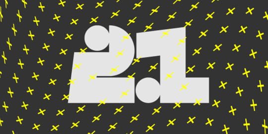
UXPin 2.1 brings a whole list of awesome improvements, from elastic boxes and buttons that expand as you type, to an easier way of selecting elements and undoing deleted pages. Discover everything that’s new and dive into the details of all other enhancements and fixes.
Elastic boxes and buttons
Boxes and buttons now expand as you type into them. Just uncheck the Fixed size option in the properties panel and you’re good to go! Apart from that, we’ve also enabled all text properties inside boxes and buttons. See how it works in Docs.
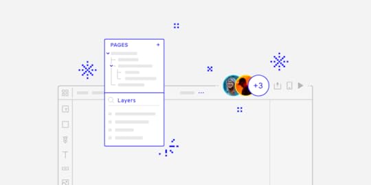
You can now undo deleted pages
This has been one of the most frequently requested features. So we’re happy to finally say that you can now recover deleted pages seconds after you remove them.
Hide pages from preview
If you have pages in your design that you don’t want to show on preview, just click the eye icon next to the page name. This makes them invisible on preview, excludes them from exports and the navigation. Learn more on Docs.
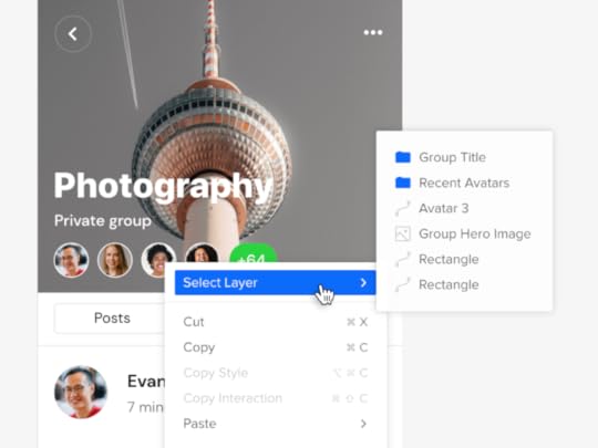
Selecting elements got a lot easier
Selecting elements on the canvas is now easier. If you want to select a locked element on the canvas or elements that overlap or are hidden under one another, we’ve got you covered. Just right-click and choose Select Layer from the context menu to get down to every single layer that’s right under your cursor. Read more in the tutorial.
Improvements
You can now move elements to a position that’s not visible in your current viewport.
We’ve improved grid rendering on large zooms levels.
You can now set the weight of system fonts for Windows.
The top bar now displays up to 5 avatars in the Top bar when you’re working with the team on the same prototype.
We’ve improved the context menu for elements by grouping actions that are relevant and adding new ones.
We have removed unnecessary options from the canvas context menu.
Editing large projects would cause a performance drop.
Sometimes the Esc button would not deselect a currently selected Page.
From now on, the possibility to open the sitemap if you have only one page is blocked.
Groups in the Pages panel are now expanded when dragging a page into the group.
Fixed
The icon for removing the guide was stuck when clicking very close below the vertical guide and dragged it.
Disappearing canvas when switching between pages while editing the Master Component.
Pinning or unpinning the Pages and Layers panel did not remember the expanded or collapsed sitemap size.
Adding a new page from the context menu duplicated the content of the selected page.
The project switch button worked only when you clicked on the project’s name.
We’ve fixed the order of layers after duplicating at least 2 elements with Alt-drag.
Copy-pasting elements with Cmd/Ctrl C and Cmd/Ctrl V would place the copied element beneath the original element.
The properties panel disappeared when you edited some expressions.
Zen mode did not hide all panels.
Flip Vertically and Horizontally is now blocked in Component Instances.
Fonts added by users would not load on Chrome [Windows].
When moving guides with Cmd pressed, ignore snapping didn’t work.
The context menu in the layers panel did not close after the first click.
Adding a new page in a collapsed pages panel no longer enters the edit name mode.
Elements didn’t snap to guides after you zoomed in.
States for hidden elements in the Layers panel were not grayed out.
Depending on the browser, the collaborator’s initials inside team avatars were not centered properly.
What’s Next?
Here’s what you should be looking forward to in our upcoming releases:
Color Picker
We’re rebuilding our color picker by making it faster to use. You’ll know right away which colors are at least “AA” rated and which don’t meet accessibility standards. You’ll also have the option to switch between the list and grid view for colors from all accessible Design System Libraries.
Grids: Column, Baseline, and Square
We will soon be adding more grids to UXPin. Column Grids that are perfect for organizing elements into columns., Baseline Grids to give a flowing rhythm to the text in your design, and Square Grids where you can define the size of cells.
Recent prototypes
You’ll be able to view the list of your recent prototypes and switch between them from the top left corner of the editor.
Pages overview
An overview of all your pages will soon be available in UXPin. You’ll see a new icon at the top of the Pages Panel that will take you to a separate view with all pages from your current prototype.
The post See what’s new in UXPin 2.1 appeared first on Studio by UXPin.


December 5, 2019
Web Development Checklist: 10 Characteristics of a Successful Website

According to Ecommerce Foundation’s country report, 88% of consumers will research product information before making a purchase online or in-store. This means that there is no greater time to have an online presence for your business but now.
But before you get started on creating and designing a website, here are 10 things that can make it successful:

1. Takes a Few Seconds to Load
For sure you know that your website should not load more than 8 seconds if you want to retain site visitors. It is about time that you ditch that information.
According to a 2017 Google/SOASTA Research, a website that takes 10 seconds to load increases the probability of bounce rate by 132%.
A bounce rate is the percentage of visitors who landed on your website but ended up hitting the Back button as soon as they arrived. Think of it as a missed opportunity for you to turn a website visitor into a paying customer.
In addition, a high bounce rate indicates that your website has usability issues, which can trigger search engine robots to flag it as irrelevant. This can result in a drop in search engine ranking.
If you do not want this to happen, make sure that your website is well-optimized that it can load within three seconds.
2. Must be User-Friendly
A user-friendly website is something that allows your site visitor to do what they want to do with ease.
If they want to buy your products online, make sure that it will be easy for them to find the item they want to buy. Not to mention that your checkout process should be simple and easy.
If they want to know more about you and what you do, make it easy for them to look for the proper page where they can find the information and resources that they need.
Also, do not forget to make your website accessible for people with disabilities, as well as those that are accessing it on their mobile devices.
3. Must be Mobile-Responsive
The mobile internet traffic takes more than half of the global online traffic.
Do you know what this means? It means that about 6 out of 10 people all over the world access the internet through their mobile devices. This only emphasizes the need for businesses to have a mobile-friendly website.
For one, you can opt to use a mobile-responsive theme when designing your website. That way, your website will automatically adjust its size and design elements depending on a site visitor’s screen size. But if you have the resources, you can tap your web developer to create a mobile version of your website.
Nonetheless, it is best to check how your website looks like on tablets and smartphones. You can also run your website on Google’s mobile site tester to find out whether it is mobile accessible.
4. Has Cross Browser Compatibility
The latest versions of internet browsers have come a long way in making sure that you get a consistent browsing experience.
Nonetheless, each browser may still have quirks that can affect how your website appears. For example, Google Chrome and Mozilla Firefox can render a transparent website background just fine. However, this may require some coding in order to appear the same on Internet Explorer.
Thus, it is important to keep cross browser compatibility in mind. That way, your site visitors can access the information on your website just the same regardless of what browser they are using.
5. Has Optimized Content
Have you heard of the cliché “Content is king”? That’s because original and well-optimized content is what sets your website apart from your competitor. Not to mention that “content” includes your blog posts, ebooks, images, videos, and more.
First, content is what educates, informs, or entertains your site visitors. This reiterates that they are making a smart decision to trust you and buy your products.
Second, an optimized content can help you be visible online. That’s because there is no great place for your target keywords but on the various parts of your content.
Third, a high-quality content is something that other websites would refer to in case they need a valid source. Not to mention that this can also drive social media engagement.
Thus, a high-quality and well-optimized content should be part of your website if you want to succeed.
6. Has Clear and Effective CTAs
Aside from your target keywords, your content is also a great place for clear and effective calls-to-action.
Why do you need a CTA for your website, you ask? That’s because it can turn an unassuming site visitor into a loyal reader, paying customer, or your own “brand ambassador.” This makes CTA buttons one of the important elements on your website.
But for that to be possible, you should determine two things:
How would you like to convert a site visitor
How can you turn that into an action-driven button
For example, you would want a site visitor to buy one of your products. Now, you need to think about how can you encapsulate that in a button.
HINT: It is not “click here” or “learn more.”
7. Optimized for Search Engines
Here’s the thing: There is no sense of creating a website if you cannot make it visible online. This is where Search Engine Optimization comes in.
Moz defines SEO as the “practice of increasing the quantity and quality of traffic to your website through organic search engine results.”
Basically, it is something that you need to do in order for your website to appear on search engine results that are closely related to your target keywords.
For example, you sell bike parts online. SEO is making sure that your website will be included in the search results when someone types in “buy bike parts online” on Google.
That way, you can attract that person to click-through and visit your website, and then buy from you.
8. Must be Shareable
You should know by now that your online presence is not limited to just having a website. In fact, you can establish your brand’s expertise and authority through social media.
That said, it is important that your website (and its content) are shareable on social media.
For one, it allows people to find your business online. In fact, there is a strong correlation between social media engagement and your website’s search engine ranking.
Second, you can leverage social media to attract visitors to your website. Third, it makes your brand less intimidating and more relatable. As long as you know how to treat social media as a communication platform, people will be more inclined to follow your brand on whatever platform you use.
9. On an Excellent Web Host
Of course, you cannot run your website if you do not have a reliable web host. Think of your web host as a plot of land where your house (your website) is situated.
An excellent web host comes with a lot of useful features. But for starters, you need something that is reliable (at least 99% uptime), secure, scalable, and can provide 24/7 technical support.
Sure, web hosts can be expensive. That’s why you can compare two of your preferred web hosts to weigh which one is right for you.For instance, you are considering SiteGround and Bluehost. What you can do is type in “Bluehost vs SiteGround review” on Google in order to gain insights on what would suit your needs based on online customer feedback.
10. Must Have Top Security
As mentioned earlier, you need a secured web host. That’s because it can affect your website security.
According to Cybint Solutions, 62% of businesses experience phishing and social engineering attacks in 2018. If you acquire sensitive customer information, such as credit card details, expect that security risk to increase.
And because of the risk, is important now more than ever to take precautionary measures to keep your website security tight.
There are a lot of things that you need to keep in mind when it comes to having a website for your business. But there is no need to be overwhelmed as you can tackle it one-by-one and with the help of website developers.
The post Web Development Checklist: 10 Characteristics of a Successful Website appeared first on Studio by UXPin.
November 26, 2019
A short story of design feedback from “douche” clients

The thing about humans is that on the one hand, we’ve mastered the most developed communication system that involves a lot of different verbal and visual factors, but on the other hand, there are so many of them that sometimes understanding each other seems harder than understanding cats. Nature is hilarious!
 I came here to chew bubblegum and give shitty feedback. And I’m all out of gum.
Image source: https://flypaper.soundfly.com
Who’s responsible for this? Our conscious brain, of course. It allows us to analyze, calculate, plan, imagine and, unfortunately, overthink. And that leads to a lot of misunderstandings, especially in a workplace, and especially when it comes to giving feedback to another person.
How to give design feedback that is actually worth something for us – designers?
Giving design feedback (or any creative-related feedback) is extremely hard since the giver should be able to switch off your private aesthetics and stick to brand guidelines, design systems and basic design rules. Unfortunately, in most cases I worked on, it was all about looking for the balance between things that the client thinks are SEXY (worst word for describing any creative project – feel the cringe yet?) and things that will actually serve the overall purpose.
I wish every client knew that good design feedback should be a combination of being a stone-cold calculator and trusting your gut.
“Criticism, like rain, should be gentle enough to nourish a man’s growth without destroying his roots.”
Frank A. Clark
Yep, I know life is harsh and clients can be too. That’s why today I’ll guide you through the maze of good and bad design feedback to cheer you up (we all work with douchebags from time to time), and to arm you with some rules, you could easily use when discussing any design changes with the feedback giving site.

November 20, 2019
8 Typography Tips for Designers: How to Make Fonts Speak
Have you ever gotten annoyed with a website because the typography was illegible? Maybe it was an indecipherable handwriting font; maybe the letters were so tightly packed that they formed a dense mass of text; maybe the font size was very tiny. Whatever the reason, you left, and they blew their chance to communicate with you. All their efforts of building the website went down the drain merely because of a few typography decisions.
Typography is not just about aesthetics but also about the readability of the text. For typography to be flawless, it needs to serve both these purposes. Let’s face it: typography can make or break your design. It is like a magic trick in the wand of a magician. The magician knows all the nuts and bolts involved in the trick, but the viewer just experiences fascination and enchantment.
No matter how experienced you are as a designer, it never hurts to recharge your mind with some helpful tips about typography. Here we list down 8 useful typography tips that will help you stand out in the marketplace:
Leverage Hierarchy
In order to create an aesthetically pleasing design for users, the elements you put into it should also be well organized and easy to navigate. As a designer, you need to form a proper structure by constructing a visual hierarchy. Visual hierarchy is a vital element in any design project and cannot be forsaken because it balances form and functionality in a design. Plus, it gives readers a sense of how to actually read material from top to bottom with visual cues.
Visual hierarchy can be divided into different parts, one of which related only to the copy elements is called typographic hierarchy. Having been used by the newspaper industry for centuries, typographic hierarchy work towards organizing copy content by breaking it into various types such as headings, subheadings, body copy, captions and others. Regulation of sizes, width, family and colors of fonts is used to differentiate between the types of copy. Consequently, it makes text legible and scannable, thereby directing the user from the most important elements to least and drawing their attention where it is most needed.
Don’t Forget Context and Audience
Believe it or not, there are no good or bad fonts – only bad use of fonts.
The first impression users form of a product is usually influenced by the visual performance of the fonts. So, our font choices should hinge on where and how will your design be viewed. Fonts are like voices; they can usually be attributed to the person who is speaking. Take, for example, you use “Times New Roman” to design a woman’s bridal shower invite or use “Chiller” on a business card. Does that sound right? Obviously, not.
Make sure that the font you use aligns with the client’s preferences. The typeface you use can set the mood of the layout. There are serious, business, funny and several other fonts that suit a certain design. It is, therefore, extremely critical to be aware of the potential audience and the context of the brand you’re designing for so you can use typography more effectively.
Create Like a Scientist, Revamp Like an Artist
Do you think many designers act snobbishly when it comes to grids and kerning? Guess what, they actually implement standards backed by science.
Studies reveal that there are some ideal typographic standards – legibility, consistency and hierarchy – that not only encourage readers to read longer but also retain more information. For instance, sketching out your document so that it fits 65–75 characters on each line will make it easier on your eyes to leap from one line to the next. This allows people to read with no trouble. Plus, they often tend to read for longer periods of time because of this.
Nonetheless, as a designer, you should never bury your imagination and artistic soul. The ideal way is to maintain a balance between art and science and create a striking amalgam of the two to get unique results.
Let the Text Breathe
Design elements need some air to breathe. So, you need to separate large blocks of texts with empty spaces.
The legibility level of the text highly depends on how much space there is between letters, words, and text lines. You may adjust the white space between the typographic elements using tracking, kerning and leading.
Since it is difficult to distinguish words that are closely placed, a lack of white space may end up giving bad legibility of copy content. Likewise, overusing it might ruin text unity. When you give adequate room between letters, lines and paragraphs and utilize white space smartly, you provide the user visual relief and encourage a smooth transition from one word to another, and from one line to the next.
Draw Inspiration from Other Sources
Before you delve deeper into typography and its design process, it is highly suggested to find other works and study them. Seeking inspiration from other designers’ work is also likely to fuel your imagination. For instance, if you are to create a typographic logo for a professional logo design company, you may go through a diverse collection of typographic logos on Behance to derive interesting ideas.
Be on the lookout for why certain things work and why others don’t. From newsletter designs to art posters, to supermarket shelves, there is always something you can learn from them.
Developing an eye for the design is an indispensable ingredient in the making of a great designer since he knows more than just the technical stuff.
Less is More
One of the most important essentials to building a successful brand is maintaining consistency throughout the design. Utilizing too many fonts is like eating many candies at once and ending up with a stomachache. So, to avoid a confusing and messy look, implement one core typeface, preferably with varying weights and styles, to create a lasting identity.
For businesses wanting to steal the limelight in a sea of brands, consistent and memorable typography will work wonders.
Contrast is King
If you want to add a creative tinge to your text and want it to stand out, then contrast is your best friend. Contrast helps to give your text an attention-grabbing and meaningful appearance and effectively communicate the ideas you want to emphasize on.
You may make some variations in the elements as tweaking the size, color, weight, style and typeface of the designs enormously helps. Not only does it make a remarkable difference, it also helps you present your ideas in a more organized way.
Moreover, when it comes to choosing the perfect color contrast, you have to be extra careful. The brand identity and your target audience should be kept in mind. Adhere to the traditional monochrome or go for a full-color design – whatever you decide, ensure the color contrast doesn’t have a negative impact on the readability. It is also a good idea to match the color of your font with the background as it creates a cohesive look.
Special Attention to Mobile Typography
Designers tend to experiment with multiple designs to achieve the desired outcome. However, mobile typography poses a new challenge i.e. create a UI and UX web design that can work equally well on mobile phones.
Mobile screens, being small, restrict typographers. They entail deep attention to detail – from compelling kerning and tracking to appropriate size of fonts. Additionally, in contrast to web design, it is more difficult to achieve good legibility in mobile typography.
Therefore, all the elements you choose to integrate into this screen need to be both aesthetically appealing and fully functional. Take both the widths into consideration and set the alignment and spacing accordingly. As smartphone UI has some clickable text parts, you need to make sure the font size is big enough to be easily clicked with a finger, which, otherwise, can be very frustrating. Keeping that in mind, designers can bring value for users.
The post 8 Typography Tips for Designers: How to Make Fonts Speak appeared first on Studio by UXPin.
November 19, 2019
All shipped: The 20 improvements that make UXPin 2.0
A lot has happened over the last few months. We’ve shipped a total of 20 improvements and features that mark UXPin 2.0 – from rebuilt Layers and Pages to enhancements to Guides, and more. And since most of them had been requested by you, delivering it all makes us incredibly proud! Let us guide you through.
What does UXPin 2.0 mean?
In fact, we’ve already shipped all the improvements, new features, and bug fixes that were planned for UXPin 2.0 – and chances are you have heard of some (if not all) of them.
There will be no grand product release, but since UXPin now performs better and works faster than ever, we’re having a launch on Product Hunt where you can ask questions, give feedback, and give us a shout out.
See UXPin 2.0 on Product Hunt
Precise Zoom
One of the highlights of the past months were improvements to Zoom, including new zoom options and what we call the Zoom mode. We have also expanded the zoom levels from 2% all the way up to 25600%. Try zooming in with a mouse scroll and you’ll see that the trackpad focuses on where your cursor is.
Get every pixel right with the pixel grid
Also, with the newly added pixel grid, it’s easier than ever to get every pixel just right. The pixel grid is available at zoom levels from 800% and higher. To find out more, read our blog post about the Strikingly Precise Zoom.
Hi, Smart Grid
In May, we released the Smart Grid which makes rearranging and adjusting the spacing between selected elements so much easier. It’s also super helpful when checking the distance between elements.
Hello, Power Duplicate
Shortly after that, we took things one step further and shipped what we call the Power Duplicate. It’s a major time saver if you want to quickly create a list of elements with various data – so look no further. See how it exactly works in the tutorial.
Guides got better
Somewhere along the way we’ve decided to tweak up our guides. For the sake of less clicking around, you can now remove all guides at once or choose to remove only the horizontal or vertical guides. So you’ve got more time to spend on things that actually matter. Read more about guides in Docs.
Smart guides got smarter
Smart Guides are one of those features that should be barely noticeable if they work properly. Often when you want to be more precise when moving or resizing elements, you’ll use the keyboard arrows to do that. And that’s when smart guides also started to show! You can read more about these updates here.
Any shape you draw – Pencil tool’s here
Sketching ideas and drawing virtually any shape you can think of has never been easier! With our mighty Pencil tool, you can draw any shapes freehand. Then, fine-tune them the way you want. Plus, everything gets magically smoothed out once you’re done drawing as UXPin simplifies the path.
Add images in bulk
Gone are the days when you had to place images repetitively one by one. You can now add images in bulk and choose exactly where you want to place each image, one after another.
New text element for happier typing
A few months ago our new text element came with plenty of new options, such as the new auto-size, vertical align, paragraph spacing and an improved auto line-height. And that’s not it – you can enable ligatures, fractions, as well as subscript and superscript.
UI changes
Over the last few months, we have done some major changes to the UI. When you open UXPin, you’ll see that the Top Bar has been reorganized – relevant features, such as Prototype Actions are now together. You’ll also see that there’s generally more space in the Top bar. Plus, the Missing fonts toast now shows in the bottom bar. And if you’re looking for Accessibility Features, go to the bottom right corner.
Project team avatars for better collaboration
In addition to more space and grouped features, we’ve made our collaboration even better. Whenever someone starts working with you on the same prototype, you’ll see their avatar in the Top bar. Just like in Google Docs.
All View Settings in one place
Much like the Top bar, View settings have also gotten an overhaul. We moved them to the bottom right corner of the app and added some new options, including toggles for rules, pixel grid, and hotspots. You can also switch between light, dark, and the auto mode which follows your system settings.
Keep your tools handy in Quick Tools
Making Quick Tools faster to work with and easier to get used to, took us some time to rearrange them. The Shapes that you use most often are in one section, including two new shapes, the Start and Polygon. Also, Libraries, such as Bootstrap and Foundation are now in Design System Libraries under UXPin Libraries along with Material Design, iOS, and User Flows.
Layers are faster than ever
Rewriting the Layers and Pages gave both panels over-the-top performance we’ve all been waiting for. They also shipped with the most frequently requested features. Eventually, we merged both panels into one section for easier access.
Layers shipped with a number of improvements, making them work up to 20 times faster than they used to. For instance, if scrolling to the end of the panel took 15 seconds before, it now takes 10 seconds.
Pages rebuilt from the ground up
As for Pages, you’ll notice a significant difference in the way you manage them now from reordering, to deleting, through duplicating several pages at once. Also, switching between Pages and Design System Libraries now happens from the bottom bar.
Hide the UI
Apart from all the above, we’ve also made it possible to toggle the entire UXPin UI with a single shortcut. So if you ever felt like viewing your design without the surrounding panels, just hit Cmd \ on Mac and Ctrl \ on Windows to hide them in the blink of an eye.
Bye Symbols, hello Components
Components were the runner up on the list of the most frequently requested features. Back in July we said so long Symbols and welcomed Components. The new way of editing the Master Component to (almost) unlimited overrides make your design workflow a much more streamlined, enjoyable, and time-saving one. Read all about Components in the tutorial.
Sketch import
If Components were the runner-up, then Sketch import was without a doubt on top of the list of requests. Thanks to it, you can simply drag and drop your files right into UXPin and on any computer, with or without Sketch. Then, you just pick up where you left off and edit every single layer of your design. We like to compare it to “breathing new life into your designs, taking them from static artboards to beautifully interactive prototypes with ease”. See how it exactly works in the Sketch import tutorial.
Tell the story of your design with User Flows
User flows can take many various forms, depending on the type of website or app you are building. Thanks to User Flows with ready-to-use components, you can now quickly create rich, perfectly styled flows and tell the story of your prototype fast.
Video and Audio
With the Video and Audio elements available in the Quick Tools menu, you can enrich prototypes with interactive videos and use sound for better guidance. See for yourself how it works.
A staggering amount of 200+ fixes and improvements
In the meantime, we’ve managed to smash and add over 200 fixes and improvements. Here are the top ones:
Fonts
[fixed] Fonts didn’t load when component overrode the font-family property in a child element.
[fixed] Missing fonts modal was visible when you used missing fonts on deleted elements.
[fixed] Missing font toast would show on an empty canvas.
[fixed] Issue with recognizing local fonts on Windows.
The Comfortaa and Oswald fonts looked different in UXPin than in the Google fonts preview.
[improved] We will try to match local fonts that are not installed on the computer with Google Fonts and replace them if available.
Guides
[improvement] Guides snapping sensitivity based on zoom.
[improvement] Reduced the possibility of accidentally moving a guide when resizing the element.
[fixed] Switching between pages, breakpoints or Component (Master) edit mode on zoom level different than 100% resulted in misplaced guides.
Zoom
[fixed] Canvas was not rendered correctly on very high zoom levels when you moved panned the canvas with space and drag.
[fixed] Canvas position was not kept on page switch especially on low zoom levels.
[fixed] The Canvas would disappear when you used the Fit All shortcut to see your entire design.
[fixed] Visible rulers when zooming in/out.
[fixed] Polygon looked weird when you changed the number of vertices at a higher zoom level.
[fixed] Guides created on a zoom level other than 100% displayed the wrong positions.
[fixed] Zoom didn’t center to elements that were off-canvas.
SVG elements
[fixed] In some cases, you couldn’t drag and drop SVG assets on the canvas.
Issues with downloading some SVG files from the Spec mode.
Pen tool
[improved] Zooming in or out while drawing a path.
[improved] Possibility to cut away lines from closed shapes.
Components
[fixed] Pressing Delete in a button inside a Component broke the Component. When you pressed Space you could also see the cursor to jump and skip letters.
[fixed] You could drag and drop images while editing Component Instances.
[fixed] The breakpoints bar was visible and the canvas was jumping when you edited the Master Component.
[fixed] Undoing deleted Components did not restore nested Components.
[fixed] Data about nested components was lost when cutting the last available instance of the component and pasting it.
Properties Panel
Clicking through the padding and radius inputs would crash the Properties Panel.
You couldn’t use TAB to move to the height input after changing the value in the width input (with lock enabled).
Values for position and size couldn’t be pasted with copy-and-paste shortcuts into their inputs in the Properties panel.
States
Nested states changed calculations – should result in 100% consistency in state changes between editor and preview.
Elements would rotate incorrectly when switching between States.
Layers
Ungrouping elements removed interaction indicators.
Cropped groups did not duplicate on the canvas when using the Power Duplicate.
Iterations
Moving a prototype between projects sometimes removed all iterations.
Missing Variables in the previously created iterations.
Spec mode
Properties of the base state would show in the Spec mode for all states within a symbol.
Desktop App
[fixed] Added compatibility with macOS Catalina.
[fixed] user was log out every time after quitting desktop app.
Other
[fixed] Sometimes, it was impossible to delete interactions from a copied element.
[fixed] When added on canvas, elements weren’t visible in dropdown while the Interaction was still open.
[improved] Added new options to the context menu.
[improved] Batch ungroup.
[improved] Faster thumbnails in Design System Library generation.
[improved] Resizing from the canvas ignores lock.
[improved] What’s New has been moved to Help in the bottom right panel of the Editor.
[improved] With the release of Video and Audio elements, we added 4 new options to customize the player: Autoplay, Controls, Loop, and Mute. Also, there are 3 new interactions: Play, Pause, and Stop.
[improved] New Rename shortcut. Press Cmd/Ctrl + R for a selected element and change its name in the Top bar.
What’s next?
Since we don’t plan to slow down, here’s what you can expect in the next releases after UXPin 2.0:
Improvements to Interactions and States
Baseline and column grid
New color picker
Pages overview
Hiding pages from preview
UXPin projects import
The post All shipped: The 20 improvements that make UXPin 2.0 appeared first on Studio by UXPin.
November 14, 2019
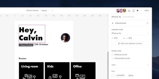
New Pages Panel and UI Changes
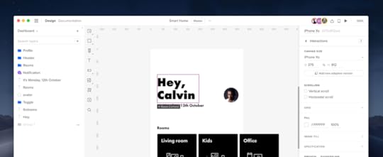
After improving Layers last month, we’re excited to launch the improved Pages panel and a reorganized Top Bar. While Pages come with a set of features and performance improvements, the new Top Bar has now more space and keeps related things together.
Pages and Layers in one panel
Up until now, Layers and Pages were two separate sections in Quick Tools. From now on, you can access both in the left corner of the bottom bar with a single click.
You can collapse the Pages panel by dragging the horizontal line that separates Layers from Pages all the way up or double-clicking on it. When the panel is collapsed, a down arrow will appear next to your current page name. Clicking the arrow icon expands the Sitemap, where you can quickly switch between pages. So if you’re dealing with a large project with plenty of pages, you’re going to love this one! Read more about it in Docs.
A whole new context menu
Right-clicking on a page name in the panel opens the new contextual menu with a full set of features for the page you’ve selected – add a page, delete, open in a new tab, duplicate and rename. To rename a page even faster, double-click on a page name in the panel and start typing.
Delightful experience and better performance
Another great way to show how much we’ve improved the performance of pages is to compare adding, reordering and duplicating pages before and after the changes.
To add a new page right below your current page, just right-click on the page name and choose Add Page. This adds a new page immediately below your current page and opens it. Previously, adding new pages was possible only from the top of the Pages panel. Plus, you always had to name the page before it was sent through the network and appeared on the list.
You’ll also notice a big difference when you reorder your page by dragging and dropping them on top of each other. Before the change, you’d have to wait before the pages get grouped. Now, it happens in the blink of an eye.
When it comes to duplicating pages, we’ve made it work a lot faster than before. You can now duplicate multiple pages at once. Gone are the days when you had to do it separately for each. Better still, if a page has child pages, duplicating it will copy the entire tree at once.
On top of that, there are two new ways of selecting multiple pages. Shift-click selects the first page, last page and all pages in between, whereas Cmd-clicking allows you to pick selected pages.
Hide the entire UI
If you want to view your design without the UI, you can now toggle the visibility of the entire UXPin UI by using the Cmd \ shortcut (Ctrl on Windows).
Reorganized Top Bar
Just as mentioned in the headline, with this update our Top Bar has been a bit reorganized. We’ve shuffled things around a bit by putting together options that are related. Here’s what’s changed:
You can now access Prototype Actions in the middle of the Top Bar. That’s where you can create a new iteration of your prototype, export and rename it. The name of the iteration you’re currently editing shows in the rectangle next to Prototype Actions. Click it to access the list with all your iterations where you can retrieve them, delete or rename iterations with a double click.
Documentation and Design modes are now on the left side of the bar.
From now on, when working on the same prototype with your team, you will see their avatars in the Top Bar – just like in Google Docs. See more on Docs.
And if you’re looking for Accessibility Features, they are now in the bottom right corner of UXPin.
The post New Pages Panel and UI Changes appeared first on Studio by UXPin.
November 13, 2019
Adaptive Design and Ecommerce UX: How They Work Together to Boost Conversions

 Source: 3D Animation Production Company from Pixabay
 It used to be that if consumers wanted a product you sell online, that would be enough to warrant a sale. But as the ecommerce industry has evolved along with consumer preferences and psychological triggers, the standards have been heightened. According to Adobe, 38% of online shoppers will leave a website if they find the design to be unattractive. People not only appreciate a good user experience (UX), they’ve come to expect it.
This article touches on what ecommerce UX is, and how adaptive design goes a long way to improving it and boosting your conversion rates.
Mobile Ecommerce Stats
But before diving into ecommerce UX and adaptive design, take a gander at these ecommerce stats:
By 2021, 53.9% of all US retail ecommerce is expected to be generated through mobile. And that number is even more significant in emerging markets, as the share of mobile ecommerce is expected to reach 72.9% by 2021, up from 58.9% in 2017.
According to Shopify, the greatest factor hindering the total domination of mobile ecommerce is the absence of mobile optimization of many ecommerce stores. For mobile optimized stores on the Shopify platform, 77% of traffic came from mobile devices, while driving 67% of orders.
After averaging rates from 40 studies, the Baymard Institute found that the global cart abandonment rate is close to 70%. Meanwhile, another study found that 60% of shoppers report leaving a transaction due to extra costs like shipping fees. Additionally, a slow website can increase abandonment by 75%, while dropping loyalty by 50%.
Defining Adaptive Design and Why It’s Important to Ecommerce UX
First Off, What Is Ecommerce User Experience?
 Source: https://synerise.com/blog/Tips-and-Tr...
In its most basic sense, the foundation of a good ecommerce UX design is one that provides a simple, easy to understand, and enjoyable shopping experience. This entails, among other things, having a web design that’s clean and easy to navigate – and one that provides a purchasing process that’s as intuitive as possible.
It’s not far removed from physical stores. What would you do if you found yourself entering a shop, find the display cluttered, couldn’t find what you’re looking for, while finding the sales associates to be inattentive to your needs? Chances are, you’d just leave – feeling annoyed and swearing never to do business with that shop again. It’s the same for online shoppers. If they can’t find what they’re looking for, aren’t presented with the payment options they prefer, or find any part of the process of the shopping experience confusing – they’re likely to bounce from your site just as easily as they came in.
But even when you’ve presented all the most pertinent information to consumers—things like price, discounts, customer reviews, product availability, and shipping options, sometimes that’s still not enough. Especially, when the web design isn’t suited to the device they’re using. Enter, adaptive design.
Adaptive Design 101
 Source: Negative Space from Pexels
Adaptive design is essentially a user interface (UI) that adapts to different screen sizes. In this approach, when the system detects your device’s browser size, it automatically selects the layout that’s most appropriate for your screen – whether it be a smartphone, tablet, or laptop.
It’s easy to confuse adaptive design with responsive design because both ultimately want to present the optimal layout for different devices. The difference is that in adaptive design, the content follows a fixed layout size, compared to responsive design, where it moves dynamically. This means that in adaptive design, there are a few fixed layouts created for the most common screen sizes (320, 480, 760, 960, 1200, and 1600) from which the best one suited for device is selected.
Tips on How to Improve Ecommerce UX with Adaptive Design
Choose Elements That Function Well
That is, as opposed to choosing those that look nice. This has been the case for design trends that, while attractive and fancy, have merely come and gone. These include things like parallax scrolling, video backgrounds, autoplay, and image carousels.
Keep in mind that what online shoppers want are very basic: an easy access to products, detailed information, and easy selection and checkout process. There’s a time and place for creative design, but functionality should always be the priority.
Maintain An Updated Website With Accurate Details
Nurturing user experience is largely founded on building trust and consistency. How would you feel if after searching for a company’s website, you find that their phone number is no longer working? Of what would happen if you find an address on a website, drive there, and find they’ve moved? That’s incredibly frustrating.
And to a certain extent, it’s even more frustrating when it comes to ecommerce. Everything needs to be on point—prices, product images, shipping fees—everything. If it concerns your products and how customers can get their hands on them, it should be updated with accurate details.
Use Microinteractions To Improve Ecommerce UX
Essentially, microinteractions are design elements meant to accomplish a single task, while also improving the natural interface flow. These can be used to:
Guide the user through the website more intuitively.
Reduce user anxiety, boost comfort, and provide a more natural interplay.
Reduce errors, and provide immediate feedback.
Improve user interaction.
Optimize Adaptive Images
One of the biggest culprits for slow loading pages is imagery. To address this, you can use tools such as Adaptive Images, which is a small PHP script that detects the screen size and automatically resizes, caches, and serves a scaled-down version of the image. The tool also has customization features that allow you to set the image quality and browser caching.
Optimizing images is an aspect that’s easy to overlook, especially with everything that’s going on in an ecommerce store. But even when promoting on mainstream platforms like Instagram, you need to be aware of optimal image sizes.
Analyze User Behavior
If you’re just starting with your ecommerce store, you can kick this practice off with the simpler things. For example, you can analyze users’ search patterns, so you can get a better idea of their interests and preferences. This will allow you to make more intelligent recommendations, which can boost your conversions. You can also track their locations and location history so you can provide information in context with where there actually are. This information could be useful not only for shipping purposes, but also for presenting offers relevant to where they are.
Then, as you build a system that’s capable of performing more intricate analysis, you can use that data to provide an even more seamless ecommerce UX to your customers and use other psychology principles in your design.
Exclude Unnecessary Elements
This has already been touched on in the examples above, but it still bears emphasizing. And to truly understand which elements are necessary, you should have a good understanding of your users. You can do this by testing different elements on your website. By using a properly set up analytics, you can find out which features users are using, and you can start taking away those that aren’t being favored.
Examples of Adaptive Design in Ecommerce
Staples
 Source
There are a few things to note from office equipment retail giant Staples’s mobile website. While you would expect to have fewer elements on the mobile site compared to its desktop counterpart, Staples committed to focusing on what users on smaller screens are more commonly looking for. These include things like the location, contact details, and store hours of the store closes to them; basic shipping details; product info and ratings. Color psychology is also leveraged – red for CTAs, and a blue “Add to Cart” button to elicit trust.
The number of featured products is also less on the mobile site, making it load fast even when connectivity is sub-optimal. As you can see, the Add to Cart button is also placed within reach of a mobile user’s thumb. That’s, quite literally, a great touch.
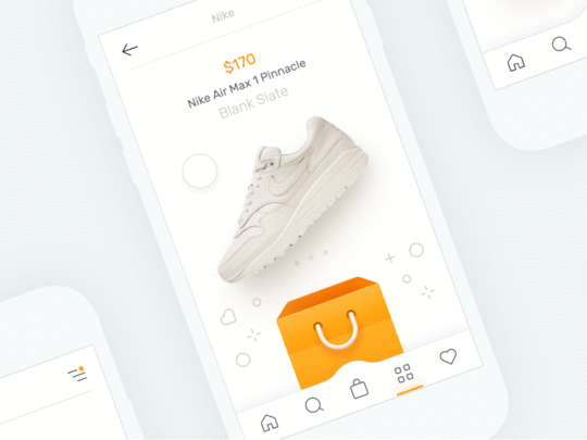
Nike
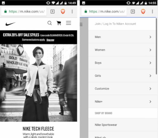
Nike does a great job of presenting users only with what they need, while still having all the necessary options just a few taps away. Case in point: while the desktop design has a looped video on the homepage, the mobile version only has a static frame – done so to save on bandwidth and hardware resources.
They’ve also cut down on the menu on top of the mobile page, but puts all the other elements inside the hamburger menu, allowing you to access all options from one place. As well, while an individual item shows a men/women menu, on the mobile site, users can just tap the “Refine” link to access search customization options.
Air France
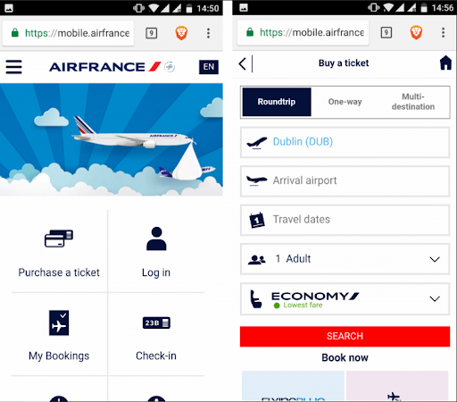
Speaking of just presenting the essentials, Air France does just that with its mobile website. As you can see, the most important options: Purchase a ticket, Log in, My Bookings, Check in, Flight Status, and Information, are all presented with their own icons. This allows mobile users to do just what they need to do, with zero distractions.
Takeaway
As you’ve learned, implementing adaptive design has a host of benefits for your ecommerce business. And while a lot of it has to do with providing an overall better UX for your customers, it inevitably also trickles down to improving your conversion rates. More importantly, it’s more than just a design trend.
With the mobile-first approach becoming a necessity in today’s digital world, embracing adaptive design is at the core of designing not only for different devices, but also for different users. And with a plethora of online tools (like an extremely useful UI kit)that can help you provide better experiences for your customers, there’s no reason not to go all in on implementing adaptive design for your ecommerce store.
Off the bat, what design improvements do you think your ecommerce store can benefit from? Let us know in the comments.
The post Adaptive Design and Ecommerce UX: How They Work Together to Boost Conversions appeared first on Studio by UXPin.
November 7, 2019
Improved Guides, Pencil Tool, and Adding Images in Bulk
While constantly working on more improvements, we wanted to take some time to share with you some other exciting product updates that are taking place. Upgrades to Guides, the Pencil Tool, and adding images in bulk are what has been shipped this time.
Guides just got smarter
Smart guides and guides are one of those features that should be barely noticeable if they work properly. So we’ve decided to make them smarter with this update! You can now remove all guides at once or choose to remove only the horizontal or vertical guides. Just right-click anywhere on the canvas and select one of the options from the context menu. So you’ve got more time to spend on things that actually matter! Read more on Docs.
Better still, you can also check the distance from a selected element to a guide. Just hold Alt and hover over that guide. Plus, guides now snap to elements and canvas edges!
Now a word on smart guides. Often when you want to be more precise, you’ll use keyboard arrows to move elements. From now on, smart guides also show when you move or resize elements with keyboard arrows. Find out more about it on Docs.
Add images in bulk
You can now add multiple images at once and choose exactly where you want to place each of them. Click anywhere on the canvas to add an image with its original size or click-and-drag to define the size. If you selected more images, you will also see how many images you have left to place on the canvas. See exactly how it works on Docs.
Draw any shape with the Pencil Tool
With the recently introduced Pencil Tool, drawing shapes and quickly sketching ideas feels like a breeze. You can draw any shapes freehand and it’s great for quickly sketching and jotting down rough ideas. Then, fine-tune them the way you want. Plus, everything gets magically smoothed out once you’re done drawing as UXPin simplifies the path. Read the tutorial on Docs to find out more.
The post Improved Guides, Pencil Tool, and Adding Images in Bulk appeared first on Studio by UXPin.
November 6, 2019
How UX Influences Gaming Experience
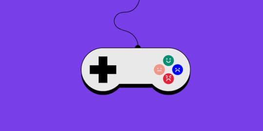
The gaming industry generated more than $135 billion in 2018 and is expected to generate more than $180 billion in profits by 2021. This is enough evidence that the industry is a goldmine waiting to be exploited. Its popularity has grown tremendously, especially in the last decade, and this is attributed to a number of factors. Relatable storylines, vivid graphics, and seamless gameplay are just some of the reasons why people spend lots of money and time playing games.
For a game to be loved by players and generate revenue as intended by the developers, it has to be appealing. There has to be something unique about the game which will make people of all ages and walks of life want to download and play it. Whatever the unique aspect of the game that makes it go viral, there is always a bottom line which it has to achieve — a seamless user experience. Therefore, the question most developers ask is how to improve the user experience of a game?
3 Don’ts and 3 Dos of Game UX Design

To help you get the most out of your brainchild and increase your chances of making it a killing, we have put together a guide of dos and don’ts. So, read on if you want to create better products!
Don’t over-use additional effects
In a bid to impress their users, some developers go out of their way and add extra dramatic sounds, actions, and unnecessary animations to their games. Whereas a little spicing won’t certainly hurt, over-using effects will influence the gaming experience and take away the authenticity of your game.
For instance, the choice of sound effects can make someone like or dislike your creation. Using overly dramatic sounds for simple actions will make the gamer turn off the sound when playing. That is already a dip in the ratings of the game. Always opt for subtle effects, which complement the genre of the game and the overall gameplay.
Don’t make it ambiguous
When creating your game, try and avoid ambiguity by exploring a single idea. Concentrate on making the game as relevant to the key concept as possible. In a bid to diversify their games, some developers incorporate more than one storyline and this makes their games overwhelming. Although parallel or branching storylines are capable of attracting some players, such games make for bad user experience, generally.
A good example of a non-linear game, which flopped because of ambiguity, is Superman. Incoherent storyline combined with overly complicated missions and technical flaws made the game a complete failure. Superman is named by many as the worst game of all time.
Don’t over-monetize your game
Yes, we get it, you want some form of reward for your efforts of creating a stellar game. But monetization might just be the killer of your game. Of course, it doesn’t hurt to throw in an ad or two and a few premium features. But completely making the game about money will chase away a lot of users and eventually kill your game’s prospects.
The integrity of your creation should NEVER sway towards money. Concentrate on creating brand loyalty in your game through the user experience and once the user demographic grows, your income streams will increase.
A good example of a game that is not overly monetized but still gives the creators billions every year is Candy Crush. There are a few ads and premium features in the game but the few generate billions every year and the game is a massive success.

Do ensure the game is player-centric
When developing a game, always think about the target audience and try as much as you can to make the game all about the user. You should design it so that the player is connected both to the storyline and to the characters. The connection will help you retain users and integrate new players.
A good way of making games player-centric is through flexible customization options in the game. Players should be able to change the theme colors and even customize the characters to their liking.
Do make game rewards obtainable
Rewards and milestones in the game are very important. They make users want to play for longer to get more prizes and unlock new levels. The higher the level a player achieves, the more immersed they will be in the game. When designing your game, you should try and make the rewards obtainable and the milestones appealing.
Temple Run made very good use of achievable rewards to unlock new characters and maps, thus keeping players glued to their phone screens. The rewards should not be too obvious but making them too complicated will affect the user experience and scare away potential long-term players.
Do ensure the intuitive gameplay
Flappy Bird garnered a million downloads in under a week because of how intuitive and instantaneous its gameplay was. It needed the user to be very assertive and quick in reflexes, and this is why millions played the game every day before it was taken down.
Always try and make your game as engaging as possible and focus on the reactions of the user. This way, the results will be very positive.
To sum up, we can conclude that the user experience design is an integral part of the development process of any game. The UX design can make or break the fortunes of a game, so you should, therefore, take a lot of time and put a lot of consideration into it.
The post How UX Influences Gaming Experience appeared first on Studio by UXPin.
October 28, 2019
5 Things to Know about Light and Dark UI

“Should I go for the dark theme that might make my app look more cool and trendy, or should I choose the white one? Choosing the right interface for your product can be insanely tricky at times. And every time I try to figure out what’s the thinking behind it; my curiosity raises. To kick off this process, – Here’s the kicker…”
“Many times I feel DUMB because I don’t even know where to get started.”
“People often get on my nerves when it comes to learning code; I really don’t wish to.”
“Being born with NO design talent whatsoever! I exactly know it when I see something nice, but when it comes to designing ANYTHING from scratch I am clueless.”
“I’m WAY too busy with other things in life so I am looking for a web design software that’s easy to use, and can make my website look good.”
All these thoughts seem so scary, aren’t they? Now tell me something – are you someone who is probably feeling a bit lost while looking for a good web design software? Fret not buddy, here you will learn how to build a website that people won’t laugh at. Also, building your first website doesn’t have to be so scary. So, sit back, relax, grab a cup of coffee, and read away.
As soon as you start designing a new project, one of the first considerations you need to think through is choosing a relevant color scheme for the user interface. It’s important because the color scheme will have a long-lasting impact on the overall user experience of your product. Let’s say, for example, UI is what the car looks like, UX is how it drives or imagine UI as a dating profile, UX is how the date goes — getting Goosebumps already! The point is, UI is much more than a coat of paint that features an entire environment, a multi-faceted construct where everything counts starting from color theory to layout, font selection, smallest elements like every single pixel.
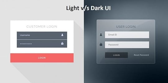
And here the confusion begins. As an endless flow of choices surrounds us all, we often end up thinking. What’s better, a light-based user interface or a darker one? Or should we let data drive decision-making or simply rely on assumptions or personal preferences? More often than not, there is no cookie-cutter answer to any such decision; it is mainly based on personal preferences and assumptions rather than solid data. In my eyes, anything claimed or predicted without any facts or figures is useless. Further below, I would like to shed some light on certain factors influencing the choice of the color scheme.
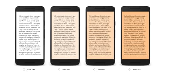
Readability and Legibility – Let me explain the point scientifically. I am sure you will agree that the sun, planets, and other bodies emit electromagnetic energy of different wavelengths? A portion of that spectrum is visible to the human eye; of course, depending on the wavelength or the color of that light. For example, a clear sky is blue because clean air scatters blue light wavelengths more than red ones.
In addition to this, wavelengths can boost our levels of attention, mood, and reaction time during the day. It’s a different story at night, though. And that’s the reason why e-book services, such as Google Play Books, introduce features such as “Night Light” for reading.
Another aspect that has been widely used across the globe is dark text on a light background. This was all for readability; for legibility you need to know what it means. It measures how quickly and intuitively users can distinguish letters in a particular typeface. This aspect must be taken into consideration, especially when the interface is filled with a lot of text. For example, black copy shown on white or light background seems to be larger than the white copy on a dark background. In any case, if the user is unable to scan the data, even more — even if the data is relevant but not readable nothing can stop from switching towards your competitor. However, it certainly does not mean that interfaces with a light background are more readable. So what you can do is use colors with high contrast between the text and the background.
Accessibility – While creating a theme, keeping the contrast between the background, text colors, font size, and other accessibility factors is extremely important. After all, you are creating a project for people who aren’t YOU, but for a broad range of users. To be precise, something that might have worked for one user might not work for another; a younger audience has different needs and preferences than an older audience. Apart from age, special needs, or disabilities, all of these can also determine the choice of color for the background and layout elements. Here the keyword is to research well to get closer to the target audience.
Clarity – in a general sense it is defined as the ability to see and distinguish all the core details on the screen or page. Let’s take simplicity and intuitiveness of navigation for starters; if your end-user can easily find zones of information and elements of interaction just by scanning the layout, he or she doesn’t need to put much effort in getting what they are looking for. In case the aspect is not tested properly; it might lead to weak visual hierarchy ending up in a complete mess. So what you are required to do is to check if the interface is clear and contrasted enough. In the end, everything has to be easily reached and noticeable.
Responsiveness – In layman’s word, the responsiveness of the interface means that what users get is usable and functional irrespective of the device they prefer using. For example, if something which looked stylish and appealing in Sketch on a high-res professional monitor may turn into a dirty stain on the small resolution screen. I am sure you must have encountered a situation where some color schemes looking nice at the design stage may lose their beauty in a variety of everyday conditions they are applied in. Provided the fact that a color scheme can have a significant impact on color, shape, and copy perceptions, one should test project on diverse devices and screens before making the final decision.
Environment – Last but certainly not least, is a question in which environments these web and mobile interfaces will be used. For example, for constant use under natural light, a dark background can literally create the effect of reflection, especially on glossy screens typical for tablets and smartphones. In a bad environment, a dark background can take the light away from the screen leading to bad influence on navigation and readability. In a nutshell, color combinations, contrast, and shades draw big attention here.
When to use dark UI?
When there is little text to read and more images/videos to watch
When there are very few elements in the design and are spaced well
When you want to give your users the feel of a dark environment like in a movie
When you want the core element of the page to stand out and gain prominence
When you want to reduce eye strain and make it comfortable for users to stay long in your website
When to use light UI?
When your website or app will be used mostly in the daytime
When your readers will be reading a lot of text
When there are a lot of elements on the screens
When you are using different color elements
Over to You!
Designing is all about creativity! Let’s not rules bind it in fact, come up with something that boosts user experience and realize business objectives. Just go for it!
The post 5 Things to Know about Light and Dark UI appeared first on Studio by UXPin.
UXpin's Blog

- UXpin's profile
- 68 followers

