
UXpin's Blog, page 91
August 25, 2020
Website Structure: 7 Visual Examples to Illustrate Site Structure For Designers
The structure of your site determines how easy it is for users to navigate your site and find the information that they are looking for. This article will explain why site structure is important for designers and how designers can create effective site structures.
What is website structure?
Your site’s structure is how the different pages on your site are interlinked and their hierarchy. It is how the information on your site is organized and presented. Good website structure facilitates easy navigation for both users and crawlers which improve the SEO ranking of your website.
Why is website structure important for designers?
The role of a designer is to create a website that has a great UX and is easy to use. A great website structure improves the usability or user-friendliness of your website by making it easy for users to find what they are looking for. To create a website structure, you need to map out how you will organize the content on your site (homepage, categories, individual page, blog posts).
This is why website structuring should be the first step in any web design project.
How to choose the best structure for your website
The underlying principle in great website structure is Information Architecture (IA). IA ensures that content is organized, structured, and labeled effectively and consistently. For you to create the best information architecture for your website, you need to consider the following factors:
User journey: Since websites are created to serve users, it is important to consider how they might experience or interact with your site and their expectations of how your website should work. You can determine the journey of your users through interviewing them or doing a card sorting exercise. Content: The structure of your website will also be largely determined by the type and volume of content on your site. The structure of an e-commerce site will be different from the structure of an academic site. Context: The context of a website is determined by its business goals, the cultural context that it exists in, and the resources available. It is important to consider this fact as you structure your website.
Elements of good website structure (plus visual examples)
The most common website structure is a hierarchical one that is based on one parent page (main page) and child pages(categories and sub-categories) that flow from the main page.
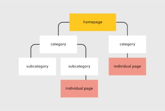
Hierarchical website structure
Let’s look at each of these elements and how you can optimize them during your design process
Homepage
Your homepage is the top page in your website hierarchy and the central place where users navigate your website from. Ensure that all the important pages on your website are linked from this page. The relationship between your homepage and the main category pages is represented by your website’s menu or main navigation.
Here’s how to design a useful navigation/menu for your website
Navigation/menu
Your site visitors will use the navigation to understand how information is structured on a website and to find what they are looking for. Ensure that all your main category pages are represented on your menu or main navigation. Additionally, use the following rules when creating your navigation:
Use short phrases or even one word for each element.Use simple language that your users can understand. Don’t clutter your navigation.
Apple’s main navigation follows these rules to create a simple but super-useful menu.
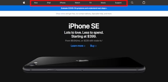
Main navigation/menu (Source)
If your site has some subcategories that are useful for users such as their account information, you can create a secondary vertical menu like the one the Asos has.
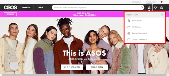
Secondary vertical menu (Source)
Other useful categories such as utility pages (privacy policies, disclaimers and legal information) can be placed on the footer of the website.
Categories and subcategories
Use categories to group website pages that have similar content which makes it easy for users to access the content. Blog posts can be grouped into categories such as ‘marketing’ and then be further subdivided into subcategories such as ‘landing pages’ and ‘email marketing.’
If you are designing an e-commerce website, you can group your products into categories such as ‘men’ and ‘women.’ If your categories are too many you can further subdivide them into subcategories. Continuing with our example of an e-commerce store example, the women category can have subcategories such as ‘clothes’, ‘shoes’, and ‘handbags’.
A great example of this is the Asos Marketplace website where their clothing category has a subcategory that shows the types of clothing available in the marketplace such as swimwear, sweatshirts, tracksuits, and hoodies.
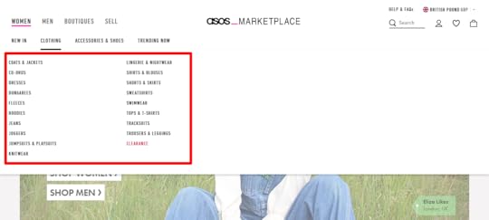
Categories and subcategories (Source)
Individual Pages/Posts
It is important to structure your individual website pages or blog posts in a way that makes it easy for users to find what they are looking for, find similar content and understand where they are on your website. Breadcrumb trails, tags, and contextual links are used to structure information on individual pages.
Breadcrumb trails
You can add navigation on your pages or posts in the form of a breadcrumb trail. A breadcrumb trail is made up of clickable links that show users exactly where they are on your site plus your site structure. Breadcrumb trails like the one used by Mailchimp improve usability and user experience.
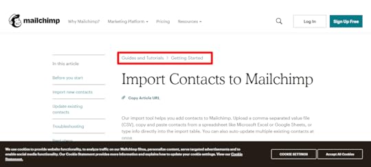
Breadcrumb trail (Source)
Tags
Tags are another useful way of grouping similar content on a specific page. The difference between tags and categories is that categories have a hierarchy and can be further subdivided into subcategories but tags have no hierarchy. They simply group similar content.
For example, Grammarly’s blog uses tags such as ‘how to,’ ‘product’ and ‘inspiration’ to group blog content.
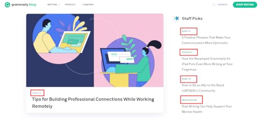
Blog tags (Source)
The usefulness of these tags is displayed when a user clicks on one of the posts tagged ‘how to’ and they are shown other posts that are also tagged ‘how to’ at the end of the blog post. This is a great example of how website structure makes it easy for users to find information.
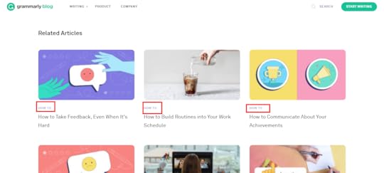
Related tags (Source)
Tags can also be used in e-commerce websites to group products according to brand and direct users to similar products.
Here are the best practices for creating tags:
Don’t create too many tags or a new tag for every post.Place tags in a place where site visitors can easily see them such as your sidebar or at the end of your blog posts/product pages.
Contextual links
These are links on webpages or blog posts that point to other relevant content on other webpages. Contextual links are useful in showing users related content. In the context of a blog post, contextual links can be used to point users to other blog posts that have similar content. Grammarly does this in their blog post as shown below.
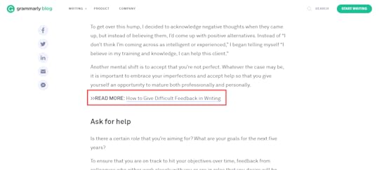
Contextual links (Source)
Contextual links can also be used in e-commerce pages to link to pages that have related items, what other people have bought, or which products are often bought together.
Easily Incorporate Website Structure In Your Designs
Web structure is how information is organized and interconnected on a website. An effective site structure improves usability and user experience which makes web structuring an important step in the web design process. The UXPin platform makes it easy for you to design, prototype and structure your website as you collaborate with other team members and designers.
The post Website Structure: 7 Visual Examples to Illustrate Site Structure For Designers appeared first on Studio by UXPin.


August 20, 2020
Atomic Design Systems: A Checklist for Each Individual Design Component
Are you following every step that leads to success? Use this checklist to make sure that your atomic design system includes all of the individual design components that you need to build amazing UIs.
What is Atomic Design?
Atomic design is a design system created by Brad Frost in 2016. Frost wanted to create a design system that made it easy for him to focus on essential elements like color, typography, and texture. While exploring his ideas, Frost kept returning to the connections he found between design processes and chemistry. Naturally, he decided to call his approach “atomic design.”
Frost’s original approach included five categories:
AtomsMoleculesOrganismsTemplatesPages
The farther you move up the chain, the more complex the design becomes. At the Atoms level, you work with the basic building blocks of a design, such as color palettes and fonts. At the Molecules level, multiple atoms work together. For example, you might pair a specific color with a particular font.
By the time you reach the Pages level, you have a fully developed design. The design has opportunities to evolve in the future. For now, though, you have a design that meets your goals.
Frost calls this approach “atomic design” because it begins with the smallest element.
In chemistry, atoms are the smallest things to work with. In design, the smallest factors might include colors and buttons. Also like chemistry, the more atoms you put together, the more complex the project becomes.
Eventually, you have a functional creature built on the smallest elements possible.
When you design from this perspective, you should find that you create more consistent, simple, effective products that users will enjoy.
Atomic Design System Checklist
Design LanguageDesign TokensCore ComponentsToolingProject Management
Design Language
A design language defines a project-wide style that guides teams toward a common goal. When done well, the design language helps products stand out from competitors. Some developers create design languages that guide product lines. When this happens, an app released today will share similarities with a website released two months later.
Developing a “Brand”
Designers successfully develop a brand when they create design languages that consumers recognize across products. When the average person knows that product A and product B comes from the same company, a brand has been established.
Developing a brand takes time as well as design skills. As a company releases more products, it has more opportunities to solidify its brand.
Copy and Content Requirements
Design language also includes copy and content requirements. Copy requirements may force writers to use a slogan on each page. Writers may also need to follow the same style guide to make sure they create a cohesive experience for users.
Content requirements can refer to any visual element. For example, the design language may require that the company logo appears at the same place on every web page.
Industry-Leading Examples
Industry-leading examples of design language mastery include Apple and Volkswagen.
Apple maintains a sleek aesthetic for every product, including its hardware, websites, and applications.
Any tech-savvy consumer will recognize an Apple product immediately.

Image location: https://cdn.arstechnica.net/wp-content/uploads/2019/09/applewatchseries5_7-800×534.jpg
Volkswagen built an alluring design language with its VW Beetle and Bug revival. The cars have a friendly design that welcomes drivers and promotes positive feelings.

Design Tokens
Design tokens make it easy for teams to maintain cohesive aesthetics while collaborating. Design tokens can include a color, font, or icon. Frost actually thinks of design tokens as sub-atomic particles. They’re more like quarks than atoms. When you put several design tokens together, you get an atom. When you start your design here, you ensure consistency throughout your project.
Color Palettes
A color palette includes all of the colors that your design team will use in a project. You can include dozens of colors to the palette. You shouldn’t add too many colors in a palette, though. Doing so will make it harder for designers to understand the intended aesthetic.
Typography
Many people think of typography and font as the same thing. There are small differences, but you don’t need to worry about them unless you design your own type.
Layout
A layout defines where items sit on a page. For example, a website may have a menu that stays on the left side of the screen, or a collapsible search bar that disappears when not in use.
Iconography
Iconography includes small images that digital designers use. You may use icons as guides for navigation or choosing features on a page.
Industry-Leading Examples
Many companies succeed because their designers know how to use design tokens extremely well.
Netflix stands out as a fairly recent example of a company that has mastered design tokens. The Netflix website follows a simple grid layout that helps users navigate their options.
Each page includes the Netflix logo. The company further emphasizes its understanding of design tokens by using white and red letters wherever possible.

Imagine location: https://streambly.com.au/content/expressvpn/netflix_us.jpg
Core Components
Core components occupy the atomic level in Frost’s atomic design schema. A web page or app needs several core components that users interact with. Core components can include buttons, search forms, and tabs.
What Makes for Effective UI Components?
Effective UI components need to work harmoniously together to give the user an intuitive experience. Ideally, new users can look at their screens and know what component they should touch to launch a feature.
The design of each component can contribute to a UI’s overall success. A green sign that says “Go” makes an extremely simple component that nearly everyone will understand.
As you add components to your UI, you need to think about how they work together. Does opening a hamburger menu push the search bar out of the way? Some users may find that frustrating. Are the icons so small that people can’t tap them without launching other features? You will lose users quickly when they find that the UI fails them.
Industry-Leading Examples
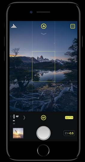
Image location: https://miro.medium.com/max/500/1*7l-68_33Vz7tlAlobxpBmg.png
The smartphone photography app Halide excels at using UI components effectively. When users open the app, they see a small section of their screens that control the camera. The large circle clearly indicates that pressing the element will snap a photograph.
The app improves the user experience even more by displaying a small version of the previous photo. Users do not have to navigate away from their cameras to see what image they just took.
Tools and Platforms
UXPin’s platform offers several features that can help designers follow atomic design principles. Some of the most useful features include:
Design systemsLibrariesInteractive elementsData inputs
Project Management
Project management involves making sure every step happens on time. Design collaboration only works well when someone manages the project. Without strong management, members of the team might find themselves waiting for someone to finish a job before they can contribute.
Project Management Tools
Some of the most popular project management tools include:
TrelloBasecampAsanaMonday.com
These project management tools work well because they let administrators assign tasks, set deadlines, and adapt to schedule changes.
Collaboration and Communication
Some of the best project management tools can also help your team collaborate and communicate. Asana, for example, lets users update each other on project milestones.
You don’t need independent collaboration and communication tools when you choose a UI design platform that offers real-time collaboration features. UXPin has seamless collaboration that works like Google Docs. You can watch your colleagues move elements across the screen.
UXPin will also let unofficial users provide feedback. Send a link to a trusted colleague or stakeholder to get meaningful feedback that contributes to your project’s success.
Create Your Own Design Systems
UI designs want to create intuitive environments that show off a brand’s personality and help users get the services they need. Many of those goals start with creating your own design system. Once you establish your design standards, everyone on your team will know how to stay within the guidelines.
UXPin makes it simple for you to create your own design systems. When making a design system, you can:
Create a UI inventory with a list of accepted patterns, colors, icons, and copy.Establish design principles that will direct other team members.Build a color palette that prevents other designers from straying.Build a typographic scale that includes type fonts, weights, line-heights, and other features.Provide examples of designs that you would like to see other team members imitate so they can create a cohesive UI experience.
Now that you have a checklist of design components that will lead you to success, put it to practice by starting your free trial with UXPin. UXPin has all of the features that you need for atomic design. Come experience how simple designing and prototyping become when you have a platform that can do it all.
Get started now. You don’t even need a credit card number to explore UXPin’s powerful features.
The post Atomic Design Systems: A Checklist for Each Individual Design Component appeared first on Studio by UXPin.
August 19, 2020
User Story Mapping: 4 Effective Examples That Create a Better User Experience
“User story mapping is a facilitated, curated conversation that brings everyone along for the journey.” — Nick Muldoon, Co-CEO, Easy Agile
Allowing development teams and product managers to better understand the customer journey and prioritize their work, user story mapping will allow you to optimize a product or service. In doing so, this allows teams to design and build a better product based on the customer’s desired outcomes.
The ultimate goal is to create a positive user experience.

This holistic visual view of a product often requires an all hands on deck approach. From engineering and UX/design teams to legal and marketing teams — and everyone in between, user story mapping may be a simple concept, but the payoffs are immense.
Why Should You Map Your User Story?
The benefits of user story mapping are vast, including:
The ability to visualize a product from a user’s perspective. More specifically, a user story will keep your user front and center.Being able to better prioritize the necessary work in order to complete the product as anticipated — both in terms of the desired timelines and overall outcome.Your ability to achieve cross-team clarity. Knowing what to build for who, why, and when will help guide the process, allowing everyone to communicate in a way that supports the overall product journey.
Bottom line: When you’re working with multiple teams, most teams will focus on their specific tasks, missing the mark in terms of the big picture. When the entire user journey is mapped out, this can also help identify any potential holes in functionality. Current and subsequent releases can also be better prioritized.
The User Story Mapping Process
A user story map can be completed using either physical or digital mediums and resources. Think whiteboards and sticky notes vs software tools. The goal is to create a story arranged on a horizontal axis, showcasing the customer journey. Once complete, you can visualize all of the ways in which a user may interact with a single product
Consider Your Products or Services
To begin, not only should your team(s) be defined but also all of your product or service requirements. Then, your main objective should be bringing a minimal viable product (MVP) to life. This is essentially the earliest version, which will include the most critical features only. Think about your desired outcomes and create a solution.
Read more: How to Write a Painless User Story
Please note: When considering your product or service, leverage all of the data you have on user personas. This information will serve as the core basis of your user mapping story.
Develop a Story Map or Multiple Maps
Once you have a clear understanding of what will be involved, it’ll be time to build the actual map.
Step one is to writer user activities. Once again, these are based on your personas. These activities are the backbone of your story and will support the development of future development. Activities are broken down based on core “epics” — these are the fundamental steps of the customer journey, often represented as “high-level features.”For example, Organize email — Manage email — Manage calendar.Step two is to write and develop user stories. At first, these stories will be fairly minimal, expanding based on the phase of the project. Remember, the goal here is to add value and meet the users’ needs. User stories are built in a grid, under epics and user activities.Based on the example above, for Organize email, user stories may include Search email — File email — Compose email. In comparison, Manage calendar may involve stories such as View calendar — Create appointment — Update appointment — View appointment.Step three is to prioritize user tasks, focusing on the tasks that are most important, this will allow you more effective plan releases. Tasks will be organized based on their releases, adapting and evolving with the product or service. Once again, using the example above:Organize emailUser story: Search emailRelease 1: Search by keywordUser story: File emailRelease 1: Move emailRelease 2: Create sub-folders
Revising Your User Story Map
It’s important to remember that user story maps are a continual process. As steps are completed, new ones are added based on analytics and user feedback. For example, you’ll want to remain mindful of changing technologies, user behavior, and consumer trends.
4 Effective Ways to Visualize & Conceptualize a User Story
Whenever you’re creating a user story, think of the following formats in terms of user stories.
As [a persona], I can [select a need or goal], so that [I can accomplish this].As a [class of user], I want to [be able to do this] so that [I can gain some form of benefit].
Example 1: E-commerce site
Although not everything is necessarily linear, a user story is arranged in chronological order. Here is a fairly straightforward example in terms of an e-commerce site.
Search for an item –> View product –> View photo to better analyze product –> Select the item for purchase –> Enter payment info –> Enter shipping address –> Confirm order
In the example above, these can be grouped into the following activities:
Find product [Search for item]Product details [View product + View photo]Shopping cart [Select item for purchase]Checkout [Payment info + Shipping info + Confirmation]
To tackle a user story, activities, tasks, and sub-tasks are clearly defined, which are then prioritized.
Example 2: Book a flight
Online flight booking system.
Search for flight –> View flight info –> Confirm
Depending on the complexity of this user story, there will be numerous releases, which are then prioritized. For example:
Search for flightRelease 1 — Select by flight type – By availability – By locationRelease 2 — Integrate with 3rd partyView flight infoRelease 1 — Display times and layover airportsRelease 2 — View additional flight options and detailsRelease 3 — Make flight info available via APIConfirmRelease 1 — Fill in payment and contact infoRelease 2 — Incorporate PayPalRelease 3 — Incorporate Google Checkout
Example 3: Change a reservation
If a user wanted to alter their reservation.
View reservation –> Change reservation –> Cancel the reservation
View reservationRelease 1 — Search by reservation numberRelease 2 — Search by usernameChange the reservationRelease 1 — Change the date and timeRelease 2 — Change reservation type/add additional details (customizable field)Cancel the reservationRelease 1 — Provide contact info to cancelRelease 2 — Cancel online
Example 4
If a user wants to purchase a pair of shoes.
Find a shoe retailer –> Find shoes –> Choose shoes –> Purchase
In this case, depending on the specific user and their goals, these activities could be further broken down into “find running shoes” or “purchase a select style for the least amount of money.”
Find a shoe retailer [Open search engine and visit the retailer’s site].Release 1 — Create keywords (SEO)Release 1 — Display special deals and discounts on siteRelease 2 — Website homepageFind shoes [Open search bar]Release 1 — Search by style (i.e. running shoes)Release 1 — Search by sizeRelease 2 — Search by genderRelease 2 — Search by brandChoose shoes [Consider shoe details and compare shoes based on preferences]Release 1 — User reviewsRelease 1 — Compare offersRelease 2 — Shoe details (i.e. material, technology, etc.)Purchase [Select shoes and pay for shoes]Release 1 — ColorRelease 1 — Pay with gift cards or creditRelease 2 — SizeRelease 2 — Pay with Apple Pay, PayPal, etc.
The post User Story Mapping: 4 Effective Examples That Create a Better User Experience appeared first on Studio by UXPin.
August 18, 2020
Landing Pages: The Complete Guide to Effective UX Design
All online experiences should end in action, and landing pages are the moment the excitement your campaign generated crystallizes into a leap of faith. From simple ‘buy now’ buttons to more complex experiences, landing pages represent a commitment or decision from the visitor.
It is where people “land”. They are excited and curious, but are they willing to take the next step? This consideration makes landing page design a top priority when designing any kind of campaign or online experience. Sometimes it takes a little experimentation to get it right.
Motivating users to click, buy a product, fill out a form, or any other action means creating trust and confidence. The choice or commitment the user is making and the reward they get should be clear, and they should be able to take the action easily, on any screen or environment.
The success of the page depends entirely on people taking action, which will drive the strategy. Each landing page has its own purpose, function and audience, which constrains your design, depending on what the landing page is used for. These choices call for bursts of creativity but also intuitive design. Here are some best practices in building engines of action.
How to Ideate, Prototype, and Design Effective Landing Pages
One of the most evocative concepts in conversion design is the idea of a “information scent.” That’s the idea that site visitors follow a scent of the information they want as they navigate through the pages of a website’s landing pages.
At the ideation stage of creating a new landing page, designers should lay out the trail that they want visitors to follow. Then, during prototyping, you can assemble the most effective elements to engage conversion kicks at turning points.
Focus on your core services and products
It’s a different world than it was even a few weeks ago and the user has changed. Make sure your offerings are evolving with them. Before you begin the design process, the team has to come together around a coordinated vision. Landing pages can help you continually articulate the core value prop in your service and product statements and to test it fast and often with your target audience. The landing page is the fast way to convey that message without requiring a full site redesign. Can you encapsulate your offering in a short headline, brief description and clear, unambiguous call to action?
Consider your customer journey
A landing page may be the final destination of a campaign or online experience, but it may represent any number of inflection points in the customer journey. When the customer is ready to take action to learn more, take the next step or join a newsletter list, the landing page should facilitate their action with the least possible friction or difficulty. When they are ready to take action it should be immediately apparent how to do so and what the result will be.
How Effective UX and UI Elements Can Move Customers Along Their Journey
The customer journey is not a straight line. Viewers drop off, come back, bounce around from page to page and often seek outside input before taking the next step. The more effective your UX and UI elements are, the less they will need assurance from online reviews or friends and relatives. Apply design elements that reduce friction and guide users along to the next step.
Practice Effective Page Layout and Design
Visuals go directly to the emotional core of the buying decision in a microsecond. The best landing page is simple and clean, providing a clear path to the visitor. While it has to communicate a simple message, it must also strike the right tone and mood to appeal to the user without overwhelming them. An effective layout is visually appealing without being too busy. Users seek familiarity, so small departures from the norm can make a big difference, and A/B testing will help you learn what visual vocabulary appeal to the audience you are trying to reach. The core benefit should be clear to the user and clearly linked to the action.
Plot Out Your Copy and CTA Placement
What copy and language are you using? What is your offer? These will drive
All of your design choices, so lay down the basic formula and then choose the elements that support the language and intent. For example, a warm invitation requires a different style then a more formal offer. The purpose of copy and CTA is to reinforce the decision they have made when they landed on the page, and drive them to take action.
Don’t Forget About Mobile Responsive Design
Mobile access to the web passed laptop and desktop browser access several years ago. Still many designers tend to start with a wide screen format and then subtract elements to make it work on mobile. We strongly recommend the opposite approach – starting from a mobile responsive design template and then building progressive enhancement for the larger screens. Mobile first design prioritizes the mobile user, which ensures the page is viewable in any environment. It’s best to consider the customer journey and what kind of device the user is likely to be using. Testing can ensure that the experience is appealing and functional on any device.
Enable Users to Navigate Among Your Landing Pages
In a recent survey by Google-partner Wordstream, 40 percent of landing pages contain 1-3 links that lead viewers off the page. The number one destination for that link is the company homepage, connected to a logo. The problem is that once they hit the home page, you have lost the primary value of the landing page, which is to tell you where the viewer came from. There are arguments for and against additional links, but make sure that your primary focus is a link to another landing page that keeps your origin data clean.
5 Examples of Landing Pages That Convert Users
The landing pages with the best conversion rates balance five design elements for maximum impact: emotional images, appealing typography, strategic white spaces, motivational colors and relevant CTAs. Take a look at some of the best in the field.
Emotional Images

Some images are purely functional while others pack an emotional punch. Landing pages from Apple are designed to focus your attention on the devices using repetition and stark background color differentiation. You can do more with less when you start from the emotion you want to convey, and when you have a beautiful product.
Appealing Typography
Even a small family business can become a major player on the web by mastering the art of typography. Busy Beaver Button Co. shows how many different font and style choices can coexist on a tiny landing page without being distracting.

Strategic White Spaces
White space, or in this case gradient space, can make all the difference in the world. The BorderBuddy landing page demonstrates how to eliminate the hassles of transporting goods across international borders with a clean line of white text, two CTA buttons and a thumbnail. Not only is it mobile friendly for people on the move, it is as simple as the product promise.
Motivational Colors
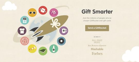
There’s a lot going on in the landing page for Gift Rocket, a site for sending cash gifts online. Instead of boring the viewer with details, this landing page conveys the core concept in a strong, central image of a rocket, surrounded by color-coded gifts. The colors are soft enough to not distract from the CTA, but dynamic enough to grab the viewer’s attention and stand out from the crowd. The range of colors suggests there’s something for everyone here.
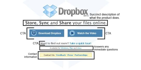
Relevant CTAs
The evolution of Dropbox landing pages is a lesson in how to deploy CTAs that drive action while occupying minimal screen real estate. Software for storing documents in the cloud could be a bit complex to explain, but they do it in three words: Your Stuff, Anywhere. With the extra space they can add two CTAs. See how Dropbox CTAs have changed over time to attract more enterprise clients.
Use the Best Tools for Prototyping and Design
You don’t have to reinvent the wheel to excel at building landing pages. The best tools on the market for prototyping and design give you the initial framework for your landing page and bring your team together around a clear vision of the goal.
Rely on UXPin for real-life prototyping tools and show your team how your landing pages will come to life. If a picture is worth a thousand words, an advanced collaboration tool like UXPin is worth a thousand pictures. Sign up for a free trial today and start building website landing pages that drive action. .
The post Landing Pages: The Complete Guide to Effective UX Design appeared first on Studio by UXPin.
August 13, 2020
Essential Microcopy Guide: How to Write Microcopy That Converts Users
Users have many fears and uncertainties that can hurt conversions. They might be afraid of being lied to, losing their money or they might not understand what they need to do. Microcopy irons out these kinks and empowers users to take action.
What is Microcopy?
Microcopy is the short words and phrases that are used in user interfaces to help users take the right action and interact with the product. Great microcopy converts users by:
Motivating them to take an actionContextualizing their experiencesAnticipating and addressing their issues Creating a delightful brand narrative
Microcopy is copy that is found in:
Form fields and labels Error messages Confirmation messages Button copy
How Effective is Good Microcopy?
From microcopy’s definition (small bits of short copy), one might think that it has a small impact. Nothing could be further from the truth, good microcopy has a positive effect on conversions and positive user behavior.
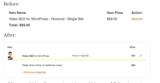
In a case study by Yoast, an SEO optimization site, there was an 11.30% increase in conversions after revising microcopy. They added “there will be no additional costs” and a ‘continue shopping’ text link to the checkout form. They also did away with the ‘remove’ microcopy and replaced it with an ‘x.’
Yoast’s microcopy changes (source)
In another case study, a Danish e-commerce site increased its conversions by 17.18% by simply adding the words “view bundle” above its CTA button.
Where to Leverage Microcopy on Your Site or App
CTAs
Calls to Action (CTAs) ask users to take a very specific task such as signing up, buying a product, or starting a free trial. The microcopy in the CTA button and around it is very useful in getting users to take the desired action.
Within the CTA, the microcopy should be short, action-oriented, and descriptive. Around the CTA button, microcopy should anticipate and reduce any friction or barriers that the buyer might have towards taking action. Microcopy should be tailored according to context and customer data. Here are some tips to reduce friction:
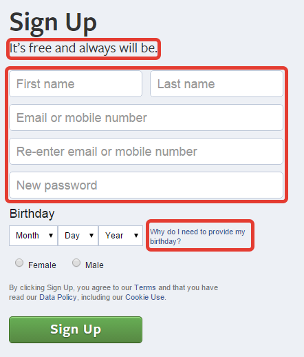
Reduce fears the users might have: Users fear being spammed, losing their data, hidden charges, and their information being misused or sold. You alleviate these fears by using microcopy such as ‘no spam,’ ‘your data will not be sold,’ ‘free forever’, or explaining why you need their information.
For example, Facebook alleviates its users’ fears by assuring them that the service is “free and will always be” and by explaining why they need to know the user’s birthday.
Facebook’s signup microcopy (Source)
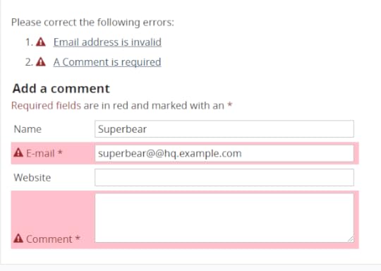
Have useful error states: Errors are a significant barrier to conversion and many new users just give up. To prevent this, write error state microcopy that helps users correct their errors and move to the next stage of the customer journey. It’s not enough to just define the error, explain how users can solve it.
In the example below, the error is explained and alternative solutions are provided.
Helpful error state copy W3C
Use benefit-driven copy: Your CTA buttons will convert better if you show your users the benefits of taking the next action. In the example below, the benefit of convenience (many book formats and free reading apps and trials) is emphasized.
Benefit driven microcopy (Source)
Use social proof: Tip over unsure users by reassuring them that their friends or other people have already taken the action that you want them to take. Basecamp used social proof to convince people to sign up for their software.
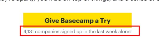
Social proof microcopy (Source)
Menu Copy
Menu copy is very prominent on websites and it pays to optimize it. The best practice is to use short phrases preferably a single command (verb like ‘save’ or ‘download’) or descriptive word (noun like ‘home’ or ‘about’) to reduce confusion.
Buttons
Button copy helps move users to take actions such as moving forward (‘next’, ‘save’) or moving backward (‘previous’, ‘cancel’). Optimize button microcopy by:
Using short commanding phrases (‘create account’)Using descriptive and unambiguous copy (‘delete’ instead of ‘remove’)Using sentence case because it is easy to readCustomizing microcopy according to context
Text Links
For text links use short descriptive microcopy that explains what users are going to get or do when they click on the link. This reduces anxiety and inertia.
Icons
Just like button microcopy, icon microcopy should use action verbs, describe the action being taken, and be short.
Writing Effective Microcopy
Understand Your “Voice” and “Tone”
Understanding your voice and tone is the first step in writing effective microcopy. They will determine what you will write and how you will write it.
For clarity, your brand voice is the unique way in which your company communicates. It might be cheeky, fun, or abrasive. Tone changes depending on the situation and your users’ needs.
Here’s how to find your tone and voice:
Go through your company’s branding information to find out your voice together with the marketing department. Interview key leaders to find out your mission, vision, and brand personality.Research your target market so that you can understand their wants and needs. Do Voice of Customer research to understand how your users actually talk and use their language in your microcopy.
These steps will help you create a voice and tone guide that you can use as a point of reference every time you write microcopy.
Test Your CTAs
The only way to know if your CTAs and microcopy are converting is by testing them on real users. Do A/B testing to find out the winning CTAs and microcopy and then keep iterating it. The truth is that CTA and microcopy testing and optimization is a continuous process because the user’s needs change often.
Microcopy in UX and UI Design
Choosing the right font, size, and weight
Fonts determine the legibility of your microcopy. Users can’t act on it if they can’t see it! Here are some tips to improve the legibility of your microcopy:
Don’t use too many font types. Use a style guide to maintain consistency between your microcopy and other UI elementsUse a legible font size, don’t make it too small that readers can’t see it. Use bolding sparingly Increase font size and padding to emphasize text without bolding. Ensure that there is enough white space around your microcopy to make it stand out.
Choosing the right text color
You can use color to increase the conversion capabilities of your microcopy. Color contrast helps to draw attention to your microcopy. Ensure that the color contrast is high enough and it conforms to web accessibility guidelines.
You can use color language to nudge users towards or away from certain actions. The color green is associated with progress while the color red is associated with danger. Use green when you want to encourage users to take an action and use red when you want to discourage them from taking an action like canceling.
Write, Prototype, and Design With the Best Tools
Use UXPin to create microcopy that converts users. Use our color contrast checker to check for accessibility and out style guides and design patterns to ensure that your microcopy is consistent.
The post Essential Microcopy Guide: How to Write Microcopy That Converts Users appeared first on Studio by UXPin.
August 12, 2020
Button Design Guide: How to Get Site Visitors to Actually Click Your Buttons
Buttons are one of the most common UI elements. They make it possible for users to interact with a system and take action by making selections. Buttons are used on forms, website homepages, dialog boxes, and toolbars.
It is important to differentiate between buttons and links. Buttons are used when you want a user to act (submit, cancel, delete) and links are used to direct users to other pages (about me, read more).
Great button design makes it easy for users to take the action that you want them to take which increases conversions. This article will give you a complete guide on how to create irresistible buttons that your site visitors will want to click.
Anatomy of a Perfect Button
Before we discuss how you can design irresistible buttons we need to examine the anatomy of a perfect button. A button has the following elements: Text label, background, border, and an icon. Other than the text label all other elements are optional.
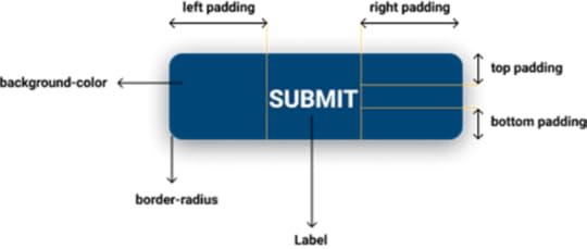
Anatomy of a button
What to Avoid When Designing a Button
Buttons that don’t look like buttons
Before a user can click on your button, they have to know that it’s a clickable element. Make it easy for users to click on your buttons by making it obvious that they are buttons. Users depend on previous experience and visual cues to determine whether a UI element is interactive or not.
While it might be tempting to use cool web button designs, don’t sacrifice usability. Avoid confusing your users and creating friction by using familiar button designs. Examples of common button designs include:
Square button with fillRound button with fill Round button with fill and shadowsOutline/ghost button
Fills and shadows make it easy for users to identify buttons because they make them look press-able. Additionally, ensure that there is enough white space around your buttons to make them stand out even more.
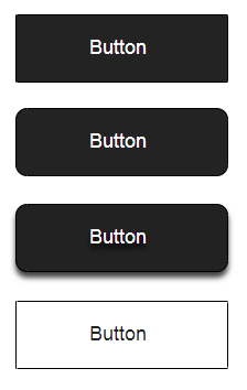
Examples of common button designs
Vague or misleading button labels
If the label of your button is vague or confusing, it can prevent users from taking action or make them take the wrong action
Use labels that clearly explain what the button does and affirm the action that the user is about to take. It is also important to consider the context of the button and adapt the label accordingly. Avoid ‘yes’ or ‘no’ labels and instead, use descriptive labels like ‘Delete’ or ‘cancel.’
Clear button label that affirms the action that the user is about to take
Buttons that don’t provide visual feedback about their state
“The system should always keep users informed about what is going on, through appropriate feedback within reasonable time.”
— Jakob Nielsen
A great button should change its state once a user interacts with it. Users require feedback that tells them if their action has been registered successfully or not. When there is no feedback, users might act over and over again. Feedback can either be visual or audio.
Design buttons that have states such as:
Primary state-button is interactive and ready to be usedActive -User has pressed the button Hoover– Cursor is placed above the interactive elementFocused – Button has been highlighted using a keyboardIn progress– The action is being processed Disabled – Button is not interactive
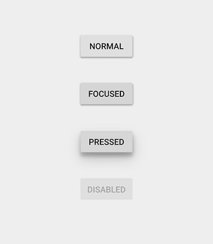
Different button states
Inconsistent button design
“Consistency is one of the most powerful usability principles: when things always behave the same, users don’t have to worry about what will happen.” — Jakob Nielsen
Create buttons that have the same size, shape, and color throughout your site. Having a design library and a style guide helps with this. A consistent button design helps your users take action faster and avoid errors. Plus, it improves the overall look and feel of your site. When there is no consistency, users get confused and they are more likely to make errors.
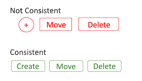
Consistent versus inconsistent button design
Using too many buttons
“Rule of thumb for UX: More options, more problems.”
— Scott Belsky, Chief Product Officer
Too many buttons make it difficult for users to act, this is known as The Paradox of Choice. Instead of stuffing your design with buttons, think of the most important action that you want your users to take and prioritize it.
Button Hierarchy and Actions
Button hierarchy provides a useful signal for users to determine the most important task on a system. Here are the most common website button design hierarchies and how you can use them to guide users.
CTAs
Call to action (CTA) buttons direct users to take the most important action that you want them to take. An effective CTA button grabs the user’s attention and makes them click. A CTA button should be big, have high contrast, and be placed in the user’s line of sight.
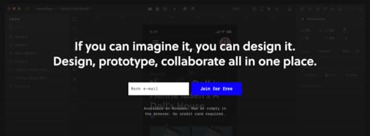
Common CTA’s include website buttons such as UXPin’s that has a very prominent “Join for free” CTA button with high color contrast.
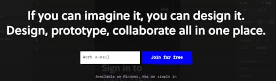
A great CTA button
The Psychology Behind Effective CTA Button Copy
For a CTA button to be effective, it needs more than just good design, it also needs copy that drives action. Poor CTA button copy is confusing, it causes errors and makes users bounce.
Here are a few psychology backed tips to strengthen your CTA copy:
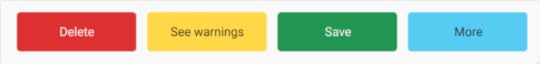
Use action words: Using copy that uses action verbs instead of generic phrases drives users to take action. Instead of giving your users a “yes or no” option use “Save or Discard.”
Use precise language: Don’t leave anything open to interpretation or misinterpretation. Don’t say “Remove” when “Delete” would be a much better option.
Use language that affirms the user’s action: Use words that specify the action that the user is about to take such as “Publish” rather than just “Submit.” This removes uncertainty and gives the user confidence to act.
Use imperatives: Imperatives turn phrases into commands. They reduce the number of words on button copy making it easy to read. Instead of “Yes, create my account” simply use “Create account.”
Primary Actions
Primary actions drive users to the next positive action such as going to the next page, completing an action, or starting a user journey. These web buttons should carry more visual weight and they should be more visually dominant to encourage the user to take the positive action.
Secondary Actions
Secondary actions are alternatives to primary actions. They include ‘back’ and ‘cancel’ buttons. These website buttons should have lower visual prominence to reduce the risk of error and to encourage positive primary action.
The difference in visual prominence between primary and secondary actions
Tertiary Actions
Tertiary actions are important actions that users might not need to take. These actions include editing, adding new information, or deleting. The difference between primary and tertiary actions is determined by the context within which the action is taken.
It is good practice to use smaller buttons that are not very prominent for tertiary actions.
Best Practices for Button Styles, Color, and Design
Button Shape
The best practice for web button shape is to use square buttons or square buttons with rounded edges. These button shapes are recommended because it is easy for users to recognize them as buttons.
There are other button shapes that you can use but they should be used carefully because some users might not recognize them. They include:
Round buttons: These are buttons with rounded edges.

A round button
Ghost/line buttons: These are buttons that have no solid fill. They are best used for secondary actions.

A line button
Floating Action Buttons (FAB): This button is used for primary actions.

A Floating Action Button
Icon and label buttons: These buttons have both an icon and a label.

An icon and label button
Icon buttons: Because these buttons have no labels, they are easy to stack.

An icon button
You can use padding and sizing to enhance the visibility of your buttons. Ensure that your buttons are big enough for mobile users to tap.
Color Palettes
The first thing to consider when choosing the color palette for your website button design is color language. Red buttons mean stop, green buttons for websites mean go and blue buttons mean more information.
Also, consider your brand colors and style guide when choosing button colors. Be sure to maintain uniformity for consistent user experience. Make sure that your buttons have enough contrast and they meet web accessibility guidelines.
Color language
Button Placement and Page Layout
When deciding where you will place your button and the page layout, the context matters a lot. For CTA’s it is best to center the website button and put it high up the page so that it can grab the attention of the user.
For primary action buttons for websites, the jury is still out on the best placement. Option A is when the primary action button comes first and in option B it comes last. The best course of action is to ask yourself what the user expects to see first in your specific context.

Button placement
Design Buttons With The Best UI Tools
For you to design buttons that get clicks, you need the best tools to help you turn your mockups into beautiful buttons. UXPin provides an all in one platform for you to design, prototype, and collaborate with your team. Maintain consistent button designs with the design pattern library and check your buttons for accessibility with our contrast checker.
The post Button Design Guide: How to Get Site Visitors to Actually Click Your Buttons appeared first on Studio by UXPin.
August 11, 2020
Lean UX: Expert Tips to Maximize Efficiency in UX
Lean UX gives you an efficient way to create spectacular user experiences. Instead of going through a long process that includes numerous validations, prototypes, and tests, you get straight to the point by turning an idea into the final product.
The Lean UX Process
The lean UX process tries to find the shortest, fastest route between an original idea and the final product. Experts have depicted the process in several ways. One of the simplest visual representations comes from renowned designer Austin Knight, who uses a circle labeled with the phases:
ThinkMakeCheck

Research Contributes to Ideas
In this version of lean UX, a team starts by developing ideas. Ideas don’t come out of nowhere. They rely on strategy, research, and analysis. These sub-phases often include:
Interviewing stakeholdersMaking storyboardsConducting surveysInterview usersMapping user flowsUser testing analysisA/B testing
Moving From Ideas to Production
Once the team has thought about what it wants to make, it immediately moves into production mode. No time gets wasted!
The make phase consists of design and implementation. Tasks within these sub-phases may include:
Collaborative designedSketchesWireframesPrototypingDeveloping codeBeta launches
Collect Feedback for Improvement
Now that the product has been developed, teams can review their work and use feedback to make improvements. This begins the Check phase, measuring and iterating take place. These steps can include:
Measuring KPI performanceHeat mappingUser testingFixing bugsReducing user pain pointsInnovating new features
Other lean experts have developed slightly different representations of the concept. Knight, however, describes the process in such a comprehensive way that it makes sense to beginners and advanced developers.

Benefits of Lean UX
Lean UX benefits teams in different ways. Most product developers, however, find that they see benefits like:
Switching from a waterfall to an agile concept that gives your projects more flexibility.Continuous improvement to products your team has released.Shorter project timelines.Opportunities to explore more ideas to discover whether they will succeed.A sharper focus on iteration and testing that leads to better user engagement.
What’s Your Hypothesis?
Creating a hypothesis is the same stage as Think in Knight’s visualization of lean UX. When a team forms a hypothesis, it doesn’t claim to know all of the answers. Instead, it states a few beliefs that it would like to test.
Writing a Good Hypothesis
A good hypothesis includes a statement about how you will test it and how you will determine success.
Here’s a good example of a lean UX hypothesis:
We believe that smartphone users want to find faster, rather than shorter, ways to reach their destinations. Providing this information will lead to increased enrollment. We will prove this hypothesis if enrollment rates increase by 30%.
The statement provides:
The belief.The plan to test the belief.The benchmark required to prove the belief.
Developing a Minimum Viable Product
A minimum viable product is a basic version of your idea. You only use it to test your hypothesis, so it shouldn’t include too many extra features. You want a bare-bones beta version that you can send to users.
Developing a minimum viable product helps you decide which ideas are worth exploring. When the product doesn’t succeed, you drop it to try something else. When the minimum viable product shows promise, you can invest more resources into building a better version that will appeal to a broader audience.
User Research and Testing
Research and testing in the lean UX process act the same as traditional approaches. The only difference is that you make your product quickly, release it, gather information, and make adjustments.
Most teams perform these steps in sprints. For example, you might release the product and gather user reviews for a week. Then, you use the research to develop and iterate improvements over two weeks. When the two-week period ends, you release your updated version.
The process never has to end. As you improve the product, you need to do more research. As you gather more data, you learn how to improve the product further.
Leverage Lean UX to Maximize Efficiency
The lean UX process doesn’t always work perfectly the first time you use it. Teams need to learn how to leverage lean UX to maximize efficiency. That may take some time, especially if your team members have followed other approaches in the past.
Lean UX’s Workflow Methodologies
Workflow methodologies that work well for most teams include:
Setting realistic expectations for hypotheses and project timelines.Focusing on ideas that start with strong hypotheses.Eliminating unsuccessful projects, even when they sound appealing.Producing functional prototypes for your early users.Finding trustworthy, experienced beta testers to give you accurate feedback.Planning ahead so you know how you will research user engagement and potential product improvements.
Ideally, you should have a team leader with experience in lean UX processes. It never hurts to have an experienced person take the reins so you don’t veer off track.
Use the Best Tools and Resources in Your UX Process
Lean UX processes often work best when you have functional prototypes that show you and other users precisely how the product will work.
You can also improve your lean UX efficiency by choosing tools and resources that include:
Built-in and customizable librariesSeamless collaborationInteractive design elementsReal dataDesign softwareIntegrations with other popular file formats and design applications
Get the Lean UX Tools You Need From UXPin
Where can you find all of these tools in one place? UXPin.
UXPin makes lean UX processes efficient and effective because your team members can collaborate, create prototypes, and test ideas within one platform. You don’t rely on multiple apps to get results. When you have everything in one place, you can make informed decisions quickly.
Are you interested in making your lean UX process even more efficient? Start your free trial now so you can see how UXPin works for you. Once you experience UXPin in action, you will never want to go back to your old lean UX tools.
The post Lean UX: Expert Tips to Maximize Efficiency in UX appeared first on Studio by UXPin.
August 10, 2020
Web Accessibility Guide for 2020: Everything Designers Should Consider and Implement
Billions of people visit websites every day, some are able-bodied and others are not. How does a designer ensure that everyone can access and use their website? The answer is web accessibility.
Why is Web Accessibility Important?
Web accessibility is designing websites that can be used by people who have disabilities like low vision, color blindness, blindness, cognitive disabilities, deafness or hearing impairment, and mobility impairments.
 01 WebAccessibility
Web accessibility is important because it makes websites responsive to the needs of all users. At the moment, there are more than 1 billion people who have disabilities in the world while in the United States, 61 million people live with disabilities. When you design websites with accessibility in mind, you make your creations available to people who have disabilities.
Accessible web design is not just a ‘nice to have’ it is required by law in countries such as the US, Israel, Canada, the United Kingdom among others. In fact, 2,000 website accessibility lawsuits were filed in the United States in 2019 alone.
Research has shown that there is a strong business case for accessible website design because it improves SEO rankings, increases customer satisfaction, improves usability, and increases the reach of a website.
POUR: The 4 Web Accessibility Standards
According to the Web Content Accessibility Guidelines (WCAG) put forward by the Website Accessibility Initiative (WAI) of the World Wide Web Consortium (W3C), web content must be POUR.
This means it has to fulfill the following principles:
Perceivable InformationOperable UI and Navigation Understandable Information and UIRobust Content and Reliable Interpretation
Perceivable Information Principles
All the Information and UI components must be presented in a way that all users can understand in different ways. There should be no invisible or difficult to understand information or UI elements.
Here are the guidelines that your design must follow to fulfill this principle:
Alternative text for all content that is not text such as pictures and graphics. This ensures that non-text content can be transformed into other forms like speech, braille, or larger fonts.Give alternatives such as subtitles and closed captions for all time-based media such as videos and animations. Create adaptable content that can be presented in a variety of ways such as a simple layout without interfering with its structure. Make it simple for users to see and hear your content by differentiating between your foreground and background.
Operable UI and Navigation Principles
This principle requires that your website’s UI components and navigation can be operated easily without a mouse and it should not require interactions that a user cannot do.
Here’s how to make your web design operable:
Make all functionalities keyboard accessible. Give your users ample time to interact with your content. Avoid designing content (flashing elements) that can cause seizures.Give users ways to find out where they are, navigate your site, and find the content that they are looking for.
Understandable Information and UI Principles
You should ensure that users can understand how your site’s UI works and the information presented on your site.
Here’s how to accomplish that:
Ensure that the text on your site is easy to read and understand. Create and present web pages that work in predictable ways. Make it easy for users to avoid and correct input mistakes on your website.
Robust Content and Reliable Interpretation Principles
Robust content is content that can be interpreted accurately by assistive technologies such as screen readers. Your content should continue being accessible to and compatible with these assistive devices even as their technologies evolve.
For each of the WCGA principles, there is a success rating of either A (minimum rating), AA (good), and AAA (gold standard).
What Makes Websites Accessible? Use Cases and Examples
Here are some changes that you can make to your web designs to make them accessible.
Color Contrast
When designing your website ensure that there is enough contrast between the background color and the foreground text. The principles of color contrast also apply to buttons, the text that’s on images, and other UI elements.
Color contrast has a significant impact on how easy it is for users to read the content on your website. Low contrast makes it difficult for people with low vision to read. According to the WCAG, the minimum acceptable contrast ratio is 3:1 while the gold standard is 7:1.
UXPin has a color contrast checker that helps you ensure that your designs are up to WCAG standards. The tool also lets you view your design the way people with the eight different types of color blindness would.
An example of the difference that color contrast makes from W3C
Alternative text
For each image and graphic, provide descriptive alternative text that passes on the same meaning as seeing the text. Screen readers read this alternative text for visually impaired people so avoid using numeric descriptors or those that do not convey any meaning.
Additionally, for time-based media such as video or audio recordings, provide closed captions and transcripts that have visible links. This also applies to icons, buttons, tables, and graphs.
You can present alternative text using the tag or use captions to provide context.
Easy to read content
Users interact with websites primarily through text content. This makes it important to use simple language that is free of jargon and uncommon words, WCAG requires that websites use language that is at a “lower secondary level” to make it as accessible as possible.
You can use tools such as the Hemmingway App to determine the readability level of your website copy.
Use header tags appropriately
Header tags make it easy for users to skim through web content and they give screen readers signals about the importance, relationship, and hierarchy of different pieces of information.
Start with the and use the tags consistently and in the correct order.
How to use header tags correctly from W3C
Design clear focus states
Focus states make it easy for people navigating your website using the tab key to know where they are when using your site. They are used by screen readers, people with limited mobility, and power users.
Ensure that your menu items, forms, links, and buttons have clear, high contrast focus indicators that help them stand out.
An example of clear focus states from W3C
Design helpful error states
Provide helpful and contextual information to users when they make errors. Also, explain to them how they can fix the errors and give them a chance to reverse their submissions.
Present instructions clearly and instances where user action is required should be displayed prominently.
An example of easily identifiable error states from W3C
Label all form fields
Make sure that you have descriptive labels next to every form field. Additionally, avoid using placeholder text as the form label because it is often low contrast making it hard to read. Placeholder text also creates confusion because users can’t tell what to do after the text disappears.
Form labels are also useful for people using screen readers to understand your form, screen readers only read the information that is tagged as and skip over placeholder text.
A form with clear labels from W3C
Don’t use flashing UI animations
UI animations that flash more than 3 times per second can trigger seizures or physical reactions for some people. So it’s best to avoid them.
Avoid using only color to pass a message
Color is a good way to pass on a message but it should not be the only way as some people are color blind. Instead, use color plus other elements such as asterisks. For graphs and other charts, use labels plus color.
Using color plus other elements to pass on a message from W3C
Use easy to read fonts
Use a font size and style that is easy to read. The readability of a font is often determined by its style rather than its type. As a rule, cursive or decorative fonts are hard to read. Use large text, with short line lengths, tall line heights, and more space between letters for improved readability.
New Accessibility Considerations for 2020 and Beyond
WCAG 2.2 to Be Released in 2020
The World Wide Web Consortium (W3C) released the first draft of WCAG 2.2 on the 27th of February 2020. This update aims to further improve web accessibility for disabled persons, especially on mobile devices.
Here’s what you need to know about WCAG 2.2:
It is backward compliant with WCAG 2.0 and 2.1 meaning that if your website meets the criteria of 2.2 it also meets the criteria of the previous versions.It includes new criteria for focus visible states such as the size of focus area and color contrast.
Growing Importance of VUI and Voice Interface Design
With more people using voice-controlled devices like Alexa, Siri, and Amazon Echo for their search needs, there is a growing need for voice interface design.
Here’s how designers can make their voice interface designs more accessible:
Tell users what they can do.Let users know the functionality that they are using.Don’t give too many options.Give visual feedback whenever possible
Don’t Over-Promise on “Full” or “100%” ADA Compliance
The Americans with Disability Act (1990) was signed into law to prevent discrimination against people with disabilities. However, this law does not explicitly mention web accessibility and is therefore open to different interpretations. This means that as a designer you should not over-promise on full ADA compliance because it is not clear how ADA applies to web accessibility.
Prototyping, Designing and Developing With Accessibility in Mind
To fully comply with accessibility web design, you need the best tools to help you with prototyping, design, and development. UXPin offers an all in one platform where you can check your designs for WCAG compliance and handoff your designs smoothly.
The post Web Accessibility Guide for 2020: Everything Designers Should Consider and Implement appeared first on Studio by UXPin.
August 4, 2020
VUI: The Future of Voice Interface Design Explained
The overall trend toward VUI has been accelerating as processors get smaller and more Internet of Things (IoT) devices come online. All of the “Big Five” tech firms – Google, Apple, Microsoft, Amazon and Facebook – have invested heavily in voice interface as the way forward.
In 2019, an estimated 59 percent of online searches came through voice, with some industry specific searches posting much higher (for example, food and restaurant search reached 68 percent). The speech and voice interface market sector is on track to hit $24.9 billion by 2025.
Voice interface design uses speech recognition to allow users to engage with technology using voice commands. As the world becomes increasingly fast-paced and information-dense, voice technologies are challenging the dominance of the graphical user interface and can make the experience much smoother. Keyboards can work for text-intensive tasks like writing a blog, but for simple tasks like searches, post updates, adjusting controls, and getting directions, people would rather just talk. They can save many steps, for example, typing in an address on a small screen, but the experience must function flawlessly. In reality, voice interface design works together with tap and swipe technologies to create a better user experience.
How to Create Effective Voice Interface Designs
There is only one thing users want from a voice interface. They want their devices to recognize their commands instantly, without mistakes. Humans are astoundingly adept at understanding voice messages despite background noise, missing syllables, variations in volume, accents and word meanings that are constantly evolving. No AI can match that ability to understand spoken voice commands yet, so it is up to designers and developers to think of every contingency. Here are a few use cases of excellence in the field.
VUI Use Cases
Any device or app could work with speech, but that doesn’t mean they all should. Intelligent voice user interface design begins with an examination of where speaking will make life easier for the user. For example, devices that will be used by the public outside, like at a drive-up window, present too many problems in terms of voice variation and environmental noise. Also, whenever the user is dealing with sensitive information like health data or confidential information, speaking out loud is the last thing they want. VUI is perfect for any tasks that benefit from hands-free use (like cooking or driving apps), smart home devices, and apps that have an emotional component (like exercise or productivity). User studies will let you know exactly where the points of friction are and how VUI could improve the UX.
How VUIs Process Information

Humans can process voice information at about 39 bits per second, so VUIs must strive to process information as fast as possible without sacrificing ambiguities of meaning. In most cases, designers have built conversational AI for information processing or outsource this portion to open source speech recognition engines. Users become impatient when the device requires them to speak slowly or one word at a time. They also may be unfamiliar with core concepts based on their generation. For example, expressions like “clockwise” and “broken record” might not mean anything to younger users. Spend as much time as possible getting familiar with the way your users converse and design the VUI’s personality around that research. Build a rich library of utterances, commands, value and intentions to streamline information processing.
What to Consider When Designing VUIs
The first and most important element in a design plan for VUI is the “customer journey map,” where designers specify what the user needs most at various stages of engagement. If there are competitors that have already introduced working versions of their product, half of that work can be captured easily through competitive intelligence. Otherwise, it will take a significant amount of time in gathering user feedback.
With a map in place specifying what VUI must do and expected outcomes, the burden shifts to defining user personas, how the VUI will interface with various devices and a library of triggers.
User Personas

Creating a persona is a critical first step to keep the team on the same page about what the user wants to accomplish. The VUI user persona expands the usual attributes, such as name, role, expectations, and so on with additional details on their tone of voice and typical word choices. Ideally, your VUI should be robust enough to automatically recognize different people or different setups for the same person. For example, a smart thermometer might have different user personas for “work at home” and “entertaining guests.” A smart car app could have different radio and navigation settings based on who is driving that day.
Devices
There are four main types of devices that depend on voice interaction and each comes with its own set of constraints. Consider these factors when designing for each.
Phones – carefully review design specs, consider how changes in the environment affect the VUI, graphics can help guide user inputsMobile devices other than phones – car-based devices and laptops will have intermittent connectivity, voice is usually not the only or primary UIWearables – most are single-use devices with limited functionality but may be paired with a phone or laptop appFixed devices – probably must adapt to multiple users, interacts with other devices in the area
VUI Triggers
There are also four main types of triggering events to consider:
Voice – the primary trigger for both launching the VUI and providing inputHaptic – pushing a button like a microphone or setting controls like turning a dialMotion – often wearable and fixed devices take actions when a person enters the room or waves their handPeriodic – VUIs can be set to remind the user at specific times or when a goal is reached like desired
Some car-based VUIs have also begun to incorporate augmented reality data like reminding users to shop for needed items when they drive near a preferred retailer.
UX and Voice Interface Designs
Designing a voice UI that meets user expectations can be very challenging, even for experienced UX designers. Users have been accustomed to making adjustments when an app or device needs more input, but the psychology of repeating a spoken command is different. When a VUI asks for a number of tickets, people tend to respond with answers like “A couple,” or “Just me and my wife.” It’s impossible to plan for every contingency, so designers must come up with engaging scripts that guide users in a friendly, conversational manner. One handy reference is Google’s guide to conversational development, based on thousands of hours of research.
Designing Adaptable and Accessible Interfaces
Specs are always evolving and radically new devices are coming online all the time, but the human voice is a user interface you can rely on for the foreseeable future. Processors are shrinking and IoT is bringing everything to life. In the world that’s emerging, there is little room for any other interface other than sound. The immediacy and versatility of voice form a direct link from user desire to device response. To reap the benefits of VUI, though, designers must start from detailed personas, work around potential limitations of specific devices, and make the best use of all potential action triggers.
Develop, Improve, Repeat
No matter what project you have in mind, iterative improvement is the foundation of great design. When your design team has the tools to stay coordinated and aligned, they can improve the code faster, make smarter design choices, and amaze end-users with experiences they’ve never seen before. UXPin merges top tools for design and engineering into one world of better, faster product development. Sign up today for UXPin 14-day free trial and see how it feels to collaborate flawlessly across distances and departments.
The post VUI: The Future of Voice Interface Design Explained appeared first on Studio by UXPin.
July 29, 2020
Agile vs. Scrum vs. Kanban: Which Project Management Methodology is Right For Your Team?

Choosing the ideal project management methodology enables users to optimize results by identifying and handling the critical components of their projects. This ensures that teams are able to manage deadlines and budgets by leveraging specific processes.
For example, agile methodologies (as the term suggests), focuses on dynamic communication and constant feedback among cross-functional teams and end-users.
A project management method provides your team with a consistent reference point toward success, however, there is no one-size-fits-all choice. As such, it is vital that project management teams identify the advantages of a method before making a decision.
Comparing Agile vs. Scrum vs. Kanban at a Glance
Agile Methodology

The Agile methodology focuses on an incremental and iterative approach that caters to the changing landscape of a project. Generally, agile methods apply to any process that is tied to the concepts contained in the Agile Manifesto drafted in 2001
Scrum Methodology
Scrum is one of the most widely applied implementations of the agile methodology. The methodology utilizes a consistent and specific set of roles, meetings, and responsibilities that are maintained throughout the project. Scrum was created in 1993 by software developer Jeff Sutherland and remains a popular methodology.
Kanban Methodology
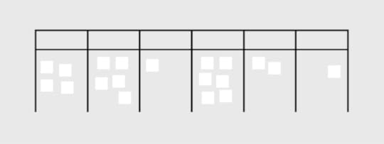
Kanban approaches are visual implementations of the agile methodology. It provides users with a comprehensive breakdown of project details at a glance, which minimizes cycle time while optimizing the overall workflow.
Here is a breakdown of the main features of each methodology:
Agile
Features a 12-point manifesto that guides teams toward more agile communication practices. Encourage continuous improvement through dynamic communication between teams and end-user customers.Supports projects with vaguely outlined end goals, i.e. work-in-progress shaped by feedback.Focuses on the adaptation to change. Shorter planning cycles pave the way for convenient editing and optimization of backlogs.
Scrum
A subset of the Agile method.Ideal for projects that focus on transparency and user visibility. Collectively handles coding and related processes in small quantities, which improves accountability. Reduces the risks of misunderstandings through improved teamwork while facilitating changes. Functions through uniform iterations known as sprints that last between 1-2 weeks, which enables project teams to ship software with uninterrupted consistency.
Kanban
A highly visual framework that presents project details in a concise manner.Sorts workflow management through online Kanban boards that are easily customized. Kanban Boards apply multiple swimlanes categorized by key details such as project status and roles.Boards are color-coded for easy referencing at a glance, i.e. grouping all completed tasks in purple and work-in-progress in green.
Choosing The Right Methodology
What is the Project’s Goal?
The project’s goal will determine the ideal approach by narrowing down on the processes prioritized by a team or organization. As such, it is important for users to identify the type of project and its involved processes before settling on a project management methodology.
This means examining the critical criteria that drive a project, some of which include: its budget, complexity(based on the timeline and number of people involved), scalability (the targeted outreach, long-term business plans), role specializations, availability of resources, industry practices, and timeline.
Upon assessing the criteria, project managers will be able to seek a methodology that enhances the structure of their project. This involves comparing the pros and cons of each methodology and determining the choice that will deliver maximum impact while eliminating those that carry the most risks.
Who Needs to Be Involved in the Project?
Customer Involvement
It is essential to establish the customer’s role in project management. Project managers should seek to provide seamless communication channels between customers and the development team. This may include the facilitation of interactions such as real-time updates between customer user responses and backend data management.
Which Teams and Stakeholders Need to Be Involved?
Project managers should determine the size of each team and the best method of communication among various roles. The selected methodology should support teams in achieving individual deliverables while maintaining efficient collaboration. Project managers should also work closely with major stakeholders who are responsible for high-level planning such as budget approval. A best-fit methodology should optimize connections among every tier within project management.
Project Teams and Role Specialization
The roles and teams involved in a project will determine the type and frequency of communication in project management. Additionally, it is essential to identify various role specializations to ensure that each stakeholder is provided relevant support and privileges.
What Is Your Timeline?
Timelines will help project managers determine realistic targets. Timeline planning should include budget considerations, the estimated response rates of the various roles involved, and leeway for technical error and other potential setbacks.
What is Your Budget?
Project managers should establish the budget for the project by considering its processes, roles, and timeline. Complex projects may require a combination of various project management methodologies.
Budget tracking should be available to stakeholders in a transparent and consistent manner. A project’s budget is a major factor in assessing the preferred methodology since it serves as the baseline in estimating the variance of a project.
How Complex is Your Project?
A project involving multiple roles and procedures might require a combination of methodologies for the most successful results. Complexity is assessed based on requirements such as the roles involved, time and cost.
How Scalable is Your Project?
Determine the long-term targets of the project, which include the scope and timelines for expansion. Project managers should check if their programs are equipped to scale-up according to set goals. Scalability might include additional processes and roles among other variables. Project managers must decide how these changes are implemented in the quickest, most effective, and affordable manner.
Use the Best Possible Tools
Project management can be simplified with excellent results by applying the most suitable methodology. The selection of an effective project management software is equally critical to the success of projects.UXPin is a leading project management solution that supports every methodology. The platform utilizes a massive range of dynamic features, which include:
-Neat and structured dashboards for highly visual Kanban-style projects, where the permissions and statuses of members are clearly displayed for easy reference. Additionally, each uploaded design is encrypted and backed up for added security.
-Built-in notifications, task assignments, and approval requests ensure that projects are carefully handled under the Scrum framework for maximum accountability.
-Optimizes user accessibility of agile methods through a dynamic and cohesive system that connects people in a project with simple push and pull changes. Users may easily share project specifications with developers through password-protected links.
Additionally, UXPin enhances project management with a vast range of design and prototyping elements which include unlimited prototypes and reviewers, stakeholder approval, conditional logic and contextual documentation.
UXPin is your one-stop platform for your project needs suitable for all methodologies. We are here to help you bring your greatest ideas to life.
The post Agile vs. Scrum vs. Kanban: Which Project Management Methodology is Right For Your Team? appeared first on Studio by UXPin.
UXpin's Blog

- UXpin's profile
- 68 followers


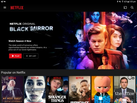
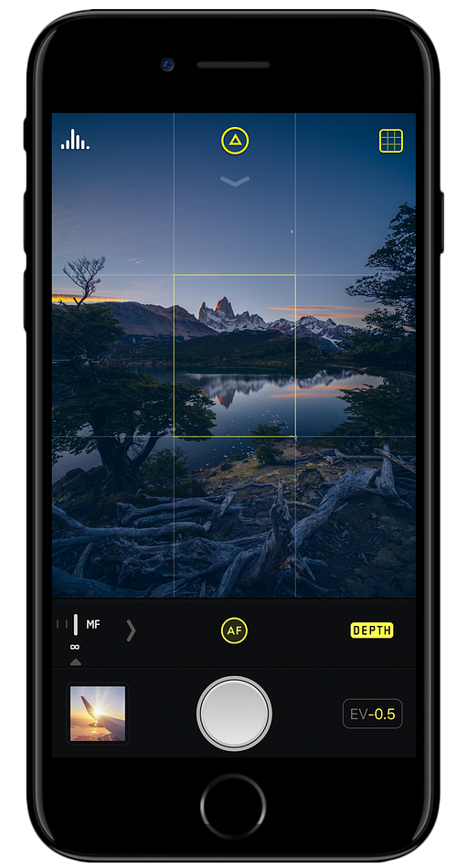