
UXpin's Blog
October 18, 2025
Top Dependency Resolution Strategies for UI Libraries
Managing dependencies in UI libraries is critical to ensuring stable and scalable applications. Poor dependency management can lead to version conflicts, broken builds, or security vulnerabilities. This article covers seven key strategies to handle dependencies effectively:
Centralized Version Management: Use a master file (like a root package.json) to standardize dependency versions across projects. Tools like Yarn Workspaces, Lerna, and Nx make this process smoother.Peer Dependencies and Semantic Versioning: Prevent version conflicts by requiring shared dependencies to be explicitly installed in consuming projects. Semantic versioning ensures clear communication of updates and compatibility.Monorepos and Dependency Segmentation: Organize multiple packages in a single repository while isolating their dependencies. Tools like Nx and Turborepo help manage these setups efficiently.Automated Dependency Resolution Tools: Tools like Dependabot and Renovate automate updates, monitor vulnerabilities, and reduce manual errors.Dependency Injection and Modular Architecture: Decouple components and externalize dependencies to simplify testing and maintenance.UXPin for Component Library Management: Sync design and development workflows by integrating real React components into the design process, ensuring alignment across teams.Continuous Integration for Dependency Updates: Automate dependency updates, security scans, and validation using CI tools like GitHub Actions and CircleCI.Each strategy has its strengths and works best in specific scenarios. Combining these approaches can address challenges like transitive dependencies, security risks, and version mismatches, ensuring smooth development workflows and reliable UI libraries.
Managing dependencies at scale1. Centralized Version Management
Centralized version management brings all dependency control under one master file, typically a root-level package.json. This master list acts as a single source of truth, ensuring that when a dependency is updated – like upgrading React from version 17 to 18 – it applies consistently across the entire system. This approach eliminates mismatched versions and keeps everything in sync.
Modern tools like Yarn Workspaces, Lerna, Nx, and pnpm are specifically designed to support centralized dependency management in JavaScript and TypeScript projects. This method not only simplifies updates but also creates a solid foundation for scalable and conflict-free development.
Scalability for Large ProjectsFor large teams, centralized version management is almost a necessity. According to the 2023 State of JavaScript survey, more than 70% of teams with 10 or more developers rely on centralized dependency management, often using monorepos and workspace tools. Unlike decentralized setups that require repetitive manual updates, centralized systems allow a single change to cascade across the entire project. This is especially beneficial in large frameworks like React or Angular, where consistency is critical.
Conflict Resolution CapabilitiesOne of the standout benefits of centralized management is its ability to reduce dependency conflicts. By enforcing uniform versions, it minimizes the risk of version mismatches. When conflicts do arise, tools like Nx and Yarn Workspaces offer solutions such as aliasing or refactoring to resolve them efficiently. This approach also strengthens security and license compliance. For example, it simplifies audits and reduces exposure to vulnerabilities by as much as 60%.
Ease of ImplementationStarting fresh with centralized management is straightforward – just configure a single dependency file. However, migrating existing projects can be trickier. It involves consolidating multiple dependency files and resolving version mismatches. Tools like Nx, Lerna, and Yarn Workspaces can ease this transition by automating much of the process.
A successful migration often depends on a detailed inventory of current dependencies, clear documentation, and a step-by-step migration plan. These steps help reduce friction and ensure a smoother implementation.
Ideal for Collaborative TeamsCentralized version management is a game-changer for collaborative environments. By standardizing dependency versions, it eliminates the dreaded "works on my machine" problem, making onboarding faster and code reviews simpler. For teams working on shared components or UI libraries, this setup ensures smooth integration, allowing developers to build on each other’s work without worrying about dependency conflicts.
2. Peer Dependencies and Semantic VersioningPeer dependencies and semantic versioning work together to manage shared UI libraries effectively. While both aim to prevent conflicts, they do so in distinct ways. Peer dependencies require the consuming project to provide the necessary dependency, ensuring consistency across the project. Semantic versioning, on the other hand, uses a standard format – major.minor.patch – to communicate changes clearly.
For instance, issues like React or Vue being loaded multiple times in a project can lead to runtime errors and unpredictable behavior, making debugging a nightmare. This approach helps avoid such problems.
Conflict Resolution CapabilitiesDeclaring React as a peer dependency ensures that only one version is used throughout the project. This avoids the infamous "multiple React contexts" error, which has frustrated many developers.
Semantic versioning adds another layer of protection by signaling compatibility through version numbers. For example, an update from 2.1.4 to 2.2.0 introduces new features without breaking existing functionality, while a jump to 3.0.0 indicates breaking changes. According to GitHub, tools that adhere to semantic versioning can reduce the risk of breaking changes and vulnerabilities by up to 30% in large codebases.
Package managers like npm and Yarn play a crucial role here. They detect version mismatches and recommend compatible updates based on semantic versioning rules, taking much of the guesswork out of dependency management.
Scalability for Large ProjectsLarge-scale projects see tremendous benefits from this approach. A 2022 npm survey revealed that over 80% of open-source UI libraries rely on peer dependencies to manage shared framework versions, improving compatibility and reducing support challenges. This consistency fosters an ecosystem where libraries work together smoothly.
Peer dependencies complement centralized management by ensuring uniformity across independent components. Teams can develop components independently while relying on the same core dependencies. For example, when upgrading React from version 17 to 18, the peer dependency structure ensures that all components align with the same version, avoiding integration headaches.
Modern UI libraries also use peer dependencies to enable plugin architectures. This allows third-party components to integrate without causing conflicts, making the ecosystem more flexible and easier to maintain.
Ease of ImplementationSetting up peer dependencies is simple in most package managers. You just define them in your package.json file, and the package manager takes care of the rest. However, keep in mind that peer dependencies require manual installation.
Semantic versioning further simplifies dependency management with its straightforward format: MAJOR.MINOR.PATCH. Major updates signal breaking changes, minor updates add features, and patches fix bugs. This clarity helps developers anticipate the impact of updates.
Automated tools like Dependabot leverage semantic versioning to safely update dependencies, reducing manual work. This approach not only simplifies updates but also lays the groundwork for more advanced dependency management techniques.
Suitability for Collaborative EnvironmentsCollaborative teams find peer dependencies especially useful because they set clear expectations and avoid version conflicts. When everyone knows React must be provided as a peer dependency, there’s no ambiguity about which version to use or who’s responsible for managing it.
This structure also streamlines code reviews and minimizes integration issues. Developers can focus on their tasks without worrying about dependency conflicts, confident that the peer dependency setup will flag any incompatibilities early in the process.
Documenting peer dependency requirements ensures smooth collaboration. Consistent versioning policies help teams work together efficiently, enabling new members to quickly understand the dependency structure and contribute effectively. This level of coordination is essential as teams integrate peer dependencies into their broader dependency management practices.
3. Monorepos and Dependency SegmentationMonorepos take the idea of centralized and peer dependency strategies a step further by organizing dependencies at the package level. In a monorepo, multiple packages live within a single repository, but each package handles its own dependencies independently. This segmentation helps reduce the version conflicts that often arise in shared dependency systems.
The primary benefit is greater control. Each package or UI component defines its specific dependencies, creating clear boundaries and minimizing conflicts. For example, if one component relies on React 17 and another uses React 18, dependency segmentation ensures these differences don’t interfere with each other.
Scalability for Large ProjectsMonorepos are particularly effective for large-scale projects where multiple teams collaborate on interconnected UI components. Tools like Nx, Lerna, and Turborepo provide features such as dependency graphs and task scheduling, making it easier to coordinate work across many packages.
In growing teams, having a unified codebase simplifies project management while still allowing individual packages to manage their dependencies. For instance, Nx users have reported up to 50% faster build times and smoother onboarding for new developers thanks to centralized documentation and tooling. These benefits become even more pronounced as projects expand, making monorepos an ideal choice for large UI libraries.
Conflict Resolution CapabilitiesDependency segmentation also helps resolve the dreaded "dependency hell." By isolating upgrades to specific packages, teams can avoid widespread issues.
Modern monorepo tools provide flexible options for managing conflicts. Teams can either allow each package to manage its dependencies independently or enforce a single version policy at the root level. For example, Nx supports mixing these approaches, giving teams the freedom to adapt based on their needs. Additionally, tools like dependency graph visualizations make it easier to spot potential conflicts early, helping teams plan updates and avoid chain reactions of failures that are common in traditional setups.
Ease of ImplementationWhile setting up a monorepo with dependency segmentation might require more upfront effort than traditional methods, specialized tools have made the process much simpler. Managing dependencies at the package level improves build efficiency, particularly in environments like Docker deployments.
Each package maintains its own package.json file, listing only the dependencies it requires. Tools such as Lerna, Nx, and Turborepo automate tasks like versioning, publishing, and builds, all while maintaining the advantages of segmented dependency management.
Perfect for Collaborative TeamsMonorepos thrive in collaborative environments where multiple teams work on related UI components without stepping on each other’s toes. A shared codebase streamlines workflows like code reviews and cross-team collaboration, while segmented dependencies give teams the freedom to update their packages independently.
This setup allows feature teams to work simultaneously, confident that their dependency choices won’t interfere with others. It reduces the need for constant coordination and lets teams adopt new technologies or update dependencies at their own pace.
Shared tooling and centralized documentation within the monorepo ensure consistency across teams while maintaining flexibility. The transparent dependency structure also makes it easier to coordinate releases and maintain compatibility. Regular audits and well-maintained documentation further support high code quality, enabling UI libraries to grow and adapt efficiently without compromising stability. This collaborative foundation paves the way for more advanced dependency tools, which we’ll explore next.
4. Automated Dependency Resolution ToolsAutomated dependency resolution tools take the hassle out of managing dependency trees by analyzing them for compatibility and keeping things up to date. Instead of manually tracking updates, these tools monitor dependencies continuously and alert developers about necessary updates or patches. For JavaScript and TypeScript projects, tools like Dependabot, Renovate, and Snyk are often the go-to choices. They build on earlier approaches to dependency management by significantly reducing the need for manual intervention.
Scalability for Large ProjectsWhen working on large-scale projects, automated tools shine by managing even the most intricate dependency graphs. These tools are designed to handle thousands of dependencies simultaneously, making them indispensable for enterprise-level UI libraries. For instance, GitHub data highlights how teams using tools like Dependabot can fix vulnerabilities much faster – cutting median patch times from weeks to just days. Features like dependency graph visualization and transitive dependency analysis are especially valuable. According to Snyk’s 2023 State of Open Source Security report, over 80% of vulnerabilities in JavaScript projects stem from indirect dependencies, so having tools that can identify and address these is critical.
Conflict Resolution CapabilitiesModern tools are equipped to resolve version conflicts efficiently. They use strategies like version pinning and deduplication to minimize issues. Tools such as npm and Yarn automatically select compatible versions when conflicts arise, while others can go further by suggesting fixes or generating pull requests for critical updates. Lock files, such as package-lock.json and yarn.lock, help ensure consistent builds across environments, making the development process smoother.
Ease of ImplementationSetting up automated tools is straightforward. Typically, you just need to add a configuration file and integrate it with your CI/CD pipeline. For example, configuring Dependabot involves adding a simple YAML file to your repository. These tools are backed by strong documentation and active communities, making them accessible even to teams with less experience. Many also allow you to automate the application of security patches, ensuring that critical vulnerabilities are addressed quickly and efficiently.
Suitability for Collaborative EnvironmentsAutomated tools are particularly valuable for fostering collaboration within teams. They help maintain consistent dependency versions across all team members’ environments, reducing potential conflicts. Features like automated changelogs and team notifications keep everyone informed about updates, while dashboards provide real-time insights into dependency health and security. For teams working on shared component libraries, these tools can enforce policies – such as blocking pull requests that introduce vulnerabilities or fail to update insecure dependencies – ensuring high security standards are upheld.
sbb-itb-f6354c65. Dependency Injection and Modular ArchitectureDependency injection and modular architecture are game-changers for managing dependencies and structuring UI libraries. Instead of components creating their own dependencies, they receive them from external sources. This approach encourages loose coupling, making testing and maintenance easier. Combined with modular architecture – where applications are split into smaller, independent modules – this strategy ensures projects are scalable and easier to manage over time.
Scalability for Large ProjectsWhen scaling large projects, dependency injection shines by isolating modules and simplifying dependency management. This isolation allows modules to be developed and maintained independently, enabling teams to work in parallel without stepping on each other’s toes. Adding new features becomes more seamless. A great example of this is Angular’s dependency injection system, which efficiently manages services and components by injecting only the dependencies required for each part of the application.
Managing ConflictsOne of the standout benefits of dependency injection is how it handles conflicts. By decoupling components and externalizing dependencies, it creates clear boundaries between modules. These boundaries ensure that changes in one module, like updating a library, don’t unintentionally disrupt others. This is particularly useful for managing transitive dependencies. Atlaskit’s design system illustrates this well, as it uses modular architecture and dependency tools to organize hundreds of components across multiple teams without causing conflicts.
Implementation Made SimpleThe ease of implementing dependency injection depends on the framework and project setup. Popular JavaScript frameworks like React, Angular, and Vue come with built-in support for modular architectures, making adoption smoother. For JavaScript and TypeScript projects, libraries such as InversifyJS provide robust dependency injection features, along with extensive documentation and active community support. Setting up DI involves defining dependency interfaces and configuring a container to manage them. While integrating DI into an existing monolithic codebase might require some refactoring and learning, starting small – by defining clear modules – can ease the transition. Tools like TypeScript also enhance type safety, making development more reliable.
Perfect for Team CollaborationDependency injection and modular architecture thrive in collaborative environments. When multiple teams contribute to the same UI library, clear boundaries and explicit contracts reduce confusion and make code reviews more efficient. Modular documentation helps new team members get up to speed faster, and the structured approach ensures smoother integration of contributions, even from geographically distributed teams.
6. UXPin for Component Library Management
UXPin stands out by bridging the gap between design and development with its code-backed prototyping features. Unlike traditional design tools that rely on static mockups, UXPin allows teams to work directly with real React components. This ensures that designers and developers are always on the same page, using the same components throughout the product lifecycle. By doing so, it eliminates the common misalignment issues that often lead to dependency conflicts.
With UXPin, teams can sync custom Git component repositories, meaning your existing component libraries and their dependencies are seamlessly integrated into the design environment. Designers build prototypes using the exact components developers will implement, complete with all dependencies intact. This creates a unified source of truth, reducing errors caused by version mismatches and integration problems.
Scalability for Large ProjectsUXPin is particularly well-suited for enterprise-level projects where multiple teams manage complex component libraries. It supports organizations with large-scale operations, enabling dozens of designers and hundreds of engineers to collaborate effectively on intricate applications. By centralizing component management, UXPin ensures consistency across projects, even as they grow in size and complexity.
"When I used UXPin Merge, our engineering time was reduced by around 50%. Imagine how much money that saves across an enterprise-level organization with dozens of designers and hundreds of engineers." – Larry Sawyer, Lead UX Designer
The platform also integrates custom-built React Design Systems, allowing organizations to expand their libraries while maintaining their chosen dependency structures and architectural standards.
Conflict Resolution CapabilitiesUXPin tackles dependency conflicts head-on through its unified design-development environment. By working with production-ready React code directly in the design phase, teams avoid the manual integration errors that typically cause issues. The platform ensures that all components inherit the tested dependency relationships established by developers.
Version control integration is another key feature, enabling teams to track changes, revert to earlier versions of components, and resolve merge conflicts when multiple contributors make updates. Real-time collaboration tools, including commenting and feedback features, help identify and address dependency issues before they escalate.
Ease of ImplementationSetting up UXPin is straightforward, thanks to its compatibility with popular frameworks and the ability to import existing component libraries. Teams can quickly establish reusable components and streamline design-to-code workflows without needing extensive reconfiguration. The platform’s intuitive drag-and-drop interfaces and AI-powered tools make it easy for both designers and developers to get started with minimal training.
Suitability for Collaborative Environments"As a full stack design team, UXPin Merge is our primary tool when designing user experiences. We have fully integrated our custom-built React Design System and can design with our coded components. It has increased our productivity, quality, and consistency, streamlining our testing of layouts and the developer handoff process." – Brian Demchak, Sr. UX Designer at AAA Digital & Creative Services
UXPin thrives in collaborative settings where cross-functional teams need to manage component libraries together. With features like real-time co-editing, shared libraries, and role-based access controls, multiple team members can work on component libraries simultaneously while maintaining consistency.
Beyond just sharing, UXPin’s commenting and feedback tools allow teams to coordinate updates and resolve dependency issues collectively. This collaborative approach minimizes the miscommunication that often causes dependency conflicts in traditional workflows.
"I think UXPin is an underrated powerhouse of design and prototyping that allows complex applications to design low, medium, and high-fidelity designs to communicate complex interactions all in one place quickly and effectively." – Benjamin Michel, UX Designer at Bottomline Technologies
Organizations using UXPin have reported measurable results, such as a 30% reduction in design handoff errors and a 25% increase in component reuse rates. These improvements highlight UXPin’s ability to streamline dependency management and support continuous integration practices for updating libraries.
7. Continuous Integration for Dependency UpdatesContinuous Integration (CI) helps streamline dependency updates, security scans, and validation, ensuring that UI libraries stay secure and up-to-date. By combining automated dependency tools with CI, development teams can extend this automation throughout the entire development process. Integrating dependency management tools into CI/CD pipelines allows teams to automatically monitor, update, and validate dependencies, reducing manual effort and improving efficiency.
Modern CI tools like Jenkins, CircleCI, and GitHub Actions can perform regular vulnerability scans, apply security patches, and even create pull requests for dependency updates. These automated workflows provide real-time oversight, building on existing strategies to enhance security and reliability. For example, GitHub reports that projects using automated dependency management in CI pipelines can cut the time needed to address vulnerabilities by as much as 50% compared to manual methods.
Scalability for Large ProjectsManaging dependencies across large codebases and multiple teams can be challenging, but CI systems are built to handle this complexity. Tools like Jenkins and GitHub Actions support parallel builds and tests, making it easier to scale as projects grow from hundreds to thousands of components. Many leading companies rely on CI pipelines to handle dependency updates at scale. A 2023 survey revealed that 68% of large organizations use CI/CD pipelines to automate dependency updates and run vulnerability scans in their frontend projects.
Conflict Resolution CapabilitiesCI pipelines are designed to detect breaking changes and enforce policies that prevent merges with unresolved conflicts. Automated workflows flag issues early, enabling teams to address them during development rather than after deployment. Tools like Dependabot integrate fixes directly into the process, while automated changelogs provide clear insights into the impact of updates. This helps teams make informed decisions about which changes to implement and ensures smoother development workflows.
Ease of ImplementationModern CI platforms make it simple to set up dependency updates, offering pre-built templates and integrations. For example, GitHub Actions provides ready-to-use workflows tailored for dependency management in JavaScript and React projects. Teams can integrate tools like Dependabot or Renovate into their CI pipelines, configure security scans, and use lock files to ensure reproducible builds. While more complex UI libraries may require additional scripting or configuration, starting with basic automation and gradually expanding the pipeline’s features is a practical approach.
Suitability for Collaborative EnvironmentsCI enhances collaboration by ensuring that all team members work with the same tested dependencies. Automated updates and validation in shared branches eliminate the risk of developers using mismatched dependency versions, which can lead to integration problems and inconsistent behaviors. Teams also benefit from automated notifications and conflict detection, allowing developers to focus on building features rather than managing dependencies manually.
The collaborative benefits extend to code reviews, where dependency updates include detailed documentation about changes, enabling informed discussions. Open-source projects like Material-UI exemplify this approach, using GitHub Actions to automate dependency updates and run regression tests on every pull request. With CI catching and flagging issues, even teams spread across different time zones can confidently maintain code quality and consistency.
Strategy Comparison TableWhen choosing a dependency resolution strategy, it’s essential to weigh your team’s needs, the project’s scale, and the organizational setup. Each approach has its strengths and challenges, so careful consideration is key.
Here’s a quick summary of seven strategies, outlining their benefits, drawbacks, and ideal scenarios:
StrategyAdvantagesDrawbacksBest Use CasesCentralized Version ManagementEnsures uniformity across projects, minimizes version conflicts, simplifies updates for the entire organizationCan be inflexible, slow to adopt new versions, and demands strong governanceLarge teams, enterprise-level projects with multiple stakeholdersPeer Dependencies & Semantic VersioningReduces breaking changes, provides clear compatibility signals, works well for shared librariesRequires disciplined developers and can be confusing for newcomersShared libraries, open-source projects, cross-team effortsMonorepos & Dependency SegmentationOffers detailed control, enhances collaboration, and improves visibility of dependenciesComplex to set up initially and involves significant tooling overheadLarge codebases, multi-team environments, interdependent packagesAutomated Dependency Resolution ToolsSaves time, enforces security policies, and lowers manual errorsCan introduce breaking changes if misconfigured and needs constant monitoringProjects with many dependencies, especially those with security requirementsDependency Injection & Modular ArchitectureBoosts modularity and testability, supports flexible designs, and ensures long-term maintainabilityInvolves a steep learning curve and added complexity during setupComplex applications, test-driven development, highly modular systemsUXPin for Component Library ManagementStreamlines design-to-code workflows, supports reusable React components, and bridges gaps between designers and developersPlatform-specific and requires onboarding and workflow adjustmentsDesign-development collaboration, rapid prototyping, and code-backed component systemsContinuous Integration for Dependency UpdatesAutomates testing and validation, speeds up updates, and strengthens securityNeeds a strong CI/CD infrastructure and can lead to unexpected build failuresProjects with frequent updates, security-conscious teams, automated deployment pipelinesTo decide on the best approach, consider performance metrics like conflict frequency, update success rates, and developer satisfaction. Often, combining strategies yields the best results, as hybrid approaches balance stability and flexibility.
For example, small teams might lean toward automated tools like Dependabot or Renovate, which simplify dependency management. Larger organizations, on the other hand, often benefit from monorepos paired with centralized version management for better control and coordination. Teams focusing on design-development consistency may find UXPin invaluable, while those with strict compliance needs often prefer centralized management for better audit trails and oversight.
ConclusionEffective dependency resolution is the backbone of secure, maintainable UI libraries and plays a vital role in improving team productivity. As mentioned earlier, outdated dependencies often serve as a gateway for vulnerabilities, making proper dependency management not just a best practice but a critical security measure.
Approaches like centralized dependency management and automated tools address the challenges of modern development by ensuring consistency, security, and efficiency. For instance, automated tools can slash the time it takes to patch vulnerabilities by as much as 60% compared to manual methods. Whether you’re using tools like Dependabot in a small team or managing enterprise-level projects with centralized version control in monorepos, the key lies in tailoring strategies to fit your team’s specific needs, complexity, and security requirements.
Beyond automation, integrating design workflows is equally important. Tools like UXPin help bridge the gap between design and development by using code-backed component libraries. When designers and developers rely on the same React components used in production, it eliminates conflicts between design and code. This creates a unified source of truth, simplifying component library management and ensuring consistency across the entire product development process.
The future of dependency management lies in automation, robust security practices, and seamless design-development collaboration. Teams that incorporate these principles – through CI/CD pipelines, frequent vulnerability scans, and integrated design-to-code workflows – position themselves to achieve faster releases, more efficient processes, and dependable software. These strategies not only enhance security and scalability but also pave the way for innovation, ensuring your UI libraries are built to support the demands of tomorrow.
FAQsHow does centralized version management help large development teams avoid dependency conflicts and improve collaboration?Centralized version management simplifies teamwork by making sure everyone on the team uses the same versions of dependencies across projects. This consistency helps avoid problems caused by mismatched or outdated components, which can otherwise lead to errors or slowdowns.
With a single source of truth for dependency versions, teams can handle updates more quickly and address issues without unnecessary delays. Plus, tools designed for centralized version management make it easier to track changes, leading to smoother workflows and boosting overall team efficiency.
What are the advantages of using automated dependency resolution tools for improving security and efficiency?Automated tools for dependency resolution are game-changers when it comes to managing UI libraries. They take the guesswork out of the equation by spotting outdated, vulnerable, or incompatible dependencies and either suggesting or applying updates. This keeps your projects secure and running smoothly without constant manual oversight.
The real advantage? Time saved and fewer mistakes. By automating this tedious process, developers can shift their focus back to what really matters – building features. The result is a smoother workflow and a noticeable boost in productivity.
How does UXPin improve collaboration and simplify managing component libraries in design and development?UXPin bridges the gap between designers and developers by offering code-backed components. These components ensure that both teams work with the same production-ready elements, reducing miscommunication and keeping workflows smooth and efficient.
With its ability to integrate reusable UI components and provide seamless design-to-code functionality, UXPin makes managing component libraries in team settings much easier. This allows teams to prototype, test, and refine their work more quickly, all while ensuring consistent design standards across every project.
Related Blog PostsUI Component Library Checklist: Essential ElementsHow Design Pattern Libraries Improve Team CollaborationHow to Build a Scalable Design Pattern LibraryCase Study: Building a Component LibraryThe post Top Dependency Resolution Strategies for UI Libraries appeared first on Studio by UXPin.


October 17, 2025
How AI Automates Component Styling
AI is transforming how we style UI components, making the process faster and more efficient. Instead of manually tweaking designs or writing CSS, AI tools now generate, customize, and optimize component styles automatically. This saves time, reduces errors, and ensures consistency across design systems. Here’s what you need to know:
What it does: AI generates responsive layouts, turns images into code, and applies design tokens for uniformity.Why it matters: A 2024 GitHub survey found AI reduces repetitive styling tasks by 55%, boosting productivity and cutting costs.How it helps: Tools like UXPin Merge produce production-ready React components from simple prompts, eliminating handoff issues between design and development.What you need: Basic knowledge of React, CSS frameworks (e.g., Tailwind), and design tokens is key to leveraging AI effectively.AI-powered styling isn’t perfect – it requires human oversight to refine code and ensure accessibility standards. However, with the right setup and tools, it can cut UI development time by up to 70%, helping teams focus on higher-level design challenges.
AI Built My Design System (with Figma + ChatGPT + UX Pilot)
Prerequisites and Setup for Automated Styling
Getting your setup right from the beginning can save you hours of frustration later and ensure you’re making the most of what AI has to offer.
Required Knowledge for Designers and DevelopersTo succeed with automated styling, you need a solid understanding of component-based design. This approach treats UI elements as reusable, modular pieces instead of standalone designs. It’s a crucial mindset because AI tools thrive on creating and modifying components that follow consistent patterns.
You’ll also need a working knowledge of React and JSX. Many AI styling tools generate production-ready React code, so being comfortable with JSX syntax is important. You don’t have to be a React guru, but understanding basics like props, state, and component structure is key.
Experience with a CSS framework can greatly enhance your productivity. Popular options like Tailwind CSS, Material UI (MUI), and Ant Design are commonly integrated into AI styling platforms. Knowing how these frameworks use utility classes, theme systems, or component APIs will make it easier to work with AI-generated code.
Familiarity with design tokens and atomic design principles is also important for scaling AI-generated components. These systems help maintain consistency across your design system, especially when AI tools are producing multiple components that need to align seamlessly.
For developers, knowing Git is essential. Many AI styling platforms integrate with custom component repositories, so you’ll need to manage version control and sync your libraries effectively.
Once you’ve got the knowledge, it’s time to configure your environment.
Setting Up Your EnvironmentYour development environment should be optimized for React and AI tools. Here’s how to get started:
Visual Studio Code (VSCode): Use this as your primary editor for its excellent React and AI tool support. Node.js : Download the latest LTS version and confirm the installation with node --version.React Project Setup: Create a new React project using tools like Create React App or Next.js with the command: npx create-react-app my-ai-styled-app.CSS Framework: Install and configure your preferred framework (e.g., Tailwind CSS, MUI) to match your design system.AI Tool Integration: Add AI coding assistants to VSCode or configure web-based tools.Ensure your setup includes live preview and code linting for quick iterations.Reports indicate that AI-driven workflows can cut UI component development time by up to 70% compared to manual coding. However, this efficiency depends on having a well-configured environment from the start.
How UXPin Supports AI Styling

Once your environment is ready, UXPin takes things further by automating component styling with its integrated tools. The AI Component Creator feature, powered by OpenAI or Claude models, lets you generate code-backed layouts from simple text prompts. For example, you can type "a responsive pricing table with three tiers" and instantly get production-ready React components.
UXPin includes built-in React libraries like MUI, Tailwind UI, and Ant Design. This means you’re not just getting generic components but professionally designed elements that follow established design systems. You can also switch between these libraries or integrate custom Git repositories for brand-specific styling.
Brian Demchak, Sr. UX Designer at AAA Digital & Creative Services, highlights the benefits:
"As a full stack design team, UXPin Merge is our primary tool when designing user experiences. We have fully integrated our custom-built React Design System and can design with our coded components. It has increased our productivity, quality, and consistency, streamlining our testing of layouts and the developer handoff process."
What makes UXPin stand out is its design-to-code workflow. After creating and styling components, you can export React code that’s ready for production, complete with dependencies. This code can be copied directly into your project, tested in tools like StackBlitz, or exported as a full project structure.
The platform also supports advanced interactions and real-time collaboration, allowing your team to work on AI-generated components together. Version history tracking ensures no progress is lost, while integrations with tools like Slack, Jira, and Storybook keep your workflow connected.
For teams looking to embrace AI-powered styling, UXPin’s Merge AI plan costs $39 per editor per month and provides everything needed to streamline component styling while maintaining design system consistency and high-quality code.
Step-by-Step Guide: Automating Component Styling with AIReady to dive into automating your component styling with AI? Here’s a clear walkthrough to help you turn your ideas into production-ready code.
Creating UI Components with AIAt the heart of AI-powered styling is the ability to generate components from prompts or images. Start by crafting a clear and detailed prompt. This allows the AI to interpret your design, map it to React components, and style it with tools like TailwindCSS.
For example, UXPin’s AI Component Creator simplifies this process. Through your dashboard, you can connect to AI models such as OpenAI or Claude. Use specific prompts like “a responsive pricing table with three tiers showing monthly and annual billing options” or “a user registration form with email validation and a password strength indicator.” The AI will then generate a layout complete with React code.
Here’s how it works: When creating something like a contact form, the AI produces JSX and CSS that usually only needs minor tweaks. In 2024, testing by Nextrope showed this approach significantly reduced development time compared to manual coding.
What’s great is that AI generates both the design and the React code simultaneously, removing the need to switch between design and coding tools. It captures design elements like spacing, typography, and color schemes while producing semantic HTML and responsive CSS classes.
For image-to-component conversion, you can upload a screenshot or mockup. The AI analyzes the visual structure, identifies interactive elements (like buttons or form fields), and transforms the design into functional React components. This is particularly useful for converting existing designs or adapting design system components into code.
The key to success here is writing precise prompts. Instead of something generic like "make a button", try "create a primary CTA button with a blue background (#007bff), white text, 12px padding, rounded corners, and a hover state that darkens to #0056b3." The more specific your prompt, the closer the AI’s output will align with your vision. These components then serve as a foundation for consistent themes and further refinements.
Applying Themes and Style TokensTo ensure uniform branding, themes and design tokens play a crucial role. These tokens standardize elements like colors, spacing, and typography, ensuring a cohesive look across your UI.
AI makes it easier to apply design tokens automatically, especially for US-specific formatting needs. For instance, in financial apps, AI can enforce currency formats like $1,234.56, date formats such as MM/DD/YYYY (e.g., 12/31/2025), and proper number formatting with comma separators.
In UXPin, you can toggle between built-in themes from popular React libraries like MUI, Tailwind UI, and Ant Design. Each of these libraries uses its own design token system. For example, MUI organizes tokens into a theme object with palette, typography, and spacing scales, while Tailwind relies on utility classes grounded in design tokens.
Looking for advanced customization? Bit‘s Hope AI can generate fully branded UI component libraries from a single prompt. Teams can specify brand colors, typography, and spacing preferences, and the AI will create reusable components with consistent styling and documentation.
For custom branding, you can define a design token configuration that includes your specific color palette, font families, and spacing scales. AI tools will then apply these tokens consistently across all components. This is especially critical for US-based teams, where accessibility compliance (like meeting WCAG color contrast guidelines) is a priority.
Typically, you’ll define these tokens in a structured format (such as JSON or CSS custom properties) and instruct the AI to use them when generating or updating components. This ensures consistency – like a login form button using the same primary color and typography as a checkout button. Once themes are in place, you can move on to refining styles for better performance and accessibility.
Refining and Optimizing AI-Generated StylesOnce your components are generated and themed, fine-tuning ensures they meet production standards. AI can help identify and fix CSS issues like misalignments, responsiveness problems, and browser incompatibilities.
It’s important to review the generated markup for semantic HTML. AI might produce code that’s heavy on elements and lacks proper accessibility attributes. Tools powered by AI can recommend improvements, such as adding ARIA labels, semantic HTML5 elements, and ensuring adequate color contrast. This is especially vital for US-based applications that must comply with ADA accessibility requirements.
Optimizing CSS is another area where AI can assist. It can transform styles into formats like Styled Components or TailwindCSS classes. For instance, a custom CSS button can be converted into Tailwind utility classes like bg-blue-500 text-white px-5 py-2 rounded transition-colors duration-300 hover:bg-blue-700.
For scalability, AI can suggest reusable classes, modular structures, and consistent design tokens. It might recommend splitting a large component into smaller, composable parts or consolidating repeated styles into utility classes .
Responsive design is another strength of AI. It can analyze components across different screen sizes and suggest adjustments for breakpoints, flexible layouts, and mobile-first approaches. This is especially useful in the US, where mobile usage patterns vary widely across demographics.
Performance optimization is also essential. AI can identify unused CSS, recommend more efficient selectors, and propose CSS-in-JS solutions to reduce bundle sizes. For React apps, this might involve converting inline styles into CSS modules or suggesting CSS variables for dynamic theming.
Finally, always test and validate the optimized code. AI can generate test cases to check for visual consistency, accessibility compliance, and cross-browser compatibility. This ensures your components function smoothly across the diverse browser landscape common in US enterprise environments.
While AI-generated code often needs some manual review, the time saved during the initial creation phase is substantial. Think of the AI output as a strong starting point that accelerates your workflow while maintaining quality.
sbb-itb-f6354c6Best Practices for Consistent and Scalable AI StylingCreating a framework that ensures consistent styling while scaling AI workflows is essential for maintaining quality and efficiency.
Using Design Tokens for ConsistencyDesign tokens act as the backbone for consistent styling across your product ecosystem. They centralize key design decisions – like colors, typography, and spacing – into a single source of truth, ensuring uniformity across all AI-generated components.
To make the most of design tokens in AI workflows, structure them into a three-level hierarchy:
Primitive tokens: Base values like #000000 for black or 16px for spacing.Semantic tokens: Purpose-driven names such as --color-brand-primary or --spacing-medium.Component-specific tokens: Tokens that reference the semantic layer, tailored for specific UI elements.This hierarchy helps AI tools recognize relationships between styling choices. For instance, when creating a pricing table, the AI can apply your --color-brand-primary token to buttons and use a larger spacing token for section breaks – all automatically.
Take UXPin’s theme-switching capabilities as an example. Their platform allows users to switch between React libraries like MUI, Tailwind UI, and Ant Design, each with its own token system. When AI generates components, they inherit the active theme’s tokens, ensuring brand consistency without extra effort.
To maximize token usability, store them in machine-readable formats like JSON or YAML. This makes them accessible to both AI tools and developers. Include clear naming conventions, usage guidelines, and visual examples in your documentation. For example, define --spacing-medium: 16px for standard padding and show how it looks in practice.
By integrating these principles with documented styling patterns, you create a system that ensures consistency across all AI-generated designs.
Documenting and Reusing Styling PatternsA strong token system is only part of the equation – documenting styling decisions is just as crucial. Proper documentation turns AI-generated components into reusable assets, reducing inconsistencies and saving time.
Your documentation should include three key elements: the original AI prompt, the generated output, and any refinements made manually. For example, when documenting an AI-generated navigation bar, include:
The prompt used (e.g., "Create a responsive navigation with dropdown menus using Tailwind CSS").The resulting code.Screenshots showing the component across different breakpoints.Notes on accessibility considerations.Standardized prompt templates can also help maintain consistency. For example, a button template might read:
"Create a [size] [variant] button with [color] background, [text-color] text, [padding] padding, rounded corners, and a hover state that [hover-behavior]."
Additionally, track common AI mistakes and their solutions. If your AI tool frequently generates buttons without proper focus states, document the fix and include it in your review checklist. This shared knowledge prevents repeated errors and improves output quality.
Interactive tools like Storybook are great for documenting and testing patterns. They allow team members to view components in various states and contexts, making it easier to identify reuse opportunities and maintain consistency.
"As a full stack design team, UXPin Merge is our primary tool when designing user experiences. We have fully integrated our custom-built React Design System and can design with our coded components. It has increased our productivity, quality, and consistency, streamlining our testing of layouts and the developer handoff process."
– Brian Demchak, Sr. UX Designer at AAA Digital & Creative Services
With a solid documentation system in place, the next step is to refine and validate AI-generated code.
Reviewing and Refining AI OutputEven with documented patterns and tokens, human review is essential to ensure AI-generated output meets production standards.
Start by comparing the AI’s output to original design specs or reference images. While automated tools can catch technical issues, human judgment is needed to evaluate design intent and user experience.
Accessibility is a key focus, particularly for US-based applications that must comply with ADA standards. Check that components meet contrast ratios, support keyboard navigation, and include proper ARIA labels. For example, ensure input fields have associated labels and error states are accessible to screen readers.
Cross-browser testing is another critical step. AI tools may not catch differences in how CSS properties like Grid or Flexbox render across browsers like Chrome, Safari, Firefox, and Edge. Similarly, test mobile responsiveness to confirm that breakpoints align with real-world usage patterns.
Code quality is just as important as design. Look for maintainable, efficient, and readable code. Avoid inline styles when possible, ensure proper naming conventions, and adhere to your team’s coding standards. AI often generates verbose code that can be optimized for better performance and readability.
Finally, define clear acceptance criteria for production-ready output. For instance, all interactive states should be fully implemented, and components must pass automated accessibility tests. Regularly audit your component library to consolidate duplicates and maintain a cohesive design system as AI scales your workflow.
Pros and Cons of AI in Component StylingAfter exploring how AI automates component styling, it’s important to weigh its benefits against its challenges. This helps teams decide how best to integrate these tools into their workflows.
Key Benefits of AI StylingSpeed and Efficiency
AI dramatically speeds up component creation by automating tasks that used to take hours. For example, AI can turn screenshots into responsive code frameworks or translate designs into TailwindCSS-based React components. This frees developers to focus on more complex design challenges instead of routine styling.
AI also simplifies style conversions between frameworks, making transitions – like moving from traditional CSS to Styled Components or Tailwind CSS – faster and less prone to errors. When modernizing legacy codebases or adopting new frameworks, AI handles the tedious syntax work while maintaining visual consistency.
Consistency Across Designs
AI ensures consistency by automatically applying design tokens and patterns across components. When paired with platforms like UXPin, AI-generated components inherit theme tokens, maintaining brand alignment without extra manual effort.
It can also handle large-scale tasks, such as customizing entire UI libraries like Material UI or Radix UI. The result? Fully functional, documented components that match a brand’s identity, making it easier to manage design systems in larger organizations.
Less Repetitive Work
AI takes over repetitive tasks like generating UI animations or pinpointing CSS issues. This allows teams to iterate quickly and experiment with different styling approaches without spending excessive time on manual adjustments.
That said, while these advantages are compelling, there are challenges that teams must address to use AI effectively.
Limitations and ChallengesQuality and Accuracy Concerns
AI-generated code often includes errors that require developer intervention. Even with clear instructions, the output may not perfectly match the intended design. Developers frequently need to adjust spacing, alignment, and edge cases, as AI struggles with complex design contexts. Diagnosing and fixing CSS errors can add to the workload.
Dependence on Human Oversight
AI tools are not yet capable of fully understanding nuanced design requirements or brand-specific preferences. Developers must review the output to ensure it aligns with brand guidelines, meets accessibility standards, and functions correctly across devices. This involves verifying responsiveness, accessibility, and overall production quality – tasks that still require human expertise.
Challenges with Complex Designs
AI performs well with straightforward tasks but struggles with highly custom or intricate interfaces. Vague instructions often lead to errors, requiring significant corrections. Complex design systems can overwhelm current AI capabilities, making it essential for teams to create clear prompts and establish robust review processes.
Comparison Table: Pros and ConsAspectBenefitsLimitationsDevelopment SpeedReduces time for component creation; automates repetitive tasksRequires manual review and correctionsConsistencyEnforces design system rules; applies design tokens automaticallyMay fall short on brand-specific nuances or accessibility standardsScalabilitySimplifies maintaining large component libraries; aids rapid prototypingStruggles with custom or highly complex designsCode QualityHandles framework conversions; identifies CSS issuesOften needs optimization for performance and readabilityLearning CurveLess need for deep expertise in every CSS frameworkRequires familiarity with AI tools and effective prompt writingWorkflow IntegrationSupports continuous design-to-code workflowsDemands close collaboration between designers and developersTo make the most of AI tools, teams need to understand these trade-offs. By combining AI’s efficiency with strong human oversight and quality control, it’s possible to maximize the benefits while minimizing the drawbacks.
Conclusion: Improving Styling with AIAI takes the heavy lifting out of component styling, transforming what used to be a tedious manual task into a smooth, efficient process. For teams aiming to scale their design systems and boost productivity, the benefits of AI styling are hard to overlook. Let’s revisit the key takeaways.
Recap of Key PointsAI-powered styling accelerates the conversion of design visuals into responsive code and simplifies framework migrations. It can seamlessly transition styles between frameworks – like moving from CSS to Tailwind – and even generate complete UI components from simple text prompts. This automation frees up time for teams to focus on strategic design and enhancing the user experience.
For growing organizations, the scalability is a game-changer. AI can update entire component libraries, tailor frameworks like Material UI or Ant Design to align with brand guidelines, and even maintain documentation – tasks that otherwise demand significant manual effort as teams expand.
That said, AI styling isn’t a set-it-and-forget-it solution. Teams must implement quality control processes to ensure outputs meet accessibility standards and function well across various devices and browsers.
Next Steps for Designers and DevelopersTo get started, explore tools like UXPin’s AI Component Creator, which uses OpenAI and Claude models to generate production-ready React components. This platform enables you to create layouts with simple prompts and refine them using React libraries such as MUI, Tailwind UI, and Ant Design.
"When I used UXPin Merge, our engineering time was reduced by around 50%. Imagine how much money that saves across an enterprise-level organization with dozens of designers and hundreds of engineers." – Larry Sawyer, Lead UX Designer
Begin by experimenting with straightforward components like forms, tables, or navigation menus before tackling more complex interfaces. UXPin’s code-backed approach ensures your designs translate directly into production-ready React code, eliminating the traditional handoff challenges between design and development teams.
Another tip: define your design tokens early. By setting rules for your brand’s colors, typography, and spacing, AI tools can automatically apply these elements, creating consistent and cohesive designs right from the start.
Investing in AI-powered styling tools delivers long-term value as your team grows. Platforms like UXPin handle routine component creation and maintenance, allowing designers and developers to focus on solving user challenges and crafting experiences that drive business success.
FAQsHow does AI help ensure accessibility in component styling, and why is human oversight important?"As a full stack design team, UXPin Merge is our primary tool when designing user experiences. We have fully integrated our custom-built React Design System and can design with our coded components. It has increased our productivity, quality, and consistency, streamlining our testing of layouts and the developer handoff process." – Brian Demchak, Sr. UX Designer, AAA Digital & Creative Services
AI has become a key tool in improving accessibility by analyzing design elements and offering style suggestions that meet accessibility standards, like ensuring proper color contrast and readable fonts. While it can streamline repetitive tasks and provide helpful insights, AI isn’t a complete substitute for human judgment. Designers and developers still need to review and refine AI-generated suggestions to ensure they align with specific user needs, contextual factors, and accessibility guidelines such as WCAG.
Human involvement is essential for tackling the subtler aspects of accessibility that AI might miss. This includes crafting designs that aren’t just technically compliant but are also intuitive and welcoming for a wide range of users. By pairing AI’s speed and analytical capabilities with human expertise, teams can create designs that are both accessible and user-friendly.
What are design tokens, and how do they help ensure consistency in AI-styled components?Design tokens are like the building blocks of a design system. They hold the key details – colors, typography, spacing, and more – that define the look and feel of a user interface. Think of them as a central reference point, ensuring every component, whether styled by hand or through AI tools, stays consistent.
When design tokens are woven into AI-driven styling workflows, they bring both order and flexibility. For instance, if you need to tweak a primary color or adjust a font size, the change cascades across all components tied to those tokens. This not only saves time but also minimizes the risk of inconsistencies or errors.
How can teams use AI styling tools to improve their design and development workflows?Teams can streamline their workflows by incorporating AI styling tools that integrate directly with code-backed components. These tools create a smooth collaboration between designers and developers, helping maintain consistency and efficiency throughout the product development process. For instance, AI can quickly generate elements like tables or forms based on simple prompts, which can then be tailored and reused as needed.
Leveraging AI-driven design tools allows teams to save time, cut down on repetitive tasks, and ensure a cohesive design-to-code workflow. This method not only improves productivity but also reduces the chances of errors or mismatched elements in the final product.
Related Blog PostsAI in UI Design: Current Tools and ApplicationsHow AI Improves Design Team WorkflowsAI-Powered Testing for React ComponentsHow to Automate Interactive Prototypes with AIThe post How AI Automates Component Styling appeared first on Studio by UXPin.
October 15, 2025
How AI Is Redesigning Product Design Workflows
Artificial intelligence (AI) continues to revolutionize industries, and the field of product design is no exception. In a recent discussion featuring design leaders from organizations like Anthropic, GetYourGuide, Verso, and Levable, experts explored the transformative role of AI in reshaping workflows, redefining team structures, and challenging long-held norms. They also addressed the opportunities and pitfalls as product designers embrace generative AI (GenAI) tools.
This article delves into the key insights unveiled during the panel discussion, presenting a roadmap for UI/UX designers and tech teams navigating the rapidly evolving landscape of AI-powered workflows.
Designing for the Future: A Human-AI CollaborationThe panel emphasized that while AI is advancing at an unprecedented rate, its value lies in how humans leverage and collaborate with it. Jenny, a design leader at Anthropic, shared her belief that while the fundamental tools to reshape design workflows with AI exist, we lack cohesive systems to fully integrate these tools into seamless workflows. "The technology is there", Jenny noted, "but the UX to fundamentally change our jobs is not there yet."
The Evolution of Design RolesA significant shift is occurring: the lines between traditional design, engineering, and product management roles are blurring. Nad from Levable described this phenomenon as the rise of empowered generalists. The ability of AI to perform tasks at 80% of an acceptable standard – while leaving the crucial final 20% to human creativity – has changed the way teams are structured. Nad explained, "It’s almost like a return to the early days of the web when one ‘webmaster’ could carry an entire project from start to finish."
This shift has led to smaller, more versatile teams working on projects end-to-end. As tools and workflows become more adaptable, roles like "design engineers", which bridge design and development, are becoming increasingly relevant.
The Human Element in AI-Driven TeamsDespite AI’s growing influence, the consensus among the panelists was clear: human qualities such as creativity, taste, and storytelling remain irreplaceable. Manuel from Verso highlighted that while AI can raise the floor of design standards, it is up to humans to define and push the ceiling. "Taste and vision are aspects that can’t be commoditized", he stressed.
This highlights a central theme of the discussion – AI doesn’t replace humans but amplifies what humans can achieve. Leaders must foster environments where experimentation is encouraged, teams feel safe to fail, and curiosity thrives.
Key Insights on AI’s Impact on Design Workflows1. Experimentation and Play Are CriticalThe panelists unanimously agreed that embracing experimentation is crucial for both personal growth and innovation. Manuel emphasized that leaders should create environments where teams feel comfortable playing with AI tools, learning from those experiments, and iterating quickly. "AI isn’t perfect, but it’s a great time to experiment and be surprised by the results", he said.
To avoid frustration, Nad suggested approaching AI tools with a sense of adventure and flexibility. Recognizing that models are still evolving allows teams to remain open to future possibilities instead of concluding that a tool is "not good enough" today.
2. AI Is Shaping Unique Team StructuresTraditional cross-functional teams with prescribed roles are shrinking. Instead, lean, adaptable teams are thriving in AI-powered environments. For example, Nad explained how Levable’s teams are asymmetrical, with staffing tailored to the project’s specific challenges. Teams focused on user experience lean more heavily on designers, whereas technically ambitious projects rely on more engineers. This fluidity enables faster and more effective collaboration.
3. Democratization of SkillsAI is leveling the playing field, enabling team members to acquire skills beyond their traditional domains. Jenny encouraged designers to step into roles traditionally occupied by engineers or product managers. "Can you do what a PM does now? The answer is often yes", she said.
AI tools are also helping organizations democratize knowledge across teams. For example, Anthropic ensures that everyone in the company, from designers to frontline support engineers, understands prompt engineering – a critical skill for interacting with large language models (LLMs).
4. Redefining Success in AI ProjectsPanelists highlighted the need to redefine what success looks like in AI-driven workflows. Rather than expecting perfection, teams must embrace iterative processes. Nad recounted how his team had to restart a project three times during Lovable’s early development, underscoring the importance of resilience and adaptability in the face of ambiguity.
5. AI’s Limitations Require Human JudgmentWhile GenAI tools can produce rapid first drafts, the final polish often requires a human touch. Manuel noted that the creative director role is unlikely to be fully overtaken by AI because humans are still needed to bring taste, vision, and emotional resonance to projects. "Models can raise the floor, but humans set the ceiling", he added.
Addressing Ethical and Societal Concerns in AIThe discussion also touched on the broader implications of AI adoption. Jenny highlighted the steps taken at Anthropic to prioritize trust and safety in their product design. For example, the company often delays launches until products meet rigorous safety criteria. This commitment to transparency and ethical design is key to building user trust in an era where AI’s capabilities raise valid concerns about misuse.
Nad elaborated on the parallels between past experiences in secure communications and current challenges in AI. He stressed the importance of collaboration between technologists and policymakers to address potential societal disruptions, such as those raised by Geoffrey Hinton’s warnings about job displacement. Policy changes, he argued, must keep pace with technological advancements to ensure equitable outcomes.
Practical Strategies for Design TeamsCreating Psychological SafetyAmber from GetYourGuide emphasized the critical role of psychological safety in team performance. Creating an environment where failure is embraced as a learning opportunity enables teams to leverage AI experimentation without fear of repercussions.
Embracing Technical ProficiencyDesigners must deepen their technical understanding of AI models to collaborate effectively with engineers and create feasible solutions. Simple familiarity with concepts like model training, context, and chaining can empower designers to build more impactful experiences.
Developing Context-Aware SolutionsThe user’s context is central to creating meaningful AI-powered products. Nad encouraged designers to think like researchers, understanding a user’s goals, motivations, and challenges. "If you freeze model development today, there’s still so much user experience work to do by zooming into user context", he said.
Key TakeawaysAdopt a Playful Mindset: Experiment with AI tools to explore new possibilities and stretch the boundaries of traditional workflows.Empower Generalists: Cultivate versatile team members who can excel across multiple domains, pairing them with deep specialists for balanced innovation.Prioritize User Context: Build experiences grounded in a deep understanding of user needs and goals.Embrace Iteration: Don’t aim for perfection on the first try. Use iterative processes to refine ideas and workflows.Foster Psychological Safety: Encourage risk-taking and view failures as opportunities to learn.Stay Ethical: Proactively address concerns around privacy, safety, and societal impact by incorporating ethical design principles.Learn AI Basics: Develop technical proficiency to bridge the gap between design and engineering, enabling more effective collaboration.Redefine Traditional Roles: Use AI to democratize skills and challenge rigid role definitions within teams.ConclusionAI has brought an exciting period of transformation and experimentation to product design workflows. While the technology continues to evolve, human creativity, curiosity, and judgment remain irreplaceable components of successful design. By fostering environments that prioritize flexibility and collaboration, organizations can embrace the full potential of AI while addressing its challenges.
For design teams navigating this new frontier, the message is clear – stay open, stay curious, and above all, have fun experimenting with what AI can make possible. As the panelists suggested, the journey of discovery is just as important as the destination.
Source: "AI is Redesigning Design Tools – with Lovable, V0 and Anthropic" – Hatch Conference, YouTube, Sep 16, 2025 – https://www.youtube.com/watch?v=Rrt_MDrpraU
Use: Embedded for reference. Brief quotes used for commentary/review.
Related Blog PostsAI in UI Design: Current Tools and ApplicationsHow AI Improves Design Team WorkflowsHow to Automate Interactive Prototypes with AIHow AI Converts Prototypes to Code
The post How AI Is Redesigning Product Design Workflows appeared first on Studio by UXPin.
October 14, 2025
Rapid Frontend Prototyping with AI, Cursor & Storybook
The worlds of UI/UX design and front-end development are increasingly being shaped by AI tools that promise to revolutionize workflows. In a recent session featuring Kevin Lenawee, Principal Software AI Engineer at Pioneer Square Labs, and Dominic Nguyen, the founder of Chromatic (the team behind Storybook), the focus was on how AI-assisted workflows can accelerate front-end prototyping while maintaining production-level code quality. The discussion highlighted the use of Cursor, a VS Code fork tailored for AI, and Storybook in tandem to create dynamic, efficient, and scalable design systems.
This article breaks down their insights, workflows, and pro tips into actionable steps, helping professional UI/UX designers and front-end developers optimize their processes and deliver better digital products.
Why Speed Matters in Front-End DevelopmentAs Dominic Nguyen opened the discussion, one central point became clear: speed is the currency of innovation in front-end development. There’s a constant race between shipping fast, shipping smart, and cutting corners. AI tools like Cursor and Storybook provide a pathway to ship fast and smart, avoiding the pitfalls of hastily written code.
Kevin Lenawee elaborated on the dual challenge of rapid prototyping and maintaining a solid foundation for production-ready code. His work at Pioneer Square Labs involves spinning up multiple prototypes quickly, testing them with users, and iterating on the winners. He emphasized that starting with shaky code can lead to wasted time and resources down the line. Thus, finding the balance between speed and quality is paramount.
The AI-Assisted Workflow for Front-End Development1. Breaking Down the Process with AIKevin demonstrated how AI can streamline the planning and coding process. The key step often overlooked is front-loading planning efforts.
Kevin noted that 40–50% of his time is spent on planning and specifying tasks for AI agents, as opposed to traditional workflows where most time is spent coding.Tools like ChatGPT or Cursor can transform vague goals into detailed task lists. For instance, Kevin uses prompts to break down high-level ideas into actionable coding steps, which the AI agent can then execute autonomously.Pro Tip: Use structured prompts for AI agents. For example:
2. Using Cursor for AI-Integrated Development"Create a modular task list for building a subcontractor invoice tool using Atomic Design principles. Include both component-level tasks and integration-level tasks."
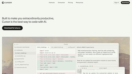
Cursor acts as a central hub for writing and managing AI-generated code. Its Agent Mode autonomously executes task lists, significantly reducing manual coding effort. Kevin shared his strategy in pairing Cursor with a pre-configured "agent folder" in his repositories. This folder serves as a contextual workspace for the AI, containing instructions, examples, and scratchpad files that help the agent stay on track.
Why It Works: By isolating AI-specific files from the main codebase, developers prevent the agent from unintentionally modifying critical files while still giving it the flexibility to explore and iterate.Pro Tip: Add specific rules for the agent to follow. For example:
3. Storybook as an AI Partner"Focus only on React components in the ‘src/components’ folder. Use Storybook for visual testing and ensure all states are documented."
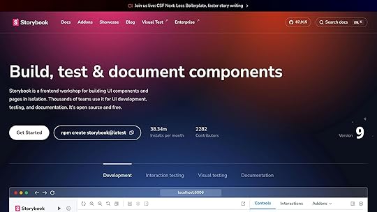
Storybook plays an invaluable role in visually verifying AI-generated components. Since front-end development is intermediated by the browser, Storybook enables developers to:
Express every key state of their components.Visually confirm that the AI-generated code renders as intended.Generate edge cases automatically, including accessibility and responsive states.Kevin demonstrated how Storybook becomes especially useful when paired with Cursor. Storybook handles the visual verification of components, while Cursor handles code generation. For example, AI-generated Storybook stories included:
Default, loading, and disabled button states.Edge cases like long labels and high-contrast modes for accessibility.4. Refining the Workflow with Browser-Aware AICursor recently introduced browser-aware testing. This feature allows the AI agent to open Storybook in a browser, navigate through components, and take screenshots to verify rendered states. This closes the feedback loop by enabling the AI to self-correct and iterate based on actual browser output.
Advanced Tips for AI-Assisted DevelopmentUse Context WiselyOne of the major challenges in AI workflows is context management. LLMs (Large Language Models) rely on limited memory (i.e., "tokens"), so feeding them structured, relevant information is crucial. Kevin shared some strategies:
Keep files small and modular: Break larger files into smaller components to ensure the AI can reference them effectively.Document your codebase: Add brief comments to files explaining their purpose for future AI-generated iterations.Predefine design systems: If your project uses a specific design system (e.g., Atomic Design), provide detailed documentation upfront.Leverage AI for RefactoringAI excels at repetitive tasks like refactoring. Kevin regularly instructs Cursor to:
Refactor files exceeding 500 lines of code.Replace hard-coded values with design token variables.Add missing TypeScript typings.Balance Quality and SpeedWhen building prototypes, it’s tempting to prioritize speed over quality. However, Kevin advises finding the right balance:
For quick prototyping: Use pre-configured templates and older, AI-friendly versions of libraries.For long-term projects: Invest in detailed specs and proper testing, even if it increases initial costs.Key TakeawaysFront-Load Planning for Better Results: Spend significant time creating detailed task lists and prompts for AI agents. This ensures higher quality outputs and reduces the need for retries.Pair Cursor with Storybook: Use Storybook to visually verify AI-generated components and maintain consistency across states.Use Contextual Workspaces: Create an "agent folder" in your repo to guide AI agents without interfering with critical files.Optimize Costs: Opt for efficient models like GPT-5 and limit token usage by refining prompts and providing clear context.Adopt AI-Friendly Practices: Refactor large files, document code, and use modular design systems to make your codebase more accessible to AI tools.Leverage Browser-Aware AI Testing: Close the loop by enabling AI agents to interact with rendered components in a browser.Iterate Prototypes Rapidly: Use AI tools to produce functional prototypes within hours, enabling faster user feedback and iteration cycles.Final ThoughtsThe integration of AI tools like Cursor and Storybook marks a pivotal shift in front-end development. By combining speed, intelligence, and structure, developers can focus on higher-level decision-making while AI handles the grunt work. Whether you’re spinning up prototypes or building production-grade apps, the techniques shared in this session can help you unlock new levels of efficiency and collaboration.
Embrace the possibilities – but remember, the key to successful AI workflows lies not in automation alone but in how effectively you guide and manage the process. With proper planning, context, and tools, the future of front-end development has never looked brighter.
Source: "Rapid Frontend Prototyping with Cursor & Storybook" – Chromatic, YouTube, Jan 1, 1970 – https://www.youtube.com/watch?v=3uu05bWdTnY
Use: Embedded for reference. Brief quotes used for commentary/review.
Related Blog PostsHow AI Improves Design Team WorkflowsHow to Automate Interactive Prototypes with AIHow AI Converts Prototypes to CodeInteractive Prototyping with React Components
The post Rapid Frontend Prototyping with AI, Cursor & Storybook appeared first on Studio by UXPin.
October 13, 2025
Devart announces dbForge 2025.2 update with AI enhancements and expanded cloud capabilities
Devart, a prominent developer of database management software, has unveiled the latest version of its dbForge product line, dbForge 2025.2. The update introduces notable advancements in artificial intelligence, greater compatibility with servers and cloud environments, and user interface improvements designed to streamline workflows for database professionals.
Smarter AI Assistant for database developmentThe dbForge 2025.2 update enhances its integrated AI Assistant to make database development more efficient and less error-prone. The upgraded AI Assistant now offers:
Real-time error analysis: Instantly scans for errors and provides smart fixes without delay.Web search and response streaming: Accesses the internet for up-to-date answers and delivers responses in real time.These improvements are aimed at simplifying complicated tasks like query optimization, code correction, and troubleshooting, allowing developers to focus on more strategic work.
Broader server and cloud compatibilityAcknowledging the growing trend of cloud migrations, Devart’s latest update expands dbForge’s compatibility with new server and cloud environments. Some of the key improvements include:
Support for Microsoft Fabric , including Data Warehouse.Enhanced Azure SQL support, covering partition functions, schemes, tables, columns, and indexes.Compatibility with the latest versions of MySQL 9.4 and MariaDB 12.These updates ensure that organizations can leverage cutting-edge cloud and database technologies while maintaining seamless functionality.
User experience upgradesThe 2025.2 update introduces several productivity-focused improvements to the user interface. These enhancements are designed to make the software more intuitive and efficient for daily use. New features include:
Automatic data type detection when creating new columns.Context-rich tooltips in SQL document tabs for quick reference.Customizable tab positioning for better workspace organization.New shortcuts to facilitate faster editing and navigation.Alias refactoring in dbForge Studio for PostgreSQL, ensuring cleaner and more consistent queries.Additional feature highlightsThe update also brings a variety of technical enhancements across supported database management systems. These include:
JSON datatype modifiers for Oracle databases.Full OPENROWSET functionality in SQL Server.Improved security with Entra ID and advanced encryption.Enhanced Query Builder options for qualifying column names.New suggestions for the BEGIN ATOMIC WITH clause.Unified management with dbForge Edge
All features introduced in dbForge 2025.2 are also available in dbForge Edge, Devart’s multidatabase solution. This tool allows users to manage SQL Server, MySQL, MariaDB, Oracle, PostgreSQL, and a wide range of cloud services from a single platform, facilitating streamlined workflows across hybrid environments.
Availability and updatesThe dbForge 2025.2 update is now available. Users with active subscriptions can upgrade to access these new capabilities, while new users can explore the latest features through a free trial.
Devart continues to position itself as a leader in database management solutions with this release, offering tools that keep pace with advancements in AI and the increasing adoption of cloud technologies.
For more information about dbForge 2025.2, Devart encourages users to explore their official website.
The post Devart announces dbForge 2025.2 update with AI enhancements and expanded cloud capabilities appeared first on Studio by UXPin.
How Web Dev Agents Scale Enterprise UI Development
In the fast-paced world of UI/UX design and front-end development, the ability to streamline workflows and deliver high-quality results consistently is paramount. The recent advancements in web development agents, particularly those that integrate design tools like Figma with coding workflows, have opened new doors for designers and developers alike. This article explores how web development agents are transforming enterprise UI development, diving deep into their capabilities and offering practical insights for professionals in the field.
Introduction: The Promise of Web Development AgentsBuilding efficient, scalable, and visually accurate user interfaces for enterprises has long been a challenge. The process often involves multiple iterations between design and development, leading to inefficiencies, errors, and delays. For years, professionals have dreamed of a seamless bridge between design tools and code – one that eliminates redundancies and accelerates delivery without compromising quality.
Enter the web development agent: an AI-driven solution that automates key parts of the design-to-development pipeline. By integrating directly with design platforms like Figma and leveraging modern web technologies (React, Vue.js, etc.), these agents simplify UI implementation, enhance consistency, and even generate production-ready end-to-end tests. In this article, we’ll break down the key features and real-world applications of web development agents.
Key Features of Web Development Agents1. Seamless Integration with Figma

One of the standout features of web development agents is their ability to connect with Figma, a popular design tool. By using Figma’s dev mode or local MCP server, developers can directly extract design components – complete with styling, layout, and assets – and convert them into reusable code.
For example:
A Figma frame can be selected and linked to the web dev agent, which then generates precise React or Vue.js components.The agent accurately identifies fonts, colors, and layout structures, ensuring a high-fidelity translation from design to code.This integration not only saves time but also preserves the original design intent, minimizing back-and-forth communication between designers and developers.
2. Support for Screenshots as InputIn cases where direct Figma integration is unavailable or impractical, web development agents can also work with screenshots. By analyzing the visual details of a screenshot, the agent approximates styles, identifies structural hierarchies, and generates code accordingly.
While this method may not be as precise as direct Figma integration, it is remarkably effective in creating functional prototypes and MVPs without requiring access to the original design files.
3. Browser Automation and Error HandlingWeb dev agents come equipped with browser automation capabilities, allowing for real-time testing and debugging. They can:
Run headless browsers in the background.Analyze console logs for errors.Automatically iterate on and fix issues based on those logs.This feedback loop ensures that any errors in the code are addressed promptly, significantly reducing the time spent on manual debugging.
4. Automatic End-to-End TestingOne of the most transformative aspects of web dev agents is their ability to generate comprehensive end-to-end tests using tools like Playwright. By automatically creating assertions and functional tests for the generated components, the agent ensures that the UI is not only visually accurate but also robust and ready for production.
For instance:
If the generated component includes tabs or dropdowns, the agent creates tests to verify their interactivity.Any failing tests are highlighted and, in many cases, automatically resolved by the agent.This level of automation eliminates a significant portion of manual testing, allowing teams to focus on higher-level optimizations.
Real-World Workflow: From Design to ProductionStep 1: Connecting to Figma or Using a ScreenshotTo get started, the web dev agent requires either a Figma design file or a screenshot of the desired UI. For Figma users:
Enable the local MCP server in Figma settings.Select the desired frame or component in Figma.Provide the agent with a link to the selection.Alternatively, simply upload a screenshot and prompt the agent to generate code.
Step 2: Generating ComponentsOnce the input is provided, the web dev agent processes the design and produces code in the specified framework (React, Vue.js, etc.). Developers can customize the output by specifying:
CSS frameworks (e.g., Tailwind CSS).Preferred coding practices (e.g., using React with Vite).Step 3: Reviewing and TestingAfter generating the components, the agent:
Creates a testing suite using Playwright.Executes end-to-end tests to validate functionality.Provides real-time feedback on errors or discrepancies.Developers can review the generated tests, approve changes, and rerun tests as needed.
Step 4: Iterative ImprovementsIf any part of the implementation requires refinement, the agent uses the test results and console logs to iteratively improve the output. This ensures a polished, production-ready solution.
Challenges and ConsiderationsWhile web dev agents offer numerous advantages, they are not without limitations:
Figma Dependency: For precise results, the Figma files need to be well-structured and organized. Poorly labeled components can lead to inaccuracies.Screenshot Approximation: When working with screenshots, the output may lack the exact fidelity of a Figma-based workflow.Learning Curve: Teams may need time to fully understand and integrate the agent into their existing workflows.That said, the benefits far outweigh these challenges, especially for enterprises looking to scale their UI development processes.
Key TakeawaysEffortless Figma Integration: Web dev agents can convert Figma designs into code with remarkable accuracy, preserving fonts, colors, and layouts.Versatility with Screenshots: Even without direct design file access, agents can generate functional components from screenshots.Automated Testing: The automatic generation of end-to-end tests ensures robust, production-ready UIs without additional effort.Error Feedback Loop: By analyzing console logs, web dev agents can identify and resolve issues in real-time.Framework Flexibility: Agents support modern web technologies like React, Vue.js, and Tailwind CSS, making them adaptable for various projects.Time and Cost Savings: By reducing manual coding and testing efforts, web dev agents accelerate development timelines and improve team efficiency.ConclusionWeb development agents represent a significant leap forward in enterprise UI/UX workflows. By bridging the gap between design and development, they streamline processes, reduce errors, and enable teams to focus on creativity and innovation. Whether you’re working with Figma files or starting from scratch with screenshots, these agents provide a powerful toolkit for building scalable, high-quality user interfaces.
For UI/UX designers and front-end developers, this technology is not just a convenience – it’s a game-changer. Now is the time to explore how web dev agents can transform your design-to-development pipeline and set a new standard for efficiency and quality in enterprise UI development.
Source: "Scaling Enterprise UI Development with Web Dev Agents" – zencoderai, YouTube, Sep 12, 2025 – https://www.youtube.com/watch?v=gmFoiu_fRXY
Use: Embedded for reference. Brief quotes used for commentary/review.
Related Blog PostsAI-Powered Testing for React ComponentsResponsive Code Export for React, Vue, and AngularReact Components with AI Animation-to-Code ToolsHow No-Code Export Tools Simplify Design-to-Code Workflows
The post How Web Dev Agents Scale Enterprise UI Development appeared first on Studio by UXPin.
October 11, 2025
How to Structure AI-Assisted Development with PRDs
In the rapidly evolving world of software development, artificial intelligence (AI) agents have become a transformative tool. However, working with AI agents can be both exhilarating and chaotic. This article explores a systematic approach to harnessing the power of AI in software development, emphasizing the use of Product Requirement Documents (PRDs) as the backbone of a structured workflow. By adopting this method, developers and design teams can eliminate the chaos, improve collaboration, and streamline their design-to-development process.
We’ll break down an innovative AI-assisted development framework that maintains order and progress, ensuring both human teams and AI agents stay on track. Whether you’re a UI/UX designer or a front-end developer, this workflow offers actionable insights to optimize your projects.
The Problem: Chaos in AI-Assisted DevelopmentAI agents are powerful tools capable of generating high-quality code and making decisions autonomously. But here’s the catch: they often lack context, jump between tasks unpredictably, and perform inconsistently when dealing with complex workflows. For example, AI might write impeccable database code in one moment but completely disregard it in subsequent tasks. This creates inefficiencies, bottlenecks, and frustrations for developers striving for consistency.
Many teams try to manage AI agents using existing project management tools like Jira or GitHub Projects, or newer AI-specific task managers. However, these tools frequently fall short. They are either too rigid, lacking flexibility for AI-driven workflows, or too disorganized to provide meaningful structure. The result? Teams spend more time wrangling their tools than actually building software.
This is where structured workflows built around PRDs come into play.
The Solution: A PRD-Centric Workflow for AI CollaborationAt the heart of this transformative system lies an important principle: AI development requires structure. The speaker in the video developed a custom workflow integrating PRDs at every stage of the process. This not only forces human developers to follow a clear roadmap but also ensures AI agents adhere to a systematic approach, reducing inefficiencies dramatically.
What Are PRDs and Why Are They Critical?PRDs – Product Requirement Documents – serve as detailed blueprints for development. They outline what needs to be built, why it’s important, and how it should function. They may also be called feature specs, user stories, or other names depending on the team, but their purpose remains the same: to provide a structured foundation for development.
For both humans and AI, PRDs act as a single source of truth, ensuring that the project evolves in alignment with pre-defined requirements, even as complexities arise.
Breaking Down the AI-Assisted Workflow1. Creating a PRD: Structured Planning Before ExecutionThe workflow kicks off with a command like /PRD create. This step is far more than just writing requirements; it involves AI performing deep analysis of the codebase, researching implementation strategies, and drafting a comprehensive plan.
Key features of the AI-driven PRD creation process include:
Codebase Analysis: AI examines existing architecture to ensure compatibility with the new feature.Milestone Planning: The PRD includes technical milestones, risk assessments, and suggested implementation strategies.Smart Model Switching: During planning, developers can use advanced AI models for critical thinking, and then switch to cost-effective models for execution tasks.This stage mirrors the work of an experienced tech lead, offering a structured plan that ensures clarity and reduces missteps later.
2. Prioritizing Tasks with PRD RetrievalOnce PRDs are created, the next step involves deciding what to work on. Enter the /PRD get command, which addresses the common problem of decision paralysis.
Rather than presenting a simple list of requirements, the AI analyzes PRDs to:
Categorize Tasks: For example, isolating critical bug fixes from feature requests.Highlight Dependencies: Identifying which tasks rely on others for completion.Suggest Priorities: Offering strategic recommendations based on project goals and urgency.This allows teams to confidently select tasks that align with their immediate objectives.
3. Starting the Development ProcessThe command /PRD start transitions the team from planning to execution. Here’s what makes this step revolutionary:
Codebase Integration: The AI analyzes the existing architecture and identifies how the new feature will integrate into the system.Phase Planning: The AI creates a detailed implementation plan, breaking it into manageable phases with clear success criteria.Interactive Collaboration: Developers approve each step, ensuring full control over the process.This structured approach prevents common pitfalls like architectural mistakes or technical debt.
4. Tracking Progress and Updating PRDsOne key principle of this workflow is that documentation should reflect reality. To maintain this, teams use the /PRD update progress command.
This command allows the AI to:
Log Completed Work: The AI provides evidence of what tasks have been accomplished.Adjust Progress: PRDs are updated with precise percentage completions, new milestones, and work logs.Maintain Clarity: Even if team members rejoin after weeks, the PRD remains an accurate resource for understanding the project’s status.This step eliminates confusion and allows development to proceed seamlessly, even across multiple sessions.
5. Adapting to Changes: Decision UpdatesSoftware development is a dynamic process. Plans made during the initial PRD creation often evolve as new discoveries surface. The /PRD update decisions command ensures these changes are captured.
For example:
Architectural Adjustments: If a better solution is identified, it’s documented in the PRD.New Requirements: Any additional constraints or opportunities are reflected in real-time.This prevents critical decisions from being buried in chat histories or forgotten entirely.
6. Closing Out the PRD: A Professional Completion WorkflowFinally, the /PRD done command ensures that each feature is fully completed and documented. This isn’t just about merging code; it’s about following a professional-grade closure process, including:
Running final tests and validating quality standards.Generating detailed pull requests tied to the PRD for efficient code review.Cleaning up branches and updating the project roadmap.By the end of this step, the team achieves not only functional code but also comprehensive documentation for future reference.
Why This Workflow WorksThis structured system transforms chaotic AI-assisted development into a streamlined, professional process. Its key advantages include:
Context Preservation: PRDs serve as the ultimate source of truth, ensuring no detail gets lost.Collaboration Optimization: AI agents and humans work together seamlessly, with each playing to their strengths.Scalability: The process scales easily, whether for solo developers or large teams.Error Reduction: Structured workflows minimize miscommunication and technical debt.Key TakeawaysStructure Is Essential: AI agents thrive within a guided framework, and PRDs provide the roadmap needed for coherent progress.Plan Before Execute: Use advanced models for planning and cost-effective models for execution to optimize performance and resources.Update Continuously: Regularly update PRDs to reflect evolving understanding and decisions.Leverage Smart Tools: Commands like /PRD create and /PRD update progress eliminate manual overhead and ensure accuracy.Keep Documentation Alive: PRDs should evolve alongside the project, preventing them from becoming stale or irrelevant.Work as a Team: Developers oversee strategic decisions while AI handles systematic execution, balancing creativity and precision.Final ThoughtsAI-assisted development doesn’t have to be chaotic or unpredictable. By employing a structured, PRD-centric workflow, teams can transform the way they collaborate with AI, achieving precision, clarity, and efficiency in even the most complex projects.
Whether you’re integrating new features, addressing bugs, or building systems from scratch, this framework ensures a seamless journey from concept to completion. Embrace it, adapt it, and see how it revolutionizes your development process.
Source: "How I Tamed Chaotic AI Coding with Simple Workflow Commands" – DevOps & AI Toolkit, YouTube, Sep 29, 2025 – https://www.youtube.com/watch?v=LUFJuj1yIik
Use: Embedded for reference. Brief quotes used for commentary/review.
Related Blog PostsHow AI Improves Design Team WorkflowsHow to Automate Interactive Prototypes with AIHow AI Converts Prototypes to CodeHow AI Enhances Developer Handoff Automation
The post How to Structure AI-Assisted Development with PRDs appeared first on Studio by UXPin.
October 10, 2025
Design vs. Development: Bridging Workflow Gaps
When design and development teams work in silos, it leads to miscommunication, delays, and inconsistent results. Designers focus on user experience and visuals, while developers prioritize functionality and technical performance. The disconnect becomes most apparent during the handoff phase, where missing details, outdated designs, or unclear specifications can derail progress.
Key Takeaways:
Designers use tools like prototypes and style guides, while developers rely on code editors and testing frameworks.Common issues include unclear handoffs, communication gaps, and differing priorities (e.g., usability vs. performance).Shared tools, automated design specs, and continuous feedback loops can help bridge the gap.Platforms like UXPin allow teams to work with real, interactive components, reducing guesswork and improving collaboration.Quick Fixes:
Use shared tools that integrate design and development workflows.Automate design specs to minimize errors during handoffs.Establish regular feedback cycles to align teams early and often.Aligning these workflows ensures fewer revisions, faster delivery, and better user experiences. The solution isn’t just about tools but fostering collaboration throughout the process.
Bridging the Gap Between Design and DevelopmentCore Differences Between Design and Development Workflows
Design and development teams tackle product creation from distinct perspectives. While both aim to deliver a great user experience, their methods and priorities differ significantly. Recognizing these differences is key to fostering better collaboration.
Design Workflow Scope and FocusDesign teams center their efforts on understanding users and crafting engaging experiences. Their process begins with research – conducting user interviews, studying behavior patterns, and pinpointing pain points. This research lays the foundation for decisions on everything from information architecture to visual styling.
Design work is highly iterative. After gathering insights, designers produce and test wireframes, prototypes, and style guides. They refine visual elements like color schemes, typography, and spacing, ensuring every detail aligns with the user’s needs. Collaboration with stakeholders is essential to validate concepts and integrate feedback. Designers also focus on creating interactive elements that guide users seamlessly through the product.
To achieve this, they rely on tools that emphasize visual design and quick iteration. Their outputs include mockups, interactive prototypes, user flows, and comprehensive design systems that ensure consistency across the product.
This creative, user-focused approach contrasts sharply with the structured methods used by developers.
Development Workflow Scope and FocusDevelopment teams concentrate on building functional and scalable solutions. Their workflow begins with technical planning – analyzing requirements, selecting technologies, and designing systems capable of handling current demands and future growth.
Development follows structured methodologies like Agile or Scrum. Developers write code, design databases, integrate APIs, and ensure compatibility across devices and browsers. Their priorities lean toward performance, security, and maintainability rather than aesthetic details.
Developers rely on code editors, testing frameworks, and deployment tools to get the job done. Their deliverables include functional code, technical documentation, and deployment-ready applications.
The development process emphasizes systematic problem-solving and rigorous quality assurance. Teams conduct code reviews, run automated tests, and monitor application performance. They focus on edge cases, error handling, and addressing technical constraints that might not be evident in design mockups.
Mindset and Deliverable DifferencesThese differences in workflows shape how each team approaches challenges and delivers results. Designers focus on user journeys and emotional engagement, while developers prioritize logical flows and system architecture. This divergence can sometimes lead to miscommunication, especially during handoffs.
AspectDesign TeamsDevelopment TeamsPrimary FocusUser experience and visual appealFunctionality and technical performanceSuccess MetricsUsability, user satisfaction, conversion ratesCode quality, performance, error-free releasesKey ToolsDesign software, prototyping tools, user testing platformsCode editors, testing frameworks, version control systemsDeliverablesWireframes, prototypes, style guidesFunctional code, technical documentation, deployed applicationsIteration StyleVisual and creativeSystematic and technicalProblem-Solving ApproachUser-centered and exploratoryLogical and constraint-drivenThese differences can sometimes create friction. Designers may propose intricate animations or interactions without fully grasping the technical complexities involved. Conversely, developers might implement technically sound features that fail to align with the intended user experience.
Timing also plays a role. Designers often explore multiple concepts before choosing a direction, while developers prefer clear, finalized specifications before starting their work. This can lead to tension, especially when deadlines loom or requirements shift unexpectedly.
Common Design-to-Development Collaboration ProblemsThe challenges between design and development teams often arise from deeply ingrained differences in their workflows. These divisions can slow progress, create frustration, and lead to misaligned outcomes.
Separate Processes and Communication ProblemsWhen designers and developers operate in silos, the lack of shared processes and tools can lead to serious miscommunication. Separate ecosystems mean that each team works with limited visibility into the other’s work.
This disconnection often results in:
Designers crafting features without realizing the complexity of backend changes required.Developers implementing outdated designs because they weren’t included in recent design updates. Feedback delays that compound the problem – developers only review designs after the team has moved on to the next phase.Version control also becomes a headache. Designers iterate based on user feedback, while developers unknowingly work from old mockups.
Another common issue is the gap in understanding technical feasibility. Designers might propose intricate animations or interactions without knowing how these could impact performance. Meanwhile, developers, under time constraints, simplify these elements without consulting the design team – leading to products that fall short of the original vision.
Unclear Design HandoffThe design handoff is one of the most critical points in the workflow – and often the most problematic. When this process lacks clarity, it leads to confusion, delays, and results that don’t meet expectations.
Handoff issues often stem from:
Missing details like hover states, loading animations, or error messages.Inconsistent documentation across design files.Poorly named assets, such as buttons labeled "CTA_final_v3_updated."Lack of documentation for essential elements like color values, font weights, or spacing.Static mockups also fail to convey how interactive elements should behave. Developers are left guessing about dropdown menus, animation timing, or complex interactions, which rarely align with the designer’s intent.
A clear and detailed handoff process is critical to ensure that both technical and design priorities are met.
Language and Priority DisconnectsBeyond workflow issues, differences in language and priorities create further obstacles. Technical jargon often widens the gap between teams who approach problems from different perspectives.
For instance, when designers talk about "visual hierarchy", developers might understand the concept but weigh it differently. Similarly, when developers bring up "technical debt", designers may not fully grasp how it impacts their work.
These differences in priorities can cause tension:
Designers focus on user experience, visual consistency, and brand alignment.Developers prioritize performance, maintainability, and technical stability .Even the definition of "quality" varies – designers value visual precision and smooth interactions, while developers emphasize passing tests, handling edge cases, and meeting performance benchmarks.Timelines and feedback expectations further highlight these disconnects. Designers may expect quick changes, unaware that these require significant backend adjustments. Developers, on the other hand, may need weeks for features that designers assume can be completed in a few days. While designers often prefer continuous iteration, developers typically work better with finalized specifications.
These differences, rooted in specialized training and distinct responsibilities, make collaboration a complex challenge.
sbb-itb-f6354c6How to Bridge Workflow GapsClosing the gap between design and development requires a combination of shared tools, clear communication, and ongoing teamwork. These approaches address common challenges like unclear handoffs and misaligned priorities.
Using Shared Tools and PlatformsAt the heart of better collaboration is the use of shared tools that cater to both designers and developers. When teams rely on separate tools, it naturally creates barriers to communication and understanding.
Platforms like UXPin are designed to eliminate these barriers by allowing both teams to work in the same environment. With UXPin’s code-backed prototyping, designers can create interactive prototypes using actual React components. This means developers receive prototypes that behave like real applications, minimizing guesswork.
UXPin also provides built-in React libraries, including Material-UI, Tailwind UI, and Ant Design, which ensure that design choices align with development capabilities from the outset. By using these reusable UI components, designers can create prototypes that clearly demonstrate functionality, making it easier for developers to implement without ambiguity.
Additionally, UXPin’s design-to-code workflow simplifies collaboration by automatically generating the specifications and assets developers need. Instead of manually documenting details like spacing, colors, or typography, the platform extracts this data directly from the prototype. This reduces the chance of miscommunication and saves valuable time during handoffs. Shared tools like these create a solid foundation for precise and efficient collaboration.
Creating Clear Design SpecificationsBeyond shared tools, having well-documented and automated design specifications is crucial. These specs should cover everything from interactions and measurements to edge cases, bridging the gap between design vision and technical implementation.
Automated spec generation significantly reduces errors and speeds up the process. Tools that pull specifications directly from interactive prototypes ensure that measurements, color values, and spacing remain consistent throughout the project, eliminating manual mistakes.
The best teams go a step further by documenting the reasoning behind their design decisions. When specifications explain the "why" behind certain interactions or how they support user goals, developers can make informed decisions about implementation without compromising the user experience.
Building Feedback LoopsTo keep both teams aligned, structured feedback processes are essential. Rather than waiting until the end of a phase to review work, continuous feedback cycles catch potential issues early, when they’re easier and less costly to address.
Effective feedback loops involve designers reviewing development work to ensure it matches the original prototypes, while developers provide input on design feasibility during the planning stages. This back-and-forth helps clarify constraints and opportunities before committing to specific solutions.
Real-time collaboration features make these feedback loops even smoother. Tools that support real-time commenting allow for precise, actionable feedback. Version control systems that track changes across both design and code ensure everyone is working from the same baseline.
Regular cross-functional reviews also help build a shared understanding between teams. When designers participate in code reviews and developers join design critiques, both groups gain insight into each other’s challenges and priorities. This mutual understanding fosters smoother collaboration and leads to better decisions throughout the product development process.
Case Study: How UXPin Bridges Design and Development

UXPin tackles the common disconnect between design and development by providing tools that unify workflows. By focusing on seamless prototyping and handoffs, it demonstrates how effective collaboration can transform product development.
Code-Backed PrototypingUnlike traditional tools that produce static mockups, UXPin enables designers to create interactive prototypes using real React components. This means the prototypes aren’t just visual representations – they behave just like the final product will.
When designers use UXPin, they’re working with the same components developers will use in production. This eliminates the guesswork during handoffs, as developers receive prototypes that accurately reflect the intended functionality. For example, instead of presenting multiple static screens to show various states, designers can build a single interactive prototype that mirrors real application behavior. Developers can then click through and test these prototypes, gaining a complete understanding of how the product should function before they write any code.
This approach also aligns design decisions with technical realities. By working directly with production-ready components, designers naturally stay within the limits of what’s feasible, reducing back-and-forth debates about implementation challenges. The result? A smoother transition from design to development and fewer surprises down the road.
Design-to-Code WorkflowUXPin takes the hassle out of handoffs by automating the process of extracting specifications. Instead of manually documenting details – a process prone to errors – UXPin pulls all the necessary information directly from the prototype.
When the prototype is ready, developers can access precise specifications such as color values, spacing, typography, and interaction details. These specifications are automatically generated from the components used in the design, ensuring accuracy and consistency. Developers can also inspect elements to retrieve exact CSS properties, React props, and asset files, all formatted and ready for production. Since the prototypes are built with real components, the specifications perfectly match what needs to be implemented.
Real-Time Collaboration and Version ControlCollaboration is often where projects hit roadblocks, but UXPin’s tools are designed to keep teams in sync. With real-time commenting, team members can leave feedback directly on specific elements of the prototype. This creates a clear record of decisions and changes, making it easier to track progress.
UXPin’s version history ensures that all updates are documented, so teams can easily revert to earlier versions if needed. This feature is invaluable when multiple contributors are working on the same project or when stakeholders request changes to previous designs.
To further streamline collaboration, UXPin integrates with tools like Slack, Jira, and Storybook. For example, teams can sync UXPin prototypes with their existing component libraries through Storybook, ensuring that both design and development stay aligned as components evolve. The platform also supports npm integration, allowing teams to import their custom React components directly into UXPin. This means designers and developers work with the same components, creating a single source of truth for the entire project.
With these features, UXPin fosters transparency and minimizes miscommunication. Both teams can track progress, understand decisions, and provide feedback – all within a shared workspace.
Conclusion: Better Design and Development CollaborationAligning design and development isn’t just a nice-to-have – it’s a critical factor for creating successful, user-friendly products. The stakes are high: nearly 25% of users abandon a mobile app after just one use if it doesn’t deliver a smooth, intuitive experience. And here’s a sobering fact: fixing an issue after development can cost 100 times more than addressing it during the design phase.
Using unified tools and clear specifications can bridge communication gaps between teams. When designers and developers work from the same playbook – whether through shared components or code-backed prototypes – misunderstandings are minimized, and costly rework becomes a thing of the past.
Continuous feedback throughout the product lifecycle is another game-changer. By incorporating real user insights instead of relying on assumptions, teams can create products that don’t just function but genuinely resonate with users. This focus on user-centered design has tangible benefits: retaining existing users is far more cost-effective than acquiring new ones, with customer acquisition costing up to five times more than retention.
Teams that succeed in this collaboration often follow best practices like defining detailed user personas, mapping out complete user journeys, and prioritizing accessibility from the very beginning. These steps not only improve the product but also foster a cohesive team with a shared focus on user needs.
When design and development work in harmony, the results speak for themselves: technically sound products that are easy to use, cost-efficient to build, and well-positioned to thrive in competitive markets. This synergy doesn’t just create better products – it builds stronger connections with users, ensuring long-term success.
FAQsHow do shared tools and platforms help design and development teams work better together?Shared tools and platforms provide a common ground where designers and developers can work together seamlessly. With features like real-time updates, built-in feedback options, and streamlined communication, these tools help minimize confusion and keep workflows running smoothly.
Another key advantage is the use of shared design systems. These systems serve as a centralized reference for components and guidelines, ensuring consistency across the board. This not only makes the development process more efficient and scalable but also speeds up iteration cycles. The result? Smarter decisions and a more unified approach to product development.
What challenges often occur during the design handoff process, and how can teams address them effectively?The design handoff process often hits bumps in the road due to miscommunication, incomplete documentation, or tools and workflows that don’t align. These hiccups can lead to delays, mistakes, or mismatched expectations between designers and developers.
To tackle these obstacles, teams should prioritize open and consistent communication, ensure thorough and organized documentation, and rely on tools that enable efficient collaboration between design and development. Using platforms that bridge the gap between design and code can streamline the process and minimize friction between team members.
Why is continuous feedback essential for improving collaboration between design and development teams?Continuous feedback plays a key role in keeping design and development teams working in harmony. It helps catch potential problems early, minimizes misunderstandings, and ensures everyone stays on the same page with the project’s goals and user expectations. By tackling issues as they come up, teams can sidestep expensive delays or the need for rework.
This steady flow of communication builds stronger collaboration, encourages shared understanding, and boosts the overall quality of the product. In the end, continuous feedback not only streamlines workflows but also results in better experiences for users.
Related Blog Posts10 Ways to Improve Design-to-Development HandoffHow to Integrate Collaboration Tools into Design WorkflowsHow Real-Time Design Fits Agile ProcessesDesigner vs. Developer: Bridging the Gap in Design SystemsThe post Design vs. Development: Bridging Workflow Gaps appeared first on Studio by UXPin.
Google unveils substantial updates to its Stitch AI design tool for UI/UX designers
Google is rolling out a series of significant updates to its Stitch AI design tool, aimed at enhancing its appeal for UI/UX designers, product teams, and professionals focused on prototyping workflows. These new features, currently available as previews, are expected to provide streamlined design processes and greater integration with Google’s broader ecosystem. While a firm release date has not been announced, the updates showcase Google’s continued investment in generative AI for design and development.
New tools to simplify design workflowsAmong the updates, the new "Annotate" feature stands out as a key addition. Represented by a banana icon, which hints at its use of Google’s lightweight Nano-Banana model, this feature enables users to add comments and visual notes directly onto UI screens. Once annotations are submitted, the annotated screenshot is shared in the chat, where Google’s Gemini AI processes the feedback and implements context-aware UI changes. This innovation is poised to facilitate faster iterations, especially for distributed teams working on rapid prototyping projects.
Another major update is the "Theme" feature, designed to support consistency in design systems. With this update, users can manage a range of visual elements via a new sidebar. Options include toggling between light and dark modes, selecting primary or dual color palettes, adjusting corner radii, and customizing font settings. These changes cascade across the entire interface, making Stitch a more compelling option for teams prioritizing cohesive theming.
Bringing interactivity to prototypingOne of the most notable enhancements is the introduction of "Interactive" capabilities for prototyping user experiences. This feature enables users to storyboard UX flows in a hands-on manner, with tools such as click and input modes and a "Describe" prompt for refining page transitions and interactions. This low-code solution allows designers to visualize how an application should behave in response to user actions, giving them granular control over app functionality.
Additionally, a new "Expert" or "Share" button has been added, enabling direct exports to Firebase Studio. By integrating with Google’s cloud ecosystem, this feature aims to streamline the handoff between design and development, further positioning Stitch as a viable choice for cross-functional teams.
Positioning Stitch as a competitive toolStitch represents Google’s response to the growing demand for AI-powered design tools in the UI/UX space. These updates align with the company’s broader strategy to integrate AI into its productivity and cloud offerings, providing more seamless workflows for professionals involved in design and frontend development. If these features perform as expected, Stitch could emerge as a strong competitor to established platforms like Figma, particularly for teams already embedded in Google’s ecosystem.
With its focus on rapid prototyping, interactivity, and comprehensive design system management, Stitch is shaping up to be an increasingly valuable tool for designers leveraging generative AI. While users await an official release date, the previewed features signal a promising direction for Google’s ambitions in the design and development landscape.
The post Google unveils substantial updates to its Stitch AI design tool for UI/UX designers appeared first on Studio by UXPin.
October 8, 2025
How to Create Logical Tab Order in Prototypes
When designing prototypes, logical tab order ensures smooth navigation for users relying on keyboards or assistive technologies. Here’s what you need to know:
Tab Order Basics: Tab order defines the sequence of focusable elements (buttons, fields, etc.) when navigating with the Tab key. It should align with the visual and logical flow of the interface.Why It Matters: A clear tab order improves usability for keyboard users, including those with disabilities, and ensures compliance with accessibility standards like WCAG 2.1 and Section 508.Standards to Follow: Focus order must be logical, all functionality should work via keyboard, and users should never get stuck (e.g., in modals).Tools and Techniques:Use tabindex to control focus.Add ARIA attributes for screen reader clarity.Test manually with Tab/Shift+Tab and screen readers to ensure proper flow.Common Fixes: Address skipped elements, confusing sequences, and missing labels by restructuring layouts and using UXPin‘s accessibility tools.Logical tab order benefits everyone by making interfaces easier to navigate and more user-friendly. Start early in the design process to avoid issues later.
Focus and Tab Order Help with Screen Reader AccessibilityAccessibility Standards for Tab Order
Designing for accessibility isn’t just about meeting compliance – it’s about creating interfaces that everyone can use. Two key frameworks guide the design of tab order: the Web Content Accessibility Guidelines (WCAG) and Section 508. These frameworks outline rules to ensure your UXPin prototypes are accessible to users with disabilities.
WCAG and Section 508 RequirementsThese frameworks set the foundation for accessibility. WCAG outlines three critical requirements that directly influence how you design tab order in prototypes.
WCAG 2.4.3 Focus Order (Level A) emphasizes that focusable elements must follow a logical and meaningful sequence. In practice, this means your tab navigation should align with the visual and logical flow of your content. For example, in a form with vertically arranged fields, the tab order should move from top to bottom. Users navigating with the Tab key should experience a seamless flow without unexpected jumps that disrupt their understanding of the interface.
WCAG 2.1.1 Keyboard (Level A) ensures that all functionality is accessible via a keyboard. This is crucial for users who cannot use a mouse. In UXPin, this means every interactive element – like buttons, form fields, dropdowns, and custom controls – must be fully operable with a keyboard. No user should encounter a feature they can’t access without a mouse.
WCAG 2.1.2 No Keyboard Trap (Level A) prevents users from getting "stuck" on any element when navigating with a keyboard. For instance, modal dialogs, dropdown menus, or custom widgets in your prototype should always allow users to navigate away using keys like Tab, Shift+Tab, or Escape.
Section 508, which applies to U.S. federal agencies, aligns closely with WCAG standards but includes specific requirements for government applications. If you’re designing prototypes for federal agencies or contractors, compliance with Section 508 isn’t optional – it’s mandatory. To meet these standards effectively, ARIA attributes can be used for precise control over focus and navigation.
Using ARIA Attributes for Tab OrderARIA (Accessible Rich Internet Applications) attributes are essential tools for managing tab order and enhancing screen reader usability.
The tabindex attribute controls focus behavior. Use tabindex="0" to include an element in the natural tab order, and tabindex="-1" to remove it while still allowing programmatic focus. Avoid using positive tabindex values (e.g., tabindex="1") unless absolutely necessary, as they can disrupt the natural flow. aria-label and aria-labelledby help provide accessible names for controls like icon-only buttons. For example, a pencil icon representing an "Edit" button should include aria-label="Edit item" so screen readers can convey its purpose. aria-describedby links elements to descriptive text, which is particularly useful for form fields with additional help text or error messages. For instance, a password field can use aria-describedby to point to instructions about password requirements, ensuring screen reader users have access to the same guidance as sighted users.In UXPin, you can directly add ARIA attributes to elements in your prototypes. This approach integrates accessibility into your design process, making it a natural part of your documentation rather than an afterthought.
How to Create Tab Order in UXPin

Building an accessible tab order in UXPin involves structuring your elements properly, managing focus effectively, and ensuring all labels are clear and descriptive. UXPin’s code-backed prototyping features make it easier to integrate these accessibility practices directly into your designs.
Setting Up Your Prototype StructureA logical tab order starts with how you organize elements in your prototype. The visual order of elements should align with the sequence users expect to navigate through them. For example, in a contact form, arrange fields vertically to match the natural flow.
UXPin’s modular design tools simplify this process. By using reusable components for standard interface patterns – like navigation menus or forms – you can ensure a consistent and logical tab order across your design. If you’re leveraging UXPin’s React libraries, such as MUI or Ant Design, many accessibility features are already built in, saving you additional effort.
Setting Focus Order in UXPinUXPin gives you control over focus behavior through its properties panel. Here’s how you can fine-tune the tab order:
Use tabindex="0" for interactive elements to include them in the natural tab sequence. You can set this directly in the accessibility section of the properties panel.Exclude non-interactive elements from tab navigation by assigning tabindex="-1". This works well for decorative elements or buttons that shouldn’t receive keyboard focus but might still need to be programmatically focusable. For example, in a carousel, only the controls for the active slide should be tabbable.Avoid using positive tabindex values. If you find yourself needing them, it’s often a sign the layout needs restructuring.With UXPin’s interaction system, you can create custom focus behaviors. For instance, when a user opens a modal, you can automatically set the focus on the first interactive element inside the modal. This ensures smoother navigation and keeps the experience intuitive.
Adding Labels and Feedback for Screen ReadersFor screen reader users, clear and descriptive labels are essential. These labels provide context and reinforce the tab order. UXPin lets you add ARIA attributes through the properties panel to achieve this.
Label all form fields: Use the aria-labelledby attribute to connect labels to their corresponding form fields. Create a text label, assign it a unique ID, and reference that ID in the form field’s aria-labelledby property. This ensures screen readers can programmatically link the field and its label.For icon-only buttons, use aria-label to describe their function. For example, a magnifying glass icon should have aria-label="Search", and a trash can icon might have aria-label="Delete item". These labels won’t appear visually but provide essential context for screen reader users.Error messages and help text: Use aria-describedby to link form fields to their associated help text or error messages. For example, when a user focuses on a password field, the screen reader should announce the field label along with any password requirements.You can also use state management to dynamically update labels. For example, a button labeled aria-label="Play video" can change to aria-label="Pause video" when clicked.
Enhancing Focus Indicators and NavigationUXPin allows you to customize focus indicators, ensuring they are clear and meet accessibility standards. Focus indicators should have sufficient color contrast (at least 3:1) and be easily visible around the entire element.
For complex interfaces, consider adding skip links. These are invisible links that become visible when users start tabbing, allowing them to jump directly to main content areas. In UXPin, you can create these links using interactions that move the focus to specific sections when activated.
sbb-itb-f6354c6Testing Your Tab OrderWhen setting up your tab order in UXPin, it’s important to use a mix of manual, automated, and screen reader testing. This approach helps catch any issues that might otherwise slip through the cracks.
Manual Keyboard TestingStart by navigating your prototype using only the Tab key. Use Tab to move forward and Shift+Tab to go backward. Watch closely to see if the focus flows in a logical way that aligns with the visual layout.
Check that focus indicators are easy to see and have strong contrast. If you’re struggling to locate the focus, imagine how much harder it would be for users with visual impairments.
For elements like modals, dropdowns, and accordions, ensure the focus shifts logically. For instance, when opening a modal, the focus should jump to the first interactive element inside it, and when closing the modal, it should return to where it was before. Similarly, when expanding a dropdown menu or accordion, all new options should be accessible through keyboard navigation.
Confirm that all interactive elements respond to keyboard input. For example, pressing Enter should activate buttons, and Shift+Tab should reverse navigation. If you’ve added custom interactions in UXPin, make sure they work seamlessly with keyboard controls, not just mouse clicks.
Using Tab Order Testing ToolsOnce you’ve manually tested navigation, use built-in tools for a deeper analysis. UXPin’s preview mode allows you to test keyboard navigation directly in your prototype. Regularly using this feature during the design process helps you spot issues early, like elements not receiving focus or appearing in the wrong sequence.
Browser developer tools also provide valuable insights. Press F12 to open developer tools and access the accessibility panel. Many browsers offer features like numbered overlays to visualize the tab sequence. For example, Chrome’s accessibility tools can highlight which elements are focusable and in what order.
Run accessibility audits to uncover common tab order problems. These tools can flag missing focus indicators, incorrect tabindex values, and interactive elements that aren’t keyboard accessible.
Keep a record of your findings as you test. Document which sections perform well and which need adjustments. This log will be helpful when refining your design or handing it off to developers.
Testing with Screen ReadersScreen reader testing goes a step further to ensure your prototype is truly accessible. Start with the screen reader built into your operating system – such as NVDA or JAWS on Windows, VoiceOver on macOS, or Orca on Linux.
Navigate using only keyboard commands to check that labels, headings, and structure make sense without relying on visuals.
Listen carefully to how the screen reader announces each element. Form fields should include their labels, along with any help text or error messages. Buttons need descriptive names that clearly explain their purpose. If all you hear is "button", users won’t know what it does.
Pay special attention to complex interactions. For example, when submitting a form or opening a new section, ensure the screen reader announces these changes. If your UXPin prototype includes dynamic content updates, verify that screen readers can detect and describe these updates to users.
Screen reader users often rely on headings, landmarks, or specific element types to navigate instead of tabbing through everything. Test these navigation methods to confirm your prototype supports multiple ways of exploring the content.
Common Tab Order Problems and FixesEnsuring proper tab order is a vital part of making your prototypes fully keyboard accessible. Even with careful planning, issues can arise during testing. This section outlines common tab order problems in UXPin prototypes and provides straightforward solutions to address them.
Fixing Skipped or Missing ElementsWhen interactive elements are skipped in the tab sequence, it creates serious accessibility gaps. Buttons, links, form fields, or custom components can sometimes get left out of the tab order unintentionally. To fix this in UXPin, check the Interactions panel to confirm that every interactive element is focusable. Pay extra attention to custom components and imported elements, as these are more likely to cause issues.
On the other hand, decorative elements receiving focus can confuse users. Items like images, background shapes, or text labels that aren’t meant to be interactive shouldn’t appear in the tab sequence. You can fix this by removing focus from these elements in the layer structure.
Hidden or collapsed elements, such as those in expandable menus, can also disrupt tab order. Make sure these elements are removed from the tab sequence when they are not visible. You can use UXPin’s conditional interactions to make these elements unfocusable when sections are collapsed.
Form elements need extra care. Every input field should have a proper label, and related items like error messages or help text should be programmatically linked. Use the accessibility properties in UXPin’s right panel to add labels and descriptions, ensuring screen readers can announce them correctly.
Next, let’s tackle layout issues that can lead to confusing tab sequences.
Fixing Confusing Tab SequencesWhen visual layout doesn’t match the tab order, users may struggle to navigate your prototype. This is common in multi-column designs, pages with sidebar navigation, or forms where the tab sequence doesn’t follow the natural reading flow. To fix this, reorder layers in UXPin to match the intended focus flow. If you need to keep a different visual layer structure, use the focus order settings in the Interactions panel to override the default sequence.
Inconsistent navigation patterns across screens or sections can also create confusion. To avoid this, define clear tab order rules, such as always tabbing through the main navigation first, followed by the page content, and then any sidebar elements. Document these rules and apply them consistently throughout your prototype.
Modal dialogs often disrupt logical tab order. When a modal opens, focus should shift to the first interactive element within it, and tab navigation should stay contained inside the modal until it closes. Use UXPin’s interaction settings to set up focus trapping, which defines the modal’s boundaries.
For complex components like data tables, carousels, or multi-step forms, break them into logical sections for easier navigation. For example, in a table, decide whether users need to tab through every cell or just the actionable elements.
Adding Feedback for Inaccessible ElementsProviding clear error messages and guidance is crucial when users encounter accessibility barriers. Not every element in your prototype needs to be accessible – disabled buttons, loading states, or temporarily unavailable content are common examples. However, it’s important to explain why these elements are inaccessible and offer guidance on what users should do next. In UXPin, you can add contextual messages to disabled buttons to clarify their status.
Loading states and dynamic content also need attention. When content is still loading or updating, users should understand what’s happening. Use labels and status messages that screen readers can announce. UXPin’s state management features make it easy to create realistic loading experiences with proper accessibility feedback.
If certain features are temporarily restricted – such as those available only to premium users, during specific times, or after completing prerequisites – provide clear explanations. Use UXPin’s text components to add messages that explain these restrictions and guide users on how to proceed.
Finally, consider progressive disclosure for managing complex interfaces. Instead of hiding key functionality, break tasks into smaller, logical steps or provide multiple ways to achieve the same goal. This approach keeps interfaces manageable while maintaining full keyboard accessibility.
SummaryDesigning a logical tab order in UXPin prototypes involves a structured approach that combines thoughtful planning and consistent testing. Begin by creating a clear visual hierarchy aligned with your intended navigation flow. Then, use UXPin’s focus order settings in the Interactions panel to define the precise sequence users will follow when navigating with a keyboard.
A strong tab order starts with understanding your users’ needs and following WCAG guidelines. Focus should only be given to interactive elements. For example, form fields need proper labels, buttons should include descriptive text, and modal dialogs must keep focus contained within their boundaries.
UXPin simplifies this process with its real-time accessibility tools, allowing you to test and adjust tab order directly within your design. These built-in features help you identify and fix issues early. The accessibility properties panel in UXPin also lets you add essential labels and descriptions for screen readers, ensuring your design is inclusive from the start.
Testing is a key part of the process. Manual keyboard navigation helps you understand how your prototype functions, while screen reader testing highlights issues that might be overlooked visually.
It’s important to note that accessible design benefits everyone, not just users with disabilities. Clear navigation, logical focus flow, and consistent interactions make your prototypes more user-friendly for all. Building accessibility into your design from the beginning also supports your development team and ensures your organization meets compliance standards.
FAQsHow can I create a logical tab order in my prototype to improve keyboard accessibility?To create a logical tab order that improves keyboard accessibility, make sure the focus flows naturally through your prototype, aligning with the visual layout – usually left to right and top to bottom. Stick to layout methods that preserve the DOM order. For instance, avoid using floats, which can disrupt this flow, and opt for CSS properties like display: table to keep the structure intact.
Be mindful when using the tabindex attribute. For custom elements, setting tabindex="0" ensures they are included in the natural tab sequence without unnecessarily altering the order. If you’re working in UXPin, these practices will help you design prototypes with smooth, accessible keyboard navigation that aligns perfectly with the visual design.
What are the best practices for using ARIA attributes to improve screen reader accessibility in prototypes?To make your website more accessible to screen readers using ARIA attributes, start by relying on native HTML elements whenever you can. These elements are naturally designed to be accessible, making them the best choice. Use ARIA attributes selectively to fill in any gaps, especially when working with custom components like interactive widgets.
Some key ARIA attributes to keep in mind are aria-label, aria-labelledby, and aria-describedby. These attributes help provide clear and descriptive information to assistive technologies, ensuring users can navigate and understand your content more easily. Always test your designs with screen readers and other assistive tools to confirm that your ARIA implementations are working as intended and improving the experience for all users.
How can I test my prototype’s tab order to ensure it’s accessible and user-friendly?To make sure your prototype’s tab order complies with accessibility standards like WCAG and Section 508, start by checking that the tab sequence flows in a logical and intuitive way. It should match the visual and reading order of your design. Tools like browser developer options or accessibility testing software can help verify that focus moves correctly across all interactive elements.
You should also manually test the tab order by navigating through your prototype using the Tab key. Pay attention to whether the focus indicators are clearly visible, so users can easily see where they are on the screen. These steps are key to creating a smooth keyboard navigation experience, ensuring your prototype is accessible to everyone.
Related Blog PostsHow to Create Accessible Interactive PrototypesHow Automated Accessibility Checks Improve PrototypesWCAG 2.1.1 Keyboard Accessibility ExplainedUltimate Guide to Accessible Form DesignThe post How to Create Logical Tab Order in Prototypes appeared first on Studio by UXPin.
UXpin's Blog

- UXpin's profile
- 68 followers

