
UXpin's Blog, page 7
June 9, 2025
Best Tools for Real-Time Design Collaboration
Want to save time, cut costs, and improve teamwork? Real-time design collaboration tools are the answer. These tools let teams work together live, eliminating delays and reducing errors. Here’s what you need to know:
Why It Matters: Real-time collaboration speeds up feedback, reduces miscommunication, and bridges the gap between design and development.Key Features:Multi-User Editing: Work on the same file at the same time.Live Feedback: Share ideas and make decisions instantly.Workflow Templates: Keep projects organized and consistent.Version History: Track changes and experiment safely.Integrations: Sync with tools like Slack and Jira to save time.Security: Protect sensitive files with strong access controls.One standout tool is UXPin, offering real-time editing, design-to-code features, and robust security. Pricing starts at $0 for basic plans, with advanced features available for $6–$119/editor per month.
Quick Comparison: UXPin Pricing Plans

Bottom Line: Real-time collaboration tools like UXPin help teams work faster, reduce errors, and stay aligned. Start with a free plan to see how it fits your workflow.
Figma tutorial: Collaborate in real-time with multiplayer [6 of 8]
Core Features of Real-Time Design Collaboration Tools
To keep up with the demand for faster and smoother teamwork, real-time design collaboration tools come packed with features that make every step of the design process more efficient. These tools address multi-user challenges by enabling simultaneous contributions, ensuring everyone stays on the same page.
Multi-User Editing and Live FeedbackGone are the days of waiting for someone to finish editing before you can jump in. Multi-user editing allows teams to work on the same design file at the same time. Features like live cursors show exactly where others are working, typing indicators reflect text changes as they happen, and component locking prevents conflicts by ensuring no two people edit the same element simultaneously.
"Real-time collaboration eliminates file sharing delays and centralizes updates." – Ably
This isn’t just about convenience. According to Gartner, the use of collaboration tools among digital workers in the U.S., Europe, and the Asia-Pacific region has surged by 44%. Add live feedback into the mix, and teams can discuss ideas and make decisions instantly, cutting down on delays.
The next step? Streamlining team efforts with workflow templates.
Workflow Templates and FrameworksWorkflow templates simplify tasks by providing pre-set processes, so teams don’t have to start from scratch every time. These templates create consistency, making onboarding quicker and helping teams stay on track with deadlines. By assigning clear due dates and responsibilities, they also improve communication and accountability. Plus, they highlight inefficiencies, giving teams a chance to refine their processes.
Version History and Change TrackingVersion history is like a time machine for your design files. It keeps a detailed record of all changes, showing who made edits and when. This kind of transparency is especially helpful in collaborative environments, where multiple people are working together. It also allows teams to experiment with new ideas without risking the main design file, making it easier to test creative concepts safely.
But collaboration doesn’t stop there – integrations with other tools take things even further.
Integration with Project Management and Development ToolsModern design tools are built to work seamlessly with platforms like Jira and Slack, cutting down on the time wasted switching between apps. Studies show employees lose up to 58% of their time jumping between tools, while integrated systems can improve productivity by up to 30%. By syncing project updates and automatically notifying team members of changes, these integrations keep everyone aligned. It’s no wonder 89% of IT professionals say inefficient tools waste valuable time.
Security and Access ControlsWhen dealing with sensitive design files, strong security measures are a must. Features like multi-factor authentication (MFA) can block 99.9% of automated account attacks. Granular access controls add another layer of protection, tracking user activity and ensuring only the right people have access. These security measures not only safeguard data but also contribute to higher team satisfaction – up to 85% – and even a 41% boost in customer satisfaction.
Together, these features create a collaborative space where teams can work efficiently, securely, and with complete confidence in their tools.
UXPin: Real-Time Design Collaboration FeaturesUXPin is a cloud-based design platform that brings designers and developers together with its robust real-time collaboration tools. It provides a workspace where teams can work in sync, simplifying the design process and enhancing productivity.
Real-Time Collaboration ToolsWith UXPin, teams can make simultaneous edits to designs, and updates happen instantly. The platform includes a smart tagging system that allows users to mention teammates directly in comments, keeping communication smooth and efficient. Stakeholders can review and test prototypes via a single, always-up-to-date preview link. Additionally, Shared Team Libraries ensure consistency across projects by centralizing components, colors, and text styles. These features create a seamless workflow, supported further by standardized templates.
Workflow Templates for Team CoordinationUXPin boosts team coordination with workflow templates and design systems that keep assets consistent. By eliminating uncertainty, these tools allow teams to focus on solving creative challenges rather than worrying about process alignment.
Design-to-Code Workflow FeaturesBeyond collaboration, UXPin stands out with its code-backed prototyping capabilities. Designers and developers can create interactive prototypes using built-in or custom React component libraries like MUI, Tailwind UI, and Ant Design. The platform also offers reusable UI components and advanced interaction options, bridging the gap between design and development.
Larry Sawyer, Lead UX Designer, highlights the efficiency:
"When I used UXPin Merge, our engineering time was reduced by around 50%. Imagine how much money that saves across an enterprise-level organization with dozens of designers and hundreds of engineers."
These features integrate smoothly with workplace tools, making UXPin a strong choice for teams aiming to streamline their workflows.
Integrations and Security FeaturesUXPin integrates effortlessly with tools like Slack, Jira, and Microsoft Teams. It also prioritizes security with AES-128-GCM and TLS 1.3 encryption, two-factor authentication, and SSO via SAML 2.0. The platform adheres to strict standards, including PCI DSS A-EP 3.2 certification and SOC 2–certified infrastructure hosted on AWS. Administrators also benefit from detailed user management controls to regulate team permissions.
UXPin Pricing PlansUXPin offers six pricing plans designed to suit different team sizes and requirements:
PlanMonthly PriceKey FeaturesBest ForFree$02 prototypes, basic prototyping featuresIndividual users exploring the platformEssentials$6/editor20 prototypes, interactions, animations, approvalsBeginners with standard design needsAdvanced$29/editorUnlimited prototypes, custom fonts, conditional logicDesigners and small companiesMerge AI$39/editorAll Advanced features plus AI Component Creator, React librariesUI developers leveraging AI toolsCompany$119/editorAll Merge AI features plus 30-day version history, Storybook integrationCompanies optimizing development cyclesEnterpriseCustom pricingUnlimited version history, advanced security, dedicated supportCompliance-focused organizationsThis combination of real-time collaboration, organized workflows, and strong security makes UXPin an excellent option for mid- to large-sized teams that rely on efficient feedback cycles and mature design systems.
sbb-itb-f6354c6How Workflow Templates Improve Design CollaborationWorkflow templates bring structure and clarity to projects, making them a perfect companion to real-time collaboration tools. These pre-designed guides lay out specific processes for tasks or projects, offering teams a consistent method to achieve their goals. In the context of design collaboration, they streamline communication, minimize mistakes, and ensure everyone is working in sync.
By removing guesswork and standardizing processes, workflow templates free up teams to focus on what they do best: solving creative challenges. Instead of getting bogged down in administrative details, the team can channel their energy into innovation and design.
Types of Workflow TemplatesWorkflow templates come in various forms, each tailored to specific aspects of design collaboration. These templates help organize and manage creative work more efficiently.
Process Mapping Templates: These templates document and strategize processes, helping teams identify and eliminate potential blockers before they arise. They provide a clear view of the design journey, from concept to delivery. Kanban Board Templates: Ideal for tracking tasks visually, Kanban boards help teams manage workloads in a transparent and adaptable way. They’re especially useful for monitoring creative assets, feedback loops, and approval stages. Flowchart Templates: These templates map out the steps and direction of a workflow, making it easier to refine and improve processes for smoother outcomes.Here’s a quick breakdown of some popular template types:
Template TypeDescriptionBenefitsProcess MappingDocuments and strategizes processes Helps prevent or address workflow blockers Kanban BoardVisualizes tasks throughout a project Facilitates flexible and transparent workload management FlowchartMaps out steps and direction of workflows Improves process efficiency and clarity TimelineOutlines project steps chronologically Keeps stakeholders informed and on track Swimlane DiagramAssigns responsibilities across stakeholders Clarifies roles and aids in process planningEach template type offers unique benefits, but they all share a common goal: improving team coordination and ensuring clarity.
What Makes Workflow Templates EffectiveThe best workflow templates are built with clear roles, customizable visuals, and seamless integration with communication tools. Clear role definitions are essential – they reduce confusion by outlining responsibilities and sequences, allowing teams to focus on delivering results.
Visual aids and customization options further enhance their effectiveness. Templates often include visual elements that can be tailored during the planning phase, ensuring they fit the specific needs of a project while maintaining overall consistency.
Integration with project management and communication tools is another key feature. By connecting templates to these platforms, teams can create a unified workflow that’s easy to manage. Additionally, templates help track performance and ensure accountability by clearly defining roles and responsibilities.
Benefits of Standardized Team ProcessesStandardizing workflows delivers tangible benefits that improve both the quality and efficiency of design collaboration. For example, 92% of professionals report that using templates increases their productivity.
One major advantage is error reduction. Consistent review procedures, approval workflows, and handoff practices significantly lower the chances of miscommunication or overlooked requirements. This directly boosts the quality of the team’s output.
Standardized processes also enhance team alignment. When everyone follows the same template, it ensures that all members are on the same page, fostering better collaboration. Centralized communication – made possible by having a single reference point for updates – further breaks down silos and keeps the team aligned.
These benefits lay the groundwork for smooth, effective, and collaborative design work in real time.
Feature Comparison: Real-Time Design Collaboration BenefitsReal-time design collaboration has become a game-changer for boosting productivity and streamlining projects. With tools that allow for seamless teamwork, it’s easier than ever to make informed decisions about which features matter most.
Studies reveal that real-time collaboration can increase productivity by as much as 30%, and a whopping 80% of workers now rely on collaboration tools daily. These numbers highlight just how important these tools have become in modern workflows.
The benefits go beyond just speed. Real-time collaboration enhances teamwork by promoting transparency and fostering creativity. It cuts down on coordination delays, letting teams focus on what really matters – creating great work.
Feature Comparison TableTo understand how these tools contribute to design efficiency, let’s break down their key features and practical advantages:
FeaturePrimary BenefitImpact on Team ProductivityError ReductionTime SavingsMulti-User EditingAllows multiple users to work simultaneously on the same project Eliminates sequential bottlenecksReduces version conflictsUp to 30% faster completion Live Feedback & CommentsEnables instant communication during the design process Speeds up iteration cyclesPrevents misunderstandingsImproves meeting efficiencyWorkflow TemplatesProvides standardized processes for consistency Simplifies task executionCuts human errors by 50% –Version HistoryTracks all changes with rollback optionsEncourages confident experimentationAvoids lost work scenariosSaves recovery timeIntegration CapabilitiesConnects tools for a unified workflowReduces context switchingEnsures data consistencySmoothens handoffsSecurity & Access ControlsProtects sensitive data in collaborative settingsSupports secure external collaborationBlocks unauthorized changesCuts down approval delaysKey Insights on FeaturesMulti-User Editing ensures teams can work together without waiting for their turn, cutting down on delays and reducing versioning headaches.Live Feedback & Comments make it easy to communicate instantly, so misunderstandings are avoided and iteration cycles move faster.Workflow Templates introduce structure to projects, ensuring tasks are executed consistently. With 50% of businesses believing automation reduces human error, these templates are a smart choice for minimizing mistakes.Version History is like a safety net, letting teams experiment freely without the fear of losing progress.Integration Capabilities bring tools together, reducing the need to constantly switch between platforms and keeping workflows smooth.Security & Access Controls provide peace of mind, ensuring collaboration happens in a protected environment.Together, these features create a workspace where productivity thrives, creativity flourishes, and miscommunication is kept to a minimum. In today’s fast-paced design world, such tools are indispensable for staying ahead.
Conclusion: Selecting Design Collaboration ToolsPicking the right real-time design collaboration tool isn’t just about convenience – it’s a decision that can directly impact your team’s productivity and overall success. In fact, teams using effective collaboration tools can see productivity improve by as much as 30%. That’s a compelling reason to choose wisely.
Start by considering your team size and how scalable the tool is. For instance, UXPin offers flexible pricing plans, allowing you to grow without the hassle of switching platforms. While the Advanced plan costs $29 per editor per month, the increase in productivity and fewer coordination delays can make it a worthwhile investment.
Next, think about how well the tool integrates with your current systems. Seamless integration is critical – tools that don’t sync with your existing workflows can lead to inefficiencies like data silos and constant context switching, which no team wants to deal with.
As your team grows, security and compliance become even more important. Opting for a tool with enterprise-level security from the start can save you the headache of future migrations and compliance issues.
"Collaboration tools are absolutely important to minimize the hand offs between the teams and to reduce the friction wherever the hand offs are required."
– Asit Tandon
If you’re unsure where to start, try UXPin’s free plan, which includes two prototypes. This trial period offers a hands-on way to explore its features and see how it fits into your workflow before making a long-term commitment.
Ultimately, the best tool balances affordability with features that enhance productivity. Look for options that offer workflow templates, real-time feedback, and advanced design-to-code capabilities – like UXPin’s React component libraries – to help your team work smarter, not harder.
And don’t underestimate the impact on morale. A whopping 85% of employees say they feel happier at work when they have access to collaborative management tools. A tool like UXPin, which streamlines workflows and fosters real-time collaboration, doesn’t just boost efficiency – it also helps create a more satisfied and engaged team.
FAQsWhat are the key benefits of using real-time design collaboration tools for teams?Real-time design collaboration tools make teamwork smoother and help decisions happen faster. They allow team members to work together at the same time, no matter their location. This keeps workflows organized, minimizes delays, and ensures projects stay on schedule.
These tools also encourage clear communication and alignment, giving everyone access to the latest updates and making it easier to contribute. By eliminating information barriers, they foster a more connected and creative workspace – ideal for hybrid or remote teams aiming to stay engaged and productive.
How do workflow templates improve design collaboration?Workflow templates bring structure to design collaboration, ensuring teams stay organized and on the same page. By breaking down complex tasks into clear, easy-to-follow steps, these templates help everyone understand their responsibilities and deadlines. This level of clarity minimizes misunderstandings, improves communication, and promotes smoother teamwork.
They also make it easier to spot potential bottlenecks or dependencies early on, giving teams a chance to address issues before they disrupt progress. Standardizing processes allows teams to learn from previous projects, fine-tune their workflows, and complete tasks more efficiently. In essence, workflow templates save time, reduce mistakes, and create a more seamless collaboration process, leading to stronger design results.
What security features are most important in a real-time design collaboration tool?When selecting a tool for real-time design collaboration, security should be a top priority to protect sensitive information and maintain compliance. Here are some key security features to consider:
Customizable access controls: These let you define who can view or edit files, minimizing the chances of unauthorized access.Data encryption: Encryption, both during transfer and while stored, helps keep your data safe from breaches.Multi-factor authentication (MFA): By requiring multiple forms of verification, MFA adds an extra layer of security for user access.Focusing on these features ensures your collaboration efforts stay secure and dependable.
Related postsHow Real-Time Code Preview Improves Design-to-Code WorkflowsHow to Integrate Collaboration Tools into Design WorkflowsHow Real-Time Design Fits Agile ProcessesThe post Best Tools for Real-Time Design Collaboration appeared first on Studio by UXPin.


June 6, 2025
How AI Converts Prototypes to Code
AI is changing how design becomes functional code. By automating the process, AI tools save time, reduce errors, and improve collaboration between designers and developers. Here’s what you need to know:
Challenges: Manually converting designs to code is slow, error-prone, and repetitive.AI Solutions: Tools analyze design files, generate clean, maintainable code, and ensure responsive designs for different devices.Benefits: Designers focus on creativity, developers avoid repetitive tasks, and businesses cut costs and speed up time-to-market.Key Stats: Developers using AI tools work 55% faster, and businesses can reduce development costs by 20–30%.AI-powered workflows bridge the gap between design and development, allowing teams to create and iterate faster while maintaining accuracy and consistency. The future of product development is here.
How To Use AI To Convert Figma into Code
How AI Tools Convert Prototypes to Code
AI-powered tools have transformed how prototypes transition into functional code, simplifying the workflow between design and development. Here’s how these tools handle the process step by step.
Analyzing Design FilesThe first task for AI tools is to dive into your design file. Once you upload a prototype, the AI meticulously examines layout grids, text, images, buttons, interactions, typography, color palettes, spacing, and user flows.
Top platforms integrate AI-driven code generation to automate tasks like exporting UI components, predicting layout alignment, and animating transitions. The quality of this initial analysis plays a huge role in the final output. These tools are constantly improving their ability to identify grouped design elements and understand how components relate to each other. This ensures that the generated code captures the design’s intent and structure accurately. Essentially, this analysis lays the foundation for producing well-structured, maintainable code.
Generating Clean, Maintainable CodeOnce the design is analyzed, the AI begins converting those details into functional, production-ready code. The generated code is typically modular and tailored to work within your chosen frameworks.
AI tools follow established coding best practices, automatically implementing semantic elements. For instance, a button in the design becomes a proper button element in the code, and headings are generated with the correct hierarchy. Instead of producing messy, hard-to-manage code, these tools create modular components that are easier to maintain and update. They can even link design tokens to CSS variables, ensuring consistent visuals across the application.
Some tools allow you to train the AI with your own code samples, helping it match the output to your team’s coding style and standards. You can also fine-tune the result using specific prompts – offering precise instructions helps the AI deliver more targeted adjustments.
Ensuring Consistency and AccuracyAI tools shine when it comes to maintaining consistency between the design and the final code. By leveraging detailed insights from the design, these tools enforce coding standards that align with the original vision. They use static and dynamic analysis to flag issues like code duplication, overly complex functions, and unclear naming conventions, providing real-time suggestions for improvement.
That said, human oversight remains critical. Developers still need to validate AI-generated code, particularly when it comes to security and project-specific compliance requirements.
To further enhance accuracy, many AI tools can be customized to fit your organization’s coding standards and style guidelines. This ensures not only consistency within a single project but also across your entire development ecosystem. The result? Code that stays true to the design and integrates smoothly with existing systems.
Best Practices for Preparing Designs for AI ConversionTo get the best results from AI-powered code generation, it all starts with how you prepare your design files. Disorganized files can confuse AI tools, leading to messy, inaccurate code. On the flip side, well-structured designs pave the way for clean, precise results. Here’s how to set up your designs to ensure the AI conversion process aligns with your vision and produces maintainable code.
Organizing Design Layers and ComponentsThe structure of your design files directly affects how well AI tools interpret and convert them. Start by using descriptive names for layers instead of generic labels – this helps prevent errors during conversion. Group related UI elements together and keep your layers neat, ensuring they don’t overlap. This makes it easier for AI to understand the relationships between elements. For text, make sure bounding boxes are snug around the content – loose boundaries can confuse AI tools about spacing and alignment.
Consistency is key. Maintain uniform layer structures across similar components to improve the accuracy of the generated code. A particularly effective strategy is mapping your design components to actual code components. Collaborate with your development team to link Figma components to those already in your codebase. When these mapped components are used in your designs, AI tools can reference existing code instead of creating new code from scratch, ensuring consistency and reducing the need for extra review.
Take advantage of auto layout features to define spacing, alignment, and responsive behavior clearly. For images, use appropriate export settings to avoid situations where the AI tries to recreate complex graphics with code when a simple image file would suffice.
Once your layers are tidy and well-organized, the next step is to clearly define how your designs should behave responsively.
Defining Responsive Behavior and InteractionsAI tools are capable of handling responsive designs, but they need clear instructions from your design files. Use interactive prototypes from AI-powered design tools to demonstrate how your designs should behave responsively. These prototypes provide the AI with the context it needs to generate accurate, responsive code.
When designing for mobile, prioritize mobile-friendly content and aim for shorter, simpler interactions. Make sure buttons and other interactive elements are sized appropriately for touch interfaces – 44×48 pixels is the recommended minimum to accommodate average finger sizes and improve usability.
Before converting your designs, test them on different devices and screen sizes. AI-powered testing tools can help you spot potential responsiveness issues early on, saving time during development. This ensures your converted code performs well across various devices.
Finally, keep your designs in their native format throughout the AI conversion process. Figma files, for example, contain rich metadata that gets lost when converted to formats like PNG or SVG. Preserving this structural information is crucial for generating accurate, high-quality code.
sbb-itb-f6354c6Benefits of AI-Powered Prototype-to-Code ConversionWhen designs are well-structured, AI-powered tools can deliver immediate advantages for the whole team. These tools are reshaping how designers, developers, and businesses approach product development, streamlining workflows and boosting efficiency at every step. The benefits vary for designers, developers, and businesses, but they all share in the value AI brings to the table.
For Designers: More Creativity, Less HassleAI tools give designers the freedom to focus on crafting user experiences without being bogged down by technical limitations. Instead of worrying about whether their ideas can be implemented, designers can channel their energy into pushing creative boundaries and refining user interactions.
These tools also improve accuracy. By offering objective critiques, AI helps maintain consistent design standards across projects and simplifies tasks like version control and tracking progress. This means less time spent on tedious revisions and more time for impactful, user-focused decisions.
Take Microsoft’s AI-powered Fluent Design System as an example – it ensures consistency across the Microsoft ecosystem by automatically adapting UI elements to user preferences and device types. This approach not only makes designers’ jobs easier but also enhances accessibility for a broader audience.
Another game-changer? AI streamlines the handoff from design to development. It can automatically generate style guides and extract assets, making collaboration smoother and more efficient.
For Developers: Smarter Workflows, Fewer Repetitive TasksWhile designers enjoy creative freedom, developers benefit from more efficient workflows. AI tools eliminate repetitive coding tasks, allowing developers to focus on innovation and delivering projects faster. According to Google AI researchers, AI code generation can save developers up to 30% of their coding time. This means less mental fatigue and more time for solving complex problems.
Developers also report feeling more productive and fulfilled when using AI tools – 88% say their productivity improves, and 60% feel more satisfied with their work. These tools help maintain high coding standards while making the process more enjoyable.
AI doesn’t just save time; it also reduces errors. Automated systems catch potential issues early, minimizing post-launch problems. However, as Albert Ziegler, a principal researcher at GitHub Next, advises:
For Businesses: Quicker Results, Lower Costs"Scrutinize it in enough detail so that you can be sure the generated code is correct and bug-free. Because if you use tools like that in the wrong way and just accept everything, then the bugs that you introduce are going to cost you more time than you save." – Albert Ziegler, principal researcher for GitHub Next
AI-powered design-to-code workflows don’t just improve individual productivity – they also drive major business gains. Companies using these tools can cut their time-to-market by up to 30% and reduce development costs by 20–30%.
The real-world impact is clear. PepsiCo, for instance, used generative AI to explore design options for Cheetos, reducing their campaign cycle from 6–9 months to just 3–4 months. This allowed them to respond to market demands faster and potentially increase market penetration by 15%.
Similarly, BMW Group’s AIQX platform has saved the company over $1 million annually in quality inspection costs while speeding up the inspection process. By providing real-time feedback, their AI systems catch defects early, saving time and money.
AI also transforms testing. Automated tools can cut software testing time in half and reduce labor costs for product testing by up to 20%. During prototyping, optimization solutions further reduce waste, lowering manufacturing costs by as much as 15%.
Another key advantage is improved collaboration. With AI, teams can interact with functional prototypes from the start, minimizing misunderstandings and avoiding costly revisions later. As Beena Ammanath, global head of Deloitte AI Institute, explains:
How UXPin‘s Design-to-Code Workflow Works"fostering collaboration between developers and business stakeholders through data-driven product development and personalized user experiences. It aligns technical and business teams." – Beena Ammanath, global head of Deloitte AI Institute

UXPin takes prototyping to the next level by using real code components right from the start. Designers aren’t just putting together static visuals – they’re working directly with the same React components that developers will eventually use in production. This method creates a direct link between design exploration and the final code.
Prototyping with Real React Components
Unlike traditional tools that rely on basic shapes, UXPin lets designers build prototypes with actual React components from popular libraries. This "code-backed" approach eliminates the disconnect between design and development.
"UXPin creates interactive, code-backed components that are instantly usable for development." – UXPin
The platform’s AI Component Creator takes things even further. Since October 2024, UXPin has allowed users to transform static images or simple elements into fully functional, code-backed designs. These designs come with built-in theming, ensuring consistency and scalability.
Bridging the Gap Between Design and DevelopmentOne of UXPin’s standout features is how it simplifies the transition from design to development. Developers can directly access the code behind every design element, and with a single click, they can copy it into StackBlitz to start working immediately.
UXPin claims this workflow speeds up app layout creation by a factor of 8.6 compared to traditional vector-based tools. Plus, because the prototypes use the exact components that will appear in the final product, teams can avoid common implementation errors like spacing, color mismatches, or interaction issues. For teams building React applications, UXPin provides a seamless way to move from design concepts to development-ready code.
Conclusion: Improving Efficiency with AIThe adoption of AI-powered design-to-code conversion is reshaping the way product development teams operate. By bridging the gap between design and development, this technology allows teams to transition from initial concepts to functional prototypes in a fraction of the time it used to take. The ability to seamlessly move from prototypes to production-ready code has become a cornerstone of modern workflows.
The numbers speak for themselves: developers complete tasks 55% faster on average, teams save 25–50% of their time, and machines now generate 20–30% of code at Cognizant.
"AI is not replacing developers – it enables them to be more innovative and productive." – Fernando Doglio
With AI ensuring that design changes are instantly reflected in code, collaboration between designers and developers becomes more fluid. Communication improves, errors are minimized, and iteration cycles speed up. By 2026, it’s projected that over 80% of organizations will have adopted AI-based development tools, a massive leap from less than 5% in 2023. UXPin’s integrated design-to-code workflow highlights this transformation, enabling teams to create MVPs up to 8.6 times faster while cutting debugging time by about 50%.
Key TakeawaysAI-powered design-to-code workflows are no longer optional – they’re essential for staying competitive. These tools empower teams to work faster and more accurately, freeing them to focus on creativity and innovation rather than repetitive tasks. To make the most of these advancements, organizations should start with prototyping exercises, train their teams on the tools, and thoroughly test AI-generated code. This shift not only saves time but also enhances the creative process, turning a once time-intensive workflow into an efficient, automated system.
FAQsHow do AI tools create clean, maintainable code from design prototypes?AI tools play a crucial role in transforming design prototypes into clean, maintainable code that aligns with industry standards. They achieve this by employing several strategies. For instance, automated testing is often built in to check the functionality of the code, catching issues early and ensuring it performs as expected. Additionally, these tools enforce consistent coding standards and offer context-aware suggestions, helping developers produce high-quality, uniform code throughout the project.
When integrated into the design-to-code workflow, AI acts as a collaborative partner. It boosts productivity by streamlining the transition from design to development, ensuring the code is not only scalable and maintainable but also adheres to best practices. This reduces errors and saves valuable time for development teams.
How can designers optimize their design files for AI-powered code conversion?To make AI-powered code conversion as seamless as possible, it’s essential for designers to keep their design files clean and well-organized. Start by giving layers and components clear, descriptive names. This makes it easier for AI tools to understand the structure of your design. Steer clear of overlapping layers, and whenever possible, simplify by flattening complex graphics to minimize processing challenges.
Consistency plays a huge role here. Stick to a unified style for text, colors, and spacing throughout your design. Tools like Auto Layout can also be a game-changer, allowing you to create responsive designs that adapt well to different screen sizes. Following these practices can make the leap from design to code much smoother, delivering more precise and efficient results.
How does AI improve collaboration between designers and developers when turning prototypes into code?AI is transforming how designers and developers work together by automating the process of turning prototypes into production-ready code. This not only cuts down on the time spent on manual coding but also reduces errors, ensuring the finished product aligns closely with the original design.
Additionally, AI-powered tools make real-time collaboration a breeze. Teams can work together effortlessly, adapting to changes as they happen. By converting design specifications into formats that are easy for developers to use, AI helps clear up potential miscommunications, making workflows smoother and the development process more efficient.
Related postsHow AI Improves Design Team WorkflowsHow to Automate Interactive Prototypes with AIHow No-Code Export Tools Simplify Design-to-Code WorkflowsThe post How AI Converts Prototypes to Code appeared first on Studio by UXPin.
June 4, 2025
How Real-Time Accessibility Tools Improve UX
27% of adults in the U.S. live with a disability, yet 96% of top websites have accessibility issues. Real-time accessibility tools solve this by integrating checks during design, making digital content easier for everyone to use. Here’s why they matter:
Fix Issues Early: These tools flag accessibility problems during design, saving time and money compared to fixing them later.Automated WCAG Checks: Ensure compliance with accessibility standards (WCAG 2.0, 2.1, 2.2) and legal requirements like ADA Title III.Interactive Testing: Test dynamic content, like buttons and forms, to ensure functionality with assistive technologies.Color Contrast & ARIA Labels: Tools like UXPin provide real-time contrast checks and ARIA label testing for screen readers.Why it matters: Accessible design benefits everyone, improving usability, task completion rates, and customer satisfaction. And it’s good for business – companies focusing on accessibility report 1.6x higher revenue.
Main Features of Live Accessibility ToolsInstant Feedback for Quick Problem FixingOne standout feature of live accessibility tools is their ability to deliver real-time feedback during the design process. Instead of uncovering issues weeks or months later, these tools flag accessibility problems as they occur. This immediate insight allows teams to address concerns right away, while the design is still fresh in their minds.
With live feedback, teams can focus on resolving the most impactful issues first. This ensures that each design iteration is shaped by actual user needs rather than assumptions .
Automatic WCAG Standard ChecksBeyond instant feedback, live accessibility tools also automate compliance checks against established accessibility guidelines. These tools scan designs to ensure they align with WCAG 2.0, 2.1, and 2.2 standards, as recommended by the W3C. They also verify compliance with related legal requirements . This automation removes the guesswork from meeting accessibility standards and saves teams from the burden of manual checks.
Understanding these guidelines is crucial for both design integrity and legal compliance. For example, ADA Title III requires private websites in the U.S. to follow WCAG 2.2, while Section 508 mandates that government websites meet WCAG 2.0 standards. Similarly, the European Accessibility Act sets a deadline of June 28, 2025, for private websites in Europe to ensure accessibility.
"ADA Title III is not a set of standards, it’s US-based legislation, enforcing private websites to comply with the WCAG 2.2 Accessibility Guidelines." – AccessibilityChecker.org
By automating these checks, live tools help eliminate human error, allowing designers to focus on creating user-friendly experiences.
Testing Interactive Content and ComponentsInteractive content, such as dynamic elements, poses unique challenges that static testing often overlooks. Live accessibility tools tackle this by testing these components in real time as users interact with them. This ensures that ARIA roles and properties are implemented correctly and that interactive elements meet accessibility standards .
Dynamic content is particularly important because it can be a source of significant accessibility failures. Globally, 16% of people live with disabilities, making inclusive design a necessity . Interactive elements, by their nature, can change based on user actions, which adds complexity to accessibility testing.
These tools help ensure that interactive content works as intended by verifying features like keyboard navigation patterns, color contrast across different states, and screen reader compatibility. They also document best practices for combining components to maintain accessibility in complex interfaces.
How Live Accessibility Tools Improve User ExperienceMaking Products Easier to Use for Everyone"Good accessible design often leads to better aesthetics overall. Simple, clear layouts with proper spacing and hierarchy tend to look more polished than cluttered, complex designs." – Andrée Lange, Digital Designer at Level Level & Trainer at The A11Y Collective
Real-time accessibility tools make digital products easier and more intuitive for all users by addressing usability issues early on. Features like clear navigation, proper color contrast, and well-structured content create smoother online experiences, benefiting everyone – not just those with disabilities.
The reach of these tools goes far beyond meeting compliance standards. Around 15% of the global population lives with a disability, and 2.5 billion people rely on assistive technology to navigate the web. Accessibility improvements also help people in temporary situations – like someone struggling to see their screen in bright sunlight or a busy parent needing efficient keyboard shortcuts while multitasking.
"Universal Design is not a special requirement for the few but a quality requirement for the many. When we design for disability, we all benefit." – Microsoft Design Team
Despite this, accessibility issues remain widespread. For example, 94.8% of homepages had WCAG 2.0 failures as of March 2025. Live accessibility tools help address these gaps by identifying and fixing problems before they affect users. This ties back to the importance of integrating accessibility checks during the design phase, which naturally reduces the accumulation of issues over time.
Preventing Accessibility Problems from Building UpThink of live accessibility tools as an early warning system for potential issues. Accessibility problems, if left unchecked, can pile up and lead to "technical debt" – making them harder and more expensive to fix later. By flagging these issues during the design process, teams can address them while the fixes are still simple and cost-effective.
This proactive approach saves both time and money while ensuring a better user experience from the start. Catching and resolving issues early prevents costly redesigns or post-launch fixes. It also helps maintain consistency, as designers can address accessibility concerns immediately, seamlessly integrating them into their workflow.
Helping Users Complete Tasks and Feel SatisfiedWhen accessibility is prioritized from the beginning, users benefit from a more satisfying experience. Digital products need to empower users to complete their tasks efficiently, and live accessibility tools make this possible by removing barriers that might otherwise hinder navigation or interaction. As a result, task completion rates improve across all user groups.
For example, a SaaS company that revamped its dashboard with a cleaner layout, modern typography, and consistent colors reported a 30% increase in task completion rates and user satisfaction. Additionally, as of 2024, 72% of organizations have adopted digital accessibility policies, recognizing that inclusive design helps them reach broader audiences. On top of that, 33% of global consumers prefer to support brands that align with their social or environmental values, proving that accessibility offers a competitive edge.
Live accessibility tools provide immediate, actionable feedback, ensuring that designs meet standards and help users complete tasks with ease.
Accessibility Testing Tools To Know | Web A11Y Tools"Accessibility is not just about legal checklists. It is about people. When you make your digital products accessible, you make the online world fairer and more usable for everyone." – Nitin Lahoti, Co-Founder and Director at Mobisoft Infotech
sbb-itb-f6354c6UXPin‘s Accessibility Features in Action

UXPin takes a unique approach to accessibility by using actual code to render components, enabling real-time, code-level accessibility testing. Unlike image-based design tools, UXPin integrates testing directly into the design process, providing accurate feedback without interrupting creativity. This seamless integration ensures that accessibility is considered at every stage of the workflow.
"It is a duty of designers to make digital spaces accessible for all people." – Marcin Treder, CEO at UXPin
By embedding accessibility checks into the design process, UXPin empowers designers to create inclusive user experiences while maintaining efficiency.
Testing Individual Components for AccessibilityOne standout feature of UXPin is its ability to test individual components for accessibility compliance. Since UXPin uses React components and code-backed prototypes, designers can evaluate buttons, form fields, navigation menus, and other interactive elements in isolation.
This targeted testing allows teams to build a library of accessible components that can be reused across multiple projects. Once a component passes accessibility checks, it can be confidently deployed without risking compliance issues down the line.
By testing accessibility properties like focus states, keyboard navigation, and screen reader compatibility within the same code developers will use, UXPin bridges the gap between design and development. This ensures accessibility features function as expected in the final product.
Testing Color Contrast While You DesignColor accessibility is a critical aspect of inclusive design, especially considering that over 1.3 billion people live with some form of vision impairment and 4.5% of the global population experiences color blindness. UXPin tackles this challenge with built-in tools that check color contrast as designers work.
The platform’s contrast checker evaluates text and background color combinations against WCAG standards in real-time. Designers can choose to comply with either AA or AAA standards, and the tool flags insufficient contrast ratios as they occur.
"In our design editor you can specify whether you want to comply with AA and AAA standards. It’ll automatically inform you whenever the contrast is insufficient." – Marcin Treder, CEO at UXPin
Additionally, UXPin includes a color blindness simulator, which allows designers to test their interfaces against various types of color vision deficiencies. This ensures that visual elements remain accessible and information is clear, regardless of how users perceive color.
Testing ARIA Labels for Interactive ElementsAccessibility goes beyond visual adjustments – accurate ARIA labels are essential for making interactive components usable for everyone. UXPin’s code-based design approach lets designers work directly with ARIA attributes, ensuring proper labeling and functionality before development even begins.
In UXPin, designers can assign and test ARIA labels, roles, and properties within the design environment. This means interactive elements like buttons, form controls, and navigation menus can be labeled correctly and tested for compatibility with assistive technologies.
The integration with React component libraries ensures consistent handling of ARIA attributes across interface elements. Designers can verify that screen readers will accurately announce button functions, form field requirements, error messages, and navigation options.
"UXPin simplifies ARIA labeling, allowing designers to focus on creating inclusive experiences." – UXPin
Because the testing is based on actual code rather than static mockups, the results provide a more reliable prediction of how assistive technologies will interact with the final product. This makes UXPin a powerful tool for building truly inclusive designs.
Conclusion: Better UX Through Accessible DesignReal-time accessibility tools are changing the game when it comes to designing for inclusivity. By embedding accessibility checks directly into the design workflow, these tools shift accessibility from being an afterthought to a key part of user experience strategies. What used to feel like a compliance task now becomes a chance to enhance design and create a better experience for everyone.
Main BenefitsLive accessibility feedback brings two major advantages: it boosts user engagement and cuts costs. With 16% of the global population experiencing significant disabilities, accessible design opens up your product to a much broader audience.
From a user perspective, the impact is clear. Studies show that nearly 75% of users with disabilities will leave a website if it’s not accessible. Real-time tools help catch these issues early, preventing user frustration and abandonment. The payoff? Better customer engagement, a wider audience reach, and stronger brand loyalty.
On the financial side, early accessibility testing can save big. Fixing issues during the design phase is far cheaper than retrofitting them later. This "shift-left" approach lets engineering teams focus on innovation instead of scrambling to fix bugs.
And it’s not just about users with disabilities. Accessible design enhances the experience for everyone. Digital designer Andrée Lange sums it up well:
"Good accessible design often leads to better aesthetics overall. Simple, clear layouts with proper spacing and hierarchy tend to look more polished than cluttered, complex designs."
These benefits make a strong case for integrating accessibility into the design process from the start.
Building Accessibility into Your Design ProcessUsing real-time accessibility tools can make the process of creating inclusive designs smoother and more efficient. Tools like those in UXPin provide instant feedback without interrupting the creative flow, making it easier to build accessibility into every step of the workflow.
The real key, though, is fostering a team-wide commitment to accessibility. Catherine Nichols, Salesforce Chief Accessibility Officer, puts it perfectly:
"True accessibility requires more than checking a box. It demands ongoing commitment, a proactive mindset, and collaboration across teams. From engineering and design to policy and customer experience, accessibility is a shared responsibility and an opportunity to break cycles of digital exclusion."
To make this happen, start by incorporating accessibility checks throughout the design process and involving users with disabilities for real-world feedback. Use design systems that include accessibility standards for consistency, and keep updating your accessibility features as technology evolves.
Accessibility guidelines like WCAG provide a solid foundation, and real-time tools make it easier to follow them. With over 96% of the world’s most popular websites still inaccessible to people with disabilities, there’s an urgent need – and a huge opportunity – for change.
Inclusive design doesn’t just improve accessibility; it redefines what great user experience can be. With real-time accessibility tools, integrating inclusivity into the creative process becomes second nature. And when accessibility becomes seamless, everyone benefits.
FAQsHow do real-time accessibility tools enhance the UX design process?Real-time accessibility tools significantly enhance the UX design process by offering immediate insights into potential accessibility challenges. These might include issues like low color contrast, missing alt text, or difficult navigation. Catching and fixing these problems early – right in the design phase – helps save both time and resources.
When accessibility checks are seamlessly integrated into the workflow, inclusivity becomes a natural part of the design process. This forward-thinking method not only makes digital experiences more user-friendly for everyone but also promotes smoother collaboration between teams. The result? Faster iterations and more effective designs that work for a broader audience.
How do real-time accessibility tools enhance user experience compared to traditional testing methods?Real-time accessibility tools are game-changers when it comes to improving user experience. By offering instant feedback during the design process, they allow designers to catch and address accessibility issues right away. This eliminates the need to wait for a separate testing phase, streamlining workflows and enabling faster, more efficient iterations.
Many of these tools leverage AI and machine learning to identify a wide array of accessibility challenges, ensuring designs are more inclusive from the start. Since they integrate directly into design platforms, teams can effortlessly stay aligned with accessibility standards, creating digital experiences that work better for everyone.
How do real-time accessibility tools boost customer satisfaction and business success?Real-time accessibility tools are game-changers when it comes to improving both user satisfaction and business performance. These tools help spot and fix accessibility issues early in the design phase, cutting down on expensive redesigns later. Plus, they ensure compliance with standards like WCAG, making the user experience more inclusive from the start.
When businesses make accessibility a priority, they open the door to a broader audience, including people with disabilities. This approach boosts user engagement and builds loyalty. And here’s the kicker: happy, engaged users are more likely to stick around, come back, and even recommend your product or service – ultimately driving revenue growth.
Related postsHow Automated Accessibility Checks Improve Prototypes7 Metrics for Testing Accessibility Performance7 Principles of Inclusive Design for UX TeamsThe post How Real-Time Accessibility Tools Improve UX appeared first on Studio by UXPin.
June 2, 2025
Common Problems with Design Pattern Libraries
Design pattern libraries are essential for creating consistent digital experiences. But they come with challenges that can derail their effectiveness. Here’s a quick breakdown of the most common issues:
Inconsistent Component Usage: Teams often misuse or interpret components differently due to unclear documentation or pressure to meet deadlines, leading to visual and functional inconsistencies.Weak Governance and Maintenance: Without clear ownership and regular updates, libraries become outdated, cluttered, and difficult to manage.Accessibility Gaps: Many libraries fail to meet accessibility standards, leaving users with disabilities behind and exposing organizations to legal risks.Disconnected Workflows: When design libraries aren’t integrated with development processes, “implementation drift” occurs, where the final product doesn’t match the original design.Key TakeawaysClear documentation and usage guidelines are crucial to prevent inconsistencies.Strong governance, including version control and structured processes, keeps libraries organized and up-to-date.Accessibility should be built into every component from the start, using audits and testing to ensure compliance.Connecting libraries directly to development workflows reduces misalignment between design and code.By addressing these challenges, organizations can transform their design pattern libraries into reliable tools that enhance consistency, efficiency, and user experience.
4 mistakes of design system teamsCommon Problems in Design Pattern Libraries
Design pattern libraries are meant to streamline user experiences and unify team efforts, but they often fall short, leading to inconsistent designs and frustrated teams. Let’s delve into some of the most common issues and why they matter.
Inconsistent Component Usage Across TeamsOne major headache is inconsistent component usage across teams. Even with a centralized library in place, different teams may interpret and implement components in their own way. The result? Visual and functional inconsistencies that undermine the very goal of standardization.
This often stems from unclear documentation or undefined standards, leaving teams to guess how components should be used. Add to that the pressure of tight deadlines and shifting project priorities, and teams may resort to quick fixes that sidestep established guidelines altogether.
"Users should not have to wonder whether different words, situations, or actions mean the same thing. Follow platform and industry conventions." – Jakob Nielsen
The fallout isn’t just about aesthetics. When user experiences vary, it creates confusion, damages brand perception, and ramps up support costs as users struggle with inconsistent interaction patterns. If a design library is to serve as a reliable single source of truth, consistent application of its components is non-negotiable.
Governance and Maintenance ChallengesInconsistent usage is bad enough, but weak governance can completely undermine a design library’s effectiveness. Governance and maintenance are critical, yet many organizations struggle to keep their libraries up-to-date, organized, and relevant. Without clear ownership and structured processes, libraries can quickly become outdated or cluttered with redundant components, turning into what some call "Design Systems Graveyards".
Poor communication and vague documentation often lead to disagreements over how to contribute to the library and what standards to follow. Teams with conflicting priorities – some focused on speed, others on consistency – only add to the friction.
"A style guide is an artifact of design process. A design system is a living, funded product with a roadmap & backlog, serving an ecosystem." – Nathan Curtis
The use of decentralized tools can also result in duplicate components across platforms, making it harder to maintain a unified system. Without clear governance, design systems can become bloated and difficult to manage.
Accessibility Gaps in Component Design"The biggest existential threat to any system is neglect." – Alex Schleifer, Airbnb
Another significant issue is accessibility gaps in design pattern libraries. Too often, libraries fail to meet accessibility standards, creating unnecessary barriers for users with disabilities and exposing organizations to potential legal risks.
Consider this: over 15% of the global population lives with some form of disability, and by 2050, nearly 2 billion people will be over 60 years old. The disability community also represents $1.9 trillion in annual disposable income. Accessibility isn’t just about ethics – it’s a business opportunity.
The problem often starts with a lack of awareness among designers and developers. Many don’t fully understand how to implement features like proper color contrast, keyboard navigation, screen reader compatibility, or focus management. And because users with visual, hearing, motor, and cognitive disabilities have varied needs, a one-size-fits-all approach doesn’t work.
Unfortunately, accessibility is often treated as an afterthought. Components are built without considering assistive technologies, and retrofitting accessibility features later can be both complex and less effective. Ignoring accessibility standards not only risks legal trouble but also damages a company’s reputation. For teams without specialized knowledge, the technical challenges of implementing accessibility features can feel overwhelming, leading to inconsistent results that frustrate users who rely on these tools.
Solutions to Fix Pattern Library ProblemsAddressing the challenges of inconsistent usage, weak governance, and accessibility gaps in pattern libraries requires targeted strategies. Below are actionable solutions to tackle these issues and turn pattern libraries into reliable tools for maintaining consistency and quality.
Creating Clear Standards and DocumentationWhen teams lack clear standards, components are often implemented inconsistently. The solution? Document everything. Every component should include:
Visual specificationsUsage guidelines that explain when and how to use each component (and when not to)Examples of correct implementationGood documentation answers practical questions like, What’s the right context for this button style? or How should this form behave on mobile? Accessibility considerations should also be outlined for every component.
To keep documentation up-to-date, use tools that automatically sync with the codebase. This minimizes the risk of outdated information. Brian Demchak, Sr. UX Designer at AAA Digital & Creative Services, highlights the benefits of such tools:
"As a full stack design team, UXPin Merge is our primary tool when designing user experiences. We have fully integrated our custom-built React Design System and can design with our coded components. It has increased our productivity, quality, and consistency, streamlining our testing of layouts and the developer handoff process."
Make sure your documentation is actionable and easy to access. This way, new team members can quickly get up to speed, and experienced team members can easily reference established standards.
Once documentation is in place, the next step is setting up strong governance and version control.
Setting Up Governance and Version ControlClear documentation supports effective governance, but maintaining consistency requires a structured approach. Start by forming a governance team with roles like Library Design Owner, Library Engineering Owner, and Brand Consistency Owner. This team ensures that both design and technical standards are upheld.
Create a governance framework with:
Standards for what each pattern or update must include, such as accessibility requirements and platform adaptabilityProcess maps and decision flows to guide updatesProper classification for components within the systemUse semantic versioning to track changes: MAJOR for breaking changes, MINOR for new features, and PATCH for bug fixes. Transparency is key – use DesignOps kanban boards, detailed release notes, and open communication channels to keep everyone informed about updates.
Strong governance helps create a solid foundation for addressing accessibility issues systematically.
Improving Accessibility with Built-In AuditsAccessibility should be a core feature of your pattern library, not an afterthought. Since 67% of accessibility issues stem from design decisions, it’s crucial to integrate accessibility checks from the beginning.
Start by auditing components against WCAG guidelines to identify specific requirements. Automated tools can quickly catch issues like poor color contrast, missing alt text, or incorrect heading structures. However, automated scans aren’t enough. Combine them with manual testing using browsers, plug-ins, and assistive technologies to identify issues that automated tools might miss.
To prioritize fixes, group similar issues together and use an impact framework. Focus first on high-impact issues that are relatively easy to resolve.
Accessibility testing should be multi-faceted, including:
Automated scansManual usability testingUser acceptance testing with individuals who rely on assistive technologiesThis layered approach ensures accessibility is integrated into your pattern library, reducing the need for separate compliance checks later on.
sbb-itb-f6354c6Connecting Pattern Libraries to Development WorkflowsWhen pattern libraries operate separately from development workflows, it often leads to a disconnect known as implementation drift. This happens when designers create components in one tool and developers build them in another, resulting in a growing gap between the original design vision and the final coded product. By directly linking pattern libraries to development processes, teams can create a smooth connection between design and code. This alignment not only improves the reliability of the system but also fosters better collaboration across teams.
Using Code-Connected Tools for Real-Time SyncTraditional handoffs between design and development often rely on static specifications, which are prone to misinterpretation. Code-connected tools solve this problem by syncing design systems directly with code repositories. This ensures that what designers envision is exactly what developers implement. Real-time synchronization establishes a single, unified source of truth, keeping design and code perfectly aligned.
There are real-world examples of this approach working effectively. Lonely Planet, for instance, developed an API to sync its UI patterns seamlessly with both production and documentation environments. Similarly, Phase2 Technology integrated Pattern Lab with Drupal, leveraging the Twig templating engine to share patterns effortlessly between design documentation and live development.
Another example is UXPin’s Merge, which allows designers to work directly with live React components. This eliminates the need for translating designs into code, saving teams significant time. Design changes automatically sync with development environments, cutting down on lengthy specification reviews. Once design and code are in sync, the next challenge becomes managing the inevitable variations in components.
Managing Component VariationsManaging component variations without creating chaos is a tough but essential task. Teams often grapple with whether to create entirely new components or modify existing ones. The question is: how can teams maintain consistency while allowing for necessary customization?
AI-powered tools can simplify this process. For example, UXPin’s AI Component Creator can generate new variations of components while adhering to the original design principles and functionality. This ensures that variations remain within the system’s guidelines, avoiding the creation of inconsistent, one-off solutions.
The foundation of effective variation management lies in establishing clear governance rules before variations are even needed. Define guidelines for when to create new components versus modifying existing ones, and outline acceptable variations that align with the system’s overall design. Automated tools can further reinforce these rules by identifying outlier variations that might compromise the system’s integrity.
A structured component request process can also improve variation management. By allowing teams to formally propose new variations, organizations can gain insight into the needs of different departments. This helps identify gaps in the system and ensures that new additions enhance its overall capabilities while preserving coherence. When handled strategically, variations can enrich the system without sacrificing consistency or clarity.
ConclusionThe challenges faced by design pattern libraries can be addressed with well-defined standards, structured governance, and tightly integrated workflows. While these libraries often encounter hurdles, organizations that prioritize clear management and seamless collaboration between teams can navigate these issues effectively. Importantly, pattern libraries are not static collections of components – they’re dynamic systems that require continuous care and strategic oversight.
Take the example of the UK Government Digital Service (GDS). Their GOV.UK design system has significantly enhanced consistency and efficiency across large-scale projects. Similarly, IBM’s Carbon Design System showcases how strong governance can support a wide range of product lines while maintaining a unified brand identity. These cases highlight how well-managed pattern libraries foster a shared understanding between designers and developers, reducing confusion and accelerating product development.
Addressing issues early is key. Accessibility problems and inconsistencies only grow more complex if ignored, and when design and development operate in isolation, integration challenges can create unnecessary work. Neglecting these areas weakens the entire system over time.
With proper oversight, however, these challenges can become opportunities for smoother collaboration. Teams that establish clear standards, adopt version control, and integrate their pattern libraries directly into development workflows can see immediate improvements. They spend less time on repetitive tasks and more time addressing real user needs. When properly managed, design systems enhance UX quality, ensure consistency, and boost efficiency for designers and developers alike.
On the flip side, a lack of governance can lead to chaos. But when done right, pattern libraries serve as a foundation for faster, more reliable, and cohesive product development across an organization.
FAQsHow can teams maintain consistent use of components across departments to prevent design inconsistencies?To maintain uniformity in design and avoid inconsistencies across departments, it’s essential to adopt a centralized design system. This system should include standardized components and clear, detailed documentation, ensuring that everyone has access to the same resources. By doing so, teams can establish a shared design language and cut down on redundant efforts.
Organizing regular training sessions can help team members familiarize themselves with the design system and incorporate it effectively into their workflows. Incorporating version control is another critical step – it allows teams to manage updates to components seamlessly, ensuring everyone remains aligned. To keep the system relevant and functional, gather user feedback and conduct periodic reviews. This approach not only refines the components but also ensures consistency across the organization.
How can organizations ensure accessibility is built into their design pattern libraries from the start?To ensure accessibility is woven into design pattern libraries from the outset, organizations can take a few key steps:
Follow recognized accessibility standards, like the Web Content Accessibility Guidelines (WCAG). This means incorporating semantic HTML, ARIA roles, and inclusive design principles to make components usable for everyone. Include accessibility documentation within the library itself. Offer clear guidance and examples so developers can easily create components that meet accessibility requirements. Perform regular audits and testing with individuals who have disabilities. This proactive approach helps uncover and fix issues early, creating a more inclusive and seamless user experience.By embedding accessibility into the foundation of design pattern libraries, teams can better meet the needs of all users while delivering more inclusive and effective products.
Why is it essential to integrate design pattern libraries into development workflows, and how can teams do this effectively?Integrating design pattern libraries into development workflows plays a key role in ensuring consistent design, streamlining collaboration between designers and developers, and speeding up the overall product development process. When these libraries are directly tied to workflows, teams can tap into reusable components, cut down on repetitive work, and make the design-to-code handoff much smoother. This connection bridges communication gaps and creates a more unified approach to building user experiences that feel cohesive.
For effective integration, teams should tailor pattern libraries to meet specific project requirements, rely on collaborative design tools, and maintain clear, up-to-date documentation. Regular updates and ongoing team training keep the library relevant as the project evolves, saving time and boosting the quality of the finished product. A well-managed design pattern library becomes a critical tool for delivering efficient and polished development outcomes.
Related postsUI Component Library Checklist: Essential ElementsHow Design Pattern Libraries Improve Team CollaborationCustomizing Design Pattern Libraries: Step-by-Step GuideHow to Build a Scalable Design Pattern LibraryThe post Common Problems with Design Pattern Libraries appeared first on Studio by UXPin.
May 30, 2025
Optimal Line Length for Readability
The ideal line length for readable text is 50–75 characters per line (CPL), with 66 CPL being the sweet spot. This range helps reduce eye strain, improves comprehension, and ensures a smooth reading experience. Lines that are too long or too short disrupt reading flow, making content harder to follow.
Here’s what you need to know:
Why it matters: Proper line length supports natural eye movement and focus. Long lines cause fatigue, while short lines break reading rhythm.Best practices: Use 50–75 CPL for body text, with adjustments based on font size, typeface, and screen size.Accessibility tips: Follow WCAG guidelines by keeping lines under 80 characters for non-CJK languages and 40 for CJK scripts.Responsive design: Adjust line length for mobile (30–50 CPL) and desktop (45–75 CPL) for better readability.Key CSS tools: Use max-width in ch units and relative font sizes to maintain consistency across devices.Proper line length isn’t just about aesthetics – it ensures content is easy to read, accessible, and user-friendly. Keep these principles in mind to create layouts that engage and inform effectively.
The right Line Length & Line Height in TypographyCore Principles of Ideal Line Length
Now that we’ve touched on readability, let’s dive into the specifics of what makes line length so important. Research in typography and human reading behavior provides clear guidelines for creating text that’s easy on the eyes and the brain. Below, we unpack the key metrics and how they influence the reading experience.
The 50–75 Character RuleThe 50–75 character rule is a cornerstone of readable text. This range is widely recognized as the point where readers can comfortably process information without feeling overwhelmed or interrupted. Within this range, 66 characters per line is often cited as the sweet spot.
"Anything from 45 to 75 characters is widely regarded as a satisfactory length of line for a single-column page set in a serifed text face in a text size."
Robert Bringhurst, 1992
Interestingly, reader skill level can shift these numbers slightly. For instance, novice readers tend to perform best with 34–60 characters per line, with 45 being ideal. On the other hand, expert readers are more comfortable with slightly longer lines of 45–80 characters, with 60 being their optimal range.
This count includes everything visible on the line – spaces, punctuation, and characters.
How Line Length Affects Reading and Eye MovementLine length isn’t just about aesthetics; it directly impacts how our eyes move across the page and how smoothly we process information. When text falls within the optimal range, readers benefit from natural eye movements that make reading feel effortless.
Research highlights that a medium line length of 55 characters per line supports effective reading across various speeds.
"A medium line length (55 characters per line) appears to support effective reading at normal and fast speeds."
Dyson & Haselgrove
Shorter lines are better for accuracy, making them ideal for detailed reading. Meanwhile, longer lines are more suited for quick scanning, which helps when readers are searching for specific information.
However, straying too far from the optimal range can disrupt the reading experience. Lines that are too long often lead readers to skim along the left margin rather than fully engaging with the text. This behavior reduces comprehension and undermines the effort put into creating quality content.
For context, adults reading English silently average 238 words per minute for non-fiction and 260 words per minute for fiction. Poor line length choices can slow these rates and increase the mental effort needed to understand the material.
Adjusting Line Length for Different FontsThe type of font you use also plays a big role in determining the ideal line length. A one-size-fits-all approach won’t work here – font size, typeface design, and line height all need to be factored in.
Font size is the most obvious variable. Start with a comfortable size and adjust the line length accordingly. For web pages, the ideal range can stretch to 45–85 characters per line, depending on the font size.Typeface design influences how many characters fit comfortably on a line. Fonts with condensed letterforms allow for more characters per line, while wider fonts need fewer characters to remain readable.Line height should increase as line length grows. Longer lines require more vertical spacing to help readers transition smoothly from the end of one line to the start of the next. A good rule of thumb is to set line height to around 150% of the font size.The language of your text also matters. For example, English has shorter average word lengths compared to some languages, which affects how many characters per line work best.
Finally, think about the reading context. Shorter lines are better for casual reading, while slightly longer lines work well for scanning or more focused tasks. Responsive design adds another layer of complexity, as line length must adapt across various screen sizes. Testing your typography on smaller devices ensures a good balance between line length, font size, and line height.
How to Apply Ideal Line Length in Digital DesignNow that you’re familiar with the basics of optimal line length, let’s dive into how to put these principles into action. With modern web development tools, you can create responsive typography that works seamlessly across different devices.
Using CSS for Responsive TypographyCSS offers powerful tools to control line length and adapt typography to various screen sizes. For example, the ch unit, which represents the width of the "0" character in the current font, is great for setting line lengths based on character count. The clamp() function allows you to define minimum, preferred, and maximum values, offering flexibility. Viewport units (vw, vh, vmin, vmax) further help scale typography relative to the screen size, while media queries can apply specific styles for different devices.
Here’s a practical example:
.content { max-width: 66ch; /* Targets the ideal 66 characters per line */ margin: 0 auto; }And for font scaling:
font-size: clamp(32px, 4vw, 48px);It’s also important to use relative units like rem and test text scaling to ensure compliance with WCAG 1.4.4 accessibility standards.
Now, let’s look at how to fine-tune these techniques for both desktop and mobile designs.
Setting Line Length for Mobile and DesktopThe optimal line length varies depending on the device. For desktop screens, aim for 45–75 characters per line, with 66 characters being the sweet spot for extended reading. To achieve this, use a column width of around 20–25 rem and pair it with a line height between 1.3 and 1.45, depending on your typeface.
On mobile, shorter lines are necessary due to limited screen space. Aim for 30–50 characters per line to maintain readability. A minimum font size of 14–15px ensures text remains clear and legible.
Here’s a quick reference:
Device TypeOptimal Line LengthFont Size MinimumLine HeightDesktop45–75 characters16px+1.3–1.45Mobile30–50 characters14–15px1.3–1.5Remember, longer lines benefit from increased vertical spacing to guide the reader’s eye, while shorter lines can work with tighter spacing.
Testing Line Length with UXPin

Once you’ve set up your typography for different devices, it’s time to test your design. Prototyping tools like UXPin make it easy to validate and refine line length across various devices and breakpoints. The platform’s responsive design features let you see how your typography performs in real-time.
With UXPin, you can use interactive breakpoint testing to catch line length issues early. Its code-backed prototyping ensures that your typography settings translate directly into development. Features like the AI Component Creator can even help you generate typography components with ideal line length settings. By testing your layout with real content in UXPin, you can spot potential readability problems early and ensure a smooth user experience on all devices.
sbb-itb-f6354c6Accessibility and Compliance for Line LengthGetting the line length right doesn’t just improve readability – it’s a key factor in making content more accessible and user-friendly. This section dives into how you can meet accessibility standards while enhancing usability for everyone.
WCAG Guidelines for Line Length
The Web Content Accessibility Guidelines (WCAG) recommend keeping text lines to a maximum of 80 characters for non-CJK languages (like English), while Chinese, Japanese, and Korean text should stay under 40 characters per line. These limits are essential for ensuring readability and achieving compliance.
"The intent of this success criterion is to ensure that visually rendered text is presented in such a manner that it can be perceived without its layout interfering with its readability." – Understanding WCAG 2.0
When text lines are too long, readers often experience fatigue because their eyes must work harder to track from the end of one line to the start of the next. To stick to these guidelines, you can use CSS with font-relative units. For example, setting the max-width property to 70ch or 34em helps keep text within the ideal range. Adjust these settings based on your chosen font to ensure readability.
Additionally, allow users to adjust text spacing by using relative units for reflow. These adjustments not only help meet accessibility standards but also cater to specific user needs, as discussed below for individuals with dyslexia.
Line Length for Dyslexic UsersFor readers with dyslexia, maintaining the right line length is even more critical. The British Dyslexia Association suggests aiming for 60–70 characters per line to improve readability.
"The Web Content Accessibility Guidelines (WCAG) 2.1 and the British Dyslexia Association suggest keeping line lengths to 80 characters or fewer, ideally around 60–70 characters, for optimal readability."
To further enhance the reading experience for dyslexic users, consider these adjustments:
Use sans-serif fonts like Arial, Verdana, or Open Sans, sized between 12–14 points.Increase letter spacing to about 35% of the average letter width.Set line spacing to 150%.Left-align text and avoid full justification, which can disrupt clarity.These tweaks make a big difference in reducing visual stress and improving comprehension for dyslexic readers.
Line Length and Screen Reader CompatibilityAccessibility goes beyond visual presentation – it’s also about ensuring compatibility with assistive technologies like screen readers. Properly structured text allows these tools to interpret and navigate content effectively.
Use semantic HTML to maintain a logical reading order and support features like text reflow. For example:
Use relative units for column widths and font sizes so text adjusts seamlessly when users modify their settings.Avoid fixed-height containers to prevent text overflow.Test your content with screen readers to ensure that line breaks and formatting don’t disrupt the reading flow.Incorporating ARIA attributes can further enhance accessibility, but they should complement – not replace – semantic HTML.
Testing and Measuring Line Length"Thus, this is another case where adhering to guidelines written based on accessibility principles will, at the same time, improve the experience for all users, including those without accessibility needs." – Baymard Institute
After setting up responsive typography in CSS, it’s crucial to test and measure line lengths to ensure your design is readable in real-world scenarios. By systematically validating your choices, you can confirm that your typography enhances readability for users across different devices and contexts.
Tools for Measuring Character CountMeasuring character count accurately is key to maintaining ideal line lengths. Thankfully, there are several tools that can help you track and monitor text metrics throughout your design process.
For quick checks in browsers, tools like Polypane allow you to select text and right-click to view detailed metrics, including the number of characters, words, sentences, and even emojis.
If you’re using design software, Adobe InDesign’s Info panel is another excellent resource. It displays essential text details – like character and word counts – for any selected text, making it easier to maintain consistent line lengths across layouts.
Another simple method is the alphabet test: check if two to three complete alphabets fit on a single line. This quick visual check helps ensure your line lengths remain within the recommended range.
"CharacterCounter gives you the info you need when you need it, getting you back to what you were doing."
– Jason Crabtree
Aim for line lengths between 45 and 90 characters, including spaces. Once you’ve set these parameters, the next step is to gather real user feedback to confirm how these measurements impact readability.
User Testing for Line LengthWhile character counts provide a good starting point, user testing offers deeper insights into how line lengths affect readability.
By combining observation with quantitative methods – such as reading speed and comprehension tests – you can evaluate how well your typography works. Look for signs of strain, like users leaning closer to the screen or mentioning difficulty reading during testing sessions.
Comprehension tests are particularly useful. These can range from simple memory exercises to more detailed questions about the material users just read. For example, one study showed that rewritten web pages about a complex B2B product led users to recall 65% of the product’s features, compared to only 33% with the original content.
"If users get 60% or more right on average, you can assume the text is reasonably comprehensible for the specified user profile employed to recruit test participants."
– Jakob Nielsen
For content that proves challenging, Cloze tests (where users fill in missing words from a text) can help pinpoint areas where line length adjustments might improve comprehension. Once you’ve gathered these insights, ensure they hold true across all platforms and devices.
Testing Line Length Across Browsers and DevicesTo ensure consistent line lengths, cross-device and cross-browser testing is essential. What looks perfect on your design software might appear differently on actual devices.
Test on real smartphones, tablets, and desktops instead of relying solely on browser simulation tools. Focus on popular screen resolutions and test in both portrait and landscape modes.
Additionally, check how your typography performs across major browsers like Chrome, Firefox, Safari, and Edge. For example, BrowserStack’s Real Device Cloud significantly reduced testing time for Optimizely, cutting a full day of work by eight engineers down to just one hour. While Chrome Developer Tools can help with initial testing, final validation on actual devices is critical. Testing under varying network speeds can also help identify font-loading issues that might disrupt your layout.
"Typography is more art than science, all my advices here are guidelines base on my experiences as a UI designer for the past 15 years. In the end, always make your own decisions."
– Oliver Schöndorfer, UI Designer
Tools like UXPin’s prototyping environment allow you to test line lengths early in the design process. By creating interactive prototypes that simulate different screen sizes, you can catch potential problems before development begins.
Thorough testing and measurement of line lengths are essential steps in creating typography that is both accessible and visually appealing.
Key Points for Line Length OptimizationMastering line length optimization involves blending foundational principles with practical strategies to enhance digital readability.
Line Length Best Practices SummaryStart with the 50–75 character rule – this range strikes the perfect balance for comfortable reading. It minimizes eye strain and helps users maintain their place when moving between lines.
Adhere to WCAG 1.4.8 guidelines, which recommend limiting text lines to 80 characters (or 40 for CJK scripts). This standard is especially helpful for users with dyslexia or other reading challenges, making digital content more accessible.
Use CSS properties to maintain consistent line lengths across devices. The ch unit is particularly useful because it adjusts automatically based on the width of the "0" character, accommodating different fonts without manual adjustments.
Context matters. On mobile devices, portrait mode naturally limits line length due to narrower screens, but landscape mode can stretch lines uncomfortably long. For desktop displays, careful attention is needed to avoid overly extended lines that hinder readability.
Line length doesn’t exist in isolation – it works in tandem with other typographic elements. For example:
Line height should be about 150% of the font size, aligning with WCAG’s recommendation of at least 1.5 times for better accessibility.Paragraph spacing should be at least twice the font size.Letter spacing should be at least 0.12 times the font size, and word spacing at least 0.16 times."Reading a long line of type causes fatigue: the reader must move his head at the end of each line and search for the beginning of the next line.… Too short a line breaks up words or phrases that are generally read as a unit." – James Craig, Designing With Type
By following these principles, designers can create text layouts that are both functional and visually pleasing.
Practical Tips for DesignersReady to apply these ideas? Here are actionable tips to help you integrate line length optimization into your design process.
Start with content, not containers. Determine a comfortable font size first – 16pt for most screens and 32pt for larger displays like TVs. Then, aim for a line length of 50–75 characters to ensure readability.
Use fluid typography. Instead of relying on fixed breakpoints, implement CSS techniques that allow font sizes and line lengths to scale smoothly with screen dimensions. This creates a seamless reading experience across devices and avoids abrupt changes in layout.
Break up long content. For extensive text, use tools like bullet points, subheadings, and visual breaks to ease reader fatigue. Keep paragraphs focused on one idea to make information easier to digest.
Test with real content. Placeholder text like "lorem ipsum" won’t reveal how your actual content will perform. Use real headlines, body text, and captions during the design phase to catch potential issues early.
Leverage prototyping tools like UXPin. Create interactive prototypes that simulate different screen sizes and content scenarios. Testing line lengths in realistic contexts during the design phase can help identify and resolve readability problems before development begins, saving time and improving user experience.
Adapt for different languages. English often uses shorter words than languages like German, which may require slightly longer line spacing. For accessibility, test your designs at 200% zoom to ensure readability for users who resize text.
Offer user customization. Whenever possible, allow users to adjust font sizes, background colors, and line spacing. This flexibility acknowledges individual preferences while maintaining the overall structure of your design.
The secret to effective line length optimization is treating it as a continuous process. Regular testing, user feedback, and iterative updates will ensure your typography evolves to meet changing needs, keeping your designs functional and reader-friendly over time.
FAQsWhat is the ideal line length for readability, and does it vary between beginners and experienced readers?The perfect line length for reading comfort varies depending on the reader’s familiarity with the content. For those just starting out, shorter lines – ideally between 34 and 60 characters (with 45 being the sweet spot) – are easier to navigate. These shorter lines help minimize eye strain and make it simpler to stay focused. On the other hand, seasoned readers can handle longer lines, stretching up to 80 characters, as they’re more adept at absorbing larger chunks of information without losing track.
Tailoring line length to match your audience’s needs can make a big difference, especially in digital settings. Experimenting with different lengths during the design phase can help ensure your content is easy to read for everyone.
How can I use CSS to ensure text remains readable across different devices?To make sure your content looks great and is easy to read on any device, try these CSS tips:
Limit line length: Use max-width: 70ch; to keep text lines around 70 characters. This length is ideal for comfortable reading. Flexible font sizes: Use viewport units like vw or combine them with calc() (e.g., font-size: calc(16px + 0.5vw);) so text adjusts smoothly with screen size. Use media queries for adjustments: For smaller screens, tweak typography using media queries. For instance:@media (max-width: 768px) { body { font-size: 16px; } }By applying these techniques, your text will remain clear and readable, no matter the screen size or resolution.
What is the best line length for improving readability, especially for readers with dyslexia?For readers with dyslexia, keeping lines up to 45 characters long is suggested to minimize visual tracking difficulties. For broader readability, a line length of 50 to 70 characters works well, providing a comfortable balance for most readers.
To make text even easier to read, use 1.5x line spacing, stick with left-aligned text, and steer clear of all caps. These small tweaks can make a big difference, offering a smoother reading experience for everyone, especially those with dyslexia.
The post Optimal Line Length for Readability appeared first on Studio by UXPin.
May 28, 2025
Interactive Prototype Behavior: React Component Integration
Interactive prototypes make design testing more realistic by mimicking the behavior of a finished product. Using React components in prototypes bridges design and development, ensuring smoother collaboration and faster workflows. Here’s why it matters and how to get started:
Why it’s important: Interactive prototypes uncover 85% of usability issues with just five users. Companies using them see a 44% higher success rate.React’s role: React’s component-based structure and state management make it ideal for dynamic, data-driven prototypes.Key benefits: Prototypes built with React components enable early testing, better communication, and faster transitions from design to production.Quick tips to start:
Use React’s useState and useEffect for state and event handling.Document behaviors with tools like Storybook and JSDoc.Sync prototypes with tools like UXPin Merge for realistic, testable designs.Interactive prototyping with React saves time, reduces errors, and ensures your designs are ready for real-world use.
Design To React Code Components
How to Define and Document Interactive Prototype Behaviors
When working with React components, defining interactive behaviors is all about turning design ideas into practical, functional code. The goal is to create specifications that developers can easily follow while leaving room for design tweaks along the way. Well-documented behaviors ensure a seamless transition from design to code, making interactive prototypes fit naturally into React workflows.
Common Interactive BehaviorsInteractive behaviors in React prototypes mimic the functionality users would experience in a live app. Here are some key types:
State Changes: These are the building blocks of interactivity. Think actions like showing or hiding elements or updating form inputs. React’s useState hook is often the go-to for managing these changes. User-Triggered Events: Events like clicks, hovers, focus changes, and keyboard interactions fall into this category. Accessibility is crucial here – hover effects need mobile-friendly alternatives, and keyboard navigation should align with screen reader standards. Animations and Transitions: Animations can make interactions feel smoother and more engaging. To ensure consistency, document details like duration, easing, and triggers. CSS transitions often handle these effects in React prototypes. Data-Driven Behaviors: These cover scenarios where the interface reacts to information changes, such as loading indicators, error messages, or dynamic content updates. They show how the UI adapts to real-world conditions that static designs can’t fully capture. Conditional Logic: This determines when and how elements appear based on user actions or data states. Clear documentation of these conditions avoids confusion during implementation. Connecting Behaviors to React ComponentsOnce behaviors are identified, the next step is linking them to React’s component lifecycle. Here’s how:
State Management: Most interactions rely on state. For example, a dropdown menu might cycle through states like "closed", "opening", "open", and "closing" to handle animations. Document the state variables and their possible values clearly. useState and useEffect Hooks: Use useState for straightforward changes like toggling modals or updating form fields. For behaviors involving side effects – like API calls or syncing with local storage – useEffect is essential. Be sure to specify dependencies and cleanup steps to avoid issues like memory leaks. Event Handlers: Define what triggers each event and the resulting behavior. For example, should the event bubble up to a parent component? Does it need to prevent default browser actions? Include these details to guide developers. Props and Component Communication: Interactive behaviors often involve multiple components. Clearly outline which behaviors are controlled by parent components versus those managed internally. This clarity helps with reusability and testing. Creating Documentation for DevelopersOnce behaviors are defined, documenting them effectively is critical for smooth implementation. Here are some tools and strategies:
Storybook: This tool is widely used for showcasing React component behaviors. It allows developers to interact with each component state and see how it behaves in different scenarios. JSDoc: Adding JSDoc comments to your code provides a standardized way to explain what each component does – and why. This added context helps future developers understand the reasoning behind design and coding choices. TypeScript : TypeScript acts as a built-in documentation tool by enforcing type definitions. It ensures consistency and provides autocompletion in development environments. As Iva Kop puts it, "I like to think of TypeScript as a way to enforce documentation". Proximity to Code: Keeping documentation close to the codebase encourages regular updates. As Ben Conolly notes, "Your documentation should live close to your code". This approach integrates documentation into the development process, making it less likely to be neglected. Automation Tools: Tools like React Docgen, React Styleguidist, and Docz can generate documentation automatically from JSDoc comments. These tools also embed interactive examples, reducing manual effort and ensuring consistency.A great example of the power of documentation comes from PayPal. In 2019, the company adopted UXPin Merge, enabling product teams to complete 90% of design projects using well-documented component libraries. This approach allowed designers to focus on usability challenges while delivering projects eight times faster. Erica Rider, Senior Manager for UX at PayPal, shared: "We build high-fidelity prototypes much quicker, and we get immediate feedback after the session. If there’s something we can fix immediately, we make that change before the next participant and get feedback much faster than before."
To make documentation a consistent part of development, organizations should treat it as a required deliverable, integrating it into code reviews. This ensures that interactive behaviors are properly documented and maintained throughout the project lifecycle.
How to Integrate React Components into Interactive PrototypesIntegrating React components into your prototypes can turn static mockups into dynamic, testable designs that closely mimic the behavior of your final application. By doing so, you can map interactions to React states and even incorporate real data, creating a much more realistic and functional prototype.
Setting Up a React-Integrated Prototyping EnvironmentTo begin, you’ll need the UXPin Merge CLI tool, which connects your React codebase to UXPin. Before diving in, ensure your project meets these requirements: React.js version ^16.0.0 or higher, webpack version ^4.6.0 or higher, and support for JavaScript, Flow, or TypeScript.
There are two main ways to integrate your components:
Clean integration: This method directly uses the production code, incorporating the exact components from your development environment.Wrapped integration: This approach relies on wrapper components, such as Higher-Order Components, to adapt existing components for prototyping without altering your production code. Wrapped integration offers flexibility if you need to keep production code untouched.The integration process involves creating a uxpin.config.js file. This file specifies which components to sync and how they should behave within the design environment. If you have a complex webpack setup, consider creating a separate webpack configuration for UXPin Merge. This step ensures your prototyping setup doesn’t interfere with your production build process.
Once everything is configured, the UXPin Merge CLI tool takes over, syncing your components with UXPin. This allows designers to work directly with functional React components instead of static placeholders, ensuring the prototype operates much like the final product.
Linking Prototype Interactions to React StatesAfter setting up your environment, the next step is to connect prototype interactions to React states. Start by identifying the key states of your components, such as Empty, Typing, Submitting, Success, or Error. These states can then be tied to user actions using React’s useState hook and event handlers.
React’s declarative nature simplifies this process. Instead of manually updating the UI, you define the desired state, and React takes care of rendering the appropriate changes. For example, clicking a button in your prototype can trigger the same state transition as it would in the final application, creating a realistic user experience.
To streamline your prototype, eliminate unnecessary state variables to avoid duplication or conflicts. Additionally, use callback props to enable communication between components. This ensures that actions in one part of the interface can influence others, which is crucial for testing complex user flows.
Adding Real Data to PrototypesOnce interactions are mapped to states, incorporating real data can make your prototypes even more accurate. Real data uncovers design challenges that might go unnoticed with placeholder content, such as how components handle varying data inputs.
For simplicity, you can use flat-file formats like JSON or YAML, or even leverage Redux as an in-memory database. This approach avoids the need for a full backend while still simulating realistic data interactions. Tools like vite-plugin-content can help you import data from formats like YAML or CSV directly into your React components.
When creating sample data, aim for realism. Use business-specific terms and examples instead of generic labels like "Item 1" or "Item 2." If possible, anonymize production data to balance accuracy with privacy. For instance, using actual product names and descriptions can provide valuable insights into how your prototype handles real-world content.
A practical example of this approach is using JSON data in a React prototype for data visualization. This method can reveal critical UX considerations, such as how to prioritize or display data, that might not be apparent with simplified test data.
Finally, when generating sample data, tools like Nano ID can help you create unique identifiers. This practice ensures data integrity and prevents conflicts during prototype testing, making the process smoother and more reliable.
Testing and Refining Prototype-Component SynchronizationOnce you’ve established behaviors and integrations, the next step is testing to ensure these interactions work as expected. Keeping prototypes and components in sync is crucial to avoid misalignments that could compromise the design-to-code workflow and, ultimately, the product’s quality.
Checking Prototype and Component BehaviorTo test synchronization effectively, start by setting clear goals for each micro-interaction. This helps confirm that the behavior of your prototypes matches that of the corresponding React components. Define what each interaction should achieve and how users should experience it.
UXPin’s Preview mode is an essential tool for testing, as it highlights issues that may not be visible in the design view. Pay close attention to cross-browser and cross-device compatibility to ensure a consistent user experience across platforms.
Break down complex interactions into smaller, manageable parts to pinpoint issues more easily. Utilize performance analysis tools like Lighthouse or GTmetrix to ensure animations and state changes don’t negatively impact performance.
For an additional layer of validation, UXPin’s Spec mode provides detailed specifications, including HTML, CSS, and JavaScript snippets. These specifications help developers accurately implement interactions.
When testing for accessibility, tools like WAVE or Axe can identify potential barriers. Consider adding alternative feedback mechanisms – such as audio cues or haptic feedback – to ensure interactions are accessible to all users.
Once you’ve validated the behavior, it’s essential to keep everything updated to maintain alignment.
Managing Updates with Version ControlAfter testing and confirming interaction behaviors, use version control to keep designs and components synchronized. Version your design system and coordinate updates through GitHub.
With tools like UXPin Merge, you can automate synchronization, ensuring that changes made on production servers are instantly reflected in your components. This keeps designers and developers on the same page.
Storybook is another valuable resource for managing React components. It allows you to develop, test, and document components in isolation, free from the complexities of your application’s larger context. To create stable testing environments, mock external dependencies like APIs so external factors don’t interfere with synchronization tests.
Finally, schedule regular checks – especially after significant updates – to catch potential issues early. This proactive approach helps prevent disruptions to the project timeline or team workflow.
sbb-itb-f6354c6Advanced Techniques for Complex InteractionsOnce you’ve mastered the basics of interactions and synchronization testing, it’s time to level up. Advanced techniques allow you to create prototypes that closely resemble fully functional, production-ready React components. These methods bridge the gap between simple prototypes and the intricate behaviors of real-world applications.
Building Conditional Logic and Multi-Step FlowsWhen it comes to complex user flows – like onboarding wizards, checkout processes, or detailed form validations – conditional logic is a must. These flows often require dynamic rendering to display different UI elements based on specific conditions.
React provides several tools to implement conditional logic effectively. You can use if/else statements, ternary operators, the logical AND (&&) operator, or switch case statements. For instance, in an authentication flow, you might manage state to determine what the user sees: a "Log In" button for unauthenticated users and a profile view for those who are logged in. Similarly, for loading states, you can use flags to show a "Loading…" message before rendering the actual content.
To keep things clean and manageable, avoid deeply nested logic. Break it down into smaller, reusable components and use early returns to handle multiple conditions. Additionally, remember that React’s Hooks must always be called at the top level of a component to avoid runtime errors. By mastering these techniques, you can create prototypes that feel polished and ready for real-world complexity.
Adding Gesture-Based InteractionsGesture-based controls are becoming essential as users increasingly expect touch-friendly and responsive interfaces. Libraries like React-use-gesture make it easy to add touch and mouse gestures to your React prototypes. This library provides hooks such as useDrag, usePinch, and useWheel, which simplify the process of integrating gestures.
HookDescriptionuseDragHandles drag eventsuseMoveTracks mouse movementuseHoverDetects mouse enter and leaveuseScrollTracks scrolling eventsuseWheelManages wheel-based interactionsusePinchHandles pinch gesturesuseGestureCombines multiple gestures in oneFor example, when adding draggable elements, setting the CSS touchAction property to none or pan-y prevents conflicts with native scrolling on touch devices. Developers have used React-use-gesture to create interactive image galleries where users can drag images, zoom with the wheel, and get hover-based visual feedback. Pairing gesture libraries with animation tools like React Spring takes it a step further, creating smoother, more responsive interactions. Once gestures are in place, you can establish reusable microinteraction systems to maintain consistency across your app.
Creating Reusable Microinteraction SystemsMicrointeractions are the small details that make a big difference. They provide immediate feedback, guide users, and enhance the overall experience. By building reusable systems for microinteractions, you can ensure consistency throughout your app while saving development time.
Microinteractions typically consist of four parts: trigger, rule, feedback, and loops and modes. For example, a button click (trigger) might display a loading spinner (feedback) while performing an action. To keep things efficient, use consistent naming conventions for components and props, and break down complex interactions into smaller, focused pieces.
Testing is critical here. Use unit tests, integration tests, and end-to-end tests to ensure your microinteractions work as intended. Tools like UXPin’s component libraries can help by offering pre-built React components that you can customize and extend. This approach ensures that your prototypes and production code align seamlessly, preserving the integrity of your workflow.
Finally, keep microinteractions simple and non-intrusive. They should enhance the experience without disrupting the user’s workflow or impacting performance. Done right, these small details can create a more engaging, intuitive interface that fosters a deeper connection with users – all while keeping your app running smoothly.
Conclusion and Key TakeawaysBringing interactive prototype behaviors into React components bridges the gap between design and development, creating a smoother, more collaborative workflow. This approach not only aligns design visions with technical execution but also lays the groundwork for faster, more efficient development processes.
Why React-Integrated Prototyping MattersThe impact is clear. In 2024, 70% of designers and developers reported that using synchronized prototypes improved communication and boosted client satisfaction. This method can make project estimates 50% more precise, cut clarification requests by 80%, and reduce post-launch fixes to just 25% of previous levels. By using React-integrated prototypes, teams can avoid misinterpretations of design specs. These prototypes showcase exactly how components should behave, leading to quicker development, polished user interfaces, and a robust base for maintaining design systems.
Another game-changer? Early validation. When prototypes are built with real React components, teams can test ideas with users and internal stakeholders before diving into full-scale development. This reduces risks and ensures the project stays on track.
In short, React-integrated prototyping doesn’t just save time – it improves communication, minimizes bugs, speeds up development, and encourages creative problem-solving.
Steps to Get StartedIf you’re ready to dive into React-integrated prototyping, start by organizing your project with a clear structure. Use modular designs, functional components, and hooks to keep your code clean and reusable. For state management, consider tools like Redux or Context API. Group related features in dedicated directories for better organization. Define specific objectives, keep iterations small and focused, and consistently gather user feedback to ensure your components meet real-world needs.
The effort you put into React-integrated prototyping will pay off throughout your product’s lifecycle. Teams that embrace this approach benefit from improved collaboration, fewer bugs, faster development timelines, and solutions that genuinely meet user expectations.
FAQsHow do React components make interactive prototypes more effective in the design process?React Components in Interactive PrototypesReact components bring a new level of realism to interactive prototypes by allowing designers to use code-powered elements that behave just like the components developers rely on. This means prototypes can include advanced features like conditional logic, dynamic variables, and complex interactions, making them feel closer to the final product.
Using React components speeds up the design process by offering pre-built, well-documented elements that maintain consistency between design and development. Plus, this method simplifies collaboration and makes it possible to export production-ready React code, smoothing out the entire workflow from design to development.
What are the best practices for documenting interactive behaviors in React prototypes to improve collaboration between designers and developers?To strengthen collaboration between designers and developers, it’s essential to thoroughly document interactive behaviors in React prototypes. A great starting point is using a unified design system – a centralized resource that outlines everything from component behaviors to user flows and responsive design guidelines. This ensures everyone is on the same page and helps maintain consistency throughout the project.
Interactive prototyping tools like UXPin can be a game-changer. They let designers build code-backed prototypes that closely resemble the final product, making it easier for developers to understand the intended functionality. These tools also support real-time feedback and annotations, cutting down on miscommunication and speeding up the workflow. Additionally, regular team check-ins and collaborative workshops can help keep everyone aligned and address any roadblocks early in the process.
How does using real data in React prototypes enhance design testing and user experience?Why Use Real Data in React Prototypes?Using real data in React prototypes takes design testing to the next level by mimicking actual user interactions. Instead of relying on static or mock data, this method allows designers to uncover usability issues that might otherwise slip through the cracks. The result? Smarter design choices and more effective iterations.
Incorporating live data also provides a clearer picture of how users will engage with the final product. This not only enhances usability but also elevates the overall user experience. Plus, it promotes better teamwork – when everyone is working with a realistic prototype, communication becomes smoother, and feedback cycles are much more efficient.
Related postsTesting Code Prototypes: Step-by-Step GuideReact Components and Version Control in UXPinIntegrating React Components with Design PatternsThe post Interactive Prototype Behavior: React Component Integration appeared first on Studio by UXPin.
May 26, 2025
How to Create a Design System Changelog
Want to keep your design system organized and your team aligned? Start with a changelog. A changelog is a simple document that tracks every update, addition, and removal in your design system. It’s not just a log of changes – it’s a tool to improve communication and prevent confusion across teams.
Here’s what you need to know:
Why it matters: A changelog keeps designers, developers, and product managers informed about updates, reducing errors and saving time.Who benefits: Everyone! Designers stay updated on new components, developers avoid breaking changes, and product managers align roadmaps with system updates.How to structure it: Use clear categories like Added, Changed, Deprecated, Removed, Fixed, and Security. Include version numbers, release dates, and concise descriptions.Use semantic versioning: Follow the MAJOR.MINOR.PATCH system to signal the type of update and its impact.Automate it: Tools like GitHub Actions and Zeroheight can streamline changelog management, saving time and ensuring accuracy.Making a Human Friendly Changelog by Following Keep a Changelog‘s Tips
How to Structure a Clear Changelog
A clear and well-organized changelog transforms updates into a user-friendly, searchable resource. By using a consistent format, teams can quickly find the information they need without wasting time.
Standard Categories for Changelog EntriesThe backbone of any effective changelog lies in standardized categories. These categories act as guideposts, making it easier for users to pinpoint the updates that matter most.
Here’s a common framework for categorizing changelog entries:
Added: Lists new features or components introduced to the system, such as a new set of icons, additional button styles, or expanded spacing options.Changed: Captures updates to existing features, like adjustments to color palettes, tweaks to typography scales, or modified component behaviors.Deprecated: Flags components or features that are slated for removal in future updates, offering teams a heads-up to plan transitions.Removed: Details components or features that have been completely eliminated, ensuring teams don’t rely on outdated elements.Fixed: Documents bug fixes, including corrections to component behaviors, accessibility improvements, or patched coding errors.Security: Highlights updates that address vulnerabilities or improve system security, more commonly used in software changelogs than design systems.Once these categories are in place, proper formatting takes the changelog’s usability to the next level.
How to Format Changelog EntriesFormatting is key to making a changelog easy to navigate. Use reverse chronological order to display the most recent updates first, as readers often prioritize learning about the latest changes.
Each entry should include the following details:
Version numberRelease dateAuthor or responsible teamA concise description of the updateAvoid using overly technical language that could alienate non-technical team members. Instead, keep descriptions simple and accessible.
To improve readability, break up dense text with headings, subheadings, and bullet points. Visual cues like colored tags or icons can also help differentiate between categories. For example, a green tag might denote "Added" items, while red could highlight "Removed" features.
Links are invaluable in changelogs. They provide direct access to supporting documentation, pull requests, or implementation guides, allowing readers to dive deeper into specific updates without overwhelming the main entry.
Using templates is another way to maintain consistency in formatting.
Changelog Entry TemplatesTemplates ensure that every changelog entry follows a uniform structure, regardless of who writes it. Here’s an example of a well-structured template:
Version 2.1.0 – March 15, 2024
Author: Design Systems Team
Added
New notification component with success, warning, and error variantsAdditional spacing options (e.g., 4px and 6px increments)Changed
Improved hover states for primary buttons to enhance accessibility contrastAdjusted typography scale for better readability on mobile devicesFixed
Resolved dropdown menu positioning issues in SafariFixed icon alignment problems in card componentsWhenever possible, provide context for each change. For instance, instead of writing "Updated button colors", explain, "Updated button colors to meet WCAG AA contrast standards, improving accessibility for visually impaired users."
Another helpful practice is maintaining an "Unreleased" section at the top of the changelog. This section tracks upcoming changes, giving teams a preview of what’s in development and offering transparency.
A consistent and well-structured changelog builds trust. When teams know exactly where to find specific updates, they’re more likely to rely on the changelog to stay informed about the design system’s evolution. Beyond documenting changes, a clear changelog reinforces the overall governance and reliability of the system.
Version Numbers and Release ManagementUsing version numbers effectively transforms your changelog into a straightforward, actionable resource. When teams grasp what each version number represents, they can make smarter decisions about adopting updates. This clarity strengthens the changelog’s role in guiding teams through system changes.
How Semantic Versioning Works
Semantic Versioning (SemVer) uses a MAJOR.MINOR.PATCH format:
MAJOR version: The first number increases when incompatible changes are introduced that could disrupt existing implementations. For instance, removing a component, changing core color values, or restructuring the spacing system in a way that requires manual adjustments would trigger a major version update. MINOR version: The middle number changes when new features are added without breaking existing functionality. Examples include introducing new button styles, adding icon sets, or expanding typography options while keeping current styles intact. PATCH version: The last number increments for bug fixes that maintain backward compatibility. This includes fixes for alignment issues, accessibility improvements, or resolving browser-specific rendering problems.This structured method replaces arbitrary versioning with predictable patterns. For example, moving from version 2.8.3 to 3.0.0 signals a major update that requires careful review.
When to Update Version NumbersClear rules help determine when to update each part of the version number:
Major updates: Reserved for significant, breaking changes such as removing deprecated components or overhauling a color palette. These changes often require teams to adjust their implementations. To ease transitions, announce deprecations at least one minor version ahead of time. Minor updates: Used for adding features that don’t disrupt existing functionality. Examples include new component variations, utility classes, or expanded icon libraries. These updates enhance the system without requiring immediate user action. Patch updates: Ideal for addressing bugs, fixing visual inconsistencies, or improving browser compatibility. These updates allow users to quickly adopt fixes without altering their workflows.Documenting breaking changes as they arise helps group them into a single major release, reducing the frequency of disruptive updates.
Automated Version TaggingAs your design system grows, manually managing versions can become tedious and error-prone. Automating this process ensures consistency and saves time, aligning with broader design system management practices.
Conventional Commits provide a foundation for automation by standardizing commit messages. Tools like Semantic Release use these messages to determine version increments. For instance:
A commit like feat: add new notification component triggers a minor version update.A commit such as fix: correct button alignment results in a patch update.Semantic Release also automates tagging and generates release notes based on commit messages.
To streamline this further, GitHub Actions can manage the entire release workflow. A typical setup includes checking out the code, configuring Node.js, installing dependencies, and running Semantic Release with the necessary environment variables (e.g., GITHUB_TOKEN, NPM_TOKEN). This ensures that every merge into the main branch triggers a new release when appropriate.
Training your team to use conventional commits and implementing commit message linting improves the accuracy of automated versioning. This approach creates a clear link between code changes and version updates in the changelog, seamlessly integrating into your broader maintenance strategy.
sbb-itb-f6354c6How to Maintain and Update Your ChangelogA changelog is only useful when it’s kept up to date. If it’s outdated, it loses its value entirely. To ensure your changelog remains a reliable resource for teams working with your design system, it’s essential to establish clear processes and routines.
Setting Up Documentation ProcessesTo avoid missing any updates, make changelog entries a required step in your development workflow.
Start by creating clear contribution guidelines. These should outline exactly how team members should document changes, including the type of information to include – like the date, author, version number, and a detailed explanation of the change. When everyone knows what’s expected, they’re more likely to provide thorough and accurate documentation.
Incorporate changelog updates into your component development process. Before marking any new component or pattern as complete, ensure all related documentation is finalized and reviewed. This creates a dependable record of how your design system evolves.
Take inspiration from eBay‘s Design Systems team. They maintain a component status table that tracks implementation across platforms. Developers use an API to confirm whether a component exists in their framework and whether it aligns with the latest Figma version and Playbook documentation. They’ve even implemented a custom linter to validate documentation, checking for issues like naming consistency, accessibility details, and proper use of image alt text.
Assign specific roles within your team to keep things organized. For example, one person could be responsible for reviewing and approving changelog entries, while another handles writing and publishing updates. This division of tasks ensures accuracy and accountability, creating a system of checks and balances.
With strong documentation processes in place, your design system can grow in a way that’s both transparent and efficient. Regular reviews will help ensure these processes translate into consistently accurate logs.
Regular Changelog ReviewsScheduling regular reviews is key to keeping your changelog accurate and complete. Align these reviews with your release schedule to maintain consistency.
During these sessions, verify that all changes are properly approved and meet project goals. Confirm that version numbers follow your semantic versioning rules and that any breaking changes are clearly flagged for migration. Also, check for gaps where updates may have been implemented but not documented.
"People crave documentation. Even with a system as comprehensive as ours, we constantly hear ‘What about this edge case?’ or ‘Have you considered documenting this scenario?’ This continuous feedback loop drives us to refine and expand our resources – partners are not just passively consuming the documentation, they’re actively helping us shape it." – Ryan Tinsley, Staff Product Designer at eBay
Encourage team members to report updates promptly and ensure they’re documented accurately. Set up feedback channels where users can flag discrepancies or suggest improvements. Folding changelog reviews into regular project meetings or communication channels reinforces their importance and encourages ongoing participation.
To make the process even smoother, consider using automation tools to reduce the manual workload.
Automation Tools for Changelog ManagementAutomation can make maintaining your changelog far less time-consuming while improving consistency and accuracy. The right tools can turn what might feel like a tedious task into a seamless process.
Zeroheight offers a "What’s New" feature that automatically generates changelog entries based on updates to your design system. For instance, any action – like adding or editing content blocks or restoring a page – automatically appears in the "Updated" section.
GitHub Actions can automate your changelog workflow when paired with conventional commits. By setting up workflows that trigger when changes are merged into your main branch, you can automatically update version numbers and generate changelog entries based on commit messages. This ensures no change goes undocumented.
For design teams, Figma’s version history can integrate with automated changelog systems, while Storybook helps bridge design and development by syncing updates with documentation.
"From maintaining the changelog to responding to user engagement, automation can significantly improve your team’s workflow." – Jen Chin, Product Marketing Lead, Beamer
Automation can also assist with design updates. Tools can automatically sync changes to color schemes, typography, or component libraries. For example, UXPin’s design system features integrate with automated workflows, keeping changelogs updated in real time as both design and development changes occur. With version history and collaboration tools, UXPin helps ensure your changelog stays current without requiring extra manual effort.
The ultimate goal is to make documentation a natural part of your development process, rather than an afterthought that gets overlooked when deadlines are tight.
Connecting Changelogs with Design System ToolsA design system changelog becomes truly effective when it’s seamlessly integrated with your design and development tools. This connection creates a streamlined workflow where updates naturally flow between design, development, and documentation. Essentially, the changelog acts as a dynamic link, keeping design and development in sync.
Syncing Component Libraries with ChangelogsKeeping your component libraries synchronized with changelog updates starts with adopting a unified versioning strategy. By using a shared versioning system, both designers and developers can stay on the same page.
Whole-library versioning is particularly useful here. It simplifies the process, minimizes confusion, and ensures that your design tools and documentation remain in sync. This approach creates a single source of truth, where your UI kit and code library share the same version numbers. With this alignment, communication between designers and developers becomes much smoother.
For instance, when your design components and code components share the same version labels, everyone knows exactly which iteration they’re working on. Tools like UXPin take this a step further. With features like code-backed prototyping, UXPin automatically keeps design assets aligned with the development code. If you update a component in your React library, UXPin Merge reflects those changes instantly, maintaining consistency between prototypes and the latest implementation. This eliminates the risk of design-development drift over time.
While versioning individual components can give developers more flexibility to update specific elements, it often adds complexity and makes testing across versions more challenging. Many teams find that whole-library versioning, combined with clear changelog documentation, strikes the right balance between simplicity and control.
To make this process even more effective, align design asset versions with code versions, and encourage your team to understand semantic versioning principles. This shared knowledge helps teams better assess the impact of updates and decide when to adopt them.
Setting Up Team NotificationsAutomated notifications play a crucial role in ensuring that changelog updates reach the right people at the right time. They prevent teams from working with outdated information or missing critical changes.
UXPin integrates with Slack to streamline team communication and automatically notify relevant members about design system updates. By connecting your UXPin account to Slack, you can route updates to specific project channels, ensuring everyone stays informed.
For example, developers might need immediate alerts about breaking changes, while designers might prefer weekly summaries highlighting new components or patterns. UXPin offers flexible notification options, including email and Slack alerts. You can even use Slack’s @here feature to notify specific team members or groups about critical updates.
Automating notifications for key events, like new prototypes or project updates, ensures that everyone stays informed without requiring manual intervention. To avoid overwhelming your team, establish clear notification protocols that balance timely updates with preventing notification fatigue.
Centralizing Documentation AccessCentralizing your changelog alongside component documentation and design assets ensures that stakeholders can quickly find the latest updates. When everything is in one place, it reduces the time and effort spent searching for information.
You can achieve this by storing the changelog with your codebase or incorporating it into your documentation site. This way, anyone working with the design system – whether they’re a designer, developer, or product manager – can easily access the information they need.
UXPin supports this centralized approach with features like version history and real-time collaboration tools. For instance, team members can comment directly in Slack channels linked to UXPin projects, enabling quick feedback and streamlined communication. This integration fosters a smooth flow of updates and collaboration across teams.
Consider creating a single source of truth that includes your changelog, component library, design assets, and usage documentation. This could be a dedicated documentation site pulling from multiple sources or a comprehensive platform like UXPin that combines design, prototyping, and documentation in one place.
Centralizing everything reduces friction. Designers can easily check the latest component versions, developers can access implementation details, and product managers can review recent changes – all without navigating multiple platforms. With this setup, your design system becomes a powerful tool that supports the entire organization.
Conclusion: Best Practices for Changelog SuccessCreating an effective changelog means balancing detailed documentation with simplicity. The most successful changelogs are well-structured, easy to access, and consistently updated.
Key Points for Building and Maintaining ChangelogsA strong changelog starts with clear standards. Using a consistent format that includes details like the date, author, and version number makes it predictable and easy to follow.
Semantic versioning lays the groundwork for managing changes effectively. It provides a shared language that both designers and developers can understand, ensuring that updates are clear and actionable. When paired with concise explanations of changes and their impacts, teams can make better decisions about adopting updates.
Taking this a step further, integrating your changelog with design tools can significantly boost its value. For example, UXPin offers a seamless way to connect changelogs with code-backed prototypes and real-time updates. This kind of integration creates a "living document" that automatically reflects changes, eliminating the need for manual updates.
Automation is another key practice. It ensures consistency and reduces the time spent manually generating changelog entries or notifications.
Statistics show that a well-maintained changelog can improve productivity and collaboration. By serving as a central communication hub, it keeps everyone in the loop about the evolution of your design system.
Clarity is essential. Use simple, jargon-free language that resonates with designers, developers, and product managers alike. Organizing updates into categories like "added", "changed", "deprecated", and "removed" makes it easier for users to find what they need quickly.
Regular reviews and an "Unreleased" section help keep your changelog accurate and up-to-date.
When integrated with your codebase or documentation platform, a changelog becomes a single source of truth. This reduces confusion, strengthens transparency, and supports smoother collaboration across teams.
Ultimately, treat your changelog as a dynamic communication tool. By weaving it into your workflow and leveraging automation, you not only maintain its relevance but also maximize its value for your team. Clear, automated, and well-organized changelogs are a powerful way to enhance your design system’s governance and usability.
FAQsHow does a changelog improve collaboration between designers, developers, and product managers?A changelog serves as a powerful tool for teamwork by offering a clear and transparent record of all updates to a design system. It keeps everyone on the same page, ensuring team members are aware of changes, understand why they were made, and can align their work with the current state of the system. This shared understanding strengthens communication and helps create a unified approach.
Beyond keeping everyone informed, a changelog also promotes accountability by showing that the design system is actively maintained. This encourages more deliberate decision-making and smoother collaboration across teams, which can lead to greater efficiency in both design and development workflows.
Why is semantic versioning important for a design system changelog?Semantic versioning plays a key role in managing a design system changelog, offering a straightforward and consistent way to communicate updates. By organizing changes into major (breaking changes), minor (new features), and patch (bug fixes) categories, teams can immediately grasp how each update might affect their projects.
This structured approach not only keeps things consistent but also ensures backward compatibility when required. It simplifies managing dependencies and makes it easier for teams to plan updates efficiently. Over time, it keeps the design system’s growth well-organized and clear for everyone involved.
How can GitHub Actions help automate and simplify changelog management?Automation tools like GitHub Actions can take the hassle out of managing changelogs by handling tasks like versioning, updating logs, and creating release notes. Tools such as semantic-release or git-chglog work by generating changelogs automatically from commit messages. This ensures your logs stay accurate and up-to-date with minimal manual effort.
This approach doesn’t just save time – it also cuts down on mistakes. By automating the process, you can maintain a clear and well-organized record of changes. Automated changelogs can even group updates into categories like new features, bug fixes, or enhancements. This makes it easier for teams and users to track a project’s progress and understand its development over time. Plus, it helps improve communication and collaboration among designers, developers, and stakeholders.
Related posts7 Best Practices for Design System DocumentationSolving Common Design System Implementation ChallengesDesign Systems vs Style Guides: Key DifferencesThe post How to Create a Design System Changelog appeared first on Studio by UXPin.
May 23, 2025
Ultimate Guide to Accessible Form Design
71% of users with disabilities leave websites that aren’t accessible. Accessible forms are essential for creating inclusive digital experiences and ensuring compliance with accessibility standards like WCAG. Here’s what you need to know:
Why Accessibility Matters: Over 1 billion people globally live with disabilities, including 18.7% of the U.S. population. Accessible forms improve usability for everyone and reduce legal risks.Key Benefits: Better user experience, broader reach, legal compliance, and avoiding costly redesigns (e.g., Target‘s $6M settlement).Core Principles: Follow WCAG guidelines: Perceivable, Operable, Understandable, and Robust.Best Practices:Use clear labels linked to input fields with and id.Ensure keyboard navigation and screen reader compatibility.Provide visible error messages and real-time validation.Maintain strong color contrast and clear focus indicators.Testing: Combine automated tools (axe, WAVE) with manual testing (keyboard navigation, screen readers) to catch all issues.How to make accessible forms – with lots of examples!Basic Rules for Accessible Forms
Designing accessible forms involves focusing on three key aspects: clear labeling, seamless keyboard navigation, and effective error handling. These principles form the backbone of user-friendly and inclusive form design, ensuring compliance with HTML and ARIA standards.
Clear Labels and Input FieldsLabels play a vital role in making forms usable, especially for individuals with disabilities. As Uday Shetty, Senior Accessibility Consultant at Deque Systems, explains, "Without visible labels, form controls are not usable to any user, let alone a person with a disability".
Here’s how to design effective form labels:
Use the HTML element with matching for and id attributes to link labels to their respective input fields.Place labels close to the associated form controls for easy identification.Avoid relying solely on placeholder text as a substitute for labels – it’s not a reliable alternative.Use and elements to group related fields, providing clear context for users.Keyboard and Screen Reader Support"The first rule for creating a truly accessible form is to use native HTML form controls as much as possible. Most of them are accessible by default with all assistive technologies, and they are semantically correct." – Uday Shetty
Ensuring keyboard accessibility is critical for users who do not rely on a mouse. Forms should be designed to allow smooth navigation and interaction using only a keyboard. Key features to include are:
RequirementImplementationTab NavigationEnsure logical movement between form fields.Focus IndicatorsProvide visible outlines for the active elements.Avoid Keyboard TrapsPrevent users from getting stuck in a loop within form sections.Screen Reader CompatibilityUse semantic HTML and ARIA attributes for clear communication.For example, the General Services Administration found that poorly designed forms can trap users in endless navigation loops, rendering them unusable.
Error HandlingGood error handling ensures users can quickly identify and fix mistakes. The Web Accessibility Initiative highlights that error messages should be:
Clearly visible and positioned close to the relevant field.Written in straightforward, easy-to-understand language.Programmatically linked to form controls for accessibility.Read aloud by screen readers to assist visually impaired users.Here’s how to improve error handling in your forms:
Use ARIA attributes: Implement aria-invalid="true" for fields with errors and use aria-describedby to link error messages to the corresponding input field.Provide clear instructions: Replace vague error messages like "invalid input" with specific guidance on how to fix the issue.Enable real-time validation: Validate user input as they type, minimizing interruptions and making corrections easier.HTML and ARIA Best Practices"To err is human. To prevent, suggest, and correct are divine." – Raghavendra Peri
Combining semantic HTML with thoughtful ARIA usage is key to creating forms that are accessible to all users.
HTML Form ElementsNative HTML form elements come with built-in accessibility features, making them the best starting point. Here’s how to use some of the most common elements effectively:
Element TypePurposeBest PracticeForm fieldsUse specific type attributes (e.g., text, email, number)Multi-line textDefine rows and cols attributes for better usabilityDropdown menusGroup related options with for clarityForm actionsUse clear, action-focused text for buttonsWhen working with form controls, keep these tips in mind:
Set the autocomplete attribute to make it easier for users to fill out forms.Use the required attribute for fields that must be completed.Provide meaningful name attributes to ensure proper form processing.Use id attributes to link labels to their corresponding fields.ARIA ImplementationWhen HTML alone can’t meet accessibility needs, ARIA attributes can fill the gaps. However, it’s important to use them wisely:
Use ARIA Sparingly Always prioritize native HTML elements. ARIA should only be added when no native solution exists.Communicate Status Updates ARIA attributes can help convey changes in form status. Here are some key attributes and their uses:"No ARIA is better than bad ARIA"
ARIA AttributePurposeExamplearia-invalidHighlights validation errorsFor fields with incorrect inputaria-requiredMarks fields as mandatoryAlternative to the HTML required attributearia-describedbyLinks fields to error messagesConnects input fields to descriptive error textaria-expandedIndicates dropdown stateUseful for custom dropdown menus Support Dynamic Content For forms with JavaScript-powered features, ARIA can ensure accessibility remains intact:Use aria-live regions to announce updates dynamically.Apply aria-busy to indicate loading states.Implement aria-controls to manage relationships between elements.
"ARIA attributes bridge the gap to address accessibility issues that cannot be managed with native HTML"
Up next, learn how design elements like color contrast and focus indicators play a role in making forms even more accessible.
Design and Interaction GuidelinesCreating accessible forms requires careful attention to both visual and interactive design.
Color Contrast StandardsColor contrast plays a key role in making forms accessible, especially for individuals with visual impairments. Ensuring proper contrast ratios helps users perceive content effectively in different viewing conditions.
Element TypeWCAG Level AAWCAG Level AAARegular Text4.5:17:1Large Text (18pt/14pt bold)3:14.5:1UI Components3:13:1To meet these standards when designing form elements:
Form fields should have a minimum contrast ratio of 3:1 between the border and background.Error messages and key text need a contrast ratio of at least 4.5:1 for clear readability. Interactive elements must include distinct visual states with sufficient contrast.Since about 1 in 12 men and 1 in 200 women experience some degree of color vision deficiency, it’s important to:
Use tools to check color contrast and ensure compliance with WCAG standards.Include secondary indicators like symbols or patterns and test contrast on both light and dark backgrounds.Once contrast is addressed, the next step is ensuring interactive elements have clear focus indicators.
Focus States and InteractionsFocus indicators are essential for guiding users through form interactions, particularly for those relying on keyboards or assistive technologies. These indicators show which element is active, making navigation easier and more intuitive.
Here are some best practices:
Touch-Friendly DesignMake touch controls large enough and spaced properly for easy use. Keyboard Navigation
All form elements should be fully accessible via keyboard, following a logical tab order that matches the visual layout. This is critical for the 25% of U.S. adults with disabilities who depend on keyboard navigation. Real-Time Feedback
Provide immediate visual and programmatic feedback during form interactions. For example, Venture Harbour‘s four-step form saw a 53% conversion rate by incorporating real-time validation feedback.
To implement effective focus states:
Ensure focus indicators are highly visible on all backgrounds.Design focus styles that work consistently across different browsers.Use animations sparingly to help users follow focus movement without causing distractions.Maintain consistent focus indicators throughout the form for a unified experience.sbb-itb-f6354c6Testing MethodsEffective testing is crucial to ensure accessible forms, especially when you consider that 95.9% of business homepages still have accessibility errors. This highlights just how important thorough testing is in creating inclusive digital experiences.
Automated Testing ToolsAutomated tools are a great starting point, capable of detecting 20–40% of accessibility issues. Here are a few tools worth considering:
ToolKey FeaturesBest Foraxe DevToolsZero false positives, detailed analysisDevelopment teamsWAVEClear issue descriptions, API accessContent creators Accessibility Insights Comprehensive checksDesigners & developersTo get the most out of automated testing:
Integrate checks into your development workflow.Use tools that provide clear remediation guidance.Track and document issues for accountability.Regularly monitor test coverage and prioritize issue severity.Manual Testing StepsWhile automated tools are helpful, manual testing uncovers deeper issues. Here are some key steps:
Keyboard Navigation
Ensure users can navigate the form with a keyboard. Check that the tab order makes sense, focus indicators are visible, and there are no keyboard traps.
Screen Reader Verification
Manually test with a screen reader to confirm:
Content and Visual Review
Evaluate the visual and content elements by checking:
These manual steps complement automated testing and ensure a more thorough review of your forms.
Testing and Updates"Automated accessibility testing streamlines your path to accessibility, enabling you to create more inclusive online spaces as well as comply with accessibility regulations."
Jeff Curtis, Sr. Content Manager
To maintain high accessibility standards:
Conduct regular accessibility audits.Update your testing process as WCAG guidelines evolve.Keep a record of testing results and improvements.Managing Form AccessibilityEffectively managing form accessibility in large-scale projects requires a solid design system and well-coordinated teamwork. Research indicates that accessibility technology improves navigation for 57% of computer users.
Design System IntegrationA well-structured design system ensures uniformity and reduces repetitive efforts.
Your design system should include comprehensive accessibility documentation, such as:
Accessibility requirements for specific componentsWCAG 2.2 compliance checklistsDetailed development notes, covering:Accessible namesKeyboard focus orderHEX codesLandmark rolesFor instance, Pinterest’s Gestalt design system incorporated accessibility documentation directly into their design assets in March 2024.
Component Architecture
Design system components should be structured with accessibility in mind:
Once the design system is established, maintaining consistent adherence to these standards requires collaboration across teams.
Team CoordinationClear roles and teamwork are essential for managing accessibility effectively.
Role-Based Responsibilities
Project ManagersThey should embed accessibility into project requirements, schedule regular audits, and document testing outcomes. Designers
Designers must apply universal design principles from the beginning, ensuring accessibility is baked into design files and style guides. Developers
Developers play a key role by:Integrating accessibility linters into their workflowAdding automated testing to CI/CD pipelinesPerforming regular component-level testingDocumenting accessibility features within the code QA Testers
QA testers should develop thorough testing plans that combine automated and manual methods, while documenting and prioritizing any accessibility issues.
Maintenance Strategy
To sustain high accessibility standards over time:
Conduct regular accessibility auditsUpdate documentation to align with international standardsMaintain open communication channelsTrack user feedback and address accessibility concernsOrganize periodic team training sessionsTools like UXPin simplify these efforts by offering built-in accessibility features and seamless design-to-code collaboration.
SummaryOver a billion people worldwide live with disabilities, highlighting the importance of designing accessible forms for inclusive digital experiences. When forms lack accessibility, a staggering 71% of users with disabilities abandon websites, cutting off access to a market with over $13 trillion in annual disposable income.
This underscores two key areas to focus on for accessible form design:
Technical ImplementationUse semantic HTML and ARIA attributes.Ensure all form elements have proper labels.Implement effective error handling.Support seamless keyboard navigation.Design ConsiderationsUse fonts that are at least 16px for readability.Design touch targets to be at least 44x44px.Provide clear visual feedback for interactions.Maintain strong color contrast for visibility."Following the best practices above will enable you to create a form that is usable and accessible to all users. And remember, native HTML is the key to creating positive user experiences!" – Uday Shetty, Senior Accessibility Consultant and Coach at Deque Systems
To sustain accessibility, it’s essential to:
Conduct regular audits.Train your team on accessibility principles.Gather and act on user feedback.Keep documentation up to date.Continuously monitor compliance.Beyond meeting compliance standards, accessibility also makes good business sense – 81% of customers are more likely to support companies that prioritize accessibility. By following these guidelines, you can create forms that enhance both inclusivity and business outcomes.
UXPin’s accessibility tools simplify this process, helping you ensure your forms remain inclusive throughout the design and development lifecycle.
FAQsHow can I make my forms accessible and compliant with WCAG guidelines?To design forms that align with WCAG guidelines, start by ensuring every form field has clear, descriptive labels. Place these labels directly above or near the fields so users can quickly grasp what’s required. Use semantic HTML to properly link labels with their respective fields, making the form more accessible.
It’s also crucial to make all form elements keyboard-friendly. This means users should be able to navigate through the form smoothly using only a keyboard or assistive tools. Avoid creating navigation traps, and include visible focus indicators to show exactly where the user is within the form.
When handling errors, provide straightforward and helpful error messages. These messages should be easy to understand, accessible to screen readers, and guide users on how to correct the issue without adding frustration.
Lastly, ensure the form has a consistent and intuitive design. This enhances usability for everyone, including individuals with disabilities, and creates a more seamless and inclusive experience.
What are the best ways to test forms for accessibility to ensure they work for all users?To make your forms usable for everyone, it’s important to combine automated tools with manual testing. Automated tools are great for catching common problems like missing labels, incorrect HTML setup, or contrast issues. They offer a strong foundation for ensuring accessibility.
That said, manual testing plays a key role in catching things automated tools might overlook. This involves testing real-life scenarios, like navigating forms using just a keyboard or interacting with them through assistive technologies such as screen readers. By blending these two approaches, you can ensure your forms meet accessibility standards while being genuinely user-friendly for all.
Why should you prioritize native HTML elements instead of ARIA attributes for accessible forms?Using native HTML elements is key to building accessible forms. These elements come equipped with built-in accessibility features, such as keyboard navigation and semantic roles, which are automatically recognized by assistive technologies. This not only simplifies your coding efforts but also lowers the chances of introducing accessibility issues.
When it comes to ARIA attributes, they should be a fallback option – used only when native elements can’t deliver the required functionality. Improper use of ARIA can create confusion for assistive technologies, potentially making things worse. Sticking to native HTML elements whenever feasible ensures a more seamless and inclusive experience for all users.
Related postsHow to Create Accessible Interactive Prototypes7 Metrics for Testing Accessibility PerformanceWCAG 2.1.1 Keyboard Accessibility ExplainedThe post Ultimate Guide to Accessible Form Design appeared first on Studio by UXPin.
May 21, 2025
How to Choose the Right Survey Tool for UX
Picking the right survey tool is crucial for successful UX research. The tool you choose doesn’t just collect data – it influences the quality of insights, research efficiency, and accessibility for participants. Here’s what you need to know:
Data Quality: A poorly designed tool can lead to low-quality responses. Look for features like skip logic and real-time updates to improve data reliability.Efficiency: Advanced tools save time by automating repetitive tasks, helping teams focus on analysis.Accessibility: Ensure the tool complies with WCAG standards and works well on mobile devices to include all users.Quick Steps to Select the Right Tool:Set Clear Goals: Define what you want to measure (e.g., user satisfaction, usability issues) and the data types needed (quantitative or qualitative).Understand Your Audience: Consider their technical skills, preferred devices, and accessibility needs.Review Features: Look for strong logic options, analysis tools, and integration capabilities.Check Costs: Compare pricing models (user-based, response-based, or fixed-rate) and account for hidden fees.Test and Implement: Run test surveys, ensure cross-platform compatibility, and create reusable templates.Comparison Table for Survey Tool FeaturesFeatureWhy It MattersWhat to Look ForLogic OptionsGuides users through relevant questionsSkip, branch, and interactive logicAnalysis ToolsTurns data into actionable insightsAutomated analysis, dashboards, exportsAccessibilityEnsures everyone can participateWCAG compliance, mobile optimizationIntegrationFits into your existing workflowAPI support, UXPin compatibilityCostBalances features with budgetTransparent pricing, no hidden feesHow To Choose The Right Survey Software? – The Friendly StatisticianStep 1: Set Clear UX Research Goals
Defining clear goals is the foundation of effective UX research. These goals will shape every decision you make moving forward.
Outline Your Research ObjectivesYour research objectives will determine what features your tools need to have. By prioritizing these objectives, you can address workflow challenges and streamline your processes.
Here are some common objectives to consider:
Measuring user satisfaction: Assess the overall user experience and pinpoint areas of frustration.Validating features: Collect feedback on both new and existing features.Uncovering problems: Identify usability issues and sources of user frustration.Gaining behavioral insights: Observe patterns in how users interact with your product.Tracking completion metrics: Analyze survey response rates and abandonment trends.Identify Your Survey AudienceUnderstanding your audience is key to choosing the right research methods. As Yuliya Martinavichene, a User Experience Researcher at Zinio, explains:
"In real-life, there is no ‘Oscar-winning’ scenario and the best answer for the eternal question ‘What user experience research method should you use?’ is simply an unsatisfactory ‘It depends!’ Different research pain points call for specific methods and approaches."
To ensure your tools align with your audience’s needs, consider these factors:
Audience FactorTool Feature to ConsiderTechnical ProficiencySimplicity or complexity of the interfaceGeographic LocationLanguage support and regional settingsAccess MethodMobile or desktop optimizationTime AvailabilityLength and flexibility of surveysAccessibility NeedsCompliance with WCAG standardsChoose the Right Data TypesYour research goals will dictate the type of data you need to collect. Quantitative methods typically require larger sample sizes, while qualitative methods can yield valuable insights from just a handful of participants.
Quantitative Data:Net Promoter Score (NPS)Customer Satisfaction (CSAT) scoresTime-on-task measurementsSuccess rate tracking Qualitative Data:Open-ended response fieldsDescriptions of user journeysFeature suggestion promptsProblem explanation sectionsAs Martinavichene notes:
Step 2: Review Key Survey Tool Features"Very often, the solution is built on mixed methods–less quantitative versus qualitative–and more somewhere in-between the two."
Once you’ve defined your research goals, the next step is to assess the features of potential survey tools. The effectiveness of your survey largely depends on core capabilities like logic, analysis, and accessibility.
Check Question Logic OptionsThe logic features of a survey tool help you guide respondents through the survey in a way that feels seamless and relevant. Advanced logic options can create personalized experiences, ensuring respondents only see questions that matter to them – reducing frustration and improving the quality of responses.
Logic TypePurposeBest Used ForSkip LogicSkips irrelevant questionsBasic user segmentationBranch LogicBuilds custom paths based on answersComplex user journeysShow/Hide LogicDynamically displays or hides questionsProgressive disclosureInteractive LogicUpdates questions in real-time on the same pageImmediate feedback collectionHere are some tips to make the most of question logic:
Turn off question numbering to avoid confusion.Avoid misleading progress indicators that might frustrate respondents.Keep branching paths intuitive and easy to follow.Test all logic flows thoroughly before launching your survey.Once your logic is set, focus on selecting tools that deliver robust analytics to interpret your data effectively.
Compare Analysis ToolsA good survey platform doesn’t just collect data – it helps you make sense of it. Look for analysis features that streamline the process of turning raw responses into actionable insights. As Gabriella Lopes, Product Designer at Maze, puts it:
"The main thing is looking for an innovative tool that saves you time doing mundane work."
Key analysis features to consider include:
Automated thematic analysis to identify patterns in open-ended responses.Sentiment analysis to gauge respondent attitudes.Statistical tools for deeper insights into trends and correlations.Custom dashboards for visualizing data in a way that suits your needs.Export options to move data into other tools for additional analysis.With your analysis tools in place, the final step is ensuring your survey is accessible to everyone.
Check WCAG Compliance
Accessibility isn’t just a nice-to-have – it’s essential. Around 16% of the global population lives with significant disabilities, making it critical to design surveys that everyone can use. As Tim Berners-Lee, inventor of the World Wide Web, once said:
"The power of the Web is in its universality. Access by everyone regardless of disability is an essential aspect."
Here are some must-have accessibility features:
RequirementImplementationColor ContrastEnsure strong contrast between text and background.Screen Reader SupportUse alt text for images and clear, descriptive form labels.Keyboard NavigationGuarantee full functionality without a mouse.Error MessagesProvide clear and actionable feedback for form errors.Caption SupportInclude text alternatives for audio and video content.Strive for WCAG 2.2 Level AA compliance, the recommended standard for 2024. Regularly test your surveys with assistive technologies to ensure they remain inclusive for all participants. This effort not only broadens your reach but also strengthens the reliability of your data.
Step 3: Review Team and Growth NeedsAfter analyzing features, it’s time to assess how well your survey tool aligns with your team’s current dynamics and future expansion. A tool that supports collaboration, scales effortlessly, and keeps data secure is key to maintaining efficient UX research workflows.
Team FeaturesTo ensure smooth teamwork, it’s important to define access levels based on roles. A good survey tool should include detailed permission settings and shared workspaces that fit seamlessly into your team’s operations.
Feature TypePurposeConsiderationsUser PermissionsAccess ControlRole-based access, custom permission levelsSecurity FeaturesData ProtectionSSO integration, password policiesCommunicationTeam InteractionComment systems, shared dashboardsBeyond these basics, look for customization options tailored to your team’s specific needs. These features help create a tool that evolves alongside your team.
Plan for Team GrowthAs your team expands, your survey tool should adapt without requiring a complete system overhaul or complex retraining. Scalability is critical to supporting long-term growth.
Key features to evaluate include:
Flexible User Management: Easily add new team members and modify roles as needed.Resource Sharing: Shared template libraries ensure consistency across projects.Integration Capabilities: Connect with popular collaboration tools for streamlined workflows.Custom Dashboards: Role-specific views provide clarity and reduce clutter.The ideal tool strikes a balance between detailed user permissions and administrative simplicity. This ensures smooth survey creation and analysis without compromising data security or quality.
Make sure your platform also includes:
Customizable confidentiality settings to suit different survey types.Automated workflows that cut down on manual tasks and coordination.A consistent user experience for teams of all sizes and roles.Clear audit trails to track survey changes and access, ensuring accountability.sbb-itb-f6354c6Step 4: Review Costs and BudgetTaking a close look at costs and budgeting is key to avoiding overspending while ensuring you get the best value for your investment.
Compare Price ModelsSurvey tools generally fall into three pricing categories, each tailored to different needs:
Pricing ModelBest ForConsiderationsUser-basedSmall teamsPay per user, often ranging from $5,000–$12,000 per yearResponse-basedVariable usageCosts increase with the number of survey responsesFixed-rateConsistent researchPredictable monthly or annual fees, ideal for steady usageWatch for Extra CostsIt’s easy to overlook hidden expenses that can quickly add up. Here’s a breakdown of potential additional costs:
Cost CategoryTypical RangeNotesData Analysis$5,000–$40,000Depends on the size and complexity of studies Dashboard Setup$2,000–$4,500One-time development fee Monthly Maintenance$500–$2,500Recurring costs for upkeep Email IntegrationVariableIncludes SPF/DKIM setup feesOther factors to keep in mind:
Incentives for participants, like gift cards or rewardsCosts for follow-up communicationsTraining and onboarding for your teamSecurity and compliance measures to meet standardsCalculate Cost BenefitsOnce you’ve outlined all expenses, weigh them against the potential benefits to see if the investment makes sense. Here’s how:
Set clear goals: Identify your research objectives and define measurable outcomes.Estimate returns: Look at how the tool can save time and improve efficiency, such as:Cutting down on user testing hoursBoosting response ratesAccelerating data insightsStreamlining team collaborationRun a sensitivity analysis: Evaluate how changes in survey volume, team size, or tool features could affect overall costs.Step 5: Check Workflow IntegrationSelecting a survey tool that works seamlessly with your UX design workflow can save time and maintain consistent data quality.
Connect with UXPin
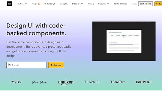
When assessing survey tools for UX research, it’s crucial to consider how well they integrate with UXPin prototypes, ensuring a smooth design-to-code process.
Integration FeatureBenefitImplementationPrototype EmbeddingCollect user feedback directly within prototypesEmbed survey triggers at specific interaction pointsReal-time AnalyticsGain immediate insights during usability testingLink survey responses to specific prototype versionsData ExportEffortlessly transfer insights to UXPinAutomate survey result exports to refine designsAdditionally, tools with advanced API features can further streamline your workflow.
Check API OptionsLook for tools offering robust API capabilities to facilitate seamless data exchange.
API Data Integration: Enables two-way data synchronization, custom queries, automated survey distribution, and secure contact updates.Webhook Support: Ensure the tool supports webhooks for real-time data transfer, multiple request types, and automated actions triggered by survey responses.While integration and API functionality are essential, data security should also be a top priority.
Review Security FeaturesSecurity RequirementDetailsPurposeData EncryptionHTTPS and SSL certificationSafeguards user feedback during transmission Access ControlSAML 2.0 compatibilityProvides secure and streamlined team accessData StorageSOC 2 accredited centersEnsures high protection standards Input ValidationCAPTCHA and upload limitsPrevents malicious data entryEnsure the survey tool adheres to strict data protection practices, such as:
Clear and transparent data collection purposesRegular security auditsSecure deletion policiesStrong password protocolsTeam training on security measuresStep 6: Test and Implement the ToolIt’s time to put your survey tool through its paces and set it up for long-term success. A solid testing phase and careful implementation are key to ensuring everything runs smoothly.
Run Test SurveysBefore launching your survey tool across your organization, you need to test it thoroughly. This step is all about making sure it works flawlessly and provides a smooth experience for users.
Testing AreaKey ChecksPurposeMobile CompatibilityScreen sizes, touch elements, load timesDeliver a seamless experience on mobile devicesSurvey LogicConditional branching, skip patternsEnsure questions flow logically and accuratelyData CollectionResponse recording, export formatsProtect data integrity and usabilityCross-platformBrowser compatibility, OS supportGuarantee access across all platformsFor mobile surveys, prioritize touch-friendly interfaces, minimize text entry fields, and optimize load times to keep the experience user-friendly. Test your surveys on a variety of devices and platforms to confirm they perform consistently. Once you’re confident in your tool’s performance, consider creating reusable templates to save time and maintain consistency.
Create Survey TemplatesTemplates are your secret weapon for efficiency and consistency. By standardizing survey design, you can streamline the process and ensure your surveys align with your brand.
What to Include in Your Templates:
A clear structure with well-thought-out objectives and logical question flowConsistent branding elements like fonts, colors, and logos Built-in connections to automated data visualization toolsMobile-friendly design for easy access on any devicePre-tested and validated question sets"Re-using questions from the survey Question Bank makes survey design fast and convenient, so you can spend more time putting feedback into action." – Manjeet Singh, ServiceNow Employee
Templates not only save time but also help maintain quality and reliability across your surveys.
Set Up Long-term UseFor your survey tool to remain effective over time, you’ll need a sustainable setup. This includes defining workflows, assigning roles, and establishing security measures.
Key Steps for Long-term Success:
Assign user roles and permissions to streamline collaborationPut robust data backup and security protocols in placeAutomate reporting workflows to save timeDevelop clear documentation to onboard new team membersSchedule regular maintenance to keep everything running smoothlyIf you’re integrating your survey tool with design platforms like UXPin, use the API to gather real-time feedback during prototype testing. This can significantly speed up your design iterations and improve the overall process. By putting these systems in place, you’ll ensure your survey tool delivers value for the long haul.
Conclusion: Making Your Final ChoiceSelecting the right UX survey tool involves weighing several crucial factors. Begin by assessing how well the tool aligns with your research goals and whether it offers the features necessary for your specific UX research methods. Use the table below as a quick reference to guide your decision-making process:
Selection CriteriaKey ConsiderationsImpact on DecisionResearch GoalsComplexity of questions, data types, audience reachDetermines tool capabilitiesTeam RequirementsCollaboration features, user seats, learning curveInfluences team adoption and efficiencyBudget AlignmentMonthly costs, response limits, feature accessAffects financial sustainabilityTechnical NeedsAPI access, security features, integration optionsEnsures compatibility with workflowsWhen reviewing costs, dive into pricing structures and calculate the total cost of ownership to ensure the tool fits your budget.
Before committing, ensure the platform integrates seamlessly into your UX workflow, supports your team’s growth, meets data analysis and security needs, and provides value without adding unnecessary costs. A trial period can help you test the tool in real-world conditions and evaluate its performance before making a long-term investment.
Finally, remember that the priciest tool isn’t always the best fit. Look for a solution that balances your current needs with room for future growth – all while staying within your budget.
FAQsHow can I make sure the survey tool I choose is accessible to everyone, including users with disabilities?To make sure your survey tool works for everyone, including individuals with disabilities, choose tools that meet established accessibility standards like WCAG 2.0 AA. Key features to look for include proper color contrast, compatibility with screen readers, keyboard-friendly navigation, and text descriptions for images.
When crafting your survey, stick to clear and straightforward language so it’s easy for all users to follow. Arrange questions in a logical order with a well-structured layout to ensure smooth navigation. Steer clear of jargon or overly complicated wording, which can create barriers for people with cognitive disabilities. These steps help create a survey experience that’s inclusive and welcoming for all participants.
What should I consider when choosing the right pricing model for a UX survey tool?When choosing the right pricing model for a UX survey tool, it’s important to weigh your budget against the tool’s value for money. The goal is to find a plan that fits your financial constraints while still delivering the features you need to conduct effective research.
Think about how often you’ll use the tool. If you rely on it regularly, a subscription plan might be the better choice. On the other hand, if your projects are more sporadic, a pay-per-use model could save you money. Also, keep scalability in mind – your tool should be able to grow with your team and adapt to changing project demands without becoming prohibitively expensive.
Finally, take a close look at the tool’s features and how well they align with your objectives. If certain advanced options, like integrations with design platforms or custom analytics, can significantly improve your workflow, they might be worth the extra cost.
What’s the best way to test and implement a new survey tool for UX research?To make the most out of a new survey tool, start by clearly defining your UX research goals. Pinpoint the insights you’re aiming to gather, and craft your survey questions to align with those objectives. Use straightforward, neutral language to ensure participants understand the questions and provide accurate responses.
Before launching the survey widely, test it with a small group of participants. This step helps identify any usability issues or confusing questions. Use their feedback to fine-tune both the survey content and the tool’s setup. Ensuring everything runs smoothly will save you headaches later. Also, check that the tool integrates easily into your workflow and meets your needs, whether you’re after qualitative feedback or hard numbers.
Think about how this tool fits into your broader design process. For example, surveys can be great for collecting user feedback in the early stages or for validating decisions as your design takes shape. When chosen and used thoughtfully, a survey tool can provide meaningful insights at every step of your UX journey.
Related posts5 Methods for Testing Interactive PrototypesHow to Integrate Collaboration Tools into Design Workflows7 Metrics for Testing Accessibility PerformanceThe post How to Choose the Right Survey Tool for UX appeared first on Studio by UXPin.
May 19, 2025
How to Verify UI Consistency Across Platforms
Did you know? Over 75% of brand credibility depends on design. Consistent UI across devices builds trust, simplifies navigation, and improves user satisfaction. Here’s how you can ensure a seamless experience:
Build a Design System: Use reusable components, design tokens, and clear guidelines to maintain consistency.Adapt to Platforms: Create variations for platform-specific needs while keeping your brand identity intact.Test Across Devices: Use tools like UXPin to test prototypes on different devices, browsers, and screen sizes.Automate Testing: Integrate UI testing into your CI/CD pipeline for faster feedback and issue resolution.Focus on these steps to deliver a reliable, user-friendly experience across all platforms.
Building Consistent Cross-Platform InterfacesBuilding a Design System
A strong design system is the backbone of consistent UI design across platforms. Studies indicate that design systems streamline development by removing the need to repeatedly create elements from scratch. By defining standardized components and clear guidelines, teams can deliver a seamless user experience, no matter the device or platform. Let’s explore the key elements that make up an effective design system.
Design System Core ElementsThe essential parts of a design system work together to establish a unified visual language. These include:
Component TypePurposeKey ConsiderationsDesign TokensCentralized source for visual traitsColors, typography, spacing, shadowsUI ComponentsReusable building blocksButtons, forms, navigation itemsPattern LibraryInteraction standardsCommon user flows and behaviorsStyle GuidelinesRules for visual consistencyBrand identity, accessibility standardsUsing tools like UXPin, you can create reusable components that adapt seamlessly to different screen sizes, saving time and ensuring a polished, cohesive design.
Adapting to Platform GuidelinesA successful design system balances platform-specific requirements with maintaining a consistent brand identity.
Here’s how to achieve this:
Define Component VariationsCreate versions of components that align with platform-specific conventions while keeping core brand elements intact. Document Implementation Guidelines
Provide detailed documentation on how components should adjust across platforms. Clear instructions help ensure design principles are applied consistently, enabling teams to deliver uniform digital experiences. Leverage Design Tokens
Use design tokens to manage platform-specific adjustments, such as spacing for touch-based interfaces, without losing overall consistency. Setting Up Cross-Platform Testing
Once you’ve established a design system, the next step is ensuring it performs reliably across different platforms. Cross-platform testing plays a crucial role in maintaining a consistent user interface (UI) experience on various devices. This process ensures your design system behaves as expected, no matter where it’s accessed.
Building a Test Device ListStart by creating a comprehensive test device matrix. Use analytics to identify the most common device and platform combinations your users rely on. Here’s a breakdown of what to include:
Testing CategoryEssential ComponentsPriority LevelMobile DevicesTop 3–5 iOS and Android versionsHighDesktop SystemsMajor operating systems and browsersHighTabletsPopular iPad and Android tabletsMediumScreen SizesCommon resolutions and aspect ratiosHighNetwork ConditionsA variety of connection speedsMediumWhenever possible, test on physical devices to get accurate results and actionable feedback.
Testing Prototypes Across DevicesTools like UXPin make it easier to test prototypes on various devices. To ensure thorough testing, follow these steps:
Develop Test ScenariosCreate scenarios that cover key aspects of user interaction. Focus on responsive behaviors, touch-based interactions, and features unique to each platform.Set Up Your Testing Environment
Test across multiple browser versions, screen resolutions, and network speeds. Don’t forget to include platform-specific interactions.Run the Tests
Check core functionalities, interactive elements, and responsive layouts. Make sure the design adapts well to platform-specific requirements.
With UXPin’s preview mode, you can test designs in real time across different viewport sizes and interact with components directly. This ensures your design system delivers a seamless experience while respecting platform-specific nuances.
sbb-itb-f6354c6Testing Visual and Interactive ElementsOnce your testing environment is ready, it’s time to dive into verifying visual and interactive elements to ensure everything runs smoothly and looks consistent across the user interface.
Running Visual TestsUsing preview modes, you can visually inspect your design in real-time across different screen sizes. This step is essential for catching layout issues early in the development process.
Here’s a handy checklist for visual testing:
Layout Verification:Test how the layout responds across various breakpoints:Is the content aligned properly?Are spacing and grid systems consistent?Do margins and paddings look uniform?Is the stacking order of elements correct? Design System Components:Ensure all elements of the design system function as intended:Does typography scale well across devices?Are colors consistent with the design guidelines?Do icons and images render correctly?Are component spacings in line with the established rules?By systematically addressing these visual elements, you can ensure your design looks polished and adheres to accessibility standards. Once the visuals are in place, it’s time to focus on how the interactive features behave.
Testing Interactive FeaturesInteractive elements are just as critical as visuals. The table below outlines key interaction types to test and their priorities:
Interaction TypeTest PointsPriorityTouch GesturesSwipes, taps, pinch-to-zoomHighClick EventsButton states, hover effectsHighForm InteractionsInput validation, error statesHighNavigationMenu behavior, transitionsMediumAnimationsTiming, smoothness, performanceMediumTo ensure everything works as intended, simulate real user behaviors. Research highlights how critical visual design and interactivity are for driving engagement and maintaining accessibility.
Here’s what to test:
Validate form submissions and check error handling.Confirm touch gestures work consistently across mobile devices.Test all interaction methods, including touch and keyboard navigation.Ensure animations and transitions are smooth and perform well.Verify that interactive states like hover, active, and disabled display correctly.Adding UI Tests to Development WorkflowIntegrating UI testing into your CI pipeline helps catch issues early and ensures a consistent experience across different platforms.
Automated Testing in CI/CDTo make automated UI testing a seamless part of your workflow, follow these steps:
Configure Test Triggers: Set your CI/CD pipeline to:Run visual regression testsTest component behavior across various screen sizesValidate interactive elementsGenerate detailed reports for easy reviewEstablish Testing Environments: Use containerized environments that mimic production settings to avoid the "it works on my machine" problem. This ensures consistent testing results across the team.Implement Parallel Testing: Run tests simultaneously to speed up feedback. This approach saves time, reduces manual effort, and allows for more frequent updates, ultimately improving the user experience.Once automated tests identify issues, address them quickly using a clear and organized tracking process.
Managing UI IssuesA structured approach to tracking and resolving UI problems can keep your workflow efficient. Tools like UXPin can help with issue management by streamlining the process:
PhaseAction ItemsOutcomeDetectionAutomated test reports, visual diffsQuick identification of issuesDocumentationScreenshots, environment detailsClear context for debuggingAssignmentTask creation, priority settingSmooth workflow managementResolutionComponent updates, regression testingVerified fixes and improvementsIBM notes that "integrating continuous testing into the CI/CD pipeline provides faster bug detection and improved collaboration across teams."
To make issue management even more effective:
Set up automated alerts for critical UI failuresDefine severity levels for different types of inconsistenciesUse standardized bug report templates to ensure all necessary details are capturedHold regular review sessions to tackle recurring problemsConclusion: Key Steps for UI ConsistencyJakob Nielsen, Principal of Nielsen Norman Group, advises: "Testing with one user early in the project is better than testing with 50 near the end."
Achieving UI consistency requires a structured approach that combines a solid design foundation, thorough testing, and a commitment to ongoing refinement. With over half of users abandoning a brand after just one poor experience, maintaining consistency across platforms is not just a design preference – it’s a business necessity.
Here are three essential areas to focus on:
Design System Foundation
Develop a unified design language that includes reusable components, detailed style guides, and clear documentation. Brad Frost highlights the value of this approach:
"A Global Design System would improve the quality and accessibility of the world’s web experiences, save the world’s web designers and developers millions of hours, and make better use of our collective human potential".
Testing and Verification
Incorporate both automated and manual testing to ensure consistent performance across platforms. Tools like UXPin allow teams to create interactive prototypes that closely mimic actual applications, making testing more effective. Research shows that automated testing tools can deliver an impressive ROI of nearly 250% within just six months.
Continuous Improvement
Create a feedback loop that allows for regular updates and refinements. As Binju K O, a QA professional, puts it:
"UI consistency across all platforms is not just about aesthetics – it enhances usability, user satisfaction, and branding".
These strategies not only improve user experience but also align with broader business goals. For example, Beacon Therapeutics raised $170 million in Series B funding in July 2024 by focusing on adaptive design features like automatic button coloring and fluid font sizing. This shows how attention to UI details can directly contribute to a company’s success.
FAQsWhat are design tokens, and how do they help ensure UI consistency across platforms?Design tokens are reusable variables that define essential design elements such as colors, typography, and spacing. They work as a single source of truth, helping teams maintain consistent design choices across various platforms and devices.
When the same token values are applied in multiple environments, updates become much easier to manage. This not only saves time but also ensures a unified look and feel, making collaboration between designers and developers smoother while delivering a seamless experience for users across all platforms.
How can I test UI consistency across devices and platforms without owning every device?To ensure your UI looks and functions consistently across various devices and platforms – without needing to own them all – you can rely on emulators and simulators. These tools mimic the behavior of different devices, allowing you to test your UI in diverse environments from your own setup.
Another smart option is leveraging remote testing platforms. These services give you access to real devices and browsers, making your tests more accurate and reflective of actual user experiences. Be sure to define clear test scenarios, thoroughly evaluate individual UI components, and adapt your testing strategy regularly based on user feedback. This approach helps maintain a seamless and reliable user experience across all platforms.
Why should UI testing be part of the CI/CD pipeline, and how does it improve the development process?Integrating UI testing into your CI/CD pipeline is a smart move for ensuring a seamless user experience while keeping development efficient. By automating these tests, teams can catch and fix interface issues quickly with every code change, preventing bugs from slipping into production.
This method doesn’t just lower the chances of releasing broken features – it also gives developers instant feedback. That means faster iterations and a smoother, more flexible workflow. Regular testing across all updates ensures your product stays polished, meets user needs, boosts customer satisfaction, and saves you from costly fixes down the road.
Related postsUI Component Library Checklist: Essential ElementsSolving Common Design System Implementation ChallengesAI-Powered Testing for React ComponentsThe post How to Verify UI Consistency Across Platforms appeared first on Studio by UXPin.
UXpin's Blog

- UXpin's profile
- 68 followers

