
UXpin's Blog, page 4
September 12, 2025
How to Notify Teams About Design System Changes
Why it matters:
Updating your design system is only half the battle – getting teams to notice and use those updates is just as important. Without clear communication, even critical changes can be missed, leading to outdated workflows, wasted effort, and missed opportunities for feedback.
Key takeaways:
What to notify: Breaking changes, new components, deprecations, and system-wide updates.When to notify: Prioritize updates based on urgency – breaking changes need immediate alerts, while minor updates can wait.How to notify: Use tools like Slack, email, or in-app notifications. Automate where possible to save time.Best practices: Keep messages clear, actionable, and accessible. Group non-critical updates into digests to avoid overload.Quick tip: Timing is everything. Sync notifications with project timelines and deployment schedules to avoid disrupting workflows.
This guide breaks down how to categorize updates, choose notification channels, and craft effective messages to keep your team informed and aligned.
Updating Design System Assets – Design Team WorkflowTypes of Design System Updates and When to Notify Teams
Not all design system updates are created equal. Some, like minor bug fixes, are routine, while others, like breaking changes, demand immediate attention. Categorizing updates accurately helps ensure your team gets the right information at the right time. Let’s break down the different types of updates and how to prioritize notifications.
Key Design System Changes to TrackDesign system updates can be grouped into several categories, each with varying levels of impact on your team’s workflow.
New components: These introduce fresh options to the system without disrupting ongoing work. While it’s helpful to inform teams about these additions, they’re typically more relevant for future projects than current ones.
Updated components: Changes to existing elements may require manual revisions depending on how and where they’re used. These updates can range from minor tweaks to more significant adjustments.
Breaking changes: These are the most disruptive updates, altering APIs or core behaviors in ways that can break existing implementations. Because they can affect multiple areas of active projects, they require immediate communication and action.
Deprecations: These updates signal that certain components or patterns will be removed in future versions. Notifying teams early allows them to plan migrations and avoid last-minute scrambles.
Fundamental system changes: Updates to core elements like spacing tokens, typography, or color palettes can have wide-reaching effects across multiple components and projects. These require detailed communication and migration plans.
Bug fixes: These address issues in existing components without changing their intended functionality. While generally low priority, any fix that significantly alters visual appearance or behavior should be flagged for relevant teams.
Accessibility improvements: Enhancements that improve usability for users with disabilities are important for compliance and user experience. Although they rarely require immediate action, they should still be communicated clearly.
Next, let’s look at how to assign priority levels to ensure teams focus on what matters most.
Setting Notification Triggers and Priority LevelsA clear priority system ensures that updates are communicated appropriately based on their impact.
Critical priority: Reserved for breaking changes, security fixes, and deprecations with short timelines. These updates demand immediate attention to prevent system failures or compliance risks. Teams must act quickly to address these changes.
High priority: Applies to major component updates, significant new features, and accessibility improvements with compliance implications. Notifications should reach teams within a couple of days, even if immediate action isn’t required.
Medium priority: Covers new components, minor updates to existing ones, and non-critical bug fixes. These notifications inform teams of enhancements they can consider for future work.
Low priority: Includes documentation updates, minor visual adjustments, and general announcements about future plans. These can be shared through regular updates, like monthly newsletters or release notes.
Update TypePriority LevelNotification UrgencyAction RequiredBreaking changesCriticalImmediateRevise code/designs promptlyDeprecationsCriticalImmediatePlan migration timelineMajor component updatesHighWithin 1-2 daysReview and plan implementationNew componentsMediumWithin 1 weekConsider for future projectsBug fixesLow to MediumWithin 1-2 weeksUpdate when convenientDocumentation updatesLowMonthly summaryReview when neededTiming is just as important as the content of your notifications. A well-timed update helps prevent overload while ensuring critical changes are addressed promptly.
When deciding when to notify teams, consider their project timelines. Teams working under tight deadlines may need advance notice about upcoming changes, while those in early stages can adapt more easily. This structured approach ensures clear, actionable communication that keeps everyone aligned.
Setting Up Notification WorkflowsOnce you’ve established your update priorities, the next step is creating workflows to deliver notifications effectively. A well-designed notification system saves time, reduces manual effort, and ensures critical updates reach the right people.
Choosing Notification ChannelsThe notification channels you choose should align with how your team works best.
Email is a go-to option for formal updates and detailed information. It’s reliable and provides a permanent record that team members can revisit when needed. This makes it ideal for announcements like breaking changes or deprecation notices that require documentation. However, emails can easily get lost in crowded inboxes, so they’re better suited for non-urgent updates or as a backup to faster channels.
Slack and Microsoft Teams are perfect for real-time communication. These platforms are excellent for high-priority updates that need immediate attention or team discussion. They also integrate seamlessly with many development tools. The downside? Messages can get buried in busy channels, so pinning key updates or following up with documentation is a smart move.
In-app notifications are delivered directly within the tools your team is already using, providing updates that feel natural and don’t interrupt workflows. These are great for medium-priority updates like new component releases or minor tweaks, as they provide context right where the work happens.
Project management tools like Jira, Asana, or Linear are ideal for updates that require specific actions or tracking. For instance, if a design system change impacts active tickets or project timelines, creating tasks in these tools ensures accountability and progress tracking.
Documentation portals act as the central hub for all design system information. While not suitable for urgent updates, they’re invaluable for maintaining detailed change logs and migration guides that teams can reference over time.
ChannelSpeedReachInterruptionsBest ForEmailMediumHighLowFormal updates, detailed changesSlack/TeamsHighMediumMediumReal-time discussion, urgent updatesIn-app notificationsMediumHighLowContext-aware updatesProject management toolsLowMediumLowAction-required updatesDocumentation portalsLowHighNoneReference material, change logsThe best approach is to combine channels strategically. For example, you might use Slack for immediate visibility of breaking changes, follow up with a detailed email, and update your project management tool with actionable tasks.
Once you’ve selected your channels, focus on automating these workflows to ensure consistency.
Automating NotificationsManual notification processes can slow things down as your system grows. Automation helps maintain consistency, reduces errors, and frees up your team for higher-priority tasks.
Webhooks are a great starting point for automation. They trigger notifications based on events in your design system repository. For instance, when a change is committed with specific tags or labels, webhooks can automatically notify the relevant channels. Tools like GitHub, GitLab, and Bitbucket support webhook configurations for events like branch updates, pull request merges, or tag releases.
API integrations allow you to connect different tools in your workflow, creating a seamless notification chain. For example, publishing a new component version in your design system could trigger an API call to update your documentation site, post to Slack, create tasks in your project management tool, and send targeted emails – all at once.
CI/CD pipeline integration ties notifications directly to your deployment process. By analyzing changes during the build, your system can automatically determine the priority and type of notifications to send. This ensures updates are based on actual changes rather than manual categorization.
Built-in automation features in many tools can further streamline notifications. These systems often require minimal setup and provide reliable delivery. For instance, design and development tools often include native notification options triggered by specific criteria.
Start with simple webhook alerts and gradually expand your automation setup. Always include backup mechanisms to ensure critical updates reach their audience, even if automated systems fail.
While setting up these workflows requires some upfront effort, the payoff in efficiency and reliability is well worth it, especially for teams managing complex design systems at scale.
sbb-itb-f6354c6Using UXPin to Streamline Notifications
UXPin simplifies the process of managing design system change notifications with features that centralize and automate updates. Here’s how UXPin’s version history, integrations, and reusable component system make notifications more efficient.
Tracking Changes with UXPin’s Version HistoryUXPin’s version history is a powerful tool for keeping track of design modifications. It creates a detailed audit trail that captures every change, who made it, and the specifics of what was updated. This makes it easier to determine what needs to be communicated and when, eliminating guesswork and reducing the chance of missing important updates.
For teams on Company plans, UXPin retains these records for up to 30 days, while Enterprise plans offer unlimited history. This flexibility allows teams to review past changes and compile well-informed notification summaries for stakeholders who need a broader perspective.
The version history also helps pinpoint the impact of changes. By identifying which projects and prototypes use specific components, teams can tailor their notifications to the relevant groups, ensuring clear and prioritized communication.
Automating Notifications with UXPin IntegrationsUXPin seamlessly integrates with tools like Slack and Jira, enabling automated notifications that fit naturally into your team’s workflow. These integrations allow you to set up notifications triggered by key design system events, making updates more immediate and actionable.
For example, Slack and Jira notifications can be configured to send instant alerts or create tasks whenever updates occur. This ensures development teams stay informed in real time about changes that might affect their work.
Additionally, UXPin integrates with platforms like Storybook and npm. When components are synced from external repositories, these integrations can trigger notification workflows, bridging the gap between development tools and communication channels.
Setting up these integrations is straightforward – just connect your UXPin account to your collaboration tools through the platform’s settings. Once configured, these automated workflows reduce manual effort while keeping communication consistent and timely.
Maintaining Consistency with Reusable ComponentsUXPin’s reusable component system ensures alignment across projects by automatically synchronizing updates from a central library to all connected prototypes. This centralized approach simplifies notifications by clearly showing which prototypes will be affected by component changes, making it easier to craft targeted messages with the right project context.
The platform’s code-backed prototyping – using libraries like MUI, Tailwind UI, and Ant Design – ensures that notifications about component updates reflect actual implementation changes. This alignment between design and development minimizes confusion and makes updates more actionable for technical teams.
With features like the AI Component Creator and React libraries, UXPin ensures that code changes are instantly synced with prototypes. This real-time synchronization allows notifications to be triggered by actual code updates, improving accuracy and reducing the risk of miscommunication.
For teams on Advanced plans and above, the component library also supports conditional logic, expressions, and variables, enabling more complex behaviors. When these advanced features are updated, UXPin’s change tracking highlights the specific functionality that has been modified, allowing teams to create more precise and relevant notifications.
Best Practices for Writing NotificationsWhen it comes to automated notification workflows, it’s essential to craft messages that effectively communicate design system changes. The key lies in balancing brevity, clarity, and ensuring the right message reaches the right audience.
Writing Clear and Actionable NotificationsStart with the impact and its relevance to the recipient. For instance, instead of saying, "Updated button component padding values", go with something like, "Button components now include 2px more padding – spacing adjustments may be needed in existing designs."
Be specific – avoid vague descriptions. For example, rather than saying, "Color changes applied", specify the update: "The primary button color has been updated from #007bff to #0056b3 in version 2.4." This level of detail helps teams focus on what needs attention.
Detail the next steps for each role. A clear breakdown ensures everyone knows their responsibilities. For example:
Designers: Update your Figma library by [specific date].Developers: Pull the latest code from npm package v2.4.Use clear labels at the start of subject lines. Tags like BREAKING CHANGE, Enhancement, or Bug Fix immediately help recipients prioritize and understand the update’s importance.
Add context to explain changes. A brief explanation can make updates more meaningful. For example: "This color update improves accessibility compliance by ensuring better contrast ratios across all interfaces." This kind of context prevents changes from feeling arbitrary.
Timing and Frequency of NotificationsOnce you’ve written a clear notification, timing and frequency are crucial for ensuring it reaches your audience when it matters most.
Group non-critical updates into regular digests. Too many notifications can overwhelm teams, leading to alert fatigue. Save immediate notifications for critical updates like breaking changes or security fixes.
Send notifications at optimal times. Avoid sending updates during sprint planning, major releases, or late on Fridays. Internal communications tend to perform best on Tuesday through Thursday mornings.
Sync notifications with development cycles. For example, if your engineering team deploys bi-weekly, schedule design system updates to align with the start of their planning phase. This minimizes disruption and ensures updates are incorporated into upcoming work.
Adjust frequency based on the type of update. Critical security patches require immediate alerts, while minor updates can wait for scheduled digests. For breaking changes, use a countdown approach:
Announce two weeks before implementation.Send a reminder one week prior.Confirm the change on the release day.Account for time zones in distributed teams. If your organization spans multiple regions, schedule notifications at times that work globally, or use tools that deliver messages at optimal local times for each recipient.
Making Notifications AccessibleAccessibility is just as important as clarity. Your notifications should reach every team member, regardless of their tools or abilities.
Ensure compatibility with screen readers and assistive tools. Use clear headings, descriptive link text, and avoid relying solely on color or visuals. For example, instead of saying, "Click the red button", say, "Click the ‘Update Library’ button."
Provide multiple delivery options. Not everyone uses the same tools. While some may prefer Slack, others might rely on email. Ensure critical updates are available through multiple channels so no one misses out.
Use simple language that works across technical backgrounds. Avoid jargon and explain updates in ways that are easy for both designers and non-technical stakeholders to understand.
Allow recipients to manage notifications. Make it easy for team members to mark notifications as read, archive them for later, or adjust their preferences based on their roles.
Include alternative text for images or visuals. If you’re using images to show changes (like before-and-after comparisons), describe those changes in text as well. This ensures everyone, including those using screen readers or unable to load images, gets the full message.
Offer different levels of detail. Start with a brief summary for quick scanning, then provide links to detailed documentation for those who need more in-depth information. This approach caters to both busy team members and those requiring technical specifics.
Conclusion: Maintaining Team Alignment Through Clear CommunicationKeeping your product team aligned isn’t just about sharing updates – it’s about creating a system where everyone knows what’s happening and how to act on it. When communication is clear, design systems become a tool for consistency, not a source of confusion.
The key to this is proactive communication. By using tools and workflows that ensure updates reach the right people at the right time, you can eliminate surprises and reduce disruptions. Whether it’s designers or developers, everyone benefits from clear instructions that outline exactly what’s expected of them.
Different team members have different needs. Some prefer detailed technical specs, while others just want concise summaries with actionable steps. By providing accessible notifications – across tools, time zones, and varying technical expertise – you ensure everyone stays in the loop when changes roll out.
Prioritizing clear communication doesn’t just smooth out workflows; it also reduces support requests, speeds up adoption, and helps maintain consistency across your product. When teams trust they’ll be informed in a timely and understandable way, they’re more likely to embrace updates rather than sidestep them.
In short, clear and consistent communication empowers your team to stay aligned and actively contribute to maintaining design consistency across your entire product ecosystem.
FAQsHow can I make sure everyone on the team knows about important design system updates?To ensure your team stays in the loop about critical updates or major changes to the design system, it’s important to establish clear communication practices and workflows. Regular meetings, such as sprint reviews or retrospectives, are a great opportunity to share updates and discuss how they might affect ongoing or future work. Alongside these meetings, develop a communication plan that integrates seamlessly with the tools your team already relies on – whether that’s Slack, email, or project management platforms. Use these channels to announce updates and share any necessary documentation.
To make the process even smoother, tools like UXPin can help teams collaborate efficiently and stay aligned on design system changes. By combining regular, open communication with the right tools, you can keep everyone informed and reduce the risk of disruptions from missed updates.
How can teams stay informed about design system updates without being overwhelmed by notifications?To ensure your team stays informed without feeling bombarded, prioritize sharing updates that are both timely and relevant. Implement a system where team members can tailor their notification preferences, so they only receive information that directly impacts their responsibilities. Keep your messages short and actionable, cutting out any fluff.
Setting up clear communication channels – like a dedicated Slack channel or regular email digests – can make updates more organized and accessible. Don’t forget to ask your team for feedback on how often they receive updates and the type of content shared. This approach helps maintain an efficient and user-friendly communication process.
What are the best ways to notify teams about different types of design system updates?Choosing the right way to share updates depends on how urgent the message is, how complex the information might be, and who needs to hear it. For urgent updates, tools like Slack work well because they deliver messages instantly. On the other hand, detailed or less pressing updates are better suited for email newsletters or platforms where documentation can be easily accessed and reviewed.
The key to an effective strategy is matching the type of message to the right channel. Use real-time communication for updates that need immediate attention, and choose more detailed formats for information that requires explanation or context. Also, keep your team’s habits and workflows in mind – this ensures that everyone stays on the same page without disruption.
Related Blog Posts7 Best Practices for Design System DocumentationSolving Common Design System Implementation ChallengesHow to Integrate Collaboration Tools into Design WorkflowsDesigner vs. Developer: Bridging the Gap in Design SystemsThe post How to Notify Teams About Design System Changes appeared first on Studio by UXPin.


September 10, 2025
Quasar Framework for Cross-Platform Prototypes
Looking to create apps for web, mobile, and desktop with minimal effort? This article compares two tools: Quasar Framework and UXPin, both designed to simplify cross-platform prototyping. Here’s what you need to know:
Quasar Framework: A Vue.js-based tool for developers that builds apps from a single codebase. It supports web, iOS, Android, desktop (via Electron), and browser extensions. It includes over 80 UI components, real-time updates during development, and tools for integrating APIs and state management.UXPin: A design-focused platform using React components for high-fidelity prototypes. It supports web-based prototypes that behave like finished products, integrates with libraries like Material-UI, and allows real-time collaboration with stakeholders.Quick ComparisonFeatureQuasar FrameworkUXPinPlatform SupportWeb, mobile, desktop, browser extensionsWeb-based, responsive across devicesCodebaseSingle Vue.js codebaseReact-based prototypesComponentsBuilt-in Vue componentsReact libraries (Material-UI, Tailwind, etc.)CollaborationVersion control integrationReal-time editing, feedback toolsPricingFree (open source)Free tier; $119/editor/month for Company planLearning CurveRequires Vue.js knowledgeDesigner-friendly, no coding neededBottom Line: Choose Quasar if you’re a developer aiming for multi-platform deployment. Opt for UXPin if you’re a designer prioritizing collaboration and realistic prototypes.
Vue.js Nation 2024: Quasar – One Code Base, All The Platforms! by Luke Diebold
1. Quasar Framework

Quasar is a Vue.js-based framework designed to create cross-platform applications, starting from functional prototypes all the way to production-ready solutions. Its core philosophy, "write once, deploy anywhere", allows developers to build applications that work seamlessly across multiple platforms.
Platform SupportOne of Quasar’s standout features is its ability to target multiple platforms using a single codebase. Developers can deploy their applications to web browsers, iOS and Android mobile devices, desktop environments via Electron, and even as browser extensions.
Quasar takes care of platform-specific styling and optimizations automatically. For instance, it uses Material Design for Android apps and adheres to Apple’s Human Interface Guidelines for iOS. Mobile platforms benefit from Cordova or Capacitor integration, which allows access to native device features. For desktop applications, Quasar leverages Electron, while web deployments include progressive web app (PWA) features like offline access and push notifications.
Component LibrariesQuasar offers a library of over 80 Vue components, covering a wide range of UI needs. These components are responsive and customizable, thanks to an SCSS-based theming system. For example, the QTable component simplifies data handling with built-in features like sorting, filtering, and pagination. Form components include validation tools, while layout components utilize CSS Grid and Flexbox for responsive designs.
Customization is a breeze with Quasar’s theming capabilities. Teams can define design tokens to ensure consistent branding across all platforms. This extensive component library not only speeds up the prototyping process but also ensures a polished and professional look for applications.
Prototyping WorkflowQuasar’s development workflow is designed for speed and efficiency. With features like hot module replacement, developers see real-time updates across connected devices and browsers as they code. The Quasar CLI automates platform-specific build processes, whether it’s generating APK files for Android or DMG installers for macOS.
Prototypes can include real-world functionality by integrating APIs, managing state with Vuex, and handling navigation with Vue Router. This makes it possible to create prototypes that closely resemble the final product in terms of behavior and functionality.
Collaboration FeaturesQuasar is built with teamwork in mind. It integrates with version control systems, allowing multiple developers to work on the same project without stepping on each other’s toes. Vue’s single-file component structure helps reduce merge conflicts during collaborative development.
The framework also simplifies sharing and feedback. Prototypes can be deployed to staging servers or static hosting platforms, making it easy for clients or stakeholders to review. Additionally, Quasar can generate interactive documentation for its components, showcasing their properties and usage examples. This documentation doubles as a living style guide, streamlining both prototyping and development processes.
2. UXPin

UXPin is a design and prototyping platform that stands out by using actual React components to create interactive prototypes. These prototypes aren’t just visual representations – they behave like fully functional applications, making the design process more aligned with development.
Platform SupportUXPin’s prototypes, powered by React, are web-based and run smoothly across browsers, tablets, and mobile devices. There’s no need for separate builds for different platforms, as the prototypes are inherently responsive. Designers can preview their work in real-time across various screen sizes and orientations, ensuring that their designs look and function as intended on any device.
Component LibrariesOne of UXPin’s key strengths is its integration with React component libraries, such as Material-UI (MUI), Ant Design, and Tailwind UI. These libraries consist of production-ready components, allowing prototypes to include real interactions, form validations, and even data handling.
For teams on the Company plan ($119 per editor per month), UXPin supports custom component libraries via Storybook and npm. This means teams can import their own React components, ensuring consistency between prototypes and the final product. This approach eliminates the common gap between design and development, as the same components used in the prototype will appear in the actual application.
Another standout feature is UXPin’s AI Component Creator, available in the Merge AI plan ($39 per editor per month). This tool can generate React components from simple text descriptions, speeding up the prototyping process by automating the creation of functional components that meet specific design needs.
Prototyping WorkflowUXPin’s prototyping workflow allows designers to create interactive, code-backed prototypes that closely mimic the behavior of the final application. Using tools like conditional logic, expressions, and variables, designers can add complex interactions without writing any code. These prototypes can handle user input, display dynamic content, and even integrate APIs to pull in live data.
The platform’s design-to-code workflow simplifies the handoff between designers and developers. Since UXPin prototypes are built with actual React components, developers receive specifications that can be directly implemented. This eliminates the guesswork in interpreting design files and ensures the final product matches the prototype down to the pixel.
UXPin also supports advanced interactions that go beyond basic click-through prototypes. Designers can create multi-step forms, sortable data tables, and intricate navigation flows that replicate real-world application behavior.
Collaboration FeaturesCollaboration is seamless with UXPin. Teams can edit prototypes simultaneously in real time, leave comments, and manage feedback through stakeholder approval workflows. The platform also offers version history – 30 days for the Company plan and unlimited for the Enterprise plan – making it easy to track changes and revert if needed.
To keep the workflow smooth, UXPin integrates with tools like Slack, Jira, and Storybook. These integrations ensure that design updates are automatically shared with relevant team members, bridging the gap between design, development, and project management.
sbb-itb-f6354c6Pros and ConsAfter diving into the capabilities of each platform, here’s a side-by-side comparison that highlights the key trade-offs between Quasar Framework and UXPin. Each has its own strengths and limitations, making the choice largely dependent on your team’s goals and expertise.
AspectQuasar FrameworkUXPinPlatform SupportDeploys a single codebase to web, mobile, and desktop platforms.Web-based prototypes designed to work responsively across all devices.Integration EaseRequires familiarity with Vue.js; setup involves a single configuration file.Offers direct integration with React component libraries and popular design tools.Component ReusabilityIncludes a robust built-in component library and a plugin ecosystem.Provides production-ready React components, custom library support, and AI-generated assets. Team Collaboration Supports collaboration via version control, focusing on development workflows.Features real-time editing, approval workflows, and tools for gathering stakeholder feedback.Development SpeedSpeeds up development by 30% with a unified codebase.Removes design-to-development handoff delays entirely.Learning CurveHas a steep learning curve, requiring Vue.js expertise.Designer-friendly interface with no coding knowledge needed.Cost StructureOpen-source and free to use.Free tier available; Company plan costs $119 per editor per month.Key TakeawaysQuasar’s lightweight footprint (just 437 KB) enhances load times and can reduce maintenance costs by up to 40%. This makes it an excellent choice for teams focused on performance and seamless multi-platform deployment from a single codebase. However, its reliance on advanced Vue.js knowledge might pose a challenge for design-centric teams without dedicated developers. Complex integrations can also require additional setup compared to tools that are ready to use out of the box.
On the other hand, UXPin shines in collaborative design workflows. Its real-time editing and automated infrastructure management streamline stakeholder involvement, making it ideal for design teams looking to work closely with clients or internal teams. That said, UXPin’s reliance on React may not suit teams using other frameworks, and the pricing – especially the $119/editor/month Company plan – can be a considerable expense for larger organizations.
Ultimately, the choice comes down to your team’s priorities. Quasar is well-suited for multi-platform product launches, while UXPin is tailored for teams aiming to enhance collaboration and streamline design processes.
ConclusionDeciding between Quasar Framework and UXPin comes down to your team’s specific goals, as each tool shines in different areas – Quasar stands out for multi-platform development, while UXPin excels in collaborative, code-integrated design workflows.
Quasar Framework is a great fit for development teams focused on creating complex applications that run seamlessly across web, mobile, and desktop platforms. Its single codebase approach simplifies multi-platform deployment, making it a strong choice for startups or companies aiming to expand their reach efficiently. However, it’s worth noting that teams may need to invest time in mastering Vue.js to fully leverage Quasar’s capabilities.
On the other hand, UXPin is tailored for design teams seeking a streamlined way to prototype and collaborate. Its real-time, code-backed prototyping features make the transition from design to development smoother. With an intuitive interface, built-in React component libraries, and AI-powered design tools, UXPin empowers teams to create interactive prototypes quickly, even without deep coding expertise. This makes it an excellent choice for teams prioritizing rapid prototyping and seamless collaboration.
FAQsHow do Quasar Framework and UXPin differ in platform support and component libraries?Quasar Framework and UXPin each shine in their own domains, catering to different needs in the development and design process.
Quasar Framework is a Vue.js-based framework built for developers who need to create cross-platform applications from a single codebase. It supports a variety of platforms, including web, mobile (iOS and Android), desktop (Windows, macOS, Linux), PWAs, and SSR. With over 70 highly customizable Material Design components, Quasar focuses on simplifying application development across multiple platforms.
Meanwhile, UXPin is designed with designers and developers in mind, offering tools to build interactive, code-powered prototypes. It features scalable, pre-designed component libraries and supports integration with custom React components. UXPin prioritizes design consistency, team collaboration, and a smooth workflow between design and development, making it a go-to choice for prototyping and creating design systems rather than building applications directly.
How does the Quasar Framework simplify cross-platform app development, and what are the key advantages?The Quasar Framework makes cross-platform app development much more straightforward. With just one Vue.js codebase, developers can build applications that work seamlessly across web, mobile, and desktop platforms. It supports deployment to a wide range of systems, including Android, iOS, Windows, macOS, and Linux. This eliminates the need for separate codebases, saving time and simplifying the development process.
This unified approach brings key advantages like shorter development timelines, reduced costs, and simplified maintenance. By reusing the same code for multiple platforms, development teams can concentrate on enhancing the user experience and delivering polished, high-quality applications efficiently. It’s a smart choice for businesses looking to roll out apps quickly while ensuring consistency across various devices.
How should teams decide between using the Quasar Framework and UXPin for cross-platform prototyping?When choosing between Quasar Framework and UXPin, the decision hinges on your team’s primary goals.
Quasar Framework is tailored for creating fully functional, cross-platform applications using a single codebase. It offers native support for multiple platforms and includes tools like a CLI to streamline project management. This makes it an excellent choice for teams focused on development-heavy workflows.
In contrast, UXPin excels in building and testing interactive prototypes. It’s particularly suited for teams that prioritize design validation, user experience testing, and collaboration during the early stages of product development.
Ultimately, your choice depends on whether your team’s priority lies in app development or refining the user experience through prototyping.
Related Blog PostsResponsive Code Export for React, Vue, and AngularReact Components in Cross-Platform Design SystemsInteractive Prototyping with React ComponentsReusable React Components in PrototypesThe post Quasar Framework for Cross-Platform Prototypes appeared first on Studio by UXPin.
September 8, 2025
How to Apply 7 AI Coding Principles in Production
AI-assisted coding is no longer a futuristic concept – it’s an essential tool for modern developers and design teams striving for efficiency, precision, and scalability. Yet, despite its growing adoption, many professionals struggle to unlock its full potential. Why? The answer lies not in the tools themselves, but in the principles and systems underpinning their usage.
If you’re a UI/UX designer, front-end developer, or part of a design team eager to integrate AI coding into your workflows, this article provides the transformative strategies you need. Based on years of hands-on experience, this guide walks you through seven actionable principles to help you maximize AI’s capabilities while avoiding common pitfalls.
Why Principles Matter More Than ToolsBefore diving into the strategies, it’s worth noting that success with AI coding hinges on your approach, not just the tool you use. Whether you’re leveraging Cloud Code, GitHub Copilot, or another AI-driven platform, the difference between struggle and success lies in how well you apply foundational principles and design efficient systems.
"Working with AI for coding requires a different approach", says the expert behind this framework. Many developers only scratch the surface of what AI tools can do, often falling into traps like treating these tools as glorified autocompletes or failing to provide clear guidance. By adopting the right mindset and workflows, you can avoid these mistakes and unlock AI’s transformative potential.
The Seven Principles of Successful AI Coding1. Deeply Understand Your ToolsAI tools are only as effective as your understanding of their features and capabilities. Most users utilize just 10-20% of what these platforms offer, which is akin to driving a high-tech Tesla without ever using autopilot.
Practical Steps:Dedicate consistent time to explore the tool’s documentation. For instance, spend 15-20 minutes weekly reviewing updates or experimenting with new features.Familiarize yourself with advanced functionalities like memory systems, autonomous agents, and hooks.Build use cases to test these features within your ongoing projects.By investing time to master your preferred AI tool, you’ll gain confidence and efficiency, empowering you to leverage its full potential.
2. Master and Constantly Update Rule FilesAI tools rely on rule files or long-term memory systems to adapt to your specific needs. These files act as the AI’s guidelines, ensuring consistency and reducing repetitive errors.
Best Practices for Rule Files:Iterative Adjustments: Each time an AI makes the same mistake twice (e.g., using the wrong import style or forgetting naming conventions), add a correction to the rules file.Project-Specific Customization: Tailor the rules to your project’s unique standards, coding practices, and architecture.Evolve with the Project: Treat rule files as living documents. Regularly update them as your project grows in complexity.Without robust rule files, working with AI can feel like training a new developer for every task. With them, you set a foundation for scalable and efficient collaboration.
3. Store and Reuse Effective PromptsWriting the same prompt multiple times is a waste of time and often leads to inconsistent results. Instead, treat prompts like reusable functions – store, refine, and version them for future use.
How to Create Reusable Prompts:Organize Prompts in a Library: Use folders or designated areas within your tool to store prompts, categorized by use case (e.g., "error handling" or "test generation").Develop Workflow Templates: Create step-by-step prompts for common tasks like code review, test generation, and changelog updates.Iterate: Refine prompts over time, incorporating feedback and lessons learned from project execution.By building a repository of tried-and-tested prompts, you can significantly reduce time spent rewriting instructions and improve consistency across workflows.
4. Plan Thoroughly Before Writing Code"Time spent planning is time saved debugging." This principle cannot be overstated. Diving into AI coding without a clear roadmap often results in overly complex, unnecessary, or unusable outputs.
A Structured Planning Approach:Define Objectives: Specify what you’re building, why, and for whom (user personas, use cases, pain points).Set Boundaries: Clearly outline scope, including what the AI should and should not attempt.Establish Success Metrics: Identify measurable criteria for a successful implementation.For example, when asking AI to build a file organizer, specifying file types, folder structures, and dependencies upfront can cut down unnecessary complexity and save hours of debugging.
5. Shift Your Mindset: Think Like a ConductorAI coding requires a shift from doing everything yourself to orchestrating workflows. Think of yourself as a conductor, guiding multiple "junior developers" (AI agents) rather than writing every line of code.
Key Mindset Changes:Trust the Process: Give AI clear instructions and let it run tasks independently. Avoid micromanaging its outputs until the task is complete.Parallelize Workflows: Run multiple AI instances for different tasks (e.g., front-end, back-end, testing) simultaneously, scaling your productivity.Focus on the Big Picture: Balance roles as a product manager, engineer, and analyst by clearly defining what to build, how to build it, and why.This shift enables you to oversee multiple projects, optimize resource allocation, and ultimately deliver better products faster.
6. Design Validation StrategiesValidation is the cornerstone of reliable AI coding. If you cannot validate the output effectively, you risk wasting time on unproductive iterations.
Four Levels of Validation:Linting: Ensure the output adheres to coding standards.Unit Tests: Define and run tests to verify specific functionalities.Integration Testing: Assess how newly generated code interacts with existing systems or APIs.Domain-Specific Validation: For example, use Playwright MCP servers for front-end testing or database MCPs for back-end validation.Additionally, let AI run validation tasks automatically before presenting the results to you. This reduces manual effort and ensures only polished outputs reach you.
7. Integrate Principles into a Systematic WorkflowCombining these principles into a cohesive workflow transforms your approach to AI coding. The result? Seamless integration of planning, execution, and validation.
Workflow Summary:Planning and Exploration: Define objectives, gather relevant context, and design validation gates.Prompt Crafting: Create clear, reusable prompts incorporating context and success criteria.Execution: Run AI workflows, allowing for independent task completion while you focus on other priorities.Review and Iterate: Validate output, refine prompts, and continuously improve processes.This workflow enables long, uninterrupted AI runs while freeing you to focus on higher-level tasks. Over time, it scales your team’s productivity exponentially.
Key TakeawaysKnow your tools inside out: Spend time learning the full capabilities of your AI platform, from documentation to advanced features.Leverage rule files: Keep your AI aligned by creating and maintaining detailed, project-specific rules.Build a prompt library: Save frequently used prompts to streamline workflows and ensure consistency.Plan before coding: Detailed initial planning eliminates guesswork, reduces overengineering, and improves outputs.Think like a conductor: Shift your mindset to orchestrate workflows, delegating tasks to AI agents for parallel execution.Validate rigorously: Use multi-level validation strategies to ensure outputs meet quality and performance standards.Adopt a systematic workflow: Combine these principles into a cohesive system for transformative results.ConclusionThe future of development is here, and it’s powered by AI. But success requires more than just adopting the latest tools – it demands a shift in mindset, a commitment to planning, and the application of proven principles. By mastering these seven strategies, you can move from struggling with AI to seamlessly integrating it into your design-to-development workflows.
The principles outlined here aren’t just effective – they’re game-changing. Start implementing them today, and watch as your team’s productivity, consistency, and innovation reach new heights. AI isn’t here to replace us; it’s here to amplify our capabilities. Embrace it. Refine it. And let it transform the way you create.
Source: "AI coding in production – 7 principles (Do You Follow These?)" – Rasmus Widing, YouTube, Aug 7, 2025 – https://www.youtube.com/watch?v=-qLW2Awz-74
Use: Embedded for reference. Brief quotes used for commentary/review.
Related Blog PostsHow AI Improves Design Team WorkflowsHow to Automate Interactive Prototypes with AIHow AI Converts Prototypes to CodeHow AI Improves Free Responsive Code Export
The post How to Apply 7 AI Coding Principles in Production appeared first on Studio by UXPin.
React Component Compatibility Checker
Stay Ahead with React Component Compatibility
Building React applications is exciting, but version mismatches or outdated APIs can throw a wrench in your workflow. That’s where a reliable compatibility analysis tool comes in handy. Developers often face challenges when upgrading React or integrating popular libraries like Redux or Material-UI, only to discover subtle breaking changes or deprecated features. These hiccups can delay projects and frustrate teams, especially when documentation feels like a maze.
Why Compatibility MattersEnsuring your components align with the latest React updates isn’t just about avoiding errors—it’s about future-proofing your codebase. A quick scan can reveal hidden issues, from outdated Hooks usage to conflicts with third-party dependencies. By addressing these early, you save hours of debugging and keep your app running smoothly across environments. Tools designed for this purpose simplify the process, offering clear insights and actionable steps without the guesswork.
A Smarter Way to CodeImagine having a resource that not only flags potential pitfalls but also points you to the right fixes with ease. Whether you’re maintaining a small project or a complex application, staying proactive about component health is key. With the right support, you can focus on crafting great user experiences instead of wrestling with technical debt.
FAQsWhat exactly does this compatibility checker look for in my React code?Great question! Our tool digs into your React components to spot issues like deprecated APIs (think old lifecycle methods), version-specific quirks, or breaking changes in newer React releases. It also checks how your code plays with popular libraries like Redux or Material-UI. You’ll get a breakdown of anything that might trip you up, plus tips to fix it. Basically, we’re helping you catch problems before they turn into bugs down the line.
Can I use this tool for large projects with multiple components?Absolutely, we’ve got you covered. Whether you’re working on a single component or a sprawling app, you can input individual snippets or connect a GitHub repo for a full scan. The tool processes everything and delivers a comprehensive report. Just keep in mind that larger projects might take a bit longer to analyze, but we’ll break down the results into manageable chunks so you’re not overwhelmed.
How do I know the suggestions will work for my specific setup?We get that every project is unique, and that’s why our tool doesn’t just spit out generic advice. It looks at your code’s context—things like the React version you’re targeting and the libraries you’re using—and tailors recommendations accordingly. Plus, we link directly to official React documentation and community resources for deeper dives. If something feels off, you can always tweak the suggestions to fit your needs. We’re here to guide, not dictate!
The post React Component Compatibility Checker appeared first on Studio by UXPin.
September 5, 2025
How Context-Aware Fields Improve UX
Forms can feel frustrating when they overwhelm you with irrelevant fields or confusing layouts. Context-aware fields solve this problem by dynamically adjusting to your inputs, device, or situation. They simplify forms, reduce errors, and make the process faster by showing only what’s necessary. Think of a tax form that hides business-specific fields if you select "Individual" or a phone number field that formats automatically based on your country.
Key Takeaways:Fewer Errors: Real-time validation and formatting ensure accuracy (e.g., phone numbers or ZIP codes).Accessibility: Easier for users with disabilities through tailored guidance and reduced mental effort.Faster Completion: Only relevant fields are shown, cutting down on unnecessary steps.Better Experience: Forms feel intuitive and personalized, not generic or overwhelming.Why does this matter? Because smarter forms mean happier users and higher completion rates – up to 25% more, according to research. Whether you’re designing for mobile or desktop, context-aware fields are a simple way to improve usability and accessibility while reducing frustration.
Using Autocomplete for Optimal Form UX – Designer vs. Developer #24Core Principles and Benefits of Context-Aware Fields
Context-aware fields work on a few essential principles that make them stand out in improving user experience. By understanding these principles, designers can craft forms that feel intuitive and responsive instead of rigid and overwhelming.
Dynamic Adaptation Based on User InputAt the heart of context-aware fields is real-time responsiveness. These fields actively adjust based on user input, creating a flow that feels more like a conversation than a static form.
For instance, when a user selects "Business" instead of "Personal", the form automatically updates to show business-related fields while hiding irrelevant personal ones – without any interruptions.
Another example is progressive disclosure, where information is revealed step by step. Imagine a shipping form that starts by asking for the country, then expands to show state options, followed by city fields, and finally delivery preferences based on the user’s location. This method keeps the form simple and prevents users from feeling overwhelmed.
Context-aware fields go beyond just showing or hiding sections. They can adjust field formats, validation rules, and input methods based on the situation. For example, they might automatically change phone number formats depending on the country or switch currency symbols based on the user’s location. This dynamic functionality ensures smoother interactions and increased accuracy.
Key Benefits of Context-Aware FieldsThe advantages of context-aware fields are clear – they significantly improve the user experience in several ways. By reducing the mental effort required to fill out forms, they can boost completion rates by 15–25%. Users only see what’s relevant, eliminating the need to figure out which fields apply to them.
These fields also encourage faster completion times and greater accuracy. Real-time validation catches errors as they happen, sparing users the frustration of fixing mistakes after submission. This immediate feedback loop keeps the process smooth and frustration-free.
Additionally, context-aware fields lead to higher completion rates because they remove unnecessary obstacles. A more personalized experience makes users feel understood, not like they’re just filling out a generic form. When forms adapt logically to previous inputs, they feel like helpful tools rather than tedious chores.
Static Fields vs. Context-Aware FieldsThe benefits of context-aware fields become even more apparent when compared to static fields:
AspectStatic FieldsContext-Aware FieldsUser ExperienceOffers the same experience to everyoneAdjusts to individual needs for a tailored experienceCognitive LoadHigh – users must figure out which fields are relevantLow – only relevant fields are shownError RatesHigher due to confusion over formatsLower thanks to real-time validationCompletion TimeLonger because of unnecessary fieldsShorter with streamlined processesAccessibilityCan overwhelm users, especially those with disabilitiesSimplifies navigation with contextual guidanceMobile UsabilityPoor – too many fields clutter small screensExcellent – progressive disclosure fits mobile layouts perfectlyThe difference is especially noticeable in complex forms. Take an insurance application: a static version might overwhelm users with dozens of fields covering every possible scenario. In contrast, a context-aware form reveals only the fields relevant to the user’s specific policy and coverage needs.
This adaptive approach turns forms into helpful guides, making it easier for users to complete them while ensuring only the necessary information is collected. It’s a win for both the user and the organization.
Design Patterns for Context-Aware FieldsThese patterns elevate the context-aware approach, offering seamless and user-friendly experiences. By leveraging these strategies, user interactions become more intuitive and tailored to specific needs.
Conditional Field DisplayAt its core, conditional field display is about showing users only what they need, when they need it. Fields appear or disappear based on user selections, keeping interfaces clean and reducing mental effort.
Take, for example, a checkout form. When users select "I have a promotional code", the promo code field instantly appears below. This keeps the form tidy while giving users the options they need at the right moment.
Nested conditionals add another layer to this functionality. Imagine a travel booking form: selecting "International" unveils a dropdown for country options. Choosing a specific country might then reveal visa requirements, followed by passport information fields. Each step builds on the last, guiding users through a logical flow.
Similarly, field grouping enhances clarity by organizing related conditional fields together. For instance, selecting "Business Account" instead of "Personal Account" might display a section with fields for company name, tax ID, and business address. Grouping related inputs helps users understand how the information fits together.
To make this process even smoother, transitions matter. Subtle animations can ease the appearance of new fields, preventing abrupt changes that might confuse users.
While conditional fields streamline forms, auto-completion takes it a step further by reducing typing effort.
Auto-Completion and Predictive InputAuto-completion simplifies data entry by turning tedious typing into quick, guided selections. This approach works particularly well for fields with predefined datasets, such as addresses, product categories, or company names.
A common example is address auto-completion. As users type a street address, suggestions from postal databases appear in real-time. This not only speeds up the process but also minimizes errors, ensuring accurate deliveries and fewer customer service issues.
Smart suggestions take it up a notch by adapting to user behavior and context. For instance, a job application form might suggest job titles based on the industry selected earlier. Similarly, an expense report could suggest vendors based on the chosen category.
Progressive refinement is another key feature. Start typing "New", and options like "New York", "New Orleans", and "Newcastle" appear. With each additional character, the list narrows, making it easier to find the right option – especially for large datasets where exact spellings might not be obvious.
Timing is everything here. Displaying suggestions after 2–3 characters strikes a balance between being helpful and overwhelming. Additionally, these suggestions should be keyboard-friendly, allowing users to navigate and select options without needing a mouse.
Dynamic Validation and Real-Time FeedbackDynamic validation ensures errors are caught and corrected as they happen, saving users from the frustration of fixing mistakes after submission. This approach not only reduces errors but also builds user confidence.
Availability checking is a great example. For fields like usernames or email addresses, users receive instant feedback. Instead of discovering that "john.smith@company.com" is taken after submission, they see a green checkmark or a red X as soon as they finish typing.
Strength indicators are another useful tool, especially for password fields. A strength meter updates dynamically as users add characters, numbers, or symbols, encouraging stronger passwords while clarifying requirements.
Cross-field validation ensures that related fields make sense together. For instance, if a ZIP code doesn’t match the selected state, the form can flag the mismatch immediately. Similarly, end dates can be validated against start dates to prevent impossible timelines.
The key is to provide helpful, contextual feedback. Instead of vague messages like "Invalid format", a phone number field might display "Use this format: (555) 123-4567", paired with an example to guide users.
Visual cues are essential for effective validation. Color coding (red for errors, yellow for warnings, green for success) combined with clear messaging helps users identify and resolve issues quickly. Icons can be helpful too, but they shouldn’t be the sole indicator – accessibility considerations require multiple forms of feedback.
sbb-itb-f6354c6Implementing Context-Aware Fields Using UXPin

UXPin makes it possible to create prototypes using real React components, enabling the design of context-aware fields. Unlike static mockups from traditional design tools, UXPin allows designers to build interactive prototypes that behave just like the final product.
Using UXPin for Interactive PrototypingWith UXPin, prototyping goes beyond static visuals by incorporating real React components capable of handling complex logic and state management.
The platform includes popular React libraries like MUI, Tailwind UI, and Ant Design, which come pre-loaded with form components designed for interactive experiences. For example, MUI’s Autocomplete component provides built-in filtering, keyboard navigation, and customizable suggestion rendering – perfect for predictive input fields.
Teams can also take advantage of custom component libraries by importing their own React components into UXPin through npm integration or Storybook sync. This means you can prototype using the exact components your development team has already built, such as an address lookup tool or a dynamic validation system, ensuring accuracy and consistency.
UXPin’s AI Component Creator adds another layer of efficiency. By simply describing a component in natural language – like "a phone number input that formats as the user types and validates international formats" – the AI generates a working React component ready for use in your prototype.
Additionally, real-time collaboration enables developers to review prototypes early, ensuring technical feasibility before moving into development.
Using Conditional Logic and Reusable ComponentsUXPin excels at creating dynamic field interactions with tools for implementing conditional logic. Designers can leverage variables, expressions, and conditional statements to replicate programming logic without writing code.
Variables store user inputs and track form states.Expressions handle real-time calculations and validations, such as determining delivery dates based on shipping methods and ZIP codes.Reusable components save time by allowing you to standardize elements like an auto-completing address input across multiple prototypes.For added flexibility, UXPin supports component variants. A single form field can include multiple states – default, error, success, or loading – as well as different sizes or interaction patterns. Designers can switch between these variants based on user actions or form states, creating more realistic prototypes.
The Patterns feature (available with Company and Enterprise plans) takes reusability further by saving entire form sections or interaction flows. For instance, a complete checkout flow with context-aware fields can be stored as a pattern, making it easy to reuse and adapt for different projects.
Testing for Accessibility and UsabilityDynamic, context-aware fields can introduce accessibility challenges, but UXPin provides tools to ensure inclusivity and usability.
The platform’s accessibility checker evaluates prototypes against WCAG guidelines, identifying issues like poor color contrast, keyboard navigation problems, or screen reader incompatibilities. This is especially critical for dynamic forms, where content updates might confuse assistive technologies if not handled correctly.
For example, keyboard navigation testing helps ensure logical tab order and focus management when fields appear or disappear conditionally. Similarly, ARIA announcements notify screen readers about dynamic content changes, keeping users informed.
UXPin also supports user testing features, allowing you to share interactive prototypes with users who rely on assistive technologies. Observing how they navigate dynamic forms can reveal potential issues early, preventing them from reaching production.
The platform’s version history (30 days for Company plans, unlimited for Enterprise) tracks accessibility improvements, helping teams document changes and avoid regressions in future iterations.
Real-time collaboration plays a role here too, enabling accessibility specialists to review prototypes and leave comments on specific interactions or states. This creates a clear record of accessibility requirements for developers to follow during implementation.
Finally, integration with tools like Storybook ensures that accessibility considerations from the prototype phase are carried through to development. When developers bring UXPin components into their workflow, the inclusive patterns and behaviors designed in the prototype are preserved.
Best Practices and Common PitfallsBuilding effective context-aware fields is all about finding the sweet spot between sophistication and simplicity. The goal is to improve user experience without adding unnecessary hurdles. By following proven guidelines and steering clear of common mistakes, you can ensure your forms are intuitive and user-friendly.
Guidelines for Better Context-Aware FieldsStick to the essentials. When it comes to context-aware fields, less is more. Research from 2021, which analyzed 40,000 landing pages, found that conversion rates dropped by about one-sixth when forms asked for extra details like phone numbers or birth dates. Only ask for information that’s absolutely necessary, and wherever possible, infer or delay non-critical data collection.
Use visuals to communicate. Did you know that 20% of the brain is dedicated to processing visual information? That’s why visual cues like icons, color changes, or formatting are far more effective than lengthy instructions. For instance, a green checkmark next to a valid email address instantly signals success – no need for a line of text saying, "Email format is correct."
Clearly label required and optional fields. If only optional fields are labeled, users often leave required ones incomplete – 32% of them, to be exact. Use an asterisk (*) for required fields and add "(optional)" next to others. This clarity is even more important for context-aware fields, where requirements might shift based on user inputs.
Think mobile-first. Since context-aware fields often involve dynamic interactions, designing for mobile is critical. Start with mobile constraints – like smaller screens and touch-based navigation – and then adapt for larger devices. This ensures the form works seamlessly, no matter the device.
Keep instructions visible. Users often need to refer back to guidance, especially when fields change dynamically. Avoid hints that disappear after interaction. Persistent, clear instructions can reduce confusion and improve the overall experience.
Provide real-time feedback, but time it right. Inline validation is great for catching errors early, but don’t validate on every keystroke – it’s distracting. Instead, validate after users finish typing. For more complex checks, like password strength, use progress indicators that update as users meet requirements instead of error messages that highlight what’s missing.
Group related fields logically. When new fields appear, place them close to the trigger action. For example, if selecting "Other" in a dropdown reveals a manual input field, position it directly below the dropdown – not at the bottom of the form.
By following these guidelines, you can avoid many of the headaches that come with poorly designed forms. But even the best intentions can lead to pitfalls, so here’s what to watch out for.
Common Mistakes to AvoidOver-complicating the logic. One of the biggest traps is designing overly complex conditional relationships. If users can’t figure out why fields appear or disappear, your form ends up causing confusion instead of simplifying the process.
Skipping accessibility considerations. Dynamic changes can disrupt screen readers and keyboard navigation if not handled properly. Accessibility isn’t something to tack on later – it needs to be part of the initial design. Use ARIA announcements to inform users of changes and manage focus carefully when fields change dynamically. And don’t rely solely on automated tools – test with real assistive technologies.
Failing to explain dynamic changes. If fields pop in or out or change requirements without explanation, users are left guessing. Always make it clear why a field has appeared or why its behavior has changed.
Overlooking form abandonment triggers. A 2018 study found that form length was the second most common reason for abandonment (27%), just behind security concerns (29%). Context-aware fields can reduce form length by hiding irrelevant options, but they can also backfire if they make the form feel unpredictable. Use analytics to track drop-off points and refine your logic.
Inconsistent behavior across devices. What works on a desktop – like expanding fields triggered by mouse hover – may fail on touch devices. Similarly, smooth desktop animations might feel clunky on mobile. Test your forms across various devices and input methods to ensure they perform consistently.
Overloading users with validation messages. Real-time feedback is helpful, but too much too soon can overwhelm users. Validate only after users finish their input to avoid interrupting their flow.
Making incorrect assumptions about user intent. Predictive logic can be helpful, but it’s not foolproof. For example, auto-filling a state based on a ZIP code is convenient – unless it’s wrong. Always provide users with an easy way to override automated selections.
Ignoring edge cases. Dynamic forms need to handle unexpected scenarios gracefully – whether it’s invalid inputs, network hiccups, or browser quirks. Have fallback options in place so users can still complete their tasks, even when something goes wrong.
ConclusionContext-aware fields are transforming user input by making forms smarter, more accessible, and easier to navigate. By shifting from static designs to dynamic, responsive interfaces, these fields help reduce form abandonment, improve data accuracy, and create experiences that are more inclusive for users with varying needs and contexts.
However, designing these fields requires a delicate balance. The best context-aware fields are practically invisible – they work behind the scenes to anticipate user needs and guide them naturally through complex processes. Whether it’s conditional logic that reveals only relevant fields, predictive input that speeds up data entry, or real-time validation that prevents errors, the goal is always the same: to make the user’s journey smooth, intuitive, and frustration-free.
Tools like UXPin simplify the process of implementing and testing these advanced interactions. Designers can prototype dynamic field behaviors, real-time validation, and responsive adjustments, ensuring usability and accessibility are prioritized from the start. This reduces the risk of issues during development and helps create a polished user experience.
Investing in context-aware design doesn’t just boost conversion rates; it also builds trust with users, reduces support requests, and elevates your product from functional to exceptional. As user expectations grow, these fields are no longer optional – they’re becoming a key part of modern, user-focused design.
When users finish a form and feel like the process was seamless and intuitive, you’ve successfully combined intelligent automation with a human-centered approach. That’s the hallmark of great design.
FAQsHow do context-aware fields make digital experiences more accessible for users with disabilities?Context-aware fields enhance accessibility by adjusting to users’ specific needs and surroundings in real time. For instance, they can modify interface layouts or deliver contextual prompts that align with a user’s preferences or abilities, making interactions more intuitive.
This personalized approach simplifies navigation, breaking down barriers and promoting greater independence for individuals with disabilities. By focusing on inclusivity, context-aware fields help ensure that digital tools and platforms are usable and engaging for everyone.
How can I use context-aware fields to make forms easier for users?To create more user-friendly forms with context-aware fields, aim to streamline the process by displaying only the fields or instructions that are relevant to what the user is doing at that moment. Start by giving clear instructions upfront to set expectations, and include subtle aids like tooltips or inline help to provide extra details when needed.
Make sure form fields adjust dynamically based on factors like the user’s role, location, or specific task. This keeps the form feeling tailored and eliminates unnecessary distractions. By reducing visual clutter and simplifying the experience, users can complete forms more quickly and with less frustration.
How does UXPin make it easier to design context-aware fields?UXPin makes designing context-aware fields a breeze by enabling you to create prototypes that respond dynamically to user actions and inputs. With tools like expressions and AI-powered features, you can build interactive forms that adapt in real time to the user’s needs and context.
Using UXPin’s reusable components and advanced interaction capabilities, designers can simplify their workflows while crafting more tailored and intuitive user experiences. This approach allows for easier testing and fine-tuning of context-aware designs before moving into development.
Related Blog PostsWhat Is Context-Aware Personalization in Interfaces?Ultimate Guide to Accessible Form DesignHow Real-Time Accessibility Tools Improve UXThe post How Context-Aware Fields Improve UX appeared first on Studio by UXPin.
September 3, 2025
AI Tools for Accessible React Components
Creating accessible React components can be challenging, but AI tools are making it easier. Tools like UXPin, React Aria, Cursor AI, HopeAI, AI SDK, and Bolt streamline accessibility in design and development. They help developers meet WCAG standards, implement ARIA roles, and ensure keyboard and screen reader compatibility. These tools save time, reduce errors, and integrate seamlessly with React workflows.
Key Highlights:UXPin: Combines design and development with accessibility checks, ARIA support, and screen reader compatibility. Pricing starts at $6/month.React Aria: Focuses on WCAG compliance with hooks for state, focus, and keyboard navigation.Cursor AI: AI-powered code editor that suggests accessibility improvements in real time.HopeAI: Generates reusable React components with built-in testing and documentation.AI SDK: Simplifies accessible conversational AI with pre-built React components.Bolt: Automates accessibility improvements in React code with AI suggestions.These tools are transforming accessibility workflows, making it easier for developers to build applications that are user-friendly for everyone.
A11y Agent – Understanding accessibility fixes in React Code1. UXPin
UXPin is a design and prototyping platform that connects design and development, with accessibility at its core. Unlike many traditional tools, UXPin lets teams create code-backed prototypes using real React component libraries, ensuring accessibility is part of the design from the start – not an afterthought.
Accessibility FeaturesUXPin’s focus on accessibility begins with its React component libraries, which include WCAG-compliant options like Material-UI (MUI), Ant Design, and Tailwind UI. These libraries come equipped with essential accessibility features such as ARIA roles, keyboard navigation support, and screen reader compatibility.
This setup allows teams to evaluate prototypes for accessibility early on, testing interactions and navigation before moving into development.
AI-Driven CapabilitiesUXPin’s AI Component Creator, available in the Merge AI plan, generates React components based on design specifications while adhering to accessibility best practices. The AI ensures semantic HTML structure and recommends ARIA attributes and roles during the creation process.
Additionally, UXPin’s AI tools provide design suggestions to maintain consistency across component libraries. When new components are added, the AI proposes accessibility-friendly patterns based on existing ones, helping teams uphold accessibility standards throughout their design system. These AI-driven features integrate smoothly with development workflows for streamlined testing.
Integration with React EcosystemUXPin simplifies the handoff between design and development with its deep integrations. For example, the platform’s Storybook integration (available in Company and Enterprise plans) allows teams to import existing component libraries, complete with built-in accessibility features, directly into UXPin. This makes it possible to test accessibility at the prototype stage using the exact components intended for production.
The npm integration further enhances this workflow by syncing custom React component libraries with UXPin. Any accessibility updates made to components are automatically reflected in the design tool, creating a feedback loop that keeps accessibility improvements flowing seamlessly between design and development.
Prototyping and Development Made AccessibleUXPin’s code-backed prototyping ensures that prototypes behave just like the final application – accessibility features included. This means screen reader users can interact with UXPin prototypes using their assistive technology, enabling practical accessibility testing before development begins.
Advanced prototyping tools like conditional logic and interaction settings allow designers to simulate accessibility scenarios, such as managing focus within modal dialogs or enabling keyboard navigation across complex interfaces. By addressing potential accessibility issues during the design phase, teams can avoid costly fixes later on.
With pricing starting at $6/month for the Essentials plan and going up to $39/month for the Merge AI plan (which includes the AI Component Creator), UXPin offers solutions for a range of budgets. For organizations with stricter compliance needs, the Enterprise plan includes additional security and accessibility compliance features.
2. React Aria
React Aria is a headless library of React components and hooks designed to create accessible user interfaces. It gives developers complete control over the design while ensuring compliance with WCAG standards. By focusing on accessibility without dictating styles, React Aria is perfect for developers who value functionality and behavior over predefined aesthetics.
Accessibility FeaturesReact Aria simplifies the implementation of accessibility by automating WAI-ARIA features through behavior hooks. These hooks handle state management, focus control, keyboard interactions, and screen reader compatibility. The library supports advanced tasks like accessible drag-and-drop functionality, keyboard-based multi-selection in data tables, and built-in form validation with error messaging. Each component is optimized for seamless interaction across mouse, touch, keyboard, and screen readers.
Integration with React EcosystemReact Aria integrates smoothly with any design framework, whether you prefer CSS modules, styled-components, Tailwind CSS, or traditional CSS. The library offers three levels of integration to suit different development needs:
High-level components: Ideal for rapid development with built-in DOM structures.Customizable patterns: Use React contexts to tailor components to your design requirements.Low-level hooks: Provide complete control over component behavior for fully custom implementations.The library’s architecture separates state management, behavior logic, and rendering. This modular approach allows teams to reuse accessibility logic across projects, even when visual designs vary significantly. It’s a flexible solution that ensures accessibility remains consistent across different design systems.
Ease of Prototyping and DevelopmentReact Aria supports internationalization in over 30 languages, offering built-in formatting for dates, numbers, and text direction. This makes it a natural fit for global applications, simplifying the process of creating accessible interfaces from the start. The library’s behavior hooks manage complex tasks like state transitions, keyboard events, and focus handling, saving development time and reducing the risk of accessibility issues.
For teams working on intricate data interfaces, React Aria provides specialized tools, such as table column resizing, sortable headers, and accessible data grid navigation. These features eliminate the need for extensive custom development, allowing developers to focus on building robust application logic.
3. Cursor AI
After diving into UXPin and React Aria, let’s shift gears and look at Cursor AI, a tool specifically designed to make accessibility in coding more seamless.
Cursor AI is an AI-driven code editor built on the foundation of Visual Studio Code. Its primary goal? To assist developers in crafting accessible React components. By analyzing your code in real time, it uses artificial intelligence to offer smart suggestions that enhance accessibility throughout the development process.
With natural language prompts, Cursor AI can generate React code that aligns with accessibility best practices. It takes care of important details like adding proper ARIA attributes, managing focus, and integrating effortlessly with frameworks such as Next.js and Create React App. This ensures that accessibility stays front and center across all your projects.
What makes Cursor AI even more helpful is its ability to provide contextual feedback and update multiple files simultaneously. This not only ensures consistency in accessibility but also minimizes the need for tedious manual reviews, making development smoother and faster.
4. HopeAIHopeAI steps away from the usual code editor experience, offering a fresh perspective on React development with its focus on a composable architecture. This AI-powered assistant is designed to simplify the process of generating, building, testing, and releasing reusable React components, making component creation more efficient.
AI-Driven CapabilitiesHopeAI uses artificial intelligence to craft components that emphasize reusability and maintain consistency throughout your codebase. One standout feature is its ability to automatically generate detailed documentation for every component it creates, saving developers valuable time.
What truly makes HopeAI unique is its structured approach to component creation. Each component suggestion comes with built-in automated testing, which helps catch common coding errors early. This not only reduces the need for manual testing but also ensures components align with accessible design principles, enhancing the overall quality of the code.
Integration with React EcosystemHopeAI works seamlessly with the Bit Platform, creating a smooth workflow for developing and distributing components. This integration allows teams to share and reuse components across projects, maintaining consistent functionality and design. By focusing on eliminating code duplication and following modern development practices, HopeAI makes managing large React applications far more efficient.
Simplifying Prototyping and DevelopmentOne of HopeAI’s most practical features is its ability to provide instant component previews alongside the generated code. Developers can see how components perform in various contexts without having to jump between tools or environments.
On top of that, the platform automatically produces detailed documentation for each component. This significantly cuts down on the time spent writing documentation manually, leaving developers free to concentrate on building new features and improving their projects.
5. AI SDK
AI SDK simplifies the creation of conversational AI interfaces with a focus on accessibility. This toolkit equips developers with ready-to-use components designed to make chat experiences inclusive and user-friendly. From initial design to final deployment, accessibility remains a core principle.
Accessibility FeaturesAI SDK’s "Accessibility First" design philosophy ensures that every component is interactive, easy to use, and accessible. Key features include:
Full keyboard navigation for seamless interaction.Proper ARIA attributes to enhance screen reader compatibility.High-contrast typography for better readability.Strong focus management to improve user experience.One standout example is the Response component, which renders Markdown generated by large language models. This component is explicitly "Built with accessibility in mind for all users". These accessibility features are fully integrated into modern React workflows.
Integration with React EcosystemAI SDK offers a robust set of React components tailored for AI chat interfaces. It uses modern React patterns to provide flexible and composable solutions for various applications. Key highlights include:
Built-in TypeScript support for enhanced development workflows.Integration of the Response component via the @ai-sdk/react useChat hook.Theme support for light and dark modes, enabling components to align with different design systems and user preferences.With these features, AI SDK streamlines the development of accessible and adaptable conversational AI experiences.
sbb-itb-f6354c66. Bolt
Bolt takes AI-assisted accessibility in React development to the next level. This tool is designed to create accessible React components by combining modern web standards with established best practices.
AI-Powered FeaturesBolt uses AI to understand what developers aim to achieve, generating React components that align with accessibility standards. These include ARIA labels, semantic HTML, and keyboard navigation. It also analyzes existing code to suggest accessibility improvements, making the process less time-consuming.
Seamless React IntegrationBolt fits right into the React ecosystem. It works with popular workflows, supports modern features like hooks and the context API, and generates TypeScript type definitions to ensure consistency. Plus, it’s compatible with frameworks like Next.js, Gatsby, and Create React App, making it highly versatile.
Faster Prototyping and DevelopmentWith Bolt, developers can speed up prototyping by turning design sketches or brief descriptions into functional, accessible components. Its user-friendly interface gives developers full control over styling, logic, and behavior, ensuring seamless integration with existing design systems.
Tool Comparison TableOverview: UXPin simplifies the process of creating design-to-code prototypes while ensuring accessibility for React components.
ToolPrimary FocusKey Accessibility FeaturesPricingBest ForUXPinDesign-to-code prototypingBuilt-in accessibility checks, ARIA support, screen reader compatibility$6–$119/editor/monthTeams focused on seamless design-development collaborationUXPin offers an easy-to-use platform that bridges the gap between design and development, making workflows more efficient. It integrates smoothly with widely-used development tools, helping teams uphold accessibility standards. Pricing starts at $6 per editor per month for smaller teams and goes up to $119 per editor per month for larger organizations that require advanced features like extended version history and team management. This summary emphasizes UXPin’s capabilities, setting the stage for the final insights in the article.
ConclusionAI tools are transforming the way developers tackle accessibility in React component development. These tools provide automated documentation, instant visual feedback on design accessibility, and AI-driven methods to evaluate theming and color choices. This ensures that designs align with visual accessibility standards right from the start. They also seamlessly integrate brand guidelines with accessibility standards, while still allowing room for creative flexibility. Additionally, features like accessible color systems are specifically designed to support inclusivity.
Platforms like UXPin highlight how these advancements are shaping the industry. By merging design with accessibility, UXPin simplifies workflows, ensures compliance, and delivers cost-effective solutions that make advanced accessibility tools accessible to teams of any size. Through automation, real-time feedback, and intelligent constraints, AI is making accessible development both efficient and intuitive.
FAQsHow do AI tools like UXPin help ensure React components meet WCAG accessibility standards?AI tools such as UXPin make it easier to ensure React components align with WCAG accessibility standards by embedding automated accessibility checks into the design and prototyping workflow. These capabilities include features like contrast checkers to verify color contrast ratios, real-time testing for keyboard navigation, and support for ARIA attributes and screen reader functionality.
By catching and resolving accessibility issues early in the development process, UXPin helps teams stay WCAG-compliant while promoting a more inclusive user experience right from the beginning.
What are the advantages of using AI tools to ensure accessibility when designing React components?How AI Tools Enhance Accessibility in React Component DesignAI tools bring a lot to the table when it comes to building accessible React components right from the design stage. They help pinpoint and fix accessibility issues early on, ensuring your application is more inclusive from the get-go. By automatically checking things like semantic HTML, ARIA attributes, and focus management, these tools reduce the chances of mistakes slipping through the cracks.
Beyond error-checking, AI tools also take care of repetitive tasks, speeding up workflows and giving developers more time to focus on creating a seamless user experience. The outcome? A more efficient design-to-development process and React applications that are easier for everyone to use.
How can AI tools like Cursor AI and Bolt enhance accessibility in React workflows, and are they easy to integrate?Using AI Tools to Boost Accessibility in React WorkflowsAI tools like Cursor AI and Bolt AI can play a significant role in making React applications more accessible. Take Cursor AI, for instance – it evaluates React components and offers suggestions to enhance accessibility. This includes improving keyboard navigation, adding proper ARIA attributes, and ensuring fallback options are in place. These features are crucial for building interfaces that everyone can use.
On the other hand, Bolt AI speeds up the creation of accessible React components by turning text prompts into functional components, all while following accessibility best practices. By automating critical tasks and fine-tuning accessibility features, these tools make it easier to design React components that are more inclusive and user-friendly.
Related Blog PostsAI-Powered Testing for React ComponentsReact Components with AI Animation-to-Code ToolsHow React Components Enhance Screen Reader AccessibilityThe post AI Tools for Accessible React Components appeared first on Studio by UXPin.
September 2, 2025
Reusable React Components in Prototypes
Reusable React components streamline prototyping by offering pre-built, interactive UI elements that save time and ensure consistency. These components combine functionality, styling, and behavior, allowing designers and developers to create high-fidelity prototypes that closely mimic the final product. Platforms like UXPin Merge simplify this process by integrating React libraries directly into design workflows, enabling seamless collaboration between teams.
Key Takeaways:What They Are: Modular, self-contained UI elements that can be reused across projects.Why They Matter: Reduce repetitive work, maintain design consistency, and simplify updates.Best Practices: Follow the single responsibility principle, use composition over inheritance, and prioritize accessibility.Tools: UXPin Merge integrates React components for drag-and-drop prototyping with real functionality.Reusable components aren’t just about efficiency – they also improve collaboration and help maintain uniformity across designs and prototypes.
Design To React Code Components
Key Principles for Designing Reusable React Components
Building reusable React components requires careful planning and adherence to certain principles. These guidelines ensure components are easy to understand, adaptable, and durable – qualities that are especially important in fast-moving workflows like prototyping.
Single Responsibility PrincipleA component should focus on doing one thing well. For instance, a button component should handle click events, manage its visual states (like hover or disabled), and display text or icons. It shouldn’t also be responsible for form validation or managing complex business logic – that’s the job of other components.
Keeping components focused makes them easier to debug, test, and reuse. When a teammate picks up your code, they should immediately grasp what a component does without wading through unnecessary complexity.
This principle also streamlines testing. A component with a limited scope requires fewer test cases and is less prone to breaking when other parts of the system evolve. In a prototyping environment, where requirements often shift, this simplicity becomes even more valuable.
Composition Over InheritanceInstead of relying on inheritance to create complex hierarchies, design components to work together through composition. This approach uses props and children to combine simple components into more sophisticated ones.
For example, a card component can be built by combining smaller components like a header, a content area, and a button. This is far more manageable than cramming all that functionality into a single, bloated component.
Composition makes components more flexible. You can reuse the same button component in a card, a modal, or anywhere else in your app, ensuring consistent behavior and appearance across your prototype.
React’s children prop is especially useful here. It allows you to create wrapper components that can hold any type of content. For instance, a modal component using children can display anything from forms to images, making it incredibly versatile.
Customizability and MaintainabilityReusable components should be easy to customize without requiring direct changes to the code. This means exposing the right props for likely variations – like color, size, or text – while providing sensible defaults for everything else. A properly designed component works out of the box but also offers flexibility when needed.
To keep components simple and maintainable, only expose props that are necessary. For example, instead of a generic type prop, use more descriptive ones like variant for styling or size for dimensions. Clear naming conventions and concise documentation further enhance maintainability, making it easier for others to use your components effectively.
Think ahead when designing your components. Use CSS custom properties for styling that might need adjustments, and structure your logic to allow for future features without major rewrites. This is especially critical in prototyping, where requirements tend to change frequently.
Sometimes, it’s better to create multiple specialized components rather than overloading a single one. For instance, a basic button and an icon button can be separate components instead of merging them into one overly complex solution. This approach keeps your codebase cleaner and easier to manage.
Checklist for Creating Reusable React ComponentsBuilding reusable React components takes a thoughtful and structured approach. Here’s a step-by-step guide to ensure your components are reliable, maintainable, and easy to use across different scenarios.
Define the Component’s PurposeStart by clearly identifying what the component is supposed to do. Ask yourself: What specific UI problem does this component address? A well-defined purpose keeps your design focused and avoids unnecessary complexity.
Follow the "three-times rule": if a UI element appears at least three times or is inherently complex, it’s a good candidate for reusability. This helps you prioritize creating reusable components without overcomplicating simple elements.
Separate business logic from UI logic – this keeps the component focused and easier to test. For example, a card component should focus on layout and presentation, while any data-fetching logic should live elsewhere.
Think modular. Instead of creating one massive component, break it down into smaller, focused pieces. For instance, a card component might consist of subcomponents like a header, content area, and footer. This approach makes your components easier to mix, match, and maintain.
Finally, document the component’s purpose in one clear sentence. For example: "This component displays user profile information, including an avatar, name, and status indicator." This clarity not only guides your design but also helps your team quickly understand the component’s role.
Use Props to Enable FlexibilityProps are the key to making components adaptable without needing frequent code changes. They allow you to customize behavior and appearance while keeping the core structure intact.
Start with required props for the component’s essential functionality. For instance, a button component might require children for the label and onClick for the action.Add optional props for variations. For example, a button could offer props like variant, size, and disabled for styling and behavior tweaks.Use clear and descriptive prop names. For instance, use variant instead of something vague like type. This ensures your components are self-explanatory and easy to use.
Set default values for optional props to provide a functional baseline. For example, a button component should have default settings for its size and style, so users don’t need to specify everything for basic usage.
Leverage prop validation with PropTypes or TypeScript. This helps catch errors early, especially in fast-paced prototyping environments. Clear error messages can save developers time by making issues easier to diagnose.
Design props to work consistently across your components. For instance, if one component uses a color prop, ensure it behaves the same way in other components. This consistency simplifies learning and makes your library more intuitive.
Ensure Accessibility and UsabilityAccessibility should never be an afterthought – it’s essential for creating inclusive, user-friendly components that work for everyone.
Add ARIA attributes where needed. For example, a custom dropdown should include attributes like role="combobox", aria-expanded for its state, and aria-labelledby to associate it with a label. These attributes help screen readers and other assistive tools understand your component.Implement keyboard navigation for all interactive elements. Users should be able to navigate and interact using just a keyboard. Test components to ensure buttons can be activated with Enter or Space, and lists can be navigated with arrow keys.Use semantic HTML elements as your foundation. Native elements like , , and come with built-in accessibility features and expected behaviors. Avoid reinventing the wheel with elements.Ensure color contrast meets accessibility standards. Don’t rely solely on color to convey meaning – use text or icons alongside color cues for error states or other key information.Test with assistive technologies. Tools like screen readers and voice control software can reveal usability issues you might miss during visual testing. Even basic tests with your device’s built-in screen reader can provide valuable insights.Handle focus management carefully. For example, when a modal opens, focus should shift to the modal, and when it closes, focus should return to the element that triggered it. These details enhance the user experience and make your components feel polished.sbb-itb-f6354c6Managing Reusable Components in Prototyping ProjectsAfter creating solid reusable React components, the next challenge is keeping them organized, up-to-date, and accessible across your prototyping projects. Poor management can lead to maintenance headaches, but a well-thought-out strategy can streamline workflows and minimize errors.
Organize Components into LibrariesTo make the most of your components, structure them in a way that encourages reuse. A centralized component library is key to maintaining consistency and improving team collaboration. With a single source of truth, everyone can find what they need without wasting time.
Start by grouping components by their function rather than by project. For example, create categories like "Form Elements", "Navigation", "Data Display", and "Feedback." This functional categorization makes it easier for developers to locate the right component for specific tasks.
Establish a clear folder structure. Within your library, separate directories for components, utilities, and documentation can keep things tidy. Each component should live in its own folder, containing the main component file, styles, tests, and a story file for documentation purposes.
Speaking of documentation, ensure every component includes usage examples and guidelines. This might include details about when to use the component, its available props, and common implementation patterns. Comprehensive documentation is a lifesaver for team members working with components they didn’t create.
For common use cases, consider adding pre-configured component variants. For instance, instead of expecting developers to remember prop combinations for buttons, provide options like "PrimaryButton", "SecondaryButton", and "DangerButton." These variants reduce guesswork and help maintain consistency across projects.
Finally, apply clear naming and versioning standards to make updates more manageable.
Version Control and Naming ConventionsConsistency in naming and versioning is crucial for avoiding confusion and ensuring smooth updates.
Use semantic versioning (semver) for your component library. This system breaks versions into major, minor, and patch updates. Major updates signal breaking changes, minor updates introduce new features, and patch updates fix bugs. This approach helps teams understand the scope of changes and plan accordingly.
Adopt clear naming conventions for components, props, and files. Component names should follow PascalCase (e.g., "UserProfileCard") for clarity, while props should use camelCase (e.g., "isDisabled") to describe their function. Avoid using abbreviations that might confuse others – clarity is key.
For version control, use branch prefixes like "feature/" or "bugfix/" to describe the purpose of a branch. This small step keeps your repository organized and easy to navigate.
Maintain a changelog to document all updates, including new components, fixes, or breaking changes. A well-kept changelog provides a clear history of the library’s evolution and makes troubleshooting easier when issues arise.
To catch potential issues early, incorporate automated testing into your CI/CD pipeline. Visual regression testing is particularly useful for component libraries, as it can detect unintended styling changes that might not be caught by standard code-based tests.
With these systems in place, you’re ready to integrate your components into UXPin for a seamless design-to-development workflow.
Integration with UXPin

UXPin simplifies prototyping by allowing direct integration with your React component library via npm or Storybook. This integration ensures that designers and developers work with the same components, closing the gap between design and production.
To get started, import your component library into UXPin using npm or Storybook sync. This setup ensures that updates to your codebase are reflected in your UXPin prototypes, keeping everything in sync.
Leverage UXPin’s Merge technology to bring your React components into the design environment. With Merge, designers can work with fully functional components that include real interactions, state management, and data handling. This creates prototypes that closely mimic the final product, making user testing and stakeholder feedback more accurate.
UXPin’s collaboration tools, such as comments, version history, and real-time updates, help keep everyone aligned. These features reduce miscommunication and ensure that design and development stay on the same page.
Finally, configure UXPin component properties to mirror React props. This alignment makes prototypes behave like the final product and simplifies the handoff to developers, as the prop structure is already defined.
Pros and Cons of Reusable React ComponentsReusable React components can be game-changers in prototyping, offering a mix of benefits and challenges. Understanding both sides of the equation is crucial to determine when and how to implement them effectively.
Weighing the Benefits and DrawbacksDeciding whether to invest in reusable components depends on factors like project scope, deadlines, and team dynamics. While they bring notable advantages, they also introduce complexities that require careful planning.
BenefitImpact on DevelopmentDrawbackChallenge DescriptionReduced Development TimeSpeeds up feature delivery by eliminating repetitive codingInitial Setup OverheadRequires significant upfront planning and well-thought-out architectureCode ConsistencyEnsures a uniform UI and user experience across the prototypeOver-generalizationComponents may become overly complex when trying to handle too many scenariosEasier MaintenanceUpdates in one place automatically reflect across the prototypeTight CouplingComponents might rely too heavily on specific data structures or business logicImproved ScalabilityFacilitates growth without a massive increase in codeExcessive AbstractionOver-engineered components can be harder to debug and maintainEnhanced ReadabilitySimplifies complex code, promoting collaborationProp OverloadToo many configuration options can make components confusing to useEasier Testing & DebuggingModular units are simpler to test and troubleshootAccessibility OversightGeneric implementations may neglect specific accessibility requirementsBreaking Down the Key Points"Reusable components are essential for building efficient, scalable, and maintainable React applications. They reduce development time, improve consistency, and make your codebase cleaner and easier to work with." – React Masters
Reusable components shine in large projects. By reusing existing elements, developers save time and speed up development cycles. These time savings grow as the component library expands, creating a ripple effect of efficiency.
Consistency is another major advantage. Beyond just visual uniformity, reusable components standardize behavior and interactions, making the application more intuitive for users and reducing the cognitive load on developers.
A mature component library also supports scalability and simplifies maintenance. Updates made to a single component can automatically propagate across the project. Testing becomes more efficient, as modular components are easier to isolate and validate.
"6 times would be more than enough for me to think about making it a common component. You’d probably also have an easier time testing it if it’s a reusable component." – TheBrightman
However, challenges like over-abstraction can’t be ignored. Creating overly generic components can lead to complexity, making them harder to use and maintain. Striking the right balance – keeping components flexible without overcomplicating them – is crucial.
Lastly, accessibility must be prioritized from the start. Generic designs often risk overlooking specific accessibility needs, which can lead to additional rework later. By addressing these considerations early, teams can maximize the benefits of reusable components while minimizing the drawbacks.
Conclusion: Building Consistent and Scalable PrototypesReusable React components transform prototyping into a strategic process, focusing on efficiency rather than repetitive tasks. By following core practices like maintaining a single responsibility for each component and leveraging version control, teams can create workflows that are both effective and easy to maintain.
Beyond saving time, reusable components foster better collaboration between designers and developers by creating a shared framework. This alignment becomes especially important when prototypes need to adapt quickly or when multiple contributors are involved in the same project.
UXPin Merge simplifies this collaboration by bridging the gap between design and development. Its integration with popular open-source libraries such as MUI, Ant Design, and Bootstrap allows for immediate prototyping. Plus, with the ability to work directly with real code components, UXPin ensures that "what you design is what you build".
The platform also introduces AI-powered component generation, enabling teams to create functional Tailwind CSS components from simple text prompts. These quick iterations pave the way for smoother transitions to development.
Another standout feature of UXPin is how it eliminates handoff delays. Designers can share preview links that include ready-to-use JSX code, dependencies, and functions. As UXPin puts it, "You’re essentially skipping the translation phase between design and development, which is a huge win, especially for smaller teams".
FAQsHow do reusable React components improve collaboration between designers and developers during prototyping?Reusable React components serve as modular building blocks that bridge the gap between designers and developers. Designers can leverage these components to craft interactive, realistic prototypes, while developers can seamlessly implement and reuse them across multiple projects. This shared library not only ensures uniformity but also minimizes miscommunication and accelerates the development process.
By incorporating reusable components, teams can stay aligned on design standards and functionality. This alignment simplifies iteration, maintains consistency across the project, and enhances collaboration between design and development teams, ultimately saving time and streamlining workflows.
What challenges might arise when building reusable React components, and how can they be solved?Creating reusable React components can be tricky. You might run into problems like over-engineering or struggling to predict how the component will be used in the future. If a component is too generic, it can become a headache to maintain. On the flip side, if it’s too specific, it might not adapt well to different needs.
The best way to tackle this is by focusing on modularity. Design each component with one clear job in mind. This keeps things simple, avoids unnecessary complexity, and makes the component easier to reuse. Also, steer clear of adding side effects within components – this helps keep them predictable and reliable.
Another key step? Write clear documentation. When your team knows exactly how a component works and how to use it, it saves everyone time and ensures consistency. Tools like design systems or component libraries can also help. They make scaling easier and keep your workflow running smoothly.
How does UXPin Merge simplify using React components in prototypes, and what are the key benefits?UXPin Merge simplifies the process of bringing React components into prototypes by letting designers import production-ready components straight into the design workspace. This approach helps maintain alignment between design and development while preserving the actual functionality of the components.
With Merge, teams can work more efficiently, minimize mistakes, and enhance collaboration between designers and developers. The real-time sync with code repositories ensures prototypes stay current, making the handoff from design to development smoother and quicker.
Related Blog PostsIntegrating React Components with Design PatternsHow to Optimize Design Handoff with React ComponentsInteractive Prototyping with React ComponentsThe post Reusable React Components in Prototypes appeared first on Studio by UXPin.
August 18, 2025
How to Use UX Testing to Improve Your SEO
UX isn’t just about attractive design; it’s also about usability. And SEO isn’t only about search engines; it’s also about users.
This is where the two overlap. And after reading this guide, you’ll see that SEO and UX testing are actually more connected than you think.
When done well, your user experience can become your biggest opportunity for helping your website rank higher in search results. You just need to know what to look out for and what is still relevant.
These are just a few UX testing hacks that can improve your SEO:
Check how well your content follows best practices.Test whether your website is easy to navigate.Evaluate mobile responsiveness. Track your page loading speed.Check your core web vitals.UX and SEO: What’s the Connection?There is a deep link between UX and SEO, so you need both to make your site attractive to users and search engines. But why can UX make or break your search engine optimization? Well, there are a couple of reasons:
User SatisfactionIf you get the UX right, it will lead to overall satisfaction because people will enjoy using your website, which means they’re going to want to:
Hang around more. Check out more pages and products/services you have. Engage with your content, sign up for something, or download what you offer.In the world of SEO, all that translates into metrics (high avg. time on page, low bounce rate, etc.). So, the search engines will see all of that as a sign that your content must be really valuable and high-quality.
As a result, they will boost you higher in the search results. See how that works to improve your visibility?
Online PerformanceLet’s face it: no one wants to deal with a website that takes ages to load. In fact, it’s a widely known fact that pages that rank on the first page of Google search results are those that load in less than three seconds.
After all, UX is all about making a website perform well, not just look nice. So, if your site’s speed is slow and the overall experience isn’t smooth, it will affect your Google Core Web Vitals score, which directly impacts rankings.
Appealing Site Structure and Intuitive NavigationNavigation is really important for a great experience. If it’s hard to find something on your site, most people simply won’t bother. They’d rather leave and find some simpler solution.
If enough users do this, your bounce rate increases and Google notices it. So, this is another place where your UX can seriously affect your SEO.
A site that has a logical site structure and the menus that are easy to find usually encourages people to check out more content. But it doesn’t stop there. It’s also easier for the search engine crawlers to find your new content and index it faster, which is a win for your optimization.
Accessibility and SEOUX is about creating websites accessible to everyone. This includes making it possible for people with disabilities to navigate through your pages. So, if your website helps screen readers access the content, it will both influence your user experience and SEO in a good way.
This is also why the optimization practices include adding alt text to images, meta tags, etc.
It’s a factor that’s often overlooked, but in reality, it improves the impression of your site and signals quality to search engines. This is why One Base Media recommends that businesses prioritize UX, no matter what type of SEO they are doing.
 Source: Trymata5 Best UX Testing Hacks That Improve SEO Rankings
 Okay, now that you know how UX affects SEO, the next best thing is to learn how to make sure you are doing things right.
There are way too many web design and SEO mistakes that can tank your rankings. So, to avoid getting lost, here are our best hacks for you:
1. Check How Well Your Content Follows Best PracticesOne of the least technical things you have to test is your content.
You want to make sure that it’s original, valuable, and easy to read so that people are encouraged to stay longer on your site, leave comments, and generally engage more. To make this happen, you need to:
Keep your sentences and paragraphs short. No one wants to read the wall of text.Use headings to organize your content. Use bullet points and lists to make it skimmable.Add high-quality images, charts, and diagrams that help readers understand the points you’re trying to make.Write your content in conversational, everyday language. Your users likely don’t want to grab a dictionary when reading your posts.Use links to help people move to other related posts. Make sure that the anchor text is descriptive and fits naturally with the rest of your text.Get backlinks from credible sources. It’s even more helpful to use .edu and .gov backlinks as these have the most impact on your SEO.2. Test Whether Your Website Is Easy to NavigateIf you ever conduct any user experience testing, you’ll have to check how people move around your site. Ideally, you want to learn how they interact with it and if they can find what they want easily without going back and forth.
Your ultimate goal should be to make that navigation as intuitive as possible, but every UI/UX designer knows that it’s definitely easier said than done, especially for complex websites.
So, how can you test and improve your navigation?
One of the easy yet is checking your domain. You might think that it has nothing to do with the navigation, but in reality, often it’s the first “contact” people get with your site. So, if your domain is easy to type in the search bar, navigating to your page is already faster. And of course, your domain choice is huge for SEO. Make sure to keep your menu simple, short, and straight to the point. Resist the temptation to sound too creative when naming things. Your website has to be functional above all.Avoid creating way too many categories that have sub-categories that are also categorized to infinity… You get the picture. Use a logical page structure and links to help people get around more easily. Clean site architecture is extremely important for your rankings.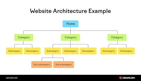
Source: Semrush
You might have heard that most of the traffic comes from people using their mobile phones. But did you know that 48% of users online take a site that is not mobile-friendly as a sign that the business does not care? Another 57% wouldn’t recommend that company to others.
But it’s not just people either. Google uses a mobile-first indexing for its rankings. See how this links UX and SEO metrics?
That’s exactly why you need to verify if your site is mobile-friendly. If it’s not, here’s what you can do in addition to fixing the page load speed and navigation structure:
Make the buttons big enough for people to click on from small screens.Use a responsive design so your site adjusts automatically to every screen size. This will have a great impact on your SEO.Tweak your content and edit it with mobile users in mind. This means shorter paragraphs, plenty of white space, etc. Ditch the unnecessary pop-ups to make it possible for people to easily close the ones you do decide to use. 4. Track Your Page Load Time (Constantly)We’ve already touched on the loading speed several times in this guide. But it is for a very good reason. Everyone hates to wait (and believe it or not, Google, too). So, your page load speed is something you have to test all the time. Literally.
Well, how do you do this? Thankfully, it’s quite easy. You can simply use Google’s PageSpeed Insights. It’s a native, free tool, so there are really no excuses.
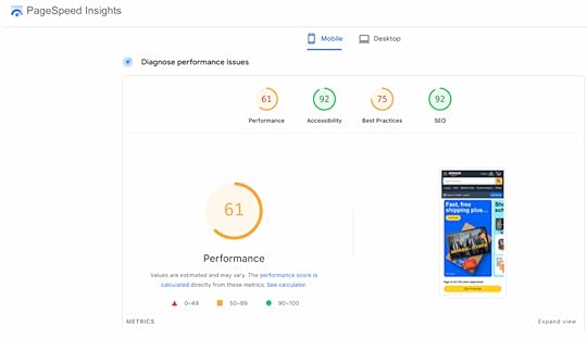
Source: PageSpeed Insights
If your score isn’t looking good, you will need to:
Compress every image so that they take up less space and upload more quickly (or use plugins that do this for you)Make sure you’re using a hosting provider that is fast. Minify your code to make it load even faster. This means you have to remove every unnecessary line of CSS, JavaScript, and HTML, and take out unnecessary spaces and symbols. Often, your CMS can do this automatically.Alternatively, you can find free tools on the internet or use ChatGPT and simply copy-paste your code to take care of it.

Source: Google
Core Web Vitals are actually high-priority metrics to look out for when you’re doing your UX testing for SEO. Why? Because Google uses this to judge your website performance and rankings as a result.
So, you want to track it all the time and improve it when needed. You can use the same PageSpeed Insights tool for this.
As for the easiest fixes here, you can consider the following:
Use a CDN network (in several servers) to make sure that users are getting their content delivered to them from the closest server.Reduce the amount of JavaScript on your page.Use fewer plugins when possible.Avoid heavy animation that not only affects your layout but can also affect your speed. Things like chat widgets, expanding banners, and so on.And of course, check your online performance regularly so you can spot issues early and fix them on time.
ConclusionThere are many ways in which user experience can affect your SEO rankings. So, ignoring this is simply impossible, especially after reading this article.
But by simply following the tips shared today, you will not only improve your position in search results but also build a reputation and the trust of your visitors. So, it’s definitely worth trying.
The post How to Use UX Testing to Improve Your SEO appeared first on Studio by UXPin.
July 28, 2025
How AI Enhances Developer Handoff Automation
AI is transforming how design teams collaborate with developers by automating the handoff process. This reduces errors, saves time, and ensures better alignment between design and code. Key benefits include:
Automating repetitive tasks: AI extracts design details, generates code snippets, and flags inconsistencies.Improved communication: AI summarizes changes, provides real-time updates, and ensures teams stay aligned.Context-aware mapping: AI understands design intent, translating it into precise, development-ready components.Efficiency gains: Teams report saving up to 75 days of engineering time within six months.With tools like UXPin, Figma integrations, and Storybook, AI simplifies workflows, boosts productivity, and helps teams deliver polished products faster.
Go from Figma to Production at AI Speed | Build Faster with MCP and Claude | AI in Action – EP07
Problems in Manual Developer Handoff Workflows
Before diving into how AI can improve handoff workflows, it’s important to look at the flaws in manual processes. Manual developer handoffs often slow down product development, creating inefficiencies that sap team productivity. Instead of facilitating a seamless transition, these workflows can become bottlenecks, delaying timelines and dampening team morale.
Manual Asset Export and Communication ProblemsOne of the biggest headaches in manual handoffs is miscommunication and inconsistency during asset transfers. Designers often need to manually export assets and share specifications, but this process leaves plenty of room for error. Since designers and developers tend to focus on different priorities, key details can easily get lost.
Tight deadlines only make things worse. When teams are under pressure, designs and documentation are often incomplete. This means developers don’t always get the full picture of why certain design choices were made or what customer pain points they address. Ben Nadel points out that, in such cases, developers are left to make educated guesses without a full understanding of the design context.
This lack of clarity can result in products that look correct on the surface but function in ways that deviate from the original intent. And to add to the frustration, many developers find design tools difficult to navigate. Daniel Vaughn, Senior Platform Engineer at NextEra Mobility, captures this well:
Version Control and Design Consistency ProblemsMost developers I’ve known don’t feel very comfortable navigating design tools.
Beyond asset transfers, maintaining design consistency is another major challenge. Manual workflows often rely on outdated methods like file transfers and verbal communication, making effective version control nearly impossible. Developers frequently end up working from old files or incomplete specs, leading to implementations that don’t align with the intended design.
Inconsistent designs can confuse developers and hurt the final product. Vaughn highlights how manual processes blur the "source of truth" by mixing experimental drafts with finalized designs. Missing screens, outdated logic, or incomplete documentation force developers to fill in the gaps, often compromising the user experience.
The problem doesn’t stop at individual files – it extends to the entire design system. Donnie D’Amato, founder and chief architect at Design Systems House, emphasizes the complexity of managing multiple UI states:
We’re talking about the tokens that I’m using to compose these things and all the different types of states that we need to consider. And that’s not just hover and active. We’re talking about things like empty states or first-time user experience stuff. All the different considerations need to be accounted for.
When these considerations aren’t properly documented, developers are left guessing, leading to inconsistencies across the product.
Impact on Team Collaboration and ProductivityThe ripple effects of manual handoff problems are felt across entire teams. Poor communication is a significant culprit, contributing to 63% of failed sprints in distributed teams. On the flip side, teams with strong documentation practices complete sprints 45% more often. This highlights how manual processes create unnecessary friction that impacts overall productivity.
Another issue is the disconnect developers feel when they’re excluded from the design process. D’Amato captures this sentiment:
Sometimes, I feel that we’re left out. As developers, we don’t know the entire story about where this design came from.
This lack of context forces developers to rely on guesswork, leading to more revisions and back-and-forth communication. It’s a frustrating cycle that lowers morale and slows progress.
The challenges are even greater for remote teams. Remote engineering teams accumulate technical debt 45% faster than co-located teams. Manual handoffs amplify this problem by creating additional communication barriers and reducing clarity around technical requirements.
Martin Fowler, Chief Scientist at ThoughtWorks, sums it up well:
The success of distributed engineering teams depends less on tools and more on deliberately designed processes and communication patterns.
These inefficiencies highlight the need for better solutions. Without addressing these workflow challenges, small setbacks can snowball into major delays, creating friction between design and development teams and slowing down the entire product development process. AI offers a way to tackle these issues head-on, transforming how teams work together.
How AI Changes Developer Handoff AutomationAI is reshaping how developer handoff workflows operate by tackling the inefficiencies and miscommunication that often plague manual processes. By bridging the gap between design and development, AI-powered tools simplify workflows and save time. Teams leveraging AI for handoff automation report saving 41 days of engineering time within the first five months, increasing to 75 days by the sixth month.
Automating Repetitive Handoff TasksOne of AI’s biggest contributions is its ability to handle repetitive tasks that are prone to errors and consume valuable time. These tools analyze design files, extract key details like color codes, typography, spacing, and component properties, and generate detailed specifications – all without manual input.
Beyond just specifications, AI can generate code snippets directly from design elements. It even predicts potential implementation issues and flags inconsistencies in the design. Thanks to these efficiencies, teams experience a 19% faster cycle from commit to production, allowing designers and developers to focus on more strategic, creative tasks.
Amir Behbehani, VP of Engineering at a Fortune 500 company, captures this shift perfectly:
AI isn’t making our developers faster typists – it’s shifting them from carpenters to architects. But only if we redesign our processes to match.
For instance, Meta‘s testing framework used AI to create 9,000 test mutations, achieving a 73% acceptance rate. This shows how AI can handle large-scale repetitive tasks while maintaining high-quality standards, something that would be challenging to achieve manually.
AI-Driven Context-Aware MappingTraditional handoff tools often treat design elements as isolated pieces, but AI introduces a new level of contextual understanding. This context-aware mapping allows AI to interpret design intent and translate it into development-ready components, ensuring the original vision is preserved.
By eliminating guesswork, AI translates design intent into precise code structures, addressing a major challenge: 48% of developers encounter knowledge silos at least once a week. This contextual awareness helps bridge gaps in communication and ensures consistency across the design system.
AI also recognizes patterns and relationships across a product’s entire design, instead of seeing each screen or component as a separate entity. This means developers gain a clear understanding of how all elements interact within the broader system, not just individual assets.
Real-Time Updates and NotificationsAI addresses the common issue of outdated design information by enabling real-time syncing of changes. Whenever designers update a file, AI detects the changes and notifies the relevant team members.
But it doesn’t stop at notifications. AI evaluates the scope of these changes and identifies their impact on the development process. For example, if a button style used across multiple screens is updated, AI flags all instances and alerts developers to the broader implications.
Several tools showcase this real-time capability in action. For instance:
Figma integrated with Locofy and Anima: Converts designs into production-ready React or HTML code with minimal manual effort.Penpot AI: Automatically generates responsive layouts from Figma designs, adapting them for various screen sizes and devices.Storybook with Chromatic: Uses AI for visual regression testing, ensuring that updates don’t unintentionally alter component appearances. It also syncs design tokens, so changes in Storybook reflect automatically in the development environment.Roman, a designer at Eleken, highlights how this transformation simplifies the process:
I don’t need to think of how to handoff design to a developer, I simply share a link. Guys pick up the design for implementation right there. If the correction is minor guys leave a comment about it directly in Figma and it’s super convenient and time-efficient… What I love the most is that I don’t need to write any additional documentation with specifications. Developers get everything they need automatically in Figma.
AI also plays a role in content creation during the handoff process. It can generate microcopy, saving time for designers and content teams alike. Automated design QA powered by AI catches issues early, preventing them from spilling over into development. When developers need code snippets, AI offers suggestions, removing bottlenecks between teams.
These advancements create a shared platform where design specs, code snippets, and feedback flow effortlessly between team members. This seamless integration reduces errors and promotes transparent, continuous collaboration across the board.
sbb-itb-f6354c6Code-Backed Tools in AI-Powered HandoffCode-backed design tools are reshaping how designers and developers work together. Unlike traditional tools that produce static mockups, these platforms use real code components to create prototypes, bridging the gap between design ideas and development execution. When enhanced with AI, these tools transform the handoff process into a smooth, efficient workflow. This shift opens the door for AI to refine collaboration at every stage of the process.
Benefits of Code-Backed PrototypingPrototyping with code-backed tools ensures design precision by delivering components that are ready for production. By using actual code components, designers provide developers with prototypes that behave exactly as they will in the final product. This tackles a major issue: UI development can account for over 60% of total development time and costs.
The difference becomes evident when comparing traditional handoffs to code-backed methods. Static mockups often leave room for misinterpretation, while code-backed prototypes deliver exact components, styles, and interactions. This eliminates guesswork for developers and ensures consistency between design and implementation.
Take UXPin’s AI Component Creator, for example. It creates production-ready UI components from popular libraries like MUI, Ant Design, Tailwind UI, and React-Bootstrap, making it easy for developers to integrate them directly into the codebase. This means designers and developers work with the same components, reducing translation errors and saving time.
The time savings are significant. Developers receiving code-backed prototypes can focus on business logic and functionality instead of recreating UI elements. This streamlined process accelerates the journey from concept to production while keeping the design intact.
Better Collaboration with AI FeaturesAI-powered tools in code-backed systems act as a common language for designers and developers. They understand the creative intent behind designs and the technical constraints of development, offering intelligent suggestions to bridge the gap between the two.
For example, developers using GitHub Copilot reported completing tasks 55% faster on average. These efficiency gains apply to design-to-code workflows too, where AI supports both designers and developers in their roles.
AI tools also improve collaboration by automating documentation. They capture design decisions and implementation details, ensuring everyone stays on the same page. If a designer updates a component, AI can automatically generate updated specs and notify the team of the changes.
"The real value of AI tools in design-to-code handoffs isn’t just speed or automation. It’s about unlocking better collaboration."
AI further enhances productivity by maintaining consistency across projects. It remembers design systems and suggests appropriate components, flagging inconsistencies before they become issues. This ensures that teams stick to established standards and avoid costly errors.
The feedback loop between design and development becomes more efficient with AI. Instead of back-and-forth emails or meetings about feasibility, AI provides instant feedback on design decisions, suggesting alternatives that align with both design goals and development needs.
Continuous Improvements Through AI IntegrationAI integration allows design updates without disrupting workflows. Traditional handoff processes often falter when designs change mid-development, leading to delays and miscommunication. AI-powered tools, however, adapt to changes seamlessly, ensuring smoother updates and collaboration.
Generative AI tools have been shown to save 10–15% of development time. Over time, these savings increase as AI learns team preferences and automates repetitive tasks.
Hewlett Packard Enterprise (HPE) offers a real-world example of this. They used an AI assistant to automate code reviews for a large software project. The AI, trained on HPE’s coding standards and past reviews, flagged missing documentation, potential errors, and style inconsistencies. This allowed developers to address issues before human reviews, speeding up the process and improving code quality.
This approach can be applied to design handoffs as well. AI can analyze past projects to identify recurring issues and flag similar patterns early. For instance, if a specific design element has caused problems before, AI can suggest alternatives during the design phase, preventing costly revisions later.
The continuous learning aspect of AI tools makes them more effective over time. As they handle more projects and observe team workflows, they gain a deeper understanding of team preferences, coding standards, and design patterns. This results in more accurate suggestions and fewer obstacles during handoffs.
AI also enables proactive problem-solving. Instead of waiting for issues to arise during development, AI can analyze designs in advance, predict potential challenges, and recommend solutions. This allows teams to address issues early, when adjustments are easier and less disruptive.
Case Study: Automating Handoff with AI-Powered UXPin
UXPin demonstrates how AI can revolutionize the traditionally tedious handoff process between design and development. By combining code-backed prototypes with advanced AI features, UXPin simplifies collaboration and ensures seamless alignment between teams.
UXPin’s AI-Driven Features for HandoffAt the heart of UXPin’s automation capabilities is its AI Component Creator, a tool that transforms simple text prompts into production-ready UI components. This feature supports popular frameworks and enables designers to create intricate components in seconds, cutting out the repetitive back-and-forth typically required between design and development teams.
Another standout feature is Merge, which integrates open-source libraries like MUI v5, Ant Design, and Tailwind directly into the design workflow. This integration ensures that designs are functional and ready for development from the start.
UXPin also automates the creation of design specs, CSS code, and style guides, saving teams countless hours of manual documentation work. Developers can access JSX code, dependencies, and functions for every component directly within the design environment, streamlining the entire handoff process.
"With UXPin, all of your team’s designs and prototypes are enriched with automatically generated specifications in one tool. No plug-ins, no third-party handoff apps."
The platform further supports collaboration with modes like Preview, Comment, Spec, and Documentation, helping teams communicate effectively while minimizing errors and speeding up workflows.
Cutting Errors and Boosting EfficiencyBy starting with code-backed components, UXPin ensures that prototypes behave exactly like the final product. For example, its Merge feature reduced front-end build time by 40% for a fintech dashboard project, allowing developers to concentrate on more complex tasks.
The AI Component Creator also helps teams adhere to best practices and accessibility standards. It can instantly generate commonly used UI elements – like FAQ sections or contact forms – complete with proper structure and functionality. Integration with Stackblitz simplifies code export and deployment, making the process even smoother.
Transforming Design and Development CollaborationThe real-world impact of UXPin is clear. In early 2024, a mental wellness startup used UXPin’s AI tools to create a high-fidelity MVP demo in just 48 hours. By leveraging UXPin Merge’s production-ready components, the team was able to align design and development seamlessly.
UXPin’s approach significantly boosts productivity by combining features like the AI Component Creator, direct code export, and open-source component libraries. Teams can use pre-designed layouts and contextual documentation to speed up product launches, fostering better communication and reducing misunderstandings between designers and developers.
The Future of AI in Developer Handoff Automation"Automate the work that your team doesn’t need to be wasting their time on. Allow them to use their creativity for real game-changing tasks."
AI is revolutionizing how teams collaborate, and developer handoff automation is no exception. With rapid advancements, these processes are becoming more streamlined, setting the stage for a broader transformation in product development workflows. Let’s dive into the trends shaping this space.
Current Trends in AI for Developer HandoffAI is becoming a core part of development tools, reshaping traditional workflows. According to data, 76% of developers are either already using AI or planning to integrate it into their processes. This growing adoption is driving innovations like AI-native IDEs and the Model Context Protocol (MCP), which are reimagining the development loop entirely.
AI agents are also making their mark. These tools can now observe application behavior, functioning much like assistive technologies. Developers are increasingly working alongside these agents in asynchronous workflows, where tasks are handled in the background, and progress is reported upon completion.
Version control is undergoing a transformation as well. AI-native Git shifts the focus from traditional line-by-line changes to how the output behaves. Similarly, AI-generated project scaffolds are replacing rigid templates, allowing developers to create custom setups based on simple descriptions. Handoff documentation is evolving too, moving from static formats to dynamic, interactive systems that cater to both human teams and AI agents.
Impact on Design and Development EfficiencyAI is already delivering measurable efficiency gains. Companies using AI tools report 3–5× faster feature delivery. This speed boost is particularly noticeable during the prototyping phase. As Reddit’s Chief Product Officer, Pali Bhat, explains:
New feature definition, prototyping, and testing are all happening in parallel and faster than ever before. Our teams can now dream up an idea one day and have a functional prototype the next. It’s that fast.
While only 23% of developers currently report that AI tools improve code quality, this number is expected to rise as AI becomes better at understanding project context and maintaining consistency in handoff processes. Gartner predicts that by 2028, 75% of enterprise software engineers will use AI coding assistants, signaling a shift from basic automation to tools that enhance decision-making.
These efficiency gains go beyond the handoff stage, influencing the entire product development lifecycle.
AI’s Growing Role in Product DevelopmentAI’s influence is extending across product development, thanks to advancements like multimodal AI, which integrates text with images, video, audio, and code. This allows for more precise translation of design intent into development requirements.
The "shift left" approach is another emerging trend, where AI addresses risks, compliance, and accessibility earlier in the development process. On this topic, Reddit’s Pali Bhat notes:
The greatest value will occur when we can remove the bottlenecks and ensure our products are compliant and high-quality from the get-go. We are already doing that with accessibility, where we ensure that it is ‘built in’ from the start of the PDLC rather than bolting it on after the fact.
Dynamic AI interfaces are also replacing static dashboards. These conversational systems adapt to user intent, driving toolchain consolidation. As Bhat explains:
An excess of point solutions fragments the developer experience. Engineering teams can only effectively use a certain number of tools as part of their core workflow. Integration will become more crucial, and we will see toolchain consolidation over time.
By 2025, organizations will move from experimenting with AI to fully leveraging its potential. Handoff automation will evolve from simple task execution to intelligent workflows that anticipate team needs and project requirements.
As Microsoft’s VP of Office AI, Ritcha Ranjan, puts it:
FAQsHow does AI enhance collaboration between design and development teams during the handoff process?AI is changing the product development life cycle by shifting human effort toward areas where we add the most value – those requiring deeper reasoning and problem solving. Traditionally, engineers follow a process: scoping requirements, determining system integration, shaping the solution, writing code, testing, reviewing with peers, and refining the design. Today, AI accelerates code writing and testing. As the technology evolves, it will begin tackling more complex aspects of the process, but advancements will be limited to textural chains of thought to emulate human reasoning. These advances will continue shifting engineers’ focus to areas requiring deeper reasoning.
AI plays a key role in improving collaboration between design and development teams by streamlining the handoff process and making communication more effective. It takes care of repetitive tasks, creates precise design documentation, and converts designs into formats that developers can easily work with. This helps minimize confusion and cuts down on delays.
When AI is integrated into workflows, teams gain access to real-time updates, maintain consistency, and stay aligned on project objectives. This leads to a smoother transition from design to development, saving time while boosting the overall quality of the final product.
What challenges do manual developer handoffs present, and how does AI help resolve them?Manual developer handoffs are notorious for causing delays, miscommunication, and errors. These hiccups can derail project timelines and compromise the quality of the final product. The root of the problem often lies in inconsistent documentation, unclear communication, and the inevitable human errors that creep in when design specifications are handed off to development teams.
AI-powered tools offer a way to tackle these pain points head-on. By automating repetitive tasks, they help maintain design accuracy and foster smoother collaboration between teams. The result? Fewer errors, faster workflows, and a more seamless connection between designers and developers. While their effectiveness hinges on factors like the quality of input data and proper setup, these tools hold strong promise for reshaping how teams collaborate during the handoff process.
How does UXPin’s AI Component Creator improve the accuracy and efficiency of design-to-code workflows?UXPin’s AI Component Creator simplifies the design-to-code process by automatically turning your designs into accurate, code-ready components. This eliminates much of the manual coding effort, reduces potential errors, and speeds up the handoff between design and development.
With the power of AI, teams can maintain better alignment between design and development, boosting efficiency and saving valuable time. This smooth workflow lets developers concentrate on perfecting functionality instead of converting design files into code.
Related postsHow AI Improves Design Team WorkflowsAI Tools for Detecting Component ErrorsHow to Automate Interactive Prototypes with AIThe post How AI Enhances Developer Handoff Automation appeared first on Studio by UXPin.
July 25, 2025
Interactive Prototyping with React Components
Interactive prototyping with React components transforms static designs into functional models that closely resemble final products. This approach bridges design and development, streamlining workflows and reducing costly revisions. Here’s why it works:
React’s component-based architecture: Creates reusable UI elements that integrate appearance and behavior.Realistic prototypes: Simulate user interactions and transitions for better validation and collaboration.Direct alignment with production code: Prototypes built with React components ensure smoother handoffs to developers.To get started, you’ll need tools like Node.js, Vite, and a code editor like Visual Studio Code. Organize your project with type-based, feature-based, or hybrid structures depending on the project size and team. Tools like UXPin enhance the process by enabling designers to use real React components, offering advanced interactivity and seamless updates.
Key benefits include:
Faster iteration cycles.Reduced design-to-code gaps.Improved long-term consistency and maintainability.React prototypes aren’t just concepts – they’re a bridge to production-ready code.
Turn Design into React Code | From prototype to Full website in no time
Setting Up a React Prototyping Environment
Creating a React prototyping environment requires the right tools and a solid structure. A well-prepared setup not only speeds up development but also ensures your prototypes are production-ready when the time comes.
Prerequisites for React PrototypingBefore you start, there are a few essential tools and dependencies you’ll need. Node.js is the JavaScript runtime environment that powers your development, while npm or Yarn serve as package managers to handle dependency installation. These form the backbone of any React project.
Choose a code editor that supports React well. Visual Studio Code is a popular choice, thanks to its integrated terminal, Git support, and a wide range of React-specific extensions.
When it comes to project scaffolding, Vite has become the go-to tool, surpassing the now-outdated Create React App. Vite offers faster server start-up, better hot module reloading, and more efficient bundling, making it a great fit for the iterative nature of prototyping.
For more complex prototypes, additional tools can make your life easier:
State management libraries like Redux or MobX to handle data flows. React Router to manage navigation. UI component libraries such as Material-UI or Ant Design to speed up development with pre-built components.Tool/DependencyDescription... runtime environmentnpm/YarnPackage managers for dependenciesVisual Studio CodePopular code editor with React supportViteBuild tool for fast developmentRedux/MobXState management librariesReact RouterRouting library for navigationMaterial-UI/Ant DesignPre-built UI component librariesOrganizing Your Prototyping ProjectOnce your tools are ready, organizing your project is key to keeping things manageable. React doesn’t enforce a specific structure, so it’s up to you to choose one that matches your project’s needs. There are three main ways to organize your React code: type-based, feature-based, and hybrid structures.
Type-based structure: Groups files by type, such as components, hooks, or utilities. This method works well for smaller projects (fewer than 50 components) and teams of 1–5 developers. It’s a simple approach that’s ideal for prototypes or quick setups.Feature-based structure: Organizes code by functionality, like user management or product listings. This is a great choice for larger projects with multiple teams or for applications that require long-term scalability. It fits well with projects exceeding 50,000 lines of code.Hybrid structure: Combines both approaches, balancing feature isolation with shared resources. It’s a middle ground that works best for midsize projects (5,000–50,000 lines of code) and teams of 5–20 developers.To improve your workflow, consider these tips:
Use absolute imports with jsconfig.json or tsconfig.json to simplify import paths.Set up barrel files (e.g., index.js) to streamline exports.Group related files – like components, styles, and tests – together to minimize context switching.Stick to consistent naming conventions, like kebab-case, and limit folder nesting to 3–4 levels to keep things manageable.FeatureType-BasedFeature-BasedHybridProject SizeSmallLargeMediumTeam Size1–520+5–20ScalabilityLowHighMediumBest Use CasesPrototypes, small appsEnterprise appsMid-size appsWith a structured project setup, tools like UXPin can further streamline the prototyping process, ensuring a smooth transition from design to development.
Using UXPin for Prototyping

Once your environment and project structure are in place, UXPin can enhance your prototyping process by bridging the gap between design and development. This tool allows designers and developers to work with the same React components, creating realistic, high-fidelity prototypes that behave just like the final product.
One standout feature is UXPin’s AI Component Creator, which generates React components directly from natural language descriptions. This cuts down on manual coding, letting teams refine and customize components as needed.
UXPin also supports advanced interactions, like conditional logic and state management, to simulate real user flows. This means your prototypes can mimic actual functionality, giving stakeholders a clear preview of the end product.
To keep everything aligned, UXPin integrates seamlessly with tools like Storybook and npm. Any updates to your codebase automatically sync with your prototypes, ensuring consistency throughout the development process and reducing manual updates. This integration makes UXPin a powerful addition to your React prototyping toolkit.
Building Interactive Prototypes with React ComponentsOnce your environment is ready, you can dive into building your prototype. The secret to a successful React prototype lies in a modular approach – breaking your interface into smaller, manageable parts, building them step by step, and then layering in the interactions that make your design functional.
Breaking Down UI into ComponentsThe first step in creating a React prototype is breaking your user interface into a hierarchy of reusable components. This method ensures that each piece has a clear role and can be developed, tested, and updated independently.
Start by identifying the major sections of your interface – think headers, sidebars, main content areas, and footers. Then, divide these sections into smaller, more focused components. For example, if a section feels too complex, split it into simpler pieces, each with a single responsibility.
Take a searchable product listing page as an example. A top-level component, like FilterableProductTable, might manage the entire interface. Within it, you could have a SearchBar for user input, a ProductTable for displaying results, ProductCategoryRow components for section headings, and individual ProductRow components for each product. Each component should focus on one specific task.
When deciding how to structure your components, think about UI segments that can be reused. Common patterns like buttons, cards, form fields, and navigation elements can often be abstracted into reusable components with customizable properties. To keep things organized, use consistent naming conventions for your components, props, and event handlers. This not only improves readability but also simplifies collaboration with your team. Additionally, plan how data will flow between parent and child components before diving into the code.
Once you’ve mapped out your components, start by building a static prototype to establish the application’s structure.
Creating and Testing a Static VersionBefore adding interactivity, focus on building a static version of your prototype. This step allows you to work on the layout and structure without worrying about dynamic behaviors – essentially creating a solid foundation for your app.
Begin by setting up the basic structure of your components. For example, if you’re using a tool like Vite, a simple Header component might look like this:
import React from 'react'; const Header = () => { return ( Product Catalog ); }; export default Header;Develop each component as a static element, using props to test different scenarios, such as long product names or missing images. This process is crucial for ensuring that your layout works well and that each component displays data as expected. For instance, a static ProductCard component should clearly present product details without handling features like cart management or data fetching.
A solid static prototype makes it easier to introduce interactive elements later. Once you’re confident in the layout, you can move on to adding dynamic behavior.
Adding Interactivity to ComponentsWith the static version in place, it’s time to make your prototype interactive. This is where React’s state and event handling come into play.
Use the useState Hook to give components memory, allowing them to store and update information as users interact with them. For instance, in an image gallery, you could use useState to track which image is currently displayed or whether a description is visible.
To handle user actions, attach event handlers to JSX elements. For example, when a user clicks a "Next" button, the event handler updates the state, triggering React to re-render the component with the updated information. Keep in mind that React schedules state updates for the next render cycle, so changes won’t appear instantly.
When working with state, always create new copies of objects or arrays to ensure the UI updates correctly. For example, a ProductCard component might receive an addToCart function as a prop instead of managing cart logic itself. This keeps the component focused on displaying product details and maintains its single responsibility.
sbb-itb-f6354c6Adding Advanced Features to PrototypesOnce you’ve nailed down basic interactivity, it’s time to take your React prototypes to the next level. Adding advanced features like animations, conditional logic, and realistic user flows can make your prototypes feel much closer to fully functioning applications. Let’s break down how you can bring these elements into your designs.
Implementing Advanced InteractionsAnimations and transitions can breathe life into your prototypes, giving them a polished, professional feel. Tools like React Spring and Framer Motion make it easy to craft engaging animations. React Spring, for instance, uses physics-based motion to create smooth, natural interactions, while Framer Motion specializes in micro-interactions that provide immediate feedback to users. Picture a button that changes size and color when clicked or a seamless page transition that guides users through your design.
When adding animations, keep them intentional. They should serve a purpose, whether it’s highlighting a feature or providing feedback. For example, a shopping cart icon could give a subtle bounce when an item is added, or a search bar might expand smoothly when clicked to signal its functionality. Timing matters too – quick animations (200–300 ms) are great for small interactions, while longer ones (500–800 ms) work better for bigger transitions like moving between pages. Don’t forget accessibility; always provide options to reduce motion for users who prefer simpler animations.
Next, let’s look at how conditional logic can make your prototypes even smarter.
Simulating User Flows with Conditional LogicConditional logic takes your prototypes from static to dynamic by making them respond to user behavior. By using variables and conditional interactions, you can create designs that adapt to user input or specific scenarios. For example, in an e-commerce prototype, the cart’s status could determine whether the user sees a "Continue Shopping" button or a "Proceed to Checkout" option. Similarly, a logged-in user might have access to different navigation options than a guest.
In React, state variables are key to implementing this kind of dynamic behavior. They can track everything from form progress to user preferences. Imagine a news app prototype that remembers what categories a user prefers and adjusts the homepage content accordingly. For more complex flows, like onboarding, conditional logic can customize the experience – offering extra guidance for beginners while streamlining steps for seasoned users. To keep everything running smoothly, document your variables and logic clearly. This not only helps maintain consistency but also makes collaboration easier during handoffs.
Using UXPin for Advanced Prototyping FeaturesTo tie it all together, tools like UXPin can help you integrate advanced features seamlessly. UXPin combines design precision with real code behavior, working with popular React libraries like Material-UI, Ant Design, and Tailwind CSS. This ensures that animations, transitions, and conditional logic in your prototype align closely with the final product. Plus, UXPin’s code-backed platform can speed up rendering by 40%.
UXPin also excels at handling conditional logic. You can set up variables to track user actions, create expressions to determine what content appears, and design interactions that adapt dynamically. This is especially useful during stakeholder presentations or user testing, where demonstrating realistic workflows is crucial.
As your prototypes grow more complex, performance optimization becomes essential. UXPin’s ability to integrate with real code ensures that your advanced features not only look good but also function smoothly during testing and reviews.
Testing, Iterating, and Handoff in PrototypingCreating advanced React prototypes involves more than just building a functional model – it’s about testing, refining, and ensuring a smooth transition into production. This phase determines whether your prototype becomes a successful product or gets stuck in endless revisions.
User Testing Interactive PrototypesTesting your React prototype with real users can uncover insights that internal reviews often miss. The goal is to engage your target audience and ask clear, focused questions that validate your design choices.
Instead of vague instructions like "explore the app", give users specific tasks that mirror real-world goals, such as "Find and customize a product" or "Complete the checkout process." This approach helps you observe how users naturally interact with your interface and identify any friction points.
Set clear expectations from the start. Use introductory messages to explain the prototype’s purpose, and provide pre-task prompts to guide participants without leading them to specific answers. After completing tasks, ask open-ended questions to encourage honest feedback about their experience.
Focus on recurring issues – like confusing UI elements or common pain points – that multiple participants encounter. Prioritize these problems based on their impact on user satisfaction and task completion. Patterns across different user groups can also highlight features that work well for experienced users but confuse newcomers. Structured feedback methods, such as the "I Like, I Wish, What If" framework, can help you systematically capture strengths, areas for improvement, and innovative ideas.
These insights guide targeted refinements and set the stage for a seamless handoff to development.
Efficient Iteration on PrototypesUser feedback is the foundation for improving your prototype. Iteration transforms a functional design into a polished product, but it’s important to approach changes strategically rather than making random updates.
"There’s no one perfect user-interface design, and you can’t get good usability by simply shipping your one best idea. You have to try (and test) multiple design ideas." – Therese Fessenden, Nielsen Norman Group
Start by categorizing feedback into themes and levels of impact. Separate critical issues that block users from completing tasks from minor annoyances that affect overall satisfaction. Address the most pressing problems first, while scheduling less urgent fixes for later iterations.
Collaborate with your team to brainstorm solutions before diving into changes. A fresh perspective can lead to better approaches, and sometimes the obvious fix isn’t the best one. Once updates are made, validate them through additional testing methods like A/B testing, targeted usability sessions, or quick feedback rounds with a small group of users.
Even testing with just five users can uncover up to 85% of usability issues.
Smooth Handoff to Development"Stay humble but also confident. You’ve talked to customers, built intuition, so go build the prototype and ship the V1. Then be humble by listening to feedback and iterating." – Tomer London, Co-Founder at Gusto
Once your prototype has been refined through testing and iteration, the next step is ensuring a smooth transition to development. Since React prototypes are built with components that align with production code, this process can be significantly simplified.
Start by organizing your component library with clear naming conventions and detailed documentation. Each component should include information about its purpose, props, and expected behavior. Highlight reusable components and make design files easily accessible. Centralizing product instructions and interaction details in one location helps developers avoid confusion and reduces back-and-forth communication.
Code-backed prototypes act as a clear guide for interactions, component states, and element behaviors, minimizing misinterpretations during implementation.
A handoff checklist can further streamline the process. Include details such as:
Component specificationsInteraction behaviorsResponsive design requirementsAccessibility standardsPerformance considerationsBe sure to document any conditional logic, dynamic behaviors, and associated variables or states. The more thorough your documentation, the easier the development process will be.
Finally, schedule regular check-ins with the development team. Brief walkthroughs of the prototype allow you to address questions early and ensure the final product aligns with your design vision. This collaborative approach helps turn your interactive prototype into a user-friendly, production-ready product.
Conclusion and Key TakeawaysInteractive prototyping with React components has reshaped how design and development teams collaborate. By using a component-based approach, designers and developers can create reusable building blocks that streamline workflows from the initial prototype to the final product. According to the Design Tools Survey from UXTools.co, the use of React for prototyping soared from 21% to 47% between 2019 and 2020, highlighting its growing popularity.
React’s declarative syntax and Virtual DOM allow for quick iteration cycles while enabling prototypes to handle real user interactions and data. Unlike static mockups, React prototypes can simulate dynamic user flows and behaviors, offering a more accurate representation of how a real application will function. This dynamic nature ensures that prototypes are not just conceptual but practical, forming a direct bridge to production code.
One of React’s standout advantages is its ability to transition prototypes directly into production. This eliminates the traditional design-to-development handoff, where developers often need to interpret static designs and recreate functionalities from scratch. Instead, prototype components can serve as the foundation for the final product, reducing development time and ensuring the design intent remains intact.
Platforms like UXPin take these benefits a step further. With built-in React libraries such as MUI and Tailwind UI, along with tools like the AI Component Creator, UXPin enables teams to build advanced prototypes without requiring deep coding expertise. This approach simplifies the process for designers and developers alike, fostering a more integrated workflow.
Beyond individual projects, React prototyping helps establish a shared language between design and development teams. This shared framework promotes better collaboration and leads to more cohesive design systems and predictable development timelines. For organizations, this means smoother processes and stronger alignment across teams.
FAQsHow do React components enhance the design-to-development workflow in prototyping?React components simplify the journey from design to development by seamlessly connecting prototypes with production-ready code. They give designers and developers access to dynamic, interactive elements that mimic real application behavior, ensuring designs are both accurate and consistent.
When teams use React components during prototyping, they can test functionality early, spot potential problems, and improve collaboration. This method minimizes miscommunication, accelerates implementation, and ensures a smoother transition between design and development.
What are the benefits of organizing React projects by features instead of file types?Organizing React projects around features can make your codebase more structured and easier to work with. By keeping all the components, styles, and tests for a specific feature in one folder, you create a system that’s easier to navigate and maintain. This setup also helps minimize unnecessary dependencies and makes the development process more efficient. It’s particularly useful for larger applications or teams, where maintaining a clear separation of concerns is essential.
On the other hand, structuring by file types – like putting all components, styles, and tests in separate folders – can lead to confusion as the project expands. This approach often makes it harder to locate or update files because related pieces of functionality are scattered across the codebase. A feature-based structure solves this problem by keeping everything for a feature in one place, making it easier to refactor and iterate quickly.
How does UXPin’s AI Component Creator simplify prototyping for teams without advanced coding skills?UXPin’s AI Component Creator simplifies prototyping for teams with little to no coding experience. It can automatically turn images, text prompts, or existing design elements into fully functional, code-supported UI components. This means less time spent on manual coding and more time for teams to focus on creativity and teamwork.
The tool empowers non-technical team members to actively participate in creating interactive prototypes, which helps streamline workflows and boosts overall productivity. It’s an effective way to connect design and development efforts while ensuring polished, high-quality results.
Related postsReact Components and Version Control in UXPinIntegrating React Components with Design PatternsInteractive Prototype Behavior: React Component IntegrationThe post Interactive Prototyping with React Components appeared first on Studio by UXPin.
UXpin's Blog

- UXpin's profile
- 68 followers

