
UXpin's Blog, page 99
May 2, 2019
Introducing User Flows library

Want to tell the story of your design fast? Quickly create rich, perfectly styled User Flows with ready components – ideal for presentations and documentation. Available in Design System Libraries.
The post Introducing User Flows library appeared first on Studio by UXPin.


April 30, 2019
UXPin Community on Spectrum

Introducing UXPin Community on Spectrum! Talk to our team, exchange tips, make feature requests, share your thoughts and get answers to questions — all in one place. Join us now!
The post UXPin Community on Spectrum appeared first on Studio by UXPin.
Introducing UXPin Community on Spectrum

Today we’re super excited to break the news about our UXPin Community on Spectrum! It’s the long-awaited place where you can talk to our team, exchange tips to hone your UXPin skills, share your thoughts and make feature requests. On top of that, our customer support, product, and development teams are there to answer your questions.
We’ve started by answering what we think are the most popular questions you may ask:
How can I join UXPin Community?
To join, go to https://spectrum.chat/uxpin and create an account with Twitter, Facebook, Google or Github. Or click the help icon in the UXPin app:
Is UXPin Community supported by the UXPin team?
Our customer support team, as well as product and development teams, will be taking an active part in the community and answering questions.
What kind of information can I find on UXPin Community?
You can read all previous discussions, product announcements, check tips & tricks, and get answers to your questions.
The post Introducing UXPin Community on Spectrum appeared first on Studio by UXPin.
April 24, 2019
UXPin Tips & Tricks You Need to Know – Part 1
With all the invaluable features that set UXPin apart from the rest, it is by far the most advanced tool out there. We’ve put together a list of useful tips & tricks to speed up your workflow.
Switch to dark mode
We all look at the screen more than we probably should. So if you want to make things a bit easier for your eyes, this should make things better when working and it’s dark outside. In UXPin you can switch from light to dark mode and save your eyes from computer strain.
[image error]
Deep click
Groups clear things up but you often have to click like crazy to select a nested element. Well…not necessarily! The trick is to hold down ⌘/Ctrl and click the element you want to select, and forget about the endless double-clicking madness.
[image error]
Crop and scroll
In UXPin, there’s a simple way to make parts of your prototypes scrollable either vertically or horizontally. Group the content first, then select Crop selected content in the Properties panel and check Vertical or Horizontal scroll.
[image error]
Copy and paste styles
After creating a layer style, you might want other layers to have the same style too. Luckily, there’s no need to recreate everything from scratch — use ⌘/ Ctrl + Alt + C to copy it and ⌘/Ctrl + Alt + V to paste it on to those layers.
[image error]
Copy and paste interactions
With interactions, things work the same. To copy all interactions from one layer and paste them on to other layers, use ⌘/Ctrl + Shift + C, and then ⌘/Ctrl + Shift + V, or do it from the context menu where you can also copy a single interaction.
[image error]
Adjust opacity
Use the numbers on your keyboard to adjust opacity. Number 2 gives you 20%, 5 gives you 50%, and 0 gives you 100%. If it’s already 100%, then it will change to 0% opacity.
[image error]
The post UXPin Tips & Tricks You Need to Know – Part 1 appeared first on Studio by UXPin.
April 16, 2019
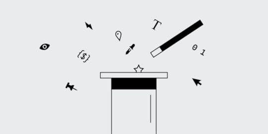
Make Words Your Greatest UX Weapon
That’s what Copywriters are for right? Content Strategists? Definitely! However, words are part of the user experience and at minimum, the first pass, belongs to UX Designers.
Not only do clients appreciate seeing the first look of their product with copy that isn’t in Latin, but users appreciate it too. I’ve walked out of many usability tests and realized that 4 out of 5 issues could be solved with copy edits, whether it’s misleading button text, a confusing headline or confusion during sign up. No matter the language or place, words and conversation are universal. They are our secret weapon and one of the most valuable tools in our toolbox.
Your leading H1 hero copy shouldn’t read like Shakespeare*
*exceptions may be made for a poetry based product
You can be direct, speak with human language, and still have sophistication and a brand voice.
When someone visits the hero of a landing page on a website or web app, we give them a first impression as to who we are as a company – through a combination of words, color, graphics, imagery. First impressions are extremely important, not just in social settings. They set the tone for the entire user experience. As an H1 writer, take lessons from journalism. The two clear goals when creating H1s are:
The user immediately knows what the product is and offers
The user engages by learning more or signing up
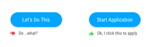
When you ‘Call To Action’ make the action crystal clear
CTA copy is arguably the most important copy on the page. It’s the engagement point where we ask users to buy, sign up, join a cause, etc. It takes wordsmithing and is not easy (how ironic). A CTA should have three important qualities:
Honest. For example, don’t use ‘complete’ or ‘submit’ and then ask for more information. Humans feel a sense of relief when they finish something. If they’re then told they aren’t actually finished, they’re unhappy.
Concise. This article is about words but the irony is that people scroll past words. They like things to be short and sweet. Use the minimal amount of words needed to help the user understand what the button beckons for.
Clear. No guessing as to what the button is for. Users are much more likely to click a button if they know where it goes.
Use Microcopy in these 3 places to increase your product engagement
Microcopy, or small bits of copy, throughout your site or product can make or break the user experience. These bits of copy should have these 5 important qualities:
Add value
Don’t overpower other words and visuals on the page
Flow with the brand tone and voice of the product
Short and sweet, never longer than necessary
Provide the user with answers and not raise more questions
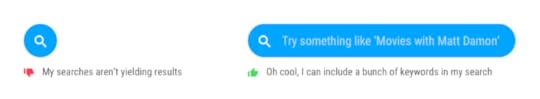
1. Increase engagement by pairing icons with words
Using words with an icon is a better user experience and a more accessible design. It’s clear what the icon means and takes all of the confusion off the table. Many icons are used for multiple purposes, like the calendar icon.
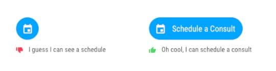
Some icons, such as search, are commonly known. However, using words we can make the search functionality more clear. Some search queries only allow one word searches, and other more sophisticated queries (like Google) allow phrases, questions and ideas.
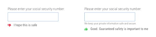
2. Take the frustration out of transactional flows
The best UX example for this is including the password rules before the user submits a password that doesn’t have a special character. However, there are more subtle ways to improve that aren’t just best practice UX. During transactional flows, users give up personal information such as emails, credit card numbers and addresses. Many people are skeptical. However, giving a simple nod to the fact that tech can be creepy can make users feel a lot more comfortable.
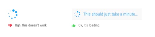
3. Leave no questions unanswered
Users have great expectations. Delight them by telling them what to expect next, so they don’t have to guess and get frustrated. I always joke that part of my job is mind-reading. We must guess how people will respond to the things we show them– this is how we can respond to some of those guesses.
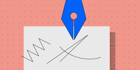
Words are part of the process
I start every project with pen and paper – jotting down ideas. These ideas are always a combination of words and sketches dancing around each other. Just as we walk away from user testing and stakeholder reviews with a list of changes to visuals, also consider how words can elevate the design. When preparing to test, review and ultimately launch, always ask these questions:
Where might a user need extra help?
How can this be more clear?
What are all the points a user could become confused?
Where can we delight and elevate with copy?
Join the world's best designers who use UXPin.Sign up for a free trial.Try it for free!
The post Make Words Your Greatest UX Weapon appeared first on Studio by UXPin.
April 11, 2019
Updates to Design System Libraries

Here they are — new Material Design and iOS libraries to speed up your workflow, a nice and neat list view in Design System Libraries you will adore, and real-time collaboration to keep your library always up to date.
The post Updates to Design System Libraries appeared first on Studio by UXPin.
April 9, 2019
How Design Systems Give Small Businesses a Fighting Chance
At heart, design systems are all about efficiency.
Streamlining tasks, removing redundancies in the process, encouraging communication and collaboration — these money- and time-saving benefits are what makes designs systems so attractive to tech startups and small businesses. How attractive? According to our 2018 UX report, 69% of 3,157 designers surveyed said they were currently working on one for their company.
In an industry as competitive as ours, you can’t afford to waste any resources, especially if you’re still finding your foothold. When done right, design systems save countless hours of busy work and ensure greater product quality, to say nothing of how much easier they make your team’s lives. And they’re pretty easy to build from scratch, even if you’ve never seen one before.
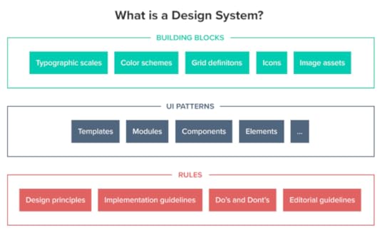
Imagine this: Better products, lower costs, shorter timeframes, and happier workers, all for a small initial investment of time. So how do design systems work and — more specifically — how can they work for your company? Below we’ve laid out the top advantages design systems give small businesses.
Faster time-to-market
Design systems are, in essence, a centralized and communal collection of design components and assets. You want to add a slider on a new page? The design system will have all the guidelines on usage, visual examples, and even code snippets for copying-and-pasting.
Among other perks, using pre-existing components makes the design process move much, much faster. Design and development becomes a simple matter of mixing and matching premade pieces, rather than creating everything from scratch. That frees up extra time for experimenting on better designs, or simply launching ahead of schedule.
Less errors
Another benefit of using prebuilt and standardized component is less errors. Because you’re copying from a master version, there’s no chance of making a mistake. As long as the components in your design system are accurate, their use in your products will be accurate.
This is especially good news for developers, who have all the code snippets they need right at their fingertips.
Consistency across the board
Consistency is vital to a user’s experience, but it can be hard to come by with multiple designers working separately. Design systems allow easy access to universal versions of design assets (and their rules) to keep everyone on the same page, and ensure components remain consistent from one page or section to another.
That also holds true for different products. Brands looking to build their identity can use the exact same assets for all their products, giving everything a unified feel and rewarding loyal customers with familiar usability.
 Make sure colors and typography are on brand to give
 each company product a consistent look and feel.
Easier onboarding for new team members
Don’t forget that design systems also act as an official reference document for a company or brand. If your team-members ever forget stylistic preferences, a specific value for an asset, or need input on a tough design choice, they can find the answer to any question in the design system.
This goes double for new employees who have yet to learn the ropes. Especially for small companies that train new hires individually, onboarding is less time-consuming if the trainee handles much of the learning on their own. Think of design systems as a user manual, with all the instructions clearly written and easy to find. You choose how detailed to make your design systems, so you can also include other resources like style guides, color palettes, and pattern libraries — a one-stop reference for any question a team-member has.
Enhanced collaboration
During the initial creation of a design system — and its periodic updates — design systems get the right conversations started. Which logos go with different screen sizes? How do you want to handle the search function? What is the best accent color for call-to-action buttons? Simply setting out to make a design system forces your team to answer these questions, and make those answers easily accessible to everyone.
Having this kind of master reference guide also helps avoid miscommunication. By offering a definitive protocol and standards for otherwise ambiguous elements, design systems keep everyone on the same page. No guesswork, assumptions, or “going rogue.”
Design systems also do wonders for sometimes-problematic dev handoffs. Because technical specs are embedded in the document, there’s less confusion about how to build something in the backend, or whether it can be built at all. Designs systems give designers and developers a shared language.
 Photo by NESA by Makers on Unsplash
No version control problems
It’s understood that the design system is the official document: every time a change needs to be made, it’s made there. Whenever a bug gets fixed or a new design component is introduced, it’s recorded into the design system so that the next person to use it stays up-to-date automatically. We like to call it a “living document” because it’s always updating.
This format of using only one, agreed-upon master document also ensures that every update gets made to the same file. You never have to merge multiple files that were updated independently of each other by different team members. Whenever you pull from the design system, you know you’re always using the most recent version. This significantly reduces the margin for error.
Stronger, data-driven UX
So much of UX design depends on customer feedback. Different customer groups have different tastes and preferences, and they can be hard to keep track of, especially if your company is targeting more than one group.
Design systems help keep your UX data organized by optimizing your favorite patterns. Discovered your users favor thumb-friendly navigation on the bottom of the screen? All you have to do is update the design system, and every designer knows it’s the new norm going forward.
Also, since everyone shares the same components, you only have to modify one copy every time you make a small tweak. That’s a huge time-saver if you decide you want to introduce a new element or make a drastic change. Because every second counts with small teams, using premade, already-optimized components could be the deciding difference in whether you launch on time.
Final thoughts: How to build a design system
Design systems are a (relatively) new idea, so a lot of companies may be confused about how to build one. That’s why we’ve implemented special design system features into UXPin’s software.
For starters, our design system libraries feature easily lets you create design system modules and store assets at the click of a button. Our simple, intuitive interface makes it perfect for people who’ve never made a design system before. Collaborative teams also appreciate UXPin’s native communication features, with real-time update notifications and note sharing.
Try it out risk-free:
Join the world's best designers who use UXPin.Sign up for a free trial.Try it for free!
The post How Design Systems Give Small Businesses a Fighting Chance appeared first on Studio by UXPin.
April 1, 2019
Designer of the Month: Robert Smith, Freelancer (March)
 Designer of the month: Robert Smith!
Welcome to a brand new series on UXPin’s Studio blog! It’s pretty self explanatory, but each month we’ll highlight a designer who uses UXPin as part of their design workflow. So you can learn more about why they work in design, what inspires their creations, and how they use UXPin.
First one up? Meet Robert Smith. Robert has been a strong advocate for UXPin for some time, so it only felt natural that he’d be our inaugural designer of the month! Plus he shares a name with one of the greatest rock singers on earth. So it’s a win-win, really.
Tell us about yourself, Robert.
I am a freelance UX designer based in London, so I work with multiple clients on multiple projects. Currently I work with a creative agency called Karmarama, who are part of Accenture Interactive.
How did you get into design?
After dropping out of my first year of a Business degree, I transferred to a Creative Design course where I was introduced to Photoshop and Dreamweaver. Another year later I quit the course and moved to London. The rest is history!
Nice! Describe your design process.
No two projects are ever the same, so I try and keep my approach agile and flexible to fit the needs of the client and the project. Broadly speaking, I always like to understand things in as much detail as I can upfront so I feel really educated about the problem at hand before committing to any design work. I always like to ask “Why?” before “How?” and try to challenge assumptions as much as possible with data throughout the design process.
What do you like to do when you’re not at work?
Being a freelancer can get stressful, especially in a big city like London, so I try to take care of my physical and mental health first. Normally this means hitting the gym as much as possible, meditating and of course, binge watching a Netflix series or two. Beyond that my time is split between shooting videos for my YouTube channel and trying to have a social life!
Check out Robert’s Intro to UXPin video!
What’s your favorite place on earth?
Sitting by the river in Berlin drinking a cold beer.
Sounds lovely. What kind of music do you enjoy listening to while you’re working?
I like anything with a lot of energy, so for me it’s often Hip-Hop or Heavy Metal!
Right on. What’s your biggest inspiration for your designs?
I don’t think there’s a single source of inspiration. I’ve learned a lot from different people over the years and I always try to keep things they have told me in the forefront of my mind when I am designing something.
Ok, now tell us a design-related joke!
I don’t know if it’s a joke, but I had a client once who insisted that I made his website on a Mac rather than a PC. That made me laugh at the time.
Ha! That’s pretty funny. What kind of projects do you use UXPin for?
Mostly for websites and web apps.
What’s your favorite UXPin feature?
I love the rich interactions you can create using Interactions and States. For me this is what sets UXPin apart from its competitors and the whole ‘clickable mockup’ thing.
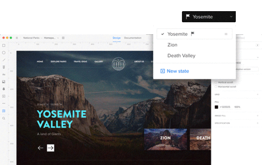 UXPin States
Check these features out for yourself:
Join the world's best designers who use UXPin.Sign up for a free trial.Try it for free!
Want to be featured as the next designer of the month? Know a designer who deserves extra recognition? Email us at marketing@uxpin.com !
The post Designer of the Month: Robert Smith, Freelancer (March) appeared first on Studio by UXPin.
Designer of the Month: Robert Smith (March)
Designer of the month: Robert Smith!Welcome to a brand new series on UXPin’s Studio blog! It’s pretty self explanatory, but each month we’ll highlight a designer who uses UXPin as part of their design workflow. So you can learn more about why they work in design, what inspires their creations, and how they use UXPin.
First one up? Meet Robert Smith. Robert has been a strong advocate for UXPin for some time, so it only felt natural that he’d be our inaugural designer of the month! Plus he shares a name with one of the greatest rock singers on earth. So it’s a win-win, really.
Tell us about yourself, Robert.
I am a freelance UX designer based in London, so I work with multiple clients on multiple projects. Currently I work with a creative agency called Karmarama, who are part of Accenture Interactive.
How did you get into design?
After dropping out of my first year of a Business degree, I transferred to a Creative Design course where I was introduced to Photoshop and Dreamweaver. Another year later I quit the course and moved to London. The rest is history!
Nice! Describe your design process.
No two projects are ever the same, so I try and keep my approach agile and flexible to fit the needs of the client and the project. Broadly speaking, I always like to understand things in as much detail as I can upfront so I feel really educated about the problem at hand before committing to any design work. I always like to ask “Why?” before “How?” and try to challenge assumptions as much as possible with data throughout the design process.
What do you like to do when you’re not at work?
Being a freelancer can get stressful, especially in a big city like London, so I try to take care of my physical and mental health first. Normally this means hitting the gym as much as possible, meditating and of course, binge watching a Netflix series or two. Beyond that my time is split between shooting videos for my YouTube channel and trying to have a social life!
Check out Robert’s Intro to UXPin video!
What’s your favorite place on earth?
Sitting by the river in Berlin drinking a cold beer.
Sounds lovely. What kind of music do you enjoy listening to while you’re working?
I like anything with a lot of energy, so for me it’s often Hip-Hop or Heavy Metal!
Right on. What’s your biggest inspiration for your designs?
I don’t think there’s a single source of inspiration. I’ve learned a lot from different people over the years and I always try to keep things they have told me in the forefront of my mind when I am designing something.
Ok, now tell us a design-related joke!
I don’t know if it’s a joke, but I had a client once who insisted that I made his website on a Mac rather than a PC. That made me laugh at the time.
Ha! That’s pretty funny. What kind of projects do you use UXPin for?
Mostly for websites and web apps.
What’s your favorite UXPin feature?
I love the rich interactions you can create using Interactions and States. For me this is what sets UXPin apart from its competitors and the whole ‘clickable mockup’ thing.
UXPin StatesCheck these features out for yourself:
Join the world's best designers who use UXPin.Sign up for a free trial.Try it for free!
Want to be featured as the next designer of the month? Know a designer who deserves extra recognition? Email us at marketing@uxpin.com !
The post Designer of the Month: Robert Smith (March) appeared first on Studio by UXPin.
What’s New in March
March just like any other month brought us some meaningful improvements, various bug fixes, and an entirely new feature we couldn’t wait for — API Requests. Clearly, not as many as you saw in January and February, but that’s because we’re preparing for the big stuff in April. Here’s what we’ve managed to accomplish in a nutshell.
API Request
When you open UXPin and go to Interactions, you’ll see a new type of action — API Request. It allows your prototypes to communicate with devices in ways one could only imagine.
For example, you can use it with smart home devices, such as color-changing smart lights. You can save data from a prototype to a spreadsheet or even communicate with a car. Trust us; we’ve had fun testing it ourselves!

Performance improvements
When it comes to performance, scrolling and zooming work faster both in the Editor. We have significantly shortened the loading time for interactions between states. On top of that, dragging and dropping parts of symbols got a lot faster.
Enhancements
Names of colors from the Design System show in Spec Mode.
You can set symbols back to their original size in the context menu and reset it in the desktop app’s Object menu.
We completely removed the Clone action for Symbols, as it hasn’t been frequently used and turned out to be slightly confusing. To clone a symbol, copy it and click Detach.
Smart guides and snapping enabled only for elements in the viewport, and they no longer appear when irrelevant.
We moved the shortcut cheat sheet to the right-hand panel and improved it in terms of naming and grouping.
[image error]
Fixed
Dragging and dropping an element inside more complex symbols would misplace them by 1-2 pixels.
The post What’s New in March appeared first on Studio by UXPin.
UXpin's Blog

- UXpin's profile
- 68 followers

