
UXpin's Blog, page 101
January 25, 2019
UXPin Mirror
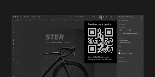
With the UXPin Mirror app you can effortlessly preview your prototypes on mobile devices and see how they look and feel, in a captivating environment unlimited by the browser. As you make changes in the editor, the prototype on your mobile device will update on the fly. There is no need to connect via USB or use Wi-Fi network, just scan the QR code to view your prototype!
Download from Google Play or App Store
The post UXPin Mirror appeared first on Studio by UXPin.


January 20, 2019
Designing for a Dev Environment in 9 Steps


Agile is the most common methodology for software product development today. And, it makes sense.
In the waterfall days, designers and developers followed requirements that were hundreds of pages long. Products were fully designed, and then fully developed. When the product was eventually released, there was no time to go back and fix what didn’t work well.
Personally, I thought the waterfall days were really hard. We rarely held meetings in the same room with the developers, so it forced me to interrupt them at their desks – and that, was a daunting task. I get it; they’re busy and they didn’t want to be bothered by a web designer, and we really had no common ground for communication.
Design was evolving so fast in this space, it was more about brand and not yet about the users’ experience. Still, it was clear that I had to work with developers directly, and I had to be creative in finding ways for them to want to interact with me.
Here’s the kicker: In the end, it was chocolate that was the common language for us. If I approached anyone with chocolate, that person would take the time to work with me and even teach me a little JavaScript.
I was first introduced to Agile in 2009. My first stand up had 40 people in it – and stand up was never ever 15 minutes. However – the process got the right people talking together every day. Over time, we learned to make our teams smaller and our sprints shorter.
Agile challenges us to create small slices of a product that is usable. Our sprints are typically two or three weeks long. During the sprints, the team can focus on problems and fix them quickly – and often, this includes design and UX issues. Missing icons, UI elements and UX that doesn’t work as designed are issues that pop up in-sprint, and need immediate attention. Each sprint, we share these pieces of working code with our users to get their feedback. This allows us time to pivot and redesign as necessary, improving our products in an iterative way.
Large features, however, can take the design team weeks and sometimes months to research, design, review, test, adjust the designs, retest and review with product and development before sprint planning.
Where does that leave designers?
How do we think about a feature far in advance and leave enough time to complete the design process? How do we pivot and jump into a sprint and solve problems mid-sprint that might need user testing?
Let’s start by taking a look at the full process of designing a user experience.
l. Discovery
Have a high-level overview meeting with the Product Manager to determine what the new feature and the business need are. Identify the stakeholders – including the Development Lead and QA resources.
Host a brainstorming session: A one-hour meeting with UX to brainstorm and get ideas from all team members. This will also ensure all UX team members have a clear understanding of the feature.
Define how many screens are affected and the number of mocks to be delivered.
Define personas, use cases and scenarios.
Decide the one UX person to “own” the project from beginning to end. The full UX teams should sketch and help find a solution.
2. Sketching
With markers and paper, sketch up high-level solutions.
Review sketches with the Product Manager and Development Lead.
3. User interviews
Start gathering feedback from the users. They can be actual users or internal team members. Face-to-face interviews are recommended.
4. Low fidelity mockups
Review feedback and create low fidelity mockups.
Create a simple prototype using the low fidelity mockups and test with internal stakeholders. This will help solve any usability issues prior to spending time creating high fidelity mockups.
5. User testing
Using the new prototype, create 4-5 tasks for the user to complete within the prototype. User testing should include as many users as possible.
Make design changes based on user feedback. Changes might require more user testing and more design changes.
6. High fidelity mockups
Create high fidelity mocks to reflect the final design.
All elements should adhere to the UI style kit and brand standards.
7. Full team review
Review the solution with stakeholders to make sure everyone agrees on what will be implemented.
8. Finalization
Once the design has passed the team review, update user stories with mocks, the prototype link and design specifications.
9. UX sign off
UX should review product changes in an end-to-end testing environment and sign off prior to release.
Not all of these steps are necessary for each UX project or task. Assign a “UX Project Size” and the corresponding steps to create a guideline for your team. This way, your team members adhere to the same process and the steps provide clear actions.

Other resources that help the workflow:
Agile board for designers – Create an agile board for your team with columns for:
Backlog – UX backlog of items you want to work on.
To Do – Items lined up for designers to take with the user story/design task ID and the designer’s initials.
Doing – User stories/design tasks that designers are actively working on now.
Done – User stories/design tasks that designers are completed this week.
Dev Backlog – User stories/design tasks that designers have completed but are not in development, so you can keep track of the UX queue of items developers can grab in their grooming meetings.
Weekly critique – At the end of each week, hold internal critique session for your design team. Close laptops, and create a safe environment to give and receive feedback.
Finally, take time to get to know your developers and get their feedback early and often. This helps to make a successful working relationship, and a well-designed product. If you need an ice-breaker, bring some chocolate. As important as a consistent design workflow is, the experience is what really makes design and agile a great combination.
This article was originally published on Medium here.
The post Designing for a Dev Environment in 9 Steps appeared first on Studio by UXPin.
January 17, 2019
Local Fonts

Access to a selection of typefaces is absolutely key to designers’ workflow. Introducing local fonts! Apart from integrations with Google Fonts, Adobe Fonts, and uploading your own custom fonts to UXPin, you can now access all fonts installed on your computer!
Learn how to access your local fonts
The post Local Fonts appeared first on Studio by UXPin.
Local fonts
Access to a selection of typefaces is absolutely key to designers’ workflow. Introducing local fonts! Apart from integrations with Google Fonts, Adobe Fonts, and uploading your own custom fonts to UXPin, you can now access all fonts installed on your computer!
Learn how to access your local fonts
The post Local fonts appeared first on Studio by UXPin.
January 15, 2019
Use Your Own Local Fonts in UXPin


The role of typography in design is enormous – that goes without saying. Uber has its own Uber Move, Airbnb uses Cereal across its product and brand, BBC replaced the good old Gill Sans with Reith. Seeing companies design their own custom typefaces that work alongside the brand’s aesthetics, we took the opportunity to provide our users with as many possibilities as we can when it comes to fonts.
Now, we’re happy to break the good news: from now on, every font installed on your computer is going to be available and ready for use inside the UXPin desktop app.
We’ve kicked this off because we know that unlimited possibilities when it comes to fonts is absolutely key to designers’ workflow. We want to ensure that your creativity will not be limited and that you can consistently use your company’s assigned fonts.
How it works
Apart from online libraries Google Fonts, Adobe Fonts (formerly Typekit), and uploading your own custom fonts to UXPin, we give you access to all fonts which are already in your system. In other words:
No more limitations related to font uploads and integrations with online libraries. Our desktop app will now list all the fonts in your system and make them available inside the UXPin editor.
You can use fonts that have pretty strict limitations, such as Apple’s San Francisco which (currently) comes only in the iOS version and not the web version.
Pro-tips to remember
1. If you want to share a preview of your prototype with someone, make sure they have the font you used inside the editor on their computer. To do that, you can:
Upload the font file via the custom font upload (in WOFF format).
Send the file to the recipient of the preview link and make sure they install it.
Thanks to that, the design is going to render correctly and they will see things as you’ve designed them. In case the recipient doesn’t have it installed, we will replace the font with Arial and inform them about it.
2. Also, you must use the UXPin desktop app to avoid browser limitations – browsers don’t have access to the list of font files installed on your computer.
Learn how to use this feature here and try it now directly in the editor.
Join the world's best designers who use UXPin.Sign up for a free trial.Try it for free!
The post Use Your Own Local Fonts in UXPin appeared first on Studio by UXPin.
January 11, 2019
Why Data Science and UX Design Need to Become Best Buds


Long gone are the days when design used to rely almost solely on the creativity of designers.
Technologies are sophisticated, subsequently rendering users more demanding. UX design has been blurring the line between art and science. According to Adobe, 38% of people will stop engaging with a website if its layout or content is visually unappealing. A similar percentage of website visitors will bounce if images take ages to load.
Enter data science to help you avoid death by bad, unintuitive design.
Eliminate educated guessing
Successfully executed UX design has a strong scientific basis. You must make informed decisions. So before you start designing, it’s essential to go through 6 steps that mimic the scientific method:
Ask a question
Do research
Develop a hypothesis
Run experiments
Analyze your findings
Make an informed decision and implement it.
Never throw darts in the dark and make assumptions on what will get website visitors to stay longer and convert. There’s a sea of information for you to dive into and find what you need. The problem, however, isn’t to collect all that vast data on user preferences. It’s to process and analyze it in a systematic manner to provide you with ready-to-use insights.
Unrightfully neglected by UXers, Google Analytics (GA) can make your life easier. This free tool helps you learn valuable information about visitors: what they’re doing and looking for on your website, where they come from, how much time they spend on each page, whether they engage with certain content, or whether mobile visitors behave differently than desktop visitors, among many other things.
How to make the most of Google Analytics:
Optimize your Bounce Rates
Assess which pages have the best and worst bounce rates. Apart from allowing you to access the report for each individual page, GA offers analyzing your landing pages and establishing the sources from which visitors enter your website.
Improve your Average Time on Page metrics
As the name suggests, this report shows you how much time a visitor spends on a particular page engaging with content. A lower average time indicates that visitors don’t react to your content particularly well, especially if that page features a lengthy blog post. This is a sign to optimize it. In certain cases though, a visitor quickly leaving means they easily found the information they were looking for.
Get to the bottom of Device Usage
This is a metric that has become increasingly important over recent years. Bear in mind that mobile traffic is expected to grow 7-fold from 2016 to 2021, according to the Cisco Mobile Forecast! With this report, find out how your visitors access your website. If you notice that your mobile sessions are extremely short, then fix things and take a multi-device friendly approach.
Obtain insight into Demographics
Gender, age, interests, level of education, income, location, and other information are crucial to understand the requirements of your target audience and their preferences when it comes to user experience and satisfaction.
Data Science + UX Design = More Conversions
Based on relevant metrics, you can build a website with UX design capable of capturing visitors’ attention and prompting them to fill the form or make a purchase. By having access to a huge volume of processed data, you’ll be able to pinpoint what exactly to do to make your design appealing and functional.
Fine-tune your layout
A/B testing has long been the most effective way to determine the performance of each element on your web page. However, this hit-and-miss method is time-consuming. Hence, a dynamic website design with adapts based on visitors’ interactions is the way to go. Heat map analysis is another tactic to boost conversions. By monitoring the eye or mouse cursor movement, you can get an idea about what colors, fonts, buttons, or types of content make your visitors tick. Since this can be pretty challenging, check out the works of acclaimed agencies specializing in web design to pick up some tricks of the trade.
Polish your content
As you know, content still reigns supreme. However, it won’t do much if visitors can’t locate a useful piece on their topic of interest. That’s why a search box is a must. This tiny element not only helps your visitors navigate your website easily, but also sheds a light on whether the results people get correspond with what they’re searching for. As a result, you can make your content more valuable and meet their expectations.
Personalize your website
Relevant visitor data is crucial for tailoring your content and giving each visitor a unique and personalized experience. The point is to avoid one-size-fits-all messaging and addressing your target audience in a bland, generic manner. Instead, connect with them on a deeper, more personal level by displaying adaptive CTAs, messages, or visuals. With segmentation, you can target different audience groups with suitable messaging and imagery, and avoid the redundant information they don’t care for.
Analyze your traffic
New leads are the lifeblood of every business. In order to understand how to optimize lead generation process, you need to identify what the most effective methods are and insist on them. Evaluate every acquisition channel and leverage those which bring the most qualified traffic. Spying on your competitors is another way to steal some of their thunder and copycat their successful tactics for your own benefit.
Maximizing Your Data’s Value
Insanity is doing the same thing over and over again and expecting different results.
This quote, mistakenly attributed to Albert Einstein, perfectly sums up the importance of trying a variety of things to create the best UX design. Sometimes a seemingly small and irrelevant change can make all the difference.
A few things to bear in mind when you’re assessing your data:
A/A testing is as equally useful as A/B testing
It’s used to prevent a false positive result which occurs due to an error in data reporting. False positives account for a whopping 80% of all A/B test results. But, if you show two random groups the same landing page or CTA, instead of two different variations, you can ensure the quality of execution as well as of your analysis tool.
Watch out for a novelty effect
Sometimes, the early performance of a redesigned website might show a sharp upward trend. Not because of the improved UX design, but because of the interest in its changed appearance. This quickly wears off, and you’re presented with a more realistic situation.
Beware of Twyman’s law
It can mislead you into believing that an interesting and unusual stat is correct. This glitch can be the result of a certain bias, data errors, or even bad design or test circumstances.
The instrumentation effect is another threat to the validity of your UX design research
This occurs if you change the instrument, observers, or measurement device during the process. So, make sure that your experiment is tested before it goes live. This means that you should use different browsers, devices, and an extra pair of eyes to help you prevent any issues.
In conclusion, data science can be vital to the success of your UX design. It holds the key to your visitors’ behavior and expectations, but you must learn to use it and be aware of its potential pitfalls.
The post Why Data Science and UX Design Need to Become Best Buds appeared first on Studio by UXPin.
December 18, 2018
The First Built-in Accessibility Features in a Design Tool are Here


There’s no easy way to say this: Design tools have completely failed to deliver sufficient ways to help create accessible experiences.
All of these have existed as plugins or external programs. Until now.
Introducing the very first built-in Contrast Analyzer & Color Blindness Simulator in a design tool. According to WHO, over 1.3 billion people live with some form of vision impairment. Of that, 217 million with moderate to severe vision impairment!
Contrast Analyzer
Think about it—can everyone perceive your digital creations? Here’s where taking size and contrast of the elements of the user interface really counts. That’s exactly what our Contrast Analyzer was built for. Now, the WCAG contrast standard is used in our built-in, automatic linter. Right inside the UXPin design editor, you can specify whether to comply with either AA and AAA levels. It will automatically inform you when the design’s text can be easily read.
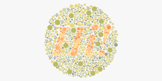
Color Blindness Simulator
And then there’s our new Color Blindness Simulator. Did you know that 4.5% of the world’s population has one of the types of color blindness? Moreover, a whopping 8% of the male population experiences a form of it! This huge number is too often overlooked by designers. Alas, the Color Blindness Simulator shows your design as perceived by someone with one of eight types of color blindness!
UXPin can simulate:
Four kinds of red–green color blindness
Two kinds of blue–yellow color blindness
Two kinds of complete color blindness
Hopefully, with this simulator at our fingertips in UXPin, we’ll all always make sure that people affected by color blindness can use and enjoy our digital creations.
Say goodbye to external accessibility checker tools and jumping between programs. Learn more about in in our CEO’s Medium article and check out the tutorial on how to use both.
No one should feel excluded from digital experiences by means of their visual, motor, auditory, speech or cognitive disabilities. Taking care of accessibility is an ethical imperative for designers. UXPin just took the first step. Let’s get to it.
Join the world's best designers who use UXPin.Sign up for a free trial.Your e-mailTry it for free!By creating a UXPin account, you consent to and fully accept our Privacy Policy.
Terms of Service apply.
The post The First Built-in Accessibility Features in a Design Tool are Here appeared first on Studio by UXPin.
December 17, 2018
Contrast Analyzer and Color Blindness Simulator
Introducing the first 2 accessibility features in a design tool! In our design editor, specify whether to comply with WCAG 2.0 AA and AAA levels. The Contrast Analyzer will automatically inform you when the contrast is insufficient. Additionally, UXPin’s Color Blindness Simulator shows your design as perceived by a person with one of eight types of color blindness!
The post Contrast Analyzer and Color Blindness Simulator appeared first on Studio by UXPin.
December 16, 2018
Build A Design System from Scratch in 7 Steps

What do you think of faster project turnarounds? How about consistency in all of your products? Does better UX and customer satisfaction sound good to you? This isn’t some new miracle product that’s available to buy — but you can build it yourself.
Designs systems are sweeping the tech world right now, with advocates like Trello, Atlassian, Stacks, and Shopify (Check out a complete list of companies with links to their design systems here at Adele). This wave of popularity explains why 69% of designers surveyed in the 2017–2018 Enterprise UX Industry Report said that they either already had a design system or were currently planning on building one.
And why are design systems suddenly so popular, you ask? Because they’re exactly as effective as everyone says. The hype is real. Incorporating a design system in your company brings a variety of benefits:
Faster time to market. By breaking design elements into homogenized components, design systems make the whole process more efficient. Planning, designing, testing and coding are all streamlined to reduce wasting time.
Improved UX and customer satisfaction. They make it easy to keep track of what your users like and dislike, retaining the former and disregarding the latter. They ensure all your products use only the UX elements your customers prefer.
Better internal communication. As a standardized document, design systems minimize the amount of miscommunication. They keep everyone on the same page to avoid confusion.
Consistency across all products. Your loyal customers expect a certain level of excellence on all the products, apps, and sites you launch. Deliver consistent quality and familiar usability on every single product by using identical components.
Less version control issues. Updating the same bug on different products can get annoying, not to mention time consuming. With design systems, you update once and it populates all occurrences.
Design systems are a clear advantage to companies that have already implemented them, and in a few years they’ll be the norm. So how can you build a design system now to utilize their benefits yourself? We’ll explain how in just 7 easy steps… but first, let’s talk a little about what they are.
What’s a Design System?
Formally, a design system is a master collection of the key standardized documentation every company needs to, in the words of AirBnB Principal Designer Karri Saarinen, “define the overall design of the product.” This includes your usual documents like pattern libraries, guideline texts and styles guide, but also more technical aids like reusable codes for common components and other time-saving design assets.
The true beauty of design systems, though, is that all of the components in these areas are already optimized and coded. That means whenever you’re designing a new project or updating an old one, all the pieces you need are already ready — you just have to put them into place.

Textual documents like the style guide and rule guidelines are not exactly coded components, but we still recommend them. Including these documents creates an all-inclusive reference guide that covers every roadblock your designers might have. Whenever someone has a question, they can always refer to the design system.
Now, chances are you won’t have all these documents lying around already. Most companies compile these only as needed, so it’s common to have gaps and oversights. That provides one more advantage of creating a design system: an excuse to gather and formalize these materials for your company once and for all.
In this article, we’ll assume you need to create all of these areas — after all, this is a guide on building a design system from scratch. Startups especially have to tackle all these issues all at once, but even long-established companies may have ignored one or two (or ten) of these areas in their focus on fast growth. Either way, the 7 steps below can lead you to a fully functional design system, even if you’re starting from nothing.
7 Steps to Building a Design System
1. Evaluate your current UI inventory and note inconsistencies
The best place to start is evaluating what you already have. Which elements do you like? Which do you want to replace? Where are there inconsistencies between products or pages?
You’ll want to review every digital asset and all pre-existing reference materials. The end goal is to create a universal guidebook and resource library, so everything that can be included, should be included. Specifically, take a good look at:
Color schemes and how each color is used
Stylistic text choices, like specialized grammar selections, voice, etc. — choices that would be outlined in a style guide
Icon libraries
Photo libraries, both stock and custom
Other graphics, especially your logo — now is a good time to reevaluate your logo and make a new one if you were planning to
UI patterns (note which ones need to be updated)
Page templates
If you’re a new startup and don’t have any finalized design elements to review, think critically on each of these areas to determine the choices that best fit your brand. Later, you’ll have to create a master list anyway, so it’s never too soon to start deciding on these.
2. Get the entire team on board
True, you could do this step first before evaluating your UI inventory; however, we recommend looking for inconsistencies first to give your argument leverage if you’re met with resistance. Nothing like a laundry list of design inconsistencies to get naysayers on board.
Regardless of how many errors you collect, you should highlight to the team the efficiency bonuses of using a centralized design system. Repeat everything mentioned above in the introduction, and accent the amount of time and work a design system saves by streamlining the entire design process beginning to end.
A common complaint about design systems is that the company doesn’t have time to set aside on a side project, but the truth is design systems make up that time — and much, much more — in the long run.
3. Color palette
Now we get into the nitty-gritty of design systems: creating a master list of all your design choices, whether you’re choosing among existing elements or creating them from scratch. It goes without saying that you should rectify the inconsistencies from the first step before adding them in the master.
Your color palette is a good place to start. Maybe you’ve noticed the company uses more than a hundred different shades of gray. How much easier would it be if everyone just used one shade, and that one could be grabbed in a readily available design system?

Identify your chosen shades and hues for every color you use repeatedly, and write definitive guidelines for how to use them. Of course this includes your primary branding colors, but also pay attention to your secondary colors. For example, what color is your text? Your links? Special buttons? Backgrounds?
Remember to include HEX, RGBA, or HSL codes to be as precise as possible.
4. Typographic elements guide
Next, you want to review and finalize your typographic choices. If you already have a style guide, most of the work is done for you. If not, this free style guideeBook will tell you what you need.
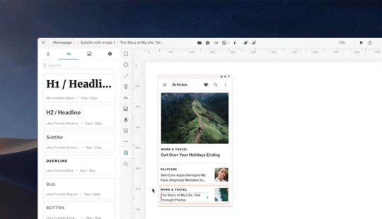
Design systems can be more technical than static style guides, so take advantage of this. Note your preferred text sizes, spaces, fonts, etc., as well as any rules on where and when to use them. For example, how big are section headings in your blog articles? What font do you use for on-site calls-to-action?
Don’t neglect the fine details, like font weights, line heights, or custom kerning rules if applicable.
5. Graphic design assets
A well-made design system allows you to simply drag and drop visual components right into your new prototype. The more graphic design assets you collect in a design system, the faster your workflow for future projects.
Don’t forget to include the proper code snippets or any other documentation developers may need. This small inclusion is an enormous help during the development stage.
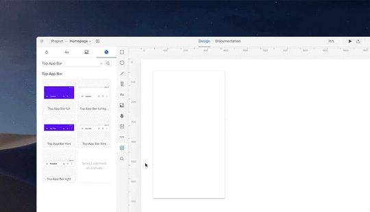
Among your graphic design assets, you’ll need libraries for
Icons — All the icons your products, apps, or sites use. Having a standardized icon library ensures consistency across your entire brand.
Photography — A single go-to reference for all your company photography, both custom images and purchased stock photos. Not only is it easier to pull these from a design system, it also allows workers to browse the selection for ideas and inspiration.
Illustrations — Likewise, compile all the custom illustrations you’ve commissioned, including page flourishes or border designs.
Branding images — This is a place for your standardized logos and other branding images, like mascots. Rules for logo usage can get strict, so it’s better to pull pre-approved images to ensure compliance.
Moreover, you may want to include a list of design principles for everyone to follow if they’re creating a new graphic asset. Sizes, colors, compatibilities, preferred file formats — having a rulebook helps ensure your company’s style remains intact in the future.
6. Pattern library
Finally, include a pattern library of all your common design elements, especially interactive ones. There may be some overlap between UI patterns and graphic assets. On the whole, your UI patterns are more advanced than stagnant visuals.
To be clear, UI patterns are any design elements you use consistently for the interface of your site, app, or product. For example, how you treat your search function is a UI pattern, including how the magnifying glass icon looks, whether the input window expands or remains open, where it’s located on the screen, and if you include placeholder text or not.
Don’t forget, once again, to include code snippets and other development documentation. This is even more significant for UI patterns, as they tend to be more technical.
When organizing your UI patterns, include usage notes to clarify the specifics of how to use it. It also helps to use screenshots or visual cues to make searching for them easier.
It also helps to organize your pattern library into subsections. Try categorizing them by function, such as “navigation,” or by type, such as “drop-down menus.”
7. Upload the select UI elements in a design system document
Lastly, you need to house your design system somewhere that’s convenient and easily accessible. The UXPin Design Systems platform was created for this in particular, with a template-like format where all you have to do is input your components in the appropriate space or upload them from Sketch.
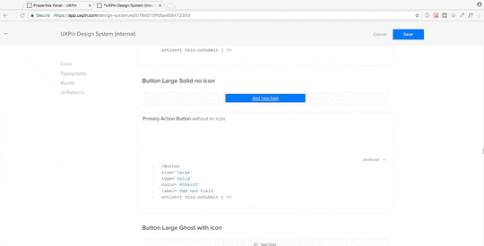
You also have the options of dragging and dropping your elements into the prototyping software, which means easy, DIY designing and a fully-coded handoff to developers with complete documentation (full markup, information about imports, and names of javascript components, etc.). If you want to optimize your time-to-market, this all-inclusive solution is the way to go.
Conclusion
Design systems are a relatively new addition to the world of digital design, but they’re already changing the game. Given the depth of what they’re capable of, we can’t fully explain their usage here; this is just an introduction on how to get started.
This article originally appeared here on Medium.
The post Build A Design System from Scratch in 7 Steps appeared first on Studio by UXPin.
December 14, 2018
8 Years on the Design Tools Market, 5 Lessons Learned

UXPin’s 8th birthday this month brought on some deeply nostalgic memories.
Eight years on the design tools market has given us a pretty broad perspective. We’ve seen trends come and go, big companies enter the market and leave, companies with lots of capital doing nearly nothing and small players out–innovating everyone. One could write endlessly about it. I don’t want to bore you, so instead I’ve boiled it down to five specific lessons.
1. Being right is not enough. You have to be right at the right time.
Timing is everything. We’ve experienced it all — we’ve been too early, too late and exactly on time. Only the last group of events strongly benefits business.
Examples of being too early
The first version of UXPin had a flawless real–time collaboration (multiple people editing one design mockup simultaneously. We called it multiplayer design) in… 2011. No-one really cared about it for the first 5 years of UXPin. Only with the growth of design organizations and the expansion of remote work did real–time collaboration become truly important.
Eventually we stopped believing in multiplayer design; and this feature completely disappeared from our communication (but not from our product!). Then, a competitor announced it like it was new. Not an unrecoverable loss, but still a loss.
Another feature of our 2011 UXPin (since cancelled) was the ability to turn paper prototypes into… HTML–based prototypes. Yes. We had a technology able to transform paper prototypes into HTML… in 2011.

UXPin in early 2012.
It was a powerful marketing machine, but with little real–life usage, we ultimately killed it in 2013. Now, 7 years later, similar products are reappearing on the market as an applauded innovation; it seems that folks are more willing to experiment with its value in real design processes. We were way, way too early.
Examples of being spot on
Back in 2015, interest grew in solutions to help organizations scale design processes without making the whole system more disjointed. The market of tools seemed almost completely empty, and customers were desperately trying to build their own solutions. We moved fast and announced Design Systems as part of UXPin before significant competitors could. First mover advantage helped us establish a solid presence on the enterprise market.

UXPin Design Systems. We were right on time!
Additionally, just two weeks ago, we launched “expressions”, a feature that exposes JavaScript methods in a design tool in a friendly way — similar to Excel formulas. Expressions allow designers to create interactive prototypes with accurate simulations of, for example, form validation, eCommerce shopping carts or sign–up/sign–in flow… basically anything that is possible on the web can be accurately prototyped in UXPin.
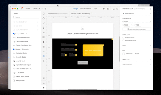
Prototype created entirely in UXPin. Real validation and recognition of type of a credit card.
A few years ago this feature would have been rejected in the divisive discussion, “Should designers code?” Nothing like that happened after the launch of expressions. On the contrary — the feedback was enthusiastic and we’re seeing amazing traction among both coding and non–coding designers.
2. Only achieving critical mass of value lets you escape the market’s gravity.
Sometimes it feels like a new design tool emerges every other week. After a couple of days of excitement on the market, the tool starts to fade away. 12 to 18 months later? No signs of any development.
Why?
Design tools are complicated. Hundreds of small features must exist for mass adoption of the product. Even the biggest players with the deepest pockets stumbled on this very problem, launching premature tools that, after initial excitement, got flooded with negative feedback. When folks don’t use your tool even though it’s available for free, you know something’s not working well.

UXPin minimalistic design in light and dark mode. Designed in early 2014. Introduced in 2015. Apparently later it inspired all the other design tools on the market

UXpin's Blog

- UXpin's profile
- 68 followers

