
UXpin's Blog, page 102
December 3, 2018
Share Sneak Previews of Your Prototypes With Device Frames


You no longer have to imagine what your final prototype will actually look like on a device. UXPin’s new Device Frames… at your service.
Imagine you’ve just poured your blood, sweat and tears into an important design project. You’re ready to shout it from the rooftops and share it with the world. But first, you want your stakeholders to preview it in its full glory—in real life. Enter Device Frames. Device Frames allow you to add mockups of mobile devices for a contextualized preview of your prototypes.
With this update, we’ve added two extra features:
You can change the color of the background and add/remove shadow for the device mockups on preview. This gives designers extra powers to control the presentation of their project to stakeholders.
Use user finger simulation on preview for mobile devices. Now for mobile prototypes, you’ll see a circle simulating finger instead of a desktop cursor. This adds to the realism of the experience on preview.
Why you’ll love it
Previously, you’d have to download a device mockup from somewhere and upload it to UXPin to preview it. Fortunately for everyone, now you’re able to automatically add the right device image/frame to your preview based on your canvas size. So not only can you beautifully present your design in the context of the right device, it’s automatic too!
Also, you can trust that they’ll see exactly what you intend for your prototype to look like. These digital mockups will help the viewer truly understand what you’re trying to present as the final result, on all its different displays. To show stakeholders the final UI in real world context. Additionally, it benefits designers’ workflow; so you can check out how the design looks like on the real device and adjust it wherever needed to get the best result.
The Device Frames for your designs are not interactive— they are static and for aesthetic preview purposes only. You can preview your prototypes on iPads, iPhones and WatchOS, as well as Android phones and tablets.
This is the first step in our plans to step up our Responsive and Mobile Design game. We’ll be releasing the UXPin Mirror app soon, to preview your prototypes directly on an iOS/Android device. Stay tuned!
The post Share Sneak Previews of Your Prototypes With Device Frames appeared first on Studio by UXPin.


November 29, 2018
Device Frames

Introducing Device Frames! Now you can display what your prototype will look like in real life. Customize the frame and background color when you present it to others! Your stakeholders no longer have to imagine what your design will look like in the context of a real device.
The post Device Frames appeared first on Studio by UXPin.
November 28, 2018
Reflections on UXPin’s 8th Birthday


On November 11th, UXPin turned eight!
Time flies! In 2010 I was 24, working as a UX Manager at a thriving Polish eCommerce company and, after several unsuccessful attempts to start a tech business (the youthful energy!), I took a break from any serious side projects. However, I still wanted to channel my energy towards something productive; 9 to 5 was never really an option for me. Instead of pursuing dreams of a tech breakthrough, I decided to team up with two friends and enjoy exploring the problem that bothered us for years — design — engineering collaboration. Without any business goals in mind, we started to think about helping designers and engineers work better together. The problem was very close to our hearts, we just didn’t know what the solution could be.
Freed from the constraints of a firm idea, we considered multiple options. A workshop or conference? A book? Some sort of software? Physical product? We casted a wide net.
After couple of months of creative explorations, we settled on the idea of… a paper prototyping notepad.
We believed that if designers and engineers could use the same tool, they could find the common ground for collaboration. Paper seemed to be the solid foundation for what we wanted to accomplish. After all, everyone is familiar with paper and can use it for creative purposes. The only issue? Not everyone can draw. Somebody who isn’t comfortable sketching will likely be terrified of sketching in front of others. We decided to eliminate this fear by providing designers and engineers with a set of predefined, generic user interface elements printed on sticky notes. Instead of drawing interfaces you could simply pin (yes! This is why we’re called UXPin!) elements to paper. Anyone can do it!

Early visualization of the first UXPin product. November 2010.
Fast forward a couple of months of prototyping and testing our tool, searching for the right manufacturer and waiting for the production to finish — on November 10th (one day ahead of schedule!) we were ready to launch UXPin!
Well… almost ready.
The one thing that we were missing was our… website. Ridiculous, taking into account that, in this entire project, building a website was the one thing that we felt really comfortable doing. We had no experience building physical products, but building a website? We certainly knew how to do that. And perhaps that’s why we left it at the very bottom of our list of tasks. To launch on 11th, we had to fix this mistake… and fast.
On November 10th we pulled a true all–nighter. We started designing and coding after our full–time jobs and finished at 4am. The first version ofuxpin.com was the most impromptu thing that we’ve ever created. Once the website was ready, we had to wait until sunrise to take pictures of our notepads. After all, people had to see the product! I remember moving my desk as close to the window as possible to catch the first beams of sun. We were exhausted.

The original UXPin Website. November 11th 2010.
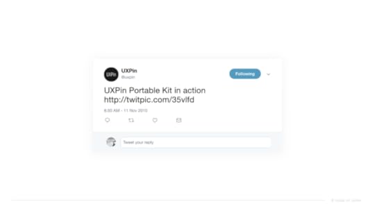
After all this hard work, our approach to the launch was as simplistic as it was anticlimactic. We announced UXPin on Twitter.
Our marketing was unbeatable

November 6, 2018
The United States of UXPin
 Introduction
The creation of advanced designs and prototypes can be tricky these days. At some point, you’ll end up with dozens of artboards or pages that look nearly identical. As a designer, you know that these details are essential for the end product to be presented to your users.
But does every small detail need to be created like this? Is it the only way to design dynamic components with different content?
The problem with any image-based design tool is that they must design static version of key screens. So this is what designers try to prepare – flow, key screens and key components from use cases. It’s time-consuming, but does it have everything developers need to implement it?
Nope.
Developers need to know every state of every component used on the project. Components are dynamic and reactive. If a designer locks all this energy into a static set of artboards, it will blow up in her face. Imagine a simple design with a dropdown and a button. That’s it! The button needs to have a default, hover, active and, probably, disabled state. Dropdown has a hover and active state on the selector, and hover/active/disabled states on every option on the dropdown menu list. That gives you over 15 static artboards to represent all the states. And what if something changes? How do you keep it up to date?
This is a difference between Design and Development theses day – different levels of efficiency.
In UXPin, we introduced Multistates elements back in 2015 to address some of these problems. And we can say it loud and proud: this is a totally unique concept in the design tools landscape. In many cases, it’s why our users choose UXPin. Still, the design and prototype world is rapidly evolving and it requires increasingly sophisticated methods and tools to cover all fields.
More animation. More mobile. More code-based tools. So, we reevaluated all use cases and granted this concept a second life. And now we are happy to introduce our shiny new States feature! Here’s what you need to know to get started.
Focus on user feedback
First, we had to gather feedback about Multistates. Our users have given plenty of feedback since its introduction three years ago. After a tremendous effort from our research team, we finally found a simple way to understand the issues and categorized them as:
Usability improvements
Product requests
Our first thought was to simply improve the UI for Multistates. However, soon we found that this would only solve some of the usability issues.
What about the ability to propagate style and content between states of an element?
What about an animation created “out of the box” based on the changes?
Or the possibility to nest an element with states inside another element with states?
When these questions came up, we knew we had to go deeper.
Inspired by nature – states of matter
That brought us back to the core question – what ARE the states?
After a few brainstorming sessions, one direction especially attracted us – the idea of transformation of the elements. The main idea was that EVERY element should have the possibility to have a different set of properties (styles) stored as states and that these states can be switched to generate element transformation.
Sounds lovely, doesn’t it?
Then we started to look for more general rules (is the number of elements stable between states? Is the number of states in symbols the same?, etc.) Diving deeper into this app architecture question led us to a great analogy for what we are building, which is the states of matter. So any matter, for example water, can transform between states (solid, liquid, gas and plasma) but the number of particles in the environment remain constant.
The same goes for elements in UXPin. You can now build advanced components with different states and transform between the states of elements, but the number of elements will always stay the same. They just change their state – style, position, size, interactions, etc.
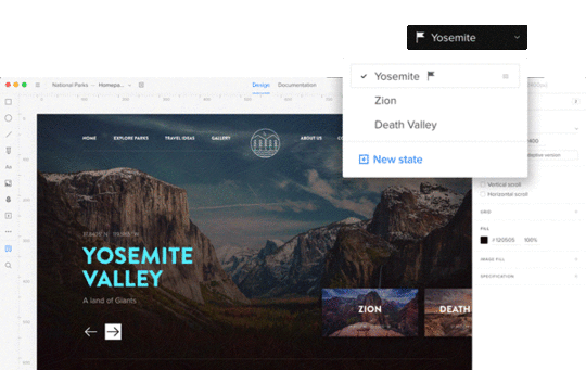
Different states of the same element
The biggest challenge, and the biggest opportunity, for us was the question – how should States be built from the perspective of the app architecture? The easiest way to understand the change is to compare it with the older concept, Multistates.
Creating another state of a Multistate was basically duplicating all the elements from a previous state. After the duplication, those were different – disconnected elements.
In the new concept of States, adding the another state of the element creates another alternative set of properties of the same element. It does not duplicate the same element again. It gives the element another alternative appearance, another level of existence.
You can edit the style and content of states, but it still will be the same element—with states. Also, if you remove the element on one state, it will be removed across all states. This approach gives us the possibility not only to transform elements with animation, but also greatly reduces impact on browser performance.
States on states on states…
One of the most powerful things you can build in UXPin using States is… another state.
Imagine building simple elements with states (buttons, headers, etc.) and using them in more complicated elements with states (login forms, dashboards, use panels, etc.).
From the interviews with our customers, we know that a lot of designers try to build that and end up with a lot of symbols and artboards.
Thus, States were developed to nest states within states and to manipulate the active state beyond that. To support this process, we’ve added the ability to manage states from the layers panel. It helps not only to change the states but also to see, understand and redesign the hierarchy of elements in any component.
Push changes to other states
One of the biggest limitations with the old Multistates was the difficulty in updating already created elements with different states. As mentioned above, this happened because we were duplicating elements. With the new approach to the architecture, we finally solved this problem.
This was one of the biggest design and development challenges for the team. We had to cover two use cases that are quite tricky:
Push changes in style/content to other states
Have the ability to reset changes added to a state
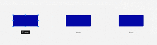
Keeping in mind these two use cases, we came up with the concept of the base state.

A base state is one with a bit different power than the other states. As its name suggests, it acts like a base/foundation on top of which other states are built. When you update the base, you update it for all states. That is to say that the change will appear in all other states too (unless the change of the same property of an element is overridden in another state). For those in software development: inheritance and overriding—sounds familiar? :)
Here’s an example. You designed a “Send message” button and built it in three states: default, hover and active. Then you have the shape of the button, dimensions, style and “Send message” text on it. After a few tests, you decide you want to remove the word message , so the button just reads “Send”. The base state lets you change that text just in one place and it applies automatically to other states!
Some of you might be wondering, “Ok, but what about when I want different text in some specific state?” For example “Sent!” in an active button state from the example above. You can set an override on any other state other than the base. Simply edit the button text in the chosen state to override the text of the base state. After that, changing this specific property of the base won’t affect the edited state, because the override is still there. But don’t worry, you can always reset the property override and it’ll restore the style or content from the base state.
What can you override in states, you ask? Almost everything – size, position, rotation, radius, color fill, border, content of the element and even interactions!
Out of the box animations
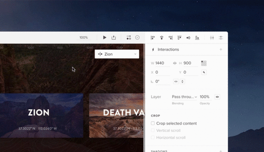
Last but not least, States provides big value for designers looking to easily create more robust animations in their prototypes. Again, this value comes from the fact that states are basically different appearances of the same element/s.
Here’s how it works. If you have two states of the same element with a different style (position, size, color), all you have to do to get animation is to create a simple interaction to change the state of the element. Once you create the interaction between them, the magic is already there! Of course you can change the timing or easing of the animation between states.
Remember states within states? You can even build the animation on the highest level of the nested states and it will animate every change of the nested states. Pretty cool, huh?

What can you use States for?
Create a simple element like a button with the different states: active, hover, disabled, etc.
Design complex patterns like a form that has an input field with different states: empty input, data provided, error state
Components like carousels and accordion menus
Learn how to use States in a tutorial here.
Join the world's best designers who use UXPin.Sign up for a free trial.Your e-mailTry it for free!By creating a UXPin account, you consent to and fully accept our Privacy Policy.
Terms of Service apply.
The post The United States of UXPin appeared first on Studio by UXPin.
November 5, 2018
UXPin + Unsplash

Now you can get curated images directly from Unsplash for your prototypes using our new Data feature.
The post UXPin + Unsplash appeared first on Studio by UXPin.
October 31, 2018
Expressions: Harness The Power of JavaScript in your Prototypes
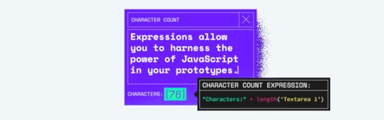

Just when you thought your prototypes couldn’t gain more superpowers, we added another to your prototyping utility belt: Expressions. Bring the power of JavaScript functions to your designs.
Now you can power up your prototype in a programmatic way. Gone are the days of design tools not having math functions! We just leveled up with Expressions. It makes JavaScript directly applicable to your prototypes. This is the most powerful feature UXPin has released to date, and it nicely complements our new Variables and Conditional Interactions features. It also brings us one step closer to our mission to enable the best user experiences by merging design and engineering into one world of better, faster product development.

Expressions is basically “code language”. You can now use JavaScript functions to perform additional operations on variables such as math, dates, text, etc. to build even more. Want to prototype a design with a computational component? Now you can! Manipulate variables, perform math and regular expressions tests, and use the results to update variables or trigger state changes and transitions— all right inside the prototype.
Think of Expressions as being similar to the functions in Google Sheets and Excel. They can also make a prototype “context aware”. Basically, a prototype can change based on its operating system, or size of the browser window.
Expressions allow you to get even closer to real apps, especially when user testing. You can change things dynamically in an earlier stage of your prototype. Say goodbye to linking static artboards forever.
The number of things you can create with Expressions is infinite. But here are some specific examples:
Perform some math on a diagram’s data
Create a shopping cart for an e-commerce website
Build an ROI calculator for your business
Create a rap name generator (as our Account Manager, Natalie, suggested)
Make a scheduling tool to book clients
Show error or success messages
Validate email addresses
There’s a lot to functions to play with, so read our tutorial here to get a full grasp of the power of Expressions. Express yourself endlessly.
Not part of the UXPin family yet?
Join the world's best designers who use UXPin.Sign up for a free trial.Your e-mailTry it for free!
The post Expressions: Harness The Power of JavaScript in your Prototypes appeared first on Studio by UXPin.
October 30, 2018
Introducing Expressions
Bring the power of JavaScript functions to your designs with Expressions. Now use functions to perform math, dates, text operations, etc on variables — right inside your prototype.
Learn more about expressions.
The post Introducing Expressions appeared first on Studio by UXPin.
October 29, 2018
States – design advanced prototypes with ease

Now you can design different versions of any element you like and animate between their states! With just one click, update any properties between every state—no more manually editing each one.
Learn more about states.
The post States – design advanced prototypes with ease appeared first on Studio by UXPin.
October 25, 2018
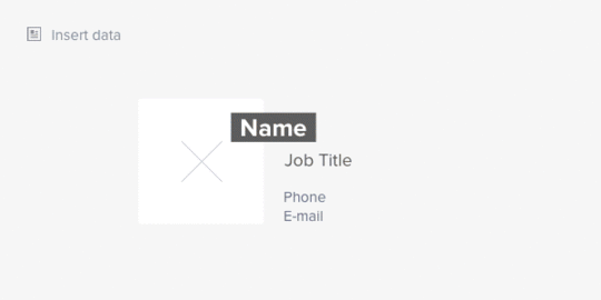
Out with Lorem Ipsum, In with Real Data


The right data, in the right place, in no time. Surprise! Now you can upload real data into your prototypes with our new Data feature. No more spending hours, even days, mocking up data for your designs. You’re welcome.
Boy, are we excited to share this one with you. You should know that this new feature was not originally on our product roadmap. One of our incredible engineers, Robert, took this on as a passion project and did this on his own time as a gift to UXPin. That’s the magic of our team.
Data allows you to fill an element with random data (avatar, name, phone number, etc.) or from JSON and Google Sheets with just one click. UXPin can automatically match all the fields based on the JSON or Google Sheet of choice. If you name your layers, it’ll automatically link that with the respective data. It’s truly that simple to use. Additionally, you can choose from many types of bundled content for random data. We’ve made sure to include a great deal of diversity for all the possible elements.
This Data feature is the most complete version of this feature available on the market. The greatest value of the Data feature is that you can save an astounding amount of time. Now, you don’t need to spend what might seem like half your design career mocking up data. We’re especially looking at you, eCommerce sites and enterprises that use a lot of tables!
Whether you need mock addresses, credit card numbers, photos or job titles, you can have it all with Data. That too in seconds. We also have some exciting additional integrations coming soon to support this feature. Stay tuned. The possibilities are endless.
Thanks, Robert!
To try your hand at Data, read the tutorial here and:
Join the world's best designers who use UXPin.Sign up for a free trial.Your e-mailTry it for free!
The post Out with Lorem Ipsum, In with Real Data appeared first on Studio by UXPin.
October 23, 2018
Out with Lorem Ipsum, in with real data
We all know that using Lorem Ipsum on your prototypes is less than ideal. Now you can use real data without spending hours, even days, mocking it up for your designs!
Fill an element with data from Google Sheets or JSON in just one click! We’ve also included a bunch of diverse sample data that you can use like avatars, names, addresses and much more.
Learn more about data
The post Out with Lorem Ipsum, in with real data appeared first on Studio by UXPin.
UXpin's Blog

- UXpin's profile
- 68 followers

