
UXpin's Blog, page 106
March 14, 2018
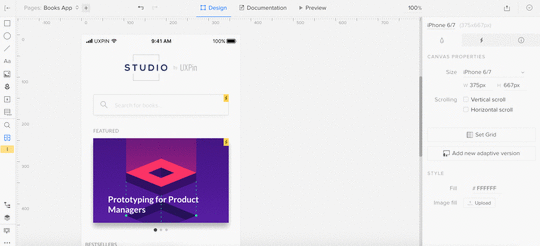
Visual changes in the Editor
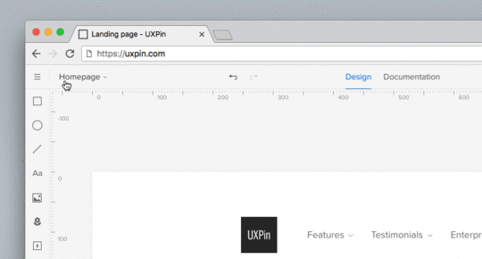
Today, we’ve released the following visual changes in the Editor.
Topbar:
Added the Hamburger menu in the top left corner.
Moved Preview mode to the right (marked with Play icon).
Moved Zoom settings to the bottom left corner.
Added prototype name and active page.
Left panel:
Bottom left corner menu (Log out, Integrations, Shortcuts, Help&Tutorial, Add user) moved to the Hamburger menu in the top left.
Moved View options to the Hamburger menu.
Added Simple/Advanced mode to the View Options modal.
Right panel:
Redesigned tabs in the properties panel (Properties, Interactions, Specification).
The post Visual changes in the Editor appeared first on Studio by UXPin.


March 12, 2018
How Atlassian Brings Content to Life in their Design System
Design system teams everywhere are having to decide the role content should play in their system. We sat down with Sean Curtis (Senior Developer) and Tony Starr (Lead Technical Writer, IX Platform Team Lead) of Atlassian to look at the unique ways they are incorporating content throughout the organization.
The role of content at Atlassian

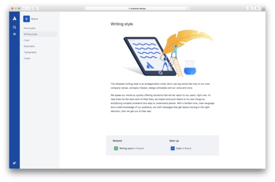
Atassian Design System Writing Styles
Within product teams around the world, it can be all too common that content gets relegated to its own, small bucket; just the words. However, the IX team at Atlassian has a holistic, cross-functional, and cross-team approach. Tony states, “Working in the Atlassian Design Guidelines, our design system, content is the main focus of everything. The point of what we do is to make things easier for teams. We aim to take the chaos of everyday, distill it and present it in a way that is useful to them to GSD (get shit done). We’re very team-oriented and it’s one of our philosophies.” Tony’s IX team is a platform team serving the entire organization. From their perspective, content is everything, from the top of the funnel all the way down. This manifests in the UI in semantic colors, animations, and interactions, to name few.
“When the latest version of the ADG (Atlassian Design Guidelines) was rolling out, Product and Brand were in the same room working on these principles together,” Tony said. Specifically, they were focused on being empathetic so that every interaction point was appropriate to the user experience. “We weren’t concerned as much with saying how people should feel, so much as how they actually feel. We came to view our products as members of the team. When a team has a win, we celebrate that win with them. When they are stuck, we acknowledge that as well. This is manifested at all points in the experience, but starts with content.” Tony said. Workshopping the system, all of these team members would come together, moodboard the system, outline the emotions, principles, and philosophy.
Atlassian’s definition of their brand tone and voice serves as the gauge by which they measure everything they produce. Their content personality is “Bold, optimistic, and practical (with a wink).” While other design systems are decidedly visual, Atlassian’s has content at its core. Sean explains that Atlassian starts first and foremost with the principles of the system before they touch patterns, components, or code.
Content at the core
Rather than content being an afterthought, it’s at the center of what Atlassian stands for, present in the personalities and paradigms of the individual team members. Sean explained how the frontend team has an innate focus on content, leading to code and documentation that is inclusive, well-documented, and accessible. “Not knowing the content you are designing for is like making a suit without the measurements of the person”, says Sean.
The personality traits are baked into each and every component at the building block level, and then when we put the pieces together (component + pattern + UI copy) we do that using the principles as well. The designers at Atlassian always have the voice and tone guidelines in the back of their minds as they create, asking themselves, “How is this bold? Should we be winking here?” It’s also about knowing when not to wink, such as a user running into an error state, even developing a system called “Voicify” that has sliding scales to help determine how much wink, how bold and how optimistic to be in any given interaction (for copy).
The IX team has the challenge of naming and documenting the whole platform. Sean explained that publishing a component or system name means it will have cross-platform implications, and it will be used this way forever, comparing it to setting legal precedent. Future changes to names will cause it to break in products across the org. This leads the Atlassian team to be incredibly thoughtful and judicious in their naming rubric. It’s extremely expensive from an adoption and knowledge standpoint, and can cause misalignment amongst teams. Additionally, the platform team is tasked with ensuring that the guidelines and components can work across products, from Bitbucket to Trello. that are made in product decisions for Bitbucket have to apply for Trello as well. Alignment and adoption ensures ensures consistency and allows teams to go faster. Finally, the documentation around components may include even a cross-team marketing and sales aspect—convincing the team why they should use these components and steering them in the right direction.
Naturally, this strong level of permanence leads to the teams being incredibly opinionated about their naming and documentation standards. Tony explained that during sparring sessions, it forces the teams empathize, and to try to deeply understand each other’s positions, in addition to coming prepared to make their case. With each individual coming to the table with such strong standpoints, it pushes and excels the platform further. This healthy challenge causes the Atlassian naming and documentation conventions to be even better.
Through that work, Tony’s team is focusing now on providing guidance, advice, and in the future, hopefully core standards as to how teams should think through naming components. For example, Sean and Tony explained that it cannot be based on appearance. Overtime, the appearance can (and will) change. Instead, they focus more on functionality and behavior and how it serves the end user.
Functional frameworks and workflows

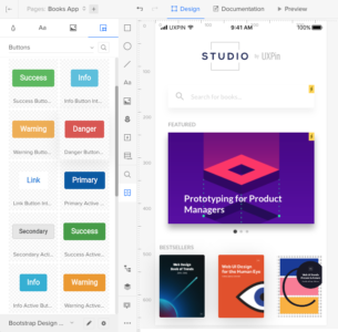
A good way to make bullets – Atlassian Design System
The IX team at Atlassian supports the entire organization, including the ADG team and the multitude of product teams. So how do they all come together? IX focuses on being a content ambassador within the organization, hosting bootcamps and training sessions around content. Tony stated that there is growing relationships with other content producing teams. People care about content, but managing across the org is difficult. But all-in-all everyone is receptive, has deep care and wants to make “all the things” better.
Sean and Tony told us about their rotational programs, specifically around content – writers will sit with the ADG team, participate in sparring sessions around naming and documentation, and even lead cross-team workshops on how they should think through content guidelines as it applies to their teams.
Interestingly, the Platform IX team has a very different workflow and style compared to other Atlassian teams. They do not work in sprints, but rather use Trello cards to collect and organize tasks. Tony’s team needs to prioritize and shift constantly, making every day pretty different from the last. This allows the team to keep a constant tab on cross-platform needs. Somedays this will be sparring sessions, working with designers on on-boarding flows, or sitting with product writers to get the voice and tone perfect for a piece of copy. This keeps the team nimble, flexible, and truly cross-platform.
As a small team, they have to balance how they get things done and also how they educate the product teams accordingly. In the future, a self-serve accompanied with more robust education is what Tony envisions as being critical to full adoption across the organization.
How the Atlassian customer interacts with content
Like any good interactive team, the IX team has the responsibility of how the end user interacts with the UI in relation to their own content. Incredible thought around emotion and feelings have gone into how the user will feel when writing out the description of a Jira issue, or how they add content to a Confluence page.
Tony explains that they strive to have the UI “disappear” to the end user as they add their own critical content across it. Atlassian aims to make these tools ones that they themselves want to use, so empathy for the end user and their emotions using the products is paramount to Tony’s team.
Another shift that Atlassian has adopted this last year is viewing components and content in the exact context a user would see it in. Sean explained “The absence of context is where patterns go awry.” The team strives to look at the whole flow and the whole page when making these critical pattern and component decisions.
Conclusion
The content centric approach Atlassian takes ensures that not only is ADG a consistent and flexible system, but one that truly represents the personality of the brand in meaningful ways across the entire product suite and ultimately is useful to what the user needs and expects from the product.
Interested in being a designer or in designing content at Atlassian? To see available positions, check out Atlassian Design Careers.
The post How Atlassian Brings Content to Life in their Design System appeared first on Studio by UXPin.
March 6, 2018
Never miss what’s new in UXPin!
Whenever we have something to share about the changes in UXPin, you’ll get a glowing dot on your avatar in the Dashboard. Just click on it to expand the dropdown and open the update.
The post Never miss what’s new in UXPin! appeared first on Studio by UXPin.
We’re one step closer to you!
Whenever we have something to share about the changes in UXPin, you’ll get a glowing dot on your avatar in the Dashboard. Just click on it to expand the dropdown and open the update.
The post We’re one step closer to you! appeared first on Studio by UXPin.
February 28, 2018
UXPin Changelog February 2018 #4

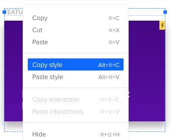
In the past two weeks, we’ve released a few enhancements to the Design Systems (redesigned Design System Libraries panel and improved notifications about updated/outdated symbols) and to the Editor (introduced copying and pasting styles, layers and search improvements). Details below.
Design Systems
Redesigned Design System Libraries panel in UXPin Editor
Notification about outdated symbol appears only when there’s a newer version in the Design System Library.
Any updates to symbols in Design System Library will be visible immediately for all users in the account.
Improved undo/redo for symbols based on their content.
Small bug fixes and visual improvements.
Editor
Possibility to copy and paste styles across elements
Elements and icons are separated in the search results
Layer dragged to the group lands at the top of the list instead of the bottom.
Extended areas for dragging and dropping layers.
If you’re interested what we’ve released inFebruary, please check out Changelog 2018 #3.
Join the world's best designers who use UXPin.Sign up for a free trial.Your e-mailTry it for free!
The post UXPin Changelog February 2018 #4 appeared first on Studio by UXPin.
February 22, 2018
UXPin Updates February 2018 #2
In the first part of February 2018, we’ve released a few improvements to Design Systems (renaming main categories, notification about changed symbols, and improved ghost elements), and the Editor (added lazy loading to the icon section in the properties panel). Details below.
The post UXPin Updates February 2018 #2 appeared first on Studio by UXPin.
UXPin Updates February 2018 #3
In the first part of February 2018, we’ve released a few improvements to Design Systems (renaming main categories, notification about changed symbols, and improved ghost elements), and the Editor (added lazy loading to the icon section in the properties panel). Details below.
Editor
Optimized rendering and lazy loading of icons in the properties panel.
Confirming input values on “Enter” for blur and colours.
Small bug fixes and visual improvements
If you’re interested what we’ve released in January, please check out Changelog 2018 #1
The post UXPin Updates February 2018 #3 appeared first on Studio by UXPin.
February 21, 2018
Virtual Summit Recap: Atlassian Shares 4 Pointers on Design Systems
Allard van Helbergen, Senior UX Designer at Atlassian, speaks from Sydney about what he and his team learned from 16 years of design system evolution.
Why do you build a design system? The popular answer is to maintain consistency across different products and different teams, but a well-made design system also reduces cognitive load and increases the speed of development overall. There is one reason, though, that stands over the others, the ultimate reason. Design systems help users.
Atlassian has known the value of design systems for quite some time, but it took years of practice before they realized just how powerful design systems are — and how to best utilize them.

Jira UI 2002

Jira UI 2002
Through gradually refining and improving their designs over ten years, Atlassian created its first official design system in 2012. Back then, the goal was primarily to ensure consistency across all of Atlassian’s products, and their first “design system” was actually closer to a traditional style guide.
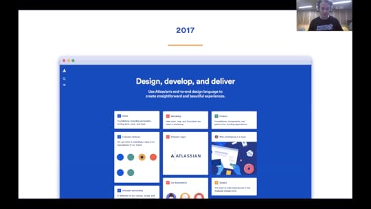
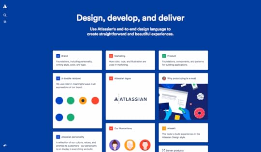
Jira UI 2017
For the next 5 years, Atlassian developed and fine-tuned their design system, learning some valuable lessons along the way — namely that it could be do more than just maintain consistency. By 2017, their latest version placed more emphasis on reducing friction in product interfaces, and to this end they added the complementary Atlaskit, a move that defined the capabilities of design systems.
The Atlaskit comes equipped with standard UI components that not only help designers maintain consistency by using the similar parts, but also offer the best ready-made UI options for better performance. The kit’s components are built around actual user preferences, so standardizing them saved time for each product.
But, as our speaker explains, “there’s a lot more to it than just delivering UI components.”
Over the years, the process of refining the design system taught Atlassian a lot. Senior UX Designer Allard van Helbergen was kind enough to share some of these Learnings during UXPin’s Design Systems Virtual Summit 2018, which presented case studies from companies like Salesforce, IBM, Airbnb, GE, Linkedin, Fjord, Zendesk, and more.
Focusing on two specific UI components, inline and modal dialog windows, Allard takes us through the four most important pieces of advice for design systems, and how to apply them. Take a look at the recap of his presentation below.
Learning 1: Tension between product and design systems is healthy.

One of the hardest parts to grasp about design systems is that their components never quite fit perfectly out-of-the-box. The design system and the product work together, but do different things. “At some point your product will be leading [the design]. At another point, your design system will be leading.”
Rather than fight this tension, Atlassian learned the smarter solution was to use it to their advantage. There is no “one size fits all” component that would work perfectly with every product, so they needed to add a degree of customization. They found that, by leaving some room for growth in their design system, the components could be slightly modified to suit whatever the product’s needs are.
“What happened was,” Allard explains, “the component that was taken from the design system had a shortcoming and didn’t allow the product to do what they needed to do. So products reached out further and made their own decisions.”
To illustrate his point, Allard shared a real-life example. Compare the design systems entry for inline and modal dialogs…

… to some of the final variations that ended up in the products…

The modifications are minor, not nearly drastic enough to threaten consistency across products. At the same time, the small changes add some new life to the design. Tweaks like color changes, illustrations, or adding a pulsing dot can be just what the product calls for, so it’s crucial to leave that possibility open.
Atlassian gives product design enough freedom to build and change components based on their own individual use cases. This gives designers room to experiment and create variations, which opens up the possibility of improving on the original designs, especially considering individual product needs.
Design systems simply can’t account for every need for every product. You wouldn’t want them to, either; that kind of cross-product uniformity would limit all your products, not to mention appear repetitive for multi-product users. So to get the best of both worlds, Atlassian provided the foundation for UI components in their design system, but gave enough flexibility that individual products could modify them as needed.
Learning 2: Look at what’s in product, synthesise, and build forward.
To perfect each component, Atlassian relies on feedback, whether user research, usability testing, or comments straight from the users themselves. Normally, each individual product would iterate the feedback into progressive prototypes and move forward on its own. Atlassian, though, encourages synthesising the feedback from all products first.
For one thing, accounting for feedback from all products adds enough diversity to balance everything out. As Allard explains, “Some products might have made some bad decisions or some products might have taken shortcuts along the way. So this is a moment when you can fill those stop-gaps and help them get that extra kick.”
The other major advantage of synthesising feedback is that the individual components are stress-tested in multiple scenarios, providing a more accurate understanding of how they should be treated. This provides extensive data and opens up improvements that a single product’s feedback wouldn’t reach on its own.

This is the method that helped Atlassian develop two new components, both born from the feedback of previous iterations. The Spotlight is “essentially a type of chaperon that will show you around the interface,” while the User Benefit Modal can “help you kick-start your new experience, telling you some highlights and why this experience is good for you.”
By looking at the entire forest instead of the individual trees, Atlassian was able to identity some UI elements that were missing across the board, and subsequently add them.
Learnings 3 & 4
We don’t want to give too much away in the recap. To learn more about how Atlassian handles design systems — straight from the mouth of a senior designer — watch the video below.
The hour-long video covers all 4 learning points, plus an informative Q&A after the presentation with questions from designers all around the world. You’ll discover a lot of professional insights straight from the mouth of an expert, such as:
How to incorporate user experience into component design.
How to build a cohesive user flow by combining chains of components.
How to synthesise experiences the same way as components, including a case study of Atlassian’s process.
Why you should build your design system as if it were a product
A personal account of how Atlassian evaluated their product line for a “roadmap alignment” to see which design system components to prioritize.
More trade details about how Atlassian devised their “First Impression” framework for onboarding.
Realistic time frames for building and implementing design systems.
The best ways to introduce design systems to other departments internally, and how to get them on board.
Recommendations for follow-up resources on how to start building a design system.
To see Allard’s presentation in its entirety, click the video below now.
The post Virtual Summit Recap: Atlassian Shares 4 Pointers on Design Systems appeared first on Studio by UXPin.
February 20, 2018
The Future of Design Systems
With many product teams establishing core design systems, it’s only natural that these systems will change and evolve as the industry does. We talked with Alex (Design Team Lead) and Venn (Senior Designer) at Atlassian to hear first-hand how they have grown the Atlassian Design Guidelines (ADG) and where they see the industry going in the future.
Breaking Down Silos

Atassian Design System connects Brand, Marketing and Product teams
Atlassian’s Design System team combines many core disciplines—design, development, content, illustration. Alex and Venn believe that the interconnected relationships between them will be at forefront of the industry’s future.
So much of the nuance in a design system can be found in the fuzzy line between those disciplines, and the ADG team sees those silos being eliminated in the future. Tooling like Airbnb’s React > Sketch Tool and UXPin’s Design from Code are already helping designers use real-life components for their mockups. This underlies a core shift to encourage designers to think more like developers, and understand how components are built along with the props available to customize and work with them.
This shared knowledge also has a pragmatic goal of creating a single source of truth that can be consumed by multiple disciplines. This allows teams of designers, developers, and other roles to not only share a single context, but operate as a single unit—sharing roadmaps, backlogs, sprints, and standups. On a more macro-level this single source of truth also allows for transparency between the core team creating the system and ancillary teams creating the products themselves.
This symbiotic relationship also benefits new designers, writers and developers on-boarding into Atlassian, which currently can take weeks. “We want to see new employees be able to use ADG and ship product in days and not weeks” says Alex. This has the potential to drastically impact the velocity of product teams consuming the core design system, helping both them and the business.
It also helps create rails for innovation. With a base system in place, ADG can effectively get new team-members up to speed quickly on foundational elements, while allowing for creativity to be focused in other areas. When approaching any design problem teams constantly juggle two questions, “Do we actually need this?” and “How should the solution work?” Historically the question of looks gets far more attention from designers, but with a design system providing the core styling for UI elements, their focus can be turned elsewhere. Instead of rethinking the whole system each time, innovation can happen in the places where that innovation has the biggest impact.
Designing for Experiences

Atlassian Design System – Product
As design systems like ADG canonize UI elements, some of the most exciting value lies in allowing teams to dig deeper into the experience of the product. The team at Atlassian hopes that ADG will foster an expectation that their products always provide thoughtful and consistent user experiences. “It’s about tapping into the emotional state of theuser, and thinking about the whole Atlassian experience—that’s our silver bullet,” Alex explains.
With this goal in mind, the ADG team is helping product teams transition from solving visual problems to product problems. Instead of thinking “What should this form look like?” a designer using ADG can ask deeper questions like “How do I make this form flow the best experience it can be?” or “Is this form even necessary?” This change of mindset gets to the core value of any system, helping teams move from surface-level design problems to the deeper emotional and business needs of their customers.
Another interesting benefit of systems pushing into experiences is that it ultimately helps them interact with another closely-related team: branding. With a base system in place, ADG has been able to focus on how to responsibly bring the experience of the brand into the product, and extend it thoughtfully into product interactions. This will only continue in the future as the system becomes more mature and every interaction can be reviewed in the light of its relation to the overall brand.
Emotion and Empathy
As design teams like Atlassian’s start moving closer and closer to user problems, a foundation of empathy becomes even more important. Currently, the team sees some tactical areas of growth that will help build empathy on their team, not only for each other, but for their end-users as well.
One of these tactics is team rotations. Recently, a designer from a product team rotated onto the Design System team to understand how product design is reflected in the system. Instead of only seeing the product through their specific team’s lense, they were able to see how the product is shaped on a global level—an insight specific to the ADG team. “It allows people who are at the forefront of user’s feedback to come into Platform, and help us design the system and make it much more robust. Because it’s that product feedback that doesn’t always make its way to the platform team.” Not only does this help bring fresh eyes to the system, but it also creates evangelists inside adjacent product teams that understand how to best leverage the system in their given contexts. Alex also sees room for this to grow to other roles and responsibilities in the future.
Another tactical focus for the future of ADG is closing design feedback loops, moving closer to the product through analytics and in turn, closer to the users themselves. Moving closer to the product exposes process and implementation problems—a crucial insight into how components should be built and maintained. “If we can close that feedback loop with user-research and metrics, then we can identify those components and patterns that are underperforming,” Venn states. As a result of that fine-tuning, teams gain a quick turnaround on revisions and iterations to address those needs—allowing products like Jira and Confluence to rapidly address their user’s feedback.
With that same empathetic foundation, the team also hopes to get closer to their users, tackling a hot-button topic in systems right now: accessibility. “As Designers we have a responsibility to ensure that our products can be used by everyone.” The design system should help ensure the same thoughtful experience Atlassian strives for in each product is extended to every user without discrimination. And with a growing foundation in place, the product can easily execute on this core value in the future.
A Bright Future
The future of design systems at Atlassian (and across the industry) is a bright one. There are plenty of opportunities for the system itself to organically grow, but even more exciting are the myriad of ways the system will help the team to really refine the experience of the product, not just its individual components. Although it’s made up of dozens of components and variables and documents, the goal of ADG is singular: to create a thoughtful and delightful experience for all of their customers. As users of many Atlassian products, we’re happy to see the team executing this vision to perfection, and excited to see where it takes them in the future.
Interested in being a designer at Atlassian? To see available positions, check out Atlassian Design Careers.
The post The Future of Design Systems appeared first on Studio by UXPin.
February 16, 2018
UXPin Changelog February 2018 #3
In the first part of February 2018, we’ve released a few improvements to Design Systems (renaming main categories, notification about changed symbols, and improved ghost elements), and the Editor (added lazy loading to the icon section in the properties panel). Details below.
Design Systems
Rename the main categories in the Design Systems documentation.
Added a notification about changes between symbols on canvas and corresponding ones in the Design System Library.
Improved ghost elements while dragging symbols from the Design System Library.
Clicking on an element in the DS Library drops it in the centre of the visible canvas.
Small bug fixes and visual improvements.
Editor
Optimized rendering and lazy loading of icons in the properties panel.
Confirming input values on “Enter” for blur and colours.
Small bug fixes and visual improvements
If you’re interested what we’ve released in January, please check out Changelog 2018 #1 and Changelog 2018 #2.
Join the world's best designers who use UXPin.Sign up for a free trial.Your e-mailTry it for free!
The post UXPin Changelog February 2018 #3 appeared first on Studio by UXPin.
UXpin's Blog

- UXpin's profile
- 68 followers

