
UXpin's Blog, page 108
December 19, 2017
How to Evangelize Design Thinking Beyond Just Buzzwords
While you practice design thinking every day, outsiders most likely see it as some form of magical thinking. At the very least, it’s certainly a buzzword.
To make others care about the practice behind the buzzword, you need to relate it back to the business and show some real examples of its value. Cut through the jargon and describe it as a business process.
First, I’ll explain how we boiled down design thinking into a 30-second value proposition, then I’ll explain some of my favorite case studies as evidence of its effectiveness.
Design Thinking in 30 Seconds
Design thinking might feel convoluted from over-usage, but it’s actually a very straightforward concept.
The core tenets are simply 1) focusing first on customer problems, 2) iterating on ideas, and 3) soliciting feedback to focus and refine those ideas.
At Citrix, we boiled down design thinking into key activities within the stages of Empathy, Ideate, and Prototype.

Here’s how we explained the value of design thinking:
“For people in non-design roles, focus easily drifts away from the customer. They might focus on a schedule or an internal process. Often, as companies scale, many employees have limited or no contact with the company’s customer.
Luckily, through structured activities, we can teach people to refocus on the problems that matter to customers and improve the bottom line.
Rather than latch onto the first solution, employees can better evaluate a multitude of options before committing resources. They’ll be able to better avoid the vicious cycle of incremental effort with minimal customer impact.
As employees evaluate and explore ideas earlier, we’ll waste less money on the wrong issues.”
And the elevator pitch version:
“Design thinking isn’t a philosophy. It’s a problem-solving strategy employees can learn to improve their business processes. With the right people teaching it, the company will see more profitable and innovative options appear when making decisions that can cost a lot of time and money.”
Design Thinking in Action
In many organizations, UX teams become facilitators and trainers of a design thinking movement. They help employees in other roles learn this new way of approaching problems.
But before you can lead design change, you need to:
Know what you’re pitching and how it benefits the bottom line.
Understand how design thinking fits into the current system and culture.
Know where to find crucial points of influence that make or break your efforts—it’s very difficult to encourage shifts in process and perspective without a strong fan base.
To show how design thinking can transform products and services, we’ll look at a few examples. These stories will help you understand (1) how design thinking impacts the business in a variety of industries and (2) how to craft your change strategy from idea to results.
1. GE Healthcare
Innovation Architect Doug Deitz transformed the MRI experience for children by creating a new offering at GE Healthcare.

Photo credit: Slate
A designer of MRI instruments, he watched a family bring their child in for an MRI. Looking on as the child cried, Doug re-examined his device—but this time from the child’s perspective. Bending down on his knees, he saw the experience in a whole new way.
It was terrifying.
The child’s reaction drove him to reimagine the experience.
Doug worked with a cross-functional team of healthcare providers, patients, and GE designers to transform the MRI design, as well as the testing room, to create a child-centered world where the MRI became a canoe in a river. Not only did this reduce anxiety for the children and family, it saved the hospital medication costs since they sedated far fewer children.
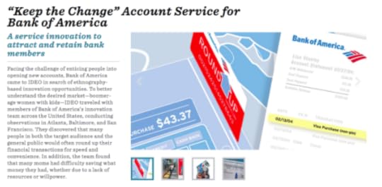
2. Bank of America
Bank of America partnered with IDEO to help their customers save money. Traditionally, that means running a marketing campaign to encourage savings.
Photo credit: IDEO
Instead, based on consumer observations and interviews, IDEO designed Keep the Change—a program that led to the participation of 2.5 million existing customers and the opening of 700,000 new accounts.
Their program made it easy for customers to save money by rounding up purchases made on their debit cards to the nearest dollar and transferring the difference into the customer’s’ savings account from their checking account.
3. Intuit
At Intuit, a team applied design thinking to create the Fasal app to help Indian farmers get the best price for their produce.
Based on their observations and learnings from the farmers, they brainstormed solutions and then created a prototype app. Based on their SMS-based app pilot, they estimated that the new approach to sharing data about produce prices could net the farmers $250-$500 annually.
Within the first few months of launch, the app grew to 500,000 users who now earned more than 20% income. With a solid user base, Intuit can now monetize the app through third-party advertising.
Conclusion
With some examples to reference, now the real work starts.
To successfully implement design thinking across your own organization, you must first align with (or devise) a process for execution and collection of results. Next, you’ll need to quantify those results.
For more advice and case studies, download Scaling Design Thinking in the Enterprise. The free ebook is based on a 5-year project I helped lead at Citrix.

The post How to Evangelize Design Thinking Beyond Just Buzzwords appeared first on Studio by UXPin.


December 14, 2017
Free e-Book: Scaling Design Thinking in the Enterprise
 Drawing on a real-life case study, this e-book goes through the step-by-step process of transforming an enterprise through design.
 Design thinking has a proven record for improving performance, customer satisfaction, and sales… so why is it so hard to implement in enterprises?
If you want what’s best for your company but don’t know how to get your colleagues on board, this free ebook lays out everything you need to do in just 56 pages.

Rather than explaining the theory, author Julie Baher recounts her own real-life experience implementing design thinking at the million-dollar software company Citrix. Baher, currently the Senior Director of UX at Illumina, shares her 5-year journey as Group Director of CX at Citrix to show — in practical terms — how she won over an entire company to a new way of discovering and solving business problems.

In this free e-book, you’ll learn:
The 3 main steps of converting your enterprise to design thinking from the ground up
The core tenets of design thinking: what it really is, beyond all the buzzwords
How to speak to company leaders about design thinking so that they’ll actually listen
Which company activities, formal and informal, can speed up the adoption process
How to train coworkers in design thinking, and how to train other trainers
Which tactics from the Lean Startup methodology can help you
Which tools and software are invaluable during the process
The true case study of how Baher succeeded in convincing Citrix to convert
Download this free e-book now.
The post Free e-Book: Scaling Design Thinking in the Enterprise appeared first on Studio by UXPin.
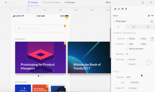
Hands-On Video Lesson: Creating Basic Interactions in UXPin
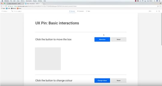
Our UXPin power user Robert Smith explains how to quickly build an interactive prototype in UXPin.
Want to try it yourself? Start a free trial in UXPin and play around.
Join the world's best designers who use UXPin.Sign up for a free trial.Your e-mailTry it for free!
The post Hands-On Video Lesson: Creating Basic Interactions in UXPin appeared first on Studio by UXPin.
December 13, 2017
Best Practices for Remote Teams: 12 Principles to Guide Your Everyday Work

I’ve worked remotely in one form or another as a designer for ten years.
In my last office job, my hiring manager was in the NYC office, while I was based as a designer in our parent company in the UK. As our team restructured over time, his 2 hour commute gave way to working earlier at home to have more overlapping time with us. Today, I’m a remote worker to an office in Spain.
To paraphrase Joni Mitchell, I’ve worked remotely from both sides now. As the one in the office waiting for the remote guy to get back to us, and as the remote worker wondering what’s being discussed in the office while knuckling down to move things forward.
Here’s what I’ve learned about creating a healthy remote-working culture:
1. When one person is remote, everyone is remote
The following principles apply to every member of the team, not just the remote ones.
Yes, this will take a bit more work upfront, but the result is a higher functioning, happier, more creative and productive team that retains talent better. Isn’t that worth a little shift in thinking? These principles build upon each other, like lego bricks.
2. Anti-distraction
Traditional offices unconsciously enforce a culture of distraction: stopping by someone’s desk to see how something is coming along or phoning instead of emailing a question. This forces people to respond to the squeakiest wheel, rather than according to priorities. By getting results this way, everyone else is trained to make every small request a “noisy one” to get ahead in the queue.
This is a toxic habit that needs to be broken.
Unscheduled status update requests create pressure on the creative, and can feel like their quality of work is in question, or worse: that they’re being treated as human plugin to execute someone else’s design. Unless you are brand new to the industry, these are soul crushing. The quality of work suffers, and the creative will want to move on to greener pastures.
Additionally, remote workers may work longer than they ought to that day to “catch up”, making them a little closer to burn out, less productive and snappier the next day. Because you can’t see them, the scenario risks repeating itself until burnout or a conflict occurs. One ex-remote worker I know woke up one morning and blasted months of pent-up resentments at every client he had, then fired them all.
For remote workers paid per hour, these kinds of distractions can dramatically add to your bill, since it takes 20 minutes to get back to pre-interruption productivity.
The cost of distractions can be roughly calculated as:
(each distraction x 20 minutes x their rate) + (the non-distraction hours x hourly rate)
You’re probably imagining that the distractions are on the workers side and it’s their job to focus, but we’ll see that this isn’t the case in the next point.
Solution:
1. Agree on feedback points and times with every coworker, and stick to them. These points may be different for juniors than to seniors, but it will allow them to problem solve with calm and creativity.
2. Have a single source of truth for documenting procedures, workflows, how-to’s and on-boarding. Use a group password manager to manage logins. Set up a slack bot for repeatable questions (status reports, who’s up for pizza on friday) or turning conversations into shared knowledge easily. This saves a lot of repeated questions and interruptions later on.
3. Asynchronous
I loved Slack at first, but even with my setting changed to only alert me to direct messages and mentions, there’s still this social norm to start all slack conversations with at least three messages before getting to brass tax, e.g.
“hey”
“are you there?”
“Hope you had a good weekend!”
“So I was thinking about the design review comments…”
“I sent my reply via email”
“Anyway, no pressure..reply when you can”
That’s six alerts to tell me I’ve got mail, which I’ve already been notified about. Multiply by every person you interact with in a project, and that’s a lot of notifications in a day.
What I’ve noticed about how I work, and what I’ve heard from a few others is that even when I only check Slack messages at intervals (say, to work in pomodoros), the very presence of that red circle with 17 alerts is still distracting.
In the background of my mind I’m imagining what they could be about instead of directing all my attention at solving the problem at hand and moving on to the next step.
I can block distractions from my computer and mobile and manage my time, but this communication style puts me in a tough spot: do I “act aloof” by not replying but deliver fast and cost-consciously, or do I respond in a similar manner and keep the clock running and risk leaving the card in the “doing” column at the end of the day?
Solution: Choose email for non urgent questions and feedback that require thoughtful answers. Use task assignment tools for things that only require action to complete and and use the comments thread to explain further.
Creating a bias towards asynchronous communication is also key to building flexibility in working hours for office staff, which helps retain talent as they seek to gain better work/life balance in the long term.
4. Effectiveness, not busyness
Busyness, is bustle.
It’s long hours. It’s moving from one task or place to the next and eating at your desk while on the phone. In short, busyness is a look. And for some reason we treat it like it’s a status symbol.

Image source: www.ban.do
Busyness is a sign of something being wrong. Perhaps of not being able to decide which project is most valuable to pursue, not being able to plan realistically for the time you have or not being able to share your workload or willing to hire extra help.
Productivity is about getting better results for less time. It can be tracked and improved through logged hours, design uploads or git commits or through various marketing dashboards.
Effectiveness, on the other hand, means first understanding what is and isn’t worth doing right now. Then tackling those tasks with efficiency.
This is why I don’t buy into these “morning routine” posts that promise “increased productivity”. Not everything needs to be done every day to be effective, and some things actually suffer when done every day. You need recovery days between run days, for example. Is a day between standups really enough time to report meaningful progress?
For myself, the most important thing I can do for my creativity and productivity during the week is take Friday mornings off.
Having to sit at a desk until quitting time tends to encourage “busywork”, doing things that take up time, but might not be the best uses of it.
I’ve seen everything from obsessing over an email signup page match a psd file to the pixel, to endless redesigns of logos in the weeks before a launch.
In small product teams with a big backlog, this is busywork, not effectiveness.
Solution:
Keep team goals and task impact firmly in view, by adding fields to project manager for “effort” and “Impact”. Both should have two options: “low” and “high”.

Image from asana blog
Now you can bring visibility to projects that return highest impact for the low effort, and filter out the low impact, high effort ones.
Add another dropdown for “goals”. This should list your current big picture (not project specific) goals for the company. Every task or project should be building towards a goal.
5. Communicating and embodying company culture
The previous point means there needs to be clear understanding of company goals, weaknesses, and values.
I’m not talking about that inspirational poster of values that hangs on the wall.
Company culture is like the 12 steps of AA: it’s something to be discussed and explored and put into practise in different ways regularly. So if you say you’re all about “openness”, actually hold a seminar and talk about what that means and how it’s applied, when it isn’t, and regularly ask for feedback and ideas. To make sure your remote workers can participate, make it available on a platform like Workplace by Facebook so they can comment live, or on a webinar platform with live comment and replay options.
Grab design ebooks created by best designers
All for free
 Download
 Download
 DownloadDownloadDo you want to know more about UI Design?
Download 'The Definitive Guide to Integrating UX & Agile' FOR FREE!
Download e-book for freeClose6. Shared values
Since the company culture and values guide every team and person in decision making, it’s essential that these are truly believed in, or group discussions will not move forwards.
If you’re all about flat structure, for example, then someone who wants to control the flow of communication will eventually cause things to come screeching to a halt.
If that person or team is managing someone remote, this can cause even more of a disconnect, because this is now their only window to the priorities within the company.
The truth is, remote workers are easy to blame. I’ve seen remote workers get thrown under the bus for managerial misjudgments, like giving them approval to launch a new design without letting other teams know in advance.
Shared values are also necessary for sustained motivation, since we need tasks to have intrinsic value or they get procrastinated.
This is partially why busywork in step 4 can become so engrossing. It may be the only step in the process the employee enjoys or feels rewarded for doing.
7. Open information/communication
Top-down hierarchy doesn’t work well when it comes to giving every employee the “why” and “how” behind projects and roadmap features. It’s also not very effective: each time we relay a conversation to someone else, we’re filtering and interpreting what we heard – and not always correctly.
With remote workers, lack of visibility between the remote worker and different teams and team members also breeds distrust. That slowly erodes relationships over time.
Solution: Keep communication channels open.
If remote standups or group VOIP or video call meetings aren’t feasible for design feedback, then hold a slack channel meeting where all key players in a project get to speak directly to each other. Copy the whole discussion and email to everyone so there’s a record that won’t be at risk of being archived at the end of the month.
If your team is multilingual, gmail and Workplace may be better options for group communication because of the auto-translate feature.
8. De-clannifying
Tell me if you recognize this scenario:
Business intelligence is sure marketing are messing up based on the numbers they see. Marketing complain about the web team not meeting their needs. The web team hates IT’s slowness. And IT is just angry all the time.
This is clan culture in the workplace. It’s always toxic, but with remote members in the mix, it can boil over quickly. I’ve seen teams plan elaborate plots to try and “oust” other teams, apparently forgetting that we all work for the same company.
Why? Because they sat in different offices.
Management believed this distrust produced harder workers, but all it did was keep valuable process, information and technology from being shared company-wide.
Solution: My ex-manager was a smart person. He knew changing our seating plans regularly so we were sat next to different teams throughout the year changed how we interacted with those teams.
But how do you change seating plans with remote workers?
The Buffer team has started using pair calls. Every work day starts with a worker
calling a randomly assigned person in the company. You talk about their previous day, their home life and what they do during the day. The idea is the same as the seating shuffle plan: you create a bond and empathy with someone new and understand their work processes better.
9. Accountability
Every person should have the power to manage their tasks, timetable and workload.
If you report to someone, that someone has final approval power for designs or code. The work won’t be sent up a management chain and information relayed down the chain again – we’ve already talked about how that gets bad pretty fast.
Also, that feedback chain takes longer, and the different levels sometimes have different ideas of what looks good, creating mixed messages for the designer at the end of the line, who may not even be in the room to “sense the mood”.
Solution: Empower people to make decisions and then hold them accountable for the results of those decisions. Workflows will speed up, and not only will they learn to think above their pay scale, you may be surprised at what ends up working best.
10; Growth mindset
Fulfilled workers are the best workers, and to be fulfilled you need to feel valued and see continual advancement in your career. But advancement isn’t dependant on professional skills alone.
Solution: Make developing a mix of professional skills and personal qualities a key objective for every new hire. Create time each week not just for skill training, but for personal skills. A goal without time is just a wish. Advancement in both of these dimensions should be discussed in one-to-one manager meetings and in annual reviews.
Having a designer confident yet tactful enough to propose a better solution to a bad idea, or a developer able to explain a technical solution simply is key to maintaining quality products and healthier group dynamics.
Here’s what I’ve seen: a lot of busywork is created as a way of dealing with personal issues or insecurity in or outside of work. Not knowing how to raise issues without confrontation has killed projects and careers. It’s easier and cheaper to pre-emptively tackle these issues before they develop.
11. Give away your Legos
This phrase means getting to a place where it’s ok to give some of your responsibilities to your junior, for example, your new hire. It’s scary, but if you want to scale your company and retain your brightest talent without burning them out, then they need to learn to let go of their older, familiar roles and teach those skills to someone new. If they’ve been learning to think above their payscale and learning new skills from steps 9 and 10, this is less daunting, because growth has become a way of life.
Preparing each member to do so early on also reduces friction between established team members and newer members.
Solution: Start noticing and documenting your processes early on. The idea is to make it easy to explain to a future you how to start and carry out these tasks.
An additional benefit? Once you start thinking and documenting your processes, you’ll start discovering more efficiencies.
12. Creative HR
An imaginative HR team is vital to a workforce that expands beyond the confines of an office or country.
There may be differences in health care plans, perks, or even currencies for remote employees, but a flexible structure for dealing with these differences now will help you expand later.
Solution: Employ least one HR staff member who’s worked remotely themselves or worked with remote workers with good results. They’re better equipped to know the kinds of qualities to screen for in interview and ways of team-building that are open to remote workers.
If your HR staff see being remote as too much of a hassle to work around, then they’re going to be a rate-limiting step. If it’s not IT being too cautious in traditional companies, it’s usually HR not knowing what forms the new hire needs.
People who have worked remotely themselves or with others successfully are more inclined to find solutions for new challenges or changes a remote team can bring.
Conclusion
Working remotely has its challenges for employees, management, IT and HR. But most of these challenges are due to a way of thinking and working that don’t even serve us well in terms of clarity, focus, output and creativity.
The solutions for working with remote coworkers result in better work and healthier communication with everyone. It gives your company a flexibility and adaptability that allows it to retain talent longer: if you can’t offer someone a raise? They can opt to work from home. Flexible working for new parents? Not a problem.
Remote works give smaller companies the advantages of having offices in other countries and regions without the big price tag. It helps you stay diverse and sensitive to other cultures.
Today, our market is global. Your team will need to be too, someday.
For more design culture and workflow advice, download The Definitive Guide to Integrating UX and Agile.

The post Best Practices for Remote Teams: 12 Principles to Guide Your Everyday Work appeared first on Studio by UXPin.
December 12, 2017
The Guide to Design Consistency: Best Practices for UI and UX Designers
What exactly is design consistency?
Consistency is what ties UI elements together with distinguishable and predictable actions, which is key for a great product experience. A way to simplify things is to think of it as a commitment that you make to your users (“whenever you see the light gray button in the pop-up, you can assume that it will cancel and the pop-up will close”) so that they can easily interact with your product.
As they become more acquainted, and become regular users, they begin to trust the product more and more, which is a reflection of the consistent design. To provide users with a consistent UI, here’s five best practices I’ve found useful for everyday design.
1. User-focused design research
Nothing is more important for a consistent experience than quality research.
This should not be underestimated or hurried. Time and budget are always a necessary consideration in product design. Without either of these, a product would never ship. Although they are important to the process, it is important not to lose sight of who actually uses the product. Keep your users top of mind and don’t overlook research in the beginning stages of product planning.
Define user goals
Get into the mindset of a new user. What do they want to accomplish? How will the application help them? List out goals and refer back to these throughout the design process.
For example, let’s assume we’re building a travel app. This travel application allows for users to select a vacation timeframe and find deals on flights and hotels within their budget. But it’s not just the standard travel site. It connects to your Facebook account, works its magic, and plans the top five vacations based on the content that you’ve shared. The user selects the vacation plan that they like best and all the details are taken care of.
Here’s some of the user goals:
View vacation options within specified timeframe
Compare different vacation options
Select a vacation based on users interests
Keep within vacation budget
Now that we know the breakdown of goals, we can design to meet user expectations.
Familiarize yourself with common UI patterns
Don’t reinvent the wheel when it comes to established UI patterns. Recurring patterns solve common design problems.
Of course, designers shouldn’t just “copy” the entire layout of another similar application. They need to filter and modify the patterns based on specific user goals.

 A typical pattern in e-commerce is a product grid. With this pattern users can easily browse and see product information.
It’s safe to say that patterns have been evolving and users become aware of standard locations for elements. Most users would agree that when they want to search for something, they look for the search bar in the upper center or right since this is common placement.
2. Establish design patterns for product design consistency
One of the keys to a successful — and consistent — UI is the user performing tasks with the minimum number of actions is. If a task that takes four steps can easily be completed in two, the UI should always be modified for the shorter task flow. UI patterns can help with this… after all, this efficiency is why they became patterns in the first place.
Design hierarchy
Along with design patterns, having an established design hierarchy does wonders for UI consistency. Whether users are aware of it or not, they instinctively pay attention to the order and priority of the elements they interact with.
When it comes to visuals and the human eye, some elements take precedence over others (bigger sizes, bright colors, etc.), depending on how “noticeable” they are. Think about your screen visuals in terms of what people will see first, second, third, and so on. This allows designers to ensure users find primary functions faster than others, but they can also present secondary and tertiary functions with the appropriate amount of attention.

Design elements
There are a multitude of design elements that go into an application’s UI, and each make up the building blocks that form UI patterns. Keep an organized inventory and check that elements are used properly to maintain a consistent experience.
Branding elements
Stay consistent with the overall brand. Typography, logo, correct image styles, brand color schemes, etc. should be reflected in the application, just like the rest of the brand’s properties.
Is the correct logo used? Are branding colors consistent? Does the typeface match the others? Brand consistency helps new projects feel like part of the brand’s family, rather than a black sheep. Style guides usually provide all the information you’ll need.
Making sure colors and typography are on brand gives each of the company’s products a consistent look and feel.
Typography
Elements with the most visual impact like typography should always be “on brand.”
This visual element is especially important, not just for hierarchy, but for the entire UX as well. Changing the sizes, fonts, and arrangement of the text can improve scanability, legibility, readability, and even navigation.
Components
During user research, become familiar with UI patterns and their components. Knowing how each component behaves, within the pattern and outside it, lets designers properly prioritize all elements on the screen without anything slipping through the cracks.
“Components” can refer to any number of elements that make up a pattern, such as:
Buttons
Cards
Forms
Lists
Panels
Progress bars
Let’s say you’re considering adding pagination to long lists so the user doesn’t have to scroll far with long lists.
As you examine the wireframes, you notice that one list has pagination with 20 or more items, while in another part of the application, a list only has pagination with 40 or more items. Which is correct? This example illustrates how making definitive decisions about guidelines is the backbone of design consistency.
Grab design ebooks created by best designers
All for free
 Download
 Download
 DownloadDownloadDo you want to know more about UI Design?
Download 'The Agile UX Best Practices Bundle' FOR FREE!
Download e-book for freeCloseTemplates
If you’re having difficulty standardizing your site or app, try using templates.
Most applications allow them, and because the layout and elements look the same, they streamline UI features across the products. Plus, you can reuse the same UI templates over and over, even years down the line.

Pattern library and design system
It may not be user facing, but it is one of the keys to consistency. Today, many teams have a pattern library or design system as a point of reference to keep everyone on the same page. Pattern libraries and designs systems are the rulebook that anyone on the team can reference at any time. For team-wide consistency, they are essential.
A pattern library may not be as robust as a design system, since it’s limited to design patterns specifically. A design system has more information all around, including helpful documentation about all the UI patterns and various components. A pattern library can also be a subsection of a design system.
3. Consistent actions in application
Everyone loves when an application is easy to use. It saves time, avoids headaches, and helps users accomplish their goals by eliminating confusion — all requirements for creating satisfied customers.
Consistent actions remove the need for user discovery, and therefore make their task flow run more smoothly. If a user knows how to use the functionality in one section, they know how to use it in all sections (as long as it’s consistent).
Users inherently transfer past knowledge to new contexts as they explore new parts of the application. Consistent actions become second nature and eventually the user can use the application without even thinking. Furthermore, users bring these expectations into new features or aspects of the product that they haven’t explored yet, minimizing the learning curve.

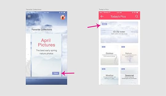
“View” placement is not consistent. On most of the cards, it’s toward the top, but on the collection card, it’s at the bottom. This inconsistency might cause the user to pause for a moment to search for the “View” option, not to mention it undermines their own natural habit-forming processes.
So what, specifically, should you consider when designing your interface? Ask yourself these questions during the entire process:
Do all parts of the application behave the same way?
How do interactions work? Are they predictable and consistent?
How much discovery is needed for a user to understand this interaction?

The example on the left has inconsistent sorting; not all columns have the option to sort. Users may want to sort data in other columns. The example on the right has consistent sorting on all columns.
4. Product content
It’s not just about the visual elements, but also the text throughout the application.
Consistent copy — especially consistent terminology — in each place in the application is another key. Using two different words for the same function makes them seem like different functions, causing a momentary pause in the workflow while the user sorts out the discrepancy.
Consistent copy avoids this confusion.
Content structure
Content plays a crucial role in UI elements, whether something as simple as navigation listings or as complex as product documentation. It’s not just the words themselves, but how copy text is presented visually, such as body copy, list items, table content, etc.
In particular, pay attention to how content is handled in these areas:
Navigation
Drop downs
Form fields
Validation messages
Tool tips
Charts
Image captions
Error messages
Loading screens
Confirmation pages
Product support documentation
Brand consistency in content
You know that feeling when a certain part of an application feels “off.” A lot times the reason is an inconsistency in the content’s language, for example, if one button says “Logout” and another says “Sign out.”
Even less noticeable inconsistencies can create that “off” feeling.
For the Oxford comma fans out there, something as “minor” as comma usage is picked up on subconsciously. After enough of these subconscious flags, the user’s conscious brain starts to notice.
Other writing guidelines such as title case and voice/tone also influence the user’s experience. While title typography is more empirical, voice and tone are a little harder to pin down. The trouble escalates if most content uses a casual style that clashes with a more formal “brand language.”
Appropriate user defaults
By considering user goals upfront, you can set realistic defaults to reduce the burden on the user.
If the defaults are set to the most popular preferences, the user may not have to make any adjustments at all. Take the datepicker on a airline or car rental site. Often the starting default date is sometime in the near future, the most likely choice according to past statistics.
Pay close attention to forms, too; they’re a great opportunity for defaults to reduce the amount of user effort.

5. Consistent communication
Search results, form submit messages, error windows — every interaction with your user is communication. For an app to be successful, it must speak to the user and keep them informed on what’s happening. And, as with everything else, the way you communicate should be consistent.
Grab design ebooks created by best designers
All for free
Download
Download
DownloadDownloadDo you want to know more about UI Design?Download 'The Agile UX Best Practices Bundle' FOR FREE!
Download e-book for freeCloseChanges in state and helpful information
Users appreciate feedback: a toggle that changes color to indicate “on” or “off,” for example, or a sound effect to verify a completed action.

Your user should never waste time wondering whether an action took place or not. Form field submissions are notorious for this, but it happens in other areas as well. In situations where it may not be clear, a quick success (or error) message is all you need.

Play it safe. Even when it’s apparent that the action was successful, a lot of users still prefer a quick confirmation.
Reduce user frustration
The most common cause of user frustration happens when it’s not clear what to do next. Some tasks are not so self-explanatory, but designers are often too close to it to notice. Luckily, some instructional text — even just a line or two — can solve the problem.

For the same reason, error messages are useful too. While users may not like seeing them, they still need to know what happened and how it can be corrected.
 Next Steps
Consistency in UI is a huge undertaking, and it’s easy for some parts to slip through the cracks. The end goal is of course a perfectly consistent and in sync interface, but that’s not always possible right out of the gate.
For new products, you can try an MVP (minimum viable product). Even if the product starts out with some inconsistencies, your team can iron them out one by one over time once you start receiving feedback.
If you’re making updates to an existing product, it can be more difficult to remain consistent. This is where design systems and style guides come in handy, but if you haven’t compiled yours yet, you can update the older areas of the product as soon as you’re able.
For more advice on improving design consistency, download Creating a Design System: The 100-Point Checklist. The guide is based on real case studies and projects.

The post The Guide to Design Consistency: Best Practices for UI and UX Designers appeared first on Studio by UXPin.
December 11, 2017
The Guide to Mobile App Design: Best Practices for 2018 and Beyond
Mobile apps are mainstream now – a popular way of delivering content and services.
But according to Fortune, more than 75% of users open an app once and never come back. Today, mobile users expect a lot from the app – fast loading time, ease of use and delight during the interaction. Adapting to the context of use, while keeping the interaction levels as low as possible (limit the number of actions required to complete a task) is quickly becoming a standard for many apps.
So what exactly can be considered as “good experience”? Let’s explore the six fundamentals of mobile app design.
Minimize Cognitive Load
The less friction and confusion users have when interacting with an app (e.g. the cognitive load), the better the chance that app stays around.
Optimized User Flow
Understanding how users interact with an app is essential for optimization. As designers and developers, we should understand the user’s goals in the context of the entire user flow. This knowledge will help us identify the most common friction points during task completion.
Here are few popular ways of optimizing user flow:
Chunking for big tasks. If a task contains a lot of steps and actions required from the user’s side, it’s better to divide such task into the number of subtasks. One good example is progressive checkout flow in e-commerce apps. You can separate a checkout process in the number of steps each of them requires a user action.
By limiting the number of actions required from the user’s side you’ll improve comprehension. Image credits: Dribbble
Use the information you already have about your users. You probably already have a lot of information about your users — you just need to use it properly. Consider Uber in the example below — the app doesn’t ask the user about his/her location, it automatically detects the location based on geographic data. At that point, the user only needs to select a pickup location.

Provide a natural next step. When the task requires users to complete a number of steps, maintain momentum by clearly showing what’s next.
The interface guides the user by providing the next step after each interaction. Image credits:
Dribbble
Prioritize one primary action per one screen. By following this simple rule, you’ll make the interface both easier to learn and easier to use. Use visual weight to prioritize important elements (such as contrasting color for primary call-to-action button).

Airbnb highlights primary call to action buttons using color
Cut Out The Clutter
Good UI design is all about delivering relevant information (signal) and avoiding irrelevant information (noise).
By cluttering your interface, you overload users with too much information: every added button, image, icon makes the screen more complicated. Clutter is terrible on a desktop, but it’s even worse on mobile devices where we don’t have too much free screen space to play with.

The clear tab bar (right) is much better than cluttered one (left). Image credits: Apple
Tip: If you want to reduce clutter on a screen which represents a part of the user flow — show only what is necessary on the current step of the flow. For example, when a user is making a choice, reveal enough information to allow them the choice, then dive into details on the next screen(s).

Progressive disclosure (step-by-step revealing information) in Duolingo app for iOS
Make Navigation Self-Evident
All the cool features and compelling content in the world won’t matter if people can’t find it.
Here are a few rules for navigation:
Don’t hide it. Avoid hidden navigation such as gesture-driven because most users will have a hard time finding it.
Consistent navigation. Mobile app developers often hide menus on individual pages. Don’t do that because it might confuse or disorient your users.
Communicate the current location. Failing to indicate the current location is the common problem for many mobile apps.“Where am I?” is one of the most fundamental questions users need to answer to navigate successfully.
Tip: It’s better to use standard navigation patterns — such as Tab bar (for iOS) and Navigation drawer (for Android). The majority of users are familiar with both navigation patterns. No need to get clever if a simple solution works.

Image credits: Google Design
Optimize Interactions For the Medium
Mobile phones aren’t smaller version of desktops — they come with their own nuances and constraints.
Designed Elements Should Look Like How They Behave
A mobile UI needs to clearly communicate what elements are interactive and what elements are static.
Unlike desktop where users can use hover effects to understand whether something is interactive or not, on mobile users can check interactivity only by tapping on an element. Users should be able to correctly predict how an interface element will behave just by looking at it.
Design Finger-friendly Tap-targets
When you’re designing actionable elements in mobile interfaces, it’s vital to make targets big enough so that they’re easy for users to tap. As a rule of thumb, design controls that have touch area of 7–10 mm so they can be accurately tapped with a finger. Such tap target makes the edges of the target visible for the users when they touch it. Users will be able to understand whether or not they’re hitting the target accurately.
Also, ensure that elements aren’t located too close to each other – there should be a proper amount of spacing between tap targets to prevent false input.

Image credits: Apple
Consider the Thumb Zone
Designing for thumbs isn’t only about making targets big enough, it’s also about considering the way we hold our devices.
While a thumb can sweep most of the screen on most mobile screens, only a third of the screen is a genuinely effortless territory. This territory is called the natural thumb zone. Other zones require finger stretching or even changing the grip to reach them. Based on hand placement (left, right, or combined), we can see how the safe zone looks like on the modern mobile device (see a green area on the following image).

Image credits:
Smashing Magazine
The bigger the display is, the more of the screen is less easily accessible.

Thumb zones for a right-handed person, according to research by Scott Hurff
Consider all the different zones when designing for mobile:
Green zone is the best place for navigation options or frequent interactive actions (such as call-to-action button).

“Share” button is located in green thumb zone area.
Red zone is the best place for potential danger options (such as Delete or Erase). Users are less likely to trigger this option accidentally.

Place destructive actions (such as delete and erase) in the hard-to-reach red zone, because you don’t want users to accidentally tap them.
Design For Interruption
We live in a world of interruption. Something is constantly trying to distract us and direct our attention elsewhere.
For example, users might use your app while waiting for the train. It’s critical to design for mobile mindset. Make it easier for users to re-engage with an app when they return to it after the interruption.
Twitter is one good example of design for interruption. The app’s notification screen shows all recent notifications. As long as the user stays on this screen, the app doesn’t update the list automatically – it simply shows a status “X new notification” at the top of the list. This allows users not to lose their current position when they re-engage with the app after some period of time.

Strive To Create Multichannel Experience
Mobile apps don’t live in a vacuum.
For example, mobile users usually browse an ecommerce website on mobile, then switch to desktop to purchase. That transition needs to feel invisible.

Spotify allows for a seamless multichannel experience. You can set up a playlist on your Mac and it’ll be instantly available on your iPhone. When you switch between devices, the app remembers where you stop.
Grab design ebooks created by best designers
All for free
 Download
 Download
DownloadDo you want to know more about UI Design?
Download
DownloadDownloadDo you want to know more about UI Design?Download 'The Agile UX Best Practices Bundle' FOR FREE!
Download e-book for freeCloseIntuitive Gestures
Only use gestures that are most natural for the app from your category.
Why? Because gestures are hidden controls.
As Thomas Joos points out in his article “Beyond The Button: Embracing The Gesture-Driven Interface”, the biggest downside of using gestures in a user interface is the learning curve. Every time a visible control is replaced with a gesture, the app’s learning curve goes up. This happens because gestures have a lower discoverability — they are always hidden and people need to be able to identify these options first. That’s why it’s essential to use only widely-accepted gestures (the ones that users expect to have in your app).
One good example of a category-appropriate gesture is pull-to-refresh for feed-like apps.
Image credits: Ramotion
Make the app appear fast with skeleton screens
Your app should be fast and responsive – but you’ll inevitably face situations where that’s not always possible.
For example, the internet connection might be too slow. If you can’t shorten the line, you should at least try to make the wait more pleasant. That can be the perfect time for skeleton screens (a.k.a temporary information containers).
A skeleton screen is a blank version of a page into which information is gradually loaded. Unlike animated loading spinners that focus user attention on the fact of data loading, skeleton screens focus user attention on progress instead of wait times.

Skeleton screen in Slack for iOS
Focus On First Time Experience
Just like a person, your mobile app doesn’t get a second chance to make a good first impression. If you don’t, you can bet (with 80% confidence) they won’t be back.
Good onboarding is a must
Perhaps the most important rule for creating onboarding – it shouldn’t be generic, it should be beneficial to the people who’ll use the app.
Designers should consider onboarding as an opportunity to create an entry ramp for the first-time users. At the same time, onboarding should only be employed if it’s really essential for first use.
Grab design ebooks created by best designers
All for free
Download
Download
DownloadDownloadDo you want to know more about UI Design?Download 'The Agile UX Best Practices Bundle' FOR FREE!
Download e-book for freeCloseDesign Zero State
An empty state (or zero state) is the state in which nothing has yet occurred. This state shouldn’t be a blank canvas (or dead-end as many designers call it), it should provide direction and guidance for getting up and running with the app.
Take an error-state screen from Spotify as an example. It doesn’t help users understand the context and doesn’t help them find the answer to the question: “What can I do about it?”

Nothing in your app should be a dead end.
Now compare it to the empty state from NFL Fantasy. This zero state makes an error message both readable and helpful. Concise, polite, and instructive copy clearly states:
What went wrong and possibly why.
What’s the next step the user should take to fix the error.

NFL Fantasy explains why a user cannot see anything, and how to solve it. Image credits: Emptystates
Use Functional Animation To Improve Interaction
Animation solves a lot of functional problems within interfaces while making them feel alive and genuinely responsive.
Show system status
When an app is busy doing something, you should let a user know that the app isn’t frozen by surfacing system status. Visual signs of progress give users a sense of control over the app.
This app using animation to notify users that it’s loading content now. Credits: Ramotion
Navigational transition
Animation is the best tool to describe state transitions. It helps users comprehend the change in the page’s layout, what has triggered the change,and how to initiate the change again when needed.
Functional animation can efficiently guide the user’s attention and make complex transitions easy to understand. Credits: Jae-seong, Jeong
Visual feedback
In the physical world, objects respond to our interactions. People expect a similar level of responsiveness from the digital UI controls.
Good visual feedback makes interaction comfortable for users. All interactive elements (such as buttons) should provide perfect visual feedback.
A button is responding to the user’s tap. Credits: Shakuro
Humanize Digital Experience
Personalization
Personalization is one of the most critical aspects of mobile apps today. It’s an opportunity to connect with users and provide the information they need in a way that feels genuine.
One good example is Starbucks. The app uses information provided by users (for example, the type of coffee they usually order) to craft special offers.
Delightful animation
Unlike functional animation that is used to improve the clarity of user interface, delightful animation is used to make the interface feel human. This type of animation makes it clear that people who crafted the app care about users. Using delightful details is an opportunity to create an emotional connection with your users.
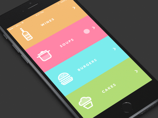
Image credits: Dribbble
Push The Value
Annoying notifications is the #1 reason people uninstall mobile apps (71% of respondents).
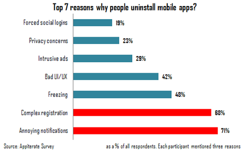
Source: Appiterate Survey
Don’t send push notification just because you can — each notification should be valuable and well-timed. Here are a few things to take into account when design push notifications:
Avoid sending too many notifications in a short period
Too many notifications delivered in a short period of time can lead to situation known as notification overkill – when a user can’t proceed the information and simply skip it. Try to combine different messages together to limit the total number notifications.
Time your notification
Not only what you want to say is important, but also when you want to say it. Don’t send push notification in weird hours (such as in the middle of the night). The best time for push notification is mobile usage peak hours — from 6 pm till 10 pm.
Consider other channels to deliver your message
Push notification isn’t the only way to deliver a message to your users. Use email, in-app notifications, and news feed messaging to notify users about important events based on the level of urgency and type of content you would like to share.

Select proper notification type based on urgency and content. Source: Appboy
Conclusion
Designers often say that great design is invisible, people who use it focus on their own goals and not the interface. As a designer, you should strive to create invisible interface because such interfaces satisfy users needs and deliver great user experience.
Just like with any other guide, tips specified above are just a place to get started. Make sure to mix and match them with your own ideas for the best results.
For more advice, download the 100+ page guide Mobile UI Patterns, featuring deconstructions of 46 examples.
The post The Guide to Mobile App Design: Best Practices for 2018 and Beyond appeared first on Studio by UXPin.
December 7, 2017
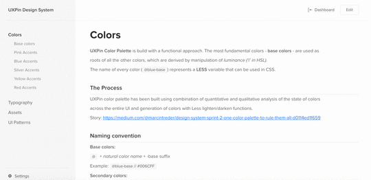
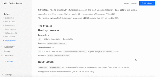
Creating Context for Design Systems: A Comprehensive Approach to Documentation
You’ve heard of design systems.
You likely have one. And if you don’t, you probably should.
But along for the ride are other names that may have been reasonably well defined within the context of your project, client or organization. They even have solid definitions outside – across the industry. Names like: frameworks, software design guides, pattern libraries, component systems, UI kits, style guides, and design tokens.
There are no universal and agreed upon definitions. And there’s a lot of grey areas, overlaps and gaps between them. However, there is at least a widely-accepted premise that the phrase “design system” is intended to be the highest level all-inclusive descriptor.
Let’s explore how to close the gaps with a more complete structure for the design system and its supporting documents.
Minding the Gap
Here’s the general hierarchy of the typical design system that I encounter:
Design System
1. Principles
2. Accessibility
3. UI
3.1. Global Styles
3.2. Templates
3.3. Components
3.4. Styles
But that’s not always enough. We need to dive much further than just the surface of our product. For example, for certain elements, we should also define:
Document structure and nesting
Appropriate parent container elements
Attributes, roles or microformats
Text web standards and accessibility criteria
Considerations for translation and localization
UI design alone is not a basis for a design system.
It’s actually more of an output of the system. The system therefore, must have inputs. Those inputs provide context for decisions.
Include them. Some decisions may have been well-informed through research. Other decisions may need no explanation. Still others may be difficult to articulate and defend. But all are important to document.
“[looks at all products] …and then design this one single design system for everything. However, once you start diving into why those decisions were made, they often reveal local knowledge that your design system doesn’t solve.” — Rune Madsen
Pulling Up One Level: Describing Full Context of a Design System
Any design system is also greatly influenced by contextual inputs like:
The institutional knowledge, legacy, culture, beliefs and biases of the organization (and those creating the system when done on behalf of clients)
Insight for how patterns are named and what problems they solve
Conventions for how class names and selectors are decided (with case, characters, separators, depth, specificity, etc.)
Success criteria for a design system
User research, usability research, and resulting data and themes that supports decisions in the design system
These all represent the decision making criteria in addition to the actual decisions.
A Meta Metaphor for Design Systems
So how do we capture this context?
In HTML, every document begins with a .
The head element represents a collection of metadata for the document. Your design system needs a to describe its context.
For example, while process, source control and governance typically fall under the role of Design Ops (operations), they should still be documented.
Here’s a structure for comprehensive metadata and a more complete design system:
Research & Insights
Principles & Ethics
Privacy & Security
Problem Statement(s)
Methodologies & Process
Definitions
Usage Guides
Other Criteria
Ecosystem
Localization
Performance Budget
Source Control
Governance
Copyright & Licensure
Design System
1. Principles
2. Accessibility
3. Platforms & Channel
4. Input
5. UI
5.1. Voice & Tone
5.2. Components and Patterns
5.3. Styles
5.4. Motion
6. Content
7. Localization & Variants
8. Performance Budget
9. Markup
9.1 Source Control
10. Hosting
11. Web View
Conclusion
All design systems have an origin story and iterate and evolve. Any changes made are the result of new learning. Capture that somewhere.
The “” seems to be the perfect metaphor for that much needed layer of abstraction of all of the metadata about the design system.
For more advice, download Creating a Design System: The 100-Point Checklist. The guide is based on real projects and case studies.
The post Creating Context for Design Systems: A Comprehensive Approach to Documentation appeared first on Studio by UXPin.
UXPin Changelog December 2017 #20

This week we’ve welcomed December with the brand-new Shadows feature, a new version of the plugin compatible with the newest Sketch 48, and several improvements to the Design Systems.
Design Systems
New: Renaming the Design System from the Dashboard by clicking on its name.
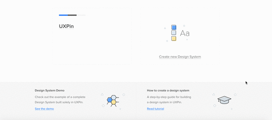
New: Replacing the Design Systems name within the logotype.
New: Adding line separator in the Design System documentation.
Sketch plugin 4.10.2
Plugin update to the newest version of Sketch 48 app (plugin is compatible with Sketch 47 as well).
Editor
New: Adding shadows and inner shadows using controls in Properties panel.
If you’re interested what we’ve released in November please, check Changelog #16, Changelog #17, Changelog#18, and Changelog #19.
Join the world's best designers who use UXPin.Sign up for a free trial.Your e-mailTry it for free!
The post UXPin Changelog December 2017 #20 appeared first on Studio by UXPin.
November 30, 2017
UXPin Changelog November 2017 #19

In the last week of November we’ve released several improvements to Design Systems, Editor, as well as a new version of the Sketch plugin.
Design Systems
Optimized lazy loading for the Assets section in Design Systems documentation.
Fixed: Disappearing documentation for the Text styles after adding any elements to Design System Library in Sketch.
Sketch plugin 4.10.1
Fixed: Decreased Sketch performance while using the UXPin plugin.
Minor bug fixes and improvements.
Editor
New: Completely new PDF exports that make documents scalable and allow to select text inside them.
New: Adjustments to the recently released layers improvements.
New: Changing opacity of an active element with the keyboard by hitting 0-9* (1 = 10% opacity, 0 = 100 or 0% opacity, depending on the current value).
If you’re interested in other November improvements, check Changelog #16, Changelog #17, and Changelog#18
Join the world's best designers who use UXPin.Sign up for a free trial.Your e-mailTry it for free!
The post UXPin Changelog November 2017 #19 appeared first on Studio by UXPin.
November 28, 2017
3 Tips for Creating a Design Systems Taxonomy

As design teams scale up from 1 or 2 members to 20 or more, design systems quickly become a necessity for product consistency and team communication.
Creating a design system is like creating a new language. You want to help your teams give meaning to their ideas, then capture that meaning, the existing knowledge, and the best practices in one place.
However, building a design system doesn’t come without challenges – one of which is building the right taxonomy.
Generally speaking, the purpose of a taxonomy is to understand a set of subject-specific concepts, and build a vocabulary for those concepts with the sole purpose of making the interaction with them easier.
In the digital world, taxonomies work in a similar way: they help to organize and classify information and features based on similar patterns and on differences.
Building a solid taxonomy for your design system helps remove subjectivity in design decisions, increases awareness of the value of design, and improves communication between teams.
Here’s three few best practices that have helped me build taxonomies for my design systems projects.
1. Break down your UI into components
You don’t build a design system only for your fellow designers, but also for the development team, content strategists, information architects, and even marketing folks.
Make sure you involve representatives from all these departments.
My approach is to create an inventory of all the components currently in our product. Then, I ask the team members to join me in a brainstorm session where we write all the names of the components on post-its. Afterwards, each person groups them and names the group as they think it makes most sense (somehow similar to card sorting). Once everyone is finished, discuss all the groups and names.
During this exercise, remind people to consider the function of each group of components so they don’t give names based on appearance.
For example below, we have a few similar components for showing labels within content.
Label:

Label-strong-with-icon:

Label-with-description:
We decided that all these components should be part of a group called “Content Labels”. We validate the decision by going through all the contexts in which we use these components and agreed that the name works for all the included components. For example, we use labels for showing topic titles, categories or to put an emphasis on a particular part of the content.
2. Focus on the functionality
Since the beginning of the web, we used to think in pages, mostly because everything related to branding, design, and advertising started with the printed world. However, the web world evolves everyday and the range of devices for which we have to build products increases and poses new challenges.
Switching our mindset from pages to components helps us simplify the taxonomy.
The following questions might help you in determining the right categories for your components :
Is it branding?
Is it navigation (including search)?
Is it call to action?
Is it content?
Is it related to integration with other business applications?
Make a list of similar questions that make sense for your product and use it as a checklist.
This way you can be sure your taxonomy supports search, website navigation, personalization and other customer experiences, and integration with other business applications.
And, needless to say, whatever naming convention you decide to adopt, it should be obvious and relevant to everyone using the design system.
3. Build for flexibility
Your product will evolve and so will your taxonomy. Plan to regularly examine your existing structure and modify it as needed.
A design system shouldn’t be an obstacle for innovation, but quite the contrary: with less time spent on making design decisions that were already agreed upon in the design system, you have more time to explore improvements.
So your structure should support innovation, flexibility and creativity. I’ve found that a layered structure fits very well with this goal: decide on a few main categories, then break those categories down into sub-categories.
For example, we have one main category called content which contains the following sub-categories: tiles, labels, and progress components (UI that lets the users know where they are in the process of solving their problem).
Next Steps
If you found these tips useful, download Creating a Design System: The 100-Point Process Checklist.
Based on real case studies, the guide explains every step of building a design system.
The post 3 Tips for Creating a Design Systems Taxonomy appeared first on Studio by UXPin.
UXpin's Blog

- UXpin's profile
- 68 followers

