
UXpin's Blog, page 109
November 22, 2017
UXPin Changelog November 2017 #18

Over past week and a half, we’ve released several improvements to Design Systems, Editor, and overall app usability.
Sketch plugin 4.10
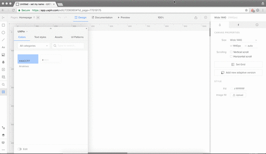
Updating colors and assets in Design System and Design System Library.
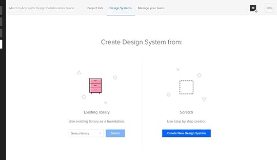
Creating Design System straight from the Design System Library panel.
Alignment issues for graphic elements imported from Sketch.
Hidden layers from Sketch are no longer exported as empty.
Symbols created in UXPin no longer disappear after re-sync with Sketch.
Sketch pages are no longer exported as empty parent pages in UXPin.
Design Systems
Ability to edit colors and assets in Design System Libraries and Design Systems.
Auto-adjustment of the Design System Library panel when switching from bigger to smaller screens.
Ability to create a Design System from the Design System Library panel. In the edit mode, the button will appear at the top right corner of a DSL window.
Button to update assets and text styles in Design System Library and DS is now shown on hover.
Editor
Automatic constraints for elements inside groups or symbols. The resize properties are set automatically in relation to the position of other elements inside that group.
Our Customer Experience team has released new a “Go to project” button:
Removed the “Back to Dashboard” button from the project folder. Now you can navigate to the list of all Projects/Groups by clicking on “Projects” tab in the Dashboard.
Updated “Go to Project” button on Preview and in the Editor.
If you’re interested in other improvements we’ve released in November, check Changelog #16 and Changelog #17.
Join the world's best designers who use UXPin.Sign up for a free trial.Your e-mailTry it for free!
The post UXPin Changelog November 2017 #18 appeared first on Studio by UXPin.


November 10, 2017
UXPin Changelog November 2017 #17
In the second week of November, we’ve released a bunch of improvements to Design Systems in the following areas: symbol overrides, Google Fonts, Design Systems Libraries, and Design Systems documentation.
In the UXPin Editor, we’ve worked on the performance, added iPhone X canvas size, animations for the “Go to page” interaction, and fixed issues with not rendering Google Fonts while scrolling the Font Management modal. Details below.
Design Systems
Added overrides for the visibility of elements inside the symbol.
Highlighted the edit mode in Design Systems Libraries and Design Systems documentation.
Fixed: Google Fonts were not rendering properly in the Design System Library.
Small visual improvements.
Editor
Improved editor loading time.
Added animations for “Go to page” interaction.
Added iPhone X canvas size (375x812px).
Fixed: Google Fonts were not rendering while scrolling the Font Management modal.
If you’re interested in other improvements we’ve released in November, check Changelog #16.
Join the world's best designers who use UXPin.Sign up for a free trial.Your e-mailTry it for free!
The post UXPin Changelog November 2017 #17 appeared first on Studio by UXPin.
November 3, 2017
UXPin Changelog November 2017 #16
During the first week of November, we’ve released a bunch of small improvements to Design Systems including the following areas: fonts, color picker, and copy/paste for nested symbols.
In the UXPin Editor, we’ve added the possibility to drag and drop layers. We’ve also improved element selection in interactions. Details below.
Design Systems
Possibility to copy and paste symbols into a different symbol.
Fixed: stretching small images.
Improvements to updating text styles in Design Systems Libraries.
Fixed: applying text styles in Safari.
Font background color is now applied when you drag the style to canvas.
Changing the order of colors in Design Systems is reflected in the color picker.
Sketch plugin v4.9.2
This version of our plugin for Sketch comes with improved performance of exports.
Editor
Possibility to reposition multiple layers on the layers list.
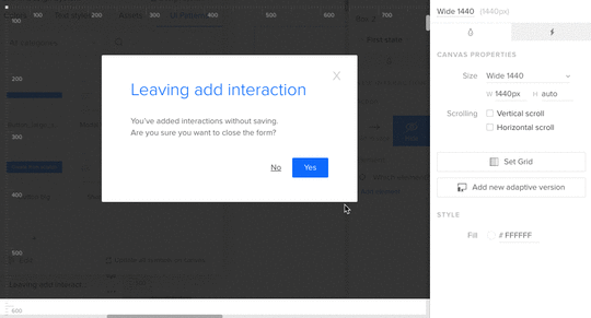
Improved selecting elements when adding interactions.
If you’re interested in what we’ve launched in October, check Changelog #13, Changelog #14 and Changelog #15.
Join the world's best designers who use UXPin.Sign up for a free trial.Your e-mailTry it for free!
The post UXPin Changelog November 2017 #16 appeared first on Studio by UXPin.
October 27, 2017
The 47-Point Checklist for Improving Designer and Developer Workflow

Designer and developer collaboration should never start during the handoff process.
Developers must be equal partners in the product development process, involved in UX discussions from the very start.
In this checklist, you’ll get tips for improving the collaborative workflow from discovery all the way through handoff. Use it as a baseline for your team and customize as needed.
During Design
1. Discovery
Invite developers to attend user interviews when possible.
Circulate bulleted summary of user interview insights with developers.
Conduct a 30-minute to 1-hour stakeholder interview with at least one developer. Use Kim Goodwin’s excellent questions.
Create and quickly review lean personas with developers.
Get developer input and alignment on technical restraints for the design brief.
2. Planning
Ensure developers (or at least the development lead) attends the kickoff.
Conduct user story mapping with developers to plan epics and sprints.
Estimate build time for user stories with developers using tactics like planning poker.
Plan design sprints 1-2 sprints ahead of development.
Check if designs will be implemented with a common framework (Bootstrap, Foundation, etc.). Adapt grids and elements accordingly.
Verify browser support with developers.
After each standup meeting, quickly review the backlog with developers.
3. Prototyping
Walk through user flows and lo-fi prototypes for developer feedback on feasibility.
Start designing extreme viewports (smallest and largest) to accurately “bracket” your content. Consider how your design will respond to screen sizes slightly smaller or larger than your assumptions.
Incorporate rough content (not Lorem Ipsum) into the prototype within the first two iterations.
Invite developers to attend at least one user testing session.
Prototypes account for all interaction states, error states, and transitions between states.
Prototypes account for data extremes (e.g. short and long last names, phone number formats, non-US post codes).
Circulate all user test recordings with bulleted summary of insights to developers.
Collect feedback and approval from developers at each iteration of the prototype.
4. UI Design
With each iteration, rename your design file (v.1, v.2, etc.). Do not rename with “Latest” or “Newest”. Upload every new version into a shared repository.
Create as many reusable patterns as possible (menus, links, buttons, panels, etc.) so developers have a component-based system.
Make UI decisions that create consistency for the experience and code base.
Get developer buy-in on image formats and sizes.
Create designs in all major breakpoints on a grid system with guides/overlays.
Use whole font values and leading values (e.g. 15 instead of 15.75) to preserve typographic integrity.
Use web-safe fonts when possible. Don’t use more than one custom font.
Check that you own the rights for all photography and typography.
Hold a 30-minute to 1-hour review of final approved mockups alongside the prototype. Walk through project goals, user stories, interactions, states, and failure states.
Grab design ebooks created by best designers
All for free
 Download
 Download
 DownloadDownloadDo you want to know more about UI Design?
Download 'Creating a Design System: The 100-Point Process Checklist' FOR FREE!
Download e-book for freeCloseDuring Handoff
1. Visual Hygiene
Delete all unused layers. Don’t just hide them, since that may confuse developers.
Delete all unused guides.
Group and name layers appropriately based on UI modules (navigation, footer, etc.)
Follow a common naming convention with developers (e.g. a “widget” is not the same as a “module”). Consider using BEM notation.
Instead of naming artboards with “FINAL” or “LATEST”, follow a standard versioning protocol (v.1, v.2, etc.).
For easier navigation, collapse all layers before sending off designs.
2. Assets
Create subfolders within your main project containing all relevant icons, fonts, images.
Include SVGs wherever possible. For raster files, include versions at 2x.
3. Documentation
Annotate prototypes with use cases, failure states, and interaction nuances.
Annotate the full code snippet (or classes in frameworks) next to every element.
Use an inspection tool to auto-generate visual specs (color codes, dimensions, font sizes, margins, padding, etc.). Avoid redlining as much as possible.
Ensure all documentation stays updated to reflect the final system as it evolves. Developers will refer to documentation to understand depth and breadth of the system, using the final prototype as a reference for acceptable behaviors.
After Handoff
1. Accuracy of Build
During the QA process, designers perform “implementation audit” of each build against the final prototype.
Designers attend sprint demos along with PMs.
Acceptance testing includes UX criteria based on final prototype.
2. Design System
Describe accessibility requirements and any implications on development. For example, Salesforce Lightning: “Our forms offer proper use of and tags as well as appropriate labeling for input controls.”
Include code snippets for all UI components (menus, buttons, etc.) along with specific descriptions of use cases.
Include links to downloadable UI kits, color swatches, and code repositories (e.g. Github).
For more advice on improving design and development process, download the 67-page e-book Product Development for Distributed Teams.

The post The 47-Point Checklist for Improving Designer and Developer Workflow appeared first on Studio by UXPin.
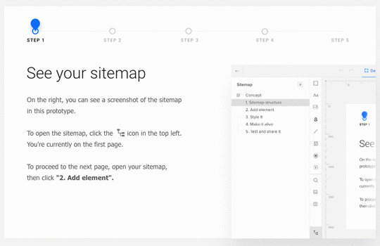
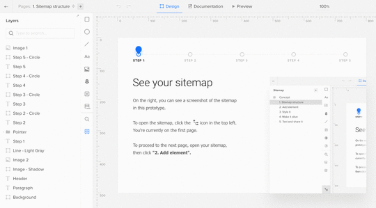
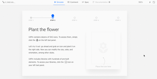
How to Quickly Build a Design System in UXPin (Video Lesson)
Design systems have quickly become a best practice thanks to companies like Salesforce, Atlassian, Airbnb, and Shopify.
When working on our design systems platform, we wanted to make design systems feasible for all companies – not just the big players. All teams deserve more automated design consistency, better efficiency, and always-updated documentation.
In this hands-on video, UX designer Robert Smith (one of our power users) demonstrates how to quickly build a design system to achieve those results.
If you’d like to try it yourself, go ahead and start a free trial below.
Join the world's best designers who use UXPin.Sign up for a free trial.Your e-mailTry it for free!
The post How to Quickly Build a Design System in UXPin (Video Lesson) appeared first on Studio by UXPin.
UXPin Changelog October 2017 #15

During the last week of October, we’ve added a bunch of small improvements for Design Systems including color picker, search and performance optimization.
In the UXPin Editor, we’ve improved deleting guides and added the possibility to choose multiple layers. We’ve also released a new version of Sketch plugin v4.9.1 that fixes problems with unsuccessful imports to UXPin. Details below.
Design Systems
Possibility to add interactions to the particular elements inside the symbol.
Added colors from the corresponding Design System Library to the color picker.
Improved performance when scrolling a Design System with heavy documentation.
Assets uploaded to Design System Library are displayed in the global search (cmd/ctrl+F).
Symbols covers are updated in Design System Library when a symbol nested inside the parent is changed.
Sketch plugin v4.9.1
Fixed: Unsuccessful import from Sketch removed prototypes in UXPin.
Fixed: Problems with opening UXPin editor after importing from Sketch (“Add new page”).
Small bug fixes and visual improvements.
Editor
An easier way of removing unwanted guides.
Improved display of equal distances between the elements.
Auto-scrolling to the corresponding layer in the panel when the element on canvas is selected.
Possibility to choose multiple layers using the “shift” key.
Ability to hide the documentation tab in the Preview mode.
Possibility to highlight interactions on the Preview by clicking on the canvas.
If you’re interested in what we’ve launched in October, check Changelog #13 and Changelog #14.
Join the world's best designers who use UXPin.Sign up for a free trial.Your e-mailTry it for free!
The post UXPin Changelog October 2017 #15 appeared first on Studio by UXPin.
October 26, 2017
Share Your Monstrosity and Win the UXPin Giveaway!

With Halloween approaching, we’ve created a special project filled with dark castles at night, thunderbolts, and, the scariest of them all, ghost buttons!
We’re holding a giveaway where all you have to do is share your favorite monster with a font and name of your choice! From all the entries will draw one that will win a single user annual subscription on our Prototyping plan!
Create your monster here!
 Photo by Beth Teutschmann on Unsplash
How to Enter our UXPin Giveaway
To enter our contest, create your monster in this app, then send us the screenshot in a reply to this post and retweet our tweet!
If you do not have a Twitter account, visit Twitter and follow the instructions to get on board. You don’t need a UXPin account to enter the Giveaway*
The giveaway only applies to users without an active subscription.
The promotion period begins 6 a.m. PST on October 26, 2017 and runs until 11:45 p.m. on October 31, 2017. The last entry must be received by Sponsor by 11:45 p.m. PST October 31st, 2017. The winner will be announced via Twitter on November 3, 2017.
Can’t wait to see your monstrosities!
*No purchase necessary to enter or win this contest.
The post Share Your Monstrosity and Win the UXPin Giveaway! appeared first on Studio by UXPin.
October 13, 2017
Webinar Recap: Scaling UX Teams at Atlassian
Alastair Simpson (Head of Design for Confluence, Stride, and Platform) shared the lessons learned in the past few years as he helped grow the UX organization at Atlassian.
Working for clients in both Australia and East Asia, Alastair first noticed that design teams seemed to be a separated service to product teams, much the same way that consultants were a separated service to the client.
In both scenarios, there was a gap between the two, where one party held more authority over the other. With consulting, this is reasonable; after all, consultation is a paid outside service. But for design to be separate from product management and engineering seemed counter-intuitive.
Wasn’t there a better way?
When Alastair began interviewing with Atlassian, he learned of a “new” model… at least new at the time.
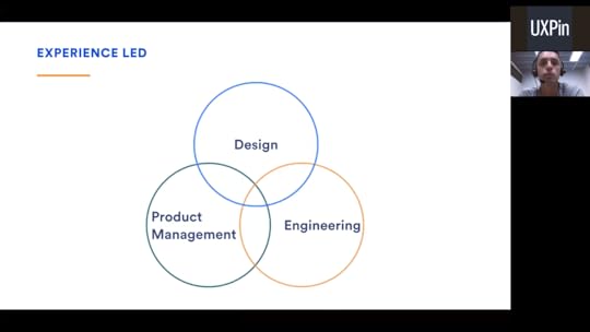
Atlassian’s triad model helps design, product management, and engineering worked together on equal footing. Rather than the product team having authority over design, or design having authority over the product team, the only guiding factor was the user experience. And so, the triad model became the foundation of the “experience-led” process.
This is echoed by a direct quote from Atlassian’s Head of Design Jürgen Spangl, “If the experience is not right, you should stop the release.”
This mentality wasn’t easy to integrate at first. It required evolving the company culture to place more value on design and user experience. This isn’t about giving designers a bigger “seat at the table,” but about spreading the experience-first thinking throughout the entire company, among all employees.
Naturally, changing an entire company culture is not easy. Atlassian accomplished it over the years through trial-and-error, learning lessons the hard way to discover what works and what doesn’t.
Specifically, Alastair lists “5 hard lessons” he and Atlassian learned along the way. He shares these lessons in the video above, so your company can get a knowledgeable head start in building the perfect team dynamics.
Lesson 1
“You can have the best design team in the world, but if your organisation doesn’t truly value design, it doesn’t matter.”
~Alastair Simpson, Atlassian
Atlassian didn’t hire their first designer until 2008, and from 2008 to 2012 the design org grew to only 6 people. This was at a time when the company was booming, with both product development and engineering teams experiencing double-digit growth.
At that time, the industry was more focused on product and engineering, and design answered to these areas. Design’s value was almost negligible, and innocently confused with other disciplines. .
Enter Jürgen Spangl who joined the company in 2011. Jürgen reorganized the company infrastructure so that design was seen as “more than just pushing pixels around.”

As Alastair explains, one of the first changes Jürgen lead was creating a design system (Atlassian Design Guidelines, known as “ADG”) to improve design cohesion and product development efficiency.
Atlassian Design Guidelines made a lot of sense. From a design perspective it was smoother, from a product perspective it was consistent, from an engineering perspective it was less redundant coding to be done. But most important, it benefitted the customer — familiar and comprehensive interfaces reduced the cognitive load and minimized distractions. It wasn’t so much a design decision as it was an experience decision.
What made this decision so monumental was partially that the customers didn’t request it. No one mentioned standardized drop-down menus or interface visuals in the customer feedback. So, going back and changing these elements to be normal was taking engineering resources away from building new features that the customers actually asked for.
As you can imagine, folks were skeptical at first and Jürgen essentially “bet his job on this,” as Alastair puts it. Regardless, the founders trusted him and backed him. The gamble paid off because the customer feedback was overwhelmingly positive to ADG.

The customers weren’t the only ones who benefitted. Product releases were faster and more consistent. Thanks to reusable components, teams could go from whiteboard sketches to working designs more quickly. ADG was tangible proof that experience-led design worked.
So, by contrast to hiring 6 designers between 2008 and 2012, Atlassian hired over 100 new designers between 2012 and 2016.
Design was no longer a service to product and engineering, but an equal partner.

Lesson 2
“Pain is temporary. Suck is forever.”
~Jason Dreamer, Pixar
Making changes is hard. Receiving feedback and criticism is hard. Unearthing and fixing foundational errors is hard. But a bad user experience is worse.

To improve and evolve their design mindset, Atlassian integrated a process they call “design sparring.” As Alastair explains, this isn’t sparring in the sense of a competition, but the proper sense: a learning exercise. Atlassian’s design sparring incorporates peer reviews and honest feedback to help designers learn and thereby improve the final product.
Design sparring at Atlassian promotes 4 key ideals:
Design-led. Designers facilitate their own design sparring sessions.
Structured. Sessions are recorded and documented for quick reference later.
Inclusive. Product managers, engineers, QA reps, and customer advocates all attend to offer their expertise.
Regular. Sessions occur periodically, at least every two weeks.
Echoing the previous lesson, many of the teams outside of design were unclear on the role of design. These inclusive sessions allowed designers to involve the rest of the company in the value of their craft.

Atlassian designers created the above visual to illustrate in no uncertain terms the design process along these 3 core steps. By sharing this visual aid on the internal server, all employees had a comprehensive guide to the design process and where they fit in.
Design is always a collaborative exercise, and there really is no “design only” stage. The better other departments understand design, the better the final product.

Lessons 3-5
In additional to the lessons above, the rest of the webinar covers:
What is “radical candor” and why it holds the key to productive company communication.
How to give constructive criticism in a respectful way.
The Atlassian method of self review and performance review via the Skills Matrix.
The Shuhari framework and how it translates into a 90-day plan for keeping designers on track.
What is “design detention” and how it can solve a lot of common design problems.
The progression of Atlassian’s Design Week tradition over the years.
How to differentiate the separate disciplines that are often incorrectly lumped together as “UX.”
How to break down UX metrics into a structured scorecard to streamline organization.
How accountability works in the triad model, and getting all teams to pull in the same direction.
Q&A session with Alastair answering questions from webinar attendees.
The post Webinar Recap: Scaling UX Teams at Atlassian appeared first on Studio by UXPin.
Design Systems and Abstraction Layers: A Model for Better Understanding and Implementation
Let’s discuss the value of clearly delineating the mental model that is your design system, its artifacts, and the tools that implement it.
Whether you’re creating your own design system, or implementing a design system created by a third party, it is important to understand the relationship between each layer of abstraction, the importance of drawing and maintaining a clearly defined line between each, and the business-oriented considerations which drive and justify a separation of concerns between each layer of abstraction.
In computing, an abstraction layer or abstraction level is a way of hiding the implementation details of a particular set of functionality, allowing the separation of concerns to facilitate interoperability and platform independence. — Wikipedia
In software development, separation of concerns is an architecture principle which drives the modular nature of a complex system. When following this principle, each section of the system addresses a separate concern. Concerns can be very general, such as hardware that software is being developed for, or very specific, such as the name of an individual method.
In this article, we’ll explore each layer of an abstraction model for design systems and how to use it for better understanding and adding more value.
A Model for Design Systems
Minimally, at the highest level of abstraction, a design system should exist as four distinct areas of concern:
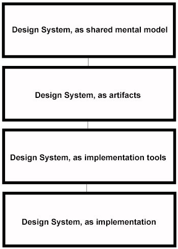
The four abstraction layers for a design system
Let’s apply this abstraction model to the concept of accessibility:
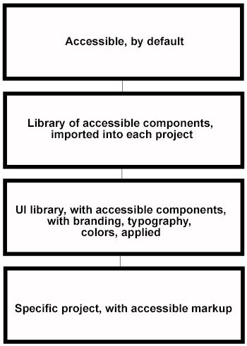
Our abstraction model applied to accessibility
At the first layer of abstraction, everyone agrees that form elements should be accessible.
At the second layer of abstraction, you have a code repository you can import at the beginning of a project which allows your developers to re-use code that meets accessibility standards.
Next, you have a UI library where developers can implement that code, with specific typography, colors, branding, and text applied, so that it may be shared and re-used within and across projects.
Finally, you have a real, robust implementation within the context of a real project, for the last layer of abstraction.
Now let’s explore each layer of this abstraction model as it relates to accessibility.
The first layer: A design system expressed as a shared mental model
As a shared mental model, a design system should be thought of as a specification, or a description of the design system. It should contain high level concepts, such as the idea that a design system should encapsulate certain principles, among those being, for example:
A design system should assume accessibility, by default
A design system should be responsive, and should operate by a mobile-first principle
A design system should articulate standard, re-usable definitions of page elements and components along every stage of product design and implementation
The shared mental model is not the system itself, but the foundation upon which it is built. Before you start building out specific components, you should give yourself the time and space to create an agreed-upon emergent framework from which to organize your effort.

Principles for accessibility for the Shopify Polaris design system.
In an ideal UX process, a high level of cooperation would exist between each discipline. But in the area of generating and maintaining a mental model, your researchers will probably provide a large amount of value within this concern and can provide a lot of leadership with regards to determining the scope and boundaries of your design system.
Grab design ebooks created by best designers
All for free
Download
 Download
DownloadDo you want to know more about UI Design?
Download
Download
DownloadDo you want to know more about UI Design?Download 'The Definitive Guide to Integrating UX & Agile' FOR FREE!
Download e-book for freeCloseThe second layer: a design system expressed as artifacts
As a collection of artifacts, assets should exist to implement the abstract principles elucidated by the Design System.
If “accessible, by default” is a principle, a way to implement that principle would be to generate a shared repository of commonly used HTML elements and components that have been implemented as being compliant and tested with accessibility standards in mind.

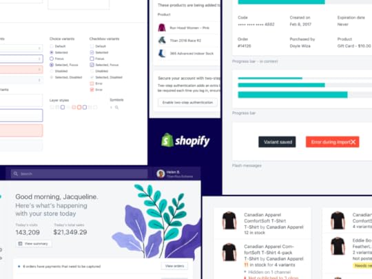
Components from Shopify’s Polaris design system.
As you might imagine, having such a reusable library will allow you to ensure the development of reusable, accessible markup over the course of a project, rather than shoe-horn it into a project at the end, or after QA reveals that certain components are not accessible.
Specific assets can be created, improved, or even deprecated over time, as your Design System, as a shared mental model, evolves and changes.
The third layer: a design system expressed as implementation tools
The shared mental model, as well as artifacts which assist designers and developers implement a design system, require some way for the world to view and interact with a design.
A UI library that showcases individual components, templates, or even entire workflows would meet this requirement. The UI library is not the application you are building itself, but a repository of reusable elements and patterns which help developers build one or more specific products based upon a design system.
Shopify Polaris design system UI library.
For example, your UI library may have a section devoted to various “resources”, such as brand colors or fonts for your project. Your design system requires a tool to hold what you build from the assets, which implement your shared model of what your design system is.
The fourth layer: a design system expressed as implementation
The implementation is what everyone on your team is working towards.
Of course, none of this means much until we answer the question of why?
Why is it necessary to maintain these layers of abstraction? Why are we borrowing jargon from the world of software development and importing it into the UX design process? Why do we need to draw these lines and decouple these layers?
This isn’t just some academic exercise. There are some practical real-world concerns which drive this and require we look at things this way. Let us imagine a couple of business use-cases where having these clearly defined lines between each area of concern will make sense:
Scenario #1
A client understands and accepts that a UI component library helps with standardization and reduces cost if their disparate design teams can work from the same code library.
They have implemented a CMS where code is organized and obtained by developers. You, of course, have developed your own proprietary UI component library to contain shared code, but you’d really like to work with this client and believe in a few years you may be able to convince them to use the UI component library you have developed.
Since the UI component library is only one of four modules within this system, and since each layer is essentially in its own separate box, you are not prohibited from working with them in the areas where you are better aligned, such as their decision to adopt a design system created by a well-known firm, with which you have a lot of experience already.
Scenario #2
A client is working with a proprietary piece of software with a well-established and documented design system. This design system works well with the customer relationship management tool they would like to implement.
Your role is understand business processes and develop workflows that meet various business objects, more so than worry about the design system, where is documented, or what artifacts are to be used — they are provided by the vendor. In this case, three of four layers are being handled elsewhere.
You can add value at the implementation layer which will help them accomplish their goals at present, or in the future, since these business processes exist independently of any design system.
Scenario #3
You have been awarded a project on the basis of the usability and appeal of a piece of software you have developed that will operate as a UI library. Your client has not settled on what design system to use, nor even what the final implementation will yield.
You and the client are both sure of the value you can add by providing a UI library with reusable components that can be leveraged by their implementation team. Since all four layers are decoupled and separate, you are confident that your UI library will help them improve their UX design and implementation process.
Conclusion
In manufacturing, specialization is common and necessary. A factory that produces air conditioners does not also need to produce screws or sheet metal. That work is done elsewhere and as new vendors emerge with better screws or sheet metal, a manufacturer can focus on the area within the value chain where their expertise is most beneficial to the market.
Decoupled layers of abstraction provide similar value within the context of UX. With each component logically separated, you are free to provide value as needed, maintain flexibility, have the freedom to innovate as you and the marketplace iterates within each layer of abstraction, and ultimately create more value within your UX design process.
For a step-by-step guide based on real case studies, download Creating a Design System: The 100-Point Process Checklist.

The post Design Systems and Abstraction Layers: A Model for Better Understanding and Implementation appeared first on Studio by UXPin.
UXPin Changelog October 2017 #14
This week we’ve introduced the possibility to rearrange categories in Design Systems (both documentation, and Libraries), improvements to Smart Guides, nested symbols, and text styles. We’ve also released two versions of our Sketch plugin – v4.8 and v4.9. Details below.
Design Systems
Ability to rearrange categories in a Design Systems Library.
Ability to rearrange categories in Design Systems documentation.
Added information that the Design System Library will be deleted with the corresponding Design System documentation. [image error]
[Fixed] Nested symbols causing problems in parent symbols and in Design System Libraries.
Sketch plugin v4.8
Assign users with unique viewing and editing permissions for Design System Libraries in Sketch.
Sketch plugin v4.9
NEW: Ability to rearrange categories in Design Systems Library.
Improvements to the design exports from Sketch to UXPin.
Visual fixes and improvements.
Editor
[Fixed] Text styles not retaining the font style.
Smart Guides show equal-distances between elements when trying to align them on canvas.
If you’re interested in what we’ve launched in September, check Changelog #12 and Changelog #13
Join the world's best designers who use UXPin.Sign up for a free trial.Your e-mailTry it for free!
The post UXPin Changelog October 2017 #14 appeared first on Studio by UXPin.
UXpin's Blog

- UXpin's profile
- 68 followers

