
UXpin's Blog, page 111
September 11, 2017
UXPin + JIRA: One continuous workflow for designers and developers

Designers and developers might think and work differently, but that doesn’t mean we can’t connect their processes together
That’s why our major updates in the past few months have all focused on unifying design and development:
Spec Mode (Oct. 2016): Auto-generate specs, CSS, and style guides for any design in Sketch or UXPin. Eliminates manual redlining for handing designs off to developers.
Freeflow Documentation (Jan. 2017): Pin documentation to elements in your design so team members can see the rationale behind product decisions. No more shuffling between design and 100-page requirements documents.
Design Systems (June 2017): Create consistency in design and documentation everywhere. Design systems libraries give everyone a single language and toolkit for design patterns and code snippets. Updates to design system documentation syncs to all projects.
Now with JIRA integration, you can visually illustrate requirements and keep the team updated on your design work right in JIRA.
Thanks to our collaboration with Atlassian you can preview your prototypes in the JIRA issue and access the design documentation and specifications.

How it works
The process is pretty simple for bringing UXPin prototypes into JIRA:
1. Install the free UXPIN for JIRA app to your team’s account, or request your JIRA account owner to install it.
2. After installation, copy and paste your UXPin preview link into your JIRA issue. The UXPin prototype will appear as a thumbnail.
3. Now you can preview the prototype in the JIRA issue, and access the documentation and specifications by clicking the tabs.
UXPin prototypes you see in JIRA (and the documentation and spec links) are always updated to the latest version. It’s just another way we’re bringing designers and developers closer together.
You can download the app in the Atlassian Marketplace.
The post UXPin + JIRA: One continuous workflow for designers and developers appeared first on Studio by UXPin.


September 8, 2017
UXPin Changelog September 2017 #9

This week we’ve released improvements for Design Systems, our Dashboard, and a new version of Sketch plugin 4.6. Details below.
Design Systems
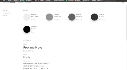
Redesign of the “Colors” tab in Design System.

[Fixed] History not handling undo action while editing the symbol.
Sketch (Plugin 4.6)
Important: Plugin update mechanism is handled by Sketch.
NEW: View, use, and edit your UXPin Libraries in Sketch,
NEW: Easily access corresponding Design System directly from the Sketch Library.
Dashboard:
Now, a single click on the prototype name takes you to the Editor (double clicking allows you to change the name).
If you’re interested in what we launched in August, check Changelog #7 and Changelog #8.
Join the world's best designers who use UXPin.Sign up for a free trial.Your e-mailTry it for free!
The post UXPin Changelog September 2017 #9 appeared first on Studio by UXPin.
September 7, 2017
How to Fix Design Inconsistency Using UXPin

Design is notoriously hard to scale because as processes and teams grow, the chaos and inconsistency in a product increases.
As a full-stack UX design platform, we improve consistency and efficiency by connecting all the steps of the UX process together. The platform connects your prototypes to your design system and documentation so there’s little room for misunderstanding.
Let’s take a look at our four core features which help get rid of design inconsistency.
Standardize Best Practices With Design Systems
It all starts with formalizing design principles, design patterns, and code conventions in a shared Design System as early as possible.
In UXPin, your design system is the foundation for all your projects.
You can create import assets from Sketch into your design system, or create it with your UXPin assets. The design system houses a whole array of Colors, Text styles, Assets and UI patterns to use across different projects. This way, each team member has a single approved toolkit.

To eliminate the risk of accidental changes, you can also set permissions for your Design Systems and limit the editing access to yourself or other team members.

UXPin allows you to add a couple of levels of documentation for your Design Systems, so you’ll be able to provide further information for whole sections, specific categories within the section and in case of Typography and UI Patterns even for a single text style or element.

Adding descriptions and details to UI patterns in your design system.
If that’s not enough, you can always add a couple of pages to your Design System to incorporate all types of details which can’t be easily included in other categories, such as project structure, style guide or naming conventions.
Give Everyone An Approved Toolkit with Design System Libraries
All your assets in the design system are accessible in your individual projects in the form of Design System Libraries.
Whenever someone updates the design system, the changes are instantly incorporated in the corresponding design systems library. For example, once a new set of SVG icons is presented, designers can access them directly from the library to use across projects.

Lo-fi design systems library.
Using the updated library, designers can quickly replace older icons or placeholders or add them to existing symbols. This way your team stays on the same page throughout the entire design process and the consistency is preserved.
As you build the design system library, you also want to attach documentation and metadata to the elements. Here you can include additional context, add extra details for developers such as code snippets or establish the methods and processes to follow during the project.

Viewing metadata for an element from a design system library.
Create Reusable Symbols
We all know how lack of reusable design assets can slow down both design and development processes as it forces people to create everything from scratch. With UXPin, you can take advantage of both Design System Libraries and Symbols to create, store, and reuse patterns quickly.
Once the designer has created the Lo-Fi mockup, they can add different sections to the Design System Library as symbols.

You can modify Symbols for specific use-cases. A master template can be pulled from the DS Library to the canvas, where you will be able to update its local copy, for example by changing text, but leaving the layout untouched.
In fact, every instance of the symbol placed on the canvas can be quickly iterated and the changes apply to all the copies at once, making editing more consistent and faster.
Verify Consistency With Spec Mode
The final part of the puzzle is verifying consistency just before handing off to developers.
As the project progresses, designers and developers can review prototypes using Spec Mode to see all the details as well as the documentation from the Design System. This way, they can notice and point out any departures from the design guidelines, for example in icon sizes.
Spec Mode generates measurements, CSS code, and style guides for projects.
Next Steps
Simplifying design and product development processes allows teams and companies to produce consistent products and come up with better solutions.
To play around with what you’ve seen here, go ahead and start a free trial.
Join the world's best designers who use UXPin.Sign up for a free trial.Your e-mailTry it for free!
The post How to Fix Design Inconsistency Using UXPin appeared first on Studio by UXPin.
September 5, 2017
Scaling UX: A 4-Step Framework for Design Leaders

Because it’s part science and part art, UX just doesn’t scale as cleanly as engineering.
All design processes eventually break. The trick to scaling UX is creating a flexible framework that adapts to size and design maturity over time.
Based on research that our friend Jason Culbertson (Design Manager at Airbnb) conducted with product design leaders at Airbnb, Gusto, and other companies, the framework he created explores the following areas of a UX practice:
Tools & Systems – What core criteria should be used by UX leaders and their teams to evaluate tools? How can design eventually become a system rather than individual practice?
Team Structure – How can UX teams evolve their structure over time to support more projects?
Collaboration – What processes and rituals help prevent siloed design?
Culture – How can UX leaders create a design-first culture in the company? How can they create a UX vision that inspires and guides their team in the long term?
In this article, we remove the mystery around scaling design by explaining each of the four steps above.
For more best practices, register for UX at Scale Virtual Summit 2017. Get advice on scaling UX from 15 design leaders at Atlassian, Salesforce, Autodesk, Linkedin, Airbnb, and more.
Tools & Systems
Tools and systems form the base of the pyramid. They enable quality and consistency of the experience across products.
Tools
Cloud-based tools facilitate scaling because they help you preserve a single version of the truth. As design teams grow, so too does the risk of “design fragmentation” with desktop tools. Version control just becomes more difficult.
When evaluating design tools, consider the following criteria:
Collaboration – How does the platform facilitate communication with other teams in different offices and time zones?
Consistency – Can different people update and reuse “approved” design patterns to create a consistent look and feel in all projects?
Control – What interactive and visual fidelity does the platform support? How does it manage versioning and permissions across members of different teams?
The ultimate goal, of course, is a standard toolkit used by product development teams to fulfill:
Project management
Requirements management
Collaboration
Usability testing
Prototyping
Visual Design
Asset Control
Development Handoff
If you use multiple tools, check that they transition well into each other’s workflows. For example, if your team uses a static lo-fi wireframing tool and a separate prototyping tool, they will lose efficiency when rebuilding their designs (assuming the two don’t integrate).
Systems
Once your UX team grows beyond 15 designers and your organization expands beyond 500 employees, you’ll probably need to build a design system.

At scale, product teams require reusable patterns and code components for creation and maintenance. Your design system, then, becomes the final component in your design toolkit.
Here’s some useful examples of sustainable design systems (more here):
Salesforce Lightning
Airbnb DLS
Intuit Harmony
One noticeable challenge in using a design system is referencing the right components on an everyday basis. If the design system only exists as a site, developers still need to spend time browsing through documentation to find the code snippet they need for a particular component. One solution, however, is embedding your snippets and other documentation in the design itself so that the metadata follows the elements.
Another challenge of using a design system lies in the long-term maintenance. As Nathan Curtis mentions, prepare to evolve your governance structure over time:
With smaller design teams, an “overlord” structure can suffice. One person publicizes their own personal design system. They also own the responsibility for updating the system.
As the design team grows to dozens of designers, you may move to either a “centralized” or “federated” structure. In the former situation, one person or team updates a democratized design system. In the latter situation, multiple teams contribute towards creating and evolving the design system.
You can also follow a hybrid “cyclical” structure like Salesforce and Airbnb in which individual product design influences the system, and vice versa.
The UXPin product team has seen customers be especially successful with the cyclical system. A design system isn’t one way – you need to evolve it based on new learnings from individual projects. At scale, a dedicated designer (or team of designers) certainly helps to facilitate the two-way balance between consistency and innovation across the organization.

An interactive design system in UXPin imported from Sketch.
Team Structure
With the right tools and systems in place, you’re ready to start growing your team and evolving its structure.
Roles/skills (T-shaped)
As Satyam Kantamneni (former Managing Director of UX at Citrix) suggests in his webinar Building and Sustaining Successful UX Teams, unicorns are simply too rare, unaffordable, and usually suffer from a “diva mentality”.
Instead, design leaders need to be more realistic with hiring needs. Seek out T-shaped designers with deep expertise in one area but enough general competency to fill in other roles as needed. As the team grows over time, you’ll experience less of a knowledge gap thanks to the overlap between all members.
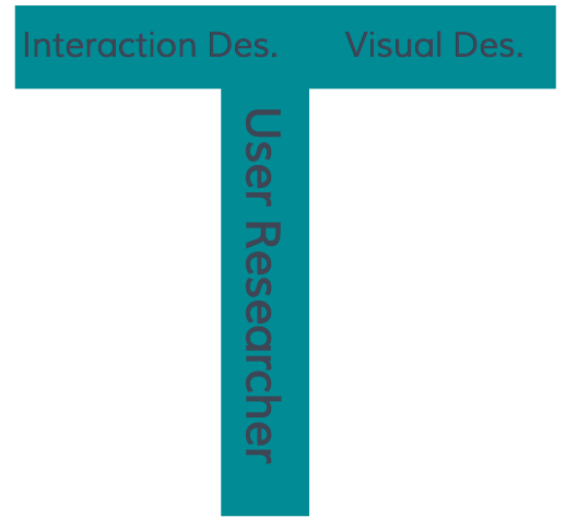
A desired T-shaped skillset for a user researcher.
Ratios
The ratios between designers and developers (and even PMs) will evolve over time.
At any size, however, Jesse James Garrett states that research suggests maintaining a minimum of 1 designer: 12 developers and a best-case scenario of 1 designer: 4 developers. In fact, as John Maeda points out in his 2015 Design in Tech report, the ratio for startups is usually 1 designer: 4-5 developers.
Organization
As Jeff Gothelf suggests, most teams progress from the “internal agency” team model to the scalable “hub and spoke model” as more people join.
For example, Airbnb’s current design organization of 70+ designers reflects a highly specialized “hub and spoke model” of designers embedded in other teams but reporting into one central design organization:
Design Language Team – Innovates and updates the design language affecting all Airbnb products. Responsible for the “future version” of Airbnb.
Outcome Teams – Designers embedded in respective product teams. Jason Culbertson, for instance, is part of the “Business Travel” outcome team responsible for that side of the product.
Production Design Team – Creates tools and iconography for designs. Ensures all designs meet Airbnb standards for quality and consistency.

As Jason Culbertson (Design Manager at Airbnb) mentioned in his webinar Scaling UX in Organizations, here are the most common inflection points you’ll experience as a UX team grows:
1-10 – Small enough to where designers may work on different features of a single product, or multiple products simultaneously. UX manager funnels projects through an “internal agency” model. Roles are more general with UI designers, UX designers, and UX researchers. Responsibilities overlap between designers.
11-25 – Specialization increases among the team as it transitions to a “hub and spoke” model. One or two designers may be responsible (part-time) for building and evolving a design system. Designers embed into specific product teams.
26-50 – The design systems team grows in size from 1-2 part-time to perhaps 3-4 full-time.
51-100 – At this size and scale, separate teams may form to fulfill responsibilities for owning the design system, everyday product design, and overall consistency of assets.
Collaboration
A scalable team structure also needs the right collaborative process to sustain its success. There’s no getting around it – as more designers join your team, you’ll need to formalize the collaborative process sooner or later.
Creating and adapting rituals
While it never hurts to formalize a process from day one, we’ve seen that a standardized process becomes mandatory once you’ve grown beyond 10 designers.
Treat creating a standard UX process as its own design problem:
1. Hold a 30-minute session or conference call with senior members of the team to learn their current processes. Diagram each person’s process, then compare for similarities and differences. Note any gaps or redundancies.
2. Create the new standardized process for an upcoming project as the pilot experiment. Choose a bite-sized project (e.g. a feature update rather than a product redesign).
3. Show the first iteration of your the process back to the people who filled in the spreadsheet and participated in the interviews. Take note of any patterns in feedback for your next iteration.
4. After sharing your finalized version with everyone, review on a weekly basis how the process performs in the pilot experiment. Where do roadblocks still occur? Who’s experiencing issues with collaboration? Continue iterating until the team falls into a natural rhythm and you notice a decrease in questions about process.
5. As people become comfortable with the process, you’ll want to revisit your tool suite. Create a spreadsheet for everyone on the product team to write down their set of tools. Review the document, then see where you can eliminate redundant tools or add new ones. Now you have an efficient process and the right tools for execution.
For example, Sunita Reddy (VP of Product at UXPin) uses the below process for all her Scrum teams.

You probably won’t follow the process to the letter – and that’s totally fine. The goal is to create a baseline to work with.
Working meetings
To keep iterating your collaborative process, we recommend a few recurring working sessions. During his interviews, Jason Culbertson uncovered a common set of efficient meetings:
Standup (daily) – Review progress, blockers, and tasks. To improve scalability, hold standup with individual Scrum teams instead of the entire design team.
Outcome managers (weekly) – Product manager, engineering lead or manager, and design lead or manager in an outcome team will discuss progress, learnings, and pending tasks.
Outcome design crits (weekly) – Designers in an outcome team will share all their work with engineering and product management.
Demo retro with engineering (weekly) – Designers review the week’s releases with developers to discuss successes and areas for improvement.
Design team share (biweekly) – Designers in an outcome team shows off all their work to each other in a rapid slides format.
1:1s (biweekly) – Design manager in an outcome team reviews career development
Design management (monthly) – All design leads or managers for all outcome teams will discuss progress, learnings, and pending tasks.
Of course, your team may not need all these sessions. Below, you can see how the sessions scale to the different inflection points.

Culture
Aside from tools, teams, and processes, you also need to build a sustainable design culture across the organization and within your team. Otherwise, your processes won’t survive past the initial push for change.
Across the organization
If your current company is not design-focused, you need to earn buy-in through a slow and measured approach. Ambitious UX roadmaps and back-to-back workshops will simply overwhelm the team. Instead, consider a system of “design nudges” along the path of least resistance.
At the executive level – Position yourself as a business leader who specializes in profitable design. Explain that you’d like to try some new processes for a small pilot project (less than 3 months), then outline the KPI goals. Ask for support just for the pilot.
At the project level – In parallel to your executive efforts, seek out pressing problems within different Scrum teams. Explain to the PM or engineering lead that you’d like to try a few problem-solving exercises that require minimal involvement. Conduct informal and brief stakeholder interviews, review all existing data, then propose a new solution rooted in design thinking. As people’s interests pique, only then start explaining the details of design thinking (and offering more in-depth sessions).
As you start getting quick wins, circulate your success with project members and executives. Summarize the processes and metrics achieved, then highlight how non-designers helped contribute. You’ll win more executive buy-in for UX while also making others look good in front of their managers (winning you even more supporters).
Across your own team
First, create a UX vision that should remain relevant in 1-3 years time (or longer).
The vision rallies the team and also communicates its value to external stakeholders.
For example, at UXPin, the vision is “unifying design and development for faster and better products”. A vision describes an ideal future state without prescribing a set solution. While tactics, quarterly strategies, and processes may change as teams grow, the vision usually prevails unless the company undergoes a significant pivot.
It usually helps to create the vision as a quick slide deck so that the team can share with stakeholders:
Explain how your vision adds user value and business value, while including relevant research on market opportunities.
Describe the methods you’ll use and how they help to improve the product experience.
Show where design fits into the organization and who the team will collaborate with on a daily basis (and how).
Outline the KPIs used to measure UX performance (e.g. NPS scores, conversion rates, etc).
Secondly, encourage designers to seek inspiration from products unrelated to your industry. Meet weekly to discuss these different sources of inspiration and how they may apply to different projects.
When you’ve built cross-functional support for UX while also defining your team’s culture, the business value of “good design” becomes far more tangible.
Conclusion
Growing a UX practice is a journey in itself.
The 4-step framework we’ve explored should serve you well as a playbook for scaling UX. Remember that it’s just a framework – tweak and adapt it to fit your needs as they change over time.
To learn more about how to create a design system to scale design, download Creating a Design System: The 100-Point Process Checklist.

The post Scaling UX: A 4-Step Framework for Design Leaders appeared first on Studio by UXPin.
September 1, 2017
7 Rules to Follow When Generating Requirements With Prototypes

“That’s not how I imagined this would work when I wrote the requirement.”
Most dev teams are resigned to hearing some variation of that statement at the worst possible point in the project. This experience usually leads to a great moment of self-righteous anger, during which they blame the stakeholder for not properly defining requirements.
As much as we all enjoy indulging that righteous anger, the truth is that the blame for these situations lies squarely with us.
Specifically, we’re failing to give stakeholders what they need to evaluate requirements for any gaps. Let’s talk about what typically happens here.
The Harsh Truth Behind Generating Requirements
Requirements typically come from meetings where stakeholders talk about what they want and the design/dev team captures those items. Instead of drawing from actual user research, the meeting can be combination of personal opinion, political pressure, and knee-jerk reaction to competitor features. This, to me, is the equivalent of placing a fast-food order for 12 million strangers.
There’s only one way to prevent this. It’s so simple that I am perpetually shocked that more organizations don’t adopt it: build a simple prototype as soon as humanly possible, and iterate with stakeholders to generate requirements.
We are at a point in history where collaborative design platforms make it ridiculously easy for anyone to build a solid low-fidelity prototype in an hour or two for feedback. And even easier to export all of it in a few clicks to HTML that stakeholders can click through just like the real thing.
I’ve seen plenty of instances where a two-hour review session with my stakeholders (where iteration and review/discussion are happening simultaneously) has replaced one or more two-week sprints.
One quick note on prototyping—low-fidelity means exactly that. You must stick to the following constraints, otherwise you’ll spend considerably more time than necessary, and you’ll be inviting everyone who sees it to fixate on what it looks like instead of what it does.
A Better Path Forward
For startups, initial product prototyping and iteration has to be three things: fast, inexpensive, and accurate. They’re facing extreme constraints, they need to get to reality quickly, and they can’t afford to be too off target right out of the gate.
There is absolutely no reason an enterprise organization cannot operate the same way.
All it takes is following these constraints:
Limited colors (use blue to indicate text hyperlinks). Everything else is filled with varying shades of grey or simple colors to indicate visual hierarchy.
No images or graphical data displays. The minute you introduce either, your reviewers fixate on them instead of casting a critical eye to screen layout, content structure, controls, interactivity, and workflow.
No fonts other than Arial. As with colors, fonts invite analysis and speculation.
Real labels on all interactive components. It doesn’t have to be correct or final, but you definitely need feedback on navigation menu items, accordion content, data tables, buttons, form fields, etc. The only way to get it is to give people something to consider as a starting point.
Real text content, to whatever degree possible. Content goes a long way in establishing context, and context is the key to user experience. Design around content. A rough draft of your content is much better than “Lorem ipsum”.
Keep interactions simple. Anything that requires significant, real coding for demonstration purposes is something you need to drop, re-think, or table it for your hi-fi prototype.
Annotate to begin suggesting and documenting requirements. It is your responsibility to communicate the rationale of all interaction decisions. Not only do annotated prototypes reduce misinterpretation, you create contextual rather than “paper trail” documentation. Try the user story format I suggest in previous chapters—it’s the perfect format.
To illustrate the fidelity level I’m advocating, here are a few prototypes I created of a possible enterprise document management platform:
Prototyped in UXPin

Prototyped in UXPin
The post 7 Rules to Follow When Generating Requirements With Prototypes appeared first on Studio by UXPin.
If A Feature Remains Undefined After Two Sprints, Table It or Drop It

As a guiding principle, anything that moves more than twice through the review cycle of requirements generation and prototyping is too complex. Table it or drop it.
In my experience, if you can’t figure it out after two passes, then it’s either a complex issue deeply entrenched in associated processes or systems, or you’re dealing with too many unknowns.
In either case, it waits. The only exception to this rule is a feature or function that is of high importance and high feasibility, as discussed in the Fixing the Enterprise UX Process ebook.
I’ll give you an example from a project I worked on a short while ago.
Introducing The Mystery Messaging Feature
At the center of this scenario was a messaging feature — presented as simple, managed communication between user roles. It wasn’t even part of the prototype, but quickly came up in a sprint planning session where two key stakeholders were in the room.
The spec from the stakeholders, in response to our barrage of specific questions, could be paraphrased like this:
We need messaging — for evaluators to talk to approvers. But other roles might be involved. They should only be able to talk to each other, but there might be times when they need to talk to other departments. And clients. But only about certain issues.
It should work like Outlook, except no mailboxes or sending anything. It could be like a comment thread, but not everyone can reply.
There shouldn’t be a central messaging screen, because it may need to appear on other screens.
What screens the messaging feature appears on depends on what’s being asked. And we need to notify everyone when a question is asked.
This is literally all the information we got. And I can assure you that all the clarifying questions you’re asking in your head right now are the same ones we asked. I’m sure you’re seeing the red flag lurking here. Anything this wide-open and undefined has no business being a requirement. We didn’t plan on including comment threads on every screen, and we weren’t convinced that doing so even made sense. But since we could absolutely see the need for communication in context, we agreed to prototype it.
Sprint One Review
Two weeks later, we reviewed the prototype. The same stakeholder pipes up with this (again, paraphrased):
“When people log in, they should see a little badge, like on the iPhone, that tells them a message is waiting.”
Oh, a badge. Magically. Somewhere. It’s all clear now. Remember, we haven’t fleshed out this messaging feature at all. There was no plan to have any kind of central “messages” screen; messages were simply comments contextually related to a specific summary.
So two weeks later, our scope has expanded exponentially: we are now building some kind of messaging app, complete with alerts and notifications. Which no one is really sure is necessary, let alone how it might work. So we ask:
“Shouldn’t there be some kind of alert or prompt that a customer sees when checking their status that this is requested/needed? How do we know they’ll bother to check messaging?”
“They will.”
Let’s pause here for a minute. A team of 12 people will each work a minimum of 80 hours to prototype something wildly undefined which will probably exceed schedule and budget. We’re spending almost $70,000 in internal cost based on two simple words: They. Will.
We voice these concerns as thoroughly and diplomatically as possible. We suggest it’s entirely possible that this messaging component is big enough to warrant a separate system and project in and of itself, with the potential to be very time consuming and equally expensive.
But you know the end result: we run the next sprint.
Sprint Two Review
Two weeks later, we’re reviewing again. We now have a messaging dashboard in place similar to Outlook’s approach to email. Threads, filters, address book, the whole nine yards. In the middle of the review session, this gem comes out:
“We’re not allowed to store these conversations.”
Wait, what?
“These examples could potentially allow customers to expose details that, by law, we cannot store on our servers.”
So we need three-way communication between evaluators, approvers, and customers, it must include or prompt the exchange of proprietary information, but we cannot store that communication. Which, as you might imagine, makes it more than a little difficult for someone to view it.
A long conversation ensues with no answers. So we pivot and explain the internal cost of pursuing this for another two weeks against the remaining project budget, which we cannot exceed under any circumstances. After much gnashing of teeth, it’s painfully clear this is a black hole of epic proportions.
At the very least, it suggests that a canned process for alerting and collecting missing data needs to be considered in detail, in a way that doesn’t expose the customer or the organization to any degree of legal liability. No small thing, to say the very least.
We collectively agree to table it until after launch of version 1.0.
Speak Up — Or Face the Consequences
Over the past 30 years, I have seen multiple variations of this story play out across a multitude of products, projects, and industries. And we’ve all learned, by way of having our noses broken more than once, is that when something remains grossly undefined after two sprints, it needs to be tabled.
So when that voice in your head pipes up and says this is going to be trouble, listen to it. Voice your concerns clearly, thoroughly and, of course, politely.
One of the best pieces of advice I ever received is that silence equals agreement. If you say nothing, you are not only agreeing that something should be done, you are also agreeing to do it.
The price of that agreement can be very painful for everyone involved.
For more practical advice, download the 91-page e-book Fixing the Enterprise UX Process by Joe Natoli.

The post If A Feature Remains Undefined After Two Sprints, Table It or Drop It appeared first on Studio by UXPin.
The 48-Hour Rule for Enterprise UX Projects
This tactic is simple, and means exactly what it says. If you’re familiar with design sprints, then you understand the value of validating a prototype as quickly as possible.
At the outset of any project, we’re always staring down significantly more questions than we can answer. That’s the normal order of things, but it encourages a tendency to want to answer them all before doing anything.
The way to get clarity is to start working, start prototyping. For the teams I’ve worked with, the 48-hour rule usually plays out like this.
Days 1 and 2: Contextual Use Scenarios
We start with stakeholders, naturally. They’re usually immediately accessible and are also itching to voice their concerns.
Our first order of business is to get the lay of the internal land, politically as well as tactically. We want to find out where each stakeholder is coming from, what they expect to happen and where their goals conflict with other departments. We also want to know what happens to each person’s world if the project succeeds or fails.
The first 48 hours of the project is spent in meetings with stakeholders and users; each session focuses on a specific user group, or a specific department within the organization. If the product in question is used by employees, getting these folks to the table is fairly simple. If end-users belong to a customer, however, doing this may be a bit more challenging, as we discussed earlier. In both cases, we have anywhere from 6 to 12 people gathered around a table.
The day is spent walking through how people use the system now (if we’re redesigning or updating) or how we believe they will use the new system (if it’s a completely new product). In addition, we’re diagramming the process as discussion occurs. The only tools necessary are a whiteboard and a table with a lot of seats. Boxes, arrows and questions, most of which consist of simply asking ”why?” The drawing is what turns this into a working meeting instead of a verbal sparring match.
The sessions work like this:
1. We ask a user (or stakeholder/IT Manager/Account Rep) to walk us through their daily work processes verbally: “On any given day, how do you do your work?”
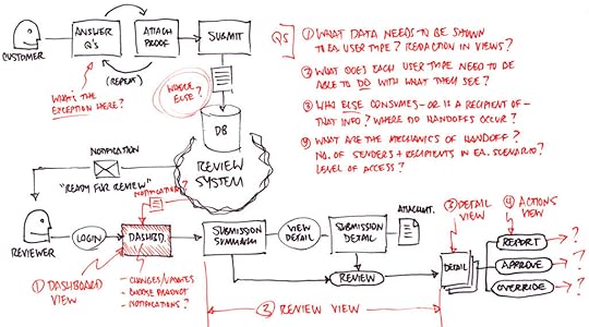
2. If there are multiple tasks, activities and processes, we go through each one. As they talk, we draw people, boxes, and arrows on a whiteboard that describe what happens, which usually looks something like this:

3. The only deliverable from these meetings is a photograph of the whiteboard, shared with all involved. The core process is usually in black marker, with problem areas and related issues or questions in red or orange. The color separation allows us to focus on those areas quickly when we refer to it later.
The visual representation helps everyone get to clarity much quicker than if they had to imagine it in their heads. It also gives the dev team the ability to confirm and correct as we go: “does it work like this?”
For now, forget formal use cases, forget formal diagramming methodologies and rules. Just draw it out and label who the players are and what they’re doing. As you draw, you ask questions:
What should happen here, and what actually happens?
What happens (or should) next?
What can (or should) the next person in the process do with what they have?
The whiteboarding exercise is a very simple way of getting a baseline for what gets created, what gets acted upon, and how it all moves through any particular process. We’re focusing on the people, their goals and how they do what they do every day.
When you’re done, it’s worth photographing the whiteboard for later reference.
At this point you may be wondering, “When does in-depth user research happen?” The short answer: later. While it’s possible to work preliminary user interviews into the first 48 hour period, these are cursory shots across the bow: short, 15-minute conversations to get a baseline for who does what with the tool at hand. But if that doesn’t happen at this point, that’s OK — and here’s why.
Some enterprise organizations are still reluctant to devote significant effort to user research and testing. We’ve know we’re short on time and resources, so we need to make every every activity and decision count.
So instead of spending a lot of time with users up front, we’ll break up our research into chunks, so (a) we’re not committing large blocks of time to this at the expense of iterating design or development, and (b) we’re creating a low-fidelity prototype to put in front of users, instead of asking them to imagine using it.
Day 3: Prototyping, Information and Action
While screen layout and interaction mechanics are legitimate concerns, the bigger fish here is the volume — and clear separation — of information and action.
Starting the prototype process early in a collaborative platform helps you come up with ways to separate the two as well. That matters a great deal, because this separation is the foundation of good UX and sound interaction design. Keep two things distinct:
Things the user needs to know, and
Things the user needs to be able to do.
Getting a handle on the relative importance of both is where you focus your effort. The latter is up-front and center; the former accessible but tucked out of the way and used only when needed — and in such a way that invoking it doesn’t obscure or compete with the user action.
You use the prototyping process to answer the questions that have arisen over the past two days of strategy discussions:
How much content and/or data do we need to expose?
How many different types or formats do we have (e.g. raw data, text, audio, video, etc.)?
How much of the data is static vs. interactive?
Where is it coming from — how many sources or systems?
How will people get to all of it?
How should it be organized, categorized and labeled?
What matters most to users, and in what order of priority?
How might we stand it up in the interface?
What interaction patterns match what the user needs or expects?
Is each pattern appropriate for the volume and type of content they’re manipulating or viewing?
You and I both know how easy it would be to spend weeks trying to formulate answers to these questions. But we also know that isn’t feasible, because we have neither the time nor the insight necessary to do so.
Instead, we quickly work towards a model that captures the volume of content and represents the ideal separation of that content from the mechanisms and controls. We’re working quickly to iterate and explore data types, navigation, labeling and interaction patterns. We’re socializing each iteration with our users, with the IT Managers or Account Reps responsible for helping them and/or with our stakeholders. We keep what works and throw out what doesn’t. Try, evaluate, revise.
We’ll use this artifact to guide everything that follows. We will absolutely revisit all of these questions as we test the prototypes with users, but we don’t wait for clarity before starting our prototype. We need to put something in front of people as soon as humanly possible to determine whether or not we’re on the right path.
For more practical advice, download the 91-page e-book Fixing the Enterprise UX Process by Joe Natoli.
The post The 48-Hour Rule for Enterprise UX Projects appeared first on Studio by UXPin.
How to Write Smarter User Stories for Product Design and Development

Most of you probably have some tried-and-true best practices that you lean on to formulate requirements and articulate what needs to be done.
In many cases, that may involve the creation of use cases and user stories. While both are valuable tools, neither go quite far enough in defining the problem and desired outcome. But as I think you’ll see, a very simple change in the user story format will profoundly impact the finished product.
For more practical advice based on 25+ years experience, download the 91-page e-book Fixing the Enterprise UX Process by Joe Natoli.
What’s Wrong With Traditional User Stories?
User stories aren’t flawed; they’re incomplete.
I’m not advocating doing away with user stories—I’m advocating that we make them more useful to our product teams.
User stories don’t describe a user’s entire journey from start to finish, nor do they consider the motivations or needs that drive the journey. Typically no more than a couple of sentences in length, they stop short of explaining how users think and feel, and they don’t address the business goals that should support every item on a list of requirements. As a result, user stories may inadvertently ask more questions than they answer.
I offer for your consideration a simple way to boost the power of your user stories: address the user’s goal behind the action, as well as how that action solves a problem for the organization. In addition, this simple change also illustrates the benefit the organization stands to receive from the user’s action.
Instead of:
“As a [ user ] , I want [ function ] , so that [ action ] .”
Write it like this:
“The [ user ] wants [ function ] to achieve the goal of [ user goal ] .
The current inability to do this is causing [ adverse effect ] for the organization.”
You can also substitute that last sentence with:
“Enabling users to do this would deliver [ specific measurable value ] to the organization.”
This changes the user story from a statement of fact to a statement of intent. It opens the door to a new question: “How do we do this in a way where we can track and measure its success?”
Remember, we’re talking about designing like a startup. All startups focus on the most important problem—the one with the potential to completely sink your ship, if left unsolved.
In this case, your overriding focus must be on the things that provide measurable value to users, and in doing so, back to the organization. It really is that critical to your survival and success.
Task Completion vs. Success
Traditional user stories operate at a very tactical level; the focus is strictly on task completion, but I have a problem with that. Task completion is not the same as success. If you want better UX, you have to focus on success, which is where the value I keep harping on about lives.
Uncover and incorporate how users feel about the interaction, along with their intended goal, the reason they’re doing it in the first place. You need to capture why a particular interaction or behavior provides a better user experience. You also need to capture why that experience, in turn, benefits the business.
Using the format above, your new user stories might look like this:
Task Completion
“As Jane the Bank Teller, I want a preset shortcut list of one-touch transactions so that I can complete more transactions.”
Success
“Jane the Bank Teller wants a preset shortcut list of one-touch transactions, to achieve the goal of getting customers through the line faster to minimize their frustration and automate lengthy transaction sequences. The current inability to do this is causing a significant percentage of customers to leave our bank for a competitor.”
For Jane, getting customers through the line and completing their transactions is task completion; she’s already doing that now. Doing this same task better (in a way that is more accurate, efficient, and makes customers feel like the process was pleasant and really fast) is success. And when people feel like they’re being taken care of, when their needs are met and expectations are exceeded, they remain loyal.
When you shift your focus from what people do to why it matters, both your head and your feet are firmly on the path to creating powerful end-user experiences.
For more practical advice, download the 91-page e-book Fixing the Enterprise UX Process by Joe Natoli.
The post How to Write Smarter User Stories for Product Design and Development appeared first on Studio by UXPin.
Rapid User Research for Enterprise UX: The 10-Minute Guide

Your mileage may vary, but my experience with enterprise organizations dictates there is usually little to no budget for true user research — meaning user interviewing, shadowing and/or direct observation of end-users.
Getting buy-in for these activities is time-consuming and difficult, and on a tight deadline we quickly realize there’s no time to educate management on user research.
So instead of just a “Sprint 0” where we carve out time and personnel for heavy upfront user research, we try a different tack altogether: we research early, and we revisit it often to continually narrow and qualify what we think we know and what we’ve learned along the way.
Here’s how.
For more practical advice based on 25+ years experience, download the 91-page e-book Fixing the Enterprise UX Process by Joe Natoli.
The 1-Page Summary
By the time a project kicks off, you’ve probably already discussed how proposed features and functionality will be used. There’s existing knowledge about user roles and responsibilities, and in most cases, some past use history that allows for educated guessing. This is what we think we know, because it has yet to be qualified.
Because it’s part of the project, our current hypotheses about user needs are worth documenting. But that documentation should be nothing more than a quick, one-page summary. Many organizations love big documents, but the truth is no one reads them. And most executives won’t read past the first page, ever.
Even if your organization mandates gargantuan documentation, create a table-based summary for each section. In terms of user research, my favorite approach is dead simple — a table with four columns:
Problem/Issue (what problems do we believe users have, that we intend to solve?)
Proposed solution (how will we alleviate those problems?)
Expected Result (what do we expect to happen [success metric] both for the users and the organization as a result of doing this?)
Related Requirements/Tasks/Activities (what do we think is needed in order to do this?)
If any of this takes up more than a single page, your scope is too large. You’re taking on too much with lines of inquiry that simply don’t matter.
In my mind, no matter what the document is or contains, these four components are what clearly delineate everyone’s marching orders. They keep all research related activities focused on value, allowing us to narrow the areas we investigate.
Break everything down to common-sense level, write so anyone can understand it. Dispense with industry jargon and big words.
Skip Traditional Personas and Get to Context Quickly
You’ll find plenty of prescriptions for personas, but they’re all essentially the same: laundry lists that suggest you can understand a person’s motivation simply by checking boxes and asking questions related to behavior.
We don’t have the luxury of time to start wide and rigorously work to separate fact from fiction. We need to be accurate in our first shot at describing user needs — which means it should be contextual.
The process includes two key steps:
1. First, develop empathy for the person. Empathy goes far beyond demographics, likes, dislikes, job roles and responsibilities. Empathy is about understanding the emotional drivers that affect the user’s behavior, because emotion will trump intellect in almost every user situation. Design for the emotion and you’re truly designing for a person instead of a collection of possible attributes. While that sounds intimidating, the truth is it can be done in 20 minutes — using what we call an Empathy Mapping Worksheet.

2. Next, uncover behavioral attributes that motivate use, in the context of a situation. What has the person just done or just finished doing when they encounter the product (site, app, tool)? What are they thinking and feeling at that moment, and how does that affect what they need to see or do, or how they act? What stress is present in that situation, and how does it affect the person’s perception and action? Sounds like a lot of work, but again, it typically takes no more than 15-20 minutes. The tool we use is called a Situational Mapping Worksheet.

Both tools are extremely simple and virtually self-explanatory, and you can learn more about them here.
Because we’re focused on context of use in both situations, our hypothesis are almost always more accurate than any traditional persona work. The enterprise teams I’ve worked with have found that combining this work with simplified user interviews (when possible) is a one-two punch that is extremely hard to beat.
Streamline User Interviews
When interviewing users, aim for the largest representative sample possible. The way you do that is by asking fewer, but more poignant and open-ended, questions.
Don’t ask them about the system at hand, or it’s features or functions. Those questions will focus the answers on the tool they’re using — instead of the process they follow. Any number of factors unrelated to the specific tool or even the task at hand may contribute to the current issue or problem. People might use workarounds to avoid using the system altogether. And if you ask a narrow question that’s tactic- or tool-specific, you’ll never hear about any of those things.

Here are the 6 core questions that typically prompt people to tell the kinds of stories that uncover problems and desired outcomes:
What constitutes a good work day for you?
How do you go about doing (name a specific process, task or end goal)?
Can you show me how you do that (if time allows)?
How does this compare to other organizations you’ve worked for?
What are the biggest problems, obstacles or inefficiencies you deal with in doing this?
What other things do you do before, during and after this?
Are there other questions you can ask? Of course.
But these six are worth their weight in gold, because they invite the kind of stories that quickly get to the heart of real obstacles. You want to interview as many users as possible, as quickly as possible, so stick to these six.
Here are some quick guidelines to make the interview process quick, focused and easy to manage:
Interview at least 3 users, but 5-10 is ideal. If you can’t get to 3, don’t do the interviews. Instead, start gathering a pool of people to test your prototype with. When you have less than 3 people, you won’t have enough data to disqualify the emotions and preconceptions that skew responses. What’s more, you won’t see a wide enough example of the diversity inherent in enterprise users.
At the same time, you may need more than 10 if you have multiple, specialized user groups. If a portal will be used by both accounting reps and development teams, these two groups have different motivations for use and different paths of use altogether.
Work to keep answer time for each question within 10 minutes where possible, because in most cases anything after that is repetitive information or ancillary detail.
Don’t expect to do all interviewing upfront. Your first set of interviews should happen in the first 48 hours, but they don’t end there. Interviews can and should coincide with post-requirements sprints, which often means two-week intervals.
If You Can’t Access End Users…
When you can’t get to the source itself, you need the next best thing — an informed opinion based on experience. Whether it’s an IT Manager or an Account Representative, find out who’s responsible for guiding end-users through the installation and configuration processes. Those people will be your user research champions, for two reasons:
They have direct face time with the people using the software, so they’re hearing a whole lot about what users like or find useful (along with what they don’t).
They have a vested interest in making sure the customer gets what they need.
People in these roles can help you connect the dots between the mechanics of product implementation and user needs. At the end of the day, it’s their job to make sure that people get things done efficiently with the software.
Any organization can pitch a product, but if users are unhappy after implementation, or if they create workarounds to avoid using the product, these folks are the first to hear about it. Because when customers are unhappy, contracts don’t get renewed. So in most cases, Account reps or IT Managers will be happy to have your help.
Offer to assist during the install, offer to make yourself available to answer any questions. Introduce yourself and relate that your job — just like theirs — is ensuring that employees are happy.
Validate User Research By Testing Lo-Fi Prototypes
Use cases and user stories should inform your requirements, but further testing/validation of those requirements should come from prototype testing.
A little later on, you’ll read about low-fidelity prototyping for requirements generation. In order to serve this purpose, our prototypes should expose the key screens in core workflows.
They should describe the content (text, images, etc.) and interactive controls (links, buttons, menus, forms, etc.) appearing on each screen. This is a two-step process: (1) iterate quickly and (2) socialize with users. And if you can’t find a minimum of 3 users for testing, dogfooding with 5-10 coworkers is equally valuable. Triangulated against the empathy and situation mapping worksheets, it’s possible to make reasonably accurate judgments about what’s appropriate and what isn’t.
The specifics of prototyping are covered in the coming pages, but we’re aiming for answers about the design’s foundation. In general, we’re asking if the navigation categories and interaction models we’re proposing are easily understood. We want to know if the visual hierarchy, information structure, navigation and workflow we propose:
Presents information users want and expect
Presents information in a way where they can easily find what they need
Uses labels users will readily understand
Allows users to easily and accurately predict the outcomes of their actions
Invite your stakeholders to attend the usability testing sessions. You’ll gain quicker buy-in for requirements decisions when they see firsthand where users struggle. User Stories (And Requirements) Are Not Created Equal.
If you asked me for the single, best piece of advice I have to offer, it would be this:
Not everything is worth doing.
Startup thinking is all about value—what matters most within the confines of reality.
Compare that to enterprise product development, where the number one problem is wasted effort — on things that don’t matter. We’ve all heard the excuses blaming time to market, customer responsiveness, Lean/Agile practices, or any number of misdirected justifications.
They’re all nonsense, because the simple fact of the matter is this: being first doesn’t matter if you’re delivering something no one wants, needs, or is willing to use.
Once you’ve tested your assumptions against users, filter all the ideas through importance and feasibility/viability. Take an hour to figure out what’s actually worth everyone’s time, effort, and the organization’s investment. Seriously, it doesn’t take any longer than that.
With the simple chart below, I’ve seen this exercise take all of 60 minutes in a room with 12 people and a list of 50+ requirements.

On one axis you have importance.
How important is the product as a whole to the business, to users, and to achieving the end goals?
To what degree does each individual feature and function fulfill needs and deliver value?
The second axis represents feasibility/viability.
What can we actually pull off in the time allocated?
Are the budget and resources (read: people) sufficient?
How much can we conceivably do? And if we get it done, how will we continue to maintain and improve the product?
Here’s how it works up close.
You poll the room for each user story/possible requirement. You ask about the importance to users and to our stated business goals, and can we do it? You graph the answer and then decide what to do according to its position:
Anything that lands in the lower left section is out. As in immediately. Otherwise you’re wasting time or money addressing things that (a) aren’t important and (b) probably aren’t possible. If a proposed requirement is of low importance and not feasible within your constraints, either postpone or scrap it.
Anything that falls in the middle section goes straight to the backlog. You could accommodate these items, but you shouldn’t spend the majority of your effort doing so. It’s unlikely that anything landing here is critical for users and the business. You may even have doubts about feasibility. These items don’t need to be perfect, just done.
Anything that falls in that top right area is what you commit to doing. That means you’re damn sure it’s important, and you’re equally sure it’s feasible. Design these items extremely well. Features and functionality in this category enable the product to serve as some kind of answer to prayer — and that’s where you’ll get the most return on your effort.
Even if this exercise takes up a full 8-hour workday, the wasted effort and potential disaster avoided makes it worth every minute.
For more practical advice, download the 91-page e-book Fixing the Enterprise UX Process by Joe Natoli.
The post Rapid User Research for Enterprise UX: The 10-Minute Guide appeared first on Studio by UXPin.
Preventing the Stakeholder “Swoop and Poop” in Enterprise UX

Stop me if you’ve heard this one before: You’re in the home stretch of development and heading toward launch when people in the organization you’ve never heard from suddenly swoop in and mandate changes to everything you’ve done.
Most of us know this scenario as the “swoop and poop.”
It happened because, from day one—from initial planning to requirements sessions to prototyping—they weren’t at the table. Perhaps they weren’t invited, or maybe they aren’t willing to make time to be “wasted” on project work.
Why do these hidden stakeholders have so much influence?
Because they carry the most risk. If the project fails, their necks are on the chopping block. They’re usually removed from the development process, which means they’re placing a very large bet on something they don’t know much about.
If you fail to recognize this—and proceed without their input—the above scenario will play out repeatedly. You’ll go down one, two, six, or eight sprints, and the scope keeps changing.
For more practical advice, download the e-book Fixing the Enterprise UX Process by Joe Natoli.
Involve stakeholders by calming their fears
It’s not unheard of for designers, developers, and organizations to get stuck in a cycle of endless iterations.
“I’ll know it when I see it” or “That’s not what I envisioned” are all running jokes, at this point.
This is often a ping-pong game of guesswork: the team is guessing at what the stakeholder wants, while the stakeholder becomes increasingly frustrated that what they’re seeing is not it.
Photo credit: Sumo Logic
What happens next is that team members start excluding the stakeholder from the process. Sprint plans include fewer iterations, and designs or builds are simply thrown over the fence for review, instead of taking the time to explain decisions.
Here are some tips that have helped my enterprise teams avoid these issues:
Invite them into the process early. You’d be shocked at how many times stakeholders aren’t involved simply because no one asked them. In at least half of the organizations I’ve worked with, they’re excluded (often on purpose). But the more you exclude them, the more concerned they become—and the more influence they try to exert as a result. So start by asking them to be involved. If you feel alienated from them, I guarantee you they feel the same way.
Explain that their vantage point is critical. Tell them you can’t do it without them. Invite them to share their pressure and pain, explaining that solving those things are part of the mission. Ask them what success means to them. In doing so, you are giving them a sense of control and ownership. They feel like they’re being heard, which is fundamentally a human need.
Educate them about the design process. Explain how their information integrates into your work. Fear comes from the unknown; fill in the blanks and the fear disappears. In many cases, it doesn’t take much to change a stakeholder’s position from critic to advocate. When that happens, they’re less likely to reject the results they see (and more likely to endorse your work to other decision makers).
When the Answer is Still “NO”
Yes, you will encounter situations where stakeholders will outright refuse to be involved. When this happens, you have one play left.
Request that all department heads be present for the first working meeting (and to me, they’re all working meetings).
With very few exceptions, you’ll hear some variation of “that’s unusual … we don’t normally involve everyone in these projects,” or “I don’t think that’s something we can afford to do.” You should expect this, so prepare to ask two very simple questions in response:
Over the last 3-4 internal projects, how many of them were significantly late and over budget?
How many of them failed to deliver the desired outcome, in the eyes of one or more of those stakeholders?
The answer to both of those questions is almost always some variation of “the majority of them.” When that’s the case, it’s also usually true that they weren’t involved upfront in any of those projects, either.
After posing those questions, tell them this is your collective opportunity to change the answer. With very few exceptions, this conversation will put you all on a path to capitalize on that opportunity.
For more practical advice, download the 91-page e-book Fixing the Enterprise UX Process by Joe Natoli.
The post Preventing the Stakeholder “Swoop and Poop” in Enterprise UX appeared first on Studio by UXPin.
UXpin's Blog

- UXpin's profile
- 68 followers

