
UXpin's Blog, page 115
May 15, 2017
The Persona of a Great Design Leader
It’s been seven years since I was a design leader for the very first time. Like most first time managers, I wanted it really badly. I wanted to grow the importance of design in the organization. I wanted to build a super star team. I wanted to serve our users.
And I wanted the prestige and power.
The last one is by far the worst reason to become a design leader. Ego is the worst reason to hold a management position. If everything is about ‘you’, then nothing is about your team and users. That’s not the way to lead the team to deliver great user experiences. That’s a recipe for UX disaster.
Don’t become a designer leader for the prestige and power. This energy burns quickly, leaving only egotistical habits.
It took me awhile to grew into the role and understand, even if slightly, what it really takes to be a successful designer leader. And just when I started to settle as a UX manager, I co-founded UXPin and had to quickly turn from a design leader to a business leader. Instead of being a design leader, I started to serve thousands of design leaders – UXPin customers.
This experience gave me a broader perspective on design leadership and. Now, 7 years later, I’m ready to share all the lessons and mistakes.
Who are the great designer leaders?
Design leadership greatness comes in many flavors, but at the core lies a common set of experiences and skills.
Great design leaders help teams and users meet their goals.
We might work in a completely different organizations and on completely different products, but some aspects of being a design leader remain the same:
1. Great design leaders are seasoned practitioners, ready to give up the craft.
I could imagine a great design leader who is not a designer at all. A person who can lead with love for design and designers, understanding of the process, and determination to build up the vision to help users. However, leading designers without experience seems like an enormous challenge in building trust and respect and might make part of the job very hard (giving tactical feedback, helping designers grow their skills). So while I can imagine a great non-practitioner design leader, I’ve yet to meet one.Typically great design leaders are experienced practitioners, who discovered they can do their job better by scaling through a team. Instead of designing directly the experiences of users, they do it indirectly, through shaping amazing teams. Growing their own design skills becomes secondary to the help they can offer to their teams. They gradually give up the design craft to grow the design efficiency of an organization.
Design leaders design indirectly – through the work of their teams.
Having said that – most design leaders, including yours truly, continue to tinker in small weekend side projects. Why? Because we absolutely love it.
2. Great design leaders are empathetic and generous with their time
The main task of a design leader is firing herself from a design job. The best design leader must become the worst designer on the team.
The key task of a design leader is to become the worst designer on the team.
Growing the abilities of the team is the shortest way to scaling design in an organization. Unfortunately, it’s not an easy task. It requires time and a saintly amount of empathy. You have to be there for your team and help them become much better than you are.
3. Great design leaders are preachers and listeners
In my experience, designers are typically more preachers than listeners. Even when we listen, we listen to make a comment. And when we make a comment, we want to be right.Being a successful design leader requires much more. In a way we have to apply the practice of user research to our teams so we can truly understand the problem. We have to listen.And our preaching becomes something completely different. Yes, to make the voice of design heard loud and clear in an organization, we have to be more outspoken. But it’s not our voice which should be heard. It’s the voice of our team.
Great design leaders listen to preach and preach to listen.
Design leaders should serve as loudspeakers for the team to amplify their message. At the same time design leaders should coach the team to listen to others and be empathetic.
4. Great design leaders are goal-oriented fighters
Great design leaders are fighters who tirelessly fight for the team and users. Both groups need strong advocates in an organization. Both groups want superb experience. It’s the job of the leader to remove all the obstacles.
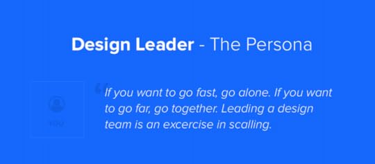
The Persona
When I realized that there’s so much that design leaders have in common, I decided to use a very familiar concept to illustrate it. I created a design leader persona.
Feel free to use it to shape your design leadership program, promote and hire design leaders, or simply use it as a conversation starter about design leadership.
Enjoy!

Putting It All Together
An African proverb says: “If you want to go fast, go alone. If you want to go far, go together”. Maintaining unity without disrupting efficiency is the pinnacle of work for a design leader.
The end game for a great leader is a successful team. A team that then consistently delivers valuable user experiences to the market.
The post The Persona of a Great Design Leader appeared first on Studio by UXPin.


Agile UX Virtual Summit 2017: Join 30,000+ registrants in the largest design event (online and free)

There’s lots of great design conferences, but not everyone has the time or budget to attend them.
So back in late 2016, we asked ourselves “why not create an online UX conference, sponsor it, and make it free for the world?” It was a crazy idea and a lot of work. But the idea took off — Enterprise UX Virtual Summit 2017 set a world record in February this year with 32K registrants and 11K attendees. We were blown away.
It was so popular that we figured it was worth doing again. This time, we’d tackle the challenge of Agile UX. Just like last time, we hand-picked designers and design leaders to present their case studies.
Spanning June 13–16 2017, Agile UX Virtual Summit features speakers from IBM, Fjord, Bloomberg, Hubspot, and Google Ventures.
Across four days, you’ll get advice from 17 speakers like:
John Zeratsky — Design Partner at Google Ventures and co-author of “Sprint: How to Solve Problems and Test Ideas in 5 Days”
Indi Young — Cofounder of Adaptive Path and author of “Practical Empathy” and “Mental Models”
Peter Merholz — VP Design at Snagajob and author of “Org Design for Modern Orgs”
Josh Seiden — Designer at Fifty2.co and co-author of “Lean UX”
Essi Salonen — UX Designer at Fjord
Erin Sanders Muntzert — Senior User Researcher at Google
Vera Rhoads — Senior UX Manager at IBM
Carol Smith — Senior UX Manager at IBM
Topics include: design sprints, Agile user research, Lean UX for enterprises, story mapping, product strategy, UX documentation, and more.
We’re excited to host tens of thousands of folks from around the world again. And we’d love to see you there.
The post Agile UX Virtual Summit 2017: Join 30,000+ registrants in the largest design event (online and free) appeared first on Studio by UXPin.
May 12, 2017
The Next Generation Wireframes are Microframes
Wireframes are dead! Interactive prototypes are everything!
We’ve heard these shouts for at least the past 7 years. If the popularity of these discussions prove anything, it’s that the opposite is true. The mere fact that we continue to discuss the alleged death of wireframing proves that wireframing is doing fine and continues to exist as part of design processes that fit, at least, some projects and some designers.
How has wireframing survived? It continues to evolve.
Wireframing might be a static asset, but it’s definitely not a static technique.
Long gone are the days of black on white wires built in Microsoft Visio or Excel Spreadsheets (yes, I worked with PMs who used to place wireframes in spreadsheets).
Wireframing Evolves
Today’s wireframing has been split into multiple techniques that serve different purposes, projects or preferences of designers.
Some designers like to gather early feedback with light weight interactive wireframes. Interactive wireframes are design deliverables that represent the high level architecture and the most basic interactivity. Created in the span of hours instead of days, they help with user testing and getting early buy-in from stakeholders. Interactive wireframes might be destroyed soon after their birth, or evolve into a completely different asset, but that’s part of the overall concept.
Wireframes are supposed to be short lived sketches. After their job is done they should be destroyed without a sign of a remorse.
Another version of a good old wireframe is a content wireframe. This static form serves as a structure used to plan content and information architecture before investing time and money into the rest of the interface design. This technique works great for content-heavy websites, which need a careful content strategy, before we, designers, get all creative with its form and beautiful looks. After all, content is king.
And finally, wireframes evolved into a form of even a lower fidelity. A form in which the format of a wireframe gets minimized, text is replaced by geometric shapes and every piece of the interface is simplified as much as its only possible.
And that’s my favorite new form of wireframing.
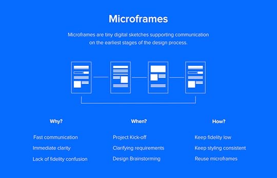
Enter Microframes
Microframes, or micro wireframes, are minified versions of wireframes. Through minimizing the effort, maximizing the speed and lowering the fidelity, microframes amplify the benefits of wireframing and eliminate most of the shortcomings.
Microframes are minified wireframes on steroids.
What are the benefits?
Speed. Microframes are as fast as sketching, but let you easily iterate on your work and immediately share the results with anybody, despite the location.
Clarity. Microframes clearly communicate plans and requirements and let designers iterate together with a customer towards the common vision, without overinvesting in disposable assets.
Lack of the fidelity confusion. Microframes cannot be confused with the final product, because their form is drastically minimized.
Microframes are also extremely flexible and can be used on their own, as part of a user journey chart, documentation or even as part of a project roadmap. They serve as a cheap illustration and a tool to enhance design thinking.
And guess what? You’ve been microframing for years. You were just doing it on a whiteboard. Microframes are digitized whiteboard sketches that we, designers, used all the time when brainstorming with colleagues and clients. Unlike your whiteboard drawings though, microframes are:
Easy to share
Optimized for speed and reusability
Yes, microframes are your whiteboard drawings optimized for speed, shareability and reusability
How to Microframe?
It’s very intuitive. If you try to fit your ideas into a 200px x 300px container, the microframe will naturally come to live. To increase readability consider the following:
Don’t use any text. Replace text by blocks symbolizing different level of typographic hierarchy.
Use different colors (shades of gray prefered) to symbolize logical pieces of the interface. For example – separate CTAs, navigation links and blocks of text by assigning them different, yet consistent, background colors.
Use icons to symbolize elements that can be easily confused with others. For example use image icon (classic landscape icon) to show where are you thinking about placing an image.
Skip details. You’ll have plenty of time to add them later once the concept is crystallized for higher levels of fidelity.
Once your basic drawings are ready, think what needs to be added to enhance their communication value. Text description? Flows? There are no rules here. Whatever serves the purpose is good.
Here’s an example of my microframe documentation and flow:

Micro Design Language?
To optimize your microframing process for speed and reusability you have to create your micro design language. Think about a convention that works for you and recipients of your work. Document it.

Just like with a full-size design, you should start with the foundation and gradually move to higher level structures (if you’re interested in building a full scale design system – I’m sharing my experience in this series of posts). Take all your text blocks and tiny patterns and turn them into symbols, nest them in your microframes and turn them into symbols as well.
You can get a glimpse of the microframing process here as I play around with design systems libraries and symbols in UXPin: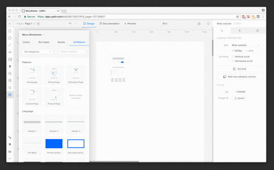 UXPin Symbols can be used to micro wireframe
So Is Wireframing dead?
Definitely not.
Wireframing won’t die as long as we need ways to quickly create and share digital sketches. Creating micro wireframes only enhances the communication and creativity of the team without sacrificing the speed of the process.
We’ve recently really fallen in love with this little deliverable at UXPin. Just this week, it’s helped our Mountain View team to communicate concepts for a new landing page with our Polish team.
Hopefully you’ll find it useful too!
Join the world's best designers who use UXPin.Sign up for a free trial.Your e-mailTry it for free!
The post The Next Generation Wireframes are Microframes appeared first on Studio by UXPin.
May 10, 2017
Deal With It: Break Established Design System Rules and Integrate the Results

Some rules exist to support the rule-breakers.
Design systems are products that enforce consistency while expediting development. They manage all that with proven design patterns and tested code snippets. But the default parameters don’t always cover every case. When the built-ins fail, it’s time to step out — intelligently.
When elements get lost, design comes to the rescue
Websites that are designed to convert casual browsers into paying customers face the challenge of telling people how to do so. The more a page needs to sell its product or service, the more information it requires. This can bury the call to action, no matter how much it shouts.
This leads to problems like, “Our user testing revealed that people want this signup form, but don’t know where to look. We think it’s obvious, but apparently not.”
Natural variations are part of the design system
Design systems are places to start, but variations naturally arise as you apply them to real-world projects. Buttons become “submit” or “search” or “cancel.” Icons change color based on context. Each level-1 heading contains its own text. Almost every time designers apply a pattern, they’re applying a starting point. Patterns are templates upon which designers create their products, not the final results.
So patterns should be flexible enough to allow for changes while including parameters about their max/min size and how much “stuff” they can hold. They also need to describe other changes that are allowed — and under what circumstances. In the signup form example, the design system allows for a larger-than-normal header. It’s a variation on the “Input Form” pattern that requires more attention than average.

So a designer breaks from convention to make the form stand out, right? Wrong. They should change the pattern to allow for an eye-grabbing variation, and apply that to their project.
It’s a truism that design elements are rarely used once. Being able to reference a pattern — including its exceptions — saves effort next time someone on the design team needs to make a form stand out. Design systems exist to keep a visual language understandable. The goal is to invent a pattern that breaks certain rules while adhering to the spirit of the system.
What might change?
Down to brass tacks. Or steel ones, or blue ones, or red ones — what variations should a pattern allow? The answer varies (ahem), but a few rules of thumb will help you make more robust design patterns.
Contrast: Higher contrast implies importance, while lower contrast demands less attention. Like elements in HTML, a few levels of priority will help most visuals find their place in a page or view’s hierarchy.

Dimensions: Small, medium, and large versions of a pattern provide the flexibility to work in a variety of layout configurations. If a given page or view doesn’t have room for the “default” size, then the try the pre-built smaller version.
Text weight: Like contrast, thicker letterforms imply dominance. But should a pattern allow different weights like bold or light when it also allows for higher contrast via color? Consider how many options are too many for the same job.

Single vs. multiple colors: Several colors in the same element can add a “wow” factor that one color can’t do alone. In gradients or in flats, use multiple hues (or values of the same hue) to make an element seem more sophisticated than its monotone brethren.

Layout grid: A standard horizontal grid, like those found in Bootstrap and Foundation, forces elements to match each other’s widths. In doing so, they create natural consistency of which you can take advantage. For example, leave the outermost columns empty until you need a break-out element. You can also twist an element to jump outside its gutters, defying the rigid layout rules.

How stand-outs fit a design system
Let’s say our hypothetical Call to Action pattern gives designers a choice between two widths. The design system also has several types of buttons. All of them obey the harmonious color scheme. That’s the problem.
To fix it, first we experiment with colors not in the scheme. Which ones complement the existing hues and values well?

Next we run it past our team members. If you’re lucky enough to have someone responsible for the design system, submitting your new button color for review is straightforward. If not, seek input from your peers both to borrow from their tastes — and to build a sense of ownership. Collaboration is important for a design system to succeed.
If the button color wins approval, then make it an official part of the design system. Then don’t forget to note the reason it exists — to grab attention when you need users to act on a busy page — and the date or version so you can test its value later.
If you can, A/B test the form to discover whether or not the color helps. You may need to adjust the hue or value for greater impact, in which case your design system should change as well. Throw out the old color, or mark the new one as a new version.
No matter how you slice it, this process keeps a new variation of an existing pattern in the system without stepping too far out of bounds. In fact, it changes the bounds to accommodate for better design based on proven needs: “our form is not converting.”
How stand-outs stand out
Common sense says that the less something seems to fit, the more attention it gets. But there’s another key factor: the more consistent the rest of your DS is, the more blatant attention-grabbers will be, even if they don’t use tricks like eye-bleeding colors or annoying animations.
The example site used mostly warm colors, so making the call-to-action form’s button helps it to stand apart.
But look at the big picture. From top to bottom, the page bathes its veneer in Earth tones. The more it does so, as opposed to a medley of hues, the more that bold green will stand out.

Write rules to break, then integrate
Consistency is great, in part because people don’t have to re-learn what things mean in a digital product. But sometimes you have to stand out. That means either breaking a pattern or, better yet, having a pattern that stands out for the purpose of grabbing attention.
Join the world's best designers who use UXPin.Sign up for a free trial.Your e-mailTry it for free!
The post Deal With It: Break Established Design System Rules and Integrate the Results appeared first on Studio by UXPin.
May 3, 2017
How to Use Minimal Design to Create Practical Design Systems

Design systems can help teams start great products. But designers sometimes forget that the system itself is a product worthy of attention. Like any project that involves UX, design systems must solve people’s pain points, like being able to find the right pattern under deadline pressure.
Design systems are the building blocks of digital products’ interfaces and behaviors. Making a system usable will encourage people to use it often — and help them design in appropriate ways.
Know your audience, know your goals
As with any design project, knowing your audience and how they use the design system — actually use it, not how you’d like them to use it — is critical to success. Yes, design systems benefit from user testing too. We’d hope that users would use a web app or site the way we plan, but that’s not always the case. User testing reveals how people defy our unconscious assumptions. Likewise, design systems need to bear in mind how people will use it.
Two things to consider:
What do people need when they’re stressed? Designers working under deadline pressure or debugging a live project need to get a component or pattern in a hurry. The best design systems give harried people what they need, and nothing else. If you design for people on rush jobs, then people under less stress will benefit all the more.
Are they new to the project — or even the company? While new team members don’t need hand-holding, exactly, they do benefit from copy that spells out a pattern’s purpose in a sentence or two. Three, tops.
Organized into four broad topics, everything about LinkedIn’s publicly-available brand guidelines helps newcomers understand their do’s and don’ts. Members of the press, for example, need more than the downloadable assets. They need instructions about the assets’ use.
Making a design system well-designed
From typography to layout to color, DS designs follow the same rules as any product design. And because many design systems for digital products live online, we can narrow it down to the rules of website design.
Uncluttered: Visual design systems work best without added decoration that detracts from the components they present.
Consistent: Don’t make people guess what various icons mean in different contexts.
Accessible: Good design systems work well across a variety of browsers, screen sizes, and interfaces.
Design systems also have their own unique traits.
Hassle-free to edit: The right people shouldn’t have a hard time making appropriate updates as needs arise.
Versioned: Is this component off-brand, or out-of-date? Dating or numbering patterns will help you keep things current.
Available: Your stakeholders, if not the general public, need an easy way to reference the design system online or in print.
The general idea is to let a design system’s examples speak for themselves against a blank or single-color background. You’re designing the content, not the chrome, of a living document. While Asana is well-known for its colorful look, its style guide fills space with usable information organized with whitespace and minimal typography.
What information should go into a design system’s design?
Live, visual examples are musts in design systems, especially if they’re online. Bonus points if interactions really interact with user input instead of plain screenshots, although those are valid as well.
For example, PatternLab’s demo includes a feature that lets design teams test components’ responsiveness against various screen sizes with discrete buttons at the top of the screen.
Another requirement is the code behind each component. Whenever possible, include HTML, CSS, JS, Swift, C++, Java, or whatever code is appropriate. The ability to copy/paste a component’s code into a project makes it handy; the ability to copy code with push-button simplicity saves time and helps ensure accuracy. Our own Spec Mode feature lets design teams copy relevant snippets by selecting the element they want, then clicking a handy “copy” button adjacent to its code.
Use cases are less obvious but surprisingly, well, useful. A good use case — “best used under these circumstances …” — not only describes the component’s intent, but also under what circumstances the code, if any, was written to work.
Salesforce’s Lightning design system does all of this — plus a little extra, by color-coding its code snippets, describing accessibility features, and warning people about compatibility issues.
How many notes are too many? As you might expect, the answer depends on the complexity of what’s getting described. In general, more sophisticated components require more notes about their use cases and caveats. A typical Lightning component like the “menus” section includes how its code functions, including a table about variations in the HTML, their purpose, and what to expect.
Organizing a design system
Like any reference, a well-designed design system is only as useful as its structure. In general, a system should be browsable, searchable, scannable, and sensible.
What makes a design system “sensible?” Ideas about common sense vary, but most systems we’ve seen organize their content into topics like “forms” and “headers.” Once again, user testing comes to the rescue: watching people strive (or struggle) to find what they need will inform how you should organize a design system.
ZURB’s PatternTap accomplishes this with a taxonomy of tags that cover everything from type to mood to size to color. And since it’s not specific to any project, PatternTap’s comprehensive search feature reaches into related “library” items as well.
Going forward
Remember that design systems are living products that need as much design polish as the projects they support. Their UX is just as important as the projects they support, especially when the team using it is under pressure to get the job done. Making a system usable will encourage people to use it often — and keep using it appropriately.
The post How to Use Minimal Design to Create Practical Design Systems appeared first on Studio by UXPin.
May 2, 2017
Have Your Say With Our Reader Survey

Hello designers and product teams! In our ongoing efforts to provide relevant and useful content, we’re conducting a survey to find out what interests our blog readers.
Please take a minute — seriously, it’s only six questions — to tell us what you’d like to learn about so we can research and provide material that will boost your skills.
Create your own user feedback survey
Join the world's best designers who use UXPin.Sign up for a free trial.Your e-mailTry it for free!
The post Have Your Say With Our Reader Survey appeared first on Studio by UXPin.
May 1, 2017
Tweak Your Buttons for a Design System With Some Leeway
Not every button has to look the same, especially in hi-fi prototypes where the nuance between “save” and “submit” is fuzzy at best. That’s when you should customize buttons to fit your meaning.
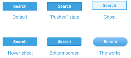
Buttons’ styles also need to reflect their surroundings to stay on-brand. If your user interface has a slight gloss or texture, then your buttons should too. How they’re allowed to change is part of a design system.
Designing a system
The trick is to figure out what should remain the same, and what’s allowed to change. Text is obvious — the same style button can say either “submit” and “create.” But what about color? If one button is green and another red, what makes still them feel like part of the same design?
Only you can decide how the design system should work. But you might consider using some of these to establish a general button-y look.
Border radius: Make buttons look like more than content boxes with a slight curve — or a major curve that turns them into round-edged pills.
Colors & gradients: Boxy or not, you can make buttons stand out from other elements by giving them a contrasting hue and value.
Shadows: “Make it pop” might make designers cringe, but having an element seem to rise off the screen isn’t a bad idea when you want it to get attention.
Text size: Boost buttons’ characters to make them more prominent than their surroundings.
Check out the live demo to see examples.
If some of the above make buttons look like buttons, then what’s left to design?
Color: Once you’ve established a default button color in your design system, also decide what other hues and values buttons can assume based on context or function.
Size: Big buttons mean business. Small buttons, not so much. Allow yourself some variation in buttons’ maximum and minimum dimensions to make some look more important than others.
Font weight: An often-overlooked button attribute is how thick its characters are. Like size, you can use bold or light typefaces to indicate importance or get more attention.
If you’re making buttons in UXPin, you’ll find all of these properties in the right-hand panel of the UXPin editor. But UXPin or not, establishing conventions of “should” and “shouldn’t” will help buttons in your design systems look like siblings — or at least close cousins. Guidelines were made to be flexed.
The post Tweak Your Buttons for a Design System With Some Leeway appeared first on Studio by UXPin.
April 24, 2017
Simulating Data-sorting in Prototypes Adds Interaction Where It’s Needed

Many design systems include simulations of their interactive widgets, although they stop short of providing real content. That’s not their job. Their job is to play what-if.
For example, while many prototyping tools won’t sort data on your behalf, you can create a “sortable” table, if you don’t mind rearranging a few elements.
Sortable tables rearrange content when people click on their headings. They’re not impossible to simulate — far from it. Here are five steps to building sortable tables.
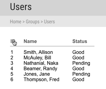
1. Create random content in rows and columns
In a prototyping or design app, make each table column its own text element. Although in some cases you’ll need a ton of content, for brevity here we’ll only create six rows with three columns. Give them sensible names like “ID”, “name”, and “status”.

2. Make column headings
Give each column a title, analogous to a element in HTML. As before, make each heading its own text element. Adding a dividing rule line is optional — use your best visual judgement as defined by your design system’s typography guidelines.
The more specific your design system is, the more specifically you can name the columns. For example, if a system spells out how special components should behave, like lists of users or a category management system, then your system should include those headings. However, if “sortable table” could apply to anything, then generic headings are best. Don’t forget to spell out what’s allowed in the component’s notes.
3. Give the element states per column
Select all of the table data, and make a multistate element. Create one state per column, named to reflect their heading. In this case:
“Sort by ID”
“Sort by name”
“Sort by status”
I also recommend you name the multistate element something like “sortable table” so you can easily find it when assigning interactions in step five.
4. Rearrange the content per state
Alphabetize or sort by number the content in each state, according to its column.
5. Make the headings clickable
Use interactions: “set state” to each state to which the column heading refers. (You did name the states in step three, didn’t you?)

Designing data
More than mere visuals style guides, good design systems include simulations of their interactive widgets to play what-if: what if someone clicks this? How should the system react? The simulated solution that suggests answers is just a few states away.
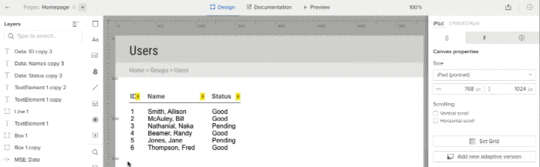
Demo
Check out this live sample to see it in action, then grab a free trial to try it yourself.
Join the world's best designers who use UXPin.Sign up for a free trial.Your e-mailTry it for free!
The post Simulating Data-sorting in Prototypes Adds Interaction Where It’s Needed appeared first on Studio by UXPin.
April 19, 2017
How to Write Killer Copy That Improves Your Design Systems

Documentation. Most people see it as a chore, like cleaning out email spam: an unnecessary irritation that detracts from “real” work. But writing notes in design systems is as important as the visuals themselves. And it’s not hard.
Think of documentation as writing commit notes in git. You know it’s important, but you can read the code to see what’s changed, right? That’s not always the case — and neither is glancing at visual patterns in a design system to tell what’s what. In this article we’ll cover ways to turn mundane documentation into useful notes that help your design systems in the long run.
The “so what?” factor
Redundant or similar patterns lead to inconsistencies and confusion, resulting in a slightly sloppy end product. If you’re concerned with pixel-perfect or responsive web designs, then you need more than precise Photoshop or Sketch files. You need to understand each pattern’s intention, its reason to exist. Every pattern in a design system should have a unique role.
Documentation reflects this. If you can’t write down why a pattern is in your design system, then do you need it at all? One way to find out is to list instances where your team has used it. A zebra-striped table, for example, might appear several times in a web app. Could another pattern have replaced it? Probably not since only tables display tabular data. Therefore the purpose of a table pattern’s alternate striping is to help people discern rows (or columns) at a glance.
Notice that “a table supports tabular data” isn’t a good purpose. That function is obvious. The table’s design solves a readability problem, as documenting its unique look explains.
What to write
Writing notes is more than jotting a pattern’s name and visual description. Three bits of information will make documentation as useful as the pattern itself.
What makes the thing you’re documenting unique? Each pattern needs its own purpose. For example, “Use this button to more attention than ‘cancel’” or “Use this panel when you need to make something look draggable.”
What are its parameters? How much content — text, images, media dimensions, etc — will help others decide if this pattern is right for them. Describe the most and least material it can contain, and how far it’s designed to stretch. If a calendar widget can only stretch across three columns before looking silly, for example, then you need to write that in its docs.
When was it made? Dating or versioning your patterns will help your team (and your future self) decide if the pattern is due for an upgrade, and which was built solidly enough to stand the test of time.
A documentation template
Still stuck for what to write? Try filling in these blanks: “I designed the (name) pattern to (goal). Use this pattern when (purpose). Intended parameters: (specs).” Some examples:
“I designed the Primary Button pattern to make calls to action stand out from other buttons. Use this pattern when you want to encourage reluctant people to click. Intended parameters: One column wide, 30–40px tall.”
“I designed the Intro Paragraph pattern to show readers where to start reading. Use this pattern when the top of your blog design looks cluttered. Intended parameters: three to five columns wide, 40–60 words long.”
“I designed the Feedback Notice pattern to tell users the results of their actions. Use this pattern when you need to inform them that hitting ‘save’ worked, or when an error occurred. Intended parameters: 10–12 columns wide, 60px tall. Use brand ‘blood orange’ for warnings, brand ‘forest green’ for success.”
“I defined the ‘Forest Green’ color as a way to stand apart from brand ‘sky blue’ for people with vision problems. Use this pattern when you need a cool color that contrasts well with the background. Intended parameters: #33691E.”
Tips
Write well. Compose two to three complete sentences per item, tops. Words are useless without context, so don’t settle for vague phrases. Thorough design doesn’t stop at the pixels. Content counts.
Consider SEO. The easier finding patterns is, the more likely people are to stick with a design system. To that end, remember that search engine optimization isn’t just for Google. It’s for any search tool — including the one in your design system, if it has one. And if it doesn’t, SEO means how well headings are to manually scan. Keywords are the key.
Review with teammates. Ask someone else’s opinion: does this make sense? What is it lacking? Like any user testing, getting an outside opinion will reveal dangerous assumptions in your thinking.
Stick to the topic. You don’t have to write a pattern’s life story to give people the gist. Most people referring to a design system just need one thing, and they may be in a hurry. Don’t wander onto tangents. Most kittens are fuzzy.
Building a stronger design system
Documentation may sound like a chore, but it’s a vital part of creating a design system. Spelling out each pattern’s purpose and best-use case will help your whole team understand not only the value of that pattern, but the value of your design system overall. Refer to these notes as you write yours.
Join the world's best designers who use UXPin.Sign up for a free trial.Your e-mailTry it for free!
The post How to Write Killer Copy That Improves Your Design Systems appeared first on Studio by UXPin.
April 17, 2017
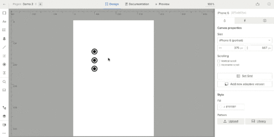
Don’t Settle for Default Radio Buttons — Make ’em Your Own

Not all assets are created equally.
Every design system has its own style, whether it’s based on an existing framework or completely home-brewed. For example, some systems for websites and apps rely on plain HTML elements and let the browser display whatever they’re programmed to display. But they don’t have to.
Take radio buttons. Radio buttons let people select one option from a series. They’re long-standing HTML elements that every major browser renders with ease. But certain looks, like Google Material Design Lite, don’t follow browsers’ built-in radio button styles.
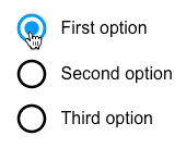
If you want to stylize your forms, here’s how to make your own radio buttons.
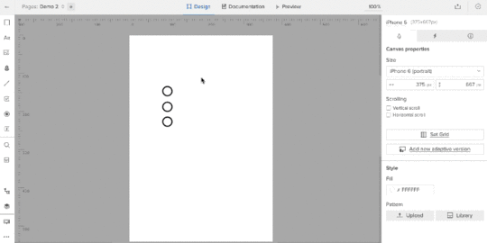
1. Find radio elements
Aside from the traditional ones, many graphic radio buttons exist. Look no further than Google’s own set — of which you can find as simulated, colorable vectors in UXPin. Create one in your tool of choice and copy it for each option you want to give users.
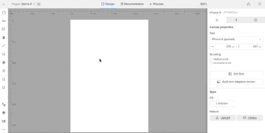
Color them to suit your needs (although for demo purposes we’ll stick with black). Then repeat the process with three “on” buttons, placing them on top of the “off” buttons.
2. Create states
Each radio button has two settings: on and off.
In UXPin, select all pairs of radio buttons and give them two more states, turning them into a multistate element (MSE).
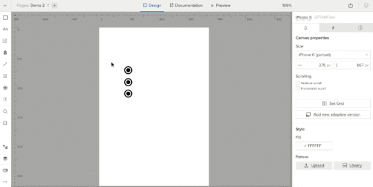
This turns the six radio buttons into one “element” with three views, one for each active button. But you need to edit each state to reflect that. To do so, go through each state and hide the appropriate radio buttons using the left-land layers menu.
3. Add interactive hotspots
Hotspots are invisible layers that act as triggers for interactions. Since the entire set of radio buttons is effectively one design “element,” put a hotspot over each radio button and its label. Then add an interaction to each: on click, set state of “Multistate 1” to state 1, 2, or 3, depending on to which hotspot you’re adding the interaction.
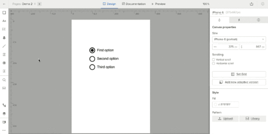
The result: a set of radio buttons that fit into your customized design system better than plain ol’ HTML-based elements.
Every design system has its own style, whether it’s based on an existing framework or your own design. Some systems for websites and apps rely on plain HTML elements and let the browser display whatever they’re programmed to display. Others, like the custom set you’ve seen here, enhance your design system with its own aesthetic.
Join the world's best designers who use UXPin.Sign up for a free trial.Your e-mailTry it for free!
The post Don’t Settle for Default Radio Buttons — Make ’em Your Own appeared first on Studio by UXPin.
UXpin's Blog

- UXpin's profile
- 68 followers

