
UXpin's Blog, page 117
March 20, 2017
Tips on Asking for Feedback in UXPin

UXPin’s preview mode is great for soliciting feedback. But leaving stakeholders to their own devices can give too many random opinions, and not enough constructive criticism. In short, “what do you think?” often results in bland, unhelpful, off-topic comments.
Here are some tips to get great feedback:
State your goals. Telling stakeholders “I’m going for X” or “I want to achieve Y” helps them to frame responses in ways that keep the conversation on topic. Learn more about goal-setting at SurveyMonkey.
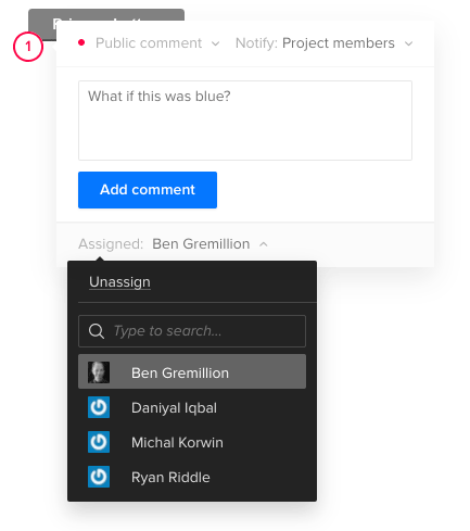
Assign comments to someone. UXPin lets you indicate who should address certain points of feedback. Learn more about assigning comments in the UXPin User Guide.
Set a deadline. I’ve found it helpful to ask for feedback by a certain date, both to encourage timely replies and to keep a project moving forward. Think of it as agile sprints for opinions. Learn more about working under tight deadlines at UXPin.
Figure time vs. benefit. Make a graph with time to implement on one axis and benefit to users or the business on the other. Then jot key words or phrases that summarizes each bit of feedback on the graph. Prioritize items that are easiest to implement and most beneficial first. Learn more about data visualization tools at Creative Bloq.
Ask the right people. Chances are, not everyone in your organization needs to weigh in on a design in progress. Ask as few people as possible, like one of your peers, your creative director, or select beta testers to keep from getting overwhelmed. Learn more about getting feedback at ZURB.
Take feedback seriously, but lightly. Feedback is loaded with personal views. People’s comments are suggestions that you can weigh against your own judgement. For example, just because someone likes blue doesn’t mean you have to change to fit their preferences. Learn more about judging feedback at Inc.com.
“Perfect is the enemy of done.” Sometimes meeting deadline is more important than getting everything perfect … whatever “perfect” even means. If you iterate on feedback more than three times, maybe it’s time to move on. at Six Revisions.
Solicit great feedback from your team with a free trial of UXPin.
Join the world's best designers who use UXPin.Sign up for a free trial.Your e-mailTry it for free!
The post Tips on Asking for Feedback in UXPin appeared first on Studio by UXPin.


March 15, 2017
How to Prepare for the Freelance Design Life

Going freelance is a risky business. Designers who want to switch from full-time to independent work face many hurdles, some of which begin long before the designers are prepared.
According to the US Small Business Association, about 50% of new businesses fail within five years. That number will likely increase for designers who set out before they’re ready, or who underestimate the amount and type of work involved.
But designers who wish to freelance can take steps that mitigate the chances of failure by following simple advice.
Don’t neglect the business side of freelancing
Designers should go into full-time freelancing with their eyes open. For example, knowing that the business itself occupies more time than most expect can help them find their daily, weekly, or monthly rhythm.
Ilise Benun (@ilisebenun ), Author, Speaker and Founder of Marketing-Mentor.com, knows this well. “Business tasks could take 30–40% of a designer’s time, including email, marketing, project management — all the things you don’t get paid for,” she said in a phone interview. “Some people say, ‘Well, I’m getting paid so that’s the priority.’ But marketing is an investment. I advise my clients to spend the equivalent of one day per week marketing themselves.” Many of her clients do just that, dedicating a single day per week to self-promotion and bookkeeping rather than breaking their flow for a few hours per day.
No matter the when it occurs, knowing how much time each project is taking is critical to success because bookkeeping can warn designers when a given project is running over budget. But when it comes to taxes, Ilise said there’s only one solution.
“Do your own bookkeeping if you can. If not, you need a separate person. But definitely find an accountant,” she said. “Don’t do your own taxes.”
Earning clients at pace
A sudden switch to freelancing is less likely to succeed than a gradual move. Ilise recommended doing side jobs before taking the plunge. And should you make the leap, you can’t expect it to happen automatically. Building a network and reputation is vital before starting a business because getting clients isn’t easy.
“People don’t realize how much time and effort it takes to get clients you want,” Ilise said. “I have a pet peeve. When people ask how to get work, word of mouth isn’t actually a marketing tool. You can ask for referrals and will probably get them from people you know, but when you do, the person referred may not have a need for you.”
At the same time, such leads aren’t without value — if a freelancer is willing to keep the relationship going. Just because someone isn’t interested in a freelance designer’s services at the time doesn’t mean their needs won’t change in the future.
“I think (freelancers) misunderstand silence or a ‘no.’ They assume the referral is not interested. Stay in touch with them — it might turn into something later,” Ilise said. “Money in the bank is helpful, but it’s better to have that network.”
Working on the side requires dedication
Employers may not take kindly knowing that one of their designers is looking to freelance. But a new trend is emerging. Designers are switching between freelance and full-time work more frequently than in past years, Ilise said. Making the switch repeatedly is a good way to keep one’s network going, although it reinforces a common notion about freelancers and their work ethic.
“Freelancers have a bad rap,” Ilise said. “People assume they’re unreliable or flaky. They have to overcome that preconceived notion by over communicating and over reliability.”
So it’s no surprise that extra work is involved, keeping designers active in the community and nimble in their self-promotion, even during full-time jobs — not to mention possibly working on the side without creating conflicts of interest.
“The way that works is if you keep freelance business going. That way you don’t have to start from scratch,” Ilise said. “Keep cultivating your network and keep your portfolio up to date.”
So what’s a freelancer’s time worth?
Money is a sensitive topic, especially for many new freelancers. Setting expectations too high is one concern. Having to pay rent is another.
“I’m a proponent that your hourly rate is not your price (per project). You can use it to determine your price, but it’s about negotiating with each client,” Ilise said.
Freelancers know what they need. Clients know what they’re willing to pay. Finding middle ground that satisfies both parties isn’t easy for new freelancers, who often price themselves under what they’re worth. Ilise has a solution.
“Here’s the trick for that: you ask the client for their budget. They’ll stop if they don’t have numbers. So ask if they have $500, $5,000, or $50,000. That restarts the conversation,” she said.
Gauging estimates by orders of magnitude may seem extreme, but Ilise said having a ballpark figure will give everyone a sense of the project’s scope that will lead to a fair price.
Taking the plunge
While no advice can substitute for practice and experience, new freelancers can prepare for success by deciding what it looks like. The old adage, “begin with the end in mind” rings true for people whose career no longer depends on meeting quotas or filling out time reports.
Almost by definition, freelancers risk a lot in starting their own business. Those who wish to try can take gradual steps to improve their odds of success.
The post How to Prepare for the Freelance Design Life appeared first on Studio by UXPin.
March 13, 2017
How to Make Expanding Buttons
Calls to action should excite people into doing something. Yet many form buttons do little to encourage the mood. Making buttons change color on hover is easy — and overused. Buttons that swell as people interact with them have a little extra “wow” factor.
They’re also easy to simulate in UXPin. Here’s how you can build one yourself.
1. Create a button
Search for the button element. Add it to your canvas and take note of its dimensions. If you choose to have round corners, no worries — we’re only going to change its dimensions and position, not its stylish attributes.
2. Move it slightly
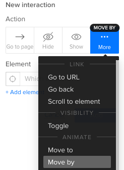
Add a simple interaction that, on hover, moves the button -6 pixels horizontally and -6 pixels vertically. Be sure to use the “move by” action, not “move to.”
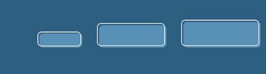
3. Make it grow
Add another interaction that, on hover, expands its width and height by 12 pixels each way.
[image error]
Customizing the effect
Six pixels is arbitrary. If you want a different size on hover, then use different figures. The key is to make the resize action twice the move. For example, if you move the button up and left by -4 pixels, then you’ll need to increase its width and height by 8 pixels.
Why not use an advanced animation? Because they’re trickier to reposition. If you decide to move the button after the fact, the animation won’t move along with it. Using the “size” and “move by” actions, your button is sure to keep its expanding effect no matter where you put it.
Grab a free UXPin trial to simulate buttons that excite people.
Join the world's best designers who use UXPin.Sign up for a free trial.Your e-mailTry it for free!
The post How to Make Expanding Buttons appeared first on Studio by UXPin.
How to Make Expanding Buttons in UXPin
Calls to action should excite people into doing something. Yet many form buttons do little to encourage the mood. Making buttons change color on hover is easy — and overused. Buttons that swell as people interact with them have a little extra “wow” factor.
They’re also easy to simulate in UXPin. Here’s how you can build one yourself.
1. Create a button
Search for the button element. Add it to your canvas and take note of its dimensions. If you choose to have round corners, no worries — we’re only going to change its dimensions and position, not its stylish attributes.
2. Move it slightly
Add a simple interaction that, on hover, moves the button -6 pixels horizontally and -6 pixels vertically. Be sure to use the “move by” action, not “move to.”
3. Make it grow
Add another interaction that, on hover, expands its width and height by 12 pixels each way.
[image error]
Customizing the effect
Six pixels is arbitrary. If you want a different size on hover, then use different figures. The key is to make the resize action twice the move. For example, if you move the button up and left by -4 pixels, then you’ll need to increase its width and height by 8 pixels.
Why not use an advanced animation? Because they’re trickier to reposition. If you decide to move the button after the fact, the animation won’t move along with it. Using the “size” and “move by” actions, your button is sure to keep its expanding effect no matter where you put it.
Grab a free UXPin trial to simulate buttons that excite people.
Join the world's best designers who use UXPin.Sign up for a free trial.Your e-mailTry it for free!
The post How to Make Expanding Buttons in UXPin appeared first on Studio by UXPin.
March 8, 2017
People Will Forge Their Own User Flows — and Design Should Follow Suit

Users’ interactions with your digital products can travel down bumpy roads. People may encounter obstacles to finding the information they want, sometimes driving them to your competition. Design can help. Solid user flows are the key.
Mapping a typical user flow shows how people move from one touchpoint — a moment in their interactions with your brand — to another. They also describe how they feel at any given moment, and where people are likely to leave. These insights are great for improving how people feel about your organization. What makes them happy, and how can you keep them that way? When do they get confused, and how can you prevent it?
Here are four tips to improve your user flow.
Follow known paths, not ideal ones
Especially when your site or app already exists, use analytics to figure out the routes customers are taking. When you match your workflow to what comes naturally to them, they’re more likely to stick around.

User flows like this example from Google Analytics visually represent how users navigate through your site, where they come from, and at what points they leave.
Determining where users enter and leave is harder to do when you’re starting a project, and easier to track if you prepare from the start. But in both cases, it means collecting data — the more, the better. The sooner you start tracking how customers navigate a site or app, the sooner you can start tweaking your ideal user flows to match reality. User flow diagrams are useful for examining your project, noticing where people leave, and fixing problems as you go.
Bear in mind that your project is likely to change as you learn how users want to navigate it. In fact, it should. You can’t ask users to change their preferences or points of view. They’re going to behave as they would naturally. It’s up to you to fit your site or app to their ways of thinking.
Use different maps for different customers
Your user flow maps — plural — should be as diverse as your ideal customers. Not that you can follow every individual, but you can look for trends.
For example, you may discover that many people visit your site via social media, avoiding the home page altogether. That would put the burden of introducing your brand on pages beyond the home page. Can people glean what your organization is about from any given page? Or they might depart after reading a blog post on your site. If so, would stronger calls to action help them see the benefit of continuing to interact with your brand?
The answers vary per project; the point is to determine if different people have different goals, and how you can adapt to serve various needs.
Don’t treat every touchpoint as an equal
Touchpoints occur when people interact with your site, app, or brand in general. But not every touch carries the same weight. Reading a tweet is different than clicking a link within it. Deciding to buy a product is more of a commitment than adding items to a shopping cart.
The differences often lie in the customers’ emotional states. Whether they’re frustrated or curious, intense feelings determine their next moves more than passive feelings. If a user is frustrated, they’re more likely to leave; excited customers are more likely to proceed. In both cases they’re active participants in the journey, and will steer a course you need to pay attention to.
Don’t use Keynote or PowerPoint
Distilling an entire user flow into a few slides doesn’t do it justice. Instead, illustrate the maps as if they were infographics or flowcharts — which, in fact, they are.
From discovery to action, detailed maps give you a bird’s-eye view of what people experience when interacting with your brand. It’s more than mapping pages or views; it’s the moment-to-moment stories of how people think, what they feel, and the actions they take. User flows are timelines, not bullet points.
Driving to success
Users ride along roads in your product — and not always in ways you intend. Matching your site to the ways you intend is key to meeting your business goals.
The post People Will Forge Their Own User Flows — and Design Should Follow Suit appeared first on Studio by UXPin.
March 6, 2017
Get $100 Off Smashing Conference 2017

As guest authors for Smashing Magazine, it only makes sense we’re excited about their upcoming conference in San Francisco.
Their conference is an in-person extension of the practical content we love on their site. Based on their speaker lineup and topics, the multidisciplinary conference tears apart UX and front-end development case studies to explore:
How to solve problems
Identifying failed ideas
Learning why certain ideas failed
How to arrive at better decisions

An image from the most recent SmashingConf in Barcelona 2016. Image Credit: Alessio Carone
What’s it about?
A fan of substance over style, the SmashingConf experience is less like navigating a convention center and more like walking into a cozy place around the corner.

Smashing Conference 2016.
They’re bringing together experienced speakers to share practical front-end and UX techniques and the pitfalls they ran into, lessons learned, and efficient workflows. Picture an intimate, hands-on conference experience, with lots of learning, sharing and networking along the way.
This year’s topics include:
Design systems
Data visualization
Progressive and responsive web design
Measuring user experience
CSS and Flexbox techniques
When is it?
April 4-5 2017.
Who’s speaking?
This year’s 15 speakers include:
Nathan Curtis – Expert in design systems and author of “Modular Web Design”
Sarah Drasner – Manager of UX and Engineering at Trulia
Rachel Andrew – Front and back-end developer and A List Apart columnist
Erika Hall – Co-founder of Mule Design (with Mike Monteiro) and author of “Just Enough Research”
Jason Grisby – Web designer and author of O’Reilly’s “Head-First Web Design”
Christian Holst – Co-founder of Baymard Institute, a center for large-scale UX studies
Where is it?
In San Francisco at the Palace of Fine Arts, right off the bay (fun fact: the UXPin office is just an hour south).

Get your discounted ticket
The folks at Smashing Conf were kind enough to offer us (and our followers) a discounted rate. See you there!
Get $100 off with the coupon code “UXPin”.
The post Get $100 Off Smashing Conference 2017 appeared first on Studio by UXPin.
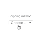
How to Make a Select List Interactive

Select lists, also called drop-down menus, are common web form elements that let people choose one item from a set. They’re handy for letting users choose, say, a method of shipping. But with a quick interaction they can also reveal additional information.
For example, if someone chooses an option for “PayPal” during the checkout phase of an ecommerce flow, the form might display a PayPal login. And if they choose “credit card,” a long number field and short CVV field might appear instead.
Same for shipping. Not every delivery method will take the same number of days. Giving people an estimate will help them choose the best option for their needs.
Building your own options
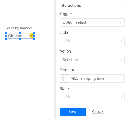
UXPin has a HTML-like select or “drop-down” element — just search for “selectlist”. But it’s a little-known fact that you can create actions based on which item the user selects. You can use this to hide or reveal information and other form elements as required. Here’s how it works.
Create a multistate element whose states hold the various types of information you want to show.
Create a select list by searching for “selectlist”.
Add a new interaction to that select list.
Trigger: Option select
Action: Set state
Other ideas
You can apply this to many other use cases depending on what your users want to accomplish. For example:
How long will it take? The user chooses expedited shipping, and a time estimate appears.
PayPal or credit card? Make additional fields appear if the user opts to pay with Visa or Mastercard.
Do you have a promo code? Make a form field appear to accept the discount.
Shipping overseas? Hide domestic U.S. shipping options if the user’s sending a package to, say, Poland.
Get a free UXPin trial to build interactive forms today.
Join the world's best designers who use UXPin.Sign up for a free trial.Your e-mailTry it for free!
The post How to Make a Select List Interactive appeared first on Studio by UXPin.
How to Make a Select List Interactive in UXPin
Select lists, also called drop-down menus, are common web form elements that let people choose one item from a set. They’re handy for letting users choose, say, a method of shipping. But with a quick interaction they can also reveal additional information.
For example, if someone chooses an option for “PayPal” during the checkout phase of an ecommerce flow, the form might display a PayPal login. And if they choose “credit card,” a long number field and short CVV field might appear instead.
Same for shipping. Not every delivery method will take the same number of days. Giving people an estimate will help them choose the best option for their needs.
Building your own options
UXPin has a HTML-like select or “drop-down” element — just search for “selectlist”. But it’s a little-known fact that you can create actions based on which item the user selects. You can use this to hide or reveal information and other form elements as required. Here’s how it works.
Create a multistate element whose states hold the various types of information you want to show.
Create a select list by searching for “selectlist”.
Add a new interaction to that select list.
Trigger: Option select
Action: Set state
Other ideas
You can apply this to many other use cases depending on what your users want to accomplish. For example:
How long will it take? The user chooses expedited shipping, and a time estimate appears.
PayPal or credit card? Make additional fields appear if the user opts to pay with Visa or Mastercard.
Do you have a promo code? Make a form field appear to accept the discount.
Shipping overseas? Hide domestic U.S. shipping options if the user’s sending a package to, say, Poland.
Get a free UXPin trial to build interactive forms today.
Join the world's best designers who use UXPin.Sign up for a free trial.Your e-mailTry it for free!
The post How to Make a Select List Interactive in UXPin appeared first on Studio by UXPin.
March 1, 2017
Sticky Design Consistency Isn’t as Awful as It Sounds

People trust the familiar. Knowing that, many designers strive to keep their work as simple as possible. It’s also practical: once you design, say, a navigation bar, then duplicating it to every page or view is easy.
But standards change over time. New designers with fresh ideas inherit old projects. New code techniques replace last year’s bleeding edge. The result is a mishmash of inconsistencies in both the visuals and underlying code. And that leads to trouble.
What is design consistency?
Design consistency is the practice of keeping a product looking and acting like a cohesive unit — as if it was planned from the start, even after changes occur. It’s an exercise in branding that helps users find their way around, especially in large sites.
In principle a consistent design is also easier to create and maintain. There’s no time spent inventing new elements that might not fit the established look. From a development standpoint, drawing from a library of pre-built components can make code copy/paste simple while creating fewer chances for bugs. Reusing well-tested code isn’t a bad idea.
Inventing standards is relatively easy. But enforcing them isn’t.
Design system documents keeps projects in line
The best way to maintain consistency is with a document that spells out how — and why — the brand looks and functions.
A design system doc does just that. Providing guidelines, design systems keep everyone in line with the tone, look, and behavior to which a project should adhere. Good docs also explain use cases and best practice, contain code snippets, and show practical, visual examples complete with source files like Photoshop and Sketch files.
That’s a lot of responsibility for a single document. But there are ways to make it work.
Get high-level approval. Designers who implement the work — the folks who push pixels daily — should get their product manager’s approval to keep things official. Many times, explaining that a design system document will help prevent future cost overruns will get their attention faster than “I read it on a blog.” Ahem.
Make it part of the contract. Whether you’re designing for an outside client or an in-house department, a formal agreement of deliverables and responsibilities will help define the project, alleviating scope-creep and declare who’s in charge of what. The final product is often the main deliverable, but to make the product last beyond launch, you should make the design system doc just as important.
Get everyone’s sign-off. From the PM to the dev intern, everyone it affects should know about the design system document. This is especially true when it’s in development. Keep everyone informed and keep stakeholders, like the art director, lead developers, and project managers, involved. Then — and this is key — get their official approval for the final doc. Hold them accountable for their buy-in. Knowing a signature is required makes people take a doc more seriously.
Make it available. Don’t lock the design document away. Whether it’s a file in Dropbox, an internal website, or a Google Doc, tell everyone where it is so they know where to go when design and development questions arise.
Make it practical. The ultimate design system doc isn’t just a doc; it’s a collection of resources or a pattern library from which people can grab ready-to-go resources. In particular, templates and code snippets will help design teams knock out new work quickly.
Keep it fresh. Review the doc every six months or so to make sure it still fits the organization’s goals and user’s needs. For example, do users still understand the iconography? Has customer service or user testing unveiled that users respond better to a friendlier tone? Does the business still want to emphasize a certain call to action? Have visual trends changed? Schedule a time for design system stakeholders to discuss changes, if any. As designer Brad Frost put it, “Once the pattern library ceases to reflect the current state of the products it serves, it becomes obsolete.”

Above, a design system document includes typography, color, styles, and notes on use cases.
What needs to stay consistent?
Depending on the project, many things. On the visual side, color, typography, iconography, and placement of site-wide elements are important to help users recognize what means what.
But don’t neglect behaviors. From modal boxes to drop-down lists to colored links, the way a site works is as important as how it looks. For example, think of icons as promises. Everywhere you see a given symbol, users should know what to expect. And when users know what to expect, they’re more likely to feel comfortable with your brand.
Tone and voice are important too. When a project, especially a large one, needs to tell users many things, having a consistent message will help reassure the users that they’re still interacting with the same brand. Not only does MailChimp do a great job of defining their voice, they also publish it for everyone to read. This should also apply to microcopy, from form labels to submit buttons.
Finally, the code. Few things drive developers crazy like having to relearn six-month-old code while hunting for that one missing semicolon. The more consistent code is, the easier it is to adapt and troubleshoot. Love ’em or hate ’em, frameworks like Bootstrap and Foundation are excellent examples of how a common codebase makes debugging code easier, especially between different developers.
How to test your own consistency
How consistent is your project? Here are a few ways to find out.
Audit your interface. Take screenshots of every element you can get your hands on, and list them by type. Don’t assume they’re all the same, or that you already know what they look like; get everything in a single view for comparison.
Audit your code. Most digital products are based on a core set of code. List exceptions to the rule.
Ask users for their workarounds. Would people rather use your search tool than the navigation bar? Discover how people actually use your product, rather than how you wish they would.
Share your findings. Show the results with your team or project manager. Surprisingly, having to explain inconsistencies often reveals one-off solutions and ill-informed assumptions.
Going forward
Consistency in design keeps a product looking and working as if it was planned — not just on paper and prototype, but all the way through the user experience. People tend to trust brands more that they can figure out, without having to relearn its UI conventions.
After the initial investment, consistency can make future design and development faster, easier, and more cost effective by removing guesswork. And they do so from a single source: a design system document, whether it’s a pattern library or a single PDF, that provides best-practice guidelines and tangible source files.
Remember that design inconsistency occurs when new team members replace old ones, or current designers and developers try to improve upon their old work. While neither is unavoidable, designing and developing from a common template is the key to consistency.
Inventing standards is easy compared to enforcing them. But both are important to keep a project in shape. Let the doc inform the product, not vice versa.
The post Sticky Design Consistency Isn’t as Awful as It Sounds appeared first on Studio by UXPin.
February 23, 2017
Web Design Trends 2017: The Year of Material Design Lite
Without a doubt, touches of Material Design are the must-have aesthetic of the year.
Google’s Android-based design scheme may have started as a mobile device interface, but has exploded in popularity and usage, regardless of device or platform.
It’s a natural continuation of the biggest trend in design during the past few years: flat design. Yet, Material does something flat never could, it adds just enough embellishment to enhance usability. Instead of stripping everything away to favor visual appeal, at the root of Material Design is usability.
What’s Material Design Lite?

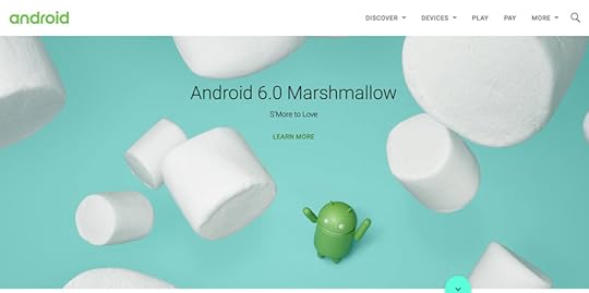
Photo credit: Android
Material Design Lite, or MDL, is the next phase of Material Design. It takes the ideas and optimizes them for all devices. MDL has been crafted to include guidelines, components, and an overall framework with templates and tools that help nearly every designer craft an MDL website with minimal prior knowledge up front.
MDL essentially makes the concept accessible to everyone in a quick and easy way.
While MDL may be a variant of “classic” Material Design, it is in no way a lesser version. Most sites designed with MDL are robust, easy to use, and visually pleasing.
The idea of MDL goes back to the mission of Material Design as a whole: “Develop a single underlying system that allows for a unified experience across platforms and device sizes. Mobile precepts are fundamental, but touch, voice, mouse, and keyboard are all first-class input methods.”
If that weren’t enough, every part of MDL is open source. Rules, templates, best practices, and code snippets are available on the MDL website or GitHub.
The Principles of Physics

Photo credit: Rumchata
The foundations of this style’s aesthetic come from physics. The designer should aim to create something that looks and functions like it would (or could) in the physical world.
This simple concept is what supports to the innate usability of Material. Consider all of the design tools that rely on this idea—layering, cards, motion, color.

Photo credit: MDF

Photo credit: Serio Verify
To understand how to create these elements in a way that looks truly Material, let’s think back to physics class, for a moment.
Varying x and y dimensions are recommended, but all elements should have a uniform thickness.
Shadows should fall naturally on the z-axis, seemingly from a natural light source.
Content can appear on any plane, in any color or shape.
Material components are solid and have no transparencies.
Each space is limited to a single component; they can’t overlap. Layering is only acceptable with backgrounds and photo elements, not singular components.
Components can shrink and expand, but not bend or break. They have a fluidity to their movements.
Components can split or be combined.
Motion can occur on any axis and should be dictated by user interaction.
Mix and Match Components

Photo credit: wrk.

Photo credit: Google Developers
MDL is packed with user friendly tools to help start the design process. While the visual design is primarily what you see, , what makes Material Design Lite different is in the backbone.
MDL is not JavaScript-based; it is designed to work on all devices, degrade in older browsers, and provide cross-platform accessibility. You don’t necessarily need to know how it works, but there is one vital takeaway you should remember: MDL will work pretty much everywhere. And that’s by design.
The easiest way to start with MDL is to pick a template. Each template (there are six to choose from) comes with everything you need for the design, including the components and color palettes. But the beauty of MDL is that you can customize as much as you like. The templates are merely a starting point.
In addition to templates, MDL has a massive component library that lets you mix and match pieces to create something uniquely yours. (You can grab just code snippets for only the components you like to keep your website lightweight.)
While these parts are a lighter, easier to manage version of Material, all of the basic elements are the same, including typefaces (Roboto), layer styles and elements, and color palettes. Almost any element can be added to a design or removed. You can even include elements of MDL in a site that’s not fully Material, if you want to experiment.
Material Color Palettes
One of the most visual aspects of MDL are the associated color palettes. Material projects are often bright and bold in color. Hues are deeply saturated and color combinations can be a little unexpected.

Photo credit: Get MDL Custom CSS Theme Builder
Material color is often based on a palette that consists of a primary color and one accent. (You’ll want to choose wisely.)

Photo credit: Dropbox Business
Dropbox Business is a classic example of a website that adopts design concepts early, yet maintains brand identity. Luckily, their branded blue is perfect for Material. Here, the site uses a single color palette with black and white to communicate. (This is quite common with MDL, as brands work to maintain identity while using the style.)

Photo credit: Pumperl gsund
The site for Pumperl gsund takes the opposite approach and goes all in with two bright colors. Note again how color is used against a mostly minimal background, with black and white for everything else.

Photo credit: Fila
While MDL projects can feature big, bold color throughout (such as Fila, above), this can be tricky to pull off with finesse. You need just the right content to make it work well. In this case, Fila had the perfect combination of elements to go big with color thanks to a colorful athletic clothing line.
Conclusion
Material Design Lite is a more usable, more flexible version of Material Design, and one that you can implement in whole or in part for almost any website design. It offers overall functionality, focus on usability, and design known for clean lines and organization.
For more UI advice from analyzing 61 examples, download the free e-book Web Design Trends 2017 .

The post Web Design Trends 2017: The Year of Material Design Lite appeared first on Studio by UXPin.
UXpin's Blog

- UXpin's profile
- 68 followers

