
UXpin's Blog, page 118
February 22, 2017
Listen Up: Boost Your Interview Skills for Better User Testing

User testing is a tricky area of expertise. It requires a lot of empathy, thinking on the fly, preparation, and the ability to extract yourself from bias. You may want users to behave a certain way, with user testing you’ll get the truth.
“Truth” is also tricky. Because it’s subjective, different people have different approaches to using a product. Designers “know” how a product should work, giving them a certain bias towards how people should behave. But people may disagree, taking unexpected paths that make perfect sense to them. And if that path isn’t friction-free, they’re less inclined to use your product.
For example, users who visit an insurance site might want to review their benefits. Or maybe they want to find a provider. Or to look up symptoms of a particular ailment. Each represents a different user flow with multiple routes. They could search. They could click icons. They could fill a the contact form. They might ignore the login link. There’s no way to know … until you test with real people.
User testing uncovers assumptions, helping you tailor user flows to how people behave. The result is a more intuitive product with less friction. But getting there requires UX designers to learn some new skills.
Listening is a skill you can practice
Listen: Start by talking less and asking open-ended questions. Initial questions help define “what’s up.” Follow-up questions should focus on “why” and “how.” And always follow up with more questions. If a person shows enthusiasm for a topic, follow it to understand their passions.
Timing: Agree upon a time limit with your interviewee, and don’t go past. Your own attention span is limited, and interviews take concentration. 45 minutes is usually enough, though some can go as long as an hour and a half. If an interview starts to run long, then set up a follow-up meeting.
Team up: If you can, bring in a co-worker to take notes while you talk to the interviewee. That frees you to keep up a casual chat — and maintain eye contact — to keep the conversation real.
Say it back: Repeat and paraphrase what the interviewee says so they know you’re paying attention. This both builds trust and helps you confirm that you understand them. It also gives you an opportunity to follow up if you want more information on a vague or interesting answer.
Come prepared: Have questions ready, but be ready to abandon them if the conversation takes an interesting turn. Questions provide a framework for talks, not hard-and-fast goals. For example, relevant stories are often the most interesting points in conversations. They can reveal how a person feels about the topic on hand.
Stay on track, mostly: While people tend to stray from the questions you ask, especially during follow-ups, that’s not always bad. Dig deeper if people start to tell stories.
Encourage them to think aloud: You want that narrative of the interviewee’s thoughts. What someone says, and what they do, aren’t always consistent. Understanding what they want to accomplish and how they assume is the best way to do that will help you find your own assumptions.
Share control: Conversations are interactive. If you keep directing the conversation — say, by prompting them with questions — then you’re probably asking closed-ended questions. Always ask open-ended questions.
Asking smart, open-ended questions
Open-ended questions are those that lead to more conversation, which is the goal of any user interview.
Ask yourself or a coworker each question. Scrap anything that can be answered with a yes or no. “How would you log in to this service?” is better than “Do you see the login link?”
Ask specific questions. “Based on this site’s appearance, would you trust the organization with your money?” is better than “What do you think of this site?”
Ask “why” and “how” several times. For example, follow up “Why did you avoid that button?” with “Why doesn’t its offer sound appealing?” And ask for examples. “When would you want to do that?”
Phrase questions to elicit emotional responses. “How do you feel about …?” or “Tell me about ….” For example, “What happened at your job today?” is less powerful than “Tell me about the projects you’re working on.”
Don’t lead them on. “Isn’t this design powerful?” will earn a yes-or-no answer partially based on what they think of your own bias.
Where to from here?
You’ve interviewed someone about your product. You took a ton of notes. What comes next? Start by organizing your notes, clarifying your thoughts as you go.
Look for follow-up questions. What doesn’t make sense, or might lead to more insight about the project? This is where lo-fi prototypes shine: you can use a mockup of your product to refresh your interviewee’s memory.
Don’t keep insights to yourself. If you work on a team, share your findings with everyone who needs to know what users actually do with your product. Since the point of user testing is to discover assumptions and problems in user flow, fixing those problems is equally important for everyone involved.
User testing will uncover your assumptions about how a product should work. You can use that knowledge to tailor user flows to how people behave, not how you want them to behave. The result is a more intuitive product with less friction.
The post Listen Up: Boost Your Interview Skills for Better User Testing appeared first on Studio by UXPin.


February 15, 2017
Why Design Mentorships Lead to Success for Everyone Involved

In 2016, UX Designer Pia Klancar began to mentor a new designer. Enthusiasm was high, but the project involved was challenging.
“When we had our first meeting I saw that he already had a lot of background knowledge and that we shared a common passion for changing the school system,” said Pia (@piaklancar), a Senior UX Design Mentor at CareerFoundry. “He is on a fast track in the program, which means a lot of work without even thinking of doing a project that is incredibly exciting, but also a bit crazy.”
Not every mentorship is a success story. But most people who stick with it tend to create their own successes. A study by The National Mentoring Partnership showed that 55% of people who received mentorship are more likely to pursue higher education to advance their careers.
But what makes a good mentorship? Success varies per case, although signs of a good program include:
When the mentee finds a job that matches their interests and challenges them professionally.
The mentor also gains new insight into his or her work.
Occasionally when the sponsoring organization retains the mentee as a valued employee or leader.
The mentor provides guidance and, sometimes without knowing, inspiration.
About her mentee, Pia said, “I usually wouldn’t encourage just anyone to go this way, but he was passionate and I had the feeling he could do it. The decision was still his, though. He chose to work on a project that he can make into a real project after the program. Until this day his assignments are one of the best I’ve seen. I’m looking forward to more.”
Great mentorships are a team effort
Unlike internships, in which young designers are often assigned to teams, mentorships pair up a veteran with a newcomer to build a close relationship.
“(Mentoring) is ideally a mutually beneficial relationship where the mentor benefits and gains from imparting their experience and knowledge and being challenged by the mentee’s questions. The mentee gains sense of value from learning from the successes and lessons learned of their mentor, and have them as a trusted advisor,” said Nathalie Crosbie (@ncrosbie), Professional Coach and AD of Experience Design at Myplanet.
A mentor’s job is more than demonstrating practical techniques. In fact, that’s rarely their primary role. Good mentors give constructive feedback, letting the mentee know what works in their designs and what doesn’t. They’re also expected to share their skills and expertise, and to help their mentee develop a professional network — without leading the mentee to answers. It’s a tall order that requires a senior designer to know when to step in, and when to back off.
“Mentors are more like teachers. They support and lead mentees to learn. They might address more than just issues connected to professional life,” Pia said.
Most of all, mentors are available to provide constructive criticism — which isn’t necessarily negative. A good mentor tells mentees what they’re doing right as well as wrong, encouraging them to follow a path that works for the mentee. This is tricky because not everyone has the same style or mentality. Mentorship is about helping mentees find their own way.
But the responsibility isn’t entirely on the mentor. A good mentee will bring more than good intentions to the relationship; they will also bring clear expectations that help mentors frame the type and manner of feedback they provide. For example, a mentee who wants to improve their presentation skills is better served with face-to-face meetings than phone or Skype calls.
“In my experience, what makes it works is a mentee who takes initiative,” Nathalie said. “They should be clear about what they want out of mentorship so the mentor knows what to bring to relationship. When mentees are clear, they empower mentors to provide what they need.”
How mentorships use timing and trust
Like any relationship, each mentorship is a unique story that unfolds over time. Some begin with a formal assignment and end with lifelong friendship; others begin among acquaintances and end when a project reaches deadline.
But there are some commonalities. Staying available is critical to a mentorship’s success. A regular meeting schedule helps both parties, although one should expect on-the-fly requests for feedback.
“Whenever I talked with (mentees), they gave me feedback that they expected me to be there for them, and to guide them to reach higher,” Pia said.
Many do so by “actively listening,” the art of framing replies in ways that encourage further thought. For example, instead of telling someone to use a warmer color palette, a mentor might ask what would make the composition warmer, and why warmth is a priority. Such questions encourage creative learning, without treating the mentee as an underling responsible for a specific task.
“(Mentors) should ask questions before they give answers. The easiest to guide mentees is to ask questions that lead them to the final answer, but for that you need to be good at asking the right questions,” Pia said. “A good technique is also giving mentees time and space to present their own work. Presenting sometimes uncovers little flaws that they see for themselves. This way they are taught to do things on their own and you just let them learn.”
Another key element of mentorships is trust.
As with many professional relationships, trust between both parties means believing the other has their best interests at heart, and knowing that their feedback and ideas won’t get dismissed without consideration. Without trust, Nathalie said, there’s no free flow of information between the people involved.
“A mentee should trust her or his mentor to listen with empathy and caring. It’s hard to be someone without much experience. So it’s good to know you won’t be judged as a person and that your mentor genuinely cares about you,” Nathalie said. “For example, a mentee might come to me with an issue they had working with clients. If I judged them as a person for their difficulties in presenting to clients for example, rather than listen with empathy, and support them by sharing potential strategies, the mentee could understandably hesitate to trust discussing performance topics that feel vulnerable. And if these are the topics on which they most need support, it’s critical to the success of our mentor/mentee relationship that they feel able to speak freely.”
WIth trust, availability, and expectations established, many mentorships are on the way to success. Then surprises emerge.
Unexpected benefits
The mentor/mentee relationship isn’t one-sided. Having to articulate design principles and techniques forces mentors to think critically about their own work, questioning assumptions and filling holes in their own knowledge. Many mentees don’t think they offer much value to their mentors, but that’s not always the case.
“It’s very common for mentees to feel some imposter syndrome,” Nathalie said. “To ask themselves ‘Why should a more experienced person want to help me?’ But in such cases mentees are overlooking some of the benefits for mentors of working with mentees who have less experience in their field. For example, mentees who come from another line of work, or are a recent grad,can bring with them new ideas and techniques. They’re not necessarily relying on old patterns and systems. They challenge established ways of doing things. Questions they ask will challenge mentors to provide rationale for previously established ways of doing things.”
Pia offered similar insight. “No matter if mentees go through the same program, (mentees) bring into the program very different experiences, and can teach you as much as you can teach them. If you push them to reach higher, you need to push yourself as well.”
And then there are the credentials. Having a mentorship on your resumé doesn’t hurt your professional standing. “Being a mentor has a good reputation, and being a good mentor will not only boost your career, but will also make you feel like you did something that matters,” Pia said.
Businesses have also benefitted from having senior designers guide younger ones. When DHL began a pilot mentorship program, “60% of its participants moved into higher positions” after completing their program.
Sun Microsystems saw similar benefits. “25% of mentees got a raise, while 28% of mentors did (vs. just 5% of managers who were not mentors),” wrote Anne Fisher of Fortune Magazine.
In the end, though, mentorships are most positive at the personal level that affects designers at any stage of their career. “For me, the question isn’t how junior does a designer need to be to require mentoring,” Pia said, “but how senior must a designer be to not need one.”
The post Why Design Mentorships Lead to Success for Everyone Involved appeared first on Studio by UXPin.
February 9, 2017
UXPin Changelog February 2017 #03

UXPin changelog is your source of product updates and sneak peeks for upcoming releases.
We’re starting February with few improvements and one really big thing coming up soon: Free Flow Documentation.
1. Zoom on scroll & pinch
You can now zoom in and out when working on your design by using cmd + scroll on a Mac, or ctrl + scroll on Windows. And if you’re used to working on your laptop, you can pinch in and out.
2. Snapping
We have improved the way you can snap elements to the document grid and to the canvas border in the editor. You’ll feel the improvement not only when joining two elements, but also (finally!) when you want it to snap to canvas’s edge.
3. Other improvements
Quick Add will no longer draw ghost elements instead of real ones.
Coming soon

This month we’re releasing Free Flow Documentation. With this new contextual way to document your design, you can eliminate the back-and-forth between your design and requirement documents. With Free Flow Documentation you can add and share your design documentation with developers and stakeholders for instant clarification — all in one tool.
Previous updates
2017 January: #01
2017 January: #02
Stay tuned!
— Chris
The post UXPin Changelog February 2017 #03 appeared first on Studio by UXPin.
February 8, 2017
Website Prototyping: The Hands-on Guide

When designing for users, you need to know their end goals and actions along the way. The two are called content and user flows, respectively, and together they form the heart of any great website.
But how do we go from an information outline to interactive design? In this post, we’ll discuss how to turn a set of content into a prototype, rapidly.
Assembling a content inventory
What are we designing? Many designers start from the outside and work their way in, crafting the containers and framework before examining the information that users spend more time with.
When you start designing from the inside out, you design with the user in mind. What they need to see immediately will gain prominence over what you want them to notice second. Navigation bars deserve less attention than the call to action, for example.
As importantly, a content-first approach is also naturally a mobile-first approach. Mobile devices have more limitations, screen size and bandwidth to name a few, and so designing within these parameters force you to prioritize content ruthlessly.
A content inventory is an organized list, spreadsheet, or equivalent document containing all the elements relevant to the end user. A good inventory acts like a hierarchy of information divided into sections.

Your completed content inventory lays out all the possibilities for your user flows.
Planning the core flow with informed decisions
A complex project like a banking website will require many flows, such as:
Changing a password
Viewing investment options
Reviewing 401k
Ordering checks
Opening a new account, or closing an old one
Transferring funds to or from a different bank
Paying the credit card balance
Each flow requires a user to weave through multiple content pages. For the sake of this tutorial, we’ll focus just on the credit card payment process, one of the most crucial flows. When you prototype, focus first on the riskiest or most fundamental user flows.
Let’s write it out this user flow:
The user lands on the homepage.
The user completes their login information and redirects to their dashboard.
The user clicks into their credit card balance.
The user chooses an account from which to pay the balance. Then submits the request and confirms their balance is paid off.
That sounds like a lot of steps, but there are only three decisions involved: deciding whether or not to pay, choosing an account from which to do so, and choosing to confirm the transaction. Each step must be clear and effortless in our prototype.
Building the prototype
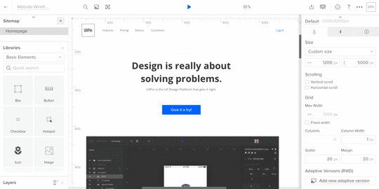
In this case, we’ll build a user flow that lets people pay off their credit card balance at a fictional bank.
Given real content, our goal is to build a mid-fi. Unlike lo-fi designs, which act like boxy wireframes, or hi-fis, which show branding in place, mid-fis demonstrate the flow of decisions users take to accomplish a task. If you’re limited on iterations, mid-fi prototypes are the perfect choice since you don’t waste time on visual design but still provide enough detail for user testing.
In a mid-fi prototype, you’ll want to show:
Correct layout of UI elements (navigation, primary content, etc.)
Basic colors
Basic interactions (no advanced animations or states yet)
Correct typography
Images in the correct dimensions
Here’s how we’d make it work for our bank website. You can start with Photoshop or Sketch and import into your prototyping tool or just start in the tool.
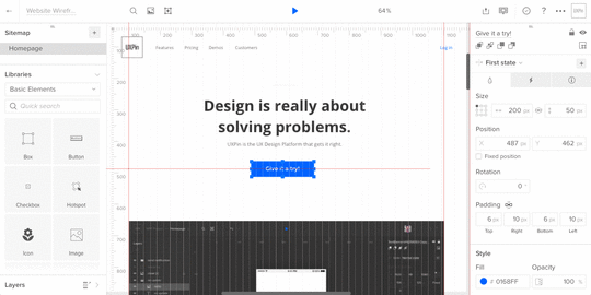
Login
Logging in is easy: a simple form on the bank’s home page lets users securely enter their account. But we don’t neglect this obligatory step because it’s the user’s first interaction with the bank and its brand. Everything from the color scheme to the microcopy must fit with the friendly-yet-professional tone.

Account overview
Upon entering their username and password, they see a dashboard that includes their account information. The purpose of this screen is to give the person an overview of their accounts. There are no ads, no upsells, and secondary information is pushed to one side. It’s all about their money.
To help them decide if it’s time to pay, we’ll include their credit card balance on this screen.

Payment process
According to the user flow, we know that the person’s next move is to choose to pay the card balance. That’s an easy click — and presents a second decision. At this point, he or she must choose the account to withdraw money from.

Decisions take time and cognitive power, so we should make choosing an account dead simple. Each account is listed with as little information as necessary (the account name and balance).
Next the person reaches their third decision: whether or not to commit the transaction. At this point all they need to know is what the transaction’s about. That means we can eliminate the previous decision’s options.
A new screen, or even a simple modal window, will present the information they need to make that decision. Specifically, the account name, the amount to pay, and the approve and disapprove buttons.

Success! Clicking the right button confirms that the balance is now cleared.
Getting close to reality makes it work
Notice that each screen in this design uses both realistic colors, typography, and layout — in addition to real microcopy. It’s not fully polished, but enough to start testing.
At this point, we just need to add some basic interactions so people can click through the screens. Once that’s finished, it’s time to collect feedback, iterate as needed, and then test with our users.
To complete your prototype, just repeat all the above steps with each user flow.
Conclusion
People visit an interactive website to accomplish a task, not use a widget or admire its graphics. That makes the flow along real content as important as developing a prototype’s UI.
Content-centric design helps find their way along that path. If you’d like to try what you learned in this guide, go ahead and start your free trial in UXPin.
Join the world's best designers who use UXPin.Sign up for a free trial.Your e-mailTry it for free!
The post Website Prototyping: The Hands-on Guide appeared first on Studio by UXPin.
February 1, 2017
What Makes a Great User Experience Portfolio?

Your portfolio is the primary tool for showing your capabilities when you’re in the early stages of your UX Design career and looking to make a move.
As with any design project, you have to know your audience, then organize your portfolio so it speaks directly to those who will interview you. Organizing your UX work for presentation is challenging, but possible with the help of a few guiding principles.
Your portfolio needs to demonstrate your ability to answer the needs of each person who sees it
UX designers collaborate with cross-disciplinary teams in every organization. In addition to UX practitioners, you should also count on people outside UX reviewing your portfolio. Expect them to look for evidence that you can support their needs too.
UX Leads
Your potential new boss or peer wants to understand how you think, communicate and present ideas as part of a team throughout a project’s lifecycle. To meet to their expectations:
Include samples of your thought process in the form of sketches, narratives, storyboards process flows and concept maps.
Show diversity in the tools you use to communicate UX concepts. Wireframes aren’t the only answer. Think about the tools you use before creating a wireframe and share some of those: pencil sketches, whiteboard brainstorming, napkin doodles, low fidelity wireframes, etc.
Demonstrate your thoroughness in communicating via annotated wireframes which show user interactions and textually explain key objectives.
Creative Directors
Creative Directors want to know how you collaborate with other visual designers. Organizations with small or informal UX teams often include UX personnel within the creative department, reporting to a Creative Director.
Include examples demonstrating how you communicated layout, transitions and design to your teammates.
Show work that demonstrates your understanding of how content elements come together on a screen in relation to position, size, and prominence. These can be rough sketches or full-blown wireframes.
Display finished wireframes alongside a final visual design of the same screen, describing how you collaborated with the design team.
Tech Leads
Tech leads focus on the technology running any interactive design you create. They include front-end developers, content management system administrators and back-end developers. They want to see that you understand how your work integrates with a technology platform. This is especially important if UX falls under the technology department.
Process flow diagrams are key deliverables to include. They show your ability to think through a system and illustrate connections to things affecting your work, like system responses and conditional states.
Internet technologies often modularize elements in code and design, especially within content management systems. Include work that demonstrates your ability to design modular content/interaction components and widgets.
Business Analysts
Your interaction design work is in response to defined requirements provided by someone with the job title of Business Analyst, or working in that capacity. These people need to see your ability to translate business requirements into interaction designs.
Include primary ways that show your understanding of business requirements include some of the deliverables previously mentioned (wireframes, flows, etc).
Showcasing how your designs answered specific business needs is important. A good example is helping a user to shop in an e-commerce experience while a business requirement needs you to show editorial content or promoted products. Demonstrate how you’ve combined business and user needs in your work.
Account Executives
Account Directors are the primary point of contact for a client or stakeholder. They want to see how you communicate complex ideas to an external client or internal stakeholder.
This is a great opportunity to showcase highly-annotated wireframes or prototypes. Storyboard-type visuals are fine for prototypes in a portfolio.
Remember that you might not be present when someone reviews your portfolio. It’s important to have deliverables a client understands without extensive explanation by you in person.
Two ways to organize your portfolio based on the type and quantity of UX deliverables you have
You can organize your portfolio by groups of deliverables, or as project case studies. The amount and type of work you have will determine which organization method is best for you.
1. When your work spans multiple projects, organize your portfolio by groups of deliverable types
Your UX examples may target specific needs of multiple projects. This organizational method is right for you If you don’t have a variety of work products supporting one project. Include a minimum of three to five of your best examples in each category of work product you have. A short list includes:
Sketching: pencil, whiteboard, digital
Process Flows and Concept Maps
Wireframes: Show examples of varying fidelity, including rough wires to show basic concepts and highly detailed wireframes with annotations
Side-by-Side Comparisons: Show your wireframe beside a finished design comp
Case Studies: If possible, include 1 or 2 in-depth case studies. Include a selection of deliverables you created in sequence to complete a sample project. You can show the work products as a group for a project, or create a formal case study document.
2. When you have many samples spanning the life of 5-7 projects, organize your portfolio by project case studies
Showcase your thought process with at least five case studies showing your involvement in a project from concept to final execution using a sequence of deliverables. Stick with five to seven case studies to ensure you have adequate representation of multiple work product types (flows, sketches, wires, etc.)
Because each case study should show various work products, limit the number of case studies to no more than seven. If you think of each case study containing a minimum of five examples of your work, you’re looking at 25–35 pieces in your portfolio.
Explain the design challenge, problem or opportunity and the desired goals for the project.
Define the end user of the design work you created.
Show how you conceptualized your initial ideas through the use of sketches, concept maps, and any other visual notes.
Show samples of visuals you used to communicate with stakeholders, other designers and developers via process flows and rough wireframes.
Provide finalized deliverables used by other team members like annotated wireframes, content matrices, and functional specifications.
Show side-by-side comparisons of your final wireframes and the final visual design.
Include any statistics to support the success of your design work in the form of charts, graphs or numbers showing success in project goals. Did sales increase? Were there increased signups? Fewer calls to the help desk?
Did a client, stakeholder or coworker praise your work on the project? If possible, include a quote or testimonial.
Case studies are a great way to show your design thinking in a linear project flow. Y Your portfolio’s main goal is to showcase your work, so don’t get bogged down in the details that aren’t related to UX. Focus on your involvement from the beginning of a project to its final execution and delivery.
Smashing Magazine has a very in-depth post about designing case studies if you’d like further reading and tips on crafting your own.
What to do next
Think about the process of solving an interactive project and the types of work products you contribute throughout the process. Organize your work samples into those groups and put them sequentially in your portfolio. This shows samples of your thinking at every stage of a project.
Create case studies by organizing your deliverables for a full project into a self-contained, sequential narrative.
Explore ways to share this information when you cannot do it in person. You might be asked to share your work for people who are not able to meet you in person immediately. Options can include a shareable PDF or website.
Establish your LinkedIn profile. Third party and internal recruiters are continually searching for UX talent here. LinkedIn also makes it easy to introduce your historical experience and allows you to provide downloadable files and links to online examples of your work.
Conclusion
A great user experience portfolio recognizes the diverse needs of its audience. Collaborating with colleagues outside of UX requires strong visual communication of design thinking and an understanding of how multidisciplinary teams work together. Those reviewing your portfolio want to see the examples that show your solutions to their needs. So, how does your portfolio speak to its different audiences?
The post What Makes a Great User Experience Portfolio? appeared first on Studio by UXPin.
January 25, 2017
Between ‘Wireframe’ and ‘Mockup’ Lies a World of Nomenclature

Product managers who build prototypes have many choices. They can give hand-drawn sketches to their design team. They can draft rough visuals in Photoshop or Sketch. Or they write exhaustive documentation to describe their vision.
All share one thing in common: They start a series of steps that leads from an idea or problem to a finished product. Too bad no one can agree names in that process. One person’s lo-fi is another person’s wireframe. Thumbnails run the gamut from doodled to digital. And at what point do you call a design high-fidelity?
Lo-fi. Hi-fi. Mockup. Wireframe. People define each term differently, but most agree that they’re different levels of detail, and one leads into the other. If only design teams could agree on the nomenclature, the design process would start on better footing.
In this article we’ll explore one set of definitions that most design teams agree upon.
Wireframes
The word “wireframe” is tricky: people often use it interchangeably with “mockups” and “prototypes.” Whatever you call them, at their essence, designs begin as a series of plain boxes that denote how elements might get arranged on a page or view.
Rather than represent real content, these boxes approximate how much attention each design element should have in proportion to its neighbors. Wireframes are static low-fidelity designs — the “skeleton” of your product.

Product Managers use wireframes both to explore priorities and to express their ideas visually. It’s one thing to say “hero photo spans the whole page,” and another to see it in action — and potentially to realize it detracts from the rest of the design.
It also leads to interesting questions. What information should users see first? Would they get more out of the view if that photo was on the left? Do we need three teasers instead of four? Wireframes let PMs quickly answer these questions with their team at the web page or app view level.
Mockups
More for visual designers than project managers, mockups are high-fidelity static designs that represent the “skin” of the product.
Like wireframes, they must suggest how the design will meet the project’s goals. Unlike wireframes, mockups often take real content into account. Can we really work with a photo that measures 700 by 200 pixels, or microcopy that’s only 12 characters long? Time to ask the UX and content folks.
Confusingly, people also use the term “mock-up” as a verb at any level of fidelity, as in “to mock up a lo-fi.” But a mockup, the noun, has its place in the design process. Several, in fact, depending on fidelity.
Lo-fi mockup: an approximation, sans-content
Lo-fi mockups turn wireframes or sketches into designs that approximate the finished product. Although they still use plain boxes and shapes, lo-fis solidify the arrangement of information and visuals. They’re an official blueprint for an app or site. Digital lo-fis sometimes includes links to each other, simulating a product’s flow.

Lo-fis mockups are also great for getting feedback from stakeholders. Ideally you’ve gathered feedback at each stage of the design process — even with sketches — but it’s with lo-fis that most non-designers seem to “get” how the final product will work. Sometimes lo-fis include real content to test how well they’ll hold up under real-world situations — but often that’s left to the hi-fi stage.
Often, lo-fis and higher are best left to designers to figure out. But that shouldn’t stop product managers from knowing a hi-fi when they see one.
Hi-fi mockup: design for content
It’s time to get visual. Hi-fi mockups are where your aesthetics and design systems come into play. It’s also where your team starts applying real or close-to-real content.
Applying content is a critical test of your design, because content varies. Sometimes it’s short, other times it’s long. Photos may not fit the orientation you intended. Buttons may say “submit,” or they might need to fit “sign up to get 30% off.” With content-rich hi-fis you’ll discover how well the previous steps hold up to the real world.

Prototypes
A prototype (also called an “interactive mockup”) is a working simulation of the final product.
It usually includes interactions, animations, and links to different pages or views. It will often react to varying screen sizes and browser configurations on the fly. Product managers use them as proofs of concept before asking the team to formally code things up.
While lo-fi prototypes help you quickly validate user flows, hi-fi prototypes help you validate that the visual and interaction designs are cohesive.
Prototypes may include visuals from Photoshop, Illustrator, Sketch, or other app that produces visuals. They sometimes incorporate real, if not final, code.
What makes a prototype a prototype is that stakeholders can play with them in the platform on which the final product will run. Building a website? That prototype had better work in a variety of browsers. Creating a smartphone app? Those touch targets had better work.
Level-up your design process
Like most rules of design, these … aren’t rules. They’re guidelines through which you can personalize your workflow and communicate with your team. You might disagree with someone else’s idea of a “mockup,” but as long as your team agrees, productivity will run that much smoother.
That also means you and your team can start with any level, skipping any level that doesn’t make sense to your workflow. Don’t like to draw? Go straight to wireframes. Want to call everything a wireframe? Go for it.
The idea behind advancing from sketch to wireframe to prototypes and mockups is to add levels of detail only as your ideas solidify. Start fast. Then refine. Then polish. Then build. Then learn more with our free ebook: Prototyping for Product Managers.
The post Between ‘Wireframe’ and ‘Mockup’ Lies a World of Nomenclature appeared first on Studio by UXPin.
January 23, 2017
2017 UX Content Survey

To continue improving our content, we want to know what you find most useful.
In the 2017 UX Content Survey, let us know which types of content and topics would help you most.
The 6-question survey takes less than two minutes to complete. It’ll directly influence the UX and product development materials we create in 2017 and beyond.
Let us know your thoughts! Thanks.
Create your own user feedback survey
The post 2017 UX Content Survey appeared first on Studio by UXPin.
January 18, 2017
Effective Code Conventions Don’t Rely on Effects

Our new Spec Mode feature gives designers and front-end developers control over the final code. But as the saying goes, with power comes responsibility.
In this case it means writing smart, reusable code that your team can get behind. Here are some helpful guidelines to follow when writing HTML in Spec Mode.
On naming conventions for the “prototype” stage
Prototypes, especially lo-fis, are prone to change. That’s their job: to help explore ideas. So when adding code to design elements in early work, we need to take change into account.
You don’t want to chase down code just because you move a column from the right to the left. For example:
Color, e.g. .red or .purple
Location, e.g. .top or .left-col
Size, e.g. .large, .xx-small
Time, e.g. .yesterday, .future, .to-do
You’ll quickly discover if your code uses naming conventions that don’t change well because you’ll find yourself having to rewrite them. To prevent that, we suggest naming things based on their purpose.
Priority, e.g. .secondary or .principle
Use case, e.g. .supplemental or .main
Specificity, e.g. .container
Audience, e.g. .user or .admin or .guest or .member
Media, e.g. .video or .photo or .feed (but use with caution — this can still change!)
Efficient code saves precious time
Browsers have to parse a ton of code when rendering a page. These days they’re pretty quick … but when milliseconds matter, we want the fastest HTML and CSS possible. The key is efficient selectors.
Most browsers render different selectors with more efficiency. From fastest to slowest:
ID, as in #name
Class, like .name
Tag name, such as div
Adjacent siblings, like article + aside
Children, e.g. section > h2
That’s great in principle, but how do we apply it to real-world design?
Practical guidelines
If certain selectors are inefficient, then writing smart selectors is critical.
Let IDs be IDs: If you’re using an ID, don’t also specify the HTML element. For example, #call-to-action, not button#call-to-action. The latter is redundant since the former is unique on the page.
Don’t pair tags and classes unnecessarily: li.primary {…} is less efficient than .primary-item {…} since browsers look for “.primary”, then re-scan those for instances of “li” within that list.
Avoid descendent selectors: header > .main > h2 is inefficient. Instead we recommend using something like “.main” on the h2 itself.
Avoid verbose selectors: div ul li a span is terrible for efficiency. Give that span a class!
Use native elements when possible: Check caniuse.com for supported native tags, like figure and article.
Use CSS shorthand whenever possible: “Shorthand” combines many properties in one. For example:
background: #fff url(…) top center no-repeat;
instead of:
background-color: #fff;
background-image: url(…);
background-position: top center;
background-repeat: no-repeat;
Varying schools of thought
While there’s no single “right” way to write code, there are many strategies.
BEM notation: Block-Element-Modifier style is verbose and tricky to grasp at first. But it’s also modular, efficient, and not bad for semantics.
OOCSS: While this approach isn’t semantic and is prone to class-itis, it’s reputedly good for developers and render speed. The idea is to write very reusable classes that describe their function within the page.
SMACSS: Naming elements with Scalable Modular Architecture for CSS makes code super-readable — once you get used to its rules.
Foundation or Bootstrap: If you want someone else to do the heavy lifting, you might consider a framework with pre-built (and well-tested) class names and JS widgets.
Roll your own: Nothing’s stopping you or your team from developing a naming convention. In some cases, it’s better than any other approach: your team would understand it because you wrote it together; it would be tailor-made for your workflow; and it would only include the code you need.
Going forward
Should designers learn to write code? That’s up for debate. But Spec Mode makes it possible. Anyone on a design team have the authority — and responsibility — for the HTML, CSS, and more. Let’s name elements intelligently.
The post Effective Code Conventions Don’t Rely on Effects appeared first on Studio by UXPin.
January 13, 2017
UXPin Changelog 2017: Week 02

The UXPin changelog is your weekly source of product updates and sneak peeks for upcoming releases.
In the second week of 2017, there are four highlights we’d like you share with you:
1. Sketch Integration: Easier way to export artboards
2. Enterprise UX Virtual Summit 2017: Biggest online UX conference. And it’s free.
3. New UI library: Version 4.7 of Font Awesome Icons includes 550+ new icons.
4. Math Operations: Design is easier when it’s precise.
1. Sketch Integration:
Our latest update to the Sketch plugin lets you export all of your Sketch artboards to UXPin with a single click. Learn more about Sketch integration with this tutorial.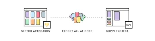
2. Enterprise UX Virtual Summit 2017:
This summit is the first online event of its size and scale. Its topics will focus on challenges that senior practitioners and UX leaders face. Every session draws from real case studies — no fluff allowed.
You’ll get actionable advice from 15 live webinars and network with thousands of peers in the Slack lobby. Join for free from anywhere in the world.

3. New UI elements: Font Awesome icons
In response to many user requests, we’ve added over 550 new Font Awesome Icons in version 4.7.

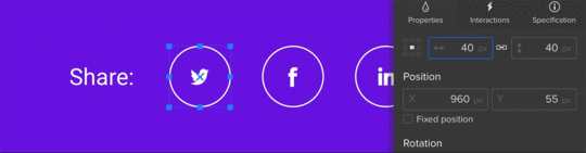
4. Math operations
Math operations will make it easier for you to change and adapt elements’ dimensions or placement with possibility of multiplying, dividing and adding or subtracting values.
Next week’s updates:
1. Revised snapping to both grid and canvas edges.
2. Zoom improvements.
Previous updates:
2017 week 01.
Stay tuned!
— Chris
The post UXPin Changelog 2017: Week 02 appeared first on Studio by UXPin.
January 11, 2017
Use This Checklist to Prevent Pre-launch Trouble

If the design process is about solving UX problems, then the pre-launch routine is about preventing them.
Let’s speak plainly: digital products are complicated. Even the simplest app or a single-page website can involve thousands of lines of code. Talk to any developer and you’ll likely hear about that one misplaced semicolon which borked a whole project.
Just as user testing is important, so is technical testing. Here we provide a checklist of common gotchas to check before, during, and after launch.
One week before launch
Test usability without CSS or images: Removing CSS and images often reveals problems with the structure of data. This is how screen readers, search engines and bots view your site. A design rule of thumb: If the page is still usable, albeit clunky, then it's a good page.
Add a copyright statement to the footer or “about us” page: US copyright law states that “Your work is under copyright protection the moment it is created and fixed in a tangible form…” Assert your rights with a copyright statement on your site or a Creative Commons license.
Run spell check on all content: Online services exist to check spelling in either pasted content or in a given URL. Is the text not in English? Multi-language spellcheckers are available as well.
Create a helpful 404 page: A helpful 404 page tells people that they reached an invalid page and offers other links to follow. It may include a search tool to help them find what they’re looking for, and might automatically notify the site’s owner that someone had a problem.
Send a test message through the contact page’s form: Make sure the contact form works and the domain hasn’t been blacklisted.
Ensure that the home page states the site’s goals, or what visitors can expect: The site’s purpose may be obvious to people involved in making it. Don’t assume it’s obvious to newcomers.
Check for trademark violations: “It’s been done” may have legal consequences if you infringe on a trademark. The US trademark office or the Creative Commons search tool to see if your idea, name or content already belongs to someone else.
Create a favicon: Favicons are graphics, starting at 16×16 pixels, associated with a domain. Saved as either a .ico or .png image, favicons appear to the left of a URL in most browser address bars.
48 hours before launch
Redirect sitename.com to www.sitename.com (or vice versa) for SEO: Search engines like Google and Bing frown on duplicate content, which they sometimes perceive if both yoursitename.com and www.yoursitename.com are active.
Send a test message to the email address(es) associated with the domain: Email is fine when it works — and terrible when it doesn’t. Making sure that messages can be sent will only take a moment.
Reply to the test message: Ensure that your site's emails can be received as well as send.
Make a robots.txt file: This enables site owners to prevent certain directories, such as a site’s CMS, cgi-bin or members-only sections, from appearing in public searches.
Check all links: Broken, outdated or mistyped URLs can be checked by hand or automatically.
Validate the HTML: Look for HTML errors that may cause display hiccups in various browsers.
Search for & remove all greeked text and testing data: Handy tip — Use an easy-to-search-for nonsense keyword like five a’s, “aaaaa” in all place-holder content. When the site is ready for launch, a quick search for that keyword will reveal bits that should be removed.
Give each page an appropriate HTML title and meta description: Google Webmaster tools can help after launch.
Give alt attributes to all images: Alt attributes tell search engines what an image is about, give something for screen readers to describe and help remind designers what an image’s purpose is.
Make the CMS password hard to guess: Punctuation, numbers and plenty of characters make a password difficult to crack. If your password is obvious, why use one at all?
Validate the XML sitemap: XML sitemaps must be formatted correctly. Errors may prevent search engines from using them at all.
Make a XML sitemap: As XML files, users can create sitemaps with any text editor and determination. But it’s less tedious to let a machine write it.
Immediately after launch
Sign up for webmaster tools: Webmaster tools help you see how search engines are or aren’t indexing your site. They also offer information about with which search terms your site is discovered.
Apply an analytics package: Analytics packages add a piece of code to your pages that tracks who, when and how people visit your site with. These data are handy for determining who’s visiting, what they’re looking at, and if traffic is improving.
Register the site with search engines: To notify search engines that your site needs indexing, send them the URL.
Sign up for monitoring: If you’re worried about the host having trouble, sign up for a service like Are My Sites Up and get notified when problems arise.
Submit the XML site map to search engines: Expedite search engines’ indexing of your site by telling them what’s where.
Three to six months after launch
Check that the contact details haven’t changed: Does everyone listed on the “about us” or “our staff” page still work there? Have the phone number, fax number, email address or postal address changed?
Change your CMS password: Occasionally changing your password is a good way to keep people from gaining access to your account or, if they already have, kicking them out.
Back up everything: If backing up the site or service isn’t part of its regular maintenance routine, do so now.
Check for spam sent through forms: Ask if the site still answers all its visitors’ needs. Is the content relevant?
Check feature relevance: What features of the site are not getting used? What can be removed?
Check the users’ browsers: What browsers are most people using to visit the site or web app? It may not match your expectations.
Check inbound links: Inbound or “back links” are one indication of how popular your site is. Use your favorite analytics package to figure out who’s sending traffic your way.
Check for invalid links: As sites evolve, content may move or get deleted. But links to outdated content don’t reflect the change in status. It’s best to check for, then remove or correct links whenever possible.
Launch your own list
This isn’t an exhaustive list, but it covers enough to help you push the “launch” button with a degree of confidence. Use it as a basis in your team’s workflow and to make for a happier launch party.
The post Use This Checklist to Prevent Pre-launch Trouble appeared first on Studio by UXPin.
UXpin's Blog

- UXpin's profile
- 68 followers

