
UXpin's Blog, page 122
October 10, 2016
How To Design With Discipline: UX Lessons From 3M

The 3M Health Care Business Group follows a strict UX design process that allows for complexity—but isn’t overly complex.
With $30 billion in revenue and 90,000 employees worldwide, 3M has built a thriving business over the past 100-plus years on one core principle: applying science in collaborative ways to improve people’s lives.

That principle is paramount to the work of the 3M Health Care Business Group’s UX team. Projects include physical products such as smart inhalers and digital products ranging from enterprise medical coding software to internal sales tools.
“Our design approach is to regularly connect with colleagues in other disciplines like marketing and R&D as strategic partners,” says Andy Vitale, lead interaction designer at 3M Health Care. “When our UX and business teams work together with clear vision and goals, we find greater success through a shared commitment to authenticity.”
Vitale’s team currently supports six different divisions of the Health Care Business Group at 3M; Health Information Systems (e.g. billing and hospital quality of care), Critical and Chronic Care, Food Safety, and Drug Delivery Systems, Infection Prevention, and Oral Care (dental and orthodontic).
His small team tackles a big list of projects, supporting both new products and long-established brands.
In a complex space where large companies struggle with scaling UX methodologies, 3M stands in stark contrast to engineering-driven enterprise. The product development process reflects one of the most mature UX models we’ve seen to date.
Due in part to the strong design culture built in the past few years since Chief Design Officer Eric Quint joined the organization, 3M Design follows a disciplined UX process rooted in co-design and customer validation.
“Show, don’t tell” is a philosophy that drives all the design work you see below.
Design at 3M Health Care
Team structure
Vitale’s six-person UX team for 3M Health Care covers the following disciplines:
Interaction Design
User Research
UX Strategy
Information Architecture
Visual & UI Design
Content Strategy
Front-End UX Development
Each team member’s skillset is T-shaped. While they may specialize in certain disciplines, each person can also help cover other areas as needed.
Initial research
At 3M, product and feature solutions can come from multiple sources, including business, technical or design teams. The 3M Health Care Design Officer also meets with the division leadership to prioritize projects based on resourcing, current status, and expected impact.
Once a project starts, the first step for the UX team is to review any existing research for context around the design problem. Stakeholders provide the following information to designers on an ongoing basis:
Market research: Information around the market landscape and how existing or future 3M solutions could fit.
Industry insights research: Information specific to the business division that identifies opportunities.
Voice of customer research: Any initial user research conducted by the business.
By reviewing the three sources of research, the design team better understands the current status of the project and the desired target users. The information also provides talking points for stakeholder interviews and helps uncover points of validation for future field visits with customers.
Stakeholder interviews
After reviewing the existing research, Vitale’s team prepares a short discussion guide for stakeholder interviews. The stakeholder interviews help the team understand business requirements. They also inform the first draft of the design brief.
Stakeholder interviews are usually conducted on an individual basis, lasting between 45 minutes to 60 minutes per session. Occasionally, the team might conduct department interviews instead (e.g. two to three marketing people in one interview), but they don’t hold cross-departmental group stakeholder interviews.
The 1:1 format allows Vitale’s team to thoroughly explore each person’s subject matter expertise and vision of success for the project. If more information is required, the designers are free to schedule follow-up interviews.
When conducting stakeholder interviews, consider Kim Goodwin’s guidelinesfor each department:
General Stakeholder Interview
Marketing Stakeholder Interview
Engineering Stakeholder Interview
Sales Stakeholder Interview
Executive and SME Stakeholder Interview
Customer journey mapping
With a clearer picture of business requirements, the UX team conducts a customer journey mapping workshop to plot out the user’s perspective before, during, and after service:
Emotions: Any moments of satisfaction, anticipation, and frustration.
Touchpoints: Every step of the journey that the user interacts with the company
Channels: Where interactions occur (e.g. online, mobile app, etc.).
Moments of Truth: Any particular touchpoints or actions that generate lasting frustration or satisfaction.
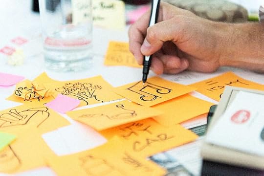
The designers typically map the journey out on a large board, while stakeholders add their thoughts with Post-it notes next to each step. Together, the team then discusses all of the potential roadblocks and opportunities.
“We try to build the customer journey collaboratively before we get too far ahead of ourselves,” Vitale explains. “Before we talk to customers, we want to make sure we’re all on the same page internally as far as understanding the problem and opportunity.”
After the first half-day “all-hands” customer journey mapping workshop, the design team will then follow up with two-hour sessions as needed. Once the whole exercise is complete, the UX team sends a summary email prioritizing the project goals and any newly revealed constraints.
For efficiency, Vitale recommends first sending out a clear agenda with timeboxes for each part of the workshop.
Grab design ebooks created by best designers
All for free
 Download
 Download
 Download
 DownloadDo you want to know more about UI Design?
Download 'The Enterprise UX Best Practices Bundle' FOR FREE!
Download e-book for freeCloseContextual inquiries
Following the customer journey mapping, the UX team conducts on-site field research, which could last up to several days with multiple users at different organizations.
Because Vitale’s team designs enterprise products, they speak with the end-users, managers, and software purchasers. The goal of the on-site visits is to validate all the insights generated so far in the initial research analysis and customer journey mapping.
“Empathy mapping is a critical part of our work,” Vitale explains. “From the beginning, we’re doing customer field visits to observe our users in their natural habitats. We’ve found bringing customers in for interviews wasn’t enough–we need to be where they live and work to truly understand their issues. And we don’t want to just hear their pain points, we want to hear their needs and desires.”
During onsite visits, the team gathers customers together for conversations about their needs and solutions based on a prepared discussion guide. Vitale’s team typically stay onsite for a few days, with hour-long group discussions and many 1:1 observations (30 to 60 minutes) of individuals at work.
“We like to observe our users doing their normal tasks,” Vitale says. “They tend to get comfortable with us looking over their shoulder. It’s just so important to understand the reasoning behind what they do rather than just their steps.”
At the end of each day, all of the designers will sort their notes into a shared template. The designated research lead then sorts through the data to remove duplicates and identify patterns.
Building user personas
Once the team returns to their office at 3M, they transform the new information into personas for user groups.
These personas are shared with the business team. The team will also update the design brief to reflect new user requirements uncovered in the field visits. “By looking at these personas together as a design team, we can see the overlaps in needs between different user groups,” Vitale says. “From there we can begin sketching solutions around the initial hypotheses and core features.”
Once the design team has finished more refined sketches of the feature ideas, they present the concepts to key internal stakeholders. All the consolidated research is available to everyone in a cloud folder.
The design brief
The research ultimately feeds into the formal design brief.
While the first draft is created after the stakeholder interviews, the design brief takes final shape after the field research. The design brief puts everyone on the same page and references:
Business needs explored through stakeholder interviews
User needs validated through field research
Overall UX principles based on brand guidelines and sketching
Project timeline
Once all internal stakeholders agree to the brief, the team dives into more detail.
Feature prioritization
With involvement from the developers, the UX team prioritizes all features based on feasibility and how much they align with the goals of the design brief.
A spreadsheet acts as an early product roadmap by breaking down features by category, owner, and schedule. The team also includes tabs for technical, UX, and business notes.
To visualize requirements for stakeholders and developers, the UX team also creates atomic models (in Illustrator) mapping out page flows and taxonomies. Since the models will evolve, the team doesn’t want to overwhelm stakeholders with a complex tree of 50 to 60 features across the whole system. Instead, designers only share high-level interactions between 10 and 12 core feature sets.
Once the team finishes their work, they hold a 2-hour workshop for stakeholder feedback on the following items:
Spreadsheet of prioritized features
Relationships between feature sets outlined in atomic models
User research and market research supporting the above decisions
Priorities may shift, so designers need to be ready. “Storytelling is one of our greatest strengths as designers,” Vitale says. “By explaining how each feature impacts the user along touchpoints of the customer journey map, we create a common reference point for stakeholders. They start to see how their decisions impact the user, and identify the path to the right solution.”
User-validated design sprints
The next step: design sprints. The first sprints address high-impact features.
Before they start, the team reaches out to a core group of users (typically eight to 12 people) to schedule testing.
3M Health Care’s UX team then follows an alternating one- to two-week sprint cycle of design and user testing for feedback and validation. Starting with low-fidelity prototypes, the design team increases the fidelity as their concepts begin to solidify, and the users become more comfortable with the design sprint process.

Design at 3M Health Care
“We usually build and test prototypes within that 40- to 80-hour duration. We understand our user’s time is valuable and appreciate that they are willing to spend time working with us,” Vitale says.
The overall length of the project varies widely depending on whether the project is an update to an existing product or an entirely new offering.
The design and testing cycles typically happen in a “rinse and repeat” format before they move into development. To keep everyone on track, the whole team also participates in daily standups.
For the sake of efficiency, the 3M Health Care team tests users remotely and through satisfaction surveys. Along the way, they communicate regularly with their core business team and adjust the design and technical requirements as needed.
Despite the different project lengths and scopes, the commitment to customer testing and team collaboration helps define the final design.
“Our basic methodology is always the same: we put the right people in the room, work together to solve problems, and make sure the customer’s voice is heard,” Vitale explains. “The results are increased customer satisfaction and ultimately, a real seat at the table for UX to impact the organization.”
Conclusion
3M Health Care’s structured process shows how enterprise companies can practice collaborative design amid complexity:
Check every design problem against initial research before diving into a full kickoff.
Validate existing research with on-site customer interviews.
Involve stakeholders in co-design sessions to sketch out ideas, but empower designers to make the key decisions.
Align the larger team to a formal design brief informed by market and user research.
Adjust design sprint length based on iteration stage.
Alternate each design sprint with a usability testing sprint.
For more best practices from top companies, download the free e-book Real-Life UX Processes: Design in Action.

Originally posted on FastCo. Design
The post How To Design With Discipline: UX Lessons From 3M appeared first on Studio by UXPin.


October 3, 2016
Inside The Organic UX Design Process At Slack

Slack is on a mission to simplify how teams communicate—a philosophy echoed in the company’s own design process.
The company, which has more than 400 employees, has a rare internal resource: a huge, pool of employees to user test with. Since all employees across the company dogfood Slack every day for eight hours or more a day, the Slack design team enjoys unprecedented access to feedback from users who have an intimate knowledge of the product. As a result, Slack’s design process mirrors the open communication that the company was created to foster.
From vague problem to product brief
Diogenes Brito, product designer and engineer at Slack’s San Francisco headquarters, explains that most product ideas and feature requests start as “a vaguely defined problem statement” driven either by customer support tickets, feedback within Slack’s product channels and social media, or the company’s own product teams.

As one of the first steps in solidifying the project, the product manager and designer meet together to record ideas in one place.
This initial document is a product brief that, as Diogenes says, is “really about the spirit of the project, seeking to define the core goal and the nuances of the problem” so everyone has the right context for the follow-up kickoff meeting. The brief is in fact a living document that will evolve throughout the entire process.
Indeed, while the core of the brief will stay the same once project details are finalized, the brief becomes a focal point for design reviews and serves as an artifact of all that was done once the project is complete. It will even be used as the core asset for final review.
The brief not only consolidates ideas in one place, but also gathers constraints.
Questions covered in the brief include:
What does the team care about the most?
What is in the scope, and what isn’t?
What does success look like, and how will we measure that?
“The brief is not prescriptive but more about asking the right questions so we can explore in the right way, knowing the boundaries of the problem,” Diogenes explains.
The kickoff
Once the brief is ready, the lead designer and product manager will hold a kickoff with the larger team. At this point, some preliminary ideas may be covered (and the designer may have completed some exploration with rough mock-ups or wireframes to act as a visual aid).

Diogenes Brito
Regardless, at the kickoff, the team always reviews the entirety of the brief to ensure everyone fully understands the project and can share their core ideas and concerns.
The kickoff helps everyone understand the design problems and goals, while also discussing any burning ideas. The kickoff is not meant as a free-form brainstorming session.
Pair design
Once the kickoff finishes, designers and developers begin their exploration and specification in tandem, checking in with each other informally throughout the process in Slack.
What is formalized is that designers always work in pairs, with one acting as the lead designer. Diogenes compares the relationship to the tennis stars Serena and Venus Williams in a doubles match, noting they are both amazing but one person is usually leading and serving.

Diogenes Brito
“Pair design gives you a partner in crime to help you explore ideas more,” Diogenes explains. “It’s two people with similar or complementary skills riffing off each other. Plus when you have two people, it helps you get unstuck faster when you hit a roadblock.”
Both designers work on different design problems, but regularly brainstorm concepts and cross-pollinate ideas. Other team members may also involve themselves with the pair for consensus building and informal brainstorming, but the team prefers impromptu activities to formally scheduled workshops.
While the designers are exploring concepts, the developers are also exploring relevant parts of the code base and overall technical constraints. Once the two groups feel confident about their understanding of constraints, the whole team will hold a “post-kickoff” to review product and technical requirements.
Following the post-kickoff, design critiques happen twice a week. When a designer feels ready, she shows her work for feedback from the larger product team. While the larger team may offer feedback to the design pair, the “lead” designer remains the clear point of contact with the product manager.
This point person remains in place all the way through final design review, which includes product leadership and CEO Stewart Butterfield.
Freedom in design tools
Instead of following strict protocol, Slack designers alternate between sketching and low- and high-fidelity prototypes when designing, using the right tool for the problem at hand.
“The big thing for us is not whether we do a wireframe, a mockup, or high-fidelity prototypes,” Diogenes explains. “It’s about thinking about the question and using the best tool to arrive at the answer with the least amount of work.”

Diogenes Brito
For example, when Diogenes was working on a new auto-complete feature, he created a number of low-fidelity prototypes to answer questions around the core interaction model. But when he encountered tricky micro-interactions, he would build working prototypes in code to finalize the details.
“Sometimes we can go right to design from sketching because we know our product so well.” he says. “We use whatever tools we are the fastest in–-and that varies from paper, Keynote, HTML, to a collaborative design platform depending on the project.”
Dogfooding & usability testing
At Slack, usability testing is not usually a separate item in the design process. Instead, user testing is ongoing because of their massive internal user base.
For example when the team decided to add voice calls, they designed and then released the feature internally, rolling it out very slowly in-house and then to an external beta before eventually to the whole user base.
“We use our intuition,” Diogenes explains. “But it is finely tuned because we all use the product for hours every day. User feedback is also regularly trickling in from outside of the company, and everyone serves weekly support shifts to better empathize with customers.”
Indeed, within the walls of Slack HQ in San Francisco, the design team can test different user scenarios with its own departments. Each department acts as a microcosm of the larger customer base.
For example, designers can learn more about how to improve Slack for finance teams by observing and gathering feedback from its own finance department.
In addition to dogfooding, they also regularly prioritize a steady stream of feedback as it trickles into their customer support Slack channel. That said, when they do embark on brand-new features or new audiences—such as international or enterprise-sized teams—the design team will conduct generative field research and more traditional moderated user testing to expand their knowledge.
“Our company is like a 24/7 lab for us,” Diogenes adds. “And because we are all in the product all the time, no issues can just get swept under the rug.”
Sprint to the finish
Once design is complete, the team moves to a development sprint model. Nonetheless, sprints remain flexible in case unforeseen challenges appear. By the time the product team reaches the sprint stage, most design work is done and the designers focus on offering support and quality control.
Aside from constantly communicating via Slack, the team also holds standups in their channels or in-person as needed.
“Transparency is key to our product and our culture,” Diogenes says. “These same core values inform our design process, making it truly organic and effective. And because we use Slack every day ourselves, new ideas keep coming every day—that’s a serious competitive advantage.”
Takeaways
Slack’s organic design process shows that structured design isn’t the option for startups and enterprises. Flexible processes for concept exploration paired with structured development can deliver successful products, so long as regular research and testing validates the progress.
In closing, we offer the following takeaways:
In a product brief, don’t prescribe the solution. Focus more on describing the context around the problem and suggestions for various strategies.
After the initial product kickoff, allow the team freedom to explore concepts and discover constraints. Merge development and UX insights by then holding a post-kickoff review to formalize constraints.
If your team structure allows, consider pair design for richer idea generation and faster problem solving.
If your company’s employees are similar to your target users, regularly dogfood the product for guerilla research. Internal feedback and testing builds a solid foundation of usability knowledge that you can expand through further field research.
For more best practices from top companies, download the free e-book Real-Life UX Processes: Design in Action.
Originally posted on FastCo. Design.
The post Inside The Organic UX Design Process At Slack appeared first on Studio by UXPin.
September 26, 2016
Why Simplicity Is Overrated in UX Design
Is simplicity a real thing? Or is design the pursuit of something else entirely?
A Logic 101 professor once explained to the class I was in that a major factor in screaming matches between people is the lack of a shared definition of a key term. “Clean,” for example, can be measured in degrees. It can mean very different things to people depending on their standards of cleanliness. Then there’s a word like “simple.” Two people can have very different definitions of a word like that. Designers, in particular, most definitely do.
When many of them say “simple,” they mean to describe something incredibly easy to use. When others say it, they’re referencing the relative complexity of a thing, whether it’s a problem, a solution, a piece of code, or something else. To this extent, I admit that what I’m proposing here may be a semantic debate. But it’s an important one, because the word “simple” also gets used in the presence of stakeholders and coworkers who may have no idea what simplicity means in the context of a user’s experience.

Photo credit: Marcin Wichary. Creative Commons.
As designers, we assume we all agree on its meaning. To us, simplicity is a high goal of design. Designers preach that notion to each other. They pass the gospel on to their constituents. They write it in articles. Simplicity is everywhere. And we sure love it when we see it.
But when, exactly, do we see it?
“Simple” is a relative word, granted. It has no definitive value; the simplicity of a thing can only be measured in comparison to something more complex. But for all the times we throw that word around, how often is the thing we’re pointing at actually simpler than something else?
It’s not that simple
Practically every designer who’s used an iPhone relies on it as the hallmark example of simplicity.
This is absurd. The iPhone –which handles phone calls, weather reports, to-do lists, maps, text messages, video, photography, audio recording, games, web use, and about a billion other things – is so far from simple, it’s unbearable to think of the word being applied to it. Besides being incredibly complicated, there is a constant learning curve. Every new app introduces some new way of doing things, just slightly different than all the other apps.
It’s an endless supply of designed pedagogy.

Photo credit: Apple
Nor is the 30-page survey on a dating website “simple.” To the contrary, it’s defined and refined over years of research, based on massive amounts of data, and its success hinges on a giant ball of complicated algorithms.
It’s so not simple.
These things might be sophisticated, beautifully designed, thoroughly considered, and extraordinarily mindful of their users, but one thing they almost certainly could not be called is “simple.”
Getting clear
So what are we talking about when we talk about simplicity?
Clarity.
Not everything can be simple. Not everything can be easy to use. Many apps and services are necessarily complex. Massive eProcurement systems, for example, or enterprise management systems can be incredibly complex. Even iPhone apps can be deviantly hard to use.

Photo credit: Tableau
But one thing they can all be is clear. No matter how complex a design, no matter how many tasks it supports, how many user roles are accommodated, or how many different ways it offers to perform the same daily actions, each and every screen, each and every detail of those screens can be made clearer.
One of the most common questions I received after I wrote “Designing the Obvious” in 2006 (and its 2nd edition in 2010) was about how to apply its lessons in core web application design principles to enterprise software. Time and time again, I’ve stressed this single point:
You apply them to each and every interaction exactly as you would in a narrow-scope application. The principles all still apply. The system you’re working on may be more complex, but the principles can still then be applied on a micro scale to each screen within it.
Good design improves things no matter the situation.
How clarity is born
All kinds of good design practices can be applied to make the complex appear simple. To create clarity in a design. They include:
Chunking: Breaking apart messy task flows into smaller chunks can slow users down to reduce mistakes, or speed them up to let them fly through mundane tasks. Either way, they mean lowering a user’s cognitive load when trying to assess a new screen and get through it. (UXPin offers some tips on chunking features on page 99 of the free eBook, Interaction Design Best Practices (Vol.1).)

Photo credit: Polyvore
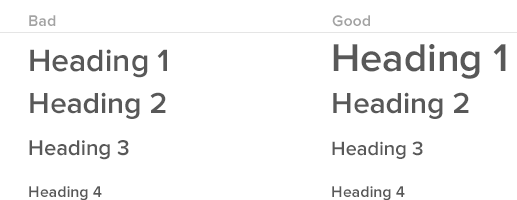
Headings and labels: Using descriptive headings and labels makes users feel more confident that they are in the right place, understanding things in the right way, and taking the right actions. For headings, be descriptive (“Your contact information”). For button labels and command links, use verb-noun pairs (“Create new prototype,”) and verb phrases (“Start over”).
Visual hierarchy: Organizing information on a screen to guide the user through it creates a path for comprehension (no matter how complex the task flow).
Progressive disclosure: This means putting the most common and necessary elements of a task up front and then dispersing everything else into a series of elements which get more and more granular. In the Settings for an app, for example, most people may only need to address a few preferences, while a few may need more additional options. To make this appear simpler, you can show the common options by default, and make the rest accessible by way of an “Advanced Options” menu like Paypal.

Photo credit: Paypal
Defaults: When a user has several options for a setting but is most likely to choose one in particular, or when you want the user to choose one in particular for whatever reason, you can enable that option by default. Only a small percentage of users will opt out of the default option. Generally, users think the default option is what the company wanted, so they stick to it. (Crazy, huh?)
Building less: Introducing fewer features in the first place is, of course, a brilliant way to minimize complexity and confusion. Simply put, there’s less in the interface to deal with, which can make it clearer by default. Do this by erring on the side of saying no to new additions. Every single feature should map clearly to the vision and success metrics for the project, else it gets filed away, usually never to be seen again.
The myth of simplicity is that it’s the real goal of design. That it’s even possible as a goal in every situation. That it’s a useful term for everyone involved in a design effort, or a good way to assess a product.
It’s not. But clarity always is. Is it as clear as it can be? Then no one cares how complex it is.
Build complex things if you need to build complex things. Just put your good design chops to work and make them as clear as you can. It’s the one thing you can do every time.
To learn more about designing clear interfaces, check out the ebook Interaction Design Best Practices (Vol.1). Examples are analyzed from 33 companies like Intercom, Medium, Google, and Bose.

This article was originally published on Wired.
The post Why Simplicity Is Overrated in UX Design appeared first on Studio by UXPin.
September 22, 2016
The Beginner’s Path to UX Career Success

To succeed as a UX designer, you need to swallow your pride and lean on others.
Not only will you further practice and improve your skills, but you’re also building your network. As UX Director Patrick Neeman mentions in his blog, the best UX jobs are found through word of mouth.
In this piece, I explain three tactics that can help anyone refine their skillsets (even if you have no formal UX training). I’ll describe:
How to build a meaningful relationship with a UX mentor
How to become a UX apprentice
How to initiate your own UX projects to get noticed by employers
Let’s get started.
The following excerpt is from The Definitive Beginner’s Guide to UX Design .
Tactic 1: Building a relationship with a UX mentor
Like becoming a Jedi, one of the best ways to learn UX is to find a master. Whenever I was doubtful as a beginner, I’d ask my mentors for advice.
Don’t be afraid to rely on mentors to fill in any knowledge gaps. The first time someone asked me for help prototyping a mobile app, I felt no shame in telling them I didn’t know how to do it. I did, however, mention I was familiar with responsive prototyping and that I was confident I could help them.
Then I emailed one of my mentors, and we figured out the rest.
Finding a UX mentor can be a difficult process, however. Most national organizations (e.g. the UXPA, the IA Institute, the IXDA) have mentoring networks they’ve tried to cultivate, but I’ve always preferred to find my mentors indirectly. I’ve attended conferences, local meetups, and talked to complete strangers. When I seem to get along with someone, and if they seem to know their stuff, I’ll ask if I can bug them about future UX projects.
And, most importantly: if they say yes, always take them up on the offer.
I can’t believe how many mentees over the years have asked me if they can get advice in the future, and then never followed up.
Advice from an experienced UX practitioner is the most valuable commodity on the planet for beginners. You should always learn from someone with knowledge and mileage.
Potential pitfall: Unresponsive or ineffective mentors

Photo credit: Matthew G. Creative Commons.
If you try taking the advice of one mentor and it doesn’t work out, try getting some different advice. As a teacher myself, I can tell you that no teacher is a perfect fit for every type of student, just as every student has specific needs that not every teacher can meet.
Follow up with your mentors (and always try to meet in person if possible), but don’t be afraid to move on if it’s not working out.
If you’d like to shorten the path to mentorship, you can also consider enrolling in an online mentored course. The classes generally allocate at least 1 hour a week to meet with a mentor over Skype (or in-person, if they’re local) to answer questions and discuss your project.
Tactic 2: Becoming a UX apprentice
Tactic 2 may sound identical to Tactic 1, but by “UX apprenticeship,” I mean what Fred Beecher means: a learning experience that takes you from UX zero to UX grasshopper. These are often programs sponsored by UX organizations (e.g. General Assembly, The Nerdery, Fresh Tilled Soil, etc).
At the same time, not everyone is cut out to be a mentor, which is really just another word for teacher.

Photo credit: Jean Baptiste Paris. Creative Commons.
When evaluating programs, make sure you seek out the opportunity to work on real projects.
Apprenticeships are like internships, but people like me (and Fred) don’t like to use the former, because an internship can mean a lot of things. An internship just means you’re working in an organizational context, but an apprenticeship means you’re actually being trained to be a certain type of professional.
So: not all internships are apprenticeships, but some are.
Formal programs with plenty of hands-on UX training also fall into this category (e.g. Kent State, Bentley, UW, SVA), though some people would probably argue that they are very different. As an academic, I don’t really see a difference between the two, however, as long as academic programs have good relationships with industry partners. (Hint: this is true of all those I just linked to).
Potential pitfall: Ineffective learning experiences
As a beginner, it’s not always easy to assess which programs are worth your time. Beggars can’t be choosers, so sometimes you just have to apply to all the programs that seem to offer what you want to learn.
Here are some questions to ask before you sign on the dotted line, though:
What kinds of portfolio deliverables will you produce through the program? Will you actually produce things you can showcase as evidence of your problem-solving skills?
Does the program have a trusted network of potential employers that you can be connected with?
How practical are the experiences that the program promises? How conceptual? How product-based? How process-based?
When it comes to the last set of questions, you must find programs that fulfill all 4 criteria (since UX requires mastery of all of them). Even if a program only promises to fulfill 1-3 criteria, or only offers training in specific, limited elements of UX (e.g. prototyping), consider looking elsewhere for comprehensive beginner training.
Grab design ebooks created by best designers
All for free
 Download
 Download
 Download
Do you want to know more about UI Design?
Download
DownloadDo you want to know more about UI Design?Download 'The Agile UX Best Practices Bundle' FOR FREE!
Download e-book for freeCloseTactic 3: Engaging in individual UX projects
Whether as part of a formal industry-based or academic program, or on your own, it never hurts to practice UX principles whenever and wherever you can.

Photo credit: baldiri. Creative Commons.
This is what I tell most beginners struggling to build their portfolio:
Find an organization in your local community with a website or mobile app that needs help. Not everyone realizes their website or app needs help. This is why networking is so important. Pretty much 100% of the clients I’ve worked with over the years were people I encountered through my professional network who happened to be looking for design help.
Let decision makers within the organization know you’re learning UX and have some feedback on their website or app that they might find valuable. Tell them you’d like to practice by providing them with advice that can improve conversion rates. If you want to matter, always frame design issues as business issues.
If they agree, treat the project as a full-blown UX project and produce some deliverables that will actually be useful to them, like a content audit, a prototype for a new homepage, or a new taxonomy for their entire website. This works even better if you can collaborate with the designer who worked on the website. At the end of the project, present your findings. If you do a good job, you might even get a reference and some portfolio entries out of the experience.
Potential Pitfall: Projects that don’t count as legitimate UX experience
I’ve seen a lot of beginners take on the wrong projects.
That’s why this tactic is the riskiest: you really need the help of experienced people to break into UX.
Here are a few things I just don’t think transfer, no matter how great they appear:
1. Deliverables produced for non-digital contexts.
You may have created the most outstanding brochure in the world for a local non-profit or small business, but you’d be much better off designing a wireframe or a sitemap of a well-known website.
2. Deliverables that don’t demonstrate current design aesthetics.
Like it or not, many (I’d hazard to say most) UX professionals work in visual media: prototypes, wireframes, sitemaps, process diagrams, etc. You don’t need to master hi-fidelity design to become a UXer, but you must understand how to communicate visually.
3. Deliverables that don’t demonstrate your process.
In today’s world of Agile UX processes, every project in your portfolio should communicate the following points:
How you helped the team balance user goals and business goals.
How you analyzed the business and technology constraints.
How you collaborated with non-designers.
How you transformed user research and quantitative data into actionable insights for the team.
How you worked with the team to resolve unexpected challenges.
If you present wireframes, taxonomies, and prototypes without tying them back to the above narrative, you haven’t sold the true value of your work as a designer.
Since it’s best to learn by example, take a look at these excellent UX portfolios below. Notice how the deliverables are only a means for communicating the thinking.
Austin Knight – UX Designer at Hubspot

Ivana McConnell – Interaction Designer at MyPlanet

Edmund Yu – Head of Product Design at Bloomz

Get out there and stick to it
Though it may sound like a cliche, one of the top traits a UX beginner needs is tenacity.
Unfortunately, we don’t start people out in kindergarten drawing mobile prototypes (yet). If you’re new to UX, chances are you’re going to have to learn a lot on your own. And as you do, consider it your mission in life to add some innovation to your own neck of the woods.
For more straightforward UX advice, download the free Definitive Beginner’s Guide to UX Design created in partnership with General Assembly.

The post The Beginner’s Path to UX Career Success appeared first on Studio by UXPin.
September 21, 2016
Stakeholders Can Now Request Changes Before Their Final Approval
Sometimes improving UXPin means helpful new features. Other times is calls for performance improvements under the hood. We’re pleased to say that recently, users started benefiting from both.
Design teams can hold stakeholders accountable for final approvals with a new feature in UXPin. But sometimes they want to leave their thoughts before giving a stamp of approval — or disapproval.
As of today, Enterprise UXPin users can comment on a design and ask for changes or make suggestions before giving their final OK. This lets them contribute to the conversation beyond a binary “yes/no” note, helping teams get closer to a design everyone can rally around.

In other news, UXPin’s preview feature got a minor speed boost thanks to some innovative development.
Spare cache: APIs are a key method to transferring data to and from UXPin’s servers. Often, that’s the same data repeatedly. We started storing frequently-used information locally, reducing latency overall. The result? Faster page loads — up to twice as quick in certain circumstances.
Anticipation: Caching had another benefit: UXPin can now pre-load pages in users’ browsers, making transitions between views snappier than ever.
Sub-standard memory: We discovered that our PubSub servers, which receive information from users’ browsers, were resetting as their memory filled up. A few tweaks raised the limit while lowering the memory requirements, resulting in fewer resets per hour.
Sometimes noticeable new features improve user experience. Sometimes the changes are more subtle. We work on both every week to improve performance so design teams can focus on their work.
Join the world's best designers who use UXPin.Sign up for a free trial.Your e-mailTry it for free!
The post Stakeholders Can Now Request Changes Before Their Final Approval appeared first on Studio by UXPin.
September 20, 2016
New ebook: The Guide to UX Leadership

A project 6 months in the making finally released yesterday.
The Guide to UX Leadership by Dave Malouf offers straightforward advice for the 4 pillars of design leadership: understanding contexts, evangelizing design, developing teams, and crafting UX strategy.
Each chapter cites examples and offers lessons learned from 15 years of UX leadership at Hewlett Packard Enterprise, Rackspace, Motorola, and Intralinks.

Compact yet packed with insights, the 72-page guide is tailored for senior designers and current design leaders. The guide explains:
How to influence the culture and politics of product development.
How to define and drive design outcomes.
How to hire, mentor, and develop your team.
How to build and scale buy-in for UX.
How to create and execute a viable UX strategy.
The post New ebook: The Guide to UX Leadership appeared first on Studio by UXPin.
Preventing Developer Conflict in Web Design: An Everyday Guide

When faced with tight timelines, collaboration can turn catastrophic.
Trying to keep designers and developers on the same page is hard enough. Throw them in a room with a website that needs to be up and running pronto and you may want to duck for cover.
So how can you design quickly and seamlessly and still end up with a world-class website at the end?
In this guide, designers will get everyday tips for less collaboration headaches. All the advice draws from all the successes and issues I’ve experienced in the past decade as a web designer and developer.
1. Master Responsive Design in Grid Systems
You’re probably not new to the idea of grid systems. The issue that I face as a developer is when designers fall short on implementing responsive grids.
Set specific grid widths
Let’s get technical: it’s helpful to start with a specific width to your grid and to know the exact gutter size for each part of the grid. Having this up-front will unify your design and keep you from making repeated minor adjustments.
When you turn this over to your dev team, you want it to look spot-on. If you set a padding of 15 pixels, it should be exactly 15 pixels. If your grid should be 1,000 pixels wide in its entirety, it should be exactly a 1,000 pixels wide. While responsive design means it should work well on any type of device and any type of system, it’s important to have a solid starting point.
Don’t leave guesswork for mobile views
Everything looks beautiful, but wait…what about the mobile view?
As a developer, I’m often in the position where I have to completely make up the mobile view. I end up interpreting the design intent and making decisions on my own to make it work well.
Designers should have a good understanding of how responsive grid systems work.
To better collaborate on a project, a designer can imply on the desktop design the mobile stacking order. If time allows, it’s extremely helpful to provide a high-fidelity mockup of the mobile view as well. Providing a mobile view will allow you to get a better interpretation of your design intent in the final product.

Sometimes using a desktop-based grid system to design a mobile view doesn’t make sense. This is often the case with wide user interface elements, which typically don’t compress well when put on mobile devices.
Another example of incompatibility between desktop and mobile interfaces is the standard timeline UI element.

It works wonderfully on a desktop, and gives a great representation of where you are, where you’ve been, and where you’re going to go. It’s a clear pattern that’s frequently seen. However, what about on mobile? The pattern falls apart.
As a designer, you need to solve these issues so your developer isn’t coming up with weird ideas that conflict with with your intent.
2. Use Modern Tools For Accurate Representation
Don’t be too shocked, but Photoshop is not the best tool for building modern websites.
As a developer, I’m often handed Photoshop high-fidelity mockups. Unfortunately, Photoshop mocks can create problems when a developer needs to build the actual site. Photoshop lacks the precision and accuracy developers crave and need.
Font consistency
First, font consistency from Photoshop to the web does not exist.
Often, the fonts I’m working with on a Photoshop file are completely off. They may be bolder, a heavier weight, or rendered in a different way. The high-fidelity mocks rarely show an accurate representation. Even open-source fonts may look different when rendered in Photoshop.
As a designer, you’ll need to adjust the design based on font weights. When they’re not accurately represented, you’re making decisions based on data or a visual representation of the font that is going to be inconsistent. The design will likely look weird or slightly off-brand when built out.
Performance concerns
Another aspect of pixel perfect representation relates to the way designers create most Photoshop files for the web.
Let’s use drop shadows as an example.
Photoshop includes gorgeous drop shadows. Designers have a lot of flexibility when they create shadows, as well as masks and other design elements. But when a developer recreates those on the web, the options are far more limited.
When a developer is creating a website’s front end, he or she is very concerned about performance. Any time they need to use a huge image representation like a translucent or transparent 24-bit PNG to represent some stylistic UI element, the site will take longer to load. Multiply this times hundreds of components and your site is going to be very laggy.
The ideal solution is to recreate drop shadows with CSS.
You can create many effects with CSS, including drop shadows. If a developer can use CSS to make shadows instead of embedding one in a PNG, he or she will. On the plus side, CSS is more lightweight, allowing you to get assets down to a much smaller size. On the down side, typography and drop shadows won’t look identical to those created in CSS.


One of the images above is a transparent PNG. The other is a SVG.
Although they’re visually identical, the PNG weighs 12.3k while the SVG is only 1.7k. Also, the shadow on the SVG can be articulated and will always blend correctly. If you change the background color on a transparent PNG, you can get artifacts where the background color blends into the alpha channel, often creating rings or halos around other elements.
CSS, FTW.
Consider Photoshop alternatives
Regardless of what tool you choose to use, I think it’s clear that Photoshop isn’t the best tool for the job. I prefer to use Bohemian Coding Sketch 3.
Now, Bohemian Coding Sketch 3 has its own bugs and funky features. However, it’s exceptional for maintaining design consistency.
Sketch allows you to quickly and easily get pixel-perfect representation. Using it ensures your fonts and drop shadows will render as if they were done in CSS. Plus, these values are so accurate, it’s possible to copy and paste the CSS so there’s no guesswork or interpretation between the design you’ve created and the final design that’s created with HTML and CSS.
Using modern tools that allow you to be pixel perfect and create accurate representations of your project will ensure your design intent comes through in the final product, making your job easier and taking some of the burden off of your developer teammates.
For further clarity, I’ll sometimes import my Sketch mockups into UXPin to prototype each layer. At that point, developers can see how the design works, not just how it looks.

3. Consistency Rules the Day
Consistency in margins, fonts, and lines all reduce frustration during fast-paced projects.
Plus, limiting font sizes, weights, letter spacing, and line heights is usually an important part of good design. Below are some specific tips for dealing with these aspects of web design.
Margins
This is a simple one. Round off margins and padding to the nearest five wherever possible. Rather than using 13 and 17 pixels, use 10, 15, or 20. This keeps everything neat and orderly from both design and a development perspectives.
Line Heights
Consistent line height improves readability.
If you use a program like Photoshop with standards for print line heights, you’ll encounter readability issues. Plus, the 1.2 line height (20% greater than the height of the font) isn’t consistent with how design is typically implemented on the modern web. This can be problematic for developers and end-users.
Many websites use a 1.5 or 1.6 line height for maximum readability. It makes a lot of sense for most body text and should consistently be used during the design process to ensure a developer doesn’t need to reinterpret a design. Now, a 1.2 line height can look great for a lot of headlines, which is fine.
The rule, though, is consistency. If your goal is to have headlines with line heights of 1.2 and body text with line heights of 1.5, your high fidelity mockup or prototype should clearly indicate this so that the final build accurately represents your design.
Font Sizes and Letter Spacing
Limit yourself to using three or four specific sizes, five at the most.
Responsive frameworks such as Bootstrap or ZURB Foundation typically have these sizes specified. Plus, they also have mobile versions that allow you to render headline fonts in a slightly smaller size. When designing, lock down these heights.
When creating headlines, use nice round numbers. A medley of headlines with one at 40 pixels and another 42, one at 38 and another 38.5 can be confusing. Keep headlines looking sharp with round numbers and consistency from page to page.
The same principle applies to letter spacing. Letter spacing can make your headlines pop with great typography. To keep developers off your back, choose a standard for letter spacing for all elements.
Font Weights
From a developer’s perspective, every weight a designer adds increases the time to download a font.
This is true in regards to Google Fonts, Adobe Typekit, and every other font source. Every additional weight takes extra time to download. How much time? Two font weights doubles the load time. The slower the site loads, the slower the experience feels.
I recommend using font weights and rendering sparingly. Designers should ask themselves, “Can this design be accomplished with fewer weights? Can it be done with three instead of five weights?”
Using fewer weights makes a project simpler to execute and keeps it lighter, which improves the user experience by speeding load time on mobile devices and other platforms.
Grab design ebooks created by best designers
All for free
Download
Download
 Download
 DownloadDo you want to know more about UI Design?
Download 'The Designer’s Guide to Collaborating With Developers' FOR FREE!
Download e-book for freeClose4. Clear, Concise Communication: Collaborative Prototypes
When I’ve worked on projects without a collaborative prototype, communication becomes a mess of meetings, phone calls, and scribbled notes (possibly with coffee stains). Not to mention, the documentation grows out of control as PMs and designers struggle to clearly convey their concepts.

Annotated wireframe PDF from hell.
Here’s a useful process for improving clarity while reducing documentation:
At the start of a project, suggest that the documentation acts as a knowledge hub rather than encyclopedia. For example, as Autodesk shows below, lay out the basic design and technical principles, then link out to additional tools where the most updated builds will live. Depending on the tool, you can then mark up the designs and builds for contextual documentation.

Product Requirements Document created in UXPin by Autodesk
Once you start the project, create user flows to plan out the interactions for the whole system. As Autodesk shows below, add notes that describe key moments in the experience. Developers and PMs can now better understand how the pieces all fit together.

Annotated user flow created in UXPin by Autodesk
Once you’ve discussed and iterated the user flows, you want to actually demonstrate the experience. Create a lo-fi prototype and add notes for developers in the margins.
5. Don’t Rule Out Desktop-First
About 95% of the projects I work on are what I would call ‘Desktop First’. Designers think about the web interface, design and interaction from the desktop perspective first.
This is opposed to mobile first, which is a great philosophy and a good way to approach mobile web products. However, the reality is it’s very difficult to accomplish in a meaningful way. Because of this, designers shouldn’t rule out designing for a desktop persona.
Once you know you’re working desktop-first, and if you have an existing audience, you can use Google Analytics to identify the approximate screen size of the bulk of your traffic. You might find that for your particular project, you should design for a 13-inch retina MacBook Pro or possibly a 15-inch variant. Maybe the most popular screen size is some sort of 12-inch netbook.
This information lets you know how your audience is viewing your content and how to design it so it looks best on their screens.
Think about the breakpoint where your design will look great and fall short. Try to understand in a general sense how breakpoints and media queries work hand-in-hand with responsive design.
6. Pay Close Attention to Asset Handoff
Handing over an asset can be simple, or it can be full of back-and-forth communication attempting to get an asset working properly.
Should they be Progressive JPEG? Compressed at what amount? Should they be an SVG? How can SVGs be optimized? How should those SVGs be created?
Let’s say a designer uses a random bunch of differently-sized icons.

A developer will need to generate a bunch of SVGs. Although they are very performant, the SVGs will have different heights. If they’re aligned to the top or bottom of the screen, they won’t look consistent. As a result, the developer needs to redo all of the assets or create a slew of specific CSS code for each inconsistency.
To avoid unnecessary work, ask about the most useful file type as early as possible.
Next Steps
If you found these tips useful, check out the free Designer’s Guide to Collaborating With Developers.
The e-book offers tips for simpler handoffs: visual hygiene, style guides, browser fallbacks, responsive mockups, and more.

The post Preventing Developer Conflict in Web Design: An Everyday Guide appeared first on Studio by UXPin.
September 19, 2016
The Right Empathy: Dissecting 4 Personas From Real Projects
How much detail do you really need in a persona?
If you Google “user personas”, the results page is filled with dozens of different personas, both in style and scope. Of course, many examples aren’t even based on any research and may be misleading about their real-world effectiveness.
What works for one project might not work for yours. Personas are not one size fits all.
To counteract that trend, the following four personas were used on actual projects with specific goals in mind. They range from simple sketch personas to detailed stories. Each serve their purpose.
We spoke with a couple of UX mentors from Springboard– Danny Luber (UX Designer at Fake Crow) and Christine Lee (UX Designer at TheRightMargin) to deconstruct why these personas are effective for their specific contexts.
1. BabyBin

Why is it effective?
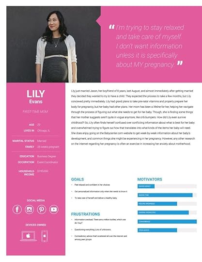
Danny Luber: This persona is great because it takes the angle of the business — (finding the right/healthy products for your baby) – and humanizes it with Lily Evans.
Providing details like the timeline of marriage to conception might seem like over-sharing, but for a product/business like this, it’s absolutely essential. It clues us into one of the many emotional states our users are enduring when visiting the site — and thus, gives us a direction when designing.
Christine Lee: This is a very thorough and well-rounded persona.
The story portion may fare better at the bottom, so that at-a-glance the team will first see the goals, frustrations and motivators. What’s great about this persona’s story is that it offers plenty of clues about her emotional state (which is extremely useful for journey mapping).
Because there’s a well-rounded background for this user, one could even go as detailed as a mental model (Indi Young’s method for understanding human behavior) if need be. The social media piece is also useful for informing the business’ delivery method of information and value to the user. Two thumbs up.
2. Opera Experience App

Why is it effective?
Danny Luber: This is a great example because it showcases someone who we might not expect to be a user of the app. (Katie Ann has never been to an opera.)
When you include details like ‘appreciates good storytelling/plot’, ‘habits: goes out to bars’, ‘interested in finding new things to do’, ‘wants to impress friends’, etc. suddenly we realize that despite Katie Ann never having been to an opera, she is certainly a potential user of the app.
Christine Lee: This hits the main characteristics you need to know to design for this type of user – why would she be interested? What does she already like that the business can offer? Through what way and how often could the app engage with someone like Katie Ann?
I do, however, still find myself wondering about a couple things:
What is Katie Ann’s price sensitivity? If very sensitive then she may not be a prospective opera app user after all.
What is Katie Ann’s experience with other tools/apps similar to the opera app? This would tell me if she’s already turning to apps for finding info. If she uses Google most of the time, she may not change her behavior, even if the opera app is a great tool for accomplishing her goals.
3. GM Cardmember Services

Why is it effective?
Christine Lee: This is a good persona example because it is very, very specific.
All the information at the top supports the summary below of her goals and desired tasks with GM Cardmember Services. Understanding the foremost, achievable tasks goes a long way in informing the IA and business requirements.
It’s great to know her hobbies as well, because financial services often find their hook via aspirational messaging. Also, Stephanie has such a clear goal (to get a car) that leads to her other goals (getting to travel, go to the beach and swim, run), so the business can show that their card is her ticket for achieving her ultimate goals.
However, my main critique is it’s a bit too text-heavy. I think having keywords highlighted would make it more easily digestible at a glance, upping the likelihood it’ll be used in everyday design. I actually found the summary too lengthy to be a summary. It’s more like a persona quote. I would expect a summary to say “Stephanie wants to find a rewards credit card that will help her buy a car with its rewards.”
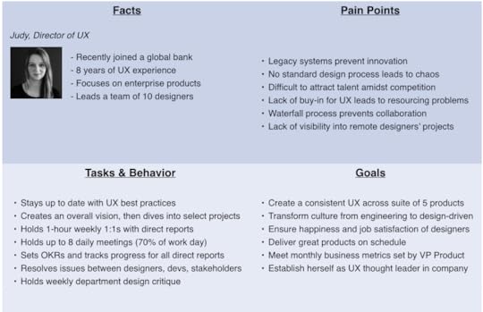
4- Genospace Healthcare Data Analytics Platform

Why is it effective?
Christine Lee: This is a very complete and well-structured persona.
The quote alone tells the reader a lot about the persona’s attitude towards technology (it gets in the way, is overly complicated, there’s a steep learning curve) and some of his current frustrations (he’s busy, and doesn’t want an overly automated process to enter what’s working for him).
The bio is helpful and not overly prioritized visually, and the charts on the right are just enough to provide good visual comparison (if this persona is placed next to others) without distracting from the main point.
I’m also a big fan of the “Experience needs” section: it concretely outlines what it means to design for this persona, and the bulleting and visual hierarchy is easy to grasp and scan. This feels useful, usable and great for high-level and detailed use.
Creating Your Own Personas
Personas unify the understanding of the users for UX team, clients, and stakeholders.
Whenever the team needed to consider the addition or subtraction of a feature, they could say, “Stephanie wouldn’t like that feature because she’s too busy finishing her graduate program” or “Tom loves the increase in efficiency that this feature creates.” The process humanizes the users and gives you a solid defense against scope creep.
To wrap up, personas should contain:
Information that taps into user interests beyond the product itself, as that will give key insights into the real motivations for which you must design.
Personal details about the user- pay attention to emotions of users, not just statistics.
Clear goals for the user (and how those relate to the product), as well as frustrations (opportunities for the product)
As much real data as possible to support each point.
Alignment from the whole team. Otherwise, your persona is just another pretty deliverable gathering dust.
Finally, don’t forget that the greatest power of personas is in the process of discovering user insights with your team, not the end document. A lean persona created with your team is far more valuable than a beautifully rich persona created alone.
To learn more about user personas and how they fit into the greater scheme of UX design, check out this curated flow of 131+ hours of free UX resources.
You can also download the free e-book UX Design Process Best Practices.

The post The Right Empathy: Dissecting 4 Personas From Real Projects appeared first on Studio by UXPin.
The UX Designer’s 5-Minute Guide to Lean Personas
Not every company needs to build complex personas.
After all, the reality of Agile timelines dictates that we focus on the 20% of effort that produces 80% of insights. Not to mention, the process of involving your team in learning from users is far more valuable than the document itself.

Source: UXPin Persona Tool
Welcome to the world of lean personas.
In this article, we’ll explain:
When lean personas work best
How to conduct the proper research for quick personas
How to use data when creating lean personas
Examples of perfect lean personas
For additional information, we’ve also included some links to help you get started.
Let’s begin!
When to Use Lean Personas
Lean personas are recommended in the following scenarios:
Limited resources — Personas require time and effort to research and build. If you’re a smaller company working on a budget, lean personas that are informed by existing analytics, web research, and user interviews still provide plenty of insight.
Rapid product development — In an ideal world, every product timeline would include ample time for user research. We know that’s not always the case in Agile processes, so even a few quick personas is better than nothing at all.
Lenient stakeholders — If your stakeholders don’t demand multiple rounds of approval and review, a lean persona should suffice. Capture the important behavioral and psychological details, then spend more time on the design and iteration.
Creating personas is a lot like sculpture: present only as much as your team needs to think about the problem, then remove the rest.
Lean User Research Options
Lean personas tend to be built more from qualitative data rather than quantitative, since quantitative data may require more effort to collect and interpret.
Anyone can conduct user interviews and supplement with some online research, but it takes knowledge and money to track user behavior metrics.
Source: UX Research
Patrick Neeman gives some practical tips for persona research on a budget.
For starters, if you’re working on a commissioned project, ask the client for customer details. Sometimes the client already conducted their own market research, which you can build into the persona. For example, you might think that your design app is intended for any designer in the world, when the client knows it’s only for in-house design teams from the United States.
But you may not be that lucky, so be prepared to do the research yourself. If you don’t have the resources to conduct full-scale user interviews, there’s nothing wrong with guerilla user research. Neeman explained a couple clever tactics that worked for him:
Conduct online research — When Neeman was working on a local government website in Alaska, he didn’t have the resources to fly a team out for user research. By using Wikipedia, he revealed that Anchorage is a college town, travel is driven by the oil economy, and other insights. He then validated the information by remotely interviewing stakeholders and residents.
Validate with co-workers — Whether it’s budget or confidentiality concerns, sometimes you can’t interview outside people. In that case, build some quick personas based on web research (and any existing analytics), then validate them with coworkers who match the profile. Interestingly enough, some large companies like Apple use this approach.
Check out competitors — For an ecommerce project, Neeman took a deep dive into competitors with similar audiences. He deduced usability best practices, content strategies, and even developed design questions (and subsequent user scenarios) without speaking with any users. The end result? Millions more in revenue.
All of the above tactics help keep your personas more rooted in reality. Of course, when possible, we always recommend interviewing users.
Conducting Quick User Interviews
The tried-and-true method for understanding your users (and therefore, building accurate personas), the user interview is one of the most cost-efficient methods of qualitative research. Aside from any scheduling back-and-forth, it might take an afternoon (at most) to develop your list of questions, and sometimes 30 minutes per interview is enough to generate actionable results.
Now when it comes to how many people to interview, the answers vary. The minimum for accurate results is 5 users. A common range is 5-30, but that of course depends on your product, timeline, data, and design process.
For example, when UXPin first moved to the United States around 2013 to build our web app, we conducted over 50 user interviews. We talked to everyone ranging from designer friends who freelanced full-time, to well-known design experts like Brandon Schauer of Adaptive Path. We wrote up an informal test script, then spoke with each person for anywhere from 30 minutes over coffee to 2 hours in our own apartments.
Because our goal was product discovery, we wanted as much data as possible to inform our personas. Now that we’ve fleshed out our personas, we interview 15-20 people per major iteration to ensure our understanding is still current.
Don’t obsess over the location of user interviews. Nothing affects the quality of the research more than the questions. We’ve compiled this list of generic questions based on this thorough research from the Open Personas Project and our own experiences.
You might not use all of them, so tweak as needed and treat this more as a guideline:
Can you describe how you spend a typical day or week?
Which activities do you spend the most time on?
What is/are your worst pain point(s)?
What would an ideal day or week be like? What would you be doing?
What are the differences between that ideal day/week and the real world?
Can you tell me how you use [product]?
What does [product] allow you to accomplish that you otherwise couldn’t?
Where does it fall short? What doesn’t it do (or do well) that you need it to? What would an ideal experience with [product] be like?
Have you used other [products] to do that in the past? What were they?
Which [product] is better? Which one is the best? Why?
What do you usually do when you’re searching/shopping/evaluating for similar products?
What kind of [reports/documentation] do you create?
Whom do you need feedback from to generate those [reports/documentation]? What insights or data do they offer you?
What roles (coworker, PM, manager, developer, etc.) do the people who receive your [reports/documentation] play?
What part of [the job] do you most enjoy? What do you least enjoy?
How do you know when you are doing [the job] well?
What are your goals? What are your ambitions?
Is anything making it difficult for you to accomplish your goals? If so, please describe them for us.
Keep your questions open-ended to encourage the interviewees to elaborate, giving you more workable results.
For an in-depth look at the art of the interview, check out Liz Danzico’s presentation, User Interview Techniques.
What to Include In Lean Personas
Considering that this type should be distinctly simple, it’s helpful to pay attention to a few aspects over others.

Justin Smith, UX Architect for Cartoon Network, recommends adding only enough details so that you can understand the user’s mindset, desires, and tasks. Within the Lean UX methodology, these quick personas are known as “proto-personas”.
Include these fields:
Name & Photo — If you like, you can give them a nickname based on their behavior, such as “Sam the Searcher.” A realistic photo also helps, but a quick doodle for a first draft is acceptable.
Job Title — Surveys can be very helpful for capturing this data. For example, Buffer conducted a survey which showed a large percentage of users are small business owners. They then used this information to create a specific “SMB” persona. Make sure to include the role and the company.
Goals/Needs — Get deep into the psychology of your persona so you know why they make their decisions. What are their fears? What are their goals? Rely on your user research and any available metrics.
Behaviors & Beliefs — Make sure the details are relevant: for instance, John the First-Time Car Buyer is so embarrassed by his lack of knowledge of automobiles that he would never ask his friends for help.
Characteristics (Attributes) — To determine the categories of attribution (like Risk Tolerance or Education), look back on the user interviews and identify patterns between users. Once you’ve created the categories, plot the users and start combining similar people into personas. For example, “Greg” shown above could be a combination of Jimmy and Steve, who are real people with the same spectrums of tech savviness, education, etc.
Usually, you can divide the your desired user base into two segment: the primary and secondary segments. Your main segment are the users you can’t do without (like our UX manager lean persona below that we use on the UXPin product team).
Your secondary segment is more like a bonus — these are the people that you’d like to have as users, but they aren’t always necessary.
Lean Persona Templates
When it comes time to create the actual persona document, you don’t need to start from an empty canvas. There’s plenty of existing templates for all levels of detail.
Fake Crow — In an effort to appeal to startups, the L.A.-based creative agency offers a free downloadable template for simple persona creation.
Pichler Consulting — A great, no-BS persona template from Agile product management consultant Roman Pichler.
UXPin — We offer lean persona templates inside our collaborative design platform.
UserForge — A cloud-based persona and usability testing tool with free plans. This tool supports lean and in-depth personas.
Next Steps
If you found this post useful, get more example-driven advice in the free e-book UX Design Process Best Practices.
The post The UX Designer’s 5-Minute Guide to Lean Personas appeared first on Studio by UXPin.
September 6, 2016
Get 25% off unlimited online UX courses for 1 year

UXPin users get unlimited UX courses at the Interaction Design Foundation (IDF) for just $72 for the first year.
The entire catalog is filled with practical self-paced courses and opportunities for beginner, intermediate, and advanced practitioners. To encourage networking, participants are limited for each course.
Our personal favorites include:
The Psychology of Interaction Design
Emotional Design
UI Patterns for Successful Software
Once you complete a course, you’ll receive an industry recognized Course Certificate to include in your resume and LinkedIn profile.
The IDF, an independent non-profit organization, is the oldest and larges provider of online UX courses, offering members rich information, interactive lessons, and discussion boards where you can chat with other designers and members. Redeem the offer below on the special landing page, then find the most useful course for your needs. Enjoy!
The post Get 25% off unlimited online UX courses for 1 year appeared first on Studio by UXPin.
UXpin's Blog

- UXpin's profile
- 68 followers

