
UXpin's Blog, page 125
July 15, 2016
Topics of the Day
We took a break from more serious topics this week to discuss recent events in popular culture. From Star Wars and Star Trek to Pokemon GO to Uber’s new logo, the conversation ranged all over.

@uxpin Pokémon Go! #UXPinChat
— Media Made Great (@MediaMadeGreat) July 15, 2016
A1 I honestly play both, but #PokemonGO has kind of taken over my life right now #UXPinChat
— Indra Sofian (@indysofian) July 15, 2016
Tetris. #uxpinchat https://t.co/vU5c04HFzw
— Ryan Thomas Riddle (@ryantriddle) July 15, 2016
@uxpin Q1 – #pokemongo – nostalgia! #uxpinchat pic.twitter.com/XbYum93aem
— Tarra Anzalone | UX (@theuxicorn) July 15, 2016
.@uxpin Pokemon Go, no doubt. Gets me out! Socializing! Involved! TEAM VALOR!! … Make new friends! #UXPinChat
— Michael Gremillion (@IselianGaming) July 15, 2016
A1: I've dreamed of being a Pokemon Master since 1996 when I started Pokemon Red! #UXPinChat #TeamInstinct pic.twitter.com/qOcb4dH3AD
— Melissa Merrick (@sesella_stellae) July 15, 2016
@uxpin neither, I'm still waiting for Super Mario AR. #UXPinChat
— Magda Mozgawa (@magdamozg) July 15, 2016
.@sesella_stellae @ryantriddle Played Red in gen 1, but chose Instinct?! Traitor! #TeamHarmonyInTheEnd
— Michael Gremillion (@IselianGaming) July 15, 2016
@uxpin hands down, Pokemon Go! #UXPinChat
— Vi (@vi_rox) July 15, 2016

MacBook. Always Apple. #addiction #uxpinchat https://t.co/lJDglQWDNI
— Ryan Thomas Riddle (@ryantriddle) July 15, 2016
Macbook Air! #uxpinchat https://t.co/vK2t0qBpkc
— Lindsey Meredith (@lindseymere) July 15, 2016
@uxpin A2: what are the specs and what do you need to use it for? Also, I'm more of a MacbookPro girl. #uxpinchat pic.twitter.com/fmze5MC7Ln
— Tarra Anzalone | UX (@theuxicorn) July 15, 2016
A2) @uxpin Really is subjective based on use/comfort. I've grown to love PCs. HP notebooks all I trust from HP though #UXPinChat #Conflicted
— Michael Gremillion (@IselianGaming) July 15, 2016
.@theuxicorn @uxpin Asking the right questions! #UXPinChat #Context
— Michael Gremillion (@IselianGaming) July 15, 2016
@IselianGaming @uxpin I use a few different laptops based on what client I'm working for. PC and Mac don't concern me unless traveling.
— Tarra Anzalone | UX (@theuxicorn) July 15, 2016
@IselianGaming @uxpin #uxpinchat #ux habits die hard.
— Tarra Anzalone | UX (@theuxicorn) July 15, 2016
.@theuxicorn @uxpin Given the choice, do you have a brand for Win or Linux laptops?
— Michael Gremillion (@IselianGaming) July 15, 2016
A2 I think the HP Spectre is a solid computer, but I can't stay away from Mac OS. Macbook ftw #UXPinChat
— Indra Sofian (@indysofian) July 15, 2016
@IselianGaming @uxpin never used Linux. I've used Dell, Alienware, and HP. I think Alienware was favorite. Love the lighting and performance
— Tarra Anzalone | UX (@theuxicorn) July 15, 2016
@uxpin MacBook all the way! #UXPinChat pic.twitter.com/dpO9iwyIYA
— Melissa Merrick (@sesella_stellae) July 15, 2016
@IselianGaming @uxpin but I'm of the "best (camera or computer) is the one that you have on you" camp. I prefer MacOS if I'm buying.
— Tarra Anzalone | UX (@theuxicorn) July 15, 2016
.@theuxicorn @uxpin Good stuff! Recommend looking at ASUS or MSI then. Can be Alienware performance, better price tag. #Derailing #UXPinChat
— Michael Gremillion (@IselianGaming) July 15, 2016
@IselianGaming @uxpin my husband and dad also can build from scratch so if I need desktop, that is an option. Laptop might be awkward to DIY
— Tarra Anzalone | UX (@theuxicorn) July 15, 2016
@uxpin A2: MacBook Pro :) #UXPinChat
— Justin Horner (@justinhhorner) July 15, 2016
#UXPinchat A2: this is some serious trolling ;) I’m yet to meet a designer who uses any PCs.
— Marcin Treder (@marcintreder) July 15, 2016

.@theuxicorn @uxpin Personal experience, laptop DIY not fun. Desktop building is love, building is life. A good #Hackintosh is fun too!
— Michael Gremillion (@IselianGaming) July 15, 2016
A3) @uxpin Old for sure. Humor just rings with me better. Admittedly viewed new through snippets, but unhappy with what I saw. #UXPinChat
— Michael Gremillion (@IselianGaming) July 15, 2016
A3 I’m willing to give new Ghostbusters a go … but I doubt it’ll top the original #UXPinChat #nostalgia
— Benjamin Gremillion (@ux_benjamin) July 15, 2016
@uxpin Neither! I actually started my own Ghostbuster Crew. Don't believe me? #UXPinChat #startuplife pic.twitter.com/uAD3AgBfAm
— Melissa Merrick (@sesella_stellae) July 15, 2016
@uxpin The Real Ghostbusters. #80stoons #uxpinchat pic.twitter.com/epWcjwzJ0H
— Ryan Thomas Riddle (@ryantriddle) July 15, 2016
I like to support indie @uxpin #uxpinchat https://t.co/alp0Q4Lkwt
— Tarra Anzalone | UX (@theuxicorn) July 15, 2016

A4. I have to choose!? To boldly go where no rebel’s gone before! May the prime directive be with us! #UXPinChat
— Benjamin Gremillion (@ux_benjamin) July 15, 2016
@uxpin #uxpinchat #starwars for sure pic.twitter.com/X8s70Maqwa
— Tarra Anzalone | UX (@theuxicorn) July 15, 2016
A4) Don't like action-flick Trek movies. Gotta go Rogue One for #UXPinChat. Sorry @ryantriddle, but I will geek over TNG any time!
— Michael Gremillion (@IselianGaming) July 15, 2016
#StarTrekBeyond, of course. #Trekkie4life #uxpinchat https://t.co/Ego3ELMh3S
— Ryan Thomas Riddle (@ryantriddle) July 15, 2016
.@uxpin Relevant to this #uxpinchat question: https://t.co/jlvrqzDErp
— Ryan Thomas Riddle (@ryantriddle) July 15, 2016
Relevant: https://t.co/TuT3H46c4Z #UXPinChat
— Benjamin Gremillion (@ux_benjamin) July 15, 2016
@uxpin In honor of my bestie @ryantriddle, Star Trek #UXPinChat pic.twitter.com/Gc8xTWhxsz
— Melissa Merrick (@sesella_stellae) July 15, 2016

A5) Said it before, will say it again. Instagram's new logo looks like something I did in middle-school. And I like dark colors. #UXPinChat
— Michael Gremillion (@IselianGaming) July 15, 2016
.@instagram's logo. I have no idea what @Uber's logo is trying to communicate. #uxpinchat https://t.co/CEadmA2Hn7
— Ryan Thomas Riddle (@ryantriddle) July 15, 2016
A5 As a designer, I like Uber's logo more because it's more of a canvas than Instagram's. And a canvas can be anything you need #UXPinChat
— Indra Sofian (@indysofian) July 15, 2016
A5 Instagram’s at least looks like a camera. Uber’s looks like a new port symbol. #UXPinChat
— Benjamin Gremillion (@ux_benjamin) July 15, 2016
.@ryantriddle For devil's advocate: Logos that don't communicate well: Chrome, Firefox, Apple? Tagging @ux_benjamin for fun too. #UXPinChat
— Michael Gremillion (@IselianGaming) July 15, 2016
@uxpin #uxpinchat uber just makes no sense and their creative brief sounds drunk. Instagram looks too generic but wins by default.
— Tarra Anzalone | UX (@theuxicorn) July 15, 2016
.@ux_benjamin @ryantriddle Would think Uber, Instagram pretty established themselves. Both certainly make headlines, not just for logos
— Michael Gremillion (@IselianGaming) July 15, 2016
.@ryantriddle @theuxicorn @uxpin Would they call themselves for a ride home? =P
— Michael Gremillion (@IselianGaming) July 15, 2016
@IselianGaming @ux_benjamin Apple's logo does communicate the Newton genius idea that is part of its brand story. The apple of knowledge.
— Ryan Thomas Riddle (@ryantriddle) July 15, 2016
.@ryantriddle @ux_benjamin Can see that. Lots of other logos more for brand than app-use communication though. #Still #UXPinChat
— Michael Gremillion (@IselianGaming) July 15, 2016
@IselianGaming @ux_benjamin Perhaps I should've said I don't understand how it communicates Uber's brand. ;)
— Ryan Thomas Riddle (@ryantriddle) July 15, 2016
.@ryantriddle @ux_benjamin Fair point, fully agree there.
— Michael Gremillion (@IselianGaming) July 15, 2016
The post Topics of the Day appeared first on Studio by UXPin.


July 14, 2016
How to Conduct a UX Review That Won’t Get Thrown Out
When conducting a UX review, you need to focus on actionable insights.
An audit is not an just a laundry list of usability issues. Triage, prioritize, and deliver clear next steps to our stakeholders and clients. Beyond fixing glaring issues, you also want to reveal new opportunities for conversion and engagement.
Unless you present a clear plan, your audit will just get left in some developer’s to-do list purgatory:

At GobySavvy, we follow a 9-step process for UX reviews. In our experience, the process helps us actually get our recommendations implemented.
I’ll explain exactly how this process works, using our project for online retailer SkyMall as an example.
1. Identify Business Goals and User Needs
For revealing business goals and user needs, the process can be light and lean (simple questionnaire and a 1-hour discovery) or in-depth (user interviews, shadowing customer support, and multiple stakeholder interviews).

For SkyMall, we followed the light & lean approach to fit a tighter budget and timeline. They werein the midst of a website revamp, and wanted to make sure they were heading in the right direction.
They approached us to learn about current pitfalls in their website’s UX, UI design, and content strategy, and to discover what rebranding options were available. Their bottom line goal was increasing revenue with higher conversions.
Knowing this, we prepared a questionnaire and hopped on a 1-hour call with their project leaders. We made sure to ask about:
Primary and secondary user groups
Specific business metrics for conversions and engagement
Important actions/tasks we want users to accomplish in our flows
Primary sales channels
Brand values
Important web pages
Top competitors, etc
All of this information feeds into our simple personas and user flows to guide the review (more on that later).
Learn more: Balancing User Goals vs. Business Goals
2. Diving Into Analytics
If you can’t access analytics directly, ask for reports for specific timeframes and segments.
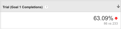
With SkyMall, we weren’t able to access analytics ourselves, so we asked their team to put together reports of popular landing pages with bounce rates and time on page, ecommerce conversions data, mobile and web statistics, and user flows (Behavior Flows in Google Analytics).

Google Analytics showing key pages ordered by popularity. Time, bounce rates, and page value shown.

Google Analytics showing eCommerce Goal completions. Although only one goal is listed here, additional goals might be: newsletter signups, contacts, free content downloads, etc.

Google Analytics showing behavior flows from landing pages through checkout.
By looking at this data for SkyMall, we saw that most people entered through 2 key paths:
From a variety of referral sources to a specific product page
From google search directly to the home page.
The people landing on a specific product page have a higher rate of eCommerce conversions (sales), lower bounce rates, and a simpler behavior flow.
The biggest problem area was visitors coming in through the home page. A majority of visitors clicked a product on the home page, viewed that product, browsed around to other products, and then bounced.
We now knew the main user flow to optimize: people landing on the home page, clicking around on products without any clear goals on what they want (browsing), and bouncing. Users either could not find their product easily or none of the products caught their attention.
Learn more: An Actionable Strategy for Data-Informed Design
3. Simple Personas & User Flows
Now that we’ve seen where to focus, we can build simple personas and user flows to guide the rest of the UX review.
Personas
For SkyMall, we identified 4 main personas from the initial stakeholder questionnaire session:
A general user who stumbles across SkyMall without a general purpose except for browsing
A middle-upper class homeowner looking for the right decor
A gift giver looking for one-of-a-kind suggestions
A compulsive buyer looking for something fun to impress.
With these personas, we built a total of 20 user flows, but ended up only choosing the top 5 most relevant to SkyMalls business goals. Remember: the key to a useful UX review is focusing and prioritizing.
User Flows
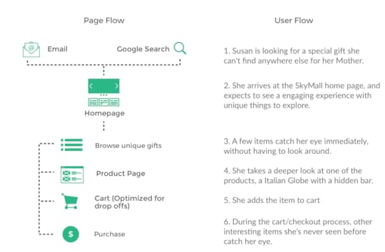
Based on analytics and conversations with the SkyMall project leads, we found two main flows were most useful:
People search for a product on Google, like “unique gifts for mom” then land on a specific product page or category page like “gifts for mom”. They browse various products, add one or more to their cart, and check out.
People land on the SkyMall home page, browse hot items, view various product pages, add products to cart, and check out.
Like I mentioned before, we created a total of 5 flows. In addition to the above two, we also created flows for browsing through the main navigation, landing on categories or product pages from email, and cross-sells of other products.
However, we focused first on fleshing out flow #2 since it showed the largest percentage of people bouncing before adding products to cart. For this flow, we designed the full purchase path.

Key page flow (#2) with accompanying user story to guide the UX review.
For the rest of this article, we’ll focus on the most important flow seen above.
Learn more: Creating Perfect User Flows for Smooth UX
4. Identify Issues
We’ll follow user stories step-by-step through each page, specifically looking for problems areas that affect engagement and conversions.
When you move through the user flows, consider the user goals on each page (“When the user lands on this page, they might immediately look for…”).
Each expert has their own approach to how they create the report itself. I recommend Google Slides, because it’s easy to collaborate with others, can be accessed from anywhere, and can be shared via URL or exported as a PDF.
In Google Slides, I will distinguish sections by page or flow, such as “Home”, “Navigation”, “Product Page”, “Cart”, “Checkout”, etc. When conducting the review, I’ve found it most efficient to detail issues, opportunities, and solutions as I go, rather than making organizing a long list later.
You’ll find a wide variety of UX checklists, UX principles, and UX research easily accessible around the web that you can use. For each issue you reveal, I follow Jakob Nielsen’s 4 point system of prioritization.
When writing about issues, keep it brief, unless the issue is critical and ranks at least a 3 or 4 on the below scale:
1 = Cosmetic problem only—Need not be fixed unless sufficient time is available on a project.
2 = Minor usability problem—Low-priority issue that is less important to fix.
3 = Major usability problem—High-priority issue that it is important to fix.
4 = Usability catastrophe—It is imperative to fix such an issue before releasing a product.

Slide detailing issues on a product page for user flow #2. We ranked the entire set of issues as 3 “Major usability problem” (top right). The most important issue was the lackluster product reviews functionality.
5. Provide Actionable Solutions and Opportunities
Finding issues is the easy part. Clients and companies pay for solutions.
As we find issues, we describe the best solution, and include a screenshot from another website to support the description. And if we’re ever unsure about the best solution, we recommend user testing as a next step after the UX review.
Above all else, we must be as prescriptive as possible. We break everything down at each step of the flow. It’s always better to over-communicate than risk your audience making dangerous assumptions.
a. BAD: “Add more vibrant colors to the home page to reflect your brand and engage users.”
b. GOOD: “Add variations of your 3 brand colors to the home page. Main color: purple, to give hints of elegance. White: simplicity and clarity to allow focus on images. Black: Elegance and contrast. Purple can be used for the main banner background and for some icons and headers. White should be used for most backgrounds. Black should be used to contrast purple; can be used for main call-to action buttons.”

Slide detailing solutions to the issues in the prior slide.
The most challenging, yet potentially rewarding part, is identifying opportunities for conversion and engagement opportunities. This part is not as straightforward as fixing issues. If you’re a UX designer with less than 3 years of experience, this is a skill that gets stronger and stronger over time.
For example, maybe we see an opportunity for a website to use an exit-intent pop-up offer in a non-intrusive way to recapture some leads or purchases. Or, maybe we notice that the website can make use of persuasive design techniques like exclusivity or time pressure to upsell people to the higher value product. These techniques aren’t exactly “issues”, but rather opportunities tailored for business impact.
For SkyMall, one of the major opportunities we identified was adapting their massive brand appeal for online consumption. The SkyMall website brand, design, and layout was missing the “unique” feel that SkyMall’s products used to create for people browsing their airplane catalogs.
In the modern digital age, we decided to focus on curated content for a specific audience. In our case, this was a unique message, an “experts recommend” feature, a retro collection of age-old popular products, etc.
By increasing the opportunities for Skymall to present products in a fun and consumable manner, we aimed to increase the soft-sell conversions.

Slide providing high level brand opportunities, which we described in detail during a follow-up meeting.
6. Tips on Searching for Issues & Solutions
Every UX designer wonders if they missed any issues or solutions. Let’s be honest: we use Google just as much as our own personal repositories of UX principles.
Here’s some quick tips to help focus your search endeavors:
Search Google for the underlying principle you think is poorly designed. Ex: “E-Commerce checkout signup UX”.
If you aren’t sure of the principle, or the proper term (ex. tooltip vs popover vs modal), look for Q&A links on google first, to see the questions others have about the topic. Here are some good general terms to append onto any search: “UX” “Principles” “Best Practices” “Usability” “Patterns” “Optimal”.
Don’t spend too much time searching. If you can’t find a principle or solution, post your question on an online community and resolve the issue later. The following communities usually respond quickly: Quora’s User Experience, LinkedIn groups such as User Experience Professionals Network or UX Professionals, Slack’s User Experience Design channel (request access), or the Stack Exchange’s User Experience community.
Always keep an eye out for great samples. Tag them in Evernote.
Don’t be afraid to browse popular apps and sites, and see how they do it. Galleries like UI-Patterns, awwwards, and siteinspire are great shortcuts to effective design patterns.
Want to learn more? Get your free e-book: UX Design Process Best Practices
7. Remember, It’s Somebody’s Baby
Usually a UX review is read by someone who is passionate about the digital product under review: a founder, CEO, product manager, designer, or developer.
Make sure to balance out all the bad with some good. Remember the principles of good design feedback.
Include a section about what has been done well. This not only cools down the room, but also ensures that the team earns praise for their current best practices (which incentivizes them to keep doing so).
Power dynamics always plays a role in how well your suggestions are received. Nobody wants to look like they’re a fool in front of their boss.
8. Peer & User Review
This step is optional, but highly recommended.
After looking at an interface for hours and hours, you start to become biased and overlook obvious issues and opportunities.
Even if it’s just 30 minutes, try to budget in an outside UX expert’s review, to give you pointers, tie things back to business goals and user needs, catch major issues, catch opportunities from their area of expertise, etc.
Even better, run some guerilla usability tests. If you’re designing for mass-market consumer audiences, buy 5 Amazon gift cards ($10-20 a piece is enough) and head to your local Starbucks. Test with 5 people, then include their feedback in your final report.
Services like UserTesting and 5 Second Tests are also highly affordable for scaling targeted tests in a hurry.
9. Next Steps
A UX review is designed for quick wins. It’s a cheap simple insurance policy against obvious UX issues choking the bottom line.
Start outlining a plan of action with suggested dates. Of course, you aren’t a project manager or product manager. But at least you’re closing the conversation in terms they respect and understand.
For SkyMall, we ended our report with a high-level roadmap of activities. We would create a more detailed roadmap for our next conversation.
Explore new branding leveraging existing branding and modern trends: styles, tone, personality, imagery, iconography, colors, etc
Content Strategy: create an overall content strategy revolving around holidays and building buzz for unique products
Usability testing: Start an open discussion with customers. Get to know them, profile them, and build a long lasting relationship so you can adapt to their growing needs.
UX Designs & UX Reviews: Leverage GobySavvy’s UX team as an unbiased, outside perspective to support internal efforts. We can guide major efforts, conduct audits of future designs, and ensure all pieces of product strategy align.
Once you’re finished, it’s time to start implementing the recommendations. Good luck!
If you found this piece useful, get more UX advice by downloading UX Design Process Best Practices . The guide explains useful activities and strategic documentation.

The post How to Conduct a UX Review That Won’t Get Thrown Out appeared first on Studio by UXPin.
July 13, 2016
Are You Falling for the Wrong Design Problem?

“The first step in solving a problem is to recognize that it does exist.” – Zig Ziglar
Product definition is the cornerstone of our entire product and sets the stage for the success of our product. Every solution we design builds upon the framework of this initial problem.
That means we need to start with a problem that we work to understand and define–carefully. Otherwise, we risk clinging to the first problem that feels right. And we all know how that ends.

Photo Credit: Marcin Treder, UXPin
Let’s go through the process of designing an app around a problem. Since it’s always fun to be a designer on a project that deals with a problem you can relate to, I’ll choose a problem experienced by myself and the majority of people I know.
The problem of having too much stress.
I did some quick and dirty research by calling up a dozen friends and asking if it was a problem they felt they also had. 9 out of the 12 people said they experience the same problem. I suspect 3 of those 12 people are super-secret Zen monks.
Of course, I didn’t have to call them up. I could’ve just sent this 5 minute survey (which you can feel free to take too) to get a sense of the problem.
Now that we have perceived a problem to design an app around we can define it in a problem statement, or definition — a statement that captures the scope of the problem we are trying to solve.
In this piece, I’ll dive deep into how to write a well-crafted statement that communicates the right problem to the team. The next time you come up with a great product idea (or get feedback), follow the steps below to make sure your heart and mind are in the right place.
Perceiving the Problem

Adapted from: Danielle Elder, Creative Commons 2.0
As a designer fortunate enough to get to work with some incredible teams building mobile apps, I get to hear a lot about what other people think about the way many apps are designed and function. There are so many great examples of well designed apps available, it makes finding inspiration easy and enjoyable. Not every app is a pillar of stellar design though, every now and then I hear about one that got everything wrong.
Recently my wife was telling me about an app she was trying to use to assist her with some of the fun things associated with newborn humans, and said:
“This is a bad app.”
My designer’s ears pricked up at the sound of a problem.
“What’s that dear? You have a problem that needs solving?”
“No, I’m trying to tell you a story. Can’t you just empathize with me and let me finish?” she probably implored.
“Of course I’ll help you!” I exclaimed. “First we need to understand your perceived problem at a deeper level.”
An audible sigh came from somewhere in the room.
Many people don’t know how to begin solving their user’s problem because they don’t take the time to listen and really consider their problem. This is usually true not because the person is lazy, rather they just don’t know how to go about thinking about the problem on a deeper level in an effort to understand what is causing it. The design process has to start somewhere though, and that starting point is usually our perceived problem. The perceived problem my wife was having (apart from my listening and empathizing skills) was that the app she was trying to use was a bad app.
To recap, here is what we need to do when a problem is perceived:
Acknowledge the problem. First things first, we must understand that there is a problem. You can’t solve it without saying that it exists. Brushing it under the rug does nothing for you or for your users.
Listen and consider. Don’t just jump to wanting to solve the problem. You have to listen to your users — think about my interaction with my wife — to really understand what’s going on. Asking follow up questions is fine, but don’t just try to suggest a solution before you really understand what’s going on.
Let’s go back to our original problem as an example: I have too much stress.
Well, the problem of having too much stress is probably too general to design a solution around. As is the problem of an app being bad. This is where you need to probe deeper, asking more questions: How many ways can you fix a bad app? All the ways probably. How many different ways can you think of to manage stress? Are overall app design and amounts of stress our real problems, or are they symptoms of deeper problems?
Learn more: The Skeptical Designer’s UX Process.
What Are the Symptoms?
A symptom is a subjective departure from normal function or feeling which is noticed by a user.
For example, the feeling (feelings are subjective, not objective) of being tired (departure from the normal of being awake during the day) is a symptom (a subjective departure from the norm) of not getting enough sleep.

Adapted from: Eamon Curry, Creative Commons 2.0
Our feeling of too much stress is a subjective departure from our normal function of not being too stressed. It also has many different ways we could deal with it, such as having a glass of wine at night, or a bottle, or listening to music, or watching TV. Maybe you know someone who has huge meltdowns and throws tantrums as a way of letting off steam. Maybe you sit in a quiet place and breathe deeply and try to figure out what is causing you to feel stressed. Many people don’t even recognize that they are stressed, which means it’s not easy to recognize what is causing it.
Is having too much stress really our problem? It seems like it is just a symptom of a much deeper problem. In order to solve the perceived problem of having too much stress, we need to think about the problem to determine if it is a root cause or merely a symptom of something deeper.
What is the Root Cause?
Why is it important to find the root cause of the problem? It’s important because solving a symptom isn’t a permanent solution.
For example, if your leg hurts you could take aspirin to dull the pain, but you will not be fixing the root cause of the pain. You will continue to experience the pain which is a symptom of the real problem.
If you went to the doctor complaining about the pain and she determined that your leg hurt because you broke a bone, you could address the broken bone, which is the root cause of the pain problem.
So how do we determine the root cause of our perceived problem of too much stress? We can use something developed at Toyota during the design of its manufacturing methodologies known as the Five Whys Technique.
The Five Whys Technique

Adapted from: Jeffrey Pioquinto, Creative Commons 2.0
The Five Whys Technique is an iterative question-asking technique we will use to explore the cause and effect relationships underlying our perceived problems. This will enable us to find the root cause of our perceived problem. What was my wife confused about again? Something about an app she was trying to use, I think.
“This is a bad app. Also you could do a better job at listening to me when I’m trying to tal..”
..oh yeah that’s right. She couldn’t figure out how to use a productivity app to help her manage some of the fun things that are associated with having a newborn. Things like the amount of poopy diapers, ounces of milk consumed, etc.
In an effort to identify the deeper problem with the app I suggested we go through the Five Whys process.
Why is it a bad app?
…because it doesn’t work the right way. (refined problem)
Why doesn’t it work the right way?
…because I don’t understand where to go. (refined problem)
Why don’t you understand where to go?
…because none of these icons make sense. (refined problem)
Why don’t the icons make sense?
…because they don’t take me where I think they should. (refined problem)
Why don’t they take you where you think they should?
…because some of them that I think are icons, actually aren’t, and the ones that are icons aren’t ones I’ve ever seen before. (alterable behaviors identified)

Created in UXPin
The root cause of my wife’s problem has been identified very quickly, which I can send to the app’s design team as actionable feedback.
How can we be sure we have identified a root cause? The key to understanding the root cause of the problem (it isn’t always answered with the 5th why) is in identifying a broken process or an alterable behavior. Sometimes there are more than one you will identify, like in the app we are going to design to help with the problem of too much stress.
Why do I have too much stress?
…because I have too many stressful thoughts. (refined problem)
Why do I have so many stressful thoughts?
…because I can not calm my thoughts. (refined problem)
Why am I unable to calm my mind?
…because I don’t practice calming my mind. (refined problem and alterable behavior)
Why am I unable to practice calming my mind?
…because I don’t have a process to calm my mind. (broken process identified)
Why do I not have a process to calm my mind?
…because I’m not aware of myself enough to know I need one. (deeper broken process identified)

Created in UXPin
The root cause of the perceived problem of too much stress is a lack of process to calming and focusing our mind. In this example, calming my thoughts would lead to less stress, which solves the original problem. We can evolve our problem definition now.
Learn more: Free e-book UX Design Process Best Practices.
Redefining the Problem
New Problem Definition:
To enable users to calm their mind in an effort to reduce their stress.
What about the deeper problem of not being more aware of our true self? Sometimes a product will benefit from attempts to solve a deeper broken processes than may be necessary. By designing a solution with a deeper and more abstract problem definition we should still be solving the original symptom with the benefit of solving additional symptoms.
Throughout the design process we will continue to evolve the problem definition, so if we find we have gone too deep we can abstract back up one level. Let’s go ahead and redefine our problem definition:
Redefined Problem Definition:
to enable users to become more aware of themselves in an effort to reduce their stress.

Photo Credit: Kevin Dooley, Creative Commons 2.0
Here are a couple of ways you can probe deeper into design problems with your team, as discussed in the e-book The Guide to UX Design Process and Documentation:
Brainstorm on the problem. Get your team together on the perceived problem, having everyone on the team — from designers to developers to marketers to business analysts to sales — participate. Now while it’ll be up to the designer ultimately to solve the design problems, teammates from other departments can provide other insights that will help frame your work. After all, sales may be closer to users and have a deeper understanding of their problems while a business analyst may have insights into the market.
Researching the problem. You can conduct a competitive marketing analysis to determine if this problem is being faced elsewhere. You can also conduct a customer survey (like the one we did earlier on stress). If it’s an existing product, dig through your analytics, heuristics, content, or conduct users tests.
Doing these things will go a long way to getting to what’s causing your problem, its root cause and how to solve it.
Learn more:
3 Mobile App Problem Statements Done Right
Let’s take a look at a few apps and their problem statements:
1. Enlight

According to Stav Tishler from Enlight, their mobile app’s problem definition is:
“To empower the mobile photographer with creative tools, that until now, were reserved only for professionals and only on desktop.”
Enlight solves this problem through the careful design and technology. Lightricks’ proprietary image processing engine powers the tools that are tied together with a consistent UI that allow the users to transfer the knowledge they acquire by learning one tool, to other tools.
2. PureChat

According to Hamid Shojaee, Pure Chat CEO, their mobile app’s problem definition is:
“To enable small business owners who are on the move to be able to communicate with visitors on their websites.”
Maintaining 4.5 stars on the Apple and Google mobile app stores is a pretty good indicator that they have designed a great solution for the problem they set out to solve.
3. Crowd Mics

According to Tim Holladay, Crowd Mics CEO, their mobile app’s problem definition is:
“To enable users who have a voice to be heard in the conference, meeting or any live event in which they are attending.”
Crowd Mics turns the users’ smartphones into wireless microphones for use in live events.
Conclusion
By dedicating some time to thinking about the problem your product aims to solve, you will define a strong foundation for all your future design decisions.
Start by making a list of the problems you perceive that you plan on solving with your product and combine them into a problem definition.
Next take some time to think deeper about the problem definition with the 5 Whys.
Finally discuss the problem with any of the product’s stakeholders and re-evaluate the problem, iterating on the problem definition if it needs further clarification.
Once you write a really strong problem statement, don’t feel like you’re married to it.
As you go along the design process, you may have to redefine your problem. That’s because you’ll discover things that weren’t apparent in the early discovery stage of the process.
For more UX advice, get the free guide UX Design Process Best Practices.

The post Are You Falling for the Wrong Design Problem? appeared first on Studio by UXPin.
July 12, 2016
Level Up Your Web Design & UX Skills at the Generate Conference
It’s all too easy to get left behind in the world of UX, which is why, no matter how much of an expert you may be right now, it’s essential that you carry on learning.
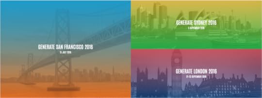
Generate – from the folks who bring you net magazine and Creative Bloq – is one such opportunity. It’s grown over the past few years into an international event. Over the next few months, we’ll hold Generate conferences in San Francisco, Sydney and London. They’re an ideal opportunity to learn digital design and development best practices in the company of fellow professionals.
We’ve partnered up with UXPin (who’ve contributed hundreds of articles to CreativeBloq) on an exclusive discount for all events.
The conferences also a great way to get a feel for what’s going on throughout the web design and frontend development business. They might not directly apply to your job, but sessions on subjects such as SVG animation, flexbox and web apps probably affect the implementation of design decisions. More specialized UX sessions also represent an excellent opportunity to grow your skills and career.
Here’s the most relevant UX talks and workshops at the three upcoming Generate conferences.
Generate San Francisco
1. The future of the web: and how to prepare for it now
The internet as we know it is less than 9,000 days old. So what do the next 9,000 days have in store?
Peter Smart, Global UX Director at Fantasy, will explore how breakthroughs at the edge of technology, science and design will transform the way the web affects our daily lives – from invisible interfaces to touchable experiences and adaptive ecosystems.
Drawing on leading research and experiments across our industry, join him on a tour of the next 9,000 days on the web – and how we can prepare for them today.
2. Design Sprints for Startups
The design sprint is a 5-day rapid UX process developed at Google Ventures.
In this talk, Braden will discuss how this approach can shortcut the usual endless-debate cycle, and enable companies to build and test nearly any idea in just 40 hours. Instead of waiting to launch a minimal product to understand if an idea is any good, teams get great data from a prototype.
Developed at Google Ventures, it’s a ‘greatest hits’ of business strategy, innovation, behavioural science, design thinking and more – packaged into a battle-tested process that any team can use.
Discount for UXPin Users
Save 30% on your ticket to Generate San Francisco (July 15th 2016) with code: UXPin30.
Generate Sydney
1. Crafting a UX that’s fast and rich
Too often increased performance is about reduction.
Developers are always saying there are too many resources on a page or that the design team went way over the top with content overload. This can lead to a culture of tension between designers and developers, with an enforced minimalism and a mentality of the fastest page being a page with nothing on it.
SpeedCurve’s Mark Zeman explores three case studies that push the boundary of what’s possible when delivering the richest web user experience possible in a way that is still highly performant.
2. Beyond Measure
We can track, measure, and store more than ever before. This is naturally exciting to designers and technologists who want to make better informed decisions.
But, says Erika Hall (Co-founder of Mule Design), more data doesn’t necessarily create more meaning, and might even make it harder to see what matters. Human experience does not reduce to an engineering problem and what we can’t count still counts in an increasingly quantified world.
3. UX for change
We are at the beginning of a new era of communication and design.
We have more access to more information than ever before in the history of humankind. We can instantly reach out around the world and talk to leading professionals in our field. In a way, the things we are creating today will shape the way the human race operates for the foreseeable future.
We are in a rare and unique position to be at the forefront. In this talk, Nick Finck (Product Design Manager at Facebook) embarks on an exploration of the possibilities of changing the world as we know it.
Discount for UXPin Users
Save 30% on your ticket to Generate Sydney on 5 September with code: UXPin30.
Generate London
1. Never show a design you haven’t tested
It isn’t hard to find a UX designer to nag you about testing your designs with actual users. But we’re not always that good at explaining why you should – and how you could do it in an affordable way.
In this talk, Ida Aalen (Senior UX Designer at Netlife Research) will share affordable, practical tips for testing your designs, with examples from actual projects she has worked on.
2. Building device-agnostic UX systems
There was a time when we did glossy page designs for our desktop browsers. With the rise of smartphones, tablets and smartwatches, that approach is now outdated.
With further developments in technology and screens, our content could go anywhere. As a result we need to move away from designing for specific devices to solutions that are device-agnostic.
For UX designers that means letting content guide layouts, and moving away from designing pages to focusing on the modules that those views are made up of. In this talk, UX designer Anna Dahlström walks through why device-agnostic design matters, what it means and how we go about it.
3. Designing for our next billion users
How does mobile first design look when users are dealing with intermittent or non-existent connections? How can we provide elegant and seamless experiences on a low speed connection where data costs are high? And how can our products be just as usable for folks navigating in their second or third language?
In this talk, Rachel Ilan Simpson (UX Designer at Google) gives context around users in emerging markets – why we need to consider these users and what kinds of limitations they face. She’ll talk about research conducted for Google Chrome, share some of the team’s early insights, and show features designed to solve these problems.
Discount for UXPin Users
Save 15% on a conference, or conference and workshop-combined ticket to Generate London (September 21-23, 2016) with code: UXPin15.
Other great speakers at Generate London include:
Adaptive Path and Typekit founder Jeff Veen
Mike Monteiro from Mule
Lyza Gardner from Cloud Four
Additional UX Advice & Inspiration
For a taste of what’s in store, here are a couple of videos from previous Generate events.
In The UX of things, Dan Goodwin looks beyond the web and considers how user experience applies to things which affect people’s health, well-being, comfort, or safety.
And in The web and flow of things, John Allsop considers what it is about the Web that keeps it thriving, despite seemingly all the odds, and how by understanding its flexible nature, we can think about its future, and help it reach its true potential.
You can find more ways to stay ahead of the game over at Creative Bloq. Among its UX articles you’ll find practical advice, including:
How to design a winning UX portfolio
7 UX tools you need to try
Google’s UX design secrets
The UX of VR
The post Level Up Your Web Design & UX Skills at the Generate Conference appeared first on Studio by UXPin.
July 11, 2016
New in UXPin: Our Redesigned Dashboard
When we launched the new UXPin Editor in June 2016, our goal was speeding up design and collaboration on individual projects.
But the entire design process is also critical to success. Today, we’re thrilled to announce the new and improved UXPin Dashboard: your design workflow that just flows.
We’ve completed updated and changed our dashboard so that it’s easier for you and your team to better manage your design projects.
Let’s see what’s new.
Keep Everything Organized and Everyone Informed
Project folders contain many prototypes, wireframes, and mockups.
Project groups let you organize those folders into meaningful collections to keep your Dashboard tidy. When you need to move a project, just drag and drop it into place.

New dashboard in UXPin.
Keep your workspace tightly organized with project groups.
You’ll also be able to keep everyone up-to-date with our project status feature. Let your team know in what part of the design process a project is at.

You can even integrate with Slack to make sure everyone knows about the latest changes.
Users Have Roles and Permissions
Chances are, not everyone on your team needs to work on every project.
To keep people on the right projects — and avoid cognitive overload — we’ve revamped your tools to control permissions.

Who can edit what? It’s completely in your control.
Going Forward
It’s organized. It’s easier to use.
The new Dashboard provides a wealth of new features, plus many subtle refinements, to help you know where your projects stand and who’s working on what. That way you and your team are never in the dark.
Over the next few days, we’ll be adding more and more of our users to the new Dashboard.
In the meantime, login to your account to see the changes. Or sign up for a free trial below to start better managing your projects.
Join the world's best designers who use UXPin.Sign up for a free trial.Your e-mailTry it for free!
The post New in UXPin: Our Redesigned Dashboard appeared first on Studio by UXPin.
July 6, 2016
The 3-Step Guide to Erasing Your UX Debt

If your product suffers from inconsistent behavior or performance, you’ve probably made long-term sacrifices for short-term gains. You’ve accumulated UX debt.
For example, it’s not uncommon for a company to release a “critical mass” of features to gain market share. The team worries first about quick user acquisition, scheduling the cleanup work for later sprints.
When it comes to UX debt, you won’t know all the answers immediately. And you probably won’t fix it all by the next release. But that doesn’t mean you should give up. If you can create a plan that doesn’t give product management a heart attack, you will eventually eliminate your debt.
Roll up your sleeves. We can do this.
Step 1: Create and Validate a UX Debt Inventory
Whether you’re at the receiving end of an incoming product acquisition or joining as a new hire, corralling UX debt starts with discovering what you’re up against. And that means conducting an inventory.
Let me walk you through the process.
First, sit down and use the product. You want to do this yourself to highlight anything you find unintuitive or confusing. Keep notes as you go, or ask someone to write down your comments as you use the product—then switch places.

UX debt spreadsheet used by my team
Another collaboration option entails using a spreadsheet (like this one) in your team’s cloud folder while evaluating the heuristics together. As the creators Susan Rector and Kim Dunwoody suggest, review the system based on criteria in the following categories:
Findability
Accessibility
Clarity of Communication
Usefulness
Credibility
Learnability
Overall Aesthetics
Persuasive Design
You can create a solid snapshot of UX gaps by involving the whole team. Completing the evaluation will definitely take more than a week. Be sure to block out a manageable timespan to slowly chip away at it (e.g., 1-2 months).
Remember that while this exercise is highly informative, at the end of the day, you’re not the intended user.
Now that you’ve conducted a UX debt inventory, it’s time to validate your findings by observing and talking with actual users and subject matter experts (read more on that in Rian van der Merwe’s free guide Practical Enterprise User Research).
This will help you better prioritize the work with product managers for the payback sprints or the backlog.
Step 2: Prioritization
Once you’ve revealed all the debt, you must prioritize so that it can be addressed in realistic stages.
Severity & Impact
How big is the issue? Is it keeping users from doing their work? Is it creating a safety or security risk? Is it causing a potential customer to turn around and look to a competitor’s product?
As explained in the free guide Eliminate UX Gaps In Your Product I wrote with UXPin, these are all relatively severe effects that suggest the issue is a high priority.
But don’t just consider the negatives. How big an improvement will the user see? Will the improvement save hours of time in the course of a month? Will it reduce errors? If so, it may be worthy of high prioritization, even if it isn’t currently considered to be a big problem.
If you have a lot of products, you may consider employing a UX Maturity Model as the basis for prioritization.
Estimated Time to Address
How long is it going to take to fix?
If all you have to do is tweak the CSS, you might slip it into the next build. On the other hand, if it’s going to require a significant amount of development or will have to be thoroughly regression tested, it may make sense to hold off until it can be resolved with other issues requiring similar treatment.
Responsible Party
Who will be tasked with addressing the issue?
If it falls primarily on the UX team, and they currently have a light workload, it may be given a high priority. If it requires the attention of a specific developer who is already assigned to other high-priority work, then it will have to wait.
Step 3: Schedule
After prioritizing your debt, the next step is to work with product management to get it into your release schedule.
Agile is so popular these days that it seems like any process that isn’t Agile is labeled “waterfall.” I find that to be a bit dismissive. There are degrees of being Agile, and you can have an effective, iterative process that doesn’t involve stories, scrums, and sprints.
For our purposes, however, I’ll address all non-Agile processes at once. Then I’ll make suggestions for Agile teams.
If You Aren’t Agile
Your work is likely planned based on a release cycle. Your organization decides what will go into the next release based on criteria such as how long the development effort will be; how badly a feature is needed by customers; what will sell; what bugs exist and how bad they are; and so forth.
I recommend handling UX debt issues as bugs. The real benefit of this approach is that debt items can be entered and tracked using the same tools and business processes as bugs. This will ensure that they get reviewed and treated equally. A representative from the UX team on the issue review board should prioritize items, ensuring that usability issues get the full weight they deserve.
Ideally, a representative from the UX team will also work closely with product management when releases are scheduled.
When a particular part of the application is being scheduled for work, check it for UX debt. Would it add much effort to address the debt at the same time? Often, there will be savings simply because the code is already being updated by developers. Even if it’s a low-priority item, take advantage of the opportunity to pay down some debt.
If You Are Agile
A company that employs a healthy Agile process shouldn’t have any problem prioritizing debt with other types of work, assigning it story points, and fitting it into sprints.
Find the rhythm
In my own experience, however, Agile has been embraced as a way to get more work done faster, rather than as a method of iterative improvement.
In such situations, you may have a harder time scheduling UX debt because (as management sees it) there’s not enough time to fit in everything they aim to wrap up, so there certainly isn’t time for all those trivial corrections you’re asking for.
Photo credit: Laura Kershaw. Design process at Kaplan Test Prep for UX Design in Action.
If you find yourself in such an environment, your goal should be to find a rhythm for addressing debt.
Propose a certain number of story points per sprint (or every other sprint). Or, perhaps a sprint could be devoted to addressing debt at some regular interval (payback sprint). This should be done at least until the backlog of historic debt—your debt inventory—has been handled. Then it should become easier to keep up with new debt that crops up without that regular schedule.
Try a “Cheese Day”
For even tighter schedules, consider holding a Cheese Day to knock out as much debt as possible. Management is almost always receptive to a one-day workshop every 60 days where you knock many items off the debt list.
The following procedure suggested by Roy Man is both realistic and effective:
About 2-4 weeks before Cheese Day, create the project in your app of choice (Asana, Trello, Basecamp, etc) and encourage everyone from customer support to developers and designers to briefly describe product annoyances.
Prioritize the cheese list based on the advice in the below chart. Separate the “Quick Wins” from the “Nice-to-Haves”.
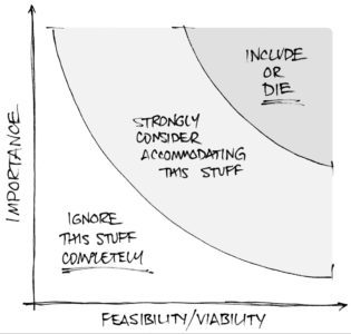
Photo credit: Joe Natoli
Schedule 6-8 hours for the Cheese Day, inform everyone of the date, then dive right into the “Quick Wins”. Everyone will feel productive, and you’ll have progress to show management at the end.
Conclusion
Most importantly, we address UX debt through collaboration.
UX debt should be understood as the responsibility of the entire organization—not just the UX group. It takes a good working relationship with your entire team to ensure that UX debt is given the attention it deserves.
And of course, the best way to eliminate UX debt is always avoiding it in the first place.
If you found this article useful, get more advice by downloading the free e-book Eliminate UX Gaps In Your Products .

The post The 3-Step Guide to Erasing Your UX Debt appeared first on Studio by UXPin.
July 5, 2016
The Skeptical Designer’s UX Process

Great UX designers are great analysts.
They question everything. They’re aware of biases. They validate assumptions through triangulation. They think in terms of screens and systems.
As a designer, you oftentimes face situations in which a coworker (or even fellow designer) enthusiastically explains a business problem that needs solving.
Before jumping on board, your first instinct must be to question the problem. Skepticism needs to drive design, otherwise we become victim to our own excitement.
In this post, we dive into:
How to ask the right questions upfront.
How to ruthlessly prioritize the right features.
How to check your enthusiasm with an MVP.
Never settle – question everything
We first learned of the 5-question approach in Chris Thelwell’s blog post.
As Head of UX at Envato, Chris asks his team these questions before every project. Let’s examine how to use each question to reveal dangerous assumptions and knowledge gaps.
1. What do we know we know?
You want to discuss anything that will influence your decisions in the project. For example, lessons learned from previous projects, existing user research insights, even opinions held by certain stakeholders.
The first question also helps you reveal assumptions disguised as facts. When someone says something they believe to be true, ask them for supporting evidence.
Let’s say you’re tasked with redesigning an analytics platform. Trial-to-signup conversions have plummeted. Something needs to change.
A product manager might say “Customers with the highest lifetime value buy our analytics platform because we offer the most customizability for reporting ”. That statement is a fact only if you can verify against prior user research and feedback. Otherwise, you must consider it an assumption.
Keep a running tally of assumptions vs. facts. Mention every assumption as an answer to the second question below.
2. What do we know we don’t know?
Now you reveal even more assumptions.
At this point, a marketer might say “I’m not sure if our competitor’s aggressive ad retargeting of our trial users is stealing away our on-the-fence users”. You would list the response as an assumption in the format of “Competitive ad retargeting might be stealing market share”.
It’s also worth discussing the consequences if your assumptions are proven wrong. For instance, if you later discover that your most valuable customers aren’t buying your platform for its customizable reporting, how will that impact the project?

The goal here is to identify the risk behind your assumptions.
As you can tell, our above assumption carries a high degree of risk. If you dive into redesign and learn after the first round of usability testing that a reworked reporting feature makes no difference, your team just wasted untold hours and dollars.
As you start seeing the different risks behind assumptions, you start to naturally prioritize the questions that initial user research will seek to answer.
Research should reveal most answers, but some might be unanswerable (e.g. determining the effectiveness of a competitor’s retargeting ad). In those cases, at least you’ve pushed that risk to the surface where stakeholders can evaluate early in the process (e.g. proceed with the project, or push to backlog).
3. What do we actually know, but think we don’t?
The answers to this question might naturally arise as other people chime in to the previous questions.
For example, a marketer might answer question #2 with “I’m not sure if people churn due to cost or frustration”, and your user researcher might explain a series of usability reports that points to frustration.
Nonetheless, it’s worth revisiting all the answers you’ve categorized as assumptions. Ask the team if they worked on similar projects in the past, and if they revealed any insights regarding the assumptions. You don’t want any facts miscategorized as assumptions since you’ll later waste time researching previously validated information.
4. What are the unknown unknowns?
This questions sounds strange, but pay close attention.
Have we failed to discover anything so far that could completely ruin the project? What haven’t we thought about yet?
When you ask this question, you’re turning the grey zone of “unknown unknowns” into illuminated “known unknowns” that your team can prioritize based on risk.
For example, the question might prompt a developer to say “Well, now that you bring it up, we actually found out three weeks ago during load testing that our reporting feature can lag by up to 4.5s for data sets exceeding 100 rows”.
That information might be an “unknown unknown” for everyone outside of the development team, but you’ve now added it to everyone’s list of assumptions to test.
You’ve now revealed that the team needs to also test that “We might be losing customers due to slight performance issues with our current reporting feature”. In this case, the solution might not even require any front-end design work.
5. What does success really look like?
“A smooth product experience” doesn’t cut it. You need to write down S.M.A.R.T goals.
Specific
Measurable
Actionable
Relevant
Trackable
Here’s an excellent example of a S.M.A.R.T. goal in our hypothetical UX project:
“Success is achieved when our trial-to-signup conversion rate increases from 2% to 2.50% without affecting churn”.
As you start validating assumptions through user research, you might make the goals increasingly specific as you start to hone in on a solution. If you discover, for instance, that a buggy checkout process is mostly affecting sales completion, you might add a secondary goal that “Success is achieved when our checkout completion rate increases from 45 to 75%”.
Reveal constraints from every corner
Questioning the problem helps us decide if we should design a solution. Formalizing our constraints helps us decide how we should design the solution.
All product design faces these constraints:
Timing – In today’s world of Lean and Agile, every company wants to ship good products quickly. Find out if you need to release your MVP by a non-negotiable date (e.g. a global tech conference your company spent $58,000 sponsoring)
Technology – How well can the development team write the code so your system’s response time feels instant? Do your servers support enough bandwidth to feed data quickly in real-time? Does the location of your data centers affect quality of experience in high-revenue regions?
Medium – What do users already expect from your type of product? What current mental models and UI patterns does your product need for consistency?
Budget – How much money is the company setting aside for the project, and how much could they stretch in case unforeseen delays or challenges appear? “Wobbler” features might emerge (e.g. features that are just slightly out-of-scope), so it helps to see if any financial cushion is available.
After your questioning exercise, conduct thorough stakeholder interviews so you can further reveal any hidden constraints as early as possible.
Grab design ebooks created by best designers
All for free
 Download
 Download
 Download
 DownloadDo you want to know more about UI Design?
Download 'The Guide to UX Design Process & Documentation' FOR FREE!
Download e-book for freeCloseNo solutions without triangulation
Once you’ve identified the initial constraints, you need to validate those assumptions. At this point, you’ll start conducting user research, prioritizing requirements, and prototyping concepts.
The most cost-effective generative research method is user interviews.

Photo credit: Cacoo
You can conduct them in the office, over Skype, or even at the user’s location (contextual inquiry) to better observe their natural use cases.
When interviewing users, your goal is to explore the whole scope of the experience – not just the immediate area of focus. For example, if you want to create a competitor to Netflix, don’t just talk to people about how they currently use Netflix. Talk to them about other services they use – legal or illegal.
Where do they watch episodes or movies? What device they use? Do they download or stream? Why?
Ask plenty of open-ended questions about user behavior (not user opinions), then pause for the answers. Don’t worry if the interview veers slightly off topic since the best insights sometimes come from tangents.
Prioritize requirements ruthlessly
Once you’ve finished the user interviews, you’ll want to review the answers and start identifying patterns. Check those patterns against any existing quantitative data (e.g. in-app analytics).
When defining requirements, designers and their stakeholders generally conduct a prioritization activity with a 2×2 matrix as they evaluate the qualitative data and quantitative data against the design constraints.
As Kate Rutter explains in The Definitive Beginner’s Guide to UX, start by making a “plus” sign of two axes. Label each axis with attributes that will guide your decisions. Common labels are: important/less important; easy/difficult; urgent/less urgent.
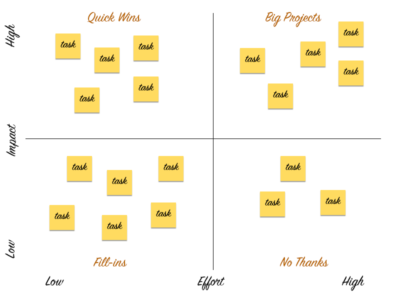
Photo credit: Sarah Harrison
Write each idea/feature on a sticky note, and as a team, plot each sticky in a quadrant, based on the attributes. Then, focus on ideas in the optimal quadrant (usually a combination of “important” + “easy” or “urgent”, but it varies based on the context.)”
Keep your enthusiasm in check with an MVP
The minimum viable product represents the least amount of effort required to validate a hypothesis. Don’t confuse an MVP for an incomplete or rushed product. Your goal is to create something complete at the smallest scale possible.
When working on the first MVP, focus on incorporating the items that populated the “Quick Wins” and “Big Projects” quadrants of the 2×2 matrix. Discard any items in the lower-right quadrant, and move all the items in the lower-left quadrant to the backlog.
You might start sketching the MVP, then move into a digital platform to create a digital prototype. It doesn’t need to be pretty, but it must function well enough to test with users.

Lo-fi MVP prototype created in UXPin by LookThink for a healthcare product.
You’re on the right track if the MVP prototype faithfully executes the 20% of features that deliver 80% of the value. Only increase the fidelity as you test additional hypotheses (e.g. if colors affect usability).
Conclusion
As you test the MVP prototype, you may reveal additional user needs and need to reprioritize requirements again. Don’t be alarmed – design is never a linear process.
While every designer’s individual process differs, they should all follow the same disciplined thinking: question the problem, gain context through user research, and build just enough to validate assumptions and uncover new needs.
The process sound simple, but it can take a lifetime to truly master.
If you enjoyed this post, download the The Definitive Beginner’s Guide to UX.

The post The Skeptical Designer’s UX Process appeared first on Studio by UXPin.
June 24, 2016
The 4 Types of Creative Website Scrolling Patterns
In web design, the journey can be as enjoyable as the destination.
Enter the world of scrolling patterns. Creative scrolling patterns let you adjust the pace, delivery, and interactivity of the content. Considering that our attention span on the web has dropped to about 8 seconds, a delightful scrolling experience certainly prolongs user interest.
In this post, we’ll examine the most common and time-tested scrolling pattern. As explained in the free e-book Web UI Patterns 2016 Vol.1, each pattern is creative yet proven usable through years of refinement.
So, how do you know which situations call for which patterns? We’ll explore examples, use cases, and best practices for:
Long Scrolling
Fixed Long Scrolling
Infinite Scrolling
Tasteful Parallax Scrolling
Let’s get started!
1. Long Scrolling


Problem
A site has so much eclectic content that a multi-page format would be too difficult to navigate.
A site wants to tell a story in a smooth, linear fashion.
Solution
Create a single-page, long-scrolling site to consolidate your content in a single place. This works great for social media sites and others with user-generated content, where part of the fun is browsing through everything all at once, and the content is diverse and difficult to categorize because it’s always updating.
The prominence of mobile browsing supports the long scrolling pattern since smaller screen sizes call for more scrolling.
Combined with the infinite scrolling pattern described below, long scrolling can create a completely immersive browsing experience. If users are searching for something in particular, a more structured navigation system like Amazon’s works better — but for explorability, long scrolling is the fastest and most fun for users.
Tips
Use sticky navigation. Disorientation and the inability to go back are the innate drawbacks of long scrolling, but a fixed menu allows users to move freely.
Long scrolling can have a negative effect on SEO, but this can be avoided by following the advice of Neil Patel from Quicksprout.
Don’t autoplay heavy media like videos, since in abundance they drastically slow down loading.
You don’t have to commit to a single-page format with long scrolling: often sites feature a central long-scrolling home page that links out to traditional secondary pages, like Facebook and Twitter’s separate profile pages.
For one-off long scrolling on specific page sections, try the fixed technique described below.
2. Fixed Long Scrolling


Problem
A site could benefit from the advantages of long scrolling, but doesn’t want to convert entirely from a multi-page structure.
Solution
Fixed long scrolling sites display information that might otherwise require multiple sections within one long-srcolling section. The effect feels like a “scroll within a scroll”.
Tips
When deciding what to include in a fixed scroll section, make sure you only choose content that fits within a unified theme or category. Each part of Squarespace’s fixed scroll section, for example, focuses on explaining how to “Create a beautiful website” for different business types.
Place CTAs in at the end of each of each fixed-scroll frame.
As the UXPin product tour page shows, you can also consider adding a “scroll progress bar” to the top navigation. The pattern helps add a greater sense of pace if you have more than 3-4 frames.
Grab design ebooks created by best designers
All for free
Download
Download
 Download
 DownloadDo you want to know more about UI Design?
Download 'Web UI Design for the Human Eye' FOR FREE!
Download e-book for freeClose3. Infinite Scrolling


Problem
Content is better organized on a single page, but there’s too much to load all at once.
Solution
With the infinite scrolling pattern, content is loaded as needed to provide a more paced experience. Infinite scrolling proves useful for single-page sites with more than a few screens worth of content, especially with multimedia galleries.
Infinite scrolling creates a rhythm for social media sites, where users are continually entertained with new content without clicking or waiting.
The problem with infinite scrolling is when users lose their place, though there are ways around this. Sticky navigation is the best way to give your user mobility in a near-infinite sea of content.
Tips
In addition to sticky navigation, there are other methods to help infinite scrolling’s disorientation. A jump-to-section option, as with Tumblr, lets users return to the start if they become lost.
Infinite scrolling can be combined with pagination for more accurate searches. For example, Facebook allows users to search timelines by year.
Don’t be constrained by the traditional loading circle — your choice of icon is an opportunity to deepen your site’s identity. Facebook, Tumblr, Imgur, and others all have custom loading signifiers.
4. Tasteful Parallax Scrolling


Problem
Users are not engaged enough in long scrolling formats.
Solution
Give your long scrolling site more impact with a parallax effect. Known to the video game industry for decades, this pattern refers to the layers of a two-dimensional image moving at different speeds when scrolling, i.e., the foreground and background moving at different speeds, or differing layers of the background. The effect creates a mesmerizing three-dimensional feel.
The parallax effect unlocks the more creative aspects of scrolling, especially when combined with scroll-triggered animations. This style lends itself to storytelling sites, building a more immersive and stimulating experience with better visuals.
The Walking Dead uses parallax and other scrolling techniques (i.e., atypical direction since the frames move left to right as you scroll down) to deepen their narrative. While not necessary, the differentiated backgrounds make just watching the scroll more enjoyable. It also makes sense for the context of the site since the character react to the scroll.
Tips
For help on coding for parallax sites, read Dave Gamache’s piece on Medium.
Be careful of loading times. A simplified fast site is still better than an extravagant slow site.
Next Steps
If you found this post useful, check out the full length e-book Web UI Patterns 2016 Volume 1.
The guide explains 140+ examples for 38 useful UI patterns.

The post The 4 Types of Creative Website Scrolling Patterns appeared first on Studio by UXPin.
A Symbolic Conversation About Icons in Design

This week we added 600 new Material Design icons to UXPin. But just having resources doesn’t guarantee a great design. In today’s #UXPinChat we talked about the use, benefits, and ethics of using icons in your work.

A1 Do: User profile, settings, search. Don't: the 3-line menu icon (big surprise to me, here) #uxpinchat https://t.co/T6xzQNgEJd
— Steve Amara (@amarast) June 24, 2016
People do not understand the hamburger icon! #uxpinchat https://t.co/GPlAk8mTQ3
— Lindsey Meredith (@lindseymere) June 24, 2016
@uxpin Accessibility icons like Settings, Help, Info are common across web. Users can pretty well understand what they mean. #uxpinchat
— Abhishek Pathak (@abhishekp1996) June 24, 2016
The "Save" icon is universally understood by people, yet I also find it funny that fewer and fewer people know where it came from #UXPinChat
— Indra Sofian (@indysofian) June 24, 2016
1 supposed to be stick Vitruvian Man for "lifeform." The middle legs look like genitals to Korean client #uxpinchat https://t.co/atyACB39Kl
— Tarra Anzalone | UX (@theuxicorn) June 24, 2016
@uxpin life tube icon for Help is also gaining popularity.
— Umajit Mongjam (@UmajitM) June 24, 2016

I haven't. But I don't see any reason not to. Pay the designer! #uxpinchat https://t.co/ipUPQ9ST7L
— Ryan Thomas Riddle (@ryantriddle) June 24, 2016
I'm moving to paying for memberships like @nounproject or other Kickstarter foundries for completeness. #uxpinchat https://t.co/va7mDueHVa
— Tarra Anzalone | UX (@theuxicorn) June 24, 2016
A2 I'll definitely pay for a large set of nice icons. Art is to be appreciated #UXPinChat
— Indra Sofian (@indysofian) June 24, 2016
A2) @uxpin We pay for UXPin, who I assume pays for professional icons! "Anything worth having is worth paying for." #UXPinChat
— Michael Gremillion (@IselianGaming) June 24, 2016
@loomie_ux it was so weird – as a western art history buff, I knew exactly what it was! Not clear in eastern art culture! #uxpinchat
— Tarra Anzalone | UX (@theuxicorn) June 24, 2016
@RamsesCabello profile = head & chest. Settings = gear. Search = Loop. But here, we realise users don’t get the menu icon cc @uxpin
— Steve Amara (@amarast) June 24, 2016
A2 Not done it yet, but I would if I have to. Great work has to be rewarded #uxpinchat https://t.co/KMbnZbLIVQ
— Steve Amara (@amarast) June 24, 2016
A2. I would if I had to. Especially if they come from @Iconfactory :) https://t.co/u7zWpClOer
— Loomie (@loomie_ux) June 24, 2016

Icons bring your designs to life. When used correctly, they have the potential to be more powerful and expressive than words. #UXPinChat
— Indra Sofian (@indysofian) June 24, 2016
A3 Only if they’re universally understood or offer tooltips. Icons b/c they look nifty is bad #UI. #UXPinChat
— Benjamin Gremillion (@ux_benjamin) June 24, 2016
What he said is my answer to Q3. #uxpinchat https://t.co/OgxMxRfU5Y
— Ryan Thomas Riddle (@ryantriddle) June 24, 2016
Yes in the age of emojis & icons, many visual queues are post text – I would argue this benefits UX #uxpinchat https://t.co/reM5kBupCq
— Lindsey Meredith (@lindseymere) June 24, 2016
What he said about what he said #uxpinchat https://t.co/kfTAzPH72w
— Lindsey Meredith (@lindseymere) June 24, 2016
@uxpin #uxpinchat A3. Visual clues guide better than text, but not to the extent that it destroys UX when icons don't load up.
— Abhishek Pathak (@abhishekp1996) June 24, 2016
@uxpin Possibly, but if they are more obscure, like not the typical save disk, edit pencil, cancel x, they often test poorly. #ABtest
— Dave Debus | UX & UI (@davedebusdesign) June 24, 2016
They "save space" if adding usability & testing well. Do they promote recognition ✔️or require recall ✖️? #uxpinchat https://t.co/40N08XmnEi
— Tarra Anzalone | UX (@theuxicorn) June 24, 2016
A3. It makes sense for millennials. Baby boomers may have some trouble understanding the message that it conveys https://t.co/VmocuNtf7i
— Loomie (@loomie_ux) June 24, 2016
@uxpin A3 In some cases, we can like info (i). It's better to have text with visual cues #UXPinChat
— Umajit Mongjam (@UmajitM) June 24, 2016
A3) @uxpin Depends on res space, visual noise. Icons help it stay clean. Absolute must for mobile design. But words are explicit. #UXPinChat
— Michael Gremillion (@IselianGaming) June 24, 2016

Depends on brand aesthetic, but I see marriage of digital and handmade with offset printing quality #uxpinchat https://t.co/s1rYnIcki8
— Tarra Anzalone | UX (@theuxicorn) June 24, 2016
A4 Brighter colors, and probably a return to thicker shapes. #UXPinChat
— Benjamin Gremillion (@ux_benjamin) June 24, 2016
@uxpin #uxpinchat A4. Minimalist designs are never going out. Cards view trend is picking up quite fast.
— Abhishek Pathak (@abhishekp1996) June 24, 2016
Gradients and skeuomorphism. ;) #uxpinchat https://t.co/yhLvaj5IjA
— Ryan Thomas Riddle (@ryantriddle) June 24, 2016
A4 Ditching the gradients. Minimalist designs, fewer but brighter colours #uxpinchat https://t.co/PEWRO30uWN
— Steve Amara (@amarast) June 24, 2016
Gradients are the #design equivalent to chunky highlights and bell bottoms… :P #uxpinchat #ux #designtrends pic.twitter.com/Uh5s967VK5
— Lindsey Meredith (@lindseymere) June 24, 2016
@lindseymere @uxpin it depends on how you use them. They are not necessarily bad. #uxpinchat
— Nene Odonkor (@neneodonkor) June 24, 2016
A4. I'm a Equal opportunity designer. I love it all! #uxpinchat
— Loomie (@loomie_ux) June 24, 2016
@uxpin Minimalist designs will continue to grow #uxpinchat
— Umajit Mongjam (@UmajitM) June 24, 2016
@lindseymere GIF NAILED! Send this to Instagram and ask them to remove the gradient from their new awesome logo. Please

June 21, 2016
600 New Material Design Icons in UXPin

Google’s Material Design informs the look and design principles behind many of the sites and apps we use today. Their distinctive look covers colors, typography, layout — and icons.
This week, we’re pleased to roll out 600 Material Design icons in UXPin to help you speed up your product designs.

What are Material Icons?
Material Design is a set of principles put forth by Google that governs how modern UIs should look and work — at least, according to Google. Their official icon set is used in many Android and Google apps, and is becoming a staple of web design as well.
Using the Icons in Your Work
Getting to these icons in UXPin is easy. Look for “Material Icons” in the left-hand Library menu.

If you don’t see them listed, go to “manage libraries,” located at the bottom of the list, and turn on the Material set.

You can also search for keywords based on the icons’ names.
Customizing Their Look
Dragging an icon into the UXPin canvas gives you a new vector image. These images can be stretched, resized, rotated, colored, and made transparent. And as with any element or group in UXPin, interactions can turn icons into clickable — even animated — buttons. The end result is more iconic designs for you and your users.
Check it out for yourself with a free UXPin trial.
Join the world's best designers who use UXPin.Sign up for a free trial.Your e-mailTry it for free!
The post 600 New Material Design Icons in UXPin appeared first on Studio by UXPin.
UXpin's Blog

- UXpin's profile
- 68 followers

