
UXpin's Blog, page 128
May 13, 2016
5 Ways to Design Like a Startup (Even If You Aren’t One)
With Square reinventing the frustrating experience of payment, Nest reimagining dull thermostats, and Uber creating frictionless commuting experiences, we see many designers migrating into these design-centric startups.
The momentum, the speed and the vision to re-imagining the way we live make startups an appealing environment for designers. But this fast-pace environment could happen anywhere. Whether you are a tiny startup or a large company, the key is just good habits.
While working at ZURB (a product design agency), I had the chance to advise companies of all sizes on better design and better processes. Since then, I picked up five approaches that I’ve continued using here at Zugata (an early stage startup reimagining performance reviews).
These five habits help our team design effectively and efficiently in a lean startup.
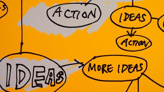
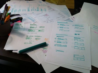
1. Start with sketches.

Sketching low fidelity wireframes at Zugata
Early in my career, I was one of those designers who went straight to the computer to make something. I found myself wasting hours pushing pixels back and forth, rather than solving the actual design problem.
It wasn’t until I started working at ZURB that I learned the importance of sketching. On my very first project, my design lead told me to deliver 50 opportunity sketches. It was a struggle to get fifty ideas on paper, but I noticed I was able to generate bigger concepts and innovative ideas more quickly. With more practice, the 50 sketches became an easy task, and it is now my favorite part of the design process.
I’ve seen companies share their “different” design concepts. But you always knew they started on their computer, because the only differences were color and typeface changes, rather than different concepts. When you place your computer aside and simply start on paper, you become agile with your thinking.
The more you sketch, the more you free your mind to reveal innovative ideas without judgment.
Start on paper by:
Sketching notes and opportunities
Sketching journey maps to convey your product story
Sketching low fidelity layouts to replace static wireframes
2. Time box your tasks.
After my design lead challenged me to 50 sketches, he then challenged me to do it all within an hour. I whined in my head before I headed to battle with time.
We battled with time for just about everything at the ZURB. If we needed to sketch, create wireframes, explore visuals, code up pages, we time boxed it.
Time boxing is when you set a time limit to complete specific tasks. It is the best way to stay focused, become lean and mean, and improve your productivity. Being the designers that we are, it also helps us avoid obsessing over unnecessary details, which is another reason we tend suffer with designer’s block.
If time pressure isn’t enough to motivate you to complete your task, add rewards upon completion. It could be a walk around the block to get some fresh air, a freshly-brewed cup of coffee, or a box of chocolate. A reward system also helps you find a balance between work and rest, allowing you to accomplish more.
Exercise your time boxing skills by:
Setting your timer for specific tasks
Creating daily milestones
Practicing 1-week design sprints
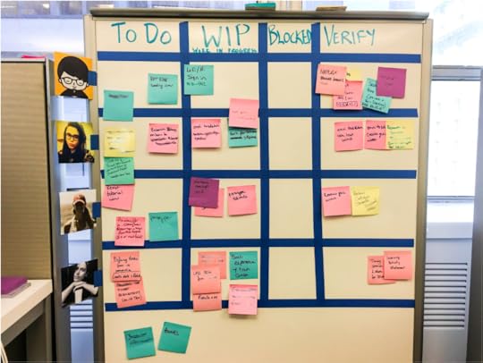
3. Share your work early and often.

Sharing work on Demo Days at Zugata
While at ZURB, I worked with a broad range of companies. Most had a siloed design process—especially the larger ones.
It was painful to see teams not communicating with each other, employees not knowing what is going on holistically, and stakeholders refusing to sign off on ideas. In the end, people got frustrated, nothing got done, and hours were wasted. It was a complete mess.
As designers, we should be that guiding light. We start by sharing our designs early and often. Most of the time, we fail by waiting until the last minute to show our polished high fidelity mockups to our stakeholders.
While we should hone our design craft, dot all our I’s and cross our T’s, these pixel-perfect mockups should be shown last.
First, share your early thought process. From sketches, workflows, storyboards, lo-fidelity mockups—show everything and be transparent to provide clarity and help others understand our reasoning and design decisions.
Other ways you could be transparent in your design process are:
Making standup a tradition; communicate what you did yesterday and what you’re planning to work on today
Capturing key takeaways and insights from your design process, then share them via Slack, Email, or UXPin
Hosting demo days for sharing your latest designs
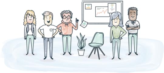
4. Everyone pitches in.

Brainstorming with the founders and engineers on the Zugata signup flow
While it is easier and more fun to collaborate with like-minded designers, remember to invite non-designers into the mix.
At our startup, we regularly collaborate with our engineers, data scientists, and founders by discussing problems and brainstorming solutions on whiteboards together. This helps us understand the problem from different perspectives, meaning we can work through those questions and problems much more quickly.
While working on a project at ZURB for a 100-year-old company with a huge team, we invited stakeholders from different departments to come together. It was immediately clear they were not on the same page for a lot of things. They were defensive with their own ideas, while close-minded to others. We took out the post-it notes, and asked them to write what makes their brand unique. After they were done, they shared their thoughts, added onto other ideas, and bucketed the ideas into themes. By the end of the meeting, they smiled at their whiteboard filled with post-it notes. The collaboration made them feel like they finally created the vision of the brand together.
As recommended in the free guide UX Design Process Best Practices, work together and create a collaborative culture by:
Listing ideas with the team
Brainstorming on whiteboards with the business team
Hosting design sessions to share your design iteration and ask for feedback
Participating in bug bashes with your engineers
5. Assume nothing until you’ve spoken to users.
Like time boxing, connecting with users will help you remain focused on key problems highlighted by the insights you gather. It is the most effective way to understand who they are, what is important to them, and what they need.
At Zugata, we’re building something that never existed before, meaning we don’t always have data to help with design decisions.
Where we don’t have data (such as the first version of a feature), we still have our users. We constantly reach out to them for feedback and insight. Reaching out helps us make decisions on different design hypotheses we may have as a team. And by hearing what they have to say, we can quickly identify what’s working and what isn’t through their tone, body language, and facial expressions.
Throughout your process, connect with your users by:
Coordinating surveys to gather feedback from users
Asking users to walk you through a few tasks
Share your early prototypes with your users to get feedback
Interviewing users to understand their needs
Conclusion
While being scrappy, nimble, transparent, collaborative, and empathetic helps you design effectively and efficiently at a startup, there is still one thing you need that cannot be trained.
Passion.
If you’re going to spend hours solving, iterating, and shipping, do it on something you’re passionate about. That passion will give you the energy and motivation to climb ladders, jump hurdles, and design great things at a startup.
Remember, “nothing great in the world has been accomplished without passion.” Let’s make great products, disrupt industries and re-envision better ways to live.
For more advice on lean design, check out the free Guide to Agile UX Design Sprints. The 97-page playbook is based on 50 design sprints conducted by author and designer Alex Gamble.

The post 5 Ways to Design Like a Startup (Even If You Aren’t One) appeared first on Studio by UXPin.


Color Me Clickable: Links and Google’s A/B Test

Google recently experimented with black links on its results pages. Not everyone was pleased with the result, especially since visited and non-visited links looked the same.
In this week’s #UXPinChat we asked people’s opinions on link colors, usability, aesthetics and more. While many of the replies were a little tongue-in-cheek, others wondered what Google was thinking — and if changes were necessary at all.

A1 @uxpin Black is fine, but they NEED a clicked link state of a different color. People react badly to change (see: Instagram) #uxpinchat
— Michelle Matthews (@michematthews) May 13, 2016
If they do, it will take some time to get use to for sure! #uxpinchat https://t.co/ymm2zRMK0T
— Loomie (@loomie_ux) May 13, 2016
@uxpin Google may know the better link color, but this is the big deal: Distinguishing links vs non-links #UXPinchat https://t.co/JoRH99n9r0
— Michael Gremillion (@IselianGaming) May 13, 2016
#UXPinChat Q1 No. Having separate colors is better. #UX #UXDesign https://t.co/0oW7CFD2dC
— Veronica Rivera (@justvcreative) May 13, 2016
.@ux_benjamin Seriously! I guess since it's an A/B test, I trust Google to have a solid hypothesis for changes like this #uxpinchat
— Michelle Matthews (@michematthews) May 13, 2016
If we are talking about the links that they force for dates and times in email, etc. then they should. #UXPinChat
— Gregory Rosenhan (@gregrosenhan) May 13, 2016
A bit outside my area of expertise, still very valuable. I'm in! #UXPinChat @uxpin #Google #testing #data https://t.co/dkkw5xfwGu
— Daniel (@aduszkiewicz) May 13, 2016
A1 At least it's not hot pink. haha! :D #uxpinchat
— Loomie (@loomie_ux) May 13, 2016
@IselianGaming @loomie_ux @uxpin YASSSSSS make it glittery too pic.twitter.com/FKeGHhnqB9
— Michelle Matthews (@michematthews) May 13, 2016

A2 @uxpin What is the need for changing color on Google? Pure experimentation? If so, not a UX exercise to me. #uxpinchat
— Michelle Matthews (@michematthews) May 13, 2016
@loomie_ux @uxpin A2 right here. Hot pink, it's the new link. #UXPinChat
— Michael Gremillion (@IselianGaming) May 13, 2016
A2 @uxpin They should be looking at colors & color usage that guides people to the info they are searching for. #uxpinchat
— Michelle Matthews (@michematthews) May 13, 2016
White… #tudum_tsss #UXPinChat https://t.co/ZIrhzJjRpd
— Daniel (@aduszkiewicz) May 13, 2016
.@uxpin Hard to truly answer, IMO. We are all so used to blue. Large bias. Twitter uses teal? What about different background? #UXPinChat
— Michael Gremillion (@IselianGaming) May 13, 2016
A2 Anything but neon, please. My eyes can't take it. #uxpinchat https://t.co/ih0rsxMW1S
— Loomie (@loomie_ux) May 13, 2016
Q2 #UXPinChat Maybe @Google could try this palette. #UX #uxdesign pic.twitter.com/Nt8J2XrAbG
— Veronica Rivera (@justvcreative) May 13, 2016

.@uxpin Habit tells me blue, but that red isn't bad. Tells me error/problem though. Why can't I drop the highlight on 5? #UXPinChat
— Michael Gremillion (@IselianGaming) May 13, 2016
A3 @uxpin Which ever one performs best in testing.

May 10, 2016
Project Managers: How to Get the Best From Your Designers
You could say I’ve worked the “grand tour” of roles—I’ve been a designer-slash-front-end developer, a project manager, and a leader for teams of designers, developers, and UX pros.
But now I’ve come full circle, and back to doing what I love: design.
Filling so many roles meant learning how each sees the design process—and how I needed to understand design from multiple angles so that I could translate that to my team.
I’ve learned that getting the best from your design team ultimately depends on 4 important lessons.
Feature photo credit: Laura Kershaw. Design at Kaplan Test Prep.
1. Demand that designers help gather requirements first-hand
Imagine that you’re given a compass and told you need to walk north. How do you know you’ve reached your destination? Why are you walking there in the first place? What’s waiting for you when you arrive?
Requirements gathering is a vital step toward understanding and framing a design problem.

Photo credit: Laura Kershaw. Design at Kaplan Test Prep.
It’s the stage where the tough questions get asked, assumptions are outlined, and the what, why, when, and where gets discussed. If designers are left out of this process, they’ll only have a second-hand understanding of those requirements. They shouldn’t be handed a summary and asked to “mock up some screens.”
When design is presented as a prescriptive exercise, it becomes a deliverable—something to cross off a to-do list. To avoid this prescriptive mindset, have them play an active role while gathering requirements. Engage your designers with the problem.
How to involve designers
If they don’t feel comfortable talking directly to users, find other ways for them take part.
Ensure that they can observe interviews or listen to phone calls, then task them with keeping notes, such as general observations or identifying key patterns in feedback. A front-row perspective helps bring a design challenge to life and sparks initial idea generation.
When it comes to business requirements, work with your business analyst to decide when designers should be included in the process. Perhaps that means designers attending a discovery workshop with key business stakeholders well beyond the kickoff, or working shadowing core business teams for a few hours.
Whatever the scenario, designers must be active participants. You want them to leave with a clear understanding of key business needs and a better definition of “Done”.
2. Adapt to the type of designers on your team
When I say “designers,” I’m including several job titles and roles. You’re most likely working with these three types:
Interaction Designers – Designers who focus on the user interface (UI)—creating engaging elements, behaviors, and actions between the system and user.
Visual Designers – Designers who focus on the look and feel of a product and brand (encompassing the whole product or service).
Product/UX Designers – Designers who focus on balancing the needs of the business, the users, and what is technically possible while designing products and services to meet those needs.
Designers with deep expertise in one area and a broad understanding of design best practices across the board may be called “specialized generalists” (If you’re lucky, you’ll have someone with expertise in all of the above.)
Speak to designers in their own “language”
Designers have different ways of tackling problems and getting to the root of a challenge. The only way to really understand those on your product team is learning how they work and how to motivate them.

Photo credit: Diogenes Brito. Design at Slack.
When working alongside visuals designers, try sketching out issues and challenges. With interaction designers, discuss problems in terms of feedback loops. Ask questions like “How will a user know they can change the content on this page?” or “What is going to make a user engage with this action more than once?”. For product and UX designers, make the user’s experience the heart of every conversation.
Be wary of designers who have a “leave-me-to-craft-my-art” attitude.
Siloed design will never be as strong as collaborative design. If you work with designers like this, encourage them to meet daily (or as frequently as possible) to present their ideas to the rest of the product team. This will help them rationalize and articulate their decisions, giving you insight into their thought process and feeding discussions among the team.
3. Minimize redundant conversations with a style guide
As designers, we naturally seek to create the perfect experience.
But as a product manager, it isn’t easy to chase perfection when you’re pulled between getting an MVP out the door on time and delivering a great experience. So how do you find that balance between quality and speed?
Enter the style guide.

Photo credit: Lonely Planet Style Guide
When I refer to a “style guide,” I’m talking about a living document (ideally, a front-end repository) that establishes how UI elements should look and behave. It should include everything the development team needs to know for implementing the design.
A living style guide can include anything—from color palettes, typefaces, and interactions to design patterns like search forms, grids, and navigation. Most importantly, it should describe the context of use for all elements (when, where, and why).
A style guide with modular design patterns helps you minimize redundant conversations about the subtleties of an interface. Developers worry less about inconsistency while they focus on the interface, freeing designers to focus on the core interaction models of your MVP.
Get more style guide best practices in the free e-book The Critical Components of Style Guides .
4. Stop, collaborate, and listen (… then iterate)
Simply put, designers will generate stronger and more feasible ideas when they have more time to gather feedback and collaborate with their other designers, developers, and end users.
Design critiques
Design critiques are a great way to produce valuable and focused feedback. They should be well-structured and kept on track by an appointed facilitator, and should include the wider project team. (Just remember that some designers are concerned about sharing low-fidelity work.)
Establish ground rules ahead of time so that everyone knows the type of feedback you’re looking for and how it should be given. It’s important that design critiques happen in-person or contextually in a collaborative platform – never via email, and never, ever on a spreadsheet.
Sharing during a critique
When giving feedback during a critique, people tend to open with subjective comments (“I don’t like that color”) or offer a solution straight away (“We should use blue icons instead”).
Because it’s not linked to project goals, this kind of feedback is essentially unconstructive. To avoid this, write down project goals at the beginning and ask that all feedback relate to those goals, whether it’s positive or “needs improvement.”

One of UXPin ’s recent internal projects.
It’s important to affirm with your designer that they are the design owner, meaning it is ultimately their decision which feedback to incorporate in the next iteration. Also, If there is only one designer on your product team, encourage them to seek feedback early (and often) from other team members.
A team feedback exercise
Print out your designs/screens and stick them to a wall (leaving space for a few post-it notes in between) rather than present them individually.
Set 10-15 mins on a timer. Have everyone silently write feedback on post-it notes, then place the relevant notes next to their design print-out.
Once time is up, the facilitator reads each note to the group. (At this point, your designer can explain their rationale behind each design.) As you go through the screens, create a list of points to be investigated and improved.
This task list can inform further design ideas and iterations.
Conclusion
To win over the heart of a designer, you need to care about the value design brings to product development—and learn how to speak the “language.”
You’re more likely to get the best out of them by encouraging collaboration, engaging them early in the process, adapting to their needs, and standardizing details with style guides.
Interested in more UX advice? Get the free e-book UX Design Process Best Practices .

The post Project Managers: How to Get the Best From Your Designers appeared first on Studio by UXPin.
What Are Your Job Values?

By definition, professional design is a job. And like most jobs, it has its ups and downs. In this #UXPinChat we looked at job values including job security, job satisfaction, dealing with quarterly reviews — and the fast track to unemployment.

.@uxpin Tough question, both important but have to say security. We all know pains of unemployment, beggers can’t be choosers. #UXPinChat
— Michael Gremillion (@IselianGaming) May 6, 2016
Provocative Q for good start. My take is : impact and influence…so from this basket, satisfaction:) #UXPinChat https://t.co/yPeKE5zwYk
— Daniel (@aduszkiewicz) May 6, 2016
Provocative Q for good start. My take is : impact and influence…so from this basket, satisfaction:) #UXPinChat https://t.co/yPeKE5zwYk
— Daniel (@aduszkiewicz) May 6, 2016
A1 Satisfaction, 100%. Though in some cultural contexts, the emotional cost from this choice can be high #uxpinchat https://t.co/caineGmIEr
— Steve Amara (@amarast) May 6, 2016
Tough call, but… If you sacrify satisfaction for security, can you really live up to your potential? #uxpinchat https://t.co/KRiddWFRpO
— Steve Amara (@amarast) May 6, 2016
.@amarast I make satisfaction from the mundane, enjoy making my job into more than it is! Room to grow is room for yourself. #UXPinChat
— Michael Gremillion (@IselianGaming) May 6, 2016
A1 @IselianGaming @uxpin This recent study making headlines says bad job worse than unemployment actually https://t.co/TI8Uk3MUAW #UXPinChat
— Michelle Matthews (@michematthews) May 6, 2016
A1 @IselianGaming @uxpin This recent study making headlines says bad job worse than unemployment actually https://t.co/TI8Uk3MUAW #UXPinChat
— Michelle Matthews (@michematthews) May 6, 2016
A1: Easy! When I know I’ve made a difference and receive a green smiley! :) https://t.co/FGVsMCeAne
— Loomie (@loomie_ux) May 6, 2016
#uxpinchat A1: job security doesn’t exist, so go for satisfaction and do your best with passion. [4/4]
— Marcin Treder (@marcintreder) May 6, 2016
Satisfaction. Security is often an illusion that fosters complacency, but my happiness is very real to me. https://t.co/30MN03C4Vs
— Ryan Weaver (@CoffeeAndUX) May 6, 2016

A2 @uxpin If I’m not satisfied in a job and thinking about leaving all the time, how secure is it? #UXPinChat
— Michelle Matthews (@michematthews) May 6, 2016
.@uxpin Don’t wait for a review to talk to your boss! Learn about them, what they do, what they believe. #HumansNotNumbers #UXPinChat
— Michael Gremillion (@IselianGaming) May 6, 2016
A2 Well, how many of us have done proper due diligence on their employer before accepting an offer? #uxpinchat https://t.co/7AfKLFePfN
— Steve Amara (@amarast) May 6, 2016
1/2: When you leave the office, tired, after a rough ride, fighting for something valuable for clients but… https://t.co/XT1uBHwFj4
— Daniel (@aduszkiewicz) May 6, 2016
@uxpin 2/2 in the brief moment of clarity you know that it’s important and influential. And then you smile and you’re happy. #UXPinChat
— Daniel (@aduszkiewicz) May 6, 2016

#UXPinChat @uxpin @ux_benjamin Never prepare for it separately. Work so well you don’t worry about the it. Your daily work is your review.
— Michael Gremillion (@IselianGaming) May 6, 2016
A3 Accelerating deliveries close to the D day… Reviewing is an ongoing process, so don’t fake it. Work! #uxpinchat https://t.co/xeytBZGWQJ
— Steve Amara (@amarast) May 6, 2016
A3 @uxpin Check in more often than quarterly. If you are being proactive, you can solve issues BEFORE the review and no surprises #UXPinChat
— Michelle Matthews (@michematthews) May 6, 2016
#uxpinchat A3 if your manager is doing a good job you should already know what’s coming, so don’t prepare. It’ll make you look defensive.
— Marcin Treder (@marcintreder) May 6, 2016

#uxpinchat A4: satisfaction of our customers drives my job satisfaction.
— Marcin Treder (@marcintreder) May 6, 2016
.@uxpin Purpose of the work. What happened in this world because of me? End of the day, what exists because of my work? #UXPinChat
— Michael Gremillion (@IselianGaming) May 6, 2016
A4 users sharing stories of how our product actually changed their life in some way. That’s priceless! #uxpinchat https://t.co/msI77MAjw2
— Steve Amara (@amarast) May 6, 2016
A4 @uxpin In a room w/ @TeamOneUSA UXers — my team! peers! coworkers! best work relationships I’ve had #uxpinchat
— Michelle Matthews (@michematthews) May 6, 2016
A4 @uxpin Seeing the many parts of UX come together. Don’t always have the opportunity for it but when it happens…

May 5, 2016
Jump Into UXPin in 3 Easy Steps

In our recent #UXPinChat Twitter discussions, in which we sometimes work with a live prototype, people have been curious about creating their own quick mockups on the fly. There’s no time to lose: here’s how to start using UXPin in three easy steps.
If you don’t have one, get a free trial. All you need is your email address and the desire to design.
1. Create a new project
The Dashboard contains all of your prototypes organized into project folders. Create a new project folder by clicking the “plus” icon.

Inside of that, make a new prototype.

2. Build with the Editor
The Editor is where you’ll create your prototype. Find (cmd-F Mac, ctrl-F Windows) text, boxes, or other shapes. There are more than 900 elements to choose from — but it’s best to start simply.
Hold down option/alt and drag an element to make a quick copy.
3. Share
Tap the blue “preview” button at the top of the editor to see your project live. The preview will update automatically as you make changes — just refresh the preview tab.

To share with the conversation in #UXPinChat, copy/paste its URL into Twitter with hashtag #UXPinChat. To share with anyone, just give them the URL. Anyone with the preview URL can view the prototype, even if they don’t have a UXPin account.

Just copy the URL and go.
Bonus: Collaborate With Comments
You can leave a note anywhere on the canvas by clicking the “comment mode” button on the left, then clicking anywhere on the canvas. Comments are immediately available to anyone watching the preview.
Learn to Do More
Whew. That’s a quick look at UXPin. If you want a more detailed read, check out these “getting started” posts and videos to learn the ins and outs of designing interactive mockups with UXPin.
Introducing UXPin
App overview, creating a project, importing from Sketch and Photoshop, and adding basic actions.
Discover the Editor
The sitemap, adaptive breakpoints, hotspots, shapes & symbols, multistate elements, and advanced animations.
Workflow
Smart elements, custom libraries, team management, and sharing prototypes.
Build Something Cool
Navigation drawers, interactive carousels, hover effects, and more.
#UXPinChat
Weekly live conversations about UX design on Twitter.
Free Webinars
From guided tours to active demos, you’ll learn fundamentals that get you prototyping quickly.
Join the world's best designers who use UXPin.Sign up for a free trial.Your e-mailTry it for free!
The post Jump Into UXPin in 3 Easy Steps appeared first on Studio by UXPin.
May 4, 2016
UX Case Study: Kill Bad Ideas with Rapid Prototyping
A bad idea—even well-executed—is still a bad idea. And, ultimately a waste of time and energy.
With so much at stake, learning how to identify and avoid these looming catastrophes is absolutely essential. At Simplease, we’ve developed a 7-step process using UXPin and Userbrain that identifies and kills bad design ideas before they have a chance to wreak havoc on our projects.
At its core, our process involves testing ideas as early as possible, rapid prototyping, and usability testing. We’ve shaped this approach to fit how we work and to make it as useful and accessible as possible.
These seven steps are easy to fit into your own projects, so I’m going to explain each one by walking you through one of our recent projects.
Step 1. Identify the problem
If people tell you what they want, it’s NOT your job to give it to them. Your objective is to understand WHY they want it—to learn more about the problem they hope to solve.
We do so by asking questions and listening closely to how our client and other stakeholders respond to a series of questions we pose. If you’re familiar with the TV series Columbo, you already know how this works. Let me explain.
Each Columbo episode is structured exactly the same way. In the beginning, you always see how someone is murdered. Though the viewer already knows the murderer, Inspector Columbo has no idea. For the rest of the episode, you watch him figuring out who committed the crime. (Needless to say, he catches the murderer every time.)

By NBC Television (eBay item photo) [Public domain], via Wikimedia Commons
Why am I telling you this? Because interpreting evidence and clues is very much like identifying a design problem. It requires reverse engineering.
When we started working with MegaCorp (not the client’s real name), we were overwhelmed by the sheer number of stakeholders and their differing perceptions of current problems and challenges. It was anything but obvious which problem we should aim to solve, and just like Inspector Columbo, we had to invest a lot of time conducting interviews and asking questions:
When was the last time you had this problem?
Can you please describe what exactly happened?
That’s interesting! Can you please explain this in more detail?
Did you use any tools, or maybe something else you can show us?
One thing you should notice when looking at these questions is that they are all asking for past behavior. Why? Because we’re interested in facts, not opinions or ideas.
In our interviews with MegaCorp employees, we discovered they were suffering from internal communication problems (which company isn’t?) and they used a wide range of tools to tackle this problem. One of these tools was an Excel file developed to help team leaders to plan, organize, and host weekly (or biweekly) meetings with their project teams.
The biggest problem with this Excel file was that most people at MegaCorp didn’t even know it existed. And those who knew about it didn’t like to use it because of its terrible usability. In contrast, those who used it considered it an invaluable tool. That’s why we scheduled interviews; we asked employees to show us how they used the Excel file, and then explain what they were using it for.
But unlike Inspector Columbo, we’re not done once we’ve identified a problem. That’s the point where we’re really getting started …
2. Sketch out ideas to solve the problem
If you’re thinking of a specific solution, you’ve already gone too far. Why? Because you can’t be sure that this one is actually the right solution for the problem.
Before we even started doing anything else, we got ourselves some sheets of paper and began drawing quick sketches to simply get ideas out of our heads. The reason for this is that your first ideas usually aren’t very good—because you don’t understand the problem well enough at this point.
Pushing out a multitude of potential solutions accelerates ideation in the same way a pressure cooker accelerates cooking. Once you get into a groove, it’s safe to tone it down and let the ideas percolate.
Sketching is the fastest way to get ideas out of your head and decide if they could actually work
Sketching is more about finding the right design, as opposed to getting your design right. That’s why we start the process by focusing on quantity—generating as many different designs as possible instead of latching onto our first solution and running with it. Sure, it’s a solution, but it might be the wrong solution. We have to find this out first, because if it is, there’s no point in perfecting it.
Ignore the details early on. You will have plenty of time to work on them once you’ve discovered a good idea for your design.
In the case of MegaCorp, my mind was set on the Excel file they had been using. I thought that if we could just make this Excel file better and turn it into a user-friendly web application, we would eventually solve their problem. Although this seems like the logical solution, it turned out to be fundamentally flawed, as you’ll see later.
But first, it’s time to show your sketches to colleagues for some quick feedback before you begin building a prototype.
3. Share your sketches with your team
At this stage, you’re looking for what doesn’t work. Find out which ideas to kill before you dive deeper. Typically, feedback from colleagues is a perfect way to filter before showing anything to one of your users.
The easiest way to share your sketches is to approach a colleague and ask for a few minutes of his or her time.
If this person is already familiar with the project, you can start asking for feedback right away. If he or she doesn’t know about the project, just explain the problem you’re trying to solve. (This also helps you better understand the problem because you have to explain it to someone else.)
Once your colleague understands the situation, begin to show your sketches—but DON’T explain any of them.
I usually only clarify the problem. My solution should be obvious, after that. If you keep asking for feedback without explaining or defending your solutions, you’re increasing your chances of achieving a design that really works.
How to ask for feedback: Ask people if they have a minute or so to help you with something. Most people like to help and will do so if they have the time. Also, tell them you’re interested in their thoughts and opinions; I have yet to meet someone who doesn’t like to know their opinion is valued.
That said, giving feedback is harder than asking for it.
How to give feedback: Before stating your (subjective) opinion, ask the designer to explain his or her thinking on the ideas you don’t think are good enough, yet. Ask why they made it the way it is. Asking why allows you to question the weak points without killing the morale of your colleagues by saying it’s bad, and it’s actually one of the best ways to understand a problem.
How to take feedback: With a grain of salt. Soak up everything, but don’t necessarily act on any of the reactions you receive. If the feedback was subjective, try to uncover the reason behind this thinking, or better yet, just ask for it. It’s hard for people to show their thought process instead of just revealing their opinions.
We’re so accustomed to talking about the tip of the iceberg that we forgot how to go deep, all the way down to the root of the issue. Your colleagues’ opinions are only supposed to provide you with input that will make it easier to pursue future design decisions—not to dictate them.
Grab design ebooks created by best designers
All for free
 Download
 Download
 Download
 DownloadDo you want to know more about UI Design?
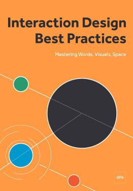
Download 'Interaction Design Best Practices' FOR FREE!
Download e-book for freeClose4. Revise your sketches and prototype your epicenter
Once you found an idea that might work, build a quick prototype. Because it’s only meant to bring you one step closer to the right design, you could even think of it as a disposable prototype.
I tried many different approaches over the years, but the one that works best for me is to start designing the most complex state (or screen) first and then backwards-engineer to gradually design a complete task flow.
“If it’s your job to eat a frog, eat it first thing in the morning. If it’s your job to eat two frogs, eat the bigger one first.”
— Mark Twain
While this may sound counter-intuitive to some of you, it’s actually the same approach productivity experts propose when they speak about “eating the big frog first”.
The first thing I do is to start with the core and build outwards—something the guys at Basecamp call epicenter design.
The epicenter is whatever the page absolutely can’t live without.
In our case, it was the list of information points, to-dos, etc. being discussed during meetings and written down by the person conducting the meeting.
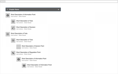
After some exploration to determine how the epicenter could be laid out, I divided the screen in sections to accommodate other parts, like info panes, menus, and action bars.
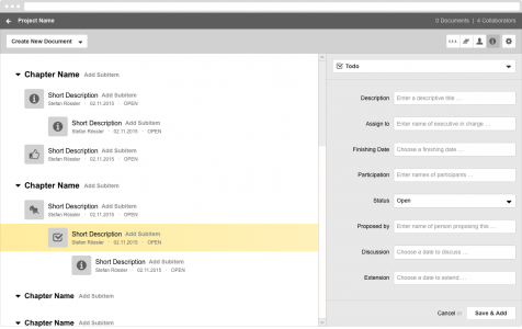
The goal of our first finished screen created in UXPin is to show as much complexity as possible. This is the only way to ensure your concept doesn’t break before you begin making all the various screens needed to build a prototype for testing.
Once you’re satisfied with how your complex screen works, it’s an easy and straightforward task to backwards-engineer. You’ll then show the complete user flow through the application. In this case, how to add chapters and create your first entry.
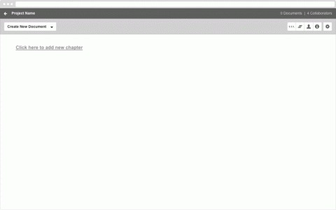
Our rapid prototype created in UXPin
5. Test your prototype with potential users
You’re not testing your prototype to make sure it works. You’re testing to find out what doesn’t work . Do everything you can to make things break, then discard whatever doesn’t work.
As strange as it sounds, the most important part of testing prototypes is to make appointments.
Appointments help you focus on getting things done. I don’t know about you, but I find prototyping to be such a challenging and fun activity that it’s usually hard for me to stop it. But if I have an appointment in about 30 minutes, I just have to stop.
And guess what, you can stop prototyping anytime you want or need to. Why? Because you can test anything—even if it’s only scribbles on a napkin.
The more advanced your prototype, the more you can test, and the more insights you will gain. Even a prototype with 2 or 3 screens is more than enough for an hour of usability testing, especially if you’re testing with potential users (which is extremely important in the beginning).
Here’s a short article about do-it-yourself testing for creators and one about why designers should do their own usability testing in case you’re not yet familiar with how to do the actual testing.
6. Interpret your test results
Early usability tests help you determine the effectiveness of your design ideas.
If you have the opportunity to test with potential users, the first thing you’ll discover is whether or not your prototype is addressing the right problem (or at least a real problem).
That said, testing with potential users is crucial in the early stages of your design process to make sure you’re not investing time and energy going in the wrong direction, a.k.a. solving a problem that doesn’t really exist. And that’s exactly what happened in this project.
Since I was testing with potential users, I took a chance and turned the sessions into actual user interviews (described in step 1). The only difference was that instead of letting them explain a problem or show me current solutions for this problem, I was showing them our solution (our prototype) and asked if it could potentially solve their problem.
If you think about the last time you did something like this, did you need this kind of feature?
Can you please describe to me what exactly you needed when you did this for the last time?
Is there a critical feature missing that you would absolutely need in order to solve the problem?
Let’s not talk about the feature; instead, tell me more about the issue and why it’s important to solve it.
Testing with potential users made it obvious that we were solving the wrong problem. That’s why our entire 7-step process is focused on quantity rather than quality. And that’s why it wasn’t a step back returning to the drawing board and starting a new prototype.
Before building a new prototype, finish your testing sessions and gather as many insights as possible while you can. You’re really only testing your prototypes to make them break (and learn something new), not to pass some kind of quality assurance.
If our prototype solves the problem, it’s effective. If users aren’t able to solve their problem with our prototype, it’s ineffective. It’s as simple as that.
It’s important to underline that effectiveness beats efficiency and satisfaction—especially in these early stages. Why? Because it lets you know whether you already have a real solution (effective) or if you’re still in the phase of killing bad ideas (ineffective).
As soon as your prototype solves the correct problem, it’s time to focus on how well your prototype really solves it.
The process I’m describing is intended to discover an effective solution—not to measure its usability.
7. Build a new prototype and keep testing
The more prototypes you’re building (and testing), the better your solution will eventually be. The most effective way is by building quick & dirty prototypes, then watch them break during usability tests to reveal bad ideas. Keep this up until you arrive at an idea that’s really good.
But what do you do after you’ve found an idea that works? Now you start improving the details of your solution based on user feedback.
Since you’ve already found the right design by testing with the right users early on, you can really focus on perfecting this design by improving the usability of your solution.
The truly amazing thing is that in most cases you don’t even need representative users for testing prototypes that can go live.
Why?
Because if you include potential users in the earlier stages, you will already know you have the right design at this point. And so, to improve the usability of this “right” design, the only thing you need is to test it with anyone who understands the problem you are solving.
Another important point: while you’re moderating your early usability tests, the solution will eventually be used by people on their own, without you sitting next to them. That’s why it’s beneficial to switch to unmoderated testing (we used Userbrain) as soon as you stumble across the right design.
Switching to unmoderated testing bridges the gap between finding the design and getting the design right. It helps you fix the glaring holes in your prototypes and forces you to build something that’s self explanatory.
Just make sure you kill your bad ideas with rapid prototyping before you spend your time and energy on perfecting a solution that might just be irrelevant.
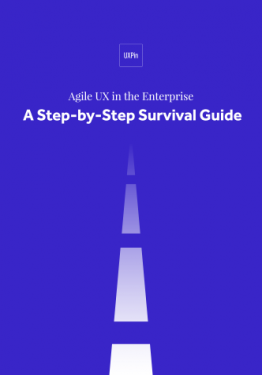
If you found this post useful, check out the free 100+ page e-book UX Design Process Best Practices .

Feature photo credit: Think With Google
The post UX Case Study: Kill Bad Ideas with Rapid Prototyping appeared first on Studio by UXPin.
App User Engagement: Expert Advice (Part 1)

I’ve asked some of my favorite product management and UX colleagues about best practices for keeping mobile app user engagement successful and fresh past year 1. The basic questions were:
What are the apps that you’ve had for a while doing to keep users engaged?
In your experience, what are the best ways for an app to tell a user about a new feature?
As time passes, how should an app handle a user who’s forgotten a password, allowed a credit card to expire, or had an email address bounce the app’s emails?
Do you have other tips and tricks for keeping users engaged with an app after year 1?
If you want to learn from the experts, read on. You can see more in Part 2 and Part 3.
1. Ellen Chisa

VP Product, Lola Travel
www.ellenchisa.com | @ellenchisa
What do successful mobile apps do to keep you engaged?
Not nearly enough! Apps that keep me engaged create habit-forming behavior, or tie to a real world trigger.
A great example of habit-forming behavioral design is the Equinox app. You need to use it every time you go to the gym, which means I’m frequently opening it and thinking about it. MINDBODY creates a white label app that does something similar for smaller studios.
Photo credit: Equinox
Another interesting one is the Spire app, which has a hardware component. When you’re in the backstack view, the app changes to say “Spire can’t track your day if you close the app.” The big text & the change always make me notice it when I’m looking at everything that’s open, and keep me engaged.
Apps that don’t have a trigger or habit component can be challenging. The one that’s kept me engaged the longest is Threes. The puzzle keeps me interested because there’s no end – I can always keep getting better. They don’t even need to add new content. At some point, Two Dots lost me, even though it changes more often. I didn’t like the new type of levels, and that caused me to fall off.
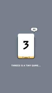
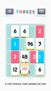
Photo credit: Threes
How should mobile apps handle a user who’s forgotten a password or allowed a credit card to expire?
On mobile, password recovery is much more seamless with a one-click login link from an authenticated email/phone number (like what Slack uses). I expect all apps to move in this direction and for it to be the new standard reset flow.
Similarly, apps that allow a photo of a credit card (using card.io, for instance) are more frictionless. Streamlining user behavior is even more important on mobile than it is on desktop.
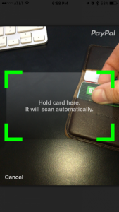
Photo credit: PayPal
2. Alicia Dixon

Senior Product Manager
What’s been your success strategy for keeping your mobile app engaging to users?
We use continuous development to deploy app updates every 4-6 weeks to add new features and keep improving functionality.
At Hilton, our situation is unique because our app supports a physical business. So we have the benefit of having face-to-face, phone and email interactions with app users to highlight new features. We also have heavily integrated our mobile apps into our value proposition, so that it is mentioned in all of our marketing vehicles.
How should mobile apps handle forgotten passwords and other data that gets stale over time?
The ability to reset a password from a mobile device is table stakes in this day and age.
Every app should allow users to reset their authentication credentials within the app. As far as other account data, using push notifications and email as communication channels is helpful to let users know when data that needs to be refreshed.
What else has helped users stay engaged with your app over time?
Loyalty program bonus points.
3. Christina Trampota

Senior Director Global Marketing Innovation
How do the mobile apps you use keep you engaged?
Push notifications to encourage ongoing usage/records, as well as a reminder when your favorite/previous purchase is on sale or available.
Specifically, I think of MyFitnessPal that reminds you to enter your food and exercise and not skip a day if you missed one, and then Munchery, which notifies you when a meal that you liked previously is available that day for delivery. Both of those are via push notifications.

Photo credit: MyFitnessPal via Andrew of LittleBigDetails,
What are the best ways for mobile apps to notify users of new features?
Multiple channels at once. Beginning with in app messaging, to push and if collected, via email that is sent out to the users in the community.
How should an app handle an expiring account?
Contact the user in a friendly manner both via mobile and non-mobile channels such as via push notifications if they still have the app, and email if they shared that information for customer communication.
However, attention to the marketing rules such as SMS regulations which differ broadly by country and CAN-SPAM are important if you should use the channels outlined in the rules.
What are some tricks to help remind users of all their good times with a mobile app?
Recognition for how long they’ve been part of the community.
I think specifically of communities such as the Starbucks Gold Card that has “Member Since 2002 ” under my name on the card, or Twitter where it mentions the date you joined (November 2008 under my @tektalk profile)

Photo credit: Twitter
Next Steps
For more useful web, mobile, and UX best practices, check out the free e-book UX Design Trends 2016.

The post App User Engagement: Expert Advice (Part 1) appeared first on Studio by UXPin.
App User Engagement: Expert Advice (Part 2)
In Part 1, we spoke with 3 product experts about tactics for engaging app users past the first year.
We continue that conversation with two more experts below.
Check out their advice and examples of best practices. You can also check out the rest of the interviews:
Part 1
Part 3
1. Roger L. Cauvin

Principal Product Strategist
http://blog.cauvin.org | @rcauvin
What’s an example of a mobile app that keeps you engaged?
Hopper occasionally gives me system notifications of noteworthy changes in airfares. These notifications don’t annoy me because they are the whole reason I use the app in the first place.
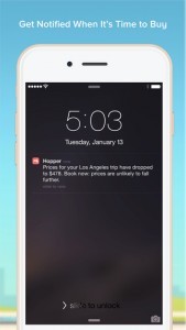
Photo credit: Hopper
How should a mobile app notify users of a new feature?
“Inline” the feature notification.
For example, I tap a hamburger menu with an item for accessing the new feature, and it is highlighted with something to the effect of “new . . . learn more”. This sort of inlining somewhat prominently notifies me, but is not very disruptive to my current task.
How should a mobile app deal with a credit card expiring or an email address bouncing the app’s emails?
Pre-emptive notifications are helpful for credit card expirations and email bounces.
They help users fix or update the problem in advance (and when they choose), instead of being interrupted and confronted with the issue when they’re in the middle of an important task.
2. Andre Piazza

What are the best ways to tell users about new features?
Traction channels
Develop a comprehensive list of traction channels where feature updates are communicated.
Typically, this includes release notes on OS, support documentation online, support blog post online. A nice way to do this upfront (and also in a casual way) is when a new version of the app is run for the first time, show the user the key updates that shipped in the latest version. Be concise, and add a button at the bottom saying “Brilliant” or “Let’s get started!”
If the new feature requires action on the user’s part, provide them onboarding upfront and specific links to perform the action. Example: updating password policies (from 6 characters to 8 characters), device portability, new app user, new app version.
Smooth user onboarding is a UX must these days. Always consider the following: what education do I need to provide the user for them to be able to achieve the minimum requirements / their goals / achieve loyalty?
Never shy away from this question.
Communication strategy
Don’t message “new features”. Message value, benefits, pains removed, gains to the user.
An efficient way to do that is to frame the conversation by benefit (or pain removed) in a specific use-case, examples: “Faster checkout when paying with Bitcoins” or “Safer connections when adding a new credit card by applying 128-bits encryption”.
How should an app handle a user who’s forgotten a password, allowed a credit card to expire, or had an email address bounce in the app’s emails?
These are all very important elements of UX that impact revenue, usage, retention, loyalty and ultimately growth. For each of these cases, let’s explore some of the best practices seen in the mobile industry:
(A) Forgotten password: Handle that via app (don’t push the user to web). Implement security checks (email validation is standard; consider 2-factor if data is highly critical). Also, simplify user authentication: do you need a username and an email? Or can you use just one of them? That will simplify login, usage and ultimately forgotten password routine.
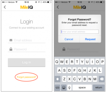
Photo credit: Mile IQ
(B) Expired credit cards: For most SaaS or subscription-based businesses, this the core of revenue streams. You must handle this pro-actively.
Detect cards that will be expiring in the next 60 days, and message customers at 30/15 days before expiration, with call to actions at T-15 and T. Message them via app or online(upon login) and via email. These T-minus timeframes will coincide with the communications that user is receiving from the credit card company, so it wouldn’t surprise them.
When messaging, include deep links to update credit card number so it’s actionable (vs. simply a warning). If credit cards are anything more than 20% of your subscription sources, handle the credit card update via app (vs. pushing user to web).
(C) Email address: Email is a key security construct for authentication and communications.
Detecting bounced emails is a nice trick to run on the backend, especially for high-stake communications.
As a proactive measure, the user flows we described for forgotten passwords help maintain a current database. As a reactive measure, consider pushing in-app or OS notifications to users when their email bounces. Of course, this applies to a minority of users. Nonetheless, if your app is dependent on email for revenue or experience, this becomes a must.
Do you have other tips and tricks for keeping users engaged with an app after year 1?
Usage / Engagement:
Continuously identify the most relevant and new use-cases for your users.
Study best practices (thought leaders, forums, influencers, power users) and ways to improve that and load those in your roadmap (development).
Match usage / consumption patterns with payment patterns. If users upsell for particular reasons, make it actionable. If users pay on a monthly / annual subscription, give them reasons and reminders to use your app on that basis. This could range from email campaigns to OS notifications (“Haven’t seen you in a while! we added a couple of interesting features”).
Loyalty / Promotion
This is the hardest, and also the most relevant because it will not only get you MAUs (monthly active users) but also ones that promote your app in places where your message can’t reach (world of mouth, influencers, niches, communities, friends and families, etc).
A few tips for making that happen:
Embed “Feedback” functionality on the app. Make it simple / clickable (like star rating) and optional space for comments. Review those periodically.
Add “Share this app” functionality on the app. Make sure they can send a simple text with links to download in all platforms / OSes (Android, iOS, Windows, Desktop, etc). From your data-driven approach (reports, forms, ratings), identify the most loved and hated use-cases. Match that with your requirements document (current) and roadmap (future). What are you doing about it? Match that with the long-term vision (analysts, influencers, competitors) — what are they doing about it? Focus on those use-cases in removing friction and simplifying first, then adding functionality. This way you’re building a solid basis for loyalty and long-term growth.
Next Steps
For more useful web, mobile, and UX best practices, check out the free e-book UX Design Trends 2016.

The post App User Engagement: Expert Advice (Part 2) appeared first on Studio by UXPin.
App User Engagement: Expert Advice (Part 3)
In this final, we speak with 3 more experts for app engagement advice.
For more advice based on interviews with UX and PM folks, check out Part 1 and Part 2.
1. Elena Schulte

UX Designer
How do the apps you use keep you engaged?
I have a bunch of apps that have become part of a daily routine. Morning coffee goes well with Twitter and news apps. On subway rides, I use Instagram, Facebook (to pass the time) and a travelling app. I also use a banking app, as I haven’t carried cash for many years now and it gives me a good overview of my finances.
The pattern in all these apps is that each of them answers to one specific need:
Twitter: What’s new in my field of work?
Banking apps: how much money do I have on my account
Travel apps: how do I get from point A to point B most effectively
The apps keep me engaged by primarily answering to my specific needs. They also provide that information reliably and without friction.
To make the answer short: consistency and contextually-relevant information.
How should a mobile app tell users about new features?
Do you really have to announce that new feature? Is it something that the user would not identify by herself? Does it add enough value for it to be worth announcing?
If you answered “yes” to all of those, then please go ahead and make a short intro to the new feature next time when the app opens. Short is a key word here. Or even more discrete, highlight the category where the new feature was added.
Is the new feature so good that it can’t wait for the user to start the app next time? In that very rare case, I would make a minimal change in the icon, or send an email to those that have decided to subscribe to the newsletter. I would also choose to do this scarcely, as it can cause irritation when overused.
As a UX expert, what advice do you have for keeping a great user experience after year 1?
If they’ve been engaged for a year, then something was done right.
Keep doing that, and continue testing and challenging the user needs. Research will point to new features and pain points that need addressing. Then again, don’t change too much unless research reveals important gaps. The core concept is obviously working and consistency is crucial to long-term adoption.
2. Paul Yokota

Senior Product Manager, Animoto
http://paulyokota.com | @Paul_Yokota
How do mobile apps keep you coming back?
Repurposing and repackaging content that the app is already collecting in a way that gives the user a compelling reason to return to the app.
Good examples are Facebook’s “On This Day” Timehop-style feature, and Swarm‘s weekly leaderboard roundup.
Photo credit: Facebook
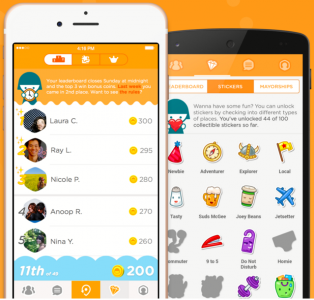
Photo credit: Swarm
How should mobile apps tell users about new features?
Depends on the goal.
If the communication is designed to drive engagement and entice the user to return, push notifications is a great channel. If it’s just to inform a user about a new feature, the best place is in the product, in-context.
What are some other tricks for keeping users engaged?
If an app offers in-app purchases, giving away something for free for a limited time creates a great, time-sensitive incentive for users to return to the app.
3. Daniel Elizalde

Director of Products
Techproductmanagement.com | @delizalde
How do good mobile apps keep users engaged?
It’s all about the initial onboarding to make sure the user understands all the different features and benefits.
A good tutorial or an autoresponder series helps get the initial engagement going. After that, good apps often ask you to invest a little in the app by entering information and personalizing some of the data or views you are getting. These steps create an initial sense of adoption.
After that, it’s important to show the user that fresh and valuable content is available every time they log into the app. Notifications or other alerts are an “after the fact” tool. If you don’t feel there is compelling value with every visit, then no alert or notification will pull you in and keep you engaged.
What are the best ways to notify users about new features?
Two parts are involved.
First, email is still the best way to notify a user of new features. If the user is not visiting your app, then no in-app notification will help. On the other hand, you know they check their email. If your email is enticing and links back to the app, then you’ll get engagement.
The second part is in-app notifications or something that informs the user of new functionality once they open it up. It’s important to not only tell the user about the new feature, but also to provide some idea of the benefit and a quick tutorial. Some apps include animated mini-tutorials or link to a blog post that shows the feature value in detail.
Are there tricks to keeping users engaged past year 1?
Every user is different.
I really recommend investing in UX research as a standard part of your development lifecycle. I recommend doing contextual inquiries with live users at 6 months, after 1 year, etc. You want to learn from them and continue to evolve your app to make sure your 6 month customers make it to a year, and the 1 year make it to two.
No magic formula, just good ‘ol UX and PM work.
Next Steps
For more useful web, mobile, and UX best practices, check out the free e-book UX Design Trends 2016.

The post App User Engagement: Expert Advice (Part 3) appeared first on Studio by UXPin.
Getting Started with UXPin

Welcome to UXPin! We’ve compiled a list of articles, videos and other resources to help you get ramped up quickly.
Introducing UXPin
App overview, creating a project, importing from Sketch and Photoshop, and adding basic actions.
Discover the Editor
The sitemap, adaptive breakpoints, hotspots, shapes & symbols, multistate elements, and advanced animations.
Workflow
Smart elements, custom libraries, team management, and sharing prototypes.
Build Something Cool
Navigation drawers, interactive carousels, hover effects, and more.
Playground
Rates of travel, triggers, color swatches, dancing buttons, type families, and the UXPin cheat sheet.
Join the world's best designers who use UXPin.Sign up for a free trial.Your e-mailTry it for free!
The post Getting Started with UXPin appeared first on Studio by UXPin.
UXpin's Blog

- UXpin's profile
- 68 followers

