
UXpin's Blog, page 127
May 27, 2016
Task Scenarios: How to Avoid User Testing Bias
You’ve found the right candidates. You’ve set aside the time and space for your usability tests. Now what?
It’s time to create specific task scenarios to guide your users during the sessions.
How Task Scenarios Prevent Useless Testing Results
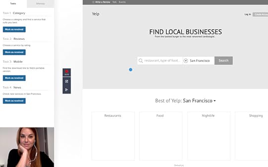
Consider a website containing that allows users find flight deals based on current location and desired destination. The user goal is crystal clear: “Find the best flight deal for my trip”.

Photo credit: Kayak
The interface (and overall experience) is successful if users can launch it, locate themselves and find a good deal – all without friction. When conducting usability testing, your goal is to reveal any of the following potential issues:
Misplaced interface elements
Buttons that don’t look like buttons
Unclear copy
Navigation inconsistent with user expectations
It doesn’t sound very complicated, but it’s fairly easy to get it wrong.
For example, if you ask users during the test to: “Pick a destination and a departure location, select dates and look for a flight using the box on the right-corner,” the test won’t provide any useful insights. You’ve already lead them down a single path. Your goal is to understand if they’ll follow the right path without guidance.
This is an exaggerated example to show my point, but bias is still incredibly common in usability task instructions.
Instead, a more effective instruction would be: “You’re planning to travel to Berlin next week. Use the website flightdeals.com to find the best flight deal for your that trip”. The phrasing doesn’t give away any bits of the interface and or experience – such as “Using the box on the right-corner”.
These clear instructions are Task Scenarios – i.e. activities aimed to replicate natural user scenarios.
The 5-Step Process to Creating Useful Task Scenarios
1. Describe your user.
Refer to your user research results: revisit user interviews, check the personas created, and dive into any other results that you or your team might have gotten. You need to understand user motivations, pain points, comfort with technology and their background.
2. Focus on the user’s goals.
What must happen for users to leave satisfied with your product?
3. Write down the tasks
Now that you’ve created a complete user profile, write down a list of specific tasks that lead to success in your product. Tasks must be clear and concise. Unless you’re designing an extremely complex product (like in an enterprise setting), less than 10 will usually work.
Remember the flight deals website example above? Here’s a few example tasks to write down:
Finding the best flight deal
Booking a flight
Receiving alerts for future deals
Don’t give instructions or lead in any way. Write simple binary tasks so that you can clearly measure success or failure.
4. Write scenarios for the tasks
The task is incomplete without realistic scenarios: the participant needs to know in which context of the tasks. Background scenarios allow users to relate to the testing more easily.
Create a scenario that mentions what illustrates the “what” and the “why” behind the tasks. Generally, 3-5 scenarios per task will suffice.
Pay close attention to details when creating scenarios. For example, the ones you create for a retired lawyer living in a US city will most likely be different from the ones you’d write for a 20-year-old actor living in India.
5. Combine tasks with scenarios
Now you must combine tasks and their scenarios to create Task Scenarios.
For example, let’s create a task scenario for a selected task from the flight deals example:
Task: “Booking a Flight”
Scenario: “Josh remembered that he promised his wife to take her on a trip to Hawaii for their wedding anniversary, which happens next week and now he needs to book their flight.”
Task Scenario: “You promised to take your wife to a trip to Hawaii next week for your wedding anniversary. Use flightdeals.com to book a flight for that trip.”
As shown in the below usability test created in UXPin for a prototype, make sure you only need to show users the task scenario.

The 6-Point Checklist for Useful Task Scenarios
At TestLodge, we use the below checklist to keep task scenarios on point:
1. Are they realistic?
The scenarios you create need to be realistic for that specific participant’s background. Don’t ask users to do something they usually wouldn’t do.
For example, let’s say Josh’s wife is responsible for organizing trips (and as part of it, booking flights). In this case, creating a task where you ask him to organize a trip won’t be relatable at all.
To avoid straying from reality, compare your scenarios against your user research (especially interviews).
2. Are you proving any clues?
Don’t provide any clues on how to complete that task. The Task Scenarios shouldn’t have indications of where to go, what buttons to push, what actions to perform or anything similar. Any explicit guidance will bias results.
3. Is it specific?
Your task should be specific enough so that the user won’t ask the moderator for clarification.
“Book a flight” has a lot of room for interpretation. That’s why we specified:
The what: Book a flight to Hawaii
The why: For a wedding anniversary
4. Does your task have a correct solution?
You need a way to measure whether or not users accomplished the task.
“Open flighdeals.com” doesn’t have a solution. The user will open the website, but then what? Instead, “Visit flightdeals.com and book a flight from SF to NYC next week” indicates a crystal clear solution.
5. Are you asking the participant’s opinion?
Don’t ask “What do you think of the feature X?”. The user will just look for a way to say the “right thing” and will provide mostly visual feedback. Asking him/her to use the feature, for example, is a better option.
6. Is it as concise as possible?
After writing, ask colleagues for input or review them yourself and try to trim out all unnecessary words.
Thinking about Real World Conditions
Consider the difference between these two situations:
A paid participant using a food delivery app in a well-lit usability lab supported by a reliable connection and a calm state of mind
A stressed person trying to grab some quick food before their next meeting.
Here lies one of the biggest challenges of usability tests: recreating real world conditions that account for physical and/or emotional states, location, time and other factors.

It’s not always easy to separate the edge cases from the core use casese.
As explained in The Guide to Usability Testing, here’s two solutions:
If possible, visit the user’s natural environment. In the case of the food delivery app, you could previously recruit a user and arrange a time that the person usually is under the stresses mentioned.
If not possible, then gather as much insights into these cases when conducting user research. Ask users for feedback on their difficulties experienced in those scenarios. While the results aren’t totally empirical, they’re certainly better than designing off pure assumption.
Next Steps
Usability tests are only as effective as the task scenarios assigned to participants.
Remember to craft your scenarios based on prior user research, leave out any biased phrasing, and write the scenario as clearly and specifically as possible.
If you found this guide useful, check out the in-depth Guide to Usability Testing. You’ll learn best practices for 20+ different usability tests.

The post Task Scenarios: How to Avoid User Testing Bias appeared first on Studio by UXPin.


Design Leaders Should Be Business Leaders

From Mark Templeton of Citrix, Brian Chesky of Airbnb, Jeff Veen of Typekit to Scott Belsky of Behance, we’ve seen designers make great business leaders.
In fact, Maria Giudice even argues that CEOs with design background (“DEOs”) have a competitive edge over traditional CEOs due to their empathetic problem-solving skills.
It definitely makes sense.
Delighting customers and employees is easier if you’re focused on the human being in front of you. Business leaders with a design background see “numbers through people,” rather than “people through numbers.” This difference might look small, but in the age when customer delight helps companies like Apple or Airbnb dominate unforgiving markets, empathy can really make or break your business.
So far, I’m telling the story with broad strokes. But it’s actually very personal. I’m a designer, and design manager turned into full-time CEO. I truly believe that today’s’ designers will be the product and business leaders of tomorrow.
In this article, I’ll identify traits that differentiate Designers-CEOs from classic CEOs. I’m hoping it will help designers become more successful business leaders.
And now, a personal story
In 2012, after years of working as a UX Designer and UX Manager, I followed the steps of my design idols and became a full-time CEO.
While I didn’t have any previous experience running a business, UXPin (the company I co-founded) was growing like crazy and needed my full attention. The change had to be immediate, and there was no going back. I said my farewells to design craft and design management to lead the company.

UXPin’s founding team back in 2011. I’m the one in green.
The beginning wasn’t easy. Operating a small company requires extreme multitasking skills and a broad attention span. In the early days, you have to take care of everything. From the strategy, through fundraising, to marketing and even cleaning up the office.
Yet, in the span of 4 years, we’ve grown to one of the leading product design workflow platforms. We started with the team of 5 working in a tiny apartment. Today, we have over 70 people working on the platform to empower product teams in 150 countries (including companies like HBO).
Even now, after four years, I still see my design background continuously influencing every decision I make. For me, running a company is just a complicated, long, and demanding design process. I’m definitely a Designer-CEO.
How my design background influences my business leadership style
Working as a designer changes the way we perceive the world. To paraphrase a famous saying: “when you’re a designer, everything looks like a design problem”.
There’s no way and no reason to fight it. As designers, we have particular traits that improve our odds of successfully running a business.
In my own experience as the CEO of UXPin, the following principles heavily influenced my leadership style:
1. No problem is impossible.
Mentoring design interns and junior designers through the years taught me that experience creates calmness. After running dozens, if not hundreds of projects, you just get a cool head. It’s an incredibly powerful trait for a leader who needs to reflect that there’s no place for panic and despair. Focus on describing the issue, deepen your understanding of the problem, plan the solution, and measure results. My design background definitely gave me this focus on problem-solving.
2. Understanding users is non-negotiable.
In the early days of UXPin, I personally contacted every user who tried our product. I had to know if we were doing anything of value. To this day, I still like to spend time with our customers, directly through meetings and calls, or indirectly through research run by our team. I can’t even imagine operating a business without the constant effort to understand the customer. For a designer turned CEO, this is non-negotiable.

User researcher Ben Kim testing our redesigned interface with designer Jessica Tiao of KissMetrics.
3. Attention to details.
Every designer knows that the greatest products perfect the details. The harmony of the design and the delight of the experience comes from consistency. This sort of quality is very difficult for early stage businesses, where a “good enough” MVP is great. Even if your first release is slightly embarrassing, keep quality in your immediate vision as you balance the cost of development.
UXPin 1.0 in 2011
UXPin 3.0 in 2016

4. Ready for constant change.
Designers know nothing lasts forever.
Today’s positive client review might take a completely different turn tomorrow. The hottest trends today might become the jokes of tomorrow. Requirements, trends, technology, tastes – designers are used to the constant change. Nothing can scare us, and this is extremely empowering in business. If you expect change, you’re never surprised and always ready to act.
5. Make the complex simple and govern chaos.
We designers always strive for simplicity in form. We despise overly complicated, chaotic objects, services, and processes. Our entire experience tells us that chaos must be governed by a planned and perfectly executed form. It seems common sense in design work, but in business, it gives us a surprising advantage over anyone else.
Grab design ebooks created by best designers
All for free
 Download
 Download
 Download
 DownloadDo you want to know more about UI Design?
Download 'The Guide to UX Design Process & Documentation' FOR FREE!
Download e-book for freeCloseHow to Become a Business Leader
The five traits mentioned above are not unique. All designers have them.
Here’s how to channel those traits as a business leader:
1. Apply problem-solving discipline to every task.
Whether it’s redesigning an onboarding flow or analyzing a spreadsheet of monthly churn, never accept anything at face value.
Get to the core of the problem, consider a few viable solutions…you know the drill. Sooner or later this becomes second nature. It sets the precedent that a logical story must support every decision.
2. Connect UX research and business analysis as often as you can.
Understand the business implications behind user research insights. While all UX issues should be fixed, reality dictates that we prioritize ruthlessly between annoyances and revenue-crippling problems.
Using your in-app analytics, check the frequency and breadth of use for features that don’t perform well in usability tests.
Try to assign a dollar cost to the affected feature. For example, let’s say the average revenue per user is $22. Currently, the hypothetical app has 1000 paying customers. If a poorly performing feature is used 38 times a week on average by 620 customers, you start to gauge the potential lost revenue if people churn due to loss in productivity.
While UX is by nature a blend of art and science, try to see the bottom line whenever possible. The math won’t always be perfect, but you’ll find common ground more quickly with business stakeholders. You’ll be speaking a language they already understand.
3. Practice the analysis – synthesis routine.
When you face a complex problem, dissect it into smaller user stories first. Look into the data and examine the events unique to each user story. Make it a habit and you’ll be surprised at what you find.
Whenever we’re facing challenges at UXPin, we try to break them down into measurable and solvable issues. Once we see individual chunks of the problem, we start designing a recovery plan.
I always encourage our designers and product folks to regularly weigh the time cost against expected returns. Based on the hourly breakdown of salaries, how much will each sprint cost us? Based on the dollar value of a trial signup and customer lifetime value, how many signups and subscriptions are required to justify the work?
Again, the math isn’t perfect, but it does help guide us towards the most valuable problems first.
Final Words
For designers to succeed in business, they need to shed the perception of being a design expert and portray themselves as a business consultant who knows design.
Luckily, all the traits we need are already within us. Just like we train our design sensibility, we can also fine tune our business sense with the same skillset.
Good design might make a business successful. It’s great designers who keep the business successful.
Join the world's best designers who use UXPin.Sign up for a free trial.Your e-mailTry it for free!
The post Design Leaders Should Be Business Leaders appeared first on Studio by UXPin.
May 26, 2016
13 Useful UI Design Articles for UX Practitioners

Check out these 13 useful articles on interface design as picked by our design team:
1. What Is Zero UI? (And Why Is It Crucial to the Future of Design?) (Fast Company)
Zero UI is a style that’s been looming in the shadow for some time, but is just now emerging. The idea is easy to understand — the less the user has to think about the interface, the better and more natural it feels. John Brownlee explains the specifics, and how this style is changing everything.
2. When It Comes to UX Design, Simplicity is Overrated (Wired)
UX designers take it as dogma that UIs should be simple, but what does that really mean? Robert Hoekman Jr. challenges our preconceptions of “simple,” and dissects what is the true attractive element in these rather complex interfaces.
3. Kill Friction Before It Kills Your UX (UXPin Blog)
Friction is one of the biggest obstacles to a smooth UI and a pleasing UX. Jerry Cao analyzes the enemy and provides some bold tactics for getting rid of it (plus explaining the rare times when friction is helpful).
4. 7 Unbreakable Laws of User Interface Design (99 Designs)
This article might as well be part of the UI design canon. Peter Vukovic outlines 7 tenets that every designer should know by heart, and discusses the best practices for implementing them. A must-read for beginners, but experts might learn something new as well.
5. Bad User Interface Design Is Death by a Thousand Cuts (Boagworld)
UX expert Paul Boag gives his take on UI design in the form of a warning. Succinct and to the point, this quick read points out some common UI mistakes and strategies to avoid them.
6. 5 Psychology Secrets for Great Interaction Design (The Next Web)
UI design deals with more than just the intricacies of technology, but also the intricacies of the human mind. Jerry Cao gives 5 techniques for UI design taken straight from the psychology books, because the user is the most important part of the user interface.
7. Why White Space is Crucial to UX Design (Fast Company)
An article all about how fulfilling nothing can be. Written by our design team, this piece explains how negative space (white space) can increase comprehension and readability, and also influence the visual hierarchy of a screen.
8. Incorporating UI Design in Agile Sprints (Mountain Goat Software)
Agile isn’t just a trending buzz word; its popularity is thanks to its effectiveness. Hence the success of the Agile sprint, a process of rapidly designing and testing for a short period, or “sprint.” Mike Cohn explains the role of the UI designer in such a sprint.
9. 32 Inspiring Mobile App UI Designs with Amazing User Experience (Graphic Design Junction)
Sometimes learning through example is more effective than being taught. Muhammad Faisal lists 32 mobile apps with exemplary UI designs. Just browsing through these screenshots is bound to inspire new ideas.
10. The “Liking” Principle in User Interface Design (Nielsen Norman Group)
Jennifer Cardello describes why being liked is more than just vanity, it’s actually good for business. She goes into the science behind likability and the power of social influence, breaking it down into practical and replicable tips for any UI.
11. UX is UI (Medium)
True, there are a lot of articles dedicated to explaining the differences between UX and UI, but Mike Atherton’s insightful piece looks at how they are interconnected. This is a thought-provoking read to help UI and UX designers to better understand their crafts.
12. Approaches for Multiplatform UI Design Adaptation: A Case Study (Smashing Magazine)
Written with the precision of a scientific journal, this article by Sergii Ganushchak & Kate Abrosimova explores how to create consistent UIs across multiple platforms, drawing on examples from companies like Instagram, WhatsApp, Facebook, Viber, and Airbnb.
13. How to Use the Best UI Patterns (UXPin Blog)
Jerry Cao gives us an all-encompassing primer on UI patterns. This cover-all feature explains everything you need to know about UI patterns: their classification, the step-by-step procedure for implementing them, and links to the most use pattern libraries online.
Takeaway
If you’d like to take your design knowledge to next level, check out a few of our downloadable UI design books, all for free.
Web UI Design for the Human Eye, contains three full volumes on the peculiarities of human sight, and how UI designers can take advantage of them.
Volume I discusses color theory in interface design, how to optimize layout spacing, and the importance of contrast. Volume II present the most useful visual content patterns, and guidelines for typography. Volume III explains how visual consistency is more than just a polish; it actually improve usability.

The post 13 Useful UI Design Articles for UX Practitioners appeared first on Studio by UXPin.
The Wrong Way to Prototype

TLDR: The wrong application of high-fidelity prototyping harms UX design more than you think.
In this article, I’ll draw from my own experiences to explain the dangers of prototyping in high fidelity too early in the process.
The Undeniable Growth of UX Design
I feel extremely lucky to be part of the UX industry. I followed my passion in the early 2000s when the field was just taking off, and years later, the power of UX became universally understood.
Yes, we have many reasons to be optimistic about the future of UX. Ten years ago, it was a hardly recognizable part of the digital product development. Today, UX plays a vital role in any product-oriented organization. We’ve earned our seat at the table.
The following Google Trends chart (keyword: UX) illustrates this amazing growth:

People do talk and ask about UX more and more. We definitely benefited from this growth at UXPin. Six years ago, we were a company of three people selling paper prototyping notepads. Today, over 70 people help bring our design collaboration platform to customers in 150 countries.
Along the way, we’ve conducted plenty of user research. We’ve seen multiple Lean, Agile, and waterfall variations of the design process. We noticed that even the most Lean or Agile companies can still prematurely jump into high fidelity in hopes of shortening project timelines.
When that happens, the team might save some time in initial delivery, but they almost always pay it back multiple times over in fixes or teardowns. Do it long enough, and UX loses its real value in identifying the right idea through eliminating the wrong ones.
The Danger of Prototyping the Wrong Way
I’m afraid that our most powerful weapon is turning into a toy detached from reality.
Prototyping is too often used to merely animate hi-fidelity design mockups. In many cases, it leads to expensive, bloated, siloed, and confusing design processes.
In my past life in ecommerce design, I remember working with a few UX designers from visual design backgrounds who would fall into this trap. Because Photoshop felt like second nature, they’d dive into high fidelity out of habit (I’ve admittedly also made this mistake a few times earlier in my career). Stakeholders would offer feedback on the wrong details, and users would sometimes uncover issues with the interaction model that required a complete rebuild.
While there are situations when high fidelity prototyping makes a lot of sense, it shouldn’t be our default prototyping mode. And while our product does integrate with Photoshop and Sketch, we always hope that step happens much later in the design process.
First, we have to step back and reconsider when and why we’re actually prototyping.
The Triple Cost-Cutting Value of Prototyping
Prototyping is not a new concept, nor is it exclusive to interaction design. As Michael Guggenheim argues in his excellent article “The Long History of Prototypes”:
“…prototyping is not simply understood as the development of “first forms” or “first strikes” as beta-versions of products as in industrial design, but as a more general mode of doing culture: a mode that is tentative, based on bricolage, user involvement and ongoing change and improvements of products and practices, as “open innovation”, rather than on an expert in a closed lab who turns out a finished product to be used by an unknowing user.”
Prototyping should set the shortest possible path to the user. During the early stages of product development, prototypes connect the vision with its recipient – the customer. This is its true value. Effective prototyping empowers:
Validation of the product idea
Correction of the product details
Expansion of the product vision
Validation, correction, and expansion, when driven by inexpensive prototyping (hence, not focused on visual fidelity) can dramatically cut the cost of product development. The faster you test your prototypes with the end user, the lower the probability of expensive errors in later stages. That’s why you should prototype early, using the cheapest means possible (play with fidelity, good enough is perfect for a prototype) and plan to iterate after user feedback.

If you spend a lot of time polishing the visuals, or you code animations in a script language only used for prototyping, you might create something that won’t survive first contact with users. What a waste of time and energy.
In most cases, it doesn’t make sense to create a hi-fi mockup in a graphic design tool, then connect everything into a prototype. We delay our path to the user, making exploration more difficult since we start falling in love with what we slowly perceive as a near-perfect design. The design process loses its spirit of iteration.
To make the most out of prototyping, start in low to mid fidelity, work fast, collaborate with your team and iterate based on user research.
Grab design ebooks created by best designers
All for free
Download
 Download
 Download
Do you want to know more about UI Design?
Download
DownloadDo you want to know more about UI Design?Download 'The Guide to UX Design Process & Documentation' FOR FREE!
Download e-book for freeCloseWhen Does Hi-fi Prototyping Makes Sense?
That being said, there are definitely cases when prototyping with high-fidelity mockups makes perfect sense.
Simple changes to existing assets
First of all, if you’re making simple changes to existing assets, there’s no point in redrawing the whole thing as a low or mid-fidelity prototype. You can make easy changes (like rearranging patterns) easily in your graphic mockup or in code. The shortest path is the best one – in that particular case, the shortest path leads through the hi-fi mocks.
Preparing a customer presentation
High fidelity prototypes based on graphic mockups also make a lot of sense if you’re preparing a customer presentation. Based on some time freelancing, I know that explaining “the fidelity level” of a prototype might destroy the wow effect of your presentation. If you already tested your design with users and you’re confident in your final interface, tie it together as a prototype for the customer. Presenting interactive, high-fidelity, prototypes to a customer greatly increases the chances for faster sign-off.
Complex products
Some projects of great importance and no urgency, or extreme complexity, might require high fidelity prototypes with access to real, dynamic, data. That usually means you have to code the prototype to fully simulate the experience.

In any of these cases, hi-fidelity prototypes are the right choice. Though expensive, they are a necessary means to meet the objectives. In any other situation, however, we should strongly consider whether investing time into a high fidelity prototype actually helps us validate risky decisions.
A Real-Life Example of Iterative Design
At UXPin, we believe that prototyping should be rapid and collaborative. We practice what we preach: unless our projects meet the criteria in the previous section, our design leadership urges our teams to start in lo-fi or mid-fi.
The recent redesign of our design editor interface is a great example of this process in action.
The overall process
After reviewing customer feedback and known issues gathered by customer support , our design team established the design principles (for example: “No distractions”, “Predictable Architecture”, “Visual consistency”…).
Afterwards, we spent two days sketching our ideas before finally prototyping multiple mid-fidelity UI concepts. Prototypes were tested with 20 users and after multiple iterations, we felt ready to invest more in the best-performing concept.
This is when we started work on the visual design. All in all, the final design was ready for development in less than two weeks (including user testing).
Below you can see the three early concepts of the redesigned UXPin prototype inside the final version of the new UI.
What we learned (and avoided)
Version 1

We tested multiple versions of the architecture to establish the best position of the key parts of the interface, including the navigation. The image above presents one of the first versions of the UI. Notice the sitemap placed in the bottom right corner. Through our testing, we luckily learned that the placement was inconsistent with user’s expectations.
Version 2

Designing a design editor is challenging because the interface must be simple, clear, and offer enough canvas real estate – all while housing enough advanced features.
The screen above uses a tab-like system to switch between different edit modes. While it looks elegant and users find it easy to switch between different options, we learned:
The lack of icons’ labels harmed discoverability of features.
The loss of about 80px of space was also hard to accept on smaller screens.
Since we didn’t invest more than 30 minutes into building this version (based on the previous version) we rejected it after a single round of testing.
Version 3

The final version of the prototype was really similar to what we launched on production servers. It incorporated all the learnings from Version 1 and Version 2.
If we heavily invested in a hi-fidelity design of Version 1, users would have trouble finding and using their sitemap (a core feature for design context). If we fell in love with Version 2, we might face an even worse problem – users wouldn’t be able to discover core features for editing their designs.
In either case, not only would the process be very expensive, we’d undoubtedly launch an inferior product.
The Final Word
UX design, like any design field, needs prototyping.
From car design to architecture, no great design exists without effective prototyping. But prototyping shouldn’t be just another step in the process. It must serve its purpose – validation of the product idea, correction of the product details, and expansion of the product vision. All done through a collaborative customer-centered process.
Let’s apply the right processes at the right time for the right reasons.
Join the world's best designers who use UXPin.Sign up for a free trial.Your e-mailTry it for free!
The post The Wrong Way to Prototype appeared first on Studio by UXPin.
May 20, 2016
14 Articles to Improve Your User Research

Conducting user research is a skill in itself, with techniques and best practices as intricate as other design disciplines.
Luckily, those that came before have shared their advice in these 14 articles on improving your user research:
1. A Guide to User Testing (The Next Web)
Diving into the common misconceptions and categorizing your options comprehensively, Jerry Cao answers the main usability testing questions, including topics like moderated vs. unmoderated testing, and succinct descriptions of the most effective tests.
2. Interviewing Humans (A List Apart)
User interviews are one of the most popular, and most effective, forms of user research available; their range is as flexible and open as the questions you think to ask. Erika Hall gives a thorough overview of how to conduct the interviews, and yourself, including sample questions.
3. The Art of Guerilla Usability Testing (UX Booth)
Guerilla testing — more or less soliciting tester involvement from strangers at cafes or on the street — is great for bypassing the cumbersome, meticulous planning of collecting user research. David Peter Simon writes about how to manage this without coming off as a maniac.
4. Comprehensive Review of Usability and User Testing Tools (Smashing Magazine)
Cameron Chapman cuts user research preparation in half, with this easy-to-understand guide of the best testing tools available, including a comparison graph.
5. Three Misunderstandings about Design Research (Medium)
In this insightful article, Sasha Lubomirsky offers three pieces of design wisdom about user testing. A quick and worthwhile read, her three points can be applied to any testing type or method.
6. Collaborative User Testing: Less Bias, Better Research (A List Apart)
Bias is one of the natural enemies to accurate user testing, and it’s almost always lurking just around the corner. This piece by Alla Kholmatova is all about how to combat bias through collaboration at every stage of the process.
7. Understanding Simple Heat Maps for Smarter UI Design (UXPin Blog)
Heat maps simplify the results of click testing, which reveal where users think to click on sample screen shots. These heat maps, then, are a valuable analytics tool, and Sezgin Hergul explains how to read them and their best practices.
8. A Collaborative Lean UX Research Tool (Smashing Magazine)
User testing can, and should, involve the whole team. The Rainbow Spreadsheet activity encourages group participation by allowing team members to take notes simultaneously in a shared document. The activity’s creator, Tomar Sharon, explains the specifics in this feature.
9. Design User Research Explained for Everyone (Froont)
Want to learn about and improve your testing skills without having to read so many cumbersome words? Amid Moradganjeh sums up the basics and lists some practical advice using fun GIFs.
10. Practical Tips for Web and Mobile Usability Tests (The Next Web)
Usability testing varies between web and mobile — the types of tests, the target data, even mechanics like recording screen behavior. In a two-part feature, Jerry Cao isolates the differences and gives the best practices for each.
11. The Ultimate Guide to A/B Testing (Smashing Magazine)
A/B tests effectively fine-tune designs by ensuring your make the decisions in line with your users’ preferences, or at least the most preferred between two options. Paras Chopra explains how to make the most out of them, with dos & don’ts, and even some case studies.
12. The Future of UX Research: Uncovering the True Emotions of Our Users (User Experience Magazine)
Andrew Schall gives a fairly straightforward account of how technological advances are improving the results of user testing. In a nutshell, we’re able to more accurately document the emotions of testers, and the article explains the best ways to take advantage of this.
13. How Copywriting Can Benefit from User Research (Smashing Magazine)
User research supports all areas of the design, not just usability. Marli Mesibov discusses how copywriters can benefit from some of the same tests, as well as advice on interpreting traditional design documents for writing.
14. The Practical Beginner’s Guide to User Research (UXPin Blog)
If you ever needed one complete and concise guide to everything you need to know about user research, here it is. Jerry Cao summarizes the main points from A to Z, linking out to additional resources to deepen your understanding when needed.
Further Reading
The articles above explain user testing in bits and pieces, but for a complete, all-in-one guide, read our free ebook, The Guide to Usability Testing. This guidebook covers all the above topics in more detail, including the applications and best practices for over 30 effective design tests, and true stories from companies like Apple, Microsoft, Buffer, DirectTV, and more.

The post 14 Articles to Improve Your User Research appeared first on Studio by UXPin.
Rotating Website Carousels: 4 Alternatives That Drive Sales

It’s unclear when rotating carousels debuted, but we see them all over the web today. Like so many things, they’re the product of digital marketing’s obsession with the newest “shiny object.”
The obsession itself isn’t a problem, but it can create them—few ask whether the new, shiny object is actually effective or smart.
Carousels: Why Do They Exist?
Here’s the hard truth. Despite the popularity of rotating carousels, they do not improve UX, they’re generally ineffective, and many websites are deeply attached to them.
They’ve survived because they help designers appease competing stakeholders, often acting as an organizational crutch.
Think I’m making some pretty bold claims? Here are just a few studies that demonstrate their ineffectiveness.
Data-Driven Concerns About Carousels
1. Merely 1% of visitors clicked on carousels when the University of Notre Dame tested its website. That’s a very low conversion rate. To make matters worse, less than one-fifth of those users clicked on anything other than the first image in the carousel.
2. Banner blindness kicks in with rotating carousels. Advocates of carousels point out that movement draws attention, yet eye-tracking experiments nullify those benefits because of the the phenomenon known as banner blindness. In other words, we’ve learned to tune out visual noise.3
3. Carousels are problematic on mobile devices. In many cases, they are simply not optimized for mobile viewing. Scaling down isn’t the answer—images becomes impossible to read or even cut off from view. They also affect site loading times, in some cases.
As mobile increasingly demands attention as a force to be reckoned with, designers may have to abandon carousels for purely technical reasons. There are also a few data-driven concerns about rotating carousels, but they’re hardly the only ones. Since this list could go on, but for now let’s move on to the user experience focused concerns.
UX Concerns About Carousels
1. Control creates trust. Anything less erodes that trust. Trust is essential to converting visitors—especially during a first impression. Undermining your efforts with poor design choices may inadvertently sabotage your brand. You wouldn’t post self-rotating stock in a store, so why would you enjoy it online?
2. Rotating banners decrease readability. Have you ever tried to read a rotating carousel graphic, only to have it move on you? This results in decreased conversions because a visitor simply doesn’t have adequate time to process the information. Plus, studies show that users automatically assume that it might be an advertisement, which makes them more likely to ignore it.
3. Your story doesn’t get heard. Most viewers (84% in the Notre Dame test) never go beyond the second slide. This is particularly a concern if you’re trying to show a holistic view of your brand, you are going to leave things out. Most visitors don’t get past your first slide, which means they’re only seeing one dimension of your company.
4. Rotating carousels eat up design costs. Why spend money on something that isn’t likely to work for you, and may even be counter-productive? A rotating carousel might appeal to your designers, but if that slider doesn’t produce results, it’s going to waste time, energy, and money.So we’ve shown that rotating carousels don’t make sense—from both a data and UX perspective. If they don’t work, the next logical question is, “What does?”
At The Good, we suggest four alternatives that have proven successful with our clients.
4 Effective Alternatives to Carousels
1. Highlight your top products. Show top products on your home page. If your customers are crazy about your new car model, highlight that new car model on the home page.
For example, Tesla Motors understands that their customers are crazy about the Model S. They easily could have cycled through all of their models in a slider, but remaining on a single, static page is much more effective.

2. Offer easy access to top content. If your customers really dive into your site (or one of your products naturally produces a ton of great content), link to it from your homepage so your customers can access it immediately.
Shopify’s static header image invites visitors to convert right away, but it also gives them static alternatives. It’s a highly effective method to use when you have to include multiple items to appease multiple stakeholders.

3. Combine top content and top products. Experiment with combinations of top content and top products to see which performs better. Test, change it up, and test again.
As soon as visitors arrive, New Balance announces their latest award-winning shoe and prominently displays a fast path to find whatever they need—by gender, age, or style.

4. Focus on your current promotion. This is really effective when customers are looking for particular products during the holidays or for seasonal items.
Burberry times certain promotions around Mother’s Day to showcase products particularly relevant to mothers (and those shopping for them).

Rotating Carousels: A Better Plan
The lesson outlined here is that—for almost all websites—rotating carousels aren’t the best use of space. Your brand is better off using slider content in an expanded, static format or removing its secondary content entirely.
Are you ready to take the next step, but not sure how?
Try this. Instead of working to convince stakeholders that a drastic change is needed—based purely on your “preference”—use A/B split tests of both versions. Let the data determine the change, because results speak for themselves.
By selecting one of the four alternatives we listed, you may find something that works better for your brand and results in a more straightforward decision making process (that’s more difficult for stakeholders to argue with).
To identify additional areas where visitors are getting stuck on your website, The Good offers a free Stuck Score™ evaluation to help you identify areas ripe for optimization. Get off the carousel merry-go-round. Cater to your users, not to the whims of those who insist on “flashy” design over “effective” design.
For more web design advice, check out the free e-book Web UI Design Best Practices. The guide includes 33 visual case studies from top companies.

The post Rotating Website Carousels: 4 Alternatives That Drive Sales appeared first on Studio by UXPin.
May 19, 2016
Live Webinars to Get You Prototyping Fast

We’re pleased to host a series of live webinars to help you get going in UXPin. From guided tours to active demos, you’ll learn fundamentals that get you prototyping quickly.
Join us to see how the UXPin Editor makes prototyping a snap with elements, interactions, and collaboration.
Building Prototypes with the Editor
How to build quick mockups with both basic shapes and pre-built interactive elements
How to animate elements in a mobile app
Watch prototypes come together before your eyes
Collaborate with your own comments on a prototype — live
Register now:
10am PDT Tuesday, June 14
10am PDT Tuesday, June 21
We hold the sessions online via Zoom.us. A camera and microphone are not required. You’ll stay muted during to the presentation to keep the conversation on track, and can ask questions via the handy Zoom chat panel.
Animating Prototypes
Our 30-minute advanced UXPin webinar will look at different ways to use multistate elements and explore ways to use both basic interactions and advanced animations.
See static mockups come to life with simple interactions
Learn how to animate interface elements that demonstrate how a prototype app should work
Discover how squash & stretch make animations even more animated
Register now:
10am PDT Thursday, June 9
10am PDT Thursday, June 16
We hold the sessions online via Zoom.us. A camera and microphone are not required. You’ll stay muted during to the presentation to keep the conversation on track, and can ask questions via the handy Zoom chat panel.
Learn More
Want to study on your own? Discover UXPin at your own pace with our forum and free resources.
Community Forum
Ask questions, learn techniques and swap ideas with your fellow design experts.
Introducing UXPin
App overview, creating a project, importing from Sketch and Photoshop, and adding basic actions.
Discover the Editor
The sitemap, adaptive breakpoints, hotspots, shapes & symbols, multistate elements, and advanced animations.
Workflow
Smart elements, custom libraries, team management, and sharing prototypes.
Build Something Cool
Navigation drawers, interactive carousels, hover effects, and more.
Playground
Rates of travel, triggers, color swatches, dancing buttons, type families, and the UXPin cheat sheet.
Need Something Special?
Reach out to us at hello@uxpin.com.
Join the world's best designers who use UXPin.Sign up for a free trial.Your e-mailTry it for free!
The post Live Webinars to Get You Prototyping Fast appeared first on Studio by UXPin.
May 18, 2016
Which UX Metrics Should You Be Tracking?

User experience is subjective by nature.
We can measure its effects on product engagement (e.g. pageviews, time on site, etc.) and conversions (signups and sales). But how do we directly measure and benchmark UX?
According to a recent case study performed by Google employees: Kerry Rodden, Hilary Hutchinson, and Xin Fu, user-centered metrics are hard to come by. Either the parameters are too generic to be useful, or too specific to be applicable across the board.
In their paper, they propose an idea for a set of genuinely useful UX analytics. Let’s explore the UX metrics every team should be tracking.
Low Level, “PULSE” Metrics
The old paradigm of analytics is geared more towards measuring progress against business goals. While still useful, they’re lagging indicators of UX decisions.

Common metrics include:
Pageviews- Number of pages viewed by a single user.
Uptime- The percentage of time the website or application is accessible to users.
Latency- The amount of time it takes data to travel from one location to another.
Seven-day active users- The amount of unique users to interact with the site or app within the last seven days.
Earnings- Revenue generated by the site or product.
While businesses should still track these metrics, they should remember that they lack context for measuring UX. For example, an average time on site of 5 minutes might mean users are highly engaged – or just aren’t finding the content they need.
For meaningful context, try examining HEART metrics.
High Level “HEART” Metrics
HEART metrics are a more comprehensive framework for UX metrics.
HEART metrics are as follows:
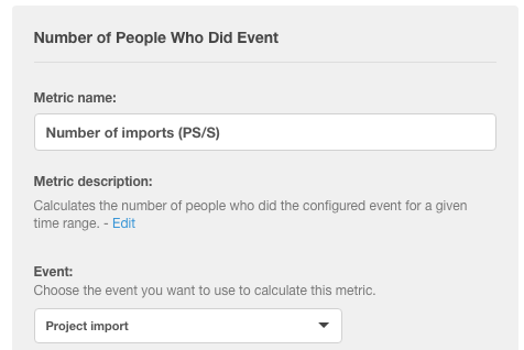
Happiness- The overall attitudinal satisfaction or delight that a user feels in relation to your product. UXPin uses net promoter score (NPS) as a Happiness metric.
Engagement- The degree to which a user responds to, or is involved with, the product. Examples include: visits per week, actions per visit, etc. UXPin uses Kiss Metrics to track custom events triggered by different features (e.g. “Created prototype in first day of trial”).
Adoption- The number of new users (or uses of a feature) within a set amount of time. After UXPin released its custom libraries feature, the product team measured use over a 6 month time period .
Retention- The number of users that continue using the product within a certain time frame. The product team and customer success team at UXPin both track churn on a monthly, quarterly, and annual basis in a shared Google doc.
Task Success- How well a task is completed, how quickly, and the amount of errors committed on average when completing the task. “When testing lo-fi prototypes, I find it more helpful to measure task success qualitatively by tracking patterns in user feedback,” says UXPin user researcher Ben Kim. “Once you’re testing a hi-fi prototype, however, you can accurately track task success with a usability checklist”.
Which Metrics are Important to You?
Obviously, it’s impossible to narrow down the analytics you track to 5 simple metrics.
For a comprehensive understanding, follow a three step process:
Goals
Signals
Metrics
First, you articulate your aims. Next, you identify patterns which point toward success. Finally, you build a metric to track those patterns. Let’s take a deeper look at each of these steps in turn.
Goals
Set up a meeting and let every team member chime in on their vision of success in the sprint. Different people may have different ideas. This is okay, preferable even. With diverse viewpoints represented, you can better piece together what your product should accomplish.
Just make sure you break down goals into project goals and feature goals.
Finally, always back up your articulation with solid user research. Base your goals on data from surveys, interviews, user testing, case studies etc.
Signals
Now that you’ve determined the goals for your product, think about what user actions will result in progress toward these goals.
These actions are your signals. Look for signals indicating satisfaction and behavior. Which trackable behaviors result in feelings of satisfaction? Or how about frustration?
List a number of possible signals and be as specific as possible when connecting them to the goals you’ve articulated. Don’t ignore signals for possible missteps either. Identifying pain points can help you build a better product sometimes much faster than concentrating on the positive points.
Before launching their Photoshop and Sketch integration, UXPin’s product team realized they would measure the following signals:
The number of plugin downloads from the Chrome store
The number of imported files
Metrics
The final step is drawing trackable metrics from your goals and signals.
Hopefully, you’ve already identified a few by the time you’ve finished your signals phase. If not, try briefly describing your site or app. Write down your description, no longer than a short paragraph.
Describe how the user should ideally interact with your product. After you’ve written your description, reread it and underline all of the verbs in your sentences. Measure each word you underlined.
A week into the launch of their Photoshop and Sketch, UXPin’s product team checked if:
Actions around creating hi-fi static designs in UXPin decreased
Actions around hi-fi interactive design in UXPin increased
Increasing number of people were using the new integration plugins
If all three criteria were met, the team could reasonably deduce that people preferred static design in a separate platform, then importing into UXPin for the prototyping.
Conclusion
There is no one size fits all set of UX analytics.
Every product is built for a different purpose and with different people in mind.
The best way to go about pleasing your users is to pay attention to how they interact, measure the key events specific to your product, and critically determine the areas where you can improve.
As always, remember to balance the quantitative metrics against qualitative user feedback.
For more UX advice, check out the free Guide to Agile UX Design Sprints . The 97-page playbook is based on 50 design sprints conducted by author and designer Alex Gamble.

The post Which UX Metrics Should You Be Tracking? appeared first on Studio by UXPin.
May 16, 2016
How to Maximize Content in a Minimalist UI Design

Minimalism is a popular style right now that’s as visually stunning as it is useful.
The style decreases loading times and increases comprehension, all the while giving the site a refined, elegant look.
But what do you do if your site has too much content and you don’t know where to minimalize?
If the goals are aligned, any site can benefit from a minimalist style, even content-heavy ones. This article will explain how to design minimally for sites with maximum content by dissecting some examples, and how the cards layout pattern can help.
3 Big Sites That Look Small
It might seem like a juxtaposition of sorts, but designers are finding creative ways to use minimal design styles even with a lot of content.
This can be pretty tricky to do. It takes a design and content team that has a lot of trust in one another to create the right balance between content and design. This can be really effective for e-commerce websites, which often contains hundreds of inventory pages along with long-scrolling pages to showcase products and styles.
Let’s take a look at 3 examples of large-content site that successfully pull off minimalism: Jatex, Nordstom and Groupon.
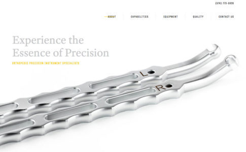
Photo credit: Jatex
Jatex features its main product, orthopedic devices, against an all white background with limited navigation and plenty of whitespace. The homepage is an almost text-book example of what a minimal design looks like.
Start moving through the site and there is a lot of information about this product, including specifications, capabilities, quality questions and answers and contact forms for medical professionals. The organization is clear and simple for a website that contains complex and complicated content. The clear structure and space contribute to overall readability and make it seem easy, even for a user who stumbles on the site by accident.

Photo Credit: Nordstrom
The front page of Nordstom is also a good example. It strikes that balance between short concise copy and an engaging minimal design. There’s just enough copy to entice you to click through to a department and see more on shoes or suits.

Photo credit: Groupon
Jatex and Groupon are each in the business of selling products, but the sites are designed as almost a yin and yang of how to do minimalism for sales.
When you first look at the product page for Groupon, you might start to second-guess the idea of minimalism in the design. But look a little closer and you’ll find that there’s actually a lot of content, just organized in a way the captures the spirit of minimalism.
The interface uses a single focal point (the picture) with only the most necessary elements to help users interact with the design. The more involved content falls below the scroll. This keeps things sparse up top with an image, short description and purchase information. (What more do you need?)
Working with complicated content does not mean the design has to be cumbersome; it’s actually the perfect setup for a minimal aesthetic. Separate content into groupings to make it manageable and use principles of space, alignment and clean typography to create hierarchy and easy reading.
And if you’re using WordPress, you may find the Hipsta Minimal Theme useful.
Applying the Card Layout
One of the best ways to consolidate space for any site, minimalist or not, is the card layout, one of the biggest trends of the past year. Thanks in part to Google’s Material Design, cards are the go-to design pattern for many Android-based mobile applications and for Apple apps as well. Cards are also finding homes in plenty of desktop sites..
The popularity is due in part to the phenomenal usability of cards. Something Pinterest has known about for sometime.

Photo Credit: Pinterest
Cards are a simple method of creating organization and flow in a design. Plus, they work with almost any type of content:
Photos
Text
Video
Coupons
Music
Payment information
Signups or forms
Game data
Social media streams or sharing
Rewards information
Links
Combinations of elements
Cards also rely on established user behavior patterns, making interfaces easy to use. Every element lives in a container that relates to a specific action, such as activating a link, filling out a form, sharing on social media or watching a video. While the first cards resembled playing cards, newer card-style interfaces are much sleeker.
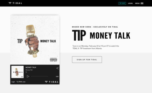
Photo credit: Tidal

Photo credit: eBay
That’s why big-name websites are using card-style design patterns in a minimal framework. Cards are a visual element that relates to a specific action against a simple backdrop, as seen above in the designs for Tidal and eBay.
This simplicity is easy to look at, calming and feels unobtrusive — all of which gives the user the feeling of control, like they have the power to do what they want on the site. It’s no wonder that a combination of minimalism and cards is a popular option for sites where users have many different choices, a common part of large-content sites like online shops.
Cards are a fluid option that can work between desktop and mobile sites responsively. However, it’s important to note that cards will look (and maybe even function) differently between devices. Look back at the eBay design above. The cards are different sizes and the “pick of the day” is horizontally oriented, while the “trending deals” is more square.
Each of these shapes presents a problem on mobile, with a solution that is more vertical. Each card will reshape for smaller device sizes.
Here’s a few things to keep in mind when using cards in a responsive design:
Is the text equally readable on desktop and mobile devices?
Do shapes work with device aspect ratios?
How will photos and images look across devices and will they be the same or different?
Are the clickable and tappable areas the same? (It is recommended to make the entire card a single linked element.)
For more on designing a minimalist card, check out the free e-book Web Design Techniques: Cards & Minimalism.
Next Steps
Interestingly, the minimalist trend can get quite complicated to apply. For a fuller treatment of the design style, read the free guide Minimalist UI Design Trends 2016. This up-to-date guide explains the all the essential techniques and considerations for minimalism today, including 20 analyzed examples from companies that do it well.

The post How to Maximize Content in a Minimalist UI Design appeared first on Studio by UXPin.
3 Techniques for the Perfect Minimalist Web Interface
Minimalism is a popular style now, both for its visual appeal and for its practical benefits (fasting loading, better comprehension, etc.).
Below, we discuss the 3 techniques that most define the minimalist style, with practical tips on how to apply them. Add them to your design to create the perfect minimalist site.
1. Crazy Colors
Previously in design, we saw a focus on hero images and video — a trend that’s still going pretty strong — but the recent shift has been toward color as a dominant element. Big color replaces some of the more typical white space that we’re used to seeing with minimal designs.
Because minimalism involves stripping away elements that are unnecessary, a strong focal area is important. That’s where big, bold and even crazy color comes in.
The stunning result borrows some of the colors we’ve seen in flat and material design trends. This creates an overall look that’s simple, engaging and demands attention.
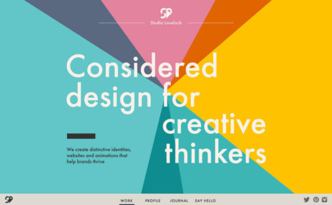
Photo credit: Studio Lovelock
Studio Lovelock uses a pinwheel of colors to create a full-screen header that draws users in. The text is simple and without any extra embellishment or words. Add an atypical bottom-screen navigation menu to keep the focus on the main image, but provide a cue to scroll. Below the scroll, the site uses the same big colors in card-style elements to move users through the design. This makes navigating the content both easy and visually appealing, yet simple and elegant.
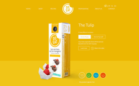
Photo credit: Do Eat
If the Do Eat website had a white background, we probably wouldn’t even guess if it could be considered minimal or not. And that’s precisely why the bright yellow background works. It create the right degree of surprise to entice users. The rest of the website design is simple and quite easy to use, with just the right balance of clickable elements and information.
Tips for Using Crazy Color
Opt for bold hues with deep saturation
Mix and match bright color with white or black typography
Use a single color as the primary palette, including the background
Plan “too much color” with care and mix up a rainbow-style color palette
Let color be the only “trick” in the design and keep everything else streamlined
Using “crazy” color choices can be one of the most effective ways to give a project a facelift. This is a great option for a minimal design, because there’s still plenty of visual interest and color to add a freshness that a more stark black and white design might lack.
2. Trendy Typeface
When someone says “minimalist typography,” what typeface do you visualize?
Maybe it’s Helvetica. Or something that looks a lot like it, with plenty of medium width, and simple strokes that come together in a highly-readable sans serif.
Of course, this would be the textbook definition of typography for a minimalistic design. But it doesn’t have to be the only definition.
When the rest of the framework is stripped down to the most basic of designs, a more trendy typography option can serve as the dominant element, at the same time as delivering its textual message. Vintage or retro-grunge type and stacking type are time-honored designer favorites. When used right, they can add a spark to a minimal style.
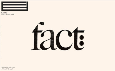
Photo credit: Flat File
Flat File uses a striking serif — ITC Caslon No. 224, to be precise. The type is roughed up, giving it a slight texture that feels artsy and like a critical component of the content. Simple scrolling effects contribute to this minimal aesthetic, because everything about the site is so easy and comfortable.
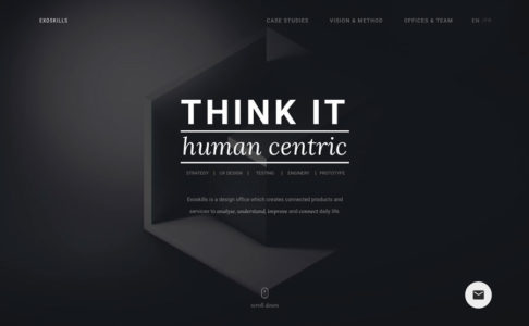
Photo credit: Exoskills
While Exoskills looks nothing like Flat File, it also combines a simple aesthetic, navigation and feel with bold typography as a dominant element. Multi-level stacked typography provides an interesting way to display information in readable way, one reason it’s becoming more and more common. As an added bonus, it also creates just the right hierarchy, telling users what’s important.
This combination of eye-catching typography and a minimal design is a great option for design projects that need to convey simplicity, harmony and organization. More importantly, minimalist typeface serves as a starting point for designs that lack other elements or that want users to focus on reading the message on the screen.
Be aware of size when it comes to this text-heavy style. On smaller devices, it’s important to watch the sizing of responsive typography – particularly with more complicated typefaces – to ensure readability remains intact.
Tips for Using Typeface Trends
Use trendy typography for a specific purpose such as a logo or headline
Complicated typefaces, such as vintage grunge, often need to be displayed at larger sizes
Don’t grab a new typeface just because it’s cool; it should match the mood of the project
Not all trending typefaces will work with minimal; styles that lack long tails, swashes and flourishes are the best options
Typeface trends can evolve and change quickly. Use this technique only if you are a constantly tweaking the design, because otherwise you would end up with something that looks dated. By applying a type trend to a very specific part of the design, such as in the hero image or main navigation, you can easily use a trend while it’s popular and change course when needed.
3. Compact Navigation Options
When you think about minimal design, navigation is not always one of the first things that comes to mind. This is partially due to the design itself. Many minimal designs actually hide some or all of the navigation to streamline the visuals.

Photo credit: Prototyping a navigation drawer in UXPin
For example, the often-debated hamburger icon, and related hidden navigation. The stacked icon that expands to a full list of menu items remains a popular design choice, especially in minimal frameworks and mobile UI.
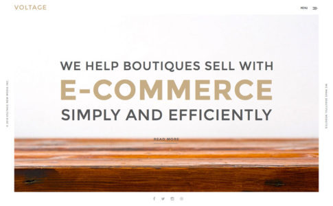
Photo credit: Voltage New Media
A slightly different take on this icon is employed by Voltage New Mkedia. Click the off-center hamburger icon, and it expands to a half-screen style navigation menu.
This style, which is often no more than a colored box containing a simple logo and list of link options, is extremely popular and growing. It works with the minimal style because you can strip plenty of “junky,” but necessary, elements from the main canvas in a way that users understand. (Love it or hate it, almost everyone understands how to use the hamburger menu.)
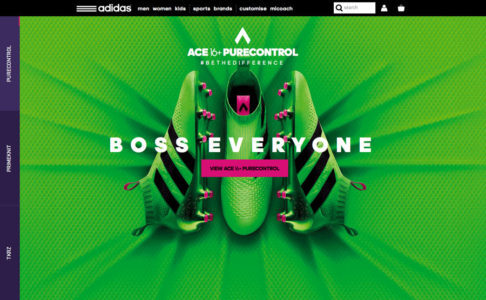
Photo credit: Adidas
The appearance of minimal navigation is growing in designs with more complex aesthetic patterns as well. Take the United Kingdom’s Adidas site, for example.
The homepage (minus the busy textured background) is sparse. There’s a simple row of top page navigation, a bouncing arrow at the bottom of the screen to help users scroll for more and hidden pop-out navigational elements on the left side of the screen. All of these techniques are commonly featured in minimal designs and are simple to understand and use, even with more complicated website designs.
Next Steps
The more popular minimalism becomes, the more frequently it evolves. To stay informed on what to expect from minimalism in 2016, read the free e-book Minimalist UI Design Trends 2016. There you’ll find even more techniques like these, plus specific advice for apply minimalism to sites with heavy content.

The post 3 Techniques for the Perfect Minimalist Web Interface appeared first on Studio by UXPin.
UXpin's Blog

- UXpin's profile
- 68 followers

