
UXpin's Blog, page 123
September 6, 2016
Get 1 free month of online UX courses

We’ve teamed up with the Interaction Design Foundation (IDF) to gift our blog readers and users with 1 month of free membership, offering complete access to all their online UX Courses.
The entire catalog is filled with practical self-paced courses and opportunities for beginner, intermediate, and advanced practitioners. To encourage networking, participants are limited for each course.
Our personal favorites include:
The Psychology of Interaction Design
Emotional Design
UI Patterns for Successful Software
Once you complete a course, you’ll receive an industry recognized Course Certificate to include in your resume and LinkedIn profile.
The IDF, an independent non-profit organization, is the oldest and larges provider of online UX courses, offering members rich information, interactive lessons, and discussion boards where you can chat with other designers and members. Redeem the offer below on the special landing page, then find the most useful course for your needs. Enjoy!
Get 1 month of free UX Courses
The post Get 1 free month of online UX courses appeared first on Studio by UXPin.


August 25, 2016
Free: The Futureproof Responsive Web Design Bundle
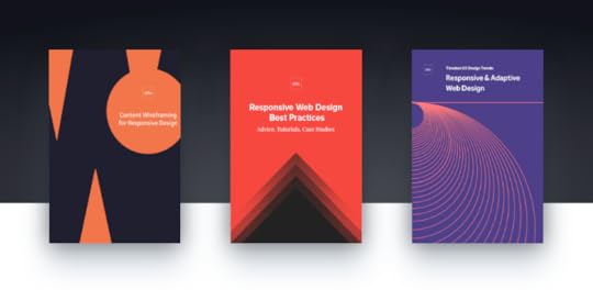
Combining our 3 greatest resources on responsive design into a single download, the Futureproof Responsive Web Design Bundle features over 180 pages of responsive design advice, available for free.
These e-books skip the theory and go straight to actionable advice, drawing on examples from top companies like Hulu, Virgin America, The Guardian, Uber, The Atlantic, and Mint.

The first e-book, Content Wireframing for Responsive Design, is written by Tom Green, author of several best-selling books on Flash and professor of interactive multimedia at Toronto’s Humber Institute of Technology and Advanced Learning. This book covers:
A comparison of different methods and tools for wireframing
A step-by-step guide to content wireframing, including sections on creating a content inventory and establishing visual hierarchy
Applying the mobile-first approach
Modifying the content wireframing process for more responsive layouts
A case study to illustrate the lessons

The second e-book, Responsive Web Design Best Practices, gives an all-inclusive list of the best techniques for responsive design. Spanning 8 chapters and 127 pages, this e-book explains:
Why responsive design is so effective
Tutorials written by responsive designers for immediate application
Best practices for responsive navigation, typography, and images
How to handle the technical aspects of responsive design
The mobile-first workflow
Case studies and examples from top companies

Last, Responsive & Adaptive Web Design discusses the two most important design methods for a mobile-dominant web, with topics like:
Why M-Dot sites aren’t sustainable
The differences between responsive and adaptive design, and when to use each
Why a mobile-first approach is synonymous with a content-first approach
How to design continuous and complementary UX
4 case studies of companies that master multi-device experiences
Download this free e-book bundle now.
The post Free: The Futureproof Responsive Web Design Bundle appeared first on Studio by UXPin.
New in UXPin Enterprise: Assignable Comments & Formal Stakeholder Approval
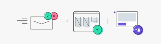
Getting good feedback is crucial to the design process. Our comment feature lets users leave specific notes on prototypes, whether they have a UXPin account or not, so any stakeholder can help improve a product.
Today comments got better. UXPin Enterprise users can now assign comments to people and send designs for formal stakeholder approval.
Comments and tasks
In talking to our users, we discovered that people loved commenting — but they wanted more accountability on their team. Good news: Enterprise users can now assign comments to specific team members as tasks to be completed.
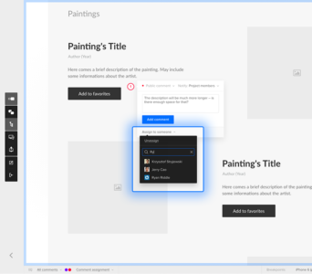
Want to see comments assigned to a specific person, like yourself? No problem, you can filter tasks by team member, or view comments not assigned to anyone. Know the bottom line for each comment thread: who needs to do what, and why.
Comment features vary per account type:
Enterprise: Comments assignment, team/public comments
Team: Internal and public comments
Basic and pro: Public comments
Non-customer: Public comments and nickname to add comments
Approval process
Specific comments are one thing. Approval on a whole project is another, and it’s also getting easier for Enterprise users. Forget long email chains for stakeholder sign-off. Now stakeholders can formally approve each iteration right in UXPin.
Click the approval icon in the lower left-hand corner of a project’s thumbnail to invite stakeholders for final review.
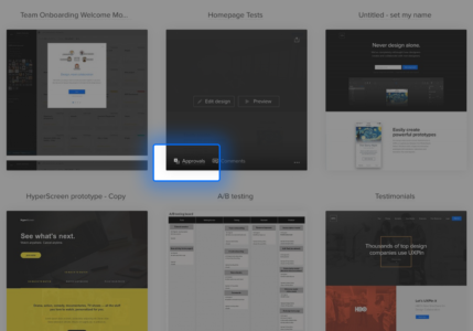
The app will ask you to provide the stakeholder’s name and email address, which it will use to request their final feedback.

They can set a prototype to one of three statuses: pending, approved, or rejected. They can then explain their decision with additional comments, creating a clear set of criteria for approval.

Want to spend less time managing feedback and more time driving design decisions? Check out UXPin Enterprise now.
The post New in UXPin Enterprise: Assignable Comments & Formal Stakeholder Approval appeared first on Studio by UXPin.
August 19, 2016
UX Case Study: Dogfooding Products When You Can’t Test With Users
Fitting user testing into a two-week sprint isn’t the easiest task. In my experience, that’s usually an understatement.
The window of opportunity to act on insights rapidly shrinks until you’re suddenly faced with a “last resort” situation—needing input but unable to observe users with the product.
When you need feedback but access to your customers isn’t possible or time is short, testing with internal users (surrogate testers) may prove more valuable than you expect. At some point you will need to test actual users, but internal stand-ins help you gain momentum until then.
To evaluate when and how internal testing should happen (and steer clear of the pitfalls), here’s how to get started.

“Internal testing surrogates can give you great feedback on the functionality and sentiment surrounding your designs”
When Does Dogfooding Make Sense?
Internal user testing (dogfooding) is most valuable when there’s greater concern for qualitative feedback and less for validity.
As shown by Slack’s design process in the Real-Life UX Processes e-book, dogfooding is all about cost- and time-conscious design insights.
Is your project right for internal testing? Make sure it falls in line with these criteria.
If the product is very general or covers a very wide range of the market.
Your co-workers resemble your user personas.
A concept needs functional testing to validate if the interactions work as designed.
You need to map participants’ mental models of use with the product.
You need buy-in from stakeholders to understand how people might react to your designs.
You need quick wins to justify budget for formal user research.
Remember, your goal is to get results quickly. Don’t spend hours on data only your desk drawer will see.
Eating Our Own Dogfood
One of the biggest challeges we faced as a team on BostonGlobe.com is understanding how readers consume digital news. We needed to present the breadth of our content in an appealing way to maximize recirculation (percentage of users who read more than one article per visit).

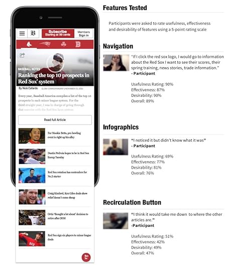
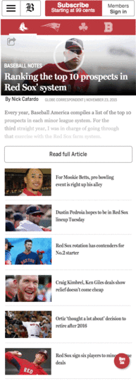
For a recent internal test of a new “Sports” vertical on Boston Globe.com, we conducted mobile testing on 17 candidates internally sourced from 13 different departments. Participants were asked to complete prompted tasks and open-ended questions. We also asked them to rate the usefulness, effectiveness and desirability of features.
For this project we needed a way to test functionality around a new navigation that uses Red Sox, Patriots, Celtics and Bruins logos as navigation elements (to drive more circulation between team fronts) and a fly-in menu bottom with additional articles to drive recirculation.
RITE testing (Rapid Iterative Testing and Evaluation) was also used to test alternative designs. We then collected reactions (feature and product level) in the form of a product reaction scale and adjectives, which we visualized in a word cloud.


Mobile sports section features tested and ratings by feature
The Results Of Our Internal Test
The results of our internal testing (example tables below with ratings for each feature) showed a number of areas for UX improvements.
Navigation
A fully functional prototype used for testing was built to test the major features and variations in the recirculation button and gauge reaction before product launch.
Navigation Ratings

The ratings table covers the three UX benchmarks: usefulness, effectiveness and in this case. I chose desirability instead of satisfaction because asking participants if something is satisfying sets a sub-standard bar for the quality of the feature or product. Instead, we aim for delight.

Word cloud used to visualize common words used in qualitative user feedback.
Findings
No clear indication of section front. If a user comes in on a featured article
Participants described the feeling of being trapped or limited if not looking for the big four Boston teams.
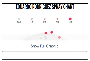
Infographics

Differences in your sample size between tests can skew your results. Don’t trust the data alone to inform design decisions. Proper due diligence includes checking your qualitative data and adjectives for a complete product perspective.

Feedback word cloud
Findings
Participants thought the infographics default state should be visible without having to click to view.
Participants overlooked the infographics, often confusing them
for advertisements.
Recirculation Button


4/17 people describe this feature with negative comments
16/17 participants noticed and understood how the navigation worked at first glance (their mental model matched the interaction)
Slowing down the animation between the sections helped to communicate different states.
Participants found it difficult recognizing the difference between an article they chose to read and a truncated article that served as a landing page (truncated article with recirculation articles at the top of the page). Furthermore if a reader had chosen the same article as the featured article the hero images were the same so there was some confusion understanding the differences between these pages. If a reader clicked the section logo it would take them to the same article only truncated. Participants explained they expected to see a team landing page which from a UX perspective makes sense because participants didn’t automatically understand that the article was serving as the landing page. To them it just looked like another article.

Positive to negative word association based on adjectives in user feedback.
Grab design ebooks created by best designers
All for free
 Download
 Download
 Download
 DownloadDo you want to know more about UI Design?
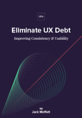
Download 'Eliminate UX Debt' FOR FREE!
Download e-book for freeCloseHow We Pivoted
Like many companies that are dealing with time constraints ultimately it was decided to release an mvp to get the product out and see how our readers responded. Once the design was out in the wild our team waited and looked at a two week post-launch analytics report and a feedback form that was launched at the same time.
What we found was a bit disheartening when we discovered that exit rates increased on sub-section fronts. While the results were not what we had hoped for they still served as an important lesson to test as early as possible. The later you test, the more difficult it becomes to adapt and pivot.
The report validated many of the concerns from our testing results. For example the recirculation button was clicked on less than 1% of articles and our testing showed that participants didn’t find the recirculation button a valuable feature and many didn’t understand or use positive adjectives to describe their experience. 3/17 people understood this feature at first glance and 81% or 22/27 had negative comments about the feature.
Luckily, as we launched iterations of the recirculation feature, qualitative feedback improved alongside the quantitative feedback. The language participants used to describe features started changing. Words like “simple” and “easy began to spring up which also corresponded with the ratings scales for gathering quantitative feedback.
How to Run Insightful Internal Testing
The secret is maintaining momentum.
Think about testing like an iterative sketch. Your test won’t be perfect – but remember, the clock is ticking. Test your prototypes with coworkers that possess varying and often overlapping needs—just like your real users.
Minimum number of coworkers to test
While the minimum is 5, I try to use common sense.
Our team recently reduced the participants from 25 to 15 without loss in quality of insights. We also recruited across differing business segments to give the test as much variability as we needed.
Frequency of Internal Testing
Besides A/B testing, we run internal tests on nearly all features in our product roadmap. The length of tests depends on complexity of the problem. We normally run testing in blocks – for this project, we ran our test over three days.
Now, we typically start testing with lo-fi prototypes during concept exploration. We iterate almost immediately after the first test to prepare for our second round.We may test up to three different iterations in the first round.
For example, we may test a button with an icon with one participant, and one with text on the next participant. If a design is glaringly problematic, simply omit it from the testing as soon as a pattern supports your assumption.
Most of the time, issues will surface after the first few participants. We also found it best to debrief after each session instead of hours later when you’re trying to recall important points from notes or recordings.
Takeaways
In closing, let’s review the benefits of internal testing:
Backing for UX initiatives. When new to a role, you need to quickly show the value of your work. By sharing your knowledge of testing with those around you, they become “true believers” in your work.
Speed of delivery. Testing your prototypes on internal users helps you iron out issues quickly. All your results will be compiled quickly and summaries can be written at the end (preferably immediately post-testing), and then compiled in a summary in one day.
Education and feedback. Internal testing with surrogates helps you it i cterate and understand the strengths and weaknesses of your own testing processes.
Saves time and money. Show your stakeholders the quick wins. When managers see tangible results at little to no cost, you’re in a better position to sell them on a test with real users.
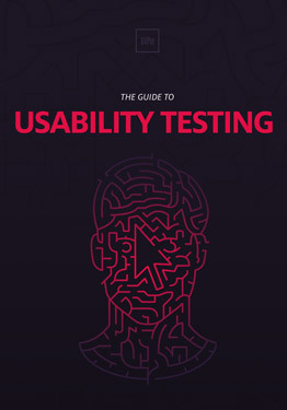
For advice on testing with users, I highly recommend checking out The Guide To Usability Testing by UXPin.
You’ll find useful tips, as well as guidelines and pitfalls you may encounter along the way.

The post UX Case Study: Dogfooding Products When You Can’t Test With Users appeared first on Studio by UXPin.
August 17, 2016
Top 10 Photoshop Shortcuts for UI Designers
As a UI Designer and long time fan/user of Adobe, I still tend to find myself using Photoshop to create icon sets and mobile/web mockups.
Here are a handful of shortcuts I’ve picked up throughout the past five years to make the everyday design workflow a little easier.
1. Filling a Layer with a Click
Now, this is a really neat shortcut.
You can fill a selected layer with your current foreground or background colors. It’s definitely time-saving.
MAC: Alt+Backspace (foreground) or Cmd+Backspace (background)
WINDOWS: Alt+Delete (foreground) or Ctrl+Delete (background).

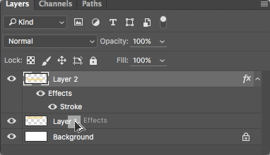
2. Copy Layer Styles
This shortcut is probably something you learned within the first few weeks of learning Photoshop.
Simply hold down the Alt/Opt key and drag the FX icon in the layers panel from the layer with the styles to the target layer – the styles will be copied right over!
3. Shape Attributes
Just like copying layer styles, copying shape attributes is also extremely helpful when needing to design multiple shape elements. When copying shape attributes, you are able to copy the live shape properties of an element such as color and border properties.
To copy shape attributes, right-click on the layer that holds the attributes that you want to copy, select Copy Shape Attributes, then select the layer that you want to paste the attributes and select Past Shape Attributes.

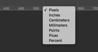
4. Quickly change measuring units
How annoying is it when you create a new document and your measurements are in inches instead of pixels? It’s definitely frustrating to have to go through the breadcrumb trail of Edit>Preferences>Units & Rulers.
But, if you didn’t already know, you can alternatively simply right-click your document’s rulers (if they’re visible) and select the measuring unit of your choice. Easy enough, right?
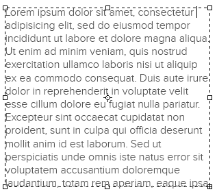
5. Insert Lorem Ipsum
Workable copy isn’t always available for the website or app we’re mocking up. That’s where Lorem Ipsum comes into play.
Now, I used to use Lorem Ipsum generator web applications, but I found out about three years ago that Photoshop has it’s very own Lorem Ipsum function. When you draw a text box in Photoshop, go to the menu bar, select Type > Paste Lorem Ipsum to fill your text box with Lorem Ipsum text.
6. Eyedropper Shortcut
Working with the Brush tool but you need to sample another color from an image? Instead of clicking the Eyedropper tool, simply hold the Alt or Option key to switch temporarily. Release to return back to Brush tool.
MAC: Hold down the Option key
WINDOWS: Hold down the Alt key

7. Save for Web & Devices
For years, I used the menu bar to access this option and save my designs for web. Solely out of habit. It was only until recently I started using this shortcut. It’s now one of my personal favorite shortcuts.
MAC: Cmd+Shift+Opt+S
WINDOWS: Ctrl+Shift+Alt+S

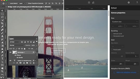
8. Artboards
This is a fairly new feature on Photoshop CC. If you’re a UI Designer, using multiple artboards in a single document is an absolute must.
Now you can lay out your separate screen mockups as if you were working in Illustrator. Awesome.

9. Adobe Preview
I absolutely love this feature. It’s a great way to view your designs on selected screen sizes.
I typically use Preview to confirm that every pixel and element in my mobile screen mockups looks pixel-perfect on the device. Just download the Adobe Preview app onto your phone or tablet, make sure the devices and your computer are on the same WiFi network and you’re all set.
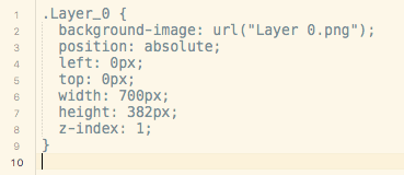
10. Copy CSS
If you’re a UI Designer who also codes your design, this neat feature allows you to copy the CSS of just about every element in your document.
Just right click on the layer of choice, select “Copy CSS” and you then you have a nice snippet of CSS in your clipboard for usage.
Bonus Tip: Prototyping Your Photoshop Design
If you use UXPin, you can use their Photoshop plugin to start prototyping your static designs. Once you’ve installed the plugin, you can create smooth interactive prototypes like the below confirmation animation.
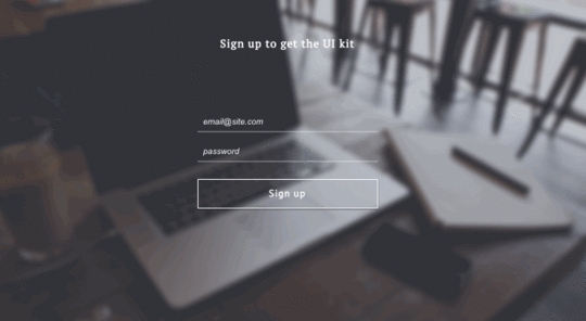
The collaborative platform doesn’t flatten files, so you can prototype any layer. Just drag and drop your file into your project and you’re ready to go.
Join the world's best designers who use UXPin.Sign up for a free trial.Your e-mailTry it for free!
The post Top 10 Photoshop Shortcuts for UI Designers appeared first on Studio by UXPin.
Google Fonts Come to UXPin

You asked. We listened. Google Fonts have come to UXPin.
Typography is described as the “voice” of text, but with tens of thousands — if not more — of type families on the market, constraining oneself to a few dozen isn’t always easy.
Many web developers look to Google Fonts to boost their online designs. Now you can choose from both libraries to make your UXPin prototypes more closely match the finished products. Through our new Typography panel — plus a new modal window — you can manage dozens of type families. All of the available Google Fonts are a few clicks away.
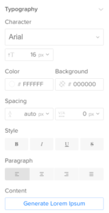
So what’s new?
A wider range: Choose from the collection of Google fonts for your designs.
This is heavy: Choose both type family and specific weight, like extra bold or light, in the new Typography panel on the right side of the Editor.
Liberate your library: Don’t need all of the standard fonts? Prune back your default font list in the new Font Management modal window.
Spaced out: Control tracking, or the average space between characters in a block of text.
The typography panel lets you search by font name. You can browse by source — Google or standard web fonts — and apply them to one or more text boxes in your prototypes.
What if you open a team member’s project that doesn’t have one of your fonts? You’ll get an alert message, but don’t fret. The text will load with its appropriate font, and you can use it — within the project at hand.
With the new panel and a ton of new fonts, you can better customize and standardize your UI in UXPin. See it for yourself!
Join the world's best designers who use UXPin.Sign up for a free trial.Your e-mailTry it for free!
The post Google Fonts Come to UXPin appeared first on Studio by UXPin.
August 16, 2016
Enterprise UX 2016 Industry Report Survey

We’ve seen plenty of reports and insights in the overall field of UX.
Enterprise UX, however, faces a unique set of challenges given its scale and complexity of problems. The term “enterprise UX” refers to the design of internal tools or B2B products, generally within global corporations with hundreds if not thousands of employees.
Yet despite the size of the industry, we’ve not seen much in-depth research or educational material within the space. Our 2016 Enterprise UX Industry Report aims to change all that. We’ll release it in Fall 2016 completely for free.
If you design B2B products or internal tools, we’d love to get your feedback in this 3-minute survey. Results are 100% anonymous. So far, hundreds have participated despite limited promotion on our end.
Feel free to complete the survey in a new window, or below.
The post Enterprise UX 2016 Industry Report Survey appeared first on Studio by UXPin.
August 15, 2016
Enterprise UX Case Study: Improving Usability Under Tight Deadlines
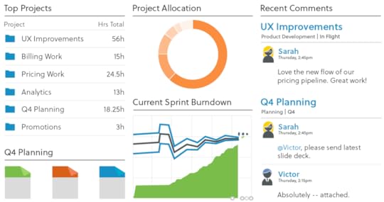
A cloud-based project management system, Liquidplanner needed to help users create dashboards more quickly.
The old process required creating dashboards, and all the widgets within, completely from scratch. Since more dashboard use correlated with higher customer engagement and lifetime value, the product team set out to create a new dashboard template feature.
The team’s goal was creating a “one-click solution” where the user could create a useful dashboard right away without any configuration.
In four months, LiquidPlanner shipped a new dashboard template feature, impressed their most valuable customers, and saw significant adoption rates and business results.
Below, you’ll see exactly how they did it.

Photo credit: LiquidPlanner
The following is an excerpt from The Project Guide to Enterprise Product Design . The free guide explains best practices based on real projects.
Setting the Context
Before getting into the actual process, let’s examine the user groups and project goals.
1. Primary Personas
LiquidPlanner serves three primary user groups:
Product Managers — The champions of the product, the people that “live and breathe LiquidPlanner.” These decision-makers ensure the team uses the product to track time, collaborate, and use the features that help them.
Functional Manager — The other decision-makers, such as a UX Manager, that hold sway over the team and keeps them accountable.
Frontline Contributors — People who use the product the most. These project contributors may not have chosen LiquidPlanner themselves, but they use it every day for their projects.
2. Project Goals
The following quantitative and qualitative goals would define project success for the dashboard template feature:
Increase usage of dashboards within 30 days of release. Using Heap to track in-app events, they discovered the friction in creating dashboards was holding the whole product.
Grant immediate access to project critical information. It wasn’t just about quality, it was about speed. LiquidPlanner needed to streamline access to data.
Finish the project in 3 months. Starting in Jan. 2016, the launch was set for early April, giving the team a compressed timeline to craft the right solution.
Stage One: Discovery & Concepting
(early Jan 2016)
Before the actual legwork started, the PM team gathered for a brainstorming/sketching session. The lead program manager, UX manager, and UX designer Edward Nguyen were all present.
Examining in-app patterns from Heap, the team categorized the most commonly-created dashboards:
Project Dashboards
Team Dashboards
Portfolio Dashboards.

From there, they sketched out their ideas on the whiteboard. These mostly involved user flow charts, drawing out the pace of the experience screen by screen. The user flows formed the foundation that would eventually grow into the perfect solution for the dashboard problem.
Stage Two: Creating & Testing Mid-Fidelity Flows
(early Jan 2016)
Immediately following the whiteboard session, Edward used Adobe Illustrator to create mid-fidelity versions of the white board sketches. These mid-fi flows become the key to the intermediary stage of internal testing before hi-fi prototyping and testing with users.

For initial, early-stage feedback, Edward showed the mid-fi user flows to 5-10 coworkers outside of the product team. He administered these casual tests individually, explaining the problem and collecting feedback on the proposed redesign for the dashboard creation process..
The informal testing also gave him a chance to answer his own personal questions and concerns. Ultimately, the tests proved successful: the absence of bad feedback is still good feedback.
Stage Three: Hi-fi Prototyping
(mid-Jan – Feb 2016)
Building on the mid-fidelity user flows and internal feedback, the team was ready to create a functioning version of their design.
1. Creation
A wireframe or user flow shows how the product might work. A prototype is how it works.
Since the goal of creating a prototype is to test your design decisions, the first step was outlining desired insights in a usability testing plan. This document prioritized test goals for the most important user actions:
Validate that people know how to create a new dashboard.
Validate the 3 default testing templates are useful options (Project, Portfolio, Team)
Validate that created dashboards are discoverable from within the project.
Determine what default widgets are most useful in a dashboard template.
The usability testing plan also included sections such as the test script and a list of user tasks (i.e., “Can you make a project dashboard from the Project template for Project A?”).
At this stage, the team then did some data mining to inventory and tally which widgets to include in which templates. This made the first prototypes closer to the final product.

Hi-fi prototype of the first screen in the flow for creating a dashboard template.
When it came time to build the actual, interactive prototypes, Edward used UXPin “because it helps us simulate real-world customer scenarios.” In his own words, “It’s powerful and simple enough to let me quickly create and test complex interaction models. I can prototype on Monday, test it Tuesday and Wednesday, and show results on Thursday.”
Since the new design needed to be intuitive without confusing current users, Edward actually chose a left-handed tabbed format versus the multi-step process the team initially sketched. He realized the choice was simpler for his team to implement while also benefiting users.
Designers wouldn’t need to create playful icons, developers wouldn’t need to build a multi-step wizard, and users could select their dashboard type faster with fewer steps.
As Edward demonstrates, while designers don’t need to know how to code, they should always understand the technical implications of their design.
2. Usability Testing & Iteration
The team conducted remote, moderated usability tests with 14 people through Join.me.
Edward moderated the testing sessions, while another team member observed and took notes. They tested two main scenarios: creating a dashboard, and finding an existing dashboard in the project.
Test results were quickly iterated into the following version, which was then likewise tested and the results reiterated, until the team came up with the proven, ideal design.
“A user even mistook one of my hi-fi prototypes as the real deal, telling me to thank our dev team.” said Edward.

Hi-fi prototype users believed was already fully developed.
Usability testing revealed the design worked well as a system:
Users found the tabbed layout easy to use and understand when creating dashboards from templates.
Users mentioned the default testing templates were useful and matched their needs.
While most users found the default widgets useful, some mentioned how they’d prefer different widgets due to personal preferences. For example, some users didn’t find the “Remaining Work” linechart widget useful. Others wanted the ability to save their customizations to the templates.
Users did experience some difficulty in accessing a dashboard once created.
Edward spent considerable time with the program manager to map out the patterns of feedback to consolidate insights. It’s a skill in itself to separate one-off, outlier comments from generally-applicable and actionable feedback.
To improve findability of newly-created dashboards, Edward decided to increase negative space around the “View Project Dashboard” label inside their details panel view.

Further improvements, such as the ability to save widget edits, were earmarked for later testing, since they were fell outside the scope of the MVP.
Stage Four: Development and Live Launch
Feb – April 2016
Following the Agile process, development sprints immediately followed the design sprints.
Even as Edward’s team was still testing prototypes, developers were already building the validated iterations. “The collaborative hi-fi prototypes and testing insights gave our developers enough confidence to implement our design decisions directly in code,” Edward said.
Communication within the team improved with daily standups, where Edward reported any new usability testing insights to developers.
Because the new feature tested well, LiquidPlanner launched the dashboard template feature live to users without beta testing.While the team runs beta tests for larger features, they needed to get the feature out the door since dashboard creation was so difficult before.
Thanks to efficient hi-fi prototyping and close collaboration, the team launched the new feature on April 9, 2016 on schedule and within scope. The initial results are promising:
Of the 17,000 dashboards ever created in LiquidPlanner, 1700 (10%) were created 2 weeks after launch.
The template feature is responsible for 75% of new dashboards created in the app.
A majority of large enterprise customers already use and enjoy the new feature, as it facilitates their large, complex projects.
“I was blown away by the numbers,” said Edward. “It was great to see that something I worked on was this popular with users.”
Takeaways
Based on LiquidPlanner’s success, keep in mind these learnings for your own product design process:
Don’t get overambitious on redesign projects. The new design needs to feel consistent enough for old users while also appealing to new users. To achieve this delicate balance, keep everything as simple as possible.
For the sake of efficiency, going straight from sketches to user flows and hi-fi prototyping is fine as long as you test thoroughly. For an existing product, hi-fi prototypes carry less risk since visual design standards are already validated.
On a compressed timeline, make sure designers work one sprint ahead of developers.
Maintain scope discipline in your MVP. As Edward did with a “Save Widget Edits” feature, don’t be afraid to table new ideas discovered during testing for after launch.
With detailed hi-fi prototypes and close collaboration, developers can implement changes in code with less risk of misinterpretation.
For more best practices based on case studies, download the free Project Guide to Enterprise Product Design.

The post Enterprise UX Case Study: Improving Usability Under Tight Deadlines appeared first on Studio by UXPin.
August 12, 2016
Webinar Recap: Spreading Design Thinking in Organizations
We invited Julie Baher, the Senior Director of User Experience at Illumina, to join our free Design Leadership Masterclass to talk about how to spread design thinking in organizations.
Prior to Illumina, Julie was a Group Director of Customer Experience at Citrix and a Senior Manager of Experience Design at Adobe.
Watch Julie’s full webinar (attended by 382 people), or read on for our short recap.
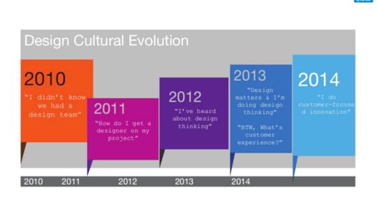
Make a Splash
The design cultural revolution at Citrix took place over the course of five years. In that time, the state of design within the company started from “I didn’t even know we had a design team” to a dedication towards customer experience from the whole company.
In 2010, Citrix’s products were all over the place in terms of design.

For Julie, the best way to propel design into a priority for the company was to make the biggest splash as possible. Julie and her team decided to conduct user research at a Citrix customer conference. After enthusiastic responses from the customers, they expanded the project to become a public user research project that included employees as well.
They had to get creative.
They tried all sorts of tactics to gather feedback and promote design, from setting up displays in buildings that proclaimed “design matters” to lining walls with empty sticky notes that asked what people’s roles were and what challenges they faced in their jobs. With that feedback, they began the redesign of several Citrix products.
The key takeaways:
Make sure people know you
Get in front of your co workers
Leverage existing structures (meetings, 1:1’s, all-hands, off-sites, events)
Get in front of your customers
Leverage existing structures (interviews, site visits, conferences)
Or create your own (user-group/fan meetings, coffee shops, etc)
Design Matters
After Julie and her team focused first on the products and their user experience, they worked on implementing design thinking through the company. It’s one thing to redesign a couple of products. It’s another thing entirely to get people thinking about design throughout the process.

To provide context for everyone on design, Julie and her team had to teach everyone design.
Since 2010, Citrix has held over 100 workshops that taught over 4000 employees in 15 different locations. Julie also partnered with the HR and Facilities departments to organize a feedback session on both departments.
By teaching everyone the basics of design and getting the Citrix employees used to thinking about user feedback and implementation of that, Julie and her team were able to make design a component that was cross-functional across different parts of the business.
The key takeaways:
Look for ways to teach and evangelize Design Thinking
Learn by doing
Be hands on and engaging
Perfect your elevator pitch
Some resources (see the upcoming UXPin ebook for more)
Stanford d-School methods
Design Thinking for Educators toolkit
Extreme by Design resources
Ideo’s Design Thinking resources
Coursera’s “Design Thinking for Innovation” online course
Next Steps
This teaser is just a small preview of the real-life lessons.
Watch the 2nd Design Leadership Masterclass webinar attended by 382 people to learn:
How to craft your pitch for UX buy-in from executive stakeholders
How to run a pilot program to prove the value of design
How to adapt your approach based on microcultures in your company
How to set the right metrics to measure the ROI of UX
The post Webinar Recap: Spreading Design Thinking in Organizations appeared first on Studio by UXPin.
August 11, 2016
UX Case Study: How Hubspot Redesigned Their Homepage
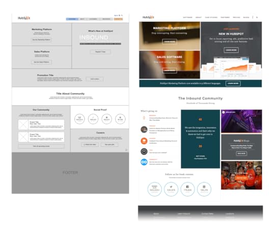
HubSpot’s home page is visited by more than 4 million users per month, serving 18,000+ companies across 90+ countries.
Their home page is the lynchpin for the company’s entire online ecosystem. So when the company grew massively from a private company to a multi-product, public global organization, a homepage redesign was in order.
And it needed to happen quickly, in time for a grand release of a whole new product line at HubSpot’s annual industry event, INBOUND, just 1.5 months from the project kickoff.
UX Designer Austin Knight led the project, supported by a team of three (visual designer, developer and marketing manager). Outside the immediate team, Knight also worked with six others for product positioning, copywriting, and technical development.
This is the story of how a designer applied the focused research, collaboration and unwavering customer focus of Lean UX to deliver bottom-line results on a tight schedule.

Photo credit: HubSpot’s redesigned homepage
The following is an excerpt from The Project Guide to Enterprise Product Design . The free guide explains best practices based on real projects.
Step One: Deep Research and Constant Testing
The HubSpot project began right when Knight was introducing the more iterative, Lean UX approach to his team. Created by Jeff Gothelf, Lean UX aligns business strategy with lightweight design process through constant “learning loops” (build – measure – learn).
In this case, the first step of this work was to dive into analytics and user research to quickly validate assumptions.
Analytics & Heat Mapping
Unlike some processes where a marketing analyst might provide the design team with web data insights, Knight dove right into the data himself. Massive amounts of data were available in HubSpot, Google Analytics and Mixpanel. The main challenge was sorting through the data to reveal meaningful patterns.

Knight discovered a significant number of users exhibited the following behaviors:
Moving straight from the homepage to pricing (pre-disqualifying themselves from the product benefits)
Moving straight from the homepage to an FAQ (signalling they weren’t finding the answers to their questions)
Moving straight from the homepage to site search (usually searching for product queries, meaning they weren’t quickly getting the information they needed).
It was clear that, despite being in-depth, the home page lacked critical information that decreased conversion.
Knight also examined heat maps and scroll maps conducted with 25,000 users each, supplying 467,308 unique data points. Ranging from several years back to present time, the maps helped Knight further understand where disengagement was happening, including discovering that only 25 percent of users would scroll on the homepage.

Session Recording
Finally, user session recordings acted as hybrid quantitative/qualitative research.
Since the recordings were live, anonymous, and undetected, the results were fairly reliable since they represented user behavior in a natural environment.
Session recordings ran continuously throughout the whole design project, providing a stream of data to validate user interviews and usability tests.

Qualitative Research
While quantitative research helps you see the “what”, it doesn’t always reveal the “why”. To dive into motivations behind behavior and UX requirements, designers need to interview users and stakeholders.
1. Customer Interviews
Because 10% of the HubSpot homepage traffic consisted of HubSpot customers logging in or searching for resources, the redesign could not neglect such a valuable user group.
Knight interviewed customers not just to validate the other sources of data, but also as a basis for determining how the new homepage could deliver dynamic content to specific segments.
By developing a rigorous user interview process and tying questions to outcomes, he gathered highly focused feedback.
2. Stakeholder Interviews
Since this project would literally change the digital face of HubSpot, Knight also interviewed executive leadership and product, marketing, sales, and customer support teams.
He then cross-referenced the results with feedback from user interviews, support call transcripts, unsolicited HubSpot redesigns, tweets, emails, and even conversations that Knight had with attendees at his own speaking events.

“Data-inspired, human-centered design – that’s what we do,” Knight said. “Designers need to interpret data on their own and objectively justify their design decisions whenever possible. We work in an industry where designers are becoming increasingly empowered by quantitative and qualitative data. As such, we generally don’t make decisions based on opinion or what someone ‘likes’. There has to be more to it. The true magic of today’s designer is in how they can interpret implicit and explicit data, and thoughtfully transform that information into design solutions.”
Multivariate Testing of Small Tweaks
Finally, based on all the initial research, Knight was soon able to quickly design a few incremental changes for validation with multivariate tests.
The tests helped qualify or disqualify specific design elements, which would then influence the entire team’s strategic decisions as they moved to the full homepage redesign.

Step Two: Building a Living Design
As explained in The Project Guide to Enterprise Product Design, Knight followed a structured process of “starting broad, testing, learning, iterating, and narrowing in on the optimal solution with each round”.
Lo-Fi Prototyping
Once the team decided on three major variations, they created lo-fi prototypes and added fidelity as needed to present to stakeholders for feedback. Once a major direction was selected, Knight remained in the lo-fi stage for multiple iterations before moving on to visual design.
In fact, the lo-fi prototypes bear a striking resemblance to the final product, given all the time spent gathering feedback and direction from users at this critical juncture.

“We tested with users throughout, from testing paper prototypes to working with our wireframes and on to visual design,” Knight said. “The voice of the customer was present throughout the process. As a designer, this extra voice in your ear is critical. It doesn’t make all the decisions for you, but it helps you find your direction.”
Mockups
During the visual design stage, Knight worked closely with his visual designer.
It’s also important to note that Knight was already discussing the design with his developer at each step of the process. While they wouldn’t begin coding extensively until the hi-fi prototyping, they all worked on interactions throughout, ensuring the entire team was on the same page.
The team created a modern aesthetic with bold colors, HD imagery and an atypical grid structure. This grid structure was inspired by the need for the new homepage to represent a “living design”. The grid-based, modular structure scales well across devices, content could be easily changed or moved and key sections could be updated with content inspired by stakeholder and user suggestions.
Another interesting element of the atypical grid structure was the photo framing.
The team took a very unique set of photos intended to fit perfectly into the structure, allowing the off-hover state to show an out-of-focus section of a photo that would expand out into the right grid element on-hover, revealing the full photo and additional information.
The photo treatment became a distinctive design element and interaction that greatly increased user engagement. The team also developed dynamic content personalized to the user, which was revealed as a major opportunity in early customer interviews.
Finally, since 16% of HubSpot users access the site via mobile and more than 19% of the U.S. population has specific accessibility needs, compatibility and accessibility elements were critical to the design and accounted for in every step of the process, including the code.

As with all other aspects of the project, the mobile and desktop versions were iterated on together on a parallel path.
Grab design ebooks created by best designers
All for free
Download
Download
Download
 DownloadDo you want to know more about UI Design?
Download 'Real-Life UX Design Processes' FOR FREE!
Download e-book for freeCloseStep Three: Coding and Testing
The next step was building clean code, using the company’s own CMS.
Knight, his visual designer and his developer worked hand-in-hand to ensure the code was compatible across all devices, QA testing their prototypes on a regular basis.

The team tested the site across devices and resolutions in multiple versions of Chrome, Safari, Firefox, Internet Explorer, Edge, Opera and Yandex. The team used BrowserStack to emulate the site on real devices and, since they knew they percentage of their users on each platform, they were able to prioritize fixes according to audience size and criticality.
Step Four: Constant Testing and Iteration
The new site went live, as planned, on stage at INBOUND, premiering as the new products and features it was built to support were announced by the company’s co-founders. The launch was a huge success.
As Lean UX practitioners, however, the core team couldn’t just rest on their laurels.
The team cross-referenced live site data in Google Analytics and HubSpot, paying close attention to the following metrics:
Conversion rate
Submission rate
Drop-off rate
Goal completion
Navigation summary (origin page and destination page)
Specific search Queries.
The team only examined vanity metrics like bounce rate and time on page to create context for the core KPIs mentioned above.
To continue optimizing the design, the team ran more heat mapping tests (25,000 users in multiple sessions) and more usability tests.

Result: Data-Informed UX Success
This was the first project that Knight and team completed using the full Lean UX process, combining data and form together to deliver quick business outcomes. And because the resulting site is as collaborative and flexible as the process itself, iterations can be made easily and often, keeping the design fresh and responsive to whatever user needs and business goals might arise.
While we can’t dive into all the numbers due to NDA, we can reveal the following post-launch business results:
Increased engagement in critical CTAs
Increased engagement with navigational elements
Increased trial signups
Less reported stress among the product team
HubSpot is now a firm believer in the Lean UX approach: “Our team was efficient and collaborated well,” Knight said. “Users were involved throughout the entire process. And as a result, we produced something impactful that we all could really be proud of.”
For more advice based on case studies, download the free Project Guide to Enterprise Product Design .

The post UX Case Study: How Hubspot Redesigned Their Homepage appeared first on Studio by UXPin.
UXpin's Blog

- UXpin's profile
- 68 followers

