
UXpin's Blog, page 124
August 9, 2016
Forget Tedious Documentation: How to Prototype Your Requirements Instead
Lengthy, 50-page requirements are not reliable ways of conveying a digital product.
Readers quickly get bored and even worse, misinterpret what’s written.
Prototypes, on the other hand, expand each user story into a tangible part of a system. If user stories express task-level goals, then prototypes help us see the horizontal feature set (breadth) and vertical feature set (depth) required for each story.
In this practical lesson, we’ll follow a process I’ve found useful in my Agile teams:
Prioritize your user stories for prototyping
Start prototyping the user stories
Annotate prototypes to get the right feedback
Let’s explore how you can whittle down requirements into a clear product vision.
1. List all your user stories
Let’s say you’re building a mobile app that allows users to print their phone pictures in a photo book. For this type of app, here are some of the primary user stories:
As a user I can create a new account
As a user I can select pictures from my phone gallery
As a user I can select my photo book size
As a user I can apply visual effects to my pictures
As a user I can pay for my book with a credit card
As a user I can access my order history
As a user I can access the Terms & Conditions and Privacy Policy
As explained in Prototyping for Product Managers, don’t worry about the fine details of each user story. List the user actions so that you can identify any gaps.
2. Prioritize user stories by risk
Little benefit comes from prototyping a user story like this one:
As a user I can access the Terms & Conditions and Privacy Policy
This is a very low-risk user story because the screens involved are static and read-only.
For prototyping, prioritize user stories involving user-submitted data and processing of user submitted data. This is where the most risk often lies and a clear user experience is most required.
For the photo book example, let’s examine the potential risks of each user story.

3. Prototype the riskiest user stories
Now that you’ve identified the high risk user stories, it’s time to visualize them through your prototype.
When prototyping requirements, use low or medium fidelity. You want designers and developers to better understand how the specs might manifest themselves as interaction models and content structures. Don’t get ahead of yourself by prescribing branding and visual design.
Let’s take a look at the prototypes for user stories 1, 2, 3 and 4. I’ll demonstrate with UXPin since I use it most often as a product manager. The advice, however, applies to whatever tool you prefer.
User Story 1: As a user I can create a new account

The first screen for the Photo Book App highlights the information that users must provide in order to create an account. This is a simple but critical screen to the technical team because it immediately clarifies the type of data stored in the backend:
Name (will contain only letters)
Email (will contain letters and numbers)
Password (may contain letters and numbers, depending on the organization’s security rules)
Based on the above requirements, stakeholders will likely ask about the rules for passwords. For example, should they contain only letters, letters and numbers, letters and special characters?
By presenting a prototype, you can discuss the best rules for secure passwords. Without a prototype, developers wouldn’t know the type of information stored and visual designers wouldn’t have any guidelines about the quantity of displayed information.
User Story 2: As a user I can select pictures from my phone gallery

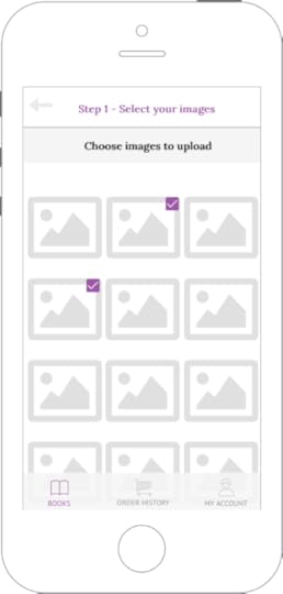
The prototype for User Story 2 involves two screens that must appear in a particular order:
User presses the camera icon in the first screen
The second screen displays all the images stored in the user’s phone
The prototype also ensures users can easily see the their selected images. This functional need is represented by the checkboxes placed in the top, right corner of each image.
While the prototype uses a checkbox, the visual designer may choose another option that works better for the screen size, brand, and overall user flow. For example, a transparent overlay could be placed over each selected image, or the color of each image border could change to indicate that it is selected. Luckily, you can now quickly discuss and refine these items.
The technical team also benefits because they can now see the rough number of images that need to be instantly uploaded from local storage into the app.
User Story 3: As a user I can select my photo book size

We prototyped User Story 3, even though it’s a Medium Risk story.
While you should always prioritize High Risk stories when prototyping, you will run into situations where it makes sense to prototype a Medium or Low Risk screen.
For our Photo Book App, once users select their photos, the above screen for User Story 2 acts as the transition point towards checkout. We can’t avoid any mis-steps in such a key moment when users are selecting the product.
While it’s nowhere near perfect, we’ve at least created a tangible reference for designers, developers, and marketers. The team can now all discuss:
How might book dimensions, price and short descriptions accompany images of the photo books?
How might we help users preview their selected images in the final photo book size?
Should the book print the photos in the book in the order they were uploaded? Or do we allow users to reorder the pages?
Do we include an additional step that allows users to select a cover image? Or do we randomly assign one from the images they uploaded?
User Story 4: As a user I can pay for my book with a credit card

The prototype for User Story 4 showcases the basic payment information we need to collect. This allows everyone to discuss the rules for each field. For example:
How many numbers can the user enter in the credit card field? Do we accept all card types (Visa, Mastercard, American Express)? American Express cards have 15 numbers while Visa and Mastercard have 16 numbers. We must account for these variances.
Should we consider adding Paypal as a payment option? If so, how do we prioritize that integration for developers in upcoming sprints?
When fields are left empty or invalid data is submitted, how does the system respond?
This prototype also highlights a very important functional requirement: saving the user’s payment information for future use.
While this is just one little checkbox in the UI, the technical implications are quite serious. We’ll need to research legal requirements for storing personal information. The technical team must also consider what might happen if servers suffer an attack or virus. Would customer data become publicly available?
By using built-in components like buttons, icons, image placeholders and phone frames, you create a user friendly prototype that helps everyone visualize the final product and associated risks.
Now that we’re done building all the screens, we would add interactions to all the key content:
Calls to action leading to new screens
Icons and images that expand or open new screens
Form fields that react to user input

Next, we’ll annotate and share our interactive prototype for feedback.
Grab design ebooks created by best designers
All for free
 Download
 Download
 Download
 DownloadDo you want to know more about UI Design?
Download 'Product Requirements Document Template' FOR FREE!
Download e-book for freeClose4. Add comments and questions to your prototype
As you build your prototypes, you’ll likely have open questions for developers, designers, or management stakeholders.

It helps to annotate:
Regional restrictions: For example, prices in the U.S. use a period (.) to separate the whole number and decimal portions. For example, $25.00. However, in the Euro zone it’s common to use a comma instead. For example, €25,00.
Nice-to-have functionality: In the Photo Book App, the option to save the user’s payment information isn’t a must-have for the first release. You’ll need more time to work on implementing the correct data encryption and security to support that functionality.
Potentially expensive items: Adapt your final requirements based on the feedback you receive.
5. Share the prototype for consolidated feedback
When it comes to reviewing feedback, you can set up a group meeting with all stakeholders and present the screens.
However, a better option is to provide some lead time during which all stakeholders can review the screens in your absence.
When using UXPin, I share a prototype link so that:
Stakeholders can interact and evaluate the prototypes without feeling rushed. The feedback is less knee-jerk.
Stakeholders can evaluate the prototypes with minimal bias. In a group meeting, the PM will usually set the context for the screens. However, outside of the confines of a meeting, the screens must speak for themselves.
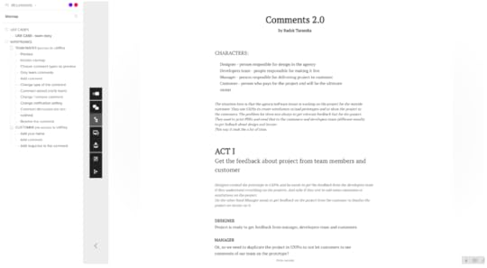
When you share the link to a prototype, stakeholders can review all the comments and questions. Stakeholders can hover over any pin to view its details as shown below. You can leave questions regarding the legal and technical requirements for this functionality.
For a more complex project, try reviewing feedback in a group setting.
6. Analyze feedback, update prototypes and user stories
Once you’ve analyzed all your consolidated feedback, update the prototype and user stories.
For our Photo Book App example, the review process brought up an important question we missed in the original user stories: the need to send confirmation emails when an order is placed and after it’s shipped.

For any ecommerce platform, transactional emails are essential for reassuring customers that their order is on its way. Therefore, we need to update our user stories.
As a user I will receive an email when I submit my order.
As a user I will receive an email when my order has been shipped.
In this case, we also need to prototype an email to account for all legal requirements for receipts and invoices. We would therefore consider this new user story as High Risk.
Each time you update the prototype, reshare it with stakeholders to validate the changes are satisfactory. After the first revision, designers and developers should see enough of your vision to create the first formal build to test with users.
Conclusion
Prototypes should always be part of the specification process. In my past projects, they’ve made it much easier to notice gaps and redundancies in the user flow.
A prototype opens everyone’s eyes. The laundry list dissolves, and the product comes into focus. The consequences of additional features become immediately real for everyone from a junior designer to a Product VP.
If you found this post useful, learn more by downloading the free e-book Prototyping for Product Managers .

The post Forget Tedious Documentation: How to Prototype Your Requirements Instead appeared first on Studio by UXPin.


August 8, 2016
Webinar Recap: Building and Sustaining Successful UX Teams

Great UX requires a great team.
We invited Satyam Kantamneni, the Chief Experience Officer at UX Reactor, to join our free Design Leadership Masterclass to talk about how to build and sustain successful UX teams.
Prior to co-founding UX Reactor, Satyam was Managing Director of UX at Citrix and UX Manager at Paypal.
Watch Satyam’s full webinar (attended by 478 people), or read on for our short recap.
After leading design teams for the last ten years, Satyam has come up with four design leadership lessons for his fellow design managers.
What got us here, won’t get us there.
It’s a journey.
Unicorns do not exist.
Manage your UX portfolio.
What Got Us Here, Won’t Get Us There
The past is a great place to learn from, but it’s not a good place to emulate. Like everything else, the field of design is changing quickly.
Everything is going digital. The entire technological landscape has shifted even over the last five years, and it has forced every company to adapt rather suddenly. Companies that have had an entire design team made up of “two or three” designers that handle everything the complex process of user research, prototyping, visual design, and more are being forced to change their ways or risk falling behind.
It’s now time to look towards the future.
It’s A Journey
Organizational change won’t happen quickly. Satyam talks about the “tools” of the journey of building a powerful UX team: people, environment, and process.
People.
It takes a village to create a great user experience for the customer. Not a single designer. An average product development team can have an architect, a front end developer, a Javascript developer, an API developer, an engineer, and a tester. Like product development teams, UX design teams also need a great deal of support from people with different skills. The average UX team can be composed of a user researcher, a prototyper, an interaction designer, and a visual designer.
User researchers are experts in communicating insights. Interaction designers are experts in crafting design systems.Visual designers are experts in design tools and pay extreme attention to detail. Prototypers are great hackers.
Don’t confuse one with the other. Each team member provides unique skillsets.
Environment.
To facilitate a great UX team, the designers need the right work environment.
Companies need to create great physical spaces for their UX teams. Their surroundings need to encourage experimentation and a willingness to fail. They can’t let design teams think that “they’ll just get it right the first time”. Processes should be iterative, and the environment must reflect that.
But beyond the physical environment, the workflow for design teams are important as well. There are many, many tools available for designers today.
At UX Reactor, Satyam’s team uses UXPin and Sketch. Sketch is their main tool for wireframing and mockups while UXPin supports the entire workflow, from ideation to prototyping to validation to development.

Process.
Design leaders must communicate a clear vision and strategy moving forward. To lead the organization, they must:
Identify the problem(s) they are trying to solve
Collect insights from users and customers
Prototype concepts based on insights and hypotheses through validation and iteration
Execute tactically to deliver the results to the customers
To facilitate an efficient process, many companies use the Balanced Scorecard, a strategy performance management tool used by managers to keep track of the execution of activities and the results.

Unicorns Do Not Exist
It’s simple. Unicorns are a myth.
The UX design process is long, complicated, and coordinates many moving parts. Each particular subset of the UX design process requires particular skills that don’t necessarily translate from one to the next. It’s not all the same work.
Unfortunately, many companies today have begun to search for the “unicorn UX designer” that can wear every hat to compensate for a lack of a true design process. Even if a unicorn did exist, it would be wise to be cautious in hiring someone like that.
A designer who can efficiently do user research, prototyping, interaction design, and visual design is someone who likely places a lot of value in himself or herself and may not stay with a company for long, given their inherent value and the likelihood that they may even start their own venture outside of the company.
Instead, companies should seek out T-shaped designers.
Manage Your UX Portfolio
Portfolio management is the art and science of making decisions about investment mix and policy, matching investments to objectives, asset allocation for individuals and institutions, and balancing risk against performance.
Design leaders must manage four sectors of their portfolio.
Talent
Do you have the right people in your organization?
Research Insights
Are you building and communicating relevant insights in your organization?
Design Experiments
Are your experiments diverse and problem focused?
Maturity of Problems
What scale of problems are you tackling? How many projects are CX-focused vs. UX-focused?
Balance your portfolio and make sure that its makeup facilitates an efficient design process.
For example, at UX Reactor, they resource their team as follows: for every one interaction designer, they set aside 0.5 user experience researcher, 0.75 visual designer, and 0.25 prototyper.
Conclusion
If you build your team, environment, and process in an efficient manner and you manage your portfolio correctly, then the process and the structure should sustain itself.
To learn more, watch the first Design Leadership Masterclass Webinar. Check out the session below attended by 478 people.

The post Webinar Recap: Building and Sustaining Successful UX Teams appeared first on Studio by UXPin.
August 5, 2016
It’s Ugly, But It Works: On Designing for Usability
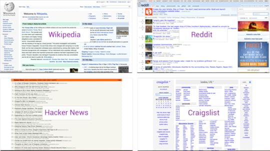
Even today in 2016, you’ll find plenty of popular yet ugly websites — they’ve hardly changed since the 90’s:

Wikipedia, Reddit, Hacker News, Craigslist
All of the above sites are massively popular despite their ugliness because of one key factor — they do exactly what people need. For example:
Reddit has 234 million unique users, 8.19 billion monthly pageviews, 25 million daily votes (stats as of 2016) — and still loads really fast!
Hacker News simply shows the latest start up news, “emphasizing content above all else”, as that’s what their users have always valued most.
Wikipedia organizes information really well, making it easy and consistent for users to find what they need.
When an app ‘just works’, it matters less what it looks like, but how it helps solve a problem. A great example of this that I recently encountered was in a less well-known app called ‘My Tabata’.
Let’s explore the app as a case study for how usability can be more important than visual design.
My Tabata: Useful UX with An Ugly UI
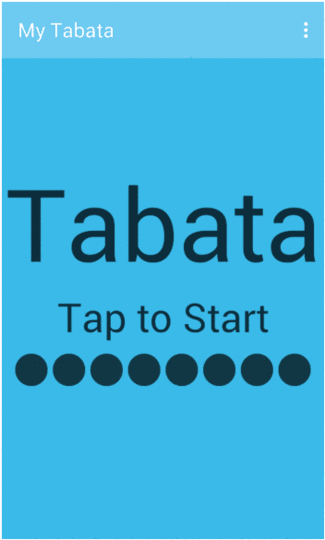
Without knowing what the app does (assuming no prior knowledge of Tabata), it seems pretty bad because of the visual design. However, it impresses when used within the context for which it was designed because it solves one problem really well. This is reflected in the 4.4/5 average review from 4200+ users:

My Tabata overview
So, What problem Is It Solving?
Tabata involves doing simple exercises at high intensity, in 20 second bursts, with just 10 seconds of rest between each interval:

Tabata training example from Women’s Health Mag
It’s not easy for users to time the intervals and rest periods using a watch or timer, which is the problem ‘My Tabata’ solves very intuitively, despite the ugly user interface. As a result, it actually enhances the exercising experience through a set of good usability principles, which are set out below.
4 Usability Lessons from My Tabata
1. Use interactions that make sense in the context
When jumping into the air doing ‘super squats’, users will probably need to pause the Tabata session to get a drink. There’s no ‘stop’ and ‘start’ button on the app, it’s done in an even simpler way by tapping anywhere on the screen — tap to start, tap to stop:

Tap to pause
This helps the user stay focused on the exercise, rather than fumbling about with their phone.
2. Use just enough navigation
When starting the app, users are faced with the ‘Tap to Start” screen — and practically zero navigation.

Tap the screen, and it’s straight into the fitness session — the experience becomes Tabata — not the UI, and not the phone. The result of this minimal navigation is that the user can achieve their goal on very first contact with the app.
“Your job is to help the user achieve their goal. Navigating an interface is never the user’s goal. If you’d done your job right, the app would only do one thing, and would do it very well, and would do it all on one screen.” ~ Antoine Valot
While users can tap the kebab menu in the top right of the screen to access the settings,the action doesn’t interrupt the Tabata experience — the settings are changed before or after each session, and the app saves those preferences for the following session.
3. Use audio only when necessary
When pushing through the last few seconds of an interval, a user’s eyes can close in the strain of the exercise.
My Tabata uses audio cues to count down the last three seconds of each interval, so users don’t have to change focus away from the exercise to their phone.
4. Enable users to track their progress
As the app goes through the different activities, it’s easy for users to forget their place in the overall exercise. While not the best visual implementation, users can quickly assess progress with a useful status bar on the bottom of the minimal UI:
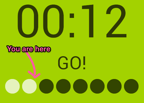
Combined with the timer, this tactic further improves the experience of the exercise.
You’ll actually notice that many of the lessons from ‘My Tabata’ cross over with Jakob Nielson’s 10 usability heuristics for UI design, which is a great set of broad guidelines to help ensure apps are usable, as well as looking great.
Learn more: UX Design Process Best Practices
Next Steps
Don’t fall into the trap of sacrificing context for visual finesse.
In closing, always remember the UX hierarchy of needs:

Photo credit: Growth Engineering
Yes, delightful design can certainly make good products great, but that only matters if the product is actually useful, usable, and reliable in the first place. Otherwise, you’re just building on a shaky foundation.
To see how successful companies design their products, check out the free e-book Real-Life UX Processes . The guide peeks inside design processes at Slack, Autodesk, 3M, and Sumo Logic.

The post It’s Ugly, But It Works: On Designing for Usability appeared first on Studio by UXPin.
August 3, 2016
User Guide Table of Contents
This guide to UXPin covers its essential features and where to find them.
This living document will help you refer to the functions that UXPin offers. If you have further questions, check the Community forum and tutorials.
2. The Editor
3. Previewing and Collaborating
4. Pages, Views and Navigation
10. Custom Libraries
The post User Guide Table of Contents appeared first on Studio by UXPin.
July 29, 2016
CapitalOne’s Alexa Project: Designing UX Without UI
The Internet of Things has been a trend since its emergence in the early 2010s.
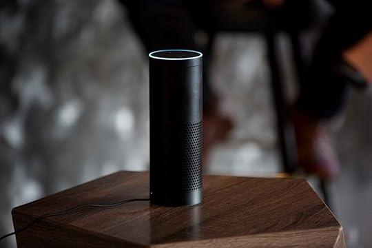
Everything from cars to lights to houses to refrigerators to even toasters have now been connected to the internet. On top of that, companies such as Amazon have come up with products like the Echo, a voice-enabled wireless speaker that is your home automation hub as much as it is your personal assistant. It’s represented by its voice-only persona, Alexa, who you can train to learn new skills to assist you with all sorts of tasks.
But, despite all of the progress, the IoT Revolution presents a unique question:how do we design for an IoT product like Alexa that has no user interface? The Capital One team needed to tackle that exact challenge when they designed an Alexa skill to allow users to manage finances just through talking with the Echo device.
In this interview with Stephanie Hay (Head of Content Strategy at Capital One), we explore the unique challenge of designing UX without a traditional UI.

What was your role on the Capital One Alexa team?
At Capital One, I work with more than 200 folks. I was the lead designer on the initial release of Alexa in all of the languages that she’s using.
We have a human-centered culture that enables everybody on the design team, including content strategy and design thinking and user research, which are different special practices within the larger design, to do great integrated work across a company the size of ours.
I joined 2 years ago because of that reason. Scott Zimmer, the head of global design for Capital One here is my boss. In the past, there was no content strategy team on the design team and he said, “We’ve got this opportunity to infuse humanity and clarity into the experiences that we’re designing to create really personalized, tailored conversation, thanks to all the great data that we have on customers and how they’re interacting with their money. So let’s do it.”
True to form, the Alexa team is exactly as I just described. A beautiful, cross-functional team of product managers, engineers, and designers who absolutely have to understand the context in how someone who is probably walking around their kitchen or their living room wants to talk about their money when they’re reading the Sunday paper or just finished asking Alexa to stop listening to NPR.
It’s an entirely new context and it’s a brave new frontier for our cross-functional team to explore.
How does the Capital One Alexa skill integrate into people’s live?
Money is already integrated in people’s lives.
You’re thinking about money when you’re buying groceries, when you’re cooking dinner, when you’re watching TV, and so many other instances. It sits in the background of people’s lives all the time. Alexa, smart homes, virtual systems, and AI all have the promise of being backgrounded in that same way to create experiences that naturally integrate in your life, your daily behavior, and the triggers that influence them, like watching TV or cooking dinner.
For us, wherever Alexa goes, Capital One could go. We wanted to be easily accessible to users, so they can talk about their money whenever needed.
How did you conduct user research for the project?
We run regular user interviews as part of the design process. We talk to customers everyday.
To better understand the natural flow of human conversation, we also dived into raw transcripts of call center research and studied Google search keywords. We learned about people’s transactional needs and their emotional context when opening up a search engine.
On top of that, having a partner like Amazon also gives us access to a wealth of useful data.
What interesting insights did you uncover about human behavior?
From a design perspective, what’s been most interesting is that the project is a reminder that language is so key to forming connections.
Words matter and nothing reminded us of that quicker than when we designed into Alexa’s conversation phrases like “all set”. As a confirmation, we actually have to affirm that we just heard what you said and we’re acting on it. So we’ll use words like “all set”.
You would think that you would probably be more likely to say words like “I’m okay” or “I’m good”. People are saying, “All set”, and it’s fascinating that we have just naturally mirrored a human conversation.
Can you describe the process of designing a conversation when no UI is available?
This project is the purest design challenge I’ve ever taken on.
All fidelity is removed. It’s only emotion and language.
One use case was hearing your balances. So what if you’re a credit card-only customer? What if you’re a credit card, plus checking account, plus savings account customer? What does the word “balance” mean in both of those cases? Balance, when it comes to a credit card, is what you owe. On the other hand, the balance in a checking account is what you have, like available cash. Even that word alone needs to change, and you start getting into this and realize that you have no UI to delineate that.
The challenge kept getting deeper and deeper.
In Amazon’s world, “utterances” form the language for what customers say to Alexa. We made that language more flexible by building word clouds around people’s intention. We had to ask: did they mean “how much money do I have” or “how much money do I have to spend”. We started designing use cases instead of only conversation.
One of our core principles was the establishment of assumptions. Let’s design to answer their question first, and then ask clarifying questions next.
Next, we needed to get as specific with the persona, based on as much real data as possible. For example, Alexa can answer your question better if we know you’re just a credit card customer or a savings account customer.
We also needed to pay close attention to Alexa’s inflection. What looks great on paper when we would design it wouldn’t always sound right because the cadence of her statements and pauses. Engineering, product marketing, legal, and design were all on the phone together everyday creating content together for these conversations. We tested the conversations in the labs, listening to the way they sounded on Alexa, and then ultimately released them.
What were some of the most important iterations you completed after user testing?
When people first paired their accounts, Amazon didn’t have voice recognition at that time, so Alexa didn’t know if she was talking to you or me. She’s just sitting on somebody’s counter in an open environment. So we asked: should we actually build in an extra layer of security that would act on top of the username and password?
With Amazon, the answer was, “Yes. Let’s go ahead and build that in.”
We also invented what’s called a personal key. It’s a four digit passcode that you can create to further protect your financial information. If you make that personal key, then Alexa’s going to prompt you for it every time you try to talk to her about money.
That’s really where having a cross-functional team comes into play: to accommodate user context and data. That’s the only way in a conversational UI to design well. Our first release is in market now and we’re learning from it, so there’s only more to come.
Where do you see IoT and AI headed in the future? What’s most exciting for you as a design leader?
Being untethered is most exciting. It means we’re available 24/7 – you just live your life knowing we’ve got your back.
That’s what immersive design looks like. We shift the paradigm and go wherever you are, and we’re there in such a frictionless and adaptive way, you can’t believe you ever existed without it.
If you enjoyed this post, download the free e-book Real-Life UX Processes . The guide explains the secret sauce behind the products of companies like Slack, Autodesk, 3M, and others.

The post CapitalOne’s Alexa Project: Designing UX Without UI appeared first on Studio by UXPin.
July 27, 2016
Beyond the Hype: A UX Reality Check on Pokemon Go

Today, I walked to work as I always have.
But I wasn’t alone. All around me, from the sidewalks lining the storefronts and restaurants of the street to the green lawns of the city parks, people roved around with their phones held up in front of them. Random areas like alleys and park entrances were filled with throngs of people, arbitrarily gathered there by a computer algorithm.
This is Pokemon Go.

Pokemon erupted as a national phenomenon almost two decades ago. People loved the idea of finding and catching Pokemon, and they were content to use the Gameboy as the platform for it.
Over the years, the buzz around Pokemon games began to fade, as no new iteration seemed to produce the magic behind the first games. But with Pokemon Go, millions of loyal fans and even non-gamers flocked to the game. 2 weeks in, Pokemon Go is estimated to have 75 million downloads.
Unfortunately, it’s not all sunshine and butterflies.
The game still has a ton of bugs, and there are a lot of UI issues that make even learning how to play the game difficult. Even as an experienced gamer, I still spent the first couple of minutes trying to figure out how to find and capture a pokemon. Despite the numerous raving articles, we can’t ignore the fact that many players have accepted frequent, periodic server crashes to be a normal experience for the game.
In this piece, we’ll be taking off our rose-colored glasses. We’ll delve into the good and the bad of Pokemon Go’s user experience.
The Good
First, let’s explore what makes Pokemon Go’s UX so compelling.
Profile Building


Customization. Everyone’s favorite part of a game.
The thing about immersive-world games like Pokemon, which includes both regular Pokemon games and Pokemon Go, is that people like to really feel they’re in the game itself. They want to explore the world and experience it as if they themselves were on the Pokemon journey.
The quickest and easiest way to bring the user closer to the game is by allowing the user to create and customize their character.
Nintendo first realized this when they allowed their players to choose between being a boy and being a girl in the second generation of Pokemon games, and it helps their case now that they’ve created their most immersive game yet. And there are many more customization options in Pokemon Go than there are in other Pokemon games.
Style of Gameplay

One of the signature elements of Pokemon games is the moment when you’re walking through tall grass and you run into a pokemon out of nowhere. Nintendo took that experience and made it infinitely more real and exciting by combining it with augmented reality technology.
Once in the game, you can quite literally find Pokemon almost anywhere. It inspires that same feeling of excitement people first felt when Pokemon first released on Gameboy in 1996. There’s a rush, a jump as you locate the pokemon on your screen and engage in “battle” with the Pokemon to catch it.
The key is that, much like the regular Pokemon games, victory isn’t assured at the first throw. Sometimes your aim is off, the Pokemon deflects the ball, the Pokemon escapes after a couple of Pokeball shakes, or the Pokemon even runs away.
That feeling of chance is what makes the game exciting to play. It hooks people by keeping the journey to Pokemon master interesting. I’ve explained the phenomenon of Pokemon Go below with Nir Eyal’s Hook Model Canvas:

Social Sharing

Nintendo and Niantic designed Pokemon Go as a social game. People only derive value from the game if other people, including their friends, play the game as well.
The more people playing around you, the more Pokemon you can find. Pokemon Go is inherently viral, based on population density and the amount of people playing the game at a time.
Players, once they reach level 5, are divided into 3 teams. After that, the game encourages friendly competition between the teams as players battle to control Gyms, which can be taken over by any team. People get very competitive, and it makes the game that much more exciting.
On top of everything else, Nintendo added a very useful feature to Pokemon Go’s UI. Most people, especially if they’re playing with their friends, want to share their experiences with others. When a player sees a rare pokemon or something else that’s interesting, their first instinct is to take a screenshot with their phone. Luckily, Nintendo included a screen capture button in Pokemon Go’s interface that makes capturing cool moments much, much easier.
The Bad
Now we’ll discuss the unfortunate aspects of Pokemon Go’s UX.
Unhelpful Onboarding UI

Let’s start from the beginning.
From the moment you finally manage to launch the game after attempting to create a profile through sluggish servers, you’re barely given any help on how to interact with the environment.
Fortunately, you are directed to a few pokemon on the screen immediately after arriving in the world of Pokemon Go. However, there are no clear instructions on how to actually capture the pokemon. You’re simply left to figure it out on your own, which can delay that “aha” moment for non-gamers or casual gamers.
The onboarding only skims the surface. You won’t find any progressive disclosure informing users about core actions like:
Transferring your pokemon to the Professor will net you candy to evolve your pokemon
How certain items like the Razz Berries work in-game
How you can press on specific nearby pokemon to find more of that species
All of the above actions help the user deepen their interactions with the game, so the UI should at least drop contextual hints.
Server Issues

The most crippling negative of Pokemon Go’s UX is awarded to the server issues.
From the moment the user tries to create an account, the user is confronted with long loading times and frequent game-ending crashes. Within the first week of the game’s release, many users couldn’t even create an account. Of those who were able to successfully launch their avatar into Pokemon Go’s world, a large amount of people still couldn’t play the game due to severe game lag, bugs in the catching and battling mechanics that would force the user to quit the game, and more crashes.
All of these issues result in an incredibly frustrating user experience for Pokemon Go players. Not only is it difficult for the user to even start the game, but the interaction flow is broken up by a series of bugs and glitches that disrupt the immersion.
The gameplay and the social aspect of Pokemon Go are fun, but only when they work.
Fortunately, Nintendo and Niantic recently released an update to deal with the server issues. It hasn’t completely fixed the loading times or the crashes, but it’s a step in the right direction.
Not Enough Sustaining Functionality

Playing Pokemon Go is fun. You can travel around the world, capturing pokemon and battling Gyms…but that’s about it.
Pokemon Go operates off two core gameplay mechanics: capturing and battling.
Capturing is capped at 250 unique species. When the number of people playing the game at a time decreases, so does the number of available Pokemon.
Battling takes place at Gyms interspersed throughout the world. Most Gyms, particularly in areas with high population density, are located near each other. However, in less-populated areas, Gyms are much rarer and receive much less traffic, which leads to fewer battles taking place. That alienates users in less populated areas.
Once the user recovers from the initial excitement of the game, the “grind” sets into the game. The “grind” refers to the tedious work required for advancement.
After the user becomes accustomed to the basic gameplay, Pokemon Go starts to overstay its welcome. With fall and winter approaching as well, colder temperatures may also force more users inside. Nintendo and Niantic will need to add careful features to overcome stagnation and seasonality.
Lessons Learned
In closing, let’s recap our takeaways from Pokemon Go:
Onboarding should match the user’s existing level of familiarity. Pokemon Go’s audience consists of a wide base of first-time gamers, casual gamers, and experienced gamers. As such, a bit more handholding might actually help.
Product doesn’t need to be airtight upon launch, but beware of accumulating UX and technical debt. While the product doesn’t suffer from feature creep, plenty of in-game bugs and server issues still need fixing.
Be prepared to evolve your product. While Pokemon Go’s value proposition is strong enough to drive initial rapid growth, the novelty of AR won’t last forever. Users still can’t battle their friends (a huge selling point of past games). On the monetization end, it’s also totally possible that Niantic and Nintendo will partner up with vendors (e.g. restaurants, coffee shops, etc.) to encourage more foot traffic.
For more UX best practices, check out the free e-book Real-Life UX Processes. Peek inside design at Slack, Autodesk, 3M, and Sumo Logic.

The post Beyond the Hype: A UX Reality Check on Pokemon Go appeared first on Studio by UXPin.
July 26, 2016
27 Non-UX Books to Sharpen Your UX Skills

A relatively new discipline, UX design is greatly influenced by psychology, business, and architecture.
UX does not live in a vacuum.
As a psychologist-turned-designer-turned-entrepreneur, I’d like to share with you all the books that helped define my current approach to UX strategy and process. As I’ve learned in the past 6 years since cofounding UXPin, the right design solution is rarely linear – you might achieve surprising breakthroughs when you attack a problem from a completely new angle.
Here’s my favorite non-UX books for UXers.
Psychology
1. The Feeling of What Happens: Body and Emotion in the Making of Consciousness
2. Who’s in Charge?: Free Will and the Science of the Brain
3. Cognitive Psychology: Connecting Mind, Research and Everyday Experience
4. A Whole New Mind: Why Right-Brainers Will Rule the Future
6. Thinking, Fast and Slow: Daniel Kahneman
7. Human Information Processing: An Introduction to Psychology
8. Influence: The Psychology of Persuasion, Revised Edition
9. The Power of Habit: Why We Do What We Do in Life and Business
Philosophy
1. Elbow Room: The Varieties of Free Will Worth Wanting
2. The Conscious Mind: In Search of a Fundamental Theory
3. The Mystery of Consciousness
4. Tractatus Logico-Philosophicus
Marketing/Sales:
1. Neuromarketing: Understanding the Buy Buttons in Your Customer’s Brain
3. Traction: A Startup Guide to Getting Customers
Architecture:
Industrial Design:
1. As Little Design as Possible
3. Keep It Simple: The Early Design Years of Apple
Business/Strategy:
1. The Entrepreneur’s Guide to Customer Development: A cheat sheet to The Four Steps to the Epiphany
2. Good Strategy Bad Strategy: The Difference and Why It Matters
3. The Hard Thing about Hard Things
4. Only the Paranoid Survive: How to Exploit the Crisis Points That Challenge Every Company
5. Scaling Up: How a Few Companies Make It…and Why the Rest Don’t
My Top 5 of All Time Picks
And to make it easier for you, here’s the top 5 I’d start with.
Psychology: Cognitive Psychology: Connecting Mind, Research and Everyday Experience
Understanding human cognition is an essential to designing optimize solutions. This book by Goldstein is a decent introduction to the subject.
Philosophy: Tractatus Logico-Philosophicus

Being a great UX designer requires a great thought discipline, organization and intellectual honesty. Tractatus is a demanding lecture, but there’s no better example of pure logic applied to the thought process.
Marketing: Neuromarketing: Understanding the Buy Buttons in Your Customer’s Brain
I use Morin’s framework almost every day. This is by far my favorite, and the most practical, book about the psychology of social influence.
Industrial Design: Keep It Simple: The Early Design Years of Apple
This book helps us digital designers, understand how industrial designers build truly mature design systems and how prototyping empowers them to quickly churn through multiple iterations.
Business: Good Strategy Bad Strategy: The Difference and Why It Matters
Great and pragmatic lesson in building a strategy. Framework described by Rumel can (and should!) be applied to any product strategy.
Hope this list is helpful! Like I mentioned in the beginning, don’t limit your knowledge and influence to only the world of digital design. And when you do return for more direct UX advice, we’ve got you covered – check out some of my favorites from our free e-book library created and maintained by active designers.
Real-Life UX Processes: How Successful Companies Design Their Products
The Guide to Agile UX Sprints: A Playbook for Product Teams
UX Design Trends 2016
The post 27 Non-UX Books to Sharpen Your UX Skills appeared first on Studio by UXPin.
July 25, 2016
When Remote Design Fails: 5 Mistakes to Avoid
If you think remote collaboration is hard, you’re not alone. Most people find remote work challenging in some way.
Creative work is particularly disadvantaged when it comes to distributed teams. Our work is visual and entails creative group participation. Many designers can’t imagine running creative work session remotely.
But our research also shows that remote design is very common: of the 275 designers we polled, 2/3 said they deal with remote situations on 80% or more of their projects.
We also found that about 50% of designers feel that the quality of their work goes down when working remotely. This is a problem. Clearly, if designers are expected to work remotely AND be productive and effective, new processes and tools are needed.
But don’t despair. With a little practice and forethought, you can continue to design effectively with remote teams.
From our conversations with and observations of remote designers from around the world, here are the biggest pitfalls we’ve seen at Mural.
1. Not enough preparation.
Sounds simple, but people often underestimate the amount of planning required for effective remote collaboration.
A key recommendation is to break down exercises into small steps and timebox each step. As a completely remote company of 30 employees, we’ve found that hour-long activities break down really well into short spurts of about 2-5 minutes.
During any remote collaboration workshops, give overly detailed instructions. If you want everyone to look at your screen, make that explicit and repeat what they should be seeing. If you want everyone to add a sketch to a shared folder, communicate exactly where it is and how they should name files.
For instance, Doug Powell, Design Fellow at IBM, shows in a webinar how IBMers do what he refers to as “micro-timeboxing”. They shoot to have short bursts of activity that last only minutes. In doing so, the team completes the activity quickly with maximum participant attention.

The bottom line is that remote design takes more discipline and rigor. It may feel like more work for you initially, but running efficient work sessions saves time in the long run.
Learn more: The Guide to Agile UX Design Sprints
2. Facilitators assume offline techniques work the same way online.
The techniques that work perfectly fine offline simply don’t work in remote context.
For instance, breakout groups are a staple of design sprints and ideations sessions. They tend to not work so well online in real-time sessions, primarily because of the single audio feed: how will breakout groups communicate with each other without everyone else hearing?
Instead of breakout groups, take turns when working remotely. Have each person work alone at first (with a limited amount of time, of course) and then present back to the group.
So, design techniques conceived offline need some translation to work online.
For example, we partnered with Jeff Gothelf, author of Lean UX, to translate his workshop for a remote context. Together, we ran several sessions where we guided a team of participants through the Lean UX method using our app as a visual collaboration platform.

Jeff Gothelf teaches a remote UX workshop.
We learned that, in addition to good preparation and timeboxing activities and giving clear instructions, we had to adjust the logistics of Jeff’s course. Here are some things we recommend doing:
1. Turn breakout groups into individual work followed by a group discussion.
2. Call on everyone to participate in order so everyone gets a chance to speak. This addresses the difficulty of speaking up or butting into remote conversations.
3. Designate discussion leads to keep things moving and avoid awkward silences or confusion about who’s going to speak. Be clear about other roles as well, such as note taker and timekeeper.
4. Play background music during longer activities. 10 minutes of silence during a remote session will feel like a long time. Turning music down at the end of exercise then lets the group know that time’s up.
3. Teams don’t capture information digitally.
There’s nothing quite like sketching on paper or standing shoulder to shoulder at a whiteboard. Who doesn’t like a good war room?
But sticky notes and screenshots on a wall in the office are a dead end for anyone not onsite.
Remote team members are effectively locked out of information available only in a physical format. Sure, you can take a photo or point a webcam at a whiteboard for remote folks to see, but that’s both unsatisfying and static itself: once the interaction is over, that information is lost.
The advice is clear: digitize your information on-the-fly. You can continue to work with pens and paper, but plan how you’ll convert physical artifacts to digital as you create them.
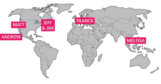
Having an agreed set of tools and locations online to store information in advance helps. But also think about working digitally from the outset. We’re a distributed team spanning 4 time zones, from Buenos Aires to San Francisco. Team meetings, design studios, and brainstorming sessions are done almost exclusively online.

Couple of our Mural team members based around the world.
For instance, we’ve found this process useful for consolidating design decisions across continents:
At the start of a project, we’ll whiteboard collaboratively within Mural (dogfooding our product)
As we critique ideas, we’ll start separating concepts that feel both feasible and viable.
We iterate the promising ideas into lo-fi prototypes in UXPin, which we can then test within the platform. All further collaborative iterations live in the platform, all the way to an animated hi-fi prototype.
4. Coworkers fail to communicate frequently enough.
Research dating back to the 1970s shows that communication decreases as distance increases. Out of sight, out of mind. So how do you make yourself known to others?
The aim is to make yourself and your work transparent. Here are some simple tactics:
Schedule weekly design reviews. Hold weekly design reviews via Google Hangouts or Skype to compensate for a lack of spontaneous hallway conversations.
Post work daily. Post all design work to a wiki, blog or shared space on a daily basis. Invite others to comment and critique your design work. Autodesk, for instance, creates a shared product portal that links to all specs and design assets.

Do personal check-ins regularly. Plan to have more casual conversations with individual team mates once a month or so. This gives you time to get to know each other and talk about things outside of work.
Let’s look at how Hanno (a completely remote design agency) adapted their process.
The team is distributed across three continents and their clients are all around the world. To smoothen handoffs between team members, they’ve developed the PPP document (Plans, Progress and Problems). It’s a lean document meant to summarize daily activity for all project members and stakeholders.

Photo credit: Hanno
At the end of each day, the PPP document is dropped into Basecamp and becomes publicly visible to anyone with the link.
Creating these types of rituals around workflow and collaboration are key for transparency and remote interaction. Again, this takes discipline, but it’s worth it in the long run.
Learn more: UX Design Process Best Practices
5. Team members just don’t know each other well enough.
The need to meet in person various from person to person, team to team, and organization to organization. Some may only need to meet once a year. Others always meet when kicking off large projects.
For any team to succeed in remote design, they must adapt to each other’s personality and communication styles.
For instance, in A Year Without Pants, Scott Berkun describes his year working at Automattic, a completely remote company. Although an HQ office doesn’t exist, the entire organization still met once a year on a company trip. And Berkun isn’t alone in his experience. Companies like Buffer, and Upworthy are among the 125 companies going fully remote.

Photo credit: Buffer planning their 2015 retreat
Meeting in person goes a long way in strengthening relationships. Even something as simple as how to interpret a sarcastic smiley-face emoji will indirectly help you collaborate better.
Remote design shouldn’t be 100% work all the time. Treat face-to-face exchanges as an investment in less wasteful iterations later.
Conclusion
Today, being a designer does not guarantee you’ll be sitting next to colleagues all of the time. Remote design is ultimately about keeping your creative momentum going, even when you’re not in the same room.
Don’t be daunted. Moving to remote work doesn’t signify the end of an era of visual work. Rather, it’s an opportunity to think about old practices in exciting new ways. Embrace remote design, you’ll thank yourself later.
The recommendations are clear:
Don’t leave things to chance or try to improvise dialogue.
Adjust your methods and techniques so they are appropriate for remote contexts.
Plan how you’ll capture and share information digitally in advance. As much as possible, start the interaction in an electronic form.
Communicate frequently. It may even feel like over-communicating, but that will avoid misunderstandings and missed cues.
Get to know your teammates and, and much as possible, build trust and have some fun.
Finally, recognize that each organization is different. What may work for one organization, may not work for you. Find what works best for you. Experiment with pilot efforts.
Don’t leave remote design to chance.
For more advice, download the free e-book Real-Life UX Processes. The guide explains successful processes practiced by Slack, Autodesk, 3M, Sumo Logic, and Kaplan.

The post When Remote Design Fails: 5 Mistakes to Avoid appeared first on Studio by UXPin.
July 22, 2016
Frameworks and Libraries in Web Development
Are CSS frameworks a boon or a burden? Do they improve productivity? This week we discussed the pros and cons of libraries and frameworks in web development.

A1) Ideally, frameworks aim at better workflow, speed, time saving and enforcing of high standards. #UXPinChat https://t.co/1PoxprNI86
— teodora (@teodora76279859) July 22, 2016
A1 Frameworks are worth learning in the long run — and sometimes you can pick & choose what you need. #UXPinChat
— Benjamin Gremillion (@ux_benjamin) July 22, 2016
A1 Frameworks can give you a great head start when you first start learning #UXPinChat
— Indra Sofian (@indysofian) July 22, 2016
A1) @uxpin The learning curve may feel like 1 step backward. But a leap forward gained, in efficiency, control, forever. #UXPinChat
— Michael Gremillion (@IselianGaming) July 22, 2016
A1)Downsides- forcing decisions on you, bloat. My approach is my own framework suited to my clients needs #UXPinChat https://t.co/1PoxprNI86
— teodora (@teodora76279859) July 22, 2016
A1 I could have not said it better. Spot on. #uxpinchat https://t.co/khkGGpuBkW
— Steve Amara (@amarast) July 22, 2016
#UXPinChat consistent workflows and branding, they leave innovation in areas like features, animations, content, etc https://t.co/vzi3A9ZWyu
— Tarra the UXicorn (@theuxicorn) July 22, 2016

#uxpinchat A2 Always! Constraints help creativity!
— Marcin Treder (@marcintreder) July 22, 2016
A2 I think there's always room for creativity in how we use our tools. You just have to be willing to think in a different way #UXPinChat
— Indra Sofian (@indysofian) July 22, 2016
A2 Sure, if you use it as a starting point and not a finished design. I think the trick is to use your ideas 1st, not vice versa #UXPinChat
— Benjamin Gremillion (@ux_benjamin) July 22, 2016
A2) @uxpin If there isn't, it's a bad framework. Any worth using will leave room for creativity in design. Framework fits you. #UXPinChat
— Michael Gremillion (@IselianGaming) July 22, 2016
.@teodora76279859 @uxpin Think a personal framework fits the question too. Learning curve, but so very worth it! #UXPinChat
— Michael Gremillion (@IselianGaming) July 22, 2016
A2) There should be! A good framework should leave you to have your own decisions and creative control #UXPinChat https://t.co/K8amxfK9Dd
— teodora (@teodora76279859) July 22, 2016
Absolutely. There's no reason that you can't have innovation when using a style guide too. Balance is key #uxpinchat https://t.co/hzbcpWHFhj
— Tarra the UXicorn (@theuxicorn) July 22, 2016

A3) @uxpin Unfortunately, inevitably, yes. I might be exhibit A. However, they also increase accessibility. #UXPinChat
— Michael Gremillion (@IselianGaming) July 22, 2016
A3) Good question! Yes and no!!! You can learn good standards and different approaches to problems… #UXPinChat https://t.co/uS1zmifjhG
— teodora (@teodora76279859) July 22, 2016
A3 No, they encourage people to figure it out. How can you read/write advanced code without digging through the basics? #UXPinChat
— Benjamin Gremillion (@ux_benjamin) July 22, 2016
A3) …but if you rely solely on frameworks, you may get behind. We need to be constantly challenged. #UXPinChat https://t.co/uS1zmifjhG
— teodora (@teodora76279859) July 22, 2016
.@uxpin I'd like to resubmit my A3! This better says what I was thinking. #UXPinChat https://t.co/isdDPtdYQf
— Michael Gremillion (@IselianGaming) July 22, 2016
A3 No. They simplify how to learn to code ==> greater accessibility. From a design standpoint, that’s

July 21, 2016
UX Case Study: The World’s First Responsive Airline Website
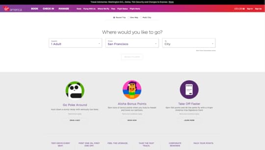
Responsive design is now the industry standard for web design. But it wasn’t always that way.
Today, we’ll take a quick trip through time to 2014. We’ll dive deep into the design and launch of the world’s first responsive airline site. You’ll see every detail and decision that lead to one of the most influential web projects in the past couple years. The best practices still ring true today.
Virgin America chose to partner with Work & Co, a new company of fewer than a dozen people at the time. The results of their collaboration?
Bottom-line results and awards for the first ever responsive airline website, and explosive growth for Work & Co, now a team of more than 100 who still work with Virgin America.

Photo credit: Work & Co
We spoke with Felipe Memoria, Work & Co’s Founding Partner, about one of the agency’s most popular projects. This is the story of how collaborative design helped push Virgin America to a successful IPO.

Ongoing: Designing for the Extremes
During all stages of the project, one clear goal guided everything: sell more tickets.
“The beautiful part of the entire process is that we were able to focus on the one thing that mattered the most – not just from a business standpoint but from a user standpoint,” said Felipe Memoria, Founding Partner of the agency.
Rather than designing based on edge cases and all the flows associated with them, the Work & Co team, working collaboratively with the Virgin America team, focused on one core use case: a single traveler buying a round-trip ticket. The team decided that if they could get the process right for this one use case, they would have a solid baseline to start from.

Photo credit:
In addition, in contrast to the movement towards “mobile-first” design, the entire Virgin America project was dictated by an “extremes-first” approach. Rather than starting with the smallest viewport and then scaling up to the desktop, the team worked with extremes – designing mobile and desktop views simultaneously – and then converging towards the in-between viewports.
Step 1: Setting One Clear Goal
The project was intended to move Virgin America from having a website to a digital platform that could respond to modern travel needs and behaviors. Based on an analysis of their website and revenue, Work & Co recommended that they prioritize rethinking their booking experience in order to improve conversion rates, repeat visits and mobile engagements.
“Really, when you think about it, an airline booking flow is just one big form,” Memoria said. “So we set out to create something different–not just a better form, but one that was actually enjoyable to use. Thinking about our project in this holistic way let us start designing immediately.”
Step Two: Collaborative Concepting
Throughout the process, the project was defined by a collaborative, multi-disciplinary approach.
Work & Co built its agency around this very concept, where everyone has particular strengths but can also serve different roles on the team. For example, someone might be an analytics master, but they might also be a great project manager. In fact, Work & Co has no account managers at all–everyone has technical skills and the soft skills needed to manage projects and client expectations.
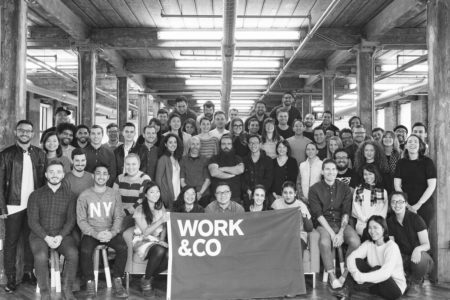
Photo credit: Work & Co
Over the course of the Virgin America project, three product strategists, three designers, and four developers collaborated directly with C-level stakeholders at Virgin America. Beyond just close collaboration with the immediate clients, the team also brought in other critical parts of the organization, such as legal and operations, into the design process. This helped ensure that ideas could be implemented and sustained successfully.
The concepting phase was spent entirely on solving the one core scenario of a single traveler booking a round trip. For two weeks, three designers with different backgrounds worked on this one issue, which is in stark contrast to a typical project’s division of labor. One designer, for example, was a classic UI designer who thought in terms of grids and colors. Another was more of a new generation of hybrid designer/developer who could build prototypes.
“Getting more heads thinking about concepting made a huge difference to our project,” Memoria said. “It gives us a higher chance to design something far superior. There is no reason to focus on tangential use cases–by testing and iterating just on the main experience, we can come up with something more pure.”
The team would only formally check in once a day. Sometimes they might switch off on designs to help solve roadblocks. The team actually worked in a meeting room at Virgin America headquarters, with Memoria moving his family from New York to the San Francisco Bay Area to be physically present and immersed with the client.
Because they were all travelers and Virgin America customers, they were able to quickly draw from existing customer research provided by the client. The team had noticed in the collective research that booking a flight was really all anyone wanted to do, so they had further validation that they were solving the right problem.
After just two weeks of focused workshops and co-design, the team was ready to present their design strategy to executive stakeholders.
Grab design ebooks created by best designers
All for free
 Download
 Download
 Download
 DownloadDo you want to know more about UI Design?
Download 'Real-Life UX Design Processes' FOR FREE!
Download e-book for freeCloseStep Three: Designing the System
For the first design review, the team presented two rough wireframes, one static mock-up, and one detailed prototype.
At the end of the day, the Work & Co designers, developers, and the client came together around the design they felt had the most promise to create the simplest, most powerful experience possible.
Single Scroll Experience
Much to the team’s surprise, it was the lowest-fidelity wireframe of them all that captured the heart of their work: the overall flow of a smooth scroll, one linear motion for the entire purchasing and checkout process. While the wireframe lacked fidelity, it showcased the essence of the flow and top-to-bottom motion that the entire site would be built around.
Memoria adds: “We were able to put our ideas together and pull from them this big insight that informed everything we did from then on.”
Contextual Choices
By all focusing on the one flow at hand, they identified the key insight that would make the Virgin America website unique. Because the airline flew a select number of cities, there was no need for huge, confusing pull-down menus. Instead, the site used geolocation to deliver a handful of contextually relevant routes (with an added option to browse all cities).
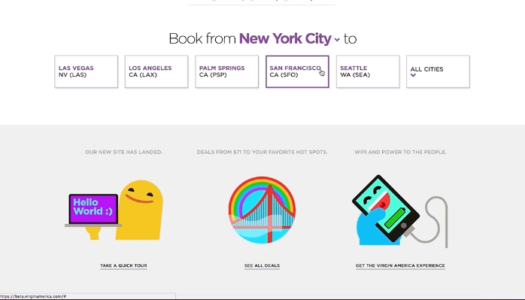
Photo credit: Work & Co
“One golden UX rule is that the more you expose things, the more likely users are to see and click on them,” said Memoria. “By exposing travel options right away on the Virgin America site, we were able to usher in a whole new type of responsive navigation. We were able to change the paradigm of a funnel flow, and make it easy to scroll through without endless back buttons and refreshes.”
Delightfully Consistent Tone
From a visual standpoint, the team used cheeky illustrations instead of stock photos of cityscapes. The decision aligned perfectly with Virgin’s fun brand.
For example, destinations were represented by icons instead of dots on a map.
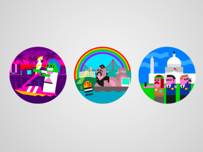
Photo credit: Illustrations for Work & Co by Build
To match the lighthearted visual tone, the team carefully crafted casual microcopy to deliver conversational feedback to users.
For example, when selecting a departure and arrival date, the following messages overlay at the top of the screen.
After selecting departure date

After selecting arrival date

Bridging the Offline Gap
To ensure a consistent customer experience even after using the site, the team also considered the experience of printing a boarding pass. After all, an easily lost or unusable printed boarding pass would certainly contradict the expectations set by the new website.
Based on user research (and their own experiences), the team carefully designed a 4-quadrant boarding pass to fit easily inside a back pocket. This design has since set a new standard for printed boarding passes.
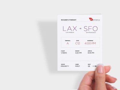
Photo credit: Work & Co
Digestible Form Elements
To improve overall user comprehension, the team followed the UX best practice of chunking out content.
For example, to make the interface even more stimulating and usable, the team designed the calendar as an entire view, saving additional user input requirements for later down the flow.

Photo credit: Work & Co
“We were inspired by the simplicity of effective PowerPoint presentations,” said Memoria. “Just like how seeing just one point per slide makes it easier to understand a presentation, isolating each part of the form made it clearer and easier to digest.”
In the end, the booking flow took the team about 6 weeks of iteration to arrive at one cohesive multi-device design system. Over the course of that time, they continued to collaborate, testing coded prototypes in four user testing sessions with a total of 100 people.
Step Four: Development
Perhaps the biggest challenge the team faced was the technology behind the solution. Given that this was the first ever fully responsive airline website in 2014, careful and collaborative implementation was required to bring the design to life.
“We could not have produced this website if we weren’t working with developers every single step of the way,” Memoria said. “Because our technology team was involved from the beginning, they understood what was required to make this work in real-life. Together, we had to ensure our concepts could actually work when confronted with cases that were exceptions rather than the norm. But hard is good, and working in parallel, we came up with an original and effective responsive site.”
As explained in a Forrester case study, the team followed a carefully phased beta rollout:
Step 1 – Dogfooding the design and testing with a small batch of friends outside the company.
Step 2 – Testing the design with a small segment of loyal Virgin customers.
Step 3 – Testing the design with more Virgin customers, members of the media, and selected business thought leaders.
Not only did a phased testing schedule help build momentum for the new design, it also helped the team adapt to edge-cases and any functionality gaps.
After iterating the new design based on beta insights, the reinvented VirginAmerica.com was released. Two quarters later, Virgin America announced its IPO.
The redesigned site exceeded performance goals in the following areas:
More than 10% increase in conversion rate.
More than 20% decrease in web-related support calls.
At 2 seconds, it remains the fastest loading airline website.
Continuing the Gold Standard
The website ultimately became the inspiration for many more Virgin American projects both online and off, from billboards in Times Square to their look and feel in airports.
In the years since, the site itself has won rave reviews, UX design awards and most of all, has delivered bottom-line ROI for the company.
The Work & Co Virgin America project is a great example of the outcomes resulting from:
An extremes-first approach, where design for the smallest mobile and largest desktop viewports at the same time and let the rest flow in.
One team that is closely collaborating, between designers, developers, and clients.
Laser focus on designing for one high-value user scenario (buying a single-seat, round-trip ticket).
If you enjoyed this post, download the free e-book Real-Life UX Processes . The guide explains the secret sauce behind the products of companies like Slack, Autodesk, 3M, and others.

The post UX Case Study: The World’s First Responsive Airline Website appeared first on Studio by UXPin.
UXpin's Blog

- UXpin's profile
- 68 followers

