
UXpin's Blog, page 126
June 20, 2016
Coding is Designing

As product development becomes more collaborative, it’s not uncommon to find developers in a design strategy meeting.
In fact, it’s encouraged. The notion that developers are “not creative” is far outdated.
You can ask the most technical coder of all, and they will describe their coding process as problem solving using a development language.
And what is “problem solving” if not a core design skillset?
In this piece, we’ll explore how the two disciplines aren’t as different as you think, and how developer experience can improve a design approach.
Two parts of the same team
Let’s look at two development best practices and their design equivalent.
1. Create modular code to increase efficiency
Just like designers strive for component-based design, developers apply reusable elements and efficient use of CSS. The lego-block approach to development scales incredibly well (especially for complex products).

Consider this scenario: a client has a contact form and wants to add a feedback form. If the developer has already created a class for general forms, adding a new one is not that big of a deal. Since developers are innately thinking in this manner – they are inevitably aware of ideas in which different aspects of an interface or application can be reused or re-appropriated in terms of functionality or UI.
2. Create flexible code for scalability
Just like designers build design languages that survive a growing product suite, developers seek to write code that doesn’t require complete re-writing for major changes.
Much like a designer’s UI kit, a developer creates a code pattern library which is even more flexible in the long run.
Change one element, and the update occurs everywhere.
The modular approach is the same – it’s just expressed in different forms.

Photo credit: Jack Moffett for e-book Eliminate UX Gaps In Your Product
How developer logic strengthens the design skillset
Of course, not all designers need to code. In today’s Agile teams, we should embrace the power of specialization.
That being said, code-savvy designers tend to better understand technical implications (especially useful for enterprise products). They also gain a more structured framework for problem-solving. I say that from personal experience as a developer turned designer.
Learning to code in grad school gave me a chance at an entry-level web development job, which lead to programming roles, which finally grew into a UX career.
My development experience disciplines my design process like nothing else. Coding opens our eyes to new ways of thinking and unlocks hidden parts of the creative process. Thinking logically within coding parameters brings the design problem into focus.

Photo credit: Laura Kershaw for e-book UX Design in Action
For example, at the start of a recent project for a data analytics product, the only requirement I faced was “reinvent our interface, inspire our company, and stand out in the marketplace”.
With such unclear requirements, I needed to blend design thinking and code thinking:
1. Identify the situation as a non-traditional exploration exercise.
First, I listened intently.
Is the client mainly concerned with the interface? Not so, in this case.
Sure, their interface needed updating, but the deeper problem was presenting data in a meaningful way beyond icons and colors.
2. Reframe the initial thinking.
As a developer, I’ve approached similar problems in the past by laying out a data model to support a richer experience.
On this project, I applied the same understanding to the client’s needs.
When the client said they’d like to surface a specific piece of data on a specific screen, I understood it as so much more – they were essentially drawing a connection between the significance of this piece of data to the adjacent components.
Furthermore, I now understood that two specific pieces of data are actually more powerful together, and was able to find opportunities to implement this type of “design relationship” throughout the application.
The client’s problem was much deeper than “we need a new design”.
To support such a complex product, they must prepare for a high degree of collaboration and flexibility.
Based on my past developer experience, I knew that the client would surface more data and capabilities as we go along. They were just preoccupied with too much work with to communicate everything at once in a traditional “requirements gathering” stage.
So, I reframed my thinking: the entire design process must be treated as ongoing requirements gathering. Everyone needed to work in an extremely flexible manner, or the project would fall apart.
In short, Photoshop wasn’t going to cut it.
3. Create a sustainable framework.
This approach to segmenting the interface is code thinking at work.
When approaching an interface development project, developers usually start by creating a framework: in broad strokes, defining areas where smaller pieces will live, and grouping these smaller pieces in a way that makes sense.
A developer’s job becomes very difficult if this organization doesn’t exist before they start diving into the details (such as specific CSS implementation and smaller components).
In a similar manner, I first sketched a “UI framework” – a way to designate some broad user goals for the design problem. By outlining the overall principles, we keep the look and feel consistent as we dive deeper into specific interactions.
When moving into the prototyping, I was able to dedicate the necessary time to perfecting the UI components since the overall vision was clear. Since the prototype elements were treated as modules, the transition from vision to detailed crafting was much easier.
Conclusion
Be it a launchpad to modular and scalable thinking, or a valuable design tool – coding is an essential part of the design process.
To ensure that code-thinking is part of the design process consider doing the following:
Include a developer or two at different checkpoints during the project planning and design activities.
Collaborate with a developer about prototyping techniques that will benefit the project at hand.
Discuss a modular approach with the development team to understand how the bits and pieces of information can positively influence the design.
If you found this post useful, get more advice in the free guide UX Design Process Best Practices.

The post Coding is Designing appeared first on Studio by UXPin.


The 3-Step Guide to Lightweight UX Documentation

The life of a UX specialist becomes hectic in the blink of an eye.
Between research, design, client interaction, team collaboration, there may not be much time left in the day to create documentation strategically.
Even so, can time spent perfecting documentation really be considered a waste? Yes, and no. It depends on the purpose, and usefulness, of the documentation.
Generalized documentation, created for no other purpose than to leave a paper trail, for example, is too general to be useful, and (effectively) purposeless. Highly focused documentation, on the other hand, can be both useful and purposeful.
In order to ensure that the documentation you create isn’t taking away from time that could be spent on design and research, consider the following questions:
Is the UX documentation going to drive decision making?
Is your UX documentation usable to your team?
Based on my experience at Codal, this article aims to help UX specialists and their teams answer these difficult questions.
1. Give your UX documentation purpose by determining it how drives decision making.
Fact: UX documentation has purpose if it drive decisions.
Think about it: UX documentation has a wide variety of end users—including designers, developers, QA specialists, stakeholders, and management—all of whom may (or may not) use a particular document to make informed decisions during the course of their work.
In fact, any given document has the capacity to impact decisions.
Let’s consider the Agile software development lifecycle (SDLC), for a moment. One particular document may impact one particular activity in the SDLC, while a different document may affect a number of subsequent activities.
For this reason, it’s extremely important to take into consideration the lifecycle of the document. The lifecycle of a document refers to the path that it will take, from user to user, before it is no longer needed.
It’s a matter of ROI.
In general—and there are exceptions—the longer a document remains relevant during the SDLC, the greater the return on time spent perfecting it. This is because these documents drive decision making across multiple stages.
In other words, UX specialists need only make documentation where it is really needed. Otherwise, you’re wasting of time and money.
You may be wondering, but how do I determine the lifecycle of a document before I’ve even made it?
Determining the lifecycle of a document is as simple as looking at it’s various use cases.
Take, for instance, the following empathy map we created at Codal for a client.

Above: an empathy map created by Codal
UX specialists know that UX research documents tend to make great decision-making tools.
Let’s investigate the lifecycle of the above empathy map. To do so, we need to consider who will likely use the document, and for what? In this case, the document in question is a compilation of user research results.
User research results drives the entire product strategy during the SDLC. Even if developers and PMs don’t own the document, its insights will inevitably influence their work.
If we follow the logic presented earlier, then an empathy map is an incredible investment in the future of the product. Consider that a document that’s always worth creating (the earlier, the better).
2. Make your UX documentation useful by meeting the requirements of the target audience.
Fact: a document can drive decision-making, yet still be useless at the same time.
Think about it: Developers don’t always have equal say in how to lay out a particular page—they might just follow the designs created by the UX & UI designers. Thus, the design documentation, however poor it may be, will drive development decisions.
In other words, “driving decisions” is one concept, and “driving good decisions” is something else altogether.
Keeping in mind that documentation has not only a purpose, but also a target audience, is likely to help stimulate good decision-making among targeted users.
The converse is also true.
Documentation that doesn’t consider the audience’s specific requirements is liable to miscommunicate the intentions of the UX specialist.
Avoiding the pitfalls of non-targeted documentation is simple:
Deduce the target user-base.
Analyze how the document will be used.
Craft the document so that it speaks the language of the user.
Consider the following interactive wireframe.

Above: an interactive wireframe created for a Codal client
One can determine the target users of any document by examining its purpose.
Static wireframes are typically used as visual scaffolds so that the interface designer may craft a pixel-perfect mockup of the UX designer’s vision.
Interactive wireframes, however, can also be used by developers to gauge dependencies and interaction models. Product managers can also quickly assess the feature breadth (horizontal requirements) and depth (vertical requirements). QA specialists may even use the interactive wireframe to double-check the work of the developer in re-creating the functionality.
As such, we can deduce that the target audience for an interactive wireframe includes:
UI designers
Product managers
Web / mobile developers
QA Specialists
In order to ensure that the document is useful, it must cater to the specific needs of each of the aforementioned users. Otherwise, our document is effectively useless.
As LookThink shows in the below annotated prototype created in UXPin, here’s how you can quickly tailor the document to each audience:
To help UI designers – Estimate image and layout dimensions.
To help product managers – Note any “wobbler” features that may provide additional value, but exceed current scope.
To help developers – Add notes to clarify complex functionality and ask for input on feasibility.
To help QA specialists – Note which functionality is up for discussion, and which the team accepts.

Above: Annotated prototype created
by LookThink for a healthcare platform.
3. Improve documentation usability by keeping it focused.
Fact: documentation, like software, depends heavily on usability.
Think about it: no matter how much good content you include in your documentation, it’s for nothing if the reader struggles to understand it. We can distill document usability down to one word: focus.
Often, UX specialists have so much to say about their work that it gets in the way of the data that must be communicated. This can be the source of many problems, especially when the data gets lost in translation.
Human beings don’t like to read extraneous details. How many times in your life have you been thrilled to read a 20-30 page document? You need to keep it focused.
Take, for instance, the following sitemap, created for one of Codal’s client projects.

Above: a sitemap created for a Codal client.
This is a focused document.
Note that there are no extraneous details, no excessive notes, and everything is confined to one page. The target audience is able to consume the intended data, nothing more, nothing less.
Achieving focus in UX documentation is simply a matter of applying the core principles of purpose and usefulness, as discussed previously. The above document illustrates this point quite effectively.
Here’s the truth: UI designers and developers might not need to hear all the reasoning behind the choices that you’ve made. Either save it for an in-person discussion, or only highlight the top 3-5 decisions.
There are exceptions, of course. If the document is intended for a member of the QA team, you might need to explain all your reasoning so that they can adequately test the functionality of the software—and even then, it’s not always needed.
Documentation isn’t a paper trail.
UX Specialists: respect your own time, and that of your coworkers. Don’t waste time crafting documentation that isn’t focused. Remember to keep it useful and purposeful—remove extraneous details.
Know your audience, and their needs. It’ll go a long way in determining exactly which details are extraneous, and which are not. Ensure that the documentation you create will be used to drive decision making, otherwise you are simply wasting your time.
And here’s a final tip: create a documentation hub that links out to all relevant documents.
As Autodesk shows below in UXPin, aside from everything being in one place, you can include explanatory notes in the hub, rather than clutter the actual decision-making documents.

Join the world's best designers who use UXPin.Sign up for a free trial.Your e-mailTry it for free!
The post The 3-Step Guide to Lightweight UX Documentation appeared first on Studio by UXPin.
June 17, 2016
A Chat on Practical Web Typography

For years, Georgia Arial and — dare we say — Comic Sans ruled text on the web. More recently services like Adobe TypeKit and technologies in CSS3 have given designers more type family options. Google recently launched their new fonts.google.com. In this week’s #UXPinChat we talked about best practice of using type on the web.

Hate to say it — but it depends. If it's sacrificing usability, than no. #uxpinchat
— Ryan Thomas Riddle (@ryantriddle) June 17, 2016
A1. Absolutetly worth users b/W it gives designers choices and allows users to connect with typography at a personal level #UXPinChat
— Sunita Reddy (@sunita_red) June 17, 2016
A1 assuming usability is not compromised, yes. #uxpinchat https://t.co/9g9VEoPFXN
— Steve Amara (@amarast) June 17, 2016
Google Fonts is great, but there's no point to buy a shiny new tool if there's no need for a shiny new tool. #UXPinChat
— Indra Sofian (@indysofian) June 17, 2016
A1. It's nice to options, but sometimes it can be too much. #UXPinChat #fonts #prototyping #wireframe https://t.co/ZgjFFUfWS9
— Loomie (@loomie_ux) June 17, 2016
Webkits are very useful if they are small sized (ie few fonts) can be worth it if you are using web best practices https://t.co/POf2Q5P7TQ
— Tarra Anzalone | UX (@theuxicorn) June 17, 2016
A1 As long as you only include the typefaces you need, they can be worth it. E.g. not every site needs semi-bold & light. #UXPinChat
— Benjamin Gremillion (@ux_benjamin) June 17, 2016
A1 totally but keep it to one IMO #googleFonts #uxpinChat @uxpin
— Matthew Cassella (@mattcassella) June 17, 2016

Nothing wrong with that. Readability is important. And sometimes boring gets the job done. #uxpinchat #typography https://t.co/oWQk6Enc41
— Ryan Thomas Riddle (@ryantriddle) June 17, 2016
A2 There's nothing wrong with using fonts like Georgia or Arial…unless you want your stuff to look like everyone else's. #UXPinChat
— Indra Sofian (@indysofian) June 17, 2016
They’re boring! Way too overused. Using more fonts is a great way to make a site stand out #UXPinChat ;P https://t.co/aerdKdTlv2
— Lindsey Meredith (@lindseymere) June 17, 2016
A2 they may not look fancy enough. They sometimes feel like the OGs of the typeface game #uxpinchat https://t.co/Hc9WlsaeT4
— Steve Amara (@amarast) June 17, 2016
A2. Nothing is wrong if you're writing a cover letter or resume. ¯\_(ツ)_/¯ #UXPinChat https://t.co/f1JNbI9s3J
— Loomie (@loomie_ux) June 17, 2016
A2 let's not forget accessibility though: Arial for instance is still by far one of the best font for users with dyslexia… #uxpinchat
— Steve Amara (@amarast) June 17, 2016
@uxpin Standard fonts are everywhere. We aim uniqueness in design and with free modern fonts it looks beautiful and less common. #UXPinChat
— Devstreak (@developerstreak) June 17, 2016
Nothing wrong with using standard fonts for body as long as you have some interesting header fonts for flair and CTA https://t.co/GAzMbSOVCy
— Tarra Anzalone | UX (@theuxicorn) June 17, 2016

Keep it stupid simple. KISS. Don't just use something because it's cool. #typography #uxpinchat https://t.co/puoxdPSWSa
— Ryan Thomas Riddle (@ryantriddle) June 17, 2016
A3 Age-old advice: use two at the most. @typewolf has some good ideas on combining #typefaces at https://t.co/JqasPQ2xc1 #UXPinChat
— Benjamin Gremillion (@ux_benjamin) June 17, 2016
A2 Nothing’s wrong, they just get old after a while. There’s only so much designers can do with them. #UXPinChat
— Benjamin Gremillion (@ux_benjamin) June 17, 2016
A3. As long it's not cosmic sans? :) https://t.co/jd7kAj56Sq
— Loomie (@loomie_ux) June 17, 2016
A3 Simplicity. Usability. Accessibility. Only then, make sure it looks lovely #uxpinchat https://t.co/R9qo1BGubd
— Steve Amara (@amarast) June 17, 2016
Only fonts that align w/ purpose & feeling. Comm in voice that user would use + too many fonts distract from journey https://t.co/nEmPBeeGKh
— Tarra Anzalone | UX (@theuxicorn) June 17, 2016

@uxpin #uxpinchat good fonts are really hard to craft and the makers deserve to make money off them. They are the backbone of a brand #fonts
— Tarra Anzalone | UX (@theuxicorn) June 17, 2016
A4 For professional fonts, sure. Typographers have bills to pay, just like the rest of us. #UXPinChat
— Benjamin Gremillion (@ux_benjamin) June 17, 2016
A4 Ideally, you'd have to pay for good fonts, like any other piece of art or premium content. But no one wants to pay these days #UXPinChat
— Indra Sofian (@indysofian) June 17, 2016
Well, if you're quite font and it's just your type — why not? #uxpinchat #typography #fonts https://t.co/OKnggz3qxF
— Ryan Thomas Riddle (@ryantriddle) June 17, 2016
@uxpin Should you pay for designs? I think it's the same answer. #UXPinChat
— Ben Kim (@_BenKim) June 17, 2016
A4 we pay for good design and, in a larger sense, good and usable/useful work. The same applies here #uxpinchat https://t.co/K4zFDml67Z
— Steve Amara (@amarast) June 17, 2016

This is one of my favorite websites and it has great typography: https://t.co/wXGG6ISYLU #TheWestWing #UXPinChat https://t.co/tpMzYFGZYB
— Ryan Thomas Riddle (@ryantriddle) June 17, 2016
A5 I like how https://t.co/XKG0A6AdoQ by @panic mixes great art with Chrono Light. #UXPinChat
— Benjamin Gremillion (@ux_benjamin) June 17, 2016
A5 Maybe not the greatest, but it's a creative use of typography: https://t.co/Sd8GWEeCIC #UXPinChat
— Indra Sofian (@indysofian) June 17, 2016
@uxpin The Twitter mobile app. The best example right now. #uxpinchat
— Abhishek Pathak (@abhishekp1996) June 17, 2016
And that’s it! Thanks for joining #UXPinChat. Watch for the notes at https://t.co/cyx9rWZWFM
— UXPin (@uxpin) June 17, 2016
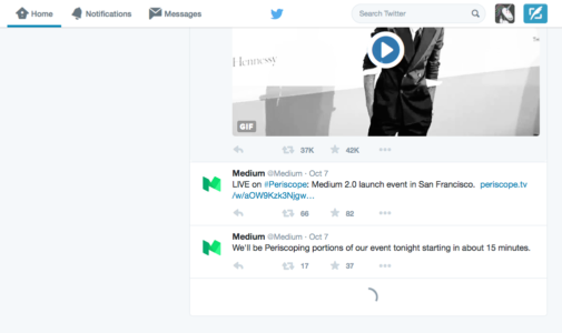
A5 Medium. UXPin :) #uxpinchat https://t.co/XNUEgH0VKL
— Steve Amara (@amarast) June 17, 2016
Get our free e-book on mobile typography, and join us next week for another #UXPinChat!
The post A Chat on Practical Web Typography appeared first on Studio by UXPin.
June 16, 2016
Website Navigation Trends: 16 UI Patterns Totally Deconstructed

Every website needs to present quick orientation (where am I?) and clear navigation (where should I go?).
In this piece, we’ll examine 16 web navigation UI patterns that stand the test of time:
Searches
Notifications
Jump to Section
“Sticky” Fixed Navigation
Vertical Navigation
Slideouts (Drawers)
Popovers
Modals
Calls to Action
Featured Content
Recommendations
Related Content
History / Recently Viewed
Next Steps
Walkthroughs & Coach Marks
Links to Everything
We’ll explore plenty of examples, best practices, and appropriate scenarios. When you’re done, feel free to check out the free e-book Web UI Patterns 2016 Vol. 1 for more tips an examples.
Let’s begin!
1. Searches


Problem
User is looking for something specific and doesn’t know where it is or wants a direct route there.
Solution
One of the most basic and popular patterns, including a search option is a navigation necessity. Typically a search bar in the upper-right corner, this feature finds related content within the site, saving the user time in going where they want.
Tips
If you’re tight on space, use an expandable input bar coupled with a magnifying glass icon. The New York Times even has a dropdown search bar when the user clicks the icon at the top.
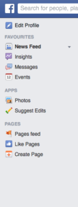
The more content you have, the more prominently you want to display your search feature. For example, content-heavy Facebook and YouTube break from the upper-right corner norm and have their searches in the upper-left and upper-center.
The autocomplete pattern further saves the user time and may even suggest content or proper wording.
If the user can search for multiple criteria, use the input hint pattern to explain (i.e., Facebook).
2. Notifications

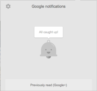

Problem
The user doesn’t know when others are interacting with them, or when new content is available.
Solution
Notifications have been popularized by social media sites as a way for users to know when others are interacting with them. However, it’s since spread to sites and web apps, with notifications available for new content, products, comments, or sales. The user, of course, selects which items they’d like notifications for.
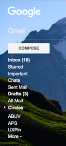
Google actually integrates notifications across multiple products. This means that when a user logs into Gmail, they can receive quickly check to see if anyone responded to their comment on YouTube.
Tips
The most generally accepted icon for notifications is a bell.
Notifications are almost always marked by a colored and circled number next to the appropriate icon. Choose a color that will stand out, as the point of notifications is to attract attention to new material.
Occasional product updates are fine, but don’t abuse notifications with too much self-promotional news. This weakens the impact for worthwhile news.
If a user has not logged in for quite some time (e.g., one week or more), consider adding a quick notifications summary modal to highlight important events.
3. Jump to Section
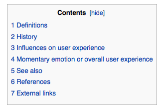


Problem
Browsing or returning to certain sections on a page involves too much scrolling.
Solution
A jump-to option, whether a text link or icon, saves the user time. As an optional feature, this should not draw too much attention from the main text, but it certain helps provide anchoring points for long-scrolling sites.
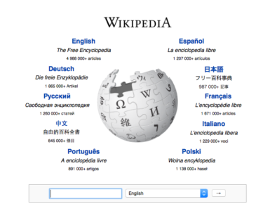
For long text-based content, adding links to the table of contents is a quick solution. This is a simple and practical solution that’s been around for a while with Wikipedia as the most known example.
But with the increasing popularity of infinite-scrolling sites, particularly with user-generated content, the option for jumping to the top of the page has become a pattern. This lets users return to familiar ground in case they get lost, or want to visit another page.
Tips
A return-to-top button usually goes unused since people can just scroll quickly, but it may be helpful for infinite-scrolling sites. For this reason, the option should be small and unobtrusive, like Tumblr’s and eBay’s tabs, “stuck” to the side scrollbar.
Unnecessary if you use an effective sticky navigation bar (described below).
For a step-by-step runthrough of how to create jump-to links in HTML, read this article from HubSpot.
Grab design ebooks created by best designers
All for free
 Download
 Download
 Download
 DownloadDo you want to know more about UI Design?
Download 'Free Ebook: Web Design Trends 2016' FOR FREE!
Download e-book for freeClose4. Sticky (Fixed) Navigation


Problem
Users get disoriented and lost when long-scrolling, or returning to the main navigation menu requires too much backtracking.
Solution
Implement a fixed navigation menu that stays in place when the page is scrolled, nicknamed “sticky” navigation. While the top navigation menu is most common, sides and bottom are also common (but more obtrusive).
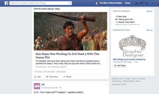
As a site with an infinite-scrolling feed, Facebook uses a sticky top navigation menu well. It gives users the always-present option to “change course,” if they suddenly want to search something specific, check their profile, or see their notifications.
Craigslist even uses sticky navigation on three sides, and two on the top. The bottom and first top menus are universal to the site, allowing users to go anywhere. The left menu and second top menus are specific to the current page, helping to refine searches, or start new searches for that field, respectively.
Tips
Since they always occupy a portion of the screen, sticky navigation menus should be as small as possible.
Highly recommended for single-page sites, which otherwise would lack any form of navigation menu.
For the sake of mobile experience, shrink the sticky navigation for smartphone users. This microinteraction draws attention to the menu so the user knows it’s there if they get lost. If your menu is already quite compact, you can try changing the colors upon scroll (Mint) to draw attention through contrast.
If your site features a mosaic of images in a card format, a sticky navigation is not advised since it can get lost in the noise when users scroll downwards. To learn more, check out this article on the pros and cons.
5. Vertical Navigation
Problem
There are too many important links that don’t fit across a horizontal navigation menu.
Solution
For more room, use a vertical navigation menu on the side. This allows you to list important sections in the most space-efficient way — as long as those links are necessary.
Vertical navigation can be used by sites with many pages that want to give their users all the options. This format also keeps the top and bottom of the screen free for either content, or more general navigation options.
Just like jump to navigation, this pattern emerged to suit the needs of long-scrolling sites. It’s well-suited for sites with user-generated content, and can be combined with other patterns like slideouts and sticky navigation.
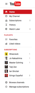
Sites like Facebook, YouTube, and Wikipedia all take advantage of vertical navigation. While each of these sites has an excess of content, the reason they chose this pattern is an excess of pages. The benefit of vertical navigation is allow users to move freely between pages — not individual pieces of content.
Tips
Because vertical navigation lists take up a lot of space, consider hiding them as slideouts (described below).
Don’t limit yourself to the left side — a right-side vertical navigation menu can make your site stand out. The left side is better for visibility with the F-pattern (see Chapter 5) and main navigation, but if your list is simple, it doesn’t matter where it goes.
To get creative you can also try combining the vertical navigation and jump-to pattern to create a minimalist navigation like what you see on Born Fighters.
6. Slideouts (Drawers)


Problem
The navigation menu takes up too much space.
Solution
Hiding the navigation menu as a pull-out menu or slideout gives your users the options they want, without wasting space — having your cake and eating it, too.
This pattern is best known on mobile devices where space is scarce, popularized mostly through the hamburger icon. The current iteration of this pattern takes many forms: the grid icon (Wired) or a simple “Menu” button that acts like a hamburger menu (DeviantArt).
Slideouts are very flexible in what they can contain. Small slideouts will contain textual links, while bigger slideouts showcase rich icons and even photos (e.g., a profile photo for a social app).
Moreover, slideouts are often used for standalone functions, such as chat windows. Facebook, Gmail, and other sites keep these windows tucked away when they’re not in use.
Tips
Use recognizable icons, such as the grid, so your user knows on sight how they work. For the most clarity, you can even use a “MENU” label.
Pay attention to the animation as the menu pulls out. This is key to maintaining the illusion that the menu is actually tucked away. If you make the drawer slide out too quickly, all the information at once will overwhelm the user. Give the animation roughly 200 – 300ms to play out the sliding motion, moving towards the upper end of the spectrum as your items increase (check out this tutorial).
Create contrast between the slideout menu items and the menu background.
7. Popovers

Problem
The user wants more information without losing their place on the current page.
Solution
Usually activated by hovering, popovers add the details that would take up too much room to display permanently. They are similar to hover controls, but with information.
The appeal of popovers is that they don’t disrupt the user’s task flow as much as going to a separate page. This makes them great for browsing through a large amount of content, where the user can call up more details about only the choices that interest them.
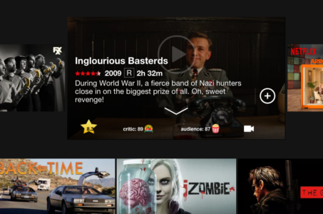
Look at Netflix: showing details for every movie would mean less entries per page, which makes browsing more difficult. With their current UI, when something catches the user’s eye, they can learn about it without interrupting their browsing.
Tips
Popovers work perfectly with the card layout: designers can display a large amount of content option in manageable doses, and conserve space in each card by listing some information in popovers.
A small pointer keeps track of which entry the popover relates to, especially useful for close textual links like Rotten Tomatoes.
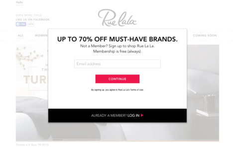
8. Modals
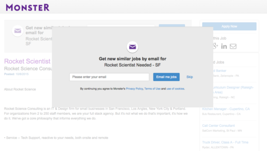
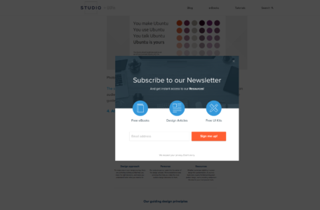
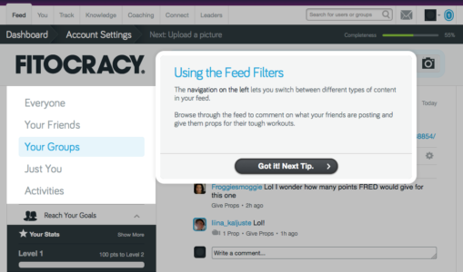
Problem
User is not noticing or interacting with important content.
Solution
Because they require interacting, modals are a surefire way to communicate important information. Like popovers, modals provide additional information without the user leaving the page. The key difference, though, is that modals demand a click, even if it’s to click “Skip” or “OK.”
Modals typically have two uses:
Draw the user’s attention to a feature they might be unaware of
Promotion
For example, if you visit the site for Gap outside of the U.S., a modal notifies you about international shipping in your area, and provides links to its international sister sites. Similarly, Fitocracy uses modals to point out and explain how certain features work.
The other popular use for modals is site promotion. Often, sites use call-to-action modals to increase conversions on signups, sales, newsletter subscriptions, etc.
Tips
Differentiate the background when the modal pops up to draw attention. This usually means fading the landing page, but a creative filter can also work as long as it’s not distracting.
Allow users to close the modal either by clicking outside the box or tapping the ESC key
If forcing users to click is a concern, have your modal automatically minimize itself and become a call-to-action button on the landing page. Use animation to make the correlation clear.
A multi-page modal works great for onboarding tutorials, as users can still see the normal screens behind them.
Modals can also show when users leave a site, as one last chance to regain their attention.
For email subscription modals, trigger them once a user scrolls partway through the content so you don’t annoy them. Learn how to create a modal that won’t annoy mobile users in this tutorial.
9. Calls to Action


Problem
Users need a clear next step on the page.
Solution
Influence users with calls to action in the form of obvious buttons inviting them towards an action, whether buying, signing up, or simply visiting certain content.
The most important factor for CTAs is visibility — they should be noticed, without being too flashy. In fact, CTAs should be the among the first elements the user sees; after all, they are synonymous with business goals and therefore integral to the site.
The CTAs on Squarespace are clear and noticeable. Their black-and-white color scheme attracts attention, the succinct and direct wording leaves no room for misinterpretation, and their fixed position keeps them on the screen permanently to add constant urging.
Tips
Colors are an effective way to get your CTA noticed. Attention-grabbing colors such as orange and green are good, as is using a color that contrasts with the background, such as white against black. For a more thorough analysis of colors in web design, check out Web UI Design for the Human Eye: Volume 1.
Another method for visibility is location. Situate CTAs in the most seen areas on the screen. While these change depending on your layout (see Chapter 5), the top is usually a safe spot. The only sure solution, however, is to A/B test the position.
As we see with Squarespace, making CTAs sticky gives them extra emphasis, plus ensures they’re permanently on the screen.
Consider ghost buttons as a flat-inspired alternative to the traditional CTA button. Ghost buttons fill with color as users hover over, adding an element of visual delight.
Don’t neglect microcopy — it’s your elevator pitch. For tips on writing specifically for CTA buttons, read Magdalena Georgieva’s piece for HubSpot.
10. Featured Content

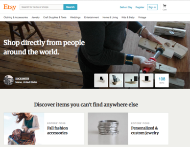


Problem
Users aren’t immediately able to discern the most important content on the page.
Solution
Let users browse the top content. Usually, this means featuring the most interesting content front-and-center (especially useful for sites driven by user-generated content).
Developed for print media and journalism, this pattern takes on new meaning on sites with user-generated content. With no “newsworthy” or “most recent” criteria to fill, site managers are free to pick any content to fill this area, and thus can sway the user’s impression of the site, while at the same time promoting chosen content.
Featured content is as versatile as the site’s business goals. The content could be paid, popular, new, or demonstrating creative ways to use the site.
A site committed to its users, Etsy uses featured content as the main focus of their home page. Behance, on the other hand, treats theirs as a separate tab.
Tips
Do your homework before deciding if a carousel is appropriate to feature content. As a general rule, it’s best to avoid them unless compelling user behavior indicates otherwise.
To immediately capture the user’s attention, try experimenting with a hero image above the fold.
Join the world's best designers who use UXPin.Sign up for a free trial.Your e-mailTry it for free!
11. Recommendations


Problem
The user wants content personalized to their preferences.
Solution
Just like featured content, recommendations lead users to content they’ll (probably) like. The difference is recommendations are tailored specifically to individual’s tastes.
Recommendations are most known for ecommerce pages, where recommendations are based on previous purchases. But they’re available to any site able to collect enough user data, whether through profile data frequent usage.
Social media sites like Facebook analyze friend/follower lists to calculate people you’re likely know. More friends means more site interaction. Sites like Hulu and YouTube simply categorize the types of videos you watch and recommend similar ones.
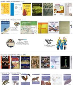
Amazon goes above and beyond, offering different variations of recommendations from different metrics like previously viewed, browsing history, and items in your wishlist.
Tips
Personalization is the key: the better your know the user, the more accurate the recommendations. Use all available data about your user.
When users create a profile, ask them to select a certain number of tags to fine-tune their preferences.
12. Related Content


Problem
The user wants to browse similar content without a new search.
Solution
While it goes by many names, the pattern of showcasing related content is popular for ecommerce, blog, and article sites. It’s effective for the same reasons as recommendations, but without needing user data.
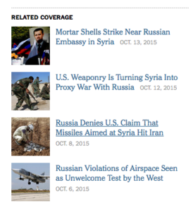
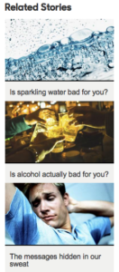
Related content generally works through tagging (see Chapter 1), or at the very least keywords. There is room for variation, though: in the above example, BBC promotes stories of different topics, but aligned with the user’s interest in the hidden dangers of common substances.
Another helpful guide is tracking similar viewers, as with eBay and IMDb. Judging by viewing patterns, users looking at the same content might have the same goals, in which case you can use past usage to predict helpful pages.
Tips
The accuracy of related content usually depends on the tagging system: more elaborate tags create more specific results.
Almost an expectation for ecommerce and news/blog sites.
13. Recently Viewed (History)


Problem
The user wants to see content they previously viewed without backtracking.
Solution
Showing recently viewed content helps users switch back and forth between pages, especially useful for comparison shopping. This pattern also creates a UI forgiving to user, in case they are indecisive or wish to return to prior content (but forgot the details).
For ecommerce sites, this simply facilitates the shopping process. Users likely have multiple products in mind, and the freedom to switch between those pages helps them achieve their goals.
This pattern is especially useful for sites like Pandora, in which users can interact with songs they previous listened to, liking or disliking them to customize their preferences.
In addition to a bar at the bottom, IMDb gives the option to see an entire page of user’s history, with a description on hover that says when the user viewed this item.
Tips
Give users the option to edit and delete items from their history to avoid mistakes from affecting the personalization features (like inaccurate recommendations).
How far back you go depends on the type of site and its capabilities. While remembering months ago is a nice feature for IMDb, it’s not necessary for a sites like Target where users typically have a final product in mind.
14. Next Steps

Problem
The user wants recommendations for what to do next.
Solution
Directly guide the user to their next steps.
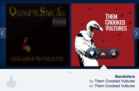
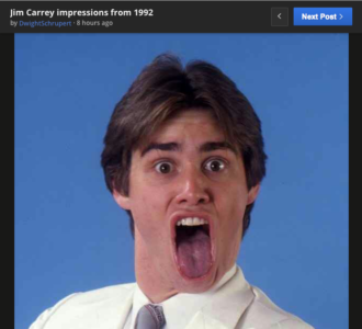
For the instances where featured, related, or recommended content fall short, it helps to be blunt about your user’s next steps. Any hesitation or confusion in the user task flow, even momentary, harms your UX. A next step prompt simply keeps things running smoothly. Imgur’s “Next Post” option streamlines the site experience, and creates an addictive habit loop for longer sessions.
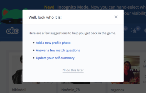
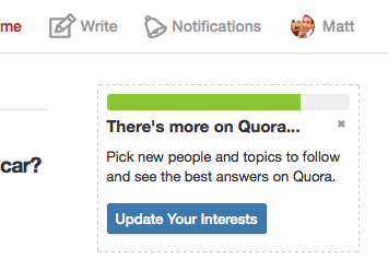
Next steps are also frequently used for administrative tasks like fuller profile completion. These prompts remind the user of optional tasks. OKCupid uses a modal to help users who’ve been away get back into the swing of things, while Quora gives a reminder to update preferences for a better results.
Tips
Promote certain steps over others with visual hierarchy techniques (explained in Web Design for the Human Eye: Books I and II). Look at how Yelp’s big red button for “Write a review” outshines the other potential actions.
When used for profile completion, couple this with the completeness meter pattern for more urgency.
Grab design ebooks created by best designers
All for free
Download
Download
Download
DownloadDo you want to know more about UI Design?Download 'Free Ebook: Web Design Trends 2016' FOR FREE!
Download e-book for freeClose15. Walkthroughs (User Onboarding)


Problem
New users need some tips to get started.
Solution
Walkthroughs (also known as user onboarding) explain how the UI and specific features work. Almost sites will have some kind of onboarding process to explain how everything works to beginners or updated features to old users.
Coach marks, as with the Quora example, draw attention to the features where they exist in the normal UI. This doesn’t distract the user from their regular routine, and are less intensive than full-scale walkthroughs.
Tips
Keep walkthroughs succinct so that users can get to actually using the site.
Pictures can communicate faster and more clearly than heavy explanations.
This patterns helps users make the most out of the site. Many walkthroughs like the one for Pinterest require users to choose their favorite tags right from the beginning to customize that user’s experience more deeply.
Try using walkthroughs through modals: with the UI in the background, the process seems less intrusive.
Know the 4 types of user onboarding, then browse these excellent examples to see best practices in action.
Provide a “skip” option to avoid frustration from some users.
16. Links to Everything


Problem
The navigation system on its own is too limiting.
Solution
Give users more freedom to explore by linking most or all the site’s content. This allows them to go to new locations as they interact normally, instead of stopping their flow to figure out how to get there in the traditional navigation system.
This pattern is all about clickability — almost everything is interactive. This is popular for Wikipedia, where users can easily jump to another entry for clarification on the initial entry.
Similarly, IMDb has a large degree of interactivity: people, genres, dates, ratings, users, and media are all clickable for more details, not to mention individual entry pages like “Trivia” or “Plot summary.”
While not a database, Asana requires interconnectivity to assist users in organizing their workflows. Projects, people, and pages are all linked for a UI that’s as fast as the user’s thoughts.
Tips
Always denote hyperlinks if they exist within non-clickable text. Blue and underlined is the safest bet.
If the object doesn’t have it’s own page or the information is small, try a popover instead, since they are less disruptive to user flows.
Additional Tips
If you found this post useful, check out the full length e-book Web UI Patterns 2016 Volume 1.
The guide explains 140+ examples for 38 useful UI patterns.

The post Website Navigation Trends: 16 UI Patterns Totally Deconstructed appeared first on Studio by UXPin.
June 15, 2016
Web Layout Best Practices: 12 Timeless UI Patterns Analyzed

People don’t visit websites for the design – they want content.
As explained in Web UI Patterns 2016 Vol. 1, design is just a means of presenting content in the most intuitive and useful manner. In this piece, we’ll explore examples, best practices, and common scenarios for 12 successful web layout patterns:
Cards
Grids
Magazine
Container-free
Split Screen
Single-page Web Apps
F Pattern
Z Pattern
Horizontal Symmetry
Approximate Horizontal Symmetry
Vertical Symmetry
Asymmetry
Take a look at how to present your web layout in the most powerful format possible.
1. Cards
Problem
Browsing is a large part of site interaction, but displaying the details for each item would clutter the screen.
Solution
Cards allow sites to present a heavy dose of content in a digestible manner. As we explain in our Web Design Book of Trends 2015–2015, cards are popping out everywhere lately, and this pattern’s success is directly related to its usefulness.
Cards act as containers for clickable information: bite-sized previews to help users find the content they want. The style of the cards varies with each site, but most contain an image and description, and sometimes individual functions, such as Facebook’s Like or Twitter’s Retweet.
Moreover, cards work well with responsive design. Since each card is self-sufficient, their placement can be rearranged to fit any screen size.
For sites with a lot of content, cards offer a lot:
Intuitive — don’t require instructions.
Advantageous for responsive design — since each card is self-sufficient, their placement can be rearranged to fit any screen size.
Shareable — easy to share only specific content on social media.
Versatile — can be used with a wide range of site styles
Tips
Make the entire card clickable, not just certain portions. Fitts’s Law, described in Interaction Design Best Practices, states that this makes user interaction more likely.
Focus each card around one central concept, and no more. Otherwise, that defeats the purpose.
Keep smaller screens in mind when selecting images. You may need to crop them differently for different devices.
Don’t get too complex. Cards work best when they’re simple, in what they show and how. Basic typography and minimal description helps browsing.
2. Grids

Problem
Content-heavy sites want to display all primary items with equal hierarchy.
Solution
A grid structure makes browsing easier. Cards are almost always laid out in a grid format, of one kind or another. Grids offer more options for browsing than simple list views, which makes this style space-effective.
Grids can vary in size, spacing, and the number of columns. Sites like Huffington Post stagger their options to avoid that “straight-laced” feel, while YouTube plays up the strict organization, with straight rows and grouped into categories (“Recommended,” specific channels, etc.).
Tips
Pay attention to white space (or lack-there-of, as with Diply) because it influences how users browse. Ample space is slower, but with more attention placed on each item. Minimal space is faster, but risks some content slipping through the cracks.
Consistency is important, especially when designing for different devices. Make sure your layout stays recognizable at different responsive breakpoints.
Get started with a basic 12-column grid with tools like 960js.
3. Magazine-Style Layout


Problem
A site has a lot of regularly-updated content in multiple categories.
Solution
Magazines had this problem long before websites, and the format they evolved remains viable. The alternating sizes of columns, cards, and/or headlines breaks up the monotony of the grid, while still showcasing a variety of content.
The magazine layout changes up how content is displayed. The left side of the screen might be dominated by a grid of cards, while the right side might have a list of text links.
Take BuzzFeed, for example: the first column is featured content, with a detailed description next to the picture. The middle is timely content, with a brief description under the picture; and the last column is what’s trending, numbered pictures with no description. Pay attention to their typography — text colors and sizes vary to show usability and create a visual hierarchy.
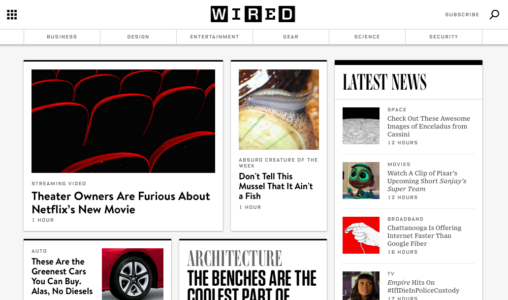
Tips
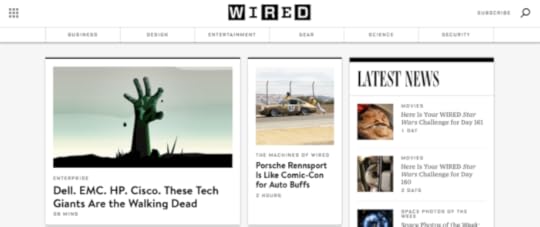
Like print magazines, this format emphasizes images. As with TIME, WebMD, and WIRED, there is usually one dominant feature image on the screen to draw focus before users scan the smaller, secondary images.
One of the characteristics of this style is a vertical menu on either side (or horizontal menu).
Grab design ebooks created by best designers
All for free
 Download
 Download
DownloadDo you want to know more about UI Design?
Download
Download
DownloadDo you want to know more about UI Design?Download 'Web UI Design Best Practices' FOR FREE!
Download e-book for freeClose4. Container-free Format


Problem
A site wants a minimalist approach when presenting data.
Solution
The container-free format takes minimalism to the next level, stripping away all unnecessary visuals and breaking away from the conventions of other sites. Rather than clear-cut divisions, this pattern format relies on visuals, grouping, and common sense to show relationships.
Historically, web design has relied on linear and highly structured layouts to present information. This works well, but with more options available today, designers can experiment “outside of the box.” This style appeals to agency (Public-Library), portfolio, and fashion sites (Cienne NY), which all value appearing modern and avant-garde.
Designing without containers puts more power back to the content itself. However, extra care must be given to the visual hierarchy. This risky pattern is only as effective as the people designing it.
Often the face of minimalism, Apple disregards containers for its site. Links are all textual (no buttons), and a clever visual design explains which content relates to what.
Tips
Typography is vital to designing without containers. Size, typeface weight, and color all communicate meaning in place of blunt dividers. Apple uses large text for the title, smaller text for the secondary description, and blue text for links out.
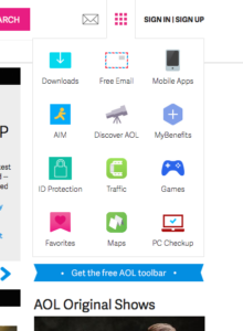
To prevent confusion, make most elements clickable. If the user is confused about an element, they will likely click on it first to test interactivity.Content-heavy sites have difficulty with this format, although AOL shows that it’s possible (although not always ideal).
5. Split-Screen
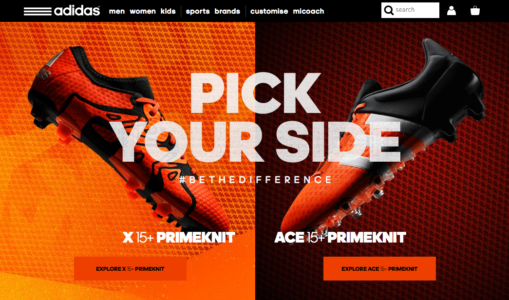


Problem
A site has two main pieces of content that are equally important.
Solution
The split-screen layout is the logical and trendy way to give two contrasting elements equal consideration.
The split-screen is a choice for displaying two central elements simultaneously or — as the Adidas example shows — pit them against each other. This is a good choice whenever you don’t know which of two elements to feature prominently: do both.
Split screens are perfect for when the site offers two drastically different variations, such as the genders in 62 Models. Users make their selection right from the start, so the site doesn’t waste time showing both options needlessly. Split screens also give the opportunity to feature two calls-to-action, as with Peugeot.
The style has since grown to become purely aesthetic. Most common is having text on one half of the page, and a header image filling the other, as with Lauren Wickware Design. Both sides are two aspects of the same concept.
Tips
The split-screen is ideal for contrast. As designer Patrick McNeil suggests, play up the duality with opposing characteristics, such as opposite colors, different text sizes, the nature of the image, etc.
Retain a single, unified navigation menu — ideally at the top, where it’s clear that it applies to both sides.
Split-screen designs do not expand well with as content grows, so do not apply them to content-heavy layouts.
6. Single-page Layouts

Problem
Multi-page navigation system is too convoluted or unnecessary.
Solution
Modern web development has paved the way for single-page sites and web apps. Both technological advancements and the prominence of mobile browsing (in which single-page apps are more useful) gave rise to this pattern, which is restructuring how the web works.
Using AJAX, single-page web apps load asynchronously and are able to combine multiple actions into one page. This pattern is also popular for non-app sites, which section off their home page to serve the needs of individual pages.
Gmail, for example, allows email reading, composing, and chatting on the same page, and even organizes emails into separate categories, which mimics a multi-page site. Spotify, too, multitasks by allowing the user to play music while they browse additional music, uninterrupted by loading pages.
Tips
Generate unique URLs for each viewpoint, like Gmail or Twitter. Because content is loaded dynamically using JavaScript, URLs require special attention. Unique URLs also enable use of the browser’s Back button.
Use sticky navigation to reduce disorientation, even if only a header menu.
Apply the scrolling techniques from Chapter 4 of Web UI Patterns 2016 (Vol.1) to properly deal with scrolling issues.
Join the world's best designers who use UXPin.Sign up for a free trial.Your e-mailTry it for free!
7. F-Pattern
Problem
Users are having difficulty browsing text-heavy sites.
Solution
If there is a lot of content — especially text — users will respond better with the F pattern layout, which mimics the way people scan naturally.
The Nielsen Norman Group explains how eye-tracking studies revealed that users (in left-to-right reading cultures) typically scan heavy blocks of content in a pattern that looks like the letter F or E. Our eyes are trained to start at the top-right corner, scan horizontally, then drop down to the next line and do the same until we find something of interest.
For example, if the user is scanning a blog entry, they will look at the first line of a paragraph for keywords or to gage the meaning, and if it’s not what they want, they’ll drop down to the next paragraph.
When there’s a lot of content, the F pattern organizes it into horizontal rows, one on top of the other. This creates pathways for the users’ eyes to go where they would normally, and gives the designer more control over what gets seen.
Yelp uses perfectly aligned vertical columns to give the users a starting point. When they find an interesting topic (or picture), their eyes scan horizontally for more information. If the item in the vertical column doesn’t interest them, they go down until they find one that does.
Tips
Place the most important content like CTAs at the left and right sides, where the user begins and ends their horizontal search. This momentary pause as they drop down gives them a little extra time to consider.
Start new paragraphs with enticing keywords. Additionally, try highlighting keywords within text, since that’s what users are looking for anyway.
The first two rows are the most important. Users may leave the site if they don’t find what they want there.
Use the right-side column to display relevant, but unrelated content, or as a search tool. This area is seen, but is regarded as outside the scanning process.
Read our Web UI Design for the Human Eye: Content Patterns and Typography for more explanation and best practices.
8. Z-Pattern


Problem
A site has a specific agenda or call-to-action that users are not interacting with.
Solution
Like the F pattern, the Z pattern layout mimics natural user scanning methods. However the Z pattern is better suited for sites with a singular goal and less content.
The Z pattern is effective at directing user attention to specific points by using well-placed visuals, text, and CTAs. While the F pattern is better for browsing heavy content, the Z pattern guides users through more open pages.
The user (in left-to-right reading cultures) again starts in the top-left corner. Instead of dropping down directly, however, their eyes wander a bit in the middle, then start again at the bottom or near bottom left corner. You can encourage this pattern by placing a telling image in the center (TripAdvisor), or by alternating text and images to create a zigzag (Wunderlist).
Tips
Place CTAs on the right side, at the end of the line: user will slightly pause at the end before moving down.
Place your most important CTAs in the upper right corner, since the top line is the most visible.
The Z pattern can be repeated over and over on the same page, so that the user developers a rhythm that keeps them there.
9. Horizontal Symmetry


Problem
A site includes many recurring visual patterns that must be organized clearly.
Solution
A visual phenomenon occurring in nature, symmetry is generally regarded as beautiful and creates a sense of order and structure, even trust.
Because they are visually pleasing, symmetrical images are more likely to create an emotional connection with users, which improves their enjoyment of the site, how they identify the brand, and how well they recognize the site later.
Tips
Balance is not necessarily symmetrical. These are two different, though related, concepts. For more on visual balance, read this Smashing Magazine article.
From its fine arts background, symmetry adds an air of elegance and sophistication to a site’s appearance.
10. Approximate Horizontal Symmetry


Problem
Horizontal symmetry is too structured for a site.
Solution
Approximate symmetry retains most of the benefits of symmetry, but with a little added vitality. It is created by adding slight asymmetrical aspects to an otherwise symmetrical image. The result is a more stimulating visual, though it loses a small amount of structure.
The slight visual disruption, however, can work to your benefit.
Tips
To grab more attention, place important lines of text, images, or calls to action in areas that break up the symmetry.
A little goes a long way; even altering a symmetrical image slightly produces visual tension. Likewise, you can create asymmetry by just placing a sidebar in an otherwise balanced design. Add your disruptive elements carefully, otherwise you risk complete visual clutter.
11. Radial (Rotational) Symmetry

Problem
A site wants to draw attention to a central point and motivate immediate action.
Solution
Radial symmetry creates balance in a circle around a central point. While difficult to apply, when done well this creates a beautiful aesthetic that attracts attention to the center, typically to the company’s name, logo, and surrounding links.
Radial symmetry is also good for showing motion. Circular patterns in general encourage users to continually move their focus around to a natural end.
Tips
Radial symmetry is a good way to stand out while looking good, since it’s not as common as the other types.
Centralize your most important elements, and keep the secondary ones near the edges.
When placing many links around the center of attention, do not complete the loop. For example, notice how Wikipedia leaves the top and bottom of the circle unoccupied. The space creates breathing room for the eye to explore links on both sides.
12. Asymmetry


Problem
Specific feature content must stand out immediately without disrupting visual flow.
Solution
Asymmetry creates tension and dynamism — not practical for every site, but worthwhile if you want a livelier site that clearly shows points of focus.
When used properly, asymmetry can create active space, which means it makes white space more lively. Asymmetrical elements cause the eye to move more rapidly, even across emptiness, which makes the site itself appear more energetic.
However, this style is difficult to apply. Misplaced asymmetry can lead to confusion in the visual hierarchy, or just plain ugliness.
Tips
The use of colors highlights the jarring effects of asymmetry. Both HSBC and Honda use patches of red to push and pull the user’s sight.
To create a slight asymmetric yet organized layout, balance the text on one side with images on the opposing side.
Objects with sharp edges (e.g., a triangle) add more visual weight to an area, which offsets the opposing area. Use these objects carefully since they can quickly unbalance the design.
Next Steps
If you found this post useful, check out the full length e-book Web UI Patterns 2016 Volume 1.
The guide explains 140+ examples for 38 useful UI patterns.
The post Web Layout Best Practices: 12 Timeless UI Patterns Analyzed appeared first on Studio by UXPin.
8 User Control UI Patterns Worth Using

When it comes to helping users manipulate on-page content, we see a few popular UI patterns persist through the years.
In this piece, we’ll explore examples and best practices for the following patterns:
Drag & Drop Actions
Flagging/Reporting
Discoverable Controls
Overflow Menus
Context Menus
Direct Manipulation
WYSIWYG Editors
Let’s explore popular techniques for letting users manipulate content the way they need.
1. Drag & Drop Actions
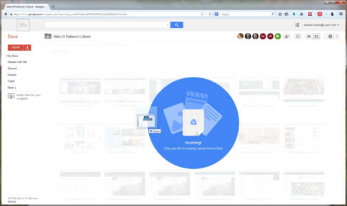

UXPin ( Photoshop & Sketch integration )
Problem
Moving and organizing content is too much effort.
Solution
The drag-and-drop functionality is a preferred method of organization for most users: it’s intuitive because it’s based on reality, and often something user try instinctually when first using a UI.
Drag-and-drop provides a level of direct manipulation that other methods can’t match. While it’s more organic with the gesture controls of mobile, it has already become ingrained on desktop sites as the most effective way to rearrange items in a list, or move documents from one place to another.
Tips
Give some visual indication that drag-and-drop is available. This could be something obvious like Google Drive’s large notification, or it could be more inconspicuous, such as changing the colors of the window’s borders.
For responsive web apps, the drag-and-drop action in the desktop version helps create a snappier design and strengthens consistency across mobile devices.
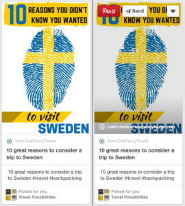
2. Flagging/Reporting
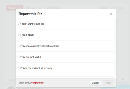
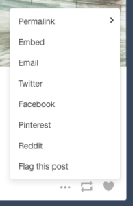


Problem
Inappropriate content gets in the way of user task flows.
Solution
Let users report inappropriate content (or other users) for administrator review and removal. Inappropriate content could mean a variety of things:
Obscene content, whether images or text
Offensive, insulting, or bigoted content
Content that is mislabelled, misplaced, or categorized incorrectly
Spam and solicitations
Violations of site policy
Copyrighted work
Descriptions/solicitation of illegal acts
This pattern takes the pressure off you to regulate every piece of content that comes through your site, and gives the users themselves some authority, which they appreciate.
Tips
The option to flag or report is essential for sites with user-generated content, but it doesn’t have to be stand out. Having a small flag icon in the corner (Pinterest), or even tucking the option in a pull-out menu (Tumblr) are acceptable.
If the questionable content was posted directly on the user’s page, the action of flagging/reporting can also double as removing it, saving them an extra steps.
3. Discoverable Controls

Problem
Displaying controls for each piece of content clutters the screen.
Solution
Hide the controls until they’re needed. Discoverable controls (a.k.a., hover or hidden controls) are one of the most useful UI patterns, and widely adopted. They are so popular, in fact, that if users are confused, they will now hover over questionable items expecting something to appear.
Discoverable controls are an effective space-saver without sacrificing user functions.
This pattern also makes the controls more comprehensive, especially together with the card grid (a common pairing). Discoverable controls make it clear which card the controls apply to. Universal controls can get confusing with multiple posts, so having the controls appear within the post itself clears this up.
Tips
A practical necessity for the cards layout, when the user is able to interact in multiple ways with each card. Controls reveal themselves upon hover for desktop and tap for mobile.
Avoid using discoverable controls for essential actions, as they’re always a chance they’ll go undiscovered. As a rule of thumb, ask yourself if users can still enjoy the interface without these controls — if so, it’s safe to hide them.
For more information, interaction design expert Dan Saffer discusses modern solutions for discoverability.
4. Overflow Menus
Problem
Too many options are cluttering the screen.
Solution
Move the extra options to a second menu. Overflow menus are a smaller, more manageable alternative to slideouts.
Overflow menus present all the secondary options that aren’t necessary and keep them hidden unless they’re needed. These could hide links (like the extra page links in AOL’s grid icon) showcase controls, as with Spotify or more detailed features (like the advanced search in Behance).
In fact, Behance demonstrates the ideal use of the overflow menu: detailed search is a useful but not primary feature, and so can be hidden from the main screen.
Tips
Animating the appearance of an overflow menu, such as sliding out, adds weight to it and reinforces the connection with the triggering element.
Treat overflow menus as slideouts, but smaller. The same rules apply to both, such as only including secondary content and using recognizable icons.
Grab design ebooks created by best designers
All for free
 Download
 Download
DownloadDo you want to know more about UI Design?
Download
Download
DownloadDo you want to know more about UI Design?Download 'Free Ebook: Web Design Trends 2016' FOR FREE!
Download e-book for freeClose5. Context Menus
Problem
Certain contextual controls clutter the screen view.
Solution
A specific kind of hidden controls similar to overflow menus, context menus offer contextual controls, specific to certain types of content. These are typically activated by right-clicking.
The controls within context menus change depending on the content.
Tips
Use common tasks for the site so that the user does not have to return to the toolbar every time they wish to use them.
As a default, CRUD (create, read, update, delete) functions work well
Join the world's best designers who use UXPin.Sign up for a free trial.Your e-mailTry it for free!
6. Morphing Controls


Problem
Some controls don’t need to be displayed at the same time, and clutter the screen.
Solution
Morphing controls save screen space and make a more logical interface. The most obvious example, from YouTube and almost every video site, is the play button that becomes a pause button — the play and pause functions never need to be displayed simultaneously.
This pattern works great for usability, as related but opposing functions are located in the same space, which matches how the user perceives and therefore search for the actions.
Tips
This works well with undo functions, such as Pinterest’s Like and Unlike.
Be consistent with both functions’ appearances, i.e., don’t change the font or text size.
7. Direct Manipulation of Content & Data


Problem
There are too many steps to manipulating content.
Solution
Eliminate extra steps by allowing users to edit, delete, or add content in the same mode. Essentially, the less steps the user takes, the better, so this pattern is about increasing efficiency.
Twitter users can drag photos into the tweet without opening the Media menu, and Wunderlist users can edit the names of their tasks by simply clicking on them.
Asana, though, handles this pattern the best. Without opening a new menu or switching screens, the user can add a new task, edit an existing task’s name or details, assign a task to a project, change the task’s privacy settings, comment on the task, unfollow it, or reorganize the order of tasks.
Tips
To see where in your UI you can implement direct manipulation, try listing out the steps of a given task and analyzing them for redundancies. For example, to send an email, a user might click the new email button, click in the content menu, and start typing. A shortcut would be to have the user already in the content menu after clicking the new email button, saving them an extra step.
8. WYSIWYG Text Editor


Problem
The user is unsure about how different text formats will appear.
Solution
A WYSIWYG text editor shows the users precisely how their text will look when finished, eliminating all the confusion about different formats and superseding markdown formatting, preview modes, or HTML code.
Just like the direct manipulation pattern above, WYSIWYG text editors save steps and time. Seeing the final product as they write it combines steps, which is why this pattern is implemented in almost all blogging and email platforms.
Tips
Don’t neglect fonts — if your site uses a specific font, have that as the default.
Use this pattern for sites in which users will spend time scrutinizing content (e.g. portfolio template sites, blogs, etc.)
Next Steps
If you found this post useful, check out the full length e-book Web UI Patterns 2016 Volume 1.
The guide explains 140+ examples for 38 useful UI patterns.
The post 8 User Control UI Patterns Worth Using appeared first on Studio by UXPin.
June 9, 2016
The Redesigned UXPin is Here

Today as we celebrate the release of our new version, we want to take you behind the scenes and show you the lessons we learned while building it.
The first thing we learned when embarking on a redesign was that it isn’t enough that you use your product. You can’t just eat your own dog food and leave it at that.
As pointed out in this Forbes article, no one uses your product as much as you do, and not everyone is a power user as much as you. You can only know so much by using your product yourself. But if you only do that, you can become myopic in your approach. You have to seek outside perspective from your users.
You have to talk to them and learn from them, while still eating your own dog food.
That’s precisely what we did with the UXPin redesign. We used UXPin to redesign UXPin, while at the same time spending hundreds of hours talking to our users.


Before and after of the UXPin design editor.
Learning From Previous User Experience
We didn’t embark on our redesign on a lark. After all, the decision to do one should be based on data and feedback from users.
As we said in the free e-book The Guide to UX Design Process and Documentation, you always need to know why you’re building something. You have to do a bit of legwork and research, analyzing users. We won’t get into creating user personas. If you’re embarking on a redesign, you probably already know a lot about users’ motivations, fears, mentality, and, of course, behavior.
But it’s the last bit that’s going to be really useful to you. How do users behave in your application? What works for them? What doesn’t? More importantly, do they have workarounds to accomplish what your product actually promises?
For us, past usability tests and user feedback via customer service, as well as various “engagement metrics” were strongly suggesting that the learning curve is too steep for a design collaboration solution.
Having the lowest learning curve is important to us because we’re not only a tool for designers.

A close up of the redesigned UXPin editor.
For instance, Ingrid Brummer, a product manager at e-commerce site CHECK24, uses UXPin with her team because it allows her to fully articulate her ideas. As she told us, “I really appreciate that with UXPin I, as a non-designer, am able to produce really exact designs.”
Since non-designers are also involved in the design process, we needed to lower the barrier to entry.
With that knowledge, we dove back into our app, taking inventory of how we can create a better user experience across UXPin. OK, here’s where things get a little meta. As we said before, we actually used UXPin to redesign UXPin.
Before embarking on our redesign, I created an early concept within UXPin in one afternoon to get the team excited. This concept was based on our user feedback and metrics. Take a look:
An Early Concept of the New UXPin from UXPin on Vimeo.
This screencast helped convey the direction we needed to head in, and helped to galvanize the team.
Why a Redesign?
Let us repeat again: a redesign isn’t a lark.
Learning from previous experience is the first part of that. Next, you have to decide why a redesign and set goals.
A redesign starts very much by asking the same questions you would before embarking on any other design project, such as “what is the purpose of this?” “What are our goals?” “How does this affect our users?”
Certainly, users were at the heart of our decision to redesign. We wanted to create a smoother experience for them all around, making it easier to use UXPin and increase the speed of our platform. But to get to specifics, these were the factors that went into our decision:
Design debt. Having grown fast through the years, we took on “design debt,” where legacy elements didn’t really align anymore with our vision and just bogged down the experience.
Experience debt. We saw visible patterns of pain from customer service and our usability tests.
Practical inspiration. This may seem like a lofty goal, but we wanted a tool that inspired others to build better products. A tool that was rooted deeply in usability principles and that invoked the timeless and iconic designs of yesterday.
Room to grow. Our previous design and backend didn’t give us to flexibility to build out new features easily. Since we were going to overhaul our entire engine, we faced less creative constraints with our new features.
And all these reasons were for our users, first and foremost. If we sound like a broken record, it’s because we can’t emphasize enough that our users drove our decision.

Using UXPin to redesign UXPin. Here you can see us leaving comments on the live preview of the prototype.
Our Redesign Process
Any design effort begins with research. And we didn’t have to look far for it. Luckily, we’d been collecting data over the years already.
We had behavioral metrics, SaaS business metrics, and customer service had data from the front lines. Finally, we had qualitative usability tests, with our existing customers.
The data gave us a jump start on our redesign process. Let’s walk through the highlights rather than go point-by-point.
Laying down your design principles
Before designing a single pixel, we outlined the design principles for project.
Think of this as a combination of requirements, our goals and our aspirations. And our research helped inform these principles.
As Robert Hoekman Jr. outlines in The Field Guide to UX Strategy, you’ll want to ask the right questions to formulate your UX strategy. You can do the same thing when it comes to your design principles. Let’s review some of those questions:
What’s your reason for being? This question may seem philosophical, but it really isn’t. Simply put, it’s asking you to understand how your product fits into your users’ workflows.
Where are you now? This is your product as it stands today. Understanding this is deadly important to deciding whether you’re ripe for a redesign.
Where have you been? For use, this was an easy question to answer. As we said previously, we had all the metrics in front of us. We just needed to dive deep and put two and two together.
Finally, one last question to ask and probably the most important one:
Where do you want to be? Where do you go from here? How do you change? And how do you measure that change? Hoekman suggests using specific numbers, which is always a good idea. For now, we’ll focus on the design aspect for this article.
Now let’s take a look at the principles we created:
No distractions. Every redundant piece of an interface — lines, buttons, shadows, animations — is a source of distraction. As such, you should eliminate it to empower user creativity.
Design centric. User designs should be at the center of UXPin. Our interface shouldn’t obstruct their work.
Adaptive interface. Our interface should always act in context of the user. That means any “interactive” features should be hidden until the user needs them.
Space. Users should have a lot of space to work so as to trigger their creativity. A cluttered interface is a source of stress.
Inspiration. UXPin design should inspire and can’t derive from design other SaaS apps. We should strive for original aesthetic inspired by the best products ever created, such as the Pilot Vanishing Point Matte Black fountain pen, Harman Kardon’s Sound Stick, Pro-Ject record player, and DALI Zensor speakers.
Interactive Consistency. Interface components, icons, and fonts should all be consistent to create a predictable experience.
Predictable Architecture. The architecture must be predictable and natural. Features should be placed in the right context for easy discoverability.
Design principles allows you to focus your efforts and keep scope creep at bay. Our principles certainly kept our course steady and true throughout the redesign.
Usability testing and iteration
Of course, it’s not enough to just come work off design principles and call it a day. Once we started to implement our revised UI, we took it to users to get their take and to ensure there wasn’t any big errors.

An early concept built of the revamped editor, built in UXPin .
And like with our design principles, we categorized our usability goals. We knew there were a few things that we need qualitative data on:
The new canvas. We were making significant changes to the new canvas. We needed to know if it would distract users, turn them off or hinder their work in any way.
The left/right tool bars. We needed to know if these were in the way as well. Or whether users found them helpful or not. Did they understand what the tool bars were for?
The functionality. Would people know how to use the new interface in the same way as the old one?
One of our biggest changes in the new UXPin was the removal of the contextual menu, which is displayed next to the selected elements. In the past, many people experienced difficulty with this component. We needed to test to see if users would be okay if we removed the menu.
While somewhat difficult at first, we found that people were more attuned to having elemental options to the right bar, partially because of its similarity to other design tools.

User researcher Ben Kim testing our redesigned interface with designer Jessica Tiao of Kissmetrics.
Another key finding was the total lack of understanding of icons residing in the top bar. While some, such as search, are universal, most of the icons we employed clearly needed labeling. During our early iterations of the redesigned UXPin, labels to icons were quickly added for the usability of users.

Labeled icons in the dropdown, prototype built in UXPin .
Closed beta
But you don’t just test early on. As we outlined in the Guide to Usability Testing, as a product gets into later stages of development, you have to launch it to a small, select group of testers. Call it a private release, or you can call it by the common name — a closed beta.
We put together an MVP to get in front of a small group of 50 accounts — hand-picked to participate. Right away, we got feedback on some small usability issues that we quickly ironed out.

We used Slack to talk with our beta users.
One thing that give us issues right away was our left-right bar menu. It took up too much real estate on the canvas. Based on feedback, we decided to change it up. Instead of a persistent menu, we added a feature that allowed the user to choose which menu to show, as well as a hover-show function.
More importantly, with a closed beta you’ll learn things that you’ll never be able to learn with a mockup or prototype. For example, users loved the dark version of our new UI in the mockup. But when it came to actually using it, we discovered it was hard to navigate at the smallest level of detail. We realized we’d gone a bit too far in trying to make the design too visually appealing.
The lesson: usability shouldn’t be sacrificed for visuals. With that lesson, we lightened up the dark version so that it was easier to navigate. And that’s something we wouldn’t have learned had we not let a small group of users play with the redesign.
Open Beta
Slowly but surely, we went from 50 accounts to 500 to 2,000, transitioning ourselves into an open beta.
With open beta, we wanted to gather quantitative data — looking more at hard numbers. For instance, we found our conversions to be lower at first because of some unexpected issues with e-mail onboarding, which we corrected.

Our new UI also comes in a light version.
We also started to quantify the user experience as well by paying close attention to bugs and requests. Using three categories — user pain, strategic value and cost — were able to set objective priorities around those issues. With this, we attacked the most painful issues first.
And that led to us adding labels to icons, changing inputs for radius and dozens of other improvements.
Throughout the whole beta phase, we did sentimental analysis to check the number of positive and negative mentions. Think of it as a happiness check-in.
Open beta is a great period to learn more about the redesign. What works. What doesn’t. And whether people will respond will to what you’ve built. It’s also a crucial time that can’t be skipped. If you do, you risk putting out a product that isn’t viable for a large group of customers.
Conclusion
Using your own product, you learn what is working and what is not working. It gives you a good baseline. But you have to take it further. You have to talk to your customers to give you additional perspective. You’ll learn even more.
That combined with data will allow you to tackle a redesign on your own product.
As for us, we’re not done yet. Soon we’ll release a new version of our dashboard, and we have a few other projects in the works. So stay tuned!
Join the world's best designers who use UXPin.Sign up for a free trial.Your e-mailTry it for free!
The post The Redesigned UXPin is Here appeared first on Studio by UXPin.
June 8, 2016
What Makes Redesigns Worthwhile?

Reflecting on our recent launch, we asked the Twitter community in #UXPinChat their thoughts on the promise and peril of redesigns.

@uxpin q1 definitely +1 for groups within groups! And I love both dark and light version :) #uxpinchat
— Marcin Kowalski (@theothermarcin) June 10, 2016
@uxpin q1 groups within groups to organize the design better! #uxpinchat
— Natasza Libich (@Natasza_UX) June 10, 2016
Zoom. Get close on the nitty gritty details or step back for the bird's eye view. #UXPinChat #uxpinredesigned https://t.co/6wOzt9CFOp
— Ryan Thomas Riddle (@ryantriddle) June 10, 2016
A1. Having groups in groups. Designs can get complex and this feature will help you stay organized! Boom! #uxpinchat https://t.co/kXur3PnnLL
— Loomie (@loomie_ux) June 10, 2016
A1 Personally I like the ability to manipulate the #UI, like the light/dark and detachable panels #UXPinChat
— Benjamin Gremillion (@ux_benjamin) June 10, 2016
A1 @uxpin Not a member of the team, but beta tester. Been loving the element interactions & exports. Helped a TON here @stirista #UXPinChat
— Michael Gremillion (@IselianGaming) June 10, 2016
@uxpin #UXPinChat #uxpinredesigned – Snapping to grids would be awesome! Also, snapping to canvas bounds.
— Justin White (@JWhiteUX) June 10, 2016

#UXPinchat A2 when user engagement is not up to your standard and UI is too cluttered to change it with small improvements. Cc @uxpin
— Marcin Treder (@marcintreder) June 10, 2016
If your site still resembles a Geocities page … #uxpinchat #redesign #webdesign https://t.co/nwrnoR6d0P
— Ryan Thomas Riddle (@ryantriddle) June 10, 2016
A2) @uxpin Calendar isn't a bad idea for a check-in. Ex, "Every X months." When traffic is down is a big sign. #UXPinChat #SiteAnalytics
— Michael Gremillion (@IselianGaming) June 10, 2016
A2 When users have to email you for info that’s on the site. Or they can’t figure out what your site’s even about. #UXPinChat
— Benjamin Gremillion (@ux_benjamin) June 10, 2016
A2.2) Alternatively, if your site is used in an article on what NOT to do. #UXPinChat https://t.co/NaTgsNeaaa
— Michael Gremillion (@IselianGaming) June 10, 2016
A2 When you get to a company's website and you have absolutely no idea what they do beyond "disruption" #UXPinChat
— Indra Sofian (@indysofian) June 10, 2016
THIS. #UXPinChat https://t.co/Rij1Xbnggk
— Natasza Libich (@Natasza_UX) June 10, 2016
@uxpin Q2 when other sites are being mean and make fun of you

June 6, 2016
Putting Some Fun Into Design

What makes a website fun? On this week’s #UXPinChat we talked about engaging users with a bit of whimsey, personality, or unexpected pleasant surprises — and when things go too far.

.@uxpin A1 I think any website can be enjoyable and should be. Some can't be pleased. But smoothness, ease of use go a long way #UXPinChat
— Michael Gremillion (@IselianGaming) June 3, 2016
Q1 The easier to use, the more enjoyable it is. Depends on it's purpose, delight is not always a priority #UXPinChat https://t.co/wWdLU4ON1C
— teodora (@teodora76279859) June 3, 2016
Q1: great UX can elevate content/visual design and enhance that previously mediocre experience #UXPinChat
— Emily Atkins (@EmilyMynall) June 3, 2016
A1. Any website can be enjoyable. A website is rarely made for all, so will a priori always please some

May 31, 2016
Is Responsive Web Design Practical?

We asked the community in a recent #UXPinChat their thoughts on applying responsive web design (RWD) to real projects, when it makes sense, and when it’s overkill.
At first glance the question is an obvious “yes, it’s important.” After all, the premise of RWD is to have one website or app design work on multiple screen sizes automatically. On the other hand, RWD takes more work up front, requiring designers to think about the same design in multiple configurations.
RWD isn’t new in web years — it’s six years old as of last week. But some designers are still adapting from old processes, like building comps straight in Photoshop, to more content-centric and prototype-driven approaches.
Here’s what people had to say:

Yes. In this age of mobile devices, #RWD is a must. #uxpinchat https://t.co/dSdFHjYYO6
— Ryan Thomas Riddle (@ryantriddle) May 27, 2016
A1) @uxpin Speaking from a marketing standpoint, YES. Customers visit via mobile & desktop all the time. That alone demands #RWD #UXPinChat
— Michael Gremillion (@IselianGaming) May 27, 2016
A1 Definitely. I feel it 100% here, where mobile app distrib is even tougher than what I saw in London #uxpinchat https://t.co/mcToXdJsaT
— Steve Amara (@amarast) May 27, 2016
A1 ) Certainly helps, if done well. We should cater for a large range of devices and screen resolutions. #UXPinChat https://t.co/bz7fo7cUqp
— teodora (@teodora76279859) May 27, 2016
@uxpin A1) Your website goals can only be reached if your website is properly accessible! So yes, #RWD is always a must! #UXPinChat
— Michiel (@vandeveire) May 27, 2016

A2 ) There shouldn't be a set number of break points, these should be dictated by the content. #UXPinChat https://t.co/vHnVOIGtbu
— teodora (@teodora76279859) May 27, 2016
A2) @uxpin For customer interaction on websites, have 2 focuses: Common desktop res & mobile res. KISS where possible. #UXPinChat
— Michael Gremillion (@IselianGaming) May 27, 2016
A2 Content of the site. And to some extent, how users interact with it… #uxpinchat https://t.co/Zjs8vIwWCV
— Steve Amara (@amarast) May 27, 2016

A3) @uxpin iphone 5 is a good minimum for me. Smaller size. Can't expect everyone to have larger phones. Expand from there. #UXPinChat #RWD
— Michael Gremillion (@IselianGaming) May 27, 2016
A3 ) To me both mobile or desktop first concepts are obsolete now,I find #ITCSS + BEMIT a better approach #UXPinChat https://t.co/UlkuWTOrgZ
— teodora (@teodora76279859) May 27, 2016
A3 Here, many smartphones have Nokia-3310-like screen size. Designing for these is a humbling exercise #uxpinchat https://t.co/PeRvQBJvrA
— Steve Amara (@amarast) May 27, 2016
iphone 5 for us. @uxpin #uxpinchat
— Ranae Guiles (@ynoepteews) May 27, 2016

@uxpin @uxpin it is less about designing the perfecting layout, rather designing systems for content to flow within. #uxpinchat
— Matthew Standage (@mstandage) May 27, 2016
@uxpin yep, and honestly it's a steep one. That's why we always try to do thorough research before designing anything.
— Steve Amara (@amarast) May 27, 2016
A4 Blocs alignment both vertically and horizontally with an easy-to-get logic. Quite handy when coding #uxpinchat https://t.co/mkNuCfdh86
— Steve Amara (@amarast) May 27, 2016
A4 ) As @IselianGaming pointed out, much easier and more logical way of structuring layout. #UXPinChat https://t.co/GkmQFoQ00D
— teodora (@teodora76279859) May 27, 2016

A5 ) I think this will be of interest – https://t.co/QxX68YwKfe #UXPinChat https://t.co/thB3h7uCjk
— teodora (@teodora76279859) May 27, 2016
A5) @uxpin @brad_frost Principle just makes sense. Start with basic mobile/desktop sizes. Build up from there. #UXPinChat
— Michael Gremillion (@IselianGaming) May 27, 2016
Join us next Friday for another #UXPinChat!
The post Is Responsive Web Design Practical? appeared first on Studio by UXPin.
UXpin's Blog

- UXpin's profile
- 68 followers

