
UXpin's Blog, page 121
November 9, 2016
Keep the Design Conversation Going With Trello and UXPin

Trello, the popular workflow and project management app, is a great way to stay on top of both tasks and conversations. But it’s not ideal for leaving feedback on web and app prototypes. Meanwhile UXPin lets stakeholders leave specific notes on prototypes, plus code and use-case notes for developers.
Luckily using Trello and UXPin is as simple as copy/paste. Here’s a great strategy to use Trello and UXPin together.
1. Make a card for each of your project’s goals.
We start with goals to keep each prototype on track. Without goals, we can’t gauge a prototype’s success — we’re designing in a vacuum.
PIC
2. Add a live prototype link to the first comment.
Copy the live profile’s URL from your browser window. Recipients of the URL can view and comment on the prototype, even if they don’t have a UXPin account.
PIC
3. In the cards’ descriptions, ask stakeholders for feedback.
We recommend asking specific questions based on the goals. “What do you think?” is good, but questions like “We want to accomplish X, how can we improve?” gives commenters guidance on what to watch for. Specific questions also underscore at what level of fidelity the prototype is; if you want feedback on the concept, not the colors, for example, then “Does the user flow work?” keeps people on track.
4. Set a deadline for giving feedback. Upon reaching that deadline, move it to a “conversation” list.
Designers iterate their work over time. Keeping a list of prototypes to discuss is a grew way to separate old versions from feedback in progress. The key is to set a deadline: give people, say, a week to comment, then move on. That often inspires people to avoid procrastinating while keeping the project from stagnating.
5. Take action
Next time your team meets to discuss the project, you’ll have everyone’s feedback in a central place — UXPin — organized by its status in Trello lists. All this keeps your team in the same conversation, complete with hi-fi visuals on which people can leave specific comments.
Tips and best practice
While there are many ways to use Trello and UXPin in tandem, we’ve discovered several techniques to make the process work especially well.
Think in terms of flows, not pages. How will users get from here to there? What compels them to move along a certain path?
Ask for specific feedback. Beyond “what do you think?”, seek an angle. For example: “we’re going for X which will benefit the Y goal. Do you think this prototype fits the bill? If not, what would improve it?”
Remember that prototypes adapt. Changes made to UXPin projects take effect immediately, so keep in mind that iterations — like design conversations — evolve over time.
Trello provides the process. UXPin provides the on-point feedback. Together they’re a great team for collaborative teamwork.
The post Keep the Design Conversation Going With Trello and UXPin appeared first on Studio by UXPin.


November 8, 2016
A Review of the Interaction Design Foundation

As a UXPin education partner, the Interaction Design Foundation provides one of the most robust collections of online courses and free encyclopedias.
Since the UXPin audience gets 25% off their first year of membership, we decided to take a look inside some of their courses and materials. For full transparency, we don’t earn any affiliate revenue from the discount – we just wanted to share a useful resource for working designers.
Who is the IDF?
Founded in 2002, the Interaction Design Foundation is a nonprofit educational institution based based in Denmark. Their founders are Mads Soegaard and Rikke Friis Dam, who both hail from an education background.
Their executive board features well-known design leaders like Don Norman, Bill Buxton, and Irene Au (one of our advisors as well). Individual designers also manage chapters of the IDF by continent and country.

Their goal is to democratize UX education with open-source academic courses taught by experienced practitioners and university professors.
In short, they’re both an online community of designers and an online course provider.
What do they offer?
The IDF hosts 4 full-length encyclopedias and 30+ self-paced courses. The encyclopedias are free for everyone. Paying members ($112.50 for first year for UXPin audience) can take as many courses as they’d like.
Encyclopedias
Given their length and academic feel, it’d be inaccurate to call these ebooks or even guides. The 4 encyclopedias offered by the IDF are true full-length publications. The encyclopedias also feature video interviews (in some cases, they’ve flown out on location to meet the experts).

As someone who’s worked on quite a few 150+ page ebooks at UXPin, even I was impressed by the depth of the material and author expertise. Their Encyclopedia of Interaction Design (2nd edition) clocks in at over 4,000+ pages with 100+ designer authors.
The best part is that they’re available for free online or in PDF format.
Given that many successful designers are self-taught, I can see these open-source textbooks as a great resource for staying updated. They are a bit theoretical, but it certainly doesn’t hurt to supplement mileage with knowledge.

Here’s all 4 of their free encyclopedias:
The Encyclopedia of HCI (2nd Edition)
The Social Design of Technical Systems (2nd Edition)
Gamification at Work: Designing Engaging Business Software
The Glossary of HCI
Ecourses
The courses are categorized for beginners, intermediate, and advanced users. Each course is self-paced and offered in regular intervals. I found enrollment to be pretty straightforward – choose the course you want, book it, then get a calendar reminder for when it starts.
In my case, I enrolled in a beginner-level HCI class to get a feel for the pacing and material, but you can see they also offer focused advanced courses.

How do the ecourses work?
After setting my information in the initial course onboarding, I was ready to dive into the materials for the Beginner’s HCI Course.

Each of the 9 lessons breaks down into sub-lessons, which include a video followed by a quick question. I thought the instructor Alan Dix (well-known HCI expert and author) was quite clear and passionate in explaining the sub-lessons.

At the end of each lesson, you’re presented with an opportunity to participate in a group discussion with peers. You can also join a local IDF group for in-person study sessions and networking. In my case, I found a local chapter for the San Francisco region.
It’s definitely a nice touch that helps to eliminate the overwhelming feeling of tackling a course all by yourself.


To earn a certificate of completion, you need to score at least 70% on all the questions in the course.

While I’m still far from completing the course, first impressions are that it’s well-structured and comfortably paced. In a few weeks time, I could probably finish the course by chipping away at it for 15-30 minutes per day. Because each sub-lesson is bite-sized, you also feel a small sense of accomplishment even if you just spent a few minutes on the material. From a design standpoint, the progress bar at the top helps to incentivize you to spend just a bit more time per day.
If you’re interested in checking them out further, feel free to browse their full course catalog and join at a 25% discount (for the first year).
The post A Review of the Interaction Design Foundation appeared first on Studio by UXPin.
A Tour Inside the Interaction Design Foundation
As a UXPin education partner, the Interaction Design Foundation provides one of the most robust collections of online courses and free encyclopedias.
Since the UXPin audience gets 25% off their first year of membership, we decided to take a look inside some of their courses and materials. For full transparency, we don’t earn any affiliate revenue from the discount – we just wanted to share a useful resource for working designers.
Who is the IDF?
Founded in 2002, the Interaction Design Foundation is a nonprofit educational institution based based in Denmark. Their founders are Mads Soegaard and Rikke Friis Dam, who both hail from an education background.
Their executive board features well-known design leaders like Don Norman, Bill Buxton, and Irene Au (one of our advisors as well). Individual designers also manage chapters of the IDF by continent and country.
Their goal is to democratize UX education with open-source academic courses taught by experienced practitioners and university professors.
In short, they’re both an online community of designers and an online course provider.
What do they offer?
The IDF hosts 4 full-length encyclopedias and 30+ self-paced courses. The encyclopedias are free for everyone. Paying members ($112.50 for first year for UXPin audience) can take as many courses as they’d like.
Encyclopedias
Given their length and academic feel, it’d be inaccurate to call these ebooks or even guides. The 4 encyclopedias offered by the IDF are true full-length publications. The encyclopedias also feature video interviews (in some cases, they’ve flown out on location to meet the experts).
As someone who’s worked on quite a few 150+ page ebooks at UXPin, even I was impressed by the depth of the material and author expertise. Their Encyclopedia of Interaction Design (2nd edition) clocks in at over 4,000+ pages with 100+ designer authors.
The best part is that they’re available for free online or in PDF format.
Given that many successful designers are self-taught, I can see these open-source textbooks as a great resource for staying updated. They are a bit theoretical, but it certainly doesn’t hurt to supplement mileage with knowledge.
Here’s all 4 of their free encyclopedias:
The Encyclopedia of HCI (2nd Edition)
The Social Design of Technical Systems (2nd Edition)
Gamification at Work: Designing Engaging Business Software
The Glossary of HCI
Ecourses
The courses are categorized for beginners, intermediate, and advanced users. Each course is self-paced and offered in regular intervals. I found enrollment to be pretty straightforward – choose the course you want, book it, then get a calendar reminder for when it starts.
In my case, I enrolled in a beginner-level HCI class to get a feel for the pacing and material, but you can see they also offer focused advanced courses.
How do the ecourses work?
After setting my information in the initial course onboarding, I was ready to dive into the materials for the Beginner’s HCI Course.
Each of the 9 lessons breaks down into sub-lessons, which include a video followed by a quick question. I thought the instructor Alan Dix (well-known HCI expert and author) was quite clear and passionate in explaining the sub-lessons.
At the end of each lesson, you’re presented with an opportunity to participate in a group discussion with peers. You can also join a local IDF group for in-person study sessions and networking. In my case, I found a local chapter for the San Francisco region.
It’s definitely a nice touch that helps to eliminate the overwhelming feeling of tackling a course all by yourself.
To earn a certificate of completion, you need to score at least 70% on all the questions in the course.
While I’m still far from completing the course, first impressions are that it’s well-structured and comfortably paced. In a few weeks time, I could probably finish the course by chipping away at it for 15-30 minutes per day. Because each sub-lesson is bite-sized, you also feel a small sense of accomplishment even if you just spent a few minutes on the material. From a design standpoint, the progress bar at the top helps to incentivize you to spend just a bit more time per day.
If you’re interested in checking them out further, feel free to browse their full course catalog and join at a 25% discount (for the first year).
The post A Tour Inside the Interaction Design Foundation appeared first on Studio by UXPin.
October 31, 2016
UX Strategy for Design Leadership: A 4-Step Guide

If you’re a design leader, you can’t make assumptions and expect to reach your goals.
When we have a Purpose and set goals for ourselves (like hiking to the top of a mountain), we identify our objective (the Peak), then determine the best way (the Path) to reach that goal and how we’ll carry out that Plan (the tactics).

Every UX strategy needs a solid framework to get started and stay on track. Sticking with the metaphor of a climb, let’s look at the 5 core elements of strategic frameworks.
1. Purpose – Why am I climbing this thing in the first place?
Is the goal clearly stated and understood? Has it been validated as something worthwhile to pursue? For whom? Does the team working toward this goal understand its purpose?
2. Peak – Choose your destination—or at least aim in a general direction. You may sometimes hear of companies focusing on their “North.”
3. Path – How you get to the peak matters.
How you climb the mountain matters. The path needs to help the organization not just meet financial targets, but also mature the organization in the process.
4. Point – Opportunity to pause, analyze, and measure.
Points on the path aren’t merely deliverables or activities. They should regularly confirm and/or adjust your goals and the path toward that goal.
5. Plan – Every expedition needs a plan for tactics.
I need the right training & equipment. I may need other people (Who should I bring versus station remotely?). Do I need to let others know where I’m going?
A lot of people mistake the Path for the Plan. True, each activity is a step toward the goal, but tactics are only one part of the strategy. The path is not a collection of tactics.
Constantly re-evaluate your framework to keep your strategy on track.
Step 1: Purpose and Peak
Purpose ties into your vision of the intended outcome. It’s the first thing you define. I always start there.
Defining purpose means asking questions like:
Why are we here?
What value will we create?
Who benefits from this value?
Why will they care?
The Peak or vision (your intended outcome/destination) clarifies your purpose:
Communicate the pain felt if the purpose is not achieved.
Demonstrate one way the problem(s) get solved.
Show how the problem’s solution adds value to users.
Propose a realistic means of achieving the solution.
Clarify any data that supports the purpose.
To make any peak truly valuable, it needs emotional and tangible merit. It can’t be expressed as a collection of features. Features only list the ingredients in your recipe – they don’t convey the whole experience.
Here’s an example from an initiative I led at Rackspace.
To define the purpose and peak, I dug into what “Managed Cloud” actually meant. I gathered a cross- functional group of people together for 2 days. First, we dove into “What is ‘managed’?” We deconstructed the term to identify the value for our customers.
I had to break through a lot of jargon bear traps—you know, the ones that leave you saying, “But that isn’t what ‘managed’ means. You’re making up random meanings.” Reflect people’s definitions back to them so that they gain a better understanding.

I then led the team through a storytelling exercise, where each person created a story with a customer (a Rackspace employee) and a scenario that reflected the new value. People didn’t simply tell fanciful stories. They explained what was wrong today and how we might improve that situation. By seeing the negative stories against a brighter future, our Purpose became more relevant and approachable.
We then captured that story in a shareable artifact that could discuss with other departments. In this case, we created a short photo essay with voice narration. A simple vision prototype.
We played the video in front of internal and external stakeholders and got a tremendous amount of positive feedback about what was working and what wasn’t. Once we connected user research to the points made in the video, buy-in soared. Product design, product management, and engineering all started prioritizing backlog items based on our new Purpose and Peak.
Step 2: Charting Your Path
The Path you choose to reach your destination isn’t the only feasible route. Each possibility requires weighing a variety of factors before adjusting course. Don’t decide your Path by thinking the “end justifies the means.”
Weighing the Options
Let’s look at our mountain again:
Let’s say the red line has the following properties:
Cheap.
Fast.
Quality (whatever that means to the organization).
Sounds like a good option. But is it? What if we throw in some factors that may or may not work for you?
Requires reassigning key players from other projects (of lower priority, of course).
Creates technical debt without a plan for paying it back.
Doesn’t account for team development (to be ready for the next thing).
The product releases on time, but lacks coordination with parallel sales & support efforts.
Fewer points in the process to validate assumptions or apply lessons learned.
No ability to instrument deliverables and offerings.
Does the red path still look appealing? What other options (and factors) can we consider?
If we go with the blue line, the path looks like this:
A bit more expensive (short term).
Takes longer to get to market—but more confidence that we deliver value.
Results in better quality than we’d otherwise get—which leads to surpassing customer-based KPIs (like NPS changes).
Provides definite answers to the bullet points associated with the red trail.
By taking the blue trail, you ship in a way that delivers the greatest value for both you and your customers.
Choosing the Right Path
How do you find the right path?
Know your organization’s culture, business, competition, capabilities, etc. Simple SWOT analysis helps, as well as the resourcing matrix explained in the previous chapter. Another tool I find tremendously useful is the“Culture Map,” as popularized by XPLANE. In this canvas, you uncover how the more intangible aspects of culture impact outcomes.
As you evaluate your options, consider the following criteria:
How much technical and UX debt are we creating? Is it acceptable given our current state? How do we plan to pay it off?
What other projects need to be deprioritized to accommodate our path? What will that cost the organization?
How much time are we afforded to validate our assumptions periodically?
Are we allowing enough time and leeway for non-design stakeholders to understand decisions (or weigh in with their own)?
Grab design ebooks created by best designers
All for free
 Download
 Download
 Download
 DownloadDo you want to know more about UI Design?
Download 'Real-Life UX Design Processes' FOR FREE!
Download e-book for freeCloseStep 3: Creating Evaluation Point(s)
Back in the days before GPS, we followed directions to get around, and the quality varied greatly depending on the person, their navigation skills, and their familiarity with the area.
At some point, you need to confirm you’re on course. Re-evaluate successes and failures, not to mention refine your target Peak.
We follow a cognitive process called “OODA”: Observe, Orient, Decide, Act. OODA (I pronounce it “OO-dah”) takes place at a stopping point to allow for:
Data collection
Analysis of that data
Reflection on the analysis
Synthesis of a set of hypotheses
Evaluation of hypothesis value
Amendment to the existing plan based on new insights
In an Agile process, let’s say that each segment of your path is the equivalent of an epic. Your strategic stopping point is then the “Sprint Epic +1” (shown below).

Just like how we use the “Sprint 0” for UX research and discovery, we schedule a “sprint epic +1” to reflect on the past epic based on agreed upon metrics. Beyond a basic post-mortem or retro, we dedicate a full sprint length for analysts, designers, and product team members to dive deep into each success and mistake – then adjust the path accordingly.
We review the whole epic because the tight timing of a sprint might hide deeper insights around the overall vision. The extra time is a worthwhile investment in giving everyone a larger perspective beyond features.
Step 4: Plan to Validate Assumptions
Your success at the Points in your path is 100% affected by how well you Plan.
The best way to create a plan is to work backwards to answer the question, “What do I need to achieve this?”
Start by creating post-its for the beginning and the end, sticking them to the biggest wall you can find. This methodology is called “back planning.” You start with your intended outcome, then keep evaluating backward until you reach the point where you know you’ll have what you need to start.
Below, I’ll explain how I might complete this exercise in an enterprise setting for an IT ticketing system.
The final outcome
Help customer IT managers better communicate with our IT operators across multiple channels. The new system isn’t just for messaging, but incorporates workflow management that reacts to decision making, and allows end-users to customize governance. Our goal is increasing NPS scores by 10 points.
Our current state
Currently, we only offer email notifications with no contextual information. The notifications don’t always target the right person on the customer’s team.
Our IT operators send notifications with a basic ticketing system:
Little customization
Only works on a desktop browser
Can only send in bulk to one person. The IT manager recipient then needs to resend to people on their team.
Our rough plan
Now that we know the beginning and end, we start filling in the gaps between. You can work backwards or forwards (I prefer working backwards).
In this case, working backwards, I first deconstruct both the experience and functionality of the end point as best I can:
We need a mobile application that scales to tablet.
If we have one already, what can/can’t it do that maps against the end point?
I’ll need to research what platforms my customers are using, but will probably have to use the top two major platforms.
We need to create or buy a business process management engine.
We’ll need to create scenarios of governance, co-designing these with our customers.
Once we understand the scenarios we can map against build or buy scenarios.
A notification engine based on a new monitoring stack will be needed.
Trend analysis to aid in predictions
Graphics engine to better add visual context to notifications (build or buy question to discuss with development and product management)
Our IT operators need a compatible console of their own to work with the new notification system.
Does the existing system have the necessary APIs to work with the new business process management engine?
While these ideas might change once you start designing and testing, you at least create a plan for stakeholder discussion.
You start creating a backlog. “Based on where we are today, what do I need to start working on this backlog item?” You just keep repeating these steps until the dots connect into a series of loosely defined epics and sprints.
During this planning, you’ll also reveal questions not directly related to the product. These questions relate to other strategic considerations around team building, culture, customer management, etc.
For example, if no existing team was familiar with mobile development or responsive design systems, you now need to also start planning for training or recruiting to fulfill that competency. Another example is aligning sales, support, and delivery teams so that they receive training materials to understand the new customer experience.
And of course, lastly, you need to also write in your research needs for generating ideas and validating design concepts.
Conclusion
Strategy is “intent with purpose.”
Organizations like IBM, GE, Honeywell, Intuit, CapitalOne, USAA, and many others have all dedicated tremendous resources toward design as an organizational and executive competency.
As design teams grow in large organizations, so too does the demand for good design leaders. To stay competitive today, design leaders can’t just be masters of process. They need to craft a digestible vision that aligns with the bottom line, vet it against customers and stakeholders, and create a clear plan for fulfilment.
Use your tools of story and visual artifacts to bring visions to life. Develop your team to build (and even challenge) that vision. And always remember to communicate how everything connects with the greater goals of the business.
For more advice, download the free Guide to UX Leadership by Dave Malouf.

The post UX Strategy for Design Leadership: A 4-Step Guide appeared first on Studio by UXPin.
October 26, 2016
5 Questions UX Leaders Should Ask In Their First Month

It’s easy for most people to swim through their daily experiences like fish swimming around the reef.
The reality is that, unlike fish, design leaders are not passive participants in an ecosystem. Design leaders focus on change. To catalyze that change requires an understanding of the building blocks that will be mixed together anew.
You can immediately apply user-centered design principles to better understand the contexts and people whom you work with and for.
Companies are social and cultural structures. Everything physical about an organization is just a reflection of the people inside. To succeed as a leader, you must be genuinely interested in other people.
Empathy works both ways: for users, and for your colleagues.
The following excerpt is from the free Guide to UX Leadership .
Asking Questions With the Right People
As a first step, identify the 5 most influential people in the organization.
They may or may not be executive leaders. Reach out to them and ask for 1 hour of their time for an interview.
When you’re done, try to repeat this process with at least 10 other people (depending on the size of your organization) over the course of 1-3 months. Include your peers, your direct manager(s), and their peers in those 10 people. You can certainly scale this down or up according to your ability to stay on track with your first 30, 60, 90 days tasks.
Here are the 5 sets of questions to ask each person.
1. How did you get here? Why do you choose to be here?
By adding the line about “Why did you choose to be here?” you reveal so much about the story of the organization, it’s myths, and the surrounding culture.
During my time as a Sr. Manager of Product Design at Rackspace, the phrase repeated again and again from especially senior people was “There is just a huge opportunity here”. Now everyone wants to go where there is opportunity, right?
But the “there is a huge” part of that phrase pricked up my ears. Why is the opportunity described as “huge”?
Upon further inquiry, it turns out that senior people (even newly hired ones) were expressing their hope with a feeling of being overwhelmed with what they discovered. This isn’t necessarily bad, but it definitely reset my expectations about the scope of work needed to resource UX projects.
2. What is the most valuable thing our organization produces? How do we know we deliver that value for customers? What are the biggest obstacles stopping us from consistently delivering value?
These questions help reveal any lack of consensus on how your company adds value to customers.
For example, at Rackspace, the different product teams were certainly delivering value, but they all perceived and described their contributions to customers in different ways in my interviews.
You’ll find that lack of consensus is a common issue across large organizations. Usually, the bigger the company, the more your role needs to bridge that gap.
3. If you were new, what 5 things would you wish you knew about the company? Why?
By asking this question early on with several people, I immediately noticed several patterns for scope and decisionmaking:
Pattern: Any project requiring more than a quarter probably won’t survive. Lesson learned: Think in small chunks, or your team will eventually burn out from dead-end projects.
Pattern: Rackspace is a relationship based organization. Lesson learned: Dig deeper into why. At first, I thought I knew what the phrase meant, but I didn’t really know Rackspace’s emphasis on employee development until 6 months later. Can’t learn everything the first time around.
Pattern: At Rackspace, consensus is how decisions are made. Lesson learned: Use your influencing muscle carefully. Observe meetings, processes, communications, etc. to uncover the real influencers for a given team and focus your attention on those people. When I discovered an influencer for my work, the next step was figuring out how to connect. Sometimes that meant scheduling 1-on-1 meetings. Other times it just meant taking them out for coffee. It’s just a form of politicking.
4. What are the next opportunities for you and the organization?
This question helps you understand if the person you’re speaking with is future-oriented or not.
When interviewing direct reports, it helps to set apart those who are growth-oriented from those who like having a “job”.
5. Who else should I speak with to understand how the organization operates?
You learn two things from these lists: who is special, and who is an outlier.
The “special” people are the names repeated often across interviews. For instance, the VP of Product, the CMO, and the Director of Engineering might all mention the VP of Project Management.
The outliers, on the other hand, are the people who only certain individuals mention. For instance, the VP of Product might also mention a specific designer or support person, but that name never pops up elsewhere.
Don’t dismiss this person, however. This outlier may exert power through a process they manage or approve.
Documenting the Results
When conducting these interviews, I recommend the #1 tool in a designer’s toolbox: post-its.
I break down core concepts and constantly add to an ever-growing affinity diagram. As I do this, I sketch out visualizations and immediately discuss them with the interviewee.
By presenting visualized ideas to others, their reactions will not just be “yes/no”. They will also be “yes, and …” and “no, but …” Both are important to revealing hidden insights about the organization.
In my case, I did a lot of mind-mapping because most of the responses were related to connections between people, processes, and systems. When visualized with a mind-map, the connecting lines started to take shape, illustrating the system at Rackspace.
It very much confirmed that the company was truly not a hierarchical system at all.
When you’re done with your research in your first 30 days, you will have a clear picture of who and what your organization is all about and how to drive the right outcomes in that world.
For more advice based on 20+ years of UX experience, download the free Guide to UX Leadership by Dave Malouf.
Originally posted on Fast Co. Design
The post 5 Questions UX Leaders Should Ask In Their First Month appeared first on Studio by UXPin.
October 24, 2016
Evangelizing UX: How Design Leaders Win Buy-In

Did you know that once you became a UX designer, you were joining a religion?
You didn’t? Well, it is.
One of your jobs at almost at every stage of your career is to make others adopt your truth. Just like any good clergy, you want others to be force multipliers for UX.
When a concept as abstract as user experience needs to be explained in order to be supported, it will usually fail, unless you find a shared experience for the truth you want to share. “I can’t tell you what [user experience] is. I can only show you.”
Let’s dive into a few useful tactics for spreading the good word.
Building Your First Flock
As I explained in The Guide to UX Leadership, an evangelist is only as good as the stretch of their voice.
You can’t be everywhere. If you’re trying to scale across increasingly larger organizations as your career grows, you must build a group of disciples to shepherd their own flocks.

Photo credit: UXPin customer Sumo Logic
The first step is, obviously, about getting your own flock.
Of course you can hire for that. But you need two things: purpose and cash. You probably have an abundance of the first and almost none of the second.
Here are the steps as I’ve experienced them.
1. Clarity
Anyone influential must understand your purpose as clearly as you do.
At HP Enterprise, I tried to place myself next to the following message,
“By helping our organization understand what our customers value, the Insights and Strategy team will increase customer satisfaction, reduce churn, and increase sales.”
Most of this messaging occurs in the meetings and 1:1 conversations I have, but it’s also like any political stump speech. Focus on the keywords and use them whenever you can.
If you read the above the keywords are helping, value, strategy. And then the ending emphasizes tangible ROI.
2. Vision
Vision is the story of your desired outcomes.
What will the organization look like if it achieved your goals? How will customers’ lives be impacted?
Your story must be dramatic, emotional, engaging. It needs to draw people in. People need to make the story their own while still retaining the core message.
The story should push boundaries, but not offend sensibilities.
When trying to build a strategic practice at Rackspace, we needed to gain support. We literally created a video prototype in Keynote of a new story that remained true to company values and it’s value proposition, was based on feasible design, and showed how the strategy would improve the lives of employees and users.
You can also try a more bite-sized approach. Segment your product into smaller units. Take a very small unit (e.g. a feature) and create a new vision for impact on the organization and customers. Shop it around as support is gained, validate it internally, and maybe even, covertly, externally.
Keep a record of your successes—and then slowly expand on your successes until you reach the decision makers or the people who influence decision-makers.
3. Ability
This is where “leader as doer” is so important.
In most of the organizations, “bias towards action” is a common reframe. But what is action? They want you to “make something I can see, relate to (and most importantly), use.”
Assess where your company lies along the 8 stages of UX maturity so that you can start building buy-in with the most influential groups.
A startup is clearly motivated by how “the possible” drives revenue growth. A large enterprise is concerned more with optimization and extension.

For example, when I was in a management role over a decade ago at a startup, the executive team was eager to grow towards IPO or acquisition. One of their big liabilities was a system burdened with legacy and tech debt. The company was motivated to refactor the technology stack and better differentiate their core experience.
Given their rapid timeline, they were most responsive to ideas that were immediately feasible.
This motivation led me to a two-pronged set of realistic tactics.
On one side, I worked closely with the CTO and his engineering team to talk about how best we could work together. We drafted an agile plan for execution to first show that our UX strategy was immediately actionable.
On the other side, a new sales team was eager to ensure the value proposition was right for the new market. I explained how the UX strategy would help differentiate the product, and they helped clarify how certain customer segments might respond.
In this way, I earned buy-in from the two most influential sides in this context: Production (the builders) and Sales (the earners). Since both sides were historically allied with executive partners, I received budget much more quickly when presenting the strategy as a unified plan.
4. Internal Empathy
Speaking of empathy, we designers spend so much time on users that we sometimes forget it takes a village to realize a design.
Can you as just easily put yourself in your collaborators’ shoes?
Demonstrate that you have your stakeholder’s back. Actively observe them. Internalize the criteria managers use to evaluate them. When designing for a future outcome, account for their needs.
For example, in the larger vision work I did for Rackspace, we ensured that one of the primary characters in our video prototype was always a Rackspace employee (in this case, a support operative). We imbued in that character the primary values of the organization, as well as showed that they win when the customer wins.
Spread Your Message Through Others
As an evangelist, you’re only as powerful as the number of leaders you harness around you. This means you move from voice, to coach, from front of the stage to the side of the stage.
1. Empower other voices
Create and use platforms that allow your disciples to make their own name and create their unique voice. Create opportunities like lunch and learns and customer councils where your disciples preach the good sermon for all to soak in.
2. Shine a light on others
Call out the success of those around you. Don’t always focus on your own voice.
When you get a quick win, explain the the specific outcomes (e.g. reduced customer support tickets by 30%).
Explain who helped execute each tactic, especially if they’re outside the immediate design team. Give credit away. They will pay you back many times over.
3. Turn from player to coach
Start mentoring people. When you can’t mentor, educate.
Give designers your lessons not just in the topic of specialization, but in how to grow as a UX evangelist. Teach them the lessons you’ve hard won. Don’t make them start from scratch.

Photo credit: UXPin customer LiquidPlanner
When working with non-designers, be generous with your knowledge and time.
Present case studies from related industries (not just the usual suspects like Uber or Google). For example, when MS Office 2007 was ramping up, I followed the blog of the UX team intensely to share with others the lessons of a company striving to be more design-focused.
Share design insights from business publications. It’s much more convincing to share material from Fast Company, Gartner, and Harvard Business Review than from only UX publications.
Conclusion
Whether you’re dropped into leading 5 people or starting from scratch, your ability to build a following and create disciples directly impacts your success.
Based on what you know about yourself and your environment, create a plan where your voice is most effective. Then shift your plans to make others more effective.
The skills needed here are empathy, communications, strategy, and a strong sense of self.
For more advice based on 20+ years of UX experience, download the free Guide to UX Leadership by Dave Malouf.

The post Evangelizing UX: How Design Leaders Win Buy-In appeared first on Studio by UXPin.
October 21, 2016
How to Use Atomic Design to Improve A/B Testing
Contrary to popular belief, A/B testing was not invented for design or marketing. “A/B test” is just a colloquial way of saying “controlled experiment”, and those have been around for centuries.
You may be thinking, what does that have to do with my ability to conduct one?
Well, the key to any successful (read: valid) controlled experiment is the scientific method.
Unfortunately, A/B tests don’t always follow the scientific method. A true controlled experiment must:
Define an explicit hypothesis
Maintain fundamental control over the test environment
Define and separate dependent and independent variables
Identify and eliminate confounding variables
Be reproducible
At Codal, our UX design teams recently experimented with a number of ways to apply atomic design towards controlled A/B testing.
Based on concepts borrowed from chemistry, atomic design describes the complex (and simple) relationships between micro- and macro-design elements.
In this article, I will discuss this unexplored use case for atomic design, and show you how to use it for the most scientifically driven A/B tests around.
1. Use Atomic Design to Define an Element-Level Hypothesis
Atomic Design makes it astoundingly easy to get very, very specific with your hypotheses. If you’re unfamiliar with the way in which atomic design is structured, you can think of it like this.

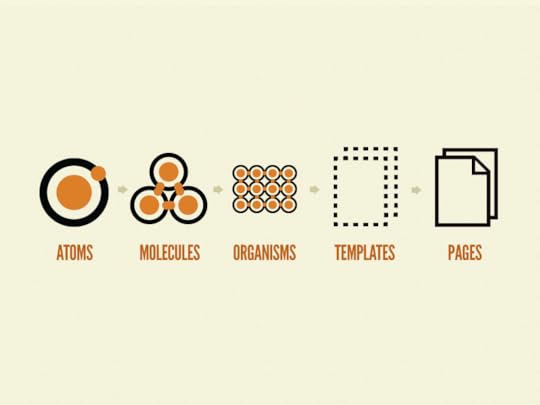
Above: atomic design representation by Brad Frost
Think of any site you visit frequently, or even one you’ve worked on. There are tiny elements, and there are massive elements. Often, tiny elements fit into (and make up) massive elements. In fact, this is true in most cases.
In conjunction with the above image, let’s define the variable types used in A/B tests.
Atoms: these are the absolute smallest elements on a page. Think icons, buttons, text fields, etc.
Molecules: these are complete elements; they consist of multiple atoms. Think search bars, option toggles, drop-down menus, etc.
Organisms: these are complete structures; they consist of multiple molecules. Think navigation bars, blog grids, sidebars etc.
Templates: these are essentially wireframes; collections of implemented organisms.
Pages: these are pixel-perfect, themed implementations of templates.
When constructing a testable hypothesis, the biggest challenge facing an A/B tester is simply to craft an explicit hypothesis. The explicitness of a hypothesis depends entirely on the size of the variable being tested.
Here’s what a bad hypothesis looks like for a hypothetical non-profit site:
“Adding more information for visitors on the landing page will increase the number of donors.”
Now, let’s say you see a conversion rate increase of 10% at a confidence interval of 95%.
The hypothesis, however, is poorly defined, non explicit, and difficult to prove or reproduce. What specific information helped increase the number of donors? The increased conversion rate can hardly be attributed to one reproducible element.
The issue is very simple: a lack of explicit variables (independent, dependent, confounding, etc) in their hypothesis. As a result, the test was ambiguous, and thus, unscientific and far from reproducible.
So, how do you use atomic methodology to pick appropriate variables?
2. Atomic Design Breeds Well-defined Variables
Due to the nature of atomic design, designers can focus on the effects of components of all sizes and functions. Whether they’re small, or large, you have strong (and documented) control over every variable that you test, because atomic design categorizes site elements by their size.
The variable types listed above do not share identical levels of impact on the results of A/B tests, nor are they equally weighted in terms of scientific accuracy. When conducting an A/B test, the smaller the independent variable, the more scientific the test due to less dependencies.
There’s a simple explanation: larger variable types, like organisms, consist of multiple smaller variables—this means that you don’t know which part of the organism actually had an effect on the observed data.
Use this knowledge as you develop variables for your A/B test hypotheses.
Always break your independent and dependent variables down to their smallest sizes. For the most part, your dependent variables will be conversions, so it’s hard to break them down. But when it comes to your independent variables, the smaller the better.
There are many ways to illustrate this concept, but Codal’s UX designers like to use the navigation bar to explain the scientific validity of each variable type.

Above: Call Potential nav bar – one of Codal’s projects.
If a UX designer were to conduct an A/B test on the above navigation bar, they may be tempted to make a blanket statement like this: increasing the visibility of the search bar will increase its usage.
The subsequent A/B test might consist of switching out the search bar for a different style or color, and measuring the impact.
But there is a danger in doing so.
Which specific aspect of the search is being measured for impact? It’d be difficult to answer that question. Is it the color of the bar? The placement of the text? The search prompt? It’s too easy to make a blanket change to an element, without doing so in an incremental fashion.
A better way to A/B test the search bar would be to follow this process:
1. Identify the conversion path you want to test
2. Figure out which elements are related to it. Start with larger elements, and work your way down to smaller and smaller components until you have a list of different “atoms” you’d like to test
3. Test each atom individually, and systematically to eliminate confounding variables
4. Make sure nothing outside of the selected conversion path changes while you conduct these tests – that is the mark of a truly scientific study
So, in the example above, rather than change the entire search bar, one ought to make a list of sub-elements (atoms) worth investigating, and test them individually. Such a list might look like this:
1. The search icon (color)
2. The text field (size; color)
3. Placement (center of header)
You could make an endless list if you tried. Regardless of length, keep in mind that each change to any particular element (color, size, etc) must be tested individually.
The point is to use the list above to make a good educated guess with your hypothesis, Sometimes, you’ll have multiple hypotheses. Often, the results from one test will spur a new hypothesis for another.
Such is the nature of science.
Grab design ebooks created by best designers
All for free
Download
 Download
Download
Download
 DownloadDo you want to know more about UI Design?
Download 'The Guide to Prototyping Process & Fidelity' FOR FREE!
Download e-book for freeClose3. Atomic A/B Tests Generate More Reproducible Results
How many times have you seen / read this article: “Company A increased CTR by XX% by changing just one thing”? Have you ever tried to replicate those results?
Good luck.
I doubt the testers who made those claims could replicate their own results on another page. There are a couple of reasons for this—the most obvious being that you can’t just apply the same variable changes to a completely different test environment and expect consistency.
Not to beat a dead horse, but the other prominent issue is just a matter of explicitly defined variables. It would be much easier to generate reproducible results if the case study in question said something along the lines of:
Changing the color of the search button from blue to white will bring enough contrast to the search bar that users will notice it and engage with the search function more often. Here are 30 separate tests to show reproducibility.
Reproducibility is so important. It is validity. After all, there’s a reason for the fact that reproducibility is a major criteria for publication in scientific journals.
Atomic methodology enables reproducibility by design.
The very nature of atomic design demands variable specificity. If you can show a particular “atom” to be tied to increases in one variable or another, then you’re giving readers a rigid framework for reproducing your results.
And if you’re not sure, it’s better to say “I changed this organism and it affected conversion rates, but I don’t know which molecules or atoms were responsible—here’s what was in there” than to say “changing this organism to a blue theme changed conversions”.
After all, was it the blue button? The white font on the blue background? The contrast created between the homepage and the search bar? There are many unanswered questions if you take the latter route.
Conclusion: Keep A/B Tests Scientific with an Atomic Mindset
If you want real conversion optimization, you have to be scientific and methodical.
And if you’re ready to take the “scientific plunge”, so to speak, there simply isn’t a better way to get the most scientific and methodological A/B tests than the atomic methodology. Not only is it easy to implement, but it gives your results validity.
Of course, atomic methodology alone will not guarantee valid results. You have to use it in conjunction with a rigid system of control over the test environment, as well as with incremental, systematic test practices.
Once you commit to all of the aspects of a scientific A/B test, you may discover that there is a wealth of easily attainable data at your fingertips, without the feeling that you’re taking a shot in the dark.
For more UX advice, download the free e-book Interaction Design Best Practices: Volume 1.

The post How to Use Atomic Design to Improve A/B Testing appeared first on Studio by UXPin.
October 18, 2016
Say Hello to Spec Mode and Our New, Improved Sketch Integration
UX designers who focus on UX are doing their job. Non-designers who express their ideas visually are trying to communicate. With UXPin, anyone can get their product ideas across with a few clicks. But it’s not enough to hand visuals over and hope for the best. Developers need collaboration too.
That’s why we’re pleased to bring you Spec Mode: a new way to get properties from elements in UXPin. No longer must developers pour over bland text documents; they can see exactly what they’re looking for and, with a click, get its colors, typography dimensions, use cases, sample code, and more.
This new tool eliminates time-consuming redlining of mockups, enabling a smoother handoff between designer and developer.

Spec Mode, available while previewing a prototype, displays the design’s major colors as hex values; dimensions and the space between them; and copy/paste the results into your code editor of choice.
When combined with UXPin prototyping, Spec Mode transforms static designs into interactive documentation. By consolidating code and design standards in one place, we create a “single source of truth” that doesn’t just show developers how a product should look — it helps them understand how the product should feel and behave. It all happens without the need for 50-page requirements documents or multiple designs to reference.
How it Works
The process is simple.
Drag-and-drop SketchApp files directly into UXPin for prototyping, or prototype with the editor. Then auto-generate design specs. Attach metadata to any element (more code snippets, use cases etc.) and never worry about them again — they’re permanently attached.
Benefits of Spec Mode include:
Eliminating guesswork and busywork. Designers no longer waste time annotating mockups. Developers no longer waste time hunting for elements’ properties (hex values, etc.) or assets, nor will they need to guess on placement of elements. It’s all auto-generated.
Development matches design. Spec Mode brings automatic clarity to designs being handed off to developers. Because metadata permanently attaches to elements, developers see everything in context — no need to switch back and forth between documentation and multiple designs.
Faster product development. Improved efficiency between designers and developers allows organizations to release better products more quickly.

This closes the gap between design and implementation. Organizations can now scale product development much easier than before while meeting important deadlines.
Design Systems
Spec Mode is a great way to help your team create an entire project design system. A “design system” is a collection of patterns, components, and guidelines to create unified UI. It’s a visual and interactive language that design teams use to keep their app or website on-message, easy to learn, and easy to deploy. When everyone has access to the same elements — and the same code snippets — they can quickly snap together interfaces when developing the final or beta product for live testing.
Design systems are not new, but they are growing more popular as companies embrace design as business solutions, not visual surfaces. Brad Frost’s Atomic Design principles gave us a high-profile example of thinking from the inside out with reusable components that create more flexible reusable components. And while not everyone agrees with his naming convention, designers are starting to incorporate the ideas into their work.
Take a simple search form. Better yet, take its individual HTML elements like the input field, submit button, label, and … tags. Each is a separate component that comprises a functional whole. Take any one of those away, and users can’t search.
Each of those vital parts can have its own CSS. That CSS applies to each submit button, input field, label, and element throughout the project. When done well, designers and developers alike can reference that code from the design system documentation — and even copy/paste it into their work verbatim.
That’s where Spec Mode enters the picture. Spec Mode is a repository of code we designed specifically to create entire reusable design systems.
Adding design system tools is one of the most ambitious projects that UXPin has taken on, so we’re separating it into multiple small projects starting today, with Spec Mode.
Not a UXPin user? Don’t neglect your dev team — get a free trial to try Spec Mode for yourself.
Join the world's best designers who use UXPin.Sign up for a free trial.Your e-mailTry it for free!
The post Say Hello to Spec Mode and Our New, Improved Sketch Integration appeared first on Studio by UXPin.
October 14, 2016
Show Us Your Space to Win the UXPin Giveaway!

Where does your daily creativity come to life? Don’t keep it in — share your awesome workspace with the community.
Join the conversation with a quick snapshot for a chance to win a UXPin notebook and water bottle.
Think your workspace isn’t “awesome?” You might be surprised. People love to see varied environments, and each one is unique. Even yours. You just might spark ideas to help people innovate their inspirational space.

How to Enter our UXPin Giveaway
It’s simple! To enter our contest, follow us on Twitter and tweet a photo of your workspace using the hashtags #UXPinGiveaway and #UXPinSpace. If you do not have a Twitter account, visit Twitter and follow the instructions to get on board. Twitter is free — however data rates may apply if accessing from your mobile device.
The promotion period begins 6 a.m. PDT on October 17, 2016 and runs until 11:45 p.m. on October 28, 2016. The last entry must be received by Sponsor by 11:59 p.m. PDT October 28, 2016. Three winners will be announced via Twitter on October 31, 2016.
Can’t wait to see where your creativity comes to life!
*No purchase necessary to enter or win this contest.
The post Show Us Your Space to Win the UXPin Giveaway! appeared first on Studio by UXPin.
October 12, 2016
A Practical Guide To Invisible Design

With examples from Dropbox, Gmail, and more, here’s a no-nonsense guide to creating user experiences that are so natural, they feel invisible.
When you examine the most successful interaction designs of recent years, the clear winners are those who execute fundamentals flawlessly, like Gmail’s autosave function and Uber’s credit card entry form. They feed off natural human behavior, then quietly remove barriers without us ever noticing.
When we talk about invisible design, we aren’t just describing minimalism. Minimalist interfaces are certainly a way to achieve invisible design, but they are not the goal.
The goal is to create an interaction system that naturally aligns with the user’s mental models. Simple user flows, clear visuals, and forgiving design help create the illusion that the user’s abilities, not the designers’, allowed for a seamless experience. Remove any sign of your ego from the interface, and the user will start to feel like the hero.
Simplify your user flows
A simple user flow doesn’t always show off your design skills, but it does help users achieve their goal. Here are some ways to get users to their goals faster:
Fewer steps — List out the steps required to complete a task, then remove redundancies. For example, to log in a user (1.) clicks in the username field, (2.) types their username, (3.) clicks in the password form field, etc. You can see how, if you make the default cursor position start in the username field, you shave off an unnecessary step. Try listing them out backwards for a fresh perspective.
Simpler steps — The goal is not to make as few steps as possible, but the simplest steps. Make an interface that’s self-explanatory, and don’t bog down users with too many decisions. Don’t obsess over the three-click rule, the idea that users will leave your site if they have to click more than three times, but recognize the spirit behind it.
Map user flow — Jessica Downey has a helpful method for mapping user flow. Ryan Singer of Basecamp has a similar but faster approach.
User testing — Guesswork is unreliable. Test at least five users to see how they instinctively try to complete a task. This gives you more informed data when applying the other steps above.
Let’s look at three examples of simplified user flows in action (as further detailed here):
1. Uber
Credit cards are notoriously tedious to enter, especially on a mobile phone, but Uber lets users snap a photo of their card to capture all of the information.

Uber
They’ve shortened the payment user flow from:
Type in First Name
Type in Last Name
Type in all digits of credit card
Type in security number
To simply:
Take photo of credit card
For a user, the experience isn’t just useful, it’s nearly magical.
2. Dropbox
Dropbox’s entire service is a simplified user flow of the otherwise tedious task of uploading and downloading a large number of files individually.

Dropbox
Dropbox created a much faster shortcut by introducing system folders.
Going in, most users are already familiar with how folders work, so this is simpler for them. But more importantly, they can upload/download all their documents in one or two folders. Add to that a simple drag-and-drop functionality.
3. Oscar Insurance
Other insurance sites typically have multiple form fields with information that’s not always relevant. Oscar Insurance brings the industry up-to-date with a modern—and simple—form entry.

Oscar Insurance
Other form fields aren’t revealed until the current one is answered.
This prevents too many fields from overwhelming the user, and clearly shows him or her the next step. And the entire process is simplified with the use of a “Mad Libs” UI pattern—this makes getting an insurance quote almost enjoyable, something no one would’ve ever guessed possible.
The semantic forms match the way users think, making the design feel invisible. The barrier between the user wanting a quote and completing the process is dramatically reduced.
Communicate clearly
Every time a user is confused, it adds friction. Clear communication is the ultimate goal of invisible design.
Everything in an interface is communicating something—spacing and size communicate importance, colors communicate mood, styles communicate atmosphere, and so on.
All the individual messages must combine to communicate in sync. With as little thought as possible, a user must know what a site or app does and why he or she should care.
Follow this checklist to make sure your meaning is clear, and therefore the design invisible:
Interactions rooted in reality — Whenever possible, use human mentals models from everyday life. For example, increasing volume is often represented in images moving upwards or getting bigger. This just feels “right.”
Legibility — For clear communication, all text must be readable. Stick to the proper guidelines for spacing between lines/letters, and useColor Safe to determine the ideal font colors to contrast clearly against the background.
Consistent mood — You wouldn’t use a casual typeface for the subtitle to a tragic photograph. Keep a unifying theme for all imagery, typefaces, and colors to set the mood you want, and tie everything together nicely. This includes content, like the subjects of images and the tone of the copy.
Signifiers — Easily recognizable UI patterns are automatically understood from the user’s previous experience on the web. Signifiers, like a play button over an image to signify video, send a universally understood message without wasting time.
Microinteractions — Small design choices, like an interactive element changing color when hovered over, can fill in the cracks in how your interface works. These subtle cues often communicate without the user even realizing it.
Let’s see how these principles are applied in the examples below:
1. Integrated Podiatry Clinic
Long scrolling sites must immediately communicate their method of navigation, otherwise users might be confused by a lack of menus.

Integrated Podiatry Clinic
The Integrated Podiatry Clinic solves this problem using signifiers and users’ own mental modes. The door arrow at the center bottom is enough to suggest scrolling, especially with a minimal design, which keeps users from getting distracted. Some users may even recognize the signifier from other sites.
Notice what the visuals say about the site and the company: the gray color has the appropriate professionalism of a clinic, while the feet image and clever tagline make it feel human at the same time. The step lego in the bottom right maintains the podiatry theme.
From the clever copy to the soft tones, the interface is designed to communicate that the clinic is staffed with experts who care about their patients.
2. Future Water City
Future Water City uses microinteractions and signifiers to explain what would be an otherwise confusing interface.

Future Water City via Awwwards
Because the circled numbers aren’t a strong enough signifier on their own, they periodically pulse with color to show that they are interactive.
Microinteractions with the cursor also show how the site work. When it hovers the map, it turns into an open hand (signifying click-and-pull navigation). When it hovers over a number it turns to a single finger (signifying clickability).
From a user flow standpoint, the interaction design also shortens the perception of distances between different types of content. For instance, when you click on a numbered bubble, a slideout appears on the same page, which you can click to trigger another slide-out that explains the product.
You don’t move from page to page. You move between frames on the same page.

Future Water City via Awwwards

Future Water City via Awwwards
Technically, the content is presented in the same number of steps, but the smooth transitions between frames creates the illusion of weightlessness.
Forgive your users
For a truly invisible design, the UI must always forgive user errors. If a user makes a mistake that can be fixed easily (or the design prevents a mistake), the user feels empowered.
Consider the following tips:
Undo vs. Confirm — Popular opinion is that Undo creates a smoother interface than Confirmations about consequential actions. AsAza Raskin explains, users develop a habit loop with popup windows, where they might click “Okay” before fully understanding what they’re confirming. Moreover, making confirmation windows flashy or embedding them with an activity that requires thought (like typing a specific codeword) doesn’t work either—such bells and whistles only distract the user from her decision, or irritate her so that she leaves the window even faster. An Undo feature accounts for the habit loop instead of challenging it. There are some exceptions, namely when undoing is complicated, as with publishing something publicly, or for critical actions (like deleting a whole email database).
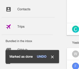
Inbox
Forgiving format for inputs — Input forms can be confusing: for example, in Yelp, users may want to search for type of food or a specific restaurant. The forgiving format UI pattern allows users to type in what they want, then sorts it out on the back end. Announce this feature through input hints, like Yelp’s placeholder text, “tacos, cheap dinner, Max’s.”

Yelp
Autosaving — Cheap data storage makes autosave a great protection against users losing data, whether caused by human error or something else, like a browser crash or power outage. To maximize its effects, create a subtle indicator (see Gmail’s example below)—something that doesn’t require interaction, so not to distract.
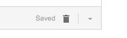
Gmail
Exceptional error feedback — You can’t always defend against errors. When they do occur, provide feedback in a helpful way to get users back on track. Clearly explain what happened and how to rectify the situation. Provide a call-to-action for the next step. Keep it succinct; users will likely be skimming anyway.

Team Treehouse
Conclusion
The point of invisible design is to get out of the way as much as possible.
Any elements that threaten to distract the user from his goals should be removed, no matter how much the designer likes them. Learn to separate which aspects are genuinely impressive, and which are only impressive to other designers. If your users don’t notice how much effort you put into the design, that means it’s working.
For more UX best practices, check out the free 2016 UX Design Trends Ebook Bundle. The bundle includes 350+ pages of advice and 300 examples of the best UX, web, and mobile designs.

“Originally posted on FastCo. Design”
The post A Practical Guide To Invisible Design appeared first on Studio by UXPin.
UXpin's Blog

- UXpin's profile
- 68 followers

