
UXpin's Blog, page 130
April 13, 2016
UX Best Practices: Designing the Overlooked Empty States
A blank canvas is both exciting and intimidating. As the famous renaissance artist Michelangelo once said:
“Every block of stone has a statue inside it and it is the task of the sculptor to discover it.”
In other words, within an “empty state,” there is infinite potential. All that stands in the way is the task of design.
Empty States and Inattentive Design
Empty states represent a pivotal point in the user journey. Each is an opportunity to build rapport, drive engagement, educate, entertain, or delight the user.
There are three primary empty states that we encounter in UX:
First use. The user begins to interact with the application/site.
User cleared. The user has just completed a task or cleared all content associated with the app or site.
The user has encountered a roadblock during the interaction.
Despite the fact that empty states can engage users, they’re often overlooked or given short shrift during design and development. Designers can become more focused on the interactive aspects of their work, and not think incorporating them, while developers may occasionally build empty states by default.
You Only Get One Chance to Make a First Impression
Every app has to start its users somewhere—and that means taking a blank canvas and painting something useful on it.
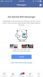

Image credit: Emptystat.es
Examine the install screen of Facebook Messenger. There’s a lot going on within this relatively small space:
It lets you know that you can take pictures or record video in-app
It exerts a little social pressure by telling you how many of your Facebook friends are using the app
It gives you the opportunity to look up additional information about the app before installing
It even has an adorable little graphic to boost engagement
The user may have just arrived at this screen expecting to touch install and be done with it. However, once they arrived, they were met with encouragement and education.
While the screen may have started empty, it became a vehicle for increasing adoption.
Mission Accomplished!
There may come a point within the use of a design where there’s no task or content available to the user. This is the “user cleared” empty state. It’s a fantastic opportunity to prompt users toward new interactions or congratulate them on a job well done.
Within a design, one of the most important components is feedback. Feedback acts as both a placeholder and a reward. It aids in the forming of habits and builds appreciation for the completion of a user task. These “user cleared” empty states are therefore very important.
After a user has finished a task, it’s essential to do three things:
Step 1: Inform them that their tasks are complete/that they’ve run out of data
Step 2: Reward them for accomplishing their task
Step 3: Offer them a next step.
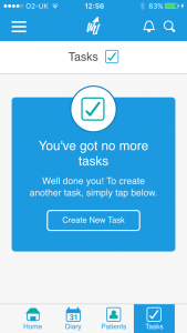
Image Credit: Emptystat.es
In our example above (taken from the WritekUpp app for iOS), clearing your task list is certainly a positive achievement, so it’s no surprise that the screen offers a congratulatory “Well done.” This is a much needed bit of positive reinforcement.
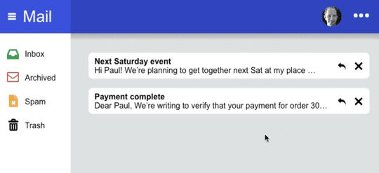
In contrast, the following example from the mobile Gmail app only notifies users that tasks are complete or that they’ve run out of data, skipping the other two steps.
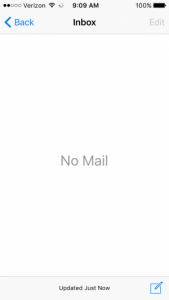
Image credit: usertesting.com
I don’t know about you, but if my inbox ever reached zero, I’d be in a celebratory mood. This truly empty state misses out on a chance to capitalize on the delight of the user, and offers no next steps to keep them engaged. Rather than feeling elated and productive, looking at this screen makes you feel bored and perhaps a little lonely that no one has anything to say to you.
Messages should celebrate achievements.
In the above mid-fidelity UXPin prototype, I created a congratulatory message with a twist. Not only does it compliment people on reaching inbox zero, but it also gives them the chance to Tweet about their accomplishment.
Best of all, it’s unexpected.
Mistakes Were Made…
Just as a congratulatory response is significant in the user cleared empty state, reassurance can be absolutely vital when dealing with an erroneous empty state.
Errors are inevitable and can happen on both ends (the user and the app/site). What’s important is letting the user know what went wrong, and why.

Image Credit: Emptystat.es
This example, taken from the App Store, illustrates the concept. Users arrived at an empty page when they were expecting a fun new app. Unfortunately, the user ran into a roadblock when said app wasn’t available in their area, and was then immediately informed of the reason.
This is a minimalist example, and none too delightful. The user isn’t given any consolation prize, nor are they offered a next step. They are, in all likelihood, left frustrated by the missing app—despite being armed with the knowledge of why it’s missing.
Injecting a bit of personality in this empty state could make all the difference. Take a look at this example from Piccsy.
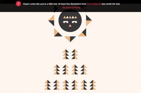
Image Credit: Piccsy
A little humor can go a long way in helping the user feel better about their misstep. This page reassures and consoles. It lets the user know they’re a bit off track; offers a look at some attractive illustration; and offers a way back to the site. Basically, everything a user might require if they’ve committed an error.
404 pages are another example of turning an error into a positive user experience.
These pages are usually dismal, boring, and inconsequential to the overall appeal of a design. However, some sites/apps take the time to include engaging content within their 404 pages.
IMDb has a particularly clever method of dealing with 404 pages in which they display cleverly altered movie quotes to their users:

Image credit: IMDb.com
The lesson here is nothing in your design has to be boring or completely blank. Even errors are opportunities to score extra points with your users.
Conclusion
You empty state should never feel empty.
Whether a user stumbles across the blank state due to first-use, accomplishment, or error, your product needs to guide them along to the next logical step. Think of an empty state as a slight pause rather than a full stop.
Orient the user, offer some tips to get them back in the flow, then get out of the way.
For more practical UX advice, check out the free e-book Interaction Design Best Practices: Mastering the Tangibles.

The post UX Best Practices: Designing the Overlooked Empty States appeared first on Studio by UXPin.


Are Prototypes Worth the Effort?
Picture this: a designer sketches 20 attempts to solve a design problem. None of them hold the answer, but one might start a path that leads to the final product.
The sketch becomes a wireframe. The wireframe becomes a prototype. The prototype becomes a product. And the product wins loyal customers — or so we hope.
The process of churning through lesser concepts is like groping in the dark. What makes sense on paper isn’t always obvious to people new to the project. And while the advice of “test early, test often” resonates within many design teams, implementing ideas is easier sketched than done.
Thinking in Flows
Everyone we’ve talked to has a different approach — but all share a similar goal. Beyond “what will it look like?” UX designers ask “what happens next?”
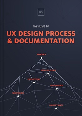
As we outlined in the ebook The Guide to UX Design Process and Documentation, User flows tell the story of how people traverse pages in a site, literally the users’ experience. They help designers imagine what users are thinking at each point, and what may compel them to continue.
For example, a user may visit a product marketing site after following a link from another site. Already we know they’re curious about the product. After skimming over the home page, what do they do next? Designers need to decide what steps users should take that will persuade them to buy the product. Each step must compel the user to move to the next until they reach the all-important “buy now” button.
A good prototyping tool lets designers link elements in a user interface to other pages or views so the team can explore the user’s journey, prune steps that don’t make sense, and reinforce those that do.
Start and End With Users
When constructing user flows, designers should start with the obvious: their users. Knowing who they are is crucial to tailoring the experience to their needs.
“Personas” are brief descriptions of who those users are likely to be. Granted, we can’t know every user who visits a website or app, but we can take some educated guesses.
For example, people visiting a furniture website are either looking to buy or saw something that piqued their curiosity. Both types are important, and require different flows. The first type is likely to need fewer steps to purchasing. They’re on the hunt for something with specific requirements. Giving them the tools they need to search and maybe customize their order is paramount.
The second type need more persuasion. Great photos and great text may accompany persistent — yet unobtrusive — opportunities to buy what they see.
User flows must account for both cases. But how designers reach that point is as varied as the users for whom they design.
Prototyping Processes Vary
In our latest Twitter chat, we asked people how they work.
Sketching
Many designers start with pen (or Sharpie) and paper, hashing out rough ideas in minutes before they settle on ideas to mock up.
Pros: fast and easily disposable.
Cons: may not get the idea across.
Straight to (digital tool of choice)
Other designers are more comfortable with their digital tools than their sketching skills. They can jump straight into their tool of choice (ahem) and knock out prototypes to share with their team and clients.
Pros: wireframes can look sharp when presenting to the team or clients.
Cons: can take longer than quick sketches, and requires familiarity with the tools.
Straight to code
Code-savvy designers may choose to dig into the ones and zeroes as they work. With or without a HTML/CSS framework, this approach is the most technically sound, but can lead to troubleshooting bugs before the ideas are even refined.
Pros: if you get it right, you know it’s technically viable
Cons: that’s a big “if.”
Conclusion
There’s a funny assumption that one’s tools are critical to one’s design. And while they certainly influence a designer’s workflow, it’s the idea of prototyping that really matters. The process of developing a site that works requires us to think about how users walk through it. Whether that process takes place on paper or code, or somewhere in between, is up for grabs.
In the end, it’s designers’ responsibility to test their work by whatever means they choose. Failing to do risks success by chance rather than by design. Prototyping tools don’t solve problems. Designers do.
Join us next week for another #uxpinchat!
In this week’s chat
.@uxpin Whiteboard sketches to code has been my go-to process of late #uxpinchat
— Michelle Matthews (@michematthews) April 8, 2016
@uxpin We always start sketching our brainstormed ideas, then we lo-fi prototype & then we drink coffee! #uxpinchat
— CastilvzDSGN (@CastilvzDSGN) April 8, 2016
I always start with a pencil and paper. Then move on to different methods depending on project. #uxpinchat
— Leon Baham (@leon_rising) April 8, 2016
@whtmnk Sure, but you've not seen my sad, sad sketches :( #uxpinchat #twolefthandsbutimrighthanded
— Michelle Matthews (@michematthews) April 8, 2016
@uxpin I had a bad habit of just breaking open Photoshop and start on mockups. But now I start with sketches and tree structures #uxpinchat
— Aaron Jackson (@jaxxthedesigner) April 8, 2016
@aduszkiewicz @uxpin Have an arsenal of tools and I pick the ones best suited for the client's comfort. Pivot if it doesn't work #uxpinchat
— Michelle Matthews (@michematthews) April 8, 2016
@uxpin Mockups and prototypes begin w/ a goal: what message is sent or product sold? Whiteboard brainstorm, then blueprints. #uxpinchat
— IselianGaming (@IselianGaming) April 8, 2016
A2. Sure thing! it's cheaper than dev's work and helps avoiding potential flaws in initial assumptions.#uxpinchat
— Krzysztof Stryjewski (@whtmnk) April 8, 2016
@whtmnk yasssss post it notes

April 11, 2016
UX for Beginners: Defining the Design Problem

You’ve heard it before: design is about solving problems.
Whether it’s building a new playground or developing a mobile app for pet groomers, there are multiple ways to satisfy a project brief. However, in order to design a product that successfully delivers business value, it is critical to first clearly define the design problem.
Ask your clients these three key questions at the start of every project:
What is the business objective?
What is the context of product use?
What are user goals?
What is the business goal?
This is the most critical question that some design teams still don’t ask stakeholders.
Understanding business objectives helps your design because it allows you to drill for more specific information. Follow-up questions can unlock a wealth of insights that influence the design approach:
How do you know this is an issue?
Who is affected by the issue?
When and how often does this occur?
What benchmarks do you have and what change do you expect?
Imagine that your client aims to reduce tech support calls for an e-commerce site.
If customers struggle to complete purchases, drilling into root causes might reveal that logging into an account is a major hinderance, or that the website refuses to validate shipping addresses. Interviews with tech support teams can also reveal pain points that customers are experiencing.

Understanding business goals also helps the design team focus and refine work through iterative user testing before full product launch.
For instance, if time on task is expected to decrease by 15% following an interface-lift, that’s a clear target to test against with prototypes.

Lo-fi collaborative prototyping in UXPin
What is the context of use for this product?
Answers to questions using where, why, when, how often, and so on, describe context of product use and elucidate multiple design decisions.
At a macro level, context informs what technology should convey the design. At a micro level, context places restraints on interactions and the visual treatment of the interface.
Imagine a food manufacturer who wants his quality control technicians to enter production data (such as oil temperature) on a kiosk-based laptop on the factory floor. On the surface, this is a simple problem. But would this be a wise technology choice if the technicians have to enter multiple production values every five to ten minutes? A tablet that the user can carry would be a better choice given the context of use, but if the client doesn’t volunteer such information, how could the design team know to make this recommendation?

Technology platforms have their own sets of best practices and capabilities. However, designers still have to consider interactions and visual treatment of the interfaces.
For instance, an athlete might count out loud a number of burpees to her smartwatch, yet ambient noise could obscure her voice commands. Similarly, luxurious colors and fancy button animations are suitable for a gaming app but not for a paramedics’ emergency response devices when used at night.
Drill deep to understand the intended context of use by interviewing and observing users in their environment. Do not assume that your client has done the necessary research to uncover the needs of her users, or that she understands the implications of context requirements on the design.
What do users expect?
Business and user goals can be very different. Successful design finds common ground to satisyf them both.
Business stakeholders are often biased or completely naive about their users, making it all the more important to conduct research directly with the intended audience. Understand not only what users need to do, but also what motivates them and what attitudes they have toward their tasks.
When business and user objectives are mapped out, designers should create user flows that support desirable user behavior while satisfying user needs and aligning with their attitudes.
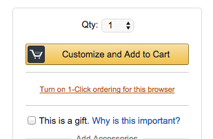
For instance, Amazon prompts shoppers with additional products while at the same time offering hassle-free one-click ordering. Similarly, TurboTax has helped its success by using clean and playful design that supports users during a task they likely find tedious, unpleasant, or even anxiety-inducing.
That said, a fine line exists between supporting users and driving the client’s business. Calls to action that appear too frequently, or lack of information to drive user decisions will fail to satisfy either the users or the business.
Conclusion
Design briefs present a problem that can be solved in different ways.
By investigating business objectives, context of product use, and user goals, you’ll gather necessary data that helps narrow down and refine a single design approach.
Data—rather than assumption-informed design—is the secret sauce of successful business products. You just need to ask the right questions.
This article only covers the surface of the UX design process. For more in-depth UX advice, check out the free 100+ page e-book UX Design Process Best Practices.

The post UX for Beginners: Defining the Design Problem appeared first on Studio by UXPin.
April 8, 2016
Web Form Design Best Practices: 5 Useful UI Patterns
From a technical standpoint, forms are easy. A dollop of HTML, a dash of CSS, a serving of your favorite back-end code, and you’re ready to go. But your users aren’t.
User experience requires more than good-looking visuals with robust code. They need to guide users along a path, hint at what’s expected, and deliver on what’s promised.
People don’t use forms for the fun of it. Whether it’s to get information, sign up for a service, or buy a product, they want results for their efforts. The best forms guide users along with minimal fuss.
Here are 5 effective UI patterns for improving UX and conversions.
1. Mad Libs Forms


Problem
Entry fields are too vague or too mundane.
Solution
A fill-in-the-blank format provides context to the information and lightens the mood. This style adjusts to natural thought processes, rather than appearing like a data-collection machine. Mad libs are more relaxed and explain the function clearly to avoid confusion, especially compared to single-word descriptions of other form fields. They also provide the opportunity to showcase your site’s personality. Studies even suggest this pattern can lead to an increase in conversions.
Tips
Underlining the input field is more natural and informal than a form box, reminiscent of mad libs and other games.
Phrase as a first person narrative, or as the user’s command to the system.
While this pattern adds life to standard data entry like sign-ups, it can have the opposite effect with too much information. If you need more than a few sentences, a more traditional form field strategy would be faster.
2. Forgiving Formats


Problem
It’s unclear which format to use for a form field.
Solution
Accept multiple formats.
Forgiving formats provide users a great deal of freedom and convenience, reducing the likelihood that they blame themselves for the system’s UX shortcomings.
Tips
Typically, this works best with in-line hints so the user knows they have options. You can bypass this step, however, if the input hints add unnecessary length. For example, Airbnb does not include input hints since writing “ZIP, Country, State, Province…” etc. would defeat the purpose.
Works great for logins, where users can choose between their username, email, etc., depending on which is easiest for them to remember.
A must for database sites (like IMDb), which specialize in different categories of content.
Verify with your developers whether the scope of information is narrow enough for the system to handle.
3. Stepped Forms (Wizards)

Problem
A service or function requires a large amount of data input.
Solution
When there’s a large amount of data entry, as with certain services or purchases, break up the process into smaller sections presented one at a time. As recommended in Interaction Design Best Practices, this makes inputting much more manageable, even though it’s the same amount of information.
Moreover, sometimes early data influences later data. For example, choosing between international or domestic delivery will change the shipping options. For these situations, a stepped form creates the right pace by preventing unnecessary information.
Tips
Use the completeness meter pattern (described next) to show users how long the total process will take.
Large amounts of input are taxing on users, even with the stepped form. Eliminate any data that isn’t necessary, and keep the number of steps to the bare minimum.
If your form requires 5+ steps, consider adding a “Steps Left” pattern to show how many remain.
4. Completeness Meters (Progress Bar)


Problem
The user is anxious about how long certain processes take, and may leave because it’s taking too long.
Solution
Inform users of progress with a completeness meter.
Completeness meters are commonly used for:
Onboarding/tutorials
Profile completion
Form completion
eCommerce checkout
Percentages or number of steps are standard, although there’s room for creativity. LinkedIn, for example, gives nicknames like “All Star” to match the amount of the profile the user filled in.
Completeness meters alleviate user concerns about time commitment, and incentivizes them by creating a sense of “incompleteness”.
Tips
If your metric is the number of steps, try phrasing such as “Step # out of #” to concisely tell both how many steps there are total, and how far along the user is at the moment.
If the amount of steps is daunting, consider sub-steps. For example, Amazon’s checkout completeness meter lists only four steps (“sign in,” “shipping & payment,” “gift options,” “place order”). However, the “shipping & payment” step breaks down into three smaller steps.
5. Emphasize the Benefits
Problem
So your site or app has convinced people to act. That’s great, but users are a fickle bunch. Smart forms find subtle ways to remind people why they’re providing information, even as they do so.
Solution
Add messaging to the form that reminds people what they’re getting at every step. You can do so with instructions — “fill out this form so we can mail you a free gift” — or with the UI itself.
Tips
Put messaging into buttons. For example, if your form signs people into a service, say “join us” instead of merely “submit.”
Keep messaging short. People who’ve decided to fill out the form often gloss over instructions. Try to keep the promise to one sentence.
A Practical Example
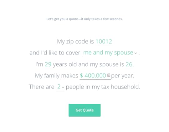
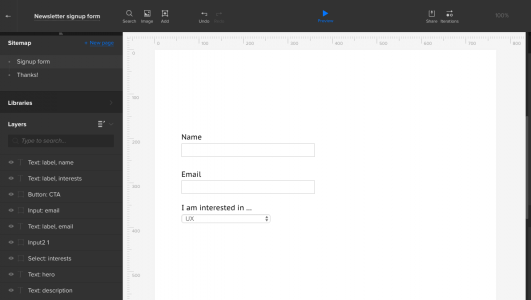
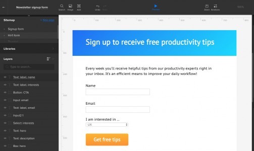
Now it’s time to put these techniques into practice. In this lesson we’ll tackle a common design problem: convincing users to fill out a form. We used UXPin to build out the medium fidelity prototype below, although the concepts apply to any design process or tool.
With the medium fidelity prototype below, our goal is to create a smooth flow of content on the form – pixel perfection comes later.
1. Choose the right fields. The less effort people have to expend, the better. For example, use “name” instead of separate “first name” and “last name” fields if your database allows. In this case, we ask for three things: their name, email address and what they want to learn.
2. Spell out the benefits with copy. Even if the user arrives knowing what they’re after, reiterate the “Sign up to receive helpful productivity tips every week” is stronger than “sign up to receive our newsletter.” Notice that even the submit button reinforces the benefit, not the action.

3. Don’t hide anything — but don’t overwhelm. People appreciate knowing that there are no hidden fees, unintended product signups, or other gotchas. Walls of text will impede signups.

4. Simplify and clarify. Spell out what’s expected in each field while removing labels from as many form fields as you can.
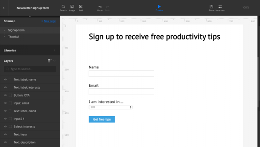
5. Flesh it out. Once you’ve iterated with feedback from your team and client, turn your wireframe into a high-fi prototype with colors and typography. Notice that we’ve waited until this point to use the “mad lib” technique, and have filled in the text fields, making them less mundane.
6. Follow up with a great “thanks!” message and, if possible, an extra gimme to keep them engaged. “Here’s your first tip … ”
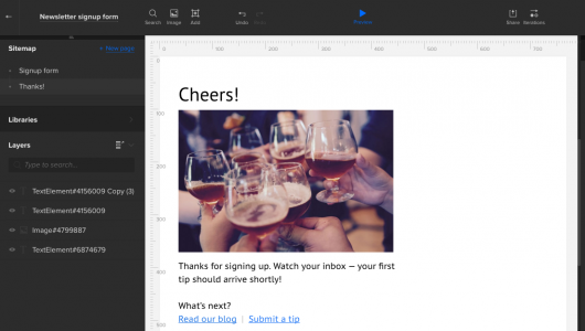
The result? We now have a visually engaging form that indicates what formats users should use, all in a two-step signup process. Cheers!
Conclusion
There’s more to form construction than code and visuals. Best practice is to put the steps in context, simple messaging, and generally convincing people that using the form is in their best interest.
In the end, it’s about making decisions that make things easy for the user. Forms that convert are forms they don’t mind.
Join the world's best designers who use UXPin.Sign up for a free trial.Your e-mailTry it for free!
The post Web Form Design Best Practices: 5 Useful UI Patterns appeared first on Studio by UXPin.
April 6, 2016
Getting to Yes: Presenting and Defending Design

The sales team might sell the job, but the design team sells the product.
While it’s frustrating to compromise on usability or experience because stakeholders request changes, it’s part of our job as designers to ensure that only happens when a positive outcome is in store.
When working together on a design project, nudge gently and respectfully to persuade clients, stakeholders, and/or coworkers to your line of thinking.
Here are a few tactics for gaining buy-in the next time you share a design with clients or team members. First, learn how to best present your work and the ideas behind it, and then learn to defend your decisions in a productive way.
Presenting Design
The first half of “getting to yes” with clients or stakeholders is presenting your work—and no one can sell design like a passionate designer. Here’s how to take advantage of that.
1. Present only one option—the right option
We learned this early at Brolik. It was commonplace at that time for advertising agencies to show multiple mockups to clients in a pitch.
We noticed that one mockup would always be a clear favorite internally, while the others just filled out the pitch. But clients seemed to never choose our favorite.
We challenged the status quo at the time and started showing a single, strong solution instead of multiple mockups. We explained why we only had one design and why we arrived where we did, and then we listened to feedback. The results were instantly better.

Due to the current Lean and Agile movement, multiple high-fidelity mockups are thankfully going away, but it’s worth noting a few things:
Multiple choice means more second guessing. That’s bad.
Spending time on a “second choice” design means time isn’t spent on the best option.
Design is about problem solving, not opinion. There’s ultimately only one right answer.
Explain the why
In good design, there’s thought behind every decision, and sometimes clients just need to know that.
They might not know what goes into the design process, but if they feel like you’re glazing over the details, it can lead to distrust—and that’s an intangible expense you want to avoid. People also like to debate specific reasoning and design decisions, which is perfectly helpful and should be encouraged.
If they don’t agree, don’t fight it; just make sure you get your “why” on the table to frame the discussion. Be straightforward, relating all your points back to hard usability data and business goals.
In the below example from the UXPin team, notice how Marcin Treder opens up his first comment by immediately referencing user research. Since he’s already set the precedent for evidence-based design, he can cite that same research when responding to further comments down the chain.

3. Be passionate but honest
At a client or stakeholder meeting, it might feel inappropriate to be honest about bumps in the process or to admit that your assumptions were wrong, but a little vulnerability goes a long way.
Talk openly about frustrations. You’ll usually get some laughs, and in the process, everyone in the room will be better aligned with your solution. Also talk about your favorite part(s) of a design, pointing out areas where you went the extra mile and feel proud of the results. If you show that you own the work, stakeholders will instinctively trust you more.
At Brolik, we act and speak passionately when we present our work, and it’s been a success with clients. For example, we might openly tell a client, “We’ve never done a site like this, but it’s the best website we’ve ever built” (if that’s the case). The honesty goes a long way to opening positive lines of communication.
Defending Design
The second half of getting to yes is defending your ideas after you’ve presented them.
It’s not always easy to graciously accept critique of your work, especially when it’s dismissive, but here’s how to do it in a productive way that ultimately helps achieve your goals as a designer.
1. Counter opinion-based comments with logic
Whenever a project stakeholder suggests a change, ask them why. Keep peeling back layers of “why” until you’ve gotten to the core of the client’s issue. Since it would be annoying to repeatedly ask “why” (like a three year old), we frame the question in useful and non-condescending ways.
One method is to ask for facts or statistics to back up someone’s opinion. As you can see in the comments in a recent project from the UXPin team below, the dialogue needs to be a helpful exercise, not a personal challenge.
It should be something like: “That’s an interesting perspective. Have you seen any data that brought you to that conclusion or is it more of a gut instinct?” When they say it’s a gut instinct, you can reframe their situation from a user’s perspective: “While that makes sense, as a user, if I were going to X, I’d most likely need Y and Z to happen first. I’ve seen case studies that back this thinking up, as well. I’m happy to send over those if you’d like.”
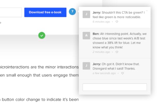
It’s harder to argue with logic. Some clients let their egos get the best of them in the moment, but I’ve found that good logic backed by user testing and user research will usually set in with time and eventually win out.
I’ve found the easiest way to present user data is to let the facts speak for themselves and empathize with clients or other team members whose assumptions were wrong. The second an “I told you so” attitude creeps in, everyone will shut down. Instead, I like to take the stance of “I’m just as surprised as you are. Data is a crazy thing. It’s a good thing we did this testing, though!”
2. Back up decisions with articles
Your clients are not usually up on the latest industry research and information. So share it with them!
Starting on the same page and aligning assumptions goes a long way toward reaching a happy conclusion. And industry knowledge is also useful for helping to back up your original decisions. Sometimes just showing that an article exists is enough to convince a client of your argument.
I think A List Apart is a great source for articles that demonstrate the level of thought that goes into design decisions, and usually in a way that doesn’t bore non-designers. Smashing Magazine is another great resource that gives credibility to the work we do.
I’m convinced that the actual content you share with clients is of less importance than the simple act of sharing. Sharing shows you’re passionate and thoughtful, and it also shows that our industry is nuanced, well-educated, and professional (as opposed to the classic “my nephew can do my website” view).
3. Filter comments for their true meaning
When someone else critiques your design, they’ll usually frame their critique in a solution. Your job is to find the core problem hiding in that feedback.
Identifying the root issue takes practice and skill, but the first step is to ask them why. Dustin Curtis’ 3 question rule is a great investigative tactic. In the below example, you can see how to apply this tactic to close out comments faster.

Photo credit: Recent project by UXPin product team
In the same way that presenting why is important, it’s equally important to require someone with an opinion to explain their own why. Asking that simple question is often enough for someone to really think about what they’re fighting for.
If they still push, the next step is to present alternatives in a non-threatening way. By that I mean, “I see where you’re coming from, but I’ve seen other sites do X, Y, and Z.” If you’re comfortable enough, follow with: “Will your idea be more effective than those solutions?”
We can’t always reach decisions this way, and at some point, it comes down to who’s paying the bills. That’s one reason I believe in the single decision maker philosophy. Every decision should always come down to one person. If we establish this ahead of time, we can avoid the dreaded pitfall of design by committee. The decision maker can take everyone’s opinions into consideration and make the final call, which is typically a productive compromise based on everyone’s feedback.
Ultimately, though, being open to compromise is half the battle. Designing for clients (or for your boss) isn’t a win or lose contest. There’s almost always a way to give someone what they need without completely catering to their wants. It may require creative thinking, but the result is a more informed final product.
Get comfortable with not always being right
Most importantly, realize you’re not always right. No two design or business problems are exactly the same. Clients know their business and audience, so they’re a valuable resource for solving their specific design challenges. Remember to listen to them.
Also remember that it’s not a “right or wrong” contest. It’s easy to let our egos make it into one, but in design, we’re all on the same team.
If you don’t own or run the business, remember that, too. You can only do so much. It’s a designer’s responsibility to do our best job and offer the best solution, even if that means fighting for it, at times.
At the end of the day, don’t kill yourself over the small battles; just remember that the more we pay attention to how we’re presenting and reacting to feedback, the easier it will be to get to yes for the decisions that matter.
If you found this article useful, check out the free 100+ page e-book UX Design Process Best Practices.

Feature photo credit: Nitesh Jain via Sumo Logic
The post Getting to Yes: Presenting and Defending Design appeared first on Studio by UXPin.
April 4, 2016
5 Reasons Freelance UX Projects Fail

The ever-so-popular saying, “Fail faster” should always be followed by “… and always learn from each misstep.”
If you adopt this mentality, you’ll discover that failure is an incredible opportunity to learn something about yourself—both as a UX professional and as a persevering entrepreneur.
If you’re a freelance UX consultant, that sense of perspective becomes even more important. Painting a clear picture of each consulting gig is the groundwork for correctly positioning yourself to bring the most business value to a project. Failing to do so can lead to projects that go horribly wrong.
If you’ve been hired as a UX consultant, chances are that at least one of these scenarios must be true:
The client has a smaller budget, smaller scope, or a limited amount of time to devote to this particular project—otherwise they would have hired a pricier digital agency.
The client has a digital team in place and just needs a boost or a fresh perspective on the UX front—hence, they hired a single individual.
Once we learn to swallow our pride and look at the situation objectively, we open the door to some incredible, invaluable lessons for next time. Here are the top 5 reasons freelance UX projects fail (along with preventative tactics).
Reason 1: You are not aware of the true need of the client.
At the beginning of each project, ask yourself: What’s the situation?
The answer is never just “The client needs a new UX design;” it’s something bigger. Think, what does the business need? A partner? A fresh perspective? A quick turnaround? A bold reinvention?
Understanding the strategy behind a business’s UX initiative reveals a lot of information that can help you deliver what the client truly desires.
To avoid this UX freelance fail:
Ask the client to describe the strategic reasoning behind this UX initiative—and ask upfront. Inquire about previous UX experiences the client has had, especially anything negative. Do this at the very beginning of the engagement, because that’s when executive-level stakeholders are present (they sometimes drop off when the project gets underway or don’t attend subsequent meetings).
Reason 2: You view yourself as a “freelancer” and may have a skewed perception of what that really means.
Yes, you are a freelancer, an outsider joining an established team on the client side, but this doesn’t mean you’re doomed to be isolated and excluded from the team. Go out of your way to integrate yourself into the team as much as you can, which means concentrating on visibility, collaboration, and facilitation.
To avoid this UX freelance fail:
1. Maintain visibility. Be there in person, especially at the beginning of the project; the client’s team needs to be familiar with you and put a face to your name.
2. Collaborate in real time. If in-person meetings aren’t a possibility, there are plenty of other options. Use the phone (remember those?), online chat, or virtual meetings. Block off enough time to discuss the project in detail and get to know the client’s team. You can also invest in collaborative platforms like Mural.ly (whiteboarding/sketching) and UXPin (wireframing/prototyping) to facilitate remote sessions.
3. Facilitate communication. Use project management tools such as Basecamp, Asana, or Trello to keep the discussion going at all times and encourage openness, transparency and visibility.
Reason 3: Communication is everything.
Managing client expectations and scope is a big part of what freelance UX designers do, even when the client has their own project manager or product manager. There is much crossover between your role and theirs.

Photo credit: Chris Thelwell
Grasping and leading the scope of work from a UX perspective can result in a lean approach that gives the client more bang for their buck, and who doesn’t like that?
To avoid this UX freelance fail:
1. Set expectations: Communicate about everything, even if it seems obvious; do whatever you can to avoid misunderstandings. Explain things like the difference between wireframes and mockups, or between site maps and use case maps. You are the UX expert – everyone else might not be.
2. Make informed recommendations: You are the subject matter expert on UX, so act like one! Don’t rely on a project manager to craft your emails; take initiative and communicate your opinions openly (and respectfully) to the client.
3. Give a backstage pass: Give the client a glimpse into the thinking behind the designs. If you’re a UXPin user, share your project folder with the client from the start and upload relevant documents (product requirements, user research, etc) each step of the way. This way, you show how ideas evolve over time. Whatever design platform you use, invite clients to a “home base” where they can see the complete context for each design or document.

Reason 4: You are more into the craft than the strategy.
Sorry— it’s true. I love sleek wireframes and personas, don’t get me wrong, but documentation for the sake of documentation is the enemy of every UX process.
Deliverables should help drive decisions, not just document them.
One size does not fit all in today’s complicated digital landscape where development, design, strategy, social platforms, marketing, and psychology intertwine. Each of those is a unique process, and not keeping that in mind may result in lots of pretty visuals with no actual use.
When to use personas? When to use user flows? When to use wireframes vs. prototypes? How complex of a prototype do you really need to build?
To avoid this UX freelance fail:
Determine early on which UX deliverables are appropriate for the project and communicate your determination to the stakeholders. Explain how each piece of documentation serves a specific purpose and supports an efficient UX process.
Be specific. For example, you might say:
“In stage 1 we will create detailed use case maps. The maps will focus on specific workflows within the application. There may be up to 15 separate maps. In stage 2 we will create a handful of wireframes. Once the general direction is agreed upon, we will proceed with lo-fi prototypes. Rather than creating wireframes for each use case, as that would be time consuming and not as collaborative, you will be able to interact with an actual prototype to gather your feedback.”
Reason 5: You don’t want to be uncomfortable.
Being out of your comfort zone can play a big role in how you bring true value to freelance UX projects.
If you are simply interested in staying safe and doing something you’ve done before, you might lose an opportunity to innovate (and become known as an innovator). Clients tend to value innovation more highly than the technical skills you demonstrate throughout the process.
To avoid this UX freelance fail:
1. Try something new, on every project.
Even if it is a small thing – such as a new approach to empathy mapping, or a different tool for creating wireframes, you will force yourself to see things from a different angle and perhaps discover a better way to accomplish a common task.
Or maybe you’ll simply learn that the old way is still better.
Doing small things differently gives you the peace of mind that expectations will be met but you’ll still learn something in the process.
2. If you want to go bigger – innovate.
The opposite of staying comfortable is often innovation.
But how do you innovate when a client is expecting certain deliverables? Innovation comes in many useful forms beyond “blue sky thinking”:
During your project kickoff, you might add a 20-minute assumptions unpacking exercise at the end to create a baseline of knowledge that you can test against.
Instead of only interfacing with the direct client team (e.g. product manager, marketer, etc.), you can suggest they introduce you to their customer support team. Review incoming tickets and listen in on calls to reveal any patterns in usability issues.
Whatever your angle on innovation might be – explain how the tactics will improve the bottom line. If your client feels particularly risk-averse, focus your more unconventional tactics on quick wins first.
For example, if you discover that 30% of customer support tickets relate to a certain feature, explain how fixing that feature first will reduce company costs by X dollars based on estimated hours of time gained back for support personnel.

Photo credit: Corey Malone
It all comes down to UX soft skills
While we spend much of our time perfecting the craft of UX so that our clients can quickly see the immediate value of our work, we need to invest equal time into the soft skills of UX.
More often than not UX freelance failures have a lot more to do with perseverance and communication rather than technical skills and design chops.
“Failure is not an option” used to be the way successful people thought. Now that we know that failure is a huge part of becoming better, we must closely examine the opportunities afforded to us with every misstep.
The next time you take on a UX project, remember the 5 points described here. Remember that you want to show clients that you’re a business partner, not just a “UX designer”.
Editor’s note: If you found this article useful, check out the free 100+ page e-book UX Design Process Best Practices.

The post 5 Reasons Freelance UX Projects Fail appeared first on Studio by UXPin.
April 1, 2016
You’re Not the Best Unless Your Customers Say So

I meet a lot of people who think they have an amazing product that’s going to change the world, but unfortunately, a lot of them are wrong.
Why?
Because they become so obsessed with their product that they don’t take the time to acknowledge how people are using and reacting to it. The key to a successful business is an outstanding customer experience and it’s more important than ever.

You don’t provide this experience by putting words such as “leader”, “the best” and “world-class” on your website or in your marketing copy. You do it by truly having a customer experience that people want to shout from the roof tops about. You do it by actually delighting your customers, one at a time, every single day. In today’s world of social media, you’ll even know it when they are delighted and when they are disappointed with you.
Ultimately, this kind of word of mouth is more persuasive than any form of advertising or marketing. So, how do you do it?
It’s about engaging with customers: You need to continually engage customers and make improvements based on their feedback. Not just what they say to do but building things that they actually need that align with your vision. This kind of conscious and interactive approach means you’re building a product–and a brand–that people feel engaged with on a much deeper level.
It doesn’t matter what stage you are at with your business or what type of product or service you are providing. You won’t delight customers without getting the critical feedback you need to make your customer experience better.
Below are some common scenarios and tactics that you can use to get the feedback you need and make improvements.
Just starting out with your idea?
Do customer development before writing any code. Find out what problems people have before you try to build anything. It’s likely that you’ll be surprised at how wrong you are about what people actually need. My ex-colleague from Kissmetrics, Cindy Alvarez recently published a book on customer development which I consider a must read.
Got an existing product and want to make what you have better?
Do usabiltiy testing to figure out what frustrates people about your current product experience. The folks at UserTesting.com built a free usability testing tool called Peek you can start using right now. Also, your customer support requests are a gold mine. Figure out what the most common support requests are that you can prevent by making improvements to your product.
Trying to add a feature to an existing product?
We’ve all seen them, from the feature matrix, ice boxes to stack ranked feature lists. Instead of wasting time building more things pick one of those features then add a button, link or even tab within your existing product that goes to an open-ended survey that just asks “What would you like to see here?” when someone clicks on it. Use this method to learn what people need before you build anything. You might even learn that nobody cares about that feature your team is so excited about. You’ll have saved yourself the time and cost of building a feature nobody wants.
Companies fail because they waste time building things people don’t want and never find a way to create things that actually delight people. Customer feedback is what’ll help you figure out what to do next no matter what scenario you are currently in. It’s what you do with the feedback and how well you execute on making improvements for customers that’ll determine how they feel about your business.
Originally posted on Hitenism.
Editor’s Note: If you liked this article, you might want to check out our free e-book bundle, The Product Design Process, which includes 320+pages of advice for UX strategy and design processes.

The post You’re Not the Best Unless Your Customers Say So appeared first on Studio by UXPin.
Sound Advice for Distraction-free Work Environments

Open offices were once billed as a revolutionary step in facilitating teamwork and collaboration in work environments. Over time, however, people began to notice a lag in productivity. Publications began to investigate open spaces’ value. Conversation interfered with concentration, and not everyone agreed that losing a bit of workplace privacy was good for morale.
We saw some of this first-hand in our headquarters in Gdansk, Poland. Open space made collaboration a breeze. But the steady buzz of activity wasn’t always the greatest environment in which to pour over thousands of lines of code or iterate through pixel-perfect visuals.
So when our team recently moved into a new office, we made sure to address noise issues that permeated the previous site. To learn how it worked, we talked to architect Ela Mrozek about the steps she took when designing the new UXPin office.

The new office. Photo by UXPin.
I’ve read that open offices are distracting — but some people like the collaboration they encourage. How can office design balance both teamwork and individual focus?
The most important part of design process is a discussion (interview) with office space users. I started from discovering/identifying needs of UXPin people and office rules and habits. During a number of interviews with different persons I learned that teamwork is the base of running the company. In the previous office, leisure and working spaces were affecting each other in negative ways. Noise created in the leisure part could be heard in the working part where people should be able to focus on their tasks. Even conference rooms, due to wrong materials used, didn’t offer enough acoustic comfort.
When designing the new space I focused on creating different zones and used soundproof materials to limit noise transmission between them. That’s why the new office space is open, suitable for teamwork and individual focus friendly at the same time.
How can we tell if open (or closed) offices lower productivity?
In fact it depends on the specific company, its rules, different projects or even projects’ phases. Some company profiles just don’t go well with open spaces.
UXPin’s needs are different for different teams and their roles. Some tasks require focus and silence. Others, collaborative teamwork in a less formal creative environment. The most important thing is to provide each team the space which is comfortable and doesn’t impact functioning other spaces.
The old office was very open — and noisy. How important is sound design in the new office? Was it a high priority?Defining zones and providing excellent acoustic isolation were high priorities for me. In the old office people often complained about the noise and found individual focus difficult to achieve. They even often preferred to work remotely on some important tasks requiring being focused.
I wanted to create a space where people want to be, work and rest.
Please keep in mind that office design can not solve all problems. It rather can be used as a way to follow company rules and its work culture.
What steps did you take to make the office space less distracting?
I divided the office space into two types of zones: silent and noisy. The silence zones consist of open spaces, conference rooms and the library, which is a room where everyone must follow strict no-sound-at-all rule. The noise zones are the front desk, kitchen, and dining area. [That’s a] collaboration-friendly, cafe-like space, where you can find comfortable chairs and people with coffee and notebooks. Also a few rooms where people can play games and music are available here.
Creating comfortable office spaces is not just about controlling noise. Also lighting, aesthetics and climate control are very important.

The old office. Photo by UXPin.
How have people reacted to the new design so far?
Everyone is very satisfied with visual, acoustic and functional design so far.
I was told that the new office’s building is several decades old. What did you need to renovate, and what did you keep?We renovated it entirely. The previous design was really archaic, so we had to introduce totally new functional and visual design.
Any advice for someone who wants to open up their office space?
Listen to users, learn from their experience and provide comfortable spaces for everyone. But remember that office design can just help strengthening company culture and rules, not create them.
The Team Sounds Off
So far, the UXPin team in Poland likes the working in their new office.
“I think that new office in general has more space for work. Additionally we have a huge common area where we can eat, chat, do the phone calls etc. That helps us to keep working area in silence what foster focus and concentration.”
— HR Coordinator Martyna Maksimczyk
Paweł Wakuła added that there are more places to talk like conference rooms and social rooms. The different teams are in one room “so communication is much better.” However, more people in one room make it occasionally noisy, and, oddly, sometimes it’s hard to tell whose phone is ringing. “But the office is still much better than the old one!”Paweł Neubauer agreed that “[the] new office is much, much better when it comes to distractions.” Having people work in three distinct “open spaces” makes the rest of the office quieter. Also, having the kitchen far from work areas keeps casual conversations where out of earshot.
As Ela mentioned, environment isn’t the only factor when improving focus and productivity. As Software Developer Maksymilian Barnas said:
“Our new office is great to be in: less crowded space results in less noise which translates to better working conditions. But it is not the the most important factor when talking about productivity per se. … I feel that my productivity is affected much more by having clear, specific tasks and well set up development environment (e.g. tools, workflows). While having those things set well I can work in crowded, noisy place, but lack of things I listed earlier can make me unable to finish my tasks efficiently even in the most roomy and quiet open space.”
From the Twitter Chat
On Friday we asked the Twitter community about open offices and distractions. Here’s what they had to say.
@uxpin Q3 I end up staying late a lot to have that undistracted work time #uxpinchat
— Michelle Matthews (@michematthews) April 1, 2016
@uxpin Q3 I probably do collaborate more but at the expense of boundaries and actual heads down working time. #uxpinchat
— Michelle Matthews (@michematthews) April 1, 2016
A3 : @uxpin The “creative process” is both *introverted and extroverted”, so it depends with the swing .. #uxpinchat #design #officedesign
— Zablon Wanyama (@wandiasilo) April 1, 2016
@uxpin Q3 an open office as AMAZING to me as a junior. got to overhear & witness more than i would have otherwise #uxpinchat
— Michelle Matthews (@michematthews) April 1, 2016
#uxpinchat been in an open office environment for several years. Definitely is distracting. So everyone wears headphones. Benefits lost.
— #HashTagDeals (@hashtagdeals) April 1, 2016
@uxpin Q2: let’s just say i think the open office concept is a conspiracy from the noise cancelling headphone industry #uxpinchat
— Michelle Matthews (@michematthews) April 1, 2016
A2 Heck No! A good Spotify playlist + Noizio “Paris Cafe” ambiance, and all set for a lovely day @ work #uxpinchat https://t.co/cRrWAECrl2
— Steve Amara (@amarast) April 1, 2016
This playlist is a killer. Inspiration flows when I listen to this :) https://t.co/hCbbGSeHvF #uxpinchat https://t.co/s8mVxYHxuU
— Steve Amara (@amarast) April 1, 2016
@ux_benjamin @michematthews #uxpinchat in an open office .. the only “alone “space you have is your headphones (music)
— Zablon Wanyama (@wandiasilo) April 1, 2016
@uxpin more natural light ☀️ #uxpinchat
— Michelle Matthews (@michematthews) April 1, 2016
@ux_benjamin #uxpinchat #quietday – the trick is to fill your schedule with a meeting with yourself and give it an obscure name
— #HashTagDeals (@hashtagdeals) April 1, 2016
@uxpinchat I get a ways from #distractions with head phones. But mostly, I leave my desk and take a short walk to clear my head.
— #HashTagDeals (@hashtagdeals) April 1, 2016
And that’s it for this week — but the conversation about UX continues. Have your say in next week’s #uxpinchat!
The post Sound Advice for Distraction-free Work Environments appeared first on Studio by UXPin.
March 28, 2016
5 Approaches To Creating Lightweight Personas

“So who are we designing for?”
That should be the first question of every single project.
It should be followed by, “What are their motivations?” or “What are their goals?” If you don’t know who you’re designing for, wireframing is a waste of time. I was once at fault: I would start projects without doing user research because I never thought there was time. After a few failed projects and wasted hours, I started every new project with at least some research so I could understand the target audience.
There is always time. Understanding your audience is essential to building great products.
One cost-effective approach of modeling your audience is personas. Personas are user models derived from data to solve design questions. They are not new (my apologies to Alan Cooper), but are a derivative of market research with origins in the 1920’s. Personas are valuable, but are biased because they are based on assumptions and data selected by error-prone humans.
Well constructed personas work because they are a starting point to define the users the product owners should identify with. They narrow the design focus and generate questions like “How would much value would this persona have for this product?”
Even at the beginning of the project, you can construct provisional personas because having something is better than having nothing.
If you need help with persona templates, UX Booth has a really good guide. Super User Friendly’s is super cool. Usability.gov also has a great list of suggestions on how to create personas.
Pitch the client or your boss on spending some time performing customer visits. Once you have your personas built out, most smart product owners will understand their value and will want to put more time into understanding their users.
Even without access to your users, you can still build lightweight personas. Here’s a few approaches.
1. Ask the client
A friend of mine recently designed a website for a wine maker. The initial assumption was that there would be a certain market segment of end customers that the wine maker would want to sell to.
The answer from client surprised him: the wine maker wanted to market to retailers that would be interested in carrying the wine in their stores, not to customers that would buy the wine online. While that significantly narrowed the audience, it dramatically changed to website approach.

With the client’s help, he was able to develop content and branding that had a laser focus on the audience.
Some clients have a pretty good idea of who they want as their customers, and you can tailor your personas that way. Understanding what they want out of the site or the application is a good starting point. It also helps you understand your client’s needs, and you may able to educate them about personas they should be considering.
However, most clients can’t answer this question clearly (or the answer is “everyone”).
2. Use Wikipedia
One project I worked on was the Municipality of Anchorage website.
There was a budget for doing user research, but flying a team of consultants to Alaska from Los Angeles was an expensive proposition. We had to build provisional personas before the first customer visit.

We used Wikipedia and other websites that contained data about the city. The government workers provided research performed by another firm about website needs. While it’s not perfect, most Wikipedia pages contain enough data that you can infer a lot about a place without visiting. In addition to the research, we validated our assumptions with stakeholders and by talking to residents informally.
Things about Anchorage that would surprise you:
Anchorage is a college town. Roughly 25,000 students, or 10 percent of the population, go to four year schools.
Ted Stevens International Airport is the third busiest freight airport in the world. Over 95 percent of the freight bound for Alaska is routed through Anchorage. Most of the air shipments that go through Alaska leave Anchorage because it’s a major refueling stop between the U.S. and Asia.
It’s all about the government and natural resources like petroleum. Flights to and from Anchorage are full of oil workers — something you learn just by being on the flight there and back.
Visitors from outside of Alaska use the city website. We determined from website traffic that many website users were potential visitors that wanted to learn about the city.
We found that many people also move to Anchorage because it’s either a lifestyle choice or they’re assigned there to work (for example, there’s several armed forces bases in the region). We used all this data to develop personas that included needs for visitors, business owners and residents, and made recommendations on content strategy that the city employees followed.
All these additional resources increased the value of the website for very targeted audiences. The personas were determined early on through research without talking to a single user, gave us a head start on redesigning the site.
3. Get out of the building
Sometimes all you need is three personas to get the conversations about customers started.
If you’ve attended my presentations, you’ll know that I bring up Bob The Chiropractor as a great example of a website where we did a lot of guerrilla user research to figure out what he needed in a site. The budget for my time was several beers.
Bob Benaderet is an online marketer that happens to be a chiropractor, and his business approach reflects that. He didn’t want advertise in the Yellow Pages — studies have show the return on investment is terrible when compared to online advertising — so most of his advertising is digital. The website and social media strategy were key to his business.
We spent time driving around the neighborhood and talking to local residents. We learned that many of his potential customers lived in apartments and talked a lot to their neighbors, didn’t have comprehensive health insurance, and needed immediate access to care.
We modeled goals on a few lightweight personas:
Make the customers feel comfortable: Chiropractic services we’re explained in plain English.
Build a low-cost price structure: Many potential patients couldn’t afford medical care and were looking for a low cost solution.
Emphasize the relationship: While one persona was about the quick fix, another persona was about a long term relationship with a caregiver.
Keep the local feel: Residents live in Long Beach because they have pride in their community.
The strategy worked — his website converts at a 12 to 14 percent rate, unheard of in website marketing. It has done so for the last five years. He’s years ahead of his business goals because he understands his customers, and has build a very loyal base.
Grab design ebooks created by best designers
All for free
 Download
 Download
 Download
 DownloadDo you want to know more about UI Design?
Download 'The Guide to UX Design Process & Documentation' FOR FREE!
Download e-book for freeClose4. Stay in the building
You may work on projects that are confidential enough that doing user research and testing outside of the building is risky.
My solution: build provisional personas then find people in the building that match them to validate your assumptions. Most companies working on these kind of projects are big enough that you can find people in the building. If you’re working at a company like that, you’re may be in the target audience yourself.
Apple is probably the best example of this. Apple designers are emotionally tied to their brand and are in their target audience. They don’t do external focus groups. They work together in teams that develop ideas collectively and share feedback that results in great products.
There’s no way you can argue with the success of that approach. While not every Apple product is perfect, they’ve built a very successful company through this kind of design culture because they have an absolute understanding of their users.
5. Research your competitors
Have competitors in the space? Use them as a starting point.
I worked on a project that was e-commerce based. Much of the research I performed was based on other e-commerce websites that had customers close to the client’s target audience. Not only could I glean a lot of best practices the other sites had spent time perfecting through their usability, but I could also develop an understanding of the merchandising and content strategies they used to reach their target audience. From this I developed provisional personas and very targeted user stories. This lead to design questions.
For example:
How do you ship a purchase to parties in different locations for the sample purchase?
How do we handle visitors that come to the site only once a year?
How do we handle visitors that come back every Tuesday to buy more stuff, and make their login process as seamless as possible?
This lead to user stories like “The shopper should be able to select shipping addresses at the item level” and “The shopper should be able to checkout without creating an account.” Each tiny detail related to an actual persona and contributed to a better experience. The end result was millions of dollars of additional revenue. All without talking to a single user of the website.
The upshot
There’s really no excuse for not performing user research. It’s easy and it’s necessary: every member of your team from the product manager to the front-end developer has to understand the customers in detail so they can build an effective product.
Model the personas, post them on the wall, and then bring some users by to test your assumptions. This will generate insights about their needs and motivations. As more and more feedback comes in, you can refine your personas and course correct your assumptions.
Originally posted on Usability Counts.
Editor’s note: For more product advice, check out the free 100+ page guide UX Design Process Best Practices.
The post 5 Approaches To Creating Lightweight Personas appeared first on Studio by UXPin.
Web Design Best Practices: Grab Attention With Minimalism
Designers use hierarchy to express relationships in the same way royalty does.
Just like a king is higher-ranking than a prince, an H1 section should look higher-ranking than an H2 or H3 section. Of course, you’ll need to edit elements like font sizes and styles — but white space can also help forge a bond between different headers or paragraph text.
Hierarchy is what makes content easier to understand.
In this piece, we’ll explore the relationship between distance and attention, and explain how to use it to create an aesthetic design.
Larger Distance Forces Attention
When you place more distance between page elements, you remove “stuff” that gets in the way. You can always use space to your advantage because it’s not directly noticeable to most visitors. What stands out most is the content, so if you leave space between content, then only the content will draw attention.
When in doubt, it’s often best to add more white space rather than less. Many websites suffer from cramming too much information together without enough breathing room. But this is just a general rule and shouldn’t be taken as gospel. Like we described in Interaction Design Best Practices, excessive white space weakens your hierarchy by dissolving the relationships between elements.
Correct spatial proportions are only correct in context. What looks good on one layout may not look great on another. As recommended in the free guide Web UI Best Practices, a delicate balance of space must be learned through practice and the study of existing website layouts.

Source: Apple
Take a look at the Apple iMac website. Many designers swoon over Apple’s trademark simplicity expressed through all their products (including the human interface philosophies behind iOS and OS X). There’s no doubt that Apple’s main website also uses simplicity and white space to emphasize what’s most important: the content!
Heading text and graphics are supersized to occupy a vast majority of the page. As you scroll down, take note that other areas of the page use smaller blocks of text which are still clearly readable from a distance. The use of more space between lines of text makes it easier to skim content and keep scrolling without taking 2-3 minutes to read each section.

Source: Apple
If you quickly scroll down the page you’ll notice a continual pattern. Each section uses an image and a block of text floating next to each other. But this pattern alternates with images on the right, then the left, and back to the right again. It’s a pattern of symmetry that makes the space feel more inviting and relaxed.
You can find another example on the homepage for Wunderlist. Some of the content is spaced towards the center while other areas use a floating effect.

Source: Wunderlist
The Wunderlist top navigation is actually very small compared to most of the page content. Links are squeezed up into the top navigation bar while content sections are given wide open pastures of white space. This type of hierarchical design structure provides visual clues as to which areas of the page should draw attention.

Source: Wunderlist
At the very bottom of the page, Wunderlist places a series of 12 basic icons located above small blocks of text describing product features. The contrast created by dark text and white background draws your eyes to the content. Once you focus on the content, the symmetrical spacing between all 12 “blocks” creates a sense of unity. As a result, the whole section feels like one big connected area.
However, if you look internally, you’ll also notice that each icon & block of text still feels like one individual “item.” Everything remains connected thanks to symmetrical spacing while the icons add individual appeal to each “item.” The reduced spacing between icons and bolded text (like the mailbox and “Mail to Wunderlist”) strengthens the content with visual metaphors. As a result, visitors only need to skim these features to understand the gist of the whole section.
The Beauty of White Space
Although white space is often considered a technique for improving UX and usability, it can also be used for aesthetic purposes. Many websites incorporate white space as part of the design style because it flows well and reflects the brand accurately.
Most layouts that benefit from aesthetic white space are designed to focus solely on content without any distractions. Content may be concise as with minimalist layouts, or it could be lengthy and detailed. Eccentric use of white space as a design feature creates a lofty, spacious atmosphere that resonates over the entire website.

Source: Marie Laurent
Take a look at the portfolio website of Marie Laurent. Her homepage uses a minimalist design style with flat colors, generic typography, and plenty of white space. The layout is built around content sections that draw your attention almost immediately.
Notice how most of the homepage is taken up by her design work. The actual portfolio examples are the most vital component and therefore should draw the most attention. In the content areas, white space separates text, buttons, and navigation links.

Source: Grace Coote
Aesthetic white space also plays a strong role in single-page layouts. Websites like Grace Coote use excessive white space to balance content sections. All of the website’s content can be found on the homepage, so the design uses extra white space to cultivate distance.
Extra space alleviates the amount of content displayed onscreen at any given moment. Since users won’t be navigating to other pages (it is a single page design, after all), there is no harm in using a slightly longer scrollbar. The best part about Grace Coote’s layout is the overall balance. Even though it’s only a single page, it feels very modern and easy to use without lacking content or design features.

Source: peeq App
The landing page for peeq App is another single-page layout with minimalist design qualities. Everything about this design screams white space. Typography, imagery, and buttons stand out against the barren background design.
However, the site feels anything but empty.
Instead, the content takes center stage and feels easily accessible. In this sense, enhancing the aesthetics also improves the usability since the principles of emotional design state that attractive things feel like they work better. The site design highlights the bright colors without distracting from the clear headline or “Get peeq App” call to action.
Takeaway
Content hierarchy is not solely built on negative space. Space is a vital piece of the puzzle, but other design fundamentals are required to truly incorporate a visual hierarchy. These fundamentals include colors, font choices and typography, similarity and contrast, and graphics placed within the content.
The space found between everything is what dictates relationships and balance. When first creating a new mockup, you will probably struggle for a little while unless you’re already an experienced designer.
Truly internalizing how much white space should be used to create a visual hierarchy requires practice, which means it requires failure. Messing up is a big part of the learning process and the more you design, the more you’ll learn.
You can learn more actionable design techniques in the free Web Design Trends 2016 ebook. The 185-page guide explains 10 best practices in great detail. You’ll find 165 analyzed examples from today’s top companies.

The post Web Design Best Practices: Grab Attention With Minimalism appeared first on Studio by UXPin.
UXpin's Blog

- UXpin's profile
- 68 followers

