
UXpin's Blog, page 134
March 4, 2016
Web Design Trends 2016: 7 Ways to Use HD Photography

Not only does the art of photography itself go through trends every few years, how it’s applied to web design also changes with tastes. Lately, photography has been playing bigger and bigger roles on the internet, furthering web design as a visual and artistic medium.
We’ve isolated the 7 most popular and most useful trends for web photography, and explain them below.

Photo credit: http://wedgeandlever.com/
1. Hero
Full-screen images, usually with a hero header, are a big trend in 2015, and they don’t appear to be leaving anytime soon. As described in the free e-book Web Design Trends 2015 & 2016, they create an immersive experience right away, then guide the eyes to the hero header and/or call-to-action.

Photo credit: http://www.cookiesound.com/
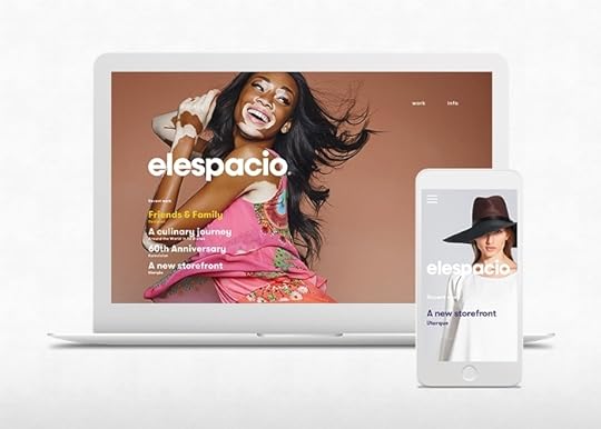
Above, Cookiesound, speaks volumes with a single photo. Rustic nature, snow-capped mountains, and of course the long open road: these are all images — and feelings — a travel blog wants to convey.
2. Objects in a Natural Environment
A popular strategy for ecommerce sites, showing objects in context is a proven sales strategy, considering that such photos boost conversion rates. The ones that do it best give the image an artistic twist, like an extreme closeup or alternative angle — head-on shots can feel contrived.

Photo credit: https://edwin-europe.com/
Clothing brand Edwin avoids the cliché of smiling children modeling clothes and goes for a more realistic and artistic photo to showcase their products. The hero background shows the shirt in a possible real-life situation, a child playing baseball. With the shirt large in the foreground and no head to distract from it (faces are natural attention grabbers), the product is displayed creatively and efficiently.
3. Black and White
Black-and-white photographs are the shortcut to professionalism and sophistication. If that’s what your site is going for, the classic aesthetic is always a safe bet. To see what we mean, check out designer Chris Spooner’s gallery of 20 black-and-white sites.

Photo credit: http://goltzgroup.com/
The site for Goltz Group combines the first two strategies we described with black and white to create an air of refinement. We can also see another latent advantage of black-and-white photos: they accent any color near them. This makes smaller call-to-actions or other colored elements far more noticeable.
4. Color Overlays
Color overlays modify images to suit more specific goals such as brand identity (using the brand’s characteristic color) or emotional response (for instance, a red overlay might give an otherwise calm photo a sense of urgency). While they do require a bit of editing, there are tutorials for creating them in CSS or in Photoshop.
Somewhat similar to black-and-white backgrounds, color overlays can also intensify the power of colorful accents. However, this only works well if the colors are chosen correctly, i.e., the right contrasting pairs. For more on the emotional responses of individual colors and how to find a color’s natural contrast, check out Color Theory in Web UI Design.

Photo credit:
http://www.knucklesindustries.com/
The tinted background of the site for Knuckles Industries creates a unique visual hierarchy that highlights the heading text and top navigational menu, despite the attention-grabbing image. The overlay also creates the perfect vintage atmosphere for a company that prides itself on all-American workmanship and industrial skills.
Grab design ebooks created by best designers
All for free
 Download
 Download
 Download
 DownloadDo you want to know more about UI Design?
Download 'Flat Design Trends 2016' FOR FREE!
Download e-book for freeClose5. Multiple Smaller Images
Perhaps as a backlash to the hero image trend (though not nearly as prevalent), or perhaps to coincide with the popularity of cards, smaller photos are gaining steam as a web trend in the near future. To state the obvious, smaller images allow sites to showcase more content on the screen.
In order to make the most out of this trend, we usually see it paired with card-style collages or carousels.

Photo credit: http://theportraitmachine.co.uk/
The Portrait Machine — an event portrait artist for-hire — uses a slider of smaller images to illustrate what she brings to an event by showing context (another trend we explained above). Because her service is a bit experimental, she needs to display more than one image to clearly show why people should hire her.
6. Photo Manipulation
The availability of better photo-editing equipment naturally means better photo manipulation. While techniques like color overlays are still pretty basic, more complex trends will become more common as more people figure out how to use these programs.
Photo manipulation can also do wonders in personalizing stock photos while minimizing costs.

Photo credit: https://beth-emily.com/
Beth-Emily doesn’t let minimalism stop her creative photo manipulation. Some of the graphics behind the shelf have been fabricated to add a little something extra to the image.
7. Paired with Custom Typography
Typography, like photography, enhances and even single-handedly creates your brand’s personality. A classic design technique is combining a well-chosen photograph with stylized typography. The style or message of the text influences how the user interprets the photo, and vice-versa.

Photo credit: http://metaversemodsquad.com/
Just look at Metaverse Mod Squad — the immediate image communicates so much about the brand’s personality. The faux-sloppy painted font draws out the rebelliousness of the scooter gang, while the photo ensures the right interpretation of the typography.
Conclusion
A lot of the strategy in using web photography has to do with the art of photography itself. Aspects like composition, color, focus, etc. are still important in web photography, if not more-so, considering that web photography serves more goals than simply artistic value.
To start creating visually stunning mockups and prototypes without code, feel free to start a free trial in UXPin. The collaborative design app comes loaded with 1000+ popular elements and dozens of UI libraries to speed up the high-definition design process.
Reimagining the way you design.A new version of UXPin is coming.Sign up for a trial and be the first to know about the new UXPin.Your e-mailGet free trial now!
The post Web Design Trends 2016: 7 Ways to Use HD Photography appeared first on Studio by UXPin.


How to Design Behavior (The Behavior Change Matrix)

Here’s the gist:
The rising interest in the science of designing behavior has also sprouted dozens of competing — and at times conflicting — methodologies.
Though the authors often flaunt their way as the only way, there are distinct use cases for when each method is appropriate.
Behavior modification methods fall into four distinct types: amateur, expert, habitué, and addict.
Each behavior type requires the use of the appropriate technique to be effective. Using the wrong method leads to frustration and failure.
Everyone suddenly seems interested in messing with your head. Gamification, Quantified Self, Persuasive Technology, Neuromarketing and a host of other techniques offer ways to influence behavior. At the heart of these techniques is a desire to change peoples’ habits so that behavior change becomes permanent.
Here’s the problem: Until now, the explosion of methods for changing behavior has been a hodgepodge of author-centric noise. Reading all of the books, blogs, and blowhards can leave one confused by their seemingly conflicting advice. Pundits push their methods as cure-alls. For example, some argue that earning badges and leveling-up can inspire the clinically obese to become slim again. They can’t. Others claim that being good at anything requires strict goal setting and performance objectives. It doesn’t. The goal of this article is to help you identify which of the different techniques would be most effective for each type of behavior change.
THE RIGHT TOOLS FOR THE JOB
To make sense of all of these methods and increase their usefulness in real-world applications, I’ve constructed a simple matrix that separates them by their appropriate behavior type. The matrix groups various automatic behaviors, or habits, into four distinct modes. Each is categorized by how much self-control it requires and whether the automatic response is a doing or stop-doing behavior.

Photo Credit: Nir Eyal
In this matrix, the behaviors on the top row have beneficial effects and people generally want to increase them. Meanwhile, addictions tend to control people’s lives and they generally want to rid themselves of these automatic behaviors. Habitué behaviors can go both ways and depending on the specific behavior, can either be detrimental or beneficial.
WHICH BEHAVIOR ARE YOU CHANGING?
How can you use the Behavior Change Matrix? Let’s say you want to change a specific behavior either in yourself or in someone else, such as a customer or user. The first step is to understand what kind of behavior you’re dealing with. Once you know the behavior type, you can reference techniques for creating the behavior you’re designing. The goal is to prevent using the wrong methods, which can lead to frustration and failure. Below, is a detailed look at each of the behavior types and links to resources for either developing or breaking habits:
AMATEUR
An amateur is a person who has an automatic, internal trigger to do a pleasurable behavior requiring relatively little willpower. Amateur habits include many of the behaviors most people do regularly as part of their daily routines. Brushing your teeth, going on a morning walk, or taking your vitamins are just some of the habits that can fill a morning. These behaviors require little willpower or self-control to create daily rituals.
Creation of new amateur behaviors follows a familiar pattern. First, an external trigger reminds the person of the desired behavior. The external trigger may include an alarm, reminder, or can even be an object, like strategically placed dental floss. Then, if the person has sufficient motivation and the ability to carry out the behavior, he does so. The behavior is repeated multiple times until the external trigger is no longer needed and a new habit is formed.
We should also consider that the amateur behavior mode is most often the starting point for all new habit creation. Amateur behaviors can evolve into expert, habitué, or addictive behaviors. For example, someone unfamiliar with computers starts with an amateur behavior pattern and then, with sufficient training, may become an expert, exhibiting automatic behaviors associated with a high degree of proficiency. Unfortunately, the former amateur may also develop harmful compulsions associated with the computer and develop habitué or full-blown addictive behaviors such as a gaming or Internet addiction.
Click here to see methods for creating amateur behaviors.

EXPERT
An expert is a person who develops an automatic response—sometimes referred to as muscle memory or pattern recognition—that requires a high degree of self-control. Tennis professionals, chess champs, topnotch computer engineers, and highly-trained surgeons exhibit these kinds of automatic behaviors. Becoming an expert requires diligent practice over long periods of time, constantly pushing the body and mind to react instantly in precisely the same way each time. Strict goals and objectives lead to the acquisition of the skill needed to perform at an expert level.Transitioning from the amateur behavior mode to the expert mode generally requires outside motivators such as schools, deadlines, competitions, coaches, or bosses. Because pushing ourselves to develop automatic behaviors requires a high-degree of self-control, it is hard work, making outside help necessary.
Click here to see methods for creating expert behaviors.
ADDICT
An addict will go to great lengths to satiate a nearly uncontrollable desire. Addicts often display self-destructive behaviors in pursuit of their urges. Addiction is characterized by a neurological response, which requires a tremendous amount of willpower to decouple from the stimulus. Studies have shown that addiction induces a severe stress response when the brain perceives the presence of the object of desire. Partaking in the unhealthy behavior becomes a compulsion to temporarily free oneself from the painful stress associated with craving.
The tragedy and lesson for behavioral designers regarding addiction is that the neural system is designed to make us pursue what we think will make us happy, without ever actually allowing us to experience satisfaction. Instead, the brain drives addicts to seek relentlessly for the promise of reward, often leaving a wake of tragic consequences behind.
Click here to see methods for breaking the addict’s automatic behaviors.

HABITUE
Like the addict, the habitué is a person with an automatic response intended to alleviate pain. In both cases, the addict and the habitué wish to relieve the painful stress of desire.
However, unlike the addict, the habitué requires relatively little willpower to resist the automatic behavior. For example, most of us can resist a craving for chocolate cake, though it may be difficult. However, for a heroin addict, resisting the craving for a hit can be nearly impossible.
When breaking habitué behaviors, we need techniques that will improve the strength of our willpower to find peace, despite the discomfort that comes from not fulfilling a desire. Behavioral designers should apply methods proven to improve pain tolerance.
Click here to see methods for dealing with habitué’s automatic behaviors.
CHANGING HABITS THE RIGHT WAY
For too long, those seeking to change behavior in themselves or in others have been frustrated by the ineffective application of techniques found in the latest bestseller. By having a classification system for the various kinds of automatic behaviors, we recognize that there are four distinct modes. Using the Behavior Change Matrix, those seeking to modify behavior can ensure they are using the technique most likely to succeed for their specific context.
Originally Posted on Nir Eyal’s blog, Nir and Far.
Editor’s note: If you want to learn more about using psychology and web design, check out our free e-book bundle The Psychology of Web UI Design.

The post How to Design Behavior (The Behavior Change Matrix) appeared first on Studio by UXPin.
March 3, 2016
Let’s Talk UX: Join Us Friday for a Real-time Chat

We love to talk about user experience and web design.
Fortunately there are many avenues to do so: blog posts, Quora, or just a quick conversation over lunch. Even Stack Overflow has a UX section. But we’ve found another way, and we want to share the conversation with you in real time.
Tomorrow at 11am PST we’ll hold our first Twitter-based conversation about UX design on our handle, @UXPin. Participating is easy. Every 10 minutes or so we’ll ask a design-related question. Anyone on Twitter can share their thoughts with #uxchat. After the chat, we’ll save the transcript for everyone to read on STUDIO.
The session should last about half an hour, so join us online for our first topic: user goals vs. business needs. Hope to see you there!
The post Let’s Talk UX: Join Us Friday for a Real-time Chat appeared first on Studio by UXPin.
March 2, 2016
The Elements of Trustworthy UI Design
Spammers, scammers, and identity thieves — the world is a scary place.

Photo credit: Down the Rabbit Hole . Creative Commons .
It falls on the individual site or app to prove its credibility through the product design and design of marketing assets (like landing pages). Designers just can’t expect the users to trust them with blind faith.
In this piece, we’ll discuss the best practices for ensuring that your product says what it does and does what it says.
The following piece is an excerpt from the free guide The Elements of Successful UX Design.
First Impressions Matter
You only get one chance — and about ten seconds — to make a good first impression. The Nielsen Norman Group recounts a study citing that users will leave your site within 10-20 seconds unless you can prove your worth. That means you don’t have much time to establish credibility and clearly communicate your value.
A different study from Stanford proves that, for web users at least, visuals are the number one factor in determining credibility. Combining the two studies shows just how important your landing page’s visual are to establishing trust, as quickly as possible.
Polished aesthetics and intuitive usability are the two base ingredients for building trust. Good usability instills confidence, while the eye candy increases desire to use the site or app.
Even if your interface strives for a progressive style (perhaps applying asymmetry), you still must create a sense of order. Clean interfaces composed of universal UI patterns are stupidly simple to use.
Consistency
A good practice all around, consistency is strongly linked to reliability. That is to say, inconsistency suggests disorganization and incompetence.

Consistency manifests itself in two different forms. First, your design must be externally consistent with users expectations and prior experience. Secondly, your design be internally consistent with itself through strict adherence to style guidelines (e.g. using the same icon styles, button shapes, etc.).
You can achieve external consistency through careful user research, proper UI patterns, and usability testing. You can achieve internal consistency by checking:
The same styles and color schemes across different pages or screens.
Layout and navigation consistency means features are always in the same place, such as a search option always in the upper-right corner.
Functional consistency means visuals reflect the same function across the whole design, such as a green button always meaning Save.
To help maintain consistency throughout the entire site or app, and more importantly so that every team member is on the same page, try compiling a style guide.
Quality Assurance
It’s difficult to nail down all performance issues while you’re still in the designing and building phases. Once the final product is ready (or a late-stage prototype) conduct a thorough quality assurance check. This involves going through every page or section of content to make sure there are no errors and everything behaves as it’s supposed to.
The two common areas to examine in a quality assurance check are:
Functionality — All interactive buttons work. This includes clickable functions and features, but also more subtle aspects, such as hover-triggered animations and gesture controls.
Proofreading — Typos and grammar mistakes scream untrustworthy — think of a typical spam email. Comb through all text to eliminate all errors, and hire a professional if your English is not up to the task.
Quality assurance may seem like an unnecessary step, especially if you’re behind schedule. But chances are there’s a least one or two errors you missed during production, and if you don’t catch them, your users will.
On a related note, no product is infallible. If you anticipate any downtime, notify users well in advance (at least 1 week) of the maintenance windows.
No False Buttons
As a rule, only buttons should look like buttons.
False buttons frustrate the user, who waste time clicking them. The mistrust will spread to your whole design since users will think twice before interacting with other elements.
Don’t outline words or phrases in a box unless the user can click on it.
No Dark Patterns
As the name suggests, dark patterns are designed to trick users into actions that make the company more money.

While tempting for short-term gains, they always damage the brand in the long run. You might be able to fool the user once or twice, but once they realize the deception, you’ll probably never earn their trust back.
Never sneak items into a user’s shopping cart upon checkout.
If users pay for a certain set of actions (e.g. 20 usability tests per month), don’t allow for more actions than what a user paid for, then demand payment or you’ll lock the account. Hostage-taking is never a viable UX strategy.
On a more subtle yet equally sinister note, don’t design difficult opt-outs (like forcing users to take multiple steps to cancel an account).
To learn more, check out UX Designer Harry Brignull’s excellent collection of dark patterns. The gallery is a cautionary tale for designers and companies alike.
Quick Case Study: Chase
For banks and financial institutions, trust is paramount.
The layout for Chase’s site is not only visually appealing, it’s also self-explanatory. They don’t rely on their name alone for credibility. The design isn’t groundbreaking, but you don’t need a completely original design to appear trustworthy.

Photo credit: Chase
Notice the basic visual logic at work:
A readable sans-serif typeface with soft edges creates a feeling of comfort and hospitality.
The tasteful icons appear friendly and designed by professionals.
The login/signup window — a likely first step — is given visual priority by clearly standing out from the photo behind it. The form’s rounded edges also draws attention to the content while feeling safer since the brain has evolved to see sharp edges as a threat.
The top navigation menu offers more options without cluttering, thanks to smart spacing, a hamburger icon, and an expandable search feature.
The brand’s use of blue colors strikes the right emotional notes. As this article suggests, blue creates a sense of safety and reliability.
The stock photograph feels candid, not a posed cardboard cutout.
When you see the landing page, you just seem to know that this company knows what they’re doing. You feel a sense of structure, which leads to a sense of safety.
Discussions around visual details like grid alignment, colors, and typography depend on far more than one’s personal taste. When they match the mindset of your user, you’ve already carved a clear path towards conversions.
For a bottom-line example of how smart visual choices lead to more revenue, check out this story of how Airbnb improved host profitability by investing in HD photos to appear more credible.
Conclusion
The tactics we outlined aren’t necessarily exclusive to digital design. These are the best practices that have emerged over centuries of businesses trying to distinguish themselves through honesty.
If you design a credible product but don’t appear trustworthy to users, few people will take the plunge. On the other hand, if you design a product full of dark patterns and present it in the best light possible, you’ll end up with plenty of angry users. For long-term success, you must instill confidence through the product design and the UX created by your marketing assets.
For more practical design advice, check out the free 109-page guide The Essential Elements of Successful UX Design. Best practices are explained based on analyzing 24 examples from companies like Slack, Apple, and others.

The post The Elements of Trustworthy UI Design appeared first on Studio by UXPin.
Validating Your Initial UX Strategy

It’s a step a lot of people miss.
You may have painstakingly done the research and developed a fine strategy document, but that doesn’t mean you can just run off and start putting it to work. You need feedback as much as anyone.
And also, the people who contributed to your research would love to know you’ve been paying attention. They’d love to know you’re going to make a solid attempt at solving their problems.

Photo credit: Quantcast
The way to do this is to pull the crumpled 1-page strategy doc back out of your pocket and bring it to the people you interviewed previously. That, and to test out a few ideas to make sure they live up to your ambitions. That, and to see how the subject matter experts feel about it.
Finding The Right Time
The best time to validate your strategy is the second you finish a solid enough draft to show to people without a disclaimer attached. You don’t want to say, “It’s a work in progress.” You want to say, “We crafted this based on a lot of different factors, including the input you gave us.”
There’s a reason. Bear with me.
When you present design deliverables, one of the advantages of lo-fi work is that it elicits better feedback. When people see rough sketches, they think you’re not so invested in what you’re showing them. It’s just a sketch. This helps them feel like they can have opinions and speak freely.

Photo credit: Fairhead Creative
Conversely, the higher the fidelity, the more constrained people tend to feel. They think you’ve invested a lot of time and are nearly done, and therefore are less likely to offer sweeping insights. Instead, they’ll nitpick. (This is, of course, assuming you agreed on the design direction prior to this point.) You’ll get minor tweaks, not bold reactions.
For wireframes and prototypes, this is great. At least for a while — until agreement builds and you can refine the work.
For strategy documents, you don’t want strong reactions. Your strategy doc is based on a lot more than a single person’s input. It’s derived from data, stakeholder vision, competitive analysis, and from your own vision. And all of that has had the benefit of your experience, knowledge, skill, and talent as a UX professional to translate it into a strong strategy.
In other words, you didn’t just make it all up. When you’re presenting a strategy document, you’d better mean it.
Remember, a big part of your job as the UX person is to lead. You want people to know you’ve heard them, but also walk away with the confidence that you are taking charge. We will be making a better product. Rest assured.
A politician doesn’t ask questions from the stump. She lays out policy. She qualifies herself. She tells anecdotes to make a point. She crescendoes to a swell of applause.
If your strategy contained a horrible mistake, you’d have found about it before now. You presented your findings to the stakeholders, and they collaborated on and approved the strategy right along with you. There’s no mistake. And if there is, you made it together. You have a team standing behind you.
When it’s time to go back to the people you talked to during the research phase, bring them a structured, well-written, coherent strategy that lays out the product vision, its design criteria, and its success metrics, and step through it with confidence.
Grab design ebooks created by best designers
All for free
 Download
 Download
 Download
 DownloadDo you want to know more about UI Design?
Download 'UX Design Process Best Practices' FOR FREE!
Download e-book for freeCloseBack To the Users
When you go back to share your strategy with the users who initially gave you input, bring your notes from those initial interviews with you.
Thank them again for the time they generously provided.
Confidently review your strategy document. This is what the product will be. These are the principles we will live by to achieve that. And this is a list of metrics we’ll use to demonstrate it. What do you think?
Take notes, or invite another researcher or designer along to act as the scribe.
Then, one by one, remind them of a principle concern they had in your prior discussion, and show them something in the design that either deals with it or eliminates it altogether.
If you have some, show them a few of your other favorite highlights, speaking exclusively to how the ideas will improve the product. Ask for their reactions. Let them react.
Take more notes.
This process is not about “building consensus,” which ends up being a fancy phrase for “compromise” after you start bending to everyone’s demands. No. This is about making sure you heard everyone correctly and that your ideas will make their product experiences better.

Photo credit: GD Steam . Creative Commons .
You want their input. You want their reactions. You want to know that what you’re doing is something they can get behind. But you also need for them to believe in you. After you go live, you can tweak and rethink things all you want. You’ll do that based on data — actual numbers reflecting actual usage behavior. That’s later. For now, you want to focus on leading a pack of people behind a unified vision everyone supports and wants to subscribe to.
Do this well and the users you interviewed will become advocates. Hold back and they’ll become mutants on the attack.
Inviting Scrutiny From SMEs
Remember the subject matter experts you spoke to during the research and discovery phase?
You’ll want to let them take a look at the strategy as well. And any early designs that show it off. The SMEs, by definition, know more about the subject matter at hand than you do, or probably ever will. If anyone can poke holes in a design strategy meant to disrupt a status quo industry, it’s them.
Your SMEs could be lawyers, accountants, power users, or someone else. Whoever they are, asking them to scrutinize your strategy and designs will accomplish two big things for you:
It will let you vet your strategy through one of the strongest resources you have.
It will keep your SMEs talking, and feeling respected, and feeling involved in the process, which will later turn them into advocates as well.
The Truth Is Out There
There is one major alternative to consider in all this. Namely, when your product is already live and running.
You still can’t forego the strategy doc. You should still do the research and define the strategy — for every overhaul, for every feature. Your improvements should be based on a lot more than the data that comes from a functioning website.
But if you do have a live, functioning site, you can validate ideas in the same way: live.
Assuming you have a decent amount of traffic, you can run A/B tests. You can track usage patterns and analyze the data. You can learn how your strategy actually pans out once it’s gone beyond throwaway design deliverables.

You can stop dealing in hypotheticals and start getting very real about whether or not your strategy is the right one. You can flip the switch on a new feature, or a design aesthetic, or an entire app. And you can get real numbers back.
Increased risk, for sure, but there is arguably no better way to validate a strategy than to test it out on real people in real situations by launching the design based on it. Yes, you should mitigate that risk as much as you reasonably can beforehand, by doing all the things I’ve mentioned already, but don’t get yourself stuck in analysis.
Launch the thing. If it doesn’t work, revise.
Don’t marry yourself to any one idea. It’s all an experiment. Until you get real data out of it, it’s all hypothetical.
If you found this article helpful, check out Robert Hoekman’s e-book The Field Guide to UX Strategy, an actionable guide based on his 15 years of experience. Define, document, execute, and test your UX strategy with methods outlined in this free e-book.

The post Validating Your Initial UX Strategy appeared first on Studio by UXPin.
The Many Virtues of Being T-Shaped

Knowing a little about what other team members do can make a world of difference when you’re crafting designs.
Familiarity with their tasks not only helps you empathize with the constraints that they’re under, it also improves efficiency across the entire process.
In other words, becoming T-shaped is a worthwhile pursuit.
What It Means To Be T-Shaped
In essence, a T-shaped designer is someone who has deep, specific knowledge within their field (represented by the vertical stem in a capital “T”), as well as some level of experience in numerous fields related to their own (represented by a shorter, horizontal crossbar on the top).
For example, an interaction designer who has worked in multiple areas such as performing and analyzing user research, building high fidelity mockups, and managing a team as a technical lead would be T-shaped. They would bring three different perspectives to their role. They would know exactly how the interface should look and work in order to satisfy user needs, and they’d have the technical know how required to coach other team members to realize their vision.

Every member of the team plays a vital role in the development of a product but if each member is working in a vacuum, then they can only recognize their single set of priorities, completely unaware of the project’s overall context. Being T-shaped enables you to seamlessly integrate multiple priorities and have the product become greater than the sum of its parts.
In other words, being T-shaped will improve the quality of work in your area of specialization.
You’ll have a broader group of skills to fall back on, without being forced to rely on others who are more technically skilled in an area with which you’re unfamiliar.
Crossing Your T
Once you decide to build a broad set of skills, it’s time to figure out how.
There are many options when trying to expand a skillset. You can volunteer to take on more work for your team, look for a mentor within your company, pursue formal education, perform research on your own, and so on. Many people learn best when they have a friend or mentor to work with them and hold them accountable.
In fact, if you’re a team leader, it will be beneficial to get your whole team thinking about expanding their horizons. The following exercise can help build interest and motivation towards acquiring secondary and tertiary skills.
Identify and build your broad strokes
1. List Your Passions
Partner up and grab a pen/paper. With your partner, take turns describing your passion, have your partner write it down in succinct terms and vice versa.
2. Identify Proficiencies and Areas to Explore
List areas where you have a broad understanding. Fields that you’ve experimented with, but are by no means a master in. Try to list areas in which you have enough understanding to work as more than a beginner. And then list the areas where you’d like to have more knowledge.
3. Make a Plan
Once you’ve got your lists, you can plan how to increase your education where needed.
Learn a New Skill
The last step will be the most difficult. Learning a new skill can be time consuming and a real challenge. (It’s not like you’re made out of time.)

Here are a few tips and resources to help you on your way.
1. Consistent effort
Examine the items from the list you made in the exercise above, and make it a point to dedicate 15-30 minutes to exploring one (or more) of the subjects on your list each day.
2. Hang with other well-rounded professionals
As it turns out, knowledge and ideas are pretty contagious. Ask others how they ended up so widely-read, and try to duplicate their process. Examine how they approach their work, and emulate whatever you can.
3. Think contextually
According to the latest academic research, westerners (and Americans in particular) perceive the world in a far more individualistic manner than far eastern cultures.
In one study, when shown a picture of an underwater landscape, US subjects described individual aspects of the picture: the color and number of fish, the types of plants, and so on. Japanese subjects, on the other hand, invariably began by describing the scenery and then moving toward more detail-oriented observations.
Understanding this difference in mindset, it’s possible to take a broader view and look at a project more holistically. Don’t focus on a singular task. Instead, think about the way your work will interact with the efforts of other team members. View yourself as a spoke in the wheel, rather than as the center around which the wheel rotates.
Take advantage of online educational resources
Search for your topic of choice and hit the virtual books. Here are a few excellent resources to get you started:
Coursera
udemy
Code Academy
Stack Overflow
DesignLab (highly-focused UX lessons with mentors)
Thinkful.com (Live instruction from an online mentor)
Meetup.com (Find a mentor through a meetup within the field of your choice, for example: http://user-experience.meetup.com/)
UX Professionals Association
Interaction Design Association
With these resources, you’ll be off to a great start on your path to becoming a more well-rounded designer.
If you found this article useful, you might enjoy our free e-book The Elements of Successful UX Design. Explore the seven most important UX best practices for building a successful product with 24 examples deconstructed from Apple, Buffer, Treehouse and more.
The post The Many Virtues of Being T-Shaped appeared first on Studio by UXPin.
8 Website Accessibility Best Practices to Improve UX
Often, accessibility best practices are just best practices overall — simple interfaces, alternative user pathways to suit user preferences, etc.
Below, we’ve listed the best practices that specifically aid handicapped users and don’t spell out hours of extra work.
The following article is an excerpt from the new 109-page e-book The Essential Elements of Successful UX Design .
1. Execute the fundamentals flawlessly
A good start to accessibility is making sure the UI is rock-solid.
Clear and logical designs benefit everyone, as does consistent navigation. The big difference, though, is that inconveniences like cluttered screens or navigation inconsistency become even bigger obstacles for people who are visually impaired.
2. Enable keyboard navigation for web design
Power users in general prefer keyboard navigation, and the availability of hotkey shortcuts is always a welcome addition.
But for disabled users, these features are mandatory. This means going beyond “tabbing” or scrolling with the space bar. Check out Wikipedia’s complete table of keyboard shortcuts to see the recognized standards for keyboard control.
3. Prioritize Text Clarity
The biggest obstacle for visually impaired users is text clarity, so designers should take every measure to increase legibility (clarity of letters) and readability (clarity of text blocks) . Here are four easy-to-apply techniques that users who are visually impaired will surely appreciate.

Photo credit: “ Two way this way .” With Associates. Creative Commons .
The W3C cites the a minimum contrast ratio between text and background as 4.5:1 (for large or bold fonts, it’s acceptable to drop to 3:1).
Body text should be a minimum of 16 pixels.
Spacing between lines should be at least 25% of the font size. With the 16-pixel minimum size above, spacing should be 4 pixels or more.
Allow font resizing in style sheets by using a measure other than pixels, such as em, pt, or relative sizes.
Like the principles of universal design, improved readability helps every user, though some more than others.
4. Don’t rely exclusively on color
As we said above, color-blindness affects close to 10% of the population.
While a color code can be a shortcut to faster and more efficient communication about functionality, don’t forget labels for explaining crucial functions.
For example, let’s say there’s an error with an input field. Outlining the box in red is a good way to communicate a problem, but also include an exclamation point icon for fuller accessibility.
If you’re ever in doubt about designing for the visually-impaired, look at your interface through a black-and-white filter.
5. Order content in HTML for screen readers
Ever since the separation of HTML and CSS, developers are able to alter what users see without changing the structure of the code. In addition to simplifying the design process, this also allows for better usability with screen readers.
While sighted users can simply scan the page and click on their preferred selection, users with screen readers must sit through the screen readers explaining every element on the page. Imagine the frustration with clicking a link to an article and having to sift through the entire navigation menu.
With the separation of HTML and CSS, though, you can reorganize the code to suit screen readers without changing the screen layout at all. The navigation menu can stay at the top, best for sighted users, while the code for it stays at the bottom, best for screen readers.
Grab design ebooks created by best designers
All for free
Download
 Download
 Download
Do you want to know more about UI Design?
Download
DownloadDo you want to know more about UI Design?Download 'Web UI Design Patterns 2016' FOR FREE!
Download e-book for freeClose6. Explanatory link text
Some screen readers have the option to list out every link on the page, but this feature is meaningless if the link text is merely “click here” — taken out of context like this, it’s impossible to tell where it leads.

Photo credit: BBC
Include link descriptions that can be understood independently, out of context. Don’t go overboard, though. Text is a design element, so never include more than necessary.
7. Use a 40×40 pt. clickable area for touch controls
Accessibility means designing for everyone, whether technically disabled or not.
For touch controls, any area less than 40×40 pts. will cause trouble for some users. This is the preferred norm for accepting all finger sizes, as well as any assistance tools.
8. Follow the accessibility checklist
How accessible is your web app or website?
Nomensa, in conjunction with Sky, released this handy accessibility checklist.
You’ll notice that most of the items on the list are more than just accessibility guidelines, but tips for a better UX overall. It’s a great way to keep on track throughout the process, so check it out.
Quick Case Study: Apple.com
If you ever need any guidance or want to see accessibility at work, check out Apple.com.

Photo credit: Apple.com
Apple’s minimalist style makes everything organized and easy to understand, and reflect this structure in their layout. This helps both the visually and mentally impaired.
The colors and contrast are suitable for visibility and legibility, but with enough diversity to stay visually interesting.
The site uses keyboard controls and avoids pulldown menus altogether.
Most text content is in short snippets, perfect for screen readers or those with trouble reading.
Conclusion
Accessibility is just good UX design.
Accessibility guidelines are not something optional— they are synonymous with good design period, and should be implemented regardless of who your users are.
For more practical design advice, check out the free 109-page guide The Essential Elements of Successful UX Design. Best practices are explained based on analyzing 24 examples from companies like Slack, Apple, and others.
Feature photo credit: Web Designer Depot
The post 8 Website Accessibility Best Practices to Improve UX appeared first on Studio by UXPin.
Free: The UX Design Builder’s E-book Bundle
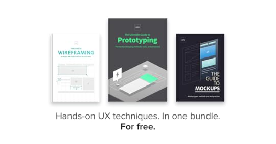
Learn everything you need to know about three hands-on UX techniques — wireframes, mockups, and prototypes.
The UX Design Builder’s E-book bundle joins three of our most successful e-books into one super collection, with expert techniques, hundreds of samples, and links to online resources in over 350 pages, all in one free download.
The first guidebook, The Guide to Wireframing, explains the art of wireframing through topics like:
Which type of wireframe to choose: sketches, cutouts, stencils, or digital
Different wireframing software and the best practices for each
Wireframing UI pattern libraries, both standalone or importable.
Advice from real wireframing experts

In the Guide to Mockups, you’ll learn the fundamentals of this strictly visual document:
What you should and shouldn’t include in your mockup
How to influence your user’s sight flow through visual hierarchy
The 3 different methods for creating mockups and when to use each
Techniques for Photoshop and Sketch specifically for UX designers

Last, The Ultimate Guide to Prototyping gives a thorough front-to-back coverage of this essential UX document, with:
Customizing your prototype to a unique project by aligning the 4 prototyping dimensions
The advantages of each kind of prototype: paper, coded, digital, and “wizard of oz”
Tailoring prototypes for usability testing
A list of 10 tips for making the most out of your prototype
Converting Photoshop and Sketch files into layered, interactive prototypes

Download this e-book bundle now.
The post Free: The UX Design Builder’s E-book Bundle appeared first on Studio by UXPin.
March 1, 2016
The 7-Minute Guide to Flat Design 2.0
Flat design is more than a passing trend.
The aesthetic will continue to evolve and is sticking around thanks to its roots in design theory (minimalism, Swiss, clean typography, etc.).
But what constitutes flat design? This trend can be characterized by five elements:
No added effects such as drop shadows, embossing or gradients
Focus on great, and simple typography (particularly sans serifs)
Use of simple elements and iconography
Bold color palettes with more and brighter hues than we were used to
Design with an overall minimalist approach with as few elements as possible
While flat design is still tied to these concepts, the “rules” are a lot looser today. And the trend is evolving.
As we dive headlong into 2016, here is how you can keep up with the ever-changing trend as flat design continues to morph into something new.
The New Flat Design: Flat 2.0
A long history of flat evolution brings us nowadays to Flat 2.0.
As we said in the free e-book Flat Design Trends 2016, this style is a compromise between the origins of flat design, hints of skeuomorphism, material design and usability. (It really is a bit of everything.)
There’s no defining characteristic to Flat 2.0, other than it “seems flat, but isn’t quite completely flat.” This is the realm where most of flat design seems to live. The best parts of flat design are mixed with elements that enhance usability. (Right now that movement is shifting toward layering and 3D styling.)

Photo credit: Adidas
Designers employ a few common effects to achieve that somewhat-Flat-2.0 look. Here’s what they are:
Raised or sunken elements to make it easier to see what actions a user is supposed to take. The three-dimensional effect helps users engage with an action, such as a click or tap.
Animated elements help guide users to actionable elements. The trick with this technique is that animations are subtle and don’t get in the way of the design.
Elements that appear to act within the laws of physics or act realistically, such as those outlined by the principles of Material Design, create a “life-like” experience. When things on the screen act in the same manner as physical things, users have no trouble using or understanding them.
Particularly for e-commerce, 360-degree animation or rotation is a popular tool. This gives users the ability to see an item (or product) in a very real way.
Big, bold and oversized everything from type to imagery helps create a bold first impression, drawing users at a glance. Oversized elements are highly usable as well, particularly on smaller screens because you don’t have to worry about the “fat fingers” effect.

Photo credit: Moteur de Reussites
It only makes sense to feature a Google Labs example when thinking about Flat 2.0. Moteur de Reussites has an aesthetic that is very much material design in scope, but is also identifiable with Flat 2.0. That’s the trick to this evolution: Flat takes on a bit of everything, thanks to its classically-rooted principles.

This Canadian tourism site uses plenty of flat concepts as well.
Bright pops of color, simple layers, geometric shapes and brilliant typography pull it all together. The site is usable and aesthetically pleasing. Flat 2.0 elements help the user focus on calls to action, buttons and next steps in the navigation. The design effect creates a “mini-tour” with layers of elements that encourage the user to want to visit.
Useful Resources
To help you get started on this trend that’s as beautiful as it is practice, here are 10 additional resources:
1. Circle icons: Ghost button styles in circular shapes ($3)
2. Colofilter.css: Create a duotone effect
3. Flat Colors: More than 11,000 colors and 2,000 palettes
4. Brand New: Take a look at the gallery of brand logo changes and note the dominance of flat
5. Long Shadow Graphic Styles: Illustrator library to help you create the perfect exaggerated shadow ($5)
6. Google Material Design: Full documentation on Google’s design language, which is constantly evolving
7. Hype for Type Top 10 Fonts of 2015: Inspiration for new flat pairings
8. CSS Button Generator: Make ghost (or colored) buttons with CSS
9. Icon Hover Effects: Simple animation styles and code for icons
10. Flat Icons: 1,303 SVG icon packs in flat styles
Takeaways
So where do we go from here? What lessons have we learned?
Flat design is not going anywhere anytime soon.
Flat design is so connected to design theory that it will continue to grow and evolve.
Flat design is a highly visual and usable technique that can work for varying site types.
One thing is certain: it’s not too late to start thinking about a flat aesthetic. More and more companies — from big to small — have all gone flat.
With that, we’ll see others follow suit. Because it is rooted in elements of simplicity, flat design can be integrated into projects using other trends and techniques so that every project looks custom and original. Pair flat with almost any other trend and the result is a modern, fresh look.
Each designer can manipulate the style in any way. That’s because there’s no perfect model of what constitutes a “flat design.”
If you found this article useful, check out the free guide Flat Design Trends 2016 below. We deconstruct over 20 examples to explain useful flat-inspired UI techniques.

The post The 7-Minute Guide to Flat Design 2.0 appeared first on Studio by UXPin.
February 29, 2016
Want Better UX? Change the Conversation.

If you’ve ever been a user experience designer, you’ve probably heard people say something like this when starting a new project:
We want to make it delightful and easy to use.
We need to do some user research.
We want to improve our onboarding process.
We think it needs a walkthrough for new users.
We want a persona/photoshop mockup/wireframe/landing page/insert deliverable here.
All of these statements are absolutely useless. Why? Because none of them help you decide what to work on or how to improve a product.
So, the next time somebody introduces a UX project by asking for a specific deliverable or by giving vague instructions to “make it better,” you need to change the conversation.
You can do that by asking the following questions:
Who is the target user for this product or feature?
What problem are you trying to solve for those users?
What business need are you trying to fulfill with this project?
What metric are you trying to move?
Why do you think that solving this particular user problem will move that metric?
How Do These Questions Help Users?
The most important thing about these questions is that they help you define three things that are critical to a successful design project:
1. The problem you are trying to solve
2. The reason you are trying to solve it
3. The way you will know if you’ve succeeded
Design without these elements isn’t really user experience design. It’s just drawing pictures. Design is about solving real problems, both for users and for the business. In fact, at its best, design is about solving problems for the business (for example, generating revenue or improving retention) by solving problems for the user (for example, offering something somebody wants to buy or helping make their lives better).
By knowing the answer to these questions, you are far more likely to build a product that users want to use and that improves key metrics for your company.
How Do These Questions Help Designers?
Answering these questions can be incredibly helpful for individual designers. When we ask these questions, we reframe the project to give the designer far more freedom to solve problems, which is, after all, the fun part of the job.
Instead of being told “change the onboarding flow” or “create a tutorial walkthrough,” we get asked to “improve the 10 day activation metric for new users.”
As designers, we get to create our own hypotheses about how we will improve that metric rather than simply implementing someone else’s vision.
More importantly, we can understand when our designs were successful, because we have a specific metric against which we can measure our results. This kind of direct feedback can make us better designers.
How Do These Questions Help Engineers?
These questions can be incredibly useful for defining the scope of a project, which has a very real impact on engineering. For example, poorly defined projects are particularly susceptible to scope creep.
After all, if you don’t have a very solid idea of the problem you’re trying to solve or the metric you’re trying to move, it’s very easy to justify adding “just one more thing.” But when you have a clearly defined problem, it’s easy to push back on new feature requests that don’t contribute directly to solving that problem.
What to Do If They Can’t Answer Those Questions
The first few times you try to change the conversation, you may get push back. You’ll get clients or product managers or engineers who simply can’t answer these questions. Keep asking them.
If people can’t answer the questions, you need to help them get the answers before you start work on the project. Otherwise, you’re shortchanging your users, your company, your team, and yourself.
Like the post? Follow Laura on Twitter!
Originally posted on Users Know.
Editor’s note: If you found the post useful, check out the free guide UX Design Process Best Practices.

The post Want Better UX? Change the Conversation. appeared first on Studio by UXPin.
UXpin's Blog

- UXpin's profile
- 68 followers

