
UXpin's Blog, page 132
March 17, 2016
The Hard Truth About UX Strategy

So you’re a designer.
You’ve been one for a while now. Maybe you’re young, maybe you’re established. You’ve been doing it long enough to know it’s not always as satisfying as it should be.
The root of the issue lies in the decisions that exclude you. They prioritize features and fixes that don’t matter. They’re reactionary, based on some data someone learned about. They make you feel like you’re stagnating.
A lot of times, this is true. Most of the time, you just don’t know enough about why those decisions are being made.

This is why you say you want to “do more UX strategy work.” You think it’s about making decisions. You think you can make better ones than the people making them now. And maybe that’s true.
Before you’ll ever find out, you need to accept the hard truth. UX strategy doesn’t work like that.
What good UX strategy actually entails is researching and recognizing the constraints and concerns from all sides and painting a big red target on the wall so that everyone involved can make decisions that serve researched, vetted, and defined objectives.
This is the truth about UX.
What UX Strategy Really Looks Like
In its most tangible form, UX design is first captured in a strategy document. Ideally, it’s one that’s been preached about to everyone involved in a project (no matter the scope) and referred to every time a decision gets made.
In concept — and the concept is what drives the tangible document — it’s a collection of several types of guidelines, each type tied to a different aspect of the same objective, together serving a unified purpose.
Every piece of the strategy has been researched. Every piece has been vetted. Every piece has been discussed and agreed upon by the relevant stakeholders.

Photo Credit: Barrel via Minnow Park
On projects with a narrow scope — like a single feature or a minor usability improvement — you can devise and document the strategy in an afternoon.
On bigger projects — the kind critical to a company or aimed at shaping a product for the long-term — it can take weeks.
In every situation, the UX process is evolutionary. A strategy is never written in stone. Companies change focus. New information pops up. Competitors appear on the scene and drive new customer requirements. Strategy must evolve accordingly.
When politicians change their minds, we call it flip-flopping. When we change our minds about strategy, we call it good design.
Without constraints, without understanding, without research, without vision and success metrics and guiding design principles, design is not design. It’s decoration. With these things, however, we practice design at its very best. We design with purpose, intent, and measurable outcomes.
The Intent UX Strategy Represents
Designers far and wide like to jump in. Get things done. Put pixels on the screen and make them do tricks.
Strategy doesn’t work like that, either.
The point of strategy isn’t to prescribe anything. It’s not a document of decisions. It’s a document that drives decisions.
The strategy document focuses on goals over actions, ideas over to-do lists. It’s purpose is to show the idea, the concept, of the thing you’re designing. It’s to give everyone involved a unified sense of what the thing is and why it will exist. It’s to enable other people to make decisions that help it achieve that.

If your strategy document is prescriptive — describing specific features or assigning detail to what should still be a notion of a product — it’s no longer strategic. It’s either a badly-written spec document or an ego-driven attempt by the designer to dictate details at a time when the focus should be on objectives.
Goals over actions. Ideas over to-do lists. This is the correct form of UX strategy.
Grab design ebooks created by best designers
All for free
 Download
 Download
 Download
 DownloadDo you want to know more about UI Design?
Download 'The Essential Elements of Successful UX Design' FOR FREE!
Download e-book for freeCloseThe Form UX Strategy Takes
A UX strategy document always includes a few key elements. I go into these in greater detail in the free Field Guide to UX Strategy. For now, we’ll focus on the vital concepts.
First, the form it takes.
A strategy is meaningless unless it’s internalized by everyone involved in the project and used to make good decisions. To this end, just like the design work from which it’s based, the strategy document itself must be approachable and usable. After doing some user interviews and talking with stakeholders, I start crafting the strategy document based on the following points:
Vision– What problem will the product solve, and what is the initial idea of what it might be?
Circumstances of Use- Who is using the product? What information do they seek? When will they use it? Where will they use it? Why are they using it?
Design Criteria – This is my favorite part because it demands specificity. “Fast, easy, and intuitive” doesn’t fly. You need to focus on how you’ll achieve those principles, e.g. “Let users slice available statistics in any way that might be helpful, so that analysis can be done in a timely manner.”
Success Metrics – Focus on a small set of core metrics. Be as specific as possible. Don’t write down, “Get more traffic.” Ask how much traffic. Ask what you want that traffic to do while it’s hanging around on your website. Ask what percentage of people you want to sign up for your app three months from now as compared to today.
I have a strict rule for my own projects that a strategy document will never require more than two sides of a single sheet of paper when printed as straight, long-form text. It needs to be short enough that people will actually read it.
That said, the strategy will, in fact, be printed. And for that reason, I almost never actually use a single sheet of paper. A Word doc will work in a pinch, sure, especially when you’re just emailing it around to people, but ideally, you’ll be able to tack pieces of this thing up all around the office where the project team works.


Better to use a slide deck.
Pop open Keynote or Powerpoint or Google Slides and distribute the points across a series of slides where they can be digested one at a time.
Use the slide deck to review the strategy with the team. Showing them one piece of information at a time prevents them from reading ahead and asking premature questions.
After that, print each slide.
Then find the thumbtacks.
Posters keep the points present. Literally. Team members see them as they arrive each morning, they can point at them during conversations, and they can look them over while considering options during a decision. They create constraints, and constraints are where design decisions are born.
Concise. Printed. Present.
The Logic Spawned by Strategy
Finally, the UX strategy, once documented, becomes the source of causality for design decisions.
There are no magical leaps in the curation of feature lists or the design of task flows. These things are born from logic. This, therefore that. The strategy drives conversations wherein one thing follows another.

Photo credit: Marek Bowers via Ryan Singer
I spoke to UX expert Christina Wodtke recently, and she explained where designers screw up with strategy.
“They miss the therefore,” she said. “A designer would say they spoke with a bunch of people who really liked ice cream, which lead to building some cookies.”
As she elaborated, you need to unthread the logic and ensure each piece connects.
“You need a therefore in there. The design strategy only makes sense if people like ice cream because they like sweets, but ice cream’s too cold and it’s not really good in the winter, so we’re thinking cookies because ….”
Strategy gives you therefore. It gives you the first part of the equation A + B = C.
And since you evangelize the strategy doc, even if you forget about it once in a while, others will be equally armed with the strategy’s bullet points to remind you that A + B = C.
It’s never enough — to say “I want this thing to exist.” This thing cannot do what you want it to do until this thing has a strategy behind it. A clear concept of what this thing is. A clear set of guidelines for what makes this thing different than its competitors. A set of metrics to measure out whether or not this thing is working well.
Great designers are not creative geniuses who spend weeks behind closed doors and return with a grand reveal. Great designers speak with users and stakeholders to tease out the right problem, document their initial strategies, then start building and testing their solutions.
Vetted ideas, based on research, must guide design logic. When you’ve followed a validated process that helps reveal the therefore, you can better coach the rest of the company to make decisions that follow your logic.
When you’ve done that, you’ve become the strategic designer. The designer who drives business results. The designer who really matters.
For more advice on planning and executing UX strategies, check out the free Field Guide to UX Strategy. The tactics are based on my 15+ years of UX work with companies like Intuit, Rackspace, Adobe, Dodge, and others.

The post The Hard Truth About UX Strategy appeared first on Studio by UXPin.


Design Leaders: 8 Questions to Regularly Ask Your Team

One of the most powerful things a leader can do is listen.
It’s not always intuitive (or convenient) to check in with your team (especially about things unrelated to clients or projects) but it’s undeniably important.
Countless books and articles on management boil down to some form of “listen to your team, then act accordingly.”
But what does that mean in a design context? To remind you to listen effectively, here are a few of my favorite questions to ask your entire team (individually or in a group) on a regular basis.
1. What was something that bugged you at work yesterday?
The idea here is to learn about smaller or near-term issues or annoyances. It’s a way to address minor concerns before they become big ones.
I try to be a hands-off manager, and I don’t meddle unnecessarily. I give advice, but I don’t micromanage, and I don’t act on everything I hear. However, asking questions like this is a chance to notice bigger patterns and to ultimately alleviate potential issues with people or process.
As a general guideline, if you hear several complaints about the same person or process, it’s time to address it. If instead you hear that there’s not enough reggae in the music mix, you’ve probably got a happy team.

Mostly, it’s just helpful to allow team members to vent. That goes a long way. Work environments are highly stressful, and even the most even-keeled need to let off steam once in awhile.
2. What small or large successes have you had recently?
Perhaps because we’ve all experienced the imposter syndrome at some point, most designers don’t give themselves nearly enough credit. Or maybe they’re too busy to stop and reflect on their successes. In either case, asking this simple question forces people to recognize their own efforts and remind them that they’re making progress each day.
In addition, as a design leader, it’s easy to miss and overlook smaller successes. We don’t always see the challenges and solutions each team member faces each day. Unfortunately, without seeing that stuff, it’s too easy to forget it’s happening. This helps the manager as much as the team member. As a bonus, it feels amazing as a manager to know that things are getting done (and getting done well) without any direct input.
3. Is there anything you’re stuck on?
This question is a good way to get a temperature reading for each project. More importantly, it can also save a lot of time if you can help someone get unstuck.
I’m not talking about throwing away your plans and diving into code with someone. Sometimes, it’s as simple as pointing them in the direction of a solution.
Typically, the right direction is a how-to article or an example of how someone else handled a similar problem. The idea isn’t to solve all of your team’s issues for them. It’s to give them the tools to find solutions on their own. A manager’s experience is one of his or her greatest assets. The more experienced the manager, the more likely they’ve overcome a similar situation in the past.
4. Have you seen anything recently that you wanted to copy or wished you’d thought of?
This is just a great way to learn about what people are thinking about outside of work. Discussing it out loud may lead to better projects, but also, it’s a question that a team member can freely answer, with no deadlines, feelings, or politics attached.
I like this question because I value my designers’ and developers’ opinions on what’s awesome and what’s played out. I also love discussing design and usability, and this question can lead to debates about aesthetics versus function or whether something is too “designy” to be effective.
5. Have you come across anything the team should read or think about?
Sharing videos and articles is huge in today’s professional world. It’s all over social media, LinkedIn, and even our emails. But, for whatever reason, it’s relatively absent in face-to-face conversation.
A junior designer or intern may not follow the creative director on Twitter, but they can benefit so much from seeing what their boss is reading and what their peers are thinking about. I tweet articles all the time, but I don’t drop urls in normal conversation.
Conversely, imagine how beneficial it is for the team leader to gain trend and industry insight from the least jaded newcomers?
Everyone has great information to share, and all it takes is to ask. I’ve found that just asking is truly the best way to facilitate this, and making the process more formal is tricky and has overhead. At Brolik, we’ve tried many different ways to post, save, and share articles. We even tried curating articles in an email list for a while. Nothing seemed to stick. Sure, monthly Movie Fridays have been pretty successful, but there’s so much information we pick up between them that could help the entire company grow.
Now, I just ask what people are reading and thinking about, and if something good comes up, we share it with the whole team.
Grab design ebooks created by best designers
All for free
Download
Download
 Download
 DownloadDo you want to know more about UI Design?
Download 'The Indispensable Designer: A Guide to Influential Design' FOR FREE!
Download e-book for freeClose6. Are there any good webinars or events coming up?
This question has two benefits. First and foremost, it encourages professional development and reminds the team to pursue ongoing career education. Second, it gives you leads on opportunities for team building and inspiration.
I remember the exact moment very clearly: it was 2011, and a conference speaker held up a copy of Ethan Marcotte’s Responsive Design. He then told us to buy it and begin reading it immediately upon leaving. We had no idea what responsive design was, but I could take a hint, so I read it.
We ended up shifting our agency’s focus and building our CMS and sales strategy around responsive design for the next several years. It all started by asking: “Are there any events coming up we should look at?”
7. Have you seen any new tools we could look into?
This is similar to webinars and events, but it comes from a more practical, day-to-day angle. Shiny new tools, techniques, and frameworks are literally too common in tech and design, and there’s no way to keep up with them all and still hit project deadlines.
So how do you know when to switch from Adobe to Sketch? When enough of the team has tried it on a freelance project or read enough to convince them, and they discuss it.
Some of your team’s biggest daily frustrations are centered around the tools they use. They may want to suggest improvements but feel it’s not their place. Ask them specifically to voice those needs. Then they’re not “asking for things.” They’re just answering a question.
When someone suggests a new tool, give the entire team a chance to check it out before implementing it into your project workflows. Not everyone will be on board with every tool, but open communication will solve a lot of process issues surprisingly fast. The whole team will get more efficient— not just the person who suggested it.
8. How’s that side project coming?
This might be my favorite. It’s the hardest one to remember to ask, though. As a manager, showing an interest in someone’s personal life is an important part of the relationship.

Side projects are where many ideas are born and where skills are honed. They help develop well-rounded, independent thinking and train people in different disciplines. For me, as soon as I learn something new on a side project, I find a reason to use it on a work project. That can benefit everyone on the team and improve your product or service.
Conclusion
Ultimately, whatever form these questions take and in whatever frequency you ask them, the idea is always to improve team members’ lives, company processes, and ultimately the product or products you’re building.
Staying engaged takes some effort, but it always pays off. Designers are trained to be inquisitive, so why not apply that towards your team? As it turns out, asking questions is one of the easiest ways to engage your team.

The post Design Leaders: 8 Questions to Regularly Ask Your Team appeared first on Studio by UXPin.
March 16, 2016
Deceiving Users for Fun and Profit … or Just Profit

Dark patterns are deliberately deceptive design practices. They’re often — but not exclusively — used in e-commerce sites to earn a little more of the customer’s money, or to trick people into signing up for something they didn’t intend to.
For example, an ecommerce site may entice people with a too-good-to-be-true deal. Upon registering for the site to purchase, people then discover the item is out of stock, and are presented with similar (and slightly more expensive) items in its place. Bonus points if they’re automatically opted in to the site’s spammy newsletter upon registration.
.Honesty is about being open and clear and not hiding anything. A good design does that. #uxchat
— Jonathan Shariat (@DesignUXUI) March 11, 2016
Ads disguised as articles, prominent “download now” buttons with tiny headers explaining what users will really get; sites that use social media logins to spam your friends; free plans for which you get quietly billed next month … dark patterns do anything to advance the business goals at users’ expense. An entire website, DarkPatterns.org, catalogs examples in the wild.
What design practices earn users’ trust?
Consistency, informing of influence on decisions, easy/opt-in transitions to new. #uxchat #uxpin
— Danelle Bailey (@danellesheree) March 11, 2016
#uxchat #uxpin Designs that contradict what most users' mental models expect can also be deceiving
— Wendy Bravo (@WendyBravo) March 11, 2016
The Best Intentions Gone Awry
Not all dark patterns are intentional. They can come from designers who want to de-clutter pages from extra fees, like those. But hiding information from users can translate to deceptive business, especially for sites offering the lowest prices you’ll find anywhere.
Can you think of any time design should, shall we say, bend the truth?
I'd say Leading with intention from the company, from a place of service, toward the customer. #uxchat #uxpin
— Adam Fairhead (@AdamFairhead) March 11, 2016
Practicing Honest Design
How do we avoid dark patterns? Ideas vary, but a few themes keep cropping up:
Don’t hide information in the name of clarity
Don’t claim more than you offer
Keep user flows straightforward and don’t confuse them with extra steps
Don’t design difficult opt-outs like forcing users to take multiple steps to cancel an account
If your site was accused of using deceptive UX, how would you respond?
Find out exactly what's deceptive, thank users for the feedback, make changes, and notify users of the changes
— Wendy Bravo (@WendyBravo) March 11, 2016
Earning Trust
Designers only get about ten seconds — if that — to prove their worth. That means you don’t have much time to establish credibility and clearly communicate your value. A study from Stanford shows that, for web users at least, design visuals are the predominant factor that proves credibility. Combining the two studies shows just how important landing pages’ visuals are to establishing trust, as quickly as possible.
Love ’em or hate ’em, it’s hard to deny that Chase’s website fits the bill.

Their site has both visual appeal and is self-explanatory. They don’t rely on their name alone for credibility. The design isn’t groundbreaking, but you don’t need a completely original design to appear trustworthy. Users just seem to know that this company knows what it’s doing. It gives a sense of structure, which leads to a sense of safety.
A sans-serif typeface with open counters creates a feeling of comfort and hospitality.
Tasteful, modern icons look designed by professionals.
The login box sets expectations — and the process delivers.
The box gets priority by standing out from the photo behind it.
People expect to log in, and that’s what happens.
The signup link is clearly labeled as such.
No unusual information is required.
The brand’s consistent use of blue strikes calming emotional notes.
Designers can’t expect users to just trust them. Sites and apps must prove themselves through a series of interactions and elements, from icons that consistently represent what they’ll do to straightforward text to imagery that fits the site’s tone.
Even if designers create credible products that don’t appear trustworthy, few people will buy into them. And yet deceptive sites that don’t appear so will deliver angry users and a poor reputation — something every business or organization wants to avoid.
But it’s not all doom and gloom. You can learn more about good patterns in our free e-book, The Essential Elements of Successful UX Design.
The post Deceiving Users for Fun and Profit … or Just Profit appeared first on Studio by UXPin.
March 15, 2016
A UX Designer’s Guide to Improving Speed of Use
Today’s product experiences are becoming blazing fast.
We expect speed. We demand no more than a few minutes for Uber car arrivals, same-day deliveries from Amazon, instant upload time of huge images on Facebook and not a single millisecond of buffering when watching a Youtube video.
Our experiences require speed of use.
Speed of use is a usability trait describing the minimal timeframe in which users accomplish a given task. This includes the actions that lead to the task but also the time it takes users to recover from errors.
Speed of use, however, should not be confused with ease of use, which refers to how easy and intuitive an interface/flow/action is without external support. Both are important and should be treated harmoniously by overlapping their key components.
Here are 5 rules you should consider for improving speed of use.
Rule 1: Respect the Rules of Fitts’s Law
Fitts’s law is a model of human movement for quantifying the difficulty of selecting a target.
First devised in 1954 by Paul Fitts, the law states that the time required to move to a target area is a function between the distance to the target and the size of the target. Basically, in terms of interaction design, the closer and larger the target area, the faster it is to reach it with a pointing object, be that the mouse pointer or the fingertip.
To support this statement, you should consider the following tips described in the free Interaction Design Best Practices Vol.1:
Create larger targets
Use slightly bigger buttons and enlarge the clickable area of your interactive elements to the maximum.
Do not exaggerate the overall size, though, because larger targets are effective up to a point, after which they hit a plateau and will only make users ignore other important elements on the page.

For example, Duolingo uses a very large button on the homepage that is easy to click.
Minimize pointer movement
Find the right balance between grouping elements by type and by usage patterns. Minimizing the distance between elements in a task flow will certainly increase the speed of use of your interface.

Duolingo, for example, includes large clickable cards with minimal distance between each card.
However, the opposite of Fitts’s law is a good method when trying to reduce user errors by adding space to separate items so they’re not accidentally clicked. In this way, we can actually add friction to minimize user mistakes.
For example, Salesforce IQ places the “Delete” function at the far right of a list of actions.
Avoid muscular tension
This law is especially relevant for mobile interaction design.
Because gestures consist of a temporary continuous movement, they require more muscular tension than simple point-and-click actions on a desktop.
Just like the previous rule, use gestures that involve more difficult movements for actions with more severe consequences, in order to avoid triggering unwanted commands.
For example, the Gmail mobile app uses the swipe right gesture to archive emails, an action that requires more muscular tension compared to a tap.
Exploit the prime pixels
Prime pixels are areas on the screen that are easier to reach.
For a desktop and laptop screen, prime pixels sit in the corners and edges (not applicable for web interfaces, though), while for a mobile device prime pixels are in the proximity of your thumb.
Still, for any device that uses a pointer, the fastest-to-reach pixel on the screen is the one you are already on, which is why contextual right-click menus were introduced.
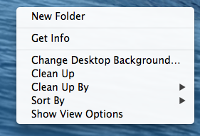
Photo credit: OSX
Rule 2: Respect the Hicks–Hyman law
The Hicks–Hyman law states that the more options you present to users, the more time it takes for them to reach a decision. When you focus the choices presented to users, you improve speed of use.
It’s important to note that the law applies mostly to items that are listed randomly, like menu items or product categories, which are often displayed based on their value for the user or the business, emphasizing the importance of a good taxonomy review and a solid information architecture.

For example, Stripe displays only two important buttons on the main pages.
Choice paralysis effect
The concept behind the Hicks–Hyman law is similar to a subsequent psychological effect named choice paralysis, first used by retail marketers and now adopted by designers.
In his book, The Paradox of Choice, American psychologist Barry Schwartz argues that reducing the number of choices offered to consumers also reduces the anxiety they face in the decisionmaking process.
Therefore, presenting less options to users will:
Reduce the time the users need to make a decision in order to continue their journey.
Reduce the mental discomfort caused by evaluating multiple items.

The top left menu on Stripe’s website also displays only the 2 most valuable pages, hiding the secondary options under a More button.
Grab design ebooks created by best designers
All for free
 Download
Download
Download
 Download
 DownloadDo you want to know more about UI Design?
Download 'Interaction Design Best Practices' FOR FREE!
Download e-book for freeCloseRule 3: Optimize Text for Scanning
Two interesting studies were conducted by the Nielsen Norman Group to investigate the connection between text scanning and usability:
i. The first study showed that “concise, scannable and objective copywriting” improved usability by 124%
ii. The second study showed that “users will read about 20% of the text on an average web page”
Optimizing text for scanning requires 2 types of optimization: layout optimization and content optimization.
Layout optimization
Optimizing text for better scanning starts with choosing the appropriate layout for the project. As explained in Web UI Design for the Human Eye (Vol. 1), consider 3 main design layouts:
The Gutenberg diagram
The Gutenberg diagram is best used for text-heavy pages and it divides the layout into 4 quadrants:
i. Primary optical area, in the top/left
ii. Strong fallow area, in the top/right
iii. Weak fallow area, in the bottom/left
iv. Terminal area, in the bottom/right

Photo credit: Vanseo Design
The Gutenberg diagram suggests that the main areas of interest are the top/left and bottom/right, as the eyes follow an axis of orientation called the reading gravity, meaning that the eyes don’t follow a straight line when scanning or skimming but “fall” from left to right.
The Z-pattern
Follows the shape of the letter Z, so the eyes travel from top left to top right and then diagonally to bottom left and then bottom right. It’s recommended for simple web interfaces that contain less information.
When repeated, the Z-pattern leads to the Zig-Zag pattern that is mostly used for designs that have to present the content in the form of a story, like long one-page websites presenting a product.

Photo credit: Web Style Guide
On Square’s homepage, you can see how they’ve optimized the pattern to communicate their core product value. The headline, trial CTA, and video CTA all sit within the Golden Triangle.

The F-pattern
Probably the most recognisable, the F-pattern is most obvious when analyzing the results of eye-tracking studies. The studies show that the eyes move from left to right at the top of the page, but as they go down, the horizontal movement decreases and the eyes stick closer and closer to the left edge.
As with the other patterns, the F-pattern suggests that the most important information should be placed at the top and left side of the page, so that they are the most visible when people scan the page. This means, for example, that the first paragraph should express the most valuable details, subtitles should start with information-heavy words and form fields should be aligned left.

Content optimization
After choosing the best layout, you should optimize the content within the page. More specifically:
Text is presented as bulleted list when possible
Subtitles should be short, explanatory and begin with relevant words
Form fields should be aligned left
Text should be divided by images or illustration to break long text into digestible paragraphs
Using bold or font variation for important words
Isolating sentence with the most valuable information
Explaining only one idea per paragraph
Starting with part of the conclusion to attract interest
Cutting down the word count

Medium aligns important content to the left and and uses different font colors, weights and sizes to make the text stand out.
Join the world's best designers who use UXPin.Sign up for a free trial.Your e-mailTry it for free!
Rule #4: Minimize Interstitial Anxiety
Interstitial anxiety describes the temporary state of tension users experience between the moment they trigger an action and the system gives a response. Delays are usually caused by slow loading times, laggy feedback and latency issues.
To minimize interstitial anxiety, we have to understand that there are two interconnected components that form interstitial anxiety: transitional and temporal anxiety.
1. Transitional anxiety
It’s the first step of the sequence and refers to the mental tension derived from the transition period to another screen or page.
This shift that takes the user from one type of interface design to another (like the steps of a checkout flow) must be seamless in order to maintain a continuous experience for the.
The best way to reduce transitional anxiety is to use subtle animations and transitions between screens like in the image below, helping users adjust gradually to the change between page states.
2. Temporal anxiety
It comes as a second step and describes the mental tension caused by the timeframe in which the accessed page is loading. This step comes after the users transition to a new page, when it usually takes some time to load the entire content.
In 2006 at Web 2.0 Conference, Marissa Mayer, still Google VP by then, presented a study showing that a 0.5 second delay in load time resulted in a 20% drop in traffic for Google’s search page.
There are a couple of methods to counter this issue, both of them focusing on delivering something visually interesting so users don’t need to stare at a blank screen:
Using a loading animation like a spinning wheel, loading bar, animated gif, animated copy etc. In an article about this subject, Rusty Mitchell talks about a Facebook test indicating that “when the users were presented with a custom loading animation in the Facebook iOS app (left) they blamed the app for the delay. But when users were shown the iOS system spinner (right), they were more likely to blame the system itself.”

Using a placeholder animation simulating the actual content that will be loaded. Medium uses this trick, showing a simple image wireframe as a placeholder, while the actual image loads.
Rule #5: Use Universal Design Patterns
Ever since the web became mainstream, designers have faced all kinds of problems which demanded scalable solutions. Over the years, the most successful solutions have become patterns that users intuitively understand.
As explained in Web UI Patterns 2016 Vol 1., universal design patterns are reusable validated design solutions, acting like a common language between designers and users. Patterns work because people adjust their future behaviour based on past experiences.
Placing links on underlined texts or clicking the logo to go back to the homepage, are all design patterns that users find easy to use because they’ve grown so familiar to such conventions.
Even now, most patterns are still in a beta stage and designers constantly look for innovative alternatives. Yet, innovation that adds value to a design and innovation for the sake of being different, are separate things.

Pinterest is an example of innovative design, promoting a different type of image display layout.
Combining innovation with consistency is critical for a good user experience and good designers take into consideration both sides of it:
External consistency
Design patterns help create external consistency because they match user expectations (e.g. consistent with their experiences external to your design).

For example, Tumblr plays into external consistency by placing the Log in and Sign up button in the top right corner (as users would expect).
Internal consistency
Refers to using the same set of patterns inside each page of an interface, which is important for creating a seamless experience for multiple user flows. Internal inconsistency annoys users and makes the product feel unusable and unprofessional.
Within a product team, pattern libraries ensure internal consistency since they document and recommend best practices for an entire design system.

For example, Twitter maintains internal consistency by using the same color for interactive elements like links and buttons.
Final Thoughts
Speed of use is a key characteristic of all great products.
Mental models try to identify and eliminate mental blockers, user journeys are optimized to require as few steps as possible and information is prioritized so users find what they want as fast as possible. As a result, every step of the experience is ultimately designed to respect the user’s time.
So, whenever you’re designing a project, keep in mind these 5 rules for improving speed of use:
Respect Fitts’s law by creating larger targets and minimizing pointer movement
Respect Hicks–Hyman law by reducing the number of choices offered to users
Optimize text for scanning by choosing a suitable layout and by formatting content
Minimize interstitial anxiety by using transitions that eliminate experience delays
Use universal design patterns by taking advantage of common user behavior for better internal and external consistency.
For more practical UX advice, check out the free guide Interaction Design Best Practices (Vol.1) below.

The post A UX Designer’s Guide to Improving Speed of Use appeared first on Studio by UXPin.
March 14, 2016
5 Ways to Adapt UX Thinking to the Enterprise

Internal politics, tight deadlines, conflicting or shifting priorities.
These are UX design challenges that all product teams face. But in the enterprise world, these challenges are present at a much more significant scale. As a result, the impact on the UX design process is magnitudes larger.
In this article, we’ll explain 4 useful techniques for designers and product managers to overcome the main challenges of enterprise UX.
1. Think “functional persona” instead of “user persona”
Traditionally we’re taught that a persona represents a particular user. In the enterprise world, however, users are often spread across various business units and even continents. A marketing manager in the U.S. may have completely different needs from one in Kenya or Mumbai.
As a result, enterprise product teams should think in terms of functional personas rather than John Clark, Marketing Manager. What do I mean by functional personas?
Let’s take the example of an online content collaboration platform. On this platform, team members can:
Create content
Edit content
Review content
Submit content for review
Approve content
Reject content
In this scenario, the content creator, content reviewer and content approver will always be different people. And in some cases, the organizations using the platform can come from sectors as varied as healthcare, education, government and more.

Photo credit: Gather Content
With all the variances between industries, you can’t manage personas in the traditional sense of “one user, one persona”. A more practical approach is to examine the functional areas within the platform (create, edit, review, submit, approve and reject) and then create personas that address each area (hence, functional persona).
But how do you go about crafting a functional persona, for example, when the actual users have different, industry-specific needs? We’ll use the “Content Creator” persona to help explain the process:
i. Collect information from users representing each functional area: In our example, you’d want to speak with content creators from various industries. Don’t worry so much about their demographics. Instead, ask them about their task needs: how they go about creating content, the content format they need, etc.
ii. Map out the workflow for each industry: This can be a user journey map, a workflow diagram or post its on a wall that show the steps in the user’s workflow.
iii. Identify common themes: Examine each industry’s workflow and start looking for common themes that you can highlight. In the case of “Content Creator”, you’ll probably find that all users need to upload images. Another theme could be the need to reference or link to existing pieces in their content library.
iv. Build your functional persona: Once you’ve identified themes that are most common to all the industries, feed this information into your persona. You can use the themes to build the story around key things like user needs, user roadblocks and user expectations.
In terms of the metric for identifying common themes, look for themes that occur in at least 50% of the workflows for all industries.
2) Be proactive about politics
Enterprise environments bring with them a much longer chain of command and the influence of many leaders or stakeholders. You can’t avoid it, so you might as well face it head-on.
Many of these leaders will want to take on the role of “decider” who gives final approval for product decisions. To help protect your Agile team from conflicting interests, here’s some tips for less painful collaboration.

i. Talk to all leaders vying for the “decider” role:
In my experience, you’ll have 2 to 4 key leaders in the company that might fit the role.
Talk to them individually or in a group meeting. Explain to each of them that you’d like to establish a clear review process for designs and specifications. Ask them if they’d like to be involved in those initial conceptualization phases.
Just by doing this, you can easily filter out one or two from the process because they’ll back out once they see the additional work required to validate their opinions.
It’s imperative that you talk to them first as opposed to imposing your ideal process on them and explaining later. You have to maintain collaborative harmony.
ii. Talk to your product team: As part of your process planning, talk to your product team, particularly your Scrum Master and UX Design Lead. Get their feedback on the preferred process for their individual teams.
iii. Present your process vision to all executives: Using the feedback from stakeholders and the product team, fine-tune the review and approval process.
Once you’ve mapped out the process, hold a short meeting (less than 30 minutes) with the remaining executives, Scrum Master and UX Design Leads to present your plan. You want everyone in the room for early sign-off on everyone’s role (or an open debate if any concerns arise).
3. Think in terms of account settings
As explained in the free guide The Future of Enterprise UX, the account settings (e.g. admin interface or admin module) is often the enterprise software designer’s best friend.
The sheer number of users and possible enterprise use cases means you can’t cram all the functionality into the default UI. You need to make the tough decision for which functionality becomes an admin setting.
Photo credit: Gather Content
To help decide correctly, return to your “functional personas” and user flows. Functionality common to most of your user groups should move up in priority as candidates for the default UI. Everything else becomes lesser priority in the admin bucket.
If a new functionality simply requires adding a dropdown menu or a couple of radio buttons, chances are you can safely add them to the UI without disrupting the UX. But if the new functionality results in an entirely new layout for an existing screen, you’ll need to reconsider placement.
For example, will there be a significant re-learning curve for existing users? You might ultimately be better off defining that functionality as an admin setting that generates an entirely new screen or layout only for accounts that opted in.
Grab design ebooks created by best designers
All for free
Download
 Download
 Download
Do you want to know more about UI Design?
Download
DownloadDo you want to know more about UI Design?Download 'The Future of Enterprise UX' FOR FREE!
Download e-book for freeClose4. Work with sales teams to identify upsell triggers in the product
As you work on new features, talk to your sales directors or their representatives (such as the pre-sales engineer). Oftentimes, the sales team’s understanding of the market will reveal which features are a right fit for an in-app upsell flow. The knowledge is absolutely mandatory for any design team working within a “land and expand” business model.
For example, Slack’s “Learn more” link below actually redirects to their pricing page. By placing the right upsell messages with the right triggers, you’re helping the company better automate expansion revenue.
Photo credit: Slack
5. Work with sales teams to internalize buyer vs. end-user needs
Talking to the sales team early in the specification process also offers a better understanding of the actual buyer and end-user. In some cases they’re the same person, but very often for enterprise software, they’re different people.
Let’s return to our content collaboration platform example.
The buyer might be the CTO while the end user is a marketing manager. The CTO won’t care much about uploading a jpg vs. a png or importing a Word document. But the sales team can help you understand that they really care about data encryption, the location of data centers, and whether their content is subject to laws such as The Patriot Act (particularly relevant for non-US customers), and other security-related aspects.
While you might understand these needs from user interviews with CTOs, conversations with the sales team will help you see what functions are actually persuading buyers to sign the purchase orders. You help close the gap between field research and field results.
Get to know the buyer and end user needs early so that everything from the functionality, color choices and language is balanced accordingly. Enterprise products must be powerful enough to sway the buyer, but usable enough for end-users to continue advocating for plan renewals.To learn more about designing a “consumer-grade” enterprise product, check out the free guide The Future of Enterprise UX.
Conclusion
UX design is always a delicate balancing act.
This is not to say that smaller companies means smoother sailing. You can still face significant obstacles if a single stakeholder (especially a co-founder) holds a very tight grip on decisions. On the flip side, enterprises can also have executives with a strong appreciation for the UX process.
The sheer scale of an enterprise company means that more hierarchy inevitably exists. As a result, every enterprise designer needs to learn to adapt to both bureaucratic sprawl and product complexity.

The post 5 Ways to Adapt UX Thinking to the Enterprise appeared first on Studio by UXPin.
4 Ways to Adapt UX Thinking to the Enterprise
Internal politics, tight deadlines, conflicting or shifting priorities.
These are UX design challenges that all product teams face. But in the enterprise world, these challenges are present at a much more significant scale. As a result, the impact on the UX design process is magnitudes larger.
In this article, we’ll explain 4 useful techniques for designers and product managers to overcome the main challenges of enterprise UX.
1. Think “functional persona” instead of “user persona”
Traditionally we’re taught that a persona represents a particular user. In the enterprise world, however, users are often spread across various business units and even continents. A marketing manager in the U.S. may have completely different needs from one in Kenya or Mumbai.
As a result, enterprise product teams should think in terms of functional personas rather than John Clark, Marketing Manager. What do I mean by functional personas?
Let’s take the example of an online content collaboration platform. On this platform, team members can:
Create content
Edit content
Review content
Submit content for review
Approve content
Reject content
In this scenario, the content creator, content reviewer and content approver will always be different people. And in some cases, the organizations using the platform can come from sectors as varied as healthcare, education, government and more.
Photo credit: Gather Content
With all the variances between industries, you can’t manage personas in the traditional sense of “one user, one persona”. A more practical approach is to examine the functional areas within the platform (create, edit, review, submit, approve and reject) and then create personas that address each area (hence, functional persona).
But how do you go about crafting a functional persona, for example, when the actual users have different, industry-specific needs? We’ll use the “Content Creator” persona to help explain the process:
i. Collect information from users representing each functional area: In our example, you’d want to speak with content creators from various industries. Don’t worry so much about their demographics. Instead, ask them about their task needs: how they go about creating content, the content format they need, etc.
ii. Map out the workflow for each industry: This can be a user journey map, a workflow diagram or post its on a wall that show the steps in the user’s workflow.
iii. Identify common themes: Examine each industry’s workflow and start looking for common themes that you can highlight. In the case of “Content Creator”, you’ll probably find that all users need to upload images. Another theme could be the need to reference or link to existing pieces in their content library.
iv. Build your functional persona: Once you’ve identified themes that are most common to all the industries, feed this information into your persona. You can use the themes to build the story around key things like user needs, user roadblocks and user expectations.
In terms of the metric for identifying common themes, look for themes that occur in at least 50% of the workflows for all industries.
2) Be proactive about politics
Enterprise environments bring with them a much longer chain of command and the influence of many leaders or stakeholders. You can’t avoid it, so you might as well face it head-on.
Many of these leaders will want to take on the role of “decider” who gives final approval for product decisions. To help protect your Agile team from conflicting interests, here’s some tips for less painful collaboration.
i. Talk to all leaders vying for the “decider” role:
In my experience, you’ll have 2 to 4 key leaders in the company that might fit the role.
Talk to them individually or in a group meeting. Explain to each of them that you’d like to establish a clear review process for designs and specifications. Ask them if they’d like to be involved in those initial conceptualization phases.
Just by doing this, you can easily filter out one or two from the process because they’ll back out once they see the additional work required to validate their opinions.
It’s imperative that you talk to them first as opposed to imposing your ideal process on them and explaining later. You have to maintain collaborative harmony.
ii. Talk to your product team: As part of your process planning, talk to your product team, particularly your Scrum Master and UX Design Lead. Get their feedback on the preferred process for their individual teams.
iii. Present your process vision to all executives: Using the feedback from stakeholders and the product team, fine-tune the review and approval process.
Once you’ve mapped out the process, hold a short meeting (less than 30 minutes) with the remaining executives, Scrum Master and UX Design Leads to present your plan. You want everyone in the room for early sign-off on everyone’s role (or an open debate if any concerns arise).
3. Think in terms of account settings
As explained in the free guide The Future of Enterprise UX, the account settings (e.g. admin interface or admin module) is often the enterprise software designer’s best friend.
The sheer number of users and possible enterprise use cases means you can’t cram all the functionality into the default UI. You need to make the tough decision for which functionality becomes an admin setting.
Photo credit: Gather Content
To help decide correctly, return to your “functional personas” and user flows. Functionality common to most of your user groups should move up in priority as candidates for the default UI. Everything else becomes lesser priority in the admin bucket.
If a new functionality simply requires adding a dropdown menu or a couple of radio buttons, chances are you can safely add them to the UI without disrupting the UX. But if the new functionality results in an entirely new layout for an existing screen, you’ll need to reconsider placement.
For example, will there be a significant re-learning curve for existing users? You might ultimately be better off defining that functionality as an admin setting that generates an entirely new screen or layout only for accounts that opted in.
Grab design ebooks created by best designers
All for free
Download
Download
Download
DownloadDo you want to know more about UI Design?Download 'The Future of Enterprise UX' FOR FREE!
Download e-book for freeClose4. Work with sales teams to identify upsell triggers in the product
As you work on new features, talk to your sales directors or their representatives (such as the pre-sales engineer). Oftentimes, the sales team’s understanding of the market will reveal which features are a right fit for an in-app upsell flow. The knowledge is absolutely mandatory for any design team working within a “land and expand” business model.
For example, Slack’s “Learn more” link below actually redirects to their pricing page. By placing the right upsell messages with the right triggers, you’re helping the company better automate expansion revenue.
Photo credit: Slack
5. Work with sales teams to internalize buyer vs. end-user needs
Talking to the sales team early in the specification process also offers a better understanding of the actual buyer and end-user. In some cases they’re the same person, but very often for enterprise software, they’re different people.
Let’s return to our content collaboration platform example.
The buyer might be the CTO while the end user is a marketing manager. The CTO won’t care much about uploading a jpg vs. a png or importing a Word document. But the sales team can help you understand that they really care about data encryption, the location of data centers, and whether their content is subject to laws such as The Patriot Act (particularly relevant for non-US customers), and other security-related aspects.
While you might understand these needs from user interviews with CTOs, conversations with the sales team will help you see what functions are actually persuading buyers to sign the purchase orders. You help close the gap between field research and field results.
Get to know the buyer and end user needs early so that everything from the functionality, color choices and language is balanced accordingly. Enterprise products must be powerful enough to sway the buyer, but usable enough for end-users to continue advocating for plan renewals.To learn more about designing a “consumer-grade” enterprise product, check out the free guide The Future of Enterprise UX.
Conclusion
UX design is always a delicate balancing act.
This is not to say that smaller companies means smoother sailing. You can still face significant obstacles if a single stakeholder (especially a co-founder) holds a very tight grip on decisions. On the flip side, enterprises can also have executives with a strong appreciation for the UX process.
The sheer scale of an enterprise company means that more hierarchy inevitably exists. As a result, every enterprise designer needs to learn to adapt to both bureaucratic sprawl and product complexity.
The post 4 Ways to Adapt UX Thinking to the Enterprise appeared first on Studio by UXPin.
March 11, 2016
4 Urban Design Principles That Influence UX Design

When I began doing UX design, I had a mentor who said to me, “The only way you will know if your design works is to build it and see for yourself.”
She was discussing a particular project, but the underlying message is that observation is the most critical thing we can do when making spaces that add to quality of life.
I started my career as an urban designer. Constant observation is in my blood (same as other urban designers and architects). We watch how people interact with a space. We make notes about being in good (or bad) designs, even while traveling—everything from scale and proportion to rhythm and activities. We learn what could have been better, note the unexpected successes, and apply it appropriately in our next design.
When it comes to UX, we need to take into account the same considerations. Are we creating experiences that are enjoyable because a visitor can consume what they see? Achieve what they want? Relate to a brand?
For urban designers, this kind of observation is only possible after a costly project is built. It’s different for UX designers – we have the luxury of user testing and prototyping.
From the start, we can use observation to build things that work in people’s lives.
Make It People-Sized
Designing to the scale of a person draws people into the experience, rather than giving them a reason to leave.
Humans are visual creatures. In the world of architecture and urban design, scale is everything—it can change the feeling of space instantly.
Frank Gehry’s buildings are iconic pieces of art designed to make a visitor feel small. The experience is the building itself, not necessarily its context as part of a larger urban fabric.

Photo credit: John O’ Neill
In contrast, Disneyland’s Main Street draws us further and further into the park. The visitor’s experience is being in the community, with its park benches, streetlights, and vendors. In urban design, we call it being “pedestrian friendly.”

Photo credit: Leo DeCandia
Where one place turns its back to the community around it, the other draws us in and encourages exploration. How does that translate to UX?
Humans have limited attention spans. To help shape positive experiences, better UX starts with breaking down content into digestible chunks and creating digital versions of “pedestrian friendly” features.
Scrolling page after page can be tiresome, and long lines of text can strain the eyes.
Instead, let the content breathe comfortably, so people aren’t overwhelmed by what they see. Use relevant, interesting images to give eyes a respite from reading, and be sure to use whitespace as a form-giving element. (UXPin has some really great writing on this in their e-books Zen of Whitespace in Web UI Design and Web UI Design for the Human Eye.)
Numerous science-backed resources can help you capture and hold the attention of a visitor. For example, BufferApp created an infographic of the optimum lengths for various social media posts, videos, and so on. You might also check out an exceptional piece on the organization of information and hierarchy in Vignelli Canon, by the late designer Massimo Vignelli.
Join the world's best designers who use UXPin.Sign up for a free trial.Your e-mailTry it for free!
Know Your Audience
Seems simple right?
Even though a site may look amazing, it may not be the best solution to your particular project. We get all excited and want to showcase our amazing talents, but the truth is, there is no greater tool than good old-fashioned research.
How people actually live is dependent upon their cultural heritage, their socio-economic background, their age, and many other factors. In the world of urban design, we might visit places that fit our target demographic, but how we carried out the design depended on our research.
What would happen if we applied a design that responded to Arizona’s climate and tried to apply it to a project in Massachussets? Or what if we took the beautiful cascading designs of the Amalfi Coast in Italy and tried to apply them to plains of Iowa?
We might take different approaches for the call-to-action, or use color more sparingly in one and more liberally in the other. Statistics might be perfect for Example A, whereas imagery and stories are best for Example B.
Example A: Millennials For Mental Health Awareness project by Brand Cure

Example B: Google Cultural Institute.

Give People Options
We love choices, so why not build that into your design? Design a few unexpected gems, but have a clear path, as well.
William Whyte’s documentary, The Social Life of Small Urban Spaces, explores numerous, documented instances where flexibility and choice increase the viability of urban plazas. The more reasons somebody has to be in a place, the more people flock to the space to people watch, thus increasing the number of people, and so the cycle begins.
Visual points of interest (such as public art, water features, street vendors, and street performers) give people something to look at or look at more closely. Movable seating allows people to form groups as small or as large as they need. Options for shaded or sun-soaked areas also appeal to visitors.
From my personal experience in urban design, I’ve seen how these distractions add to the vibrancy of a city street or plaza.
Our digital designs should also give people a reason to stay, but not overload them to a point they cannot complete their task at hand. No matter how vibrant the activity on a home screen, if somebody can’t find the entrance to their desired path, it proves to be a frustrating experience.
Just think about how often do we drive around looking for a place before finally giving up and looking for another option.
We may like the little distractions and discoveries, but it’s the efficiencies and clear directions in the user flows that allow us to get straight to the point.
Observe Carefully
Design. Test. Refine. Test. Refine. Test. Refine.
We should always be striving to improve upon the last project. Observe how people move through a site. Is the call-to-action too hard for people to find? Is the hamburger menu too confusing for older users? Is there an ability to search?
Ideally, setting up groups of users and recording their reactions would be best. But sometimes we don’t have that time or those resources built into a project. When this happens reach out to the non-designers in the office, and let them navigate your site or app. Begin these user tests during low fidelity wireframes and continue them until launch.
When a project’s complete and is live, use heat maps. See what people are clicking on and respond to that information. You may find that there should be a call-to-action added to help increase conversion rates.

And lastly, sit with the SEO expert in your office. Walk through the analytics with them. Understand what has been performing well and identify key elements that you could apply again.
Conclusion
Charles Eames may have said it best, “If it is the function of design to solve the evolving problems of man, then the designer’s first concern must be the true need.”
As designers, our job is never done; there is always something we can learn from past projects, other projects, and even other disciplines.
If we truly believe our job is to make lives easier or quality of life better, then we need to be observing the world around us and paying close attention to how people actually live, as opposed to a utopian ideal that, in the end, could have the exact opposite effect we hope for.
For more UX advice, get the free UX Design Trends Ebook Bundle.

The post 4 Urban Design Principles That Influence UX Design appeared first on Studio by UXPin.
March 9, 2016
User Onboarding Best Practices From 3 Popular Mobile Apps

Mobile app onboarding is changing for the better.
App developers pave the way for higher rates of user opt-ins – and more effective communication with users later on – by focusing on building user trust. Over the last few years, the norm has been to ask users to create an account, sign in, opt in, and then use the app.
I’ve chosen three examples of the trend for not asking users to sign up for an account immediately, or without justification. Instead, users are eased into trusting the app.
invoice2go, Two Dots, and Hotel Tonight are three apps that exemplify the following mobile app onboarding best practices:
Point out the app’s benefits before requiring user information
Quickly get the user immersed and enjoying the app
Create a successful experience the very first time
Pick the right moment to request opt-in to notifications
Give the user as much time as possible before asking her to create an account
1. invoice2go
What they do right: They let users create something right away (users don’t want to just fill out forms).
invoice2go is a tool for making professional invoices. The compelling thing about the app is how the user creates the thing that justifies the use of the app within a few minutes. Whether a technology expert or novice, the user is customizing and prototyping an invoice as part of the onboarding experience.
Step 1: 5 screens on the benefits of the app teach also show users what they will be doing in the app

Step 2: Set up your company (with many creative options for invoices)

Step 3: Opt in to notifications

Step 4: Create your first invoice

UX Result: You haven’t paid for anything yet, but you’re already emotionally invested in using this app because you put on your creative hat, experimented, and built something. It’s the same reason why you’re attached to that Ikea table. Also, they asked you to opt in to notifications, so they will be able to reach out to you.
How can your app give users a running start like invoice2go? Can you provide simple tools for them to customize and experiment with the basic functionality?
2. Two Dots
What they do right: They make onboarding genuinely fun.
Two Dots is a puzzle game that takes the user through onboarding by making them play the game. They do all the right things in making the user feel comfortable, because the user succeeds and gets congratulated before the first official puzzle.
Step 1: Do you want notifications? Do you want to create an account? You can decline both and still play.

Step 2: Your training, which you can’t skip out of and can’t fail

Step 3: Level 1, after using the app for ~1 minute

Step 4: Level 2, because you’re already a superstar in less than 5 minutes

UX Result: The user has a very successful first experience with the app, all because the process of onboarding was made easy and enjoyable.
Join the world's best designers who use UXPin.Sign up for a free trial.Your e-mailTry it for free!
3. Hotel Tonight
What they do right: They give you a result fast and streamline the account creation process.
Hotel Tonight is an app that handles when you have a business trip that just got extended another day, or a sudden road trip to Las Vegas. It takes an anxiety-inducing situation and puts the user back in control. But that’s not why I’m showing it here; I’m showing it because you can download the app without even having an account and book a room in two minutes.
Step 1: Where are you?

Step 2: Showing you the area.

Step 3: Looking at the details of the hotel.

Step 4: Booking the hotel.

UX Result: So did you notice that you created an account in Step 4? That was only required after you’d browsed the list and performed an action. How different would the experience have been if you had to create an account before choosing the hotel, or before downloading the app?
Conclusion
Many mobile app developers are changing their approach to designing their onboarding process, and these three apps show why it works:
invoice2go pointed out the app’s benefits before requiring user information
Two Dots quickly got the user immersed and enjoying the app
Both invoice2go and Two Dots created a user success the very first time they tried something
All three apps tried to pick the right moment to request opt-in to notifications, preferably after they’ve established the trust of the user
And lastly, best shown by Hotel Tonight, the apps try tried to give the user as much time as possible before asking her to create an account
The next time you’re designing your mobile onboarding, remember that the goal is to get them to the “aha!” moment as quickly as possible.
For more example-driven best practices, check out the free 2016 UX Trends Ebook Bundle. In addition to mobile best practices, the book also explores web design and UX techniques. The single download includes 350+ pages of advice supported by 300 examples.

The post User Onboarding Best Practices From 3 Popular Mobile Apps appeared first on Studio by UXPin.
March 8, 2016
UX Design Trends vs. Fads: 7 Experts Weigh In

UX is a constantly evolving field.
At Springboard, we offer UX education with mentorship from design experts because we believe that’s the best way to gain knowledge and stay relevant. We’ve also worked with experts to curate a free curriculum to learn UX Design.
In line with that philosophy, we worked with UXPin to ask some industry experts what they thought were the latest design trends and fads of 2016. Here are their insights.
1. Eva Kaniasty
Eva runs her own company (Red Pill UX) based in Boston, is a regular at events of the UXPA Boston, of which she is the former President.

2016 Design Trends That Matter
Trend #1: Microinteractions
Microinteractions are small, single purpose features that are critical to web and mobile applications. They are beginning to play a huge role in application and mobile design, and with good reason. Microinteractions improve design in a number of ways:
By increasing discoverability, because movement or in-place change is great at focusing attention.
By reducing clutter, because interface feedback can show on mouseover, in context, or in multiple stages.
By increasing overall usability. Microinteractions often include little details like visual feedback and transitions that help users navigate successfully.
Once you start looking for microinteractions, you’ll see them everywhere, but here are a few examples to get you started:
The new Facebook like function, which shows a set of feedback emoji on hover; the mouseover album menu on Spotify; the ‘swipe up to access camera from lock screen’ function on the iPhone; and, the Buddhify meditation app color wheel navigation.

http://artfcity.com/2016/02/25/gif-of-the-day-facebook-reactions-reactions/
Trend #2: Simpler Logins
After years of implementing increasingly complex security design patterns, banks and credit cards are phasing out multi-page logins (i.e., enter your username>click login>enter password/enjoy silly clipart on a second page). The captcha is also starting to fade away in favor of simpler UIs like ‘Click here if you’re human.’ These changes are a small step toward shifting the burden of security back where it belongs… on system designers and developers.
Trend #3: Web Typography
Typography has finally come to the web in full force, with the days of Arial, Verdana and Times New Roman combos remaining an increasingly distant memory. This is one area where art school trained designers can truly shine, especially in an age where graphic design continues to trend toward minimalism.
2016 Design Fads Worth Questioning
Fad #1: Hamburger Menus
Hamburger menus, while not a new trend, simply refuse to die, despite pretty much universal consensus that they are unusable.
I’ve seen countless users miss hamburgers on smartphones, and yet I regularly see designers apply them to the much larger surface area of the desktop UI. This is one case where mobile-first spells disaster. If you insist on using a hamburger menu, ask yourself this first: is my site navigation important for users to find? If the answer is yes, skip the hamburger, for just like in real life, it’s not good for you. Sadly, on mobile, the alternatives continue to pose a real estate challenge, but simply labeling the menu is often enough to draw user attention.
Fad #2: Intro Screens
Have you visited Google Docs lately? It has an intro screen you WILL want to miss. Before you can jump in and start working with your files, Google treats you to a marketing landing page. Clicking on ‘Go to Google Docs’ then opens the application in a new tab. This is marketing-first design, a trend that must surely die.
2. Jack Zerby
Co-founder of Flavors.me and Goodsie, and previously Design Director at Vimeo, Jack says he was hooked onto design the very first time he started up Photoshop while he was in high school and counts his father as one of his primary influences. Nowadays, you can find him at Workshop – a no nonsense entrepreneurship training program for young adults.

2016 Design Trends that Matter
Trend: Onboarding with Quick Wins
Every single day, new products and services are launched that are competing for your customers attention. If they don’t immediately understand how you’re going to solve their problem, they’ll leave in heartbeat.
So when you do get their attention, and they want sign up, what if you asked “How can we get results for this customer as quickly as possible?”, instead of “How can I get this customer to use our app?”
When you frame the challenge that way, using a boring walk-through screencast or a swipe-right slideshow won’t cut it.
By driving the entire onboarding experience towards getting them a quick win as soon as possible, you’ll SHOW them you can solve their problem, instead of just telling them you can.
For some great examples of onboarding around quick wins, check out Agolia, Headspace and RobinHood.

2016 Design Fads Worth Questioning
Animation that is done for animations sake, not to enhance the message.
3. Joshua Garity
Described as a design psychologist and brand strategist, Joshua has worked with companies like Wendy’s and the New York Times to help connect with their customers and increase their revenues. You listen to what he has to say on his blog, Twitter and Candorem, the company he runs.

What design trends in 2016 matter, versus which ones are fads?
Design trends are inherently fads.
All short term concepts to structure something that should be driven by business needs, demographic research, and the context of how people are using your design.
If I think back over the course of the last 10 to 20 years, a number of popular trends come to mind: blinking text, Apple’s glossy buttons, Macromedia/Adobe Flash animations, increasingly large text, home page slideshows or full screen video backgrounds, grid based design, and taking over control of the mouse wheel scroll functionality.
Some are design element trends. Some are user experience trends.
All end up pushing businesses into a perpetual redesign cycle every two to three years to make sure their company, product, or service doesn’t look dated. That wastes time, resources, and is typically devoid of real strategy. Business without strategy results in failure.
In an ideal world, people would ask why and qualify decisions more often. Push back. It’s ok. Care about what you are doing a little bit instead of simply doing what is asked of you.
Why do we need to have 8 slides on the home page? Sure, a business wants to showcase all of their important events, products, or promotions, but how many users will find value in those slides? Based on years of user testing and competitive analysis audits we’ve done, not many. They’ve become ignored because they are glorified ad spaces now.
Every decision in design should be backed by a legitimate reason. Each page of a website should be audited to make sure only the most important information, and design elements, are present. Otherwise you risk impeding the momentum of your potential customers toward their final goal.
It’s why we’ve coined the term “speed bump” for the large hero images above the content of web pages. It slows the momentum of a user browsing your site down. If used strategically, that can be a very positive thing. If used as a full screen background image with overlay text as an intro to every page, it’s a bit much and is more self-serving than you may realize.
Don’t blindly reduce your business to fit in with trends. Design something timeless based on your specific customer. Specific to your business. Focus on your customer’s needs.
Why are they coming to your website? Talk to them. Study their behavioral data. Do some user testing. Deliver value to them that no one else can based on your business offerings.
Grab design ebooks created by best designers
All for free
 Download
 Download
 Download
 DownloadDo you want to know more about UI Design?
Download 'The Complete 2016 Web Design Trends Bundle' FOR FREE!
Download e-book for freeClose4. Mike Kus
Having started out with graphic design and then making the move to web-design, Mike has worked with the likes of Twitter, Microsoft, and Mailchimp to create User Experiences that marry form and function.

What design trends in 2016 matter, versus which ones are fads?
Now that designers and developers have become expert responsive website makers, the web will become less about specific trends and more about how to stand out from the crowd; rather than following the crowd.
2016 will be the year that companies/organizations rediscover their identity on the web. We’ll see creative, bold language used to convey a company’s offering and vivid expression in visual design. Organisations will strive to own their space on the web and show people their true values and identity. After years of repetitive design on the web, expect to start seeing more exciting and original web design.
5. Essi Salonen
Having worked with IDEO, and as a freelance UX designer for several years, Essi now works with Fjord, a design and innovation consultancy that reimagines people’s relationship with digital media.

2016 Design Trends that Matter
Trend: Empathy with Movement
As VR becomes widely adopted in 2016, it is becoming clear that designers need to understand how body movement affects the user experience and how the body might be integrated in interactions with artifacts and spaces. Kinesthetic empathy – empathizing with people as they move and act – is going to be an important skill for anyone creating VR experiences.
Designing for VR isn’t common for most UX designers yet, but it will become a typical assignment as all the technology giants, Microsoft, Google and eventually Apple push out their own versions.
2016 Design Fads Worth Questioning
Asking if designers should code is a fad. Stop asking it.
6. Kedar Shiroor
Previously the VP of Global Design at SAP, Kedar is now the VP of UX for CliQr, a cloud management startup that Cisco recently signalled its intent to acquire.

2016 Design Trends That Matter
Trend #1: Patterns Libraries
As product and application release schedules become shorter and more frenetic, we’ll see a continued focus on designers constructing thoughtful controls or building blocks. These controls will be used to build composite pages and layouts. A way for UX to adopt lean principles – less is more! This explains the trend behind many open source, responsive and customizable UI libraries that are comprehensive and elegant. Semantic UI, Sencha and SAP OpenUI5 to name a few.
Trend #2: Intelligent Notifications Replace Over-Reliance On Apps
The emergence of time and context sensitive notifications, with the always handy nature of smart devices like Phones and smartwatches, will bring a trend of notifications that are timely and useful. No more reliance on checking multiple apps to check weather, stocks, news, location etc. Commonly accessed data will generate informative notifications – short and sweet.
Trend #3: Creative Typography
There’s a whole host of digital device friendly fonts that are emerging. San Francisco, Roboto and many others are leading the way. We’ll see an artistic culture of digital, even animated typography flourish as businesses continue to create unique, stylish identities.
Trend #4: Interface Previews Become Ubiquitous
Data is being fed to our devices like water through a firehose. Seamless and frictionless scrolling experiences have become the norm. Interface previews are like appetizers for the product. To learn more, here’s great article about the benefits of interface previews).
Trend #5: Interactive Onboarding Experiences
A great example of gamification is how some apps have very quick, intro guides that actually achieve goals – but also show you how things work within the product. Very similar to how a first-person shooter immediately immerses the gamer, offering tool tips only as needed.
Trend #6: Designing With Real Data Becomes the Norm
UX tools will enable designing with real data. No more lorem ipsums and other placeholder content. This helps UX designs better represent real business and user needs. It also helps iron out edge cases that might otherwise be missed with placeholder content, which leads to better informed and scalable experiences.
7. Julia DeBari
Julia worked with Dell, VMWare and TripIt before settling into her role mentoring UX learners at Springboard, General Assembly, CareerFoundry, and DesignLab.

2016 Design Trends that Matter
Trend #1: The Development of UX Design Education Programs
With the advent of online education becoming ubiquitous across the world, there are more and more opportunities for people from other disciplines to join the UX industry. This also leaves people who decide to specialize right out of high school opportunities to cross-pollinate their learning. Programs such as Center Centre, Bentley University, and other formal college programs will need to keep up to date, find a niche, and iterate quickly to keep their programs fresh.
Trend #2: UX and the State of Business
As the state of the UX industry has grown in design chops, it now needs to focus on another core value, business needs. For a long time, it has been “about the user” with a frequent lack of focus on business value. However, as the understanding of the user has grown across organizations, it is time to marry these two core values of UX into a seamless whole cloth.
Trend #3: UX Strategic Development
While User Experience is not quite a mature industry, it has grown substantially over the last 10 to 20 years into a strong placement within business units. UX still has room to grow, but as it matures it deserves a seat at the table with business strategy. As leaders in the UX industry become more well known in a business context they will be brought in as strategists.
2016 Design Fads Worth Questioning
The separation of “No UI” and the internet of things. They are basically buzz words for now.
Next Steps
If you found this post useful, check out Springboard’s free resources, including their free guide to getting a UX job.
You can also learn about all the design trends worth knowing in UXPin‘s free Definitive 2016 Design Trends Ebook Bundle. You’ll get 3 ebooks on mobile, web, and UX best practices totaling 350+ pages of advice and 300+ examples.
The post UX Design Trends vs. Fads: 7 Experts Weigh In appeared first on Studio by UXPin.
UX Trends vs. Fads: 7 Expert Designers Weigh In
UX is a constantly evolving field.
At Springboard, we offer UX education with mentorship from design experts because we believe that’s the best way to gain knowledge and stay relevant. We’ve also worked with experts to curate a free curriculum to learn UX Design.
In line with that philosophy, we worked with UXPin to ask some industry experts what they thought were the latest design trends and fads of 2016. Here are their insights.
1. Eva Kaniasty
Eva runs her own company (Red Pill UX) based in Boston, is a regular at events of the UXPA, of which she is the President.
2016 Design Trends That Matter
Trend #1: Microinteractions
Microinteractions are small, single purpose features that are critical to web and mobile applications. They are beginning to play a huge role in application and mobile design, and with good reason. Microinteractions improve design in a number of ways:
By increasing discoverability, because movement or in-place change is great at focusing attention.
By reducing clutter, because interface feedback can show on mouseover, in context, or in multiple stages.
By increasing overall usability. Microinteractions often include little details like visual feedback and transitions that help users navigate successfully.
Once you start looking for microinteractions, you’ll see them everywhere, but here are a few examples to get you started:
The new Facebook like function, which shows a set of feedback emoji on hover; the mouseover album menu on Spotify; the ‘swipe up to access camera from lock screen’ function on the iPhone; and, the Buddhify meditation app color wheel navigation.
http://artfcity.com/2016/02/25/gif-of-the-day-facebook-reactions-reactions/
Trend #2: Simpler Logins
After years of implementing increasingly complex security design patterns, banks and credit cards are phasing out multi-page logins (i.e., enter your username>click login>enter password/enjoy silly clipart on a second page). The captcha is also starting to fade away in favor of simpler UIs like ‘Click here if you’re human.’ These changes are a small step toward shifting the burden of security back where it belongs… on system designers and developers.
Trend #3: Web Typography
Typography has finally come to the web in full force, with the days of Arial, Verdana and Times New Roman combos remaining an increasingly distant memory. This is one area where art school trained designers can truly shine, especially in an age where graphic design continues to trend toward minimalism.
2016 Design Fads Worth Questioning
Fad #1: Hamburger Menus
Hamburger menus, while not a new trend, simply refuse to die, despite pretty much universal consensus that they are unusable.
I’ve seen countless users miss hamburgers on smartphones, and yet I regularly see designers apply them to the much larger surface area of the desktop UI. This is one case where mobile-first spells disaster. If you insist on using a hamburger menu, ask yourself this first: is my site navigation important for users to find? If the answer is yes, skip the hamburger, for just like in real life, it’s not good for you. Sadly, on mobile, the alternatives continue to pose a real estate challenge, but simply labeling the menu is often enough to draw user attention.
Fad #2: Intro Screens
Have you visited Google Docs lately? It has an intro screen you WILL want to miss. Before you can jump in and start working with your files, Google treats you to a marketing landing page. Clicking on ‘Go to Google Docs’ then opens the application in a new tab. This is marketing-first design, a trend that must surely die.
2. Jack Zerby
Co-founder of Flavors.me and Goodsie, and previously Design Director at Vimeo, Jack says he was hooked onto design the very first time he started up Photoshop while he was in high school and counts his father as one of his primary influences. Nowadays, you can find him at Workshop – a no nonsense entrepreneurship training program for young adults.
2016 Design Trends that Matter
Trend: Onboarding with Quick Wins
Every single day, new products and services are launched that are competing for your customers attention. If they don’t immediately understand how you’re going to solve their problem, they’ll leave in heartbeat.
So when you do get their attention, and they want sign up, what if you asked “How can we get results for this customer as quickly as possible?”, instead of “How can I get this customer to use our app?”
When you frame the challenge that way, using a boring walk-through screencast or a swipe-right slideshow won’t cut it.
By driving the entire onboarding experience towards getting them a quick win as soon as possible, you’ll SHOW them you can solve their problem, instead of just telling them you can.
For some great examples of onboarding around quick wins, check out Agolia, Headspace and RobinHood.
2016 Design Fads Worth Questioning
Animation that is done for animations sake, not to enhance the message.
3. Joshua Garity
Described as a design psychologist and brand strategist, Joshua has worked with companies like Wendy’s and the New York Times to help connect with their customers and increase their revenues. You listen to what he has to say on his blog, Twitter and Candorem, the company he runs.
What design trends in 2016 matter, versus which ones are fads?
Design trends are inherently fads.
All short term concepts to structure something that should be driven by business needs, demographic research, and the context of how people are using your design.
If I think back over the course of the last 10 to 20 years, a number of popular trends come to mind: blinking text, Apple’s glossy buttons, Macromedia/Adobe Flash animations, increasingly large text, home page slideshows or full screen video backgrounds, grid based design, and taking over control of the mouse wheel scroll functionality.
Some are design element trends. Some are user experience trends.
All end up pushing businesses into a perpetual redesign cycle every two to three years to make sure their company, product, or service doesn’t look dated. That wastes time, resources, and is typically devoid of real strategy. Business without strategy results in failure.
In an ideal world, people would ask why and qualify decisions more often. Push back. It’s ok. Care about what you are doing a little bit instead of simply doing what is asked of you.
Why do we need to have 8 slides on the home page? Sure, a business wants to showcase all of their important events, products, or promotions, but how many users will find value in those slides? Based on years of user testing and competitive analysis audits we’ve done, not many. They’ve become ignored because they are glorified ad spaces now.
Every decision in design should be backed by a legitimate reason. Each page of a website should be audited to make sure only the most important information, and design elements, are present. Otherwise you risk impeding the momentum of your potential customers toward their final goal.
It’s why we’ve coined the term “speed bump” for the large hero images above the content of web pages. It slows the momentum of a user browsing your site down. If used strategically, that can be a very positive thing. If used as a full screen background image with overlay text as an intro to every page, it’s a bit much and is more self-serving than you may realize.
Don’t blindly reduce your business to fit in with trends. Design something timeless based on your specific customer. Specific to your business. Focus on your customer’s needs.
Why are they coming to your website? Talk to them. Study their behavioral data. Do some user testing. Deliver value to them that no one else can based on your business offerings.
Grab design ebooks created by best designers
All for free
Download
Download
Download
DownloadDo you want to know more about UI Design?Download 'The Complete 2016 Web Design Trends Bundle' FOR FREE!
Download e-book for freeClose4. Mike Kus
Having started out with graphic design and then making the move to web-design, Mike has worked with the likes of Twitter, Microsoft, and Mailchimp to create User Experiences that marry form and function.
What design trends in 2016 matter, versus which ones are fads?
Now that designers and developers have become expert responsive website makers, the web will become less about specific trends and more about how to stand out from the crowd; rather than following the crowd.
2016 will be the year that companies/organizations rediscover their identity on the web. We’ll see creative, bold language used to convey a company’s offering and vivid expression in visual design. Organisations will strive to own their space on the web and show people their true values and identity. After years of repetitive design on the web, expect to start seeing more exciting and original web design.
5. Essi Salonen
Having worked with IDEO, and as a freelance UX designer for several years, Essi now works with Fjord, a design and innovation consultancy that reimagines people’s relationship with digital media.
2016 Design Trends that Matter
Trend: Empathy with Movement
As VR becomes widely adopted in 2016, it is becoming clear that designers need to understand how body movement affects the user experience and how the body might be integrated in interactions with artifacts and spaces. Kinesthetic empathy – empathizing with people as they move and act – is going to be an important skill for anyone creating VR experiences.
Designing for VR isn’t common for most UX designers yet, but it will become a typical assignment as all the technology giants, Microsoft, Google and eventually Apple push out their own versions.
2016 Design Fads Worth Questioning
Asking if designers should code is a fad. Stop asking it.
6. Kedar Shiroor
Previously the VP of Global Design at SAP, Kedar is now the VP of UX for CliQr, a cloud management startup that Cisco recently signalled its intent to acquire.
2016 Design Trends That Matter
Trend #1: Patterns Libraries
As product and application release schedules become shorter and more frenetic, we’ll see a continued focus on designers constructing thoughtful controls or building blocks. These controls will be used to build composite pages and layouts. A way for UX to adopt lean principles – less is more! This explains the trend behind many open source, responsive and customizable UI libraries that are comprehensive and elegant. Semantic UI, Sencha and SAP OpenUI5 to name a few.
Trend #2: Intelligent Notifications Replace Over-Reliance On Apps
The emergence of time and context sensitive notifications, with the always handy nature of smart devices like Phones and smartwatches, will bring a trend of notifications that are timely and useful. No more reliance on checking multiple apps to check weather, stocks, news, location etc. Commonly accessed data will generate informative notifications – short and sweet.
Trend #3: Creative Typography
There’s a whole host of digital device friendly fonts that are emerging. San Francisco, Roboto and many others are leading the way. We’ll see an artistic culture of digital, even animated typography flourish as businesses continue to create unique, stylish identities.
Trend #4: Interface Previews Become Ubiquitous
Data is being fed to our devices like water through a firehose. Seamless and frictionless scrolling experiences have become the norm. Interface previews are like appetizers for the product. To learn more, here’s great article about the benefits of interface previews).
Trend #5: Interactive Onboarding Experiences
A great example of gamification is how some apps have very quick, intro guides that actually achieve goals – but also show you how things work within the product. Very similar to how a first-person shooter immediately immerses the gamer, offering tool tips only as needed.
Trend #6: Designing With Real Data Becomes the Norm
UX tools will enable designing with real data. No more lorem ipsums and other placeholder content. This helps UX designs better represent real business and user needs. It also helps iron out edge cases that might otherwise be missed with placeholder content, which leads to better informed and scalable experiences.
7. Julia DeBari
Julia worked with Dell, VMWare and TripIt before settling into her role mentoring UX learners at Springboard, General Assembly, CareerFoundry, and DesignLab.
2016 Design Trends that Matter
Trend #1: The Development of UX Design Education Programs
With the advent of online education becoming ubiquitous across the world, there are more and more opportunities for people from other disciplines to join the UX industry. This also leaves people who decide to specialize right out of high school opportunities to cross-pollinate their learning. Programs such as Center Centre, Bentley University, and other formal college programs will need to keep up to date, find a niche, and iterate quickly to keep their programs fresh.
Trend #2: UX and the State of Business
As the state of the UX industry has grown in design chops, it now needs to focus on another core value, business needs. For a long time, it has been “about the user” with a frequent lack of focus on business value. However, as the understanding of the user has grown across organizations, it is time to marry these two core values of UX into a seamless whole cloth.
Trend #3: UX Strategic Development
While User Experience is not quite a mature industry, it has grown substantially over the last 10 to 20 years into a strong placement within business units. UX still has room to grow, but as it matures it deserves a seat at the table with business strategy. As leaders in the UX industry become more well known in a business context they will be brought in as strategists.
2016 Design Fads Worth Questioning
The separation of “No UI” and the internet of things. They are basically buzz words for now.
Next Steps
If you found this post useful, check out Springboard’s free resources, including their free guide to getting a UX job.
You can also learn about all the design trends worth knowing in UXPin‘s free Definitive 2016 Design Trends Ebook Bundle. You’ll get 3 ebooks on mobile, web, and UX best practices totaling 350+ pages of advice and 300+ examples.
The post UX Trends vs. Fads: 7 Expert Designers Weigh In appeared first on Studio by UXPin.
UXpin's Blog

- UXpin's profile
- 68 followers

