
UXpin's Blog, page 129
May 3, 2016
The DEO: How Designers Can Lead Companies

The life expectancy of companies in 1937 was 75 years. Now it’s only 15 years.
If you look at successful companies in that era, you’ll notice that many failed to innovate and were outpaced by younger competitors. Kodak, Xerox, and Lotus are just a few companies who were left behind.
One of the key reasons younger competitors are outdoing their older counterparts is because the new players aren’t being led by traditional CEOs. Instead, they’ve been replaced by a DEO, people who are traditionally considered creators or creatives.
For example:
Airbnb was co-founded by 2 designers (Brian Chesky and Joe Gebbia)
Behance was cofounded by 2 designers (Matias Correa and Scott Belsky)
Youtube was cofounded by former Paypal designer Chad Hurley
The list goes on.
In fact, The Design Management Institute shows that a pool of 15 design-led organizations outperformed the S&P by 228% over a period of 10 years.

To get a deeper understanding of the differences between a CEO and a DEO, and how their leadership styles help companies innovate, I sat down to interview Maria Giudice, formerly the founder of Hot Studio.
Maria built and successfully ran Hot Studio through three tech busts to a successful acquisition by Facebook – I’d say that’s enough of a reason to want to learn from this amazing design leader.

Maria’s latest role is the VP of Experience Design at Autodesk and she has co-authored a recent book called The Rise of The DEO.
In her book, she talks about why traditional CEOs have been replaced by a new breed called DEOs, design executive officers, and how companies are basically being led by executives who embrace design thinking.
So what does a traditional CEO look like?
A traditional CEO is based on the industrial age model which was very much driven by a command and control attitude. The leader takes data and mandates what to do next.
As a result, traditional businesses are very hierarchical.
Employees have boundaries around what they are responsible for. This is what leads to silos. To climb up the hierarchical ladder, employees have to take credit and ownership for a particular area and leverage their contributions to move up.
Now enter the DEO
Now we live in a world where you can’t do anything without collaboration. We even collaborate with people who might disagree with us, and the collaboration is multidisciplinary.
“The world is so complex now. You cannot solve problems one at a time. You have to think in systems. You make decisions that impact systems,” says Maria Giudice. “And it’s also a global society. People are forced to change from linear thinking,”
It also means that employees don’t work in a hierarchical environment where they are limited to particular area. Maria highlights, “Career ladders have been replaced by trampolines.”
Maria outlines 6 major traits of a DEO. Let’s dig into each of them
Trait #1: Evaluate and take risks
DEOs embrace risk differently than traditional CEOs.
Maria says, “Traditional CEOs whole job is about mitigating risk. Risk is a scary thing.”
She continues, “DEOs use risk as connective tissue. It’s fluid. You’re constantly assessing how far you can push it. It’s about taking smart risks and smart failures.”
Doing this successfully requires the next trait.
Trait #2: Think in terms of systems
“Traditional CEO solves problems linearly. But now the world is interconnected. You have to have a vision of the whole system.” says Maria. “Designers are trained to be system thinkers, which is why they are critical to businesses. You have to think in patterns and identify patterns.”
She goes on to tell us, “There is the problem and then there’s the real problem. Designers are really good at decoding the real problem and how it impacts the entire system.”
Trait #3: Use their intuition to guide their decision-making
DEOs use their intuition a lot, but that can be hard to justify, especially in a world where we are obsessed with analytics.
Maria mentions, “You have to have the what and the why. Being analytical will give you the what, but it doesn’t tell you the why. It doesn’t give you the edges, and it may not even get you to the root cause.”
Maria tells us, “Intuition gives you that flexibility. It makes you feel your way through a problem. DEOs have to live in a juxtaposition between analytics and creativity. Intuition is really strong.”
“DEOs are comfortable with not quantifying everything,” Maria states.
Trait #4: Have cultivated a high level of social intelligence
Unlike traditional CEOs, designers are trained to look at the world with a sympathetic and empathetic lens. They reflect a level of awareness of the world around them.
But empathy isn’t just limited to customers. It also extends to co-workers and community.
Maria says, “Ultimately we are here to do things on behalf of people.”
Trait #5: Care about getting stuff done
“Vision without execution is hallucination.” – Thomas Edison
But it’s not just about getting it done to get it out there. You have to look at the quality of the experience.
One of my favorite quotes from Maria is the following: “It’s not really about the minimum viable product. It’s about creating the minimum loveable product.”
Trait #6: Co-create with their teams and manage different roles
As an engineer and co-founder of Femgineer, I’ve struggled with this because I love to create, and can end up micromanaging my team. However, in order to scale, the leader cannot be doing the work, it needs to be distributed.
Maria tells us DEOs balance co-creation, but it’s a challenge when people have sentiments like the following, “Oh collaboration! Oh creation! That just means it’s going to take longer to do things because it takes more people.”
But co-creation is a mindset.

Maria guides us and says, “Understand that people come to the table with a special superpower, then you are going to get something greater than what one person can execute.”
Maria recognizes the following, “You each also have kryptonite. What you aren’t good at, someone else is good at.”
Ultimately Maria says, “Design is not a noun, it’s a verb. It’s a responsibility shared by the team. Creation is shared by the team. It’s not owned by the person who has the art degree.”
All 6 traits impact company culture
“You cannot talk about quality without talking about culture. In order to create better products you need a strong foundation.”
While employees have roles to play, they should still be treated equally, can share work, and share points of view.
As a result, you get better work out of people.
As you’re building the culture, you have to embrace failure, and give employees permission to fail. But there is acceptable failure and unacceptable failure.
“Unacceptable failure is making a decision that will bring the company down.”
“Before you make any kind of decision, you always ask, what is the worst thing that can happen.
And if you can live with the worst thing that can happen, it’s probably an OK risk.”
Watch the full interview with Maria here or listen to it here.
If you found this post useful, check out the free e-book UX Design Process Best Practices .

The post The DEO: How Designers Can Lead Companies appeared first on Studio by UXPin.


May 2, 2016
Improve Your Work With a Smarter Feedback Strategy

“What do you think?” — four words that kill a feedback session almost before it starts.
On #UXPinChat last week we discussed different ways to get other people’s opinions about feedback, while taking feedback on a prototype design that progressed live.
That got us thinking about how to get feedback in general. We know that the best constructive criticism leads to a better product. But getting feedback that really helps is an art unto itself. For example, “why do you prefer that color?” will get more insight than “do you like it?” But how?
Here are some techniques to get a critique that helps you improve your work.
1. The Three-question Rule
Dustin Curtis, founder of the Svbtle Network, developed a helpful system of asking critics three questions. The questions themselves drive conversation and elaborates more on the feedback being offered.
2. State Your Goals
Giving feedback is easier with context. When asking for a critique, always begin with quick summary of what the design is supposed to solve. Followed with, “How well does this design achieve that goal?” gives critics an angle from which to frame their thoughts, rather than commenting on the veneer.
3. Avoid Yes/No Questions
Yes. No. Boolean questions result in little substance. Although it takes some practice, getting to why and how will get answers along the lines of, “I think” or “I don’t like.” Positive or negative, such comments help you get to the heart of the critic’s thinking to understand their point of view. “Do you like it?” is nothing compared to “what do you like — or dislike — about it?”
4. Clarify the Context of the Fidelity
Getting feedback early is a vital step to dodge early problems. Unfortunately, not everyone gets that rough sketches are ideas taking shape, or that lo-fi mockups don’t mean gray is your favorite color.
Part of your job in asking for feedback is to explain what a critic is about to see. One way to underscore that they’re about to review ideas rather than the quality of your Sharpie work is to do just that: ask for their thoughts on the ideas.
“Before I go further, I want your feedback on these ideas.” “I’m exploring loose ideas at this point, and I want your opinion.” “So I had this quick idea … ”
In fact, we started with an idea: feedback is more useful when framed correctly. To that end, this article’s goal is to help you get meaningful feedback. Did it achieve that goal?
From the #UXPinChat

@uxpin @ux_benjamin #uxpinchat I am not too sure about the colors. For me they just seem kind of thrown together and dull. #uxdesign #ux
— Veronica Rivera (@justvcreative) April 29, 2016
@uxpin @ux_benjamin The functionality works well. This prototype is really well put together #ux #uxdesign
— Veronica Rivera (@justvcreative) April 29, 2016
@uxpin @ux_benjamin I’m hardly the most color-creative person, but those colors don’t seem to compliment well.
— Michael Gremillion (@IselianGaming) April 29, 2016
@UXpin A1 I do only grayscale prototypes, except for error states. Otherwise people are expecting those colors to be THE colors #uxpinchat
— Michelle Matthews (@michematthews) April 29, 2016
@ux_benjamin Maybe something monochromatic if you are using that photo. Or maybe a more interesting photo. #UXPinChat
— Veronica Rivera (@justvcreative) April 29, 2016

@uxpin A1 Prototyping for me is about functionality/layout. Clients get excited about color, focus on that, ignoring the rest. #uxpinchat
— Michelle Matthews (@michematthews) April 29, 2016
@uxpin A2: When you hit a first goal in the design. Usually the lofi wireframe, the basic concept. #UXPinChat
— Michael Gremillion (@IselianGaming) April 29, 2016
@uxpin A2 When I have a meeting scheduled :) #uxpinchat
— Michelle Matthews (@michematthews) April 29, 2016

A4: When it’s all about how you should do your job instead of what the problem is. #uxpinchat
— Bartek Nowak (@siedemender) April 29, 2016
@uxpin A4: Never. Even if it’s “irrelevant,” why did they think they should give it? What made them think that way? #UXPinChat #ClearDesign
— Michael Gremillion (@IselianGaming) April 29, 2016
A4 @uxpin Will removing this negatively impact goals/KPIs? Has testing refuted this feedback? #uxpinchat pic.twitter.com/ZBrQ5ehOUk
— Michelle Matthews (@michematthews) April 29, 2016
@IselianGaming My advertising is showing, but ego-driven-design-by-committee is real. I always consider, don’t always implement #uxpinchat
— Michelle Matthews (@michematthews) April 29, 2016
@uxpin If feedback is constructive (suggestions to improve), could be worth taking. If not (“I don’t like it”), then just ignore #UXPinChat
— ErroZero (@errozerodesign) April 29, 2016

A5 @uxpin If it works, if you are delighted, if it’s totally wrong but moving in the right direction, say it! Also, “Thank you”! #uxpinchat
— Michelle Matthews (@michematthews) April 29, 2016
@uxpin A5:Even if the design isn’t sth I expected, I appreciate and point the general idea behind design choices. #uxpinchat
— Bartek Nowak (@siedemender) April 29, 2016
Want to talk UX design? Join us next Friday on Twitter!
The post Improve Your Work With a Smarter Feedback Strategy appeared first on Studio by UXPin.
April 27, 2016
Lessons Learned from Failure: 6 Expert Designers Open Up

As part of our guide to UX careers, Springboard interviewed a bunch of UX designers to get their inside insights on what made for a successful UX career.
Our good friends at UXPin asked us to flip that dynamic on its head in order to examine what successful designers have learned from their design failure:
1. Sandy Woodruff
Sandy is a UX designer at Rent the Runway who has seen her work featured on Forbes, Fast Company, and as part of Apple’s Keynote. She’s also the co-founder and head of product of Intellibins, an intelligent solution to where New Yorkers should recycle, and a mentor for UX students at Springboard.

Frank Lloyd Wright once said, “A doctor can bury his mistakes, but an architect can only advise his clients to plant vines.”
A UX designer’s mistakes, luckily, do not have to bear the same gravity. If you have the right systems in place, failure is very much a part of the process. Who else has the advantage of being able to build, test, tear down, rebuild and retest without costly repercussions?
In art school I had a typography teacher who encouraged us to iterate on our project beyond what we thought was humanly possible, and had this to say about moving things around in InDesign: “It’s free”. It doesn’t cost anything to make 10, 100, or 500 more versions by sliding type around on the screen. You can bet that my version 10 mockup is always way better than my version 1 mockup, and I wouldn’t have gotten there if I didn’t do a couple dozen of failed (and often dumb) designs first.
One recent failure at our company happened when we did a huge revamp of an important part of our site. Tech, product, and UX all worked to improve both the technology that backed it, and the user experience. There was huge fanfare and excitement around launch, but shortly we soon found that it was not performing well and had to pull the release.
It was a huge blow to team morale, but we learned a number of valuable lessons. Now we release everything as part of an A/B test, avoid broad sweeping changes, test incrementally, separate major changes and detach tech framework improvements from UX improvements.
That’s why I like working product side as opposed to agency side. In an agency, you might send off work for a client and never hear from them again. On the product side, you have a responsibility to clean up your mess and therefore a built-in obligation to learn from your failures.
2. Eva Kaniasty
Eva runs her own company (Red Pill UX) based in Boston, is a regular at events of the UXPA Boston, of which she is the former President.

The biggest design mistake I’ve ever made has been not involving stakeholders in helping me execute research and design.
It can result in two negative outcomes: the first is that stakeholders remain apathetic and passive and have very little connection to the final design. The second is that their only level of engagement is what’s colorfully called ‘swoop n’ poop,’ or tearing apart a design they don’t feel any ownership about.
For me, the solution can be summed up in one word, “workshop,” and it means making every design and research activity as engaging as possible. I’m not going to lie, it can be quite difficult to change stakeholders from passive receivers of information into engaged collaborators, but here are some simple examples of where to start:
Turn a sales pitch into a discovery workshop by handing everyone a dry erase marker.
Turn research observers into active participants by handing out sticky notes and asking them to jot down their findings.
Point a document cam at a notepad to sketch out proposed solutions during a remote meeting.
Include dotted note-sheets in a report or presentation to guide people to put pen to paper.
The second part of the workshop puzzle is developing a toolkit of visual thinking methods (empathy mapping, dot voting, affinity diagramming to name a few of over a hundred out there), and running structured design workshops that incorporate those methods.
Taking the workshop approach definitely takes more, well, work, but the payoff is worth it: a better design, and a happier project team.
3. Emily Waggoner
Emily is a guardian of design who hones her craft as a UI/UX designer at the MIT Technology Review and as a mentor teaching UX learners at Springboard. Her personal website highlights her obsession with Harry Potter and calligraphy.

Failure in design is essential and unavoidable. Designers have a strong tendency and desire to finesse and tweak things inside a bubble, but designing in isolation is risky.
Every time we show our work to other people, whether it’s fellow designers or users, we have to put down our egos and accept that we may have created something that doesn’t work the way that we imagined. It can be a little hard to swallow at first, but it quickly becomes an invaluable way to solve problems along the way.
Instead of waiting until a big launch to release things into the wild for the first time, share your work as often as you can.
Once you see failure as an essential part of the process, it becomes less intimidating to put your work in front of other people. Failure in design is a problem-solving tool unlike any other.
I always say that I have to get all my bad ideas out to get to the good ones.
It’s okay to fail – It’s excellent, even. Failing in design should feel great because it’s a sign that you’re one step closer to the right thing.
Grab design ebooks created by best designers
All for free
 Download
 Download
 Download
 DownloadDo you want to know more about UI Design?
Download 'Interaction Design Best Practices' FOR FREE!
Download e-book for freeClose4. Lis Hubert
Lis has worked with a number of companies, large and small, to create technology products, – like espnw.com and nba.com, that change people’s lives in a meaningful way. She also serves as an Advisory Board Member for Future Insights events.

Early on in my career, I learned one crucial lesson that shaped the way that I work: everyone on the project really is on the same team.
In the beginning of my career I saw, and was told, that there was the design team and then everyone else. The tech team, business team, brand team and the marketing team were all separate.
I took that to heart as comments and my frustration skyrocketed as requests that I thought were absurd trickled in from these “other teams”. Many of my fellow designers have probably felt this way before.
But over time, and after many failures from not involving the rest of the project team for buy-in, I saw that we were all working towards the same big goal. Personal design goals were no longer as important as project goals.
As a result, not only did I design better, but my frustration level decreased dramatically, while my personal success rate, and the success rate of the project teams, increased dramatically.
5. Joshua Garity
Described as a design psychologist and brand strategist, Joshua has worked with companies like Wendy’s and the New York Times to help connect with their customers and increase their revenues. You listen to what he has to say on his blog, Twitter and Candorem, the company he runs.

I think this may be part of an overall growth for many designers, especially those that focus heavily on user behavior and user experience, but a pivotal moment is realizing that people don’t know what they want.
When I say people, I mean clients, customers, or leads you may be generating for a business.
There is a small motivating force that gets them to open that door. To visit your website. To consume your marketing message. There is a problem that needs a solution. But, for the most part, people don’t know what that solution is yet. It’s your job to outline the solution in a language that speaks to them clearly without the trappings of marketing jargon.
When you meet with a client, they tell you what they think the solution is. They tell you what they want.
But, as the designer, you are the professional. You are the “expert”. If they choose to do business with you, and you choose to work with them, there needs to be a clear understanding that the right solution may not be what they expect. Otherwise, they probably just want someone to do what they ask. You don’t want to work with those clients.
When we do user testing, competitive analysis, or marketing audits at Candorem, we sift through potentially 30-40 of hours of feedback, surveys, workshops, and information. In a general sense, anyone could capture that information but what makes us special is knowing how to distill that into a strategy.
It reminds me of designers complaining about clients who want to make logos bigger, use brighter colors, or make it “pop” more. That just means you aren’t doing a good job distilling, or communicating, the needs of your customer. They don’t want you to literally make the logo larger or use brighter colors. They want you to better focus the attention of a potential customer.
Design is a language. A very nuanced language that is about reading between the lines and answering questions before they’re raised.
The biggest lesson is taking the time to dig deeper. To understand why something is a problem and not the simple fact that there is a problem at all.
6. Julia DeBari
Julia worked with Dell, VMWare and TripIt before settling into her role mentoring UX learners at Springboard, General Assembly, CareerFoundry, and DesignLab.

First Lesson: Working Lean and Agile.
Just because it’s called Agile, doesn’t mean you are working in the agile methodology.
A few prior places I worked considered sprints enough of an agile methodology. However, teams fall into the trap of just not chunking up work well and another sprint is added, and another, until the project is finished. This leads to missing deadlines and failing stakeholders.
What I learned from is to break up my work into small pieces and work very collaboratively with developers.
Second Lesson: Being a leader when you are not a manager.
Working at a company with no design culture can be depressing. Instilling that culture without “authority” can be a challenge.
However, I learned over the years that just a few simple activities can help bring a team together, such as:
Lunch & Learns
Sketching hour
Team activities (an hour coloring or putting together things to put around the office)
Inviting speakers to come and talk
Going to meetups together
Creating a poster together to hang up in the team area
Going out of the office for lunch / or all eating together at lunch once a week
Starting a book club
You don’t need to have a title to do most of these things. You just need the willingness and to make the effort to carve out the time.
I now do many of these activities starting in the first month of employment at a new job, and I’ve learned it can significantly improve the success of the design team in the long run.
Next Steps
If you enjoyed this piece, check out the free e-book UX Design Process Best Practices.
Across 100+ pages, you’ll get advice for process and documentation for each stage of UX design.

The post Lessons Learned from Failure: 6 Expert Designers Open Up appeared first on Studio by UXPin.
April 26, 2016
How to Use Sketch: 10 Shortcuts for UI Design

Working as a UI/UX designer, I use Sketch to create most of my interface designs.
Along the way, I’ve learned a few things that helped me work smoother and faster.
Here are the 10 tips that I find most helpful when working with Sketch.
1. Use shortcut for Pick Color (Ctrl + C)
‘Pick color’ is one of the most underrated functions in Sketch. The ability to copy any object’s color instantly is imperative, yet this function is hidden deep inside the Fill option.
What’s nice about Sketch’s Color Pick is the zoomed-in magnifier view to increase precision and can also be used outside the app. Ctrl + C is one the most used shortcut in my opinion and this neat little trick makes a big difference in productivity.

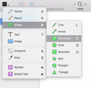
2. Use shortcut for Inserts
Rectangle – R
Circle – O
Line – l
Vector – V
Text – T
At its core, we use shapes and text to construct our design in Sketch. It is important to learn the shortcuts to insert basic objects in Sketch so that you can quickly create the building blocks of your design. Furthermore, they are easy to remember and execute.
3. Rename layers rapidly (cmd + R , tab)
If you use a naming convention to keep your files organized, you will know that renaming layers is very time consuming.
Use cmd + R to enter edit mode to rename the layer. You can also tab through layers (while still in edit mode) to rapidly rename all layers.
4. Focus on layer while moving (alt + cmd)
Moving a selected layer that is obscured by another layer above is a delicate act.
You’re standing on a fine line between accidentally selecting the above layer and your intended layer. Holding alt + cmd will focus your selection so you will never waste time on moving the unintended layer.
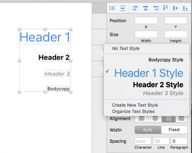
5. Use Text Style/Object Style for repeated style
When working with text heavy projects, it’s always a good idea to create a shared style of the given text, as it will save you a great deal of time.
Sketch’s shared styles is extremely easy and it works on object styles as well.
Grab design ebooks created by best designers
All for free
 Download
 Download
 Download
 DownloadDo you want to know more about UI Design?
Download 'Free Ebook: Web Design Trends 2016' FOR FREE!
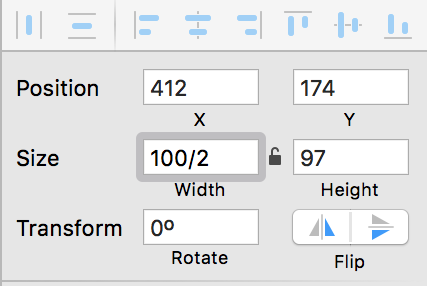
Download e-book for freeClose6. Use math to quickly resize object accurately
You can resize object by using the input field on Sketch’s sidebar.
This will speed up your process of creating precise measurements of the object and keeping your design consistent. The magic here is that you can use math (divide, multiply, add or subtract) in the input to resize.
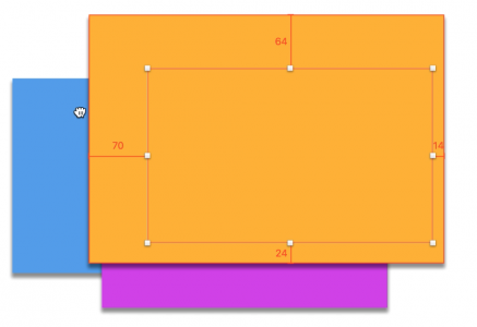
7. Use ‘ALT’ to show object margin (Hold ALT)
Moving objects around and instantly seeing the margin between them can save you a lot of time when aligning objects for consistent spacing.
Just select the object and press ALT. You can also select a second object to see the distance between them by simply moving your mouse over.

8. Creating symbols for grouped object
Dealing with repetitive elements can be risky.
You might end up making tiny tweaks on each duplicate for every little change in design. Instead, try developing the habit of creating symbols so you can apply changes to all repeated elements on the fly.

9. Learn to hide/lock your layers to prevent mistakes
It’s frustrating to select the wrong layer in your design, especially with multiple overlaps.
You will find that learning the shortcut to locking/hiding layers will help boost your productivity as you make less accidental selections.
To unlock a de-selected layer, you can right-click and choose “Unlock layer”.
10. Make your Sketch file interactive
Once you’ve downloaded the UXPin plugin, you can turn all your layers into an interactive prototype just by exporting the selected artboard into UXPin.
Thanks to the preserved layers, you’ll save plenty of time exporting/recreating layers so that you can focus on the interaction models and micro-interactions within your design.
Next Steps
If you found these tips useful, check out the free UX Design Builder’s Ebook bundle.
The bundle includes 3 e-books with wireframing, mockups, and prototyping best practices. Lessons are also included for Sketch and Photoshop.

Feature photo credit: Designmodo
The post How to Use Sketch: 10 Shortcuts for UI Design appeared first on Studio by UXPin.
April 25, 2016
How to Design with Difficult Clients in UX Projects

Any time a client comes to you, they are taking a big risk (especially the smaller ones on a tight budget).
To feel more comfortable—like they have more control over the risk—some clients become nearly over-involved in the design process. Don’t be surprised if they hand you a stack of pre-determined solutions to already-identified problems.
It’s enough to leave you wondering, “Why did they hire me in the first place?”
It’s smart for UX designers to read between the lines in these cases. There is always an underlying situation, so work to identify what’s really going on, as soon as possible.
For instance, clients may be nervous about investing a large sum of money, or feeling pressure from their boss to make the project a success. A few other possibilities might be that:
They don’t want to look like they don’t know what they’re doing
They don’t want to be wrong
They don’t want you to be wrong
They have a hard time submitting to other people’s opinions or insights.
Working around their struggles (or hangups) may sound like walking on eggshells, but how you establish yourself to the client is imperative at the beginning of the process. As a freelance UX designer at Slayter Design, I’ve found that the clients most likely to recommend me to others are those I’ve spent extra time educating and reassuring.
Uncover the Real Problems.
The only way to get the to the real problem is to ask the right questions and conduct the right research. How do you do that, or know if your questions are good?
Often, those pre-determined solutions the client suggests are fundamentally “off” because the the wrong questions were asked from the start. For example asking “Why is our revenue dipping?” instead of “Why are our users unhappy?”
Photo credit: Chris Thelwell for UXPin
If you’re lucky, the client will have raw analytics for you to analyze. If not, ask for any other company data you can collect, such as customer service complaints or feedback the company has received. This will at least give you enough to do a SWOT analysis, empathy map, and/or potentially a few lightweight personas.
Data helps prove to your client that you have their goals at the forefront and will happily guide them during this new venture. It can be frustrating to feel like you have to continuously prove your points. While some clients will be less receptive than others, never lose your cool. Be just as empathic with clients as you are with your users.
Just Test It.
Sometimes, the client likes a bad idea and needs convincing. If they aren’t open to your suggestions or proof, the solution might be to “just test it.”
Depending on the problem, you’ll find countless methods for testing and research to choose from:
Focus user interviews
User testing
A/B testing
Analytics
or a combination of testing methods.
On one of my projects, we decided to leave “the definitive answer” up to the audience.
We were unable to agree on subcategories and how they should be organized, so I suggested that we go straight to the users and ask what made sense to them. After we explained card sorting, we had them take over and define how they thought the subcategories would fall.
Here are a few end results:
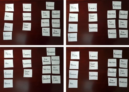
This answered some critical navigation questions, and helped us move forward. The real test was coming up: how would users respond to a prototype?
I’ve encountered numerous clients that aren’t open to suggestions and won’t back down from a bad idea. In these cases, testing is pretty much the only way to go. Once the data comes in, good or bad, it’s nearly impossible to refute. This is assuming that you’ve selected the right testing method for the problem, tested with an appropriate number of users, and have allowed the proper data to be collected (more on that in The Guide to Usability Testing).
If you find your results have rendered only a direction, but not a concrete solution, you can still work with this. Follow that direction and assure your client this will be an area that is kept under close watch for further insight.
I always tell clients that the product we’re launching is an educated hypothesis—but a hypothesis, nonetheless. One of the hardest things to do is educating your client to understand that the end application isn’t really the end, but more the first ‘final’ iteration, which will be improved upon with testing and analytics.
Educate, Don’t Patronize.
When working with clients, the most important things that you can do are to:
Help your client see their project from the user’s point of view.
Disconnect their personal biases.
This helps you avoid the dreaded reasoning of “I don’t know why, but I just don’t like it.”
When faced with a conversation like this, don’t overwhelm them—you only need to supply targeted evidence to get your point across. Establishing your knowledge and expertise at the beginning of the project ought to be enough—after all, they did hire you for a reason—but they might want proof to support your statements.

The first step is to always give your client credit for their suggestions. I often find myself saying “That’s a really good point, but what about…?” or “I think that’s a great suggestion but what do you think about…?” or “I see what you’re saying but have you considered…?”
Since there’s really no such thing as a bad idea (even from your client), it’s your job to let them know why there might be a better solution.
It doesn’t hurt to respond with “I’d love to send you some evidence on the topic.” This buys you time to investigate quality data and/or proof to support your stance. There are plenty of highly-respected resources to corroborate your recommendations, such as Nielsen Norman Group, Smashing Magazine, and UXPin’s ebooks, to name a few.
A very fine line exists between educating and patronizing; you can help clients see past their fears while providing them with quality information, but it’s also important not to push them on the subject.
Pick Your Battles.
It’s important to know which battles are worth fighting. You don’t want the client to feel like you’re pushing too hard even for what they see as insignificant things. If you go overboard, it can come off like you’re disputing just to dispute.
For instance, the hierarchy of information on the page is usually more important than logo size. If you have to sacrifice a smaller battle to win another that’s more important for the users, do it.
That being said, don’t be afraid to question their suggestions. Once you’ve identified more pressing issues, make your points known on the lesser important issue and move on. You can always revisit the smaller issues later.
Everybody Wins or Nobody Wins.
What happens if you don’t fight for your ideas? What if you just sit on the sidelines and wait for someone to tell you what to do?
You’ll end up with a project you aren’t proud of that doesn’t deliver desired results to your client. Regardless of how difficult they made it, it’s rare that they know just how difficult they were. The blame is likely to come back onto you, since as far as they are concerned, they sought out your expertise to help them.
UX designers are only worth as much as their insights and knowledge, so nobody wins if you let that go to waste. True, you’ll inevitably come across that one client that hates the color green, but you’ll know when to pick your battles.
Always put forth your reasoning, all the way through to the finish.
If you found this post useful, check out the free 100+ page e-book UX Design Process Best Practices.

The post How to Design with Difficult Clients in UX Projects appeared first on Studio by UXPin.
April 21, 2016
Responsive Images: The Designer’s Definitive Guide

Web design isn’t always cheap. But of all web design costs to the designer, we should first consider the user’s costs.
Mobile users often pay for every byte they download (and upload) away from wifi. HTML and CSS files, while getting larger every year, aren’t as large as hefty JPG, PNGs and animated GIFs. Conscientious designers know that best practice includes making websites and apps that download as quickly as possible. It’s like trimming out extra adverbs from copy, or extra div elements from markup.
If users don’t need pixels, don’t send them.
As we’ve seen, thinking “responsive” is more than slapping media queries into our code. Responsive images have their own set of challenges that designers must overcome. To make sites that work well and look great on a variety of screens, they need a smart strategy for images from the beginning.
Difficult? Perhaps. Worth the effort? Yes. A picture may be worth a thousand words, but if it weighs a million bytes, then users may give up before the picture downloads.
Choosing the Right Format for the Job
JPG, SVG, GIF and PNG (and PNG-24) — anyone new to web design may confuse the three. That’s not surprising when even seasoned veterans opt for JPG when a SVG would do, or default for PNG-24 instead of PNG-8.
JPG
Or JPEG, short for Joint Photographic Experts Group, was developed in 1991 and published in 1992 as a means to standardize pictures transmitted over the internet. Bandwidth was at a premium, so users prefered files that showed more picture for fewer bytes.
The JPG format uses lossy compression, meaning that once applied, an image can never be fully decompressed back to the original quality. It trades smaller files for reduced quality on a scale of 0 – 100. Oddly, files with 100% JPG compression have the highest quality and the worst file size. 0% compression yields the smallest files with the worst quality.

Artifacts are parts of an image that JPG compression changes for the sake of file size. They resemble blocks of homogenous color, when visible, as if herding colors into areas about 20 pixels square. Hard edges in images are the first victims of artifacts. That, and because JPG compression can look natural on complex images, means that this format is ideal for photos.
Bottom line: JPG compression works well for complicated images with lots of detail, like photos.
PNG (8-bit)
Unlike JPG, Portable Network Graphics files use lossless compression that doesn’t compound as the file is opened and resaved. Instead, PNG-8 files include a list of every unique color they use.
And by unique, I mean unique as in #FFFFFF is not #FFFFFE, although to the unaided human eye they’re indistinguishable. Each pixel is assigned to a color in the file’s list, reducing the need for identical pixels to waste precious bytes reproducing what’s already been said.

If the first hundred pixels use RGB(255,255,255), there’s no need to say so — just state that pixels 1–500 belong to color #1. For this reason the PNG format is great at compressing images with perfectly flat colors.
Bottom line: The PNG-8 format can hold up to 256 unique colors in its list, called a color table. It can also make pixels fully transparent. These facts make PNG-8 ideal for today’s trendy “flat color” look.
PNG (24-bit)
Files that use PNG’s other variety, PNG-24, look great because they use no compression. Nor do they use a color table. Every detail is preserved when saving PNG-24 files … and that’s the problem.
Opacity is another problem. While pixels in PNG-8’s images can be transparent, it’s all or nothing. Either you see them or you don’t.

Bottom line: Pixels in PNG-24 files can have partial opacity, meaning they tint elements behind them. Again, at the expense of file size.
GIF
Graphical Interchange Format, or GIF, resembles PNG-8 in many ways.
It’s universally accepted by every browser. It’s established, having been around since 1987 (somewhat younger, PNG debuted in 1996). GIF uses color tables. It’s compression is slightly less efficient, on average, than PNG. And it can make its pixels completely transparent.
Where GIFs shine is their ability to hold more than one “image” per file, and show them sequentially. That is, GIF supports animation. Animated GIF files usually find their way into content more than design, as their animations can’t be started and stopped — they’re not truly interactive. That and their slightly-higher file sizes mean that designers often prefer PNG over GIF for flat-color images.
Bottom line: If you need simple animations, GIF is the way to go. Otherwise you’re probably better off with PNG-8’s slightly more efficient compression scheme for simple images (like flat-color illustrations) or JPEG for complicated images (like photos).
Join the world's best designers who use UXPin.Sign up for a free trial.Your e-mailTry it for free!
Squeezing Every Byte
Compressing image files — the act of reducing file size by eliminating redundant data or altering the image for easier downloads — is crucial to making websites load quickly. Fast websites, in turn, earn more users.
Most image editors like Photoshop, Sketch and Pixelmator export compressed, web-friendly files without fuss. But they’re not always ideal. Other tools can help compress images even further.
Compression Services
As the name implies, this free, online service takes extra bytes out of any JPG file without sacrificing quality.

Compress JPG slimmed down the above image, saved in Photoshop at 70%, from 217KB to a svelte 160KB. Quality remains untouched.
2. TinyPNG
Another free service squeezes 8-bit and 24-bit PNG files for faster load times.

TinyPNG reduced the above image from 16KB to 12KB by eliminating nearly redundant colors in its color table — without affecting its quality.
How Much is Too Much … or Too Little?
Although it varies per image, our goal is to get the best quality image in as few bytes as possible. At some point, we trim too much out.
But how much? Is there a sweet spot for compression?
For JPGs
To find out, we saved the crowd photo above with increments of JPG compression. Results ranged from 45KB at 0% compression to 479KB at 100%. Contrary to what the term suggests, remember that the highest compressed JPGs have the highest quality (and largest file size).

This chart shows a dramatic decrease in the higher compression ranges. Just dropping the quality from 100% to 70% reduced the file size by almost half — a real bargain. The lower compression percentages, though, didn’t see as much of a difference. Although bytes fell from 0 – 20%, we saw quality drop too quickly to be worth the savings.

The image was 45KB at 0% compression (left) and 94KB at 30% compression (right). Although it halved the file size, the increase in artifacts, or blocky areas where JPG compression takes effect, wasn’t worth the savings.
Best practice: Don’t compress JPG files higher than 70%, or lower than 20%. This is a guideline rather than a hard rule, but we’ve found it the 20–70 range covers most cases.
For PNGs
The story gets more complicated when we look at PNG files. We ran the same experiment on this graphic:
Notice that these colors aren’t strictly flat. There’s a fine gradient over the entire composition. To account for that, we need dithering: a pattern of dots that simulate subtle gradients.
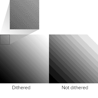
Unlike JPG, the PNG format doesn’t use percentages. The number of colors in its color table determine its quality and, to an extent, its file size. With 88% dithering, the results were, well …

In general we saw a relationship between the number of colors and file size. But not much. Photoshop struggled to find the best patterns with limited color tables. In fact, 40 colors had about the same number of bytes as 25, meaning the same file size but with much higher quality.
Best practice: For best results when squeezing every byte out of a PNG, the best approach is to experiment with different color tables. Unfortunately the right amount is a subjective matter that varies per image. When it looks “right” is up to you.
SVG
Scalable Vector Graphics, or SVG, use lines instead of pixels — vectors instead of raster images — to display line art. SVGs are actually a form of XML, easily created in programs like Inkscape and Adobe Illustrator.
SVG files can generate gradients without dithering, and scale up to fit containers of any size from older smartphones to widescreen TVs. They don’t lose resolution because, as vectors, browsers connect the dots on the fly. They can be animated with JavaScript. And instead of files that must be downloaded separately, which ties up time and server power, SVG can be embedded right in HTML documents.

Above: vector art (left) scales up well. On the other hand, raster art (right) looks blocky and pixelated.
But like PNGs and GIFs, SVGs suffer as images become more complex. They’re terrible for photos and grow quickly in file size as they gain points and curves.
Best practice: If you’re looking for the flat 2.0 look, with its sharp lines and gentle gradients, and aim for recent browsers (IE8 is out of luck), SVGs are the way to go.
Grab design ebooks created by best designers
All for free
 Download
Download
Download
 Download
 DownloadDo you want to know more about UI Design?
Download 'Web UI Design Best Practices' FOR FREE!
Download e-book for freeCloseCode Considerations
Aside from image files themselves, we can do lots with code to make pixels respond well to different situations.
Essential CSS Properties
One of the most common — and most reliable — solutions is to set a bit of CSS:
img { max-width: 100%; }
This selector and property makes most images fit into their containers. For example, if a media query sets a wrapper to 300 pixels in width, then no image inside that wrapper will exceed 300 pixels. This technique has excellent support across modern browsers, which is why you’ll find it in many responsive websites today.
Future HTML Image Elements
Today we’re limited to background images with CSS and the [image error] element. But when (and if) implemented, a new technology will go a long way to making images as responsive as page layouts in responsive web design.
The experimental element contains one or more child element that uses media queries to declare when they should load. Browsers replace the src attribute of an [image error] element within with the relevant source, if any.
For example:
[image error]
The code above would replace sample-default.png with either a large or small variation, depending on the image’s container’s width.
As a bonus, browsers that don’t support will still read the default [image error] element as normal. That’s good news because, at the time of this writing, these elements are not universally accepted — in fact, few modern browsers support them today. But support for and is growing, and smart designers will keep an eye out for their usage in the future.
Browser rendering
Sometimes the best image is none at all. Modern browsers are capable of rendering their own graphics, including gradients, animations, bezier vectors, shadows and geometric shapes. With a little creativity, we can even make stripes.
Creating images in browsers puts the burden of visuals on the user’s end. It doesn’t require downloading any image files, which saves bandwidth and time. But it does require the browser to have certain capabilities.
Best practice: Use browser rendering for aesthetics, like background colors and fancy borders, but don’t rely on it for content. Always test your designs for readability without fancy CSS3 tricks, or even without CSS at all, to see how gracefully it degrades on less-capable browsers.
Implications for UI Design
From icons to backgrounds to content, there’s no doubt that images are crucial for good user interfaces. But responsive images face many challenges including bandwidth concerns and sizing issues.
In a perfect world we’d have the ability to either crop an image for smaller viewports, focusing on the most important parts, or the ability to upload different images for different breakpoints. It is possible to do so. Workarounds exist, and we look forward to and srcset. Until then the best-practice approach is to test your images at various sizes to make sure they’re readable on various devices and browsers.
Designers concerned with responsive web design must consider images in their work. Using the right file format, optimizing compression (but not too much) and watching future technologies go a long way to making websites load quickly and look great on screens of any size, resolution or orientation.
It all comes down to one question: what serves the user best?

The post Responsive Images: The Designer’s Definitive Guide appeared first on Studio by UXPin.
Native Apps vs. Web Apps: and the Winner is …

Are web apps better than native apps, or vice versa?
There’s an ongoing debate about web apps vs. native apps. Some point to native apps’ natural speed, given that they don’t need to go through a browser. Others point out that web apps update faster, are more universal and easier to use.
With HTML, CSS and JavaScript, web apps’ barriers to entry are lower than Java- and Swift-based development. But Java and Swift come with many interactions that, so far, takes extra effort in JavaScript. Web apps require a working internet connection. Native apps require certain operating systems. A web apps can be responsive. A native app can fit its screen perfectly.
The pros and cons go on, but one thing’s clear: neither is going to overtake the other. And that’s good.
User Experience vs. User Experience
The principles of design apply to both types of app in slightly different ways because, in the end, we’re designing experiences for users. But there are some differences. For example, gestures are more common on native apps than websites (except for scrolling down long pages). Native app designers are more likely to use swipes than taps between screens, which — when done well — respond as if they were physical objects, following fingers like real paper.
That’s not to say web apps are devoid of gestures. Drag-and-drop has been available to front-end designers even before jQuery UI came around. But there’s a time and place for each types’ capabilities. For a start:
Web apps
Work on most any device (with a little responsive design planning)
The only “installation” required is to load a URL
Update to the latest version upon each page load
Are easily discovered with a quick web search
Are generally better suited to consuming data
Native apps
Take full advantage of native gestures like inertial scrolling, a.k.a. Rubberbanding
Don’t need to be downloaded every time they’re launched
Are (usually) guaranteed spam-free by app stores’ vetting process
Have easy access to accelerometers, cameras, GPS, and other device features
Can share data like contact info and photos with other apps
Have guaranteed one-tap icons on mobile devices’ home screens
Are generally better suited to letting users interact with data
But there are some overlaps, especially in design. Both require designers to consider personas and user flows. Both require smart use of color, typography and layout. And both benefit from prototyping processes. Design sensibilities aside, weighing the tradeoffs will shape the final product. For example, our own UXPin is a web app for many reasons. Our collaboration features work quicker on the web than it would on isolated mobile devices. We’ve also found that it’s much faster and easier to issue critical updates to our customers. Both let our users work from any computer with a ’net connection, save changes automatically, and review team members’ feedback on the fly — features we’ve found critical for success.
Crafting experiences
Which is better? Frankly, users don’t care that much. They use an app of any variety to get information or accomplish a task, regardless of how it’s created or accessed.
Likewise, UX designers can still apply the same principles to both types of apps. An interface still needs clarity and utility. Google’s Material design principles work great in any context, and collaboration is about teamwork, not platform preferences.
But web apps persist because of their unique properties. Native and web — which one wins? Both. There’s a time and place for each because, in the end, we’re designing for people, not platforms.Join us next week for another #uxpinchat!
From the #UXPinChat
@uxpin A1 I think web will be more popular for certain sectors and less in others… Native is always best for gaming for example #uxpinchat
— Michelle Matthews (@michematthews) April 15, 2016
@uxpin A1 Plus native feels more secure than web for financial apps, but again, as browsers improve that may change #uxpinchat
— Michelle Matthews (@michematthews) April 15, 2016
#uxpinchat I prefer #web-apps if I am not accessing the hardware functions. It can always be put into an native wrapper.
— #HashTagDeals (@hashtagdeals) April 15, 2016
@uxpin non-answer: not sure it matters bc both have their role in efficiency & usability. real answer: prob not — see: capitalism #uxpinchat
— Mike Donovan (@MikeLikeBike) April 15, 2016
@ryantriddle @uxpin Totally. But some tools, maybe not. Think of the prototyping tools that are web-based. #uxpinchat
— Michelle Matthews (@michematthews) April 15, 2016
A1 hard to say, depends on the product… Native offers so much options, but the web "seems easier" #uxpinchat https://t.co/wcfYV9SADS
— Steve Amara (@amarast) April 15, 2016
———————
@uxpin A2 Ability to move seamlessly from device to device, ease of sharing and collaborating #uxpinchat
— Michelle Matthews (@michematthews) April 15, 2016
@uxpin A2 cont. Some native apps can accomplish that too, but I find it's more front of mind when designing a web app #uxpinchat
— Michelle Matthews (@michematthews) April 15, 2016
@uxpin Simplicity in access. I can go straight from search to your site, see content on the spot. Quick, easy. #uxpinchat
— IselianGaming (@IselianGaming) April 15, 2016
@uxpin Native app download = time investment, offer more options. Browser access = quick, follow KISS rule #uxpinchat
— IselianGaming (@IselianGaming) April 15, 2016
@uxpin Consistent & established UX regardless of platform, browser or device. Avoids split & specialized dev on multiple systems. #uxpinchat
— Mike Donovan (@MikeLikeBike) April 15, 2016
A2 distribution. And documentation easier to find #uxpinchat https://t.co/zxJNupZhan
— Steve Amara (@amarast) April 15, 2016
#uxpinchat A2 All users will always be on the same web app version, vs not everyone would update their native apps.
— Uppercut (@madebyuppercut) April 15, 2016
@ux_benjamin @imgur. If I find a cat picture, don't make me DL the app. But if I want an account, features, I'll DL the app #uxpinchat
— IselianGaming (@IselianGaming) April 15, 2016
@uxpin There is no lengthy approvals process in comparison with native app stores meaning you can enhance an experience instantly #uxpinchat
— Matt Pointon (@matthewpointon) April 15, 2016
—————
@uxpin Features, features, features. Accounts, options, personalization, deep use. More control in your app vs browser. Security? #uxpinchat
— IselianGaming (@IselianGaming) April 15, 2016
A3 @uxpin SaaS web apps provide easier access to data and "sharebality" than any classic software. #uxpinchat
— Marcin Treder (@marcintreder) April 15, 2016
@uxpin A3 (Presumably) more secure & more powerful #uxpinchat
— Michelle Matthews (@michematthews) April 15, 2016
A3 you can really tailor the experience to each individual case/user. Personalisation! #uxpinchat https://t.co/kNnJrxxIam
— Steve Amara (@amarast) April 15, 2016
@uxpin finer & explicit control of UX ecosystem albeit at a dev cost. better integration w/ hardware/devices, i.e., notifications #uxpinchat
— Mike Donovan (@MikeLikeBike) April 15, 2016
#uxpinchat A3 Integration with devices, performance, offline mode.
— Uppercut (@madebyuppercut) April 15, 2016
——————-
A4 Yes there is! Native design has different expectations and UI constraints than a web app #uxpinchat
— Zachariah Reiner (@zsr5) April 15, 2016
@uxpin 100% yes, difference in what is offered. Intro content on web, deep on native, adjust UI accordingly. #uxpinchat
— IselianGaming (@IselianGaming) April 15, 2016
@uxpin A4 #uxpinchat I can only speak to mobile, but absolutely. Web has a lot more variables in terms of browsers, but with native you 1/2
— Michelle Matthews (@michematthews) April 15, 2016
@uxpin A4 …pretty much know the UI you're competing with #uxpinchat 2/2
— Michelle Matthews (@michematthews) April 15, 2016
A4 I have to thank Google for Material Design here. They really “unified” Web & Native UI design with it #uxpinchat https://t.co/HZbpx4J8tI
— Steve Amara (@amarast) April 15, 2016
A4 That being said, Web UI Design seems more uniform, hence easier to me. Native can quickly be challenging… IMHO #uxpinchat
— Steve Amara (@amarast) April 15, 2016
@uxpin certainly each have their own constraints. but the goal is for users to not feel/notice the burden of different platforms #uxpinchat
— Mike Donovan (@MikeLikeBike) April 15, 2016
A1 @uxpin access to web apps is so much easier than to software. Culture of access distribution must take over the world. #uxpinchat
— Marcin Treder (@marcintreder) April 15, 2016
@uxpin also, you can leverage established/familiar UI/UX patterns specific to each platform but still align w/ your universal UX. #uxpinchat
— Mike Donovan (@MikeLikeBike) April 15, 2016
—————-
@uxpin ha lighter fare. all the consistent UX ones: @chrome @amazon @twitter @Dropbox @feedly @newsifyapp @SlackHQ @netflix #uxpinchat
— Mike Donovan (@MikeLikeBike) April 15, 2016
A5 @uxpin Most of my work is done in native apps (until they are inevitably web based that is ^__^) so yeah, those. #uxpinchat
— Michelle Matthews (@michematthews) April 15, 2016
@uxpin In all seriousness, @Spotify, @gmail, @Twitch, @amazon for sure. Find myself using a LOT of Firefox/Chrome on the phone. #uxpinchat
— Michael Gremillion (@IselianGaming) April 15, 2016
@uxpin I love a bunch of web OR native apps too, but boy am I disappointed when I have to feel the difference b/n the two #uxpinchat
— Mike Donovan (@MikeLikeBike) April 15, 2016
Q5 @uxpin Tbh, there's no app I can't live without. Skype, now it's Slack. Omnigraffle, now Sketch. #ontothenextone #uxpinchat
— Michelle Matthews (@michematthews) April 15, 2016
The post Native Apps vs. Web Apps: and the Winner is … appeared first on Studio by UXPin.
April 19, 2016
Consumer-Grade UX in the Enterprise: 2 Quick Case Studies
As slick consumer UX becomes the norm, end-user expectations will only increase.
Enterprise products today need to be just as intuitive and fast as their consumer counterparts.
To see the success of consumer-inspired UX principles, you need to look no farther than modern enterprise products like Slack, Blue Jeans, Intercom, and others.
As I explained in the 47-page free guide The Future of Enterprise UX, today’s successful enterprise products require:
Compelling first-use experience
Simplified navigation and interface overhead
A feeling of satisfaction upon task completion
Sufficient end-user customization
Useful offline mode
Lightning-fast performance
But how does that actually play out in the real world?
In this post, I’ll dive deeper into the decisions behind redesigns at Intuit and Asana (where I currently serve as the Head of Design). For each project, I’ll quickly explain the following areas:
Goals
Problems
Challenges
Key insights
Business Results
Let’s get started!
1. Quickbooks Redesign
Goals:
Our goal was to optimize for new users, to make the product usable on tablet devices, and to modernize the application so that it looked consistent across devices and within the application.
We wanted to simplify the user experience while making the product viable for desktop users who had access to more power features.
Problems to solve:
QuickBooks Online existed for over 10 years.
Initially ahead of its time, the product became antiquated and complex as new competitive threats increased. As the product approached the 250k user mark, we realized we needed to rebuild the product UI from scratch in order to scale for future growth.
In August of 2013, I was given the opportunity to partner with the developer and product lead to redesign QuickBooks online end-to-end.
Design challenges:
The original QuickBooks Online tool was burdened by over 70 tabs in the navigation. This was overwhelming to users and made the product harder to understand.

Quickbooks before redesign.
For the redesign, we needed to create a more object-oriented user experience.
Users had access to 7 key tabs of functionality, but actions didn’t have a physical location. If you wanted to create an invoice for example, you could do that from the customer tab, or anywhere else in the application. By creating workflows as objects, we were able to flatten the product experience and help the user focus on their chosen task.
Key decisions/insights:
Creating a great product experience isn’t about getting everything perfect.
Focus on the 3-4 areas in the product that must be outstanding and hold those to a very high bar with your design team. Make sure those experiences exceed customers expectations.
We started with a focused set of design principles:
Be simple, easy to use, and guiding.
Design for the customer and instill confidence.
Establish modern and iconic ownable moments.
Celebrate data while respecting user and device context.
We then defined a new design language (I’ve included a few elements below).

Navigational elements of Quickbooks Design Language.
With the QuickBooks redesign, we actually didn’t rework the entire application for launch. The most important pages were redesigned, while lesser used functionality on older pages were iframed into the new UI.

Quickbooks after redesign.
In doing so, we launched faster without disappointing customers.
Outcomes:
QuickBooks went from ~250k users to over 700k in one year.
Significant increase in conversion to paid users in the US and globally.
23% increase in first visit task completion.
Net promotor increase of 9 points.
33% increase in users adding on other paid services to Quickbooks (like payments).
Decrease in support call volume.
2. Asana Redesign
Goals:
Maximize clarity for new users & improve NPS for existing users.
Problems to solve:
The designers redesigned both the web and mobile apps, reworking the page structure and layout to better communicate the mental model of the product. In Asana, users create projects, which are made up of tasks, which have conversations tied to them.

Asana before redesign.
They clarified this structure through simplified navigation, a unified set of components across the product, and made collaboration tools more prominent.
Design challenges:
Early on in the design process, we realized that making decisions was difficult. We knew we needed to redesign the product, but then realized a larger issue was at play. We needed to take a step back and define our brand first.
We then began our rebrand work so that we could clearly articulate our visual motif and give designers the framework needed to make choices.

New Asana branding.
Key decisions/insights:
One key learning for us was that a rebrand is more than a user-facing project, it’s an exercise in cultural transformation for your company.
It’s critical that everyone at the company internalize the revised brand so that we reflect a unified vision in everything we build. That meant that we needed to provide a lot of internal feedback loops and socialize decisions. We brought the design team together physically so that we could get natural collaboration between marketing, brand, web, and mobile teams.
Asana after redesign.
Another key decision with the redesign was to launch the UI improvements incrementally and separately from the visual changes. This gave the team clarity on which UI improvements were clear wins, and also made the process of rolling out the redesign more palatable for existing customers. The team established core collaboration metrics and tracked core actions (like commenting) to ensure that the redesign was succeeding for users.
Outcome:
Less than 2% of existing users opt out of the new design.
Increase of 5-10% on adoption funnel metrics.
Collaboration rate for new domains has increased ~10%
Next Steps
When considering all the advice we’ve explored so far, remember that you still need to adhere to existing user interface standards, focusing your innovation on the parts of your product that are better than what’s already out there.
It’s not the easiest balance, but the payoff is an enterprise product that feels familiar yet is more efficient and satisfying.
If you found this post useful, check out The Future of Enterprise UX that I wrote with the team at UXPin. Across 47 pages, I dive deeper into best practices for enterprise products based on my experience at Asana, Wells Fargo, Intuit, and Yahoo.

The post Consumer-Grade UX in the Enterprise: 2 Quick Case Studies appeared first on Studio by UXPin.
April 18, 2016
The Beginner’s Guide to Capturing UX Requirements

As we move away from the deliverables business, we become susceptible to the poor planning.
In order to continue designing great products with less of a paper trail, we must make sure to create the right documents, instead of more documents — especially in the early stages.
Let’s explore the documents that help us better understand user requirements without bogging us down in busywork. All these documents are simply artifacts of collaborative UX activities, which is where the real value lies.
1. Gathering Early Requirements
As explained in the free e-book UX Design Process Best Practices, the first stage of the process should be research, which is divided into collecting data and organizing it.
But even before that, you must know why you’re collecting data. Every UX project has its own unique requirements, and research is used to determine what they are. We can divide the requirements into three categories: business, user, and technical.
i. Business Requirements
What the product hopes to accomplish for the company/sponsors. Startups and smaller companies might be able to summarize these in a business model canvas.
Larger companies will usually have more requirements, sometimes completed by business analysts or product managers. In either case, these requirements can be better understood through stakeholder interviews.
Business requirements include overall project scope, rough timelines, and business goals (e.g. “Increase new user sales conversion by 20% without affecting retention”).
ii. User Requirements
What the user wants is central to design thinking, so these requirements should have an enormous influence on the UX design. While using your own empathy will help, you shouldn’t guess at user requirements — these should be gathered through user interviews, surveys, field or diary studies, etc.
iii. Technical Requirements
We can separate technical requirements into functional and nonfunctional categories.
The functional specifications outline what the product should be able to do, such as authentication and administrative functions, and can be organized into a specs document like this one from Product Hunt. Nonfunctional specifications describe how well the product performs, such as usability, performance, data integrity, and maintenance.

The entirety of the design process will be shaped around these requirements, so the better you understand them from the onset, the more precise your final product will be in satisfying them.
2. Conducting Thorough Stakeholder Interviews
One of the best first steps to any UX project is to interview your stakeholders.
Kevin Hoffman of Goodkickoffmeetings.com even suggest doing this before the initial kickoff meeting so that you have a better “behind the scenes” understanding by the time everyone comes together.
Best Practices
If your company has a Product Requirements Document, jotting down notes from this is a good starting point before composing the questions.
As Kim Goodwin suggests, breaks up the types of questions based department:
Marketing Stakeholders — brand promoters looking for new, viable markets.
Engineering Stakeholders — design engineer, system architect, or GUI, if applicable. For hardware, heads of manufacturing and electrical or mechanical engineering.
Sales Stakeholders — in addition to a marketing head, it’s advisable to talk to a sales head, as the two often have different goals.
Executives and SMEs — the decision-makers with authority over the different branches.
Pay particular attention to the following:
Assumptions
Lists of requirements
Prescriptive solutions
When these are brought up, probe with follow-up questions. These areas tend to be complicated, so extra effort is needed to clarify them.
3. Interviewing Users Carefully
As described in the free e-book UX Design Process Best Practices, user interviews also validate the other areas of research. Here you can either confirm or deny the problems and potential solutions that arose from stakeholder interviews or brainstorming sessions.
Best Practices
Every project will have different goals, which means the actual questions should be different. However, there are some general guidelines that can apply to all situations.
Instead of asking what users like and dislike, ask what they do, how they do it, and what frustrates them. Asking open questions, such as “why?” questions, give the user the opportunity to expand on their thoughts and feelings and yield data that simplistic “yes or no” questions cut short. An appropriate amount of silence on the part of the interviewer will also gently encourage the user to elaborate.
Remember that users don’t always tell the truth. Triangulate the interviews against quantitative research (like reviewing analytics and running surveys)
Just as with the stakeholder interviews, keep it casual and light. Since the user is likely a stranger, helping them relax will give you better, more honest responses.
Also like with the stakeholders, record of the interview to share with the team.
4. Surveying Users Correctly
You can think of user surveys as “user interviews light” — if you’re short on time or resources, they’re the next best option for understanding your users. While their data is not as in-depth or reliable as interviews, they can still shed light on your customer base.
Best Practices
Surveys are generally low maintenance — your involvement is limited to writing the questions and analyzing the data.
While surveys are a time-saving option, you should still be diligent when writing them to get the results you want.
First, shorter is better, so only ask the questions you need to. Users will give better data to a 3-minute survey than a 20-minute one. Try creating a list of all potential questions, then editing them down to 5. If you have 8 questions, that’s fine, but any more and you should start cutting.
Pay attention to phrasing. Closed questions (yes/no, multiple choice) will give you data that’s easier to analyze, while open questions allow you to discover new information — however, Jonathan Kochis, partner at Treble Apps, advises to be highly selective with your open questions.
Consider the order of your questions, with the most important first. If you’d like to follow up, mention this at the end, after they’re more familiar with you.

5. Documenting Just Enough Specifications
Some UX documents collect and officialize data for reference. If you’re trying to streamline the process as much as possible, you can cut them out, but if you have the time, they’ll prove valuable.
Specs Document — Lists concretely the product requirements and technical requirement. Treat specs documents as a knowledge portal rather than encyclopedia. To learn more, check out our practical How-To article.
Style Guide — organizes all the project-wide choices for areas like color, typography, brand usage, layout, etc., and can even include bits of code. Download the free Critical Components of Web UI Style Guides for best practices.
Mood Boards — Showcases more abstract mood of the product, usually through collages, and sometimes with minor style guide elements. Great for communicating a consistent product atmosphere during the early stages.
Change Log — Somewhat of a relic from the waterfall days, but occasionally useful for settling disputes or general record-keeping.
Since the less documentation the better, ask yourself whether or not these will actually help you generate better designs before committing to any of them.
For example, some of our customers use a hybrid approach that combines lightweight requirements documents with annotated UXPin prototypes. Instead of prescribing every requirement in the document, they describe the guidelines and then link to the user flows and prototypes for the most up-to-date visual representation. Designers and developers can then both annotate the prototype to map out the technical implementation.

Wireframed user flow in UXPin created by Autodesk
Takeaway
Card sorting, field studies, participatory design — these all lend their own type of insight to the process. The methods we mentioned above, however, are what we consider the bare minimum. They are the proven methods that any company can implement.
For more real-world advice on improving UX design, check out UX Design Process Best Practices. The free 100-page guide provides tips on the whole UX process from gathering requirements to testing designs.
Feature photo credit: Fast Co. Design
The post The Beginner’s Guide to Capturing UX Requirements appeared first on Studio by UXPin.
April 15, 2016
6 Persuasive UI Design Patterns to Hook Users
The products we find most engaging have a basic design pattern: a hook.
In his book, Hooked, Nir Eyal explains how to form hooks: experiences that connect users’ problems to a company’s solution with enough frequency that a habit is formed. Hooks are in all sorts of products we use with little or no conscious thought.
Over time habits are formed as customers form associations sparking unprompted engagement. They move from needing external triggers like advertisements and other calls to action, to letting associations with internal triggers spark unprompted engagement on its own; to self-trigger.
The hard part is getting from the need of external triggers to letting internal triggers and associations do their job. Looking into the patterns of psychology is the key. Many of these are documented in the Persuasive Pattern card deck; a collection of 54 design patterns driven by psychology. Each card describes a psychological insight and explains ways to apply it to your product. Let me explain a few of them.
Below are 6 of such persuasive patterns, which will all help you form hooks that will connect your users’ problems with your company’s solution – hopefully with enough frequency to form a habit.
1. Feedback loops
Communicate how our actions modify subsequent results. Allow people to play interactively with information in so they can adjust their behavior and future actions toward reaching a greater goal. Use numeric data to show progress and translate data into analogous visual information.

Dribbble.com lets designers upload their own designs to get feedback from their peers, who can then reply with rebound alternate takes on the initial designer’s proposal. In a recurring feedback loop, designs can again be rebounded and so forth. Dribbble play on multiple ways of starting a feedback loop: likes, comments, tweets, and rebounds.
2. Kairos
Communicate to users in situations that are the opportune moments for change. Kairos represent situations of change. Situations of change are potentially valuable as users are here especially open and receptive to change or making a deal.

When your trial period nears an end at ClickTale, you are notified that you are about to loose everything you have recorded so far. Act now or lose out on valuable data forever. They’ve identified an opportunity for selling me a paid account at the time of change that was most opportune.
3. Trigger
Use small nudges to cue users to take action – directly or through learned associations. Triggers cue the user to take action in the context they are in. Triggers might be notifications, tweets, emails, text messages, links, or other distractions. Offline triggers should also be considered. Triggers can be set (alarms), brought home (printed reminder sheet), or follow an action (ask someone a question).
Meetup.com has implemented both a notification system and group and private messaging; all great triggers for continued behavior.
4. Tailoring
Adapt the offerings of a system to match individual users’ needs and abilities. Tailored information is more effective in changing attitudes and beliefs than generic information. Make life simpler for users by showing only what is relevant to them. Tailor to factors relevant to the individual such as individual needs, personality, interests, and usage context.

Amazon.com is the classic example of a site that has mastered tailoring to its fingertips. Their data-driven suggestions based on your browsing and purchasing habits are prevalent on both their website and in their newsletters.
5. Self-monitoring
Enable users to track the behavior they want to change. Make it easy for people to know how well they are performing a target behavior, increasing the likelihood that they will continue to produce the behavior. Self-monitoring can help users learn about themselves and can be intrinsically motivating.
The mobile fitness app “Pact”, lets you commit to a goal of exercising regularly. If you don’t reach the goal, you have to pay up. If you do reach your goal, you are paid by those who didn’t reach theirs. Pact helps you track your exercises to make sure you stick to your goal.
6. Periodic Events
Construct recurring events to build up anticipation, a sense of belonging, comfort, and a sustained interest. Consider ways to create shared recurring experiences users can look forward to or reminisce about. Typical examples of periodic events are seasonal events such as Christmas, Mother’s Day, and Black Friday sales events. However, you can also create your own events. Consider how you can implement things like monthly report cards, weekly tips, and daily updates.

Udemy.com uses Black Friday to sell their courses at a gracious discount.
Next Steps
If you found this post interesting, feel free to check out my Persuasive Pattern cards. The 54 insights are the result of years of writing and teaching about these exact principles.
I created the cards to help generate ideas for new products, features, or creative solutions to problems.
You can also check out the free 2016 Web UI Design Best Practices Ebook Bundle, which includes over 400 pages of advice on web design and UI patterns.

The post 6 Persuasive UI Design Patterns to Hook Users appeared first on Studio by UXPin.
UXpin's Blog

- UXpin's profile
- 68 followers

