
UXpin's Blog, page 131
March 25, 2016
Unleashing Your Design Superpower

They work for good. They can change lives. They’re often tireless individuals who rush to beat killer deadlines. They’re designers.
The idea of a designer as a hero isn’t meant to make grandiose claims of their importance to society. In fact the best designs go unnoticed, keeping their identities secret.
Designers themselves can be downright modest about their work, boasting only through their portfolio or résumé. And that’s fine. No one likes a self-absorbed braggart. However, that means they can get caught up in humility, especially when bombarded with negative feedback for weeks or months on end.
But there is a bit of hero in every designer, even if she or he doesn’t know it. Over time, self-confidence can make good designers better, just as a lack of confidence can detract.
How does it work? This checklist will help you find your inner hero.
How are you a superhero?
What do you like to be known for? Every superhero uses their powers in different ways. Some are known for it, like Spider-man’s web-slinging way to get around town. Identifying your personal and professional values will help keep you on track when accepting work and honing your design process.
Do you show your process? Superheroes may sometimes hide behind their secret identities, but aren’t ashamed to show their stuff in action. How you demonstrate your design process to potential clients, or encourage team members to stick to a plan?
What inspires you to act? Like heroes, many designers aren’t in it for just the paycheck. Remembering why you got into the business will help keep it from becoming just a business.
What’s your itch? Sure, this is more of a super-villain thing, but some designers have their pet peeves (I’m looking at you, bad kerning) — wrongs that must be righted at any cost. Taking professional pride in your work means minding those details … maniacal laugh optional.
What’s more important to your work: tools or skills? Not every designer has powers beyond those of mere mortals. Sometimes they rely on experience or their software. A quick test: do you start a project on pen & paper or in a particular app? The better you understand how you think, the better you can instill confidence in your process to potential clients.
How cool is your hideout (work space)? Great designers find inspiration all around them. Dull cubicles may not always equate to dull work … but surrounding yourself with art that you love helps keep creativity flowing.
For order amidst the chaos of form and function… https://t.co/pnQlXjDCw8
— Zubaa (@michalineum) March 25, 2016
.@uxpin using visual methods to convey information honestly and clearly! #uxpinchat
— Christie Walsh (@walshrarebit) March 25, 2016
A4 : @uxpin #uxpinchat @johnmaeda He is doing amazing work raising awareness in the value of design in tech.. #DesignInTech
— Zablon Wanyama (@wandiasilo) March 25, 2016
Up, Up and Away
Not every designer considers her or himself to be a hero. They may not wear flashy costumes or outrace bullets. But they can — and often do — perform stupendous feats while racing against the clock. What are your design heroics?
Join us for the next #uxpinchat on Friday at 11am PDT when we’ll talk about music, open offices, and how they affect productivity.
The post Unleashing Your Design Superpower appeared first on Studio by UXPin.


March 24, 2016
What Design Team Morale Means for CEOs and Designers
Most designers naturally want to join a company where the design of the product is already strong, believing it reflects the value the company places on design and how well designers are set up to succeed.
However, product / design quality is a lagging indicator of companies’ relationship to design and only tells you part of the story. It is equally important to consider leading indicators as well.
Lagging indicators are output-oriented, the results of efforts that were made in the past. They are backward-focused and trailing. Leading indicators, on the other hand, are precursors that help predict the direction something is going.
In public companies, for example, lagging indicators of a company’s health might include net revenue, revenue growth, and return on net assets. Leading indicators might include customer satisfaction, growth in new markets, brand recognition, or number of new patents. Both kinds of metrics are important to consider when evaluating how well a company is doing and where it’s headed. Similarly, lagging and leading indicators for product and design can help guide what companies need from design and what CEOs can do to turn design around within their companies.
When it comes to assessing a company’s relationship to design, it really boils down to two things: (1) design team morale and (2) product quality.
Design team morale is a leading indicator for a company’s design health. Are the designers in the company positive and happy, or do they complain about feeling disempowered or disenfranchised? Product quality is a lagging indicator for a company’s design health, because it reflects all the actions, decisions, and processes the company makes, from the CEO and throughout the organization.
The morale of a UX team is a canary in a coal mine because everything a company does and is impacts the end user experience — the strategy, scope, process, and talent all manifest in the design.

Photo credit: Doug Thompson via Share America
Yet the design team often feels the least empowered to fix the experiences they’re responsible for designing. If designers are not happy, it likely reflects larger issues with the company that impact current and future products under development. Moreover, if designers are not happy, it’s really hard for them to create a joyful experience.
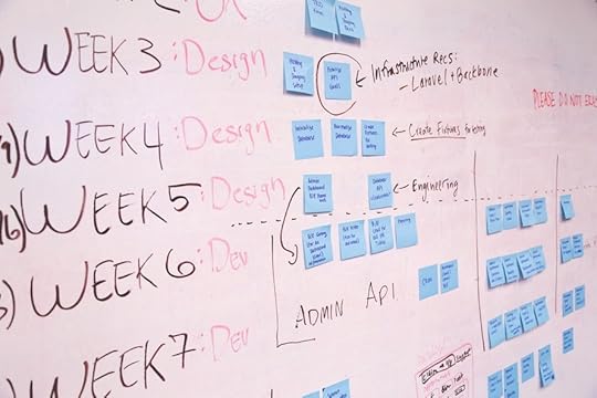
You can chart the relationship between design team morale and product quality into a 2×2 box to infer where things are at and what is needed:
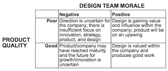
Let’s take a look at each box and what it means:
Design team morale is negative; Product quality is poor
Under this scenario, it’s likely that the company lacks a strong vision for what it wants to do and/or how to get there. The product is confused because internally the company lacks clarity. The design team’s morale is low because they don’t feel empowered to solve the company’s problems; the problems go beyond the purview of the design team.
What’s needed from design and the CEO: The company needs a strong vision that senior leadership can communicate and sell to everyone. Design can help shape strategy by making vision tangible and helping leaders understand possible outcomes. In order for this to be possible, there needs to be a healthy, close relationship between the design leader and company leaders. If a clear vision for the future exists, it’s incumbent upon the design leader and CEO to rally the team to see the opportunity ahead and be excited about delivering it.
Within product development teams, designers suffer the most when there is insufficient process. Process can often be overlooked or undervalued within companies trying to move quickly, but a little bit of the right process can help teams move even faster toward the desired goal. Process can keep a team focused by clarifying escalation paths and how decisions get made. The first design created is rarely the best; use process to carve out sufficient time for designers to explore, design, prototype, and iterate.
Grab design ebooks created by best designers
All for free
 Download
 Download
 Download
 DownloadDo you want to know more about UI Design?
Download 'UX Design 2015 & 2016' FOR FREE!
Download e-book for freeCloseDesign team morale is positive; Product quality is poor
There can be a variety of explanations for this scenario but rarely are designers ever happy to work at a company that is shipping a bad product unless they believe in the future. Under this scenario, the company is likely orchestrating a pivot or change that gives the designers hope.
What’s needed from design and the CEO: Designers are gaining power and influence and need to step up their efforts to get the company aligned in a single direction. They feel support from the CEO and believe they are set up to succeed. Many designers will overlook opportunities at companies in this box because they only focus on the lagging indicator of bad product quality. However, the leading indicator of design team morale suggests that things will soon improve and there is a chance to play a huge role in turning things around.
Design team morale is negative; Product quality is good
It might be surprising to know that a design team’s morale can suffer even when they are shipping products that are well-designed, but it does happen. Under this scenario, the product has likely reached some level of maturity, but the company has stopped innovating, growth is starting to stagnate, and the future is uncertain. The company ships reasonably good products but designers feel they are not helping to move the needle forward significantly.
Another reason for this scenario may be that the designers are overwhelmed and cannot keep up with the internal demand for their skills. They are spread too thin across too many projects.
What’s needed from design and the CEO: The company needs to chart a future beyond the status quo, and design can be instrumental if not crucial. Companies in this box might fund innovation centers staffed with designers to disrupt or augment their current business, or they might fund skunkworks projects which include designers.
Alternatively, if design team capacity is the problem, the team needs strong management: allocate more headcount towards design to keep up with the demand, and prioritize aggressively. Rarely are there ever enough designers to go around. Rather than spread few resources across too many projects, redirect designers’ energy toward working on a few projects really well.
Design team morale is positive; Product quality is good
Everything is running well and people are happy. While the product is successful and there is company growth, positive design team morale reflects opportunities for their growth and development, not stagnation, and such opportunities are typically the outcome of a strong vision for the company and a clear direction for how to get there.
What’s needed from design and the CEO: With growth and success come challenges related to designing at scale and creating a coherent, consistent design. Style guides, design principles, best practices, and codification of design process are important endeavors that enable a design team to stay effective at scale. Engineering can best support such efforts by building front end infrastructure that allows design to be propagated consistently, and product managers help ensure a coherency in the product by prioritizing such “design infrastructure” projects.
What this all means for designers
Designers vetting different job opportunities should pay attention to both the morale of the design team and the quality of the product. Either in isolation will only tell you part of the story, but combined can give you a more complete picture.
Once you have made that assessment, consider what the company needs from design, and decide for yourself whether you want to sign up for that challenge. No single challenge is more or less worthy than the others; everyone’s temperament and appetite for these different challenges vary. The better you know yourself and what kind of work nourishes you, the better equipped you are to choose what makes sense for you.
What this all means for CEOs
For CEOs, design team morale is a both a leading and lagging indicator, because morale is deeply affected by the sum of how the company thinks and acts. If CEOs care about the success of future projects, they need to pay attention to the morale of their design team. Connect with the design team to understand:
Are the designers proud of the work they create? Do they feel like they can do their best work? Why or why not?
Does the company have access to all the skills needed to create great design? For example, do they understand who they’re designing for, what they need, how they think and feel? Do they have the skills to create beautiful products? Do they know how to move people through an experience so users feel satisfied and delighted? Can/do designers explore a range of solutions before narrowing in on the best fit for a problem?
Does the company implement designs with a high degree of fidelity, or is it usually “close enough”?
Do designers feel they are constantly catching up and servicing requests from stakeholder functions or do they offer equivalent leadership to the rest of the organization?
Can you attract the best talent in the industry? If designers keep rejecting your company, why do they choose to not join?
How much pride does the company take in the product or service offered? How does the company prioritize respect for craft vs. getting things done?
Does the company commit to iteration or do they move on to the next feature and never look back?
How do design decisions get made? Who decides, and what is the company optimizing for (e.g. quality, speed, ease of implementation, etc)?
With insight into these questions, you can start to uncover the factors that contribute to low design team morale and take steps that will ultimately benefit product quality.
Originally published on Medium.
Editor’s note: For more product advice, check out the free 100+ page guide UX Design Process Best Practices.

The post What Design Team Morale Means for CEOs and Designers appeared first on Studio by UXPin.
March 22, 2016
The 25-Minute Design Sprint
 Can we really create great work in just 25 minutes?
In my earlier article ‘Quality vs. speed – The death of the designer,’ I talked about the problem designers face in the new digital world: quality versus speed.
We need to switch from quality-first to an approach focused on speed and learning in order to get our ideas into the marketplace sooner. The 25 minute design sprint is a technique I’ve introduced into our design team at Envato to help break the quality habit and to see instant results from working and learning quickly.

The theory is simple, we create short feedback loops in the team to design, measure and learn. We break the quality habit by forcing the designers to work very quickly and focus on what they can learn rather than what they can produce. It’s based on the Pomodoro Technique which uses blocks of 25 minutes followed by five minute breaks to focus attention on getting something done.
The 25 minute design sprint is really easy to do, it’s ideal to use at the start of a project when exploring ideas and concept. It can be used continuously throughout a project, breaking all parts of the design work into 25 minute slices or stopped when you feel you are getting somewhere and have clear direction.
The Process
Using a timer, set up 25 minutes for the first sprint
The whole design team then works individually for 25 minutes to create and explore ideas, ideally using sketching first
I recommend that the 25 minutes includes at least ten minutes of researching and gaining inspiration
It’s also a good idea to make sure the team sit together so everyone can see what everyone else is doing, this is great for creating inspiration and encouraging competition between designers
When the sprint ends everyone stops what they are working on (don’t give in to the ‘I just need another five minutes’)
The whole team then comes together to discuss and share their ideas, this is where we measure success and learn
The team then decides if each designer needs to persevere (develop their ideas) or pivot (try something different) in the next sprint
We then take a five minute break away from work
The sprint process then starts over again
The Results
At first, the results are quite poor. But after the first few sprints, we start to see the benefits of the learning and the collaboration.
The ideas and thinking really start to improve and the concept starts taking shape very quickly. The 25-minute design sprint has some great advantages over the unstructured approach of sit down, get on with it and show me what you have at the end of the day.
Stops designers hiding in their work, forces them to design in the open
Encourages collaboration and sharing of ideas
Gives everyone in the team a voice, allowing them to show their ideas
Prevents time being wasted crafting the wrong thing
Quality actually improves as more feedback is created
Everyone can see how their own input has helped create the end result
The ‘how we came to the solution’ story can be told to the client
The incremental development of the concept helps prevent the last minute rush to deliver
The team starts to work much quicker (even when not sprinting)
Originally posted on Chris Thelwell.
Editor’s Note: For more example-driven advice, check out the free 100+ ebook UX Design Process Best Practices .
The post The 25-Minute Design Sprint appeared first on Studio by UXPin.
5 Ways to Ensure Usability Testing Results Aren’t Ignored
 Usability testing is only useful if your team acts on the results.
In this piece, I’ll quickly explain a couple best practices for helping your team actually implement the insights.
1. Understand the purpose of the feature or application that you’re about to test.
Why are we building this thing? When it succeeds, how will it benefit the company or product line? What benefit are end users going to get out of it? What are the regulations, expectations, and constraints? The user researcher should be able to answer all of these questions back to the product stakeholder.
What happens too often is that the user researcher doesn’t really know these answers. That hinders them from writing the most effective test scripts and surveys (and usually means that the product manager or other stakeholder takes too much ownership over writing those docs).
When the user researcher is deeply familiar with all of the “why” questions, they can work more independently in creating and conducting the tests. They know which tangents to follow up on and can ask really useful spontaneous questions.
2. Find out what the questions need to be answered by the testing.
What beyond “can they complete the core tasks” do you want to know? Are there questions you have around how users behave, attitudes they hold, competing technologies they use, their intent? The first user research interview you should be doing is on the stakeholder of the testing.
Task-based usability testing can often feel like it was conceived in a vacuum. If you’re wondering how likely it is that people will buy premium services on top of a product, testing the rote mechanics of going through the checkout flow will probably not answer that question. A combination of surveys and interviews may be a more effective approach.
3. Design the shortest possible test.
“Here’s a PDF report and links to the 5 hours of videos.” — WHOA. No one is watching those videos, ever.
I’ve gotten tons of value from long customer interviews (some of which I’ve recorded and some where I just took notes), but they’re hard to consume. When people don’t watch the results, they don’t act on the results. Better to do multiple, shorter, tests than long ambitious ones that are overwhelming.
4. Recommend changes based on test results.
Take a stand. How can you expect other stakeholders to make changes based on research if you aren’t willing to suggest them?
This is why my first point is so critical: without it, the user researcher won’t be equipped to make recommendations that make sense for the user AND the business. “Pure usability” rarely wins in a business context; it’s always a tradeoff.
Stakeholders won’t necessarily follow your results, but a strong stance gives them something to bounce ideas off. In most cases, product managers agree with some of our recommendations and use other bits to form a different — but educated! — opinion.
5. Tell a (SHORT) story with the results — juicy quotes, numbers, screenshots.
Recommendations in bullet point form
Quotes that support your assumptions
Quotes that totally negate your assumptions
Really [insert emotion] quotes!
Screenshot or video still or pie chart (optional — these do take longer)
X% of participants did X, Y, Z
That is the extent of most peoples’ attention spans. Sure, you can add in that link to the 5 hours of videos at the bottom. But your first job is to grab the first 15 seconds of your stakeholders’ attention and keep it.
Originally posted on CindyAlvarez.com.
Editor’s note: To ensure your next usability test is as actionable as possible, get started with our free Usability Test Kit created by CEO Marcin Treder.

The post 5 Ways to Ensure Usability Testing Results Aren’t Ignored appeared first on Studio by UXPin.
Use Color to Up the Ante on Your UI Cards
Thanks in part to the growing popularity of Material Design, card-style interfaces are popping up everywhere. This trendy and functional aesthetic uses container-style design elements to hold a variety of information. If you want to take advantage of this highly versatile approach, your cards need to stand out.
One way to do that is with color. Great color choices, exciting color palettes, and interesting combinations can be used to create emphasis, enhance usability, and draw users into your design projects.
Card-Style Design Primer
There’s a lot to know about designing with cards, which can feature various kinds of data (such as images, text, buttons, links, comments, or video) that all relate to one link or piece of information.
Designed to mirror the look of old-school playing or trading cards, these clickable containers include an area for some sort of visual and a small block of text or a button. The advantages to a card style interface are that users tend to easily grasp how they work, making them an ideal solution for aggregated content or e-commerce. Plus, they’re easy to browse and are highly shareable and versatile.

Photo credit:

Photo credit: The Clymb
To start using cards, begin by learning the basics of card design in UX Pin’s “Web Design Book of Trends 2015-2016.”
You’ll also want to follow these seven best practices from “The Complete Guide to Effective Card-Style Interface Design”:
Negative space. Use sufficient borders and padding to avoid clutter.
One card, one concept. Cards simplify your site’s structure. Don’t undermine that by making each card overly complex.
Suitable images. Card images tend to be small, make sure you use clear pictures that are appropriately cropped to suit where they’ll be used.
Simple typography. Because text also tends to be small, simple typography is most legible. Choose simple and elegant fonts, avoiding decorative typefaces.
Get creative. Make an extra effort to stand out from the crowd, using elements such as animated effects, video, round frames, or new color schemes.
Use an open grid. A standard grid helps maintain the same spacing while respecting various sizes and breakpoints.
Implement Fitts’s Law. As we described in Interaction Design Best Practices , Fitt’s Law (as applied to cards) suggests that the entire card be clickable—not just the text or the image. This makes interaction easier for the user.
Light vs. Dark Cards
The first decision you have to make is whether you prefer a light or dark color scheme. There are pros and cons to each; white or light schemes are most common, but darker colors are becoming increasingly popular for mobile apps.
Photo credit: Dribbble
Dribbble’s cards are easy to see, sort, and click to learn more about an individual project. Its design uses white cards against a light background, with a content area below each image to display work. The light color scheme works particularly well on desktops and is easy on the eyes.

Photo credit: SB Joinery
SB Joinery chose a much darker color scheme—reverse type on a dark background—and uses a tinted overlay on images to put visual emphasis on the text and ghost buttons. The pop-out menu also uses this darker theme. Thanks to bolder fonts and high-contrast colors, this dark card aesthetic is readable and highly usable.
Bright Color Schemes
Material Design has been a major influence in the use of cards—and for good reason. The design style emphasizes mobile usability, borrowing from flat design and minimalism to follow an aesthetic and techniques that users are growing accustomed to.
This style incorporates a color palette of bright, saturated hues ranging from blues to greens to reds. While you don’t have to abide by these color suggestions, the idea is a good one. Adding bold, bright color elements can create emphasis and facilitate usability.

Photo credit: Helbak
How can you make the most of bright color?
Use for headers, buttons and call-to-action elements.
Use as a background that adds meaning—such as colors associated with different types of cards. (Like this example from Helbak.). Note that even pastel or light colors can work beautifully in this way.
Use color for primary text elements to assist readability.
Overlay images with bright color or use a duotone technique to guide users through cards.
Color for Emphasis
Finally, bold color choices can be a great tool to emphasize specific elements. For example, color elements can break up visual monotony and increase interaction.

Photo credit: Mayors Challenge 2016
The Mayors Challenge design makes the most of material concepts without feeling like a Google product. Color is bold and bright, while cards are somewhat simple and “undefined.” Pulling it all together are hints of bold color in iconography, text, and links that guide users through actions to take on the site.
One of the criticisms of card-style design interfaces is that elements can start to look too much alike—so have fun and think outside the box.
Takeaways
Color can be just the thing that helps your card-style design stand out from the crowd. Think about how color best compliments your brand and serves users, as you choose which techniques to use.
For maximum impact use color for a specific purpose and to draw users through the design and stir them to action. Whether you go with light versus dark, or bright colors and trendy combinations, color can influence how users feel about and interact with your design.
The post Use Color to Up the Ante on Your UI Cards appeared first on Studio by UXPin.
March 21, 2016
14 Design Psychology Articles for UX Practitioners

Thought processes, behavioral patterns, the predictability of experiences — these are subjects of study in both psychology and UX design.
Understanding psychology directly improves how well you design, but how can that help short of getting a Masters? Read these 14 design psychology articles for a crash course in designing for the human mind.
1. The Psychology Behind Web Browsing
If one person can teach about web psychology, it’s Liraz Margalit, PhD, and resident psychologist at a website optimization firm. Her feature covers the basics, including stress responses, instincts, and the expectation of perceived control.
2. How Bad UX Makes Users Blame Themselves
If there was every any doubt, this piece proves the deep link between psychology and UX design, not to mention to one of many peculiarities of the mind. More than dwelling on the science, Ivana McConell also offers some good workarounds to a bad experience.
3. The Psychology of Notifications
Ximena Vengoechea and Nir Eyal team up to explain the right and the wrong way to design notifications, and their role in developing habit loops to ensure a user’s repeated and continual patronage.
4. Combining UX Design and Psychology to Change User Behavior
As a UX designer, you’re in charge of your user’s behavior, for better or worse. Nadine Kintscher explains how designers can influence and guide what they user does, including tips on motivation mapping and identifying triggers.
5. How to Design Websites that Mirror How Our Eyes Work
Psychology isn’t just about how we think, speak, and act — it’s also how we see. Learn some science about human eyesight and viewing patterns, and more importantly how to apply them to UX design.
6. The Meaning of Shapes: Developing Visual Grammar
A fascinating read for everyone, but professionally applicable for UX practitioners, Steven Bradley’s piece dissects the greater meanings behind everyday shapes.
7. Psychology Power of Closure Experiences
Closure experiences, with definitive beginnings and endings, can have a great effect on the user’s mind, but in experience and reflection. Joe Macleod describes the relevant psychology behind closure experiences, and solid tactics for making the most of them.
8. Dark Patterns: Deception vs. Honesty in UI Design
This piece shines a light on dark patterns, UI patterns that rely on deception or misleading the user to influence their behavior. Harry Brignull discusses them in-depth and with an open-mind, at times even defending them, and compares them with honest alternatives.
9. Cognitive Psychology for the UX: The Principle of Least Effort
As part of an ongoing series, the UserTesting team studies individual psychology principles and their applications in UX design. The entry on the Principle of Least Effort complements Steve Krug’s Don’t Make Me Think, explaining why we prefer faster, automatic responses to calculated analysis, and its implication on UX design.
10. Cognitive Psychology and UX: The Principle of Limited Attention
Another entry to the UserTesting series, this article covers what users pay attention to and why. Using scientific backing, the piece describes topics like inattentional blindness, compromised attention spans, and what causes items to become background noise.
11. 5 Psychology Secrets for Great Interaction Design
Just as the title suggests, the article gives 5 practical interaction design techniques based in psychology — ranging from empathy tips to shortcuts for establishing emotional connections, to — plus the best practices for applying them.
12. The Psychology Behind High Converting Sites
What are high converting sites doing that you’re not? Peter Boyle brings psychology to CRO, spelling out concepts like the decoy effect, the pleasure principle, the Law of Prägnanz, Hick’s Law, and mental models.
13. Brain Hacks: Using Psychology in Web Design
A broad discussion of psychology in web design, but nevertheless full of actionable techniques any designer can use, Stephen Moyer’s article is a good place to start for beginners. He talks a little on a lot, covering the deeper meanings in colors, imagery, and typefaces.
14. How to Create Emotion with Color in UX Design
Every color — even every shade — creates predictable emotional responses in the viewer, even if subtle. Learn the 12 most common colors and their implications on web design, including screenshot examples from real sites for each one.
More UX Best Practices
To dive deeper into your users’ heads, download the free Practical Interaction Design Ebook Bundle.
This package contains three of our most popular ebooks on psychology applied to design (Interaction Design Best Practices Volume I & Volume II, Consistency in UI Design), with over 250 pages and 60 real examples analyzed.

The post 14 Design Psychology Articles for UX Practitioners appeared first on Studio by UXPin.
15 Useful Prototyping Articles for UX Practitioners
Prototyping is one of the most useful UX practices available. Rather than showing your static design, prototypes are the living design.
Luckily, there’s no shortage of advice online, so if you’re looking for some quick reads on prototyping, check out our favorites below.
1. Three Metaphors for Prototyping
This clever and thought-provoking piece better explains the heart of prototyping through three novel metaphors. A great read for UX practitioners of any level of experience, Matt Yurdana’s article helps understand the point of prototyping by seeing it from a new light.
2. Why Designers Should Never Skip Prototyping
Our own Ben Gremillion explains straightforward why prototyping is not just helpful, it’s practically necessary. If you’re not quite sold on the idea, or new to designing in general, this is a good piece to start
3. Prototyping Your App
In this helpful piece, Javier Cuello gives an overview of a basic prototyping process, exclusively for apps. Because app prototyping has different goals, even prototyping veterans would find this article helpful in translating the process to this new format.
4. How to Turn Photoshop Mockups into Animated Prototypes
Many designers ignore prototyping because they view them as wasteful. This is a misconception, as, with the right tools, prototypes can be built from existing documents and later progressed into new documents. Mateusz Makoseiwicz explains how to turn static Photoshop mockups into interactive, testable prototypes.
5. Paper Prototyping
Shawn Medero discusses everything a UX practitioner needs to know about paper prototyping. While this style has its obvious limitations, for certain purposes nothing is better. This all-inclusive guide explains how, when, and why to use paper over digital mediums.
6. Hi-Fi Prototypes: Design is Our Muse, Code is Our Medium
Heather Daggett’s perspective on prototypes is something all UX practitioner’s can learn from. Her article gives a good examination of the theory of prototypes, and why she prefers high fidelity. While she suggests coding, even designers who aren’t familiar with this can still learn from topics like “The Prototyping Mindset.”
7. Exploring the Problem Space Through Prototyping
One of the most reliable voices in UX design, Jared Spool pens an article that lives up to his reputation. His calculated analysis of prototyping reveals how to use it to explore the three dimensions of the problem spaces (technology, business, and users), plus breaks up prototype design into four phases.
8. Creating Perfect User Flows for Smooth UX
Marek Bowers wrote an excellent piece for our blog all about user flows, including how to make them and why they’re important. The article also goes into detail about creating user flows for prototyping, and if implemented can increase low-fidelity prototypes.
9. How Prototyping is Replacing Documentation
Getting philosophical about prototyping, Ian Schoen not only gives a concise description of the prototyping practice, he also analyzes its role in the future of design, and how modern prototypes are making more traditional deliverables obsolete.
10. Rapid Front-end Prototyping with WordPress (Smashing Magazine)
Daniel Pataki explains a very specific process of prototyping, using WordPress templates. While this process isn’t for everyone, he makes a few good points to support his favorite method, as long as you’re familiar with WordPress templates and emphasize the rapidity of prototyping.
11. 3 Top Ways to Build a Website Prototype (CreativeBloq)
Another piece from our team, this practical article by Jerry Cao dissects the 3 best methods for the common website prototype. This clear-cut article lists out the theory, process, and pros & cons of the most effective ways to build website prototypes, with real-life examples.
12. 10 Tips for Prototyping Your Designs
This article gives ten standalone pieces of advice for prototyping in general. Almost common sense in their simplicity, and yet neglected enough to warrant reminding, these tips range from “make user interactions as simple as possible” to how to design for a prototype for a specific audience.
13. Sketching in Code: The Magic of Prototyping
For designers that know code, building coded prototypes can save a lot of time and manpower when it comes time for development. David Verba explains what to pay attention to when building a prototype in code.
14. Prototyping Paper on iPhone
Another article outlining a specific process, FiftyThree’s blog The Open Studio, explains their reasoning behind prototyping with the the iPhone app Paper. They explain personal case studies and why the app was effective, plus show screen examples and explain what they did and why.
15. Design Better and Faster with Rapid Prototyping
In the age of Agile and Lean UX, designers are making more prototypes, and faster. Lyndon Cerejo’s classic article explains the rapid prototyping process: why making and testing more prototypes will ultimately have a better effect on the final product, and how to reduce waste at the same time.
More Comprehensive Guides
While these articles are nice for quick tips and refresher lessons, to fully understand all the nuances of prototyping, as well as the other documentations like wireframing and mockups, a more complete guidebook works better.
If you’d like to know the finer details, download our UX Design Builder’s Bundle. This package offers 3 of our most popular design ebooks, the complete guides to Wireframes, Mockups, and Prototypes. Over 350 pages and notable real-life examples like Google Ventures and Apple are available in this single free bundle. Download it now.

The post 15 Useful Prototyping Articles for UX Practitioners appeared first on Studio by UXPin.
3 Ways to Sculpt Your Web Interface With Minimalist Design
Design isn’t just about what you put in it — it’s also about what you leave out.
White space (or “negative space,” or “empty space”) can be just as important to defining visual hierarchy as the actual elements involved.
In this article, we’ll talk about three techniques for using absence to strengthen substance: use grouping for comprehension, combine white space and contrast, and vary white space for navigation menus.
1. Use Grouping for Comprehension
The footer design of Lever is a perfect example of using white space to create groups of content. All footer links are split up into vertical columns aligned side-by-side.

Source: Lever
Let’s look at each individual column. Notice that the vertical spacing between each link in the footer (like Navigation and Features) is identical. The contrast from the white text, however, forces us to first look at the header before perusing any links.
The most interesting point here is the white space is found both vertically and horizontally. The horizontal space is much greater than vertical space found between the links.
The spacing combined with contrast draws our attention to the white links while preserving our understanding that all the links are related. No “Footer” label or any other effects are necessary, allowing us to maintain the minimalist design.

Source: Lever
As dictated by the Uniform Connectedness principle, elements that are closer together appear related.
Lever is a responsive website and when you resize the layout, these footer columns all drop vertically. When viewing the smaller responsive layout, the design adapts by creating more vertical space between the footer columns. As a result, the user can still see where one list ends and another begins.
2. Combine White Space and Contrast
Another similar effect is visible in the footer area of Geckoboard’s website. It uses 3 link columns, but instead of giving headers more contrast, only the important links (like Product, Benefits, and Pricing) stand out in clear white text.

Source: Geckoboard
Negative space in the footer is both compositional and textual. The footer itself is quite large but the link text is spaced both horizontally and vertically. As a result, the generous space allows each link to almost feel like an individual block of text.
The link text style also uses all-caps with a bit of letter-spacing added via CSS. All this extra space between columns, links, and individual letters creates a spacious feeling. Contrast defines higher-level text and extra space conveys the relationship between groups of links.
Remember that white space is universal and footers are not the only areas which can benefit. Headers, sidebars, and even in-page content can use white space and high/low contrast to build contextual relationships.
To learn more about leaving strong visual impressions, Check out the first volume of the free guide Web UI Design for the Human Eye .
3. Vary White Space in Navigation Menus
Almost all websites require some form of primary and secondary navigation unless they’re only single-page designs. In fact, as you can see in this excellent gallery, many single-page layouts still use some form of stripped-down navigation — whether it’s a simple top-level horizontal menu or a hamburger menu.
As described in the Web Design Trends 2016 ebook, the white space found in a navigation can vary wildly. It’s all based on content density and how many links must fit into a single navigation. Many of the examples shown earlier are just simple landing pages with a few links. The less content on the landing page, the more creative control you can exercise in the navigation layout — for example, designing navigation links as either large typography blocks or cramming them into a corner.
But when structuring a more complicated web UI, you’ll need a stricter plan of attack. Take for example Microsoft’s homepage, which supports links for all of their products. As we all know, the design of Microsoft’s site must account for its enormous breadth of products ranging from tablets to Xbox consoles and games. It’s a very delicate balancing act.

Source: Microsoft
Their navigation menu features a series of links with dropdown menus. Each dropdown list uses a flyout secondary menu with tertiary product links. Needless to say, Microsoft’s website has a lot of content.
The great part about their navigation is the exquisite use of white space. All of the links in their dropdown behave like block-level elements with plenty of padding. Visitors can hover anywhere over the link area and it will become clickable. By following Fitts’ Law in creating large targets for navigation links, the design makes navigating the site smooth and easy.
Readability tends to increase when adding more space between text, so err on the side of extra space when you place dozens of links together in the same menu. In this case, generous white space helps to offset the decision paralysis effects of too many interface objects as described by Hick’s Law.
What’s even more interesting is that Microsoft includes a few other smaller menus further down the page. These are much simpler with just a few links and related icons, but they’re still a way to get visitors digging deeper into the site.

Source: Microsoft

Source: Microsoft
When designing a navigation menu, always think about content density. How much content needs to be available in this portion of the website? The answer will offer a glimpse into some of your options for navigation design, and thus how much white space must be available.
Here’s some tips for styling nav menus:
Adjust font size & space according to the number of links.
Smaller links can still draw attention through contrast or with a scrolling navbar.
Extra space leaves more room for links to stand out. Consider space both vertically and horizontally to create “link blocks”.
Different page sections call for different white space values. A website’s top navigation may be wildly dissimilar to the footer navigation.
If you’re interested in learning more about navigation best practices, we highly recommend this 5-part series on Smashing Magazine.
More Design Best Practices
You can learn more actionable design techniques in the free Web Design Trends 2016 ebook.
The 185-page guide explains 10 best practices in great detail. You’ll find 165 analyzed examples from today’s top companies.

The post 3 Ways to Sculpt Your Web Interface With Minimalist Design appeared first on Studio by UXPin.
March 17, 2016
14 Favorite Resources for UX Principles From Top Companies
Each of these resources shows which design principles are prioritized by some of today’s top companies.
We found these 14 resources useful during our research for our new ebook The Essential Elements of Successful UX. We hope they will inspire you to continue designing cohesive web and mobile products.
1. The 269 Principles of Modern Design
3. Basic Principles of Natural UI Design
5. Facebook’s Product Design Principles
6. OPower Product Design Principles
7. UK Government Design Principles
8. 10 Things We Know to Be True (Google)
10. Apple iOS Design Principles
11. The 18 Principles of Product Design (Joshua Porter)
12. Developing Design Principles (Luke Wroblewski)
13. What Every Designer Needs to Know About People
14. Design Principles Inspired by Zen Wisdom
To see how top companies apply the design principles described above, check out our free 100-page guide The Essential Elements of Successful UX.

The post 14 Favorite Resources for UX Principles From Top Companies appeared first on Studio by UXPin.
The 11 Minute Guide to Bulletproof UX Strategy
The heart of great UX strategy lies in thorough research. Unfortunately, UX research is usually a mess.
If you’re an outsider, you’re still getting to know everyone involved in the project at the same time you’re navigating which research activities to take on. If you’re an insider, it can be the same story.
Even if you already know everyone, it’s a new project, and that means new approaches, new information, new documents, new everything.
Photo credit: Juhan Sonin . Creative Commons .
Sure, there’s been a kickoff, but now you’re into the real stuff. You have to become an expert on this product as quickly as possible.
You have to figure out who to talk to, what they know, how to make the most of each resource, and how to turn it all into a sound UX strategy everyone will agree with.
The Well of Knowledge
The principal stakeholders on the project will have a good idea who’s available to talk (and they will likely be on the list themselves). If they don’t, they can point you to the people who do.
Oftentimes, for example, larger companies have a user researcher on staff who will already know plenty about any existing user base. If you’re building something brand new and there is no user base just yet, your options will be far more limited. Either way, discovery involves people and data.
There are a few places you can go to gain insight relevant to your product’s future success. Each one has different cares and concerns.
Primary stakeholders
These are the people in charge of the product.
In a startup — especially a newer one — it’s usually the CEO and/or CTO. New companies don’t often have more than one or two major stakeholders. For more established startups, you may also find a product manager.
Whatever the title, in a startup situation, odds are good that at least one of your primary stakeholders is the person authorizing your paycheck.

When you talk to one, speak to data and to revenue. In startups, primary stakeholders often have a financial stake in the business. In larger companies, their jobs depends on a product’s financial success.
As explained in the free Field Guide to UX Strategy, include questions like:
There are a billion ways to make money. Why this one?
What do you see as the biggest concerns with regard to the user’s experience, and why?
What do you think is working well?
How do you believe this product compares to its competitors?
What particular metrics would you like to see improved?
(Pro tip: Keep your questions scoped to what a particular person cares about most and knows most about. A primary stakeholder may be intensely concerned with the state of the business, but this doesn’t mean he or she is a wealth of expert information outside of their own role.)
When they give you answers about the product’s purpose, scope, users, competitors, and so on, these answers are driven by financial concerns. So when you make recommendations later on, be sure to couch them in discussions about what percentages of users do generally or are doing in this case, and with regard to how a decision affects the product’s ability to make money.
For more on this, Kim Goodwin has a great writeup on the kinds of questions to ask.
Secondary stakeholders
These are people whose roles are incredibly important, but not to the level of actual ownership or financial stakes. People like development leads, marketing leads, and whoever’s going to be doing the bulk of the visual design work.

Secondary stakeholders can also be people outside the company or the immediate project team, like an investor or investment group, a higher-level executive, or even someone the CEO deems worthy of decision-making power.
In interviews with secondary stakeholders, first lay out the high-level description of what you and the primary stakeholders have decided or want to achieve. From then on, focus only on the part of the project the secondaries affect. If it’s a graphic designer, ask about what visual design directions might be feasible, what’s been done in the past, how that person thinks the current version performs, and so on.
What you ask entirely depends on the person’s role. Stick to the person’s area of interest. Anything outside of that carries high risk of misleading information and perspective.
Current users
If the product exists already, you can almost certainly dig up some enthusiastic users.
Your instinct is going to be that these people need some sort of compensation for their time. It’s not likely true. People love to give their opinions. They will not expect anything from you unless you plan to take up a lot of their time. Keep it to 1-3 phone calls and you’ll get happy, talkative people who want to help in any way they can.

Photo Credit: Barrel via Minnow Park
The stakeholders will know who the most active users are and how to reach them.
Simply email the users to set up a meeting (phone, Skype, in-person, whatever is convenient). Introduce yourself, explain your role, explain that the company is researching ways to improve the product, and ask if they’d be willing to answer a few questions. Do this in as few sentences as possible to respect their time.
Here’s 7 tips:
Set up meetings with at least three users. More can be better, but not always. After five or so, you’ll start to hear all the same things the first four said.
Invite other team members. For example, another designer or researcher can help take notes while you focus on follow-up questions. Marketers and developers can also benefit from a firsthand understanding of the user’s background and behaviors.
Build rapport by asking about their lives, their hometowns, how they became so attached to the product you’re asking about.
Instead of asking only about feelings and preferences, ask about behaviors. For example, “What do you do when…” instead of “How do you feel when…”. Also try asking more open-ended questions since you’ll have more room to explore compared to binary yes/no questions.
Prepare a list of questions beforehand. Treat this as a guideline rather than a script, since the interview will likely deviate somewhat from what’s on paper. But that’s alright because it gives you room to investigate user characteristics that you might have overlooked during preparation.
Ask lots of follow-up questions when you start discussing the product. No answer is cut and dry. If a complaint starts but then goes nowhere, chase it. Find out what’s causing the grief. Do this for anything that piques your curiosity.
Before you get off the call, ask if you can get back in touch once you have some design ideas worked out. You want to make sure you’ve interpreted their concerns and needs correctly and are able to address them in the product.
To learn more about user interviews, Erika Hall has written up an excellent piece on the topic for A List Apart.
Grab design ebooks created by best designers
All for free
Download
 Download
Download
Download
 DownloadDo you want to know more about UI Design?
Download 'Interaction Design Trends 2015 & 2016' FOR FREE!
Download e-book for freeCloseBeta testers
If the product is brand new, the stakeholders may have a relatively functioning prototype hanging around online already.
They’ll refer to this as “the current site” or “current app”. “The existing site” doesn’t always resemble the thing the stakeholders really want to achieve. But sure enough, they’ll have a few beta testers on the case.
Get in touch with beta testers. Again, at least three.
Usually, by the time you talk to all of them, there’s not much left of “the existing site.” The beta testers, you’ll discover, may need something else entirely. “The existing site” won’t live long.
(In some cases, “the existing site” is actually pretty solid. When that happens, your job is mostly to validate what’s good, tweak what’s not, and move on to a project that really needs you.)
Beta testers are often less invested in a product than users of more developed products. They’re also often more frustrated, since “the existing site” is usually heavy on bugs, light on features, and little more than proof of a weak concept still in need of good ol’ fashioned UX work.
Be empathetic. Ask about their usage cases so far. Their problems. Their disappointments. Their biggest wishes. Stress that your purpose is to improve the thing, and you can’t do it without them.
Subject matter experts
Once in a great while, you work on a project tied to a deep field of knowledge, like say, accounting, or environmental planning, or architecture. When you do, you should absolutely talk to whomever the stakeholders have identify as their resident subject matter experts (SME).
You probably won’t want to talk to them every day. They can easily overload you with facts and opinions that, while crazy fun to learn, will only slow you down and possibly send you off course.
But in appropriate doses, these people are your biggest assets. They frequently know things the stakeholders don’t and are happy to tell you how the stakeholders misinterpreted their expertise on prior occasions.

Often, the primary stakeholder for a product is the subject matter expert (especially if they have a strong technical background).
Never assume you understand something completely when talking to a SME. Spend nearly 100% of your time asking questions and listening and restating to make sure you’ve heard them correctly. When you come back to them with design ideas later on, you can map your ideas to their previous input.
Even if you’ve done your job well, they’ll have things to nitpick. But eventually, you’ll get to something they agree with.
Users of competing products
Besides using competing products yourself, you can see what those products’ other users have to say about it. Not necessarily by stalking them online and trying to either poach them or get them to say inflammatory things, but by reading their reviews.
Buried inside their comments online are usually all kinds of hints about what they really have trouble with. Read between the lines.

Photo credit: Amazon
Data
If there’s data to be had, it’s time to do a little dance of joy.
In person, people can lie. They’ll give you all sorts of false self-assessments about their dealings with a product, including how they supposedly do things, how easy or hard a task supposedly is to complete, and what they would supposedly do in a given situation. While informative and better than not talking to users at all, take their answers with a grain of salt.
Data gives you something to compare their answers to. If anything has been tracked on “the existing site,” pour over it and learn what you can. You could see that users tend to stay on a particular screen for what seems like a very long time. You could discover that only a small percentage of users are getting through the sign-up process.

Photo credit: MadKudu
Find out what’s available, and compare the insights to other sources to create a clearer picture of the behavior of any existing users. Event-tracking tools like KISSMetrics and predictive behavior tools like MadKudu all help you arrive at the real version of the truth.
UXPin, for example, uses MadKudu to map out the behavior of users leading up to a purchase.
Throughout the onboarding experience, individual product events (like “Create a Prototype” or “Commented on Prototype”) are also logged in KISSMetrics. The UX team can then combine the in-app data with user interviews and usability test results to triangulate where improvements are required for onboarding and post-purchase.
Putting It To Work: The UX Strategy Document
I’ve talked many times about what goes into a UX strategy document.
Just about everything you learn in the discovery phase here will feed into a one-page document (described in full detail in the free Field Guide to UX Strategy):
Vision- The product vision laid out by the primary stakeholders melds together with the thinking of most of these interviews to turn into a coherent vision statement for the long-term product design.
Circumstances of Use – The user interviews and research will help you define the situations in which the product is used (Who, What, When, Where, Why).
Design Criteria– Through all these stakeholder and user interviews, you’ll also identify design aspirations that will help you improve the product compared to its competitors, compared to now, compared to what the stakeholders think is working well and what isn’t. “Fast, easy, and intuitive” doesn’t fly. You need to focus on how you’ll achieve those principles, e.g. “Let users slice available statistics in any way that might be helpful, so that analysis can be done in a timely manner.”
Success Metrics – Based on the existing data, you can project realistic success metrics for the design. Don’t just write down, “Get more traffic.” Ask how much traffic. Ask what you want that traffic to do while it’s hanging around on your website. Ask what percentage of people you want to sign up for your app three months from now as compared to today.
The important part is that you apply the information when creating the strategy document. No matter how much or as little as you get.
If there are no beta testers, no existing users, no existing site, no subject matter experts, and no data, it’s going to be up to you to find competing products — relevant or related products — and talk with the primary stakeholders to form a strategy without all that. This happens a lot. It’s nothing to panic about.
Conclusion
Invention doesn’t always have a lot of evidence behind it. In these cases, the discovery phase can take as little as a day.
In other cases, you can have several weeks to do all this research. You can spend three or four weeks on a project before you write a single line of the strategy document.
But at the end, you’ll have a UX strategy. And with that comes the guiding light for the rest of your project.
For more advice on planning and executing UX strategies, check out the free Field Guide to UX Strategy. The tactics are based on my 15+ years of UX work with companies like Intuit, Rackspace, Adobe, Dodge, and others.

The post The 11 Minute Guide to Bulletproof UX Strategy appeared first on Studio by UXPin.
UXpin's Blog

- UXpin's profile
- 68 followers

