UXpin's Blog, page 133
March 8, 2016
Twitter Chat Reveals Different Takes on User Needs and Business Goals

Which comes first: the business or the user?
On Friday we hosted our first #uxchat, a weekly discussion on Twitter about an issue in UX/UI design. The topic pitted businesses goals against user needs and explored instances where they overlap.
Exhibit A: the instant pop-up modal. Most readers don’t take well to having their reading interrupted after they’ve only seen a sentence or two. Email subscription modals may actually prevent people from signing up if the content doesn’t have a chance to hook them first.
@addClass_Sister @uxpin User first, but what happens when user isn't signing purchase order-how to reconcile buyer goals too? #uxchat #UXPin
— Jaye Brown (@jaye_brown1) March 4, 2016
I see Business needs as those necessary design constraints on user solutions. @uxpin #uxchat #uxpin
— Danelle Bailey (@danellesheree) March 4, 2016
Try to understand the reason behind the change and do your best to achieve the goal. #uxchat #UXPin
— Marcin Treder (@marcintreder) March 4, 2016
A2 – Understand your users. Business goals should come from end user needs #uxchat #uxpin
— Kelly Whelan (@KellyLWhelan) March 4, 2016
.@addClass_Sister @uxpin If you put users at the heart of your business, then user and business goals should align. #uxchat #UXPin
— Ryan Thomas Riddle (@ryantriddle) March 4, 2016
In-depth: Understanding Users
One thing everyone seemed to agree on was understanding your users. After all, aren’t we solving problems for our users? Logic would dictate that we get to know them a bit. Or else we’d be designing in an echo chamber. As we outlined in The Guide to UX Design Process and Documentation, great product experiences begin and end with understanding your users’ needs. There are a couple ways that you can do that. Let’s take a quick look at them.
Personas
Who is your audience? What do they want? What are they hoping to accomplish? Answering those questions are at the heart of creating a user persona.

Photo Credit: UXPin
Personas can focus your vital decisions because they add a layer of real-world consideration. However, they aren’t meant to represent everyone — just the most important user groups. It’s almost as if you’re outlining the perfect user. You can do this by:
Give the persona a name. Make it real, personal. You can also label it by segment, such as “Peter the Pensive Product Manager.”
Outline job roles and responsibilities. Why does this persona need to use your product? What does it help them accomplish in their role? What are the outcomes they will achieve?
Age, gender and social security number. Ok, not the last one. But describe all the other vital information, such as age, gender and device. You also have to dive deep into their psychology — fears and aspirations.
Personas aren’t the only way to delve into your users’ mindset.
User Stories … or Flows
Outlining the path your user will take can give you a clearer picture of how he or she would use your product. This will help you ensure that the experience is smooth as possible. UX and Product Designer Marek Bowers states that your product is tied directly to whether the flow meets the needs of your users, as well as your business. Personas can get you started here, and you can use them to map out what the user will accomplish. It’ll give you clearer idea of where they need to start and where they need to end up. Think of it like putting together a quest — the ultimate user journey.
To learn more on user stories, check out the free e-book UX Design Process Best Practices.

Aligning User Needs and Business Needs
Of course, putting users at the heart of your business is a just sensible business practices. And that seems to be the consensus of our Twitter chat. But how do you ensure that the user is a consideration in the business plans? One way is to make sure there’s a market for your product. That takes some upfront research. This will help inform not only who your users are, but whether you’re building a product that they actually need.
As outlined by Rebecca Bagley, CEO of Nortech, you’ll want to figure out what the revenue opportunity is for your product. More than that, you’ll want to know what is the serviceable available market (read: people who will use it and pay for it). You can also interview stakeholders to gain perspective on what they view as the ultimate business goals. This will give you insight into what the business side of things, especially if that’s not your speciality.
But here’s a piece of non-textbook advice: be the advocate for your users if no one else will. As the designer on the team, you’ll have insight into your users that others might not have. Be their voice. And if you can, pair up with those who work in customer service, as they are on the front lines with users. They know their pain, probably better than you do. Seek their wisdom. In the end, who comes first — the business or the user? It’s the chicken and the egg. They’re both important. And they both need to work together.
Conclusion
So not every design technique is best practice. In fact, some are downright deceptive. Join us next Friday at 11am PST when we’ll chat about dark patterns in web design. And you can always hit us up with questions on Twitter @uxpin.
The post Twitter Chat Reveals Different Takes on User Needs and Business Goals appeared first on Studio by UXPin.
Stop Building Apps, Start Building User Behaviors
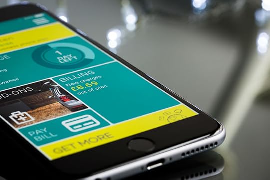
Do you get the feeling apps are getting dumber?
They are, and that’s a good thing. Behind the surprising simplicity of some of today’s top apps, smart developers are realizing that they’re able to get users to do more by doing less. A new crop of companies is setting its sights on changing user behaviors; the small behaviors in your life, hoping to reap big rewards.
They’re using the best practices of interaction design and psychology to build products with your brain in mind. Here’s how they’re doing it:
Be a Feature
Famed venture capitalist Fred Wilson insists that successful mobile products need to do just one thing well.
App designers often forget the speed and attention constraints people experience while using their products. Testing your app in the office, while it’s connected to wi-fi and is the focus of your attention, hardly represents the hectic, real-world conditions experienced by most users. Mobile services not only compete for our attention with the other umpteen things we could do with our smartphones but also have to vie for our focus with the many offline distractions associated with life on the go.

Photo Credit: Voxer
For example, Voxer‘s simple walkie-talkie interface gives new functionality to the smartphone by replicating the “push to talk” experience within the app. Its few options give users limited functionality but focus on the one thing the app is built to do — send short audio messages.
Mobile apps need to get users in and out of the service quickly. By thinking of the app as a facilitator of a single feature as opposed to a rich experience, developers can trim away the steps and options typical of an onerous, and ultimately unused product.
Build it Easier
Of course, if an app does too little, even if it is a simple feature, users will not find it valuable. In order for developers to create the kind of engagement necessary to grow a substantial business, the software must to make core user behaviors substantially easier.
Changes in interfaces, such as the one now occurring in the switch from desktop to mobile computing, create new opportunities to make user experiences significantly easier than before. For example, just think how much more often you communicate with people now that the technology to do so is with you at all times.
The next wave in mobile computing will move beyond the phone. Several companies are anticipating a world where users wear devices to make difficult behaviors much easier. LumoBack, a company now money on Kickstarter, has built a new way to improve users’ posture. [Disclosure: LumoBack co-founder Charles Wang is a close friend.] A device, worn like a belt around the waste, sends data to an avatar named Lumo on the user’s phone. When he or she slouches, so does Lumo, providing immediate, actionable feedback.
Make it a Habit
The importance of forming new user behaviors will not be limited to health and wellness applications. To stand out from the home-screen clutter of a typical user’s phone, app designers must ensure they can quickly create user habits.

Developers are increasingly focusing on how to create repeated user engagement as they realize that viral growth is difficult on a tightly controlled platform like Apple’s. To make the numbers work out profitably, developers must keep the users they have by pushing down churn rates.
Evernote’s smile graph demonstrates how the company increased its value to users the more they used it. The habit of capturing notes in Evernote increased the utility of the service. Entering notes while on the go made retrieving them from the desktop more valuable.
Of course, there are no guarantees in building a new business. Mobile app development is still in its infancy, and as new interfaces evolve, so will the opportunities. However, as more developers realize that their success hinges on understanding user behaviors, the principles above will prove important.
The success stories of tomorrow will not come from the most elaborately ornate apps, which try and solve all of the customer’s needs and wants. Instead, it will come from smart developers, building simple, elegant solutions.
This article originally appeared on Nir Eyal’s blog, Nir and Far.
Editor’s note: If you want to learn more about using psychology and web design, check out our free e-book bundle The Psychology of Web UI Design.
The post Stop Building Apps, Start Building User Behaviors appeared first on Studio by UXPin.
March 4, 2016
3 Questions Product Teams Should Stop Asking

We ask questions that help us to make better decisions.
We don’t want to waste time. So we need to stop asking questions that won’t help us make better decisions — that, in fact, often obscure our insights or mislead us.
1. Which design do you like better?
You won’t get an answer that matters to your business.
While people enjoy beauty, it doesn’t trump usefulness, or context, or critical mass. Path didn’t kill Facebook, Gowalla didn’t win over Foursquare, and countless startups have failed to dethrone the hideously bare-bones Craigslist.
Your prospective customers will definitely have an opinion about which workflow or copy they think is superior, but they’re probably wrong.
I’ve seen far too many A/B tests that directly contradict what people say they will use or prefer.
Most humans just aren’t good at predicting what they will use, or articulating their needs perfectly. That’s not their job. That’s YOUR job, product manager/designer/engineer.
2. Do you want [this feature]?
Of course I want that feature. I want all the features! I also want a deep-dish pizza and bourbon and a whole quart of cookies-and-cream ice cream, right up until the moment where my stomach feels lurchy and I can’t focus on anything.
Customers will always say yes to a feature, because that question only focuses on getting something. We always want to get something! Even if we did mention the cost, it wouldn’t seem like much.
Hey, it’s just a toggle, it’s just one more click, it’s just one more decision to make, one more split-second for your app to load. That sounds fine until you multiply that times the forty-seven times per day they need to interact with this screen. Then your customer will hate you for forcing them to make so many choices before they’ve finished their morning coffee.
Along comes a startup offering an elegantly bare, stripped-down, clean product that only does one or two things but does them simply and easily and there goes your customer.
3. Would you buy/use [this product]?
Yes (if it sounds like the socially responsible or cool thing to do).
No (if it sounds frivolous or doesn’t match the external view of myself I wish to portray).
Look, people are terrible at predicting the future.
For one thing, we’re hopelessly aspirational. People make New Year’s Resolutions, break them all by mid-January, and then the next year we do it again, swearing that this is the year we’re going to hit the gym every day/quit smoking/finish that novel. It means that if your product promises to make me better at my job, I’m going to say YES, of course I’ll buy it. The truth may be that I don’t really care about being better at my job; I really just want to show up on time, do what I’m asked, and not disappoint my immediate coworkers, and I certainly don’t want to change or have to learn something new.
The other thing is that we over-index on our current environment and situation. We aren’t willing to pay $15 for a beer — until it’s late and hot and we’re tired in our hotel room and order room service (markup + service fee + tip!). We assume our current processes and tools will suffice — until we get a new boss or a new business fad takes over. We laugh at those idiots buying in-game turns on Candy Crush — until we do it ourselves.
Saying ‘no’ to bad research questions is critical to building the competency to ask the right ones.
Originally published on CindyAlvarez.com
Editor’s note: For more practical UX advice, check out the free 100-page guide UX Design Process Best Practices.
The post 3 Questions Product Teams Should Stop Asking appeared first on Studio by UXPin.
6 Goals for Product Design Teams
 1. Demand objectives from the people you’re working with.
Your job as a designer is to solve problems, not to make things look pretty. To do your job, you need to understand the who, why, when, what, where, and how.
People will try to hand you a spec or a list of requirements and say,”I’ve already thought about this a lot, just design it.” Don’t accept that. Insist, politely but firmly, that they tell you what the main goals of this project are. For any project, one can say, “if it doesn’t achieve X and Y, then we’ve failed”. Are you trying to sell or educate? Reassure or challenge? Are you encouraging exploration or optimizing for speed? Is this a one-time signup or an everyday task? Is the audience skeptical, or already enthusiastic?
People will suggest that you just use a lightbox, or just use the same styling that we used for feature Q, or just copy what Company Z is doing. These might end up being the best available solution, but you won’t know unless you push back to the defined objectives.
“OK, I like how Facebook uses that design element to solve X problem. Are we solving X problem, or is our situation different?” or “Yes, using that green button style would be consistent with what we’re doing on screen Y. But on screen Y the user is completing a one-time configuration, and in our case we’re trying to make a common task as fast as possible. Does it make sense to force consistency for completely different types of behavior?”
2. Shine some light on the design process.
I also call this, “don’t be magic.”
If you’re a skilled designer and an intuitive listener, you can probably combine what people are saying and not saying, deduce what they’re hoping to end up with, and make it magically appear on your screen. Voila! People will love you for this. It’s a critical skill for early-stage startups and design emergencies.
It’s also terribly non-scalable. It allows people to believe that they are communicating clearly when they’re not. It allows people to believe that design is “just drawing”, and that the thousands of implicit decisions you’re making about visual priority and color and scale and ordering are arbitrary.
You need to translate out loud: “So it sounds like you’re asking for X and Y, and you like the way that Company Z solves this problem because they have these similarities to us. And you’re looking to solve problem Q. Is that right?”
You need to explain your decisions: “I’m using this style because it emphasizes element A, which is the single most important action a user has to take. I’m deliberately not copying what we do for feature B, because the target user is completely different.”
3. Fight for what you believe in (pragmatically).
In past jobs, I’ve worked with designers who were at opposite ends of this continuum:
[tell me what to design and I’ll crank it out] < — — — — — > [change 1 pixel and you’ll destroy my masterpiece]
Neither is productive. And it’s incredibly hard to learn where on that spectrum is the most effective for you, your personality, and the organization you’re in. But you’ve got to try.
If you really believe that adding that fourth link will clutter up the UI, speak up and explain why. Feel free to express your doubts and the risks. And then, if your stakeholders disagree, pick your battles. Sometimes it’s worth it to fight to the death. Usually it’s not.
Grab design ebooks created by best designers
All for free
 Download
 Download
 Download
 Download
 Do you want to know more about UI Design?
Download 'The Guide to UX Design Process & Documentation' FOR FREE!
Download e-book for freeClose4. Be clear on what you will deliver, and when.
These are the questions that people will have but usually not ask:
How likely are these designs to change?
How final are the details like fonts, icons, and images?
Are you going to illustrate the interaction or will this be static?
Are you illustrating just the core use cases or multiple edge cases and usage scenarios?
Will everything be done, or ‘enough to get started’?
You’re better off listing out what you’re going to deliver in writing, with the above questions answered, and a date. It will feel like overkill. It will prevent a lot of misunderstandings. Use it as a checklist.
5. Recover and compensate.
If something comes up — and it will — and you are not able to deliver what you promised, immediately reach out and offer a plan for getting back on track.
Ask to make sure that’s the most convenient/effective plan for the people on your project.
Do not let a deadline slip without a word. Do not go off without a word, work in silence, and re-emerge 3 days later with all the work done. Speak up immediately so no one has to wonder or go looking for you.
6. Always be thinking about how we could be doing things better or smarter.
Our process is not there to constrain you, it’s there to help the team work more effectively. If it’s not working, you chafing at it and making yourself miserable will not help. Trying to sneak around the rules won’t help either. Complain constructively so we can fix it.
If you find yourself doing the same task repeatedly, stop and ask if there is a way to automate it or simplify it. If you feel like work you do is wasted, stop and ask why.
Or — if you did something awesome, stop and teach your peers what you did. Share successes. Rehash good meetings and projects, not just bad ones. Analyze why things went well, and try to reproduce.
Originally posted on CindyAlvarez.com.
Note from the editor: If you found this post helpful, check out the free guide Design Collaboration for Product Teams (Volume 1).
The post 6 Goals for Product Design Teams appeared first on Studio by UXPin.
5 Ways to Avoid the Drawbacks of HD Web Design
There was a time when 72 pixels per inch may have been enough, but those days are coming to an end.
Studies are showing a quickly accelerating rise in HD devices (220 ppi or higher), with Apple’s retina displays and the ensuing technology war. Today, designers have two options: either implement HD, or else risk getting left behind.

Photo credit: http://www.wonderfullywild.co.uk/
On the bright side, there are strategies for getting around the performance drawbacks of HD design. In this article we’ll talk about how to have your cake and eat it to: implementing HD while sidestepping the problems.
The Problems with High Definition
The revolution of resolution may be great for users, but it’s causing designers some headaches. Naturally, the higher resolution means more data, which means longer loading times. The other major factor is how standard 72 ppi visuals look on HD devices.
At best, they fall flat, especially in comparison to other sites who’ve already adapted to HD.

Photo credit: https://flipboard.com/
Additionally, HD visuals, whether video or images, just plain cost more. That means you’re paying more for content that takes longer to load. Even if you’re providing your own content, the tools necessary to create HD visuals are still expensive.
So, are all these drawbacks worth it? We say yes – even if you can still get by with standard definition at the moment, the popularity of HD will only continue to grow. The sooner you adapt, the better you’ll be prepared for the future.
Besides, there are ways around the drawbacks. Let’s look at 5 tactics designers have already discovered for getting around these problems.
1. Scale Vector Graphics
The rise of HD displays impacts more than just the popularity of HD backgrounds, but the way we think about design altogether, specifically between uploading images in raster or vector formats.
Before, raster formats like .jpg, .gif, and .png were preferred as a way to compress images and hasten loading times. These simply translated the image to the screen pixel-for-pixel. But with HD displays, this images appear blurry, with the same amount of image pixels displayed on twice as many screen pixels.
The shift is leaning towards scalable vector formats (SVG), which allows the same image to appear at its best on different screen resolutions. By using connected points and lines instead of pixel-for-pixel, vector formats allow the image to accommodate various resolutions without changing the file. To see vectors at their best, go to Les Jardins de la Poudriére below and play with the window size.

Source: Les Jardins de la Poudriére
HD web design requires rethinking and using vector formats, which is a newer concept when it comes to the internet. (Coincidentally, print designers have been doing it for ages.) That’s where the Scalable Vector Format, or SVG, comes in. As with other vector graphic formats, SVG graphics use connected points and lines, rather than pixels, to create images that can be scaled to any size without a loss of quality.
But that doesn’t make vectors a cure-all solution. Photographs, for example, are limited only to the resolution they were taken in, so vectors won’t change how they’re rendered on larger or smaller screens. For that reason, we recommend the following guidelines:
Use vector for original graphics
Use raster for photographs and graphics whose pixels can’t be changed
With this in mind, use the highest resolution possible when selecting or taking photographs for your site.
2. HTML5, CSS3, and JavaScript Rendering
Traditionally, images are rendered in the browser, which is where some of these problems arise. If you render your images in HTML (width & height attributes), CSS (properties), or JavaScript (properties), however, you gain more control over how they’re viewed, and can sometimes avoid that unsightly blurriness.
The easiest solution is to set the image’s size to be half of what it actually is, so that when converted to HD, it’s displayed normally. For tips and tricks on the coding of this – including media queries to change the dimensions according to the device – Paula Borowska explains the details in this piece for DesignModo.
3. “Still” Video
With the growing popularity of HD video backgrounds, designers are looking for creative solutions to alleviating the loading strain. One of the most creative is simplifying not the quality of the video, but the content.
The fine compromise is to have HD video with little movement and/or composed of mostly static elements. The slight motion will still have a positive effect on the user experience, but will not overtask the loading of the video.

Photo credit: http://bellroy.com/live-life-outside
A good example of this is Bellroy, maker of wallet covers. Emphasizing their product’s durability and quality, they use a simple HD video to showcase it surviving unscathed in the harsh elements. Only the falling snow moves in the video, making the scene closer to a still image than video.
From a technical standpoint, we can see some smart decision-making at play. First, the entire background uses a fairly limited color palette, which naturally improves load times. Secondly, because the video renders in .mp4, the moving snowflakes have mostly soft edges while only the still wallet image has hard edges (again, improving load times).
The end result is a visual compromise that works just as well as it looks.
Grab design ebooks created by best designers
All for free
 Download
 Download
 Download
 Download
 Do you want to know more about UI Design?
Download 'Web UI Design Patterns 2016' FOR FREE!
Download e-book for freeClose4. Unfocused Imagery
In the same vein of simplifying content instead of quality, more designers are appreciating the flexibility of the “unfocused” style of videography. Like the “Still” HD video, this adds some of the visual delight of HD video, without so many drawbacks.

Photo credit: http://fernando.is/all-about/
Fernando Maclen’s site lives up to its “superb simplicity.” Users are still able to discern movement, which invigorates and enlivens the atmosphere, and the artistic style masks the more practical benefit of reducing load strain, not to mention responsive design (the video is only 640 pixels wide, but it looks fine on larger screens thanks to the blur effect).
This strategy has a few other additional benefits, as well. Crisper elements, such as links, buttons, or text, attract more attention and therefore have more force behind them. This is an excellent way to emphasize certain elements over others.
5. Less Visuals
This is a bit of a last resort solution, but will work in a pinch. Simply reduce the amount of your images, animations, and videos on the screen. You get the benefit of HD with some of your visuals, without the drawbacks on loading time, or having to buy too much HD content (which can get real expensive).

Source: Oh Deer Games
With minimalism itself being another timeless design trend, the benefits of this strategy extend beyond just loading times. Your site will feel more sophisticated and you’ll emphasize more of the existing content (which provides a smoother experience when executed properly).
Takeaway
The transition to HD might seem scary to some designers who are set in their ways, but those who embrace the new opportunities will better position themselves in the future. Just like when sound and then color was added to movies, there is an adjustment period followed by one of experimentation, and ultimately a renaissance. The heightened visuals of HD will, in the end, give the designers more power, not less. The key is to get in on this fantastic new movement while it’s still in its early phases.
As fast-growing web design trends, modern HD backgrounds and photography have a variety of techniques and best practices to get the most out of them. If you’re interested in learning the specifics of these 2 trends — and 8 other current web design trends — download the free ebook Web Design Trends 2015-2016. You’ll find 166 hand-picked examples from companies like Adidas, Intercom, Apple, Google, Versace, and others. To help speed up the design process, there’s also a curated list of 100 free resources.
The post 5 Ways to Avoid the Drawbacks of HD Web Design appeared first on Studio by UXPin.
Free: The Practical Interaction Design E-book Bundle

Three popular interaction design ebooks are now available in one free download.
Our Practical Interaction Design Bundle collects both volumes of our popular Interaction Design Best Practices series, along with our Consistency in UI Design guide, giving you over 250 pages practical interaction design advice.
With over 35,000 downloads and counting, Interaction Design Best Practices: Volume 1, covers the tangibles of design: words, visuals, and space. In this e-book, you’ll learn about:
The 5 dimensions of interaction design, and how to apply them
Using copy and visuals to establish an emotional connection
Orchestrating visual hierarchy to influence what your users see and when
4 different types of signifiers and how to apply them
How to make interactions feel like conversation
The importance of empty space, and how to use it

Interaction Design Best Practices: Volume 2 continues in the series with the intangibles: “time, responsiveness, and behavior.” This e-book explains:
The best time frames for site responsiveness
Finding the happy medium between too few and too many user choices (Hick’s Law)
A quick guide to animation
Designing for human behavior to create user habits
How to reduce friction and raise enjoyment

Last, Consistency in UI Design discusses why consistency is essential to effective interaction design, with topics like:
The common errors of inconsistency to avoid
When maintaining consistency with other sites can help, and harm
How strategic inconsistencies can draw attention to elements of your choice

These three books draw from real examples of companies such as Netflix, Airbnb, Etsy, Behance, and Mint.
Download the ebook bundle now.
The post Free: The Practical Interaction Design E-book Bundle appeared first on Studio by UXPin.
Free: The Futureproof Web UI Design Bundle
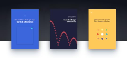
How do you design a website that can both function and stand the test of time? How do designers hope to stay current when web site technology changes almost as quickly as user preferences?
Our free Futureproof Web UI Design Bundle, collects three e-books on new UI trends that aren’t going out of style any time soon.

In more than 200 pages, you’ll learn about cutting edge techniques and the best practices to apply them, drawing on over 130 hand-picked examples from sites like Airbnb, Squarespace, the Guardian, Eventbrite, and more.

You’ll also find links to 60 free resources online, from tutorials on creating effects like longshadows, to articles comparing CSS and Javascript for animations.

This collection covers the 6 latest web UI trends with the staying power to survive well into the future of UI design:
Cards — The layout pattern that improves user comprehension and searchability, not to mention saves the designer trouble for multi-device designs.
Minimalism — An aesthetic style built on “less is more,” with adds sophistication while reducing loading times.
Interaction Design — Technology gives us the ability to make more immersive interactions, and users are expecting it.
Animations — When, where, and how to add animations, and the best practices for designing them.
Flat Design — The flat style isn’t what it used to be five years ago. Learn about what changed, and why.
Colors — As with other visual arts, color trends come and go. But unlike the rest, web design also considers usability factors, making some colors better than others.
All this is available for free. Download this e-book bundle now.
The post Free: The Futureproof Web UI Design Bundle appeared first on Studio by UXPin.
Free eBook: The Critical Components of Web UI Style Guides

Style guides take a lot of the weight off the design team’s shoulders. They keep track of all the nitpicky details, and compile them into a single, quick-reference document for maintaining site-wide consistency. And with all the team-members referencing the same style guide, there’s less room for error and misinterpretations.
This 49-page guide explains the most common types of style guides, the sections they include, and which ones you need for your project. We even illustrate what we mean using screenshots from the actual style guides of 22 companies like Facebook, Starbucks, Adobe, IBM, MailChimp, Skype, Yelp, and Lonely Planet.
In our characteristic informative and easy-to-understand style, this book explains:
The difference between mood boards, style tiles, brand guides, and front-end style guides.
The most useful sections and how they’re laid out.
Real screenshots from 22 well-known companies.
Which information is most helpful, and which you don’t need
Different styles and customizations to personalize your style guide.
The post Free eBook: The Critical Components of Web UI Style Guides appeared first on Studio by UXPin.
Free Pocket Guide: Flat Design Trends 2016
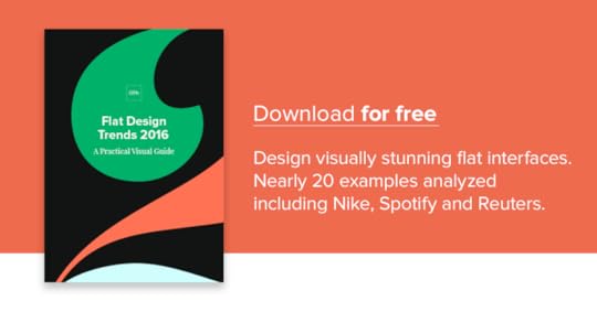
Flat Design is one of the most popular design trends of the last fews years.
Its simplicity improves loading times and interface learnability, plus its vibrancy energizes and excites users. And like all trends, flat design continues to evolve.

Our new free e-book, Flat Design Trends 2016, explains flat design in its current, and future, state. What changed and why? Designer Carrie Cousins explains everything you need to know in 35 pages, drawing on examples from companies like Spotify, Adidas, and Corona.
This pocket guide covers such topics as:
The five key components of flat design, and how to apply them individually for the benefits of flat design in more complex styles
Using typography pairs to get better results than just one
How, when, and why to apply circles and rounded edges
What it means that the mainstream is going flat
The best use of color and video with flat design
How flat design 2.0 compares to its ancestors
10 free online resources for more hands-on help with your flat design.
Download this free e-book now.
The post Free Pocket Guide: Flat Design Trends 2016 appeared first on Studio by UXPin.
Free e-book: Practical User Research for Enterprise UX

While the details may change, user research is as important in enterprises as everywhere else. The trouble is, bigger companies mean more obstacles.
That’s why we’re offering our new free e-book, Practical User Research for Enterprise UX. The guide discusses how to tackle the nuances of enterprise user research.

As the Design Director at Jive Software, author Rian van der Merwe explains the actual techniques that help him conduct effective user research. Based on his 10+ years of UX experience, this book covers topics like:
Practical, actionable tips on cultivating support for user research
A step-by-step approach to discussing UX research with the people who matter
How to write a user research plan
How to choose the right user research and usability testing method
Different options for recording and documenting test sessionsDownload this free e-book.
The post Free e-book: Practical User Research for Enterprise UX appeared first on Studio by UXPin.
UXpin's Blog
- UXpin's profile
- 68 followers


