
UXpin's Blog, page 116
April 12, 2017
Beware Sloppy Shortcuts — Use Design Systems to Keep Code on Track

People like shortcuts. It’s not that they’re lazy; developers and designers alike like to save time, and who can blame them? Beating deadline is an important part of design as a business. But shortcuts carry risk.
Here’s one problem: copying code snippets is easy. Copying the right snippets takes precious time. And even if a design team’s internal slang helps them remember what things are — billboards, carousels, and rafters, for example — there’s no definitive code behind them. So the thought process wanders: “What was that thing called again? Never mind, I’ll just copy from the web page.”
Don’t do it!
Would designers revamp graphics from JPGs or PSDs? Would front-end designers edit CSS generated from Sass? Of course not. They’d go to the source. So why copy/paste code from old web pages into new ones? That approach is fraught with peril.
You might copy to much or too little code.
Or get unrealistic expectations of what content goes into it.
To avoid the above, you need to spend precious time analyzing source code to find the correct bits.
It’s impossible to say how an instance of code has changed. Copying from an instance might get someone else’s hack.
Depending on a team’s code standards, someone has likely vetted a design system’s code against major browsers.
A systematic approach
Imagine making a list of components in a project. From sidebars to buttons to scrollers to list items, there’s no shortage of things to inventory. Picture this list as a sketch of each component. Then imagine giving each one a button that copies its code to your clipboard.
Click. Copy. Paste. Move on.

Such a solution is part of a coded design system. It’s about getting code from the source. A visual source that’s easy to browse.
Ideally developers could look up a component, module, or other widget by its look as well as its name. Upon selecting that element, they’d see its code which they could copy/paste into their favorite code editor.
The advantages are huge:
Working from the same codebase, everyone on a team can work with everyone else’s code.
There’s no need to reinvent and test blocks of code, saving time in development and maintenance.
Front-end developers can test code snippets beforehand, ensuring that it will work with their target browsers.
There’s a smaller chance for typos.
What are the downsides? As the saying goes, old habits die hard. Some people have trouble remembering to use the design system’s code snippets, or figure eh, I’ll just cheat a little. After all, it’s just one button.
One button with a potential bug. One button that doesn’t fit the spec. One button that, when it needs editing, someone must take time to figure out. These little problems add up.
Bringing the team onboard
How do you fight old habits? With new ones.
A habit is what we tend to do without conscious thought. And they’re usually small: checking email over morning coffee; paying rent on the first of the month; muscle memory for your favorite keyboard shortcuts. To change a team’s habits, you must make changes one step at a time. Specifically, adding new habits to replace old ones rather than trying to “break” them.
In the case of visual code libraries, changing the copy/paste habit begins with a few simple steps.
Include everyone in developing the pattern library and its code.
Start today. Don’t put off changing your or your team’s current habits or else they’ll continue to dominate your workflow.
Practice building web pages or app views with the design system’s pattern library.
Enjoy the “work” so your mind accepts change more readily.
What’s in a snippet?
You may chose to document more than a visual reference and the code itself. Five bits of metadata you might include with your code snippets are:
A sensible name. “Top widget” could refer to anything. “Navigation bar” is more descriptive.
Version number or date. When was it last updated? Is there a newer edition that your team should use, even though older versions are still in use?
Min/max. How much content can it handle? What are its widest, narrowest, shortest, and longest dimensions?
Safe browser versions. Since web browsers change frequently, knowing which snippet works in what circumstances is critical as users’ capabilities evolve.
While these metadata are optional, you may find them handy for long-term success.
Going forward
It’s not that shortcuts are a problem. Far from it. Recognizing a technique vs. a cheat, however, is the key to getting consistent, accurate code for your digital projects.
The post Beware Sloppy Shortcuts — Use Design Systems to Keep Code on Track appeared first on Studio by UXPin.


April 10, 2017
Hide the Right Functions With Custom Drop-down Lists

Let’s face it: users don’t need every function in your app at all times. Hiding the right tools at the right time keeps visual distractions at a minimum, helping users focus on the task at hand.
A good design system not only includes reusable widgets, but instructions on their use cases. For example, a system may present a drop-down list’s appearance, and even offer an example of its interactions. But which items should get tucked out of view? When designing a component — especially interactive ones — best practice is to, well, describe best practice.
Build your own drop-down list
Here’s a handy trick to building custom drop-down lists: group ’em twice.
Most apps treat each element as its own layer — including groups — which you can show or hide in the left-hand layers menu.
Typically we make the “trigger” element — an icon or bit of text that people see first — show the menu on hover. Multistate elements are a great example of this. But the drop-down menu may disappear as soon as the user’s mouse leaves the trigger icon, making the menu impossible to use.
Instead, group the drop-down menu — and then group that within another group along with the trigger element (in this case a green, pill-shaped button).

Next, make the outer group hoverable. Then hide the inner group. The outer group will expand as the menu appears, making it reachable as your mouse covers its options — and it’ll disappear as soon as your mouse leaves.
Once you’ve got it built, add the component to your custom library to share with your team as part of a design system.
How it works
“Hoverable” means that as the mouse enters the trigger element, an effect will take place. When it leaves the trigger element, then the element reverts to its default state. For example, a button may darken on mouse in, then return to its original light color when the mouse exits it.
Here, the outer group is hoverable. It expands as the drop-down menu appears, also expanding the entire mouse-out-able area. And as you might expect, any links within the drop-down menu (the inner group) remain clickable.
Join the world's best designers who use UXPin.Sign up for a free trial.Your e-mailTry it for free!
The post Hide the Right Functions With Custom Drop-down Lists appeared first on Studio by UXPin.
April 5, 2017
How to Find Your Team’s Design Assets in a Hurry (Hint: it’s More Than a Name Game)

Everyone has their own design and development style. One person’s .class-name is another person’s .className in CSS, not to mention HTML formatting and how people organize their Photoshop layers — if at all.
Teamwork hinges on people’s ability to get along, yet disparate file-organizing and naming strategies can make things hard to deal with. If Bob goes on vacation, how is Alice supposed to carry on his prototype work on the important $50k Big Ranch website redesign?
That’s where design systems come in. Design systems do more than provide visual and interactive style guides to which teams should adhere. They also make their contents easy to find. After all, UX doesn’t just apply to non-designers.
Organizing a design system’s pattern library
Pattern libraries contain templates upon which to build instances of design. For example, a list of the ranch’s amenities is a list plus real content. The list itself — its bullet point style, its line-height, its maximum and minimum widths — are parameters upon which one-off lists are made. Does the client need a list of their ranch houses for rent? It’s the list template to the rescue.
The trick to pattern libraries is — well, it’s not a trick. It’s common sense with a dab of discipline. No matter what you put into a pattern library, each component, widget, and element will need a few common bits of information that makes them easy to locate in a hurry.
Element overview
Name things how they’re used. Avoid specific names that describe context like “horse signup template”. That describes what it contained when it was built — and obviously it’s a template. Instead, think about how it should get used, now and in the future: “signup form” or even “basic form” are more useful and more applicable to future needs.
Write a (brief) description and use case. Consider the following:
“This form has a photo, three to five radio buttons, an email field, and a submit button.”
Anyone could tell that by looking at the form. Try instead:
“Use this form when asking users for personal information and you want to reassure them that they’re not going to get spammed.”
Include a version number or date. Patterns change. Most digital assets do. That’s why versioning — anything from 1.x to 2017-01-01 — will help you weed out old patterns and track your library’s evolution. Bonus points if you use a versioning system like Git to track “what if?” experiments in branches and copies.
Pattern use cases
Cite live examples. Whenever possible, reference examples of how the pattern’s used in the wild, rather than with generic placeholder content.
“Best used for ….” What is a pattern good for? Answering this is tricky because, at least the first time, patterns are often created to answer one-off needs. The best bet is to try different contexts. For example, on how many different pages could a specific header get reused? What would have to change to make it work? Think generic. “Best used for third-level inside pages” is more useful than “best used for pages that feature barbed wire.”
Include sample variations. Plain-box templates are useful for low-level views of a template or element. But seeing it in action — several times — will help your team understand its versatility (or lack thereof).
Taxonomy
Categories: Organizing your assets into groups is an obvious approach to organizing at all. But what should the groups be? Some suggestions for categorization:
Based on psychology, like those found at UI Patterns.
Based on prominence, or how important a pattern is to the project.
Based on type, as in “teasers,” “primary content,” “lists,” or “panels.”
Based on application, like “layout,” “navigation,” or “social.”
Based on frequency of use: “major,” “minor,” or “supplemental.”
Tags: In general, categories divide different types of information, while tags create cross-references among them.
Primary color, if a pattern requires a certain hue or value.
Version number — there’s that concept again.
Style, such as “bright,” “textured,” “elegant,” “illustrated,” or “flexible layout.”
Resources: don’t think of patterns as strictly visual. Remember inclusive tags like “has HTML,” “has CSS,” “has PSD,” and “has content.”
Meta data: Information about the pattern is just as important as the pattern itself.
Informal title: How do you refer to the pattern?
SEO title: If we’re talking about an entire page layout, what guidelines do we follow to make it search-engine friendly?
Last modified date: When was the last time someone tweaked the pattern?
Next check date: When is the next time the pattern is up for review?
Author: Who is responsible for the pattern’s upkeep?
Medium: Is it a layout component? A video template? A single graphic?
Size: How wide and tall is it? Does it adhere to a particular layout grid? If it’s video or audio, how long does it last?
Notice that the tags listed above are adjectives, while categories lean towards nouns. Metadata, meanwhile, answers questions. Use these as cues to forming your own taxonomy.
Pattern libraries work with a team’s workflows
Whether Bob’s file is called brown-cow-teaser-5.psd or Photo-2017-01-01.psd, a curated design system helps Alice find it by type, description, use case, or maybe even dimensions. The goal is find-ability, not just search-ability. Your team should be able to round up assets its pattern library by browsing as searching.
The post How to Find Your Team’s Design Assets in a Hurry (Hint: it’s More Than a Name Game) appeared first on Studio by UXPin.
April 3, 2017
Do Your Future Self a Favor: Don’t Bust the Grid

Layout grids help designers define and structure elements in a composition. Sticking to them is critical to success in any design system because elements and blocks should stay modular. You never know in what context the future “you” will want to use something.
Context is key. Should a hero element go on the left or on the right? Should it fill four width-units or six? Knowing its size determines how you can arrange everything, LEGO-like, in a composition — and more importantly, what can go adjancent to what.
Prototyping a design system grid
From prototyping apps to CSS frameworks, some design tools let you establish a standard grid to keep your components’ dimensions interchangeable. For example, UXPin has a customizable horizontal layout grid that’s analogous to those found in Bootstrap and Foundation. Here’s how it works.
Editing the grid
With no elements selected, UXPin gives you canvas options on the right side of the Editor. Click “Edit Grid” to do what it sounds like. Options include:
Number of columns
Gutter width
Side margins’ widths
You can also type option-G (Mac) or alt-G (Windows) to toggle the horizontal grid on and off. When the grid is on, elements will snap to the visible columns. Turning the grid off disables this snapping feature — although elements will still align to the canvas and each other.
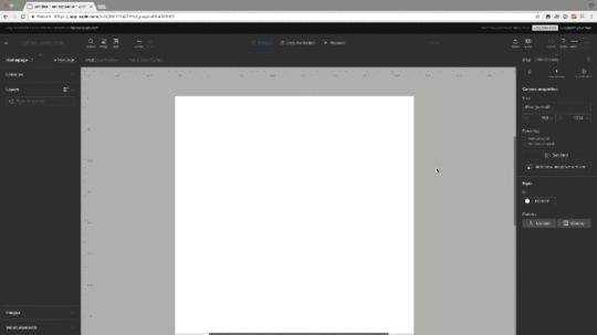
What about the canvas?
A design system’s canvas is just as important as its layout grid. To change the canvas’s width and height in UXPin, look for “Size” above the grid button. You can choose from a preset size or enter your own pixel dimensions.

Using grids in your work
Grids are a fundamental part of your style guide or design system. They inform components’ dimensions (or, if the grid is flexible, their limits) which makes them modular. That is, you grid-based elements ensure you can easily rearrange them in a page or view.
When thinking in terms of flexible building blocks rather than static templates, your designs can adapt to circumstances beyond their original context — I’m looking at you, as-yet-undreamed-of-next-version.
Grab a free UXPin trial to build prototypes that snap to a sensible grid.
Join the world's best designers who use UXPin.Sign up for a free trial.Your e-mailTry it for free!
The post Do Your Future Self a Favor: Don’t Bust the Grid appeared first on Studio by UXPin.
March 31, 2017
Beyond Brainstorming: An IDEO UX Ideation Technique

Ever wondered about how our designers at IDEO help overcome creative block when designing new products and services?
The Mash-up method is a fast and fun ideation technique that brings odd or unexpected things together to spark fresh ideas. We use it in our everyday client work, and also teach it as a technique as part of IDEO U (our online school for learning creative problem-solving).
The Mash-up method (45-60 minutes total) emphasizes quantity, which is the heart of divergent thinking. The more ideas you come up with, the better chance you have to zero in on a the right solution. Perhaps most importantly, it helps us start down the path from the ridiculous to the radical solution.
We’ll walk through all the steps below quickly in the video and instructions. All you need are pens, Post-Its, and paper.
Step 1: Frame
Articulate the challenge as a “How Might We” statement. For example, “How might we design a better patient portal experience?”
Step 2: Narrow
Pick two broad, unrelated categories, for example healthcare dashboards and Kayak.com. The categories should be unrelated to each other, but at least one should tie in to your “How Might We” statement. Think outside your industry.
Step 3: Generate
Starting with one category at a time, list as many elements of these two experiences as you can in two minutes.
Step 4: Mash-up
Combine items from the two lists to ideate as many new products, services, or experiences as you can. Try putting together items that seem the most different, and see if you can communicate the value of your inventions in ways that are relevant to your challenge.
Next steps
Remember this is just another tool in the ideation process. New ideas are great, but don’t forget to also invest the necessary time to understand your users and frame a challenge first before ideating.
To try out the exercise yourself, go ahead and download this worksheet.
Grab design ebooks created by best designers
All for free
 Download
 Download
 Download
 DownloadDo you want to know more about UI Design?
Download 'The Project Guide to Enterprise Product Design' FOR FREE!
Download e-book for freeCloseThe post Beyond Brainstorming: An IDEO UX Ideation Technique appeared first on Studio by UXPin.
March 29, 2017
Get Educated, Get Freebies, Get Designing in April and Beyond

No design system should live in a vacuum. Nor should design teams copy other people’s work outright.
When developing a visual language, brand guidelines, or pattern library, designers can seek inspiration both from their personal experiences and that of their peers. Luckily the web is full of inspiring ideas and free resources.
But finding them isn’t always as easy as a quick Google search. So here are 47 great resources, inspirational material, and instructional content to help you design faster and better while improving your digital product design workflow.

Resources
PatternTap: Inspiring examples of UI design, organized by type, color and style.
UI Patterns: The ideas behind design elements, supported with real-world examples.
Sketch App Resources: Hundreds of downloadable designs in Sketch format, ready for customization.
Sketch Apper: Plugins, templates, and other goodies for Sketch.
Favicon creator/generator: Construct your own image or build upon a template in this web app.
Pexels.com: Free photos for personal or commercial use.
Unsplash photos: Even more free photos.
HOW Design freebies: From ebooks to price sheets to wallpapers to Photoshop color swatches, HOW provides many learning materials and other goodies.
UX Sketchbook: Paper notebooks that mix device bezels and dot grids.
Product Tribes: A popular Slack community for UX designers.

Education
Free UXPin ebooks: Our own collection of learning resources, free to download.
Career Foundry: Mentorships and 1-on-1 instruction in job hunting and career building.
Our webinars & master classes: Free, practical advice from industry leaders in video format.
Atomic Design: Brad Frost’s book as a paid download or a free online read.
Lynda Groupon codes: Occasional deals on the popular education platform.
Don’t Make Me Think, revisited: The third edition of this “common-sense approach to web usability.”
Design Lab: Online classes with mentorship from industry experts, articles, and videos to guide you to success.
Udemy: Video lectures on topics in UX design.

Blogs
Boxes and Arrows: Well-organized articles on the design life.
UX Myths: Dispelling design misconceptions in UX and UI principles.
Nielsen Norman Group: Thoroughly researched reports and articles based on real-world experiments.
Luke W: Digital product design articles and notes from the guy who brought us the “mobile-first” concept.
Usability Geek: UX, HCI, IA, and other hot digital design topics in easy-to-read blog form.
r/userexperience: Reddit users’ thoughts on all things UX.

Media
Presentable podcast: “How we design and build the products that are shaping our digital future.”
UI Breakfast podcast: “Join us for exciting conversations about UI/UX design, products, marketing, and so much more.”
Austin Knight podcast: “I welcome a different co-host with every episode, giving you access to unique and fresh perspectives that are designed to challenge the ways you think.”
Intricate beauty by design by illustrator Marian Bantjes, 16:28 minutes.
Design and discovery by David Carson, the “grunge typographer” behind Ray Gun Magazine, 22:39 minutes.
The first secret of design is … noticing by iPod originator Tony Fadell, 16:41 minutes.
Taking imagination seriously by urban artist Janet Echelman, 9:26 minutes.

Style guides and design systems
Boldly Facing the Future by DeviantArt.
Brand Resource Center by Facebook.
Branding by Dropbox.
Building a Visual Language by Airbnb.
Cedar Style Framework by REI.
Design Language by Microsoft.
Global Experience Language by the BBC.
Graphic Standards Manual by NASA.
Lightning Design System by Salesforce.
Living Language by IBM.
macOS Human Interface Guidelines by Apple.
Material Design by Google.
Styleguide by Github.
Styleguide by Mozilla.
Styleguide by Yelp.
U.S. Web Design Standards by the GSA.
UX Patterns by MailChimp.
Join the world's best designers who use UXPin.Sign up for a free trial.Your e-mailTry it for free!
The post Get Educated, Get Freebies, Get Designing in April and Beyond appeared first on Studio by UXPin.
March 27, 2017
Take Advantage of Complex, Pre-built Elements in Design Systems
What resources do designers and developers need to keep a project on track, consistent, and easy to edit?
The answer lies in their team’s design system, which often includes practical, relevant examples of items used in design. They go under many names: components, widgets, elements, molecules …. Regardless of their names, the items that go into a design system solve several problems.
Easy to reference: Design systems make items easy to find in a hurry, whether by search or category or other criteria. To do so, the items’ names and metadata must be accurate and up-to-date.
Easy to apply: Ideally, items in design systems would contain the files, like PSDs, that designers can copy and repurpose for their immediate needs.
How complete should design system elements be?
From lo- to hi-fi, items in design systems should reflect the team’s workflow. If they need boilerplate information, then blank templates comprised of grey boxes should do the trick. If the team needs more pracitcal examples to answer, “how did we use this six months ago?” then high-fidelity items with real (or realistic) content is more appropriate.
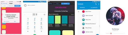
For example, UXPin has basic shapes like boxes, arrows, and circles — standard design stuff. But it also has some built-out sets you can use as starting points for your work.

Design system components should be fully editable, right down to the text and colors. And some are more customizable than others. They should also be easily findable. For example, searching UXPin for certain keywords will produce many results:
app
store
list
music
phone
social
set
Individual component keywords include:
pagination
breadcrumbs
navigation
bar
form
tab
slider
body
head
foot
activity
icon
Build a design system in UXPin
Once you’ve customized the pre-built components — or created your own — you can save them as templates with our custom library feature. Dragging a saved component out of your custom library will create a copy that you can edit to suit your current design’s needs. This helps keep your interactive visuals in the same general family without having to reinvent them every time.
This is critical when thinking in terms of components: design system parts that snap together, rather than building single-use templates that don’t adapt to projects’ future needs. (Let’s face it: when was the last time an active digital project didn’t evolve over time?)
Log in or grab a free UXPin trial to take advantage of the many pre-built elements that give your designs a head start.
Join the world's best designers who use UXPin.Sign up for a free trial.Your e-mailTry it for free!
The post Take Advantage of Complex, Pre-built Elements in Design Systems appeared first on Studio by UXPin.
March 24, 2017
Design a System of Icons With These Techniques

Little icons have a big job. With limited real estate, they must convey meaning to people who expect to be informed about function or status. Maybe that’s why thousands of icons sets exist, many for free. But there’s nothing quite like making your own.
Project-specific icons help the project to stand apart and convey meaning unique to its functions. For example, most apps or dashboards let you create new records. But fewer systems will let you assign one record to another. That may require a creative symbol that people will come to recognize as they learn your product.
Their role in design systems leaves little room for ambiguity: meaning must remain clear in a variety of surrounding contexts, while fitting into the system’s overall aesthetic.
How does it work? Here are some tips to create your own winning icon sets.
Create a visual language
Iconography is more than tiny pictures. Together they form an entire family, not unlike a set of typefaces, that reinforce a brand.
They also prevent extra work. When you need an icon, just grab one from the project’s style library, or use the library as inspiration. To that end writing (and drawing) guidelines for new icons is important.
Make guidelines. Part of your design system should include parameters on what your team can and can’t do with icons.
Practice style. One of the best ways to develop a visual language is to apply it to new ideas. As you invent icons, make sure they fit the same look — but don’t be afraid to modify that look early in your work.
Test each iteration. Do your icons make sense? Can people figure out what they mean? Getting stylish while retaining clear meaning requires showing your work to users.
Getting ideas
Where do icons come from? Your imagination is just the beginning. Seeking inspiration from outside sources can be critical to success.
Look up synonyms for the word or concept you want to represent.
Look for styles beyond the obvious. What inspiration might you find from, say, Polynesian symbols or Mandarin letterforms?
Doodle shapes at random, avoiding backgrounds like circles or squares.
Use the brand. Does your project’s logo have an eye-catching characteristic you can use? How about the project’s typography?
Create negative space. How can the interactions of three or four regular geometric shapes overlap to create new and interesting forms?
Base complex forms on the same shapes
Recognizability is the most important aspect of an icon. If people don’t know it at a glance, they may waste precious time deciphering it — or look elsewhere for a shape they associate with the function at hand.
With that in mind we start by defining icons’ silhouettes. But don’t just start drawing lines.
Use the same geometry. Here we make shapes based entirely on small circles and rectangles. When you base icons on the same general elements, they look like they belong to the same family
Use the same angles, e.g. 90°, 45°, 30°. Doing so will make them more legible and more consistent.
Same line weight throughout. Here, basing glyphs on the same few shapes will help keep your icons looking similar without looking derivative.
Stick to symmetry — or the same asymmetry. Tilting your icons is a great way to make them stand out from other sets. But if you do so, tilt them all at the same angle to reinforce that they’re part of the same family. Otherwise stick to good ol’ right angles.

This example may stick to its base shapes a little too closely for practical design work, but demonstrates how simple geometry can create complex forms that look like they belong together.
Make a consistent color palette
Like using geometry to make icons look like a set, if you plan to use color, then you should use the same color palette. But which colors?
Seek inspiration from your photos. If you have final art for your project, make the icons look harmonious by sampling colors from that art.
Borrow from Google’s MDL palette. They’ve done a great job of selecting bright colors that stand out against a variety of backgrounds, yet rarely clash among themselves.
Make sure the colors work well together. Speaking of clashes, test every combination of your preferred colors to keep them from looking awkward when adjacent to each other.
Use one color per icon. The contemporary “flat” look works best without shading, shadows, gradients, or other details that detract from their silhouettes.
Use values. If you must use multiple colors, try to use different shades of the same hues.
Consider meaning. Should colors imply function? It’s up to you, but remember that many people associate color with actions, like red for “delete,” green for “create,” and faded (usually less opaque) for “disabled.”

How much color is too much? How much is too little? Determine your color palette based on one factor: attention. If your icons need to grab people’s eyes, then make ’em bright. Otherwise aim for consistency.
Remember that symbols have preconceived meanings
People often associate certain “universal” icons with certain functions. The trash can, for example, means “delete.” Hamburger icons, though, aren’t universally understood … yet.
Using microcopy with icons is a good idea. Rely on shapes for quick identification, and text for folks who don’t get it.
Designing a system
Icons must do a lot with a little. In spite of running small, people expect to “get it” at first glance. That’s why silhouettes, consistency, color, and meaning all work together for a great, on-brand icon set.
The post Design a System of Icons With These Techniques appeared first on Studio by UXPin.
March 22, 2017
How to Guide People Down a True Path to Success

UX Designers (rightly) pride themselves on crafting intentional, memorable experiences between real people and their tools. Experiences that are a delight to use. But you know what? I’ve grown to dislike the term “human-centered design.” I believe it demeans the essence of a UX Designer’s best work. And by the end of this article, I hope you’ll see why, and what to do about it.
In this post I’m going to unpack the human-centered design mindset and replace it with something better: the destination-centered design mindset. But first, let’s quickly check in on a fundamental component of both mindsets: leadership.
What is Leadership?
“Leadership is a choice, not a position.”
— Stephen Covey
I’ve found that the term “leadership” turns a lot of people off in the Designer space. Yet it’s fundamentally important to the role of a UX Designer. Look at the definition:
lead·er·ship
ˈlēdərˌSHip/
Noun: The action of leading a group of people or an organization.
It’s the responsibility of a UX Designer to plot an elegant, deliberate, natural course for the recipients of the experience being designed. And then take them there with as little resistance as possible. Put another way, it’s to steer a group of people to success. Good design is not forceful, vague, selfish, ignorant or accidental, but intentional. Good design leads people.
Let’s look at a bad example, followed by a good example. Which have you been using?
Aaron does human-centered design
Regardless of your faith, there’s no denying how many great design and leadership examples there are in the Bible. And when it comes to the lauded Human-Centered Design Mindset, Aaron is—in my opinion—one of the best examples.
Aaron was the older brother of Moses, who you’ll likely know as the chap who led the Israelites out of Egypt and through the Red Sea.

Aaron’s leadership
We’re told of a time when Moses lead many Israelites out of slavery. Moses climbed a mountain called Mount Sinai, where the 10 commandments were born. While he was up there, Aaron became interim-leader of the exodus. This is when Aaron learned a UX Design lesson: Users can be sort of weird.
“When the people realized that Moses was taking forever in coming down off the mountain, they rallied around Aaron and said, “Do something. Make gods for us who will lead us. That Moses, the man who got us out of Egypt—who knows what’s happened to him?”
— The Bible
The people asked for something to worship. So Aaron gave them one. The dude took their gold and made a golden calf for them to worship. Problem solved, right?
User feedback was very positive. This is human-centered design at its best: listen to users, respond to their immediate needs, get hugely-positive feedback. Isn’t that what UX Designers live for?
Unfortunately that wasn’t really the destination they wanted. The experience Aaron designed took them all to where they thought they wanted to go, but it was a dead end. Inappropriate direction, but entirely human-centered design.
Moses knows his audience
Humans can only verbalise and articulate the Aaron-style of leadership. Put another way, “They only know what they know.”
As a UX Designer, it’s critically important to collect human-centered design feedback, but you don’t necessarily want to implement the design that those humans you’re talking to are telling you about. Sometimes, the data is just wrong.

Moses’ leadership
“When Moses came near to the camp and saw the calf and the people dancing, his anger flared. He threw down the tablets and smashed them to pieces at the foot of the mountain. He took the calf that they had made, melted it down with fire, pulverized it to powder.”
— the Bible
Woah. Clearly, this is a guy who cares about good design, and getting to the right destination.
If you read the whole story, you’ll realize Moses was far from perfect. But he knew where the people wanted to go: The Promised Land. So that’s where he headed. Aaron had a human-centered design mindset.
Moses had a destination-centered design mindset. The difference? Destination-centered design moves “design” from a satisfying aesthetic to a vehicle for change. When we design experiences for our users, change is what they’re looking for: that’s why they’re using the product we’re designing for.
As a UX Designer, no amount of implementing user requests verbatim is going to drop attrition rates below a certain threshold. At some stage, the design must ask, “Is this experience leading people to the right destination?” By using destination-centered design, experiences can lead people toward their Promised Land.
What better case study are you likely to find from a user than that?
Action steps
Every UX designer should adopt the mantra of destination-centered design. When we build websites that are BuiltForImpact specifically for cause-driven companies, all roads point to the destination, by design. Here’s how you can start introducing destination-centered design in your work:
Seek to understand first, then to be understood. The users’ language is the most important language of all, so speak it fluently and natively.
Be proactive. Don’t wait for data to come to you. Most people want to talk about their experiences. You need only ask. But listen carefully; people don’t always know what they want, and they don’t always know the best way to their destination.
Be data-guided, not data-driven. You can reject data that points away from your destination, rather than accept them blindly.
Begin with the end in mind. Where does the user want to go? With that goal clearly defined, you’ve found your true north.
People don’t always know what they want, and they don’t always know the best way to their destination. That’s where you come in. A UX designer should focus on where their users want to go, and take responsibility for them getting there, rather than taking them at their word alone.
My parting question for you: Where do your users want to go?
The post How to Guide People Down a True Path to Success appeared first on Studio by UXPin.
March 20, 2017
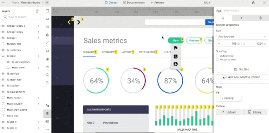
Tips on Asking for Feedback
UXPin’s preview mode is great for soliciting feedback. But leaving stakeholders to their own devices can give too many random opinions, and not enough constructive criticism. In short, “what do you think?” often results in bland, unhelpful, off-topic comments.
Here are some tips to get great feedback:
State your goals. Telling stakeholders “I’m going for X” or “I want to achieve Y” helps them to frame responses in ways that keep the conversation on topic. Learn more about goal-setting at SurveyMonkey.
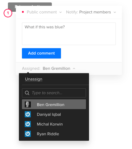
Assign comments to someone. UXPin lets you indicate who should address certain points of feedback. Learn more about assigning comments in the UXPin User Guide.
Set a deadline. I’ve found it helpful to ask for feedback by a certain date, both to encourage timely replies and to keep a project moving forward. Think of it as agile sprints for opinions. Learn more about working under tight deadlines at UXPin.
Figure time vs. benefit. Make a graph with time to implement on one axis and benefit to users or the business on the other. Then jot key words or phrases that summarizes each bit of feedback on the graph. Prioritize items that are easiest to implement and most beneficial first. Learn more about data visualization tools at Creative Bloq.
Ask the right people. Chances are, not everyone in your organization needs to weigh in on a design in progress. Ask as few people as possible, like one of your peers, your creative director, or select beta testers to keep from getting overwhelmed. Learn more about getting feedback at ZURB.
Take feedback seriously, but lightly. Feedback is loaded with personal views. People’s comments are suggestions that you can weigh against your own judgement. For example, just because someone likes blue doesn’t mean you have to change to fit their preferences. Learn more about judging feedback at Inc.com.
“Perfect is the enemy of done.” Sometimes meeting deadline is more important than getting everything perfect … whatever “perfect” even means. If you iterate on feedback more than three times, maybe it’s time to move on. at Six Revisions.
Solicit great feedback from your team with a free trial of UXPin.
Join the world's best designers who use UXPin.Sign up for a free trial.Your e-mailTry it for free!
The post Tips on Asking for Feedback appeared first on Studio by UXPin.
UXpin's Blog

- UXpin's profile
- 68 followers

