Do Your Future Self a Favor: Don’t Bust the Grid

Layout grids help designers define and structure elements in a composition. Sticking to them is critical to success in any design system because elements and blocks should stay modular. You never know in what context the future “you” will want to use something.
Context is key. Should a hero element go on the left or on the right? Should it fill four width-units or six? Knowing its size determines how you can arrange everything, LEGO-like, in a composition — and more importantly, what can go adjancent to what.
Prototyping a design system grid
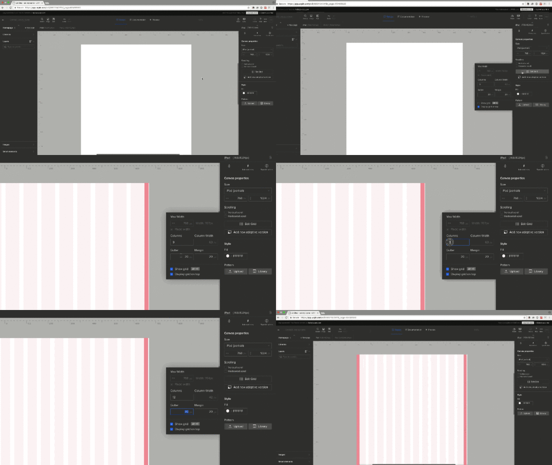
From prototyping apps to CSS frameworks, some design tools let you establish a standard grid to keep your components’ dimensions interchangeable. For example, UXPin has a customizable horizontal layout grid that’s analogous to those found in Bootstrap and Foundation. Here’s how it works.
Editing the grid
With no elements selected, UXPin gives you canvas options on the right side of the Editor. Click “Edit Grid” to do what it sounds like. Options include:
Number of columns
Gutter width
Side margins’ widths

You can also type option-G (Mac) or alt-G (Windows) to toggle the horizontal grid on and off. When the grid is on, elements will snap to the visible columns. Turning the grid off disables this snapping feature — although elements will still align to the canvas and each other.
What about the canvas?
A design system’s canvas is just as important as its layout grid. To change the canvas’s width and height in UXPin, look for “Size” above the grid button. You can choose from a preset size or enter your own pixel dimensions.

Using grids in your work
Grids are a fundamental part of your style guide or design system. They inform components’ dimensions (or, if the grid is flexible, their limits) which makes them modular. That is, you grid-based elements ensure you can easily rearrange them in a page or view.
When thinking in terms of flexible building blocks rather than static templates, your designs can adapt to circumstances beyond their original context — I’m looking at you, as-yet-undreamed-of-next-version.
Grab a free UXPin trial to build prototypes that snap to a sensible grid.
Join the world's best designers who use UXPin.Sign up for a free trial.Your e-mailTry it for free!
The post Do Your Future Self a Favor: Don’t Bust the Grid appeared first on Studio by UXPin.
UXpin's Blog
- UXpin's profile
- 68 followers


