
UXpin's Blog, page 110
October 6, 2017
UXPin Changelog October 2017 #13

This week we’ve introduced improvements to Design Systems, Sketch plugin, and Editor. Details below.
Design Systems
Review the changes while syncing symbol to/from library in the properties panel.
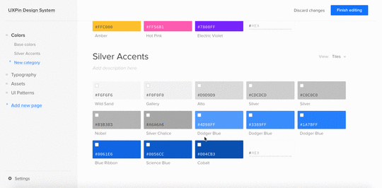
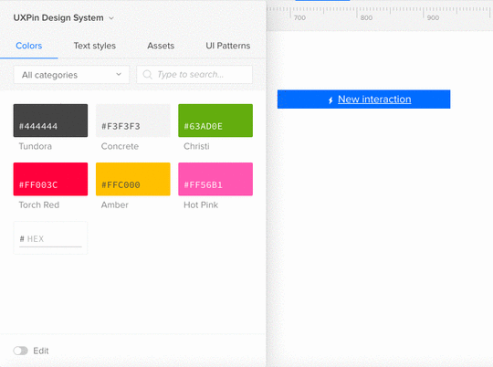
Create and manage categories in the Design System documentation.
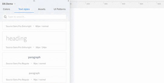
Possibility to drag text styles from Design System Library to canvas.
Sketch
After removing a Design System Library in Sketch, clicking undo restores both the library and the corresponding Design System documentation.
Editor
Smart Guides show the distance between elements on the canvas.
If you’re interested in what we’ve launched in September, check Changelog #11 and Changelog #12
Join the world's best designers who use UXPin.Sign up for a free trial.Your e-mailTry it for free!
The post UXPin Changelog October 2017 #13 appeared first on Studio by UXPin.


October 2, 2017
How to Automate Your Developer Handoffs With UXPin
Constant back-and-forth between designers and developers is a pain we all know way too well. It can slow down the development process, cause frustration, and create inconsistency.
UXPin comes with features for closing that gap during handoff to developers.
Let’s explore how these features help clear roadblocks for designers and developers:
CSS styling
Documentation
Automatic specs
Automatic style guides
Jira integration
Use CSS to style elements
Designers need more power to customize the look of design elements while matching what’s possible in web browsers. That’s why you can completely customize element styling in them CSS.
All CSS styling applied to a layer can be later on used during development, so the code doesn’t need to be written from scratch. Elements from Sketch are imported with the CSS styling and code (and can be accessed when inspecting particular elements on preview).

Add documentation and specification
While prototyping, you also want to communicate the reasoning behind your design decisions or call out any interesting details – edge cases, failure states, design principles, or code references.
To add more information to a specific element, switch your properties panel to the “Specification” tab. You can create metadata, describe the effort required to develop the component, or even provide multiple code snippets in different programming languages. It’s a simple, straightforward way to keep your design and code together. Any metadata you add is permanently pinned to that element for later inspection by developers.

To describe general use cases and design decisions, you can use Free Flow Documentation. Just write your comment and pin it to anything imported from Sketch or created in UXPin to avoid shuffling between design and 100-page requirements documents.

Scale your work with design systems
Using Design Systems and Design System Libraries gives everyone a single language and toolkit for design patterns and code snippets. The entire team can reuse the styles and elements, instead of making every pattern from scratch.

Once you’ve generated your system, you can add documentation, including code snippets to any element. In UXPin, documentation from the design system follows the elements in any project, so all the information is automatically populated for developers. Definitely gets rid of busy work.
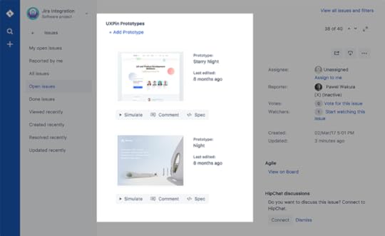
Keep all the details in Jira
With our Jira integration, project managers or developers can pin prototypes straight to the Jira issue. UXPin prototypes you see in Jira (and the documentation and spec links) are always updated to the latest version.
Illustrate your requirements, provide your developers with the right design assets and keep the team updated on the work right in Jira.
Send a single link to hand off the design
When your design is finalized and you’re ready for developer handoff, send your developers a single preview link from which they can source all the information they need through Spec Mode and Freeflow Documentation.
Developers can switch between different modes in the prototype to get information or request clarification. They can learn more about the particular solutions by opening Documentation or ask questions and leave feedback by enabling the “Comment” mode. When they’re ready to start coding, clicking on “Specification” on the top of the preview, will give them access to Spec Mode.
Spec Mode by default shows a page summary that includes size, grid, used colors and typography. On the design, you can see distances to the canvas and between the elements by hovering over them.
Click any element to see its properties and specification. When checking properties, besides size and and information about used colors, you can also check border and radius settings, take a look at CSS code as well as preview and download SVG version of any element you have created. All the information that you put in the editor and design system is also accessible.

Spec Mode also includes an automatically generated styleguide. It provides the developers with a birds-eye-view of all the crucial styles used in that design and download all icons and images in a single click.
Next steps
At UXPin, our goal is systematizing and centralizing the design and development process, which gives teams more time to solve bigger problems.
If you’d like to try out what you’ve seen here, go ahead and start a free trial.
Join the world's best designers who use UXPin.Sign up for a free trial.Your e-mailTry it for free!
The post How to Automate Your Developer Handoffs With UXPin appeared first on Studio by UXPin.
September 29, 2017
Design Systems vs. Pattern Libraries vs. Style Guides – What’s the Difference?
You’ll often see the terms design system, pattern library, and style guide used interchangeably.
The three concepts are connected but definitely not the same.
Let’s clarify definitions, visualize how they fit together, and discuss the major milestones in building a design system.
Design system definitions
First, let’s get the definitions straight so we can learn how our concepts are connected and how they can be used to create better products.
Design System – the complete set of design standards, documentation, and principles along with the toolkit (UI patterns and code components) to achieve those standards.
Pattern Library – A subclass in the design system, this is the set of design patterns for use across a company.
Style guide – Another subclass in the design system, this static documentation describes the design system itself: how products should look and feel, use cases for UI patterns, correct typographic scales, etc.
Bottom line: A pattern library (e.g. set of symbols and assets in Sketch) and style guide are only parts of the much more robust design system.

How it all connects
First, keep your focus broad and think about the idea of design systems.
At the broadest level, a design system is a living entity containing the common linguistics, principles, and tools to help teams build products coherently. As Nathan Curtis says, a “design system isn’t a project, it’s a product serving products”.
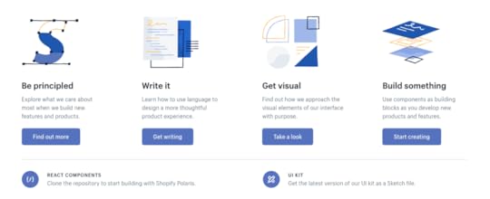
Shopify’s Polaris Design System is one of the best examples. On the homepage, they’ve already broken down all the core sections:
Product principles – What is the purpose and soul behind all the products?
Written content – How should the product’s interface copy look and feel?
Visual properties – What should the “skin” of the product look and feel like?
Components – What are the UI patterns and code components needed to build products coherently across devices?

Shopify’s Polaris Design System.
In this case, Polaris is the complete design system of principles, written content, visual properties, and components. The style guide is simply the static documentation on the Polaris website which describes how to use the design system. The pattern library is part of the “Components” in the Polaris design system.
The differences are subtle but unmistakably important when it comes to improving product development. A style guide on its own becomes quickly outdated since documentation requires maintenance. A pattern library lacks the instructions and principles for coherent implementation.
The design system ties everything together.
Creating a design system
Now that you know what these terms mean and how they work together, let’s quickly review how to build a design system. Here’s a quick overview of the steps involved from our 50-page e-book Creating a Design System: The 100-Point Process Checklist.
1. Create the UI inventory: First list and describe all of the design patterns currently used in your interface and note the inconsistencies therein.
2. Get support of the organization: Present your findings and explain the utility of a common design language to everyone. As explained in our Evangelizing Design Systems templates, estimate the number of design and engineering hours wasted on redundant work and how product coherence can improve NPS scores.
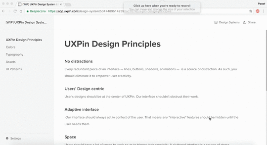
3. Establish design principles: Codify your practices. You’re now starting to work on the style guide for the design system.
4. Build the color palette: When building the UI inventory, we found 116 different shades of grey that needed consolidation. Create the palette and its naming convention.
5. Build the typographic scale: You can optimize the scale to serve existing styles, or you might try to build a harmonious scale using the golden ratio or major second. When building the scale, don’t forget that you’re not only setting the size of the font, but also weight, line-height and other properties.
6. Implement icons library and other styles: Decide which icons from the UI inventory will become part of the design system, then standardize the implementation.
7. Start building your first patterns: This is the task that will never end. Patterns should always either reflect the truth about the product, or reflect the aspirational state of the product in the near future.
Next steps
We’ve defined and organize the terms design system, style guide, and pattern library into a hierarchical structure. We’ve also quickly described how to build your own design system.
For a step-by-step walkthrough of how to build a design system, download the 50-page ebook Creating a Design System: The 100-Point Process Checklist. All the advice is based on UXPin CEO Marcin Treder’s experience building the internal design system.

The post Design Systems vs. Pattern Libraries vs. Style Guides – What’s the Difference? appeared first on Studio by UXPin.
UXPin Changelog September 2017 #12

Here is a portion of improvements for Design Systems, our Editor, and a release of a new version of the Sketch plugin 4.7.1. Details below.
Design Systems
Export design tokens from the Design System in a YAML format.
Instantly update all symbols on the canvas with the master version from Design System Library.
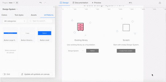
Update to the master version all the instances of a symbol on the canvas by dragging it from Design Systems Library.
Display in Spec Mode information that the given symbol is nested within a different component from Design System Library.

Fixed: nested symbols didn’t keep their size after refreshing the editor.
Visual improvements for buttons in Design System documentation.
Sketch (Plugin 4.7.1)
Plugin update to the newest version of macOS – High Sierra.
Fixed: Problems with changing “Uncategorized” name in Design System Library.
Fixed: Different order between items in UXPin Design System and Sketch Design System Libraries.
Editor
Smart Guides are only stretched between the dragged element and the element it snaps to.
If you’re interested in what we’ve launched in September, check Changelog #10 and Changelog #11.
Join the world's best designers who use UXPin.Sign up for a free trial.Your e-mailTry it for free!
The post UXPin Changelog September 2017 #12 appeared first on Studio by UXPin.
September 28, 2017
Inside Atlassian’s Design Process: The Power of Autonomous Teams
Designing at scale is one of the greatest challenges faced by product teams today.
What activities are required? How do you govern collaboration and decision making? And what about delivering quality on time?
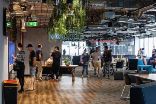
Atlassian Sydney office.
To find out how a global enterprise tackles the challenge, we spoke with three members of the Atlassian Design team:
Ashleigh Sterzenbach – Senior Product Designer
Erin Howard – Senior User Researcher
Alastair Simpson – Head of Design, Confluence, Hipchat, and Platform
They revealed how the 2,200+ employee company structures its design team and process for collaboration, efficiency, and product quality.
Team Structure
Starting with just 6 designers in 2012, Atlassian’s design team has since grown to almost 200 employees, including designers, writers, and user researchers. The team is lead by Jürgen Spangl, the current Head of Design, who reports directly to the CEO.

The design organization covers five disciplines:
Information experience – Crafting the product content, interface copy, technical documentation
User research – Researching and validating user needs
Product design – Product improvements and new product development
Creative team – Creating interactive marketing projects
Design operations – Putting in place the right tools, processes, and vision to make design teams successful
Within the design operations group, the design systems team consistently pushes the boundaries by working with all product teams to implement the latest design language. Meanwhile, the information experience, user research, and product design teams fully embed into product teams.
To govern product development, Atlassian uses the triad model in which engineering, product management, and design all collaborate in making decisions.

“You need healthy tension in the triad for solving engineering, business, and customer problems,” says Alastair. “If product performance suffers because of technical debt, it doesn’t matter how polished the features might feel. The triad is ultimately responsible for the whole experience.”
Based on the yearly strategy for the company and its product schedule, managers guide their teams in the right direction instead of prescribing every step of the roadmap. Whilst managers influence the overall strategy, the product triads have full autonomy to make decisions – managers don’t need to sign off on everything all the time.
Once a project starts, regular critiques and check-ins let managers ensure the triad’s work matches the high-level strategy.
“Individual contributors are given a lot of flexibility to investigate use cases and problems instead of following a baked-in roadmap that defines everything,” adds Erin. “And that helps us avoid the historical problem in tech of shipping quickly to hit a deadline without checking if the right problem is being solved.”
Atlassian’s Agile Design Process
To balance product quality with speed of implementation, Atlassian practices a design process that’s both structured and highly fluid. Following an Agile methodology where incremental updates are shipped regularly, product teams rely on collaboration rather than a purely linear process.
1. Creating context and alignment
The process always starts with reviewing data and research to identify knowledge gaps.
If they’re working on improving current features, for example, they may start with qualitative and quantitative data around product usage, use cases, and user activity. New product or feature development, however, requires more qualitative insights from generative research.
The team may spend up to a few weeks validating quick prototypes and running user research to make sure they’re honing in on the right problem statement:
Who has the problem, and have we validated the problem exists?
What is the problem? What data or research supports our assumptions?
Why is the problem worth solving? What is the customer and business impact?
Where does this problem occur?
Team members are encouraged to identify areas of risk and even pause the process to investigate further.
“As a user researcher, I’m hardwired to bring skepticism into the process,” says Erin. “For example, we once stopped the momentum of a product update because user comprehension wasn’t where it needed to be. We ended up running some more research studies and were able to solve the issue and deliver the right thing in the end.”
To create a complete picture of the customer journey, the triads will also conduct multiple explorative workshops and activities (described in more detail in Atlassian’s Team Playbook):
Competitor analysis
Writing a press release for the idea (like Amazon’s work-backwards tactic)
User interviews, contextual inquiry, surveys, and other ethnographic research
Baselining experiences
Project canvas
Experience canvas
Job stories
Persona cards and role cards

“You don’t want to jump into solutions too early in the process,” Alastair says. “Shipping doesn’t equal success — moving metrics for customers and your business does.”
2. Collaborating on ideation and creation
To deliver customer value as quickly as possible, product managers will help developers and designers break down large problem statements into smaller chunks of work. Members of the triad will then pair up to tackle each chunk of work.
“Engineers may not push pixels, but they’re absolutely involved in creating ideas,” Ashleigh says. “We pair up designers and developers as part of the process.”
When concepting, it’s quite common for designers like Ashleigh to run in-depth sketching sessions where designers, product managers, and developers all participate. In fact, the team rarely goes 24 hours without gathering feedback – whether it’s for a sketch, a wireframe, or a hi-fidelity prototype.
Product teams alternate between heads-down time and collaborative sessions with a strong regimen of activities:
Standups (daily) – The triad reviews a “highlight reel” of updates, challenges, and to-do items for their projects.
Team sparring (weekly) – A designer will explain the context and reasoning behind the designs, then ask peers in the triad for feedback. Each person marks up feedback individually, then the group debates the feedback. The designer then explains what feedback will be incorporated in the next version, and what won’t.
Design detention (biweekly) – Designers across all product teams gather together (3 hours to the full day) to tackle challenges individually or in pairs, with sparring sessions happening afterwards. Email, chat, and meetings are all put on hold.
Design blitzes (monthly) – Like a compressed design sprint, the triad collaborates across several hours on a complex challenge.
“There’s never just a ‘design-only’ phase,” Alastair says. “Sure, designers might be creating mockups on their own at some point, but everyone is involved in solving customer problems. You don’t build good products in isolation.”
3. Measuring the impact
Throughout the product development process, the triads regularly measure their work against the baseline metrics defined in the beginning.
Using tools like Attrakdiff, Treejack, and UserTesting, Atlassian summarizes the results of its user research and usability testing in a Non-Instrumented UX Scorecard with data like:
Time on task
Ease of use
Success rate/ task completion
Expectation measures
Happy path clicks
BERT (to measure emotional response).
“We always baseline and measure against what’s in the product today to ensure the new experiences are heading in a positive direction,” Ashleigh says. “This helps us build confidence in our design decisions as we move through the design process and continue to iterate.”

Atlassian’s UX Scorecard.
4. Shipping carefully and measuring regularly
Atlassian’s policy on shipping is best described as “measure twice, cut once.”
“We don’t work off an agency model,” says Alastair. “Designers are involved all the way through shipping.”
In fact, more technical designers can even participate in code reviews. The cycle of iteration, QA, and measurement allows triads to push both front-end and back-end updates to its cloud products every day.
After a product or feature launches, the triad tracks metrics in a Instrumented UX Scorecard. Now the team can check the real impact of the new experience by measuring the progression of customer behavior metrics.
“Millions of people on teams around the world depend on our tools to get work done,” says Alastair. “We must be purposeful and thoughtful with how we release changes.”
Conclusion
As Atlassian’s process shows, sometimes the key to a scalable process is in executing the fundamentals well.
Give design a seat at the executive table, structure product teams for natural collaboration, then give them room to make decisions every day. Replace bureaucracy with guidance and the self-governance model can actually succeed at scale.
“No team wants to be micromanaged. Every team wants ownership and accountability over what they’re building.” says Alastair. “Managers can’t oversee all the details — you hire smart people, ask the right questions, then get out of the way.”
Interested in being a designer at Atlassian? To see available positions, check out Atlassian Design Careers .
The post Inside Atlassian’s Design Process: The Power of Autonomous Teams appeared first on Studio by UXPin.
September 22, 2017
4 Ways UX Managers Can Improve the Design Process With UXPin
At UXPin, we focus on collaboration, communication, and consistency to make the process easier for design managers.
UXPin supports the core activities in the design process in one place: design systems, prototyping, documentation, and developer handoff.
By bringing all these tools under one roof, we’ve centralized the process, which improves efficiency and gives everyone a single source of truth.
Create a design system to improve consistency
Completing a successful project always starts with assigning specific roles and project access to your colleagues. As a manager, you can quickly distribute the tasks using UXPin User Management.

Once everyone knows their roles, you can lead the process of giving everyone an approved toolkit for design and development.
The best way is to build a design system at the earliest stages of a project:
Create a design systems library (DSL) with colors, assets, text styles and UI patterns from Sketch or your UXPin projects
Add metadata to your DSL elements so that it follows along in your projects (e.g. code snippets, use cases, etc.)
Display the “inventory view” of best practices and design principles. If you need to share some broader context or additional requirements, you can always add additional pages to the design system to include general requirements of the projects.

As your team creates the design system, you can also specify the viewing and editing permissions for the design system and a corresponding design system library to avoid any miscommunication.
Quick feedback loops
With our newly released integration with Jira, you can easily collect feedback from designers, PMs, developers, and stakeholders.
Integrate your UXPin account with Jira to plan the project and attach UXPin prototypes with all relevant information including comments, documentation, and specification. This way you’ll be able to follow the progress of your team and review the prototypes with just one click.

If you want to share your perspective and leave some feedback, it’s enough to open the Design Preview and switch the mode to leave some comments. Additionally, you’ll be able assign comments as action items to the person responsible.
The communication chain can be further connected with a Slack channel to facilitate collaboration and keep everyone up-to-date.

As a project approaches handoff to developers, designers and developers can generate specs, CSS, and style guides with Spec Mode in the editor for smooth implementation.

Simplified stakeholder management and approvals
As projects hit milestones, you can also change its status to notify everyone on the team.

For example, once a design is out for stakeholder approval, you can mark it as such and then send your work for signoff with the Approvals Process feature.
Once the stakeholder enters the preview, they can review the proposed design along with the attached documentation, leave some additional comments and accept or reject the project.

Upon receiving the approval, the manager has the green light to proceed to the next stage of the project. They’ll be able to easily share the word with the entire team by updating the project status in UXPin.

Spreading the news can be even faster, if your project is integrated with Slack – all the team members can see the update directly on the connected channel.

Next steps
UXPin provides you with tools to get the right information across to your team and stakeholders. Keep your team members updated, request approval from the stakeholders, and gather feedback effortlessly – all within one application.
Take us out for a test drive and see how UXPin makes your team’s workflow smoother.
Join the world's best designers who use UXPin.Sign up for a free trial.Your e-mailTry it for free!
The post 4 Ways UX Managers Can Improve the Design Process With UXPin appeared first on Studio by UXPin.
UXPin Changelog September 2017 #11
This week we’ve released improvements for Design Systems, our Editor, and a new version of the Sketch plugin 4.7. Details below.
Design Systems
Added “X” to close the Design Systems Library panel.
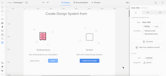
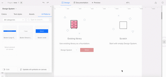
Replaced “from scratch” creator with an empty Design System.
Sketch (Plugin 4.7)
View, use, and edit your Sketch Libraries in UXPin.
Use custom proxy configuration for the plugin.
Small bugfixes and improvements.
Editor
While coping layers, “copy” is not added to the layers name anymore.
Ability to navigate through a prototype preview using arrows. Try it out!
If you’re interested in what we’ve launched in September, check Changelog #9 and Changelog #10.
Join the world's best designers who use UXPin.Sign up for a free trial.Your e-mailTry it for free!
The post UXPin Changelog September 2017 #11 appeared first on Studio by UXPin.
September 15, 2017
UXPin Changelog September 2017 #10
This week we’ve released improvements for Design Systems, our Editor, and a new version of Sketch plugin 4.6.1. Details below.
Design Systems
Ability to add colors with the hex code directly in the Design System Library in UXPin.
Sketch (Plugin 4.6.1)
Ability to add colors with the hex code directly in the Design System Library (as in UXPin).
Small bug fixes and improvements.
Editor:
The zoom level is kept the same when switching between pages.
[Auto-naming] Layers inherit names from the text elements and images.
If you’re interested in what we’ve launched in August, check Changelog #8 and Changelog #9.
Join the world's best designers who use UXPin.Sign up for a free trial.Your e-mailTry it for free!
The post UXPin Changelog September 2017 #10 appeared first on Studio by UXPin.
September 13, 2017
Free e-Book: Creating a Design System – The 100-Point Process Checklist

Our new free e-book offers directly applicable advice, straight from our CEO Marcin Treder.
How do you create design consistency across teams and products? Well, you need a design system.

Based on experience creating the UXPin internal design system, the ebook describes the 100 guidelines for a powerful design system.
Across 42 pages, Marcin breaks the process into 10 steps, each with their own individual checkpoints.

In this e-book, you’ll find:
Everything you need to know to compile your own inventories for UI patterns, colors, typography, icons, and spatial grids.
Best practices for communicating with team members and stakeholders.
How to make key decisions and establish key rules and principles.
Practical advice on building color palettes, typographic scales, and icon libraries.
A brief runthrough on conducting an effective sprint retrospective.
Links to dozens of additional reading materials to continue learning at your own pace.
Download this free e-book now.
The post Free e-Book: Creating a Design System – The 100-Point Process Checklist appeared first on Studio by UXPin.
The Atlassian Design System: Creating Design Harmony at Scale

When Atlassian expanded their focus on design in 2012, Jürgen Spangl was hired as the new Head of Design. One of the first projects he initiated was creating the Atlassian Design Guidelines (ADG) – their new internal design system.
At the time, they faced several challenges common to scaling a design practice:
Design inconsistency – For example, 45 different types of dropdowns.
Insufficient tooling – The team needed more powerful design tools to scale their work across multiple products.
Redundant questions – Atlassian designers wanted to spend more time on core problems and less time answering the same questions (e.g. which button to use).
Nathan Curtis once said that “a design system is a product serving other products”. Atlassian’s design system is certainly one of their most ambitious products, created from a need to solve complex problems.
To explore Atlassian’s journey from inconsistency to harmony, we spoke with Jürgen Spangl (Head of Design) and James Bryant (Lead Designer) about the creation, governance, and evolution of their design system.

Jürgen Spangl, Head of Design at Atlassian.

James Bryant, Lead Designer at Atlassian.
Creating and Adopting the First Version
Inspired by Apple’s Human Interface Guidelines , Atlassian decided their design system needed to be based in code while maintaining ease of use.
People from multiple teams contributed to the process – a dedicated team wasn’t formed at first so that the design system wouldn’t be created in isolation. The decision paid off since it resulted in design systems champions embedded across the company.
“Instead of creating consistency for the sake of it, we wanted our design system to create a more harmonious user experience,” says Jürgen. “We wanted to equip everyone to make better design decisions – not just designers.”
The process, of course, was not without challenges.
“Early on, we weren’t sure how to document the design system at scale. We tried using Confluence, using embedded iFrames in Confluence, a Bitbucket repository,” says Jürgen. “It wasn’t until a ShipIt hackathon session that one of our designers turned our existing UI toolkit (known as AUI) into a Living Style Guide coupled to the code.”

Planning for the first version of ADG in JIRA.
With a technical framework in place, the design systems team also needed to create a unified design language for the overall brand and each product.
“It’s never easy to align multiple teams on a path forward on the design language,” says Jürgen. “Do you create one direction or several smaller directions for each product?”
To define its design language and create all the patterns and components, the team followed a two-stage process:
Every month, the team would meet to work on ADG. The fast decisionmaking and momentum helped the team create many new patterns with 70-80% completeness.
During the following week, the team would then spend small chunks of time refining the patterns and codifying them into ADG.
The first iteration of ADG was released in June 2012 to govern its products. To allow for careful iteration, the team used a staged rollout and launched ADG first to Bitbucket, then Confluence and JIRA.

Atlassian Design Guidelines 3.0.
Supporting and Governing the Design System
Now 5 years later, Atlassian Design has grown to almost 200 people while the design system governs the brand and its 12 products across multiple devices, platforms, and marketing properties.
The company has since built a dedicated ADG team of 18 full-time employees: 5 designers, a writer, a project manager, and 11 developers. To maintain a high level of technical proficiency, an engineering team was embedded into the overall design organization.

Design space in Atlassian Sydney.
“A coding background is a huge benefit for designers who want to join our team,” James says. “They also need a strong understanding of prototyping tools and be able to work with developers to ship their work quickly. Finally, they must understand how their work multiplies across different contexts, products, and teams.”
When it comes to contributing to the design system, the workflow is a two-way open source model:
1. The ADG team is regularly exploring changes and consolidations to the design system. Once they’ve done the initial research, the team converges to discuss specs and requirements. Program managers then work with other product teams to align on the design system changes, roll out the changes, and monitor feedback.
2. Product teams can also suggest changes to the design system. The process is made much easier since each product has its own ADG representative to collaborate with a member of the design systems team.
Change requests are managed in JIRA and Confluence. Updates are pushed live to AtlasKit (based in React), which acts as the source of truth for design patterns and code components. The ADG team also maintains a library of UI assets in Sketch for all designers. Meanwhile, the ADG website describes the logic and guidelines around how to use all the patterns and components
Evolving the Design System
“Every 5-7 years, you probably need to revamp your design language completely because of new trends and technologies,” says Jürgen. “The world is constantly changing.”
The team works in 2-week sprints to ship iterations within days or weeks to customers. Larger changes (like revamping a color scheme or set of UI patterns) require more time.

JIRA using ADG 3.0, the latest version of the design system.
Luckily, as James points out, embedding designers in product teams (and vice versa with developers in design teams) helps build consensus more quickly for changes to the design system.
“It’s very hard to scale when you need to talk to all designers for every single change,” James says. “We bring all the champions into large design critiques to understand whether our ideas and proposed changes affect their current projects or down the line. They may learn something from our way of thinking that they can then apply back to their own work.”
To measure the success of design systems updates, the team triangulates data from several sources:
Opt-in and opt-out in products for changes to the design system
Changes in NPS scores for products after design system updates
Qualitative and quantitative feedback from testing iterations with UserTesting and in-person sessions
Now in its third version with strong adoption and instrumentation in place, one of the next goals of ADG is to make back-end services more consistent.
“A really good example of that is how we’re improving ‘@mentions’ for users in our products,” says James. “Design guidelines and front-end components make the experience feel more coherent, but you can also make back-end processes more consistent in a way that improves performance. Now we’re exploring how we can improve that level of platform services.”
Conclusion
When you consider the nature of Atlassian’s products, the stakes are almost too high to not have a design system in place.
“We’re changing the tools people use to get their work done,” says James. “I don’t think there’s anything more frustrating or frightening than having changes slow you down since that threatens your efficiency and livelihood.”
A design system is more than just a style guide or pattern library — it’s the blueprint for product development. By rooting the design patterns and code components to a common language, ADG gives room to innovate without forcing users out of their comfort zone.
“Some tension between the product and ADG team is perfectly healthy,” says Jürgen. “Product teams don’t just give in to ADG without good reason, and the ADG team doesn’t accommodate every change requested. That balance really helps drive us forward in the enterprise space.”
Interested in being a designer at Atlassian? To see available positions, check out Atlassian Design Careers.
The post The Atlassian Design System: Creating Design Harmony at Scale appeared first on Studio by UXPin.
UXpin's Blog

- UXpin's profile
- 68 followers

