
UXpin's Blog, page 107
February 9, 2018
UXPin + Dribbble: Get a free year of Dribbble Pro if drafted

At UXPin, we’ve been pretty active on our Dribbble account for the past few years – uploading shots and responding to feedback.
Dribbble has actually been a top destination for the global design community to find inspiration, share their work, and get hired. So we figured it made a lot of sense to partner up with them on a cool deal for the design community.
As you might know, Dribbble is an invite-only community and has curated a community of cool designers. They’re looking for more folks to join them.
You can now sign up and upload your work to Dribbble, making it easy to be drafted into the community. You’ll have a dedicated URL with your Dribbble portfolio making you one step closer to a Dribbble invite.
We’ve partnered with Dribbble to give you a free year of Pro once you’re drafted. All you have to do is Sign up for Dribbble by Feb 16th and start uploading your work to your profile. If you’re drafted, you’ll receive a free year of Pro.
Seems simple right? Try it out and let us know how it goes!
The post UXPin + Dribbble: Get a free year of Dribbble Pro if drafted appeared first on Studio by UXPin.


January 31, 2018
UXPin Changelog January 2018 #2

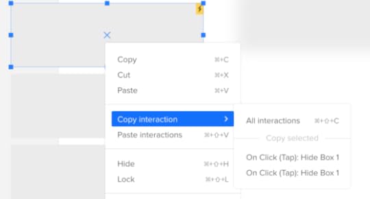
In the second part of January 2018, we’ve released many improvements to Design Systems (subpages in custom pages, protection from losing documentation, table element), the Editor (copy-paste of interactions, manual distance measurement, blur, and more), and also a new version of Sketch plugin 4.10.4 with small bug fixes and improvements.
Design Systems
Add and manage subpages for custom pages in the Design System documentation.
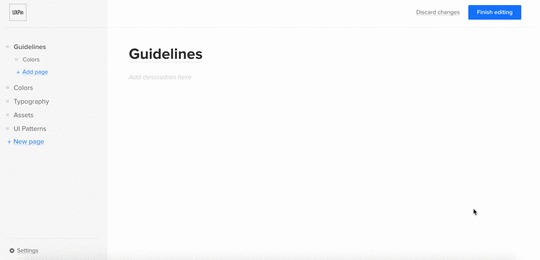
Protection from losing changes in the Design System documentation when the user is logged out.
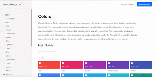
Add a table element to the Design System documentation.
Sketch plugin 4.10.4
Small fixes and improvements.
Editor
Clone/detach/break symbol and clear overrides from right-click menu in the UXPin Editor.
Copy and paste of interactions across all elements.
Manual measurement of distances between two elements on the canvas.
Blur for elements on the canvas.
Smoother repositioning of a layer into a group of layers.
If you’re interested what we’ve released in January, please check Changelog 2018 #1.
Join the world's best designers who use UXPin.Sign up for a free trial.Your e-mailTry it for free!
The post UXPin Changelog January 2018 #2 appeared first on Studio by UXPin.
January 17, 2018
Introducing Adele — The Largest Open Source Repository of Design Systems

Building things was always my passion. As a kid I spent countless hours playing with weird Russian metal construction sets (I guess only kids from the former Eastern bloc know what I’m talking about), wooden blocks, LEGOs, etc.
I was the kind of kid that disappeared into his own world for hours, completely consumed by creating the next great thing.
And while over the years plenty of things about me have changed (there’s barely a cell in my body that remained untouched, for an interesting discussion check this reddit thread), the passion of building has not changed a bit.
The task of creation fascinates me so much that over 7 years ago I co-founded a startup focused on helping designers and engineers create products together. A tiny side project at first, UXPin, grew to be a real business helping the world leading companies scale their design and development. Thanks to our design, prototyping and design systems tools companies can build better products faster.
The irony is that while tens of thousands of people use UXPin to create great digital products every day, the fast growth of UXPin, elevated me into the full-time CEO position. And while there are a lot of gratifying aspects of growing and managing a serious business with a great team of over 50 professionals, I was always itching to get back to the creation side of things. So… I just did it.
There’s probably a million reasons why the CEO of a startup that has outgrown its infancy, shouldn’t build things anymore. And, in my humble opinion, non of them matter.
If 32 years on this gorgeous planet taught me anything, it’s that to be happy one has to follow the one, defining, passion that focuses the mind and makes the heart beat faster. Following this passion makes us stay true to ourselves. It makes us authentic. And, in my opinion, the only worthy path to be a great leader leads through a relentless authenticity.
The only path to be a great leader leads through a relentless authenticity.
With that in my mind, I decided to spent every hour I can, on creating projects, from start to finish, that can help others build great products.
And today, I’m ready to launch the very first of these projects.
Please give a warm welcome to Adele 
January 11, 2018
Design Systems Virtual Summit 2018

Design systems are the hottest topic in UX today.
Everyone seems to either be creating one, or planning to create one. The benefits are undeniable: better design consistency and more efficient product development.
So what better way to usher in the golden age of design systems than with a worldwide online event full of experienced speakers and compelling case studies?
That’s how Design Systems Virtual Summit 2018 came to be. And thanks to sponsorship from Atlassian and Salesforce, it’s free for the world. Design Systems Virtual Summit 2018 features 13 webinars across Feb 13–16, 2018.
 Featuring 13 free webinars from today’s top practitioners.
Speakers include folks like Dan Mall, Bethany Sonefeld, and Ken Skistimas. They come from places like Salesforce, Atlassian, Airbnb, Linkedin, Fjord, IBM, GE Digital, Fjord, Athena Health, ForumOne, and Zendesk.
You’ll learn:
How to assemble a design systems team and technology stack.
How to identify and resolve design inconsistencies.
Where design systems should be consistent or flexible and how to adapt tools and technology to balance both.
How to avoid vague design principles.
How to sustain consistency across products and interface targets (Android, iOS, VR, or even Natural Language interfaces).
How to build a design systems backlog, governance model, and ROI tracking.
How to unify design with code.
How to close knowledge gaps between designers and developers.
How to sell a design system to designers, engineers, and stakeholders.
Register, share, and invite your teams to join in. This February, design systems are going global.
The post Design Systems Virtual Summit 2018 appeared first on Studio by UXPin.
UXPin Changelog January 2018 #1
In the first week of 2018, we’ve introduced: enhancements to Design Systems, improvements to shortcuts in UXPin Editor, and released new Sketch plugin v.4.10.3.
Design Systems
New: Colorize stroke for SVG assets.
Fixed: Issue with uploading big packs of assets to the Design System Library or Design System documentation.
Small bug fixes and visual improvements.
Sketch plugin 4.10.3
New: Dark background for white SVG assets in the Design System Library.
Fixed: Issue with overridden elements after uploading a single artboard to UXPin.
Small fixes and improvements.
Editor
New: Improvements to shortcuts in the UXPin editor. Shortcuts cheatsheet.
If you’re interested what we’ve released in December, please check Changelog #20 and Changelog #21.
Join the world's best designers who use UXPin.Sign up for a free trial.Your e-mailTry it for free!
The post UXPin Changelog January 2018 #1 appeared first on Studio by UXPin.
January 5, 2018
Video Lesson: Handing off Designs to Developers With UXPin
In today’s video lesson, UXPin power user Robert Smith explains how to prepare your work for developer handoff in UXPin.
See how to:
Add documentation to your designs for developers
Generate automatic redlining
Inspect CSS code and technical notes for elements
To try what you’ve learned, go ahead and start a free trial.
Join the world's best designers who use UXPin.Sign up for a free trial.Your e-mailTry it for free!
The post Video Lesson: Handing off Designs to Developers With UXPin appeared first on Studio by UXPin.
December 27, 2017
Rapid Prototyping Process and Fidelity: A 10-Minute Guide for UI and UX Designers
Prototyping is the cornerstone of the design process, requiring a blend of creativity and practicality.
We create and test the features that are most appropriate. Finally, our vision comes to life.

(Image credit: Adapted from Naked Design Labs )
As shown in the above illustration, prototyping gives you something functional to test with users so you can iterate accurately. But while prototyping is an important technique, designers can choose from a variety of styles, methods, and processes.
The fidelity of your prototype helps determine the appropriate process.
When we talk about fidelity, we’re referring to the functionality and visual detail. How close is your prototype to the final product? Low fidelity prototypes (like those created on paper) translate rough design concepts into something tangible and testable. High fidelity prototypes, on the other hand, are usually later iterations created in prototyping tools to help refine interactions.
Multiple factors affect the level of fidelity to build into a prototype, including:
Client & company budget in terms of time and money
Company’s resources and specializations (e.g. simpler prototypes can be more feasible for startups)
Tech savviness and creativity of users (less savvy users might have difficulty imagining a low-fidelity prototype as the final product)
Potential conflicts of interest (e.g. if the person prototyping will also help in coding the product)
Responsive design (lower fidelity prototypes aren’t as helpful for visualizing how a design adapts to different devices)
Designers can also choose to build their prototype from wireframes midway in the design process, from more detailed mockups later on, or jump right into prototyping from the very start.
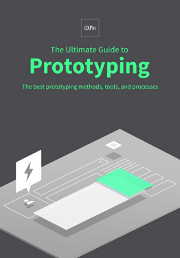
As described in the free Ultimate Guide to Prototyping, there is no “best” way to prototype, only the right tool and process for the job at hand.
In this guide, we’ll explore the spectrum of prototyping processes, fidelities, and tools so you can find the best fit for your project.
When to Start Prototyping: 3 Points of Convergence
There’s no green light that will magically blink when it’s time to start prototyping. When to prototype is the subject of just as much debate as how to prototype. The traditional linear process looks something like this:
Sketching — Brainstorm by drawing quick and rough sketches on paper.
Wireframing — Start laying out the skeletal framework with boxes and rough shapes.
Mockups — Inject detail into wireframes with colors, typographies, photos, and other visual design elements.
Prototyping — Add interactivity to mockups by stitching screens together for basic prototypes or adding animations/interactions for advanced prototypes.
Development — Code in language of choice to turn the prototype into the final product.
But with the popularization of new ideas such as Lean UX and rapid prototyping, plus the school of thought that wants to get into coding as quickly as possible, this traditional sequential method is becoming outdated.
Let’s look at some new variations, and explore their advantages and disadvantages.
1. Sketches/Wireframing & Prototyping
Some designers prefer to start prototyping right away, and for good reason.
This is a core concept of Lean UX, devised by Jeff Gothelf, Director of UX at Neo Innovation Labs (you can hear him describe it in this thorough webinar). Lean UX emphasizes prototypes as “the fastest way between you and your code.”
The Lean UX process offers three simple advantages over other methods:
Speed: Skipping and consolidating phases will get you to the end product faster, but possibly at the cost of quality.
Efficiency: The nature of the method is to avoid waste, so the only work done will be the essentials — no time spent on “busy work.
Experience, not deliverables: Part of “trimming the fat” is minimizing documentation. Teams communicate better and faster, improving collaboration in designing the experience. State the design vision, then iterate with that in mind.
One of the core processes of Lean UX is going straight from a detailed sketch or wireframe into a prototype. You can do this as simply as adding a few animations and basic interactivity to your prototype (if you’re using the right tool), testing with a minimum of 5 users, and iterating as needed.

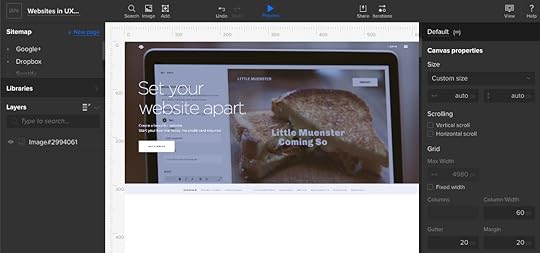
Low fidelity prototype created during a Yelp redesign exercise. ( View large version )
In our Yelp redesign exercise, our goal was to increase frequency and time on site for occasional Yelp users. We started with some rough sketches to explore concepts. Once we narrowed it down to a single concept, we created a wireframe. As we created the wireframe, we also created functionality by adding a few interactions.
You can see above that the lo-fi prototype created in UXPin was far from complete, but we were already able to arrive at the following structural decisions:
Distinguish the search field as the primary visual element through generous white space
As a secondary visual element, “Best Of” content is presented in a dropdown menu for fast acces
All categories are presented in a card format for ease of selection
While we don’t yet know exactly how the design will look, we certainly have a clear idea of how it will function. Not bad for roughly
If you’d like to know more about Lean UX and rapid prototyping, UX Matters features a great discussion thread about it in which 9 industry experts weigh in with their opinions.
2. Mockups & Prototypes
Mockups are better-dressed wireframes.
Neither require functionality, but mockups give a better idea of what the final product will look like, and at times suggest how it will function. You could build a hi-fi mockup in a prototyping tool (if it includes enough visual libraries), but you could also create them directly in Photoshop/Sketch.
The main difference between building a prototype based on a mockup instead of a wireframe is that mockups automatically provide the baseline design for a mid- to high-fidelity prototype.
Because wireframes are more concerned with the broad strokes of design (such as overall layout), they usually lead to low-fidelity prototypes. You’ll definitely want to consider this since, while low-fidelity prototypes are great for quick collaboration and exploration, high-fidelity prototypes can be better for product definition and estimates.

High fidelity prototype created during a Yelp redesign exercise. ( View large version )
When redesigning an existing website, creating prototypes from a mockup makes a lot of sense. Since you already have the high-fidelity visual assets, you don’t necessarily need to restart with a wireframe (unless you are doing a drastic rehaul).
In the second half of our Yelp redesign exercise, we created a new iteration in UXPin for the hi-fi prototype. We then created custom UI patterns and icons, saved them as Symbols for easy re-use, and then started layering them over the old lo-fi prototype. As a finishing touch, we added basic interactions like page transitions and dropdown animations.
The result was a hi-fi prototype that looked and worked much like the end product – perfect for another round of usability testing.
3. Coding & Prototyping
Introducing code early into the design process produces a lot of benefits, namely a more solid foundation when beginning development (which can mean less revisions in code). But it’s not so much a question of whether or not you should code with the prototype, but whether or not you can.
As Andrew Fitzgerald, Senior UX Architect for Deloitte Digital, points out, most designers have a “complicated” relationship with code.
When it comes to coding prototypes, it helps to start with a sketch and then dive straight into HTML or another language of choice (just make sure you check your work on smartphones and tablets). This lets you explore ideas on a whiteboard or on paper (where they’re easy to alter) so you aren’t trapped with mediocre concepts just because they’re cemented in code.
Regardless of whether you choose to add coding to your prototype, involve your developers each step of the way. You don’t want the first time your developers to see the prototype to be in an email with a long list of notes.
How to Prototype: The Rapid Prototyping Process
Rapid prototyping is less a separate process and more a filter for efficiency.
Designers consider it a core principle of Lean UX, but it also applies to any of the prototyping processes we previously described. In rapid prototyping, you revise quickly based on feedback and shift to multiple prototyping approaches based on the requirements.
We can break down the process into three stages:
1. Create your information architecture and user flows
Your information architecture (usually represented in a site map) lays out the breadth and depth of the content. You create the the blueprint for the entire experience by laying out all your screens.

Photo credit: Adapted from UX Movement’s site map chart
Once you’ve built the IA, you can dive one level deeper with user flows. User flows show common paths for moving between different screens in your information architecture.
2. Scope the prototype
Your first prototype should focus on just the core user flows. Focus on the 20% of functions that deliver 80% of your product’s value.
If you were creating a mobile banking app, the first prototype must build out the flows for primary functions such as:
Logging in to the app
Reviewing monthly statements
Paying off monthly credit card balance
Redeeming rewards points
Disputing payment claims
3. Iterate, Test, & Repeat
Start with breadth, then dive into depth.
You’ll usually begin with a “horizontal prototype” that covers all your main screens (like a home screen and category screens).Your next iteration will dive deeper into user flows for each screen (like updating account information in the settings page, selecting different rewards programs on the home page, etc).
Make sure you test major iterations with at least 5 users.
What to Prototype: 4 Ways to Combine Fidelity & Functionality
Most prototypes fall into four categories, depending on how you combine high- or low-fidelity visuals and functionality. All of these types are useful — but at different times for different needs.

A quick landscape of prototyping fidelities. (Image credit: Fred Beecher, Boxes & Arrows , used with permission.)
As Bill Buxton once said, and Fred Beecher (Director of UX at The Nerdery) illustrates in his excellent article: there’s no such thing as “high” or “low” fidelity — only the right fidelity.
Let’s explore the different combinations he mentioned here so you can select the right fidelity.
1. Low Visual Detail + Low Functionality
These prototypes are usually made from paper, look rough, and require someone to act as a “human computer” to move from screen to screen.
Popular low visual/low functional prototypes include:
Paper prototypes
Paper sketches
Digital static wireframes
The main advantage here, at the cost of both visuals and functionality, is speed. These prototypes are made quickly, and can be thrown away and replaced just as quickly. They’re great for horizontal brainstorming in which you explore a wide range of concepts.
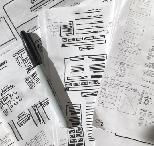
Photo Credit: Fairhead Creative
You can build this type of prototype over and over until some fundamental questions about UX concepts, feature completeness, and high-level page flows are answered. If you’re following the rapid prototyping process, this will be one of the earliest prototypes you produce.
You’ll be able to answer questions such as:
Did we offer enough features to meet our user’s needs?
Does the overall content deliver content at the right pace?
Understand, however, that when you test this prototype, you won’t be able to answer questions regarding interactivity such as:
How well does the design adapt to other devices?
Do the animations feel smooth, or are they jarring?
Does the interface provide the appropriate feedback to the user?
Can users scroll smoothly (either vertically or horizontally) between sections of content?
The beauty of this stage, however, is that you can explore multiple page layouts, page flows, and basic functionalities with very little friction and time.
For example, when redesigning UXPin, our design team spent 4 hours paper prototyping the Preview mode. Even though all of the work had to be recreated in a digital tool, our designers were able to review current usability issues and walk out with new positioning of elements. In that sense, paper prototyping was an excellent exercise in restructuring the layout.
For paper prototypes, grab some paper, scissors, pens, and keep it lightweight and conceptual.
i. Use printer paper and cheap pencils/pens.
The form affects your creative freedom. If you use a Montblac and a Moleskin, you might subconsciously restrict your thinking since you don’t want to draw something “ugly”.
ii. Start by loosening up.
Maybe you need to take a sheet of paper and scribble all over it. Or maybe you need to just start sketching out thoughts and ideas in your head as rapidly as you possibly can. Whatever works for you, start by loosening up. It’ll make your lines more confident, and your sketches stronger.
iii. Prototype mobile-first.
Because of the limited space on a mobile viewport, you’ll be forced to prioritize content. When you prototype mobile-first, you create a 100% experience that you can scale up for other viewports.
iv. One sketch per screen.
No matter how big or small they are, draw a separate sketch for each screen.
v. Iterate as the ideas happen.
Don’t question your ideas as they come – just let them out. You can question them all later. Remember, sometimes great ideas can come from a little detail within a terrible idea. Let them out, nobody’s judging you.
Aside from paper prototyping, you could also create a low visual/low functional wireframe in a digital tool. For prototyping purposes, we recommend selecting a tool that also allows you to add interactions later (otherwise your low visual/low functional wireframe is a dead-end document).
Pro Tip:
In the earliest stages of prototyping, consider creating a “content wireframe”. Instead of diving straight into the boxes and arrows, you’re first carving out space for broad categories of content.
Not only do you focus on the most design element (the content), but the approach is also responsive-friendly.

If you’re using UXPin, you could start mobile-first by creating a 320px breakpoint for your prototype.
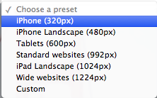
From there, simply add box elements sized appropriately for the content. For example, as you can see below, we set the dimensions of 320px wide and 225 px high for the smaller videos (Video 2, Video 3).

Once you can start to see the whole content hierarchy for your design, you can then create a second project for your low visual detail/high functionality prototype.
For your second prototype, you’ll be able to design faster since you’ve already answered your main structural questions in the content wireframe.
Grab design ebooks created by best designers
All for free
 Download
 Download
 Download
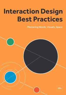 DownloadDo you want to know more about UI Design?
Download 'Interaction Design Best Practices' FOR FREE!
Download e-book for freeClose2. Low Visual Detail + High Functionality
Considered low- to medium-fidelity, these prototypes are basically “interactive wireframes.”
If you started with a paper prototype, you’ll need to rebuild the prototype in a specialized tool that supports a high range of interactions. If you’re technically adept, you can also build a low visual/ high functional prototype in code.
Popular low visual/low functional prototypes include:
Interactive wireframes
Coded prototypes
As Beecher explained in his article, low visual/high functional prototypes help with:
Testing usability
Gaining validation from stakeholders
Supplementing documentation for developers
Running remote usability tests (the higher functionality reduces risk of confusion, and thus the need for someone to moderate in-person)

Low Visual/ High Functional Prototype
If you’re on a budget, these prototypes are very useful for usability testing thanks to the more powerful functionality. A lower level of functionality will confuse users, while a higher level of visuals can be a waste of time since you haven’t validated your concepts.
In our experience, the low visual/high functional prototype gives you the best insight for the time involved.
They’re rough enough to encourage honest feedback, but features enough functionality to test user flows. Plus, it’s much easier to test than a low visual/low functional paper prototype since it actually works on it’s own (no need to shuffle a bunch of pages around).
If you’re following a lean design process, these prototypes will suffice. You can explore and test the interactions early on, saving the visual design for later (either in Photoshop/Sketch or straight in code).
3. High Visual Detail + Low Functionality
If you’re building a visually rich site, you might jump to this step after your low visual/low functional prototype. This stage focuses more on testing visual design details rather than core interaction models.
As such, we do not recommend creating high visual/lo-fi prototypes unless you’ve validated your assumptions through previous testing. Otherwise, you’ll be investing in visual design when the information architecture or content structure is broken.
Popular low visual/low functional prototypes include:
Digital prototypes with basic interactions
Coded prototypes with basic interactions
Think about these prototypes as a “prettier” paper prototype — limited in functionality, but much more visually rich.
If you started on paper, you could create the visual design in Photoshop/Sketch and then drag and drop your files into UXPin to add interactions to each layer. If you’ve already created a lo-fi prototype in a specialized tool, you’ll need to iterate on top of your work.
High Visual/Low Functional Prototype.
Think of this prototype as as a “mockup +”.
It serves all the purposes of a mockup — finalizing visual decisions, presenting to clients, etc. — but with the bonus of some limited interactivity. In some tools, you’ll be “stitching” together screens through the creation of linked hotspots. As users click on the hotspot, the next page will load. Instead of the “human computer” required of paper prototypes, the prototyping app does all the work.
Pro Tip:
When adding hotspots to mobile prototypes, remember the rule of designing for fat fingers. Your interface buttons (and any hotspots on the prototype) should be at least 40 x 40 points for the sake of tappability.
4. High Visual Detail + High Functionality
The hi-fi prototype falls just one step below the finished product.
High visual/ high functional prototypes are helpful if you’re building a product with complex functionality, intricate visual design, or dozens of microinteractions.
For example, Carbonmade is a web app that allows users to create custom portfolio sites. The app is full of microinteractions (like hover animations), rich color palettes, and visual elements that are core to the product experience. While you could test the basic usability with a low-visual/ high-functional prototype, you can’t gauge the overall enjoyability of the full experience.
On a related note, high visual/high functional prototypes also help you test the effectiveness of new visual languages or new branding. Usability testing will reveal if any colors or typefaces wreak havoc on a previously usable design.

Photo credit: Carbonmade
High visual/high functional prototypes generally include:
Digital prototypes with advanced interactions
Coded prototypes with advanced interactions
Either of the previous prototypes can be iterated into a high visual/high functional prototype. You can create high visual/ high functional prototypes with visual design tools and prototyping tools, or build it right in code if you are technically adept.

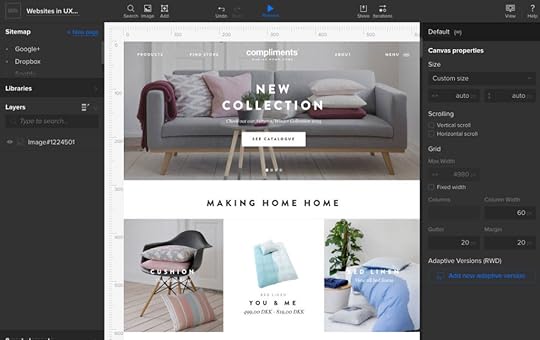
High Visual/ High Functional Prototype of the Compliments site recreated in UXPin.
Since they resemble the final product, these prototypes are also helpful for testing with users who aren’t very tech savvy, or for communicating design needs with outsourced programmers against the specs (less chance of misinterpretation).
Because coding is always the next step after a high-fidelity prototype is finalized, these prototypes act as highly realistic “living” technical specs.
As Jared Spool suggests, high visual/high functional prototypes are most appropriate for convergent design (when you’re narrowing down a list of ideas).
If you’re still exploring broad questions like “How should we present primary and secondary content?,” then you’re better off doing low visual/low functional prototyping since you can easily create 10–20 sketches, slap them on a wall, and get some nice perspective.
Pro Tip:
Keep your interactions simple to start with. In our experience, they’re likely to change early in the design process, so don’t spend too much time developing them early on.
If you’re using UXPin, name your elements as you make them interactive so you can track which is doing what.
Can it be coded? Consult with your developers or, if you’re the one writing the code, make sure you know how to build interactions technically as you dream them up. Don’t be afraid to push your boundaries — but do your homework first.
Build pages before you link them together to make sure you know what needs linking first.
Conclusion
Prototyping enjoys a wide versatility in terms of process and purpose. Even before you get into the types of prototypes, the initial decisions (rapid prototyping vs. higher quality, basic vs. detailed visuals, coding vs. no coding) will all lead to different outcomes in the design process.
In closing, let’s reiterate Bill Buxton’s timeless advice: it’s not so much about choosing high-fidelity or low-fidelity, as it is about choosing the right fidelity.
If you want to practice what you’ve learned, go ahead and play around with a free UXPin trial.
Join the world's best designers who use UXPin.Sign up for a free trial.Your e-mailTry it for free!
The post Rapid Prototyping Process and Fidelity: A 10-Minute Guide for UI and UX Designers appeared first on Studio by UXPin.
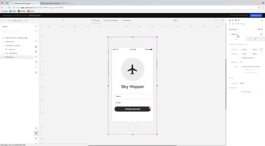
User Research Video Lesson: Collecting and Analyzing User Feedback With UXPin Prototypes

In today’s video lesson, Robert Smith teaches you how to gather and analyze feedback with UXPin prototypes.
You’ll learn:
How to collect user feedback with the comments feature
How to organize and analyze user feedback with a spreadsheet
How to turn user feedback into action items
To follow along, go ahead and start a free UXPin trial.
Join the world's best designers who use UXPin.Sign up for a free trial.Your e-mailTry it for free!
The post User Research Video Lesson: Collecting and Analyzing User Feedback With UXPin Prototypes appeared first on Studio by UXPin.
December 22, 2017
Interaction Design Video Lesson: Creating and Mastering Interactive States in UXPin
In today’s video lesson, power user Robert Smith teaches you how to use interactive states to build powerful prototypes.
By the end of the lesson, you’ll have a functional prototype that’s ready for usability testing.
To follow along, ahead and start your free UXPin trial.
Join the world's best designers who use UXPin.Sign up for a free trial.Your e-mailTry it for free!
The post Interaction Design Video Lesson: Creating and Mastering Interactive States in UXPin appeared first on Studio by UXPin.
December 20, 2017
UXPin Changelog December 2017 #21

Recently, we’ve released new features in Design Systems: search in the documentation, dark background for light assets and text styles, possibility to add colors from any website to a Design System. In the Editor, we’ve: added a possibility to break a symbol, improved copying and pasting, and enabled aligning single elements to the canvas.
Design Systems
New: Break symbol – revert the symbol content back to regular elements.
New: Dark background for white text styles and SVG assets in Design System Library and documentation.
New: Search in Design System documentation.
New: Cancel upload of multiple assets in DS Library and DS documentation.
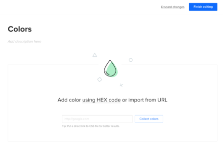
New: Add colors from any website when creating Design System from scratch.
Small bugfixes and visual improvements.
Sketch plugin
[Fixed] Squeezing Symbols after changing their size in Sketch and reimporting them into UXPin.
Editor
New: Align single element to the canvas.
Copy/paste improvements.
If you’re interested what we’ve released in December please, check Changelog #20.
Join the world's best designers who use UXPin.Sign up for a free trial.Your e-mailTry it for free!
The post UXPin Changelog December 2017 #21 appeared first on Studio by UXPin.
UXpin's Blog

- UXpin's profile
- 68 followers

