
UXpin's Blog, page 105
April 30, 2018
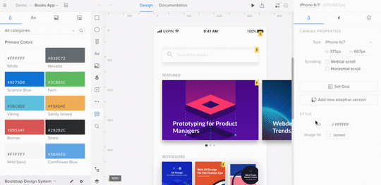
Importance of Design Consistency

How creating Design Systems help solve problems every designer and developer face when scaling up.
Not long ago, our CEO, Marcin Treder, wrote a series of posts describing his work in helping to build UXPin’s internal design system. After interviewing leaders in the industry, he concluded that a lack of design consistency was clearly a prevalent issue for teams around the world. And for design teams and users, this lack of consistency can lead to numerous issues:
User confusion: Different patterns responsible for the same action confuse users.
Slow design process: The lack of reusable design assets slows down designers (everything is created from scratch).
Slow development: The low number of fully reusable components bogs down development.
Difficult onboarding: Introducing new designers and developers to an undocumented “system” is terribly difficult.
So how are these teams working to minimize design inconsistencies? Participants of our study had the same answer: building and maintaining a design system. And the enterprise segment (B2B products) of the design market seems to already be there:

Results of UXPin State of the Enterprise UX Survey
69% of enterprise teams either have a design system or are currently establishing one. Companies such as Salesforce, IBM, Airbnb and Atlassian lead the movement with their implementations of living design systems.
It certainly makes sense. At that size and scale, the problem of inconsistency is too painful and expensive to ignore.
A design system is a process and therefore is simultaneously always ready and never done.
—Marcin Treder, CEO at UXPin
Why build a design system?
Allard van Helbergen, Senior UX Designer at Atlassian, spoke during our latest Virtual Summit about what he and his team learned from 16 years of design system evolution.
Why do you build a design system? The popular answer is to maintain consistency across different products and different teams, but a well-made design system also reduces cognitive load and increases the speed of development overall. There is one reason, though, that stands over the others, the ultimate reason. Design systems help users.

One of the hardest parts to grasp about design systems is that their components never quite fit perfectly out-of-the-box. The design system and the product work together, but do different things.
At some point your product will be leading [the design]. At another point, your design system will be leading.
—Allard van Helbergen, Senior UX Designer at Atlassian
Rather than fight this tension, Atlassian learned the smarter solution was to use it to their advantage. There is no “one size fits all” component that would work perfectly with every product, so they needed to add a degree of customization. They found that, by leaving some room for growth in their design system, the components could be slightly modified to suit whatever the product’s needs are. Want to know more about Atlassian’s journey? Check our recap of Allard’s webinar.
A design system is more than just a style guide or pattern library — it’s the blueprint for product development. All the design principles, visual assets, and patterns are thoroughly documented. All code references are included for each piece of design. As a result, design can scale right alongside development.
The ROI of Design Systems
Increased velocity and time to market: A component-based toolkit accessible in one place allows for a more agile process, speeding up releases without compromising quality.
Increased product value: Reusable components build upon each other, which creates a consistent look, feel, and behavior to the product. Just as consistency increases, so too does user efficiency.
Increased collaboration and knowledge sharing: Because the shared design system includes approved assets and conventions, designers and developers are more autonomous without closing off into silos.
Less time and money wasted: Because designers and developers aren’t caught up in redundant questions or repetitive work, they’re freed up for projects that deliver more business value.
You can read more about the process for building a design system in our free online guide. We hope this will help product teams get a head start on scaling design consistency and efficiency. UXPin is a product design platform used by the best designers on the planet. Feel free to give it a try and start your free trial.
If you’ve worked on a design system yourself, we’d love to hear your thoughts.
The post Importance of Design Consistency appeared first on Studio by UXPin.


April 25, 2018
Desktop App
Today we’ve released our brand new desktop application! It has all the tools you know and love from the original browser version. Download here for Mac or Windows.
Learn more about it in this tutorial.
The post Desktop App appeared first on Studio by UXPin.
April 16, 2018
Web Design Trends 2018: The Complete Guide for Designers
So far, 2018 has been a remarkable year for web design trends. We’re seeing years of design evolution finally come to fruition in trends like Design Systems and Tactile Design, as well as fun and energetic styles like the return of retro. Now more than ever it’s crucial to reflect on what’s happening with web design, and what will continue into the future.
In this article, we discuss the 6 web design trends that are influencing 2018 the most, starting with one that’s shaping up to be a new design necessity.
1. Component-Based Design Systems
If your company hasn’t implemented a design system yet, chances are you will in the next few years. According to the most recent 2017-18 Enterprise UX Industry Report, 67% of those surveyed are now currently building theirs, if they don’t have one already.
There’s a good reason for their success, too. Design systems are the natural progression of style guides and pattern libraries, but with so much more to satisfy the needs of modern companies.

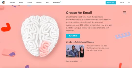
MailChimp, built according to MailChimp Design System .
What is a design system?
A design system includes design standards, documentation, and — one of its central advantages — a UI toolkit with patterns and codes. Design systems aim to ensure consistency across each of an organization’s products, and even within individual products themselves, and to use the optimal design solutions in any given situation.
As Nathan Curtis says, a “design system isn’t a project, it’s a product, serving products”.

Because some of these areas can change, a design system is a “living document,” constantly updating itself whenever new or better solutions reveal themselves.
What does a design do in practical terms? Let’s look at the Polaris Design System, used by Shopify. They break their design system into four areas:
Product principles: Mission statements and approaches to product design, such as putting the merchant first and an emphasis on accessibility.
Written content: A style guide for all written content, including grammar/spelling choices, voice & tone, and general guidelines like target reading levels.
Visual properties: All things visual: color, typography, image guidelines, icons, chart presentation, etc..
Components: The nitty-gritty, covering design patterns, their usage rules, and quick-copy code.

Shopify’s Polaris Design System.
How to Create a Design System
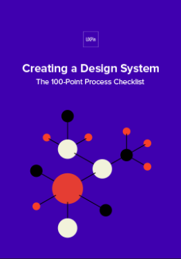
You can create your own design system by following these 7 steps from our free ebook Creating a Design System: The 100-Point Process Checklist.
Create the UI inventory: Go through all your products/websites and list all the design patterns used. Rectify any inconsistencies you come across.
Get support of the organization: Present your findings to get everyone else on board. It helps to estimate the number of design and engineering hours wasted on redundant work, plus mention how more streamlined products can improve NPS scores.
Establish design principles: What are the principles that govern your company? Consolidate answers into a master list.
Build the color palette: Standardize your color palette using precise color codes and agree on a universal naming convention
Build the typographic scale: Fine tune your font sizes, weights, line-height, etc. and establish concrete rules for displaying text.
Implement icons library and other styles: Revisit your initial UI inventory and carry over select icons and design choices.
Start building your first patterns: Audit your pattern library to select the ones that best reflect your company, your products, and your customers.
Keep in mind, a design system is never fully finished. Update periodically and keep an eye out for areas that can be improved.

GE Digital, built according to Predix design system.
2. Polygonal Shapes and Geometric Layers
One of the most distinct web design trends of 2018 focuses on geometric themes, specifically polygons and layered shapes. Chances are you recognize this style when you see it, but to put a precise definition on it, a polygon is any closed-off shape with straight lines, typically 3-5 sides. This trend includes every floating triangle and square you see, but also original shapes that fit the definition.

The style essentially centers around geometry, either with shapes (both regular and irregular) or basic geometric patterns (grids, planes). Let’s break down its specific components:
Simple geometry

http://www.espn.com/espn/feature/story/_/id/19742921/espn-body-issue-2017
Rather than filling the entire screen, many companies like ESPN above opt instead for more original, but simple, shapes. This can bring other subtler benefits; for example, ESPN’s slanted shapes above influence the natural visual flow, creating a more dynamic screen overall.
Bold Lines to Grab Attention

http://www.mountaindew.com/nba/
Lines are geometry too, so highlighting them fits this style as well. When used correctly, big, bold lines can visually carry a screen, or draw attention to the complementary image.
When using thick lines, you want to pay attention to both color and intersection points. Color will determine where the user’s attention goes, whether drawing attention to or away from the lines. Intersection points inherently become focal points, so use them to your advantage.
Detailing

If you don’t want to commit to a full geometric aesthetic, you can also use this trend for detailings. Polygons and geometric layers are visually interesting at any size, and so they make great secondary graphics or even button icons.
3. Tactile Design
Tactile Design has an interesting origin: it grew from the principles of Material Design, but at the same time it modernized the old skeuomorphism trends from the early 2010s.
In a nutshell, Tactile Design makes objects appear real in a digital space. In the words of Google’s Material Design guidelines, “the material is grounded in tactile reality, inspired by the study of paper and ink, yet technologically advanced and open to imagination and magic.”

Tactile design is hard to pin down with words, but like the geometric trends, you know it when you see it. Let’s take a look at its common components:
No Borders

Like the real world, there are no borders or windows; everything is taken in altogether. Certain elements — particularly text — cross over from one element or screen to the next. For this to work, designers make a good use of space so that users know what they can click on and where it will take them. That’s why you often see ample negative space (white space).
Multilayer Design

https://www.apple.com/ios/ios-11/
Just like Material Design, Tactile Design incorporates multiple layers to create a more realistic look. That means lots of drop shadows to distinguish layers and instill a little more realism.
Purposeful Motion and Animation

https://www.getprepd.com/products/prepd-pack
Tactile Design prefers meaningful motion over more complicated animations just for fun. Moving elements like hover states and transition animations don’t just improve the visuals, they also serve a purpose and improve usability.
Detailed Photography

https://www.adidas.com/us/ultraboost-all-terrain-shoes/S82036.html
Again because of the importance of realism, Tactile Design uses highly detailed photography, a mixture of HD quality and close-up angles. This is doubly beneficial to ecommerce sites, since detailed photos give shoppers a better understanding of what they’re buying.
Grab design ebooks created by best designers
All for free
 Download
 Download
 Download
 DownloadDo you want to know more about UI Design?
Download 'Creating a Design System: The 100-Point Process Checklist' FOR FREE!
Download e-book for freeClose4. Complex Desktop/Simple Mobile
The desktop vs. mobile rivalry has been around since the rise of smartphones, but what we’re coming to realize is that they’re not rivals at all. They actually work together. According to a GO-Gulf study, around 90% of users complete the same task on multiple devices, across all age ranges.
Recently, we’re seeing a differentiation between mobile and desktop interfaces of a site. Rather than cramming a complex system into a mobile device or moving a simplistic system as-is to desktop, companies are designing more device-specific variations of the same product, site, or app.
The trouble is knowing what needs to be changed, and how. Below, we’ve collected some top pointers on how to best use mobile device’s individuality instead of just translating a desktop system:
Mobile Alternatives for Complex Interactions
Replace header videos with stills from the video. If you need to include a video on your mobile site, use a link to YouTube.
Don’t use hover effects. Instead, tappable buttons or gesture controls can hide/show information.
Simplify animated effects. They just don’t work as well on mobile. For example, Coach replaces its desktop slider-animation combination graphic with an animated gif on mobile.
Replace dropdown menus with hamburger menus. Love them or hate them, hamburger menus are an established pattern that everyone already knows how to use.
Implement voice activation when you can. This is becoming increasing popular, and may be the new norm in a couple years.
Reevaluate colors and backgrounds. Mobile devices sometimes require more contrast to maintain readability.
5. Modern Retro Design
Even the New York Times admitted that web design is currently in an age of nostalgia. Today, designs are borrowing more and more from the distinct tastes of the 90s, 80s, and 70s. Let’s look at what each of these eras is bringing to the table:
90s: A time when designers where exploring what digital platforms could do. Lots of animation, colors, and moving parts, or else stripped-down designs of pure information.
80s: The pixelation from the budding video game industry mixes with the bright neon culture from period fashion and early MTV.
70s: Muted colors and bold typography — particularly psychedelic fonts — from when print media was still strong.
Using retro styles in modern times requires picking-and-choosing the best elements to use. After all, certain design styles are best left in the past. Below are our suggestions on what to keep:
Old-School Typography

http://www.sbs.com.au/imyourman/
We see a resurgence of not just big and bold text, but also the fonts themselves. Fonts with elaborate strokes, thick cursive, and/or rough edges are becoming popular again, as are fonts reminiscent of old movie posters.
The key to using such “loud” fonts effectively is moderation. Big and bold typography is ideal for titles and headlines, but can be distracting for secondary information or body text. It’s best to pair loud fonts with a simpler and subtler font for normal copy.
Extreme Colors

Whether using muted colors or bright colors, modern web design pays extra attention to color. Color overlays are common, and so is using matching colors to accent other images and illustrations.
Texture and Gradients

Like colors, texture and gradients are commonly seen in extremes. Some organizations put plenty of texture to give their sites a more realistic feel, while others are stripping away such effects for a stark minimalism.
Video-game Style

Pixelation, mimicking the original Nintendo console, is a popular style even for non-gaming sites. The juxtaposition of low and high fidelity allows for a interesting aesthetic both older and younger generations love, not to mention how easily it stands out.
6. Simple Homepages
Last, a return back to basics. Homepage trends have come and gone over the years, but now we’re seeing simpler home pages that work more as a gateway than a source of information.
This trend actually emcompasses a variety of other trends. So to get a homepage that looks modern, you can utilize any number of the trends below.
Minimalism

The go-to style for simple and easy-to-use interfaces. You can identify minimalism by its abundant negative space (white space), big & bold typography, and colorful accents. For homepages, color works best to draw attention to your main call-to-action, as with Evernote above.
Flat Design Family

Flat, Almost Flat, and Flat 2.0 — similar but with distinct differences — all work well for simplifying homepages. Like minimalism, they reduce distractions and take advantage of color flourishes, but flat design is more forgiving of detailed visuals like an HD hero image.
Subtle Animations

https://www.roystonlabels.co.uk/

Animations can improve both usability and user enjoyment, but they can also distract from your main elements. Lately homepage animations have become more subdued, limited mostly to:
automated animations that move on a fixed schedule
trigger-based animations that move when the user clicks or scrolls
These more subtle animations retain the benefits of movement, but without losing the simplicity that modern homepages are going for.
Beautiful Photography and Videography

As long as you leave out other attention-stealing imagery, using a solid hero image or video background still can make a simple homepage. It allows the user to focus solely on the subject of the visual, which can have a powerful effect when done well.
Prioritize Readability

Particularly popular with long-form content sites, homepages are seeing a renewed appreciation for readability. If you want to highlight your homepage copy, make it more legible by using:
above-average text size (>16 pt. for body copy).
exaggerated leading or line heights (1.75x text size).
oversized gutters.
text color contrasted with background.
centered images and callouts so line lengths remain equal.
Conclusion
Web design in 2018 is making huge advancements, perhaps more than in any preceding year. That makes this year one of change and transition, where fields like mobile design and component-based systems are coming into their own, while older styles like busy pages are retiring.
Now more than ever it’s time to reevaluate your design strategies and catch up on everything that’s been coming to light over the last few months and years.
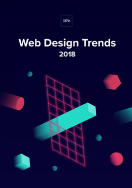
For more advice and dozens of examples, download the full 78-page free ebook Web Design Trends 2018 .

The post Web Design Trends 2018: The Complete Guide for Designers appeared first on Studio by UXPin.
April 12, 2018
UXPin Changelog April 2018 #6

In the past two weeks, we’ve released a few enhancements to the Design Systems (restricted access, export Design Systems in new formats), Editor (Pen Tool, resizable left panel), and in-app changelog in the Editor. Details below.
Design Systems
[New] Restrict access to Design Systems only to your team in UXPin.
[New] Export Design Systems with documentation in JSON format.
[New] Export tokens in YAML, CSS, SCSS, LESS, and STYLUS formats.
[Improvement] Create symbols with CMD + K shortcut (Alt+S also works).
[Fixed] Losing connection between symbols when pasting a symbol into a different project.
Editor
[New] Create any shape you want using Pen Tool.
[New] Resize left panel, and its content will adjust accordingly.
[New] In-app changelog also available in the Editor.
[Improvement] Click on the changelog orange dot to get the “What’s new?”modal immediately.
[Fixed] Canvas was jumping after entering symbols or multistates edit mode.
[Fixed] Unwanted transparency after fill color was changed for a SVG element.
[Fixed] Stroke width was not copied correctly.
If you’re interested what we released in March, please check out Changelog 2018 #5.
Join the world's best designers who use UXPin.Sign up for a free trial.Your e-mailTry it for free!
The post UXPin Changelog April 2018 #6 appeared first on Studio by UXPin.
April 9, 2018
What’s Old Is New Again: Modern Retro Web Designs for 2018
What’s old is new again. At least when it comes to website design, anyway.
Design concepts borrowed from decades ago are making an impact in digitally today. Many of the ideas and designs were originally created for print campaigns that are making a comeback in the digital space.
What makes retro design styles work is the sense of nostalgia they invoke with users visually. Pair that emotion with a modern interface and user patterns and you’ve got a combination that’s hard not to interact with.
Modern retro design is so popular that The New York Times even gave it a mention:
“While millennials and members of Generation Z — those born in the years from the mid-1990s to the early 2000s — may not remember what the web looked like in the era of AltaVista and GeoCities, the retro designs tap into the current cultural revival of all things ’90s. (See the return of “Twin Peaks,” “Will & Grace” and concert T-shirts.)
“For those who are older, these sites recall the improvised internet of their youth, in the days before mobile optimization and beta-tested user interfaces brought a sleek uniformity to modern web design.
“Nostalgic websites meant to mimic the days of dial-up modems are cropping up in artsy and tech-geek corners of the web.”
So what does the modern retro design trend look like? Let’s take a look.
Throwback Decades


http://www.sweetmagnoliagelato.com/


Retro can actually refer to a lot of things. The modern retro designs that are most popular now include styles that are most reminiscent of the 1980s and 1990s. (Which for some of us might not seem like that long ago at all.)
Designers are also borrowing a few influences from the 1970s, particularly in terms of color.
What’s appealing about retro design is that it pulls from early computer influences as well as print, fashion and events of the time:
1990s: This era was both bold with lots of animation color and moving parts or stripped down versions of designs that provided pure information. Designers were trying to find their way in the new digital age of visual and graphic design.
1980s: Pixels were OK and the bright neon culture of MTV and video games had a distinct influence on design elements of the time.
1970s: Muted color and bold typefaces help draw users into designs that were still primarily in print (aside from television screens).
To make any of these retro styles work, the interface must meet modern usability standards. In many of the examples, you can actually see the juxtaposition of old and new — a muted color palette with a familiar hamburger-style navigation menu or a pixelated game with simple swipe actions.
Old-School Typography

http://www.sbs.com.au/imyourman/

Big, block-style lettering with elaborate strokes and coloring will take users back in time in an instant. The same can be said for more cursive styles with heavier lines and roughed up edges.
Both styles have found new success because of resurgence in retro typography styles. Many of these website designs pay homage to print with an almost movie-poster style that demands attention.
To make the most of these vintage style typefaces, keep the rest of the typography palette simple. Opt for one retro typeface for display purposes and use a simple serif or sans serif for the main body copy to ensure readability.
Consider pairing this style of typography with old-style visuals as well. (Some of these typefaces can look a little odd with super modern imagery. Remember one of the keys to a retro style is to evoke the emotion of the era.) Both examples above use a dot-grain filter for images that connects typography to the design style of the 1970s and 1980s when photography and videography had that same dotted look.
Less Bright or Brighter Color Choices


Flat design and material design led to a resurgence in bright, bold color options. Modern retro styles pull color trends the other way with more muted hues and color overlays.
Reds, yellows and oranges are especially popular. As can be subtle blues and greens when you are going for a 1970s or 1980s vibe. Many of these color choices are paired with illustrated imagery, rather than actual photographs.
Color sometimes isn’t enough to move you to another time though; it can take other visual cues.
Consider neon colors, which have an early 1990s feel: With the right animation – harsh flashing rather than subtle movements – users know exactly what decade they are in. The same colors though are popular today without the nostalgia, making it important to use color with some other visual cues, most often typography or texture and gradients.
Texture and Gradients


https://www.balenciaga.com/us/women/new-arrivals
Background patterns can be a huge visual cue when it comes to creating a time-period connection. Remember getting away from skeuomorphism just a few years ago?
There are two distinct styles when it comes to texture and gradients:
Plenty of texture in the design so that websites have a realistic (kind of) look
Lack of all styling for an easy, minimal, stripped down style
Both options are usable and either style can work in a number of ways. But they take on very different feels – warm and cozy with plenty of high-design texture or more stark and cold with the minimal option.
Video-Game Style


http://www.rleonardi.com/interactive-resume/
How many of you think “Super Mario Bros.” when you think of video games? This is a common connection and the video-game style retro design pattern is popular because of that.
In a high-def everything world, an intentional, more pixelated style actually starts to stand out.
The examples above showcase two very different ways of drawing on that video game nostalgia. The Most Decisive Game is a fully block style design that looks old (but does not have old-school interactions). Leonardi’s portfolio uses the color and mood of the classic Mario Bros., but with smoother, cleaner lines for the artwork (that’s the modern touch).
The combination of old and new works well for both sites and really exemplifies what modern retro is all about.
“Obnoxious” Graphics


We went through a lot of bad website design before we got to some of the more polished styles that users are accustomed to now. But are some of those obnoxious graphics actually appealing?
They can be for some users.
The old flicker TV really can take you back to the past in an instant. It’s at the heart of why designers can make style like this work. There are a lot of users that connect to the imagery.
What keeps the designs fresh is that connection to yesteryear and a desire to go back in time with click and touch actions and navigation and user elements that are very now. Everything Now is packed with videos to watch, iTunes and Spotify downloads and concert dates and ticket sales that are just one click away.
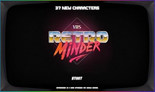
Retro Minder TV is a fast-paced speed trivia site, which uses images of the past with modern gamification and appeals to a desire for instant gratification (a common user behavior).
Pull it All Together
Modern retro is a bit of a quirky design trend.
The trick to a retro design is adding enough modern flair so it doesn’t just look old. (You don’t want the next Million Dollar Homepage.)
Make sure to use imagery and design styles that invoke the type of brand nostalgia that works with your messaging. Then build the design on a modern framework so that users feel an emotional draw and understand how to interact with and use the design.
If you plan to go the retro route, pick a specific look and decade to pull from. You probably want to avoid mixing and matching all of the styles noted in the examples above. One distinct piece of retro design is more than enough.
It’s also important to consider that not all modern retro styles will work for extended periods or for every brand, making this trend ideal for a smaller brand page or microsite. Some of today’s trends might just be the next retro style and it is important to stay on top of those changes so that your vintage style is appropriate.
For more advice and dozens of examples, download the 78-page free ebook Web Design Trends 2018.

The post What’s Old Is New Again: Modern Retro Web Designs for 2018 appeared first on Studio by UXPin.
April 3, 2018
Pen Tool
Use Pen Tool to draw shapes and icons directly in UXPin. Any drawn element can be viewed in spec mode and downloaded as an SVG.
The post Pen Tool appeared first on Studio by UXPin.
March 30, 2018
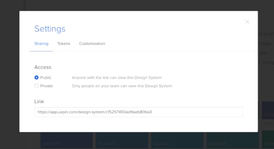
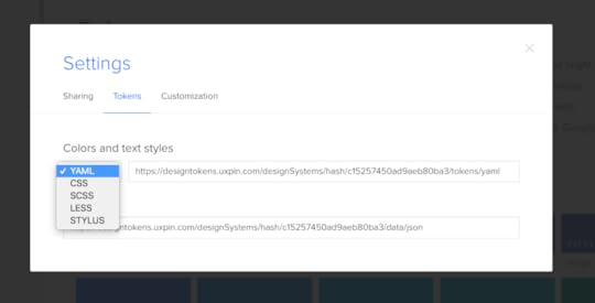
Design system tokens

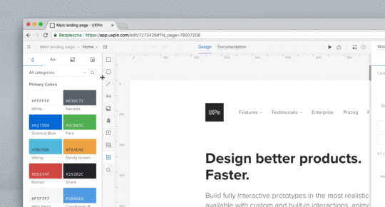
Design systems are now accessible with their documentation in JSON. Additionally, you can access design tokens (color and typography styles) in multiple formats such as YAML, CSS, SCSS, LESS or STYLUS. This option is available in design system’s settings under “Tokens” tab.
The post Design system tokens appeared first on Studio by UXPin.
March 20, 2018
Create Component-Based Websites with Design Systems

While it’s not necessarily a visual or interactive trend, design systems undoubtedly influence the look and feel of all the properties they govern. They provide the principles, tools, libraries, and code that create the trends we see on the web today.
Design systems are becoming more than a trend—they’re a best practice that will extend far beyond 2018. In the coming years, we can expect improved design consistency across the web.
That doesn’t mean that every website will look the same, but rather that each website will be more consistent with itself and with user expectations of functionality and usability.
Design systems help solve the problems of scale that come with large and remote teams working together. They give everyone standardized principles and components, which leads to benefits including:
Faster time to market: Design systems create a Lego-like process where everything is reusable, minimizing the time spent rebuilding the same components.
Consistent UX across platforms and products: Standardized components create a much more coherent “look and feel.”
Less version control issues: If you update a component in a design system, the changes populate across all instances. The design system is the final record of truth.
Easier collaboration and communication: Design systems create a shared general knowledge base and components for designers, PMs, and engineers.
That’s why 69% of 3157 designers surveyed said they were currently building their own design system, if they didn’t have one already.
While only large companies had the resources to build design systems before, new tools and processes have now made it much more feasible for companies of all sizes. We’ve seen it firsthand as small companies and agencies have even utilized UXPin’s design systems platform.
Let’s explore the nuts and bolts of a design system, learn how to build one, and showcase a few examples of websites built using a design system.
What exactly is a design system?
First, let’s get the definitions straight.
Design System: The complete set of design standards, documentation, and principles along with the toolkit (UI patterns and code components) to achieve those standards.
Pattern Library: A subclass in the design system, this is the set of design patterns for use across a company.
Style guide: Another subclass in the design system, this static documentation describes the design system itself: how products should look and feel, use cases for UI patterns, correct typographic scales, etc.
Bottom line: A pattern library (e.g. set of symbols and assets in Sketch) and style guide are only parts of the much more robust design system.

How it all connects
First, keep your focus broad and think about the idea of design systems.
At the broadest level, a design system is a living entity containing the common linguistics, principles, and tools to help teams build products coherently. As Nathan Curtis says, a “design system isn’t a project. It’s a product serving products.”
Shopify’s Polaris Design System is one of the best examples. On the homepage, they’ve already broken down all the core sections:
Product principles: What is the purpose and soul behind all the products?
Written content: How should the product’s interface copy look and feel?
Visual properties: What should the “skin” of the product look and feel like?
Components: What are the UI patterns and code components needed to build products coherently across devices?

Shopify’s Polaris Design System.
In this case, Polaris is the complete design system of principles, written content, visual properties, and components. The style guide is simply the static documentation on the Polaris website which describes how to use the design system. The pattern library is part of the components in the Polaris design system.
The differences are subtle but unmistakably important when it comes to improving product development. A style guide on its own becomes quickly updated since documentation requires maintenance. A pattern library lacks the instructions and principles for coherent implementation.
The design system ties everything together.
How to create a design system
Now that you know what these terms mean and how they work together, let’s quickly review how to build a design system. Here is a quick excerpt from our 50-page ebook Creating a Design System: The 100-Point Process Checklist.
Create the UI inventory: First list and describe all of the design patterns currently used in your interface and note the inconsistencies therein.
Get support of the organization: Present your findings and explain the utility of a common design language to everyone. As explained in our Evangelizing Design Systems templates, estimate the number of design and engineering hours wasted on redundant work and how product coherence can improve NPS scores.
Establish design principles: Codify your practices. You’re now starting to work on the style guide for the design system.
Build the color palette: When building the UI inventory, we found 116 different shades of grey that needed consolidation. Create the palette and its naming convention.
Build the typographic scale: You can optimize the scale to serve existing styles, or you might try to build a harmonious scale using the golden ratio or major second. When building the scale, don’t forget that you’re not only setting the size of the font, but also weight, line-height and other properties.
Implement icons library and other styles: Decide which icons from the UI inventory will become part of the design system, then standardize the implementation.
Start building your first patterns: This is the task that will never end. Patterns should always either reflect the truth about the product, or reflect the aspirational state of the product in the near future.
Websites built with a design system
You can find plenty of websites that describe each company’s design system.
But what does a website look and feel like when it’s built with a design system? It is much more logical, consistent, and better-performing thanks to less code bloat.
Here are a few websites that were built with the principles and toolkits of some of the best design systems around.

Built according to Predix design system.

Built according to Polaris design system .

Built according to Atlassian Design Guidelines .

Built according to MailChimp Design System .

Built according to Github Design System
This is an excerpt from our full-length ebook, an overview of web design trends. You can read the full ebook for free here. If you’re interested in learning more about design systems, click here to view recordings of UXPin’s Design Systems Virtual Summit. Try UXPin’s design systems capabilities for free here.
The post Create Component-Based Websites with Design Systems appeared first on Studio by UXPin.
March 19, 2018
Resizing left panel horizontally
From now on, you can resize left panel according to your needs and its content will automatically adjust.
The post Resizing left panel horizontally appeared first on Studio by UXPin.
March 15, 2018
UXPin Changelog March 2018 #5

In the past two weeks, we’ve released a few enhancements to the symbols, new version of the Sketch plugin, visual improvements in the Editor, and new features in the Dashboard (iterations from iterations, in-app changelog). Details below.
Design Systems
[Improvement] Handling local and master symbols’ relations while using undo/redo.
[Improvement] Changes in nested symbols are synced across all parent symbols when pushed to the library.
[Improvement] Removing symbol when all elements inside were deleted.
[Improvement] Symbols keep connection to the Design System Library after duplicating the prototype.
Sketch plugin 4.11
[New] Exporting shapes as SVGs.
[New] Design System Library redesign.
[New] Exporting opacity as property which can be changed in the UXPin Editor.
[Fixed] Upon exporting from Sketch, additional export sizes are no longer added.
[Fixed] Plugin supports the newest version of Sketch app (version 49).
Visual changes in the Editor
Added the Hamburger menu in the top left corner.
Moved Preview mode to the right (marked with Play icon).
Moved Zoom settings to the bottom left corner.
Added prototype name and active page.
Bottom left corner menu (Log out, Integrations, Shortcuts, Help&Tutorial, Add user) moved to the Hamburger menu in the top left.
Moved View options to the Hamburger menu.
Added Simple/Advanced mode to the View Options modal.
Redesigned tabs in the properties panel (Properties, Interactions, Specification).
Dashboard
[New] Creating iteration from iteration.
[New] In-app changelog notification with information about fixes or new features.
If you’re interested what we released in February, please check out Changelog 2018 #3 and Changelog 2018 #4.
Join the world's best designers who use UXPin.Sign up for a free trial.Your e-mailTry it for free!
The post UXPin Changelog March 2018 #5 appeared first on Studio by UXPin.
UXpin's Blog

- UXpin's profile
- 68 followers

