
UXpin's Blog, page 83
February 16, 2021
You Can Become a Code-Based Designer Without Learning Code
When you hear about code-based design as an emerging trend in digital apps development, you might experience a shudder of panic. You enjoy design images, and you learned how to use software common throughout the industry so you could get a job. Now, they want you to learn to write code!

Knowing how to write basic code could open doors in your career, especially when you focus on popular languages like Swift and Java. Thanks to UXPin, though, you do not need to learn how to code to become a code-based designer.
Does that sound confusing? The following points will clarify how you can become a code-based designer without learning code.
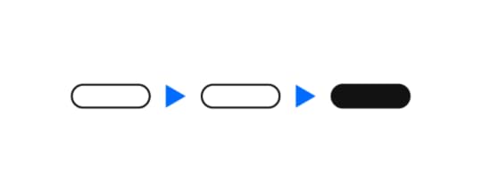
Adopt a no-code designing and prototyping solutionIf you want to adopt interactive code-based design without learning to code, there’s a way! Just search for a solution that simply lets you add interactive components with a drag-and-drop feature. When you drop a feature into your design, the solution generates code that matches your work. It’s commonly named a no-code tool. 
Companies already use no-code and low-code platforms to develop apps. The platforms let practically anyone build basic, unique applications by adding features to their apps. Knowing some coding basics makes the solutions more powerful, but you don’t need any skills to get started.
It isn’t surprising that software developers have finally released products for digital designers.
Keep in mind that you don’t have many options when choosing no-code designing and prototyping solutions. Most graphic design softwares still generate static images that developers need to remake to add functionality.
UXPin Merge stands out as an excellent resource for designers that want to improve workflows and functionality by taking a code-based approach to digital design. Thanks to the single source of truth in Merge your design will look and behave just like the final product.
Think beyond aesthetics to make your designs more functionalIt’s easy for graphic designers to get stuck thinking about how they can make their work more attractive to users. That’s a significant part of the job, after all! The product that gets sent to consumers, however, needs more than intuitive navigation, beautiful color combinations, and meaningful icons.
Code-based design pushes you to think through the entire process of building a digital product. Don’t think of this as a burden. Learning to think beyond your specific role in product development will give you a more rewarding experience.
If you feel frustrated taking a code-driven approach to design, remember that it:
Will result in a final product that looks more like your original design. Image-based design forces developers to take some liberties when using code to build your work. Code-driven design makes that less likely.Gives you more control over how components function, which means you have a greater influence over the user’s experience.Improves collaboration between the design and development teams. Improve collaboration should lead to better products that perform well in the market.Gets you to think about how the end-user will experience more aspects of your design. You’ve probably been disappointed by a website or application you worked on. Maybe the navigation didn’t work as you’d intended. Perhaps the interactions don’t feel as fluid as you’d imagined. Code-based design will help you overcome those limitations.Aesthetics matter, but products with poor functionality don’t thrive. You can contribute to success by taking a code-based approach to design.
Get Friendly With Developers on Your TeamYou can become a more effective code-based designer by communicating with developers. A no-code platform will let you create designs with interactive components, but you don’t automatically have access to every feature you might want to use. Someone needs enough technical knowledge to:
Connect your software to Material, React, and other libraries.Push live components to make sure designers have access to the latest options.Provide advice when designers want to make small changes to components in their libraries.UXPin Merge has a very open command-line interface (CLI) that helps developers add new libraries and components to your designing and prototyping environment. If you don’t know how to connect with other libraries, use your relationship with the development team to gain access. They may do the work for you or take some time to teach you the process. Either way, making friends with developers will improve your code-based design abilities and speed up the design handoff!
Sign up to experience code-based design with UXPin MergeAre you ready to try code-based design? Get access to UXPin Merge to see how it works for you. You’ll discover that it lets you do much more than your typical design software will. It allows you to design with already interactive components that look just like the final product. It’s time-efficient and helps you make an extremely realistic prototype.

The post You Can Become a Code-Based Designer Without Learning Code appeared first on Studio by UXPin.


February 11, 2021
What is React and why use it for your app?

Designing an app is complicated at the best of times, so anything that will make it simpler is always welcome. That’s where React comes in. What is React? It is a library of JavaScript code and components designed to make the creation of user interfaces easier. As an open-source framework, it has been used to create some of the biggest apps on the market today, including Paypal, Netflix, and more.
This framework is popular for a number of reasons, but perhaps the biggest one is that it offers declarative views. You can create an interactive app that will be neatly updated instantly when new information comes in. As soon as the data reaches your app, it will update. You can see this in comments on Facebook, where you can see new ones come up without the need to refresh your screen.Originally developed by Facebook, React is now run by both Facebook and Instagram developers. They are joined by a number of outside developers, as well. The end result is a very versatile, useful framework that more and more app developers are interested in using.
Why JavaScript is bestWhile we know React uses JavaScript, why should that matter so much? It matters because Java is one of the most used programming languages in the world. In fact, 9.7 million developers use JavaScript for their programming needs, making it the best choice for a wide-spread building platform.

With this programming language mixed with HTML, it’s possible to get React to do just about anything you need it to. The learning curve is fairly low for anyone already familiar with JavaScript, too. The ability to jump into React and start programming apps immediately means you get started faster than ever.
Individual components can be edited aloneMost programming works so that if you change one thing, the whole program needs to be adapted. This can cause a lot of issues if you are trying to change one area of the app and end up with a big mess to sort out. However, with React, you don’t get that. It’s a downward flow programming method, so anything that is changed will not affect what is upstream from it.

The components can also be changed and edited without affecting the rest of the components. This speeds things up drastically. You no longer have to adjust all the codes in order to suit one change. When it comes to fixing glitches and doing regular maintenance on the app, the entire process is faster, since the components are separate.
JavaScript libraries are available from multiple sourcesSince React is open-source, there are a lot of developers working on making it better. You’ll find JavaScript libraries available with code you can use for a wide variety of functions. These libraries are full of pre-written codes for a variety of functions and you can simply grab them for use. There’s no reason to code the most basic functions when you can use an existing code. It speeds up the entire process and makes it less frustrating.
Everyone needs similar codes at some point, so don’t reinvent the wheel, just make a point of working smarter, not harder. Using code that manages basic ideas is just a better way to do it.
The virtual DOM helps load info fastNormally, your app or website updates the DOM or document object model, using HTML. This was the only way to do things for a long time and while it is functional, the method takes longer and longer when you have more people using the site. The more users on the site, the more complicated it is to refresh the page. Previously, this was the only way to update things like comments and any other data that needs to be refreshed instantly.
The virtual DOM just copies the actual DOM and then lets you instantly update using ReactJS. Instead of reloading the whole page, it only loads the info that is changing. This means the entire page or app will run much faster. As a small feature, it may not make a huge difference to one or two people. However, if large amounts of people are using the same page, then the difference is incredible.
React has drastically sped up the entire process of not only creating an app or site but also the everyday function of said app. Not only can developers speed through the creation of a prototype app, but they are also able to get a full app up and running in half the time. This is thanks to the ability to reuse code. Once the app or site is in public use, the user interface creates a better user experience, as well, due to the virtual DOM.Now you know the answer to what is React? Are you ready to start your own app? At UXPin, we offer a better way to build prototypes and apps. If you’re ready to start creating your own app faster than ever, get started for free today!

The post What is React and why use it for your app? appeared first on Studio by UXPin.
February 10, 2021
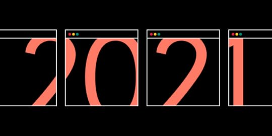
Design Trends 2021
Each year brings fresh design trends for people to enjoy. After 2020, expect a lot of—hopefully—fun surprises in 2021. The following trends will likely stand out from the crowd.
More Animations and Interactions That Increase Conversions https://jetup.digital/
The design trends in 2021 need to do more than look attractive. They need to get results. If an app or website doesn’t generate leads or convert visitors, no one will care how attractive it looks.
Many designers and marketing professionals believe that they can make landing pages more successful by adding more animations and interactions that engage users. This approach makes sense considering that brands have used in-person engagement to cultivate customer loyalty for years.
For example, Coca-Cola personalizes bottles to gain attention from potential buyers. Several years ago, the company even stuffed refrigerators with bottles branded with popular names. Today, you have to request the bottles. At the time, though, Coca-Cola managed to generate quite a bit of buzz from this simple engagement strategy.
With websites and apps, designers need to take a more virtual approach to get similar results. Still, spending a few seconds playing with an app’s animations could boost a customer’s mood enough to increase spending.
An Increased Focus on Design Ethics
Design trends in 2020 need to contribute to business success, but they can’t reach that goal through deceitful practices. When design only focuses on increasing sales, developers can take advantage of audiences.
Making more money right now sounds like a great idea, but it can backfire and lead to long-term failure. Design ethics helps ensure that consumers have all the information that they need to make good choices. Designers need to resist the temptation to hide details or mislead customers, even though doing so could increase revenues.
Design ethics can make professionals feel better about their work. Research shows that brand trust has a growing importance among consumers. About 57 percent of American consumers and 62 percent of global consumers say that brand trust matters because they want to support socially responsible companies. Spreading false information, however, stands out as the top way that a brand can lose consumer trust. Ethical design helps companies avoid damage to their brands.
More Contrast That Grabs the User’s Attention Source
Contrast has always been a popular way to make designs more attention-grabbing. For example, placing complementary colors like orange and blue next to each other makes it nearly impossible for someone to resist glancing at a design. When you see the contrast, you can’t help but stop and take a look.
Designing with contrast also helps make websites and apps more accessible to people living with impaired vision. Think about how easy it is to read black print on a white background. The contrast helps your eyes focus on the words. The closer the colors get, the harder the text becomes to read. Imagine reading gray text on an off-white background. You’d get a headache within minutes.
Color contrasts will become especially popular in 2021 because designers want to make their work more accessible to a wider range of people. It doesn’t hurt that playing with bold colors is fun!
Playfulness—Because People Need and Deserve It Source
Isolation during the COVID-19 has increased mental health problems for millions of people. It’s time for playful design. Not because it accomplishes anything in particular, but because everyone deserves a little more fun in their everyday experiences.
Playfulness can take a lot of forms. Some designers like to play by mixing colors that rarely go together. Others might choose to add fanciful scripts, fun puzzles or little mazes to their designs. Anything that distracts people from the ongoing stress of a pandemic deserves applause. If you can add a second of joy to someone’s life with a humorous icon, good for you.
Seamless Surrealism That Doesn’t Create Barriers to Success Source
Surrealism takes playfulness to the extreme. Even if you know little about art, you’ve probably seen surrealist paintings by Salvador Dali. They often seem like oddly warped versions of reality, as if you’ve somehow taken one step to the left of the dimension you live in.
Seamless surrealism places contradictory images next to—or inside—each other to create a “what the!” experience for the viewer. It might even take you a few seconds to realize that something doesn’t feel right. One moment, you’re looking at children sitting on a bench. The next second you realize that it’s the earth rather than the moon hanging behind them.
Seamless surrealism only works well in graphic design when it gets people to pause without creating a barrier to use. If it confused potential users too much, the design fails. If it sticks in the person’s head without preventing them from submitting a form or finalizing a purchase, the design succeeds.
Increased Diversity and Representation
Black Lives Matter and other social movements have finally forced many people to realize that they make boring designs that don’t represent humanity’s diversity. Diversity and representation matter in so many ways.
From a business perspective, you want all consumers to buy from your brand. When a company’s website only has pictures of white men and women, people of color will probably go elsewhere. And they take their money with them.
From an artistic perspective, it just makes sense to integrate as many types of people as possible into your designs. In 2021, you don’t have to limit yourself to your country’s “norm.” You can use your talents to depict other body types, colors and activities.
Diversity has already become a trend. In 2021, expect it to become a requirement.
Design That Is Based on Code Source
Digital products need interactive components that gather information from users, encouraging visitors to return, and make experiences more enjoyable. Historically, there has been a gap between the graphic designers who make attractive images and developers who add interactive features to the products. Code-based design is eroding that gap.

Merge gives graphic designers a no-code solution to add interactive components to their prototypes. They can use the drag-and-drop environment to insert commonly used components directly into their designs. Now, they don’t have to confer with developers or worry that someone else will radically change their work. Instead, they can create impressive UI/UX designs that function precisely as expected.
Coding must play a role in 2021’s design trends, but decisions don’t belong solely to developers. As new prototyping platforms emerge, designers and developers can work together seamlessly toward a common goal.
Test 2021 Design Trends With UXPinWith Merge, UXPin’s revolutionary technology, companies like PayPal can easily solve DesignOps challenges. UXPin Merge allows you to design with React components to achieve full consistency with the final product. Get access to Merge by UXPin so you can see the benefits of code-based design.

The post Design Trends 2021 appeared first on Studio by UXPin.
February 9, 2021
Powerful microinteractions to improve your prototypes

Prototypes are, by their nature, designed to be less polished than the final product. However, that doesn’t mean you shouldn’t finish the prototype as much as possible. You want to give the user a good idea of what the finished app will be like, which means adding in those little interactions that make all the difference. This gives the best possible look at your product and ensures people know exactly how it will work. But which microinteractions are the most important to focus on? Let’s take a look.
There are infinite microinteractions that you can add to a prototype, but often these end up being just a button with a verbal explanation of what will happen. What if you could just push the button and actually show your user what things will look like?
Mouse over effectsThere are a few ways you can use a mouse over effect, including having the moused over button or text highlighted. For years, certain ad companies allowed small popups when you moused over an ad link.

You may also create microinteractions for mousing over by adding small lines, a zoom in of an image, or a mini animation that makes a button appear to pop up. Another option is to have the mouse change when it moves over something. In games, this may mean a search icon or a hand appears over an object you can interact with.
Tap effectsThink about Instagram, when you double tap an image you like, it adds a heart to the post. This is a very small interaction, but adding it to the prototype app means it will look more professional. There are infinite ways to create tap effects, but anything that allows someone to react to information on the screen can be considered as such. This includes hearts, likes, and similar reactions.

Another way the tap effect can play out is having a tap highlight something on a screen. This is usually seen in forms that need to be filled out, allowing you to tap on the field you want and seeing it light up. This simple confirmation that the field is ready for input is helpful in molding the user experience.
Tap and hold effects
Another option is tapping and holding an element on the screen. This is seen on apps or sites like Facebook, where you can choose a different reaction by holding the like button. If you add this to your app, consider giving the user more of a reward with a little animation or a ripple effect when they perform the action.
Tactile feedbackHave you ever had a phone vibrate when you performed an action? This is considered tactile feedback and can be quite useful in some situations. Some apps use this as a method of warning the user that what they are attempting is not possible. It can be used to mark between two time periods, as well, like a timer.

The vibration is useful if your app is meant to be used when the user may not actually be listening. Having tactile feedback allows for faster notifications.
Scroll to view
When it comes to microinteractions, you’ll find that scroll to view makes the user experience more exciting, even if they are just looking at basic information. This is often done so that as you scroll, more information pops up or new elements appear, with a small animation.
Slide in or out
Moving your mouse over something can be annoying when a further menu abruptly pops up. A very minor change to this interaction can create a smoother user experience. For example, you just need to have the menu slide out instead of popping up. It can also slide back out of view when you’re done.
This interaction may also be used on mobile by making it possible to swipe the screen and either eliminate or save the email, photo, or whatever is on the screen. It’s a relatively easy way to make it all look good.
System feedbackMost people have little patience for waiting to find out if their app is working or if the interaction they just had is actually going through. To this end, you can create system feedback microinteractions. These just let the user know that something is going on.

Often, you’ll notice that once you’ve submitted a form or clicked on a button, there is a spinning circle, turning hourglass, or another symbol that lets you know the app is working on it. This is reassuring to the user and simple enough to add for the developer. Another option is to have different icons for sending a message, having it arrive on the other person’s device, and even changing for when the message is read. You can see this in Facebook Messenger, WhatsApp, and many other messaging systems.
Microinteractions don’t need to be very complex, but they can certainly change the way people interact with your app. The better your prototype, the more likely it is to be approved.Ready to get started with creating your own high-quality prototypes in less time? Join UXPin today.
The post Powerful microinteractions to improve your prototypes appeared first on Studio by UXPin.
February 4, 2021
How to Use UX Design Patterns to Satisfy Your Users?
The term user experience (UX) refers to how users feel when they interact with a system. A system can be a website, an application, software, or even a service. Great UX connects users with products by fulfilling their needs in the easiest way.
As a UX designer, you will face the challenge of creating a logical and easy-to-use navigation while ensuring that you maintain a visually appealing UI design. UX design patterns solve this challenge by providing designers with tried and tested solutions to common user problems. This article will explain what design patterns are, give examples of common design patterns, and then show you how you can use them to improve user experience.
What are UX design patterns?UX design patterns are reusable design components that are used to solve common usability problems that users experience. For instance, a breadcrumb trail that shows users the path from the homepage to the page they are on is a design pattern. However, design patterns are not templates, they are the building blocks of a great UX.
 How design patterns improve UX
 UX design patterns are not only useful to designers, they are also useful to users because they reduce the time and mental effort that users need to navigate a site. When users interact with an interface, they associate unknown elements with elements that they have encountered previously. Additionally, there are outcomes that users expect when they interact with systems. For example, users expect an endless scroll when they interact with social media sites or news sites. UX design patterns deliver these expected outcomes to users.
When users encounter familiar interactions in the form of design patterns, they don’t have to spend a lot of time analyzing every decision that they make. Plus, the fulfillment of their expectations gives them a dopamine hit which is how design patterns improve user experience.
Types of UX design patternsThere are four types of UX design patterns that target different core site functions. They include:
Input and output: They deal with how users submit or input data into a site and how the site gives feedback or responds. Navigation: These design patterns guide users when they are navigating a site and they help them find their way back to the home page. Content structuring: They help designers organize site content so that users can find it easily. Social sharing: These patterns help users to engage with site content and share it.Let’s take a deeper look at some common UX design patterns that fall under each category.
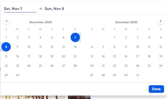
Input and OutputMost systems need users to input information when they are signing in, choosing a date for an event, and creating profiles. As a designer, it’s your job to make sure that users can submit this data fast, conveniently, and without errors. A design pattern such as a date picker makes it easy for users to book a flight or a hotel room. Expedia offers its users two calendars in their date picker which makes it easy for them to choose a range of dates.
Similarly, you can use design patterns such as notifications and progress bars to give users feedback about their progress.
NavigationNavigation design patterns increase the usability of a site by increasing learnability and reducing friction. Navigation controls such as tabs and menus make it easy for users to find content on a site.
A common navigation UX design pattern is the infinite scroll that adds new content as a user scrolls down a page. This pattern makes it easy for users to consume a lot of content because they don’t have to tap/click on next/previous buttons.
Content structuringClear Information Architecture makes it easy for users to find the information that they are looking for on a site. Content structuring UX design patterns like dashboards and FAQ sections reduce friction making it easy for users to achieve their goals. Dashboards are a central place where users can view data about the status of the system. A good dashboard informs users without distracting them.
Social SharingThese patterns increase user engagement through competition and building trust. Users can chat, share content, and invite friends. A common social sharing UX design pattern is leaderboards which are used in competitive sites to drive engagement and create a sense of community. For leaderboards to be successful, they should compare users on the same level, those with similar activity levels and friends.
How to apply UX design patternsNow that you are aware of the different types of UX design patterns that you can use, it’s time to learn how to choose the best one for your site. The first thing that you need to keep in mind is that we use design patterns as solutions to usability problems, if there is no problem, then a pattern should not be applied. Here are four steps to help you choose a UX design pattern:
Identify the problem that needs to be solved. You can identify usability problems when doing research using surveys and interviews. If you want to improve the UX of an existing site, you can use focus groups, A/B testing, and support tickets to detect usability problems. Analyze how the problem has been solved on other sites. Visit sites that are similar to yours and examine how they solve the issues that you identified in step 1. It is highly likely that you will discover that they use more than one design pattern to solve the problem. Investigate the efficiency of the solutions that have been used on other sites. You will make this assessment based on the needs of your users and the goals that they need to achieve on your site. Choose a pattern that is most suited for your site and users’ needs and then investigate it further. Look for other sites that use this design pattern so that you can find out how to customize it for the specific needs of your users. Bring your UX design patterns to life with the best design toolsDesign patterns make it easy for designers to solve common usability problems. This improves UX by reducing the time and effort that users spend when they are navigating the site. UXPin is an all-in-one design tool that makes it easy for you to create design pattern libraries and share them with your design team. Sign up for a free trial of UXPin today and improve the UX of your site.
The post How to Use UX Design Patterns to Satisfy Your Users? appeared first on Studio by UXPin.
February 3, 2021
Things every designer needs to know about accessibility

Developing an app or website isn’t just about creating what you know. It also means considering accessibility and how those who are different from yourself will use the site. Ideally, your design should allow anyone, regardless of abilities to use your app and easily get information from it. Unfortunately, many designers never stop to think about this side of design.
What do you need to know about accessibility? First, it means that your program should be useful to someone who cannot hear or someone who cannot see, etc. Consider all the angles and then create something that will work for everyone. You can learn more about making the web accessible by reading the Web Content Accessibility Guidelines 2.0.
Second, you should be able to create an amazing design, while making your app better. It doesn’t require making things look terrible or feel clunky.
Here’s what you need to consider when designing an accessible product.
Not everyone can see colors
There are a large number of people who are colorblind or have low vision. They may not be able to distinguish colors easily and if they are completely blind, colors won’t make a difference at all. While you can add colors to your project, keep in mind that many people won’t be able to differentiate between subtle changes, so bigger differences in tone are best.
Look at your app in grayscale to get a better idea what someone with low vision may see. You should also add backups for any information that is provided by color only. For example, if you only use red highlights or outlines to mark an error field (no name added, etc.), there should be a symbol or text sharing which sections have errors. This goes for anything you might use color to convey. Include text or a visual descriptor so anyone can understand what is happening on the page.
Don’t make users hover for informationFor those with difficulty managing a mouse, trying to hover over a specific point on the screen long enough to get information can be frustrating. Drop down menus are a good example of this. You want to avoid causing difficulties, so make the text pop down when the mouse passes over or have it open with a click. It should then be possible to move through the list with the keyboard.
Keep in mind that if you add other options below the original label, the accessibility software may not have the ability to explain what is there. Keep the design simple and any extra information or elements on the page itself.
Create higher contrast text
Have you ever tried to read text that is too small and light on a screen? It’s very difficult and strains your eyes. For some users, this is the case with regular text when the contrast isn’t high enough. You should always make sure you have enough contrast between the text and its background. Aim for a minimum of 4.5 to 1. Another way to help make text more readable is to increase the font size or use bold text.
Make form field boundaries obviousIt’s not always easy to see exactly where you need to click with your mouse in order to start searching or to input data on a form. While many forms have obvious text boxes, there are more than a few that just show a blank space that blends with the background. Others contain text that makes it hard to tell just where you need to start clicking. It’s relatively simple to add a rectangle around the input box and this makes it that much more accessible. You could also add text saying something like “click here” or “enter name here.”
Forms should also include labels instead of filler text. This makes it more obvious what is expected where. You make it easier on the user by simply putting a high contrast label on your form fields.
Add a way to see where the keyboard focus isThe use of reset style sheets has made life simpler for designers, but it also makes it difficult to navigate a website using only a keyboard. You’ll want to increase the ease of use for the end user by creating a unique focus box.

Your focus indicator needs to be obvious, even without color. Create a focus indicator for your page or app and then make it obvious even in grayscale. Adding a tooltip can make it more obvious and helps everyone see exactly where the keyboard focus is.
Have people test the site or appThere’s nothing better than user testing to make sure your project has the accessibility necessary for anyone to use it. It’s easy to get caught up in creating a pretty app, but it needs to be functional, too. As designers, it may be tough to design something for the general public, rather than your fellow designers. Testers will be able to notify you of potential problems. It can also be helpful to go through things with accessibility technology to ensure everything works as expected. Ready to start your own project and make it accessible? Join UXPin for free today!
The post Things every designer needs to know about accessibility appeared first on Studio by UXPin.
February 2, 2021
Product Design Trends 2021
A new year means adjusting to emerging design trends that will shape the way people use products like websites and mobile apps. Stay ahead of your competitors by learning about the product design trends you can expect in 2021.
Skeuomorphic Designs That Match Real-World Objects
 Source
If you’re not familiar with the word “skeuomorphic,” you might feel a little intimidated right now. Don’t worry. It just means that a graphic accurately represents an object in the actual world. For example, an app that replicates the sound of a piano might display realistic piano keys on the screen.
You’ve seen skeuomorphic designs countless times, but you might not have thought about why some designers use them. The reasons should become more obvious in 2021 as people yearn for more realistic interactions.
Many people will tire of using apps with outlandish designs. They just want a calculator to look like a calculator! They don’t want a radically new approach to calendars. They want calendars on their phones that look like the ones hanging on their refrigerator doors!
You might think of the skeuomorphic trend as a backlash against other trends. Regardless, there are plenty of people out there who will embrace it. Companies will pay attention because they want to attract that crowd of users.
UI Animations That Engage Users Source
Interacting with motion graphics can make people feel more connected to their products. When people use apps long enough, repeated motions train their muscle memories. The action becomes an ingrained part of the user, and they can perform actions automatically. Just think about how quickly people can learn the complex movements needed to play today’s video games.
Building more motion graphics into your products could increase the time that people spend using them. The more opportunities for the interaction you create, the more often users will return.
Keep in mind that interacting with motion graphics needs to feel natural. Swiping left or right, for instance, feels like a natural way to move your screen in a direction. Placing two fingers on the screen and slowly moving them apart feels like an obvious way to zoom in on a picture.
Advanced Personalization That Conforms to Each User’s Needs
Many mobile apps let users personalize their experiences by choosing colors, sounds, and layouts. Advanced personalization doesn’t ask the user to do much. The more your product learns about the user, the more personalized it becomes.
Advanced personalization has two goals: make users feel like the product was developed just for them and increase conversions. Not surprisingly, the two go hand-in-hand.
As a designer, advanced personalization likely means that you will need to create several versions of each feature. You will need to do more work to reach your goal. After you create the designs, though, developers must find ways to connect with users and decide which adaptations match their needs. More often than not, that involves artificial intelligence.
If you work for a small design firm, you might not have many opportunities to try advanced personalization in 2021. Large companies, however, will put a lot of effort into making their apps as unique as possible for each person.
More 3D Than Ever Before https://ny.paraweb.me/
3D designs have been around for years. In fact, we included it in our list of 2020 design trends. In 2021, they will likely become more advanced and widespread.
Very few people own 3D displays, so you can’t expect many designers to create truly 3D images. Instead, graphic designers need to use perspective, movement, and optical illusions to create the appearance of 3D images on two-dimensional screens.
You can start by reviewing the huge number of 3D websites that already populate the internet. You will see that something as simple as shifting a camera’s perspective creates the illusion of 3D space. Patterns and texture scan also contribute to the illusion.
While UXPin doesn’t create true 3D designs, it can use the cloud-based tool to collaborate with 3D designers in real-time. That way, you get the basics completed in your 2D prototype and reduce the number of surprises your teammates will encounter when they move to 3D rendering.
Expect 3D design to become increasingly important over the next decade. The novelty captivates people, which means it attracts users.
Useful Asymmetry Source
Some psychology research shows that people prefer symmetry, especially when it comes to the attractiveness of other humans. Adding asymmetry to your design tests that hypothesis by adding unexpected elements that many consumers will find useful.
Asymmetrical design can create a visual hierarchy that guides the viewer’s eye. English-readers tend to look at designs from left to right. That automatically gives more weight to objects on the left side of the screen. Asymmetry can reverse expectations for a more interesting design that forces the viewer to pay more attention to an item that takes up a larger amount of space on the right side of the screen.
Asymmetry can also create spaces for you to display pictures and text. Depending on how you want to promote a product, you might choose to use most of the screen to show off the item’s appearance or use text to describe the benefits of owning the item.
Even More Material Design Source
Google introduced Material Design in 2014, and the design language’s popularity has continued to grow as developers add more iconography, typography, motion and interaction options. Material Design currently has hundreds of icons that you can use in UXPin.
Expect to see even more websites and apps use Material Design in 2021. The approach to product development has become so advanced that it makes little sense for most developers to use other methods.
If you plan to make websites or Android apps in 2021, start using UXPin’s Material UI kit.
Code-Based Design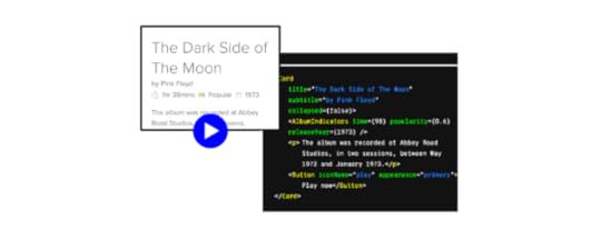
Code-based design adds exceptional functionality to websites and mobile apps. Many developers believe that the industry’s next step will involve striking the perfect balance between design and development.
The trend toward code-based design makes a lot of sense, especially when you consider the role it can play in DesignOps. Graphic designers might know how to make appealing images, but they rarely have the skills needed to build interactive components that digital products need to keep users engaged and offer useful services.
UXPin Merge is making it easier code-based design easier for graphic designers without technical backgrounds. A simple drag-and-drop environment lets designers add the components and functionality their products need without forcing them to write code. Instead, UXPin Merge generates the code on the backend. If developers want to tweak it, they can make small adjustments without damaging the design’s visual appeal.
Code-based design will rule the future of product development because it gives team members the ability to collaborate, bring their best ideas together, and make stunning prototypes that behave the way consumers expect. You get a more consistent product without any drift between design and production.
Try UXPin Merge!With Merge, UXPin’s revolutionary technology, companies like PayPal can easily solve DesignOps challenges. UXPin Merge allows you to design with React components to achieve full consistency with the final product.
Try Merge from UXPin today to see the immediate benefits of code-based design built on a no-code platform.

The post Product Design Trends 2021 appeared first on Studio by UXPin.
January 28, 2021
UX Design Patterns You Should Focus On
As a designer, the challenge is to create an interface that is both convenient and visually pleasing, all while implementing structured content and logical navigation. It’s a balancing act, and when done effectively, many refer to UX design as a “work of art.”
To combat common interface problems, designers can leverage the power of UX design patterns. These patterns are essentially reusable solutions that allow users to overcome common usability issues.
What Are UX Design Patterns and Why Do They Matter?When designing an interface, the goal is to create a convenient interface that retains users.
As discussed above, designers are faced with the challenge of getting everything just right in terms of functionality and the overall user experience. Luckily, there are UX design patterns that help target common interface problems. When applied correctly to user interfaces, these patterns reduce the time and effort required to navigate.
A great example of this is Skype’s status indicator, which resembles a traffic light. Although a user may not be familiar with the app itself, it’s easy to understand when a user is offline or available based on the color of one’s status (i.e. green means someone is active, while red means do not disturb).
When recognizing a familiar design pattern, a user will experience an increase in dopamine — the chemical involved in motivation, reward, memory, and attention. There can also be an increase in dopamine production when a pattern works as anticipated.
There are many UX patterns that have become common language among designers. When aiming to communicate an idea, mentioning a familiar pattern, such as the breadcrumb pattern, will help eliminate misunderstanding.
UX design patterns typically fall under one of various categories, including:
Data input/outputNavigationContent structuring Hierarchy Social media IncentivizationSince you can copy and adapt design patterns, they will help you save time and money. Instead of “reinventing the wheel” for every new interface, design patterns allow designers to solve common problems.
When and How to Apply UI Design PatternsKnowing when to use a certain design pattern is imperative. Although there are many design patterns available, you do not need to use every pattern in your layout. Patterns should be used when there is a usability problem. Meaning, if there isn’t a problem, there’s no need to implement a solution.
Choosing the best design patterns using a problem-centered approach can be achieved in four main steps:
Pinpoint what the problems are — This can be achieved through your research, discovering what users dislike about current design solutions. In this case, you can research pain points to better the development process. When dealing with an existing product, leverage the help of Google Analytics. For example, if an ecommerce store has a high bounce rate and users leave the website during checkout, user feedback may reveal where the problem lies (i.e a lengthy sign-up form). Conduct research, analyzing other websites or apps that have found a solution to the problems you’ve uncovered — Whatever the core issues are, you can learn how to improve them by looking at successful websites that are similar to yours. Based on the example above, you’ll want to look at how competitors enable visitors to check out (i.e. a PayPal or store account).Examine how these other websites or apps have implemented solutions — The next step is analyzing the efficiency of each pattern to determine which pattern best matches your needs. For the example above, you may find that a social login is the fastest and most convenient way for your users to sign in. Analyze available patterns to decide which is best for you — Once you decide what is the best solution (i.e. a social login), you must then decide how to customize the pattern for your needs.Related: How to Use the Best UI Patterns
The Most Common UX Design Patterns to Be Aware OfAs discussed above, there are six main categories of design patterns.
Here are some of the most common UX patterns based on each category:
Data input and outputAs a designer, your goal is to make the user’s experience as seamless and positive as possible. When a user needs to create a personal profile or select a date, for instance, this process needs to be quick and error-free. A great example of this is booking a hotel or flight, which is when a date (or calendar) picker can come in handy. This pattern can be customized based on what the user will aim to achieve with their booking dates (i.e. Airbnb vs Booking.com).
It’s also important that you provide feedback when a user tries to complete a specific task. Whether they submit data or send an email, it’s important that they receive an alert about any potential errors. You can also provide input feedback when they are successful. For example, when a user successfully submits a campaign, MailChimp displays a fun notification of a monkey pay giving the user a hand five.
Content structuringClear navigation and well-structured content will lead to a more satisfying user experience, which is why you’ll want to implement quick fixes to common actions. The idea here is to reduce any possible friction so that the user experience is as seamless as possible. From confusing functions to visual clutter, there are many reasons why a user would abandon a page. However, these reasons are preventable.
This is where UX design patterns come into play, including those that improve content structuring (i.e. image galleries and dashboards), as well as those that simplify common procedures, such as autocomplete and social logins.
Learn more by downloading Designing Better UX with UI Patterns here.
NavigationThere are navigation patterns for both web and mobile. These patterns will ensure smooth user flow and greater ease-of-use. The goal here is to ensure simple and clear navigation, which is why you should use common navigation patterns. That way, users will essentially know where to go next, based on the use of menus and tabs.
Best of all, these types of controls are flexible, allowing for greater customization. For content navigation, one of the more common patterns is infinite or continuous scroll. This eliminates the need for users to click buttons, such as “next” or “back”. Being able to scroll through content is more enjoyable for the user, allowing them to consume content more easily.
Related: The 4 Types of Creative Scrolling Patterns
Social media
There are many UX design patterns available for social media, including chat for communication, auto-sharing for content sharing, testimonials to support a brand’s reputation, and follow to encourage social interaction. You can dig deeper into this topic by downloading the Essential Guide to Mobile Design Patterns.
IncentivizationThese design patterns leverage psychology, encouraging users to perform desired actions. The goal here is to create a bond between the user and a product. This can be achieved through the use of hooks. Read more about hooks in this article, 6 Persuasive UI Design Patterns to Hooks Users.
Incentivization design patterns are further broken down into categories such as feedback, cognition, gamification, etc. For example, gamified patterns encourage users to take the next step in their journey (i.e. renew a subscription or invite friends). This is where incentives such as rewards, points, and other tactics come into play.
HierarchyWhile design patterns associated with content structuring ensure more convenient and neat positioning, hierarchy is key for prioritizing content. For example, large, bold headlines draw more attention than small text. Some of the UI tricks to build visual hierarchy include everything from contrast to colors, space to page scanning patterns.
One of the most common UX design patterns that will allow you to develop great visual aids is breadcrumbs. Much like the breadcrumb trail from the fairy tale, Hansel and Gretel, this design pattern is used to help determine the user’s path from the main page. This is particularly useful for ecommerce websites when users need to effortlessly come back to a product category or main page.
What UX Design Patterns Are Best For Me?Whether you use the leaderboard pattern to boost engagement or hover controls to hide nonessential details, the best UX patterns are those that provide familiar frameworks for YOUR users. You’ll want to use some of the most common UX design patterns without making your site feel too much like a “cookie-cutter” site.
If you’re ready to take the next steps to implement and customize patterns, be sure to download this guide — Tactical UI Design Patterns. It includes tips, tutorials, and more than 140 examples. Choose and apply the best patterns for your users!
You can also sign up to try UXPin for free! Design and manage your entire UX/UI project in one tool today!
The post UX Design Patterns You Should Focus On appeared first on Studio by UXPin.
January 27, 2021
Types of UX Research Methods and Their Use Cases

User research is one of the main disciplines that make up the User Experience field. According to that, it’s easy to understand that having a user experience research plan is something that should never be overlooked.
You don’t have the luxury to waste time when mapping out a UX project. Incorrect user research data that doesn’t align with your predictions and expectations can have detrimental effects.
So, depending on how well the research phase goes, you might as well pave the way for a smooth project stage or completely throw off your team in the wrong direction..
How to choose the right UX research methods?But it’s not always easy picking the right research methods. Not all user experience methods are created equal and some will be a better fit for a certain project than others.
With that said, you will have to take a few things into consideration when defining your ux research method.
Those things are:
The type of product you will be developing (app, website, software, etc.)The type of clientProject stageEnvironmentTimeframeResourcesThe method you choose will be reliant upon all of the factors mentioned above.
Benefits of user experience researchIn the essence of user experience is one specific thing. That is – striving to create a product that will not just help the users interact with it more easily but also leave a lasting impression on them.
A lasting impression in terms of making them feel happier and satisfied. And users are happy and satisfied when the product meets their needs.
User research experience has a great set of benefits:
Enables you to design and develop human-centered products with a strategy in mind for users’ specific needs and goalsGives you an insight into users’ behaviors and usage patterns;You can greatly avoid any unnecessary costs that may arise from an inaccurate approach to development or design;Creates a vision for the whole process with the end goal in mind;Facilitates collaborative work across all teams;Helps you solve specific user-related problems by replacing assumptions with data;User experience research will help you drive back a bigger return on investment through usable design that meets the user’s needs.Main classification of user experience research methodsIn order to build a sustainable product and create an agile lifecycle, you need to collect the right type of data. Your product needs to reflect your users. And every bit of info you’ll get from user experience research is going to be put back into the creation of your user personas.
You can collect data with the help of different UX research methods which are classified into four main categories.
Those main categories of user experience research methods are:
Quantitative Qualitative
The quantitative category refers to methods that are used for acquiring data. Numeric data is measurable and is collected in the form of numbers. It provides a certain degree of statistical accuracy.
The data from qualitative research methodologies are descriptive in nature. It provides data in the form of knowledge, contextual insight, and explanation of certain human actions and behaviors.
The qualitative and quantitative methods can be further broken down into attitudinal and behavioral methods.
UX research methods and use-case scenariosWe previously mentioned the primary classification of methods into quantitative and qualitative which can further be divided into attitudinal, and behavioral. Now let’s take a look at the most frequently used methods in user experience research.
A/B Testing
With this research method you will be comparing two different versions of your product in order to find out which one performs better.
Use-case scenario: You can implement this method to determine which version of your product converts better, has a better click-through rate or lower bounce rate, for example. It will enable your product to communicate better with your users.
Participatory Design
This method facilitates brainstorming in a very unique way by being heavily user-centered. Anyone from users to company employees can contribute in a meaningful way by expressing their ideas and suggesting creative solutions.
Use-case scenario: When you are designing a product that relies on offering a heavy personalized experience and wish to reflect that in both user experience and interface design.
Focus Groups
With this method, you’ll have targeted users participating in a group discussion on a range of topics relevant to your product. It provides insight into user attitude and behavior patterns.
Use-case scenario: You can implement focus group research well after development when the product is live to gather opinions on the current build or in the early stages.
Interviews
This user experience research method is a one-on-one discussion between the researcher and the participant on a specific topic or range of topics.
Use-case scenario: Conducting interviews can help you acquire information about user behavior and habits. You can tailor the interview to get feedback about as many topics as you require. The collected information will help you create accurate journey maps and user personas.
Card Sorting
This is an established UX research method that stood the test of time. It involves participants sorting cards with labels on them into categories they find relevant.
Use-case scenario: This method is invaluable when creating information architecture. It will help you create or refine the information architecture of your website..
Eyetracking
Used to find out where exactly are your users looking during performing tasks and interacting with your product.
Use-case scenario: Eyetracking will give you knowledge on how users interact with your website or application. It will help you find any issues and optimize your user interface design.
Usability Tests
Usability testing involves participants having to navigate your website and perform specific tasks and actions.
Use-case scenario: This ux research method will help you improve website performance and create a positive user journey when they need to complete certain critical tasks like shopping on your website (finding the product) and checking out (paying and continue browsing or leaving).
ConclusionEven if UX research means bringing users just one step closer to solving their problem, it’s something worth doing.
With the wide range of UX research methods that are available, you can’t expect to use all possible user experience research methods on a given project.
But, you should go out of your way and use more than one or two methods you’re most familiar with. You’ll get a better insight and approach a problem from different angles.Head over to UXPin for more resources on research techniques or just about anything else regarding UX. If you’re struggling to implement an effective UX strategy, don’t hesitate to contact our experts.
The post Types of UX Research Methods and Their Use Cases appeared first on Studio by UXPin.
January 26, 2021
Stages of the Design Thinking Process

Designing a website or app is not something you just jump into. It requires some planning and laying out the design and ideas you may want to use. There are ups and downs in the design thinking process and you may need to come up with a few different ideas. In the end, the project will be that much better for having taken the time.
There are five basic steps in the design thinking process and each one is equally important.
Step 1: Find what your users need
Step 2: Determine the issue you want to solve
Step 3: Come up with potential solutions
Step 4: Create a prototype of your best idea
Step 5: Test your product repeatedly
Step 1: Find what your users need
This is the beginning stage, when you need to figure out just what people actually want and need. If you skip this step, your project won’t get very far. Most developers will take the time to hang out where their target market is, on social media, blogs, chat streams, forums, etc. This gives you a much better idea of what is going on in their world and what they truly need help with.
Once you have a general idea of what is going on with your customers, you may wish to interview some of them. This allows you to ask some market research questions and build your audience avatar.
Step 2: Determine the issue you want to solve
What is the biggest problem your target market is facing? What can you do to alleviate their pain? This is the next big step and it is where you define the actual problem at hand. This will help you narrow down your possibilities.
Again, you need to be in contact with your ideal customer at this point, to ensure you are getting their thoughts. You may think you know what they want and need, but unless that is confirmed by the actual customer, it may not be profitable. It’s always best to check with the people who will actually be using the product. They are your best method of checking what the market is like.
Step 3: Come up with potential solutions
Now that you know what people want, what causes them pain, and have narrowed down the problem to just one, you are ready to solve the problem. This requires brainstorming and you may want to do it with someone else to ensure you have as many minds working on the problem as possible.
It’s important to figure out the best way to solve the problem. Chances are, you will come up with more than one way to resolve the issue, but you won’t pursue all avenues. Figure out which option is the best one, even if that means talking to your target audience once more to get their feedback.
Step 4: Create a prototype of your best idea
This step can be fairly simple in the beginning. You just need a prototype that will give the basic idea of its function for the first stage. This will be something you can show to your target market and find out what their thoughts are, before you go back and work up a more detailed prototype.
Each level will take more time and will be closer to the end product. If you manage this step correctly, you should be adapting the product at each stage to improve it. Every adjustment will bring it closer to its final form, shaped by feedback from those who will actually be using it in the field.
Step 5: Test your product repeatedly
Finally, you have your completed product. Depending on how complicated it is, you may reach this point in a few months, or in a few years. There’s no limit to how fast you have to get through the changes and upgrades.
Testing the product will allow you to find the glitches and mistakes that need to be repaired before it goes to market. A limited run release may be helpful in finding the worst problems. Your customers will let you know just what they think and will give you ideas for fixing everything and making sure it is running as close to perfect as possible. From there, you can finally release your brand-new design.
The design thinking process may be long and drawn out, but it saves a lot of time in the end. You’ll find yourself moving step by step through the various parts of the process with the end being a great product.
UXPin has everything you need to create your prototype app faster than ever before. Speed up the process and you’ll find it easier to get to the testing point and then launch. If you’re planning to start designing your own app, you can do that at UXPin. It’s free to join.
With Merge, UXPin’s revolutionary technology, companies like PayPal can easily solve DesignOps challenges. UXPin Merge allows you to design with React components to achieve full consistency with the final product.

The post Stages of the Design Thinking Process appeared first on Studio by UXPin.
UXpin's Blog

- UXpin's profile
- 68 followers

