
UXpin's Blog, page 81
March 29, 2021
Guide to building a UI design system

A UI design system keeps your product design organized and consistent. Here’s how to create one for your next project.
UI design systems help you establish consistent design across your product. This consistent design is crucial for user experience and SEO. You won’t have an effective product without a good component design.Effective component design starts with gathering market research and inspiration. Start with a mood board and let everything else branch off from there. Establish consistent elements including a color palette, type scale, icons, and forms.The world of web design allows for more creativity than ever. Long gone are the days of static pages with neon fonts and background music. Evolving technology means web design can include so much more than previously imagined. It also means that design can be more complex than ever. Keeping your component design consistent can be a challenge. That’s where UI systems come in. Read on to learn how to design components to be uniform across the whole of your product.
Guide to building a UI design systemOverviewWhat is a component design system?Why do you need a component design system?Creating a component design systemMood BoardColor paletteShadowsType scaleIconsButtons, sliders, forms, and other componentsWhat is a component design system?A component design system is a reference point for certain design standards that you’ve decided on prior to or while putting your product together. Think of it as a visual style guide, or an inventory for design components. This will include your color palette, type scale, icons, buttons, and any other design elements the product uses (more on each of these components and more below).
What’s the point? Having these elements in one place will make it easier for you to keep your design consistent. You’ll know exactly what color your buttons are supposed to have, the general style of your icons, your font sizes and style, and so on. UI systems eliminate the guesswork when adding future pages and features to your product.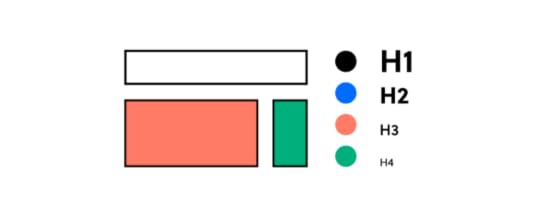
To get a better idea of what this looks like, take a look at some UI design systems from recognizable brands and our free repository of available design systems and pattern libraries – Adele.
Why do you need a component design system?There are a number of reasons why a component design system is necessary, and a number of ways poor design can hurt you.
A well-designed website doesn’t just look good. It reads well and gets your message across with intuitive navigation. Your product, whether a website or an application, becomes the user’s first impression of your brand. Consistent design is the key to an intuitive design, as the user can get a good grasp of where to navigate, how buttons look, what an error looks like, and so on.
Ux-optimized design can also make or break your product’s visibility. SEO best practices may seem like a moving target, but today’s tactics are much more involved than the keyword stuffing of yesterday. Design and accessibility play big roles in SERP rankings, so if your product delivers a poor user experience, search engines will not look favorably upon it.
Creating a component design systemBuilding your own UI system isn’t something to be taken lightly. It’s a process that takes a lot of time and dedication. But it’ll be worth it when you have a consistent, high-quality design for your product. So don’t rush! You’re taking crucial planning steps for your product’s brand.
Mood boardYour first step to planning your component design should be constructing a mood board. Here’s where you gather images of anything that inspires your intended design. That can include current design trends, inspirational images, thematic graphics, and so on. 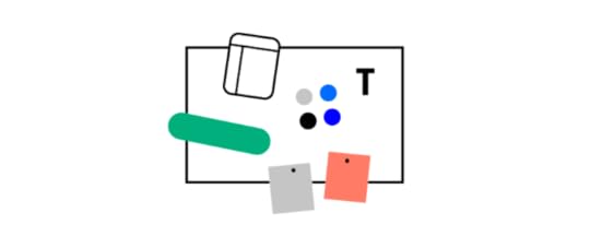
You’re essentially putting together a private Pinterest board. Once you have enough “pins,” you’ll be able to step back and see some common threads between them. And with these common threads, you can decide on components like colors, lines, and icons.
Color paletteYour product’s color palette should be based on your mood board and research into your product or service. For example, if your industry has anything to do with water (boats, sailing, fishing, conservation, etc), it may not make sense for you to have a palette with primarily warm colors. And the images you’ve gathered on your mood board would likely steer you in the direction of greens, blues, and purples.
But color palettes in UI design systems are more complex than that. You’ll want to decide on primary, secondary, and tertiary colors, as well as colors that indicate success or failure for relevant fields. (These will relate to your buttons and forms, described below.)
You’ll want a basic understanding of color theory to make an eye-catching color palette. This means understanding value, saturation, and color schemes. You’ll also need to decide how often to use each color, using primary colors and accents often enough to convey their importance. There’s a 60-30-10 rule that’s generally recommended for this purpose: your primary color gets used 60% of the time, secondary color 30%, and accents 10%.
Read more about choosing a color palette.
Shadows
With all our technological advancements, computer screens are still two-dimensional. But that doesn’t mean you can’t add some depth and perspective to your design, and it’s definitely something to consider. The use of shadow is a trending design element lately, and with good reason. Strategic use of shadows with your design components is an effective yet subtle way to add emphasis and draw the eye. Just make sure to keep these shadows consistent with direction, depth, and strength.
Type scale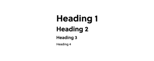
When it comes to your text, you want to make sure the font stays consistent and legible. But you also want to pay attention to the scaling of your text and headers so that everything looks uniform. If your H2 on the homepage looks different from an H2 on your contact page, that’s not a good look. You also want to avoid your H2s looking too close in size to H1s or H3s. A standardized type scale helps with this by establishing uniform sizes and formats for your body text, headings, links, and so on.
If you need help establishing a type scale, there’s a free-to-use type scale online.
IconsKeep your icons simple and uniform. Since they’re small by nature, too much detail can get lost. Inconsistent design with your icons will only look sloppy. There are free icon set packs available online if you have trouble nailing down a design but to make things much easier for you, we have ready-to-use icon library in UXPin.
 Buttons, sliders, forms, and other components
These are vital parts of your UI design, as these are the elements that your users will interact with the most. They must stand out and be identifiable, and their purpose should be obvious.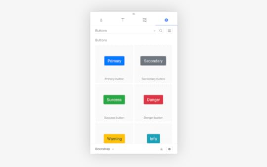
Buttons are like icons in the sense that simple design is best, and consistency across buttons is a must. This doesn’t mean button design has to be boring – there’s plenty of room to play around with the look of your standard buttons and radio buttons! If you need inspiration or want to add ready-to-use components to your design, you can find a ready library in UXPin with Material Design patterns.
Keep your other components like navigation drop-downs and text fields visible without crowding the rest of your design. This is where your color palette and shadows can come into play.
Still working on that perfect design? Join the platform used by the best designers on the planet. UXPin helps you design and manage your whole UI project with one tool. Join for free now and get started without a credit card.
The post Guide to building a UI design system appeared first on Studio by UXPin.


March 24, 2021
Make Theme Switching Easy with UXPin Merge
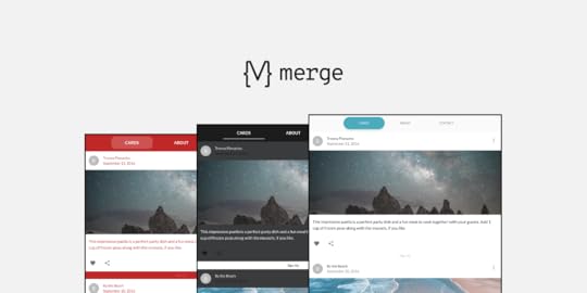
Theme switching is an essential part of designing prototypes. Whether that be changing between a simple light and dark mode or testing several client’s themes on a single prototype, it is something that all designers need to consider and have a well-thought-out process for. Furthermore, this need has become increasingly important with the adoption of open-source Design Systems, such as Material-UI, which have become a valid choice for projects.
So, theme switching functionality – such an integral part of the design process, enables to dynamically test themes on-the-fly without using multiple design systems or layouts. It is an amazingly efficient and powerful feature to have at your disposal. With the importance of this feature, we want to show how this can be done in UXPin, thanks to the power of Merge and designing with code.
Want to use the power of Merge yourself? – get access here. After the verification process and the setup, you’re on your way to designing with code! Just remember that Merge uses Git and there’s no requirement of your codebase location, so you can use GitHub, BitBucket, or other!
Why do we need a Theme Switcher?You don’t have to be a white labeling web design agency or a large-scale company with several brands to make use of a theme switcher, you could be a sole developer wanting to quickly test a new color scheme. But, switching themes is sometimes no easy task. You don’t want to be making multiple layouts of a single prototype just with different themes – that’s an incredibly tedious process just so you can test something.
Using the Material UI library, we can explain this limitation. Material UI has themes already built into their components but UXPin (and many other prototyping tools) don’t have a unified dynamic way to switch between themes that can be used by both developers and designers.
The power of Merge – designing with code solutionNo longer do you have to be limited to only vector-based tools. Instead, using the power of UXPin Merge you’re free to create whatever wonders you can imagine. Merge gives you the freedom to design with ‘real’ production React code and vector-based tools together, breaking free of previous limitations. That’s why Merge is powerful.
As we can design with actual code, we can make use of Styled-components. Styled components are the perfect solution to our problem as you can inject Javascript into the CSS to create editable theming capabilities.
So, creating themes is easy. For each theme, create a file containing css values you want to inject into your styled components as properties. Then, from the list of imported themes, you can simply select the one you want and the styling of that theme will be passed as props to the html elements.
So, what if you just created files for each theme you wanted, import them into a wrapping theme switcher styled-component, and then pass those values down into each nested child component. Then, all you need to do is change the theme at the top-level component using the Javascript props injected into the Styled Components CSS.
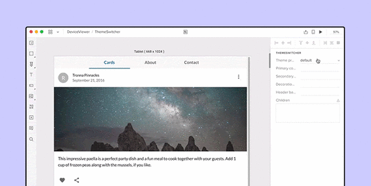
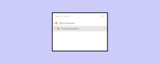
Creating a Theme Switcher ComponentFirst, we create a component named ThemeSwitcher, that functions as a top-level wrapper component, passing a selected theme’s styles to all nested components. When components are nested in the ThemeSwitcher, you can dynamically switch between any imported themes – themes, which can completely change the look and feel of components, while keeping all their functionality.
The code below shows the simplified structure of ThemeSwitcher and a breakdown of how it works will follow.
import blue from "./themes/blue";import red from "./themes/red";import dark from "./themes/dark";import light from "./themes/light"; function ThemeSwitcher(props) { let selectedTheme; function getTheme(themeProfile) { switch (themeProfile) { ... } return selectedTheme; } function makeCustomTheme() { const customTheme = createMuiTheme({ ... }); return customTheme; } return ( {props.children} );}As you can see, it’s a simple React component using the Material UI’s imported hooks, only two functions, and a return statement to pass the theme down as props.
Inside the return statement, we have the MuiThemeProvider component. This is used as a wrapper component that passes the selected theme as props down to the child components.
getTheme()We created themes using Material UI’s styling guidelines, then imported them into the Theme Switcher component.
import blue from "./themes/blue";import red from "./themes/red";import dark from "./themes/dark";import light from "./themes/light";To keep track of which theme is selected, we pass a drop-down target value into the getTheme function and pass the result as a theme prop in the MuiThemeProvider component in the return statement.
function getTheme(themeProfile) { switch (themeProfile) { // _.merge combines two themes together case "light": selectedTheme = _.merge({}, igloo, light); break; case "red": selectedTheme = _.merge({}, igloo, red); break; case "dark": selectedTheme = dark; break; case "custom": selectedTheme = makeCustomTheme(); break; case "blue": selectedTheme = selectedTheme; break; default: selectedTheme = selectedTheme; } console.log(selectedTheme) return selectedTheme; }return (When in the UXPin editor, this is what the theme selector menu populated from the getTheme function would look like.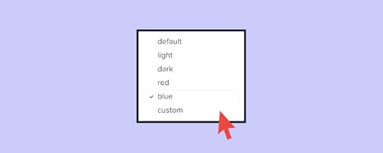
Not only do you have the option to import completed themes, but you can also create custom temporary themes within the UXPin editor. We’ve only included a few properties such as primary and secondary colors for simplicity but you go into as much detail as you need.
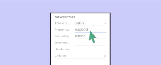
Below is the code of the makeCustomTheme function. This makes use of Material UI’s built-in core function of createMuiTheme, which creates a theme based on options received.
function makeCustomTheme() { const customTheme = createMuiTheme({ ...selectedTheme, palette: { primary: { main: props.primaryColor ? props.primaryColor : selectedTheme.palette.primary.main, }, secondary: { main: props.secondaryColor ? props.secondaryColor : selectedTheme.palette.secondary.main, }, decoration: { main: props.decorationColor ? props.decorationColor : selectedTheme.palette.decoration.main, }, headerBadges: { main: props.headerBadgesColor ? props.headerBadgesColor : selectedTheme.palette.headerBadges.main, }, }, }); return customTheme; }That concludes one way to include a dynamic Theme Switcher in your design system. Just a wrapper component (Theme Switcher) passing properties to nested child components, allowing you to dynamically change the theme without creating a new design system, page or layout.
SummaryUsing UXPin Merge gives you so much flexibility and creativity when comparing it with other design tools on the market. Focusing on a code-based, single source of truth for styling and functionality creates an interconnected system, bridging the gap between designer developer handoffs. Anything you can create in a React component, you can bring to life in your design system. You don’t have to rely on 3rd party plugins or APIs to add important features to your design system. You’re free to create dynamic and interactive prototypes while changing styles with a single command.
As UXPin Merge continues to improve, we will be sharing a great number of amazing components such as this Theme Switcher that help in prototyping, a lot! The possibilities seem endless and it’s so exciting seeing what people can make. We hope that this has inspired you to see what you can create and add to your Merge library.
If so, please join our growing UXPin community, and share your thoughts and ideas with our diverse community! Your ideas matter as this content piece was created with Jack Behar from Taylor team!
Want to find out more about Merge or would like to try it for yourself?
 Discover Merge
The post Make Theme Switching Easy with UXPin Merge appeared first on Studio by UXPin.
Design Your Own Design Process Step By Step
Managers have developed dozens—at least—of processes that they believe improve efficiency and get better results. Those series of steps, however, may not match the needs of your design team. You might also find that some projects don’t fit into the restrictions of established stages of design? Who says you can’t make a design process of your own?
Start by learning popular approaches to project managementYou may want to establish your own design process, but you should still take some time to learn from established project management methodologies. They may offer steps and concepts that you want to incorporate into your process.
Agile

With Agile, you create an iterative process that includes steps for:
Planning the design process and defining goals.Creating the product design according to your established guidelines.Testing your design to find opportunities for improvement—UXPin works well during this step because it lets you create fully functional prototypes with interactive features and real data.Finalizing the first version of your product and releasing it to consumers.Using feedback from users to make additional product improvements.Continue the cycle until you retire the project and decide to use the current version of the product.Scrum

Scrum creates results quickly by planning ahead and relying on design sprints.
Choosing someone who will direct the design project’s vision.Putting together a team of designers and developers with skills the project needs for success.Selecting a “scrum master” who can run daily meetings.Creating a list of the goals you need to meet during the design process.Planning your design sprints.Following a transparent workflow that lets everyone on the team see each person’s progress.Meeting daily to discuss successes, failures, and barriers.Making a prototype of the product to show the client – it’s very easy with a UXPin preview and share feature. Incorporating feedback into your plan and beginning the next design sprint.Continuing until you finalize the product.Kanban

Kanban gives you an extremely easy way to track a design project’s progress. You can use it successfully by:
Visualizing and planning your workflow—this usually involves making columns for tasks that have been “not started,” are “in progress,” and have been “finished.”Determining all of the tasks that you need to accomplish during the design project.Establishing rules like deadlines and task assignments.Moving tasks through the categories until you have completed them all.Lean

As the name suggests, Lean gives you a streamlined approach to managing design processes. Key concepts of Lean include:
Setting specific goals and breaking them down into the tasks your team must complete reaching those goals.Spending more time working on the design project instead of planning the project.(User) testing designs for functionality and aesthetics before giving a prototype to the client.Making any necessary changes to satisfy the client’s needs. Waterfall

Waterfall design processes recognize that you must finish some tasks before you can move on to others. Project managers commonly approach this by:
Establishing the design project’s requirements.Working on all of the tasks required to complete the design.Bringing the designs together to create a prototype.Verifying that every feature in the prototype works.Delivering the product to the client.Managing updates as needed.Related article: Agile vs. Scrum vs. Kanban: Which Project Management Methodology is Right For Your Team?
Identify your user persona

Regardless of the design process you decide to follow, you need to create user personas that help your team understand its target market. When you develop a user persona, think about features like:
Pain points the user wants your product to solve.The user’s age, level of education, income, etc.Interests and values that will appeal to the ideal user.The devices that your user persona likely owns.At the end of the process, you should have a concrete description of your user persona. It might say something like:
“23-year-old woman who recently graduated from college, wants to find ways to move her job forward, volunteers at a local animal shelter, and owns the latest iPhone.”
From this point, you can start to think about how your design makes it easier for her to reach the goals in her life. Perhaps you decide to build a career-oriented app that posts job openings and offers tips for getting a new position. Depending on whether you want to focus on a smaller niche, you might even create a product that helps animal-lovers find jobs.
Every person has numerous problems to solve. Just make sure that solving those problems becomes a part of your design process.
Related article: How a Human Centered Design Process Infinitely Enhances Your UX and UI
Use wireframes to outline basic ideas

Many designers have big ideas in their heads that they can’t wait to create in software. You want passion in your designers. Those are the people that do amazing work and push boundaries!
At the same time, you might want to slow them down to make your design process more manageable.
Requiring wireframes might accomplish that goal for your design team. Even as your expert designers roll their eyes at the rather boring process of making wireframes, you must admit that they have advantages like:
Centralizing the team’s vision instead of letting each person pursue their own creative ideas.Improving development by ensuring that you have a sturdy structure before you add cool features.Saving money by shortening the design process and avoiding errors.Easier handoffs when one person can’t complete a task—perhaps she calls in sick—and someone else has to do the work.Improving the user’s experience by forcing your designs to think about the project from multiple perspectives instead of just making the product look amazing. Build a library of approved assetsEarly in the design process, you should build a system design that creates guardrails for your designers. The design system can include approved:
ColorsTypographyAssetsComponentsUXPin lets you add descriptions within your system design. Hopefully, the descriptions will prevent designers from barging into your office to ask why they can’t [insert interesting but unrealistic idea here].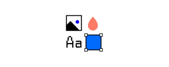
Without a design system, some designers will take paths that don’t lead to your desired result. Stop that impulse by restricting them to the project’s approved options.
Learn more about UXPin data systems here.
Get feedback from as many people as possibleYou and the rest of your design team might feel a lot of enthusiasm for your work. You might even think that this project is the best thing you’ve ever done.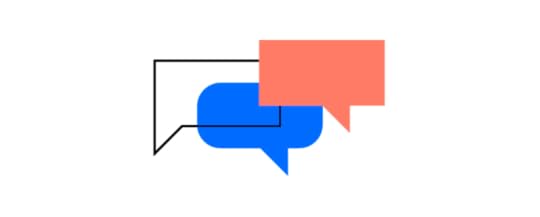
Get feedback from as many people as possible so you can get an outsider’s perspective. What seems amazing to the people working on a project could look odd to those outside of the team.
UXPin lets you get feedback from anyone, regardless of whether or not they have a UXPin account. When you send a link to your prototype, people with the link can interact with your design and leave comments. Hopefully, they will love your work as much as you do. If they find issues, though, take them seriously. There’s a good chance that other people will also dislike how the feature works.
Decide what steps do and do not work for your team’s design processExperiment with design processes to identify steps that work for your team. If you find something that doesn’t get positive results, discard it. If you feel like your process misses something, brainstorm to find a new step that will improve your process.
You don’t have to follow someone else’s rules. You can make your own design process that helps your team get the best results.
Sign Up for a Free Trial With UXPinUXPin has several features that will support your own design process. Start your free trial today to see how it can contribute to the evolution of your design process.
The post Design Your Own Design Process Step By Step appeared first on Studio by UXPin.
March 23, 2021
UI Components in Atomic Design

Atomic Design: once an obscure concept, it’s gained popularity in recent years. And it’s a hot design trend for good reason. When done correctly, Atomic Design allows teams to deploy truly unique design systems. What’s more, these design systems offer unparalleled high-quality, consistent UI, which benefits users and developers alike.
In this post, we’ll discuss the ins and outs of Atomic Design, and what you need to know about the UI components within it.
Let’s dive in.
The 5 UI Components of Atomic DesignAtomic Design is a web design theory pioneered by Brad Frost. A student of chemistry, Frost used the basis of the atom to develop the theory. In chemistry, several atoms combine to form a single molecule, which can then be combined into a series of progressively larger organisms and molecules.

Frost adapts this process as the foundation of his Atomic Design approach.
In essence, Atomic Design consists of five elements that build on one another. They are as follows:
Atoms. In Atomic Design, as in chemistry, atoms are the basic elements that help inform everything. In the world of web applications, atoms are the foundational elements, such as HTML tags, fonts, animations, and color palettes. Web design “atoms” can also be less concrete. Examples include buttons or forms.Molecules. Molecules are the next-largest building block in the food chain. Created by the joining of different atoms, molecules are complex by nature. Because they’re the product of various atoms, though, it’s possible to break them down, conceptually, into something easier to digest. Examples of web design molecules include the things that become the backbone of the larger design system, such as form labels or input fields.Organisms. Atoms combine to form molecules, and molecules combine to form organisms. In the world of Atomic Design, organisms are the elements that shape both the appearance and functionality of a website. They’re also the elements that start to impact UI. The way a developer arranges molecules informs the site experience and the complexity of the finished product. Examples of organisms include logos, search fields, and main navigation.Templates. At this phase of the Atomic Design process, we start to break with the chemistry analogy and shift back into the lexicon of web development, as a whole. Templates, then, are “organisms” strung together to create pages or finished products. Templates, online atoms, organisms, and molecules, are highly concrete. They provide a fixed context for the more abstract pieces to fit and are responsible for pulling the site together into something resembling its final form. An HTML wireframe is an excellent example of a template.Pages. Pages, finally, are the final element of Atomic Design. According to Frost himself, pages are the specific instances of templates. Pages are the most tangible element of all and are the places users spend most of their time. They’re also one of the most essential phases of the Atomic Design process since the final iteration of pages is where developers get to see whether the entire design system is effective or not. In short, the final appearance of the pages dictates whether the site is ready to launch, or whether the developer needs to loop back and make changes to earlier design elements.The Benefits of Atomic DesignNow that we’ve discussed the basic UI components of Atomic Design, let’s take a deeper dive into why these components are beneficial, and why it’s emerged as such a popular design system.
Atomic Design allows for a “mix and match” approach

With Atomic Design, developers can take site elements independently, rather than as a single brick that all needs to move at once. This allows developers to identify portions of the site that can be reused, repurposed, or paired with other elements to form new organisms.
Atomic Design generates straightforward layouts

This is true for both developers and final users. For developers, the code of sites created with Atomic Design is easier to read and understand. For users, atomically designed sites are easier to navigate and more intuitive. When and if developers need to go back into the site to make changes, Atomic Design makes it easy to identify each element and what it represents and alter things accordingly.
Atomic Design creates simpler sites, overallWhile the basics of Atomic Design may sound complex, the fact is that sites created from a place of Atomic Design contain fewer components, overall.
Here’s why:
When developers have a list of components (including atoms, molecules, and organisms) available before they begin to build a site, they’re more likely to employ existing infrastructure than they are to create new elements needlessly.
The end result is fewer components, which makes for leaner, easier-to-use sites.
Atomic Design Enhances UI ComponentsThe world of web design is intensely UI-focused right now, and for good reason. As customers become more advanced and discerning, web development needs to keep up. Fortunately, Atomic Design makes. it easy to do just that. By simplifying otherwise-complex web development outlooks, Atomic Design streamlines workflows for developers and promotes better UIs for end users.
To maintain simplicity in the design workflow, you should also think about a design tool that streamlines the handoff with features that enable sharing, leaving comments, and listing detailed specifications automatically. Try UXPin with a free 14-day trial to see how to improve your design process.
The post UI Components in Atomic Design appeared first on Studio by UXPin.
March 18, 2021
Benefits of Using a Random Name Generator
For a lot of people, random name generators provide a fun, easy way to come up with inventive names. You might use them to name a business, pet, or just to have fun. When it comes to developing products like websites and apps, though, you can get several benefits from using a random name generator. Learn about these six random name generator benefits to help you decide whether you want to have a .
No one likes Lorem ipsumLorem ipsum used to fill an essential role. With modern design software, though, you don’t need it. As fewer and fewer designers rely on Lorem ipsum, more managers and clients expect to see more realistic text in prototypes. It looks much more professional to use a random name generator than insert Lorem ipsum into text fields.
Basically, no one really likes Lorem ipsum. One of the random name generator benefits is that you can avoid annoying your bosses and clients.
Lorem ipsum can lead to embarrassing mistakesTraditionally, designers have used Lorem ipsum to fill space where they expect to place text. Lorem ipsum can create a lot of problems, though. Some designers forget to replace the fake language with real text from their copywriters, which creates embarrassing situations for brands.
A random name generator lets you replace Lorem ipsum with real text. Consumers might scratch their heads in bewilderment when they see a random name like “Ellie-May Derrick” on a package, but at least they won’t know the designer completely forgot to do a part of their job.
You can use real names to test interactive featuresInteractive features have become standard for today’s websites and apps. Interactive features like popups and content gates make it possible for companies to generate leads that increase sales and ad revenues.
You don’t want to send prototypes to clients until you have tested all of your product’s interactive components. Often, that means making sure fields can accept, predict, and sort text.
UXPin and a random name generator benefits your prototype by letting you test the functionality of your interactive features. UXPin’s prototypes can replicate practically any feature that you plan to include in your final product. You can create sortable tables that let users rearrange content by clicking their headings. Without a random name generator, you either need to spend time writing names or use strings of nonsense.
Either way, you get a more efficient, trustworthy test by using randomly generated names.
Add novelty to your prototypesThink about how many times your managers and clients review products before releasing them to consumers. After weeks or months of work, testing products can feel like a difficult chore. One of the random name generator benefits is that you get to add novelty to your prototypes during the testing phase.
Many online random name generators have different categories that you can choose. As a client, would you rather review products that use names you’ve seen a million times (William Shakespeare, Jane Austen, Ernest Hemingway, etc.)? Or would you rather see new names that make you giggle?
At the end of a long week, you would probably appreciate the laugh.
When you ask a random name generator to give you pirate names, you get results like:
Cap’n ScrawnySean BonesBarry De WalesCurvy BarryCutthroat Cosma the SympatheticWouldn’t you rather see some new names instead of the ones that have bored you over and over for years?
Save your creativity for work that mattersYou might think that you can get better results by writing your own names. That’s probably true. With some effort, you can think of funnier or more insightful names than the ones generated at random. You don’t see comedians standing on stages reading from Mad Libs templates. The jokes would get old very fast.
As a designer or project developer, though, it doesn’t make sense for you to waste your creativity on something as minor as fake names that act as placeholders for future content.
Every decision that you make during the day can literally lower your level of willpower to accomplish other tasks. Psychologists call it “ego depletion.” Not everyone succumbs to ego depletion as quickly as others. Some creative people seem like they can keep coming up with witty ideas forever. More likely than not, though, using your energy to write fake names doesn’t make sense. If nothing else, you have better ways to use your time.
Random name generators don’t need your helpMost random name generators will only create a handful of names at a time. You fill in a few variables (where you live, a pet’s name, etc.), and the generator uses the provided information to spit out a short list of names.
Not all random name generators work that way. lets you order up to 100,000 fake names at a time. The more you require, the longer it takes the website to fulfill your order. You don’t have to pay attention to it, though. The website will work in the background while you do other things.
Random name generators don’t need your help, so don’t expand your energy and time making up names.
Use real data or a built-in generator

Make your design process easier by taking advantage of the UXPin feature that allows you to generate and fill an element with the type of data that you choose like name, address, business, date, etc. If you already have a file with real data that you would like to include in your prototype, just import it from your Google Sheets, CSV, or JSON files.
All with just one click, so it’s time-efficient and makes your prototype much more reliable by getting rid of lorem ipsum. What’s more, it’s all built-in, so there’s no need to search for additional tools that can help you both importing and generating exemplary data.
ConclusionUXPin gives you the tools that you need to create fully functional prototypes that work with generated data. You don’t have to use nonsense anymore. Make your projects more impressive with interactive features that show off your creativity and expertise. Try UXPin by signing up for a free, 14-day trial. Whether you use a random name generator or not, you will love the prototyping features that come with UXPin.
The post appeared first on Studio by UXPin.
March 17, 2021
The Benefits of Dark Mode and Why You Should Also Dim the Lights in Your Product

On its most basic level, dark mode turns white backgrounds with black text into black backgrounds with white text. The more you explore dark mode, though, the more design opportunities you will discover.
Why should you bother learning about dark mode designs? Here are a few important reasons to get you motivated.
Dark mode reduces blue light that can interrupt sleepWhen it gets dark, your brain naturally begins to produce more melatonin, the chemical that makes you sleepy. Any type of light can disrupt the melatonin levels, so people should ideally avoid all types of light as bedtime approaches. Although no one has found enough evidence to prove it, some studies link exposure to light at night to increased risks for health problems like obesity, heart disease, and diabetes.
Blue light disrupts melatonin secretion more than other types of light. Unfortunately, computer and smartphone screens bathe your eyes in blue light. Comparative research at Harvard shows that exposure to blue light suppresses melatonin for twice as long as other green light.
Harvard says that people should avoid using bright screens about three hours before bed. Considering that many people look at their phone before going to bed, though, few consumers follow this advice.
Night mode produces significantly less blue light than standard screen settings. Ideally, you shouldn’t use any screens leading up to bedtime. If you do, using dark mode should disrupt sleep much less than standard screen modes that use blue light.
As screentime grows, eyes need more restIf people only used websites and smartphone apps for short periods during the day, they probably wouldn’t need the benefits of dark mode. Studies show that the amount of time that people spend focused on screens keeps growing, though. Dark mode could serve an important role in curbing the negative health effects without telling consumers to put down their devices—designers and developers don’t want to do that for obvious reasons!
On average, people pick up their phones 58 times per day. Most of the interactions are rather brief:
70% of sessions last less than two minutes.25% are between two and 10 minutes.Only 5% of sessions last more than 10 minutes.Cumulatively, though, all of those interactions add up to 3 hours and 15 minutes of screen time.
These statistics only apply to smartphone use during workdays. Now that more people use computers during work, you can safely assume that many of them can add at least 6.5 hours of screen time to the 3 hours 15 minutes that they spend looking at their phones. Even a conservative estimate shows that people expose themselves to the bright, blue light of computer screens for more than half of the waking day.
Dark mode extends battery lifeSmartphone and laptop sellers often use long battery lives as selling points that will convince consumers to spend more money on devices. Battery life certainly matters in a mobile device, but users probably have much more control than they think about how long charges will last.
When testers compared the battery life of iPhones, they found that they could play video for 15 hours on the phone using light mode while the dark mode phone kept working for 20 hours. They got a 33% increase in battery life just by switching to dark mode.
The researchers point out that only smartphones with OLED screens will get the benefit of extended battery life. LCD screens use about the same amount of energy regardless of the type of light they use, so they probably won’t work longer while in dark mode.
You can explore more design options with dark modeDark mode gives designers more opportunities to explore design options for their products. A white screen can make it difficult to view certain colors. Light blue, for example, may force you to concentrate on text much carefully against a light background than a dark one.
The move toward darker designs has been much more prevalent in smartphone apps than websites. Many app designers like to dim the lights because the darker environment:
Increases contrast between backgrounds, oversized images, and text.Makes it easier for image-heavy designs to look professional.Younger people who play a lot of video games have gotten used to dark color schemes, so they expect to find a similar aesthetic used by apps.Finally, there’s no denying that a black background makes certain colors pop! When you dim the background—or start using completely black backgrounds—you can make light blue, pink, yellow, and other colors stand out. These colors would blend into a white background, but they look stunning against black.
Related article: 2020 Design Trends: The Most Interesting Design Trends to Watch in 2020
Consumers want the option to choose dark modeMaybe you don’t care a lot about the effects of blue light, extending battery life, or exploring designs that work better on a black background. All of those points aside, you still care about making your products popular. Unpopular products don’t survive, which could mean that your job title doesn’t survive long, either.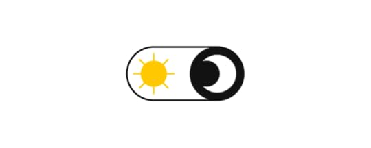
Over the last few years, there has been a significant trend toward dark mode. Tech giants like Google, Facebook, YouTube, Apple, and Twitter have adopted dark mode options, creating an important trend within the design industry. About 70% of software engineers prefer working in Dark Theme IDEs, so it seems natural for them to create tools with dark backgrounds and colored text.
Ultimately, though, the consumer matters most. As more people start watching videos online, dark backgrounds have become standard on websites like YouTube. In August 2019, 2.08 billion people worldwide said that they watched videos on their smartphones. When it comes to viewing videos on computers, 1.87 billion people admitted to it during the same month. Interestingly, a much smaller number (1.64 million) said that they watched online videos via their smart TVs.
Related articles: Dark Mode Feature as an Ultimate Solution in Mobile App Design
Explore more design concepts with UXPin prototypesDark mode isn’t the perfect solution for every product’s design. Since consumers and developers like having the option to switch to dark mode, though, it makes sense for more designers to test dark mode concepts.
UXPin gives you an easy way to explore dark mode concepts by turning designs into fully functional prototypes. UXPin prototypes respond to interactions just like their final products will, giving you opportunities to tweak your dark mode versions to make sure they look attractive and make users more comfortable.
Try dark mode prototypes with a free UXPin trialStart your free UXPin trial to see how easily you can turn your dark mode designs into interactive prototypes. It’s a truly free trial that doesn’t require a credit card number. If you decide that you don’t want to keep using UXPin, you will never get charged for the membership. More likely than not, though, you will find that the simplicity of UXPin makes you want to become a lifelong member.
The post The Benefits of Dark Mode and Why You Should Also Dim the Lights in Your Product appeared first on Studio by UXPin.
March 16, 2021
Understanding DesignOps and Its Role in Design Teams

When you have a very small design team with just a couple of people, you might wonder why anyone needs a DesignOps professional. As your agency grows larger, you start recruiting help from more freelancers, or your products become more complicated, you will quickly realize that DesignOps plays a crucial role in design teams.
If you’re unsure whether you need DesignOps, consider some of the positive roles that design operations professionals can improve in your teams and projects.
DesignOps can build a team of diverse talentTechnology always moves forward, which means that your products will have to adjust to emerging trends quickly. Smartphones are literally everywhere, so it’s easy to forget that the first iPhone didn’t come out until 2013. Think about how much apps have changed within less than a decade! You have no idea what experts you will need on your team a few years from now.
Currently, your team probably needs at least one:
Project managerGraphic managerAnimation designerUI/UX designerMore complex projects might require:
Content creatorsAn art directorA brand managerDeveloperAre you certain that your team has the right members to complete challenging projects? A DesignOps professional can build a team of diverse talent that helps you attract high-profile clients, grow your brand recognition, and increase your revenue.
Related post: Design Team Structure: Ideal Setup for Small, Medium & Large Organizations
DesignOps can recruit the talent you need for individual projectsYou don’t necessarily need all of those people on your payroll. According to the U.S. Bureau of Labor Statistics, animators earn about $75,270 per year plus benefits. As long as your animator stays busy, it makes sense to pay for a full-time employee. The situation changes when you only need someone to add animations to occasional projects.
When you don’t need a team member consistently, you can outsource tasks to a freelancer. DesignOps can make sure that the chosen freelancers have the right skills and talents for the job. You could hire a random person from a website like Fiverr, but that doesn’t guarantee you’ll like the results you get. You can trust DevOps to find the right person for the job.
Trust DesignOps to create great design systemsYour DesignOps professional acts like a coach that develops strategies and communicates plans to the team. Creating a great design system makes communicating project requirements and limitations a little easier.
DesignOps is the right person to create design systems because they communicate with everyone involved in a project, including the client or brand expert. Branding plays a critical role in product development. If your client makes its products more recognizable by using the same icons in every design, your team needs a design system that limits them to those icons. More often than not, DesignOps is the only person talking to the client often enough to know the importance of these decisions.
Give your DesignOps professional control of design systems to streamline the prototyping process and meet the client’s expectations.
Related post: How to Use a Design System to Make Great UX Design Decisions
DesignOps handles business issues so your team can focus on design
Wouldn’t it be great if your team could design products without worrying about budgets? They could do so many amazing things!
In the real world, every design project comes with countless business tasks like:
Tracking budgetsLogging hoursResponding to emailsAttending client meetingsMore likely than not, your product designers don’t have any interest in these things. They’d rather spend their time doing the work they love. Let them focus on design by assigning business tasks to DesignOps. Without the burden of these tasks, your team will work more efficiently and build better products.
You need DesignOps to perfect project managementYour design team needs a system that helps members coordinate their efforts and reach common milestones. That means you need a project management methodology that works well for your team.
Some of the most popular management methodologies for design teams include Agile, Scrum, and Kanban. There are dozens of other options, though, that could make your team more effective.
It’s also possible that your team needs a unique approach to management. Creating your own design process can break down barriers and give your employees the freedom to explore radical ideas that lead to amazing features.
Who decides what project management methodology your teams should follow. Leave that job to DesignOps. They already know a lot about your team members, projects, clients, and processes. It makes sense for them to take responsibility for choosing a management methodology that brings out the best in your team and technologies.
Related post: How Agile Environments Revolutionize a Team’s Workflow
DesignOps finds the technology your team needs to thriveYour technology stack dictates—at least in part—what your design team can accomplish. You can’t make animations when you don’t have software with animation features. Similarly, you can’t test designs unless you have a tool that lets you interact with your prototypes.
When you search the internet for design tools, you will get dozens of results claiming that they offer the best features. Can you trust those statements? Even writers making best-of lists have partnerships that encourage them to position some design tools over others.
In other words, it’s best to get help from someone who knows how all of these products work. What reputations do they really have? Do they integrate well with other tools? Will other designers laugh when they find out that you use an outdated app? Are there any trends on the market that your team should follow?
DesignOps professionals know the answers to these and countless other questions that you need to answer before you can choose a technology stack. They usually also follow tech novelties that can help optimize the whole product development process.
For example, one of the burning issues in product teams is the disconnect between design and development – the handoff reality check is the moment when some of the design ideas can’t be implemented into production or take much more time than it was predicted.
In such a situation, DesignOps would search for solutions like tools that can help convert the design to code, much more interactive prototyping tools to check the interactivity scenarios before passing the design to development, or even tech that allows designers to create a prototype with already coded components that are production-ready.
The last solution simplifies and shortens the process of product development by making it faster for designers to prototype and for developers to launch the ready product. If you’re interested in that as a DesignOps or any other member of a product team, we have a solution – UXPin Merge. You can create designs with UI React components that are already interactive and easily reusable. It may sound complicated but in reality, there’s no difference between prototyping with standard elements and the revolutionary code-powered components.
Sounds like a perfect solution?You don’t have to trust our perspective of UXPin Merge. It’s best if you checked on your own how beneficial it may be for you. Designing with code can help you optimize your product development process a lot, so if you’re ready for implementing a revolutionary, yet not so complicated tech, just request access to Merge.
Discover MergeThe post Understanding DesignOps and Its Role in Design Teams appeared first on Studio by UXPin.
March 11, 2021
Creating a better design handoff experience for developers
Every project requires a design handoff at some point. Unless you’re one person doing all the work, there will come a time when you need to take your prototype and have someone else work on it. While that sounds simple enough, it’s usually anything but.
Moving a project from design into development can be a move fraught with errors, misunderstandings, and other issues that stretch the launch date out. Today, you’ll learn how to eliminate or smooth over many of these issues.
How can you ensure the entire process of a design handoff goes smoothly? Here are some ideas to help you and your team.
Keep everyone in the same loopEven if the developers are not part of the early development of the product, you’ll have fewer problems if they are kept in the loop on the progress from the start. This eliminates the abrupt shift from one party to the other and ensures the developers are aware of what went into the original prototype. This may be done by CCing them on important conversations and developments with the project early on, and inviting their input as the handoff draws nearer.
Streamline your filesIt can take a ridiculous amount of time to pass files from one person to another, so this is an area you need to streamline. There are a few ways to do this. First, you’ll want to optimize your images, since these usually take the longest to load on a website. Over a fifth of website file sizes comes from the images, so this is easily remedied by optimizing those images.
The other way you can speed things up is to keep all files on the cloud so everyone has access to the most recent update. This also allows everyone to access the files from any device, even if they’re in another country.
Create design styles and stick to themTemplates are particularly handy for this step, but even if the project is very different from anything you’ve previously used, it’s simplest to set a style. You can create a style board with specific fonts, colors, etc., and make this available to anyone working on the project. This ensures everything is the same across the board.
Documentation of typestyles and brand colors is a must if you want the design handoff to go smoothly.
Create a design systemTake one step forward – use your pattern libraries, style guides, toolkits, and design principles to create a design system – set of standards for design and code. It ensures design-product consistency and saves a lot of time. It can boost your productivity by making the most of reusable UI components.
Components are an essential part of building an app and it’s much easier if everyone has access to the same ones. The product team working on the project will have an easier time keeping it all going properly. This also minimizes the time needed for communication, because everything is easily available.
The designers should also maintain documentation for their project, so the developers can later check back on it.
Here’s all that you need to know.
Design with codeHow about taking your designing process to a whole new level? If you really want to:
save a lot of time – design and code the product faster, make sure there is no disconnect between the design and the product, make the most of your design system,… then design with already coded UI components!
Don’t worry, you won’t have to learn how to code. It’s extremely time-effective and it lets you skip redrawing the same components over and over again. Not to mention it practically gets rid of the complicated and repetitive handoff process.
How to do it? Find a design tool with a code-powered approach. At UXPin, we have a solution called Merge that allows you to leverage your design system and design with React components to streamline the communication between dev and design.
Use a grid systemGrids are a simple way to ensure everyone is on the same page. Turn grids on throughout the team and you’ll all see exactly what you need. This is also a good way to ease communication since people will all reference the same grid as they talk about the project.
Create a dedicated channel for communicationCommunication is key and that means you need to ensure everyone can discuss the project, both before and after the design handoff. To make life simpler for yourself, you’ll want to make this a single channel and set up some guidelines ahead of time. Make sure everyone has access and require frequent updates. There should also be regular meetings if you want to make sure everyone is in on the latest changes.
Use a system that is designed for communicating and that allows you to create a to-do list, deadlines, etc. so all team members know where they stand. This will help keep the project on track as well as let developers know when they will need to step in and take over.
Get licenses pre-approvedWant to avoid a lot of issues down the road? Make sure your images, text, and any other components are licensed and paid for if need be. Even if you have used free fonts, you should have a copy of the license on hand. This ensures there is no last-minute scrambling to figure out whether or not everything is legally able to be used.
SummaryThe design handoff process doesn’t need to be as complicated as it usually is. When you have a solid plan with everything carefully documented, it will go easier on everyone involved, especially with the new code-approach to design that can make things easy for both sides. Ready to try a solution that will streamline your design process once for all? Sign up for Merge!
Discover MergeThe post Creating a better design handoff experience for developers appeared first on Studio by UXPin.
March 10, 2021
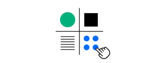
Webinar Wrap-Up: 11 Ways to Start Your Inclusive, Accessible Design Toolkit
Inclusive design affects the ways that people interact with technology and feel about the world. Organizations that strive to make their digital products more accessible reap several benefits from considering the needs of diverse users.
By offering more inclusive designs, businesses can potentially attract more customers and earn more money. They might also avoid fines by disenfranchising people with physical and cognitive impairments that block their access to products and services.
During our last webinar, with Piotr Źrołka accessibility Expert, UX strategist, and CEO of Kinaole, we focused on a deeper explanation of inclusivity, what it means for designers, and how UXPin’s features make inclusive design easier than ever.
Piotr addresses in this webinar common accessibility challenges that people with vision, motor, hearing, and cognitive impairments encounter when using digital products. Creating an inclusive, accessible design kit helps remove challenges. Instead of focusing on a target audience, inclusive designs try to reach as many users and customers as possible.
Piotr also provides real-world examples of how organizations add accessibility to their websites and apps.
What You Will Learn“Focus on the characteristics rather than demographic data.” – Piotr Źrołka. Piotr discusses using impact maps to identify user types, their needs, and design solutions that can meet those needs [7:44].Piotr shows examples of using UXPin to:Add keyboard functions to designs [15:52].Define page titles to help users know where they are [32:30].Add pause and stop to give users the time they need to understand content [34:48].Include headings that offer visual indications and site structure [44:22].Use alt attributes that describe images and other non-text content [45:43].Notify users what links are and where they lead [54:20].Include language attributes that tell users what languages products use [55:02].Make responsive designs that automatically reorient themselves to how users hold their mobile devices [56:26].Use colors to make images easier for more people to see [57:11]“We’re building better services for everyone.” – Piotr explains the customer service and financial benefits of designing inclusive products. [1:01:49]Watch WebinarThe post Webinar Wrap-Up: 11 Ways to Start Your Inclusive, Accessible Design Toolkit appeared first on Studio by UXPin.
March 9, 2021
The Guide to Remote Design Sprints

Remote design sprints have become increasingly popular as more people collaborate from different locations around cities and across the world. The coronavirus pandemic accelerated the move to remote work, but the trend started long before 2020 as companies discovered that they could build stronger teams by hiring employees and freelancers according to their talents instead of their locations.
As more companies turn to remote work, they need to update their approaches to design springs. The following guide will help ensure that your remote design sprints go smoothly, giving you terrific results with as little pain as possible.
Create (and confirm!) a team for your remote design sprintA couple of weeks before your design sprint, you should reach out to people to make sure they can participate. Creating a team requires more than putting together a group of people with the right skills. If they can’t fully commit to the project because they have something else planned for that time—watching their children, attending other remote events, etc.—it makes sense to recruit someone else.
Although the people working on your remote design sprint will vary from project to project, some of the roles you usually need to fill include:
Facilitators (at least one)Graphic designersIllustratorsAnimatorsDevelopers with coding experienceMake sure everyone has the tools they need to participateWhen everyone works on-site, you can easily make sure they have the tools that they need to succeed in a design sprint. You don’t have as much control during a remote design sprint. Connect with participants a couple of weeks before the sprint to confirm that they have everything required for the project.
You will get the best results by setting specific standards. Remote collaboration doesn’t work well when members of your team use different tools. At the very least, you can expect that situation to cause formatting problems.
Note-takingNote-taking apps will make it easier for members of your team to keep up with everyone’s ideas and the final decisions made by your facilitator. Some favorite note-taking apps include:
EvernoteMicrosoft OneNoteGoogle KeepNotionWhiteboardingYour team members need a way to brainstorm remotely. Plenty of online tools can give you virtual spaces to share ideas quickly. Favorites include:
MiroSketchboardStormboardConceptboardExplain EverythingTeleconferencingTeams tend to get the best results when everyone has their cameras turned on—more on that below in the “establish rules” section. By now, you probably already have a favorite teleconferencing app. If not, consider:
ZoomGoogle MeetGoToMeetingCollaborative prototypingThere are plenty of design apps that let teams collaborate remotely. You need more than a designing app for an effective sprint, though. You need a tool with seamless collaboration for cross-functional teams. That way, everyone from your coder to your animator can work together in real-time within the same platform.
UXPin stands out as the best option for real-time prototype collaboration. It has all of the features members of your team need. Plus, you can send project links to clients and other people outside of the design sprint. They can view your work and leave feedback without starting UXPin accounts. That way, you give them easy access without any barriers.
Have a short practice session before the design sprintDoes everyone on your team know how to use the required tools? Iron out any kinks by hosting a short practice session a day or two before your sprint. It’s much better to discover issues now instead of during the design sprint.
You never know what will happen during a practice session, but pay close attention to:
Slow internet speeds that make real-time collaboration difficult.Old operating system or software that doesn’t cooperate with updated versions.Camera and microphone issues.Whether everyone can sign on to the required tools.If you run into anything that worries you, bring up the issue as soon as possible. Finding a solution might involve nothing more than giving someone access to a piece of software. It doesn’t harm anything during the practice, but it could create a serious disruption during the remote design sprint.
Set a schedule unique to each remote design sprintEach remote design sprint needs a unique schedule tailored for the project. Creating a schedule takes more than setting a beginning and end time for your sprint, though. Everyone involved should know exactly what they will be doing throughout every minute of the spring.
You can follow any schedule that makes sense to your team and goals. Some teams find that 25-minute repeating sprints based on the Pomodoro Method work well. According to this approach:
Everyone starts working on the sprint at the same time.Everyone ends after 25 minutes of work (no excuses or extensions!).Five-minute breaks between sprints with longer breaks scheduled as needed.During the first few rounds, your team probably won’t come up with anything revolutionary. It doesn’t take long before the best ideas become obvious, though. As you progress, members of the team can focus on the concepts that work best for the product.
You can’t expect your team to only take five-minute breaks between short sprints. Place longer breaks where they make sense in the schedule. For example, you might give everyone a 45-minute break at noon so they can have lunch.
Establish rules the team must follow during the remote design sprintDesign sprints only work as well as the rules that govern them. You know that rules play an important part during in-person sprints. They become even more crucial during remote design sprints.
Don’t assume that your approach to in-person sessions will work during remote projects. A lot of project managers mistakenly assume that their offline techniques will get positive results during remote sprints. Some of the techniques that you rely on in person are unlikely to work in a virtual environment.
Your sprint’s rules will vary depending on your team’s weaknesses and strengths. In general, you should use the following rules to stay on track and get great results.
Only one person can speak at a time. You get chaos when multiple people speak at once online.Assign a facilitator who can acknowledge people who want to speak and enforce rules.Always stay on video to create the impression that you’re working together and hold team members responsible for following the schedule.Everyone must use a split-screen or multiple screens. No one gets to toggle between the video and design apps while working.Forbid all multitasking so people must focus on the current step. No skipping ahead or going back to work on previous steps in the sprint.Start your free UXPin trial to see how it can make your remote design sprints successfulUXPin was developed as a collaborative designing and prototyping tool that meets the needs of today’s teams. As you start to rely more on remote design sprints, you need a platform like UXPin that lets teams create fully functional prototypes in real-time.
Start your free trial with UXPin today so you can see how much easier your sprints become when you have a tool with features created for how today’s designers work.
The post The Guide to Remote Design Sprints appeared first on Studio by UXPin.
UXpin's Blog

- UXpin's profile
- 68 followers

