
UXpin's Blog, page 78
June 3, 2021
The UX/UI designer’s guide to user-centered design
You’ve heard about human-centered design. It’s one of the most omnipresent design philosophies in UX/UI. But what about user-centered design (UCD)? These two terms sound similar, but there are differences between them, and you should consider both principles when designing future prototypes. In short:
Human-centered design (HCD) considers the psychological/emotional preferences of users that engage with UX/UI designs.UCD takes a less emotional approach and focuses on the situational/environmental factors that influence the way users interact with designs.Check out UXPin’s helpful guide to human-centered design.
In this post, learn why UCD is such a valuable design principle and why you should always consider it for future projects.
What is user-centered design?It’s critical to establish the differences between user-centered design and human-centered design as these concepts confuse some designers. While HCD considers a user’s emotional and psychological characteristics in a UX/UI design context, UCD is more tangible, focusing on specific situational traits that influence how a user perceives and engages with a design.
 A designer that adopts the HCD approach considers a user’s emotional response to a prototype or product through the paradigm of UX/UI design — how a user responds, behaves, and feels on an emotional level. A designer that adopts the UCD approach considers more tangible concepts such as a user’s age, social status, and education, and how these factors influence the user’s response to a prototype or product. There’s still psychology behind UCD, but the approach is less emotional and more situational/environmental than HCD.
 There are similarities between UCD and HCD. Both philosophies involve processes that put users at the center of product design and development. In both scenarios, designers recognize user’s pain points and how the product (or the design/prototype) solves these problems. Designers might switch between UCD and HCD depending on the circumstance or design brief or use both methods.
How user-centered design worksUCD requires more research than HDC, which involves a lot of guesswork. With UCD, you center designs around the situational and environmental contexts users find themselves in, so you’ll need plenty of data to execute this design philosophy properly.
Start with UXPin, which gathers feedback from users about your designs as early as the wireframing stage. Use this feedback to influence your UX/UI designs and create better prototypes and products based on user requirements and the problems they need to be solved. The world’s best designers already use UXPin, so why not join us with this free trial?
Then research demographics on other platforms. Designers collect a broad range of data from disparate sources to understand the situational factors that influence design perception. These sources include:
Census data Social media pages Beta testingSurveysOnline forumsTelephone callsInterviewsAnalytical programs that provide designers with real-time user insightsThe purpose of data collection isn’t to build a database about users but identify trends that affect perceptions toward UX/UI design. For example, monitoring social media tells designers how users in different locations (say, New York City vs. London) respond to a particular product. If social users in London perceive a design differently from those in New York, designers might want to tweak the product for an international audience. In this context, situational factors (specifically, location) influence how users respond to design. There’s a lot of generalization involved in UCD, but it’s a design philosophy that proves incredibly useful.
Surveys are another data collection method for identifying situational or environmental factors that drive design perceptions. Take age, for example. A designer might want to gauge prototype responses from a group of 18–24-year-olds and compare the results with a group of 25–35-year-olds. The older cohort could have different opinions about the product than the younger cohort, so the designer might have to make adjustments to the product if trying to appeal to both demographics. Designers typically use several feedback methods to determine audience reactions toward prototypes, and the process might take many months.
Benefits of user-centered design for UX/UI designersThere are multiple benefits of UCD because you get to understand your target audience better. This approach can have the following effects:
 Save time
You spend less time prototyping when you know what targeted users want (and don’t want) from design. You learn user pain points and bespoke requirements just by testing and measuring key demographics.
 Increased interest in your design
Users in specific contexts are more likely to invest in your prototype or design if it fulfills their needs or requirements. However, you need contextual insights to satisfy user needs.
More investmentWhen more users are interested in your design, you attract more investment opportunities and overall interest in your product.
Longer-lasting benefitsOnce you understand audiences and target markets, you can move users through your design and development life cycles and, eventually, increase sales of your product when it gets to market. In the future, you prototype less and spend more time designing innovations that fulfill user needs.
SummaryIt’s important to differentiate between user-centered and human-centered design for consistency. But once you’ve mastered the basics of UCD, incorporate this approach into your design philosophy and create products and prototypes based on situational and environmental contexts. UCD can be difficult at first, so a digital tool like UXPin proves invaluable. Use it to gather feedback from users during the design process for exceptional insights. You’ll learn more about your target audiences and waste less time creating prototypes that don’t work.
Generate user insights during the design process with UXPin, the design and prototyping tool for UX/UI designers everywhere. Start your free trial.
The post The UX/UI designer’s guide to user-centered design appeared first on Studio by UXPin.


June 2, 2021
How to go from a style guide to a design system
Like a lot of companies, Johnson & Johnson once relied on a style guide to make sure designers used approved language and components. Style guides can still help brands enhance their UX, but they don’t always match the needs of larger companies. Newer technology also makes it possible for smaller enterprises to move from style guides to design systems.
During an April 2021 webinar, J&J Experience Design Expert Service Leader Ben Shectman talks about how he and his team used the corporation’s existing style guides to build an interactive design system. It’s a lesson in how adopting the right process and software can make a design department more effective and efficient.
Why you need a design system instead of a style guide
For years, Johnson & Johnson had used style guides saved as PDF files. The disadvantages of static style guides were obvious to an experienced UX designer who knew the benefits of interactive design systems.
Some of the benefits you gain when you transform style guides into design systems include:
Creating a place that stores all the standardized versions of components. Adding consistency to products that help users know what to expect when they encounter new features.Controlling the design components that employees can access and add to their prototypes.Establishing guardrails that make it impossible—or at least extremely difficult—for anyone to add unapproved features.Improving efficiency by providing components that designers can drag and drop into their work.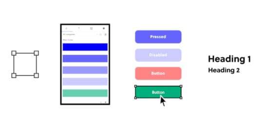
With a design system, the person in charge gains more control over product design and development. Meanwhile, the jobs of designers and developers become easier as designers used standardized and approved components in their work.
Moving from style guides to design systems with atomic design
Ben Shectman and his team chose to convert J&J’s style guides into a design system using atomic design. Atomic design works well for large corporations like Johnson & Johnson. Benefits of atomic design include:
Letting designers mix and match components to build new products.Relying on consistent, predefined pieces that maintain consistency throughout products.Updating existing designs doesn’t require nearly as much effort.When using atomic design to build design systems, you get to focus on five layers of complexity:
Atoms—the most basic, essential elements that get used to make everything else.Molecules—more complex structures built from multiple atoms.Organisms—the result of combining molecules (examples include search fields and navbars).Templates—a controlled environment where designers can place organisms.Pages—the final product that shows designers whether their approaches yielded the results they expected.All of these levels of complexity serve essential roles, but most design managers focus on giving their teams templates.
Create templates for designers, developers, and other employeesIdeally, your design system should include as many templates as possible to fill potential user needs. Designers should be able to open the appropriate template and drag organisms into it. Depending on the template, the organisms might snap into specific places based on their functions.
For an example of how valuable templates are, watch J&J designer Gil Gerard Austria use one to transform an old employee search tool into a design that matches the company’s preferences and provides excellent functionality.
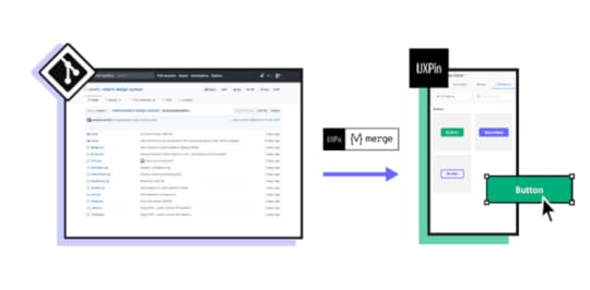
Build your interactive design system with UXPinUXPin makes it easier than ever for you to go from outdated style guides to interactive design systems. The team at J&J chose UXPin in part because it helps in creating an interactive design system that shows all clickable components and helps a lot in user testing.
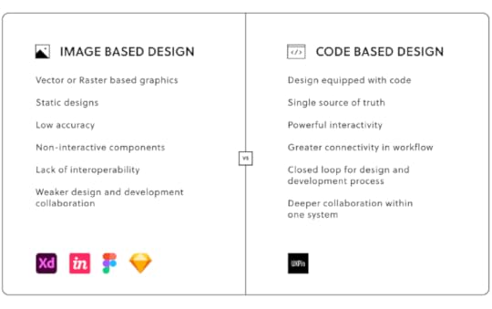
The interactive design system solves numerous problems often caused by image-based design, such as inaccuracy, static designs that don’t respond to interactions, and the number of back-and-forths with developers before establishing how exactly each component should look and behave.
Take your design system to the next levelIf you want to keep the consistency of your components with the end product, reduce the number of designer-developer back and forths, and eliminate the handoff drift, you should choose to design with code components.
Our Merge technology allows designers to use UI code components that developers already created and are stored in the coded design systems. This gives an ultimate single source of truth for the whole product teams, as designers use production-ready components in the designs that later on developers just search for in their libraries to build the product. Besides, the imported components are fully interactive, which means that the prototype will look and behave just like the end product!
Reading about the benefits of design systems and code-based design doesn’t always communicate how much more effective tools like UXPin Merge work. Experience the advantages yourself by requesting access to UXPin Merge.
Discover MergeThe post How to go from a style guide to a design system appeared first on Studio by UXPin.
May 28, 2021
The Benefits of Turning a Static Style Guide into an Interactive Design System
Static style guides have a role to play in keeping digital products on brand. When it comes to actually designing products, though, interactive design systems make it much easier for professionals to create products that meet project goals.
Where style guides can succeedStyle guides have been around for much longer than anyone creating new designs today. They play essential roles in everything from choosing the right font for a newspaper to telling academics how to cite their sources.
Style guides have fallen out of favor — they’re in the process, at least — but they offer essential information that you can use to create interactive components and design systems.
If you take a new job leading a design team, you’ll be glad that the company already has a style guide for you to follow. Without one, you have to start from the very beginning. Considering that it took the design team at Johnson & Johnson about six months to turn their static style guide into an interactive design system, you don’t want to undertake the task of starting from scratch.
The failures of static style guidesAll design teams need guidelines that help them build products that conform to expectations. Static style guides, however, fail to meet today’s real-world needs in several ways.
Static style guides cannot evolveA static style guide never really changes. You can release a new version, but you cannot update the one you have already made. That’s the unfortunate fate of all static things.
What happens when you update the style guide to reflect changes in the company’s branding? Can you replace every copy of the old guide saved on computers throughout your organization?
You can try to collect every old version and replace them with updated copies, but someone will inevitably keep and use the outdated one. There isn’t much that you can do about it.
Static style guides only offer limited guidanceIt might sound obvious that a style guide only offers guidance. What else should you expect from a style guide except to guide your designs? The challenges will become more evident in the design systems section below.
If you have used a static style guide, you have probably found yourself trying to compare your design to the image in a style guide. A good guide will tell you the distance between each line of text, but that doesn’t mean it will look exactly how it does on your screen.
Static images also can’t show you how a feature should function. Does a menu drop down when you click a button, or does it open off to the side?
You can follow to the best of your ability, but the guidance only goes so far before you find yourself making decisions without an authoritative source.
Why interactive design systems work better
Interactive design systems solve all of the problems mentioned above.
Evolution is the nature of interactive design systemsCritically, interactive design systems give you a single source of truth for designers that you can update when needed. Design leaders commonly use design tools to give their teams access to design systems. When you update the design system, the changes happen globally. They don’t just apply to your copy. Everyone who views the design system will see the changes you made. In UXPin they will even get notified if some components are out of sync, and will give you a chance to update it fast.
https://uxpincommunity.cdn.prismic.io/uxpincommunity%2F96af2d89-de72-4c10-887e-943b05148f10_updatecomponents.mp4Interactive design systems offer drag-and-drop functionalityWith an interactive design system, no one has to worry that they aren’t following guidelines correctly. Instead, they can use drag-and-drop functionality to place components into their design environments. Of course, they can make adjustments — such as fixing spaces or adding new text — but the components are pixel-perfect.
Start with UXPin to make interactive design systems you controlUXPin is one of the most advanced designing and prototyping tools available. You can create your own design systems or rely on popular options like Material Design.
Regardless, you get an elegant, code-powered way to design and prototype products. If you want to tear down the wall that keeps designers and developers separated, try our editor with a boost of Merge-technology that powers two integrations: with Git repositories and Storybook. Now, you can connect UXPin to the places where your developers store production-ready components and import them to our libraries. It allows you to design with interactive components by just drag and dropping them on the canvas. The future is now as you can build high-fidelity prototypes in minutes and relieve the pain of a troublesome handoff.
Request access to Merge today to see how much easier managing your interactive design system becomes when you have a code-based tool on your side.
Discover MergeThe post The Benefits of Turning a Static Style Guide into an Interactive Design System appeared first on Studio by UXPin.
May 27, 2021
What is a single source of truth, and why do you need it?
Lead designers need to make sure they keep their team members on the right path. Managers have tried several methods to reach this goal, including pattern libraries and style guides. While those options have a place to play within some organizations, they don’t always provide the single source of truth that you need to optimize design efficiency and avoid mistakes.
Defining the single source of truthToday’s design and prototyping tools tend to rely on design systems as a single source of truth. The design system should include everything that employees involved in product development need to conform to the company’s brand identity and align with all expectations.

When using a design system as your single source of truth, you will likely establish approved:
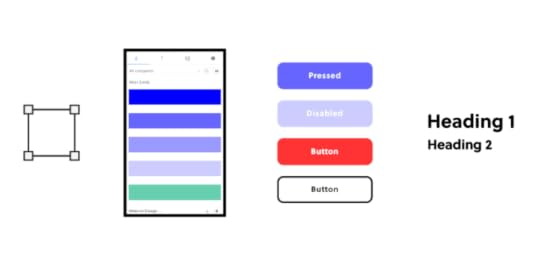
Color palettesType scalesIconsButtonsFormsSlidersKeep in mind that you can use a pre-existing design system or create a unique one for your team’s products. Building a new design system takes time, so a lot of smaller design groups decide to use options like Material Design, which already gives you a library of attractive, functional components that you can add to designs easily.
Other popular design systems include:
Design Language (from IBM)Fluent Design System (from Microsoft)Human Interface (from Apple)While you can save time and energy using one of these as your single source of truth, you lose a little control over your aesthetic. Plus, a lot of designers already use these design systems. You might find that developing an independent, single source of truth helps your brand stand out from the crowd.
If you decide to make a new design system, you can build it with atomic design. UXPin has a useful checklist that will help contribute to your atomic design system’s success. You should also consider reading Creating a Design System: The 100-Point Process Checklist (don’t worry. It’s free).
Why you need a single source of truth (more than you probably know)Establishing a single source of truth gives you benefits way beyond controlling what components, icons, and color schemes your designers use. Depending on how you approach your design system and the tools you choose, you can make work much easier for everyone on your team.
You provide everything designers need to build productsIn a very loose way, this is something that you already expect static style guides to do. When someone has a question about what color to use for the homepage’s background, they can consult the style guide. When someone isn’t sure how far apart to place lines of text, a style guide provides the answer. However, if you want teams to reuse some elements that are already in-line with the company standards, then an interactive design system comes in handy.
You can decide to go one step further by linking designers’ single source of truth and developers’. Bring fully interactive and developed components to your design editor so that you can prototype with the production-ready components right away. Then you get a library of approved components that they can drag and drop into their design environment.
If someone needs to build a new app that lets employees request days off, they can find the appropriate interactive elements, drop it into the design environment, and tweak individual fields to meet their goal. Most of the work has already been done because someone has created reusable components that serve frequent needs.
It also removes all the inconsistencies in the handoff process. As both designers and developers use the same components, there’s no way that those can be off in the prototype. Using the ultimate single source of truth for product teams will cut down not only the designing time, but also the development process as the reusable components are already coded.
No one ever has an outdated design systemIf you’re old enough, think back to the time that everyone relied on printed style guides. A good style guide would tell you just about everything you could ever need to know while designing a new digital product.
Even when companies started to digitize style guides, they usually turned them into PDF files.
Digital style guides seem great until you have a better option. After all, you don’t have to print pages and pages of instructions anymore. You can just send a single document to everyone via email. Easy!
Except that something always goes wrong. Last year’s style guide doesn’t necessarily conform to this year’s standards. Even last month’s style guide might not conform.
When everyone has a static document that tells them what to do, they may end up using the wrong edition. It’s a challenging situation that always seems to happen.
With a design system, though, no one ever has an outdated guide. When you update the library, everyone who accesses it from that moment on sees the change because you keep the library in a centralized location that you control. You can build one in UXPin and keep everybody up to date.
If you integrate your design tool with developers’ Git Repository or Storybook where the ready components are, you literally have one source of truth. When developers change elements, your design library and the projects get automatically updated. Also, the designs are code-powered so everything will synchronize and display exactly the same as in your devs’ libraries or repositories. There’s no need to worry about components, colors, typography and more being off.
A single source of truth saves everyone timeMaking a design system that serves as your single source of truth will certainly save your designers some time because they don’t need to consult style guides or knock on your door to ask questions.
But if you really want to drastically cut down the time of design and development phases, you should consider syncing your design editor with developers’ repositories and libraries. PayPal compared designing with interactive code components vs. pixel-based components, and the first method turned out to be over 6 times faster! Several companies use code-approach to improve their product design, development models. Learn how PayPal took advantage of UXPin Merge’s code-based design to streamline development with a small design team.
UXPin Merge makes every step easierDon’t waste your energy and time with static style guides and design software that isn’t code-powered. UXPin powered by Merge technology gives you a better option that helps you create a single source of truth, give your designers the interactive and production-ready components they need to work efficiently and save time when your prototype reaches developers.
Discover MergeThe post What is a single source of truth, and why do you need it? appeared first on Studio by UXPin.
May 26, 2021
「リモートデザインスプリント」ガイド

リモートデザインスプリントは、都市や世界のさまざまな場所でコラボレーションする人が増えたことで、ますます人気が高まっています。コロナウイルスの大流行はリモートワークへの移行を加速させましたが、企業は社員やフリーランサーを場所ではなく才能に応じて雇用することで、より強力なチームを構築できることを発見したため、この傾向は2020年よりずっと前から始まっていました。
より多くの企業がリモートワークを採用するようになると、デザインスプリントのアプローチを更新する必要があります。以下のガイドは、リモートデザインスプリントをスムーズに進め、できるだけ苦労せずに素晴らしい結果を出すために役立ちます。
リモートデザインスプリントのチームを作る(そして確認!)
デザインスプリントの2、3週間前に、参加できる人に連絡を取り、参加できるかどうか確認します。チームを作るには、適切なスキルを持った人たちを集めるだけでは不十分です。全工程に参加できる人を選びましょう。
リモートデザインスプリントに参加する人はプロジェクトによって異なりますが、通常必要となる役割は以下の通りです:
ファシリテーター(最低1名)
グラフィックデザイナー
イラストレーター
アニメーター
コーディング経験のある開発者
全員が参加するために必要なツールを確保する
全員がオンサイトで作業する場合、デザインスプリントを成功させるために必要なツールが揃っているかどうかを簡単に確認することができます。リモートでのデザインスプリントでは、そこまでコントロールできません。スプリントの2、3週間前に参加者と連絡を取り、プロジェクトに必要なものがすべて揃っているかどうかを確認します。
具体的な基準を設定することで、最良の結果を得ることができます。リモートコラボレーションでは、チームのメンバーが異なるツールを使用しているとうまくいきません。少なくとも、フォーマット上の問題が発生することが予想されます。
メモを取る
メモアプリを使えば、チームのメンバーが全員のアイデアとファシリテーターが下した最終決定に追いつくのが簡単になります。お気に入りのメモアプリには次のようなものがあります:
Evernote
Microsoft OneNote
Google Keep
Notion
ホワイトボード
チームメンバーはリモートでブレインストーミングをする方法を必要としています。多くのオンラインツールが、アイデアを素早く共有するためのバーチャルスペースを提供しています。代表的なものを紹介します:
Miro
Sketchboard
Stormboard
Conceptboard
Explain Everything
テレビ会議
チームは、全員がカメラをオンにすることで、最高の結果を得ることができます。すでにお気に入りのテレビ会議アプリをお持ちの方もいらっしゃると思います。まだお持ちでない方は、以下をご検討ください:
Zoom
Google Meet
GoToMeeting
コラボレーションによるプロトタイピング
チームが遠隔地でコラボレーションできるデザインアプリはたくさんあります。しかし、効果的なスプリントを行うためには、デザインアプリだけでは不十分です。クロスファンクショナルなチームがシームレスにコラボレーションできるツールが必要なのです。そうすれば、コーダーからアニメーターまで、同じプラットフォーム上でリアルタイムに共同作業を行うことができます。
UXPin は、リアルタイムのプロトタイプコラボレーションに最適なオプションです。UXPinは、チームのメンバーが必要とする機能をすべて備えています。さらに、プロジェクトのリンクをクライアントやデザインスプリント以外の人に送ることもできます。UXPinのアカウントを持っていなくても、作品を見てフィードバックを残すことができます。UXPinのアカウントを持っていなくても、あなたの作品を見てフィードバックすることができます。
デザインスプリントの前に短い練習セッションを行う
チームの全員が必要なツールの使い方を知っていますか?スプリントの1日か2日前に、短い練習セッションを開催して、問題点を解消しましょう。デザインスプリント中に問題を発見するのではなく、今、問題を発見する方がはるかに良いのです。
練習セッションでは、何が起こるかわかりませんが、以下の点に注意してください:
インターネットの速度が遅く、リアルタイムでの共同作業が困難である。
OSやソフトウェアが古く、アップデートに対応していない。
カメラやマイクの問題。
必要なツールに全員がサインオンできるかどうか。
気になることがあったら、すぐに相談してみましょう。誰かにソフトウェアへのアクセス権を与えるだけで、解決できるかもしれません。練習中は何の支障もありませんが、リモートデザインスプリント中に深刻な混乱が生じる可能性があります。
各リモートデザインスプリントに固有のスケジュールを設定する
各リモートデザインスプリントには、プロジェクトに合わせた独自のスケジュールが必要です。しかし、スケジュールの作成は、スプリントの開始と終了の時間を設定するだけではありません。スプリントの開始時間と終了時間を決めるだけでなく、関係者全員がスプリント中に何をしているのかを正確に把握する必要があります。
チームや目標に合わせて、どのようなスケジュールでもよいのです。チームによっては、ポモドーロ・メソッドに基づいて25分間のスプリントを繰り返すとうまくいく場合もあります。この方法によると:
全員が同時にスプリントの作業を開始する。
全員が25分間の作業を終えたら終了する(言い訳や延長は禁止!)。
スプリントとスプリントの間に5分間の休憩を入れ、必要に応じてより長い休憩を入れる。
最初の数ラウンドでは、おそらくチームは何も画期的なことを思いつかないでしょう。しかし、最良のアイデアが明らかになるまでに時間はかかりません。スプリントが進むにつれ、チームのメンバーは製品に最適なコンセプトに集中できるようになります。

短いスプリントの間に5分間の休憩を取るだけでは、チームは期待できません。長めの休憩は、スケジュールの中で意味のある場所に配置します。例えば、正午に45分の休憩を取り、全員が昼食を取れるようにします。
リモートデザインスプリントでチームが守るべきルールを決める
デザインスプリントは、そのルールがあって初めてうまくいきます。対面式のスプリントでは、ルールが重要な役割を果たすことはご存知の通りです。リモートデザインスプリントでは、さらに重要な役割を果たします。
対面式セッションでのアプローチがリモートプロジェクトでも通用すると思わないでください。多くのプロジェクトマネージャーは、自分のオフラインのテクニックがリモートスプリントでも良い結果を生むと勘違いしています。対面で頼りにしているテクニックの中には、バーチャル環境では通用しないものもあります。
あなたのスプリントのルールは、チームの弱点と強みによって変わります。一般的には、軌道に乗って素晴らしい結果を得るために、次のようなルールを使うとよいでしょう。
一度に発言できるのは一人だけ。複数の人がオンラインで一度に発言すると、カオスになる。
発言したい人を承認し、ルールを徹底できるファシリテーターを任命する。
常にビデオを見ながら、一緒に仕事をしているという印象を与え、チームメンバーにはスケジュールに従う責任を持たせる。
全員が画面を分割して使うか、複数の画面を使うこと。作業中にビデオアプリとデザインアプリを切り替えることはしない。
マルチタスクを禁止して、今の作業に集中してもらう。前のステップをスキップしたり、前のステップに戻ったりしない。
UXPinの無料トライアルを開始し、リモートデザインスプリントを成功に導く方法をご覧ください
UXPinは、今日のチームのニーズを満たすコラボレーションデザインおよびプロトタイピングツールとして開発されました。リモートデザインスプリントへの依存度が高まるにつれ、チームが完全に機能するプロトタイプをリアルタイムで作成できるUXPinのようなプラットフォームが必要になってきます。
今すぐUXPinの 無料トライアルを開始して、今日のデザイナーの仕事の仕方に合わせて作られた機能を持つツールがあれば、スプリントがどれだけ楽になるかを実感してください。
The post 「リモートデザインスプリント」ガイド appeared first on Studio by UXPin.
製品設計・開発モデルを改善する方法: PayPalからの教訓
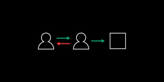
一般的な製品モデリングプロセスは、部門間の行き来が多く、非効率なコースを辿ります。従来の製品設計・開発モデルのライフサイクルでは:
プロジェクトマネージャーがアイデアを出し、それを文章化してデザインチームに送ります。デザイナーは、プロジェクトマネージャーが書いた指示を解釈し、それをイメージに変えなければならないデザイナーは、開発者にそのイメージを伝える開発者は、コーディングの経験を生かしてイメージを再現し、機能を追加するプロジェクトマネージャーは、開発者が作った製品の機能を確認し、修正を依頼するこのプロセスは、プロダクトマネージャーのビジョンを実現するまで繰り返されます。
PayPalのデザインチームは、このような従来の方法論に問題があることを認識していました。PayPal社のデザインチームは、このような従来の手法の問題点を認識し、会社のニーズに合った、より合理的なアプローチを生み出しました。ここでは、PayPal社のアプローチが、自社のプロセスを改善するためのヒントになることをご紹介します。
目次へ移動製品モデルのプロセスを、コードベースのシステム的なアプローチに移行するプロダクトマネージャーやチームがデザインを行えるようにする再利用可能なテンプレート、ビジュアルアセット、およびインタラクティブコンポーネントのライブラリを構築する開発者を軌道に乗せるための重要なガードレールを確立する新しい製品の開発者がデザイナーとの時間を簡単に設定できるようにする製品開発を効率化するためにUXPin Mergeを採用する製品モデルのプロセスを、コードベースのシステム的なアプローチに移行する
従来の製品モデルプロセスがビジネスモデルを阻害し、収益性を低下させることは、少し考えればわかることです。PayPal社は、より効率的な製品を開発するために、部門間のサイロをなくし、開発者やプロダクトマネージャーが自分の仕事をよりコントロールできるようなオペレーションモデルを構築しました。
PayPalはこのアプローチをDesignOps 2.0と名付けました。デザイナーは、PayPalのステークホルダーが期待する美観や機能から逸脱することなく、誰もがさまざまな製品を構築するために使用できる資産を作成しました。コードベースのシステマティックなアプローチにより、製品設計にかかる時間を半分に短縮することができました。
プロダクトマネージャーとチームにデザインをさせるPayPal社には、例外的な課題に取り組むことを厭わない、素晴らしいデザイナーチームがあります。社内でUX開発者の数が増えるのを見て、小さなデザイナーチームは適応することを決めました。彼らは、デザインチーム以外の人ができることの範囲を広げ、プロセス全体を改善しました。製品の設計・開発モデルを改善するために、彼らのステップをいくつか参考にしてみてください。
再利用可能なテンプレート、ビジュアルアセット、およびインタラクティブコンポーネントのライブラリを構築するPayPalのデザインチームは、誰もが利用できるオリジナルのデザインシステムを構築しました。物事を効率化するためには、このプロセスにデザイナーと開発者が必要ですが、彼らはそれほどハンズオンな役割を果たす必要はありません。プロダクトマネージャーは、ツールのワイヤーフレームを作るためにデザインチームにアプローチする必要はありません。その代わりに、デザインシステムを使って既存のテンプレートを探します。また、ロゴやボタンなどのビジュアルアセットも、デザイナーが独自に作成する必要はありません。
マネージャーがデザイナーや開発者に頼らずに製品を作るために必要なテンプレート、ビジュアルアセット、インタラクティブコンポーネントを含むデザインシステムを構築します。例えば、マネージャーが不具合を追跡するデジタルツールを追加したい場合、テンプレートを開き、ツールの目的を反映させるために変更を加え、プロトタイプをテストして意図したとおりに機能することを確認することができます。
おすすめの読み物: プロジェクトでReact.jsコンポーネントを使用する7つの最適な理由
開発者を軌道に乗せるための重要なガードレールを確立するコードベースのデザインコンポーネントは、マネージャーと開発者にある程度の柔軟性を与える必要があります。しかし、優れた製品管理は、人々が会社の美的感覚や期待される機能から大きく逸脱することを防ぐ必要があります。新しいIT製品が類似製品と同じように機能しなければ、ユーザーを混乱させることになります。
デザイナーは、自社製品の他のツールから離れてしまわないように、重要なガードレールを設定することで、全員が一線を画すことができます。
おすすめの読み物: コードでデザインする
新製品の開発者がデザイナーとの時間を確保しやすいようにするPayPalのデザインチームは、開発者が彼らの助けを借りずに製品開発作業の80%以上を終えることができることを発見しました。しかし、多くの従業員が使用する製品や顧客に送る製品には、デザインチームの意見が必要です。彼らは、開発者やプロダクトマネージャーが必要な指示を簡単に得られるようにしています。
まず、デザインチームは、デザイナーではない人たちができるだけ多くの作業を行えるよう、優れたトレーニングツールを提供しています。社員は3時間を超えるトレーニングビデオにアクセスできます。また、以下のこともできます:
60種類以上のプロトタイピングコンポーネントへのアクセス
オフィスアワーを設定して、デザイナーと直接またはバーチャルでミーティングができる
フィードバックや指示を得るためにSlackチャンネルを利用する
最終的には、デザインチームが製品をリリースする前に確認します。これは、デザインの正確性と機能性を確保するための最終ステップです。デザイナーが同僚を成功させるためのお膳立てをしているので、変更で追加作業が多くなることはほとんどありません。
おすすめの視聴方法: PayPal のプロダクトマネージャーである Sandeep Yeole 氏が UXPin Merge を使用して製品を構築する様子をご覧ください
製品開発を効率化するために UXPin Merge を採用するUXPin Merge は PayPal のデザインチームの成功に重要な役割を果たしています。UXPin Merge がなければ、この小さな部署はプロダクトマネージャーや開発者が製品を作るのを簡単にする、コードベースのコンポーネントでいっぱいのデザインシステムを構築することができませんでした。
承認されたすべてのデジタルアセットが目の前にあれば、数分から数秒でデザインの変更ができます。ある程度経験を積めば、デザイン部門以外の社員でも1時間以内に自分の製品を作れるようになります。
また、UXPinのプロトタイピング機能は、PayPalが完全な製品を市場に出すことをより簡単かつ迅速にします。UXPinのプロトタイプは、完成した製品と同じように機能します。プロトタイプは実際のデータを使用し、テスターがコンポーネントと対話し、複雑な製品のように動作します。デジタル製品のバグをテストすることは常に良いアイデアですが、UXPinのプロトタイプはほとんど微調整の必要がありません。
UXPin Mergeへのアクセスをリクエストすると、コードベースのデザイン、効果的なデザインシステム、完全に機能するプロトタイプの利点を発見することができます。このツールは、PayPalのデザイナーの仕事の仕方に革命をもたらしました。あなたもこのツールを使ってみませんか?
The post 製品設計・開発モデルを改善する方法: PayPalからの教訓 appeared first on Studio by UXPin.
May 24, 2021
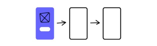
UXPin and Storybook Integration is Here!
There are many ways for product teams to achieve greater efficiency and consistency in the design handoff.
At UXPin, we believe that smooth communication between designers and developers is one of the most important factors in setting up an efficient and scalable DesignOps process for your business. In the ideal world, both designers and devs should speak a common language when building digital products together.
With our new release of Storybook integration rooted in Merge technology, we believe we are getting one step closer to reaching this goal.
The challenge behind design consistencyDesigning products with vector or pixel-based tools leads to endless inconsistencies during the design implementation. If you’ve heard it somewhere it’s because many design thought leaders like Nathan Gitter, or UXPin’s own founder, Marcin Treder have been echoing this statement for years.
The drift between design and the end product often boils down to one problem. The technology behind design tools to display the UI elements and what devs use to build the product for end-users is just completely different tech. What most designers do, is merely paint a picture with a visual representation of a digital product.
Think what would happen if instead of drawing text input with a rectangle and adding some text to it on a separate layer, designers could use a native input component where they could type something in. Or how about using an interactive component of a radio button that changes states, instead of drawing circles that mimic those buttons?
Some design tools (like UXPin) give you the code-based components as your building blocks. They look and behave the same way both in the design editor and as an end-product. It doesn’t require you to know how to code – it just gives you some common vocabulary to work better with devs. Great, but why stop there?
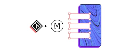
https://uxpincommunity.cdn.prismic.io/uxpincommunity/c6b35e5c-7a63-4e23-8e7b-754fd8696c89_0_forms_preview3invalid-wc.mp4As your company and product grow, you end up with different UI patterns, elements, and typography that are standardized by Design System and organized in your devs’ Git Repo – the ultimate source of all the shiny, finalized components that went through tons of revisions. All full of interactions and states.
Now imagine taking those code components from your devs repo and using them to build new parts of your product. Wouldn’t that just make sense?
 The code components as a common language
Some time ago UXPin came up with a revolutionary technology called Merge. It does exactly what we’ve just described: it allows you to plug into any Git repo with UI components and bring them to the UXPin design editor. The outcome of this integration has blown us away. Some of the biggest tech giants, like PayPal, adapted Merge technology and built the whole design process with its help.

PayPal measured that Merge sped up their design process over 6 times, and allowed them to remove product drift during the handoff to the absolute minimum. It really helped designers and devs speak one language. Whatever designer used in their prototype to build UI – the dev already had it in their repo as the same component.
As we kept talking with other companies, we realized how many of them face the same problems. That’s why we’ve decided to expand the Merge technology in two ways and bring more comprehensive design innovations to the market.
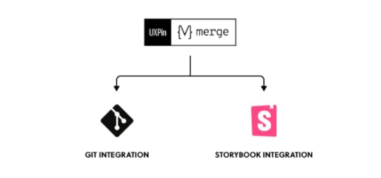
The first thing we have been working on is adding more frameworks to the existing Git integration. The second one was finding an alternative source of components developed by UI engineers. Something that would allow for a faster setup and supported a wider range of frameworks. The integration with Storybook seemed like a natural choice here.
What is StorybookIf you haven’t heard of Storybook, it’s about time. This great tool helps developers build UI components and pages in isolation. It simplifies testing and preparing on-point documentation. If devs or UI engineers want to turn a design Style Guide or a Design System into organized coded components, Storybook is a perfect place for that.
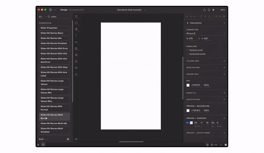
Storybook shared a list of really great examples of design systems and component libraries that are open to the public. All were built in Storybook, some of them by companies like: Audi, Shopify (Polaris), IBM (Carbon), or Airbnb (with date components). And yes, you can bring any of those libraries to UXPin and use those components in your prototypes.
How the integration worksFirstly, you need access to Merge technology in your UXPin account. If you haven’t requested it yet, you can do it here.
Then, just copy the link of the Storybook that you want to use (e.g. Audi’s), go to the UXPin editor and add the new library by pasting the link in the “Import Storybook components” box.
Yes, it’s that simple! Now you can design with the exact same components right away and play with all interactions on Preview.
If you want to get to know more about the integration, see our Docs.
Benefits of the integration Build advanced UI fastWith Storybook integration, you can build high-fidelity prototypes fast just by dragging and dropping code components on the canvas. They are fully interactive and behave just like an end product. On top of that, you can still add UXPin’s interactions to glue different UI patterns together into a truly immersive experience for user testing and show your team how the product should look. The whole process is extremely fast.
Besides speed, you also improve the design consistency. The Storybook components are in line with your production standards, so you don’t have to spend time matching the right colors, fonts, or rebuilding parts of the UI.
 Manage only one library
 There’s no need to take care of the UXPin and Storybook libraries separately. The components are in sync all the time, so whenever your Story (Storybook component) is changed, your designs and library in UXPin get automatically updated. These are the same code-powered components as in the Storybook library, so whatever works there, will work in UXPin.
Handoff revolutionAll those back and forths between designers and developers cost time and money. By using a single source of truth, you can remove the silos and speed up your product development process. There’s no place for handoff drift with design or interaction inconsistencies. When the prototype is finished, the developer just needs to find the components that designers used, in their Storybook. That’s it! Developing a product where you already have the code for design is much faster and clearer.
15 FrameworksUXPin’s integration supports all 15 frameworks that Storybook does, so it doesn’t matter whether you work with React, Vue, or Angular – the library imported to UXPin will work just fine.
 Try UXPin + Storybook integration with your team
Build prototypes that behave like real products and cut down your product development process. Request access for our Storybook integration, integrate with your library in under 1 minute, and get ready to design with code!
Try out Storybook integrationThe post UXPin and Storybook Integration is Here! appeared first on Studio by UXPin.
May 20, 2021
The Guide to Front-End Prototyping
Front-end prototyping is the making of a simulation of the final design. It’s a sample of how the final product will look and feel. This gives the design team something tangible so it can assess its functions, plus it helps uncover flaws.
Teams can test the prototype before investing time, money, and labor. Stakeholders can give feedback and approve the next phase.
Why front-end prototyping?A prototype helps clarify the goals of the product and how to move to each phase in the project.
It gives stakeholders a first look at the design.UX teams can test the feel of the product.It shows the design’s states in the context of the product.It helps reveal those pesky algorithms that output nonsense.Front-end prototyping begins with the endIt’s easy to fall in love with all the bells and whistles in a design and forget that the goal is a good user experience (UX).
As a UX designer, it’s important to get inside the users’ heads. Get to know their pain points. What frustrates them? What are their goals and aspirations?

There are some useful UX marketing tools that let you “tell the story” about your target user.
User personas. These are fictional characters that represent your end user. You can have 1 to 3 personas for each product.User stories. These are brief tales of your user personas using the design. They can help you avoid adding features that aren’t useful.User scenarios. These help you connect your UX design with the personas and their goals.Customer journey maps. By mapping out user behaviors and emotions before, during, and after can help you predict users’ needs before they are even aware of them.Although these are fictional portrayals, they should represent real people and real events. In other words, you build them from what you learn from user research.
Static front-end prototyping
A front-end prototype could be almost anything. You could scribble it on a paper napkin, in a notebook, or on a whiteboard. You could create it in Photoshop or Illustrator. Static prototypes like these can show how the product will look, and they can show how the user interacts with it.
Suppose you’re designing a mobile website for a restaurant where customers can order carryout. You’ll need to design the prototype to show user interactions and screen states while placing an order.
Create account. The prototype should mimic the process of setting up the account. Suppose research shows that restaurants get more orders when users create the account at checkout. The prototype should simulate user input at the checkout.Log in. Here the prototype would show the input fields. It also needs to show the response if the user enters incorrect info. It would also show the screen state if the user tries to log in when he or she hasn’t yet created an account.Ordering. The prototype would have the menu categories (main dishes, sides, drinks, etc.) It would show how the site behaves when the user chooses a category. It should also show how the product appears on the screen when it’s selected from a category.Checkout. Shows how the user enters payment information, saves it for future orders, etc.Arrived for pickup. Simulates how the user announces their arrival at the restaurant. For example, if the restaurant has curbside service, the user can enter a parking space number.But suppose the restaurant also wants to let customers reserve a table in the dining room. The prototype would show how it presents the options of order carryout and reserve a table.
A static prototype might present the product like this:
The home page. In this example, you can order carryout or reserve a table. The prototype shows the buttons taking them to the carryout page and the reservations page. Arrows or lines could join to drawings of those pages.Carryout. Here it shows the layout of categories.Main DishesSidesDrinksReservations. Shows which tables are available.TableBoothPatioBarCheckout. Represents how the user completes a carryout order.Login/Create Username and password if neededPayment infoConfirm orderArrival. This tells how the user alerts the restaurant staff.Curbside parking space numberArrived for reservationYou could arrange each of these like a flowchart so it communicates what each piece of the prototype does and how the product will look.
But it doesn’t allow user interaction.
Interactive front-end prototyping
An interactive prototype is better because UX teams can get a feel for the design. With feedback from product testers, you can improve the prototype before moving to the next phase.
Home page. The interactive prototype lets you test the links by choosing carryout or reservations.Carryout. Here you can see how the button and other graphics look. You can tap the button and judge if the design needs improvement.Reservations. You can evaluate the UX of reserving a table. You can see how it shows which tables or booths are available, whether there are patio and bar tables available, and what times you can make the reservation.Checkout. You can see whether the site makes it easy to enter and save payment info, save favorite orders, etc.Arrival. Demonstrates how you let the restaurant staff know you’re there.Front-end prototyping with codeUsing code in front-end prototyping is solves all your problems connect with static, vector-based design. Let’s say it’s the “real” front-end prototyping. With UXPin powered by Merge technology, you can import coded components for your prototype to the library in UXPin. This makes it much simpler when you move the project forward.
Designers don’t need coding expertise.Engineers can work with design elements already coded.Design ops teams can build prototypes that serve both designers and engineers from a single source.Since you’re working directly with code, you won’t need to translate it later. That helps design editors avoid making complex codes that can be a nightmare to fix and remove the whole design-dev process.
Merge not only makes your prototype functional but also lets you do that easily and fast, just by drag-and-dropping the component on the canvas. You don’t need to add any interactions unless you want to. Merge technology is the ultimate front-end prototyping as you just focus on UI, forgetting about the back-end with the production-ready components.
It’s easyYou don’t have to reinvent the wheel. You can import coded React.js components from your Git repository like Github or Bitbucket to the UXPin design tool and make the most of what you already have.
Try UXPin powered by Merge technology to start designing with code components and cut down your product’s time to market.
Discover MergeThe post The Guide to Front-End Prototyping appeared first on Studio by UXPin.
May 19, 2021
6 Articles to Improve Your User Research
User research can give you insight into what aspects of your design do and don’t work. Learning how to perform customer research, however, takes some time and instruction.
The following six articles should help you find effective ways to conduct user research that leads to better designs and higher adoption rates for your digital products.
Explore the lessons you learn from these articles by experimenting with UXPin’s designing and prototyping tool. Sign up now for a UXPin free trial with no credit card required.
1. How to Conduct User Experience Research Like a Professional (Career Foundry)Career Foundry writer Raven L. Veal provides an in-depth article that will show you several ways to collect information from users. She starts by breaking down the differences between good and bad UX research, an essential step that will lead to better results as your skills improve.
[image error]The bulk of Veal’s article provides introductions to user experience research methods, including:
User groupsUsability testingUser interviewsOnline surveysUser personasUser research analysisSet aside 20 to 30 minutes to read this entire primer. Practically everyone will learn something valuable from it.
Additional reading: The UX Designer’s Guide to Lean User Personas
2. The Ultimate Guide to Doing Kickass Customer Interviews (User Interviews)As a UX designer, you might not have much experience conducting interviews intended to gather specific information. You might not have spent any time interviewing other people in a professional way. Carrie Boyd’s “Ultimate Guide to Doing Kickass Customer Interviews” does just what the title says: teach you how to interview users for actionable information.
Boyd provides specific tips for different types of interviews. She writes sections about developing customer interviews that will help you decide whether:
Customers like your design.Users enjoy your product’s new features.Your target audience wants to buy your product.After establishing the basics, she guides you through:
Prep work to do before the interview.Conducting interviews.Sharing information learned from interviews.Taking action based on what you learned.If you want to conduct interviews to connect with your users, go over Boyd’s guide to improve your process.
Sign up for a UXPin free trial to see how much your customer interviews influence your UX designs.
3. Usability Testing 101 (Nielsen Norman Group)Nielsen Norman Group has decades of usability testing experience, so take your time learning as much as you can from this entry-level guide.
Although the article doesn’t get into the weeds of usability testing, it provides a surprising amount of information, including:
What you can learn from usability testing.The core elements of usability testing.Types of usability tests.The cost of usability testing.After the article, you will find a long list of helpful resources. Choose the ones that apply to your situation so you can pick up more tips about how to make the most of usability testing when improving your UX designs.
Additional reading: The Guide to Usability Testing
4. The different types of usability testing methods for your projects (hotjar)Hotjar covers three types of usability testing and compares the pros and cons of how you can approach them. The usability testing options compared in the article include:
Moderated vs. unmoderated.Remote vs. in-person.Explorative vs. comparative.You will also learn about guerrilla testing, session recordings, and other strategies that could improve your user testing and customer interviews.
5. A/B Testing: Optimizing The UX (Usability Geek)A/B testing can help you choose the better of two UX designs. That sounds great until the time comes to perform A/B, and you realize you don’t know how to conduct a rigorous study that optimizes your UX.

Nicholas Farmen lays out the basics of A/B testing in an easy-to-follow language in this Usability Geek post. He covers topics like:
Writing a hypothesis.Making a controlled test (Test A).Making an altered test (Test B).Comparing results.The article offers preliminary advice, but it also serves as a teaser for Usability Geek’s online course, Conducting Usability Testing.
6. Creating a user research plan (with examples) (UXPin Blog)This article from UXPin is perfect for anyone struggling to take a strategic approach to conduct user research. The advice gives you step-by-step instructions that include examples of how you can create and implement each step.
[image error]UXPin will show you how to establish:
A background that explains why you want to collect information from users.Plan objectives that line up with your metrics and KPIs.A UX research plan methodology that should get you the information you need.Participant profiles that help you determine which users you want to recruit.A research timeline that holds everyone involved accountable for meeting milestones.If you have a general idea of what you want to get from your user research—but you don’t have a solid plan for how to get the right information from the correct users—you will learn important lessons from this article.
Try UXPin to build wonderful designs based on user researchUXPin gives you a collaborative workspace where you can create designs and generate prototypes. You can also make design systems that establish approved assets and guardrails for projects. If your user testing shows that you need to update your design system, you can do it easily from within the application. It will update everyone working on your project.
Experience UXPin’s features for free by signing up for a 14-day trial. It doesn’t cost anything, and you will get an opportunity to experience one of the world’s most robust cloud-based design platforms.
The post 6 Articles to Improve Your User Research appeared first on Studio by UXPin.
May 17, 2021
10 Useful UI/UX Design Articles for UX Practitioners
Check out these 10 useful UI/UX articles on interface design as picked by our design team. Learn more about the latest news from the design world, mistakes to avoid, and all the best practices that you should keep up with.
1. Zero UI: The End of Screen-based Interfaces and What It Means for Businesses (Inkbot Design)
Zero UI is a style that’s been looming in the shadow for some time but is really starting to emerge now. The idea is easy to understand — the less the user has to think about the interface, the better and more natural it feels. This article explains the specifics, and how this style is changing everything.
2. Why User Experience is Vital for Quality SEO (Entrepreneur Magazine)UX articles don’t cover the SEO side of things as often as they should, but this article on Entrepreneur shows why UX and UI design is so important. SEO and UX go together when creating any type of content since no one will share something that just feels awkward.
3. UX Writing and UX Design: How to Bring Them Together (UXPin Blog)Most designs start out with either the writer creating the content or the UX framework. It’s only later that the two come together and they need to make sense and enhance each other for the ultimate user experience. This article from our very own blog shares just how to mesh these two integral parts of UX designs in a way that will enhance the final experience.
4. Why UX Design is an Important Consideration (Business Matters)Why is user design so important? This article by Business Matters is short and to the point. If you’re still not sure why you should be paying so much attention to UX, this is a must-read.
5. UX/UI Design Trends That Will Dominate 2021 (Ideamotive)It’s essential to keep up on the latest trends in UX design and this is one of the best UX articles for that. You’ll learn what is hot this year and where you should focus your efforts on design. With technology improving constantly, there’s no reason not to lead the pack.
6. The 5 Biggest UX Mistakes Turning Your Users Off (Jeff Bullas)In addition to staying on top of trends, it’s a good idea to know what the most common mistakes are in UX design. Irina Linnik lays out the top mistakes designers make when it comes to user experience, so you can avoid them.
7. White Space in UX Design (Medium)An article all about how fulfilling nothing can be. This piece explains how negative space (white space) can increase comprehension and readability, and also influence the visual hierarchy of a screen.
8. Eye-Opening Examples of Good & Bad UX Design (Adobe)Need to see some actual examples of UX designs that absolutely rock it? Matt Rae has put together this incredible article that shares both good and bad UX designs. Use it to compare your own designs and give them a boost.
9. The Stages of UX Design Process (UXPin Blog)Good UX articles provide you with education and information that you can actually use. This one is no exception, sharing the very detailed process of UX design, step by step.
10. 8 Psychology-Based Design Hacks That Will Make You a Better UX Designer (Usability Geek)Chintan Bhatt takes you on a unique journey through the world of psychology when it comes to UX design. It’s a lot more mentality-based than you might expect.
TakeawayIf you’d like to take your design knowledge to next level, check out many of our downloadable UI/UX design books, all for free.
The post 10 Useful UI/UX Design Articles for UX Practitioners appeared first on Studio by UXPin.
UXpin's Blog

- UXpin's profile
- 68 followers

