
UXpin's Blog, page 74
September 1, 2021
What Are Storybook Args and How They Improve Your Storybook
In recent times, there has been an increased focus on having a pixel-perfect UI that is not only visually stunning but also fulfills the requirements of the user effectively. This renewed focus on UI has resulted in a massive growth in tools, frameworks, and environments that aid this movement. Storybook is one such tool that helps make UI development faster and easier.
Today, we take a brief dive into understanding Storybook and how Storybook Args can be helpful for us. We start with taking a quick look at Storybook and discuss some of its massive advantages. Then we move on to an overview of args and how we can use them.
Table of contentsWhat is StorybookWhy use it when developing UIWhat Exactly are Args How to Use Storybook ArgsComponent ModificationConclusionWhat is StorybookFor the uninitiated, Storybook is a development environment for UI components that allows you to create and test components in an interactive and efficient way. You can easily browse a component library and view the different states of each component via Storybook. It serves also as an interactive design system for developers.
Using Storybook, you can create different ‘Stories’. A story is a place where you can add your components and create and test various use cases in a sandbox environment. Storybook enables you to create small standalone components as well as complex pages for your web application.
Storybook provides a whole ecosystem that makes it easy to learn, implement, test, and document the whole UI design process. You can start by installing the Github starter project. Storybook also provides detailed documentation as well as interactive tutorials that can help you become acclimated with the ecosystem.
Why use it when developing UIThe best thing about Storybook is that it is an open-source tool. This in itself is reason enough for proponents of the open-source community that are on the lookout for a robust UI development tool.
Apart from the fact that it streamlines UI development, testing, and documentation, one of the standout features of Storybook is the sandbox environment that allows you to build UIs in isolation. This enables you to shift your focus where it matters most, i.e. on implementing the right components and pages. In the meantime, you can forget about data, APIs, and business logic.
Storybook also allows you to mock hard-to-reach use cases, such key states can be a bit difficult to reproduce in the app but Storybook makes it extremely hassle-free.
It also allows you to generate timely feedback by allowing your team to witness how the UI actually works. Storybook also comes with handy addons like Storybook Docs — allowing you to write high-quality, customizable Markdown/MDX.

Storybook Args provide us a better way to write stories by enabling stories to receive dynamic data through input arguments. They not only reduce the size of the stories but also allow portability, as well as the ability to reuse fixture data across multiple stories.
Another way of understanding Args is to view them as an instrument deployed by Storybook to define arguments in a distinct JavaScript object. This helps to live edit components. It must be noted that there is no need to change the underlying component code in order to use Args.
How to Use Storybook ArgsFirst, let’s take a look at what an Args object is. The Args object is a serializable object in JSON. It comprises string keys that come with matching valid value types. These keys can be passed into a component for your framework. There are two ways to define an Args object; the story level and the component level.
At the story level, the args CSF story key is used to define the args for a single story to which they are attached. It may be reused via a JavaScript reuse object. In contrast, at the component level, the args apply to all the stories of the component. This holds true unless they are specifically overwritten.
The arguments of a story can be separated to compose in other stories. This can be extremely handy in writing stories for composite components, i.e. such components that are created by using various other components. These composite components can pass arguments as it is to their respective child components. Args allow us to directly compose the arguments.
Another way of setting Args is via URLs. Args for the active story can simply be overruled using the args query parameter in the URL. This may be done manually by altering the URL or can be automated with the help of an addon called Controls. To enhance security, there are certain restrictions on the args defined by this method. For instance, only alphanumeric characters, numbers, spaces, dashes, and underscores. The Args that are implemented through the URL extend and override the args specified by default.
Component ModificationMerge technology provided by UXPin makes your life easier by allowing seamless integration of your own Storybook or any existing public Storybook. You can check out the step-by-step guide on storybook integration here. The code-based components can be brought into the interactive world of UXPin and you can get going with your design in minutes by using production-ready, interactive components for prototyping.
Args allow you to effortlessly change the properties of components in UXPin’s design editor instead of doing that in the code. The great thing is that you don’t even need to have prior coding experience and can still build industry-standard prototypes. You don’t even need to worry about the specific Storybook framework as all frameworks are supported.
ConclusionThere is no doubt that Storybook is a complete UI development ecosystem that provides an interactive and user-friendly way to design and test UI’s. Its ease of use and immense flexibility has made it one of the leading UI development tools in the industry.
UXPin allows you to harness the power of Storybook and has incorporated an easy way to benefit from Storybook args through its Merge technology. This enables you to easily solve all design-related issues and create stunning designs that are consistent with the final product.
The post What Are Storybook Args and How They Improve Your Storybook appeared first on Studio by UXPin.


August 31, 2021
Why You Should Switch to Code-Based Design

Since the very beginning of digital product design, the default way of designing user interfaces has been image-based. Designers have been drawing different states of the mobile app or web designs using graphic design tools – GIMP, Adobe Illustrator, Fireworks, Sketch, or now Figma, Invision, Adobe XD – and then the development teams have been writing code that would replicate what has been drawn. But over the years this method has proved to have considerable limitations. What limitations are those and is there an alternative? Read on to find out.
The Problems with Image-Based DesignIn the image-based design approach, designers produce a set of static artboards representing different states of the interface and forward them to software developers to code interactive interfaces on their basis. This brings about a lot of troubles for not only the UI design but also the whole product development process – let’s have a closer look at them.
 Lack of interoperability: There is virtually no connection between designers’ and developers’ universes. Designers work outside of the constraints set up in code and therefore, unknowingly, create things that are very difficult and expensive to code. Lack of accuracy: As the image-based tools use completely different methods for rendering the result of the designers’ work, texts, gradients, and colors that have been carefully chosen look different in code when an engineer applies the same specs. Some details are missing and some ideas that looked great on a static image are simply impossible to recreate on an actual working product. The handoff then turns into a nightmare.
  Static designs: Image-based design only allows for building static artboards, so even simple behaviors (e.g. expanding a dropdown) quickly become unmanageable. Interactive components can’t be reused and there’s no way of setting states of elements, defining variables for content, or using conditional logic. There are prototyping tools out there that fake the interactions but none actually use the ultimate language that creates the clickable elements in real life – the code. Weak design-engineering collaboration: Even if you use a style guide or a design system, image-based design tools are completely separate from the engineering processes. They’re rather abstract and – unlike technologies used by developers – can’t be experienced by users as the final product. This lack of interactions or having very limited ones, and the inability to import components from code keeps engineers and designers disconnected and frustrated with one another. As a result, not only the handoff drift appears, but also the final user experience suffers.The benefits of code-based design
 This alternative approach to product design allows designers to render their design intent directly in code… without even knowing how to code! Whenever they draw something, the tool creates relevant HTML, CSS or Javascript, and engages the browser, showing the result visually. This totally flips the entire software designing process, making it more efficient and beneficial for everyone involved. The benefits are:
Code-Based Design Ensures High-Fidelity and InteractivityUnlike image-based tools, the code-based approach provides 100% match between the intent of a designer and a code-able result. That’s because code-based tools use the same technology as those used in web development to render all of the design projects. As a result, designers can benefit from the full power of code without any coding expertise.

Code-based design tools allow for drawing objects that move, interact, and create complex patterns – on the highest level of interactivity. Before coding the final version, software developers can fully experience the product instead of just imagining how it should work. There’s no redundant code, so the software works quickly and it’s easy to maintain it. And as the provided designs reflect the approved standards for software development, the final products created by a given company or a software house are consistent with one another.
Code-Based Design Bridges Gap Between Design and DevelopmentThe code-based design establishes a common language for both designers and software developers. Since everyone involved in the process uses the same technology, there are fewer misunderstandings between teams, especially on the handoff stage. You can even go a step further and use a technology such as Merge which allows you to take components that have already been coded by engineers and import them into your code-based design tool. It uses elements that can actually be coded – because those ready and interactive components come from developers.
This establishes a single source of truth for your entire software project – all the components and documentation are stored in a components library like Git (importing React components) or Storybook and designers and engineers are connected in one collaborative, creative process, preventing misunderstandings and frustrations from building up. Also, it helps to avoid inconsistencies in the user interface, code, and documentation – which in the long run saves a lot of time and money by optimizing the design process.
Code-Based Design Provides Endless Possibilities
Code-based design allows you to have richer prototyping options. And with the aforementioned Merge tool you can greatly extend them. You can create your own components that can be reused all across interfaces of different products you work on. This saves your entire team a lot of time and effort on designing, coding, and testing particular elements – you only need to do it once. And this also means there are fewer bugs in your products.
Code-Based Design Allows for Powerful InteractionsUsing code-based design allows you to create prototypes that look and behave exactly like the final product built by developers. Instead of linking artboards, code-based design tools use the most advanced interactions on the components level, allowing designers to create highly reusable interactive design systems. Simply put: designers draw interfaces with text fields that can be clicked in, checkboxes that can be checked and unchecked, and so on. Goodbye, static artboards!
PayPal and Code-Based DesignDon’t just take our word for it – some of the top UX designers in the industry corroborate what we say. UX Design team at PayPal did a test of Merge, our new technology in our code-based design tool. Our solution has accelerated their work while giving them the power to easily create their own beautiful high fidelity prototypes consistent with their Developer Console standards. When compared with an image-based tool, the design quality was much better and there were fewer errors. Also, unlike the competing image-based software, the drop-downs, calendar buttons, and data table controls made using UXPin Merge were interactive. And the entire designing process took less than 1/6th of the time spent doing the same job using the competing software!
Try it Out!As you can see, switching from image-based to code-based design is a no-brainer. It can only save your team time, effort – and frustrations. To unleash the power of merging the design and development workflows, sign up for a free 14-day no-obligation trial with a test Storybook library.
 Discover Merge
The post Why You Should Switch to Code-Based Design appeared first on Studio by UXPin.
August 26, 2021
Angular vs React vs Vue – Which Framework You Should Use

As a developer, you definitely heard about Angular, React, and Vue and the constant discussions and comparisons around which one is better. Of course, all three of them are used for building web, mobile apps, and fast development of UI through the use of components.
However, that doesn’t mean they are the same as Angular offers a wide range of pre-built features available to the user, React is really minimalistic in terms of features whereas Vue stands somewhere in the middle.
So, in that regard, if you are a UI developer who wants to learn one of these technologies, but can’t decide which framework to learn, a detailed comparison might help.
Market popularity and demandEach one of the mentioned technologies have their own purpose in regards to how to approach and handle a specific project.
For example, Angular is an extensive front-end framework that lets you develop dynamic single-page web apps, suited for large-scale enterprise projects. However, Vue and React are also capable and flexible enough to be used in both enterprise or start-up level projects when developing UI through the use of components.
Talking simply from a pure job-market aspect, React and Angular are probably the more popular and in-demand when compared to Vue. Vue is the newer one among the three, but slowly taking over, with major companies moving to Vue.
Community and ecosystemWhen choosing a framework you want to learn, an active community and development are part of a growing and stable ecosystem. All of the mentioned frameworks are under active development and maintenance while being used by thousands of developers. That means there are people willing to help you out and share their knowledge with you.
Angular EcosystemAngular is the oldest of the three frameworks, and it has been around since 2010. Being developed and maintained by Google, Angular offers a lot of ready-made components for any new and aspiring UI developers who are looking to start building mobile and web apps.
It features a lot of pre-built components from Google’s Material Design visual design language to CSS themes.
React EcosystemDeveloped by Facebook back in 2013, React is the second oldest framework on our comparison list. Since then it has grown massively in popularity and amassed a big community.

When compared to Angular and Vue, React may be the winner in terms of overall ecosystem maturity and component availability as well as community. Also, it offers integrations with other platforms and tools like Git, UXPin.
Vue EcosystemDeveloped in 2014 Vue is the youngest when compared to the other two frameworks, but has grown a lot in popularity.
When it comes to data binding, Vue made a lot of things easy for developers. Speeding up mobile and web app development with Vue means using the most popular open-source projects within the ecosystem so you can take advantage of input components.
Ease of useLet’s take a look at the complexity of Angular, React, and Vue, their syntax and which one is the easiest to learn.
SyntaxWhen it comes to syntax and structuring your code, it’s probably a matter of personal preference. Some developers like to use TypeScript while others stick to JavaScript and there’s really no argument here because syntax doesn’t impact anything in terms of performance.
However, in terms of complexity as to which framework is easiest to learn and which one has the steepest learning curve, we pit Vue against Angular since React is the least demanding.
And if you really don’t like the way a certain library handles the code in terms of syntax, you should probably not work with that framework on a daily basis.
So in terms of syntax and structure complexity, Angular will be the most demanding because projects in Angular use TypeScript, the JavaScript superset and it’s something you’ll have to learn additionally.
As a component-based framework, Vue utilizes single file components and plain JavaScript so you’ll probably find code written in JS only although it offers TypeScript support too.
Compared to Angular, Vue syntax is the easiest to learn and to grasp for any newcomer dev and UI developer since it doesn’t mix HTML and JavaScript.
As mentioned, React is the easiest one to learn both in terms of web and UI development.
ComponentsWhen talking about components, the main premise behind their use is speeding up the development process by reusing code since that’s the most important aspect in open-source, component-based libraries like Angular, React, and Vue.
React
You can think of components as the building blocks in React. They help you reuse pieces of code, modify behavior or render parts of the webpage in a different way without too much hassle through the use of input properties.
Furthermore, they go well with objects called props which store valuable object attribute data and they also have the ability to pass that data from one component to another.
With that being said React’s components are really powerful in terms of composition, and reusing code between components.
Angular
Angular is also a component-based framework where the components or directives (Angular components are called directives) utilize templates to define basic parameters.
So, the directives or components in Angular usually contain the basic behavior parameters like metadata within a template. It is advised to use TypeScript with Angular for the best experience when working on projects.
Vue
Being a highly customizable component-based progressive framework, you can create amazing, modern-looking, intuitive UI systems with flawless component behavior. It’s based around View components
Which one is the Best?When comparing the three most popular JavaScript frameworks, there is no absolute best when it comes to UI development since all three are under a very active development
However, based on many aspects that we’ve covered, like community and ecosystem, syntax, ease of use, or components, you should make your choice based on both the projects you want to work on and the team you’re going to be a part of.
Push components to design editorNo matter which of these 3 you will choose, you can benefit from UXPin’s Merge technology and bring your React components to the design editor to avoid designing and building prototypes from scratch. If you go for Angular or Vue, use Storybook as your design system and connect it with UXPin to include code components in the design flow. You can play with public Storybook libraries in UXPin on a 14-day free trial!
 Conclusion
Knowing that all three frameworks are being actively developed and maintained while features are added or removed as new versions come, you won’t make a mistake regardless of what you choose. After all, these are the best JavaScript frameworks you can learn if you want to advance your career as a UI developer.
The most important thing would be to always keep up to date on the newest features and development regardless of which JavaScript framework you choose to dedicate your time to.
The post Angular vs React vs Vue – Which Framework You Should Use appeared first on Studio by UXPin.
August 25, 2021
Should Designers Code?

The argument about how design fits into the workflow of web development is a constant struggle.
We often hear designers say, “can we develop these new onboarding flows and put them into the app?! It will massively improve our conversions.”
Then, developers come back with “no. Those onboarding flows are much more complicated than you think, and they use elements we’ve never coded before. I don’t think we should do this.”
And that’s just a basic example.
Let’s take that situation and scale it up to a team of 20 developers and 5 designers. The result is inconsistencies in design patterns, broken onboarding flows, one week of wasted developer time, slow mobile web-pages, and one date picker that looks like it’s from 1995.
Here at UXPin, we’ve seen this situation happen over and over again. UXPin with Merge technology pulls existing components from your developers’ repositories like Git or Storybook into the design editor, so you can design efficiently. Check out the UXPin free trial and start making your design operations easier.
Where does the designer to developer disconnect come from?We see a disconnect between designers and developers, as the designers are tasked to imagine what could be, and the developers are tasked with the materialisation of it.
Some people say the solution is that designers should learn to code. If designers could code, then they would understand the challenges at play when developing the product.
On the other hand, some people say that developers should design. If developers just had a better design mind from the get-go maybe we wouldn’t need the designer at all.
As we know, both of these perspectives are completely wrong.
Developers and designers: two completely unique roles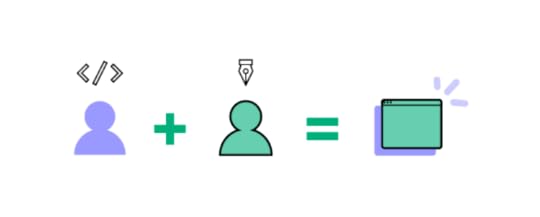
Developers have a specific skill set. They know deeply how to put websites and apps together. But understanding how a user will respond to an app is not intuitive. The UX needs to be researched and reiterated. It’s a full time job to study your users and identify how they move through your app.
Designers need to be looking at their population of users to identify how they behave. Constant and reiterative design needs to occur before an app can be positioned well to cope with the behaviour of users.
UX designers have a unique skill set for understanding user psychology, and they need to be focused on careful experimentation on pages.
But how do developers cope with the constant demands of designers while simultaneously building the product according to the customer’s needs?
We need a tool to bridge the gapEven if a designer learned to code, the challenge of optimizing design implementation would remain. Understanding the whole product’s existing components, functionalities, and branding takes a ton of time, regardless of who is doing the work.

If we’re aiming to design in a way that re-uses the most pre-existing components, we would still need someone to go and catalogue everything existing in the app to date. As well, other analysis would need to take place to make sure the designs fit the exact parameters.
We can’t assign this operations job to the designer or the developer, as both of these roles are already well defined. The designer’s role is already a full time job, with deliverables related to UX research, UX design, and conversion rate optimization. A developer has their hands full with building and coding features.
We need a real solution that improves the design and development workflow.
We need a tool that outlines all of the existing components and elements in a specific repository in a visual, drag and drop way. This would allow designers to pick and choose from the menu of existing components while making new designs.
Introducing Merge, a no-code design tool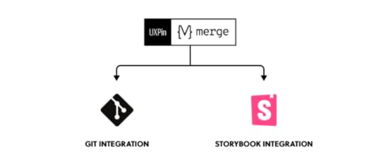
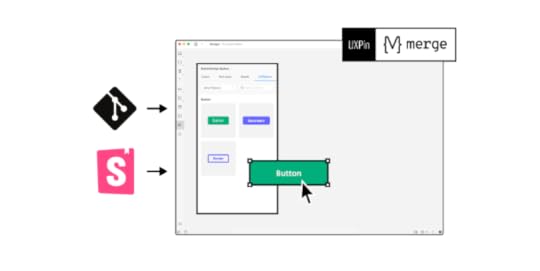
UXPin with Merge technology is a design tool that leverages dev tools through Git and Storybook integrations. . Sounds great, but what does that mean?
First, we have Git integration. Merge allows you to import existing components from your Git repo into UXPin design editor.
Second, we have an integration with Storybook, an open source UI development tool. UXPin has built an integration with Storybook that allows you to use your existing design components directly in Storybook. This means you can use a library of your existing design components when building out your next UI changes.
Then, you can just pass the design to a developer and have him use the code that he already has to build your new product.
Let’s dive in deeper.
Part 1 – UXPin MergeUXPin Merge imports your design components from your Git repository into the UXPin editor. This integration is currently only for the React framework, allowing you to pull in React components and work with them directly in UXPin.
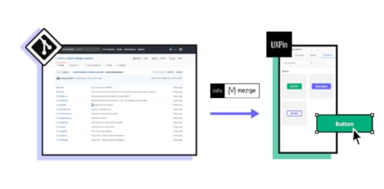
Your components will get stored in your UXPin design libraries, and any new components or updates will automatically sync into your library.
The functions of your components, and how they function, are also directly visible in your UXPin editor. This allows you to see mouse-overs, auto-fills, text field suggestions, emphasis animations and more directly in your UXPin editor.
Everything that you design with UXPin Merge will be coded exactly to spec by your developers. Why? Because all of the code in your design already exists in devs’ Git Repo. Your developer won’t have to make anything new.
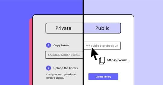
Part 2 – The UXPin Storybook integrationThe UXPin storybook integration allows you to use your existing design components, imported from Storybook- public or private. As in Git integration, you can change properties and add new interactions to parts of the ready components if you want to.
Consistency achievedUXPin Merge solves DesignOps problems quickly. Designers use components that are already existing in order to do their design. If they need to change items, they know exactly which components to change, as well as every page that will be affected once that change is made.
There aren’t three versions of the same component throughout your site, making your site easy to build, change, and keep consistent.
Should designers learn to code?Why learn to code if you can do your job with a no-code interface.
For designers, learning to code will give you a wider perspective, and give you more life experience to draw from when designing your app. However, it’s not necessary to learn to code when you can improve your design-dev communication by using the right tools.
Therefore, as the world trends towards making code more accessible, our answer to this question trends towards “no”. Designers should improve themselves not by learning to code, but by getting better and better at design.
We build teams so that we can bring people with different skills together. We need people who are thinking about UX 100% of the time so that our apps can actually measure up to the needs of our users. We need people who can code rapidly, and we need them to code without being weighed down by UX design questions.
With UXPin Merge we can bring these two sides together so that the two sides of our web development teams can actually work together easily.
The post Should Designers Code? appeared first on Studio by UXPin.
August 24, 2021
Useful Tips for Great App Icon Design

Icon design plays a crucial role in helping users navigate interfaces. Icons replace words so that UX designers can create a clean, easy-to-navigate user experience.
Designing an icon set provides users with a unique, on-brand experience while providing helpful directions and instructions.
Icon design has many challenges as designers must find the perfect balance between form and function for these communicative symbols. Icons need to look beautiful while conveying an important message to the user.
UXPin makes icon design effortless, especially if you are working with a team. You can get started with a 14-day free trial and start creating beautiful icons for your next project.
What is Icon DesignHumans have used symbols throughout our existence. These small but highly technical illustrations provide a universal language for service, directions, features, warnings, design, marketing, and much more.

Icon design creates a visual representation of a program, entity, data, interactions, or actions in software, websites, and applications. These universally recognizable icons enable users from around the world to navigate quickly through a website or application.
A Brief History of Icon DesignGraphic designer Susan Kare is widely recognized as the pioneer of pixel art and modern icon design. Her work dates back to the early 1980s at Apple, where she designed interface elements and contributed to Apple’s typefaces.
Susan designed all of Apple’s icons and typefaces on graph paper before drawing everything out pixel-by-pixel on a Mac, nothing like the sophisticated UX design tools we have today! By 1984, Susan had switched to the first release of MacPaint, which made icon design much easier.
 Susan Kare’s icons. Source.
Some of Susan Kare’s early icons include scissors (‘cut’), a finger (‘paste’), a paintbrush, and a pencil.
Icon Design ProcessIcon design starts with identifying which icons your project will need. It’s a good practice to list all of your design’s pages, actions, navigation, and interactions, so you can identify where you might need icons.
Some considerations for icon design:
Try to keep your icons as simple as possible with minimal detail. Many icons live in a 24×24 pixel world. So, if you have too much detail, your icons will appear as incoherent blobs.Don’t try to reinvent the wheel for universally recognizable icons like the cog for settings or heart for like. It’s important to exercise creativity when designing an icon set, but don’t forget to maintain a user-centered approach. In UXPin you can freely use ready Material Design icons that are waiting for you in ready libraries.Uniformity is what separates an average icon set from a great one. If you are working in a team, you must develop a guideline for everyone to follow. For example, maintaining a 5px corner radius for every stroke.You also need to ensure your icons are on-brand while conforming to the project’s design system.Due to their small size, icon design can appear deceptively simple. But, with all of the above to consider, things can get technical and require a lot of thought.
Consistency in Icon DesignMaintaining consistency is challenging when designing icons, especially when working in a team.
The first step is to decide on a grid. Always use a 1px grid, as this will give you the best visual reference for your canvas.
Next, you need to decide if you are designing in multiples of 8 or 10? Most icon sets follow multiples of 8 with sizes of 16, 24, 32, 40, 48, and so on.
To maintain consistency, decide which multiple will be your base size for designing all your icons. For example, if you’re designing at 512 pixels, make sure you design all your icons at 512 and then scale up or down.
Some designers prefer to start with the largest size they’ll need for the project and then scale it down as required. It’s often easier to remove strokes than it is to add them.
Stay On-PixelOne trick to maintaining consistency is staying “on-pixel.” Like a child coloring in the lines, you want all of your icon’s strokes to remain inside the gridlines rather than straddle them. If you need to straddle a gridline, center your strokes to maintain an on-pixel aesthetic.

Staying on-pixel will help keep your icons clean and consistent as you scale up and down. It’s also an excellent way to maintain uniformity across your icon set.
To Fill or Not to FillAnother consideration for clarity and consistency is whether your icons are stroke (sometimes referred to as line or outline), fill or an icon set with both variations. In most cases, branding will play a key role in whether your icons use a stroke or fill design.
Stroke icon design is fantastic for capturing detail, while filled icons are bolder, providing the user with more clarity.
Technical RulesYour strokes, shapes, corners, curves, and angles should be mathematically precise to maintain consistency across your icon set. Even if you’re aiming for a hand-drawn aesthetic, sticking to numbers rather than freehanding your icons will help maintain uniformity.
For example, are your ends rounded or square? Are you using whole number increments or decimals? What are your portrait and landscape ratios? What are your angle increments?

Like any design system, your technical rules will evolve as you grow your icon set. Even for a small icon set, keeping detailed documentation will allow you and your team to maintain consistency. These rules also streamline onboarding or handover.
Clarity in Icon DesignWhile it’s important to inject your brand’s creativity into your designs, your icons must make sense to the user. Think of icon design as a language rather than illustrations. What message do you want to send to the user?
For example, if you have a “view” action, an eye icon would make the most sense. You could also use a camera or a pair of binoculars (both used to “view” things), but the user might relate these symbols to capturing an image or sightseeing.
If you’re designing an icon for something new or unfamiliar to the user, do some research to figure out how to convey your message visually.
Follow the Rules of Icon DesignIf you approach icon design as a universal language, you’ll recognize the importance of sticking to a set of rules and principles.
If you’re giving someone directions, you’re going to point where to go, not wave at them. The same is true for icon design. The house icon always means home icon, search is always a magnifying glass icon, and the bin icon always represents delete.
Google’s Material Icons feature a vast library of standardized symbols to reference if you are ever stuck. Redesigning versions of Material Icons will help keep your icon set universally recognizable.
Color in Icon DesignIncorporating color can help keep your icons on-brand or draw users’ attention to important actions or features. Color can also assist users with navigation by using a different colored icon for an active state.

Designers must exercise caution when using more than one color as icons become challenging to read.
Generally, two colors for icon design work best with a different color for the background and symbol. As you scale icons beyond 64 pixels, it becomes a little easier to incorporate several colors and shading without losing any detail.
AccessibilityIf you are using color, make sure you test your icon designs against your project’s backgrounds, as sometimes icons are difficult to see without the right contrast.

Considering accessibility is crucial when choosing colors because icons are small and can be challenging to see. Using our built-in contrast checker will ensure your icons stand out for users with visual impairments.
Cultural MeaningIcon designers must also consider how different cultures will interpret colors, hand gestures, and symbols. If you are designing a product for a specific marketplace, some local language and culture research can prevent users from misinterpreting or misunderstanding an icon’s meaning.
White SpaceWhite space is another factor designers need to consider to make icons legible and accessible. White space also adds balance resulting in a visually pleasing experience for users.
Because icons have to scale down (sometimes 20 times or more from the original size), white space plays a critical role in maintaining the design’s form.
Iconic…icons
The at (@) symbol is possibly one of the most used icons today. It’s found in email addresses and used to tag accounts on social media but has an ancient history. The @ dates back to the early 1,300s when it was used to capitalize the letter ‘A’ in Amen.
The peace sign is another universally recognizable icon, first used in 1958 for an anti-nuclear protest in England. Gerald Holtom designed the symbol using the N and D (representing Nuclear Disarmament) from the Semaphore alphabet.
The International Symbol of Access, often referred to as the wheelchair symbol, is used worldwide and online to represent accessibility features for people with disabilities. Danish design student Susanne Koefed designed the icon in 1968. The original design was headless; several years later, a circle was added to the top for the character’s head.
The power icon is a combination of the | and O found on analog power switches. With the advent of digital electronics, the power switch changed to a button, so designers combined the two symbols with the | nested inside a broken circle (representing the O).
Designing Icons with UXPinUXPin is the perfect tool for icon design. You can invite your team to collaborate on your icon set, use the built-in icon library and share the project’s URL for clients to review and provide feedback.
UXPin also makes it super easy to set up a grid for your icon design. Here is an example to create 24-pixel icons in UXPin.
Choose a canvas or create a custom one. We used a 340×720 canvas for this example.Set your COLUMN GRID to 10 x columns, 24px width, 10px gutter, 5px offset.Set your BASELINE GRID to auto columns, 24px height, 10px gutter, 0px margin.
Adjust your width and height to suit your icon design requirements. Try it for yourself! Start designing icons in UXPin today with a 14-day free trial.
The post Useful Tips for Great App Icon Design appeared first on Studio by UXPin.
August 23, 2021
Storybook Best Practices That Will Improve Your Product Development Process

Storybook integration with UXPin makes it easier than ever for you and your team members to build digital products from a UI library of approved, interactive components. After the integration, expect a better workflow and more effective product development. Simply integrating the two tools, however, doesn’t mean that you get all of the benefits. Make your product development process even more effective by following these Storybook best practices.
If you haven’t already integrated Storybook and UXPin’s Merge tech, head to our tutorial now to get started. The process only takes a minute.
Table of contentsFind a naming convention that helps everyone find componentsStick to Storybook’s CSF formatWork on one story at a timeTalk to your development team to determine whether you need custom documentationTake time to play with StorybookGet involved with the Storybook communityGet started with Storybook and UXPin!Find a naming convention that helps everyone find componentsStorybook has a search feature that can help people find the stories and components that they want to add to new projects. The search, however, relies on you remembering the name of what you want to find. You don’t have to remember the name perfectly, but you need to get pretty close. Otherwise, you get stuck browsing through endless files until you happen upon the asset you need.
Choose a naming convention that eliminates this problem. Realistically, it doesn’t matter what convention you select. [ComponentName].stories.[js|jsx|tsx] works well for a lot of teams. That might not work for you, though.
The most important thing is that you choose one naming convention and require everyone to use it. You don’t want any rogue components living in the nooks and crannies of your design system.
Stick to Storybook’s CSF formatWhen you export components from Storybook, the file will default to CSF format. Some designers and developers feel tempted to change the format to fit their editing software. That’s never a good idea. CSF format helps ensure that metadata stays with your files when you move them to other environments. 
Besides, Merge users don’t have a reason to change file extensions. Just integrate the tools and add your UI component libraries to UXPin’s editing and prototyping environment.
We’re keeping these Storybook best practices as simple and actionable as possible so everyone can understand them. If you want more information on using CSF, visit this Storybook tutorial on the topic.
A word of warning: most of it will probably make more sense to your developers than your designers. Don’t worry if the tutorial looks like nonsense to you. Storybook and Merge give you drag-and-drop design environments that you can learn quickly.
Work on one story at a timeClients want results quickly. That’s the nature of building digital products. Some people respond to incessant emails by multitasking. Then what happens? They end up wasting a lot of time-solving problems and organizing the messes they made jumping from project to project.
Take a mindful approach by working on one story at a time. Seriously, it will help you organize every aspect of your project, give you better results, and help you reach milestones faster. 
When you start working on a story, continue adding and testing components in an organized way until you reach a good stopping point. This will help ensure that all of your components get put in the right stories and you track your project’s progress accurately.
Of course, this doesn’t mean you can only work on one project until you complete it. You just need to schedule your day so that you focus on one story at a time.
Move methodically. Storybook and Merge take a code-based approach to design, so you already have tools that will save your team a lot of time. Don’t feel rushed.
Talk to your development team to determine whether you need custom documentationShould you use the DocsPage that comes as Storybook’s default, or should you create custom documentation? Universally, there isn’t a right or wrong answer to this question. One option, however, probably makes more sense for the types of products your team develops.
Unless you have plenty of experience with JavaScript, you will need to talk to your development team about the best way to document components. Turn to the people who know what they’re talking about, and rely on them to decide which approach suits your design and development needs.
Take time to play with StorybookStorybook has a sandbox that lets you take creative risks without hurting other components in your story. Seriously, it’s one of the best things about Storybook, so you need to take advantage of it.

Playing is not a waste of time. It’s one of the most effective ways to learn how a tool works (and doesn’t work). The hours you spend exploring now will make you a better Storybook user in the future. Think of it as practice. But have fun while you do it!
Get involved with the Storybook communityStorybook has a lot of tutorials that will help you find effective ways to create UI component libraries and design systems. The tutorials can’t answer every question, though.
That’s where the Storybook community comes in. Like most open-source tools, Storybook has an active community of users and developers. Get involved so you can trade insights and tips with others.
Connecting with the community will also help you stay informed of Storybook updates and how they might affect your design process.
Get started with Storybook and UXPin!How can you take advantage of Storybook best practices when you don’t integrate it with your favorite design and prototyping tool? Integrate the two and start designing with code components today.
It all starts with a very simple, one-minute process that anyone can do! Start trial, integrate now, and see how your design and development processes improve!
Try out Storybook integrationThe post Storybook Best Practices That Will Improve Your Product Development Process appeared first on Studio by UXPin.
August 19, 2021
Low-Code and No-Code Tools – What Are They?

There is an ever-growing hype around no-code and Low-Code Application Platforms (LCAP). It seems like every week a new low-code product hits the market. Some low-code products target a specific niche, while others work on solutions to eliminate the necessity for coding for a broad spectrum of apps, software, and tools.
The beautiful thing about low-code and no-code development is that it makes building apps and tools more accessible, especially for young entrepreneurs with a big idea and little or no capital.
Many LCAPs allow users to integrate with APIs and infrastructure architecture like Google’s Firebase, enabling companies to build affordable apps and plugins for existing software.
Low code development is also beneficial for UX research and testing. UX designers can create fully functioning prototypes using an LCAP to conduct better user tests before handing designs to engineering teams. This type of low-code workflow could save significant time and money when shipping new products or features.
Low Code vs. No Code – What’s the Difference?To most people, low-code and no-code development are interchangeable terms meaning the same thing. Most development tools that claim to be no code still allow users to insert some code (usually CSS) for customization, which essentially makes them low code.
The most common and widely accepted term is low code (sometimes Low-Code Application Platforms – LCAP), which refers to low code and no-code development environments.
Still, there are a few subtle differences between low code and no code.
No-Code Application PlatformNo-code builders usually come with pre-built templates where users can only change logos, images, and text. 
These no-code platforms also allow users to connect to simple databases like Google Sheets or Airtable. No-code development is highly accessible because it enables users with no technical skills to build a functioning app.
Low-Code Application PlatformLow-code builders might also provide users with templates but allow for more customization, like editing page/column layout, adding CSS or Javascript, and connecting APIs.
Low-code platforms might also allow users to connect to more technical databases like Google’s Firebase, Parse, or AWS Amplify.

Many enterprise applications like SAP and Salesforce provide low-code tools so that businesses can build apps to integrate with their software.
How Does Low-Code Development Work?Low-code platforms typically use a drag-and-drop builder to place elements on the page of an app (mobile, desktop, wearable device) or website. These elements include things like text, images, buttons, navigation, etc. Within each of these elements, users can also pull data from a database, create actions and animations, and more.
Each element is effectively a widget that the low-code platform uses to compile an app or website. Some low-code platforms offer hosting options, which means the user doesn’t have to worry about exporting the code and finding an appropriate hosting environment.
Low-Code in the Design ProcessLow-code is fast becoming an essential tool in the design process too. Let’s start with the fact that if a design tool is code-based, not image-based, then the built prototype behaves much closer to the end-product and the interactions can get extremely realistic.
Another perk of low-code design tools is that they can empower whole product teams. Low-code design software makes it easy for product teams with little or no design experience to build products and interfaces with design libraries composed by the UX team.
A perfect example of this is UXPin Merge. Designers can use Merge to import ready UI code components to UXPin and design with them right away. Those ready elements can come from developers’ Git repositories or Storybook. 
Product teams can then use those components to design new products and user interfaces. The best part is that the interactions are already there, so the prototype that teams build is high-fidelity and aligned with all the company’s standards.
Because team members use production-ready components, the engineering team can build the final product much faster.
Low-Code Product Design from PayPal DesignOps 2.0A fantastic example of low-code product design in practice is PayPal’s DesignOps 2.0. Using UXPin Merge, PayPal’s UX designers and developers built a design library of 60+ components for product teams to work with.
This code-based design library allows PayPal’s product teams to build products with minimal input from the UX team. The engineering process is also much faster, with developers completing more than 80 percent of product development work without assistance from the UX team.
Low-Code Development BenefitsThe most significant advantages of low-code development are speed and accessibility. Anyone can turn an idea into a workable app, often within a few hours.
Here is a closer look at the benefits of low-code development:
Speed – Low-code development allows teams and individuals to build applications fast. Even a simple app can take days for engineers to code into a functioning product. More complex apps can take weeks or even months.Reduce costs – Engineering is one of the most expensive steps when building apps and websites. Some elements, like security, require specialized engineering skills, which are costly and time-consuming. Easy deployment – Low-code platforms often provide one-click deployment and hosting. Hosting an app or website comes with many challenges, especially if you don’t know anything about servers and hosting environments.Concept testing – Low-code platforms are fantastic for startups to build a cheap product to test a new concept or idea. A successful proof of concept could help startups secure crucial seed-stage funding. Established companies might use a low-code platform to build a new service, plugin, or add-on to test before investing in development.Disadvantages of Low-Code DevelopmentWhile there are many advantages to low-code platforms, there are several disadvantages you might want to consider.
 Scalability – While low-code platforms are excellent for proof of concept, these apps aren’t scalable because they are confined to the platform’s limits. Still, once your app starts producing revenue, you can invest in hiring developers and come up with a scalable solution.Limited innovation – Low-code platforms also have a significant limitation on innovation. Again, you have to work within the confines of the platform you’re working with and, therefore, cannot write potentially innovative code or algorithms.Expensive hosting – While it’s cheaper and faster to build low-code applications, hosting on low-code platforms offer is exponentially more expensive than a regular hosting service, especially as you scale.Performance – There are a couple of factors where low-code development can negatively impact performance. Firstly, because these systems provide a one-size-fits-all solution, it’s likely that there will be lots of redundant and unused code in your final application. Secondly, if you’re using a low-code hosting service, this is likely a shared hosting environment, which is not ideal for speed and performance.Security – Apps that process sensitive and consumer data might not be secure enough to pass privacy laws in some parts of the world. For example, the EU’s GDPR and California’s CCPA are very strict about managing personal data. What Can You Build With Low-Code and No-Code Platforms?
Many people are surprised to learn what you can build with low-code application platforms. For example, with a popular LCAP like Bubble, you can create everything from simple APIs to complex social media platforms, SaaS applications, accommodation reservation platforms (like Airbnb), and much more.
Some LCAP platforms even provide the functionality to create Javascript functions, and sophisticated user flows using a drag-and-drop builder.
Custom Software Add-Ons & APIsLow-code development is perfect for businesses that need a custom add-on to integrate with existing software.
For example, a company can build a low-code app that connects to their accounting software for employees to log their hours. This kind of app isn’t profitable for the company, so spending tens of thousands of dollars on a custom app doesn’t make financial sense.
In the above scenario, someone from the accounts department could build and deploy a low-code app that works precisely how they want it within a day.
A perfect example of this is Zoho Creator, a low-code app builder that allows companies to build native iOS & Android apps that integrate with their current systems.
SaaS products
There are a growing number of startups building simple SaaS products using low-code platforms. Because these startups don’t have to rely on designers and engineers, they can keep overheads low and scale fast.
EducationLow-code is a perfect solution for building educational tools and apps. These apps could be as simple as capturing new student applications to customized virtual classrooms where students can watch videos, submit homework, interact with classmates, download course notes, receive report cards, and much more.
These are just a few examples of low-code applications, but the use cases can be exhaustive, especially when looking at the potential for cash-strapped developing nations seeking to digitize systems for essential services.
Will Low-Code Replace Developers?While there will always be a need for developers, low-code application platforms are the future of app development.
The LCAP industry is moving fast. It’s creating new opportunities for startups while allowing established companies the ability to upgrade and improve legacy systems.
According to Gartner, an S&P 500 research and advisory company, “By 2023, over 50% of medium to large enterprises will have adopted an LCAP as one of their strategic application platforms.“
As AI/machine learning technology merges with LCAP, hiring a developer to code an app will be the equivalent of choosing a steam train over the hyperloop. It won’t be long before we see highly complex enterprise applications built using intelligent LCAPs that perform automated upgrades for device compatibility or meet the latest security requirements.
The Future of Low-Code Application PlatformsAccording to Brandessence Market Research, the low-code market will be worth $65.15 billion by 2027 and $187 billion by 2030.
Software giants like Salesforce, Microsoft, Appian, Oracle, and Agile already have a strong foothold in the low-code market and continually improve these systems to provide their clients with more customization.
It’s likely that instead of building software, these companies will provide the tools for customers to develop their own applications, perfectly adapted to meet their exact business needs.
It is crucial to point out that these low-code application platforms won’t exist without developers and engineers to drive innovation. We’ll be confined to the limitations of low-code applications, even those powered by AI.
Low-code won’t necessarily replace developers but instead, change the systems and tools engineering teams build.
If you want to connect design and development using low-code platforms that anyone in a product team can use, try a free trial of UXPin with Storybook integration. Experience the power of code-based design tools to build digital products faster.
Try out Storybook integrationThe post Low-Code and No-Code Tools – What Are They? appeared first on Studio by UXPin.
August 18, 2021
Who Is a Web Designer: All You Need to Know

Love that website you see? Having fun with the links, the buttons, and the colors that mesmerize you? How about the typeface that makes it easy for you to read?
That’s all the work of web designers whose work brings you the slick websites you visit every day.
How the website behaves, how it scrolls, and the initial impressions you gather from the visuals are all backed by a web designer’s intuition, experience with design, color theory, typography choices, and the art of visual design.
Behind the scenes, web developers build and manage code, scripts, and the infrastructure for websites.
Web designers work with web developers to create websites compatible with all devices, such as desktops, laptops, tablets, or smartphones.
Web designers use their creativity and knowledge of design principles to create memorable user experiences for website visitors, while also building websites for performance and results. 
If you’re looking to expand your skill in web design, start experimenting with UXPin. UXPin is a design tool that will help you from wireframing to hi-fi prototyping. You should sign up for the UXPin free trial now.
Who is a Web Designer?Web designers are experts in aesthetics where the ultimate goal is to drive business results.
The goals that a designer will typically affect are lead generation, conversion to signup, brand awareness, and new customers.
Web designers bring a range of skills to the table that they use to achieve these goals. Some of these skills include:
Graphic art (images, logos, and diagrams)Page design (the layout of a web page)Product design (onboarding flows, form design, functionality) Consumer behavior research (how the consumer actually responds to the product)UX/UI research and designReporting on business goalsPlanning for business goalsWhat skills does a web designer have?At a more granular level, these are the more focused skills a designer will work with:
Principles of design Web design languages (HTML, CSS, and a working knowledge of JavaScript). Some web designers also segway into learning web development languages such as Python, Ruby, and ReactTypography Color theory Graphic composition Responsive designThe principles of user experience (UX) designThe principles of user interface(UI) designDesign strategyIn a designer’s daily life the required skill set and the associated responsibilities go way beyond the basics.
To get a better idea of how designer’s think, check out this resource on Jacob’s law. This site pulls in info about UX design, UI design and more.
What are the KPI of a web designer?
The KPI a designer uses will depend on the exact strategy in play. However, some typical measurements designers take on their work are as follows:
Conversions from web page visitor to leadEngagement on pages (i.e. button clicks, downloads)Click through ratesBrand awareness scores (measured in a variety of ways)User behaviour throughout the site (measured in page view funnels)Time on pageTime spent watching a videoScroll depth (measured by heat map tools such as hotjar) What tools does a web designer use?Web designers deliver their work using several tools, ranging from the humble notepad to tech-powered, code-based design tools like UXPin. 
Primarily, web designers and the tools they use are just as varied and personalized as web designers themselves — based on workflow requirements, needs, skills, and the projects they work on.
Some web designers choose to focus on specific CMS systems and platforms. This affects the tools and web design workflows they might end up using.
Here are a few web design tools that designers use for their projects and workflows:
Design Thinking Tools (For conceptualizing, visualizing, and mockups)Design is an evolutionary process. Starting from concepts and prototypes moving to user feedback, and then pulling that feedback back into the final prototype version. It’s an iterative process that requires rebuilding based on how your customers are actually using the product.
To learn more about phases of design thinking, check out our article on design thinking tools.

While you could do web design magic on the back of a napkin, web designers need something more functional and powerful.
SurveyMonkey Concept TestingWith templates specifically built for web designers, you can use SurveyMonkey to run surveys and polls to gather quick and definitive feedback on customer needs, user satisfaction and more.
TypeformIf you need more control, and if you love to add some character to your forms, you can use Typeform.
VideoAskWant more engagement? How about going face-to-face with your audiences while still gathering feedback, asking questions, and more? VideoAsk by Typeform allows you to use video to ask questions and get your answers by just sharing a single link. You can also use conditional logic, multi-response fields, and more.
Tool for Web Design Starting from Wireframing up to Hi-Fi PrototypingAfter web designers ask questions and gather insights, it’s time to put concepts into something more tangible. Since an actual website build is still far away, prototyping is a necessary in-between process to bring life into your web design concepts.
UXPinUXPin is a website prototyping tool that allows you to not only make designs, but also see how the designs interact and function with the help of advanced interactions, states, and conditions.
You can pull in the existing components from your developers’ libraries, and include them easily in your prototypes. This saves a ton of time for you and developers, as well as helps maintain consistency.
The best way to understand prototyping tools is to sign up for a UXPin free trial and start experimenting.
Other CMS-specific tools & workflows:As a web designer, if you gravitate towards specific CMS systems, the choice of web design tools will vary.
You will still use tools like UXPin for concepts, wireframes, mockups, prototypes, design iterations, and more. But sometimes you’ll need specific tools or features built into the platforms themselves to complete web design projects.
Popular CMS solutions such as WordPress and design solutions such as Webflow might require slightly different pathways and workflows.
Web designer vs. web developer: what’s the difference?Some people tend to use the phrases “web designers” and “website developers” interchangeably. However, they’re completely different roles in a web development team.
Web designers focus on visual design, UX, UI, branding, how the content interacts with design, and the user experience with the product.
Meanwhile, web developers focus on what’s “under the hood”. Web developers build out the site with code, and focus on making sure the site renders fast and is always live.
Some web designers foray into web development. Some web developers also get their hands wet with web design.
There’s a rich and varied interplay between the two career tracks, but there’s so much work to be done that the trades typically get divided between the lines of “web designer” and “web developer”.
What are some examples of great web design?Looking for some inspiration and examples of great web design?
Here are some of our favorite examples of great design:
Chili Piper
Notice the large, unmistakable, and only call-to-action on the homepage of Chili Piper? It’s built to generate leads while still providing value to end-users.
The CTA itself is appealing, simple (just an email grab), and promises an Instant Inbound ™ Preview in 30 seconds flat.
Also, notice the clean navigation menu, the colors used, the contrast, and the clear call-to-action button on the top right corner of the nav menu.

Can a simple navigation menu be “more” than just a menu? Going beyond the functionality of the navigation menu usually found on websites, ThoughtSpot put an ebook download right into their nav menu. This means this nav bar is getting conversions, even though it’s just a navbar. How cool is that!?
Also, check out that eye-popping tombstone graphic and loud content topic using the word “death”.
ThoughtSpot is a SaaS platform that provides businesses with analytics solutions for modern data stacks.
You could achieve this with our UXPin multi-level dropdown element.
Trivago
We love minimalistic, results-oriented designs at UXPin. Trivago is a hotel aggregator you might be familiar with.

It all starts with this minimalistic home page. Notice how everything else looks a little faded in comparison to just the “search” element, which is found front and center on the site?
The site has a focus. It does only “one thing” and tries to do it right. Meanwhile, all those logos not only act as social proof but also clearly lets you know where the properties are going to be sourced from (to help compare and deliver the information to you).
Want to see examples of interactive web designs? Go here.
Who are some great web designers in history?There are several thousands of web designers who do impressive work, and you only have to look at certain sites like Awwwards and Behance to check out some of the best web designers you can find.

Thankfully, a few of the best web designers do have their work put up for the world to see. Here are some of the greatest web designers we know of:
Berners-Lee:Berners-Lee invented HTML and designed one of the first websites on the web. Built for the European Organization for Nuclear Research, here’s the first website Berners-Lee built for distributing access to information about other researchers, research projects, and more.
While we are talking about the world’s early web designs, here’s a look at Aliweb – the world’s first search engine.
Shane MielkeShane is as accomplished as web designers can be, with six Adobe Sites of the Day, two Awwwards, 36 FWA Sites of the Day, four FWA Mobile Sites of the day, two FWA Sites of the Month, and 3 Adobe Cutting Edge Awards.
Shane also published a book called Launch it: A Handbook for Digital Creatives. Shane’s portfolio tilts heavily towards designing movie websites.
Dan CederholmAs the Co-founder of Dribble, author, and keynote speaker, Dan Cederholm is a Massachusetts-based web designer known for standards-based web design.
Having worked with the likes of EA (Electronics Arts), YouTube, Microsoft, MTV, ESPN, and Google, his accomplishments and the web design career itself should go in some sort of a hall-of-fame for web designers.
Jan Cavan BoulasWorking as a product designer at Automattic – the company that runs and manages WordPress, WooCommerce, Tumblr, and JetPack – Jan Cavan designs products that millions of people use. If there’s a list of web designers working to make the web a better place, Jan Cavan Boulas will take the top few spots.
She speaks at several design conferences, published books, and focuses primarily on app design.
Yaron SchoenFounder of Made For Humans (a web design shop) and recently holding the title of design lead at Twitter, Yaron is a Brooklyn-based web designer focusing on interface design.
Yaron has an impressive list of clients that other web designers might kill for. Featuring National Geographic, AOL, Pixable, Travelocity, and several others, he has an entrepreneurial spirit which led him to start several other projects such as Float.
ConclusionGive your web design learning and your web design career an amazing start by getting educated in who is a web designer and what they do.
Extend your learning to make the design work for business’s goals, and use the right tools of the trade.
Start by signing up for UXPin and take it for a spin now.
The post Who Is a Web Designer: All You Need to Know appeared first on Studio by UXPin.
August 17, 2021
Storybook Frameworks You Can Use to Build Component Libraries

Building component libraries can make UI development efficient and failure-proof. Some of the advantages of making a component library include:
Creating a single source of truth that keeps everyone in line with your current guidelines.Scaling quickly when you need to meet a significant milestone or release date.Improving collaboration and communication in product teams.Reducing code duplication to prevent redundant work.Building digital products that work on multiple devices.Now that UXPin offers Storybook integration, it’s time to learn about Storybook frameworks you can access. Storybook’s popularity means that members of your development team probably already have some experience with these common frameworks. If they don’t, give them opportunities to explore Storybook frameworks to discover their pros and cons.
Table of contentsStorybook for ReactVueAngularCommunity Storybook frameworksDIY Storybook frameworksIntegrate Storybook and UXPin to build digital products more efficiently!Storybook for React
React is a JavaScript library with plenty of benefits. We’ve posted about our appreciation for React features like:
Component reusability.Stable code with easy options to fix glitches.Short learning curve, especially for anyone familiar with JavaScript.Reliable engineering team that keeps the library working.Conditional statements within the JSX extension.React is a natural fit for Storybook because the framework already offered a way to change individual components without affecting others in the UI library. Storybook makes that feature even more effective by isolating components. The sandbox lets you build an entire UI without wading into many technical details.
React Storybook framework will also help you document your components, which makes reuse easier than ever, and visually test components to avoid buggy code.
If you want to learn more about using React with Storybook, read Storybook’s introduction to React and visit the website Component Driven User Interfaces.
Vue
The Vue Storybook framework offers all of the essentials that you would get from Storybook for React. The biggest difference between Storybook for Vue and React frameworks is that you cannot get the graphQL add-on, which can make it slightly more difficult to integrate with other tools.
Many developers like Vue because it has a small size but doesn’t compromise performance. It offers a solid tooling ecosystem, reactive two-way data binding, and virtual DOM rendering.
Angular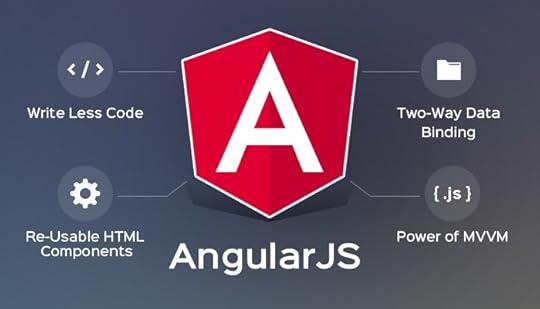
The Storybook Angular framework gives you all of the essentials and add-ons that you get with React.
It makes sense to choose Angular when you have a small development team that would rather focus on extending the functionality of HTML with plain JavaScript. Anyone with basic JavaScript coding skills can use this framework, which could help you save money, decrease development time, and avoid mistakes.
Angular’s simplicity doesn’t make it weak. You still get excellent features, including directives, reusable components, data binding, and localization.
Community Storybook frameworks
Community frameworks don’t have large communities behind them, so they don’t tend to get updated as often as major Storybook frameworks like React and Vue.
Although they aren’t the best options for Storybook, the open-source tool still works with:
EmberHTMLMithrilMarkoSvelteRiotPreactRaxKeep in mind that you will lose some features when you use these Storybook frameworks. Only Ember on Storybook has all of the essentials (Actions, Backgrounds, Docs, Viewport, and Controls). None of the community frameworks have graphQL support. They also miss numerous other add-ons, which could make it more difficult for you to finish projects quickly.
Still, Storybook’s flexibility extends to these frameworks. They aren’t perfect, but they will work.
DIY Storybook frameworksStorybook is an extremely flexible tool that lets you scaffold a new framework specifically for your team. Storybook has always done an excellent job helping users succeed, so it’s not surprising to see that the website has a comprehensive tutorial for going with a new Storybook framework.
Integrate Storybook and UXPin to build digital products more efficiently!Once you have your component libraries established in Storybook, you can easily import them to UXPin. It’s so easy that the process literally takes about one minute.

After integrating UXPin and Storybook, you can manage your UI component libraries from within Storybook. Any change you make will automatically take place in UXPin libraries, too. That way, you can maintain a single source of truth in Storybook and create fully functional prototypes in UXPin with Merge technology.
Storybook and Merge will make your development processes more efficient and effective by putting the power of code-based design into everyone’s hands. You want efficiency, right? So get the Storybook integration now and start exploring the benefits!
Try out Storybook integrationThe post Storybook Frameworks You Can Use to Build Component Libraries appeared first on Studio by UXPin.
August 16, 2021
8 Common Prototyping Mistakes Plus Tips on How to Avoid Them

Prototyping is one of the best ways to validate design ideas before time and resources are wasted on ideas that are not viable. While there is no single “perfect” way to create a prototype, there are common mistakes that designers make. These mistakes can affect the suitability of your prototype and slow down the design process. Here are eight common prototyping mistakes and tips on how to avoid them.
Mistake # 1: Prototyping without a clear goalThe first prototyping mistake is starting a prototyping project without a clear goal of what it intends to achieve. Will the prototype be used to test a new website or test a specific flow such as the check-out flow? Who will be the stakeholders? What’s the timeline? This goal will act as the north star that guides the entire prototyping process and prevents the project from veering off course. Additionally, a good goal also defines what success looks like and how to measure it. Use frameworks such as SMART to make sure that your prototyping project has clear objectives.
Mistake # 2: Prototyping too earlyOften, designers rush into the prototyping process before having a clear picture of the design solution they are going for. They are tempted to just open up a prototyping tool assuming that the design solution will take shape on its own. The problem is that prototyping tools force designers to focus on details such as layout and alignment instead of high-level design concepts. 
By skipping the ideation process – or rushing through it – you can get locked in on the first design solution that you come up with, which may not be the best one. To avoid making this mistake, ensure that you do the following:
Use design thinking to brainstorm several design solutions before choosing the one you are going to prototype. For best results, involve internal stakeholders such as product managers in this process. Even when you are doing rapid prototyping, come up with sketches, mockups, or wireframes of different design solutions. Sketch or wireframe each of your main pages or screens before prototyping them. This will reduce the amount of time you spend on creating the prototype. Mistake #3: Using the wrong prototyping toolWhen choosing a prototyping tool, the first thing that you should consider is the level of fidelity that you require. However, most designers default to the prototyping tool that they know how to use or the one that their company provides. This leads them to create prototypes that are the level of fidelity that the tool provides, which is sometimes limited because of the image-based approach, instead of code-based. 
If you need a low fidelity prototype, then you can use a whiteboard or pen and paper to create a paper prototype. If you need a high-fidelity prototype that looks real and is as interactive as the real thing, then UXPin is the best choice. It makes it easy for you to create life-like prototypes using advanced interactions, variables, and states.
Whatever prototyping tool you choose, make sure that it aligns with your goals. Don’t create a super high fidelity digital prototype when a low fidelity one would have been enough or vice versa.
Mistake #4: Using placeholder text and images instead of real dataPrototypes should be as close to the final product as possible. When you use placeholder text such as Lorem Ipsum, it creates the impression that it’s just a test version of the product which disrupts the usability testing process. Plug in pre-existing content or rope in the writing department to provide you with copy and content for your rapid prototypes.
UXPin has built-in data such as names, cities, and images that will make your prototypes look and feel like the real thing. No need to spend a lot of time looking for stock images or using Lorem Ipsum. You can also import your data as well.
 Mistake #5: Not prioritizing interactivity
A good prototype is made up of more than just simple page transitions. It should also provide a realistic user experience. When you are creating a prototype, ensure that its user interface responds to user manipulation the way the final design would.
You will miss out on the opportunity to get feedback on functionality, like how expandable menus work and conditional navigation flows when you don’t create interactive prototypes. Interactivity can give startups an edge over their competitors especially when used in mobile apps. Additionally, a fully clickable prototype will make the design handoff and development process easier.
 Mistake #6: Asking for feedback late in the process
One of the best ways to take your prototype to the next level is by asking for feedback from different people throughout the process. Show the prototype to other designers and ask for their feedback. You can also get feedback from developers and the product design team to gauge their gut reactions. 
Avoid the common prototyping mistake of working in a silo until it is too late or too expensive to incorporate feedback. For best results, use the feedback to make changes to the next iteration of the prototype and ask for feedback often.
Mistake #7: Getting too attached to a prototypeAt the end of the day, one of the prototype’s purposes is to simply test ideas and get validation. However, some designers make the mistake of being too attached to a prototype and thinking that it has to be perfect. So they end up over-prototyping by spending too much time and effort on the prototype. If you are prone to get carried away, focus your prototyping workflow on designing the minimum viable interaction instead of adding all the bells and whistles.
Mistake # 8: Being discouraged by failureAfter user testing or stakeholder feedback, your design solution will either be validated or invalidated. While this can be disheartening, you should not view it as a failure. Prototyping is about testing ideas and assumptions and not all of them are validated. Instead, look at it as a learning opportunity that will improve your next prototype.
Avoid prototyping mistakesWhile there are no specific best practices of how to prototype, there are mistakes that can make you waste time and money. Avoiding these common mistakes will help you create a prototype that gets useful user feedback on time and on budget. Create life-like prototypes using UXPin’s prototyping tool today – sign up for a trial.
The post 8 Common Prototyping Mistakes Plus Tips on How to Avoid Them appeared first on Studio by UXPin.
UXpin's Blog

- UXpin's profile
- 68 followers

